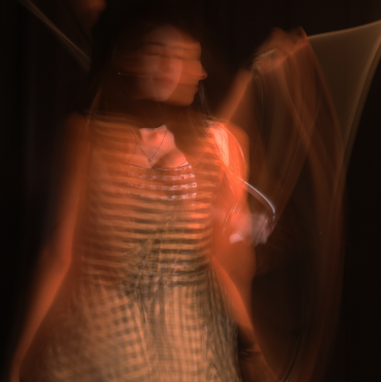
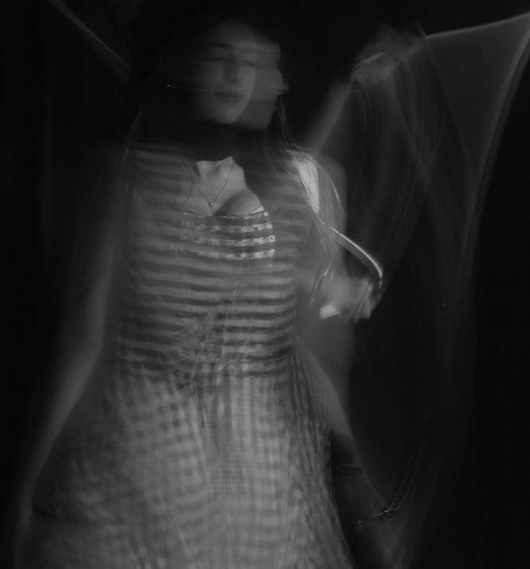
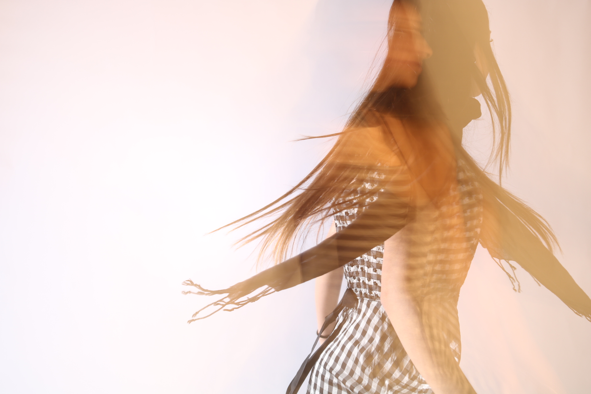
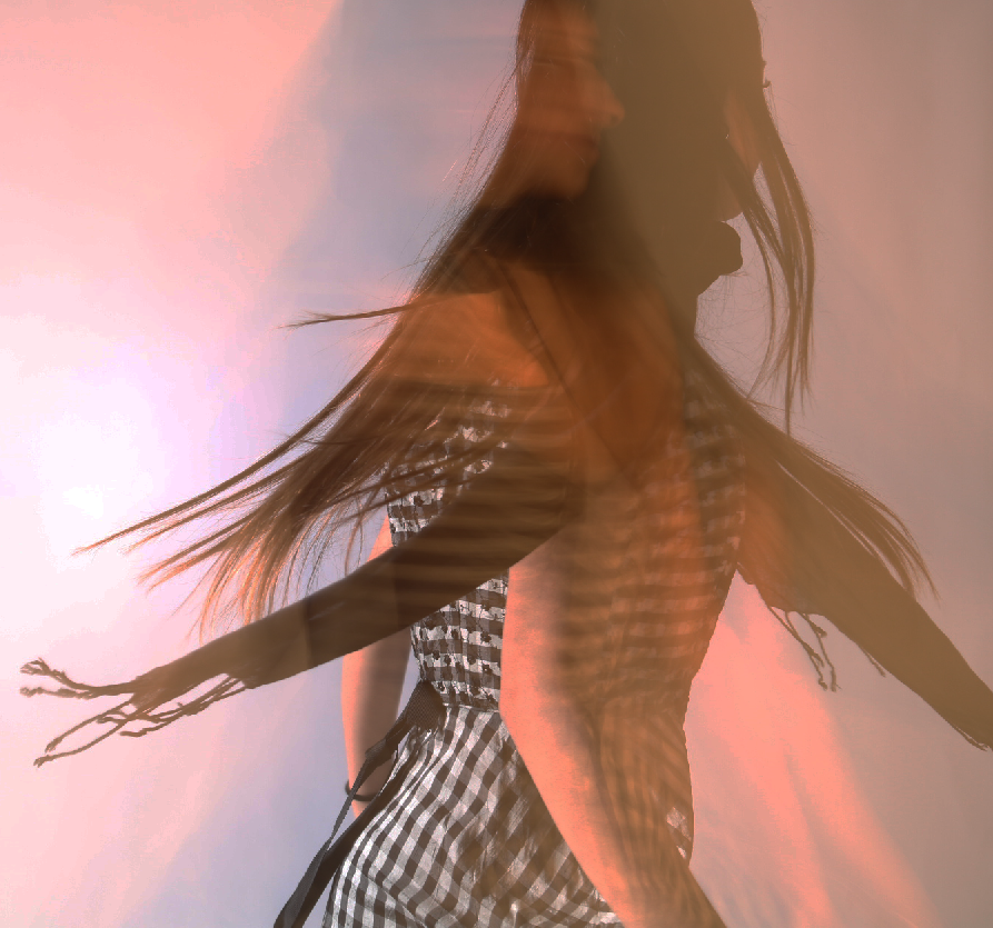
I have taken images using paper to try create some unique abstract images. The artist who has inspired my images is named Francis Bruguière.
Francis Bruguière
Francis Bruguière is an American photographer who was famous for creating amazing images using only paper and light. He was introduced to photography by Alfred Stieglitz (Photographer and modern art promoter) in 1905 where after studying painting in Europe he became acquaintances with Stieglitz who accepted him as part of the photo-secession. He experimented with many different options with his photographers and in 1927 he created the Cut-paper abstraction piece which became really popular. He was able to capture this image by cutting up the paper and folding it in a way which is used to make unique details and make it look 3D, he would then use light to shine through the paper which would then result in shadows being created against the paper which resulted into making some amazing images.
My Texture Photoshoot:
My Favourite Images
I selected these images as they looked the most appealing compared to the rest, you can also see how they’re structured in a way that gives it that 3D look and you can also see the amount of shadows it creates against the paper and floor.
My Favourite Images Edited
With these images I edited them by changing the image temperature up to around the mid 20s which gives it this yellow tint which brings out more detail in the image and also matches the kind of colour Francis Bruguière’s photo uses, I also turned up the contrast high in order to get a better visuals with the shadows, as well as slightly increasing the exposure to give the image more light. I also lowered the highlights of the photo to make it less bright in some areas to increase detail. The final results after applying these changes are these images where its easy to identify the shadows in the image as well as preserving the detail of the paper pattern.
The aperture is the opening in the lens that allows light to enter the camera and onto the sensor or film. The size of this opening can be adjusted by changing the aperture settings. Take a look at the picture of a lens aperture above. Notice the adjustable blades that can move to adjust the size of the opening.
Focusing on a camera
Manual focus (MF) is the function to let the photographer adjust the focus manually instead of the camera. Although autofocus (AF) shooting is more typical in digital cameras, MF is effective when focusing is difficult with autofocus, such as in macro shooting.
Focal length
Focal length is the distance (measured in millimetres) between the point of convergence of your lens and the sensor or film recording the image. The focal length of your film or digital camera lens dictates how much of the scene your camera will be able to capture.
Depth Of Field
Depth of Field refers to the distance between the closest and farthest objects that appears acceptably sharp in a photograph. In other words, it’s the area in front of and behind the subject that appears in focus. It helps distinguish the foreground from the background to create a focal point that draws the eye and tells it where to look.
Ralph Eugene Meatyard
Ralph Eugene Meatyard was a visionary photographer known for his dreamlike black & white photographs of family members in masks, elegant portraits of bohemian friends and radical experiments in abstraction. Meatyard liked to experiment with ‘No focus photos’ which are blurry photos.
These would mean that he had probably used manual focus on his camera to capture these blurry photos. He also took quite a few photos of ‘Zen Twigs’. With his study of “Zen Twigs” Meatyard examined the mysterious forms of tree branches photographed close-up with a low depth of field. The camera’s focus on the twig detail contrasts with the obscured shapes of the background.
Everywhere we look there are textures, no matter if the object itself looks bland from far away or up close. But if we use a digital camera or smartphone, we are able to see all the intricate details hidden away from our very eyes. This is achieved by using a zoom range of around 3X to 10X which is quite is common and can be suitable for general photography. For more specialized purposes, such as wildlife or sports photography, a camera with a higher zoom range, such as 20X or more, might be preferable. These Zoom ranges can help us achieve photographs like these…
Visual Elements (Formal)
Visual elements are the devices and techniques applied by photographers when taking a photograph to ensure that the outcome is pleasing both aesthetically and meets the photographers intentions. The visual elements are like a set of tools that can be used to construct a great image. There are a total of 7 elements that we tend to use in Photography; Line, Shape, Space, Repetition, Texture, Colour, and Value/Tone
Line
Lines are a great starting point when thinking about formal elements, as they are almost everywhere. Start by looking for lines in your composition that can guide the viewer through your shot or to a specific focal point. These are known as leading lines. Your lines don’t necessarily need to be straight, horizontal or vertical; they can be curved, angular, or random too. Angular lines that converge into a central point, commonly known as a vanishing point, will add perspective to your image. Think of how a straight road or railway line naturally disappears to a central point on the horizon, this is a classic example of a vanishing point. You can also add lines to your scene by creating entirely new ones. For example, when photographing moving traffic, you can use a slow shutter speed to create a light trail.
Shape
Regarding Shape in photography, this usually means a 2D subject outline. In contrast, form refers to a shape with a more 3D appearance. We’ve put these two together for this video as one formal element. Effectively representing shape and form in your compositions can turn objects, landscapes and figures into defined, striking focal points. Using various lighting techniques, such as backlighting, silhouettes, and paying attention to shadows, will help elevate the shapes and forms in your shot.
Space
Building Space into your compositions creates a sense of scale and brings added depth to your shot. It can also provide breathing room for your image’s main subject, allowing the viewer to focus on the scene’s primary features. Adding space to your compositions is particularly useful with outdoor photography, where you may want to emphasise the scale of geographical features, such as mountains and bodies of water. However, you can add space effectively when shooting almost any photographic subject.
Repetition
Symmetry and Repetition make interesting photographic subjects. And when you start looking, you’ll see a surprising amount of patterns around you in the natural and built environment. Often flat, even light works well for patterns as it emphasises its repetitive nature equally throughout the shot. But for some patterns that are more 3D in nature, you may want to experiment with a range of lighting setups to help bring them out. Some of the most striking patterns, such as aerial shots or extreme macro photography, can be those not usually visible to the human eye. But you don’t need to invest in a drone or a fancy macro lens to shoot patterns.
Texture
Texture in your composition can bring your image to life by giving the viewer a tangible connection with it, and is particularly popular in macro photography. You can draw textures out of all kinds of surfaces and environments. And to do this, you can use a wide range of lighting setups and shoot with a variety of depth-of-field. Textures are ideal for experimenting, try different setups and see what you like. You can use flat light with the camera head-on to bring out the surfaces of a weathered wall. Or, use backlighting for ripples in dunes, shallow depth-of-field for intricate materials, and long-exposure to get the silky-smooth look of flowing water.
Colour
A prominent Colour in your image – whether it’s a concrete colour block or a set of similar colours that form a palette can make a bold statement in your shot. Colours can also convey a mood to your image that will be emotive to the viewer. And you could also single out one particular colour to make a striking statement and have it ‘pop out’ of your shot.
Value/Tone
Focusing on Tone in your image means using variables of contrast and light and dark areas to bring depth to your image. The tone is fundamental in black-and-white photography, where it should be used to guide the viewer through your image where there is no colour present to focus their attention. Practice makes perfect when it comes to tone, and we recommend trying different lighting scenarios and contrast levels for your preferred aesthetic.
Exploring abstraction in photography with Francis Bruguière, Jaroslav Rössler and others.
Many Photographers focus on texture in their images as capturing texture in a photograph can add visual interest, highlight unique patterns, or even evoke emotions. Texture photography overlaps with many kinds of photography, including everything from fine art to classic portraiture.
Here are a few Photographers that focus primarily on texture in their images that I will be looking deeper into…
Francis Bruguière
Bruguière was an American photographer who moved to London in 1928 where he began to experiment with non representational photography. Of these, the cut paper abstractions are particularly beautiful. The photographer exploits the endlessly subtle qualities of both paper and light, manipulating both in order to create complex patterns of texture and form.
Jaroslav Rössler
Rössler was a Czech avant-garde photographer who became known for combining different styles of modern photography including cubism, futurism, constructivism, new objectivity, and abstraction. His photographs often reduced images to elementary lines and shapes, exploring the contrast of light and shade. He experimented with a wide range of techniques and processes including photograms and double exposures
Jerry Reed
Jerry Reed is an English photographer who claims his objective is to sustain the interest of the viewer through his photographs. He focuses heavily on a contrast in the shadows from the light on the paper, giving a very two-toned effect.
Brendan Austin
Brendan Austin creates imaginary landscapes out of crumpled pieces of paper. He calls them ‘Paper Mountains’. Austin examines what we mean by nature and the way humans have impacted upon it. “The isolated desert city running on oil generators, the mars like landscapes of a volcanic environment and the mountains made from paper all attempt to start a conversation concerning the loss of meaning and reality.” The resulting images appear both recognisable as landscapes but also suggest a sense of artifice. Humble materials are made to carry an important message
Howard Lewis
Howard Lewis is a New York based artist whose artwork explores the concepts of light, form and the perception of time. Through his camera, Lewis strives to capture the dimensional qualities of form as rendered by light, illuminating the texture and age of each subject through the synthesis of photographic elements.
My Paper Experiments
I decided to use Origami in my Photos as I quite liked the texture that they produced and because scientifically Origami can help reduce stress, improve hand-eye coordination, boost creativity, enhance patience and persistence. It also symbolizes hope, healing and good fortune.
Knowing these facts about Origami it can create a hidden meaning behind my Photographs which I liked very much.
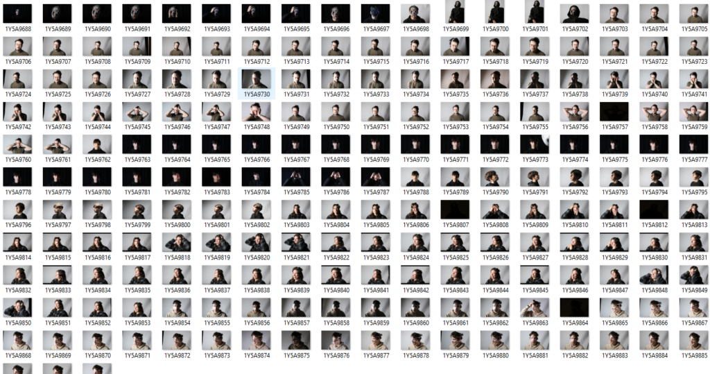
Contact Sheet
My Texture Experimentation
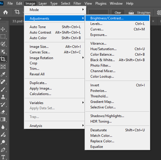
I used Adobe Photoshop for editing my Photographs and instead of just making my Photographs black and white, I decided to play around a bit with the settings to create these Monochrome based images. The settings that I used was…
Black and WhiteColour BalanceBrightness/ContrastBeforeAfter
This is the Before and After of the Original Image, and then the Black and White Filter applied.
BeforeAfter
This is the Before and After of the Black and White Image, and then the Colour Balance Filter applied.
BeforeFinal Result
This is the Before and After of the Colour Balance Image, and then the Brightness/Contrast Filter applied.
Combining all these filters together created a Blue cooling effect, used to convey a sense of cold or a depressing atmosphere which was my intention when editing these photographs. This effect can also enhance shadows as seen in the Photos above, adding depth to an image.
Scientifically, the colour blue can represent or be associated with open spaces, freedom, intuition, imagination, inspiration, and sensitivity. Blue also represents meanings of depth, trust, loyalty, sincerity, wisdom, confidence, stability, faith, and intelligence.
These might be some things to note when editing my Photographs in the near Future.
Adobe Lightroom is a photo editing and storage application available through the Adobe Creative Cloud. This program allows users to quickly and easily edit their photographs with tools to alter contrast, balance colour, and change brightness on mobile devices immediately after taking the picture.
Are Photoshop and Lightroom similar?
Although the two digital photography editing apps are similar, the main difference between Photoshop and Lightroom is that Photoshop is ideal for more intense, detail-oriented photo editing and specializes in image manipulation, creation, and enhancement, while Lightroom is great for day-to-day workflows as it focuses on editing, organizing, and processing photos.
Adobe Lightroom Modules
Each module In Adobe Lightroom focuses on a specific portion of the photographic workflow. For example; the Library module is for importing, organizing, comparing, and selecting photos. The Develop module is for adjusting colour and tone, or creatively processing photos and lastly the Slideshow, Print, and Web modules are for presenting your photos.
Adobe Lightroom: Library
In the Library module you can review and organize the images in your photo library. The work area offers several different viewing modes so you can browse, inspect, compare, or select images with ease.
Adobe Lightroom: Develop
Although the Quick Develop panel in the Library module offers some basic image editing options, you’ll work in the Develop module when you wish to make more detailed adjustments and modifications to your photos. You can correct the colour balance or tonal range, crop or straighten an image, remove red eye, and apply a range of selective local adjustments—all non-destructively
Adobe Lightroom: Map
Lightroom Classic consists of a geotagging feature in the new Map module, where you can see or mark where your photos were taken. Photos already tagged with GPS coordinates will automatically appear on the map. You can drag images captured without GPS information directly onto the map from the Filmstrip, and edit location details and other metadata in the panel at the right. The Filter bar above the map view lets you highlight just those photos at locations currently visible on the map or filter for tagged or untagged shots. In the Saved Locations panel at the left, you can save a list of your favourite places for easy access.
Adobe Lightroom: Book
The Book module, delivers a suite of layout and type tools to help you create sophisticated photo book designs that can either be uploaded directly from Lightroom for printing through the online book vendor Blurb, or saved to PDF and printed on your own printer.
You can work with a multi-page preview of your book layout, focus on your design spread-by-spread, or view single pages in the Book module’s central work area, switching between these viewing modes and moving through the pages of your book using the controls in the Toolbar.
Adobe Lightroom: Slideshow
In the Slideshow module you can easily create stylish presentations from any image collection in your library. The images in your collection are displayed in the Filmstrip, where you can choose which photos you wish to include in your slideshow, and drag their thumbnails to change the order in which they will appear. The work area shows one image at a time in the Slide Editor view, where you can work on the slides individually, or preview your slideshow as a whole.
Adobe Lightroom: Print
The Print module offers a range of preset templates and all the layout tools you’ll need to quickly prepare any selection of images from your library for printing.
The photos in your collection are displayed in the Filmstrip, where you can select the images you want to print. You can drag the thumbnails in the Filmstrip to change the placement of your photos in the layout. The work area—the Print Editor view—shows your print layout, which may include only one image, a single image repeated at a variety of sizes, or multiple images.
Adobe Lightroom: Web
In the Web module you can build, preview, and then export or upload your own website to showcase your photos interactively.
As in the Slideshow and Print modules, the Template Browser in the left panel group offers a wide range of preset gallery templates which can be previewed in the Preview panel at the top of the group. The Collections panel provides easy access to your images and saved gallery designs. The panels in the right panel group contain settings and controls that enable you to choose between HTML and Flash gallery styles, customize the appearance and functionality of the preset templates, add titles, captions, information, links, and graphics, and manage output.
Jerry Reed is an English photographer who claims his objective is to sustain the interest of the viewer through his photographs. He focuses heavily on a contrast in the shadows from the light on the paper, giving a very two-toned effect.
The series is based on paper sculptures meticulously crafted by Reed, explorations in architectural forms and spatial relationships. Reed makes his photos black and white to remove the distraction of colour and to help the viewer focus on other aspects of the photo, such as the subject, the textures, shapes and patterns, and the composition.
In his series, “Paper Work”, Jerry Reed’s B&W photographs of close-up paper arrangements become abstract designs through careful directional lighting. His constructions are sensually textured, elegant studies of form and tonality.
Paper experiment photoshoot
This is my contact sheet for all of my paper experiment photos. I tried to use different shapes and sizes of scrunched up paper to create different textures. I used the studio to take these pictures using the ring lights at different angles. The only thing I kind of struggled with taking these photos is the aperture and what ISO to use for my photos. These photos are just scrunched up pieces of paper, or cut up paper shaped into different forms to create dimension and let the light go in in different areas of the paper.
Edited (before and after)
For this photo I turned it black and white to get rid of distractions of colours to get the viewer to focus on the texture of the dried up leaves and the form of it.
This is a before and after of a texture photo I took. I decided to enhance the colour to really bring out the texture in it. It isn’t easy to see here but I also cropped the photo so it was a square so that it could be more focused on one area of the photo only. I turned the brightness and contrast up to make it more clear.
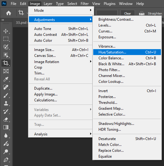
In these photos that I took of some fake flowers and leaves, I decided to make the photo black and white as I thought there was too much going on which all the colour and now the viewer can just be focused on the main aspects of the image. I made the hue and saturation higher. I also cropped my image so that it didn’t have as much negative space and the viewers would be able to focus on only the main aspect of the image.
This photo that I took represents many of the formal elements, for example:
Line: This is included to divide the space and suggest patter, form, depth, distance and rhythm.
Shape: This makes the photo stand out as it captures the viewers attention as it has sharp edges and well-defined corners.
Repetition: The same shape is used repeatedly which creates a sense of rhythm and balance in the image.
Texture: The texture on the film around the shapes brings life and vibrancy to the image so it doesn’t appear flat and uninspiring.
In these 3 photos, I had edited the first one in 3 different ways. The first photo I increased the saturation, vibrancy and the hue to make the colours really stand out more. In the second one, I added a gradient map over the top of it and used a mixture of blue and a pale pink to show the contrast between the colours and shadows. These colours also bring out more texture than you could see in the original photo. In the last photo, I decided to make it black and white to remove the distraction of colour so that the viewer could focus on the other aspects of the photo, like the texture and the shapes.
My Final Photos
These are my favourite final photos. I think they create a good variation of the formal elements. The texture in all of them creates a sense of dimension in the photos and the ones in black and white make sure that the viewer isn’t distracted by the bright colours and takes more time to notice the little features of the photos to get it more in depth. In the photos which are not black and white, I decided to enhance the colour as it makes the texture of them come out even more. The photo in the top right and the photo of the trees have a lot of shape which stands out and captures the viewer’s attention, along with repetition to produce a sense of rhythm and balance.
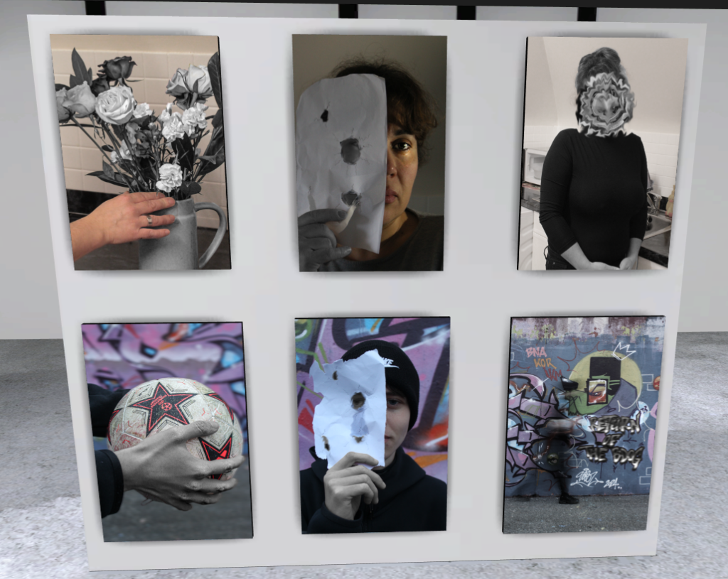
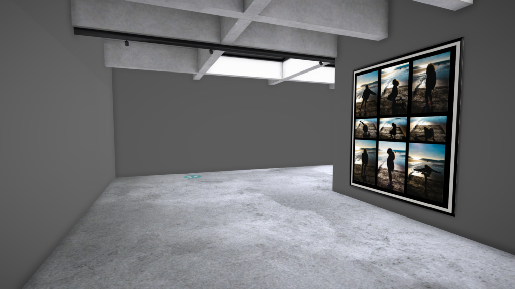
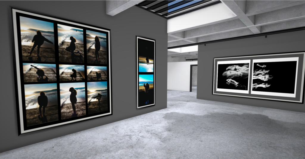
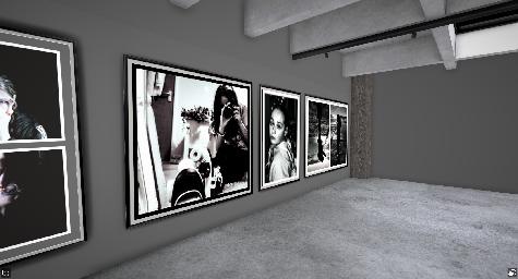
ArtSteps Gallery
I decided to put these photos together as they kind of give off the same concept and are both in black white so the viewer is not distracted by the colour of the photo. both these photos are based off of nature which makes them look good together. The two photos together really compliment each other and all the dark lines makes the images stand out to the viewers. I decided to get three different types of leaves to really show the difference between them but how well they work together. The dark tones bring out the texture in each photo and can really grab the viewers eye.
I believe that these three photos work really well with each other as they are all in colour and they all give off the same vibe. All have a lot of repetition within them which creates a sense of balance and rhythm. I think the colour in each of them enhances the amount of texture in each photo which can really grab the viewers eye and make them more intrigued in the photo. The green and blue tones in all photos give off a sense of calmness and relaxation which is another reason why I think these photos work really well with each other.
Adobe Lightroom is a photo editing and storage application available through the Adobe Creative Cloud. This program allows users to quickly and easily edit their photographs with tools to alter contrast, balance colour, and change brightness on mobile devices immediately after taking the picture.
Catalogue
When I had first opened Lightroom, I had to create a personal catalogue that I named after my name and it was saved in the video data drive.
This is where everything for my images in Lightroom are stored.
Importing Images
After creating my catalogue, I had to import some of my own images into Lightroom. I did this by pressing the ‘Import’ button in the left-hand corner.
Collections
I then had to create a collection which would store all of my shutter speed experiment photos. This helps as it will be much easier to find all of my edited shutter speed photos and I can store all of my photos into separate collections so they are all sorted out and easier to find.
Selection
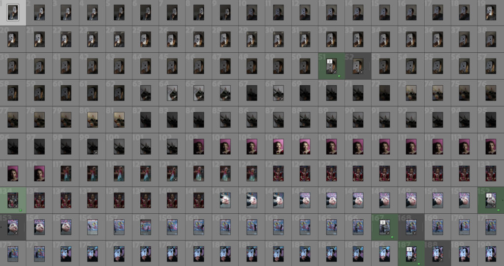
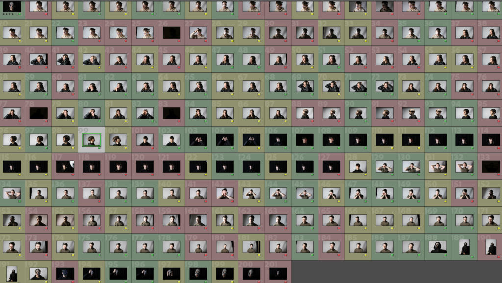
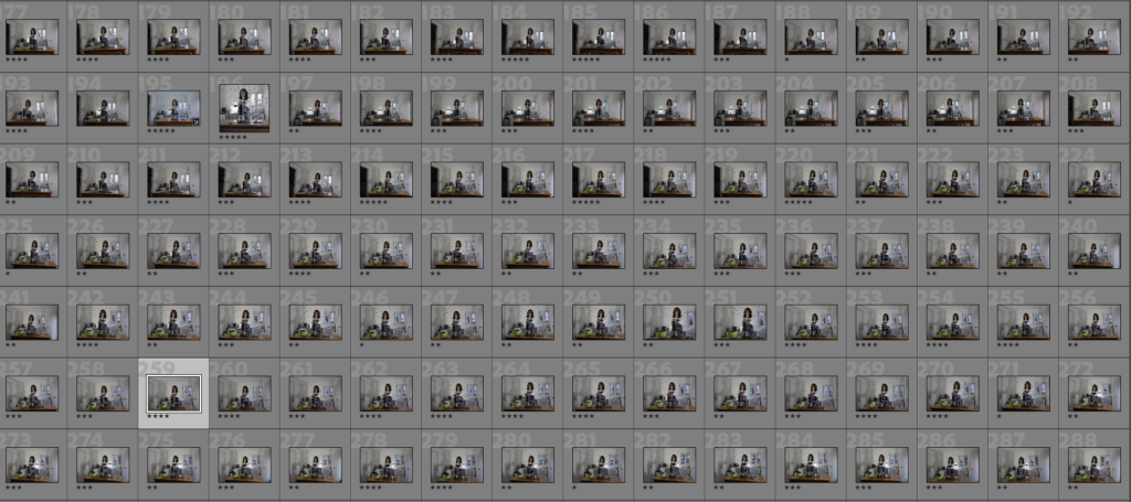
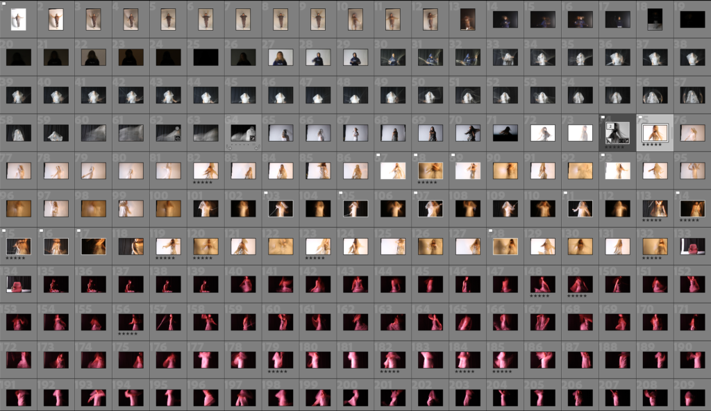
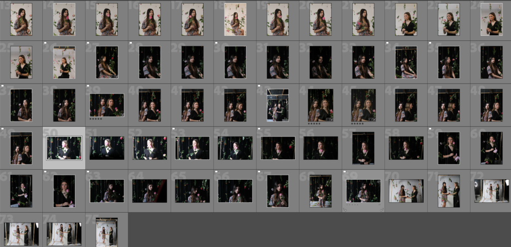
After creating a collection with all my photos in it, I had the option to rate all of my photos in different ways. I was able to flag my selected images, by either using the X key (bad) or the P key (good), these could be filtered out by pressed the flagged button to see which ones you chose for good. Another option was rating all the photos out of 5 stars.
(Images with white flags are the ones I chose for good with ratings underneath)
Develop Mode
Develop mode is used when needing to do very specific editing on only one image, this is different to library mode as it would only allow you to make small adjustments to more than one image.
At the bottom of the screen there is an option to see your photo before and after you make changes to it. This could help me identify what still needs to be changed and what I should keep the same to make the photo better.
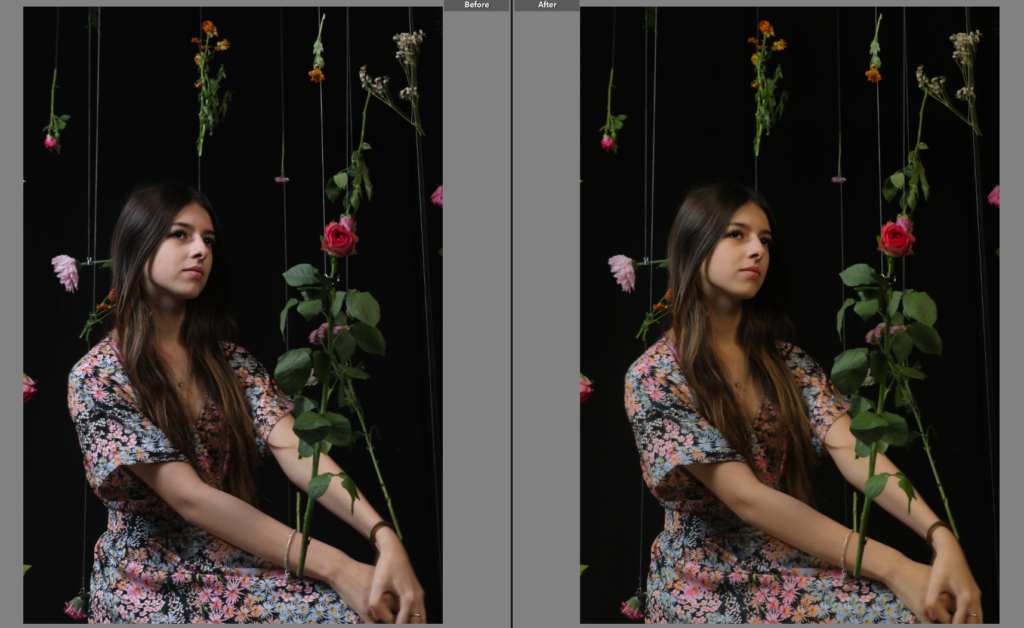
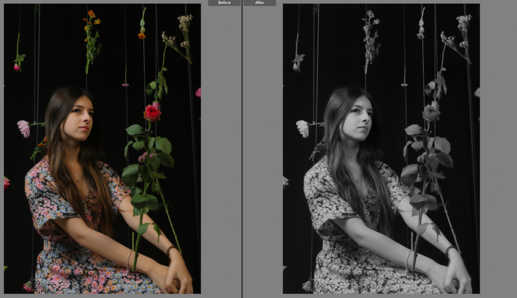
As you can see in my before and after photos, I had changed my photo to a black and white scheme. Develop mode includes many pre-sets which are used to make fast edits of your photos or you can just edit the photos manually with the tabs on the right-hand side.
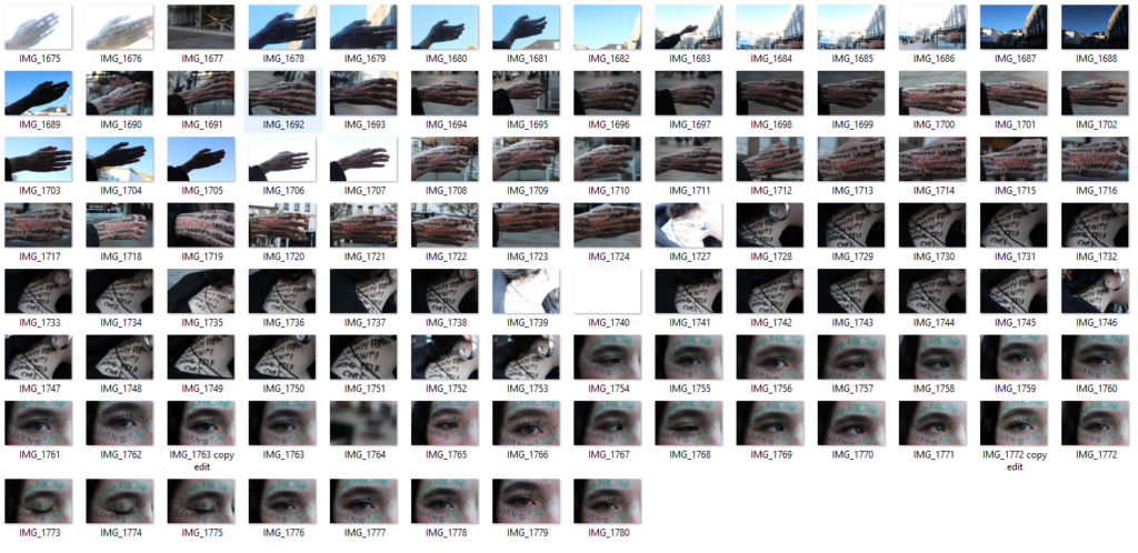
Contact Sheets
This is my contact sheet which has all of my photos from my shutter speed experiment.
William Klein
William Klein was an American-born French photographer and filmmaker noted for his ironic approach to both media and his extensive use of unusual photographic techniques in the context of photojournalism and fashion photography. He was well-known for his unique contact sheets where he drew over and colour coded images to identify and group them, showing his thought process behind his pictures and clearly identifying what he considered his strongest work.
We use texture in an image to add visual interest and different patterns to the image, it adds levels to the image and helps represent shadows and light in different ways, this ties in with many different types of photography which I will represent in this post.
A photographer who looks at texture – Jerry Reed
Jerry Reed is an English photographer who claims it is his goal to keep the viewers attention and interest through his images. The image you can see above is part of his paperwork series one. You can see he achieves his goal of enticing the viewer through texture created by layers and shadows in his image.
some more of his images–
my contact sheet –
As you can see in the image above I have taken a wide range of photos with different ISO aperture and shutter speed and different lighting conditions along with this to get the best results.
Here are some images that I selected –
ISO 100, 27 mm, f/ 7.1, 1/15 secISO 100, 27mm, f/ 7.1, 1/4 sec
As you can see I have used varied light and camera conditions to create images with texture, I took inspiration from Jerry Reeds images using the varied and unique texture that is created by something simple such as a piece of paper. I will now edit the images and represent them next.
Image selection process
as you can see above I used P and X to flag my images to filter out the bad ones from the ok and good ones, next I rated these images 4 or 5 stars as 4 being ok ones and 5 being good ones, finally I gave them the colour yellow or green, green being the best and yellow being good. I will now edit these images that I selected and present them bellow.
My edited images
ISO 100, 27 mm, f/ 7.1, 1/15 secISO 100, 27mm, f/ 7.1, 1/4 sec
above you can see I have edited the images and I attempted to enhance the whites and the blacks to separate the texture much like Jerry reed did in his work.
James Welling began taking pictures in 1976 using a 4×5 view camera. In 1978, he moved to New York and started a sequence of abstract photographs like: Aluminium Foil, Drapes and Gelatine Photography. He has become known for a relentlessly evolving body of images that considers both the history and technical specificities of photography.
Gelatin Photograph 72, from the series “Gelatin Photographs”Date: 1984 Artist: James WellingDrapes, 1981 James WellingUntitled (Aluminium foil) (b. 1951) James Welling
I decided to focus my photoshoot and take the black an white tone aspect to my photos as the light shows a strong contrast between the two colours. I also chose to take the pictures in natural and artificial light to see the difference it makes to the shot. Furthermore, I took pictures in front of a black and white background to see how the paper ball would contrast with a different background.
My Contact Sheet:
Original Photos:
ISO – 100ISO – 250ISO – 1600
Edited Photos:
I started by upping the highlights (+40) and maxing the shadows so the white would standout from the black as it was a big contrast. I then upped the whites (+25) and blacks (+42) to help the large contrast. I added some clarity and texture so the crevices could be visible. I started with cropping the image. I then upped the exposure (+0.70), and fully upped the contrast to show the dark shadows of the paper ball. I also lowered the highlights (-81) so the dark colours would stand out. Lastly, I upped the texture (+16) and clarity (+42) so you would be able to see the image clearly.I started by converting the image to black & white so the shadows and highlights would stand out. I then turned the exposure down (-2.37) so the white colour would allow the creases to be visible. I upped the contrast (+40) to help as well. Next I maxed the texture, upped the clarity (+14) and upped the dehaze (+86) so the creases and folds would look crisp.
Technical:
I started this photoshoot by working out how the light would have the specific effect I wanted on the paper ball. I used a mix of artificial and natural light to see how big the difference would be. I used a range of different ISO’s to see what it would look like how big the contrast would be and how the shadows would lay out.
Visual:
I preferred using a black background instead of a white one as it showed no shadows behind the paper ball. I chose to do the paper ball to show the texture of it scrunched up and how every fold has a different look to them. The use of the black background and the 3D ball makes an illusion as the paper looks like is floating when in reality its just the effect of the lighting.
Contextual:
When choosing the paper ball envisioned the artists (James Welling) work and the paper ball which is the cover of the ‘Core Skills + The Formal Elements’. I liked the cover because it shows a range of different tones like: black grey and white. This inspired me to create my own to see how it would compare against it. I chose this photo as my favourite one:
Artist Research
Paul Jackson is a specialist in origami and the folded arts. He was one of the pioneers of folding/origami as Fine Art lots oh his work has been put in galleries and museums. He has also curated several ground-breaking exhibitions of origami, undertaken many commercial commissions for print, screen-based media, festivals and more, and has been a consultant for companies such as Siemens, Nike, Tetra-Pak and Tata.
I took the inspiration from the origami and decided to make a white paper crane. I did this because I would be able to play around with the colour of it in Adobe Lightroom. I also chose to create a landscape with torn paper. This is because the torn area gives the photo good texture and I worked with different lighting to see how that would effect the shadows.
My Contact Sheet:
I then went through the pictures and decided which ones I liked best
Original Photos:
ISO – 100ISO – 800ISO – 100ISO – 100
Edited Photos:
I started by upping the exposure (+3.07) to make the image brighter. After I maxed out (+!00) the contrast to give it more depth. I slightly added some temperature (+14) to give it it’s ‘sandy’ colour. I decreased the highlights (-63) to lessen the white light on the top. I then added texture (+68) to give it the ‘sandy’ look, this is because my idea was to make it seem as if you were on a beach. Lastly, I upped the clarity to give it more shadows and texture.I lowered the exposure (-1.32) to give it a darker look and make the shadows darker. I upped the texture (+93) so the ripped edges would be more defined and roughen up the shadows to make them look rigid. Then, I upped the clarity (+37) to give the ripped edges some shadows. Lastly, I decided to convert the image to black and white.I ended up just maxing the texture (+100) to make the image less blurred as the image had a lot going on already I wouldn’t be able to do much more without it looking strange.I started by decreasing the exposure (-0.61) to make it look darker and have the paper crane stand out from the background. I then maxed out the texture (+100) to make the edges of the crane crisp and tidy and emphasise the creases. Lastly, I decided to up the clarity (+21) just to give the background more depth.
Technical:
I started by taking photos in the photography class using the artificial light. I tried using the flash however, with the white background the paper crane got washed out. I also used an F-stop of 4.5-5.2 to see how it would differ from each image.
Visual:
I used a red light to give the paper crane a colourful effect, this is because the light would be able to emphasise the shadows on the paper crane. The light was sometimes put closer and further away to see how opaque the colour would be, like the third and fourth image. I used shape when taking pictures of the paper to make it seem like mountains or sand which was my main idea for this photoshoot. Adding on, the form of the paper crane allowed for shadows to appear in other areas because of its 3D shape.
Contextual:
When taking these images my inspiration was Paul Jackson an origami artist and photographer. The mountain and sand pictures followed a different artist however they weren’t as detailed as those specific images. Jackson used colourful animals whilst I decided to do colourful background and animal to make my work different from his. The picture I chose reminded me of is photography the most:
we did a experiment with the ISO (sensitivity to light) using paper as our subject, we used a range of ISO’s to be able to clearly see a difference between the photos.
This photo has a low ISO, we also used a dark see through piece of plastic to give us a brownish tint to the photo which we did for these next two photos as well as we found it to be aesthetically pleasing.
This photo has a medium ISO, you can clearly see the subject
This photo has a high ISO, this has caused the subject to become overexposed
This photo we decided to put a red see through plastic sheet half over the spotlight, leaving half of the light how it was and the other half red, this gave us a really unique image
I really liked this photo and had the idea to try and make it look like the French flag so I went to experiment in light room and gave it a go, here is my outcome:
I this project we were told to scrunch up paper and photograph it in different lights and settings to try create interesting shapes and shadows.
this was the first photoshoot, I scrunched paper in different shapes and moving the lights around to the light and shadows were different.
these were my two favourite favourite pictures there isn’t much difference other than one being more zoomed in than the other.
This was the picture I ended up choosing to edit and work with because there is a lot a texture coming from the paper and think she shadow made an interesting shape, there is also a lot of dark and bright spots which I like to have in my images.
I made the image black and white, I kept the exposure and the contrast the same, however I lowered the highlights, shadows and whites and added a bit of more black.
Jerry Reed
Jerry Reed is an English photographer who claims his objects is to sustain the interest of he viewer through his photographs. He focuses heavily on a contrast in the shadows from the light on the paper, giving a very two-toned. Jerry transition from commercial studio photographer to conceptual fine artist required changing what his images were of what they were about. During this process the was guided by his extensive knowledge of art history- painting, sculpture and photography.
Image Analyse
This image is taken using artificial lighting which was smartly positioned to make the right shadows. The depth of field in this image is focused and sharp. And the aperture that was used to create this image mas about an F8.In this image there are only 3 different colours them being black, white and different shades of grey. The tone in this image in dark in the background but the actual focus point is very light this choice by the artist makes the image contrast very well and . There is little to no texture in this image everything is quite smooth. Jerry reed talks about his ” paper work series 1 ” he says that this series took him 3 years to create and it consists of 26 black and white images. the paper sculptures were crafted by Reed. In the the woven tale press website they say ” His studio background is evident in the creative use of Fresnel lighting techniques, which can accentuate sharp or soft edges as well as master shadows, their often sensual and quite subtle tonal gradients.” This image reminds me of a flower. In my opinion is one of the only images in this series that don’t actually look like paper and I think that’s really interesting how he used a simple material lie paper and made it look like something so interesting and beautiful. His knowledge in art history could also help him know how to look at simple things and have the creative mind to transform them in something so artistic and creative.
work inspired by Jerry Reed
for this photoshoot I used more structured paper and photographed it in different angles and ISO and lighting.
these were my favourite pictures, the ones that have better quality and are more interesting.
I then labelled it green or yellow to get closer to the best one.
In my opinion the is my best photograph I think the shadows make the image really interesting and give the image have more texture
Editing
This is how edited my picture, I really enjoy seeing black and white photos when the image has a lot of shadows like this one, I this it makes the image have more personality and makes it more interesting it also creates a mood its quite dark and abstract which I like.
photoshoot 2 in the style of jerry reed
In this photoshoot I liked more the pictures that were taken using a red light I like how the unfocused is in the right places.
these were my favourite pictures that I took, the more interesting ones and I like how they don’t look like they were made from paper.
these were the 4 pictures which I liked more I this the shapes are interesting the light is well positioned next step is to choose my 2 favourite ones so then I can edit them.
These were my favourite ones I think they kind of look like rose petals I really like that.
Editing
I edited this image by making it darker, my idea mas to make the image not look like it was made from paper and make it look more abstract , creative and interesting. Like I said before I like how this image looks like rose petals and I think editing it made made idea look better.
In this image I edited it almost like the one above, I wanted to make some parts at the front darker and then the part where the light hits the most lighter so it gives that effect of depth.
Experimenting with photoshop
I used photoshop to make this and I used an tutorial on the blog to do this. The name of this effect is Kaleidoscope Effect Which is basically using the same image ad stuck it together to make an interesting effect.
An artist that works with this effect is Amanda Buck she takes pictures of nature and then uses the Kaleidoscope Effect to edit the photo.
expedition created by me on art step
Art step is a really useful website for artists to make expeditions without having to pay, it gives you the option to make your own room or you can use the template that it comes with. I used at first the template but it wasn’t really working for me so I created my own. It’s really easy to add your pictures and move them around to your choice. you can also look at others people expedition.