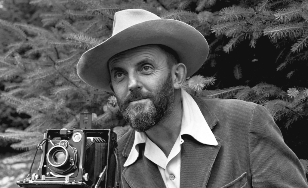
Who is Ansel Adams?
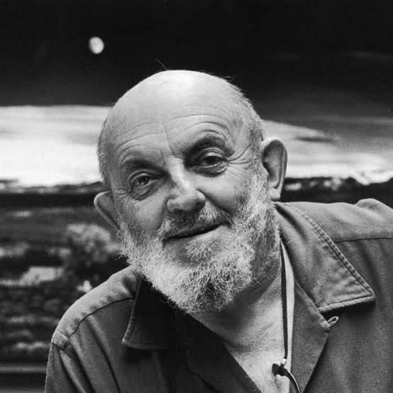
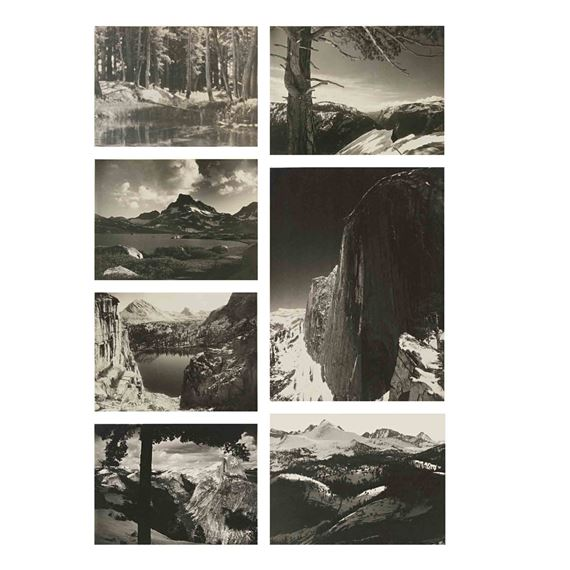
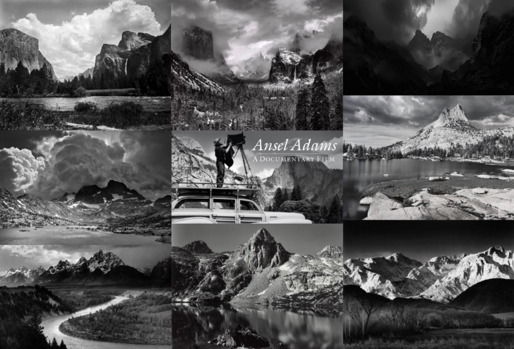
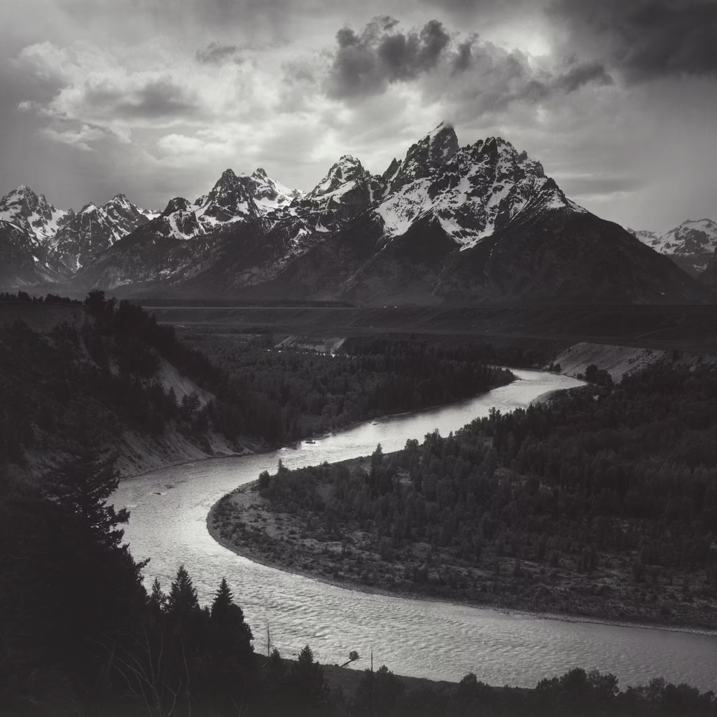
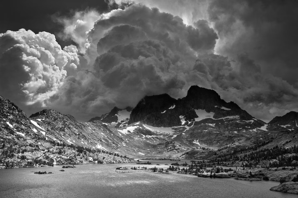
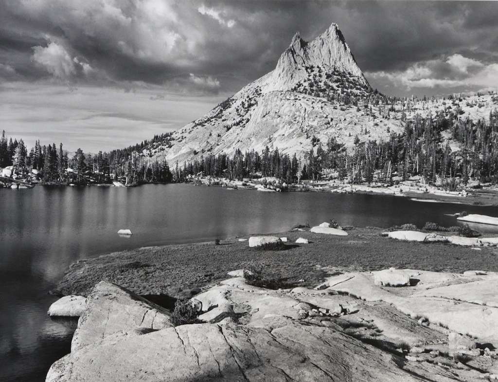
Ansel Adams was an American photographer and environmentalist, best known for his black-and-white landscape photographs of the American West, particularly Yosemite National Park. His work helped define modern landscape photography and played a significant role in conservation efforts.
His childhood
Ansel Easton Adams was born on February 20, 1902, in San Francisco, California. As a child, he was somewhat shy and struggled with formal schooling, partly due to what some believe may have been dyslexia. He was home-schooled by his father and aunt, which allowed him to explore his interests more freely. One of the defining moments of his childhood was the San Francisco earthquake of 1906, which caused Adams to fall and break his nose, leaving it permanently crooked. His love for nature started early, as he spent much of his childhood exploring the outdoors.
Yosemite
Adams first visited Yosemite National Park in 1916 when he was 14 years old. His parents gifted him a Kodak Brownie camera, and he was immediately captivated by the landscape. This trip was a turning point in his life, sparking both his love for photography and his deep commitment to conservation.
‘I knew my destiny when I first experienced Yosemite’
Adam Ansel
How did his photography career develop?
During his early visits to Yosemite, Adams took numerous photographs and experimented with darkroom techniques. He later joined the Sierra Club, which played a major role in shaping his environmental consciousness. Through the club, he met influential conservationists and began to see photography as a tool to advocate for nature preservation. His early Yosemite images led to his first portfolio and professional recognition.
Sierra Club
The Sierra Club is one of the oldest and most influential environmental organizations in the United States. Founded in 1892 by naturalist John Muir, the club focuses on protecting natural spaces, promoting environmental policies, and advocating for conservation efforts.
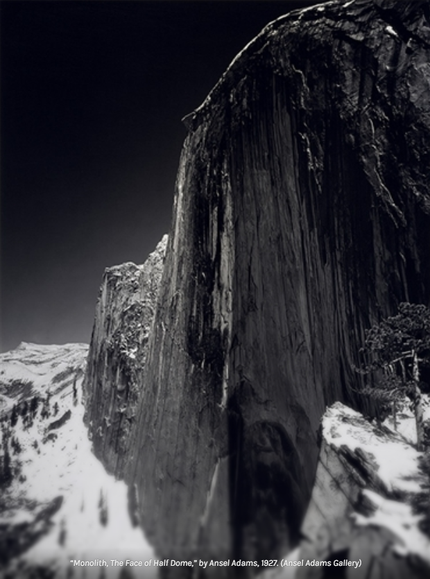
In 1927, Adams created one of his most famous images, “Monolith, the Face of Half Dome” in Yosemite. This photograph marked a turning point in his career, as he moved away from soft-focus pictorialism to a more sharp, detailed style. This year was also when he began using a larger format camera, which allowed him to capture more precise detail and tonal range—techniques that would define his later work.
What else was he involved in?
While photography was his main passion, Adams was also deeply involved in environmental activism. He worked with the Sierra Club, using his images to support conservation efforts, and played a key role in lobbying for the establishment of Kings Canyon National Park in 1940. The powerful rushing Kings River peaked the interest of the nearby and fast-growing city LA. Because the river plunges nearly 11,000 feet in just 80 miles, it carried enormous potential as a hydroelectric power source. Additionally:
- He was an author, writing books and essays on photography and conservation.
- He developed the Zone System, a technique for controlling exposure and contrast in black-and-white photography.
- He served as a consultant for Polaroid, testing new film and cameras.
- He was a teacher, mentoring aspiring photographers through workshops and writings.
Why were Ansel Adams’ images first used for environmental purposes?
Ansel Adams’ images were first used for environmental purposes because they showcased the beauty and grandeur of natural landscapes, particularly in the American West. His black-and-white photographs captured the majesty of places like Yosemite and the Sierra Nevada, inspiring public appreciation and support for conservation efforts. His work was instrumental in advocating for the protection of wilderness areas, as his striking images helped convince policymakers and the public of the need to preserve these landscapes.
Why was Kings Canyon at risk?
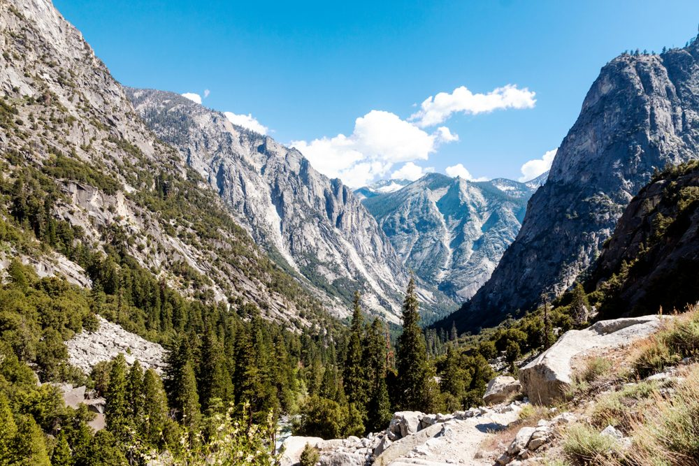
Kings Canyon was at risk due to logging, grazing, and potential development, which threatened its pristine wilderness. In the early 20th century, there was pressure to use the land for commercial purposes, but conservationists, including Ansel Adams and the Sierra Club, worked to prevent this and advocate for its protection as a national park.
How did Ansel Adams protect the Sierra Club?
Ansel Adams played a key role in protecting and promoting the Sierra Club by using his photography as a powerful advocacy tool. He was an active member of the club and served on its board of directors for many years. His images were used in Sierra Club publications, helping to garner public and political support for conservation initiatives. His work significantly contributed to the success of the club’s campaigns, including the push to establish Kings Canyon as a national park.
When was the proposal to create the national park approved, and what prompted this?
The proposal to create Kings Canyon National Park was approved in 1940. The movement to protect the area gained momentum in the 1930s, thanks in part to Ansel Adams’ photography, which helped highlight the region’s natural beauty. His 1938 book Sierra Nevada: The John Muir Trail was sent to President Franklin D. Roosevelt and Congress, influencing their decision to grant national park status and protect Kings Canyon from development.
Presidential medal
Ansel Adams received the Presidential Medal of Freedom in 1980 from President Jimmy Carter. This award recognized his contributions to photography and environmental conservation, as his work had played a crucial role in inspiring efforts to protect America’s natural lands.
Ansel Adams was all about visualisation in his photography what does this mean?
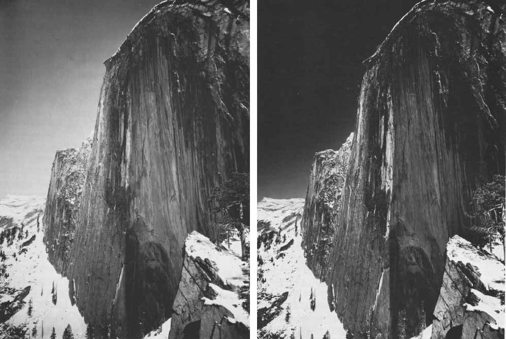
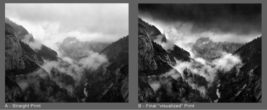
Ansel Adams describes The Monolith, The Face of Half Dome (1927) in his book The Negative as his first true example of visualization—the process of imagining the final print before capturing the image. Initially, he took the photograph using a yellow filter but soon realized that it did not achieve the dramatic effect he had envisioned. The yellow filter resulted in a more neutral, less striking image that did not fully convey the depth and intensity he sought.
Recognizing this, Adams took a second exposure, this time using a red filter, which dramatically darkened the sky and enhanced the contrast, creating a bolder and more powerful composition. This decision aligned with his pre-visualized idea of the scene, as the red filter emphasized the blue light in the atmosphere, intensifying the shadows and adding a sense of drama.
Although Adams was known for his darkroom techniques, the foundation of his images was always established at the moment of capture. Unlike modern digital photography, where extensive post-processing allows for greater manipulation, film photographers had to make critical choices in-camera to ensure the final print aligned with their artistic vision. This method of working underscores Adams’ mastery of light, exposure, and the Zone System to create his iconic landscapes.
What is the Zone system?
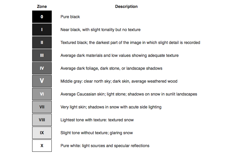
The Zone System is a photographic technique for determining optimal film exposure and development, formulated by Ansel Adams and Fred Archer. It divides the tonal range of an image into eleven zones, from pure black (Zone 0) to pure white (Zone X), with various shades of grey in between.

Image Analysis
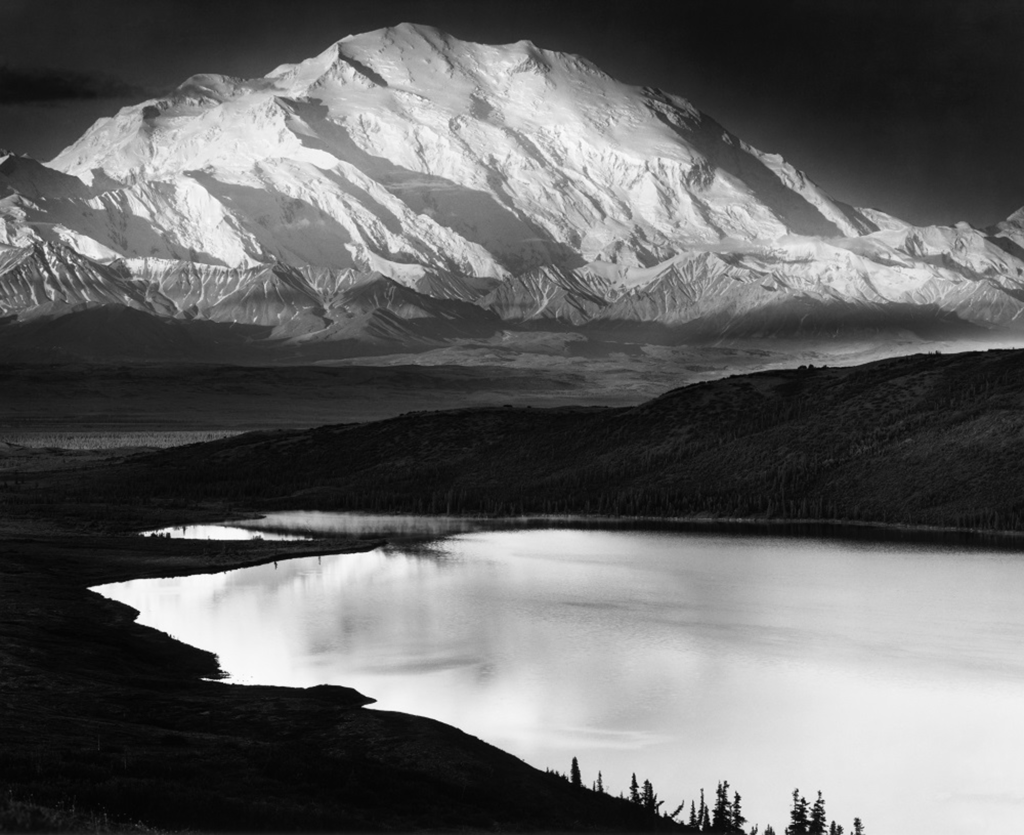
Visual Analysis
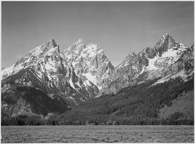
• The image is a black-and-white landscape photograph showcasing a contrast between dark, rolling hills in the foreground and bright, snow-capped mountains in the background.
• The use of light and shadow emphasizes the rugged texture of the mountains and the smooth, dark surface of the lower hills.
• The sky is subtly detailed, with wispy clouds adding depth to the composition.
• There are leafless trees in the lower section of the image, which provide a sense of scale and natural framing.
Conceptual Analysis
• The stark contrast in the image could symbolize themes of duality—light and darkness, foreground and background, life and desolation.
• The snow-capped peaks evoke a sense of majesty, while the dark hills below create a sense of mystery or even foreboding.
• The lone figure (possibly a horse or another animal) in the distance adds an element of solitude and scale, reinforcing the vastness of nature.
• The image may reflect themes of isolation because the landscape is so desolate. It may also be showing passage of time as the light creates an almost passageway through the shadows, until it reaches the bright mountain.
Technical Analysis
• The photograph is likely taken using a high-contrast black-and-white film
• The sharpness and depth of field are well-controlled, making both foreground and background elements crisp and detailed.
• The use of natural light is very well controlled, with strong highlights on the mountains and deep shadows in the foreground.
• The composition follows a layered approach, leading the eye from the dark foreground to the bright, intricate peaks.
Contextual Analysis
• This image is reminiscent of Ansel Adams’ work, particularly his photographs of the Sierra Nevada mountains in the United States. If this is indeed the Sierra Nevada, the photograph could carry historical or environmental significance.
