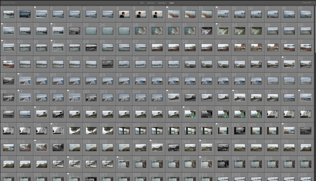
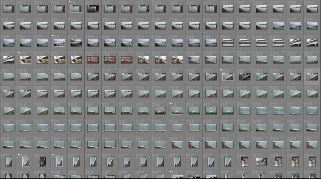
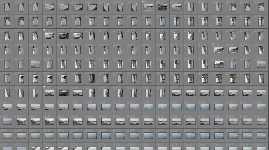
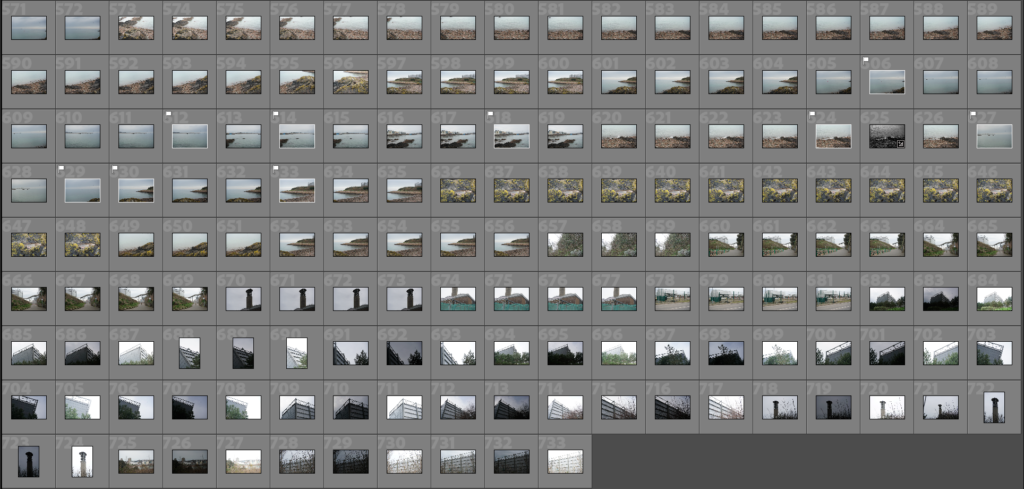
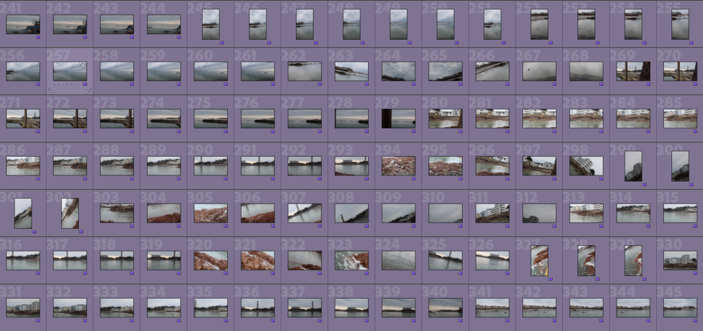
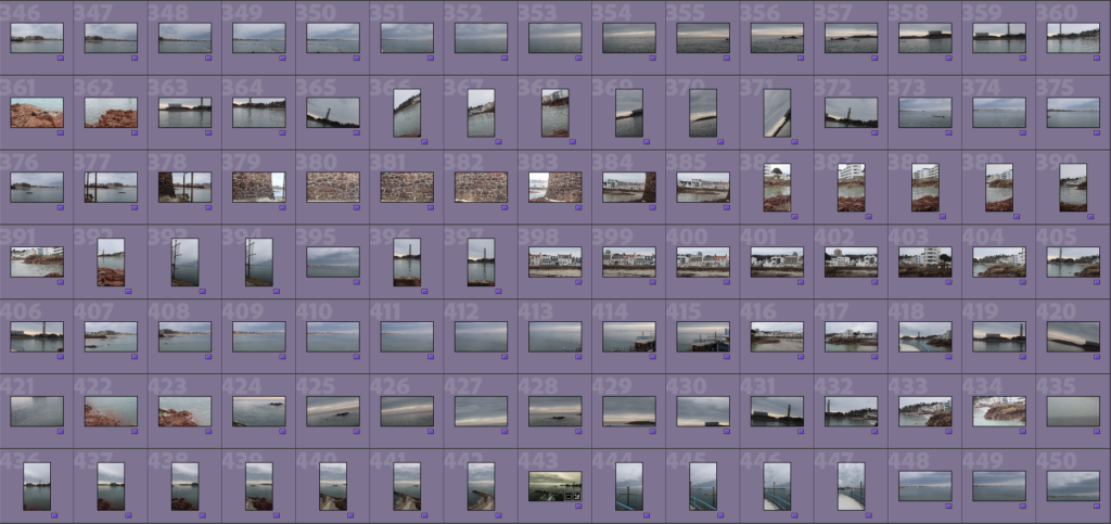
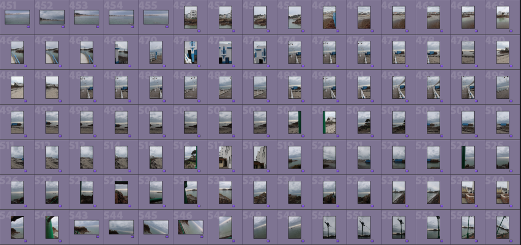
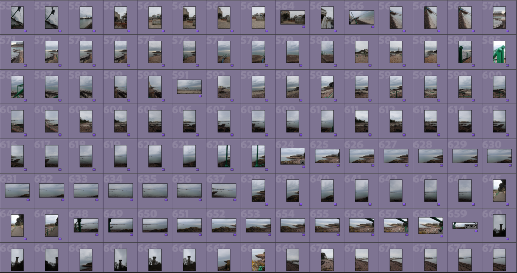
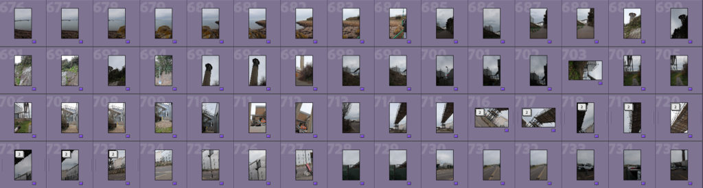
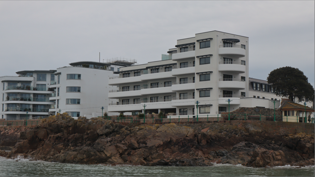
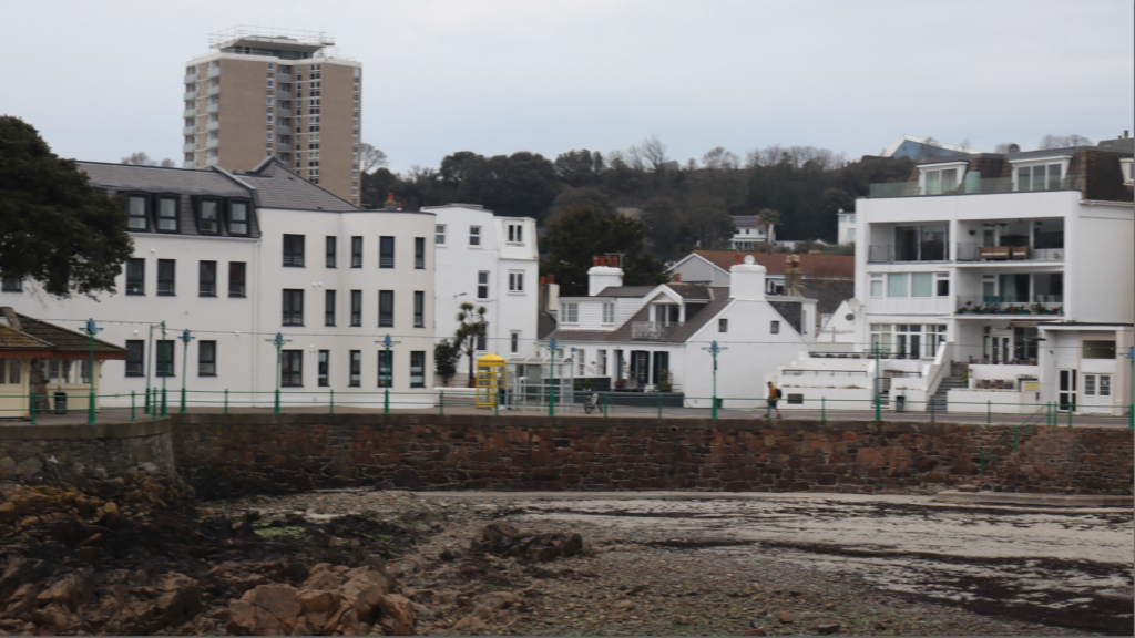
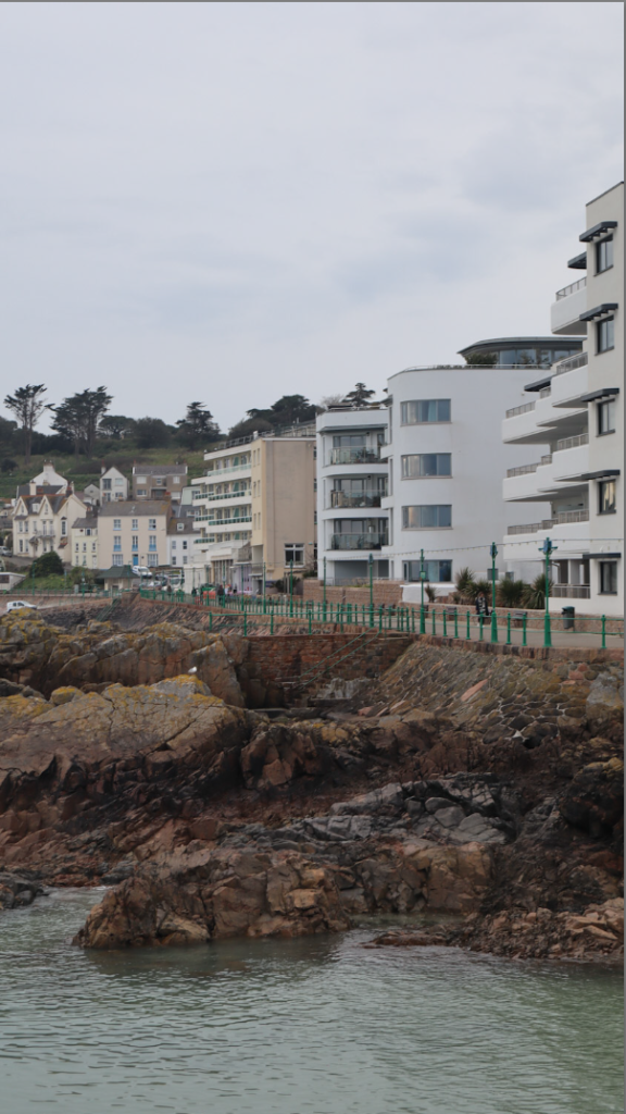
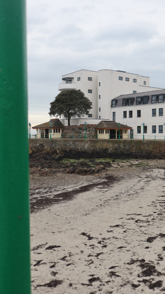
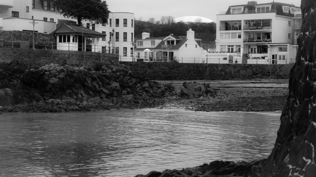
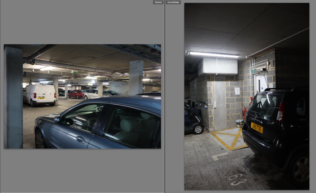
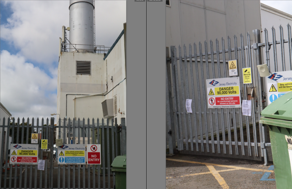
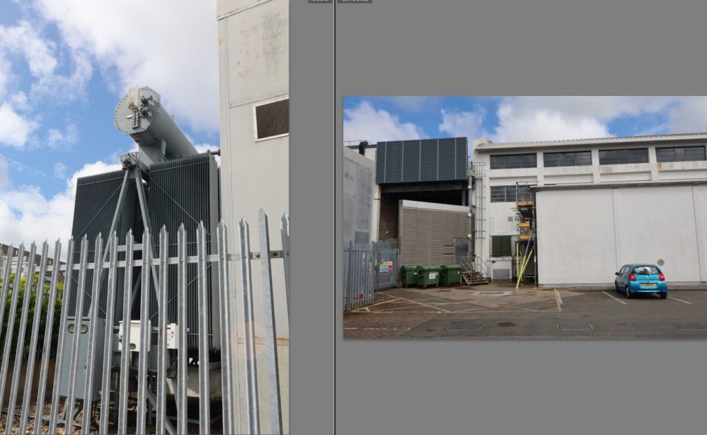
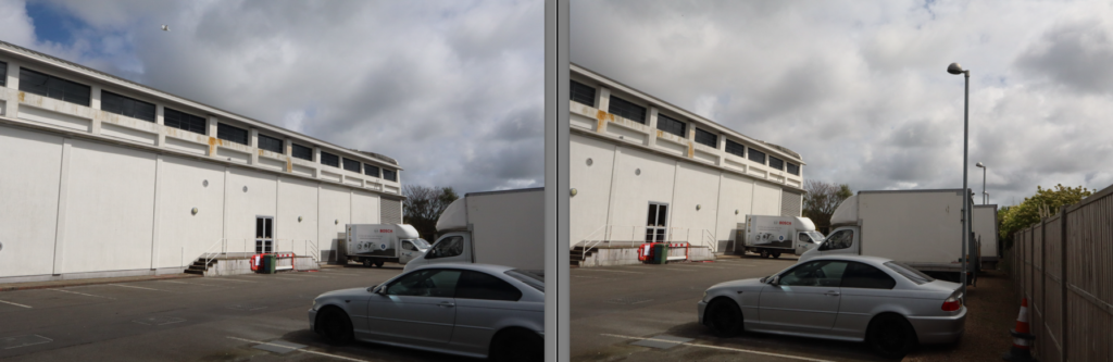
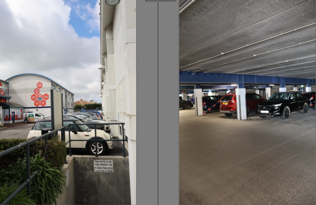
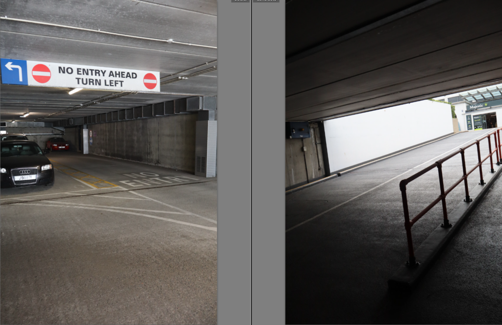
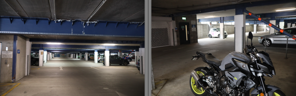
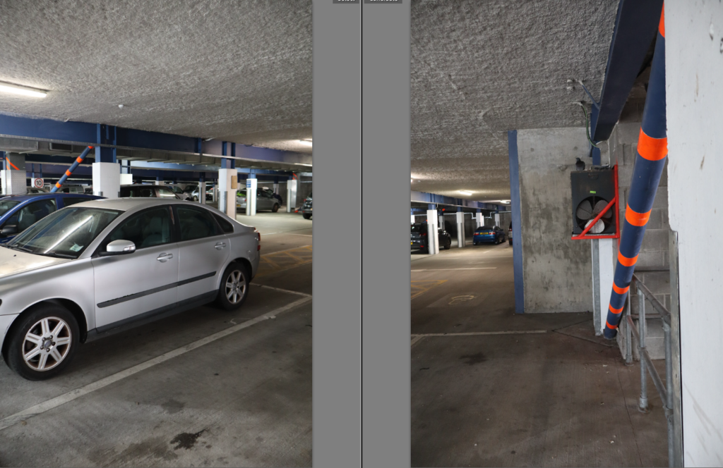
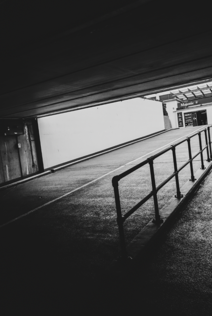
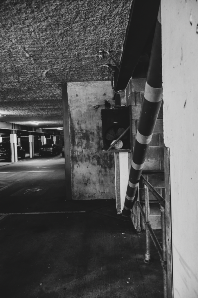
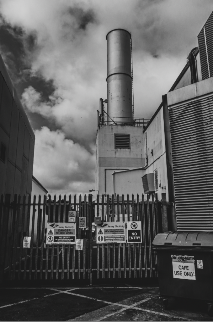
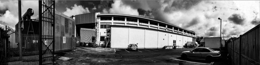
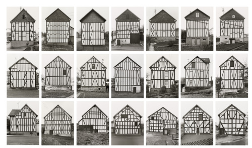
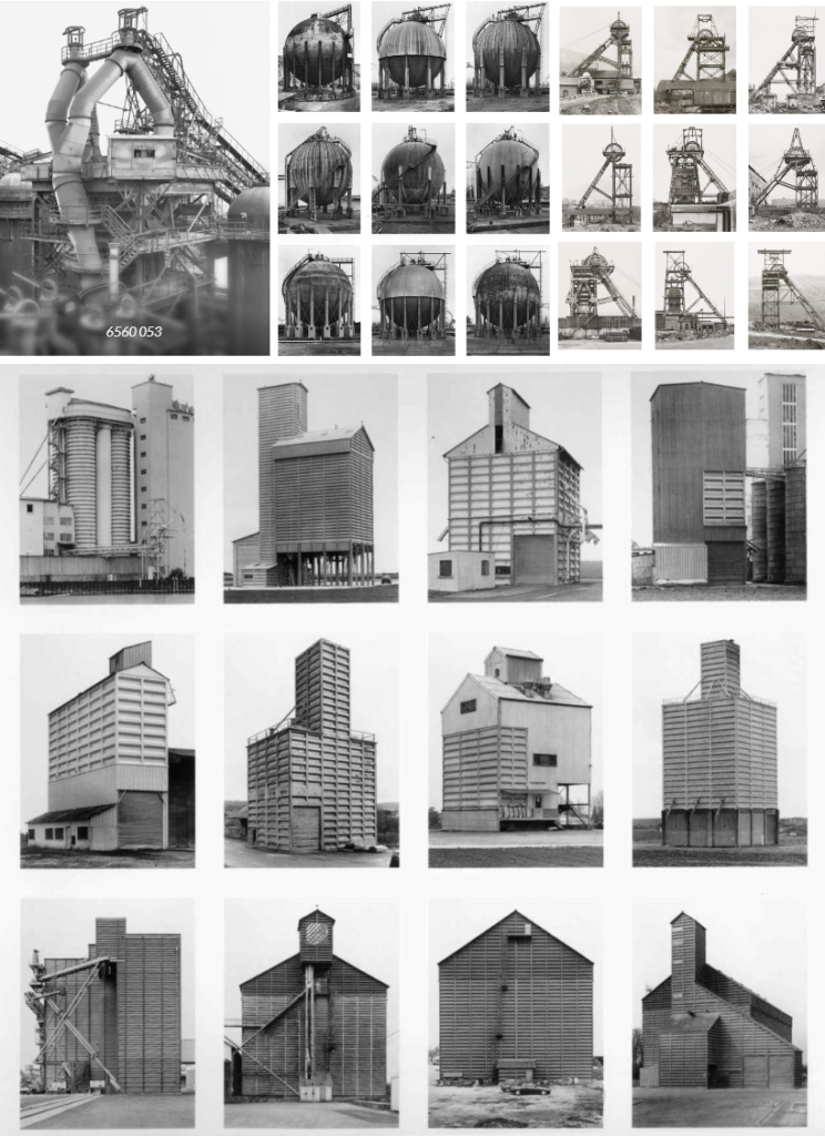
Contact Sheet


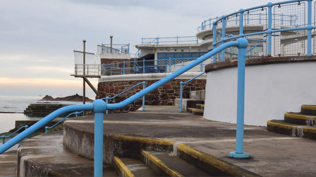
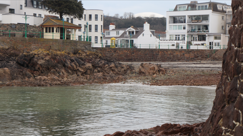
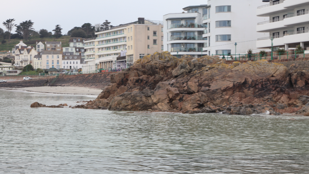
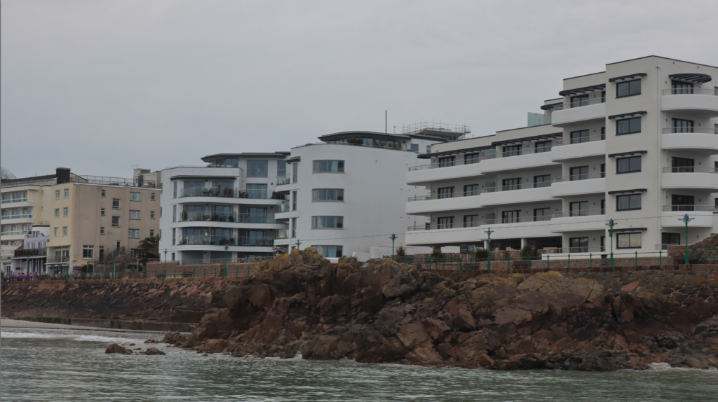
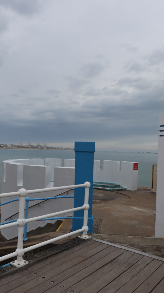
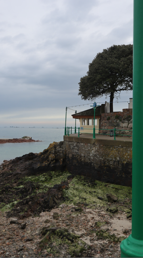
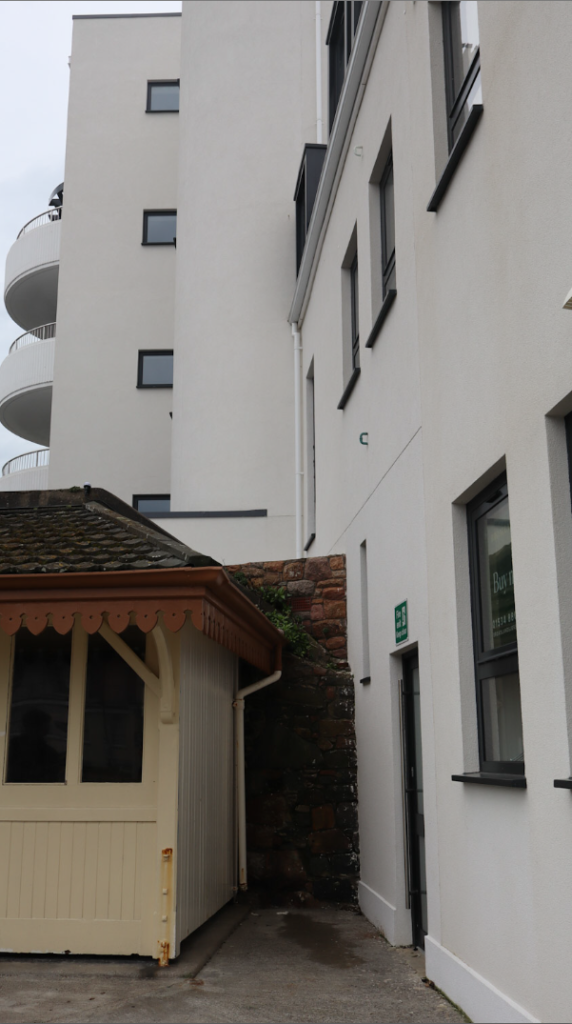
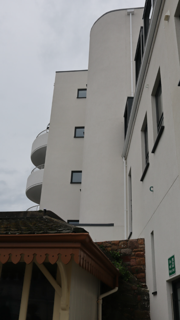
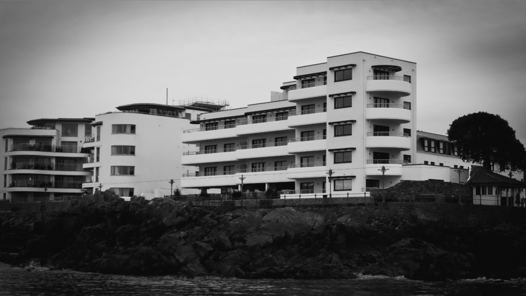
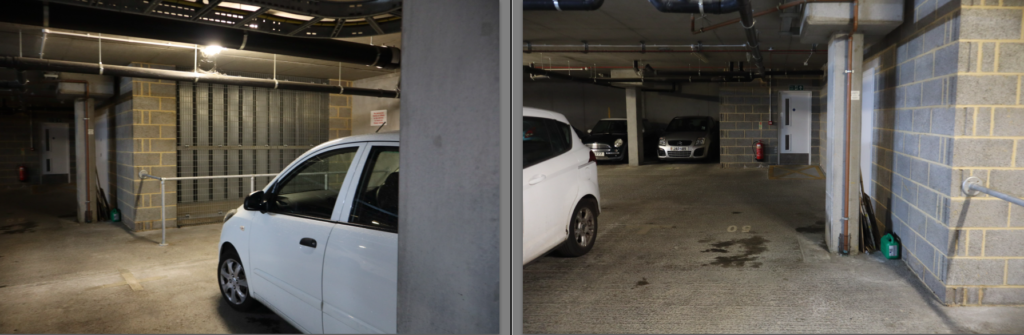
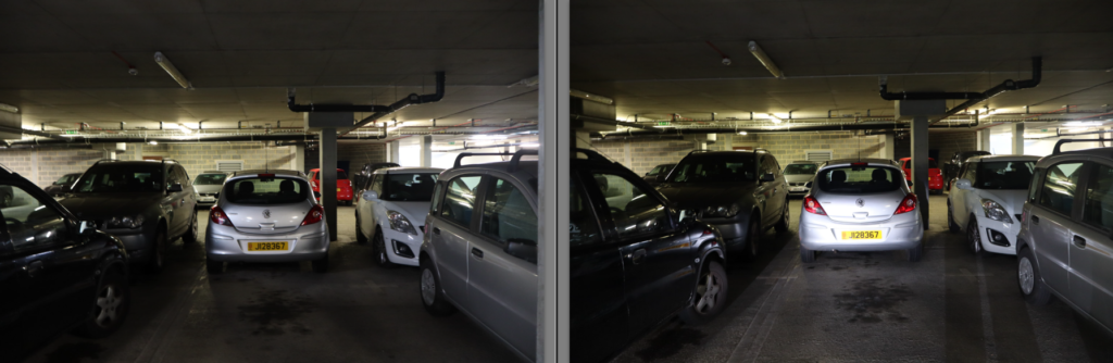
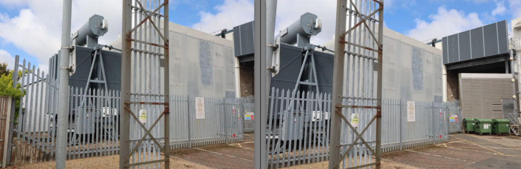
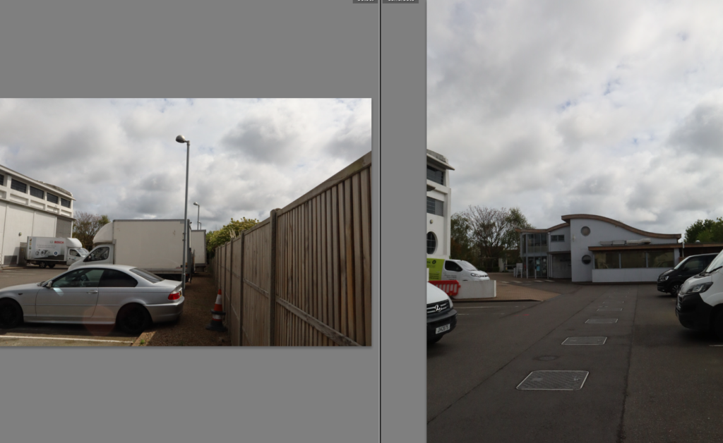
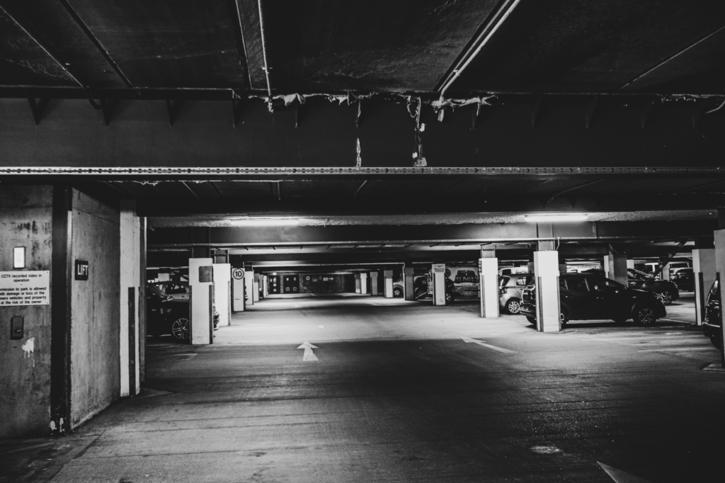
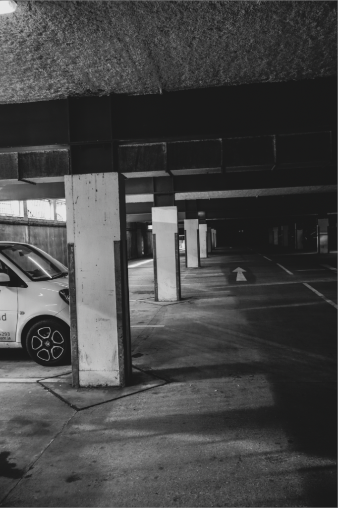
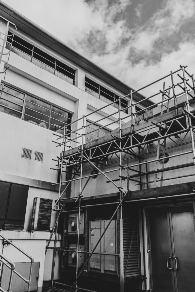
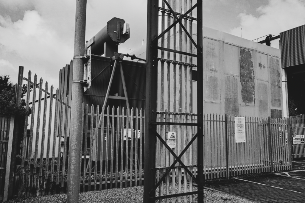
The Selection

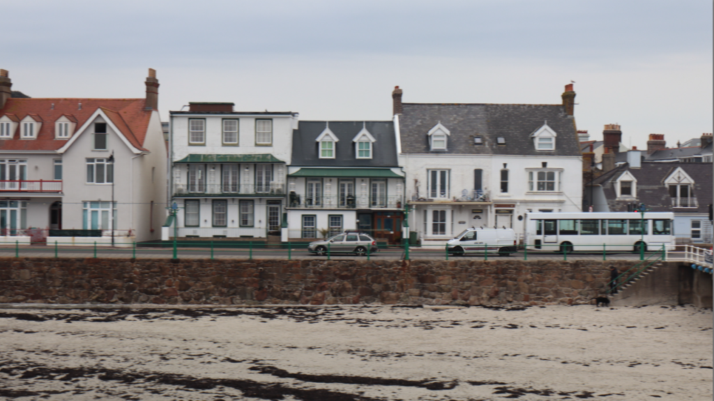
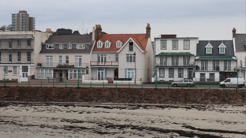
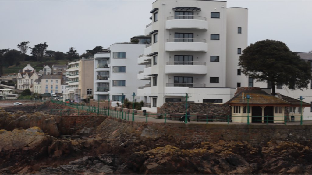
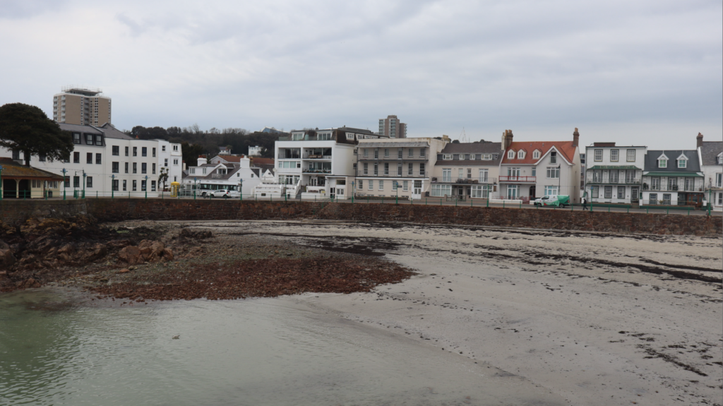
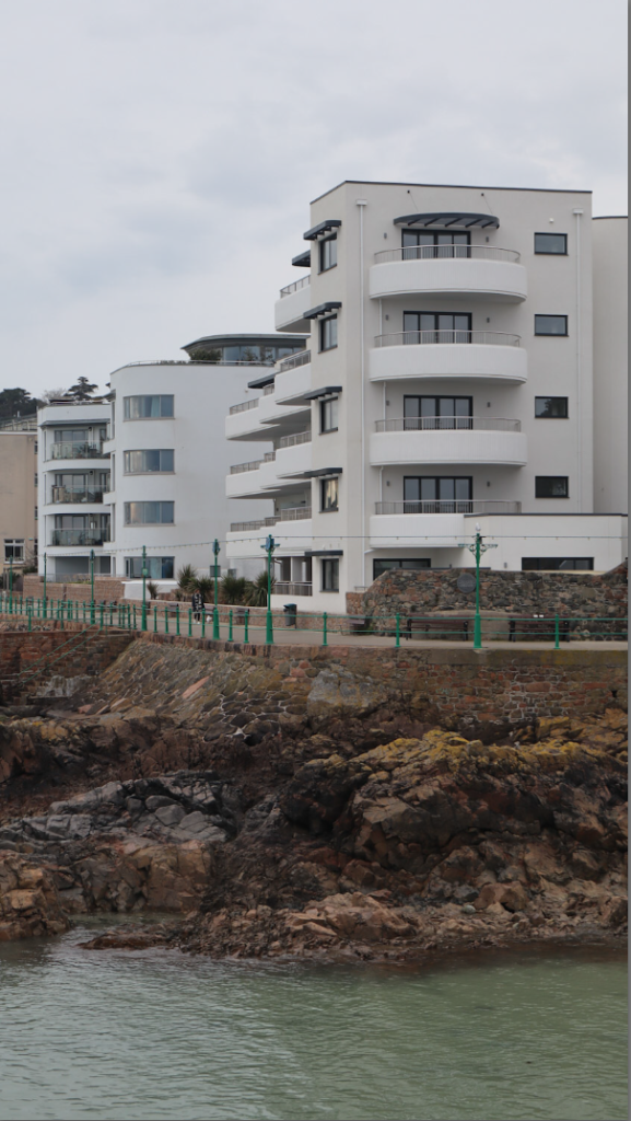
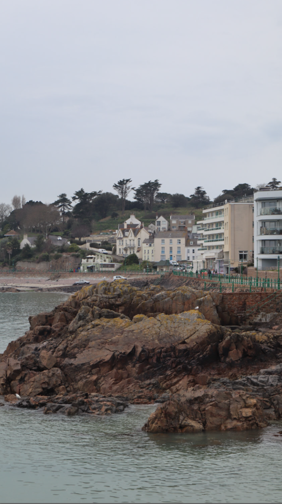
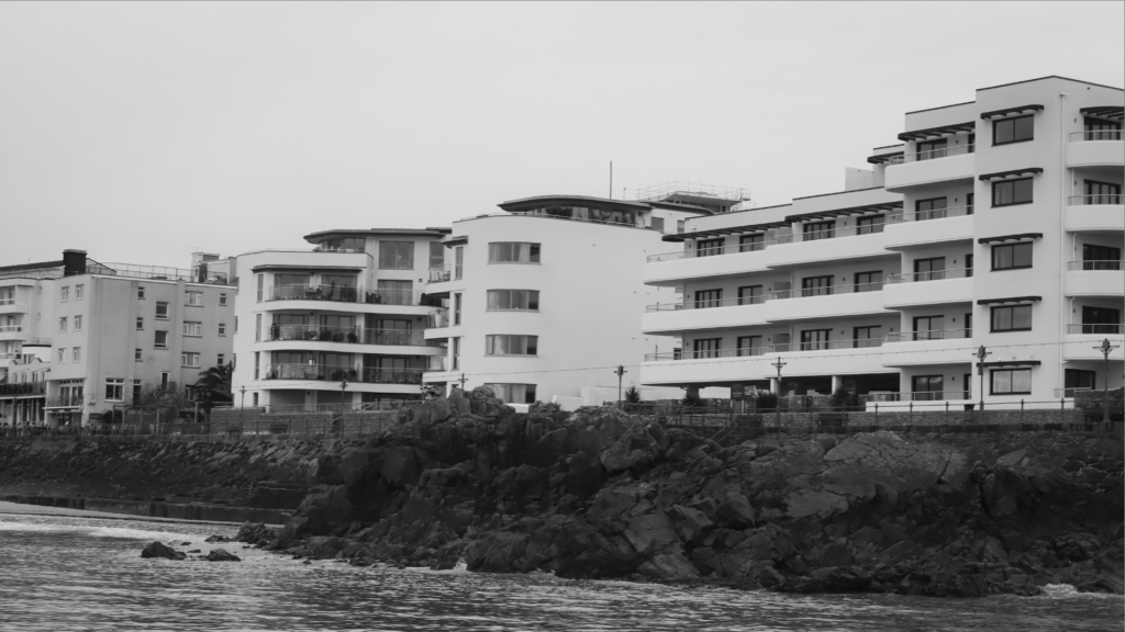
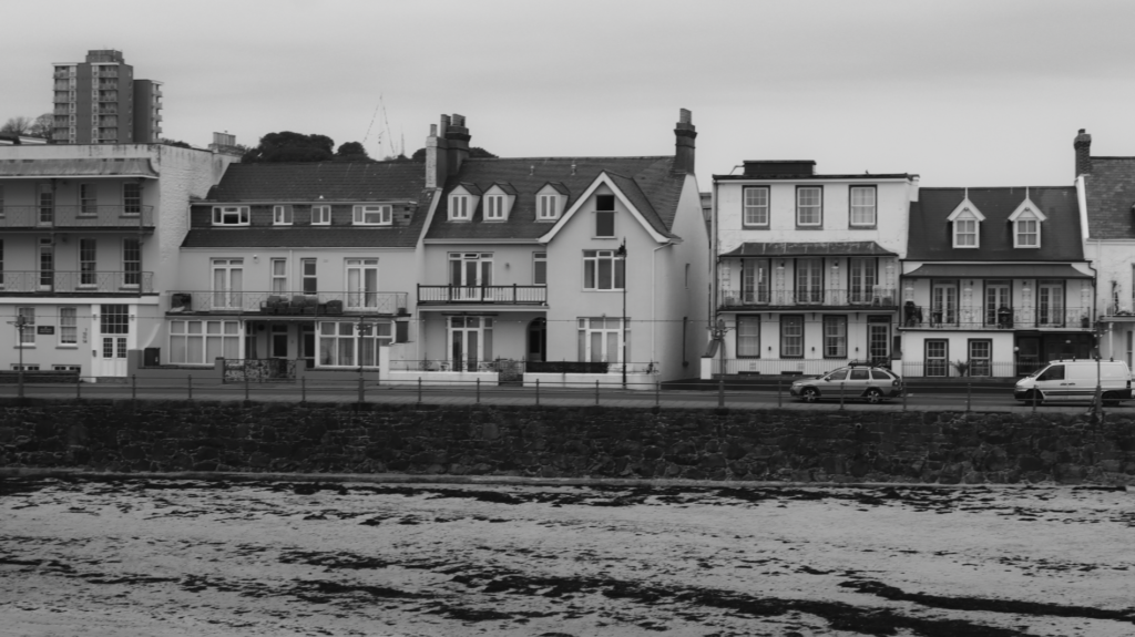
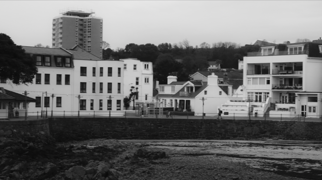
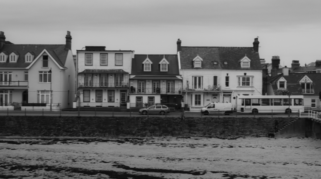
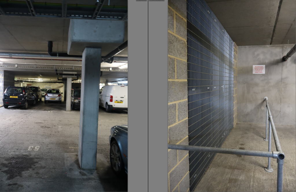
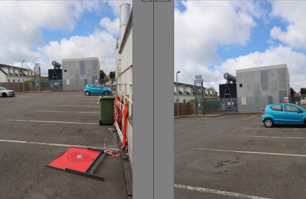
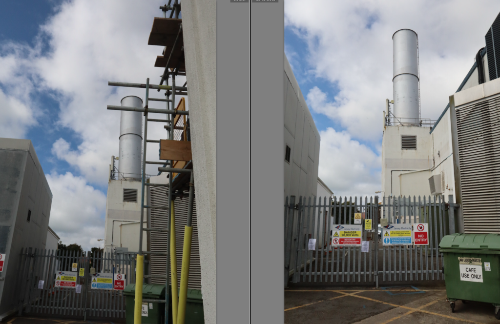
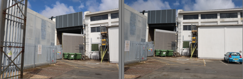
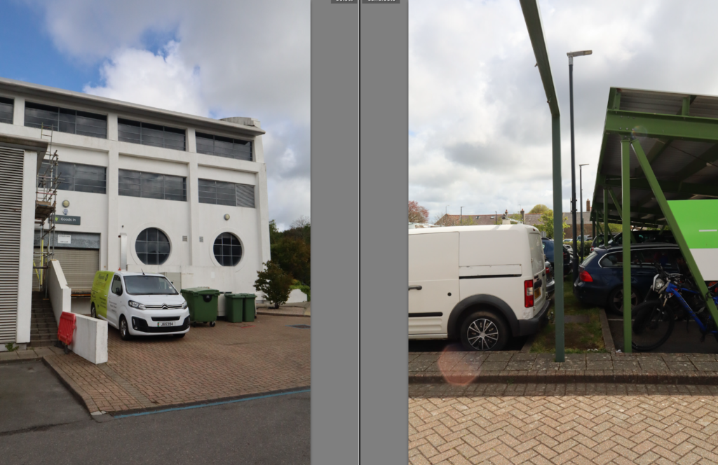
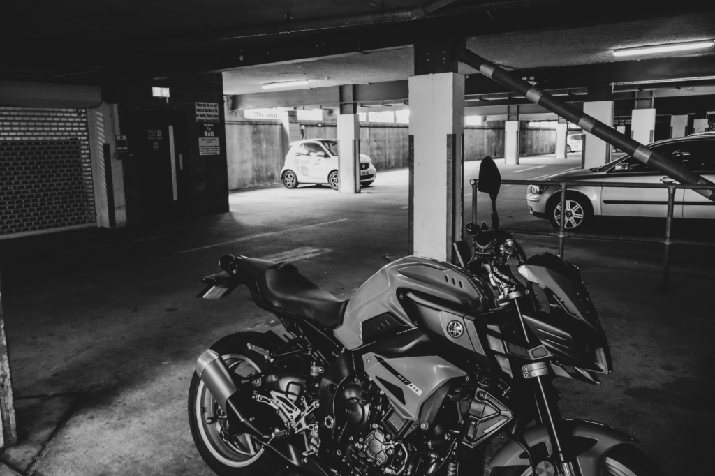
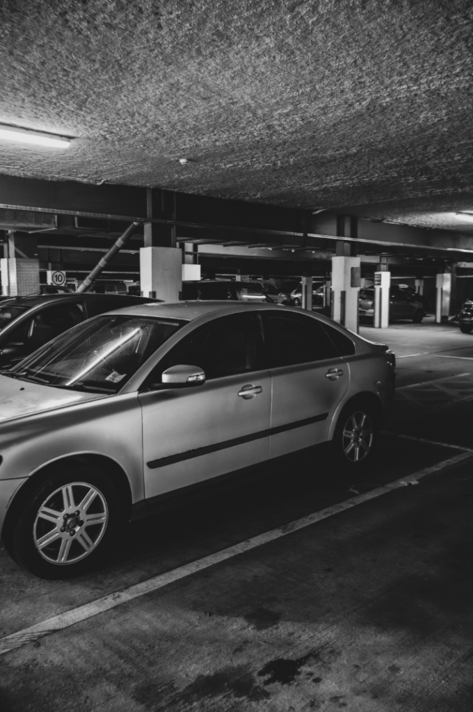
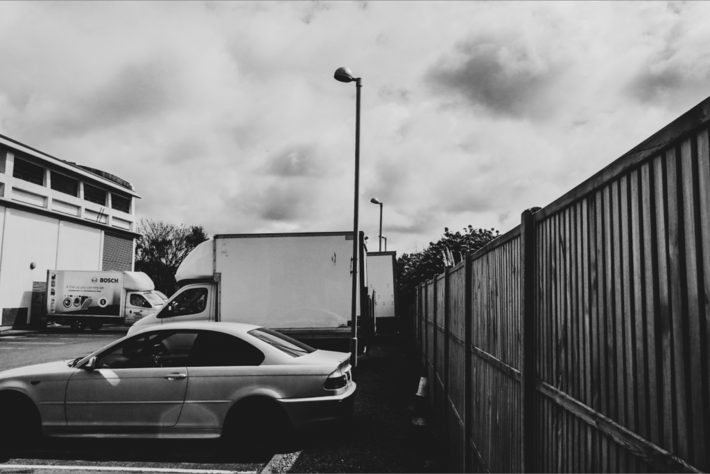
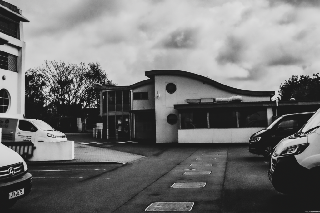
Further Selection


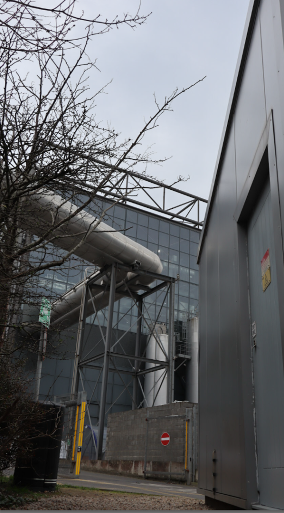
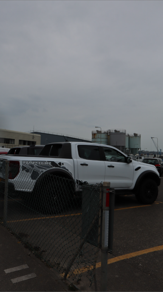
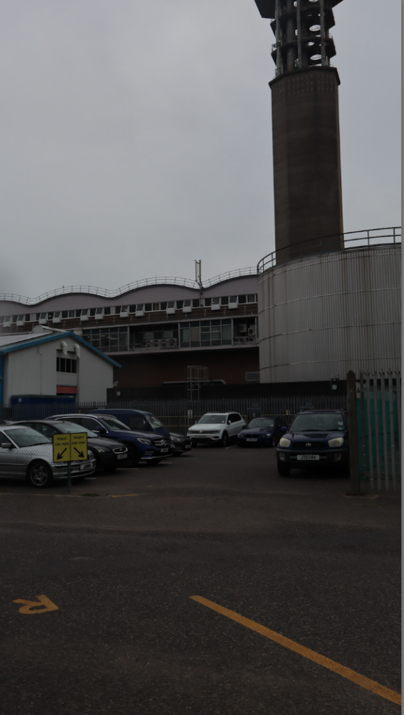
With the rating system, I decided to categories it by group and what I think looks best. For the 1 star, I chose the images which looked overexposed and just overall not the best. The 2 star category was for images which have high and low exposure shots, this gives me a wide variety but overall not the best quality. For the 3 stars, this was for images in which looked the same or have potential to be edited better. The last two stars (4 and 5) are my favourite pictures I took which I think have potential to be edited even better and create good pieces of work.
The red rating system is so I can be organised with my individual joiner images so I can find them when needed in order


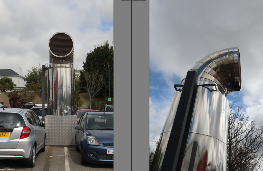
Editing


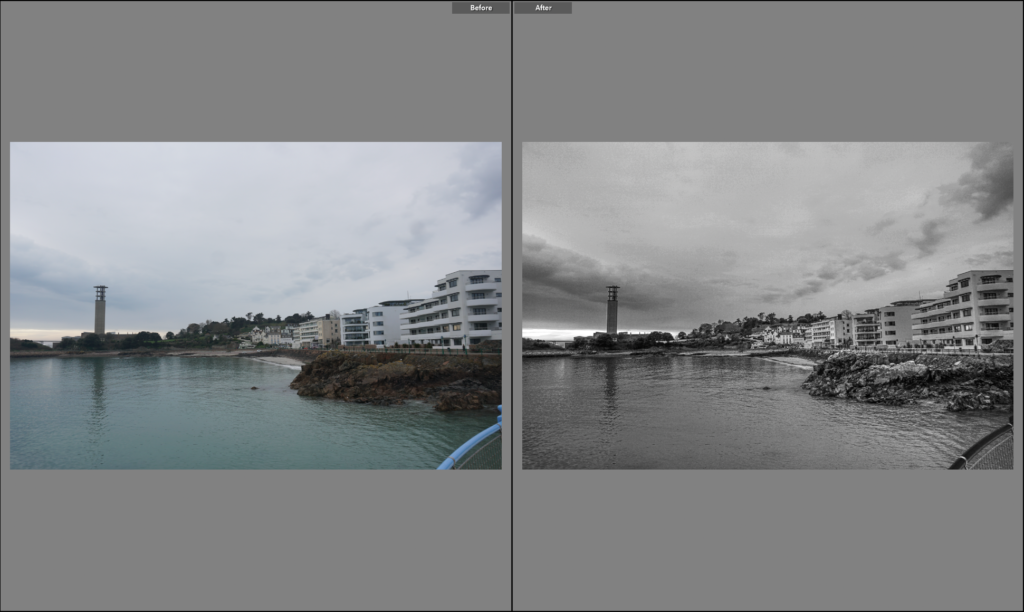
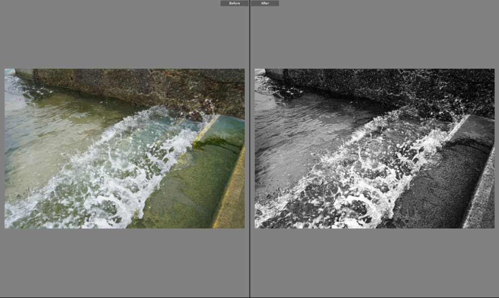
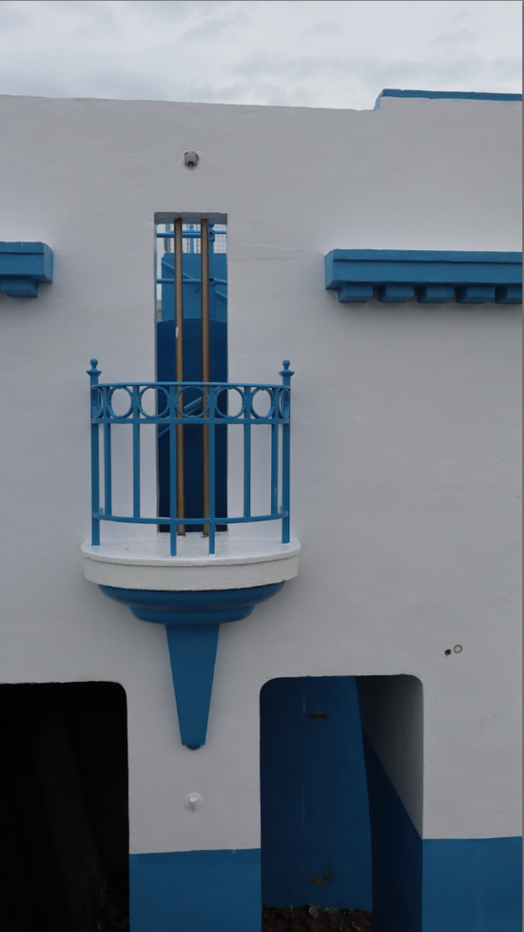
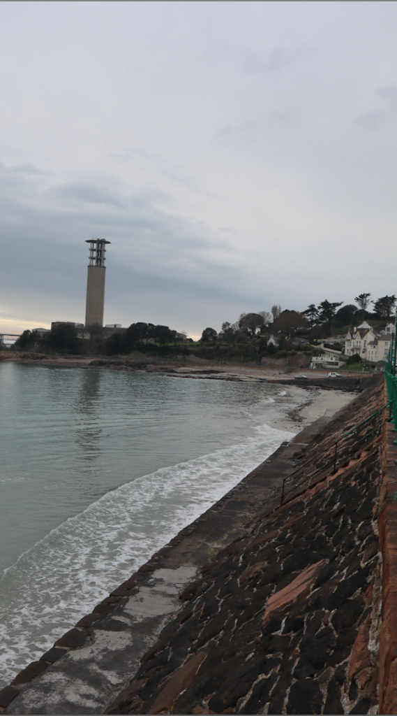
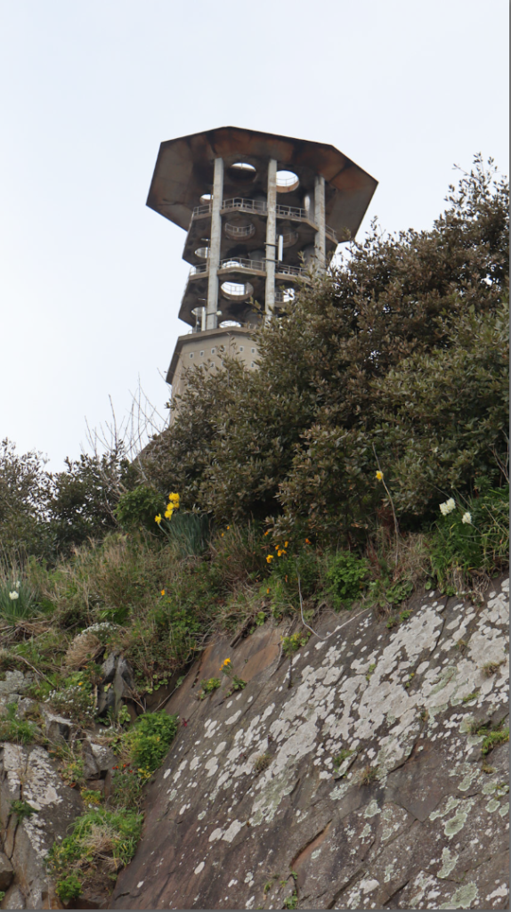
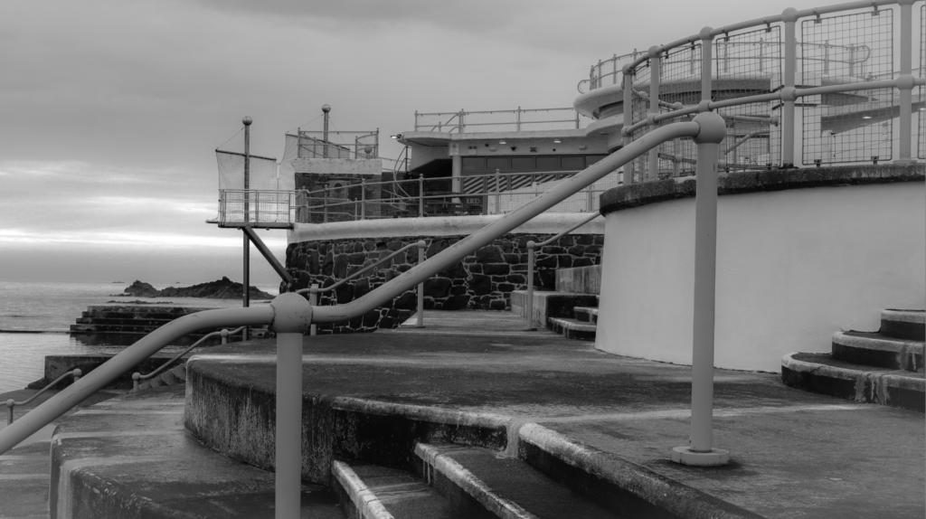
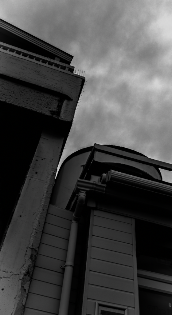
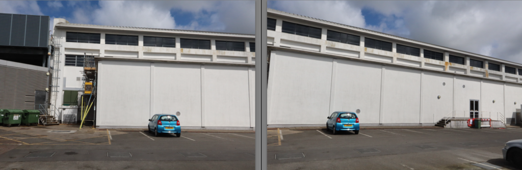
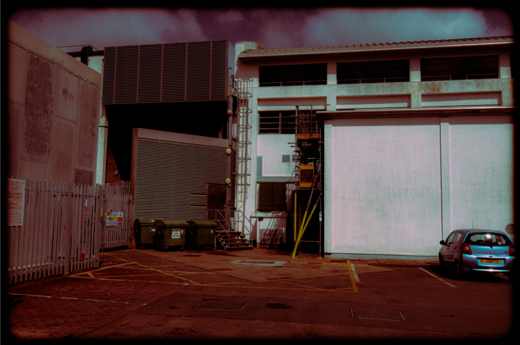
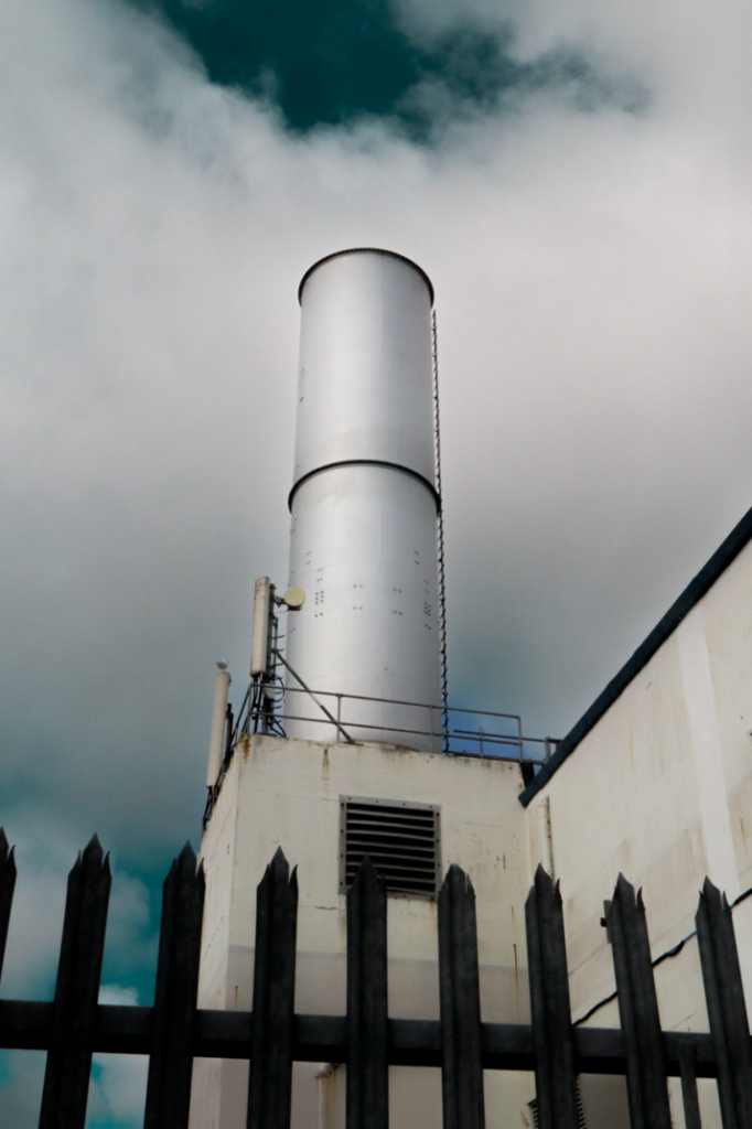
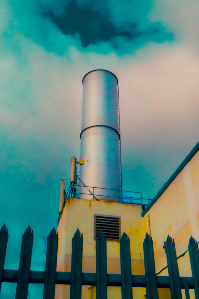
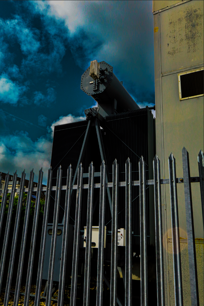
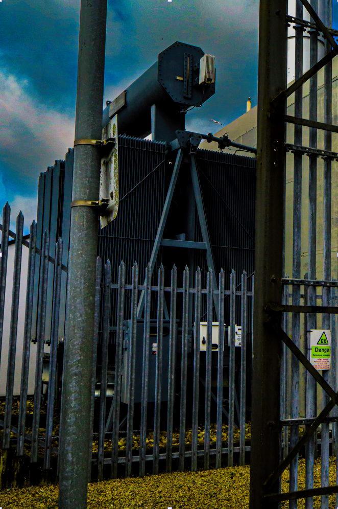
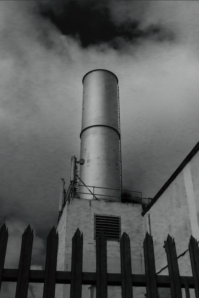
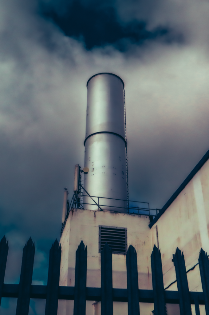
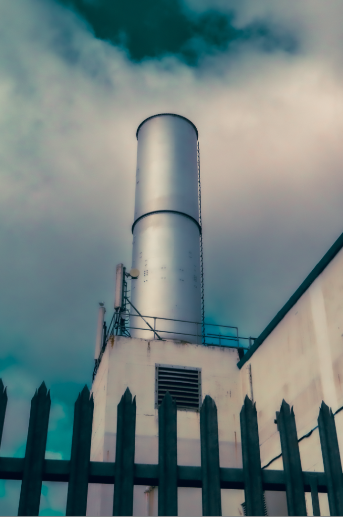
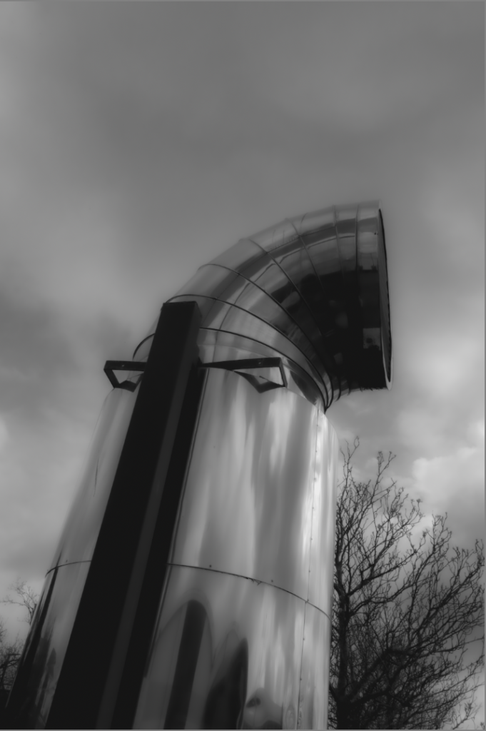
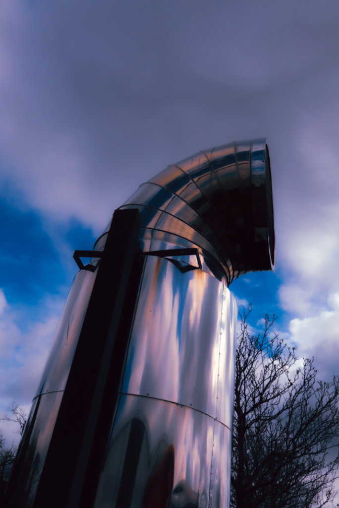
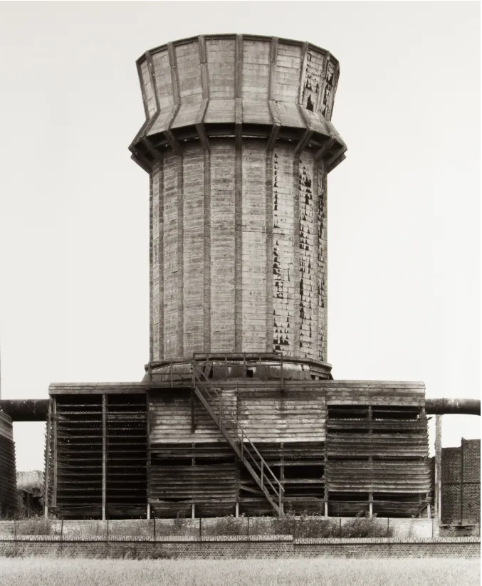
I decided to take one image from my 1 star selection and see if I could improve it. For this image I chose to edit it originally and then create a HDR image to see how it would look. I made sure the photos were different exposures to see the best effect. When doing this I also created 3 digital copies of the photo so it wouldn’t interfere with the original image. With the original image I edited I used a mask on the sky to emphasise the colour of it without it messing up the bottom of the image. This allowed me to create a deep contrast of light and dark by turning down the whites and upping the blacks.


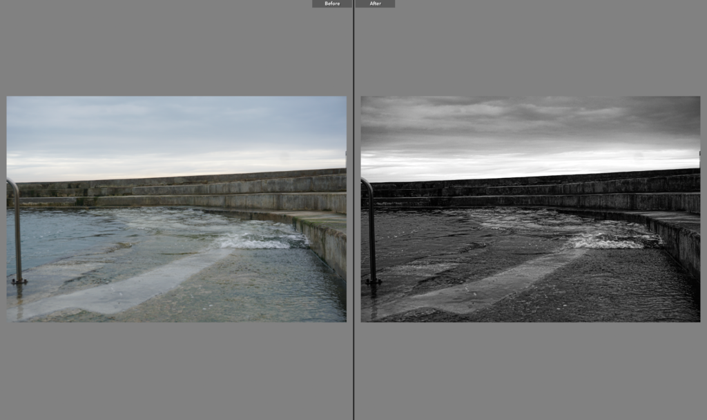
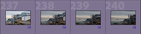
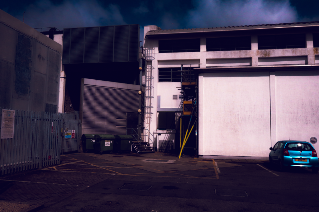
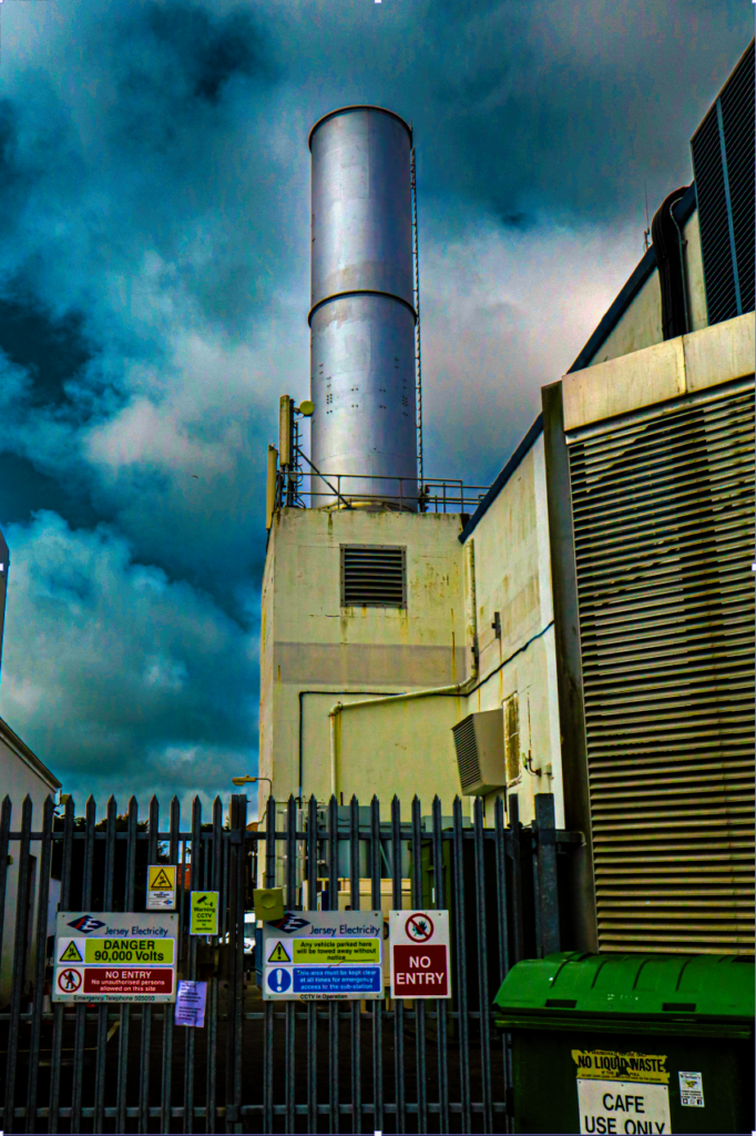
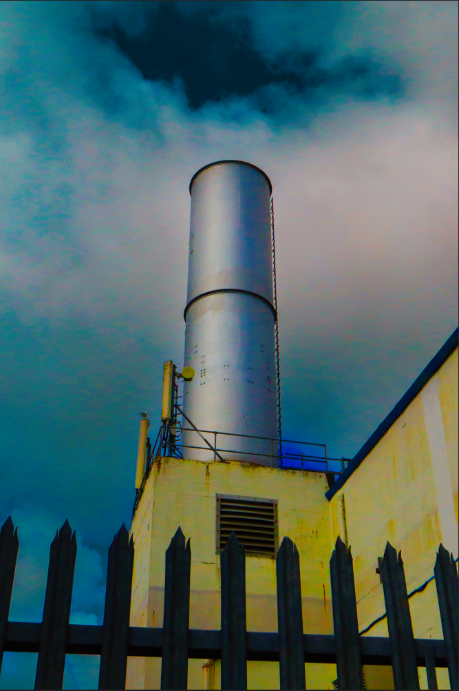
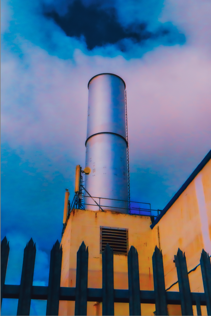
For this image I just turned the exposure down and upped that shadows so the image would have more depth and have more of a dramatic sky. I also cropped the image so it would be straight and the horizon line would be properly horizontal.