Shutter speed in photography refers to how long the camera’s shutter stays open, letting light hit the sensor. It’s a key part of how bright or dark your photo turns out. A fast shutter speed (like 1/1000 of a second) freezes motion, great for action shots, while a slower shutter speed (like 1/2 second) lets in more light and can create cool effects like motion blur. It’s all about balancing light and movement to get the shot you want.
Examples and Benefits of Slow Shutter Speed:
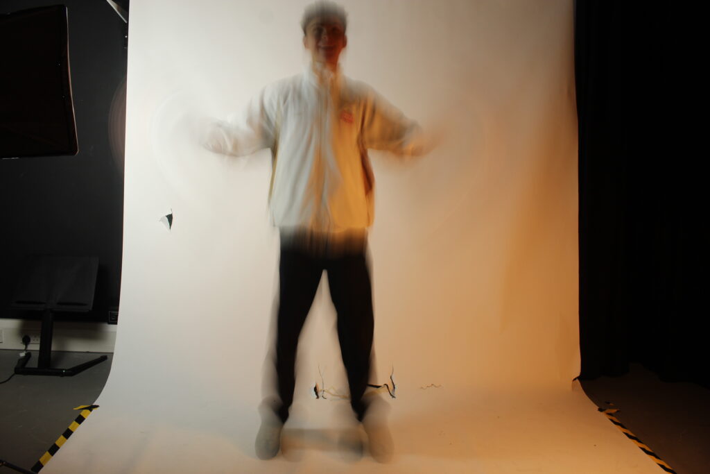
This Photo was captured using low shutter speed. The use of a tripod would be significant as you have to be careful with a slow shutter speed as it can be heavily effected by movement. Also to capture the vivid colours it would have to be night. Slow Shutter speed has certain benefits, such as you can make and control motion blur adding extra detail into your photos.
My own Picture example of the use of slow shutter speed is Below
The Benefits of using slow shutter speed is how motion blur is created. This helps as it captures more of a story in a frozen image and also a sense of mystery as you don’t know where the subject is going or where its been.
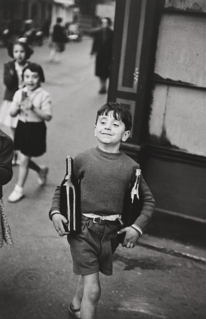
Examples and Benefits of Fast Shutter Speed:
Fast shutter speeds in photography allow you to control the action and the mood of the image you’re creating. You can freeze moments that are too fast for the naked eye to see. This can help capture moments and allow you to hone in on specific parts that would be left unrecognised
Cartier-Bresson approach is observational as the decisive moment is all about sitting back as if your hunting and waiting ‘observing’ until the perfect frame pops up, and then making the decision to act on it. His beliefs viewed photography to be all about everything aligning into the right moment. He also believes this helps capture subtle emotions as no one is posing and its all candid.
He often uses a 35mm Leica camera. At the time this was a very small camera which allowed him to not stand out when capturing his images. His style was to analyse a moment and predict when this moment is changing as whilst the person is heavily involved in this change they are not focused on getting their picture taken, therefore further emphasis is given to the fact of participants not being aware.
Technical:
Cartier-Bresson used a small aperture to make sure he gets a large depth of field. This further allows him to capture his scenes in sharp focus, as this is a key aspect of street photography as everyone’s always moving randomly. He was also known for using a faster shutter speed, often working with speeds between 1/500 and 1/1000. This was a key aspect of street photography as a persons actions or an event can change within a blink.
Visual:
His images are in black and white with a high level of contrast. He uses the rule of thirds to help capture his photos which are taken at eye-level bringing it into a perspective of someone in the every day scenario.
William Klein:
Introduction:
William Klein was born in new York and studied social sciences at the city college of new York, and later joined the U.S. Army and was stationed in Germany. It was here that he won his first camera. After winning this camera in a poker game he started to focus on street photography. His street photography was known for being very intrusive and confrontational, gritty and expressive. Many also described his photography as raw. He did this by using certain techniques; these include motion blur which creates a sense of energy and movement. He also used a wide angle.
Confrontational
In contrast to Cartier Bresson, William Klein took a much more confrontational approach to the idea of street photography. He wanted to be as close as possible, His work often showed a violent and chaotic view of urban life.
Klein used a wide-angle lenses which allowed him to still capture a good wide shot whilst being so close. His images often had colour and a sense of confrontation. Most people in his images also addressed the camera as it was so close up in their face. His beliefs was to capture the chaos of modern life.
Klein saw photography as a way to capture the world as it is. for example when he did a shoot in Paris he captured the rundown little buildings there which juxtaposes how a place like Paris is seen to be.
Image analysis William Klein:
Moves and Pepsi William Klein
Image Analysis
Moves and Pepsi, William Klein 1955
Composition
This image shows a group of young African America males who appear to be in mid-movement. The body in the foreground is blurred which cement the feeling of energy throughout the image. In the background at the image there is a male that is grinning. unlike the other people in this image this man is showing emotions bringing life to the image. He is also in sharp focus therefore suggesting he stopped for this picture. The fact that the male in the background is moving of the screen to the right and the male in the foreground is moving to the left furthermore suggesting juxtapositions.
Technical
He uses natural lighting and a slightly longer shutter speed which shows off life to the audience. This is controversial because some photographers would class this as a technical flaw but some could also suggest how it brings the image to life
Classic street photography or Observational street photography relies on observation over confrontation in order to create candid portraits. The goal is to be discreet and capture authentic moments as they naturally occur. Classic style photography is created with a more unnoticeable, documentation approach where people aren’t posing for the picture or even know they’re being photographed. The aim is to blend the people and the environment rather than interfiere or adapt the scene. This style often involves movement or action as well as intimate interactions between people such as conversations and hugs.
Confrontational photography breaks away from classic street photography by interacting with the subjects and is intentional with the environment and composition often talking and asking subjects to stand in certain poses or places. Sometimes the photographers will prompt a reaction from subjects such as using flash up close to get their initial reaction to the camera. The aim of confrontational street photography is to provoke and engage with the subject and explore relationships between subject and camera. The style often involves movement and blur while people react as well as up close portraits.
History of Street Photography
Street photography started in the 1850’s not long after photography was invented. It started with documentation photography such as in the American Civil War with Mathew Brady documenting the soldiers fighting and the change in landscape as war continued.
Around the same time, Charles Nègre’s work looked into capturing the street life of Paris in the 1850’s. He used the calotype process creating a negative prints on paper.
Compare and Contrast Henri Cartier-Bresson and William Klein
A way in which both Bresson and Klein are different is how Bresson focuses more on observational photography meaning he does not interfere with the subject or situation. Whereas Klein interacts with the subjects he finds and sometimes moves and interferes with the natural behaviour of the people using confrontational photography. Bresson’s theory of the decisive moment reflects more in his work as he waits for the perfect opportunity in a naturally occuring, unfiltered environment where his aim is to capture the moment with only one chance to do so. However, Klein’s attitude towards photography is that there should be a second chance to recreate pictures and he moves subjects to create better geographical harmony within the environment of the image. Klein also prefers to capture movement more often in his work utilising blur to add depth and interesting factor to the photo. It enables the viewer to imagine the movement and life within the image. Keir also does not tend to change settings on his camera to create less or more movement instead just leaves it to what is happening at the time, where as Bresson will alternate between settings to create certain desired effects or clearer images. Similarly, they both photograph in black and white and their primary purpose is to create art through capturing people in everyday settings.
The lighting is natural as its taken outside however the use of shadows and shapes around adds contrast within the tones of the image.
Bresson used a Leica 35mm rangefinder camera as it was compact meaning the subjects are less likely to notice they’re being photographs making expressions and body language more authentic. The leading lines of the stairs and the framing of the image makes it obvious of the subject focus. The path of the foreground to the background gives the image a wide depth of field.
Visual
He photographed all of his works in black and white as though colour photography did exist it did not become popular until the 1960’s. The black and white image makes the different tones pop and gives a serine feel to the environment. The textures of the walls and stairs captures the history the place holds. Bresson has chosen a detailed space with many interesting shapes to draw the viewer’s attention. The pattern of the doors gives even more framing to the image with more square shapes replicating the walls and sky framing subject.
Contextual
The position the woman is walking or running in up the stairs which dip in the middle shows just how many have taken the same path as her or how she is following in the footsteps of so many. This image was taken in 1961 in Sifnos Greece documenting the day to day life of the locals of around the world.
Conceptual
Though feminism was gaining traction in places such as the UK, Ireland and The US sexism was still apparent in Greece during the 1960’s. This image frames her in a way as she rushing showing how women still had to climb and work to be seen. I also think the pattern of homes surrounding her path shows how women were forced into domestic work and though at a declining rate in the 1950’s arranged marriages were still prevalent which was another obstacle to overcome.
The lighting looks to be outdoor lighting as it looks like a wall outside of a diner or restaurant. Klein used a Pentax 6×7, a medium format SLR. He’s clearly used a long shutter speed as he has captured a motion blur as he’s taken the picture. The exposure looks to be on a higher setting as there is light captured on the boys face and there’s not many large shadows.
Visual
The picture has been taken in black and white. but with many tones throughout with the black and white tiles contrasting one another creating a range of tones and adding texture and a checkerboard pattern to the image making the subjects stand out amongst the repetition.
Contextual
This image is called Candy Store taken at Amsterdam Avenue, New York in 1955. Racism was very apparent during the 1950’s and coloured segregation was strictly enforced throughout the USA until the act of Rosa Parks refusing to give up her seat on the bus sparked a revolution and became a symbol of the Civil Rights Movement in the year of 1955. Back people were photographed but often only presented in ways that would reenforce racist ideals and stereotypes making Kleins photo an exception to this as he’s photographed the child in an innocent light with no ulterior intent to describe him as anything else than what he is.
Conceptual
William Klein is known for using “the street as his studio” according to https://www.thenation.com/article/culture/william-klein-photographs/. For Klein to choose a young black child as his subject represents the youth as the future and the movement and blur within the image represents the change and movement in society. I believe in ways this was documentation in art format of the changes happening within society. The fact it was taken outside of a candy shop reinforces the child’s innocent presentation as it is a metaphor for how black children are being prevented from having a regular childhood as they are discriminated against and shut out giving the impression Klein was supportive of the new Civil Rights Movement in America.
My response to both William Klein and Henri Cartier-Bresson
Black And White Images
Coloured or Sepia
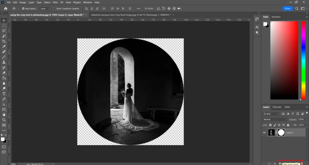
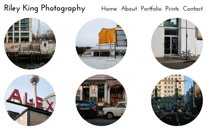
Cropping
In some of my images i experimented with extreme cropping to make sure they were the sole person in the shot and that there facial expressions were clear. With no background or foreground the characters speak for themselves and their personality comes from their body language and face. However, I still believe the larger images are more effective as they set a scene. The background adds more context to the person making the viewer see them as individuals with their own life story rather than cosmetic subjects.
I also experimented with preset settings making a batch of images black and white. This has been helpful as it makes editing faster and more efficient however a drawback is that each image has different lighting as they are being taken at a different time or location making each image more original and require more uniquely tailored edits to get the most from each image.
St Malo is a port city located in northwest France, on the northern coast of Brittany. it is known for it’s beautiful walled old town and it’s maritime heritage.
Map
St Malo was once a base for legal pirates (privateers) who stole goods from ships in the name of the French crown. The high granite walls were built as a defence against invaders and they still remain in good condition today.
The city has a moto: “Ni Français, ni Breton, Malouin suis” (“Neither French nor Breton, I am Malouin”) which shows their independence.
Key Street Photography Locations
Intra-Muros (The Walled City)
Cobbled medieval streets.
Stone arches, staircases, and passageways.
Old doors, window shutters, street signs, shop/café signs.
tourists and locals.
Markets & Cafés
Restaurants with outside areas
Outdoor cafés — perfect for candid shots, reflections in windows.
Creperies, ice cream stalls etc..
Harbour Area
Fishermen, sailors, dock workers.
Construction workers- machinery
Things to Look out for:
Textures: ancient stone, weathered wood, old signs.
Contrasts: tourists vs locals, old vs modern.
Movement: people walking, bikes, delivery carts.
Street life: dogs, kids playing, old locals sitting, street artists.
Reflections in puddles or shop windows.
Contact Sheet
Editing/Experimenting
Edits- Before + After
Here I used a colour pop editing technique on Lightroom.
Saint-Malo is a historic port located in Ille-et-Vilaine, Brittany, France. This walled city, situated on the coast of the English Channel, has a rich history of piracy, which brought in a lot of wealth through local extortion and adventures overseas.
As of now, it is a tourist hotspot, with plenty of people walking through the streets of the old town, especially during warmer periods of the year.
A map of St Malo’s old town in Google Maps, satellite view.
History
Established by Gauls in the 1st century BC, the ancient settlement where Saint-Malo stands was referred to as the Roman Reginca or Aletum. By the end of the 4th century AD, the Saint-Servan area housed a significant fort on the Saxon Shore, which safeguarded the Rance estuary from sea invaders beyond the borders. As the Western Roman Empire weakened, Armorica (present-day Brittany) revolted against Roman authority led by the Bagaudae and during the 5th and 6th centuries, many Celtic Britons escaping turmoil across the Channel settled there. The current Saint-Malo can trace its roots back to a monastic community established by Saint Aaron and Saint Brendan in the early sixth century. Its name comes from a figure believed to be a disciple of Brendan the Navigator, Saint Malo or Maclou, who was an immigrant from what is now known as Wales.
World War 2
In World War II, during fighting in late August and early September 1944, the iconic walled city of Saint-Malo was almost completely destroyed by American shelling and bombing.
Colonel Andreas von Aulock, the German commander, refused to surrender when asked to do so by the town’s authorities; he said he “would defend St. Malo to the last man even if the last man had to be himself”.
On 13 August, the walled city was on fire and a short truce was declared to allow French civilians to flee the city. Outlying German positions at St. Ideuc and La Varde fell to infantry attacks. This fighting ended resistance on the north shore of the peninsula. Only the citadel remained. Surrounded by American artillery and under frequent air attack, this last holdout surrendered on the afternoon of 17 August.
Eventually, they surrendered on 2 September when the three-hundred-man garrison ran out of drinking water. The Americans had taken more than ten thousand prisoners during the two-week fight, including von Aulock.
Post-War
Saint-Malo was reconstructed over a span of 12 years from 1948 to 1960.
It serves as a subprefecture of Ille-et-Vilaine. In 1967, the commune of Saint-Servan was combined with Paramé, forming the new commune of Saint-Malo.
Street Photography in St Malo
With St Malo being a tourist destination, there is likely going to be many people in the streets to produce effective street photography images.
An AI overview says:
‘St-Malo, a walled city in Brittany, France, offers a rich backdrop for street photography. Its narrow, cobblestone streets, historic architecture, and vibrant coastal atmosphere provide ample opportunities for capturing the daily life of the city and its inhabitants.’
Examples of St Malo’s Streets:
Contact Sheet
160 total photos
My images were all taken using an authentic street photography camera that had a fixed 18mm lens, so my photographs are mostly more confrontational and up-close rather than observational (meaning I focused more on William Klein’s style of photography).
Map Showing Routes Taken:
Simple Editing and Experimentation
Original image has a strong sense of depth with the path, as well as one figure being in the foreground and the other being further back in the middle ground.
Increased exposure and contrast, black and white.
Linking to the decisive moment with the woman smiling at the bird, as well as composition having each part of the image split across evenly.
Black and white, increased texture.
Original composition shifted a little as I was trying to get used to the camera, but I will fix this with cropping – although I like how the image is taken from the ground up.
I like the objective and very documentary-like style of this image, which I will enhance by making it black and white.
Black and white, decreased highlights, increased texture.
Original image has an effective composition and I like how the subject is looking the way the statue is pointing (links to decisive moment), I will crop it slightly to zoom in more on the statue and subject.
Black and white + cropping, as well as storm clouds preset which adds drama to the sky and enhances the negative space.
I like the William Klein and confrontational style of this image alongside the fact it has little to none negative space, filling the frame and making the image feel crowded.
Black and white, increased texture, increased contrast.
I like the large amount of negative space with the subjects positioned in the middle of the image, as well as the solitary child excluded from the group on the right creating an intriguing scene.
Black and white + cropping.
I found the contrast of the couple on the left third and solitary figure on the right to make an interesting photo.
Black and white, increased shadows and contrast.
Clear sense of depth with a foreground, middle ground and background. Emphasis on the solitary figure in the foreground while still highlighting the crowd around the image, creating an image which blends both the styles of Cartier-Bresson and Klein.
Cropped in, decreased highlights and increased shadows.
Visually pleasing composition with use of negative space.
Cropped inwards, black and white, increased exposure and contrast and texture, decreased highlights.
Solitary figure positioned on the lower end of the image with plenty of lines and negative space around.
Black and white, increased texture, contrast and highlights.
Sense of depth with a foreground and middle ground as well as simple but effective visual storytelling.
Black and white, decreased highlights, cropped down the top part of the image.
I like the geometry and lines with the bricks and railings, but mostly the crowd positioned in the centre creating a Klein-style image.
Black and white, cropped, increased shadows and decreased highlights,
I like how empty this image feels, with the clear focal point being on a solitary figure in the middle, creating contrast between other images of crowds and busy streets.
Black and white, cropped inwards, decreased highlights and blacks.
Sense of depth and three dimensions with the image being taken on a cornerstone, as well as interesting expressions/actions from subjects.
Top cropped down, decreased highlights and whites.
Interesting subjects in the foreground and background (especially with the focal point being on the woman in the front’s vibrant clothing), leading lines with the bricks.
Cropped inwards, black and white, increased shadows and whites.
Focal point on the figures in the middle, more of an observational Henri Cartier-Bresson style image.
Increased shadows and exposure, decreased highlights and blacks.
Another observational image, leading lines with the bricks.
Cropped in, increased shadows, exposure and contrast.
Sense of depth and geometry with the street expanding into the distance as well as leading lines. Clear contrast between busier street in the distance and solitary figure in the foreground.
Decreased highlights, increased shadows.
Lots of shape and geometry around the image, as well as a simple depiction of a family eating ice cream without excessive focus on composition or visual elements (referencing Klein).
Increased shadows and whites, decreased blacks.
Crowded scene as well as slower shutter speed with motion blur on the hand of one of the subjects, showing clear inspiration from Klein.
Increased contrast and shadows, decreased blacks and highlights.
William Klein-style image, being informal and crowded, as well as a sense of depth with foreground, middle ground and background.
Decreased highlights, increased shadows.
Observational image with a solitary figure positioned on the right third, simple but appealing image.
Increased shadows and whites, decreased blacks.
Solitary figure with smaller crowd seen in the background, emphasis created on the subject since the man he is interacting with cannot be seen, only his arm.
Increased shadows and whites, black and white.
Further Development with Best Images
I then wanted to experiment with editing some of my best images further, experimenting with things like grain, vignette and masking.
Observational Image 1:
BeforeAfter
I added some slight grain and vignette since I liked the original image as it was edited, but these effects help to amplify the nostalgic feel further and present the image as more similar to one from Cartier-Bresson or Klein.
Observational Image 2:
BeforeAfter
When taking observational images, I liked focusing on solitary figures, so when editing this I made only the subject black and white to help him stand out from the environment more.
Confrontational Image 1:
BeforeAfter
Experimenting with grain and vignetting again to emphasise a nostalgic atmosphere.
Confrontational Image 2:
BeforeAfter
Making subjects black and white to contrast them from vibrant background, making them stand out more.
I then wanted to experiment with the colour mixer to isolate particular colours while the rest of the image is in black and white.
Image 1:
Keeping blues in colour while removing the rest of colours adds additional emphasis on the main subject, separating the image into her and the smaller group of people in the background which creates a stronger sense of depth.
Image 2:
Keeping only blue in colour removes colour from everything except primarily people’s clothing, which creates a contrast in the image since despite one out of focus figure (taken with a slow shutter speed) taking up the majority of the frame attention is still drawn to people in the background.
Image 3:
With this image I experimented with a unique style, creating less of an emphasis on the people themselves and more on the environment by having only the flowers and pavement in colour.
Image 4:
I then tried the opposite of my previous image, keeping everything black and white except for people and their belongings which is in more of a street photography style, having some visual elements in a Cartier-Bresson style.
Image Analysis + Comparison
Analysis 1:
Technical – Natural (daylight) lighting, aperture f/8, fast shutter speed.
Visual – Black and white with slight range in tones, with shape, form and lines present around the image creating an interesting image out of an ordinary scene.
Conceptual/Contextual – Fast shutter speed alongside a visually poetic scene with geometry, line and shape creates a pleasing composition that reflects the style of Cartier-Bresson – furthermore, there is clear use of the decisive moment, as if the image was taken even a few fractions of a second the subjects wouldn’t have been stood the same way and the scene captured could’ve likely not have been as appealing.
Visual – Less focus on visual elements and creating an intriguing scene with more emphasis on capturing the raw scene as it is – visual elements include lack of colour with a range of light to dark tones ranging from the people to the café itself, as well as a sense of depth with foreground (bench), middle ground (people in café) and background (street).
Conceptual/Contextual – There was less of an emphasis on visual techniques/elements as this was leaning towards being more of a confrontational image in the style of William Klein, so I instead focused on informality and capturing the crowd in the café as they were.
Direct Comparison Against Cartier-Bressonand the Decisive Moment:
Technical – Cartier-Bresson’s image features natural lighting with a lower aperture value to create a shallow depth of field and blur out the background figures – similarly, my image also uses natural lighting as both images are outside street photography pictures, but mine has a slightly higher aperture since the subjects in the background are still in focus and detailed.
Visual – Cartier-Bresson’s picture has a strong tonal range with lights and darks present throughout the image, as well as depth and lines with a visible foreground and background. Similarly, mine has ranges of light and dark tones with the shadows cast from the shop as well as leading lines and geometry from the shop.
Conceptual/Contextual – Henri Cartier-Bresson often employed his technique called the decisive moment into his works, waiting for the perfect moment for elements of the image to align in a compositionally and visually appealing manner to create a formal and poetic final product – in his image above, the image was taken when the child was perfectly in the centre of the image and with the ideal expression, creating an extraordinary scene out of an everyday street; I tried replicating this philosophy in my own work and for this image in particular I found it effective, since both subjects in the image have intriguing stances and expressions which they may not have had if the picture was taken half a second earlier or later, resulting in the final product being an intriguing depiction of an otherwise ordinary street (linking to Cartier-Bresson’s poetic and less raw approach to his photography, in contrast to Klein).
Best Images and Evaluation
Observational (Henri Cartier-Bresson):
Overall, it was difficult to capture observational image with an 18mm so often times I had to capture observational scenes unnoticed but from up close, which differs to Henri Cartier-Bresson’s exact style of being a bit further back and trying to go unnoticed to minimise chances of interference with subjects.
Confrontational (William Klein):
In contrast to observational images, confrontational ones tend to be informal, up-close pictures and typically feature crowds of groups of people – overall I think these turned out quite well compositionally and visually, especially with an 18mm lens capturing scenes much closer and creating more of a connection between the subjects and viewer(s).
References to Artists in my Imagery:
Visually:some flâneur-style imagery with appealing composition and techniques such as depth, lines and form to enhance the image and turn ordinary scenes into interesting photos (Cartier-Bresson), as well as some being close-up and informal, focusing less on compositional mastery and more on capturing raw scenes typically of crowds (William Klein).
Visual references to Cartier-Bresson; observational, poetic.Visual references to Klein; crowded, less emphasis on composition and techniques.
Technically: fixed 18mm lens which led to mostly confrontational images, although observational images captured with a wide lens allowed for more negative space to fill frame and isolate the one or two subjects further, creating more intrigue towards the images.
Conceptually:emphasis on the philosophy of the decisive moment when taking observational images, with some consideration of it for confrontational imagery.
Image 1, Observational – if the image was taken any sooner or later, the subjects wouldn’t have been stood they way they are now, likely resulting in a less interesting image. Image 2, Confrontational – if the image was taken too early or too late, there wouldn’t have been a contrast with the people facing directions and people potentially could have moved resulting in less of a crowd and therefore less of a William Klein-style image.
Next Photoshoot Development Ideas:
– use a different lens with zooming capabilities to be able to focus on capturing both observational and confrontational images, as an 18mm lens is constrictive in terms of observational photography
– greater emphasis on solitary figures/couples/contrast to create effective presentations of multiple images that go together in this style
– greater emphasis on decisive moment and patience to try capture more interesting scenes
Presentation in ArtSteps
For presenting the images, I wanted to match images with similar themes (e.g. solitary figures, couples, crowds) with each other as well as trying to group images with similar styles (e.g. group confrontational images with other confrontational images).
These two work effectively in a diptych since they are both more observational images with a focal point on a solitary figure, but still different enough to create small contrasts that make each image an interesting scene in its own way (e.g. the first one contains a lot more negative space and has the subject positioned in the centre whereas the second one has slightly less negative space and has the subject positioned on the right third.
Similar ideas with this diptych, both being solitary figures although with these two images there is significant contrast since one is more confrontational and the other is more observational.
I chose three images that had two people in them to maintain a theme throughout the triptych, but the differences in environments and composition still allows for each image to be interesting on its own.
I then made a triptych with three confrontational images of solitary figures, which turned out really effective especially with the visible contrast in the environments as well as the middle one standing out due to its significantly more up-close shot and use of a slower shutter speed, clearly referencing techniques used by Klein.
St Malo is a port located at the north of France. It is widely known for its old wars and history. It was really good as a trip destination as it gives us students from jersey a better image and insight into the french culture. This was demonstrated by everything, from small conversations – to the food and how everyone goes about their daily life.
History of St Malo
St Malo is commonly known to be described as the walled city. This is due to its big walls that tower over the roofs of the buildings below. These walls were ordered to be built in 1689 by the King at the time called King Louis XIV. The reasoning behind this was to protect St Malo from the english during a time of conflict. Nowadays St Malo is commonely visited by tourists due to its past and attractive infrastructure.
Contact Sheets
How I edited them:
I chose to use a colour mixer method in Lightroom. This let me precisely choose which colours I wanted to pop or be dulled down. For the other ones I used a black and white filter in Lightroom called PBO4
I managed to capture some of this French culture in my images
Saint-Malo has gradually become a highly popular city, renowned for its coastal location, the charm of its privateer history, and its unique architecture. Saint-Malo, seaport, Ille-et-Vilaine département, Brittany région, northwestern France. It is situated on the English Channel and on the right bank of the estuary of the Rance River. The walled city on the English Channel coast had a long history of piracy, earning much wealth from local extortion and overseas adventures.
History
The modern Saint-Malo traces its origins to a monastic settlement founded by Saint Aaron and Saint Brendan early in the sixth century. Its name is derived from a man said to have been a follower of Brendan the Navigator, Saint Malo or Maclou, an immigrant from what is now Wales. The Battle of Saint-Malo was fought between Allied and German forces to control the French coastal town of Saint-Malo during World War II.
My Contact Sheet
My chosen edited photos
Editing
In all my photos, i chose to do a black and white theme as i believe it is the best way to capture all of the details in the photos and they all easily work well together. In a few of my images i chose to make everything in black and white except for one thing which is in colour, which would be the main subject of the photo to make it really stand out.
In most of these I used a Fast shutter speed to capture a clear, in detail image. In a couple I used a slow shutter speed to capture the movement of people walking through the town.
My Final Photos
I decided on these photos because I believe that they all work really well together and really emphasise St. Malo.