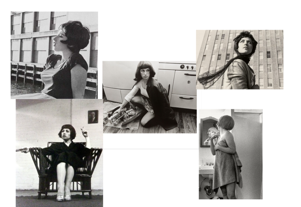
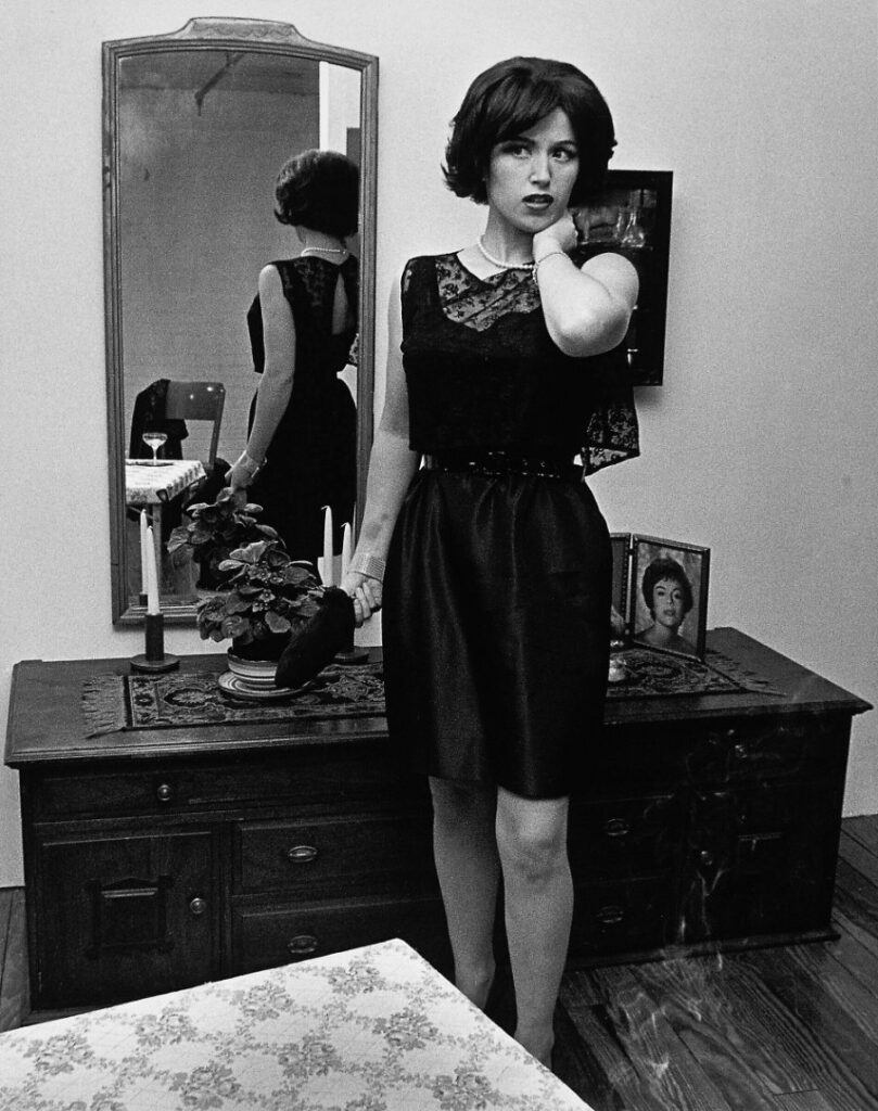
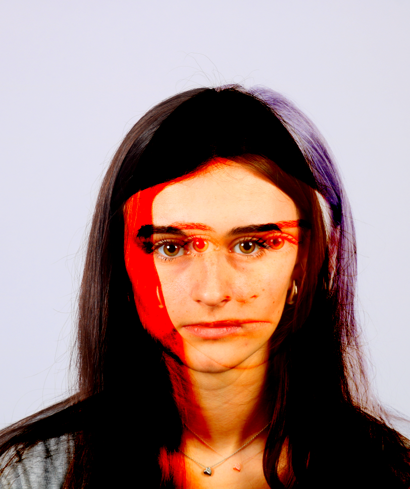
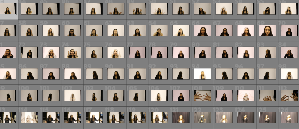
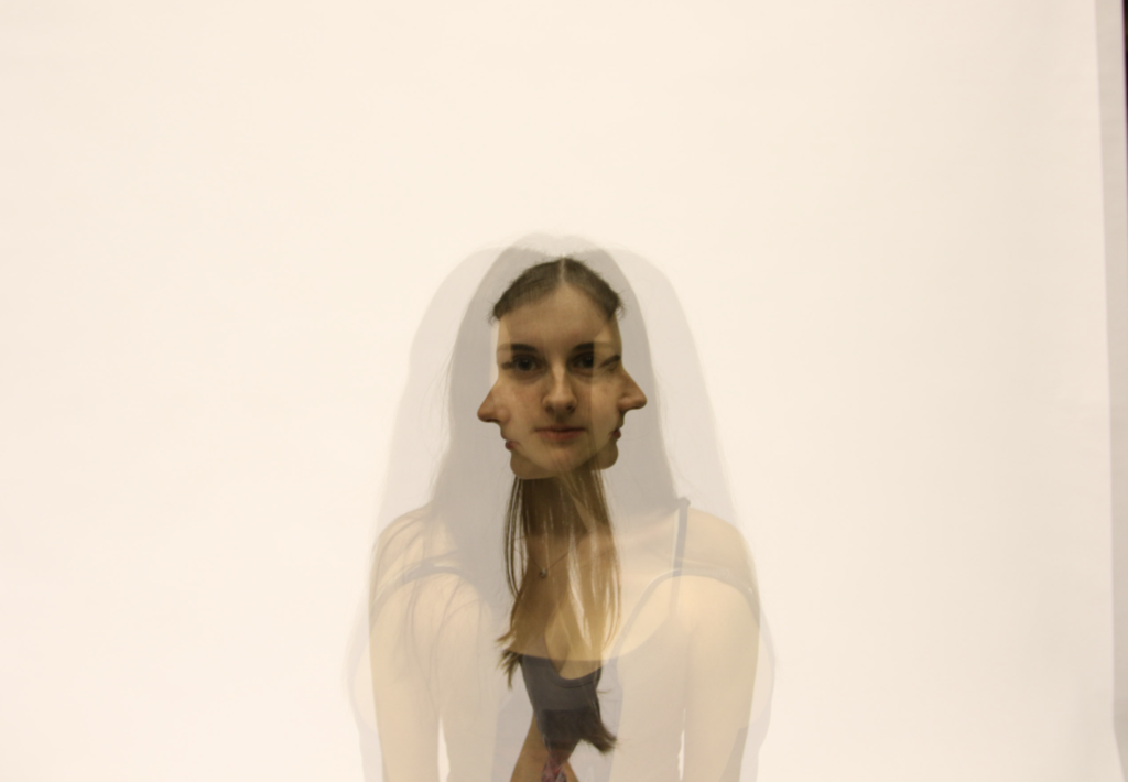
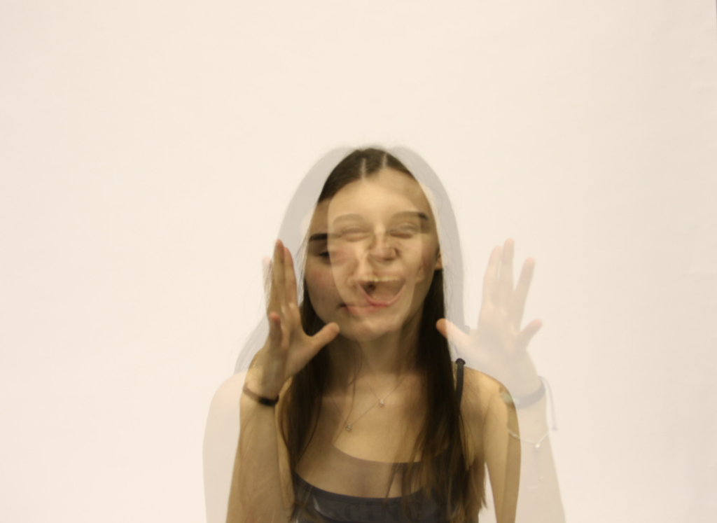
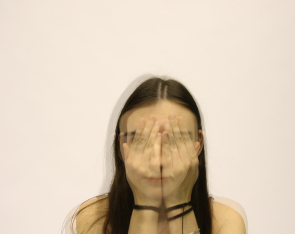
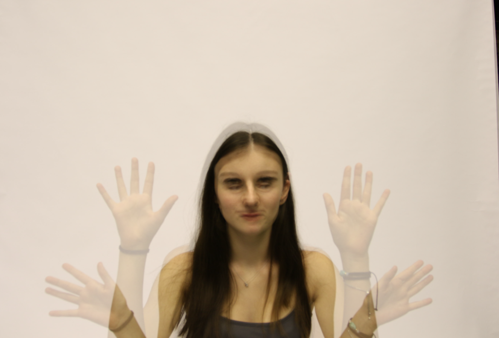
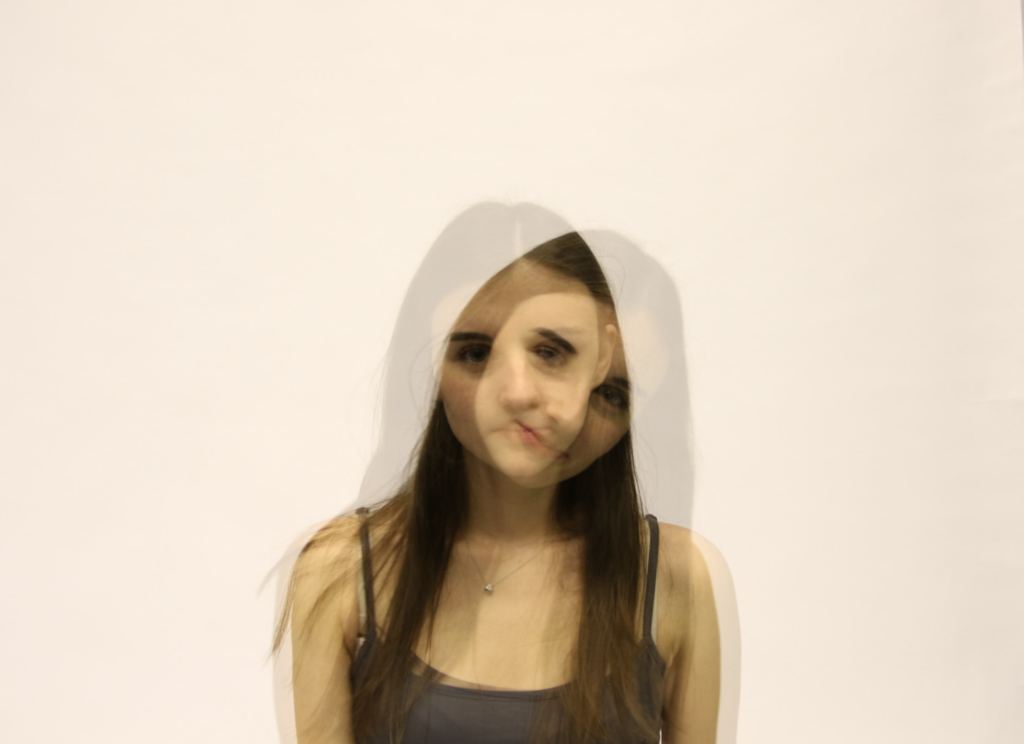
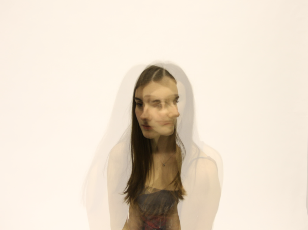
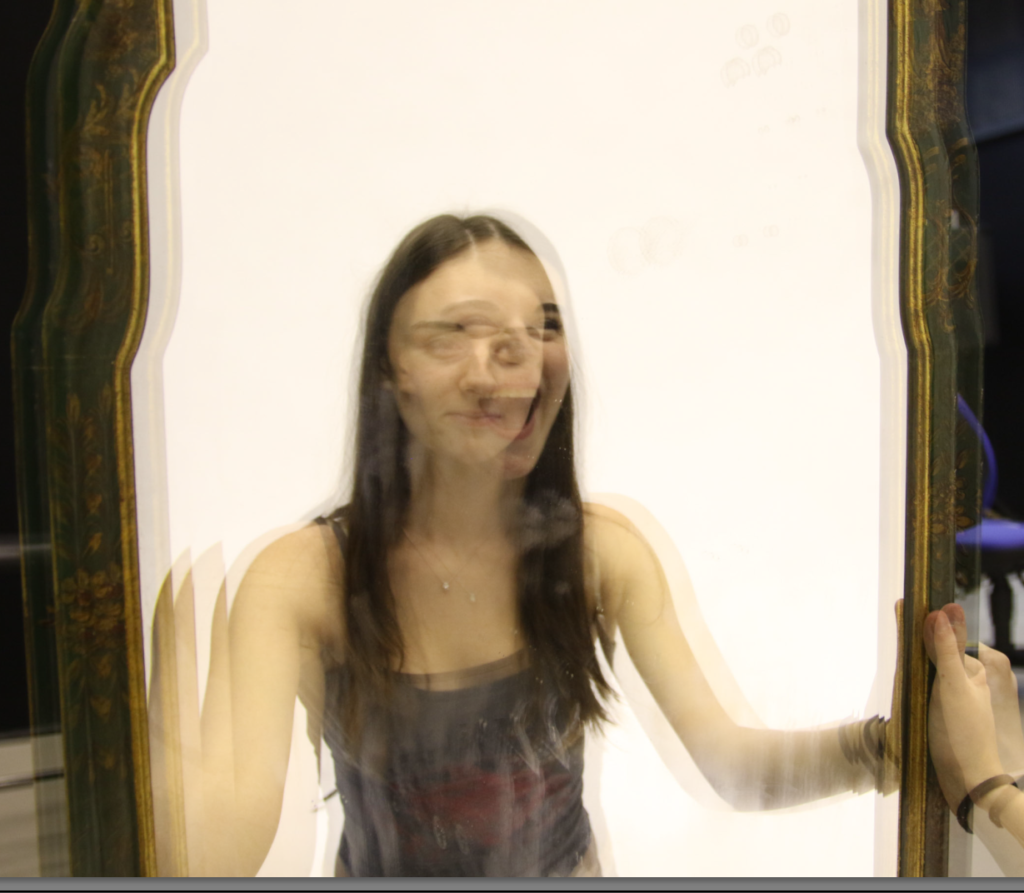
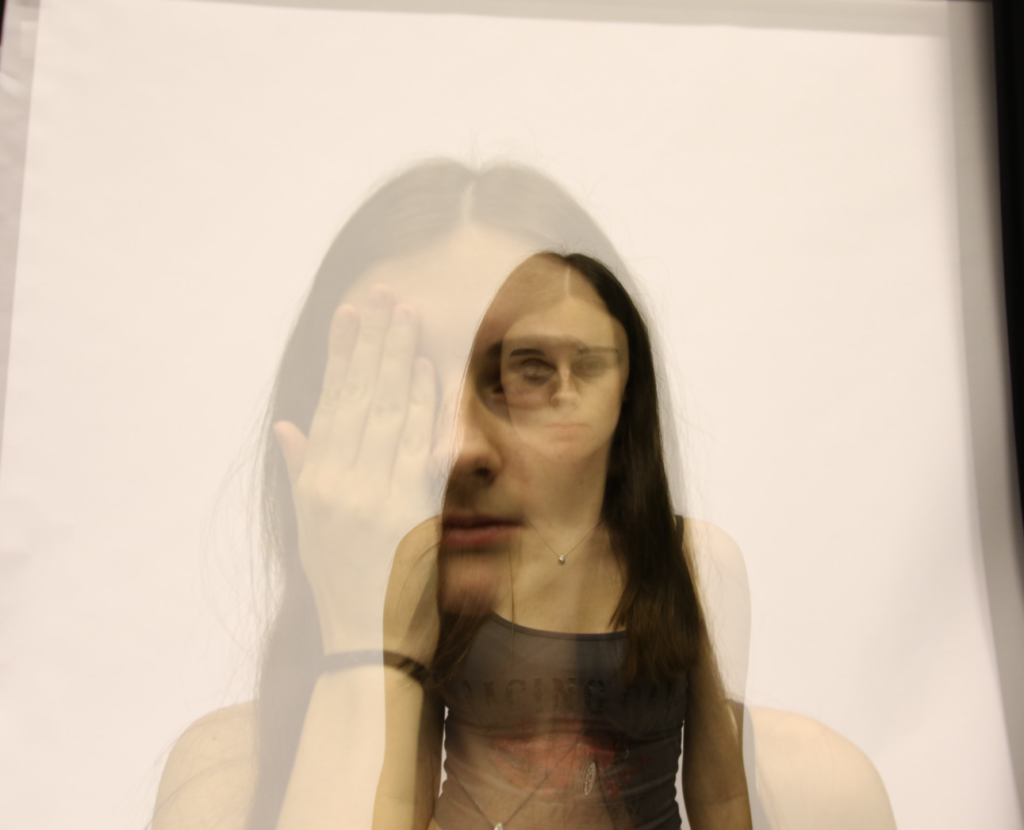
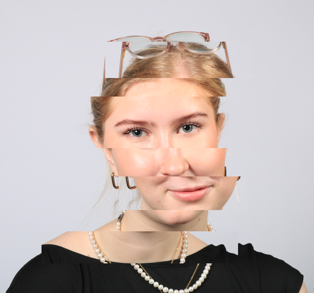
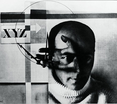
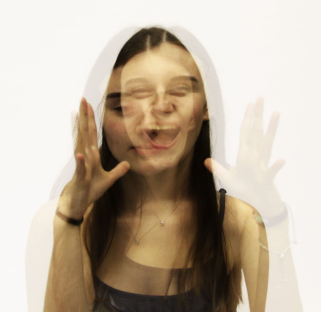
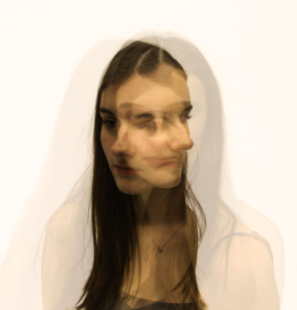
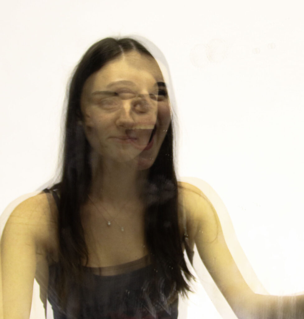
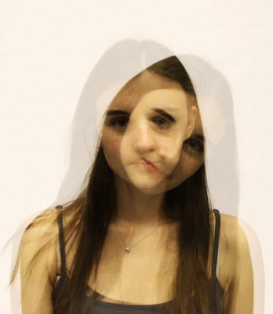
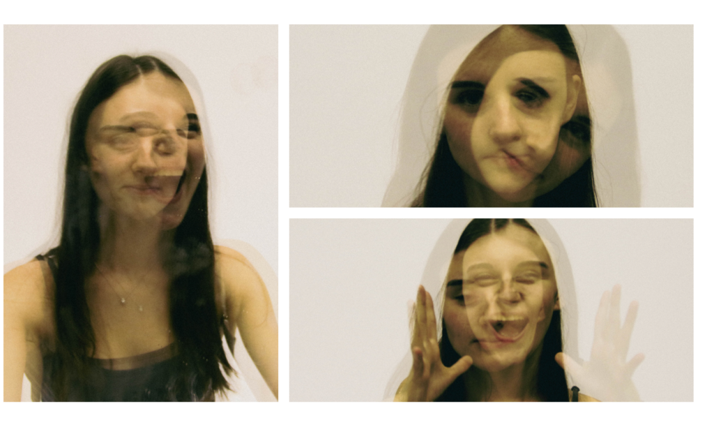
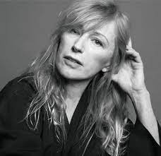
Clare Rae is an artist from Melbourne, Australia who makes photographs and moving image works that examine representations of the female body via an exploration of the physical environment. Rae came to see Jersey as part of the Archaise international artist-in-residence programme in 2017. She was researching the Claude Cahun archive .Rae is very inspired by Cahun. She was shooting new photography and film in Jersey, as well as doing workshops.
From her research she produced a new body of work, Entre Nous (between us);Claude Cahun and Clare Rae. That was exhibited at the Centre for Contemporary Photography, Melbourne Australia 22 March – 6 May 2018, and subsequently at CCA Galleries in Jersey, UK, 7–28 September 2018.
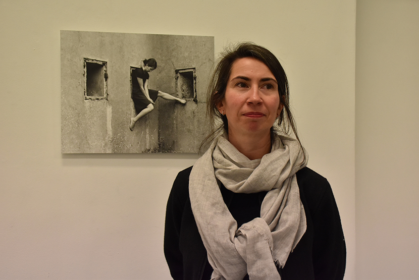
This is from her series Standing On Her Own Two Feet.
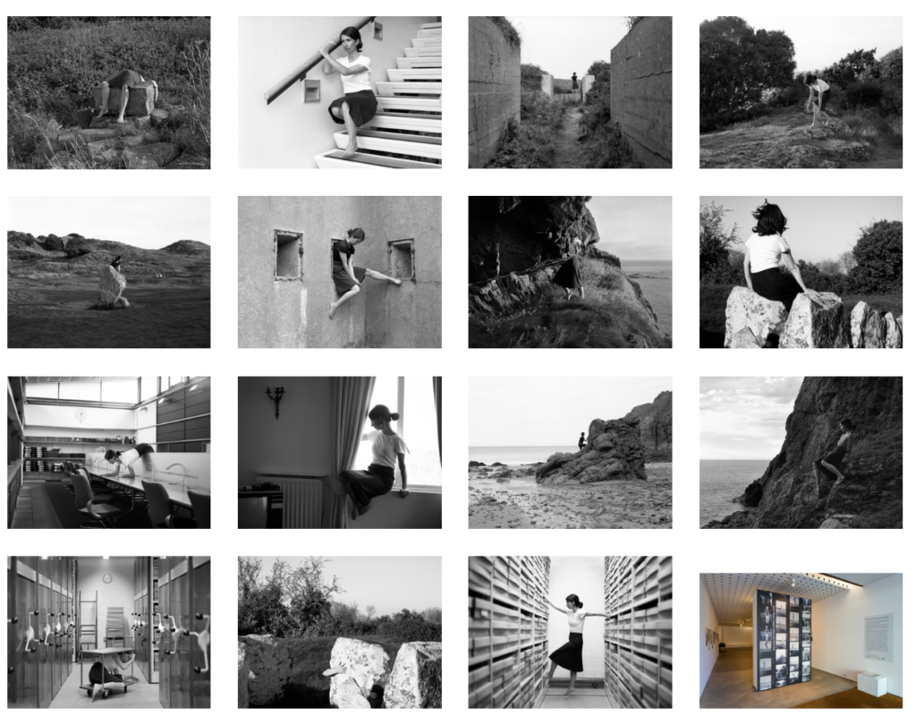
In her series, Never standing on two feet, Rae considers Cahun’s commitment with the physical and cultural landscapes of Jersey, an aspect of her work that has received not a lot of analysis to date. Rae writes:
Like Cahun’s, my photographs illustrate my body in relation to a place; in these instances sites of coastal geology and Jersey’s Neolithic ritual monuments. I will use a visual dialogue between the body and these environments, and will trial how their photographic histories impact upon contemporary engagements. Cahun used self-portraiture to overthrow the dominance of the male gaze in photographic representation of the female body in the landscape of Jersey .
My practice is invested in the feminist act of self-representation and I draw parallels between my performances of increasing vocabulary of gesture and Cahun’s overtly performative images of the body expressing a multiplicity of identity. In this series, I tease out the interpretations inherent in landscape photography. I will be using gestures and the performing body to contrast and unsettle traditional representations of the female figure in the landscape.
Image Analysis
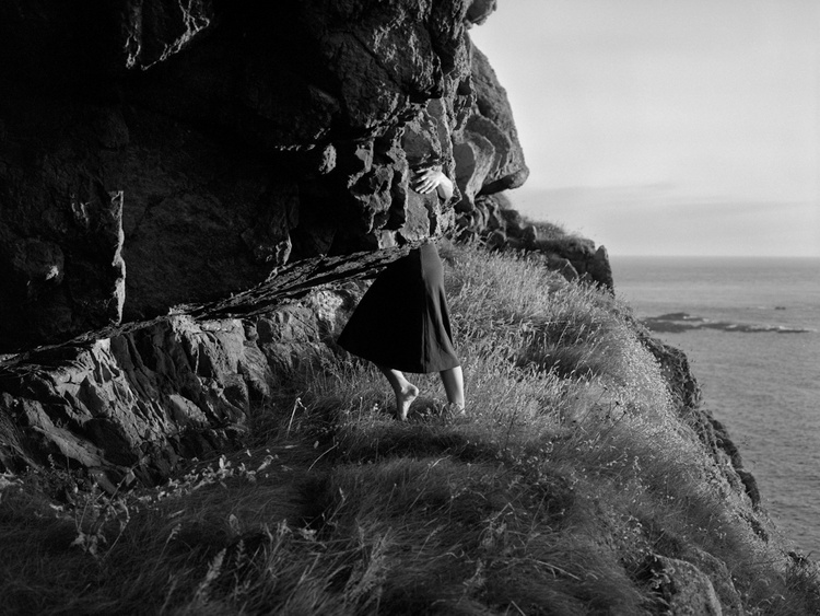
Visual
In the image there is a large rock covering Rae’s face. I think these rocks are granites, gabbros and diorites, since Jersey is very famous for these rocks and they are the most common rocks as well. One leg is straight which is the left and the right leg is slightly bent to create this pose. In this angle it looks like a skirt is being worn from the waist down. In this image they are holding a rock which my show the connection to family.
Technical
This photo is a half body shot due to her face not being present. In this image there is little to no lighting due to the image being very black and white, so there is no colour present. In the background there is no focus which means the aperture is very large, with a large hole in the middle of the camera and a very shallow depth of field.
Contextual
Some types are connected to rocks and buildings which suggest attachment. I utilise gesture and the performing body to contrast and unsettle traditional representations of the female figure in the landscape. This may suggest rocks are too heavy for women. This was influenced by Claude Cahun.
Conceptual
Through my photographic performances I will research specific gestures and movements undertaken within public and private spaces, considering the impacts on the body by educational and institutional authority. This is linking to Morden day portraits.
Artist Number 2
Claude Cahun
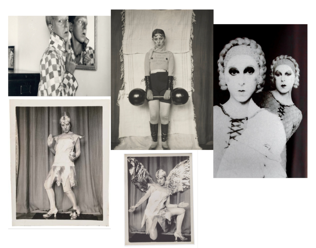
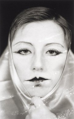
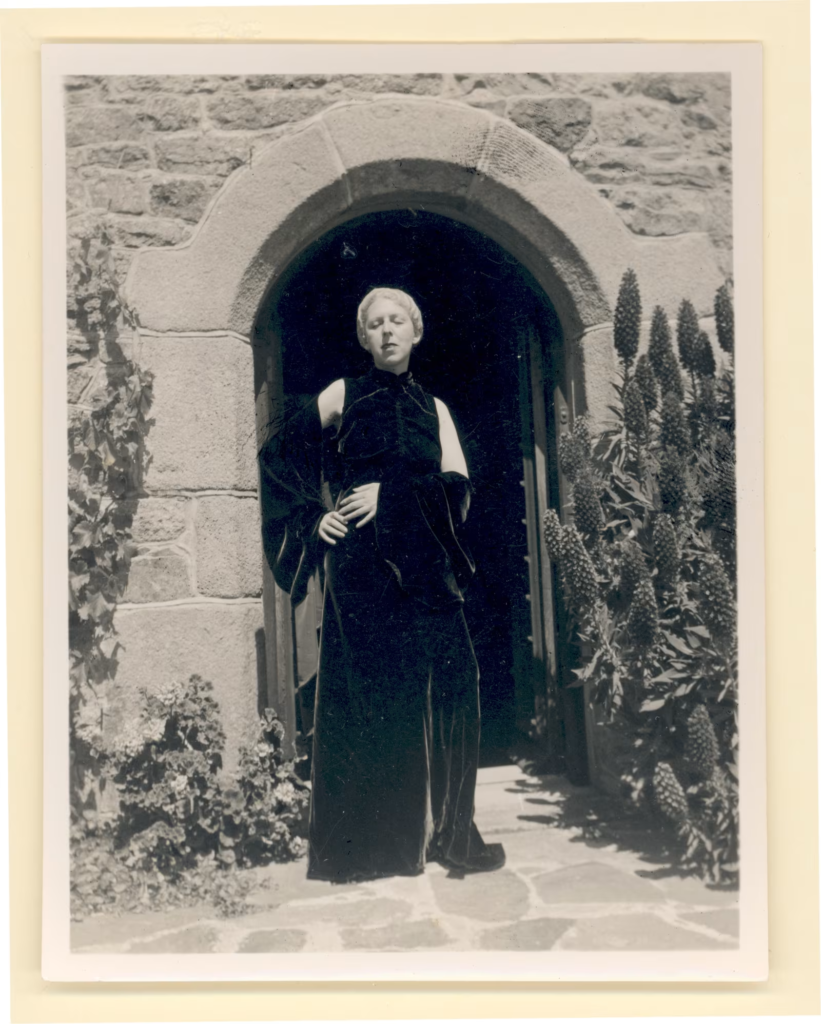
Claude Cahun (born October 25, 1894, Nantes, France—died December 8, 1954, St. Helier, Jersey) was a French writer ,photographer, surrealist and a performance artist. Who was largely written out of art history until the late 1980s, when her photographs were included in an exhibition of Surrealist photography in 1986.
In early-20th-century France, when society were normally considered women to be women and men to be men, Lucy Schwob decided she would rather be called Claude Cahun. It was her way of protesting gender and sexual norms.
One of the most interesting figures to emerge from the island’s artistic community is Claude Cahun, a ground-breaking artist whose work challenged traditional gender roles and explored themes of identity, resistance, and self-expression. Surrealism will aims to revolutionise human experience.
She used self-portraiture as a tool to deconstruct and explore various personas, often presenting herself in androgynous or fragmented forms. Through costumes, makeup, and props, Cahun blurred the lines between masculinity and femininity, demonstrating that identity is not fixed but rather fluid and performative. Her work aimed to provoke viewers to rethink conventional notions of gender and self-expression.
Cahun’s relationship with Jersey began extremely early, with childhood holidays spent in Jersey and Brittany. They were born Lucy Schwob in Nantes, France to a wealthy and well off Jewish family. In 1937, Cahun moved to Jersey with her partner, Marcel Moore. But in their late teens and early twenties Cahun had been looking for a new, gender-neutral name for a while.

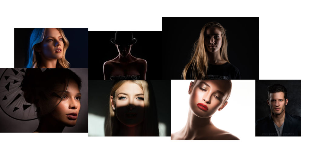
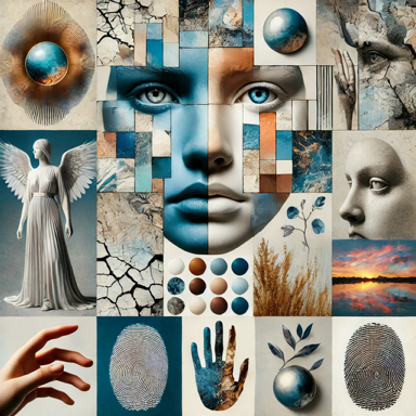
A Mood-board of Cahun’s work
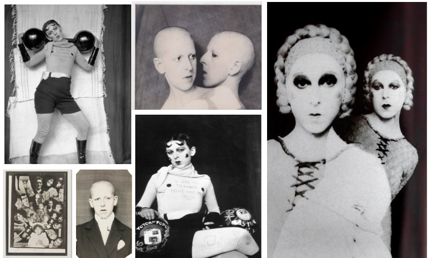
Image Analysis
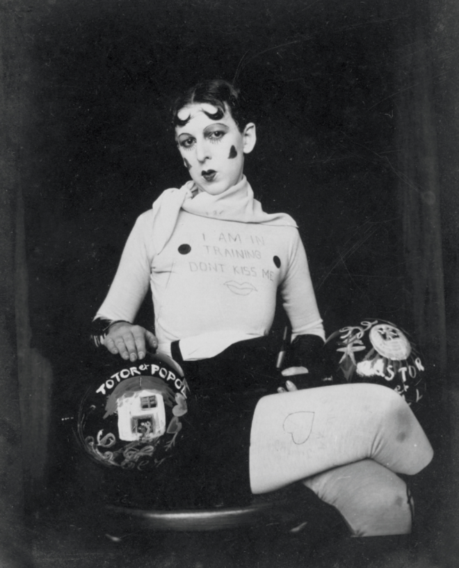
Visual
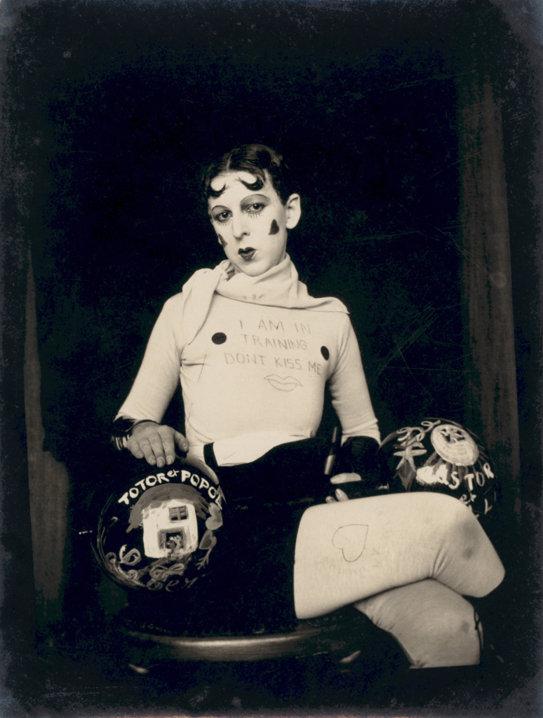
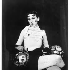
In the image there may be a man or a woman due to Cahun becoming gender neutral later in life. . In this photograph, Cahun is posed facing to the camera, yet her gaze is directed downward, with her face isn’t obscured by any part of her body. This creates a sense of mystery and ambiguity, which makes the viewer’s ability quite hard to categorize her into a traditional gender role. The obscured face also speaks to Cahun’s exploration of the fluidity of identity, rejecting fixed, conventional representations.
The object Cahun holds in her hands is a dumbbell, was not something a female figure would usually have in the 1920s considering, it was made for men because they are classed as “strong”. A time when women were often portrayed as delicate and gentle. The dumbbell implies strength, power, and physicality, which is in contrast to the more elegant, ornamental role which was often assigned to women. The choice of this object reinforces Cahun’s rejection of gender norms and her embrace of physicality, autonomy, and control over her identity.
Technical
The photograph used artificial lighting, likely studio lighting, given the sharp contrast between light and shadow. The light contours Cahun’s face and hands , which means the viewers eye is getting immediate attention to where the face and hands are positioned.
The background is blurred which will give a shallow depth of field, which suggests that a wide aperture (low f-stop) was being used. This sharp focus on Cahun’s figure, contrasted with the soft and out-of-focus background, which will direct the viewer’s eyes on her and the symbolic elements she presents, such as the dumbbell and the sign.
The image is caught from a straight-on or slightly elevated angle. This neutral and original angle will emphasize the subject’s self rule and implies that Cahun is presenting herself on her own terms, without depending on traditional hierarchical positioning.
The image was taken at a three-quarter body shot, focusing on Cahun’s torso, waist and hands. This framing allows for a accurate examination of the subject and the symbolic elements that will make up the image ,while also depending on the performative nature of Cahun’s self-presentation. The three-quarter shot also will allow for a sense of confidence while keeping the viewer at a slight distance, which keeps the public a certain distance away so thy can’t interfere.
Contextual
She wears a loose, neutral outfit, steering away from the traditional feminine dress of the time. This ambiguity in dress further tests the social expectations of how women were expected to look like in the 1920s.
In the 1920s and 1930s, women had to follow a strict dress presentation. The 1920s, known as the “Roaring Twenties,” saw the rise of the “New Woman,” which were more self-reliant, more mobile in public spaces, and more vocal about particular rights. This period also was a victory of women’s suffrage in many Western countries. However, many social pressures still remained, especially as the Great Depression in the 1930s was a return of the more traditional, conservative gender roles. In this context, Cahun’s work responds to these shifting dynamics, particularly the tensions between newfound freedoms and the persistent constraints on women’s roles.
Conceptual
Cahun’s works on the challenges of the rigid roles that were imposed on women between the 1920s and 1930s, using her art to critique both gender expectations and the broader societal limitations placed on individuals. By adopting an different appearance and rejecting the traditional representations of femininity, Cahun declines the traditional gender expectations in the 1920s-1930s.
The sign on Cahun’s chest, “I am training – don’t kiss me,” serves as a direct acknowledgement of the independence and autonomy. It suggests that Cahun is focused on her personal growth, which suggests this ants really expected from women because it implies using dumbbells in the gym.—whether intellectual, artistic, or physical—and rejects the idea of being defined by romantic or sexual attraction. The phrase “don’t kiss me” further suggests a refusal of being known as an object and a desire to assert control over how others interact with her.
Artist Number 3
Gillian Wearing
Gillian Wearing is a CBE, Who is an English conceptual artist, one of the Young British Artists, and winner of the 1997 Turner Prize. In 2007 Wearing was elected as lifetime member of the Royal Academy of Arts in London (RAAL).She was Born :December 10,1963,which will make her 61yrs.
Wearing was part of a movement where conceptual as very popular. This type is of art is from the mid-1960s to the mid-1970s. Conceptual is where the ideas are more important than the actual image.
Wearing, was initially inspired by fly on the wall documentaries such as Michael Apted’s Up series, which is about lives of others and her own family history; she uses photography, video and a range of devices to reveal and include personal details. Wearing also uses documentaries in her work.
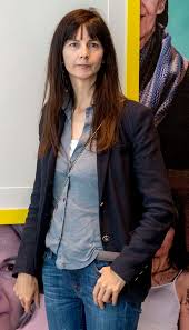
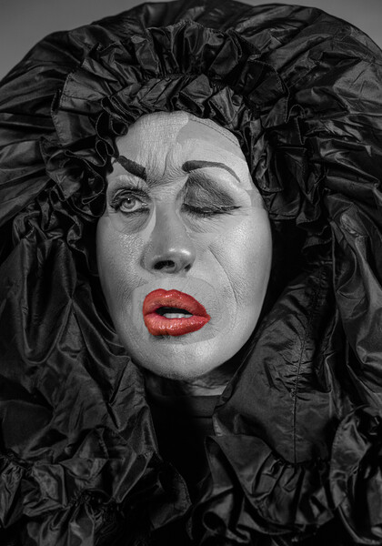
A Gallery of Her Work
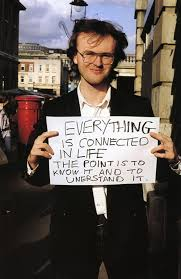
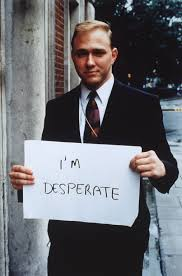
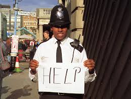
These images are from her ‘Signs that Say What You Want Them To Say and Not Signs that Say What Someone Else Wants You To Say’.
Image Analysis

Visual
In this image there is a man holding up a piece of paper saying ‘I’m Desperate’. ‘I’m Desperate’ may imply he may be in danger due to the environment he’s in The environment looks a bit run down due to slight bits of rubbish in the background. The man is standing straight up and straight on which means the man is clearly seen. This man is wearing a suit which suggests he may be rich and wealthy, since suits were expensive back in the 1990s.By wearing a suit may imply a certain amount of power.
Technical
In this image the aperture is a low F-number due to the shallow depth of field and the background has also been blurred by the camera. This photo was taken was taken in all natural lighting because it outside and there no other light sources appearing on it. If you look closely on the photo there may of been a slightly high ISO in some parts of the image due to some visual noise appearing which will give the image a degrading quality. The visual noise slightly appears on the Blue, navy blazer. This is three quarter shot due to the legs not being shown. This image is zoomed in which means you can see the finer details. The three quarter body shot will highlight the facial characteristics while still giving a close view of the body.
Contextual
Lad culture (also the new lad, laddism) was a media-driven, principally British and Irish subculture of the 1990s and the early 2000s and it was the main culture. The statement lad culture continues to be used today to refer to collective, boorish or misogynistic behaviour by young heterosexual men, particularly university students.
By the 1990s the notion of a crisis of masculinity in con temporary life had begun to make news headlines. Concerns were raised about “deadbeat dads” and the increase of the “angry white man” as a voter type.
As the 90s dawned things were looking up for women. Daughters of second-wave feminism came of age and chose new paths unavailable to their mothers: delaying marriage and children, pursuing higher education, joining the workforce, and were assuming independence and identities outside of the home.
Conceptual
It also wasn’t traditional for women to go through to higher education until the late 90s.
It was right for men to wear proper suits and have only men jobs. E.G Builders and many more. Signs that say what you want them to say and not Signs that say what someone else wants you to say. HELP, 1992-1993. Gillian Wearing’s candid videos and photographs reveal the disconnection between inner lives and public personas.
