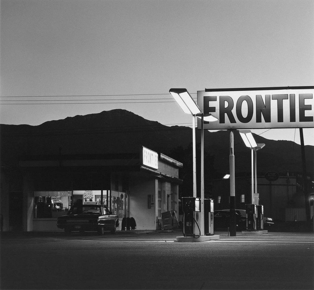
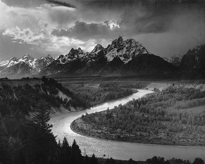
Landscape photography used to be about capturing nature at its most dramatic and untouched. But in 1975, a group of photographers took a different approach. Instead of photographing mountains and forests, they focused on suburbs, industrial sites, and parking lots, everyday places shaped by people. This style became known as New Topographics and changed the way we think about landscapes.
Where Did New Topographics Come From?
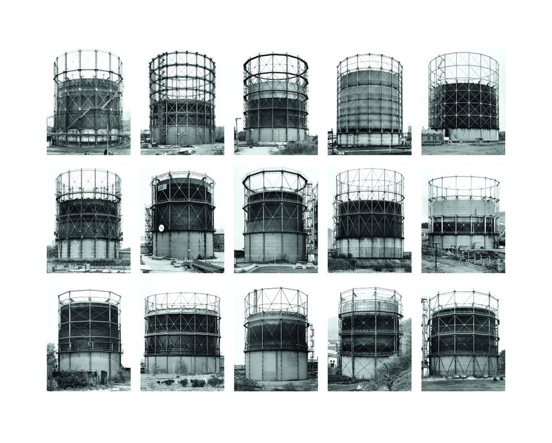
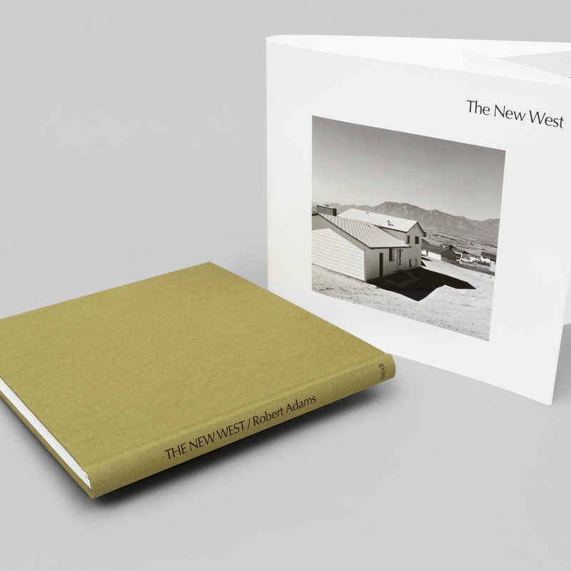
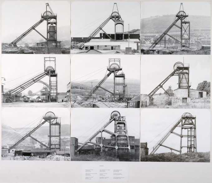
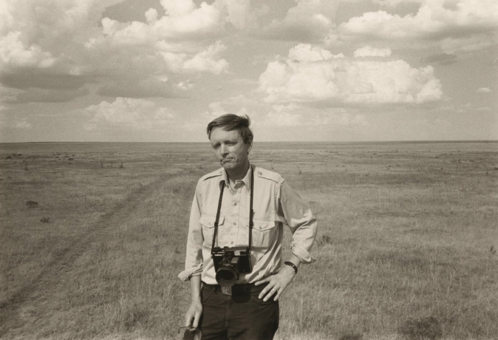
The term New Topographics came from a 1975 exhibition at the International Museum of Photography in Rochester, New York. Curated by William Jenkins, the show featured photographers like Robert Adams, Lewis Baltz, Bernd and Hilla Becher, and Nicholas Nixon, who all photographed human-altered landscapes in a neutral, documentary style.
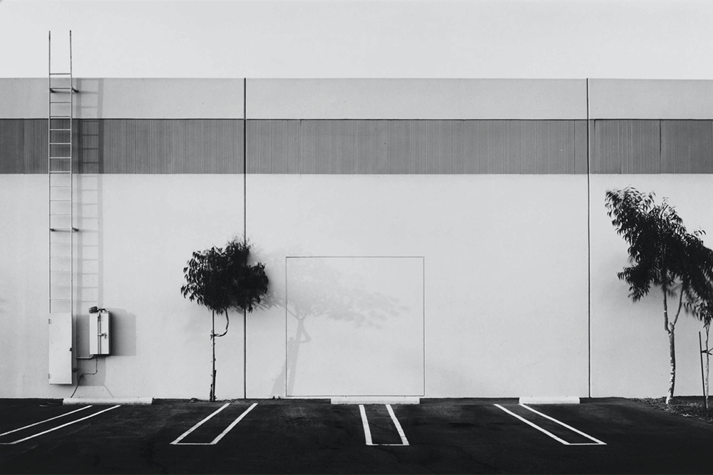
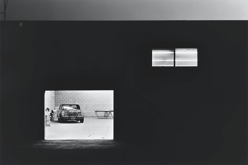
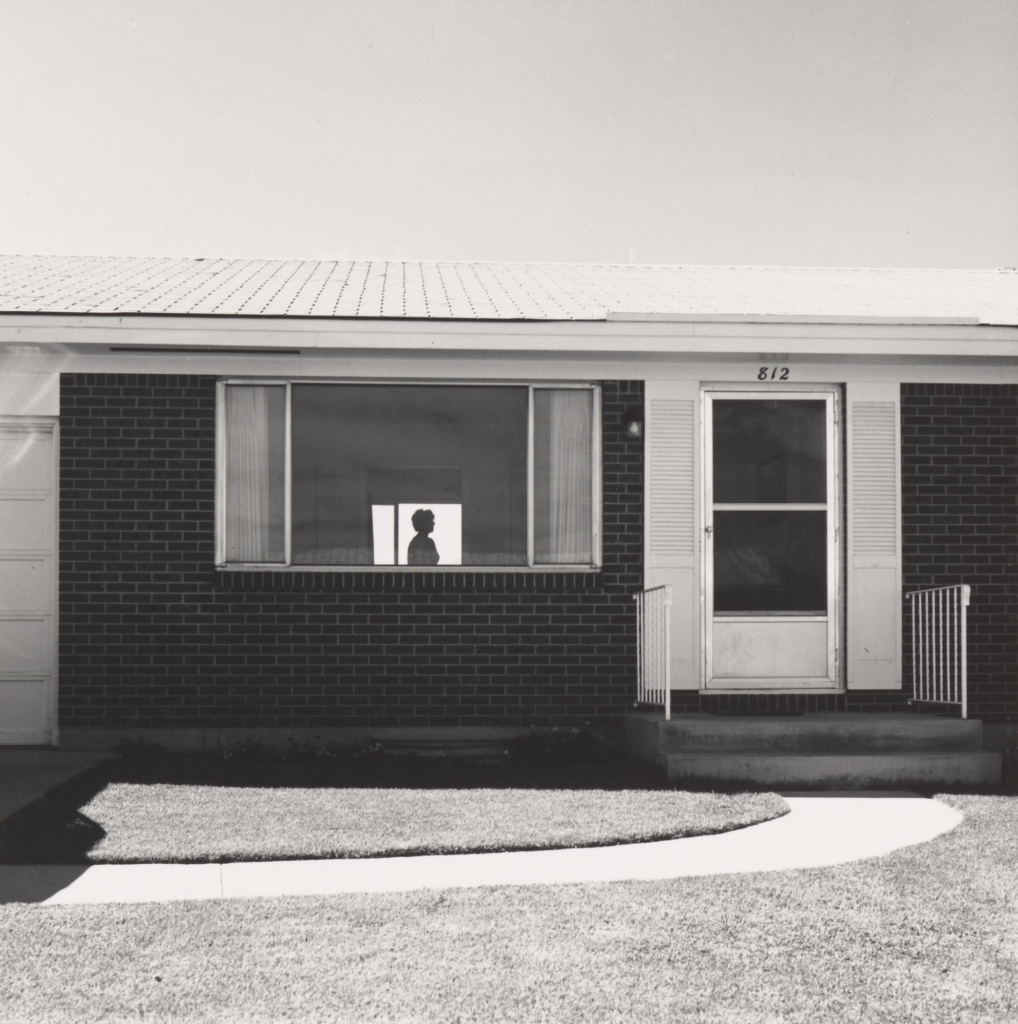
Their images weren’t meant to be beautiful or dramatic. They were often black and white, simple, and straightforward, just showing the way things were, without adding emotion or judgment.
Robert adams
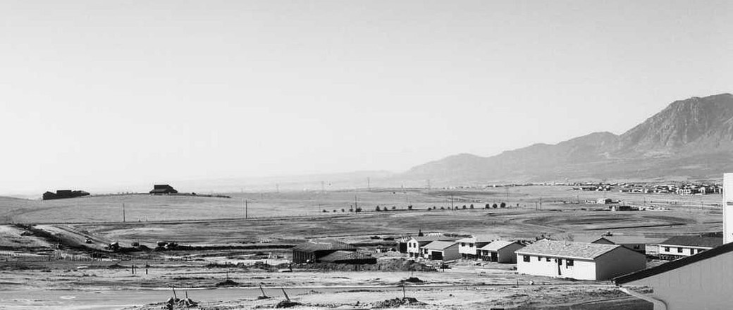
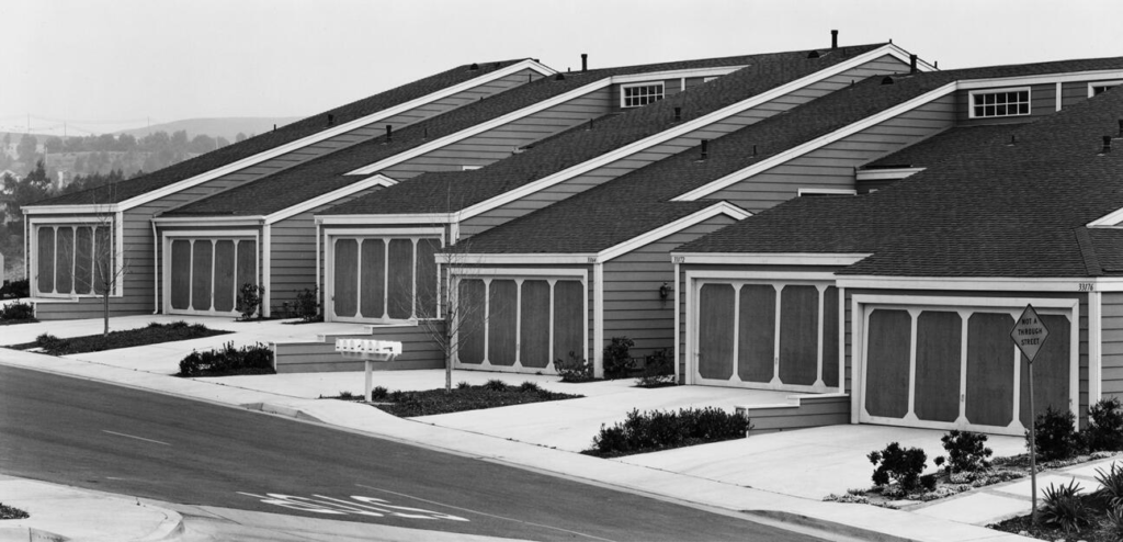
One of the most influential photographers in the New Topographics movement was Robert Adams. His work focused on the rapid urbanization of the American West, particularly in Colorado. Adams documented how new housing developments, roads, and industry transformed the once-open landscapes.
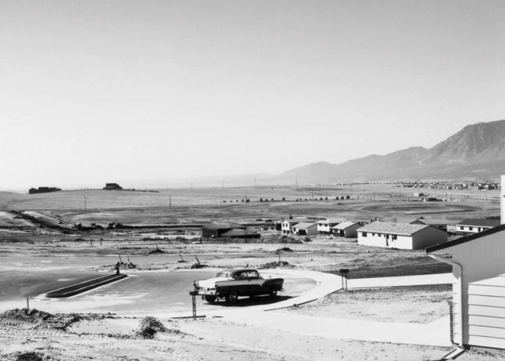
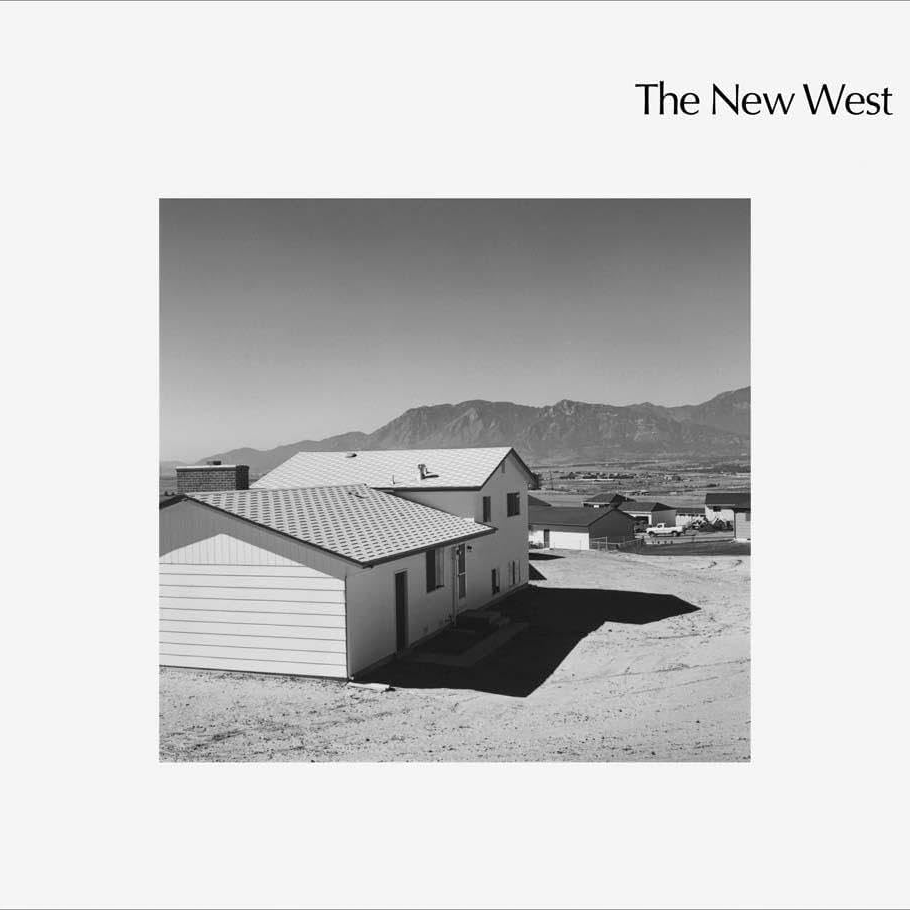
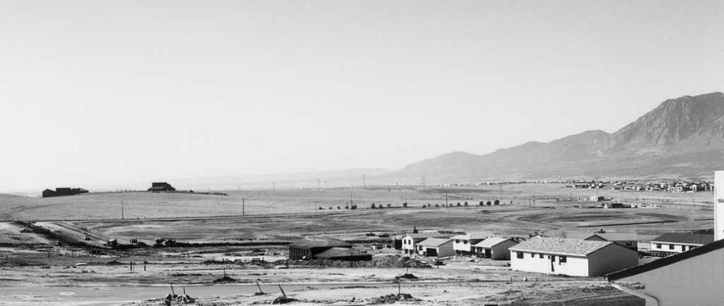
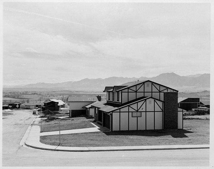
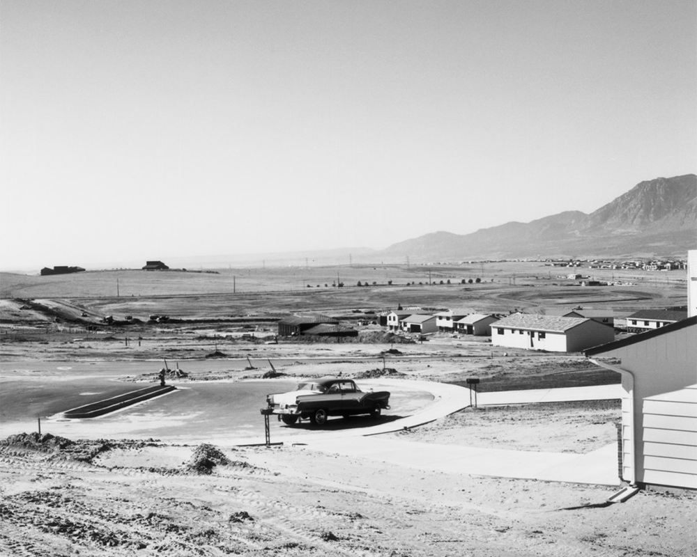
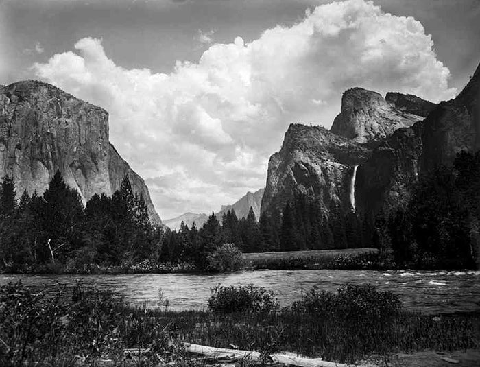
His photos often present stark contrasts between nature and human expansion. In images like Colorado Springs, Colorado, 1968, Adams captures rows of identical houses against vast, empty skies. The uniformity and repetition of these structures highlight the loss of individuality and natural beauty in the push for economic growth.
Adams’ work isn’t entirely pessimistic, though. While his images show environmental change and urban sprawl, they also find quiet beauty in the ordinary. His compositions are carefully framed, making even mundane subjects, like highways or suburban fences, visually striking. His photography encourages us to look at familiar places differently, questioning how we shape and experience the world around us.
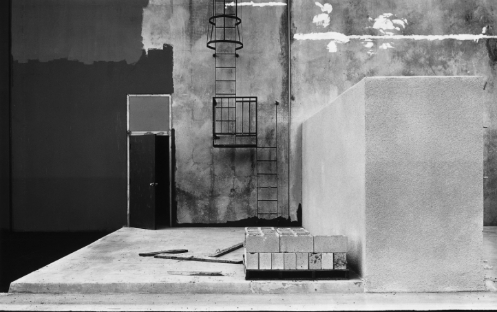
Image Analysis
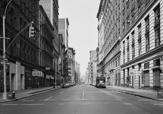
Robert Adams’ Colorado Springs, Colorado, 1968:
Technical
- Camera and Film: Adams likely used a medium or large-format camera, which gives a lot of detail and depth to the image.
- Exposure and Lighting: The lighting looks natural, with soft shadows and clear highlights. It feels like it was taken in the late afternoon, with a balanced exposure showing both light and dark areas clearly.
- Composition: The photo is well thought out, with elements like the land, sky, and possibly some buildings placed carefully. The horizon line is low, making the sky feel vast.
Visual
- Tone and Contrast: Since it’s black-and-white, the contrasts between dark and light are important. The stark contrast gives the photo a clean, sharp look that adds to the feeling of openness.
- Subject Matter: The focus is on wide, open spaces, often with very little human presence. Any human-made structures are small, showing how nature dominates the scene.
- Space: There’s a lot of empty space, making it feel wide and open. This can give a sense of loneliness or isolation.
Contextual
- Historical Moment: The photo was taken in 1968, during a time when cities were rapidly growing, and suburban sprawl was taking over. This fits into Adams’ focus on how human development was starting to change the natural landscape.
- Environmental Impact: Adams is known for photographing the American West, especially focusing on how urbanization and development were affecting the environment.
- Adams’ Perspective: He loved the American West and wanted to capture it before it was changed forever. In the late ’60s, he started showing the effects of that change, highlighting the quiet, sometimes sad consequences of human growth.
Conceptual
- Nature vs. Civilization: The photo highlights the tension between the open land and the human structures that are slowly taking over it. It’s a reminder of how much nature is being altered by development.
- Solitude: The wide, empty spaces give a feeling of loneliness. The smallness of human figures or buildings in the scene makes you think about how we’re just one part of a much bigger, more powerful world.
- Critique of Development: Adams is kind of questioning the idea of constant growth and progress. The photo feels like a commentary on how human development might be coming at the cost of something beautiful.
What Was New Topographics a Reaction To?
Before this movement, landscape photography often romanticized nature, ignoring how people had changed the environment. New Topographics photographers challenged that idea, documenting the way human expansion had reshaped the landscape.
Historical Context
It was also a response to what was happening in post-war America. After World War II, there was a housing boom, highways expanded, and shopping malls took over open land. Cities grew fast, and suburbs spread further out. These photographers were capturing that shift.
At the same time, environmental issues were becoming more noticeable. Industrial development and urban sprawl were raising concerns about pollution and overdevelopment. While these photographers didn’t make direct political statements, their images highlighted the impact of human progress on the landscape.
Why It Matters
The 1970s was a time of big changes. The economy was shifting, inflation was rising, and protests for civil rights, women’s rights, and against the Vietnam War were shaping society. The landscapes captured by New Topographics photographers reflected this moment, a world where expansion, progress, and loss were happening all at once.
Their images still feel relevant today. Urban sprawl, industrialization, and environmental change haven’t slowed down. This style of photography makes us look at these spaces differently, not as background scenery but as part of the world we’ve built.
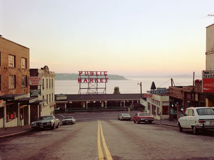
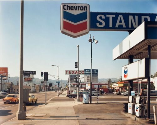
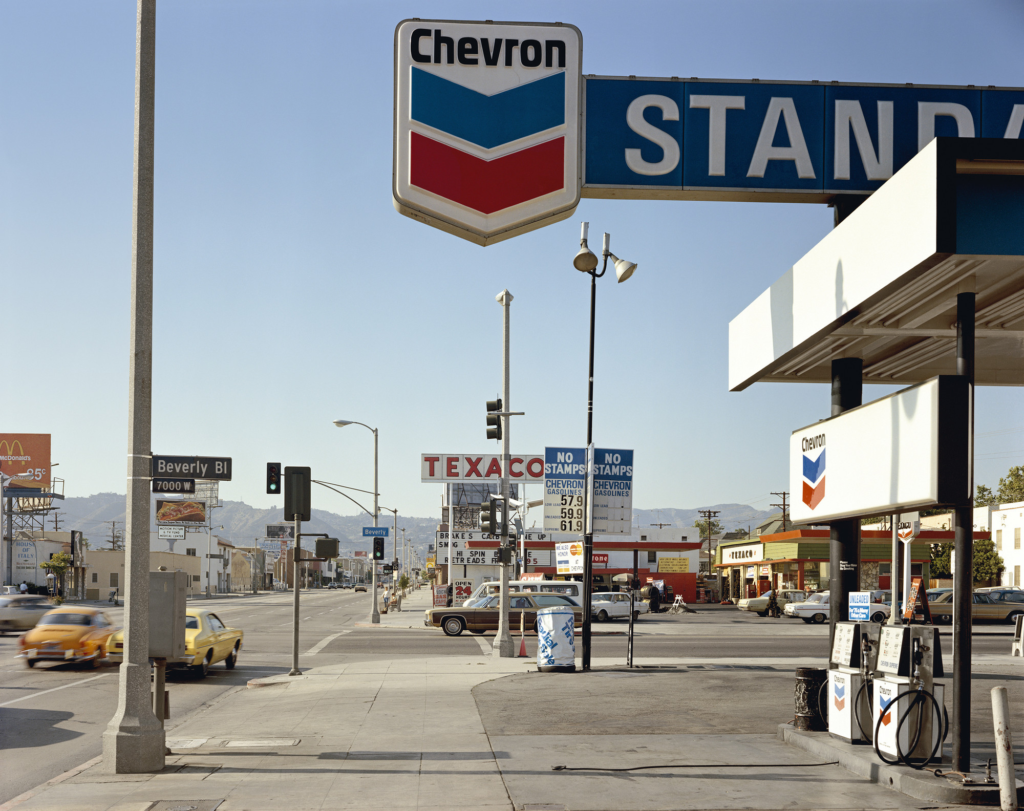
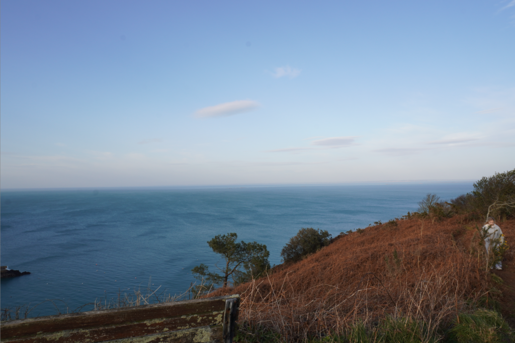
Stephen Shore, Beverly Boulevard and La Brea Avenue, Los Angeles, California, June 21, 1975, chromogenic colour print
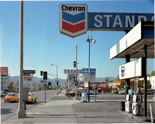
- Foreground vs background | Dominant features
- Composition | low horizon line | Square format
- Perspective and detail / cluttering
- Wide depth of field | Large Format Camera
- Colour | impact and relevance
- Nationalism vs mobility vs isolation
- Social commentary | The American Dream ?
- An appreciation of the formal elements : line, shape, form, texture, pattern, tone etc
Description:
Technical:
Stephen Shore’s photo of Beverly Boulevard and La Brea Avenue captures the harsh daylight of midday, where the sun is directly overhead, creating sharp shadows that give the scene a lot of depth and texture. The use of a large-format camera makes everything in the shot super detailed, from the cars on the street to the buildings and the trees. The chromogenic color print brings out the vivid colors, making even the smallest things stand out. The result is a super clear, almost crisp image that feels both real and slightly heightened, like you’re seeing the everyday world in a new way.
Visual:
The composition is all about the urban environment. You see a long stretch of road and low buildings, and there’s a sense of space that feels wide and open. The way the elements of the photo are arranged follows the rule of thirds to some degree, but it’s not strict. There’s a flow to the image, with the street and the buildings pulling your eye toward the horizon. The lines of the road and the edges of the buildings lead you into the distance, creating a sense of depth. The square format of the photo makes everything feel balanced, and the whole scene seems a bit compressed, like it’s all being funneled toward one point, adding to the feeling of space in the image.
Contextual:
This photo was taken in Los Angeles in 1975, a time when the city was all about cars and expansion. The image shows the effects of urbanization, with lots of streets, billboards, and cars, symbols of a rapidly industrializing America. The bright colors, reds, blues, and whites, could be nods to the American flag and what those colors represent in terms of national identity. The scene is a bit isolating, even though it’s a busy street, you don’t see much interaction between people. Instead, it’s all about the car culture and consumerism that defined the time. It feels like Shore is commenting on how progress and technology shape our lives, for better or worse, and how that can sometimes disconnect us from nature.
Conceptual:
The image is more than just a snapshot of Los Angeles, it’s a reflection on what America was going through at the time. The street seems to go on forever, pointing toward a future that’s all about roads and infrastructure. There’s this pull between the ideal of the open road and the reality of urban sprawl. The photo isn’t romanticizing the city but is more about observing it as it is, big, fast, and sometimes a little isolating. The cars and the billboards show the busy, consumer-driven culture, but the image also makes you think about where all this progress is taking us. It’s like the road stretches out, but does it lead to something meaningful or just more of the same?
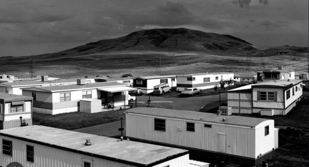
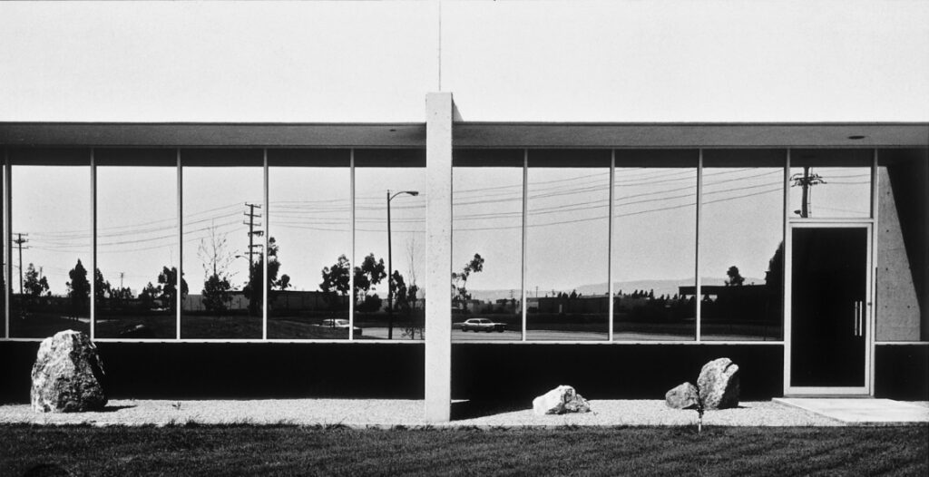
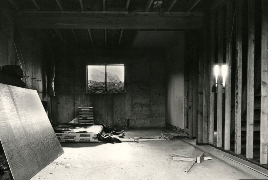
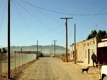
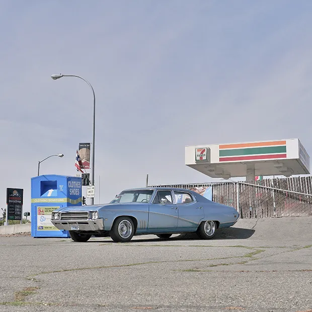
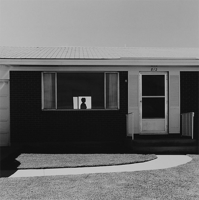
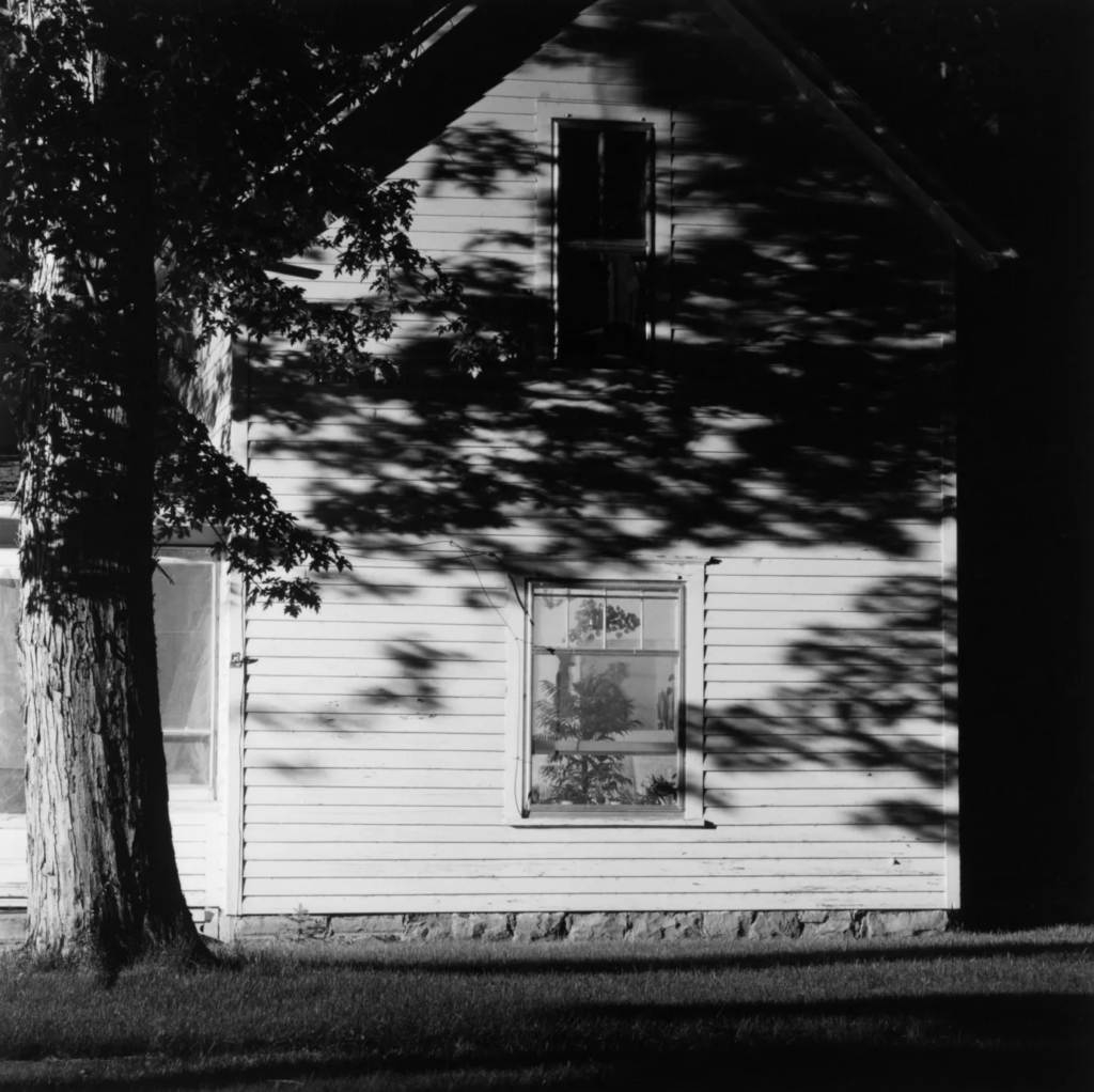
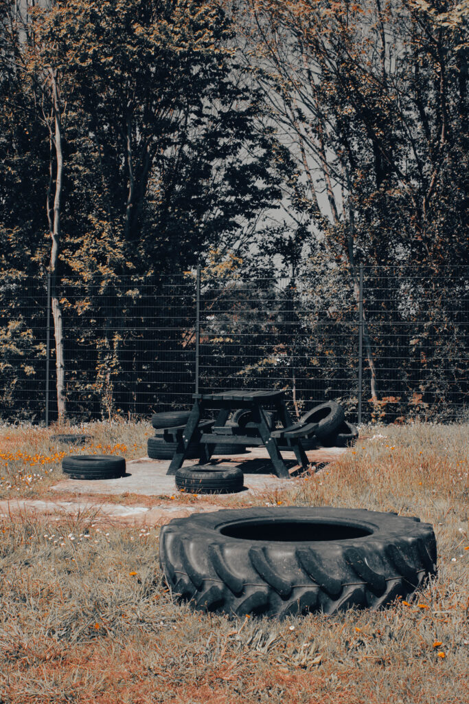
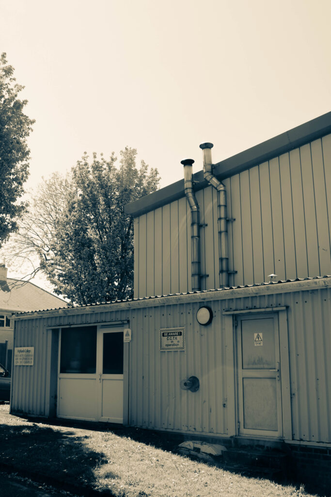
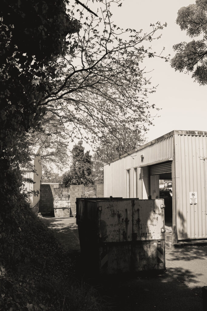
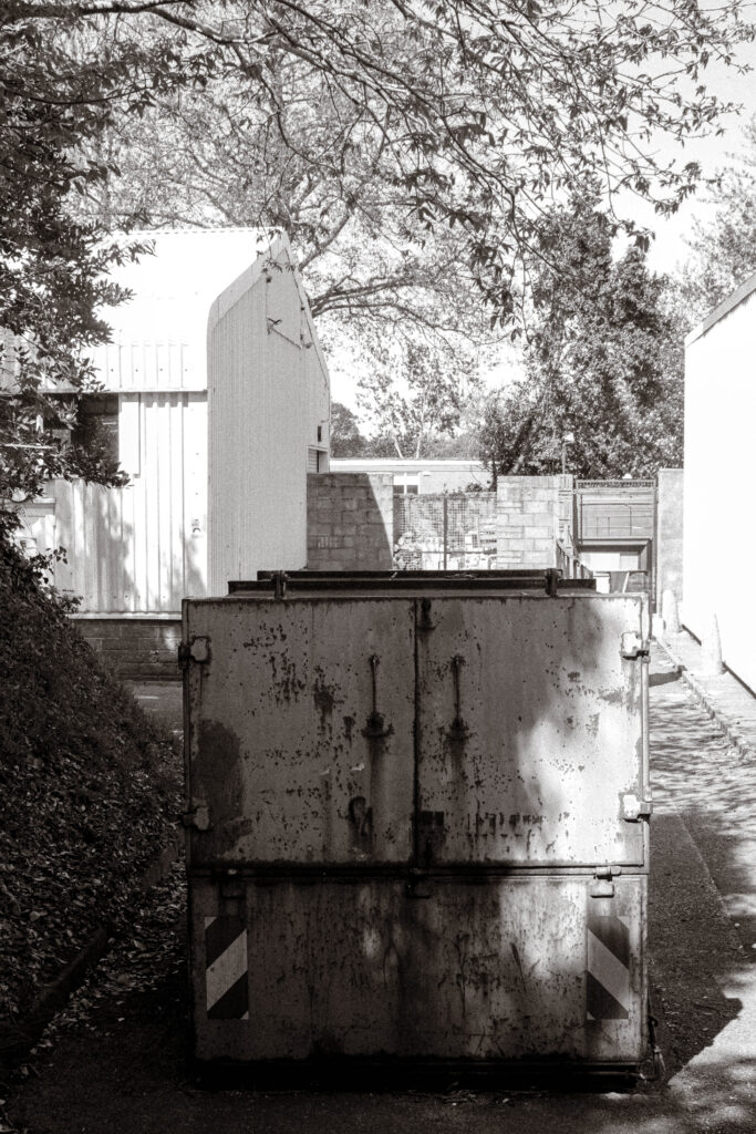
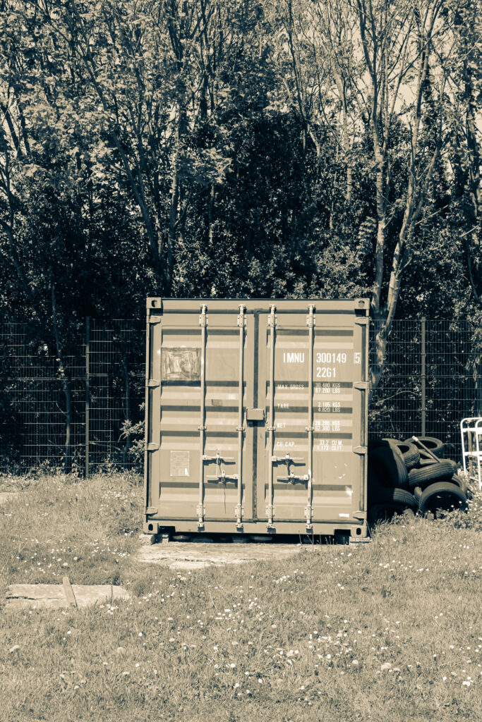
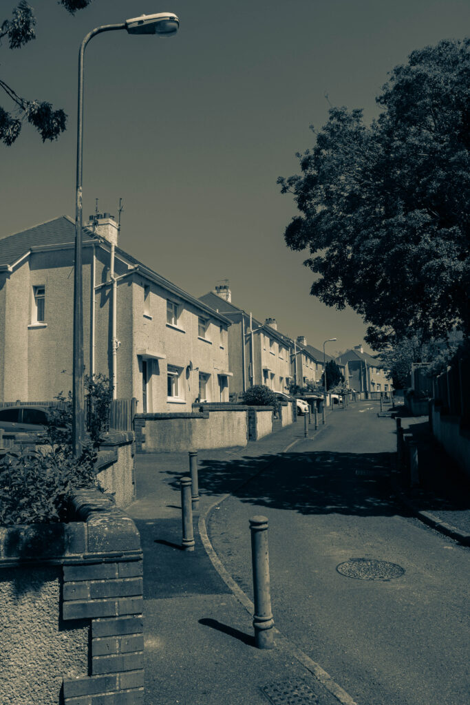
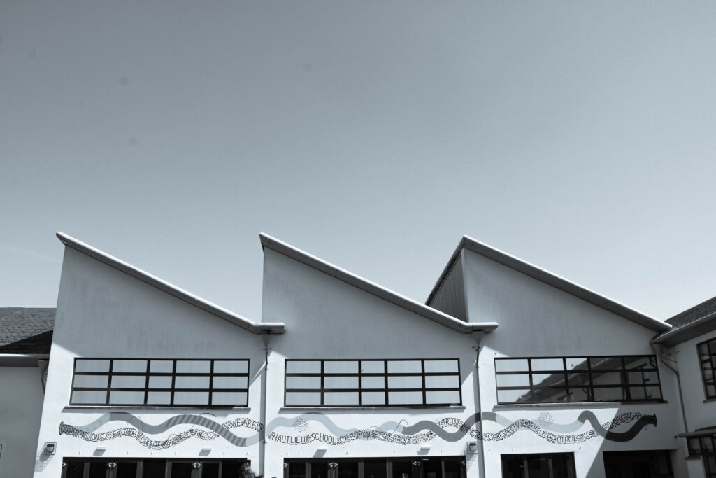
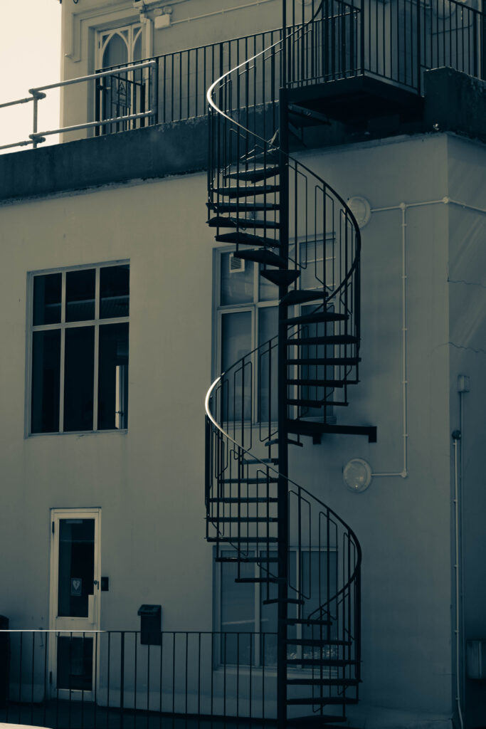
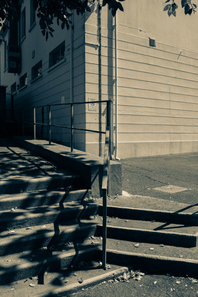
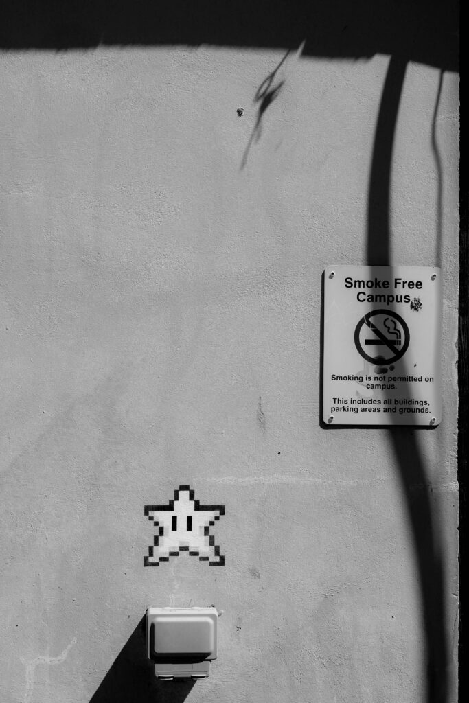
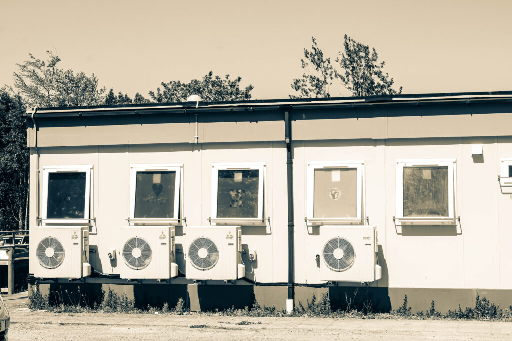
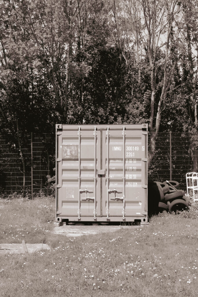
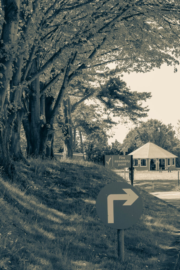
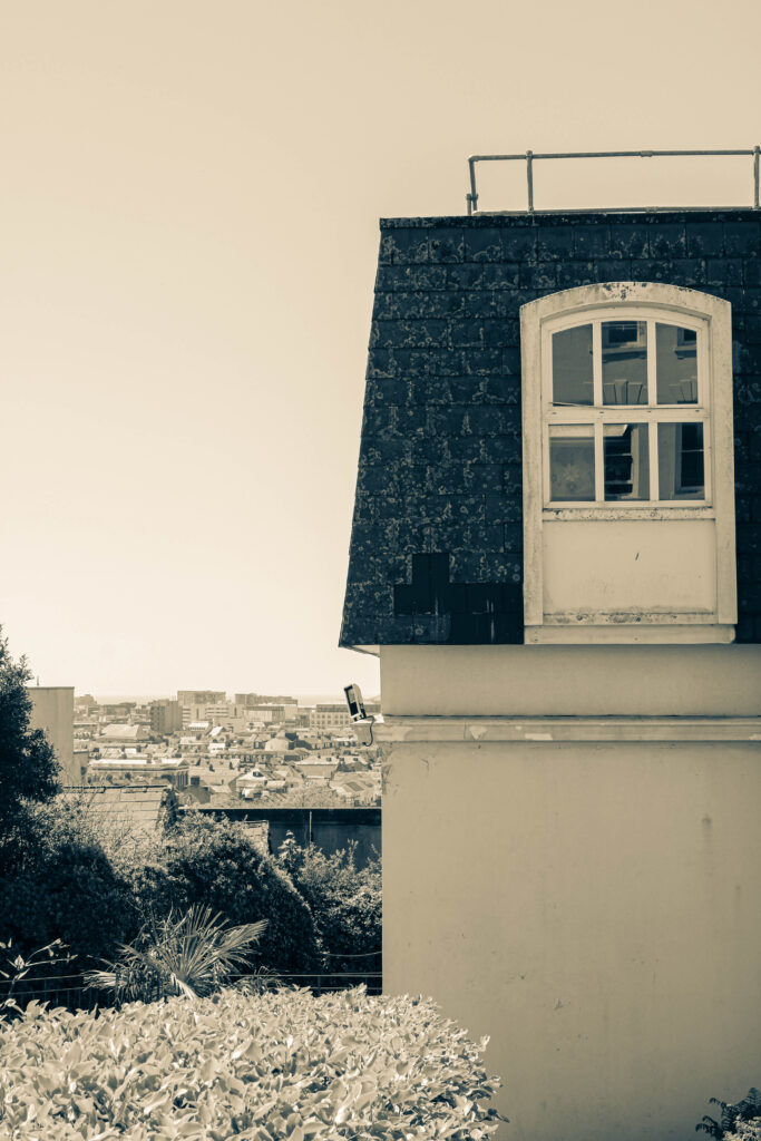
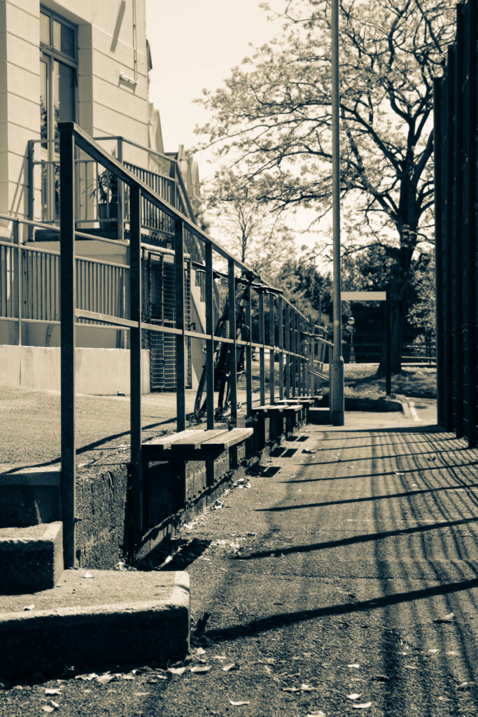
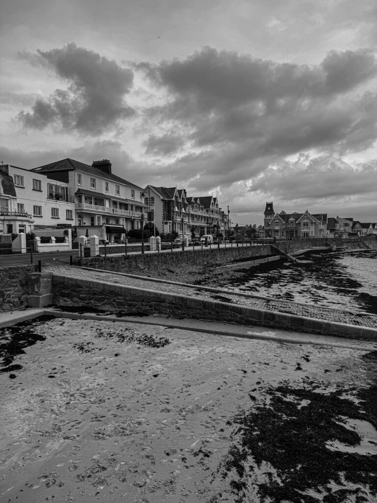
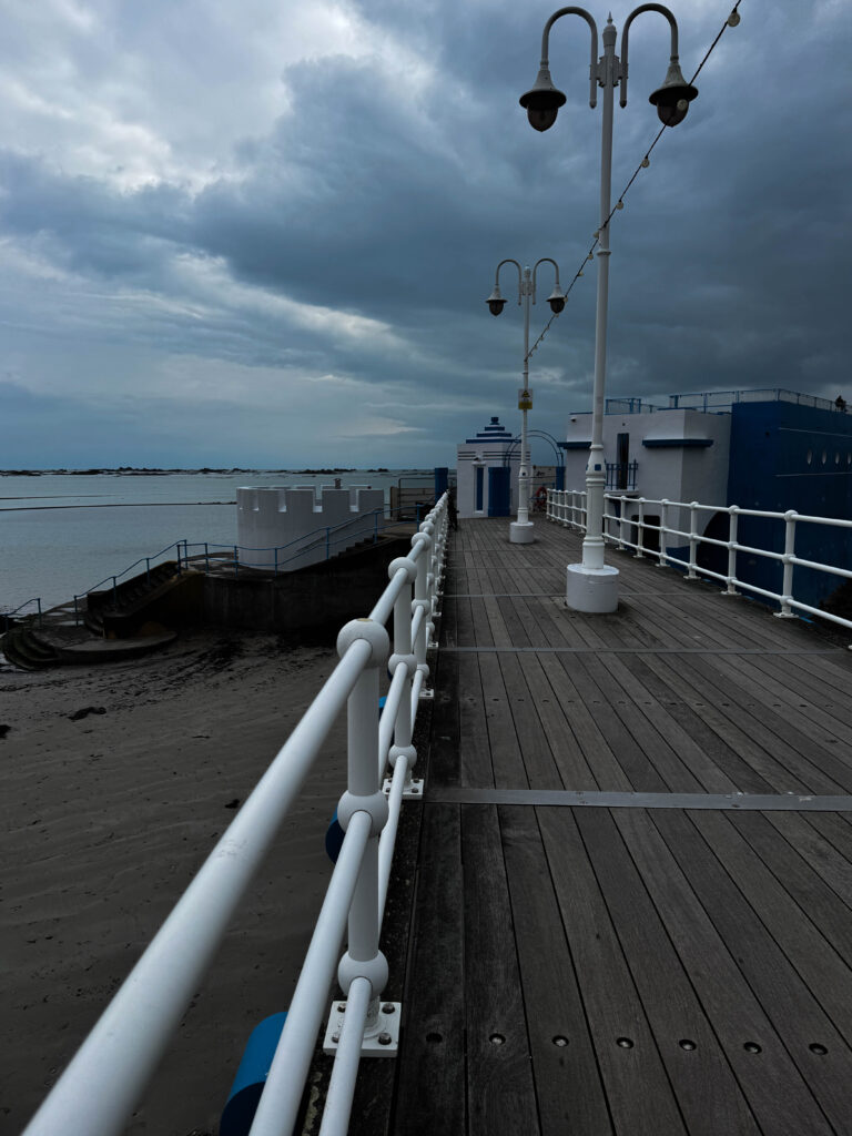
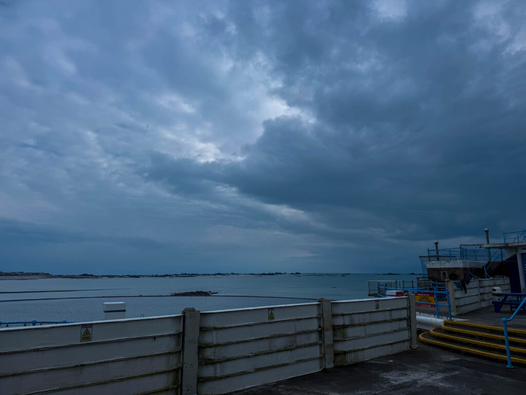
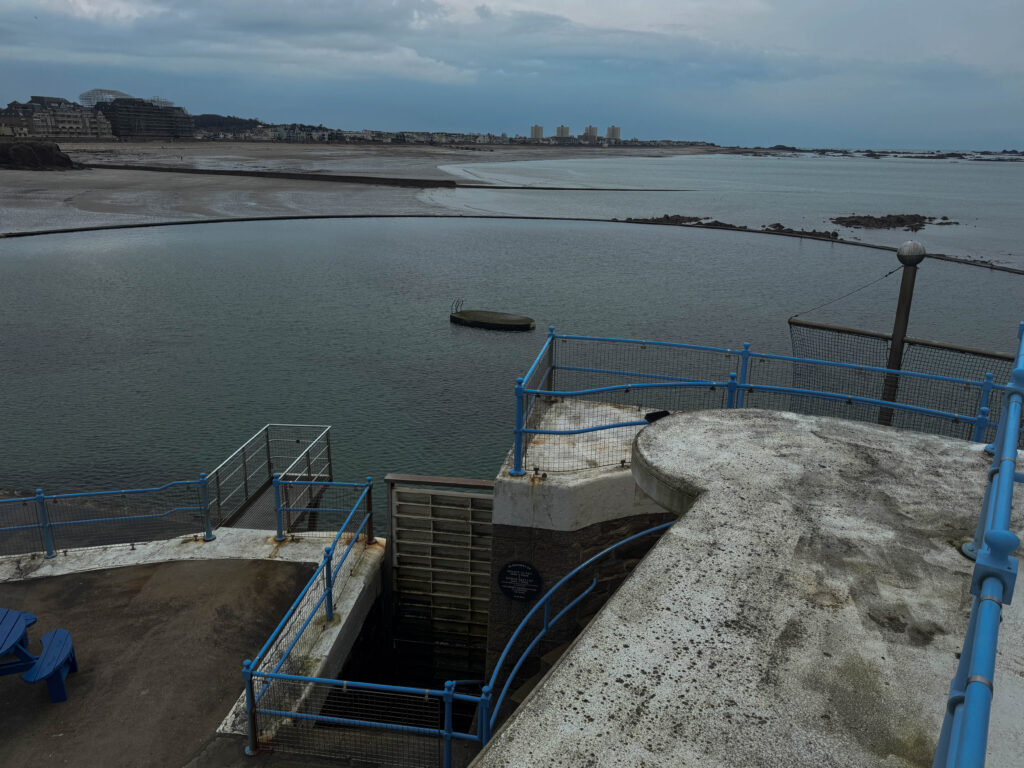
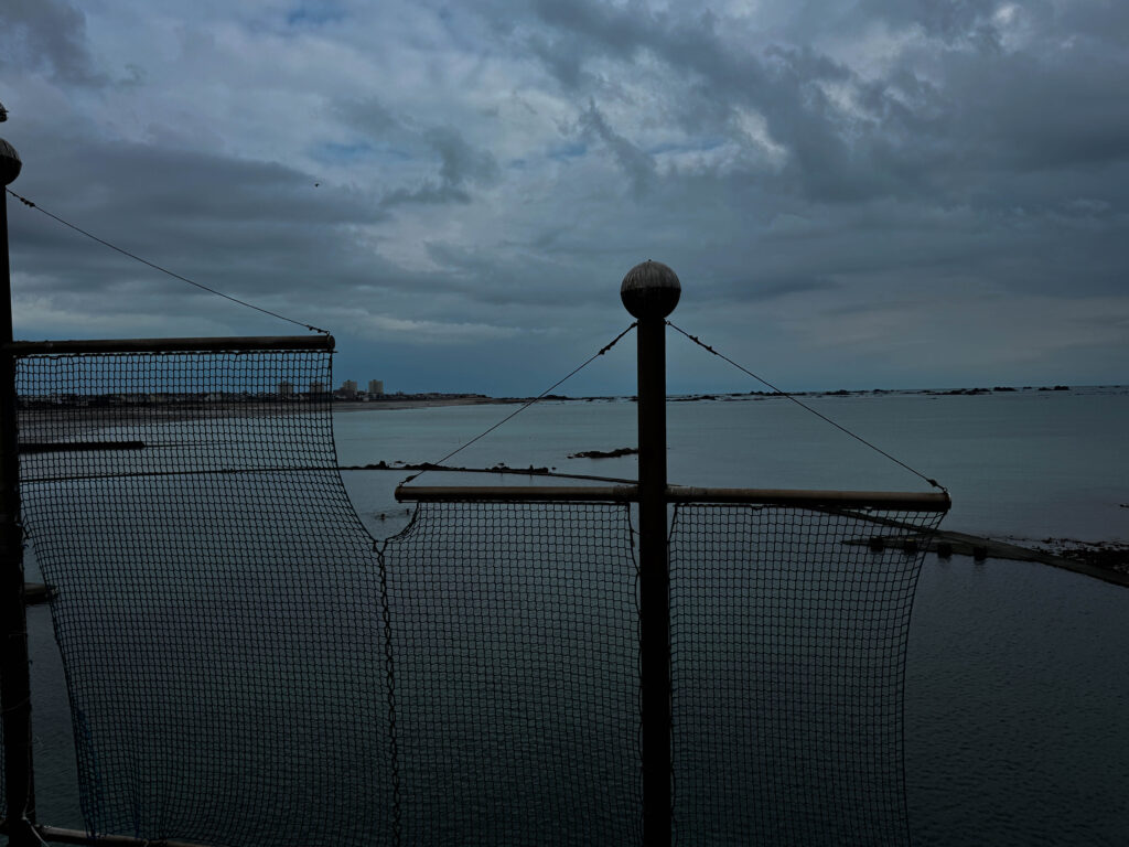
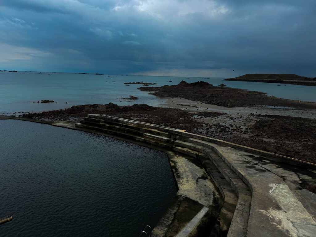
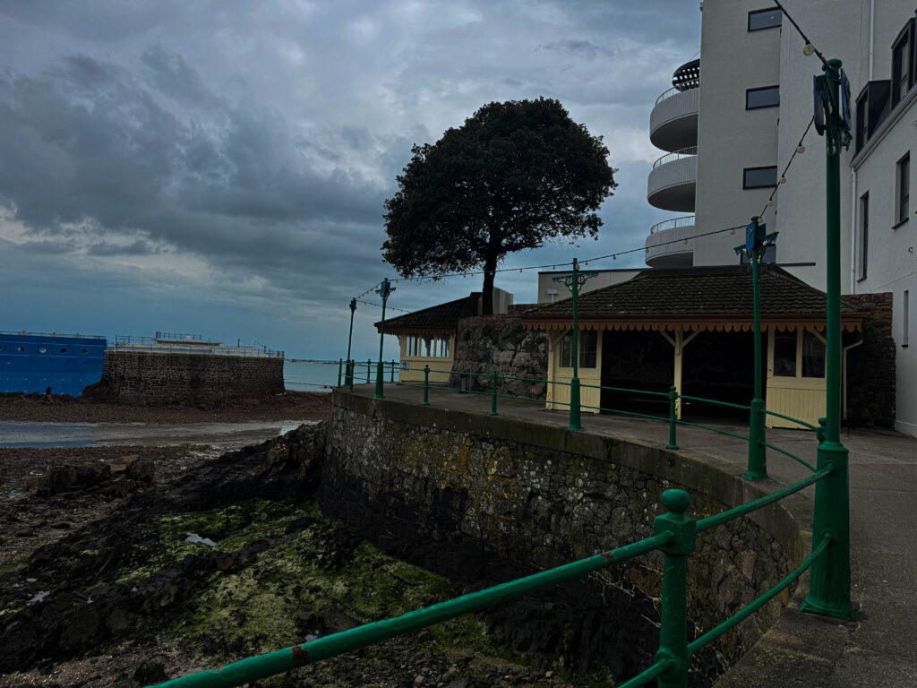
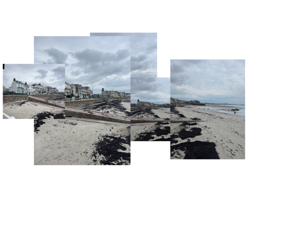
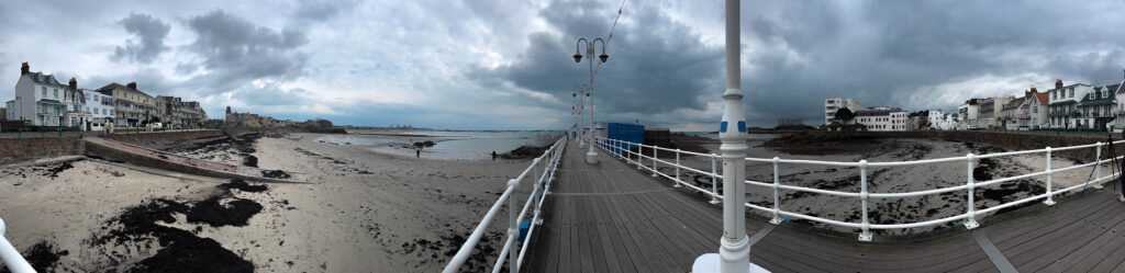
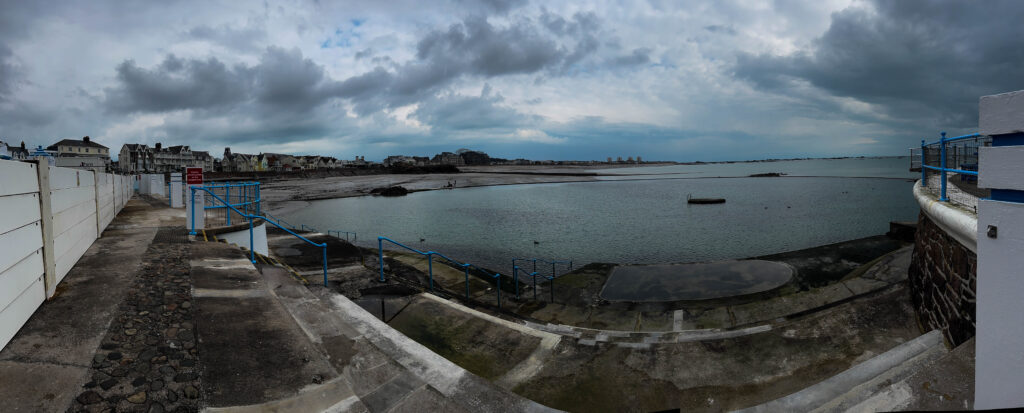
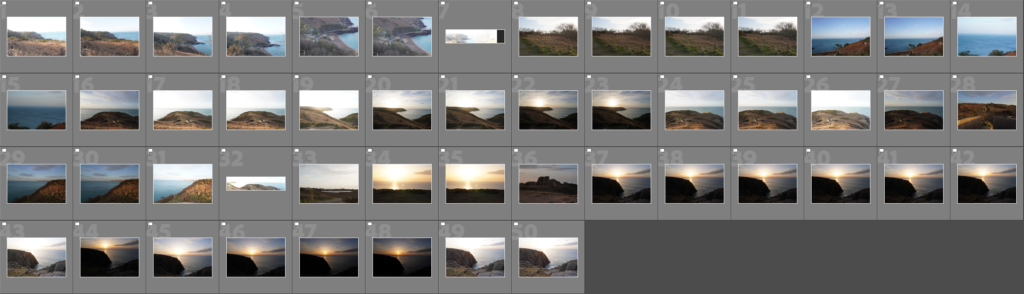
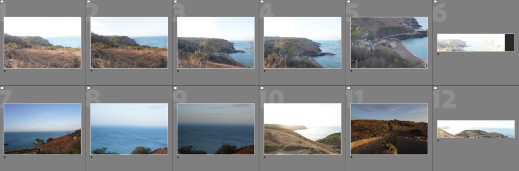
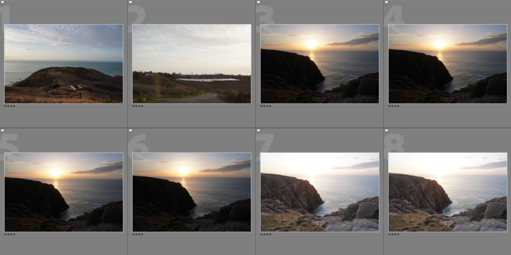
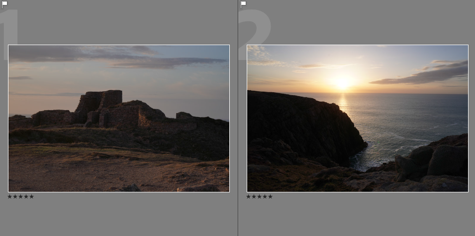
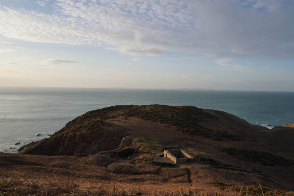
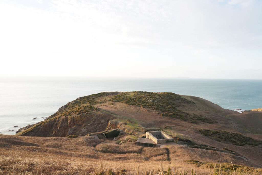
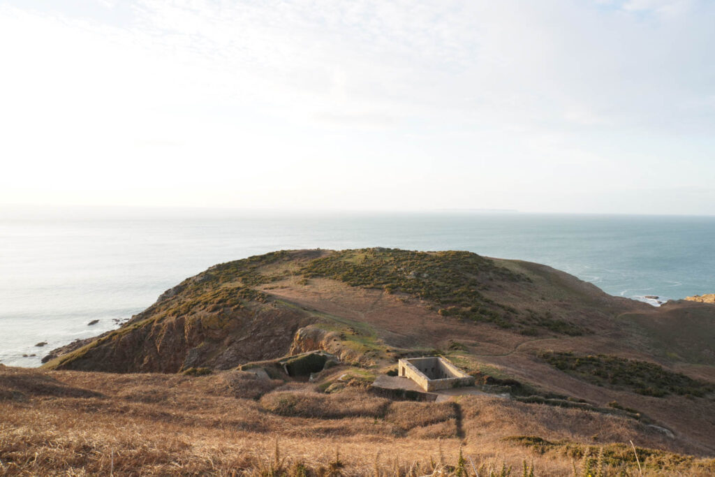
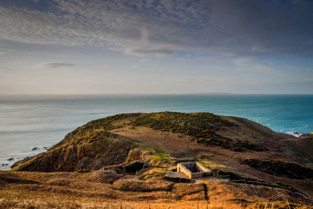
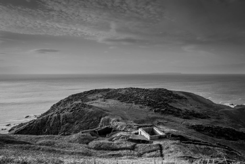
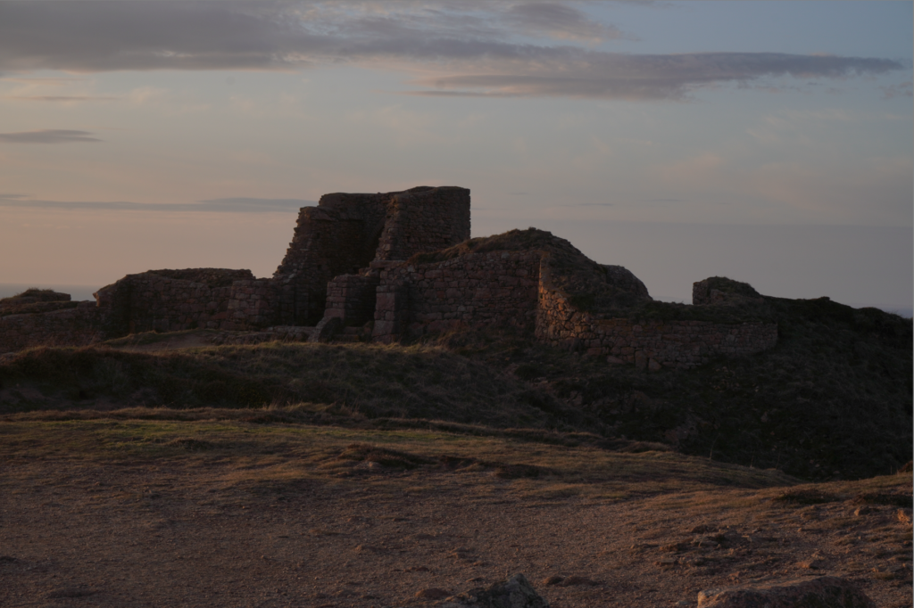
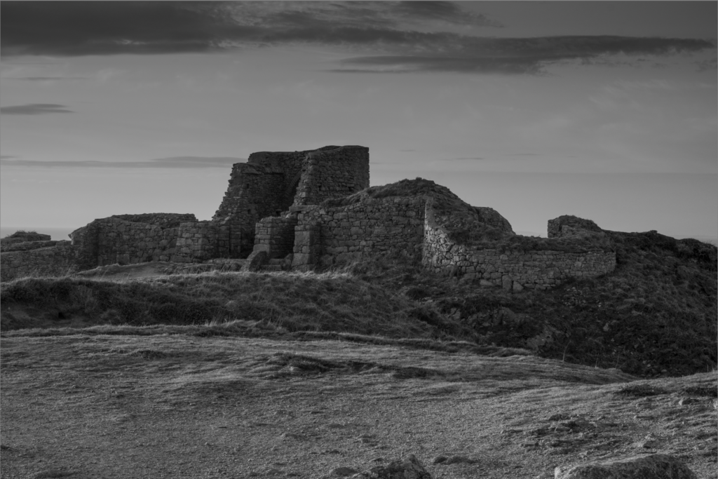
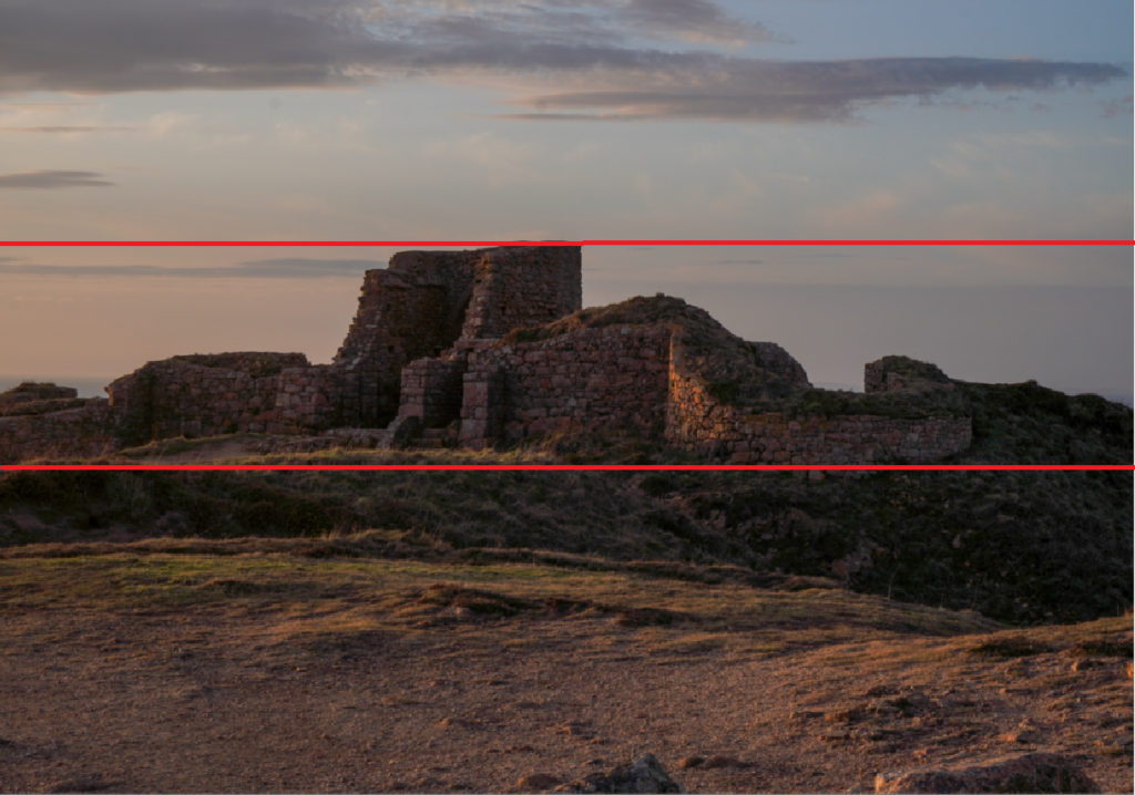
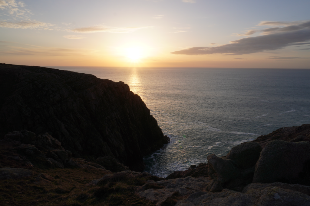
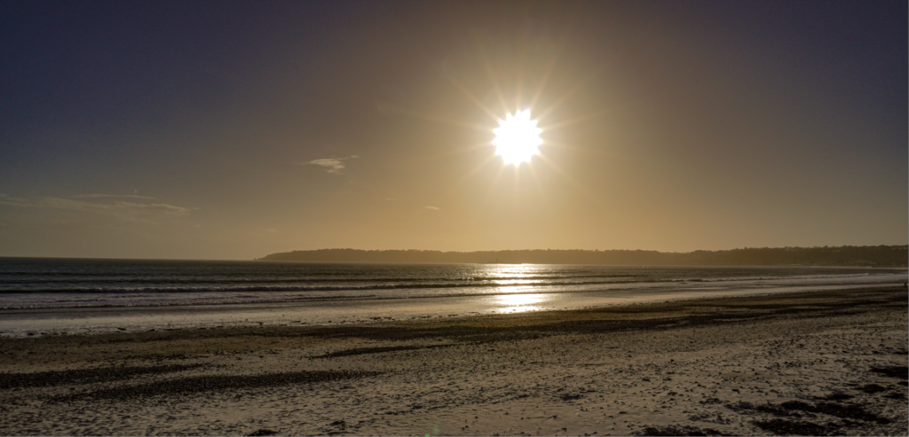
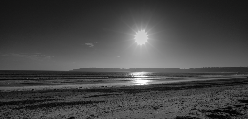
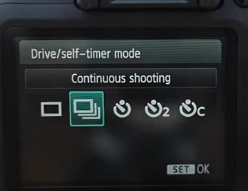
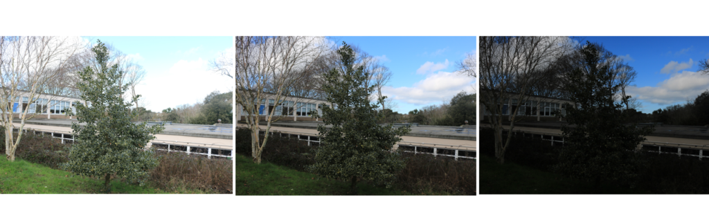
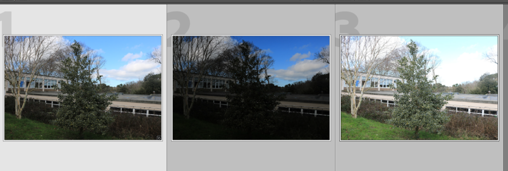
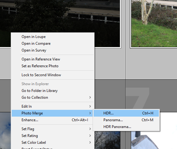
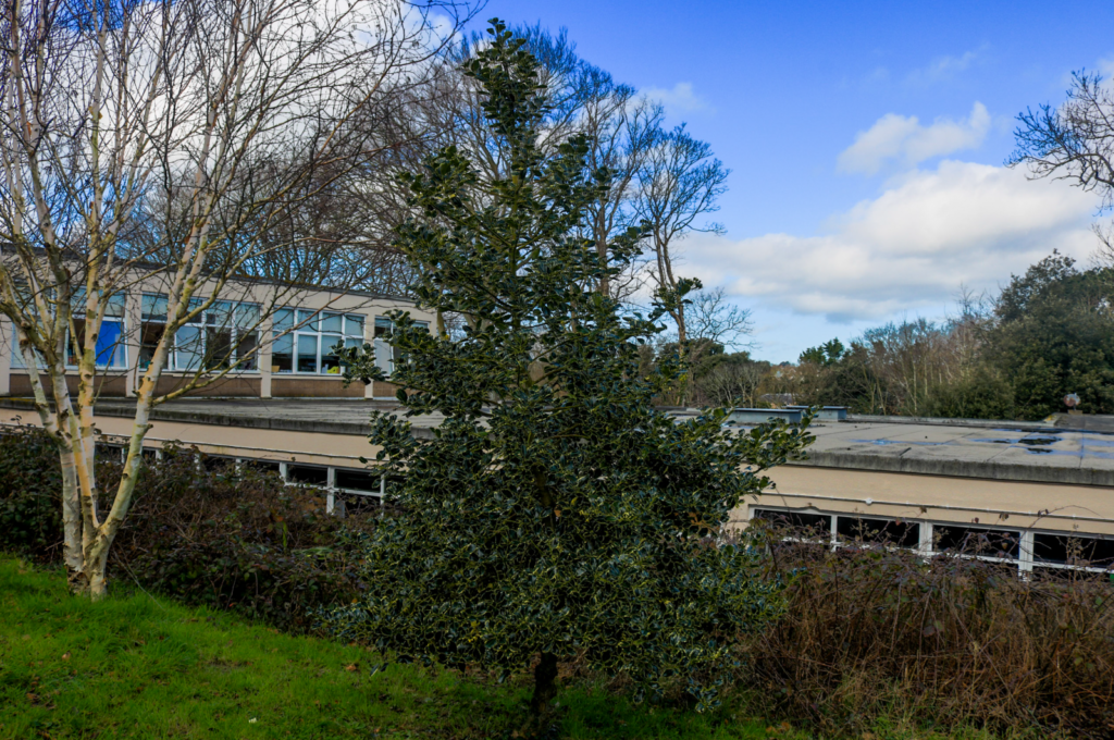
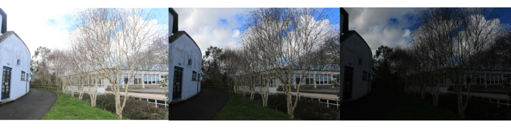
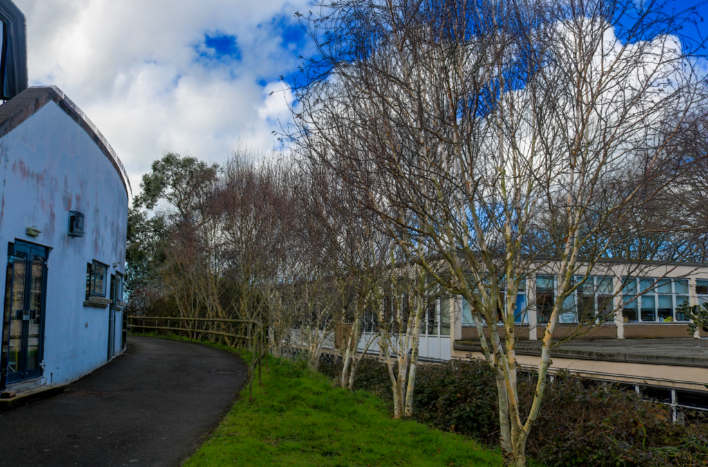
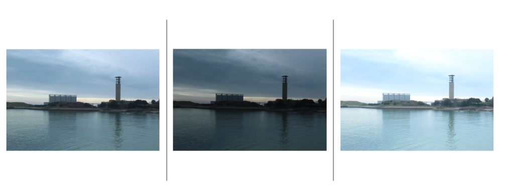
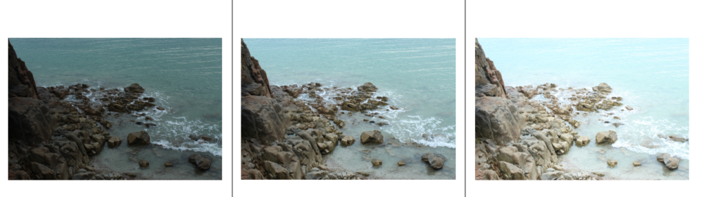
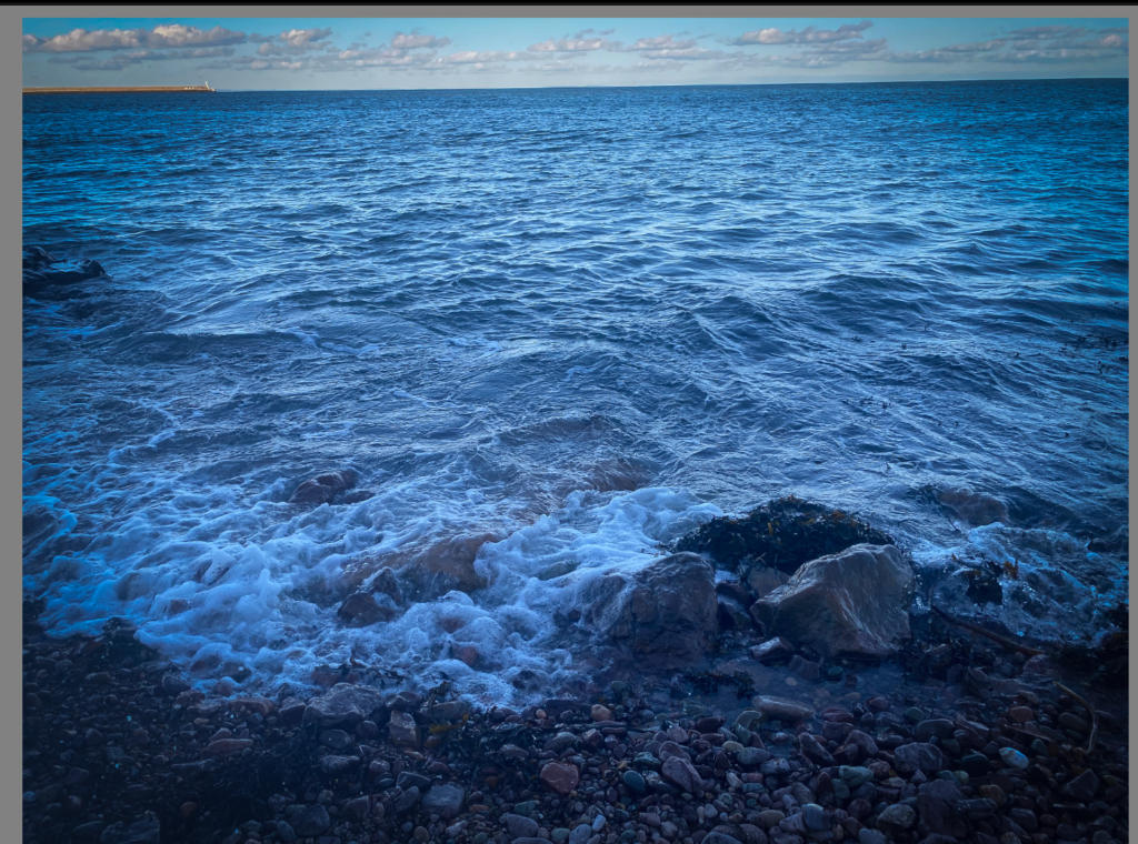
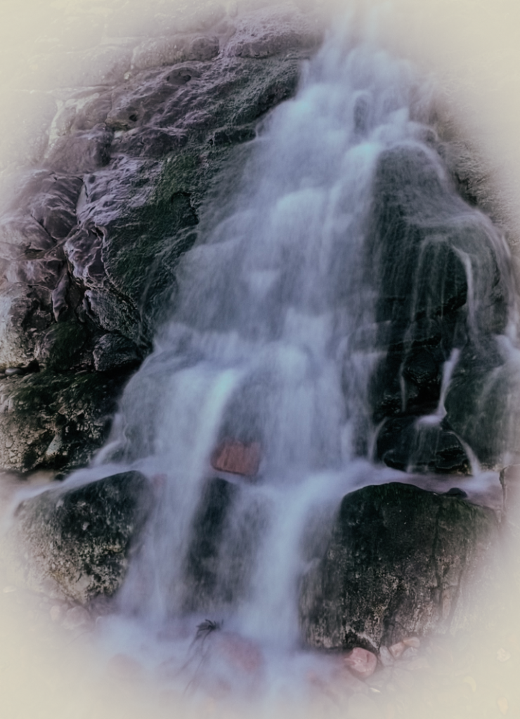
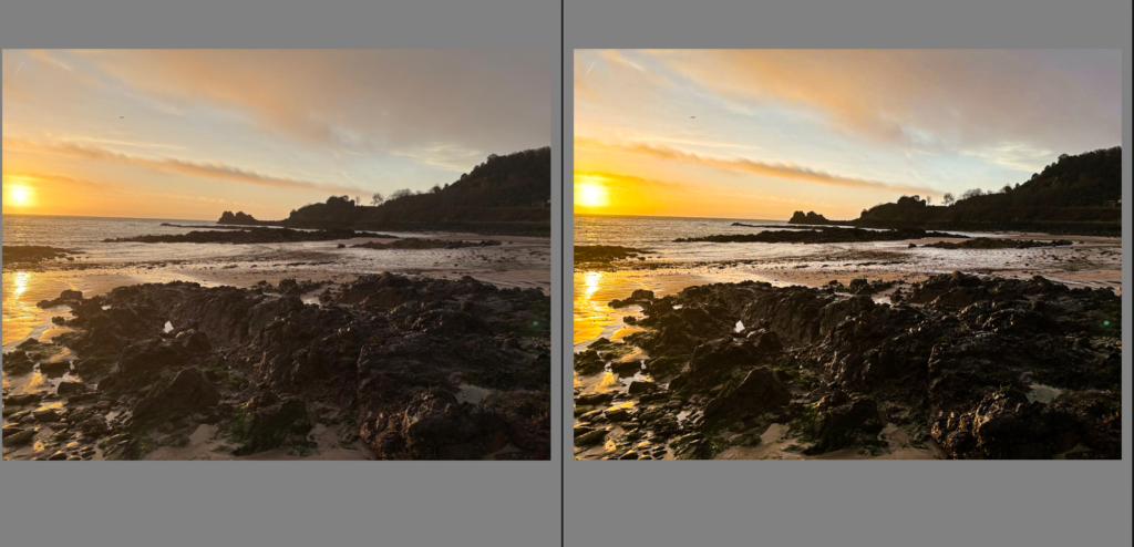
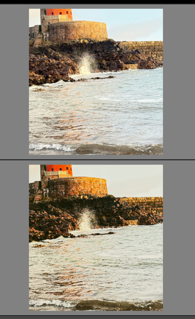
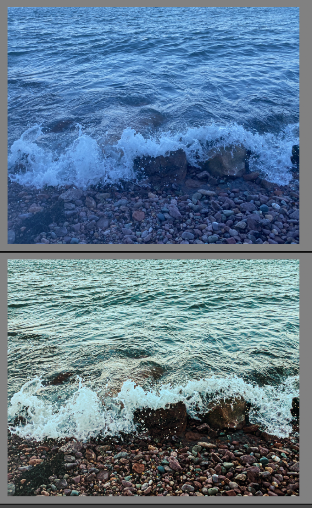
My photos:
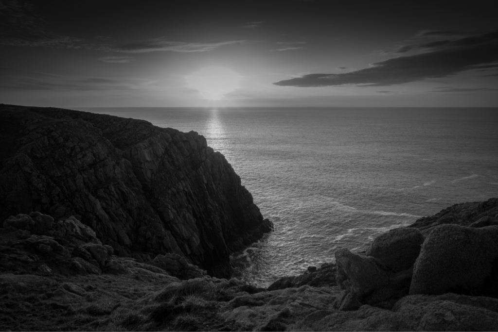
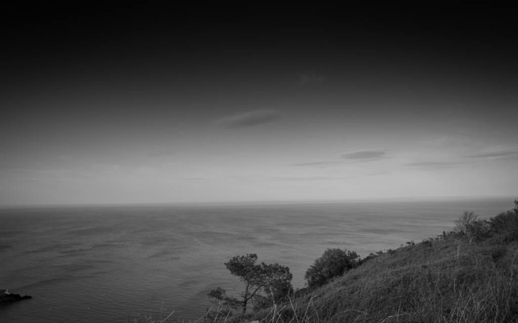
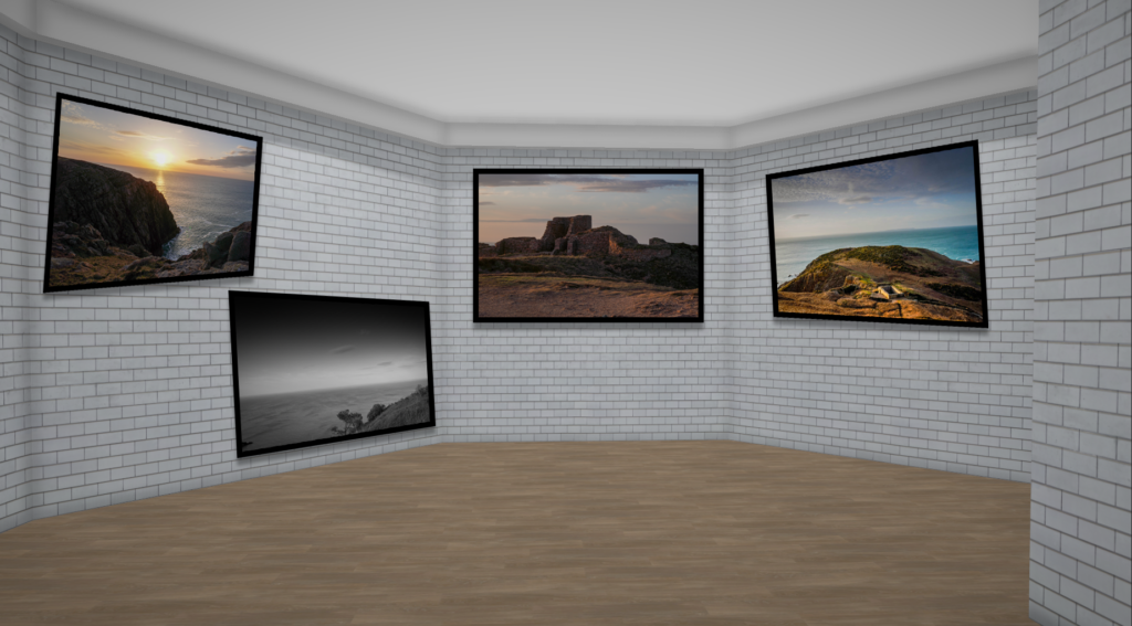
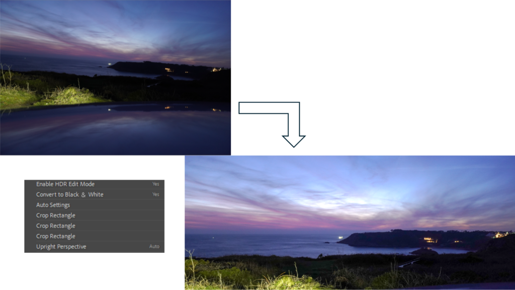
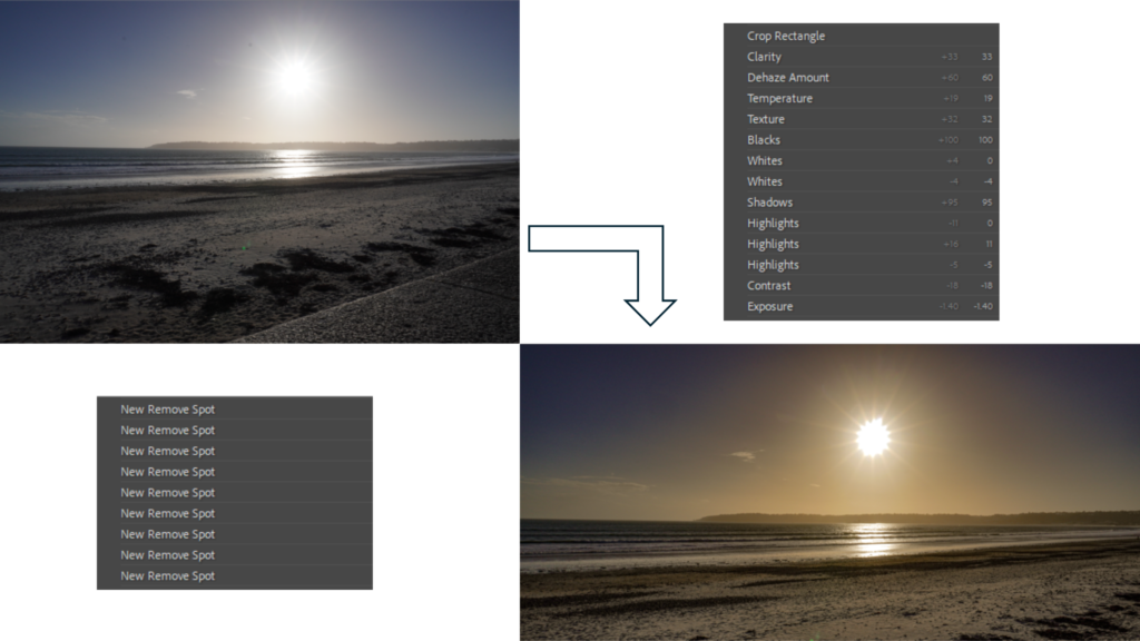
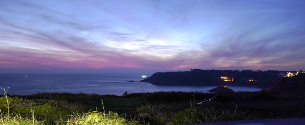
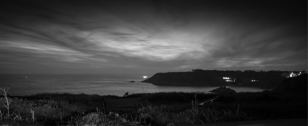
These are my photos that i think represent the type of new topographic photography the best, in which i will pick a few that i think are edit worthy and more likely to reproduce this way of photography.

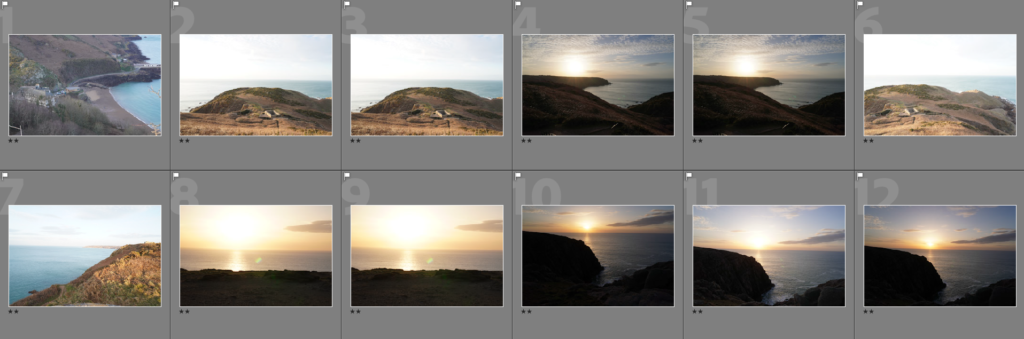
These are the photos i think are good enough to be able to edit and that i think most represent the work of new topographics

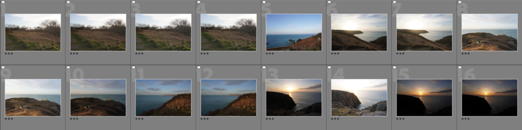
The way i have edited these photos makes it so it better represents the way of new topographics at the time of its relevance, with it being in black and white.