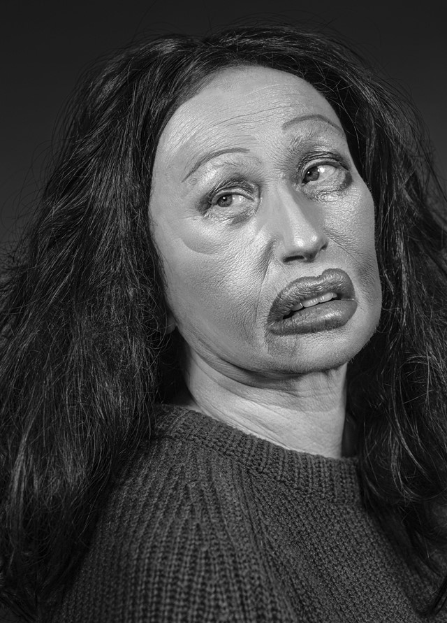
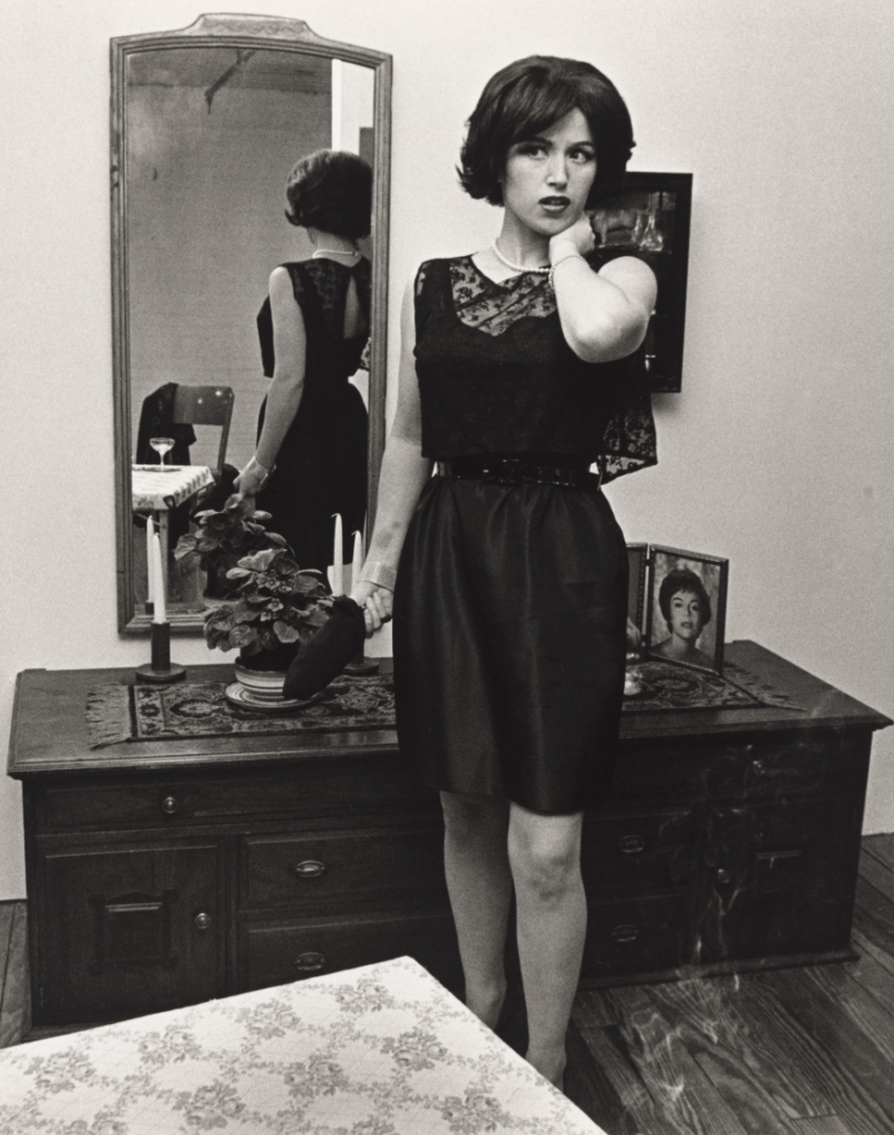
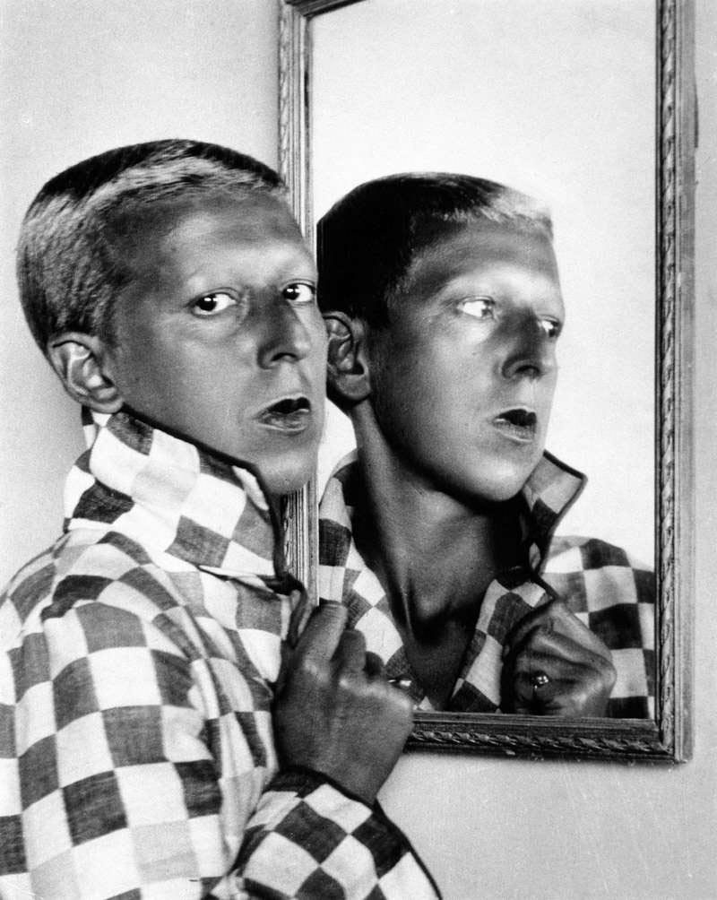
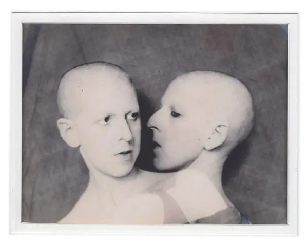
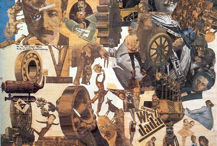
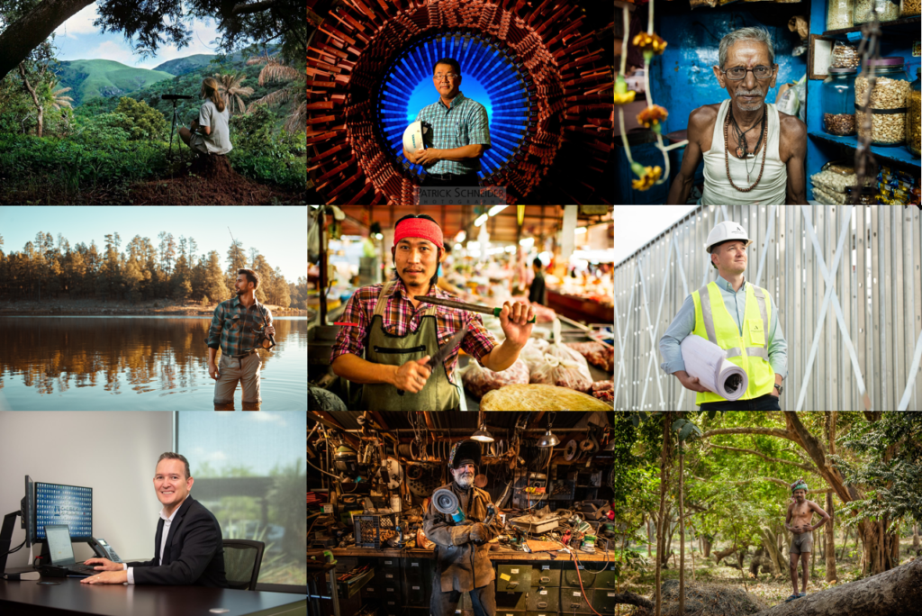
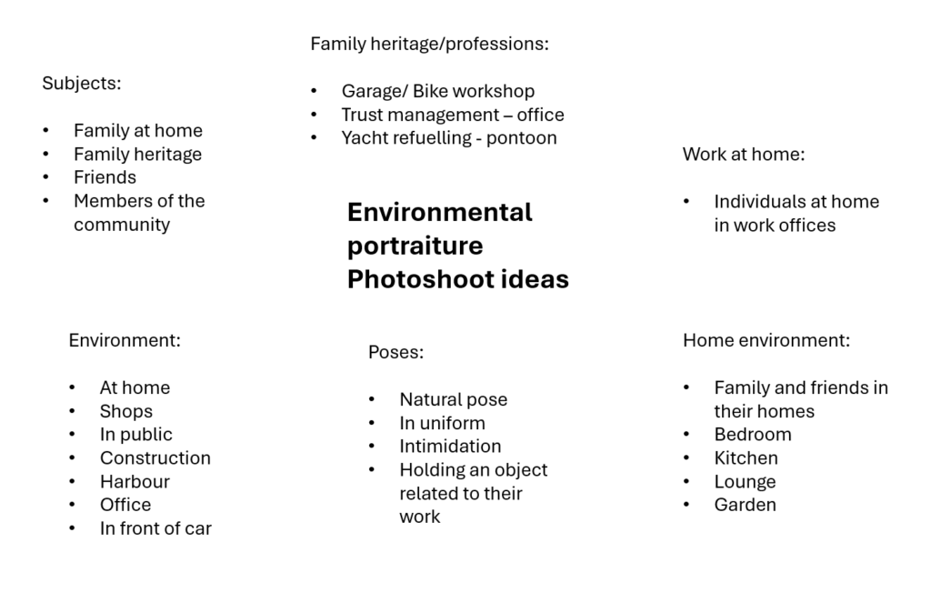
Mood-Board, Mind-map of ideas:
Definition and introduction:
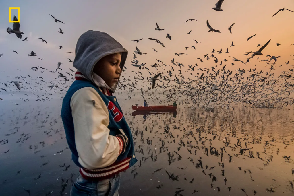
An environmental portrait is a photo of someone taken in their own space, like their home, office, or any place that’s meaningful to them. Unlike a traditional portrait where the focus is just on the person, in an environmental portrait, the surroundings are just as important. The place they’re in helps tell us something about who they are. The environment can reveal a lot about the person’s personality. For example, if someone is photographed surrounded by books, it might suggest they’re into reading or have an intellectual side. If they’re in a studio with art supplies, we might guess they’re creative. The space can show us what they care about or what they’re passionate about. It adds depth to the person’s identity, turning the portrait into a more complete picture of who they are.
Compare and contrast to artist reference:
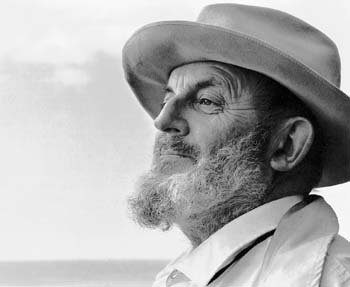
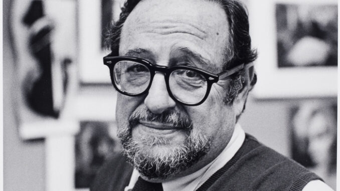
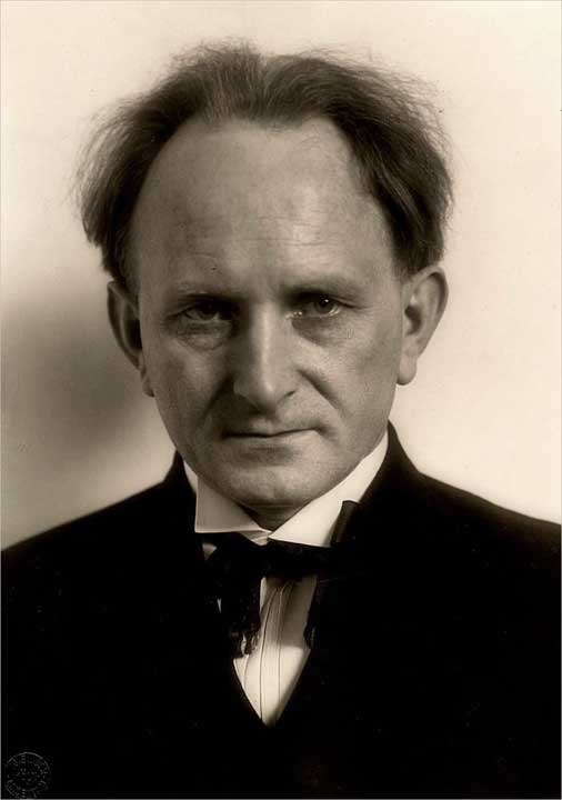
Arnold Newman
Arnold Newman (1918–2006) was a famous American photographer known for his portraits that told a bigger story about his subjects. Instead of just snapping a regular headshot, Newman’s portraits often included the subject’s surroundings places or objects that reflected who they were and what they did. This style became known as environmental portraiture. Newman started out in New York and studied photography at the University of Miami. He worked in commercial photography early on but soon developed his own artistic style. Rather than taking posed, studio photos, he preferred to shoot people in the places that defined them, like artists in their studios or musicians with their instruments. Some of his most famous photos include a shot of composer Igor Stravinsky at the piano and an image of Alfried Krupp. Newman’s portraits helped show not just what someone looked like, but who they were and what they cared about.
Visual:
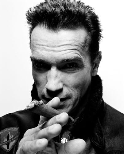
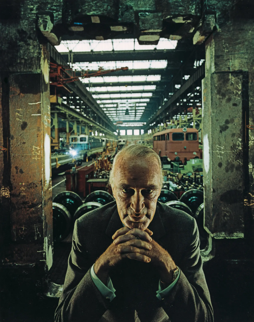
The photo of Alfred Krupp, taken by Arnold Newman, puts him right at the center of the frame, making him the clear focal point. The concrete pillars in the background add to the cold, industrial vibe, giving the whole scene a harsh, almost intimidating feel. Krupp is leaning slightly forward, his hands clasped under his chin, and he’s making direct eye contact with the camera. His posture and gaze suggest confidence, but there’s also something sinister about it. The industrial backdrop makes it look like Krupp is in charge of everything around him, adding to his sense of power. The lines in the photo, especially those at the top, draw the viewer’s eyes directly to his face, which adds to the feeling that he’s the center of everything. The balance of light and dark in the image also plays a big role. The light at the top of the photo contrasts with the darker bottom, creating a sense of tension and drama. This contrast exaggerates the eerie feeling, making Krupp seem even more menacing. His elevated position in the frame makes him appear in control, almost as if he’s towering over the scene.
Technical:
Technically, the lighting in the photo seems to be artificial, casting sharp shadows across Krupp’s face and deepening the intensity of his gaze. The sharp focus on Krupp’s face suggests a medium aperture, which keeps him in clear focus while the background is a bit softer but still recognizable. The fast shutter speed used helps keep everything crisp, with no blur in the image, and it helps maintain a balanced exposure. The camera is at eye level with Krupp, which makes the viewer feel like they’re sitting right across from him. This angle not only draws us in but also makes the photo feel more confrontational and unsettling.
Contextual:
As for the context, Alfred Krupp was a German industrialist who ran factories that produced weapons for Nazi Germany during World War II. His factories relied on forced labor, including prisoners of war, many of were Jewish. These workers were often worked to death in brutal conditions, making Krupp a figure of hate. Arnold Newman, who was Jewish, didn’t want to take the photo at first but eventually agreed. During the shoot, Newman asked Krupp to lean forward a little, and when Krupp did, he clasped his hands under his chin. The way the light hit Krupp’s face in that moment was striking, and Newman said he got a chill down his spine when he saw it. That moment led to one of Newman’s most famous photos.
Conceptual:
When Krupp saw the photo, he was reportedly furious. For Newman, though, this was a bit of sweet revenge. The photo captured Krupp in a way that was both sincere and menacing, showing a side of him that was both powerful and unsettling. As the image circulated, it forced Krupp into the public eye, pulling him out of the shadows and exposing his true nature. For Newman, it was more than just a portrait, it was a way to share his own deep hatred for Krupp with the world, using the photograph as a tool to show the man’s cruelty and dark legacy.
August Sander
August Sander was a German photographer known for his groundbreaking portraits that captured the different people in German society during the early 20th century. He’s considered one of the most important portrait photographers of his time. Sander’s work aimed to document the variety of social classes, professions, and lifestyles in Germany, especially during the period between the World Wars. His most famous project, Antlitz der Zeit (Face of Our Time), was a collection of portraits of people from all walks of life, from farmers and factory workers to scientists and artists. Rather than just taking a photo, Sander tried to reveal something deeper about each person, showing who they were in their society and what their role in it was. His approach was direct and respectful, aiming to capture the personality and dignity of each subject.
Subject:
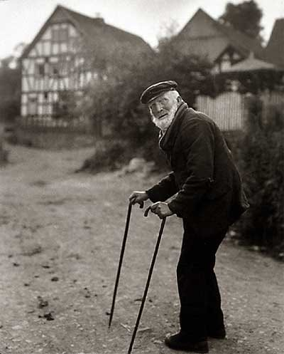
The photo shows an elderly man using two walking sticks, standing in the foreground. He seems to have paused while walking up the lane in the background. You can tell he’s old by his bent posture and white facial hair. The man appears to have been walking along the road and stopped to face the camera. He’s positioned to the right of the frame, looking toward the center and into the empty space on the left. This draws your eye to the building in the background, suggesting that he’s heading there. His neutral expression makes it feel like a natural moment, as if he’s just going about his day, not posing for the camera.
Sander’s photographic style helps us connect with the people he captures. The subjects’ direct eye contact with the camera draws us in without being forced or overwhelming. They seem natural and at ease, going about their everyday lives in familiar surroundings. His photos feel like a celebration of ordinary people, giving us a glimpse into who they are and inviting us to appreciate their essence.
The environment:
The house in the background looks like a classic Tudor style, with white stucco walls and decorative half-timbering, or a mix of dark brick and stone. This traditional building adds to the feeling of a cozy, simple setting where the subject likely lives.
Visual:
This photograph, like all of Sander’s work, is in black and white. While this was due to the limitations of cameras at the time, the monochrome style actually strengthens Sander’s typographical approach, giving all his photos a unified feel. The lack of color also brings out the tonal contrasts in the image. For example, the dark shrubbery on the right contrasts with the lighter pathway on the left, guiding your eye towards the house in the background. The rough, natural texture of both the shrubs and the path suggests this is a rural setting.
Leading Lines:
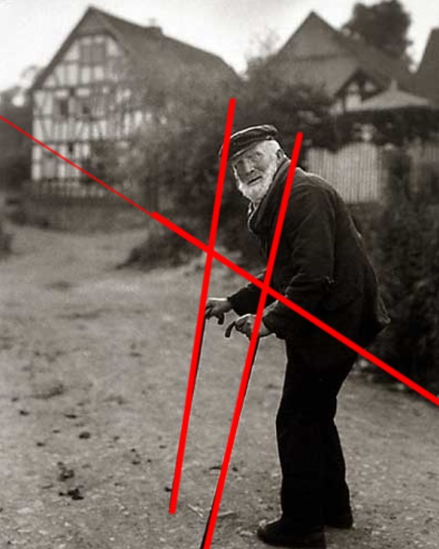
The main leading line directs your gaze from the bottom right corner, up to the subject, and then towards the house. Additionally, the angle of the walking sticks guides your eye straight to the subject’s face.
Balance:
The line formed by the shrubs in the background cuts through the photo, splitting it into two halves. The bottom half features the pathway, which is more open and empty, creating a contrast with the heavier details in the top half of the image.
Composition:
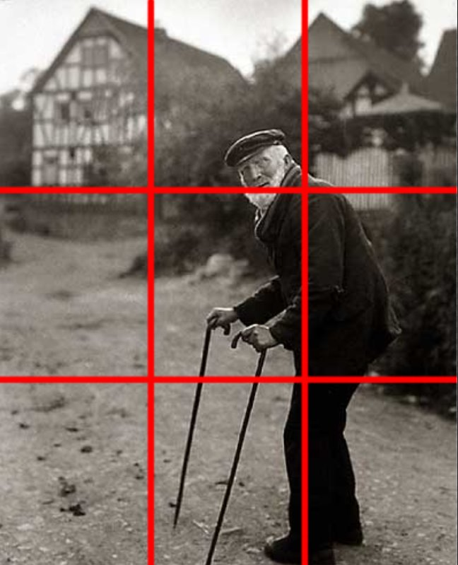
Upon closer inspection, it seems Sander has applied the rule of thirds in this composition. The subject is positioned at the intersection of the right third, while the house is placed within the top left third. The subject takes up two-thirds of the frame, making it the main focus of the image.
Angle:
The photo is taken from an eye-level perspective, which helps establish a sense of equality and connection between the subject and the viewer. By aligning the camera with the subject’s eye level, Sander creates a more personal, direct interaction. This perspective allows the viewer to engage with the subject in a way that feels natural, as if we are standing right there with them.
Technical:
The photo uses natural lighting, which adds to its authentic, unposed feel. The exposure is well-balanced, without any formal experimentation, allowing the scene to appear straightforward and true to life. The large aperture creates a shallow depth of field, focusing our attention on the subject in the foreground while softly blurring the background.
Context:
This photograph is part of Sander’s book Face of Our Time, first published in 1929 with a foreword by German writer Alfred Döblin. When it was first released, the book was advertised as follows: “The sixty portraits of twentieth-century Germans featured in Face of Our Time represent just a small selection from August Sander’s larger body of work, which he began in 1910 and spent two decades developing and refining. Sander did not approach this monumental project from an academic or scientific perspective, nor did he seek guidance from racial theorists or social researchers. Instead, he drew on his own direct observations of human nature, appearances, and the environment, guided by an instinct for what is authentic and essential.”
Conceptual:
The book is titled Face of Our Time, not Faces, which suggests that, together, these individuals form a single collective identity. It could be interpreted that Sander’s concept was to unite these people as a representation of his era. There is no underlying theory driving the work, just a straightforward examination of the period, capturing it in its purest form on the “face” of it.
Photoshoot Plan:
Mind map:
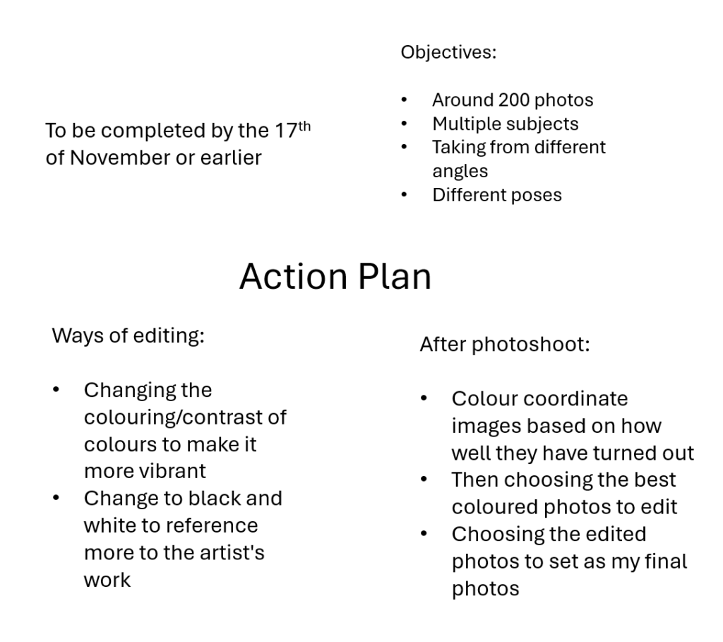
Action plan:
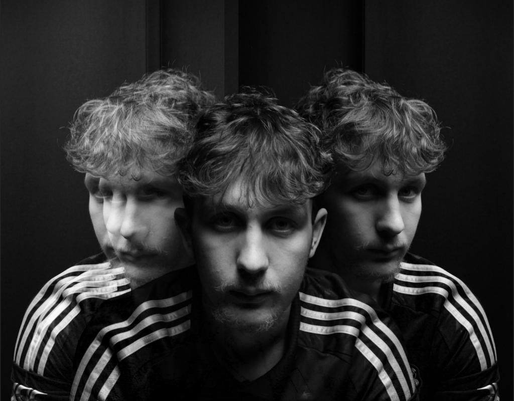
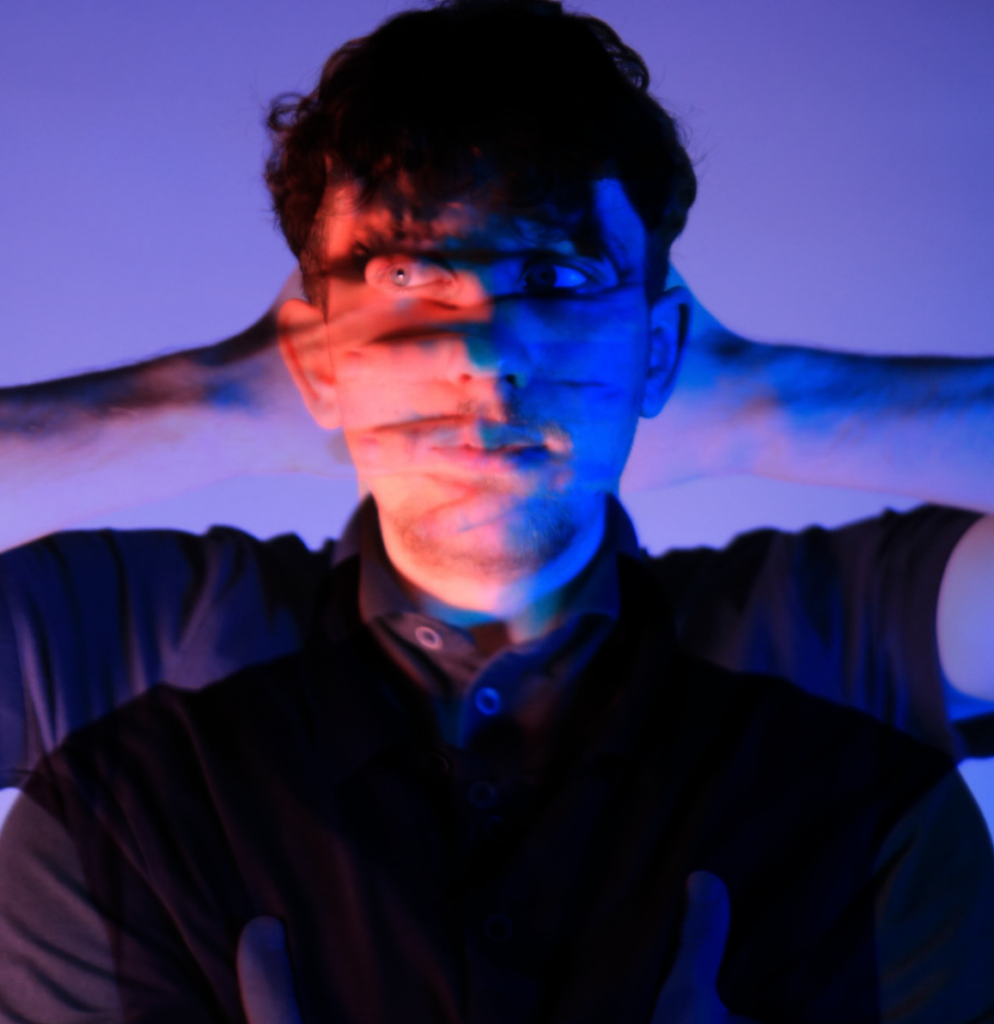
Photoshoot:
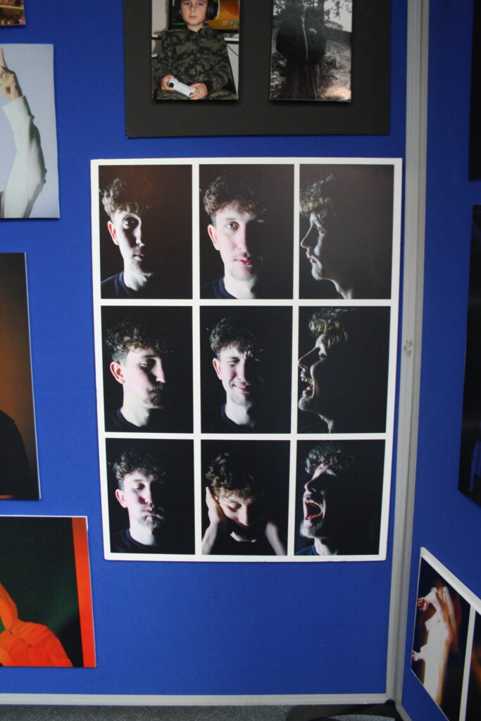
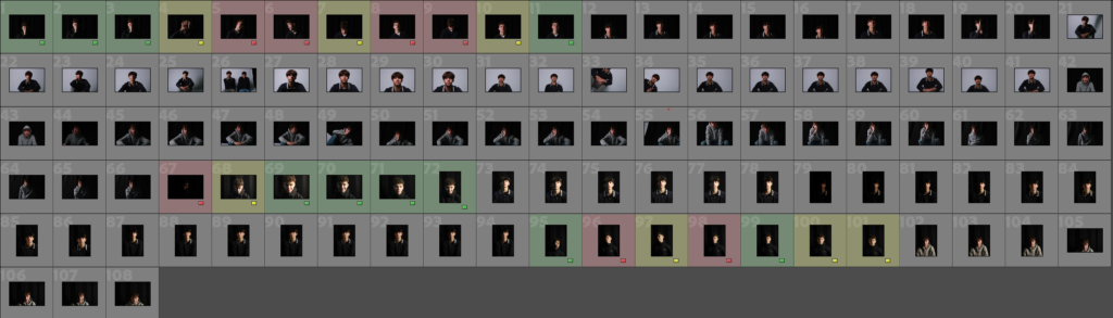
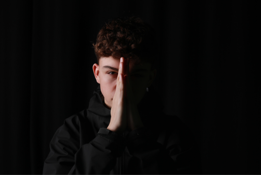
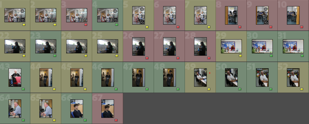
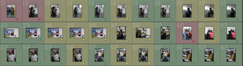
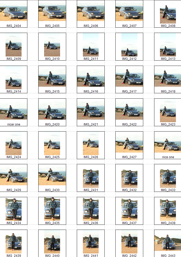
Photos inside of school:
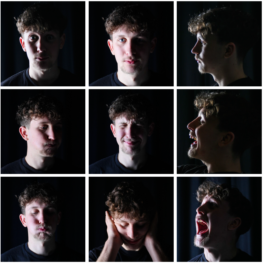
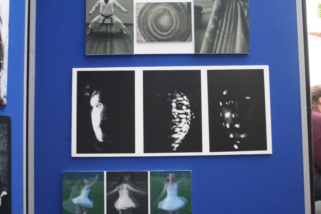
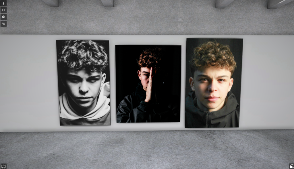
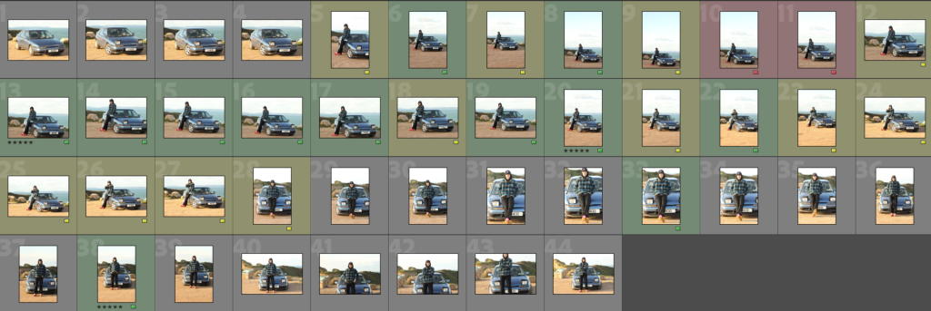
These are the photos i have taken inside of school, in which I have colour coordinated them in terms of how good I think they are as a photo in general. With green being good, yellow being decent and red being bad. The green colours also signify that they are ready to be editing. The yellow colours could signify what I should improve on in the photo to make it good/green.
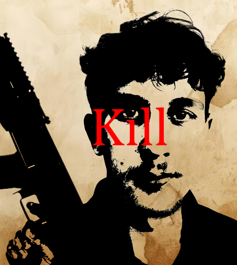
Editing photos of inside school:
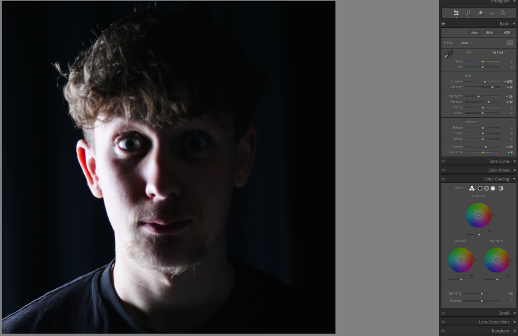
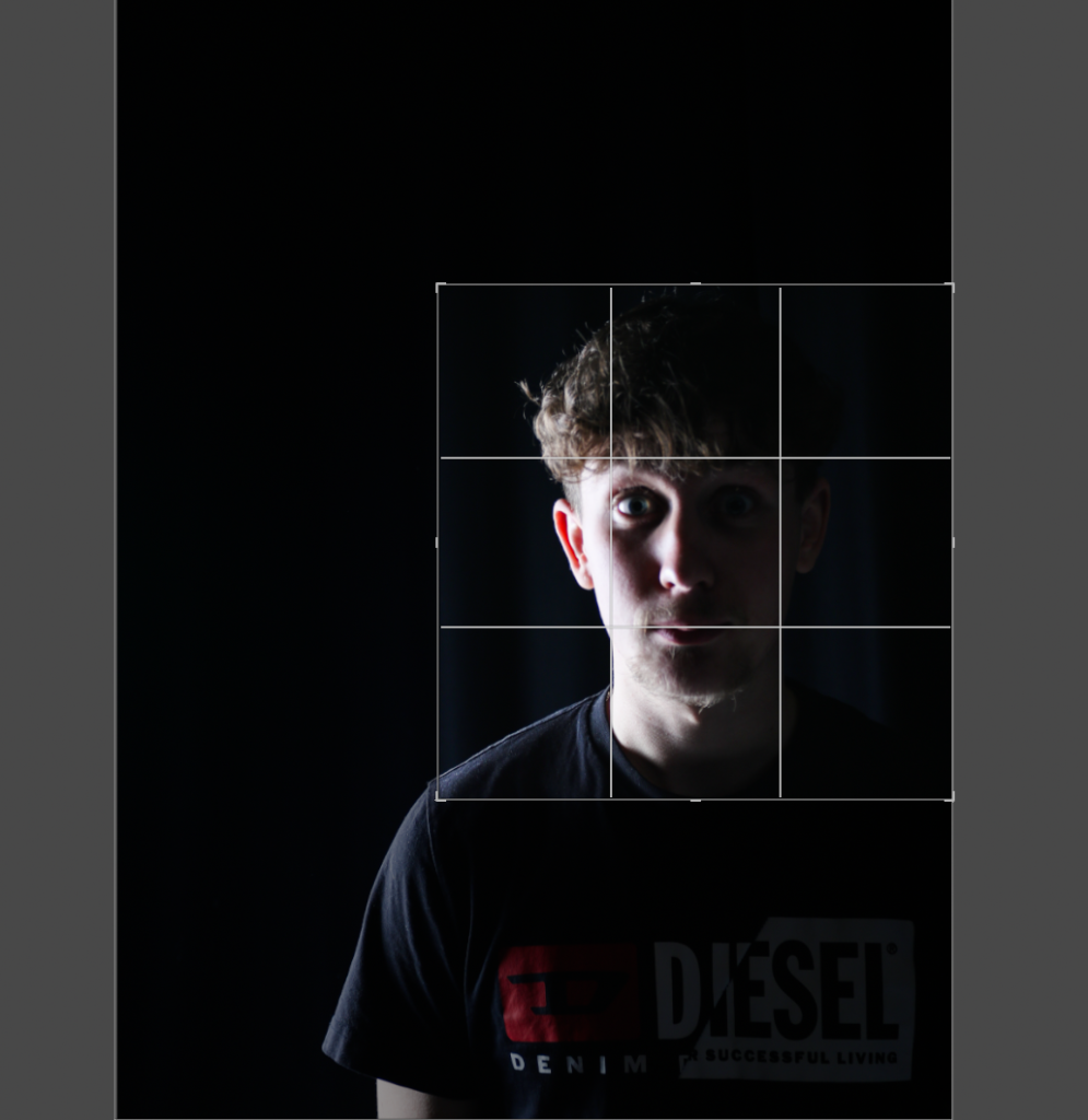
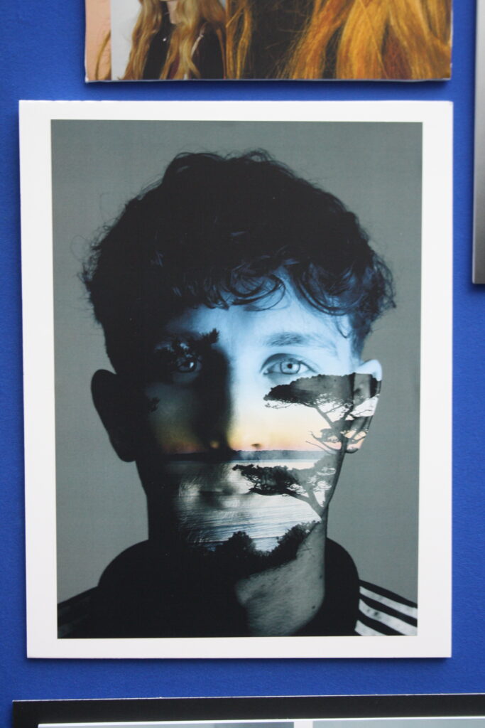
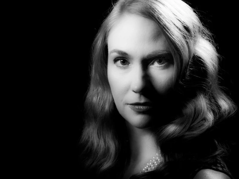
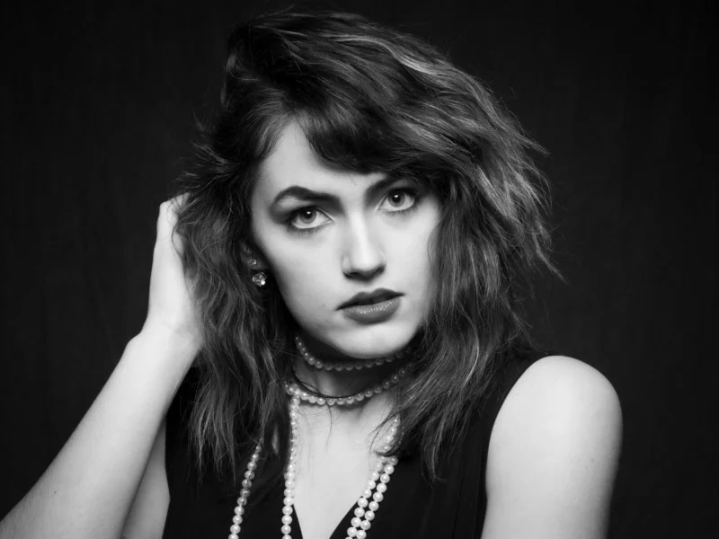
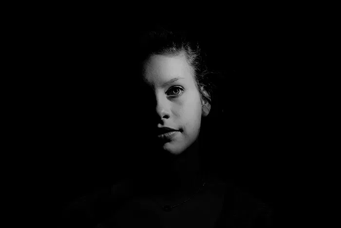
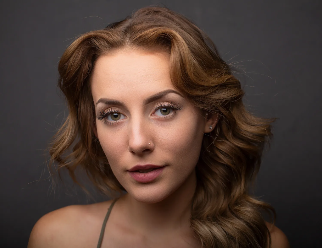
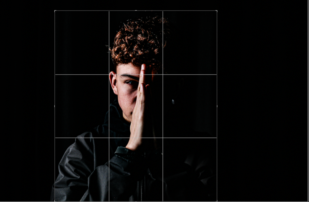
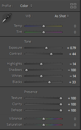
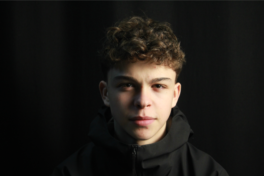
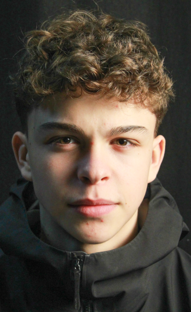
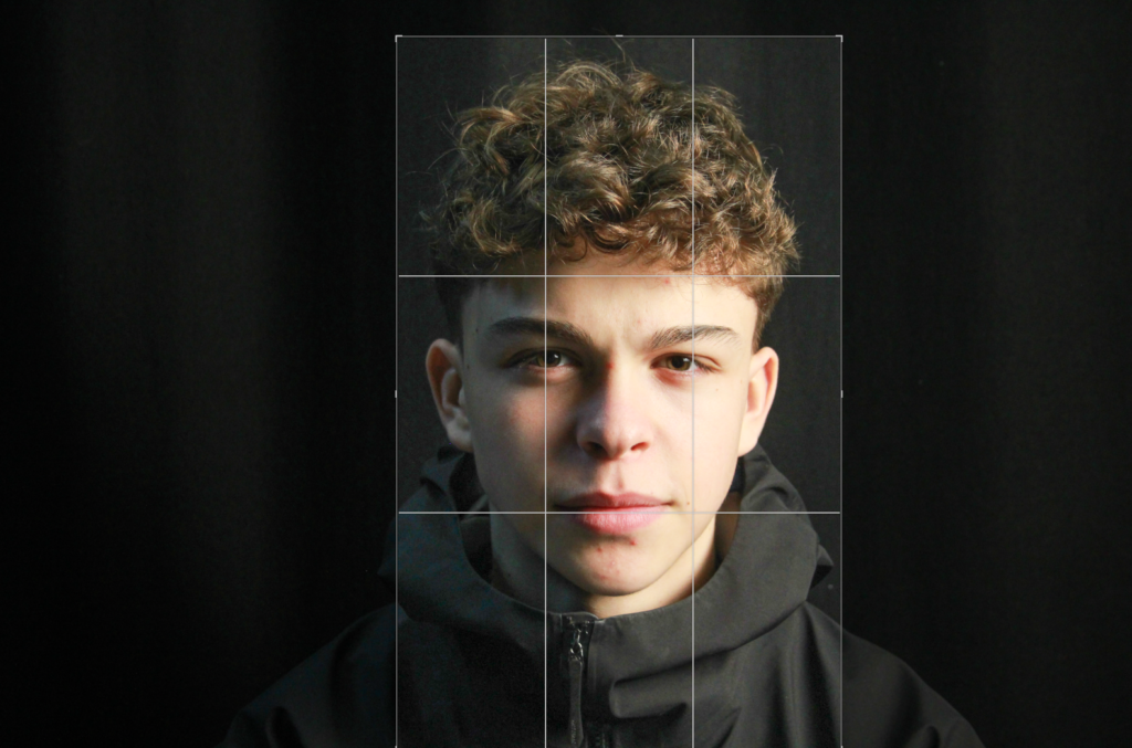
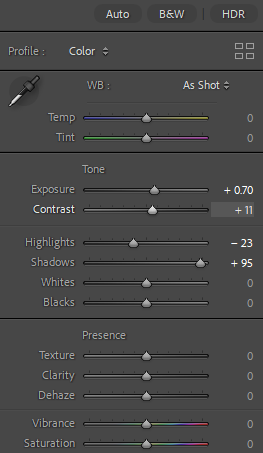
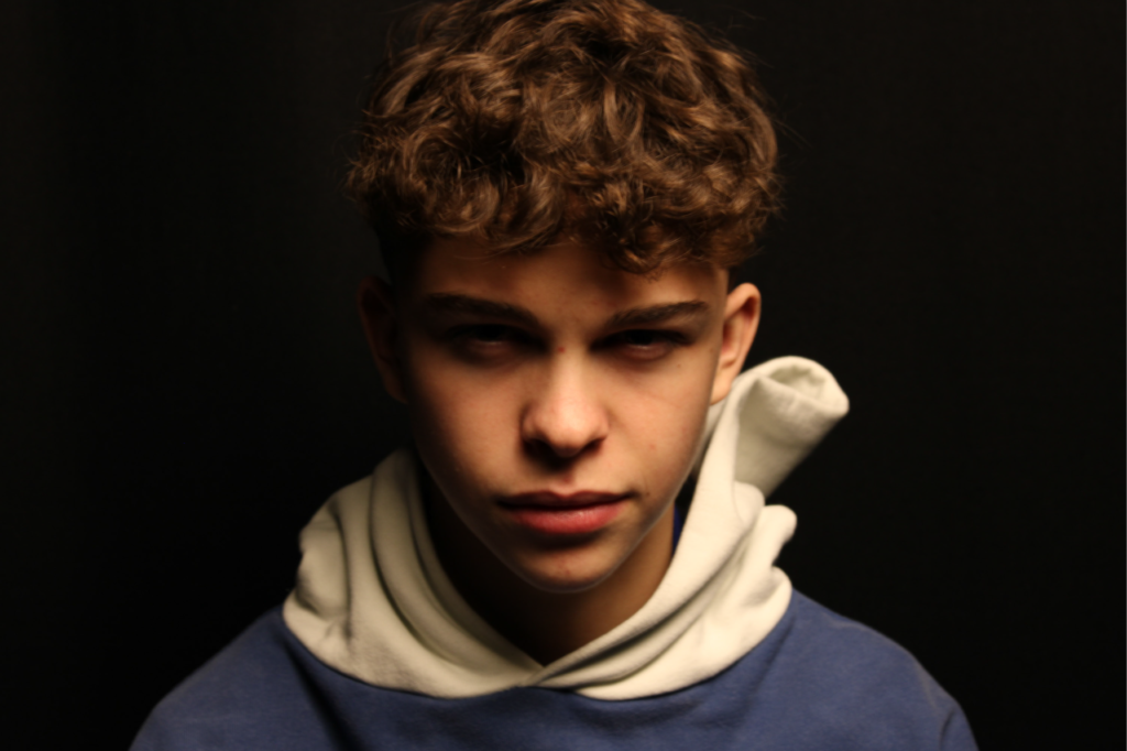
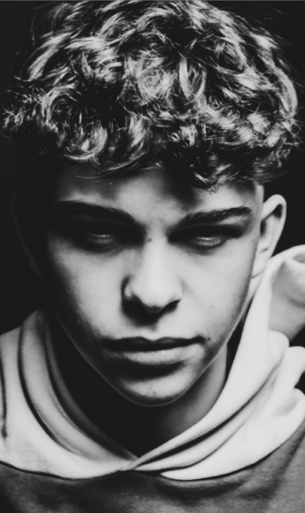
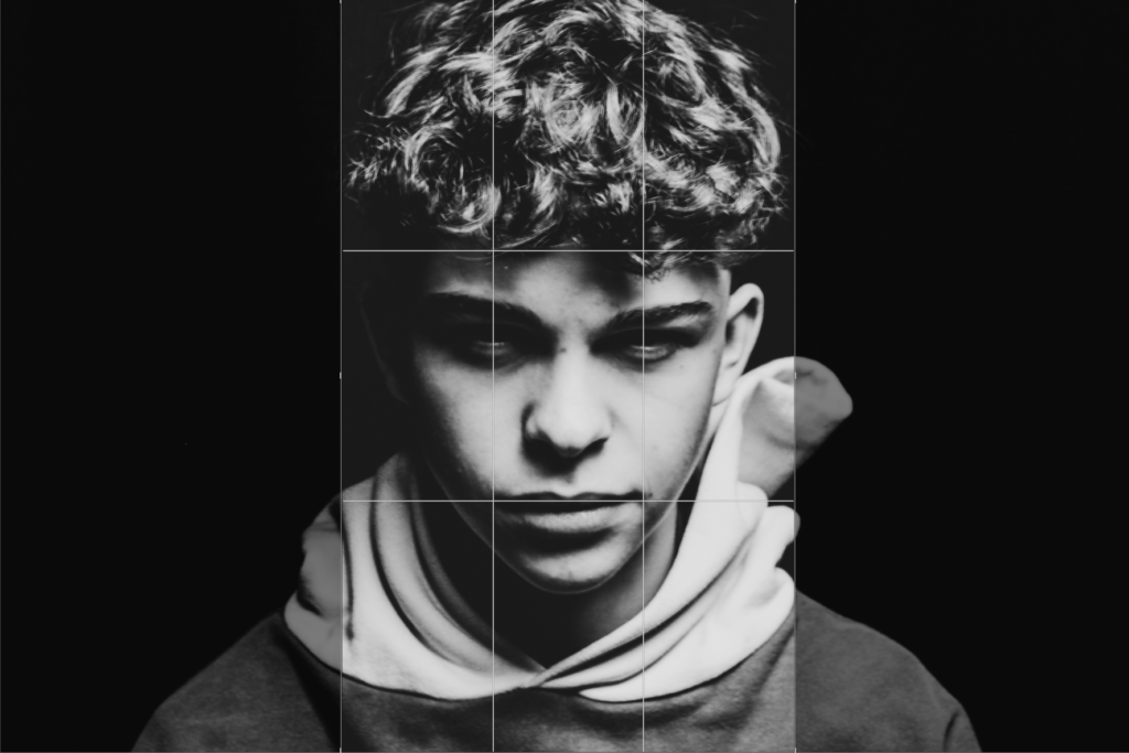
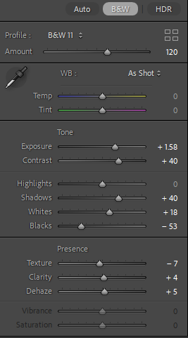
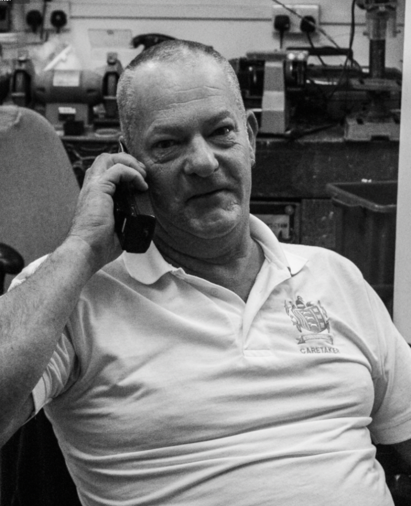
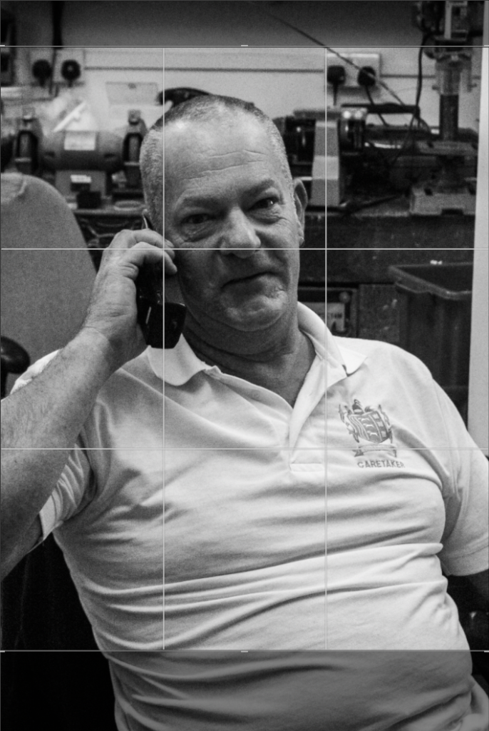
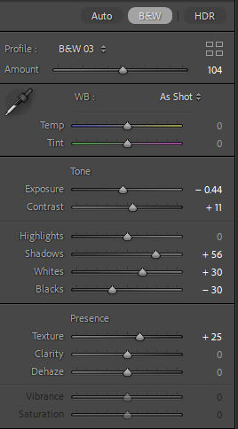
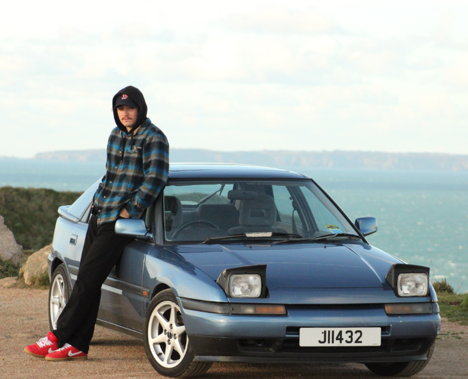
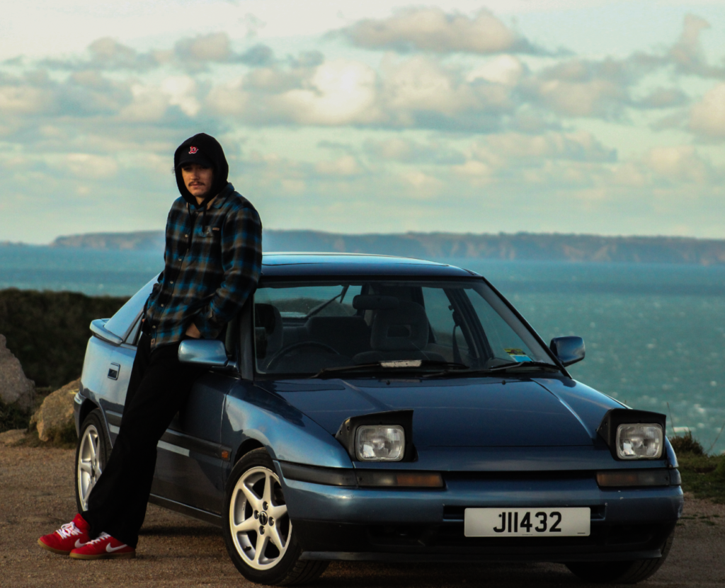
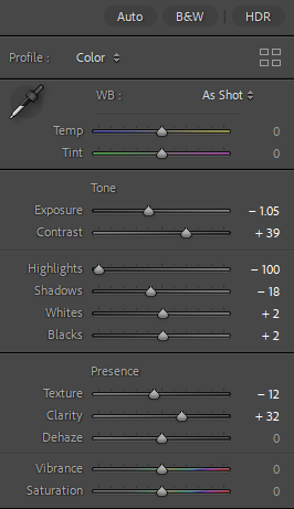
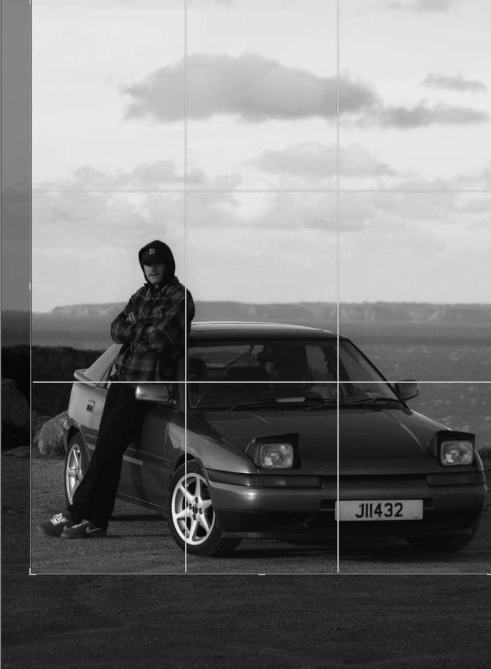
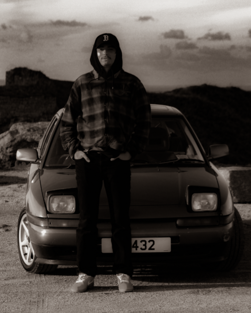
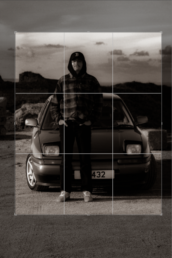
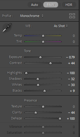
For this edit, I changed the colour to black and white to more relate to August Sander’s work and how most of his work is in black and white as well. After this, I experimented with the tone and presence sliders in which enabled me to tweak the photo to completely how i would want it. I then cropped it to then make the subjects more of the focus in the photo, getting rid of any negative space in the process.
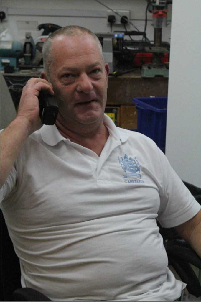
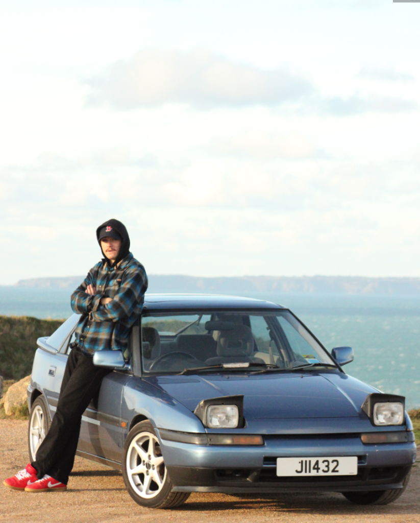
Before:
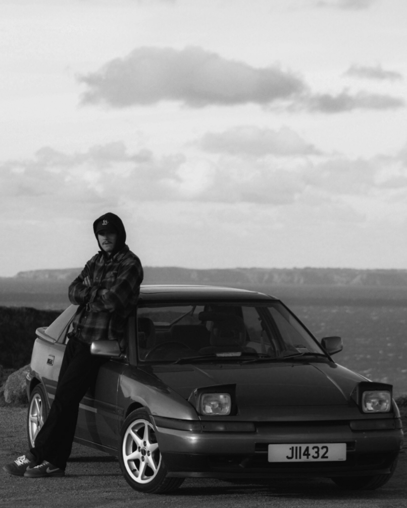
After:
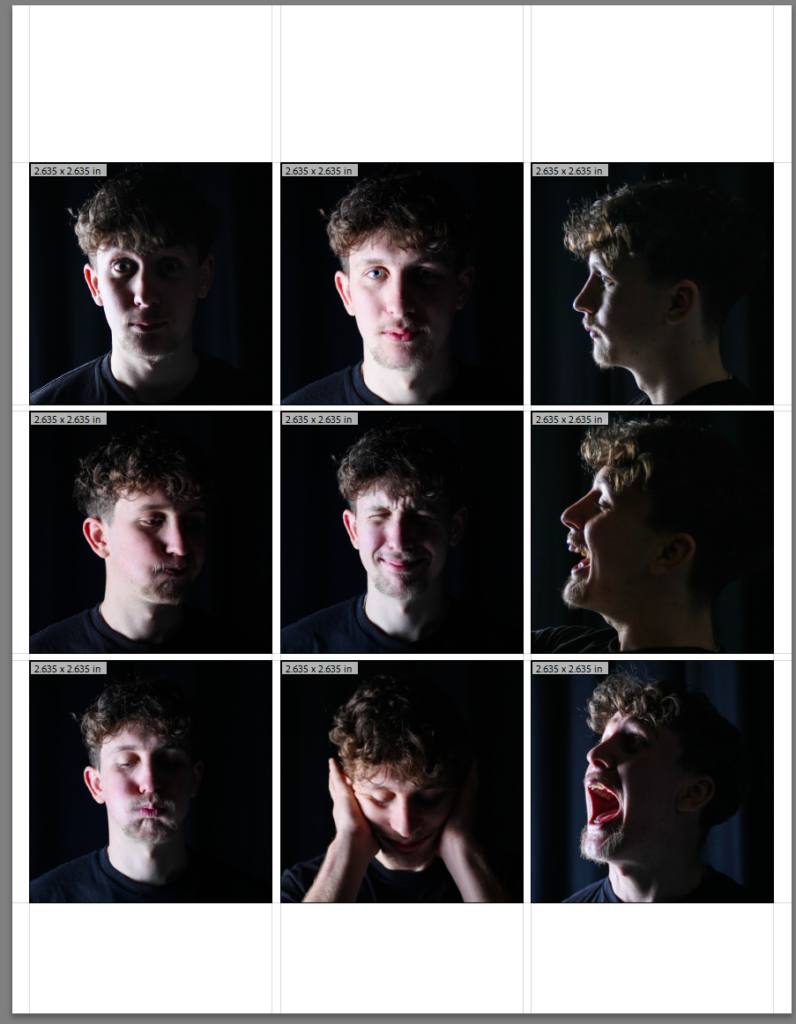
Contact sheet inside school:
Photos outside of school:
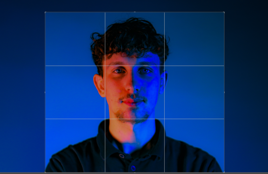
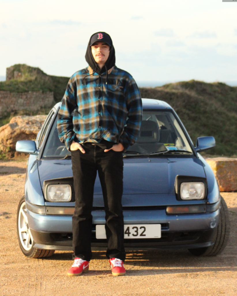
Before:
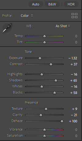
After:
Before:
After:
Before:
After:
Contact sheet outside of school: