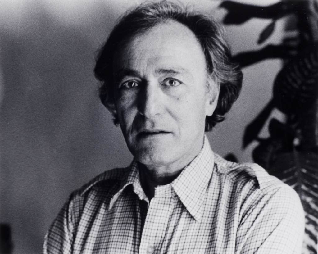
William Klein
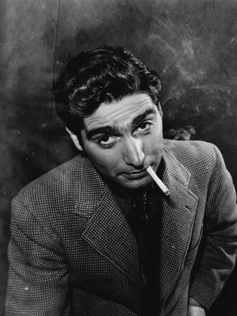
William Klein was born in 1928 in New York City. He studied painting and sculpture at the City College of New York. Later, he joined the U.S. Army and was stationed in Europe, specifically in Germany and France. It was here that he won his first Camera from a game of poker and began experimenting with photography. He focused on street photography and photojournalism, known for his unconventional, raw, and energetic style that challenged traditional photography norms. He used techniques such as wide-angle lenses, unusual framing, motion blur, and grainy textures to create dynamic and spontaneous images.
William Klein’s Confrontational Approach vs Cartier-Bresson’s Observational Style
William Klein’s approach to street photography was radically different from Henri Cartier-Bresson’s quiet observation. While Cartier-Bresson waited patiently to capture the “decisive moment”, a perfectly balanced, calm instant in the street, Klein was much more direct and confrontational. Klein didn’t hide from his subjects, instead he got up close and personal, often invading their space with a wide-angle lens. His images are raw, energetic, and sometimes shocking, showing the gritty, chaotic reality of urban life. Unlike Cartier-Bresson’s poetic, composed style, Klein embraced blur, grain, and distortion, breaking many traditional photography rules.
WK Image analysis
Visual Analysis
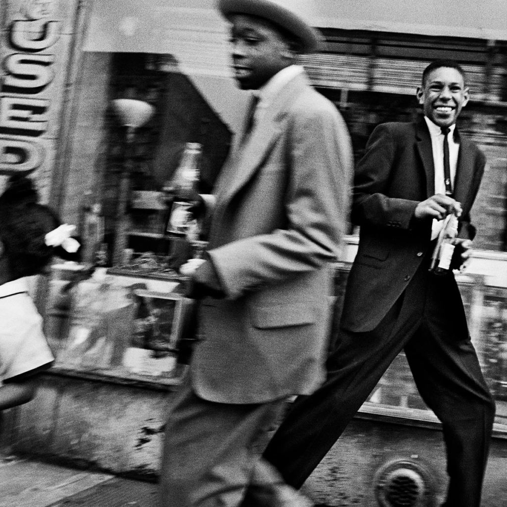
William Klein’s photo Moves and Pepsi, Harlem, New York, 1955 really captures the lively energy of street life in Harlem back in the ’50s. You can feel the movement and hustle of people going about their day. Since the photo is black and white, it highlights the contrasts and textures more than colors, which gives it a gritty vibe. The natural light and shadows help add depth and a bit of drama to the picture, making it feel alive and real.
Technical Analysis
On the technical side, Klein used a wide-angle lens that probably made parts of the photo feel closer or more exaggerated, which pulls you right into the action. Shooting with black-and-white film and high contrast gives the image that raw, documentary look Klein was known for. Most of the scene is in focus, letting you notice lots of details throughout the busy street. Depending on how fast people were moving, Klein might have used a quick shutter to freeze the moment or a slower one to show some motion blur, really showing how active the street was.
Contextual Analysis
The photo also has a lot going on in terms of history and culture. Harlem in 1955 was a vibrant place full of Black culture and creativity but also faced some tough social and economic challenges. This was before the big Civil Rights Movement kicked off, so the photo gives a snapshot of everyday life during an important time. Klein was famous for capturing real, sometimes raw moments in city life, and this photo fits right into that style, making it more than just a snapshot, it’s a story about the place and its people.
Conceptual Analysis
Conceptually, the photo explores the mix of everyday life, culture, and consumerism in the city. Y It tells a story about resilience and the energy of Harlem’s streets, while also making you think about how big companies and ordinary people coexist. Klein’s photo invites you to see the city’s rhythm and complexity, showing both its struggles and its spirit.
Comparison Between their key photos
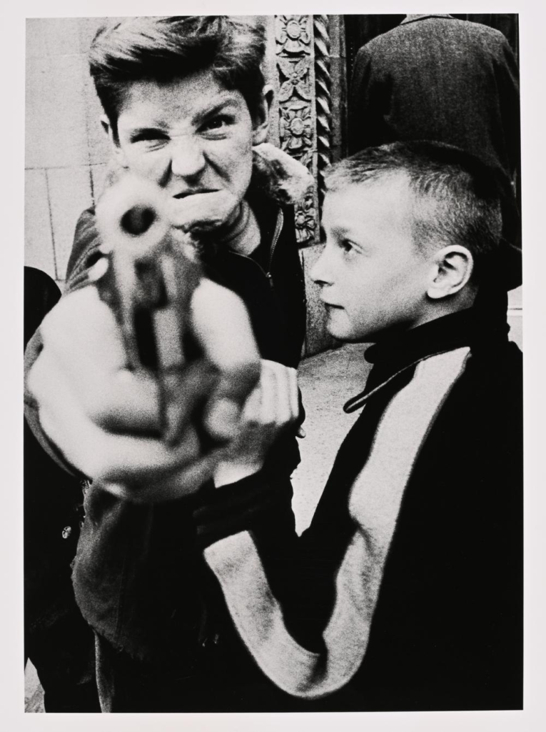
Gun 1, William Klein:
William Klein is known for his raw, gritty, often chaotic street photography with a bold, graphic style. Gun 1 (from his series on New York or other cities) captures a tense, dynamic moment involving a gun, a snapshot of urban tension and social realities in mid-20th century America (usually 1950s-60s). Klein’s style is often grainy, high contrast, and full of energy. Shows a tense moment involving a gun, which gives a feeling of danger or conflict. The scene feels spontaneous and chaotic. The photo is often high contrast (strong darks and lights), with a grainy or rough texture. It feels raw and energetic, sometimes with blurred or unusual framing to show movement and urgency. The mood is tense and urgent, showing the harsh realities of city life and conflict. He also mentioned that this photo reminds him of himself as the 2 boys represent the 2 different emotions and personalities he is.
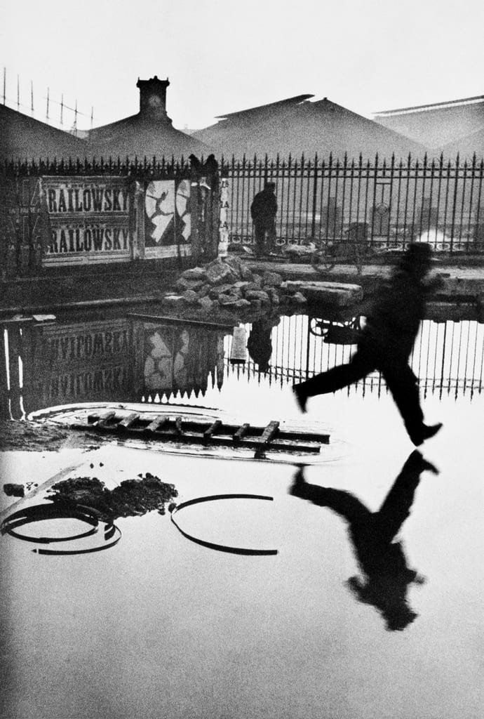
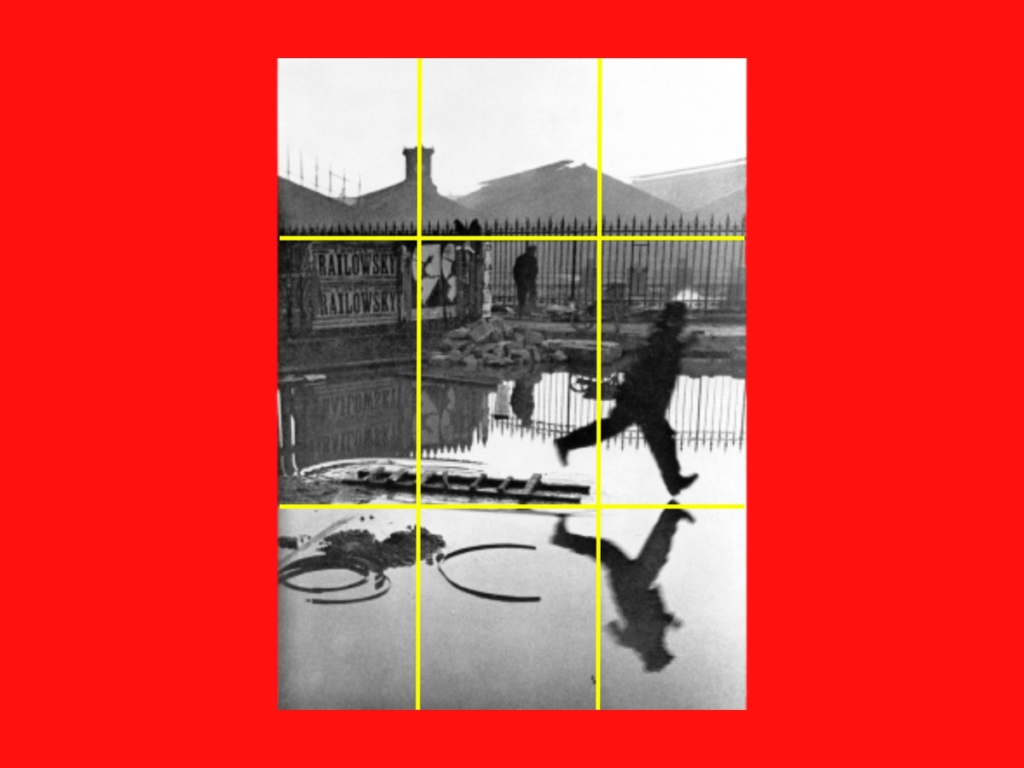
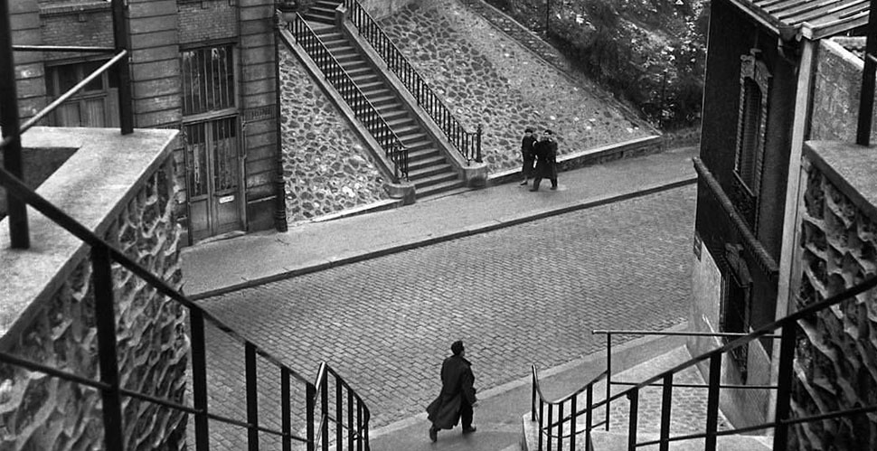
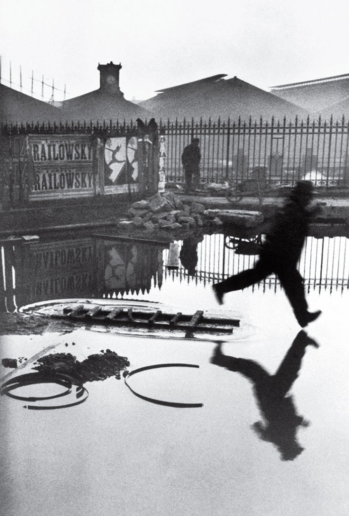
Gare Saint-Lazare, Henri Cartier-Bresson, 1932:
Cartier-Bresson’s style is elegant, poetic, and meticulously composed. He is the master of the “decisive moment”, catching a perfect instant in everyday life that reveals deeper meaning or beauty. This photo is serene, balanced, and a classic of early street photography, taken in Paris between the World Wars. Shows a man jumping over a puddle, caught at the perfect moment mid-air with his reflection in the water below. It’s a peaceful and balanced scene. This photo is sharp and clean, with clear lines and shapes. The composition is carefully balanced, using reflections and geometry to create harmony. The mood is calm and poetic, capturing a fleeting, perfect moment that shows the beauty in everyday life.
Confrontational and Observational Images
Confrontational images: challenge the viewer or subject directly, often showing tension, conflict, or strong emotions. Confrontational photography can be powerful to expose truth, create urgency, or make a statement. It involves risk and energy, and sometimes disruption.
Observational images: capture moments quietly, without disturbing the scene, like watching life unfold naturally. Observational photography requires patience, awareness, and respect for the subject. It’s about seeing the beauty in the ordinary without disturbing it.
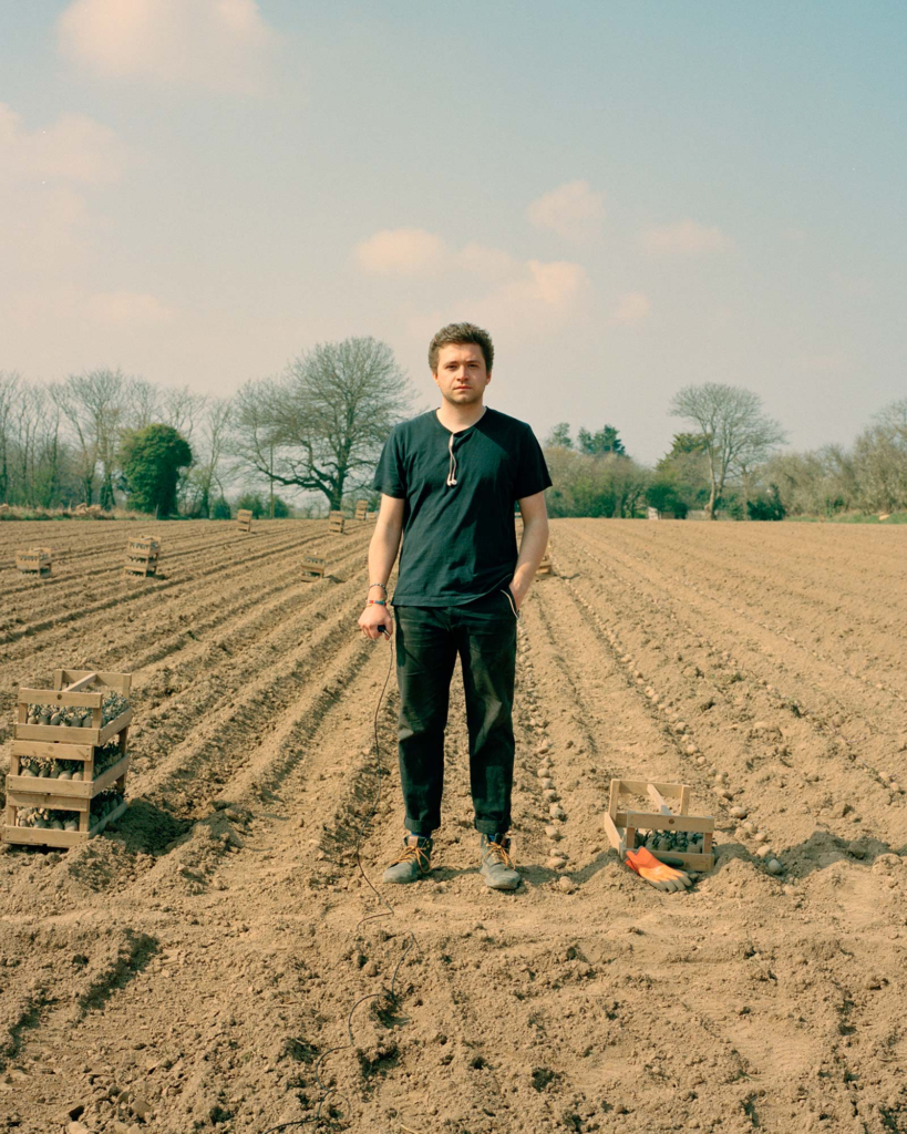
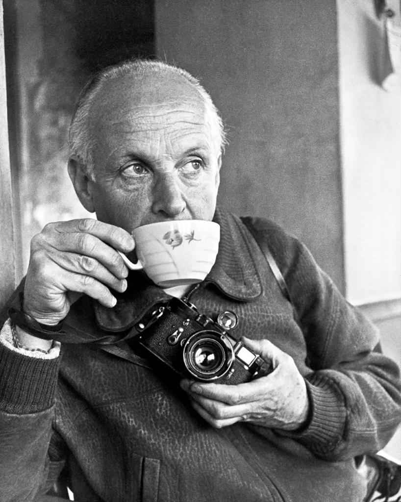
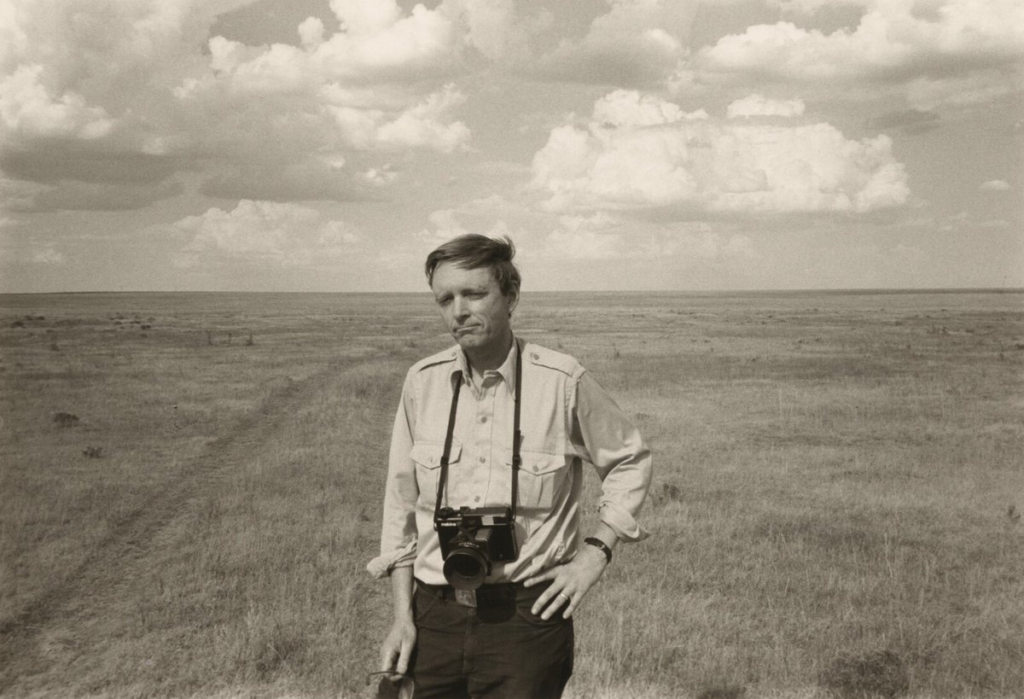
Robert Capa
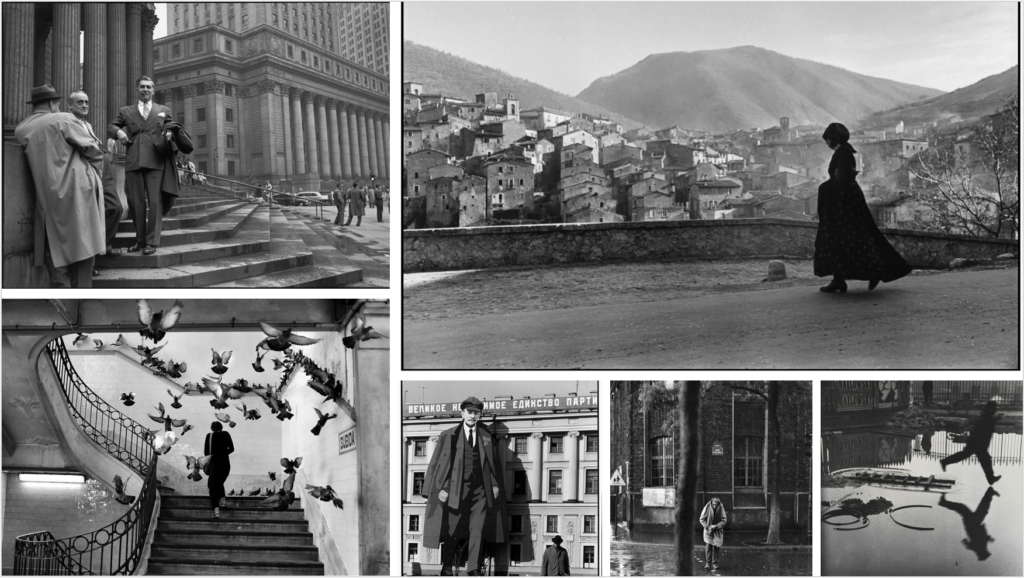
In relation to WK and HCB: