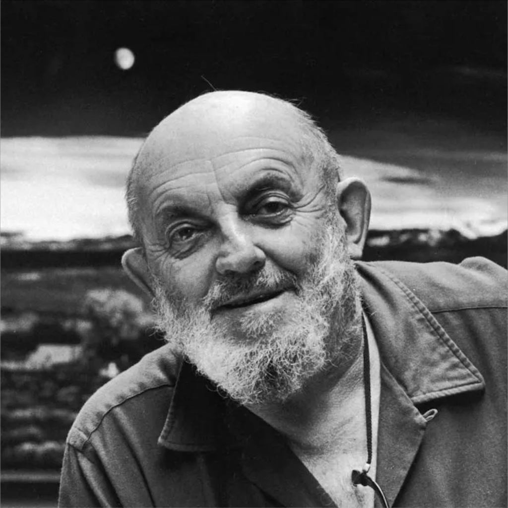
All posts by Ruby Jones

Filters

Author:
Category:

Ansel Adams

Who is Ansel Adams?

Ansel Easton Adams (February 20, 1902 – April 22, 1984) was an American landscape photographer and environmentalist known for his black-and-white images of the American West.

His childhood?

Adams was a hyperactive and sickly child with few friends. Dismissed from several schools for bad behaviour, he was educated by private tutors and members of his family from the age of 12. They believed he had dyslexia. Adams taught himself the piano, which would become his early passion.

Yosemite National Part

At age 14, he was given his first camera during his first visit to Yosemite National Park. He was mesmerised by the rough and creative textures around him and became inspired. He developed his early photographic work as a member of the Sierra Club. He was later contracted with the United States Department of the Interior to make photographs of national parks.

The Sierra Club

To practice and promote the responsible use of the earth’s ecosystems and resources; To educate and enlist humanity to protect and restore the quality of the natural and human environment; and to use all lawful means to carry out these objectives.

In 1927, Adams participated in the Club’s annual outing, known as the High Trip, and, the next year, he became the Club’s official trip photographer. 

What else was he involved in?

A passionate champion of photography as a legitimate form of fine art, he referred to his most stunning images as his “Mona Lisas”. But Adams was also a tireless conservationist and wilderness preservationist who understood the power of a strong image to sway public and political opinion.

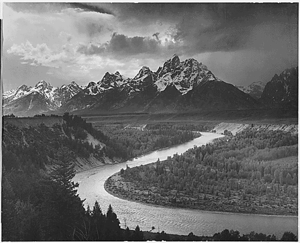
Ansel Adams’ images were used for environmental purposes when the Sierra Club was seeking the creation of a national park in the Kings River region of the Sierra Nevada. The Sierra Club were seeking the creation of The King’s Canyon as a national park to save it and preserve the natural beauty. The King’s Canyon was at risk because the river plunges nearly 11,000 feet in just 80 miles, it carried enormous potential as a power source, and by the mid-1930s, power and water interests had proposed a series of large dams in the canyon. In 1936, construction on the dams had been halted, but protecting the Canyon once and for all would require creating a new national park.

Ansel helped to convince congress (which was miles away in Washington) to protect the High Sierra by taking images of the beautiful nature, and bringing them to the congress to show what they would miss out on when they use it as an energy source instead. This was not an easy task for him – he had to travel to present his images to them, hoping they would understand his determination to preserve the natural environment.

Originally established in 1890 as General Grant National Park, the park was greatly expanded and renamed on March 4, 1940. I believe that Adams found the true heart of the Sierra. He loved the natural side to life, and wanted to try his best to keep what he could. He believed it would benefit the wildlife and nature by changing it into a national park so they couldn’t use it as a power source. There he found beauty as well as inner peace.

Visualisation and Zone System

Visualisation

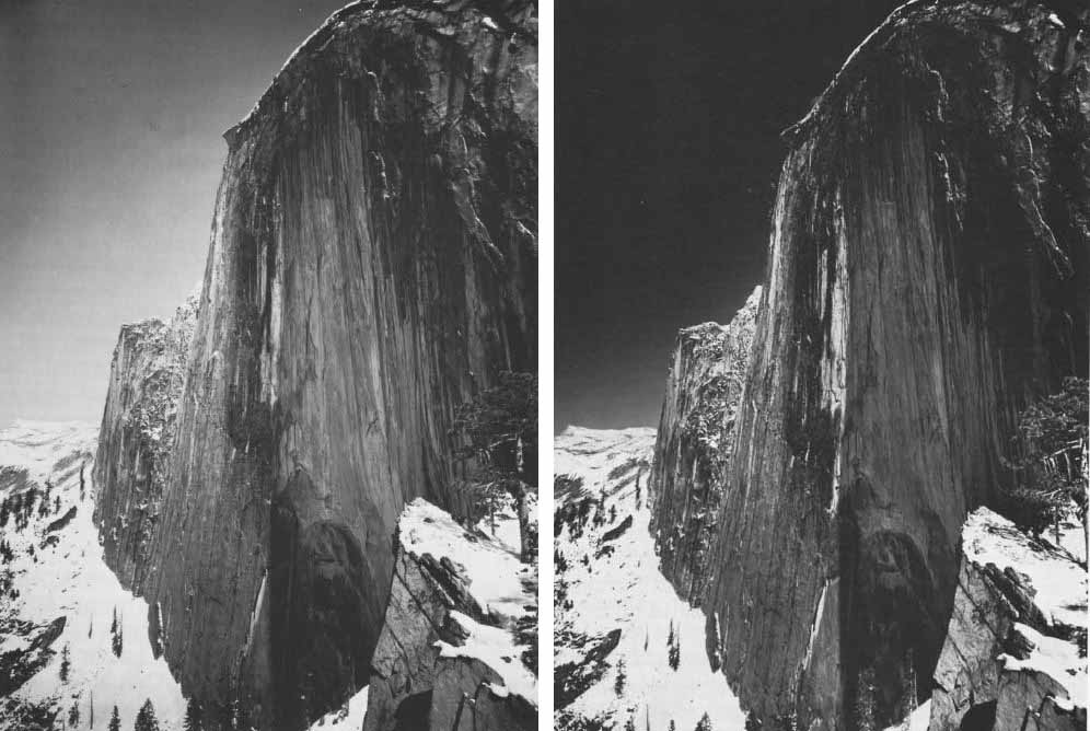
Visualisation is the concept of interpreting a scene and deciding on the final shot before pressing the shutter. Taking place within the ‘mind’s eye’, as Adams often said, visualisation involves intuitively assessing a subject and choosing the most important attributes to frame and highlight. He did this by using photo filters (as there was no photoshop at that time) so he made the images a slightly different colour from it.

Zone System

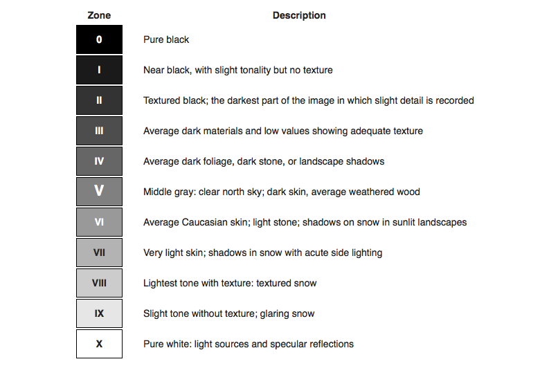
The Zone System is a photographic technique for determining optimal film exposure and development, formulated by Ansel Adams and Fred Archer. It separates tones from pure black to pure white into 11 zones, numbered 0 to 10, with Zone 0 being black with no detail and Zone 10 being pure white with no detail. In the middle of these is Zone 5, which is a neutral grey.

By measuring light in a scene and deciding which zone a subject should fall into, a photographer can change the exposure to make sure the image captures the detail and contrast. This helps make sure that shadows aren’t too dark and highlights aren’t too bright.

Romanticism

What is Romanticism?

Romanticism is the Romantics celebrated the spontaneity, imagination, and the purity of nature. Along with these elements it also incorporated a deep feeling of emotion as an authentic source of experience. Romanticism was a reaction against the Enlightenment and against 18th-century rationalism and physical materialism in general. Romanticism emphasized the individual, the subjective, the irrational, the imaginative, the personal, the spontaneous, the emotional, the visionary, and the transcendental.

What is the Sublime?

The Sublime is a western concept of ‘the exalted’ of ‘beauty that is grand and dangerous’. The Sublime refers to the wild but beautiful side of nature. The Sublime is related to agony and to pain, and it is spaces where things happen beyond the need of human control and human manipulation to nature. It overwhelms the viewer, but also excites them with the image.

The Hay Wain – John Constable

This painting is a 6ft landscape made in 1821 named the Hay Wain, which is a classical painting, and is not mundane. Previously, it was called the ‘Noon’, but they changed it. This image is very diverse for it’s time, as landscape wasn’t a very popular genre to paint/ draw. This image consists of very small details planted throughout, so you have to look closely. John’s father was a land owner, so John grew up around nature and had a very environmental life. This image represents the industrial time period where it was a common ideology that machines were taking over. However, this image challenges this as it shows the beautiful side to the time period, and it makes this more significant as this was not a typical landscape that was seen. This image creates a connection between farmers and the land, which therefore makes the image romantic and personal. Especially as John’s father was a farmer, it really connects John to the landscape. Lastly, the rough textures from the paint can link to the textures of the actual texture. For example, the texture for water is similar to the water in real life.

JMW Turner

J.M.W. Turner was a British painter who lived in the late 1700s and early 1800s. He is known for painting powerful and emotional pictures of nature. Turner liked to paint the sea, the sky, and the weather. He often showed things like storms, sunsets, and ships in rough water. His paintings showed both the beauty and danger of nature. As he got older, his style became more loose and blurry, and his work later inspired modern artists.

History of Landscapes

The term “landscape” actually derives from the Dutch word landschap, which originally meant “region, tract of land” but acquired the artistic connotation, “a picture depicting scenery on land” in the early 1500s. It is a wide view of a natural aesthetic like mountains, trees, or fields, which can all be classed as landscapes. It can also refer to artwork or photos showing this kind of view, or to the horizontal layout of a page or screen.

8 Dutch Landscape Painters of the 17th century | TheCollector

In the 17th century the classical landscape was born. These landscapes were influenced by classical antiquity, and wanted to illustrate an ideal landscape recalling Arcadia, a legendary place in ancient Greece known for its quiet pastoral beauty. Landscape became a separate art genre in Western culture during the 17th century. While landscapes appeared earlier in Renaissance art as backgrounds, it wasn’t until the 1600s that artists began painting nature as the main subject and the main focus of many art pieces.

Dutch Landscapes and Seascapes of the 1600s

The rise of landscape art during the 18th and 19th centuries was influenced by societal and cultural shifts. The idea of romanticism was a key part, as artists began to focus on emotion, individual experience, and nature, to portray their thoughts into their artwork. Many art projects would either be very dramatised and over the top or peaceful and natural. At the same time, the Industrial Revolution led to individuals desiring nature again, as society was focused on manufactures and factories, which led to artists painting nature in landscapes.

  • When did landscape photography originate?

Image adjusting

Here are some images where I am experimenting with the different types of levels/curves/brightness and contrast that I can adjust to improve the image. I also included images of me experimenting with the different types of double exposure I can have, and this was me figuring out which ones I liked the best.

I was able to adjust these images in various ways to see which of the edits I preferred. From doing this, I made the decision that I wanted to blend two images together, as it produced a unique image, that had a creative effect on it. I also wanted to experiment by changing the background colour, as it links closely to the artist, Wes Namen. The background made the subject stand out, instead of looking like every other photo which I liked.

Lastly, I improved my work by adding its own style to it, by using different colours to Wes Namen. This shows that it is similar to the artist, as I implemented their work into mine, but it isn’t identical as I perceived their work in my own way. As you can see below, instead of the greenish blue Wes Namen uses, I changed the colour to red as I felt that it suited the image more, and gave it my own twist.

Photoshoot 2 and Image Selection

Statement of Intent

For this project, I took two photoshoots (one consisted of 201 images and the other had 106) to showcase the idea behind identity. I planned the first photoshoot by implementing Wes Naman’s ideas into my images. The reason I took these photos are because I think your looks don’t define you as a person, and Wes Naman does a brilliant job at distorting your face to make you look unrecognisable (to prove it doesn’t change you as a person).

I used many different materials, like clingfilm, masking tape, cellotape, and string to recreate his images, as he uses a lot of similar materials.

After I uploaded all my images to Lightroom, I scrolled through every image from the 201 photos to select my favourites. As shown, I would say there is quite an even amount of every colour in this image selection. Although I was being picky, a lot of these images really linked to Wes Naman closely, and accurately represented his work.

Photoshoot 1 and Image Selection

Statement of Intent

For this photoshoot, I was hugely inspired by Noor+, an unknown photographer on Pinterest, who draws on the body to show Identity. I ended up taking 106 images, from different angles to different lighting and different poses.

I planned this photoshoot by buying the equipment I would need (like the washable pens and some wipes) and planning whereabouts I would do the photoshoot. I thought that I wanted to have natural lighting for my images so I planned to go outside and take these images.

Once I uploaded my images to Lightroom, I went through each individual photo and analysed it to decide which images were the best. However, a lot of my images turned too bright or too dark due to the ISO, which made me colour them red. In comparison, the images highlighted in yellow and green are good images, but I like to be more specific with the ones I like.

Wes Naman and Noor+

Wes Naman

Here is a range of Wes Naman’s images where he uses vast materials (like cellotape and rubber bands/ string) to shape the subjects face and make them look unrecognisable. The idea behind this is to prove that looks aren’t important, and they don’t define you as a person (which closely relates to your identity and how you see yourself).

Technical

The image uses a fast shutter speed, as the subject looks still and in focus. The lighting is artificial, as the viewer can tell they are using a backdrop with strong white lights (which would not happen with natural light), and it seems like it is very intense, as you can notice the outside edges of the top are a lot darker, meaning the photographer has used a strong light on the subject. The image has a good ISO, as there is no grainy elements that are visible.

Visual

The middle-aged man looks unrecognisable as he has rubber bands wrapping his face, giving him a new look. He has a sort of confused and hurt look on his face, which could suggest he is shocked with the feeling. The navy background gives a cool tone, which could represent sorrow and sadness towards the pain of the rubber bands.

Contextual

A common belief is that beauty is everything, so by taking away that view in these images, it leaves the subject wondering who they actually are, and what their identity really is. The history of beauty is been around for centuries, so to counter act the beauty stereotype Wes Naman had his subjects distort their faces.

Conceptual

I believe the reason behind this image is to show the suffering people go through to accept themselves, when they shouldn’t need to. I also have the idea that it links to the appearance of yourself, and by manipulating the face into a different shape, it causes you to wonder what your identity is if you don’t have your looks (which is a common link for identity).

Noor+

Noor+ is a unknown photographer, who writes on the subjects face to show their identity and what they associate with. I liked this idea as I thought that it is a great way to demonstrate you as a person, and the ideas you think you are. Unfortunately, the words aren’t in English, so for my photoshoot, I will base it off of identity. This is also the only image I could find of this photographer, so I cannot create a mood board of his work.

Presentation of final outcomes

Wes Naman

Here is one of my final outcomes, where I selected my 4 best images and tweaked them to improve the quality of them. Luckily, I had 4 different subjects so the final presentation works well as you don’t have many of the same person, like Naman who also has various subjects. When I finished editing them, I put them into Powerpoint to make show the idea I want to have.

I then also decided to do another final outcome using the Wes Naman inspired images, to experiment and create different versions. I decided to choose a diptych styled presentation, where instead of multiple images, I only have two, which helps you to see the specific details linked into these images from the editing.

Noor+

Lastly, for my Identity project, I also decided to use my other photoshoot where I wrote on area’s of my subjects body to show that no two are the same. I chose to place three of my best images into a triptych, to give the illusion of a story, and a meaning behind the different words placed on the different parts.

Creative Portraits

I wanted to include my final images from my creative portraiture, as I wanted to imagine the layout of them. For my first presentation, I only selected three images as I didn’t want to over crowd the layout I already thought of, and these were my best images from that specific artist.

For my other presentation of Creative Portraiture, I decided to only use one image as I really like the unique and artsy side to this edit, and I didn’t want to draw the attention away by including more.

Studio Portraiture

This is my final presentation of Studio Portraiture, where I used the three different lighting methods to showcase my knowledge.

Environmental Portraiture

Lastly, this is my environmental portraiture, and I incorporated three images as well but I decided to lay them vertically instead of horizontally like the rest as it creates diversity.

Creative Portraits

Creative portraiture is a type of portrait photography where the photographer uses artistic and expressive ideas to make the photo more diverse and interesting. The goal is to tell a story or create something different and eye-catching. It might involve dramatic lighting, fun backgrounds, or editing effects. Creative portraiture is all about making portraits more artistic, to differentiate these images from normal portraits.

Double Exposure – Camera

For these next images, I used a specific type of camera which allows you to take two or more photos and combine them to create double exposure. These images are heavily inspired by Michael Betzner, who also used a double exposure camera to take his images.

Michael Betzner

I really liked how these images turned out, as it closely relates to the artist’s work. I decided to make one of the images black and white as I wanted to see the contrast of the two images in one properly, so by turning it into a monochrome colour, it made the contrast of the lighter and darker shades more noticeable.

EL Lizzitsky

For this creative edit, I used image and uploaded it to photoshop with an old type of background I found on google. I then put the two images into one and used double exposure to see which one would suit this combination the best. Lastly, I found a bulls eye target and included it into my work on the eye of the subject as it follows what the artist I am inspired by does.

Photoshop Editing

These images relied on the use of photoshop editing to create different outcomes. Like the other creative image, these photos are just experimental, but I ended up really liking these. They have no inspiration, but they do have a creative and artsy side to them.

This image uses double exposure with two images overlapped to create a distorted, blurred image. I liked this as I liked the unique colours incorporated to make this photo more eye catching.

For the next image, I also did not have inspiration, but I do like how the colours juxtapose each other like a type of “happy vs sad” image. I also like it as the subject on the right looks as if he is creeping over the left subject, like a evil thing. This adds to the “happy vs sad” type of image, as it makes it seem like the happier person is more up close and the sad person is more in the shadows.

Distortion

For this creative portrait, it was more of an experiment to see what techniques I could try, and I ended up really liking this one. I think this works so well because of the pose the subject is doing, as it is a classic pose to seem sorrowful, and with the distortion added, it represents the subjects thoughts in a way.

Kensuoke Koike:

Kensuoke Koike was born June 28, 1980, in Nagoya, Japan, and is a contemporary visual artist. He previously graduated from The Academy of Fine Arts, (2004). He is best known for his collages.

For my first creative portrait, I used a regular studio portrait, and up levelled it by selecting small horizontal rectangles, and shifting each piece slightly to create a zigzag effect. Evidently, you can see each section in the image creates an overall unique approach to portraiture, like Koike.