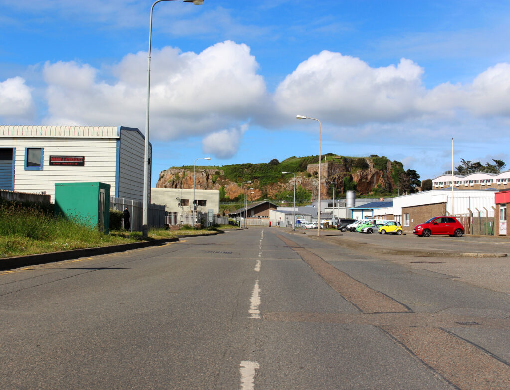
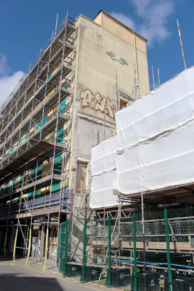
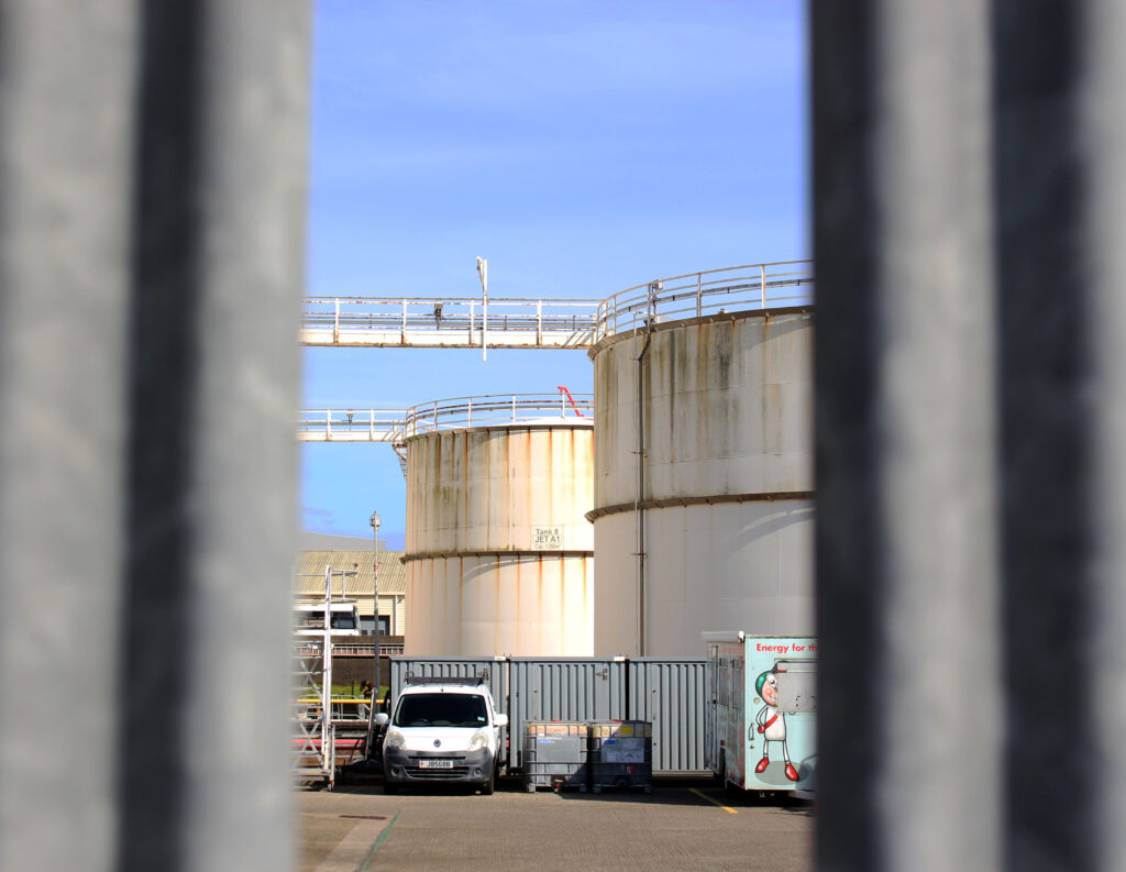
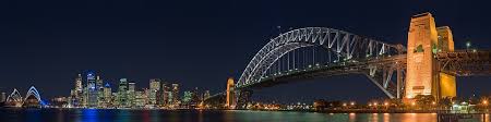
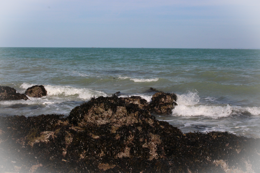
I am planning to take photos to achieve the industrial side of Jersey as many of the New Topographics are highly based around that. I am aiming to take photos of various locations such as Pier Road Carpark, La Collette, and The Old.. These are similar locations that I can find that link closely to the New Topographics in Jersey,
Image Selection
I carefully went through each individual image and colour coded them red, yellow and green to help highlight the best images when I edit them in photoshop. This is convenient as it minimises time-loss from searching through each image to select my favourites. As I went through these photos, I noticed a reoccurring pattern where the images were not clear as I moved the camera before I took the image, leading to a imprecise image.
Best Images
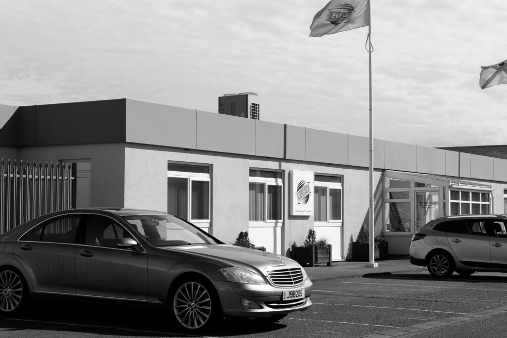
The following images are my best images for this photoshoot, as I used Lightroom to select them and I uploaded each one to Photoshop. Once I uploaded them, I enhanced the levels and brightness of each image as I felt they would look dull otherwise. Some of the images I decided to make black and white, since the New Topographics had photos only in black and white, so I wanted to have that similarity in some of them. I also managed to include a photo of the street like Stephen Shore did in his images, as that was a key part of his photography.
This last image reminded me of a New Topographic image, as the photo looks plain and generic, like a lot of the images. I also edited this in monochrome colours, to replicate those photos. They also used a dead-pan aesthetic, with a rejection of emotion so I ensured that I did the same, since there is no emotion happening.
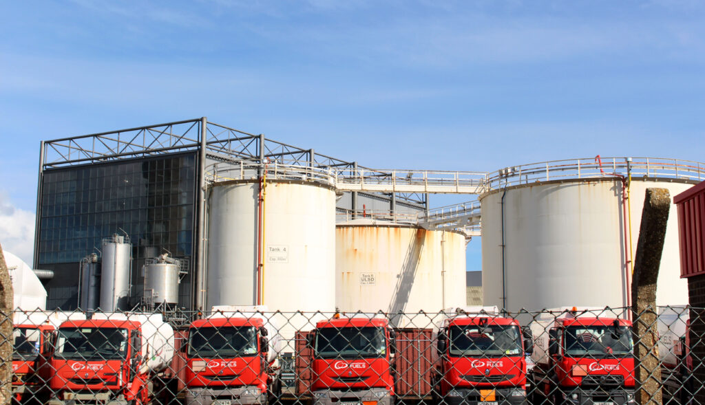
Topographics focus on capturing man altered buildings, like parking lots, suburban housing and warehouses. Topographics translates to the arrangement of the natural and artificial physical features of an area.
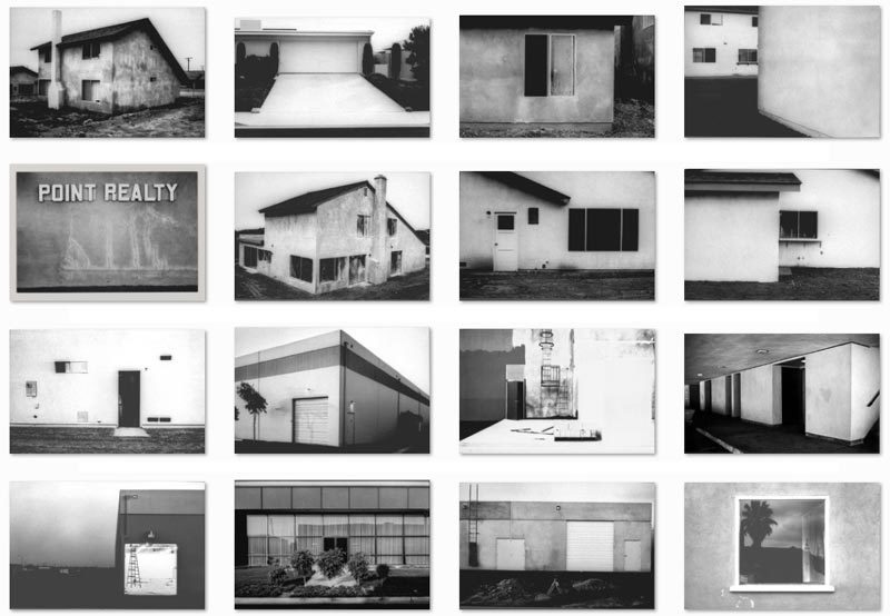
In 1975, William Jenkins used the term “New Topographics” to describe a group of American photographers whose work shared a similar aesthetic, focusing on the overlooked aspects of urban landscapes. Their photographs were formal, black-and-white images that signified the influence of man made development on the environment. Key photographers associated with this include Robert Adams, Lewis Baltz, Nicholas Nixon, and Bernd and Hilla Becher, who were all inspired by the presence of man-made structures.
What was the New Topographics a reaction to?
It acts as a response to the mainstream influence of idealised, suburbanised landscape of photography, which intends to glorify the elemental aspect of the natural world. This type of photography counteracts it and opposes the natural beauty by taking images of man made buildings.
Robert Adams
Robert Adams is an American photographer, who has focused on the changing landscape of the West in America. His work first had significance in the mid-1970s through his book ‘The New West’ and his participation in the exhibition New Topographics: Photographs in 1975. He’s famously known for counteracting against the idealised, beauty of the world by capturing images of the generic world.
His images
This image above is a mixture of his new topographic images. Adams uses a range of natural landscapes with manmade buildings/creations, to highlight the difference humans make in the natural world. He shows the significance in the geometric shapes of each element (natural and created), and how we create generic, plain buildings. In some images, he bases the images solely on these buildings, to create a sense of what the world has become.
Bernd and Hilla Becher
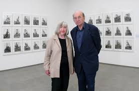
The renowned German artists Bernd and Hilla Becher (1931–2007; 1934–2015) changed the course of late twentieth-century photography. Working as a rare artist couple, they focused on a single subject: the disappearing industrial architecture of Western Europe and North America that improved the modern era. They began collaborating together in 1959 after meeting at the Kunstakademie Düsseldorf in 1957. Bernd originally studied painting and then typography, whereas Hilla had trained as a commercial photographer. After two years collaborating together, they married.
Image Analysis
Technical
Visual
Contextual
Conceptual
Typologies
Typologies in photography are a way of taking pictures of similar things in the same style. The photographer uses the same angle, lighting, and setup for each photo to show how the subjects are alike and different. Bernd and Hilla Becher are an example of this method, as they took many photos of buildings like water towers and factories in a very simple, repeated way. When these photos are shown together, we can see patterns and small details we might not notice in just one picture. This photographic style enables people to look closely into objects we see everyday.
A panoramic image shows a wide perspective. They capture a large amount of scenery, more specifically, natural landscapes. Very few cameras have an automatic button to press to create a panoramic image, so you have to do it manually. You do this by setting the camera up (either with a tripod or by hand) and you move the frame along, but you leave a bit of an overlap to connect them in photoshop.
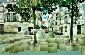
David Hockney
David Hockney is a British artist who became well known for his creative work in photography during the 1970s and 1980s. He made photo collages called “Joiners”. These collages showed different views and moments at the same time, instead of just one fixed image like normal photos. Hockney wanted to show how people really see the world. He also used tools like photocopiers to make pictures in new ways, and later did the same with iPhones.
David Hockney’s Joiner Photos
David Hockney’s Joiner Photos are picture collages he created in the 1980s by combining many small photos. He used Polaroid and 35mm photos to create a larger image, similar to putting together a puzzle. These photos don’t show just one single view, instead, they show different angles and moments all at the same time, by taking lots of images in different positions of the same area. Hockney wanted to show how people actually see the world (piece by piece) as our eyes move around a scene.
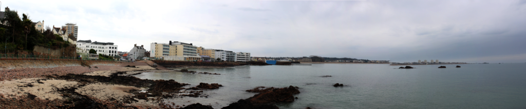
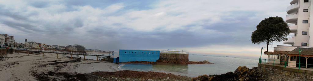
My panoramic Images
I decided to recreate Hockney’s panoramic images by taking an image and slighting moving the camera to create a longer version of the image. I uploaded these images to photoshop and placed them side by side using the tools that photoshop provides in order to do this. However, at the end I had to crop these images as they were uneven and some areas would be shorter than others.
I prefer the first image to the second, as I feel like it presents the landscape in a better way, with no distractions or anything blocking it. Unlike the first image, the second one’s lighting is dimmer, and the building on the far right distracts the viewer from focusing on the main part of the image.
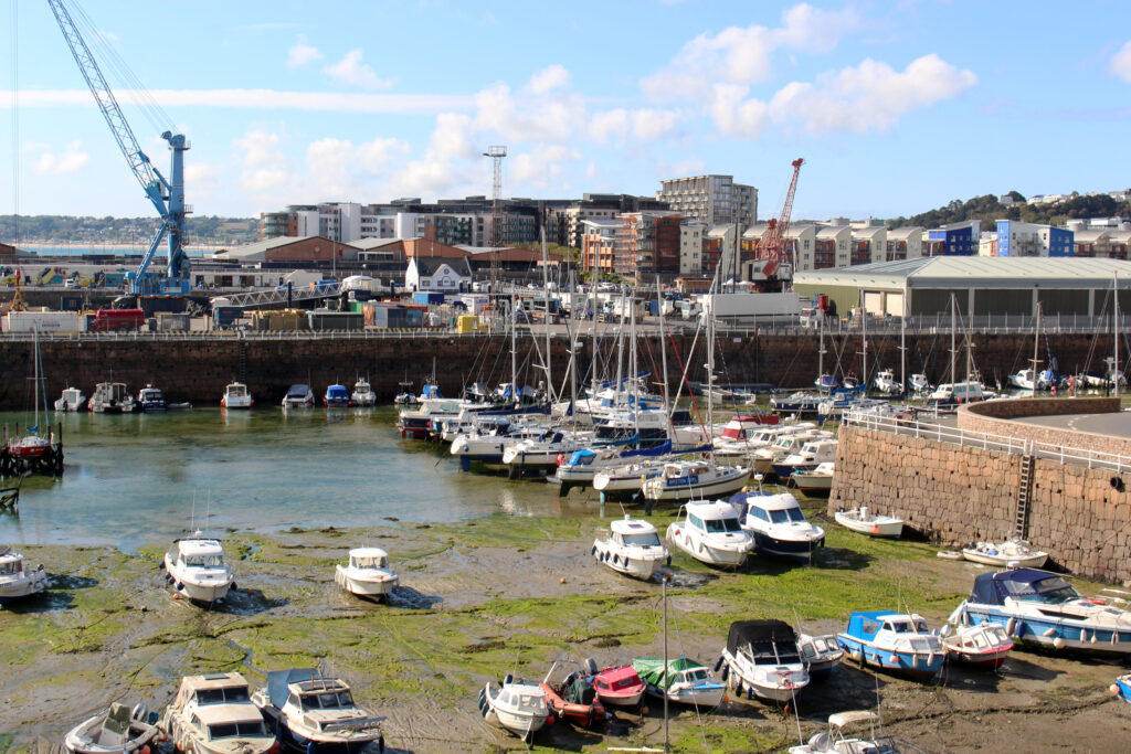
For this photoshoot, I am planning to go to Harve Des Pas and take images along the coast to take images of an Urban area. This will broaden the range of my images, and I can collect a diverse selection as I can take photos of the beach and the buildings nearby. This will take place when the weather is somewhat nice, so I can use the natural light to my advantage.
Image Selection
For the following images, I colour coded each one to make the process easier when uploading the image to photoshop. This way, I can easily identify which images I like, and ones I don’t, so I don’t have to use them. I took around 230 images, which I am pleased about as a large selection improves the amount of images I can edit and choose.
Best Images
The following images are the best images from this photoshoot.
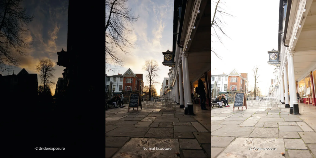
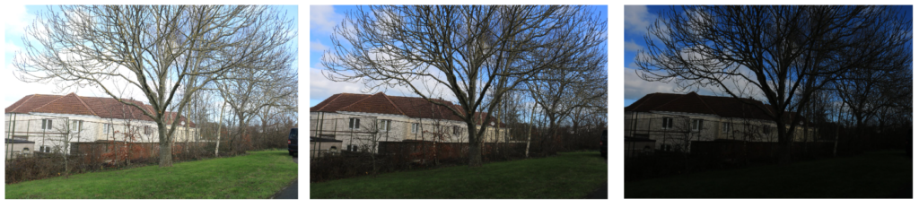
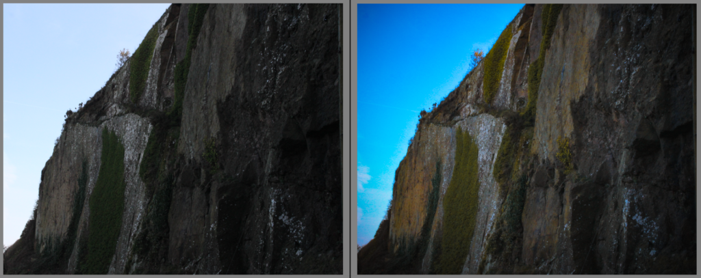
Exposure Bracketing
For the next couple of images, I used a technique called exposure bracketing, where the camera takes three fast images at different exposures to enhance the brightness and quality. I merged the three images from each photo to ‘HDR’ in Lightroom to exaggerate the exposures and show the detail.
In comparison to the first three original images of each photo, these definitely improve the quality and they have the perfect amount of lighting in each.
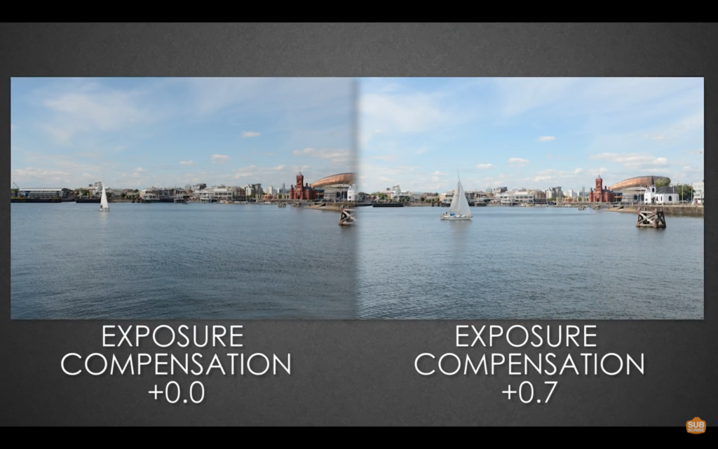
Exposure compensation basically helps you override automatic exposure adjustments your camera makes in situations with uneven light distribution, filters, non-standard processing, or underexposure or overexposure. It lets you take control of your image’s brightness by manually increasing or decreasing exposure.
Exposure Bracketing –
When you bracket your shots you take exactly the same picture of your subject at several different exposures. This technique gives you a range of options to choose from when you’re editing. As a result, it’s much less likely that you’ll end up with a badly underexposed or overexposed photo.
HDR Photos –
HDR (High Dynamic Range) Photos refers to the capture of an entire image scene that has both bright highlights and dark shadows. In other words, instead of capturing highlights that are clipped and pure white, and/or shadows that are lost to total darkness, your image depicts visible detail in all areas.
My Own Exposure Bracketing
I decided to take my own images of the exposure bracketing technique, by changing the settings to apply. The steps were very straightforward,
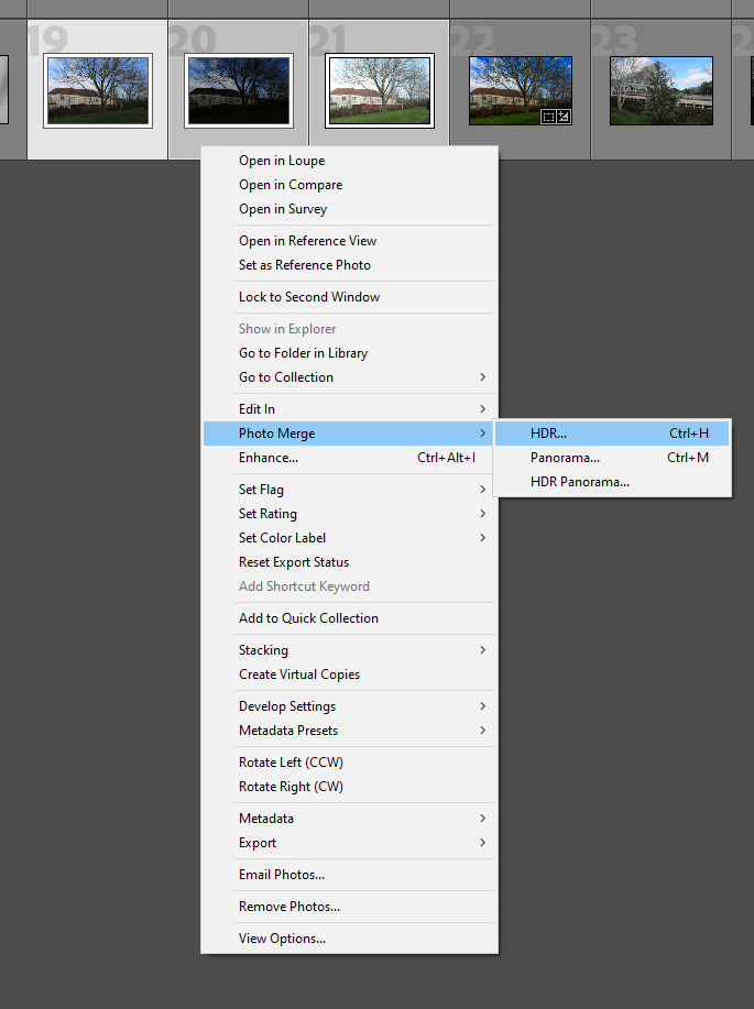
Merging the images
Once I took my three images, I uploaded them to Lightroom where I merged them. The way I did this is by selecting the three images, right clicking, pressing photo merge and lastly, I pressed HDR. This merged the three images together, to create a dramatic and detailed image.
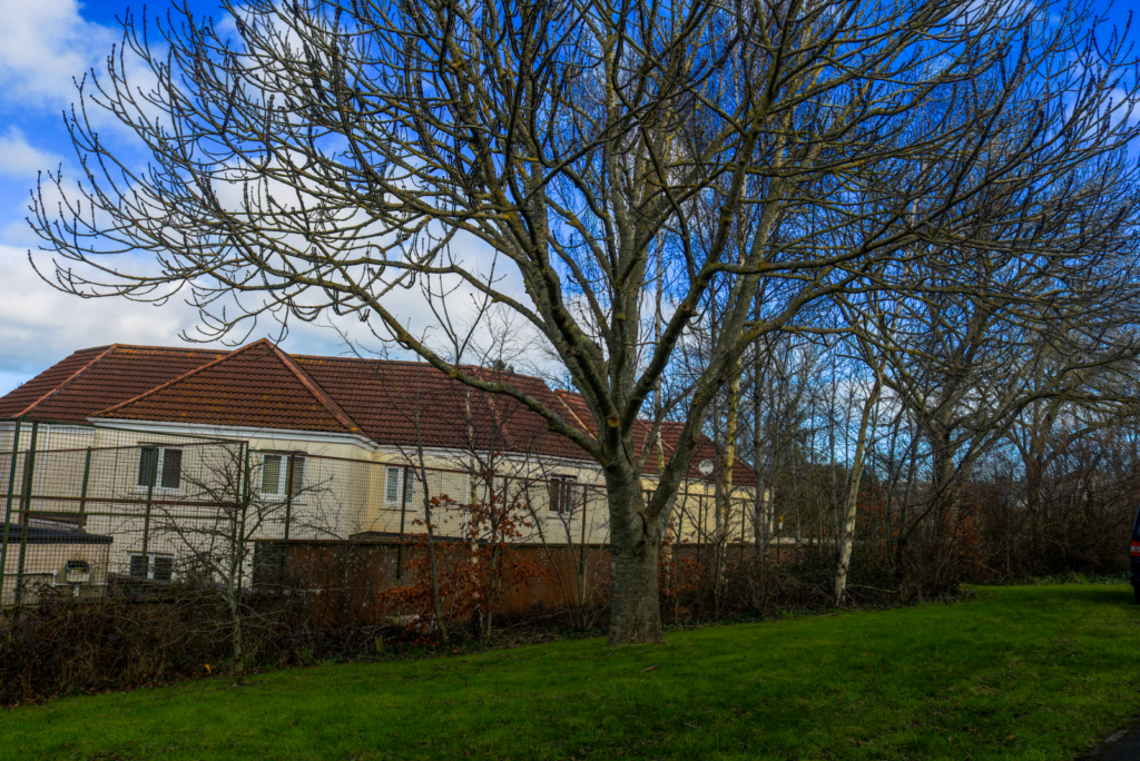
Final HDR image
This is my final image below, where the colours are very vibrant. This is because the three images
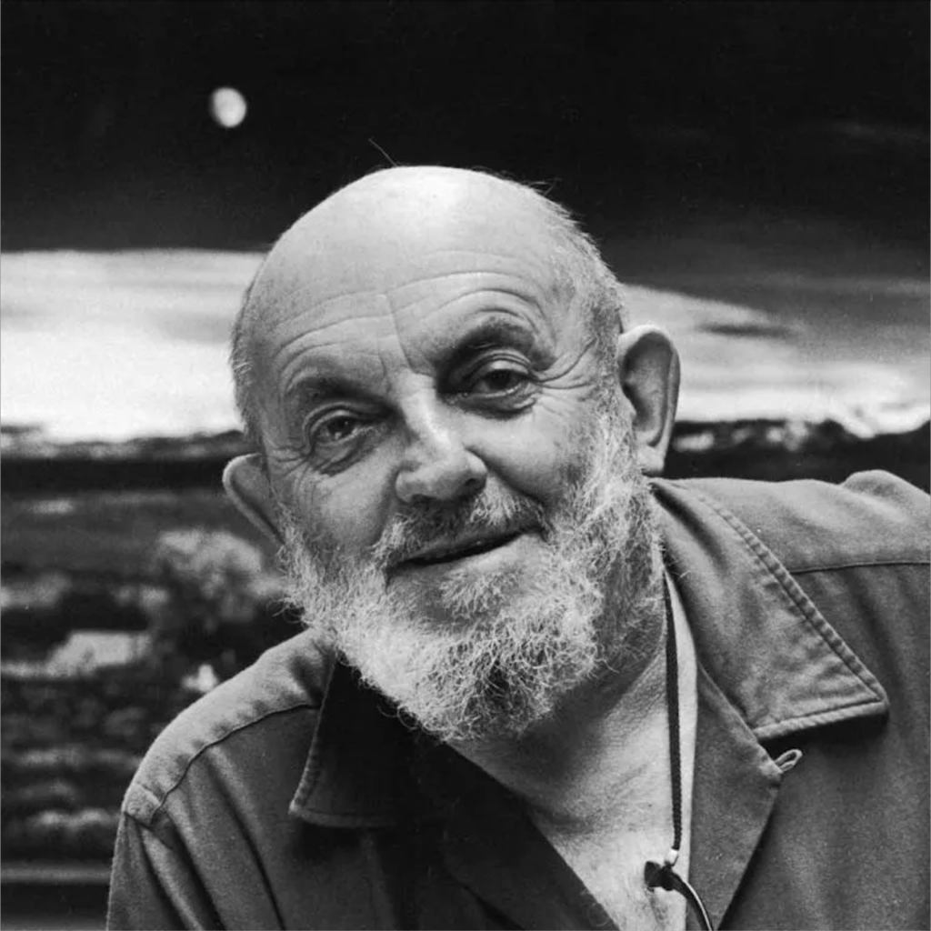
Ansel Easton Adams (February 20, 1902 – April 22, 1984) was an American landscape photographer and environmentalist known for his black-and-white images of the American West.
His childhood?
Adams was a hyperactive and sickly child with few friends. Dismissed from several schools for bad behaviour, he was educated by private tutors and members of his family from the age of 12. They believed he had dyslexia. Adams taught himself the piano, which would become his early passion.
Yosemite National Part
At age 14, he was given his first camera during his first visit to Yosemite National Park. He was mesmerised by the rough and creative textures around him and became inspired. He developed his early photographic work as a member of the Sierra Club. He was later contracted with the United States Department of the Interior to make photographs of national parks.
The Sierra Club
To practice and promote the responsible use of the earth’s ecosystems and resources; To educate and enlist humanity to protect and restore the quality of the natural and human environment; and to use all lawful means to carry out these objectives.
In 1927, Adams participated in the Club’s annual outing, known as the High Trip, and, the next year, he became the Club’s official trip photographer.
What else was he involved in?
A passionate champion of photography as a legitimate form of fine art, he referred to his most stunning images as his “Mona Lisas”. But Adams was also a tireless conservationist and wilderness preservationist who understood the power of a strong image to sway public and political opinion.
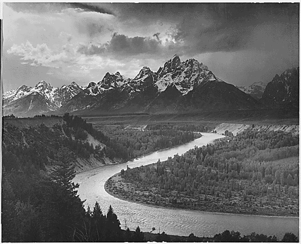
Ansel Adams’ images were used for environmental purposes when the Sierra Club was seeking the creation of a national park in the Kings River region of the Sierra Nevada. The Sierra Club were seeking the creation of The King’s Canyon as a national park to save it and preserve the natural beauty. The King’s Canyon was at risk because the river plunges nearly 11,000 feet in just 80 miles, it carried enormous potential as a power source, and by the mid-1930s, power and water interests had proposed a series of large dams in the canyon. In 1936, construction on the dams had been halted, but protecting the Canyon once and for all would require creating a new national park.
Ansel helped to convince congress (which was miles away in Washington) to protect the High Sierra by taking images of the beautiful nature, and bringing them to the congress to show what they would miss out on when they use it as an energy source instead. This was not an easy task for him – he had to travel to present his images to them, hoping they would understand his determination to preserve the natural environment.
Originally established in 1890 as General Grant National Park, the park was greatly expanded and renamed on March 4, 1940. I believe that Adams found the true heart of the Sierra. He loved the natural side to life, and wanted to try his best to keep what he could. He believed it would benefit the wildlife and nature by changing it into a national park so they couldn’t use it as a power source. There he found beauty as well as inner peace.
Visualisation and Zone System
Visualisation
Visualisation is the concept of interpreting a scene and deciding on the final shot before pressing the shutter. Taking place within the ‘mind’s eye’, as Adams often said, visualisation involves intuitively assessing a subject and choosing the most important attributes to frame and highlight. He did this by using photo filters (as there was no photoshop at that time) so he made the images a slightly different colour from it.
Zone System
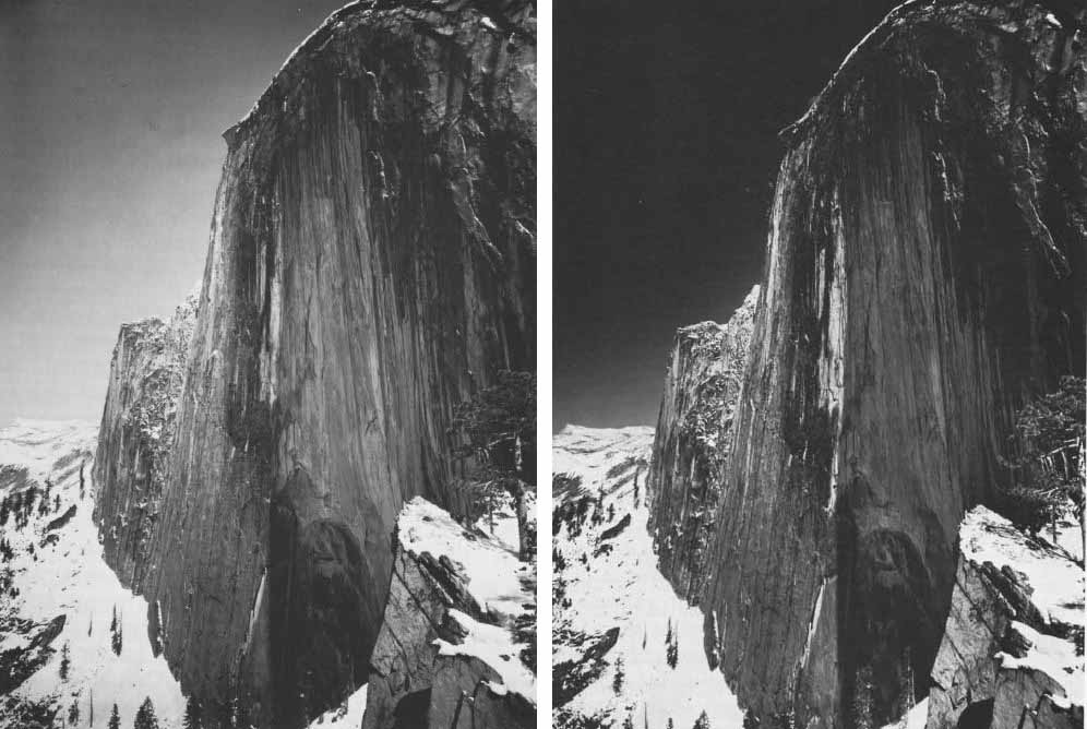
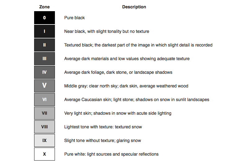
The Zone System is a photographic technique for determining optimal film exposure and development, formulated by Ansel Adams and Fred Archer. It separates tones from pure black to pure white into 11 zones, numbered 0 to 10, with Zone 0 being black with no detail and Zone 10 being pure white with no detail. In the middle of these is Zone 5, which is a neutral grey.
By measuring light in a scene and deciding which zone a subject should fall into, a photographer can change the exposure to make sure the image captures the detail and contrast. This helps make sure that shadows aren’t too dark and highlights aren’t too bright.
Romanticism is the Romantics celebrated the spontaneity, imagination, and the purity of nature. Along with these elements it also incorporated a deep feeling of emotion as an authentic source of experience. Romanticism was a reaction against the Enlightenment and against 18th-century rationalism and physical materialism in general. Romanticism emphasized the individual, the subjective, the irrational, the imaginative, the personal, the spontaneous, the emotional, the visionary, and the transcendental.
What is the Sublime?
The Sublime is a western concept of ‘the exalted’ of ‘beauty that is grand and dangerous’. The Sublime refers to the wild but beautiful side of nature. The Sublime is related to agony and to pain, and it is spaces where things happen beyond the need of human control and human manipulation to nature. It overwhelms the viewer, but also excites them with the image.
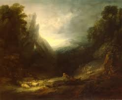
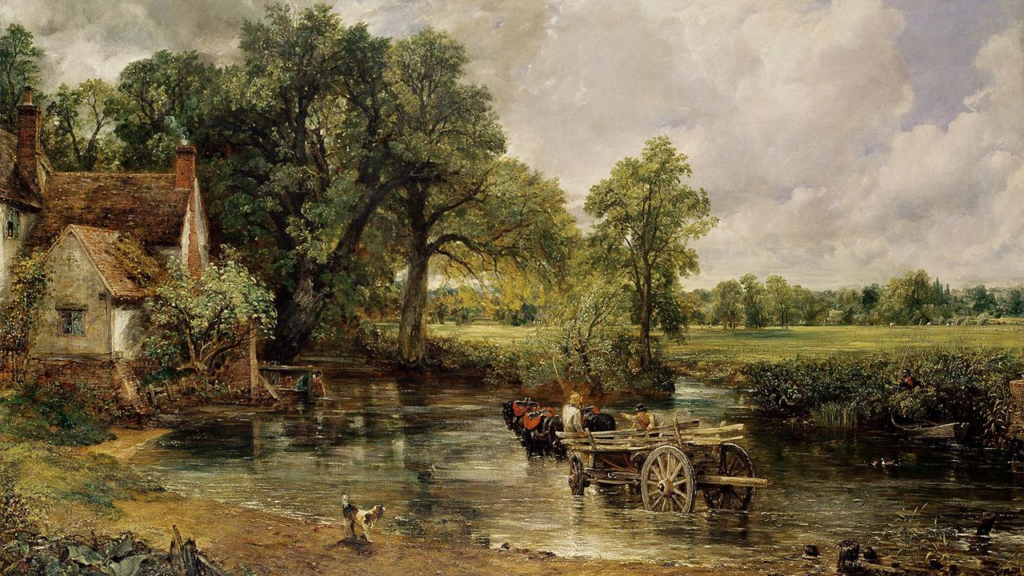
The Hay Wain – John Constable
This painting is a 6ft landscape made in 1821 named the Hay Wain, which is a classical painting, and is not mundane. Previously, it was called the ‘Noon’, but they changed it. This image is very diverse for it’s time, as landscape wasn’t a very popular genre to paint/ draw. This image consists of very small details planted throughout, so you have to look closely. John’s father was a land owner, so John grew up around nature and had a very environmental life. This image represents the industrial time period where it was a common ideology that machines were taking over. However, this image challenges this as it shows the beautiful side to the time period, and it makes this more significant as this was not a typical landscape that was seen. This image creates a connection between farmers and the land, which therefore makes the image romantic and personal. Especially as John’s father was a farmer, it really connects John to the landscape. Lastly, the rough textures from the paint can link to the textures of the actual texture. For example, the texture for water is similar to the water in real life.
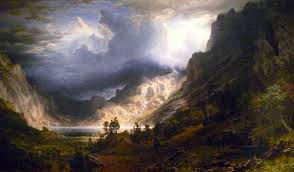
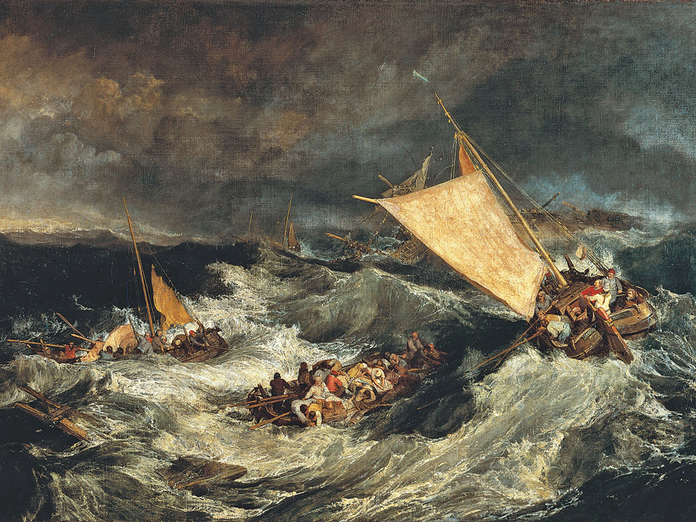
JMW Turner
J.M.W. Turner was a British painter who lived in the late 1700s and early 1800s. He is known for painting powerful and emotional pictures of nature. Turner liked to paint the sea, the sky, and the weather. He often showed things like storms, sunsets, and ships in rough water. His paintings showed both the beauty and danger of nature. As he got older, his style became more loose and blurry, and his work later inspired modern artists.
The term “landscape” actually derives from the Dutch word landschap, which originally meant “region, tract of land” but acquired the artistic connotation, “a picture depicting scenery on land” in the early 1500s. It is a wide view of a natural aesthetic like mountains, trees, or fields, which can all be classed as landscapes. It can also refer to artwork or photos showing this kind of view, or to the horizontal layout of a page or screen.
In the 17th century the classical landscape was born. These landscapes were influenced by classical antiquity, and wanted to illustrate an ideal landscape recalling Arcadia, a legendary place in ancient Greece known for its quiet pastoral beauty. Landscape became a separate art genre in Western culture during the 17th century. While landscapes appeared earlier in Renaissance art as backgrounds, it wasn’t until the 1600s that artists began painting nature as the main subject and the main focus of many art pieces.
The rise of landscape art during the 18th and 19th centuries was influenced by societal and cultural shifts. The idea of romanticism was a key part, as artists began to focus on emotion, individual experience, and nature, to portray their thoughts into their artwork. Many art projects would either be very dramatised and over the top or peaceful and natural. At the same time, the Industrial Revolution led to individuals desiring nature again, as society was focused on manufactures and factories, which led to artists painting nature in landscapes.
Here are some images where I am experimenting with the different types of levels/curves/brightness and contrast that I can adjust to improve the image. I also included images of me experimenting with the different types of double exposure I can have, and this was me figuring out which ones I liked the best.
I was able to adjust these images in various ways to see which of the edits I preferred. From doing this, I made the decision that I wanted to blend two images together, as it produced a unique image, that had a creative effect on it. I also wanted to experiment by changing the background colour, as it links closely to the artist, Wes Namen. The background made the subject stand out, instead of looking like every other photo which I liked.
Lastly, I improved my work by adding its own style to it, by using different colours to Wes Namen. This shows that it is similar to the artist, as I implemented their work into mine, but it isn’t identical as I perceived their work in my own way. As you can see below, instead of the greenish blue Wes Namen uses, I changed the colour to red as I felt that it suited the image more, and gave it my own twist.
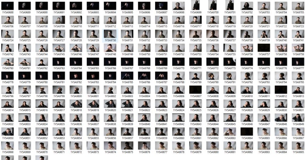
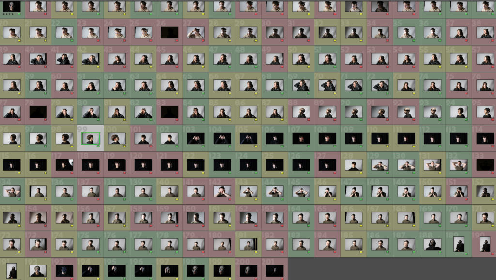
For this project, I took two photoshoots (one consisted of 201 images and the other had 106) to showcase the idea behind identity. I planned the first photoshoot by implementing Wes Naman’s ideas into my images. The reason I took these photos are because I think your looks don’t define you as a person, and Wes Naman does a brilliant job at distorting your face to make you look unrecognisable (to prove it doesn’t change you as a person).
I used many different materials, like clingfilm, masking tape, cellotape, and string to recreate his images, as he uses a lot of similar materials.
After I uploaded all my images to Lightroom, I scrolled through every image from the 201 photos to select my favourites. As shown, I would say there is quite an even amount of every colour in this image selection. Although I was being picky, a lot of these images really linked to Wes Naman closely, and accurately represented his work.