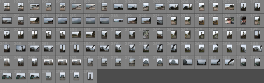
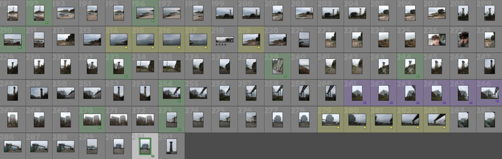
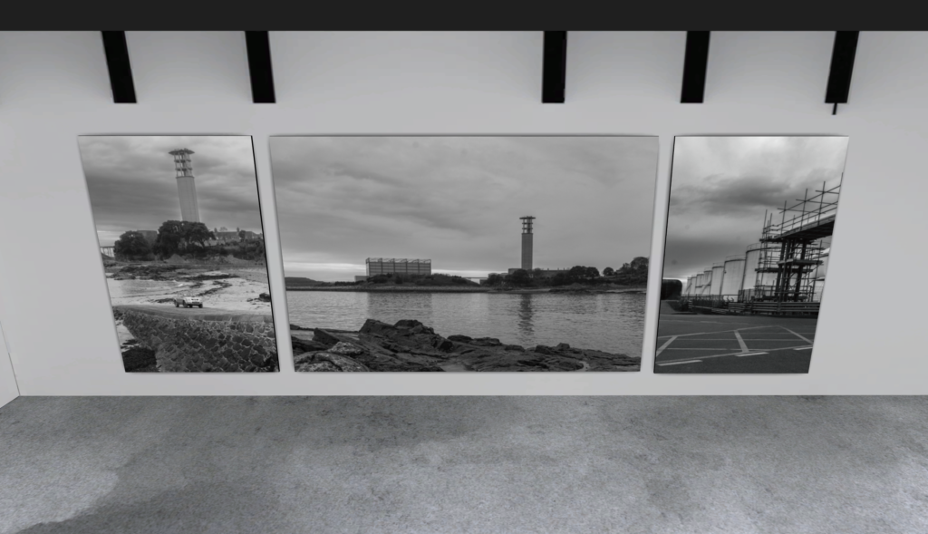
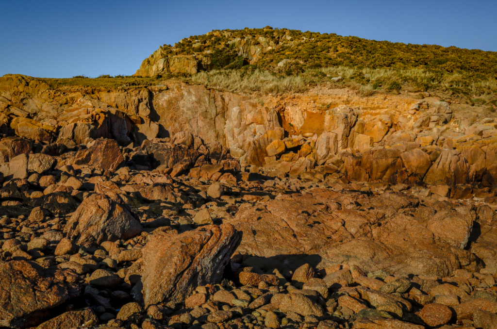
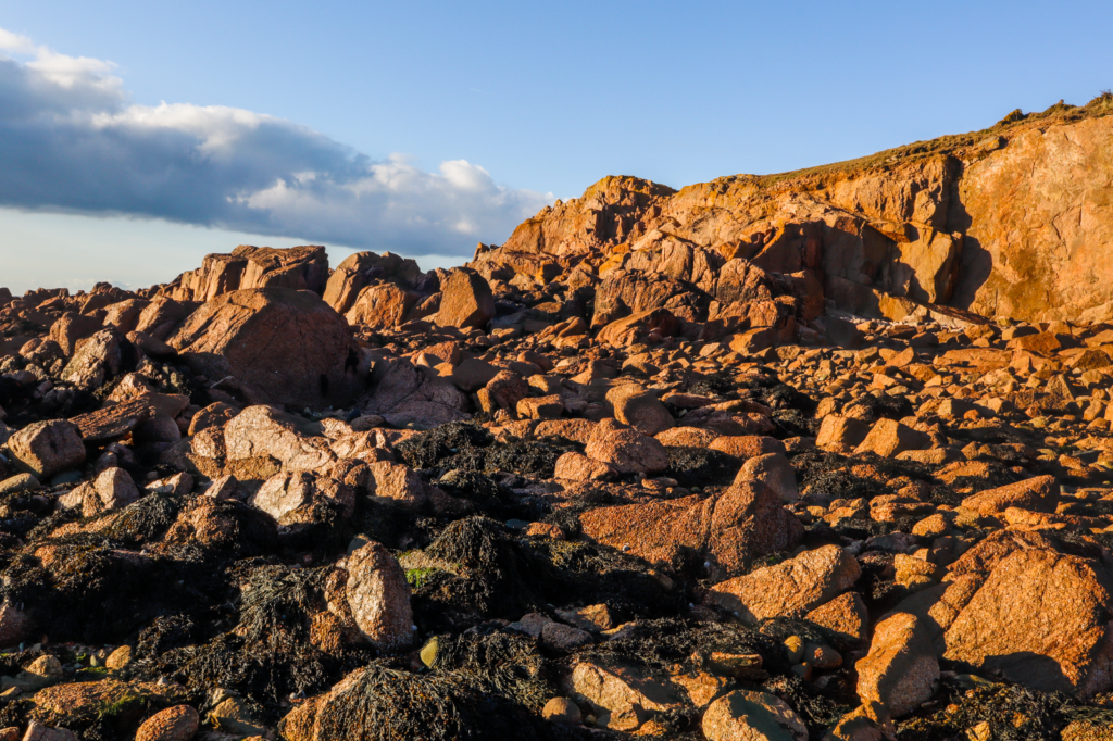
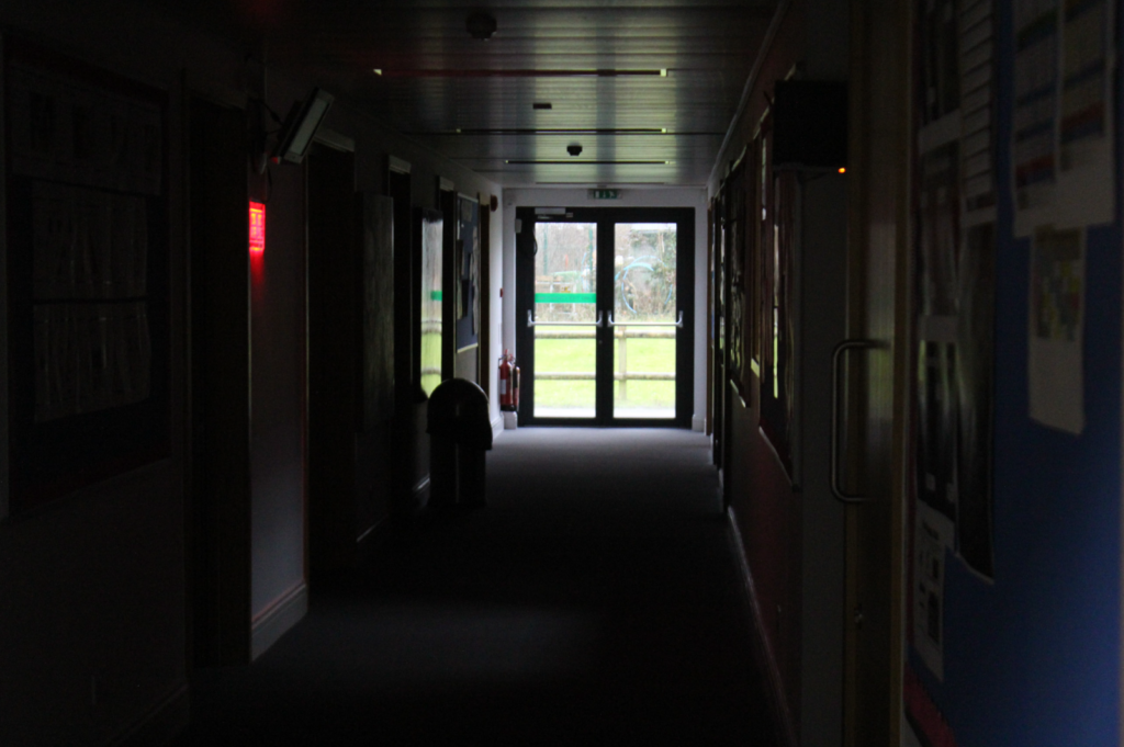
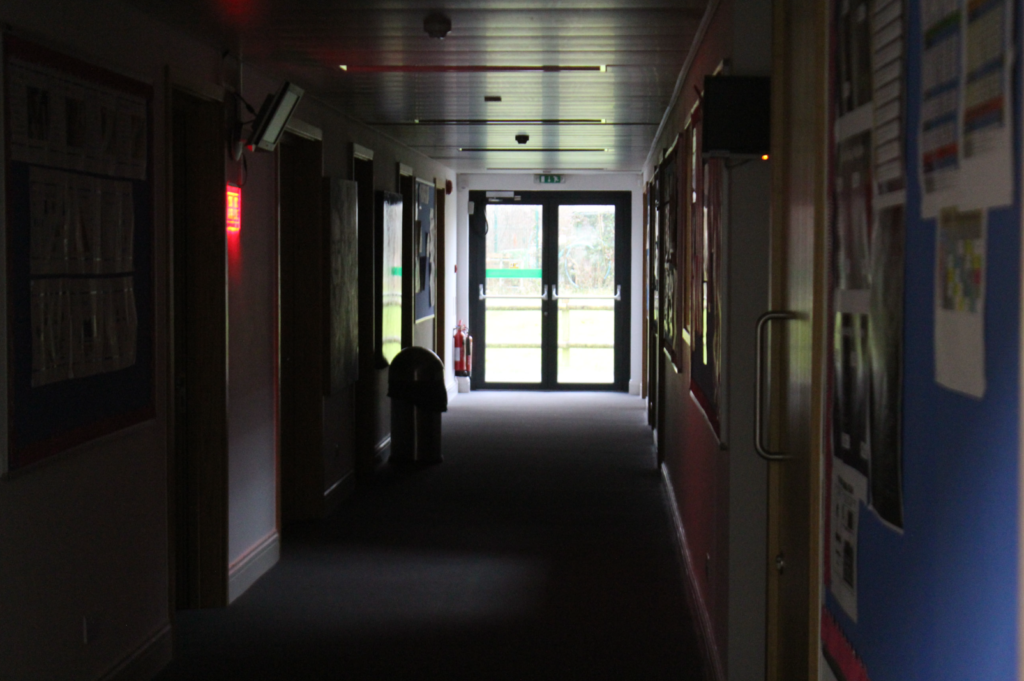
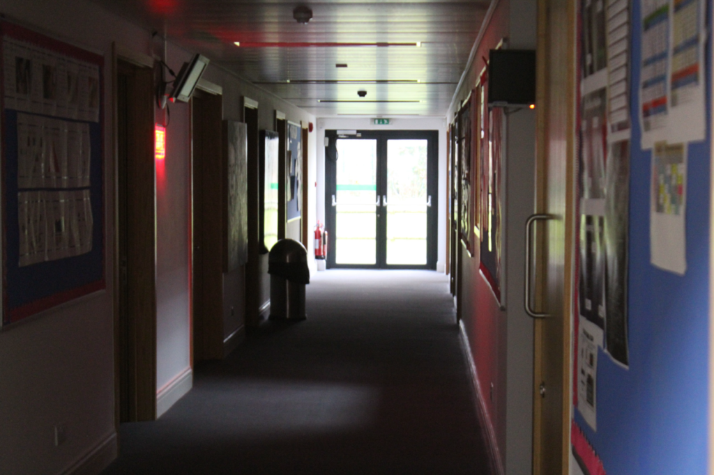
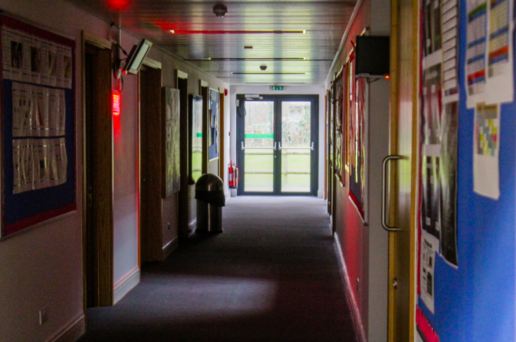
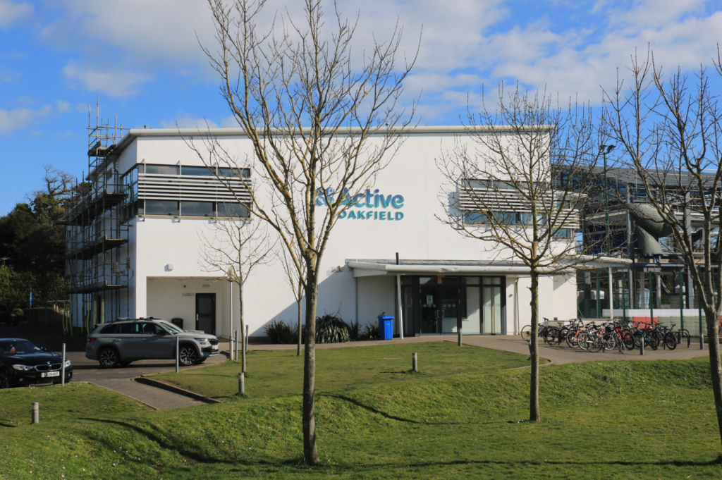
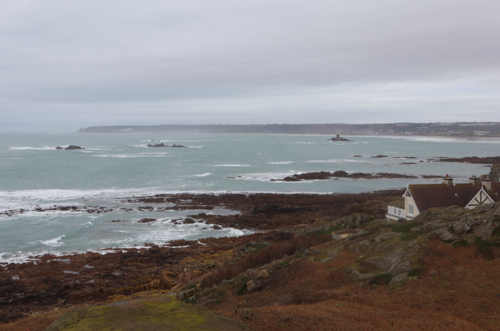
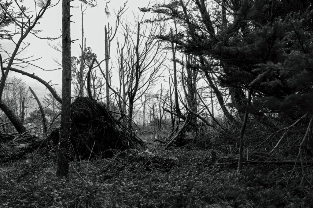
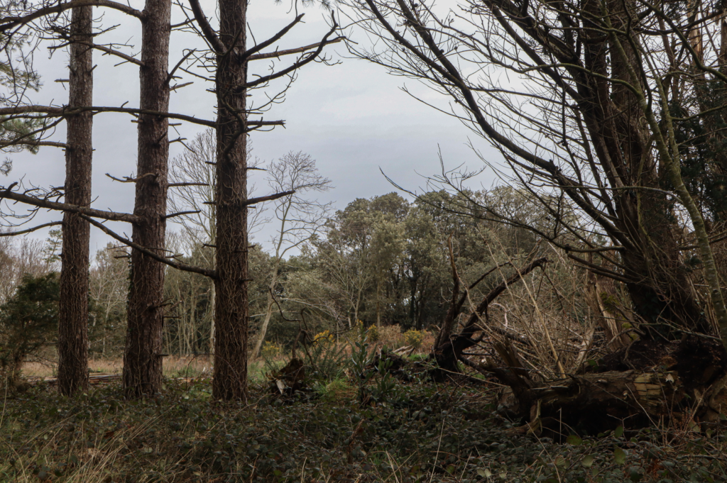
I went to the recycling centre near Fort Regent for my photoshoot, taking pictures of the industrial area and buildings.
Best Photos
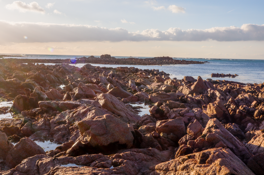
I found this image to be successful since it clearly has aspects of the New Topographics with the industrial buildings, signs and cars which overpower the landscape in the top right and stand out more.
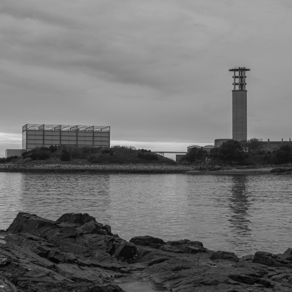
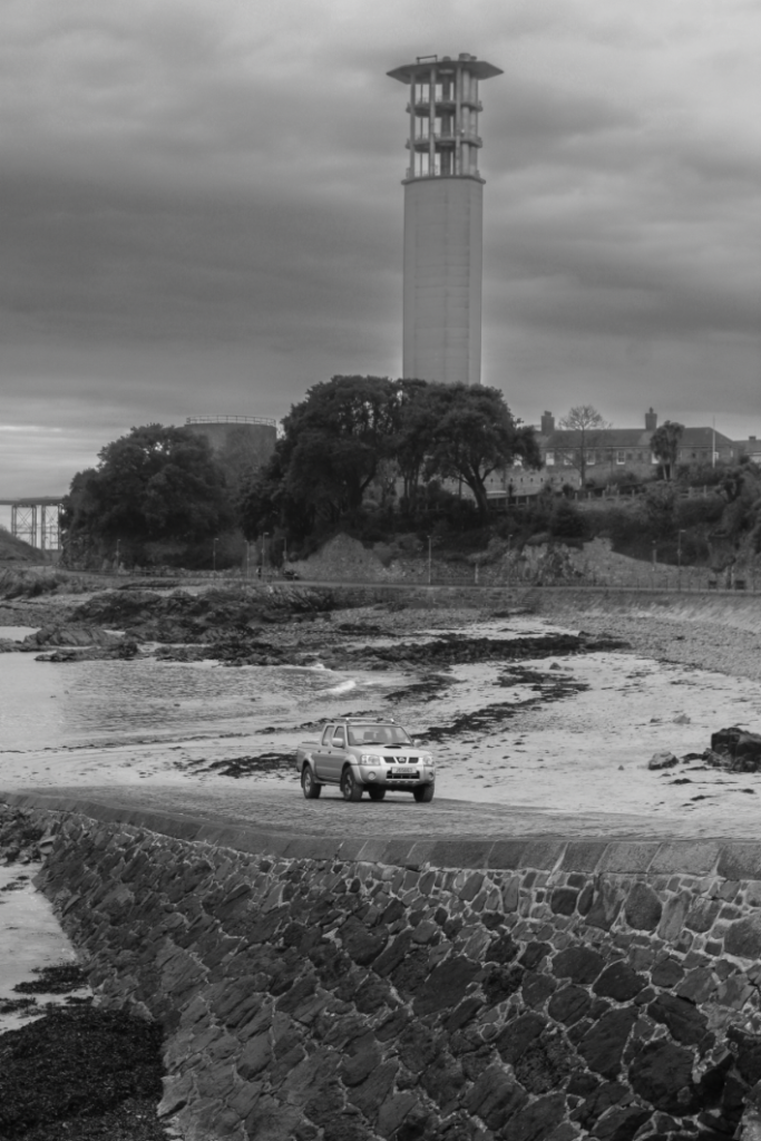
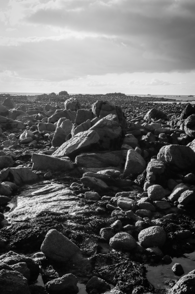
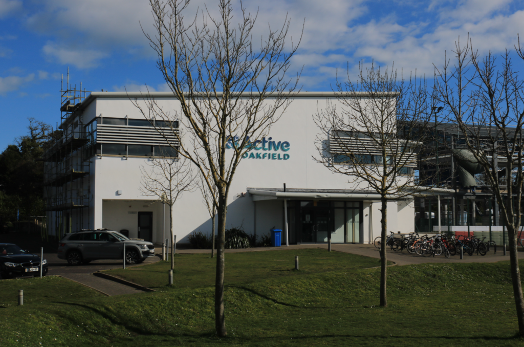
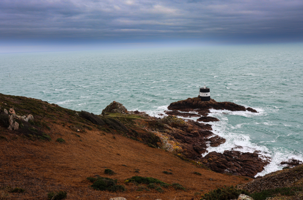
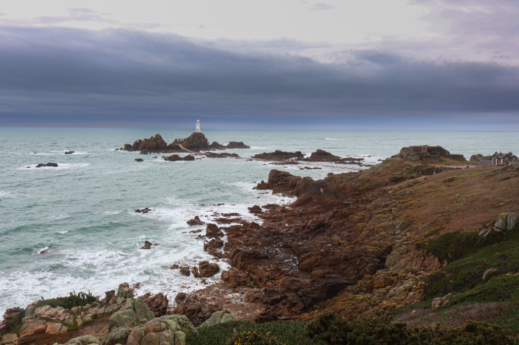
I find the tower really effective in this image since it towers over everything and becomes a clear focal point of the image, whilst still maintaining aspects of the New Topographics with the industrial buildings and cars closer to the foreground.
For this image, I focused on angle and perspective, trying to make the building’s stature seem as big and menacing as possible. I took this photo from the ground up, and found that I managed to capture this initial idea I had really well.
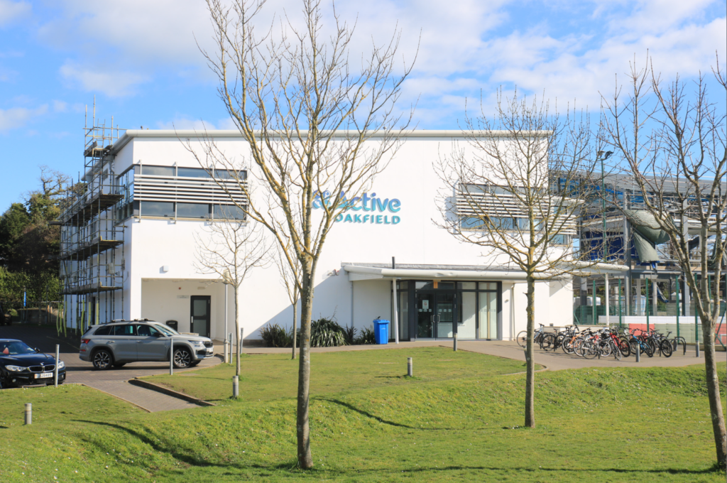
I focused on rule of thirds with this image, positioning the sign on the second third. The sign which reads ‘town centre’ creates a nice contrast with the industrial buildings in the background, as well as the arrow and leading lines from the sign almost implying to the viewer to get out of the area.
The seemingly dying grass in the foreground contrasts really nicely and effectively with the fence and the industrial buildings, linking the themes of the New Topographics and creating a clear divide between nature and humans.
Similarly to the previous picture, the divisions created between nature and man with the fences and no entry signs link to themes of the New Topographics.
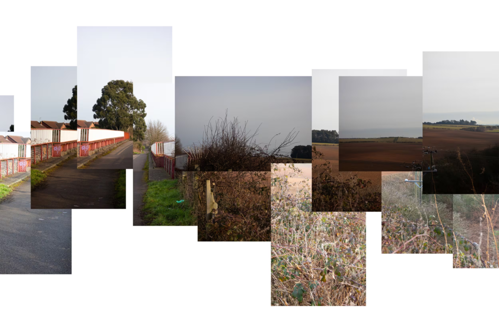
These 3 images will all go altogether in a triptych, since they were each taken of the same area. They all are also really objective and sterile, which groups them together even more.
Editing
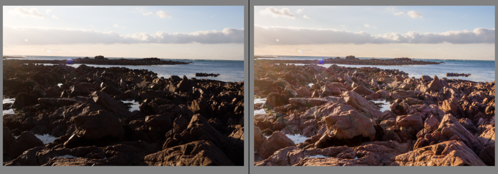
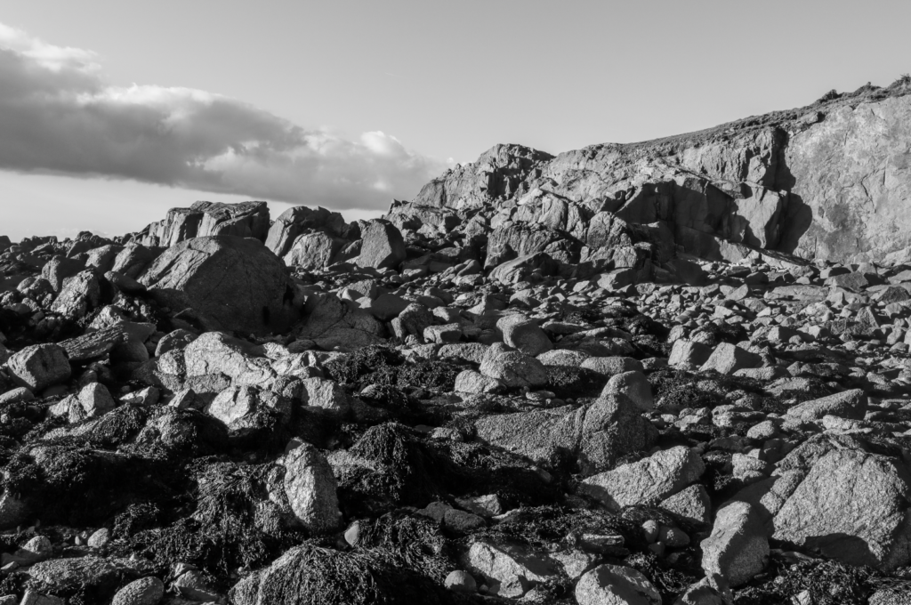
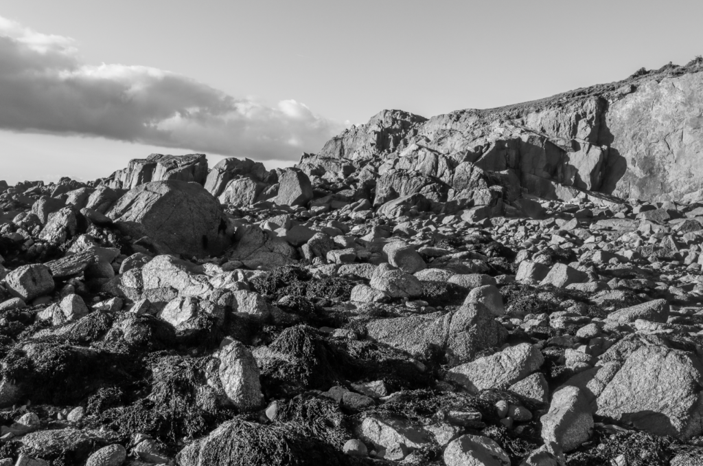
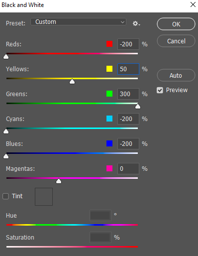
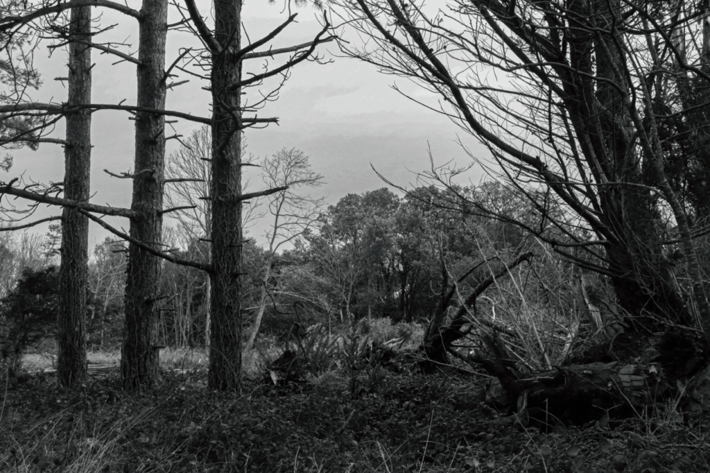
Most of my editing will be experimenting with black and white, since the New Topographics photographers typically presented their work this way. I aim to make use of Ansel Adams’ zone system when editing images to be black and white, featuring a wide range of tones from light to dark.
Image 1
Light tones in the cars and road, midtones in the sky, darker tones in the signs and mountains.
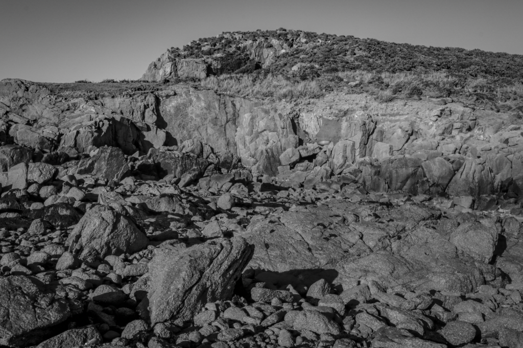
Image 2
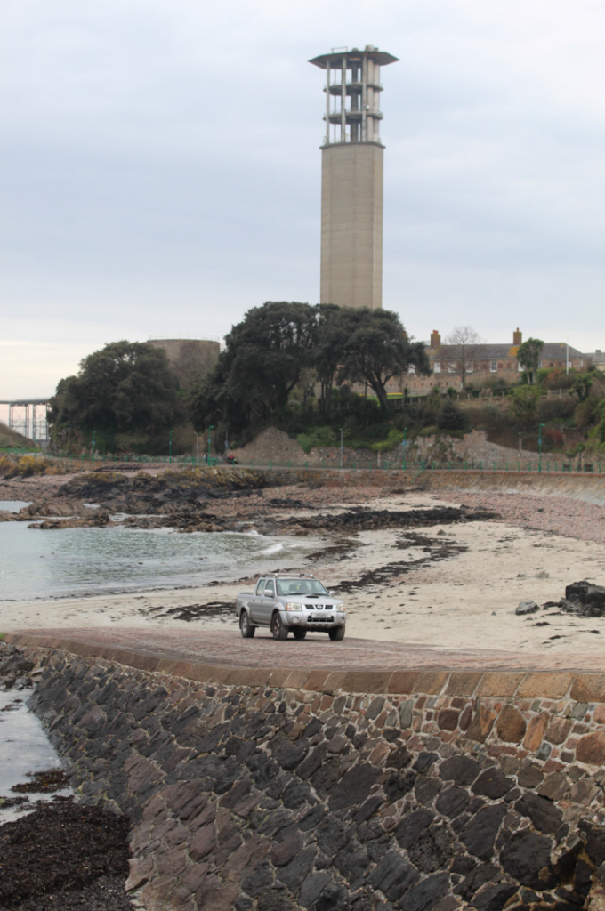
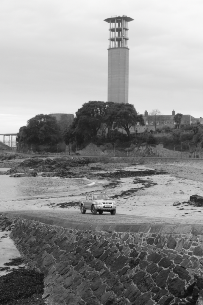
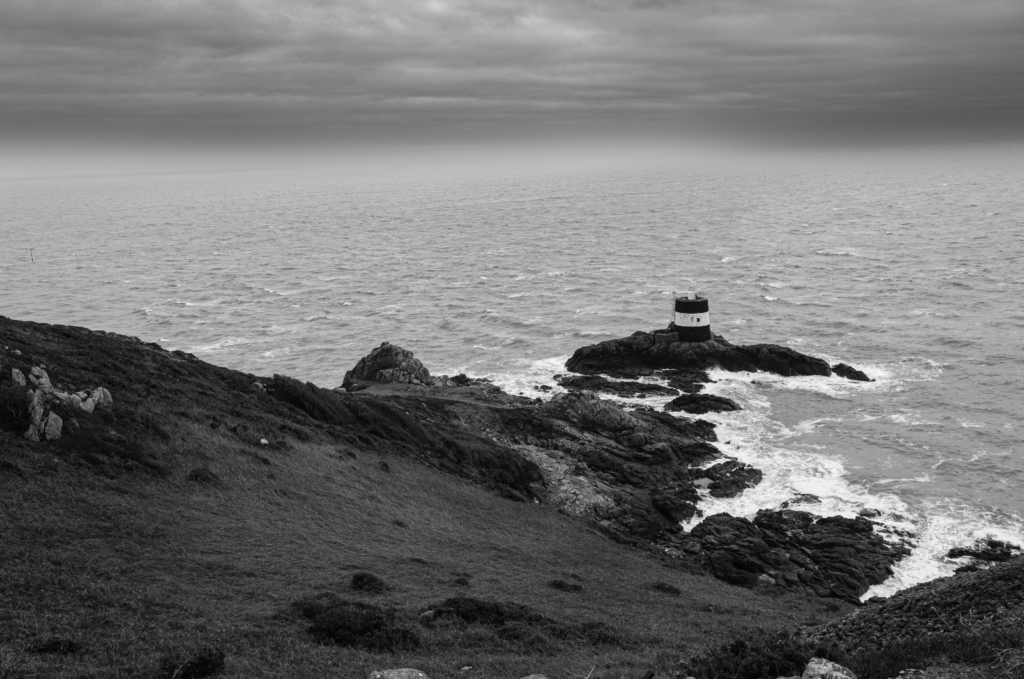
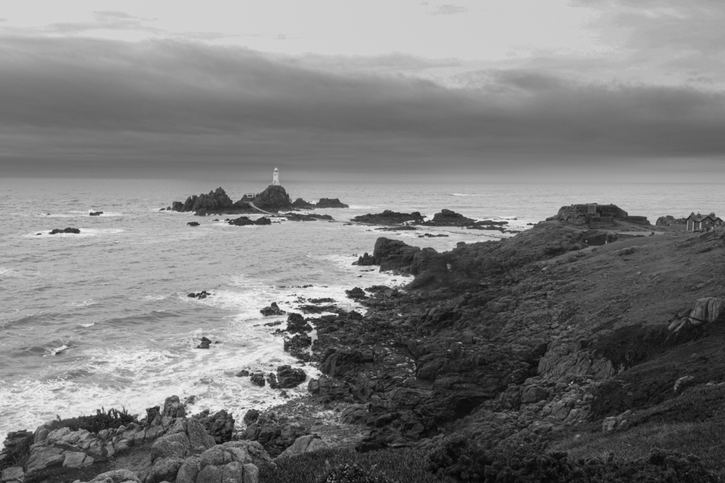
Light tones in the cars, midtones in the road and darker tones in the sky and tower. Focus is brought onto the tower, which when combined with it towering over other elements of the image creates a greater sense of intimidation.
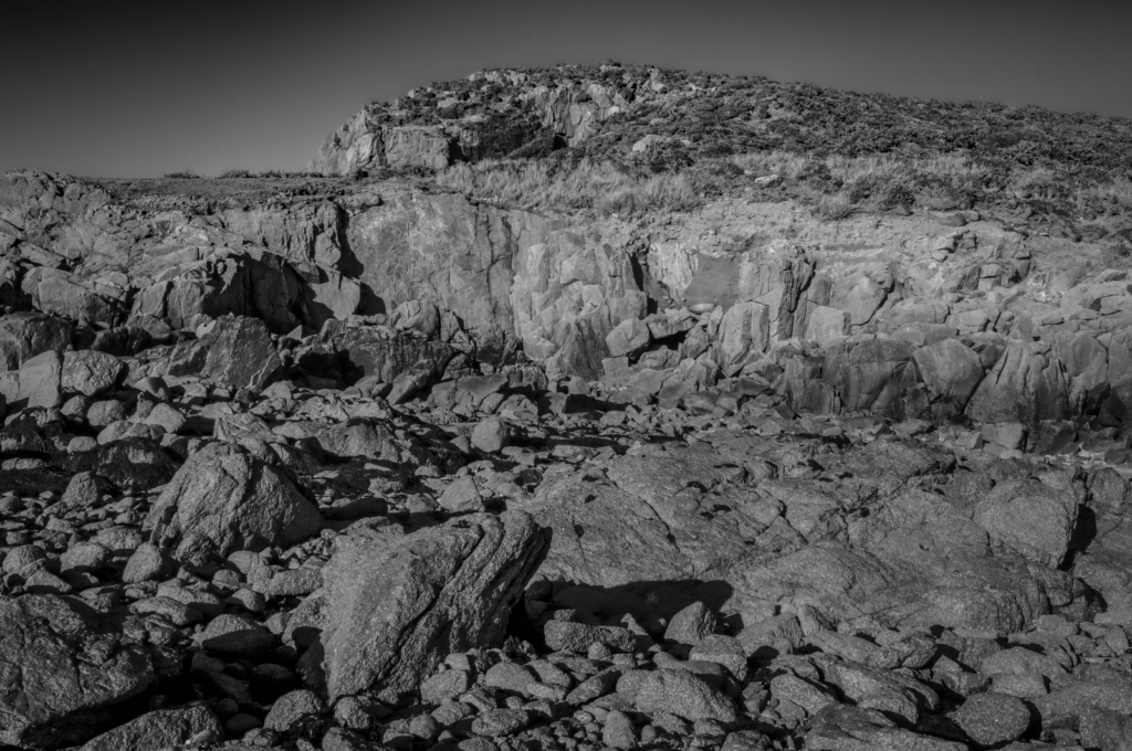
Image 3
Light tones in the fence, midtones in the buildings and dark tones in the sky. The darker sky also contrasts with the lighter buildings and creates drama.
Image 4
Lighter tones in the road, midtones in the building and sky and darker tones in the sky.
Image 5
Lighter tones in the grass and industrial area, midtones in the grass and darker tones in the sky. The darker sky also helps to create more drama and add to the mood of the image.
Image 6
Light tones in the building, midtones in the road, dark tones in the sky and grass.
Image 7
Light tones in the sky, midtones in the buildings and darker tones in the road.
Image 8
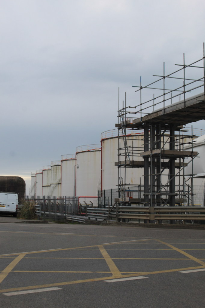
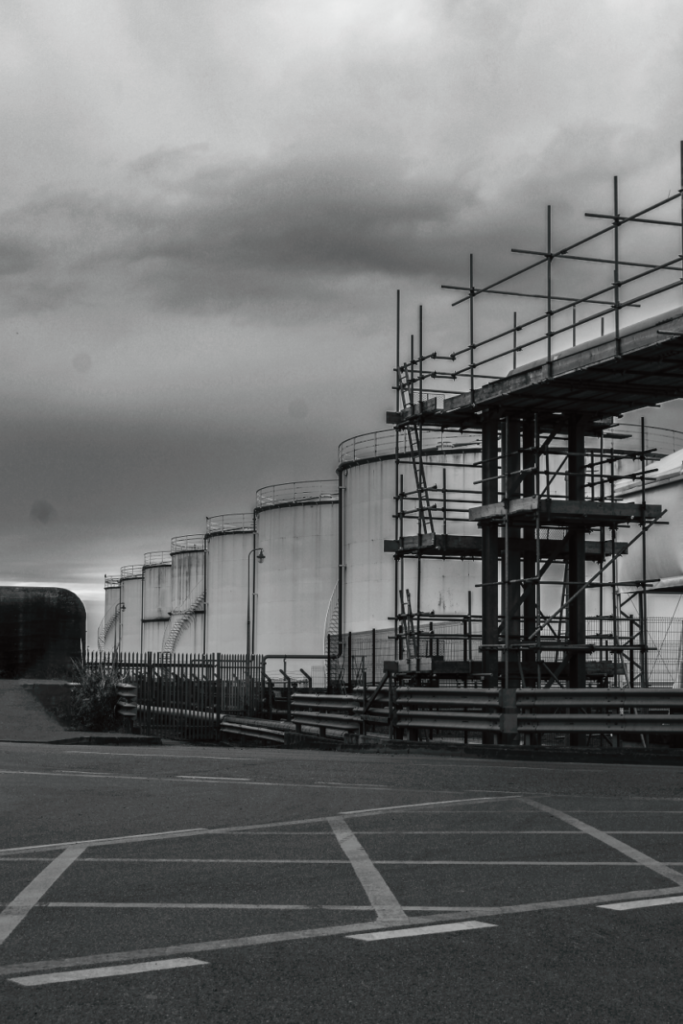
Light tones in the sky, midtones in the background buildings and darker tones in the scaffolding.
Image 9
Light tones in the sky, midtones in the tower and darker tones in the buildings.
Initial Presentation Ideas
Diptychs:
Triptychs:
I also wanted to experiment with presenting my images in typologies, so I cropped them in a 1×1 resolution (square).
Presentation in ArtSteps
Diptych:
Triptych:
Typology:
Comparison/Critique vs Artist References
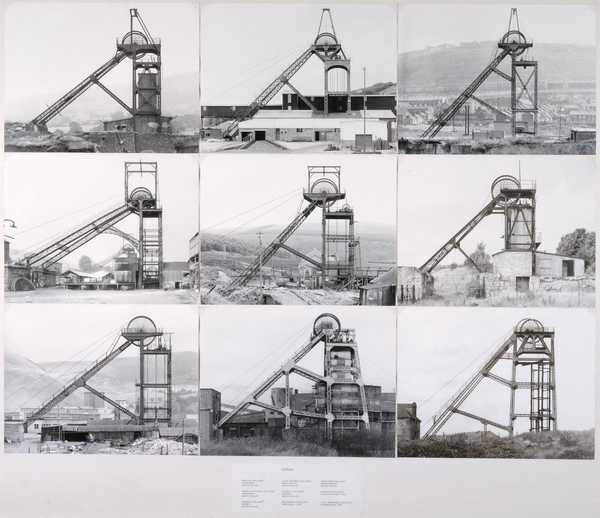
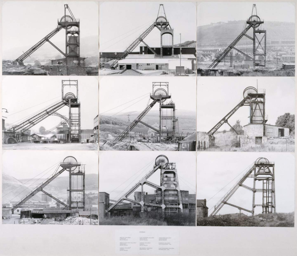
My typology compared against ‘Pitheads’ by Bernd and Hilla Becher, 1974
Overall, I think my images were able to replicate the Bechers’ styles somewhat successfully, although my images are from a wide range of different angles and perspectives rather than all being shot dead-on at the exact same angle, which adds more drama and atmosphere to each individual image compared to typical work of New Topographics photographers.
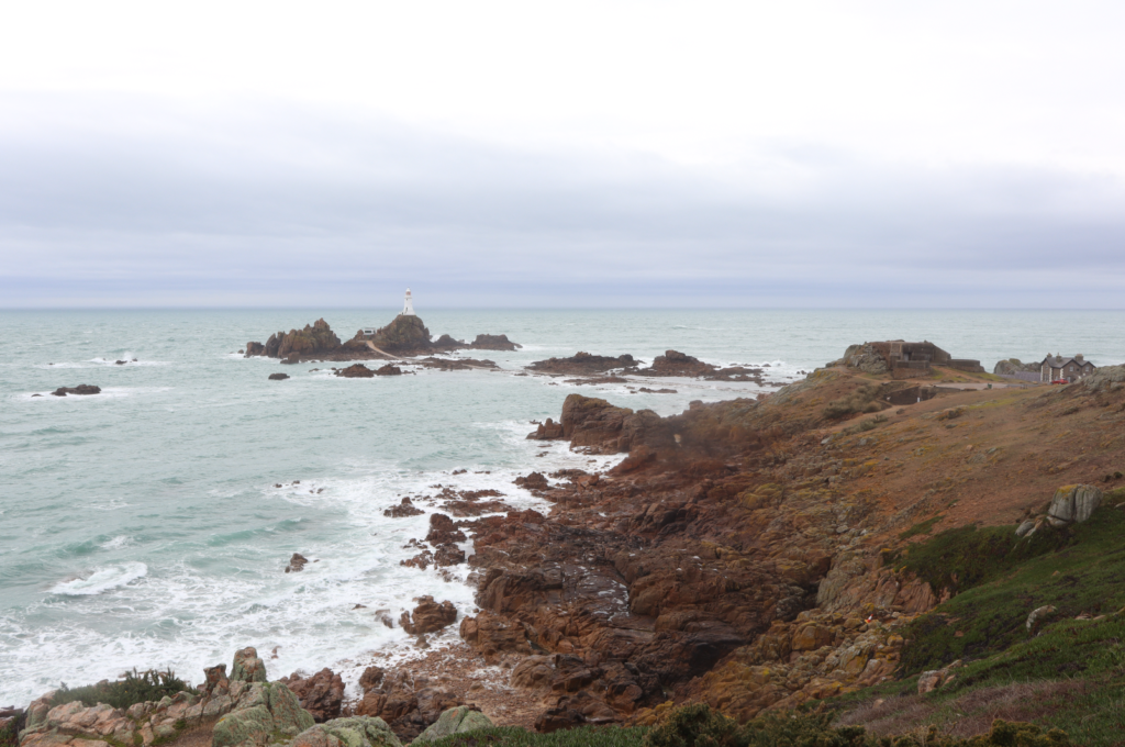
One of my New Topographics images compared against Robert Adams’ Pikes Peak, Colorado Springs (1969)
Both images have similarities in the sense that there is minimal nature present, but the main focus is still on New Topographics which creates a divide between nature and humanity (for my image there is grass visible which is cut off from the industrial area by fences, and in Adams’ picture there are mountains visible in the background). However, the main difference comes from Adams’ sky being used as negative space in contrast to the sky in my image being dark and having clouds, which again creates drama and takes away from the focus on New Topographics.
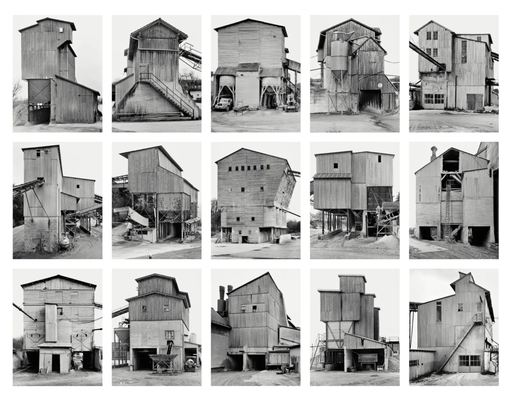
A typology can be defined as a study of “types”. That is a photographic series that prioritizes collecting and showcasing images in groups or sets rather than stand-alone images.
Case Study – Bernd and Hilla Becher
Bernhard “Bernd” Becher and Hilla Becher were German conceptual artists and photographers working as a collaborative duo. They are best known for their extensive series of photographic images, or typologies, of industrial buildings and structures, often organised in grids. As the founders of what has come to be known as the ‘Becher school’ or the Düsseldorf School of Photography, they influenced generations of documentary photographers and artists in Germany and abroad. They were awarded the Erasmus Prize in 2002 and the Hasselblad Award in 2004.
Some of their work.
Image Analysis
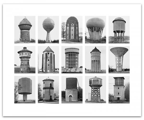
‘Pitheads’, 1974 by Bernd and Hilla Becher
Technical – All pictures in the typology were taken outside meaning the lighting is likely 100% natural, with detail visible throughout the image meaning aperture was likely high in order to have a deep depth of field. Little to none visual noise is present in any of the images, so ISO was kept to a minimum with a value likely between 100-200.
Visual – Each image is capturing some sort of machinery, presumably an oil well. Each picture has been taken from the same perspective creating an obvious similarity between them all, whilst still maintaining contrast since the background and environment around the oil wells are different in each photo. Some photos in the typology feature minimal natural elements (e.g. grass), although the frame is still largely dominated by the oil well so there is very little focus paid to natural landscapes in these images.
Conceptual/Contextual – Bernhard Becher gave up making paintings, drawings and etchings of old industrial buildings because he had decided that photography met his needs better. Painting necessitated composition which involved changing the object and was too subjective; photography was more precise and objective, being able to clearly capture and present exactly what is happening in a scene. The pictures in the typology leave little to nothing up to the imagination of the viewer, simply being 9 different oil wells occupying spaces, almost as if they are invading the natural landscapes.
New topographics was a term made by William Jenkins in 1975 to describe a group of American photographers (such as Robert Adams and Lewis Baltz) whose pictures had a similar banal aesthetic, in that they were formal, mostly black and white prints of the urban landscape.
Many of the photographers associated with new topographics including Robert Adams, Lewis Baltz, Nicholas Nixon and Bernd and Hiller Becher, were inspired by the man-made, selecting subject matter that was matter-of-fact. Parking lots, suburban housing and warehouses were all depicted with a beautiful stark austerity, almost in the way early photographers documented the natural landscape. An exhibition at the International Museum of Photography in Rochester, New York featuring these photographers also revealed the growing unease about how the natural landscape was being eroded by industrial development.
Pitheads (1974), Bernd Becher and Hilla Becher
What were the new topographics a reaction to?
These stark, beautifully printed images of this mundane but oddly fascinating topography were both a reflection of the increasingly suburbanised world around everyone, and a reaction to the tyranny of idealised landscape photography that elevated the natural and the elemental.
Case Study – Robert Adams
Robert Adams, born in 1937, is a prominent American photographer renowned for his exploration of the evolving landscapes of the American West. His work gained significant recognition in the mid-1970s, particularly with the publication of his book, The New West, in 1974, and his involvement in the 1975 exhibition titled New Topographics: Photographs of a Man-Altered Landscape. Throughout his career, Adams has been awarded with two Guggenheim Fellowships, a MacArthur Fellowship, the Deutsche Börse Photography Prize, and the Hasselblad Award.
Critic Sean O’Hagan, writing in The Guardian about Adams’ work, said “his subject has been the American west: its vastness, its sparse beauty and its ecological fragility. [. . .] What he has photographed constantly – in varying shades of grey – is what has been lost and what remains” and that “his work’s other great subtext” is silence.
Image Analysis
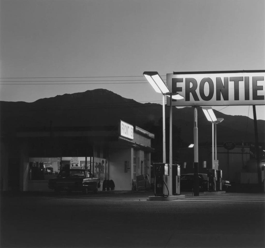
Robert Adams, Pikes Peak, Colorado Springs, (1969)
Technical – The picture shows a gas station on the frontier, presumably at darker hours which means the lighting for the image is coming mostly from the manmade lamps that are visible. All details in the foreground are clear and visible, meaning a high aperture value and deep depth of field were likely used – furthermore, there is little to none visual noise meaning ISO was kept to a minimal value such as 100.
Visual – The picture is completely lacking in colour being in black and white, which helps add to the bleakness of the image due to the gas station almost having invaded the landscape. There is also a clear contrast in light and dark tones, with the station in the foreground having more of an emphasis on lighter tones with the mountains in the background not being illuminated and therefore being darker. There is also a sense of depth and three dimensions with how the station has been positioned in the image, helping to create a sense of drama.
Contextual/Conceptual – Adams was part of The New Topograhics with a focus on manmade landscapes and their effect on natural ones, hence why the image focuses on a station which is taking away the focus and attention from the mountains placed farther away in the background.
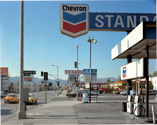
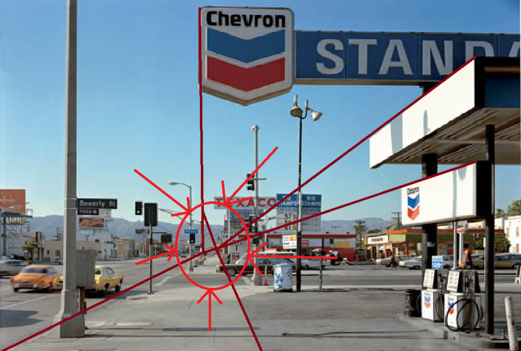
Stephen Shore
Beverly Boulevard and La Brea Avenue, Los Angeles, California, June 21, 1975, chromogenic colour print
Key features:
Foreground vs background | Dominant features
Composition | low horizon line | Square format
Perspective and detail / cluttering
Wide depth of field | Large Format Camera
Colour | impact and relevance
Nationalism vs mobility vs isolation
Social commentary | The American Dream?
An appreciation of the formal elements : line, shape, form, texture, pattern, tone etc
Image analysis:
Technical – The image features natural light, likely taken in the most prominent hours of sunshine (~12pm) which casts distinct, hard-edged shadows on the pavement. It is also likely a high aperture was used since there is clear detail in all aspects of the image, even the mountains in the distance to an extent.
Visual – There is some alignment to the rule of thirds which the lamp posts, but the main visual feature of this image is the fact that most of the detail is cluttered in the bottom third with the two top thirds of the image being almost empty except from the sky and gas station sky, which when combined with the lines leading towards the mountains creates a contrast between this suburban area and the natural landscape off in the distance.
Showing how angled lines in the image all point towards the horizon
Contextual/Conceptual – The image features predominantly the colours red white and blue, linking to the American flag which when considering the lines pointing off towards the horizon creates links towards American pride for their landscapes.
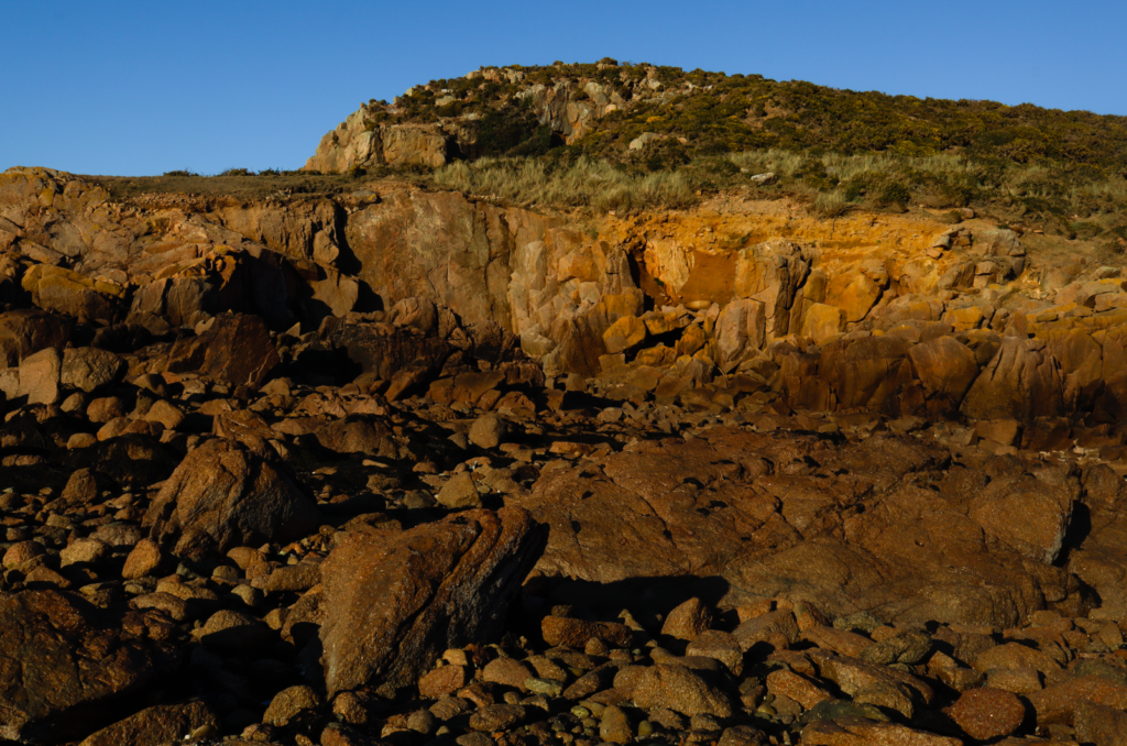
Examples in Jersey
Recycling Plant – Fort Regent
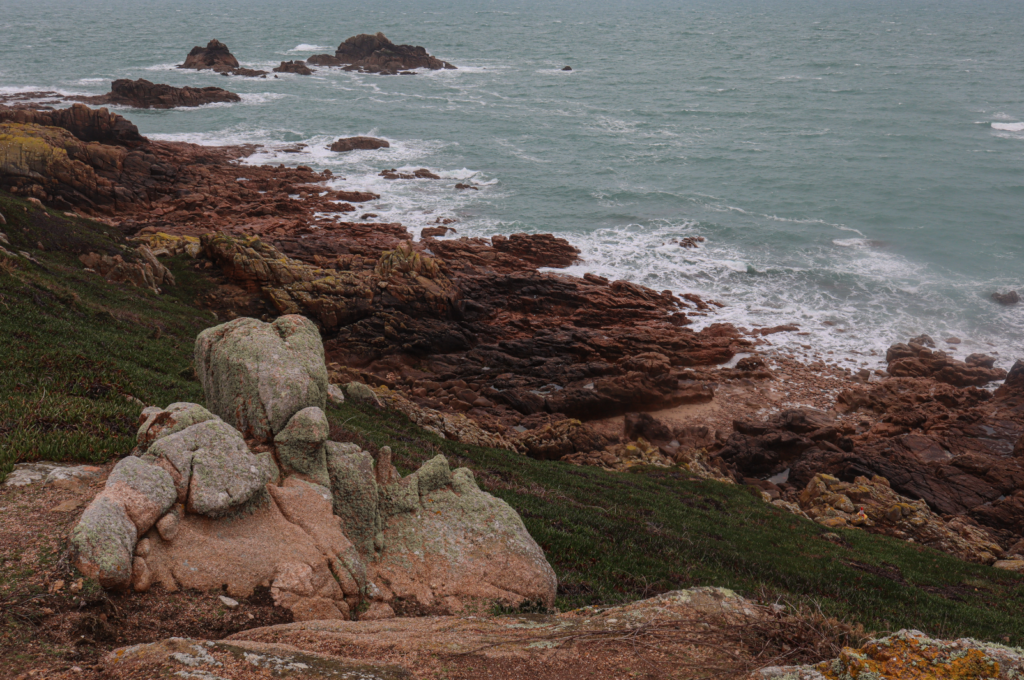
Around this area there is plenty of natural landscape (e.g. Havre des Pas), allowing for images capturing both man-made and natural landscapes for contrast.
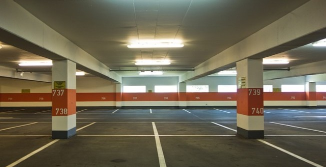
Car Parks
Car parks are fully man-made and create a bleak atmosphere, containing mostly artificial lighting and the lack of people also adds to the uncomfortable mood.
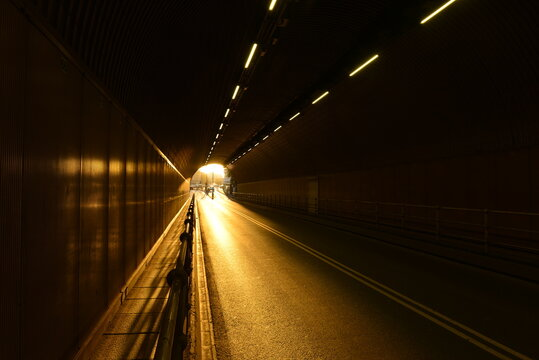
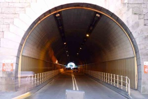
Tunnels
The lights along the top of tunnels create leading lines which direct attention towards the end of the tunnel, creating immersive images with a dramatic atmosphere.
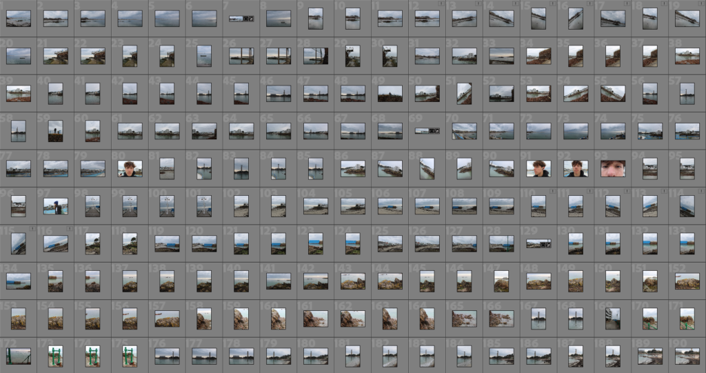
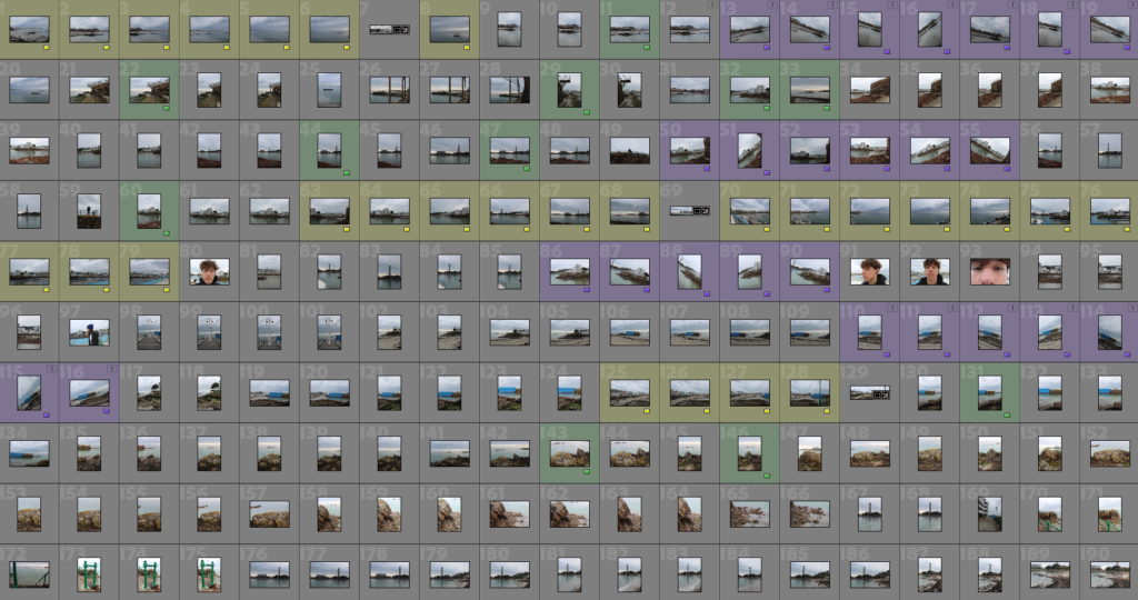
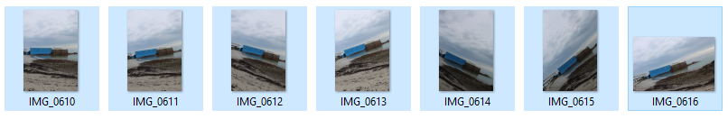
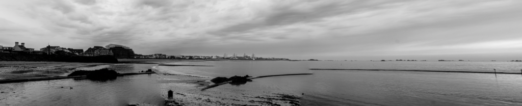
For this photoshoot, I took pictures around Havre Des Pas and the industrial recycling area with a focus on panoramas and joiners.
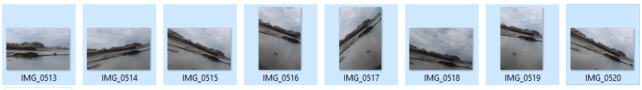
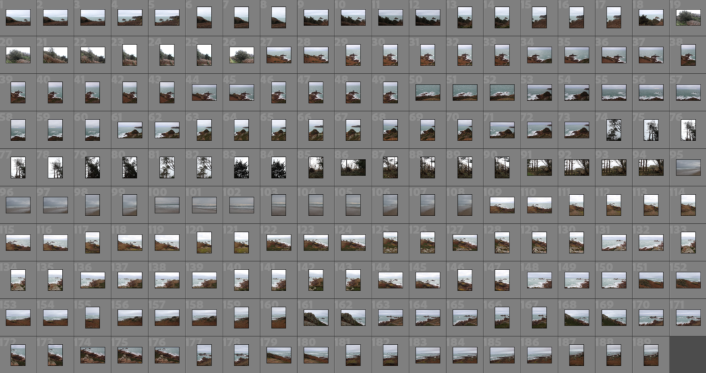
Contact Sheet
Selection Process
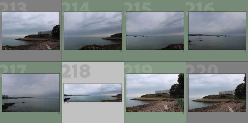
After importing my images, I selected my images to be used for panoramas (yellow), joiners (purple), and other images I liked (green).
Editing
Panoramas:
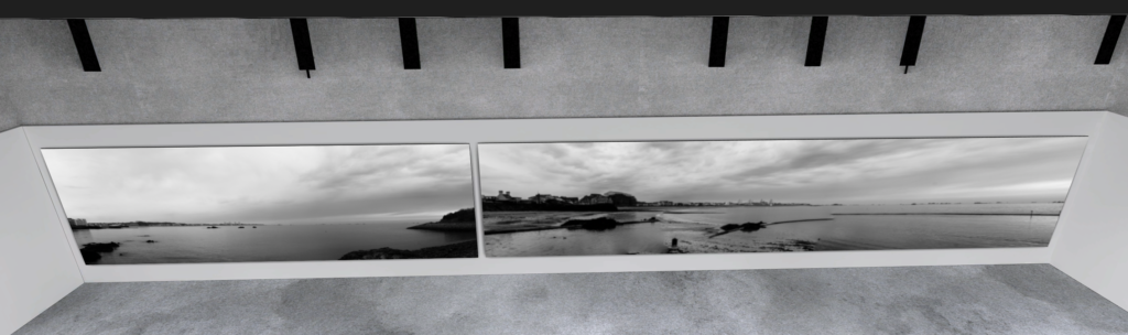
To create my panoramic images, I merged a series of image taken back-to-back of a landscape into one singular wide image using Lightroom.
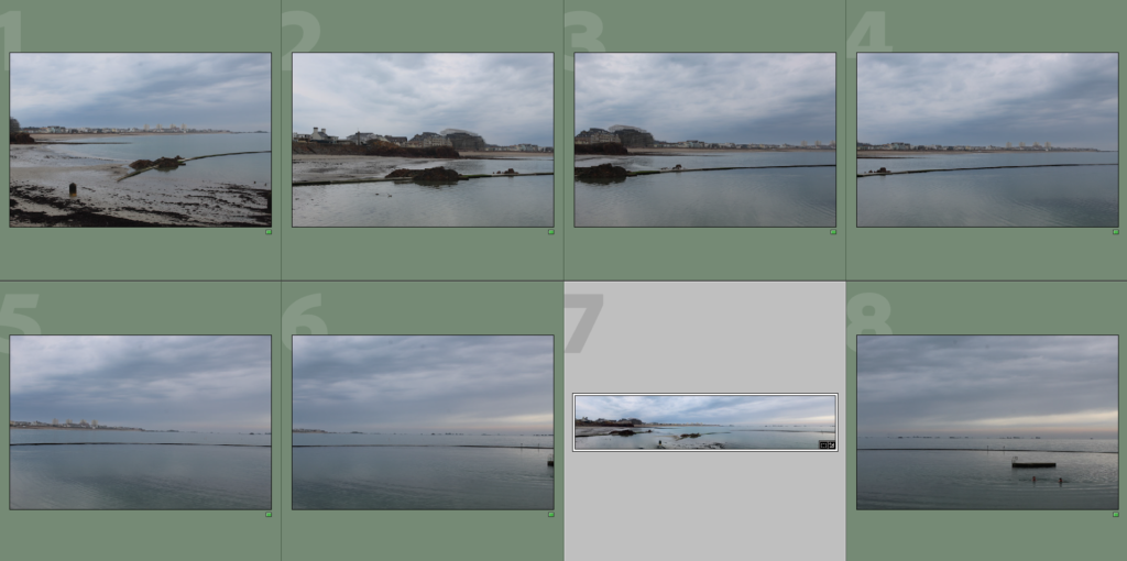
I merged all the images selected in green to create my panorama
The result
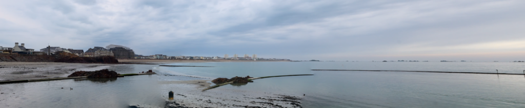
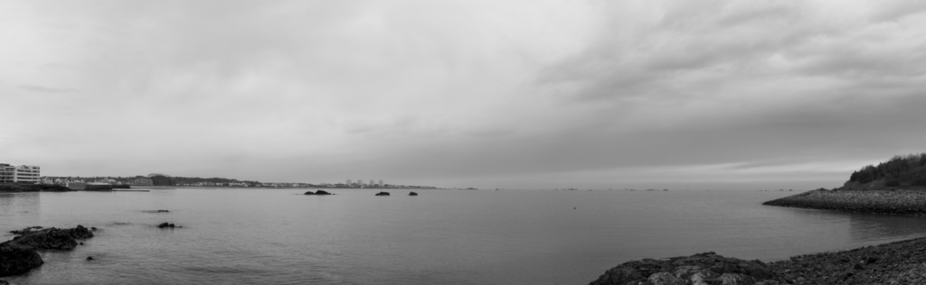
This blends all 7 images together, creating a wide panoramic shot of the left side of Havre Des Pas. I found it effective since the left side captures some buildings in the distance as well as the beach, which contrasts nicely with the right side being mostly the sea.
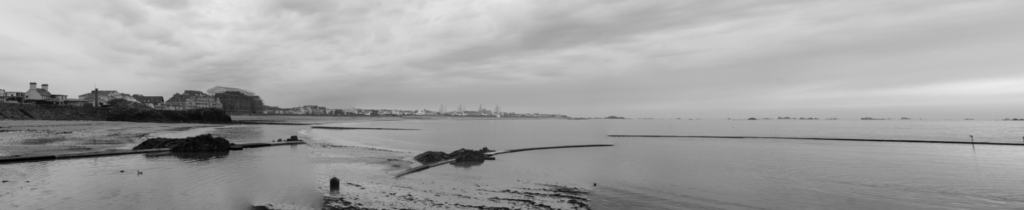
Experimenting with black and white
Making it black and white I can see there is visibly a lack of contrast between light and dark tones, with most of the image being the same grey colour.
Final result
I decreased the blacks and increased whites and contrast, noticeably creating more contrast between the lighter tones in the sky, midtones in the sea and darker tones in the buildings and rocks.
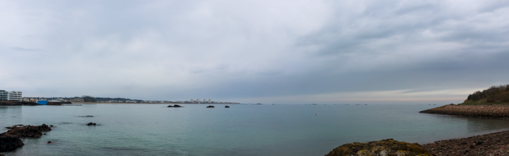
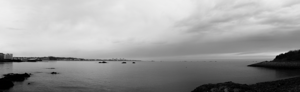
2nd panorama
Result after merging
I find this image effective with how much of it is taken up by the sky and the sea, creating a clear contrast with the rocks and buildings visible in the distance on the left as well as the rocks on the right.
Black and white
Making the images black and white shows the contrast between light and dark tones, although the contrast isn’t very obvious between the sea and the sky which takes away from the drama of the photos.
Final result
Increasing highlights and decreasing shadows, allowing for the sea to contrast more with the sky and creating a sense of drama with the darkened landscape.
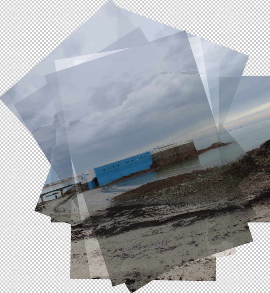
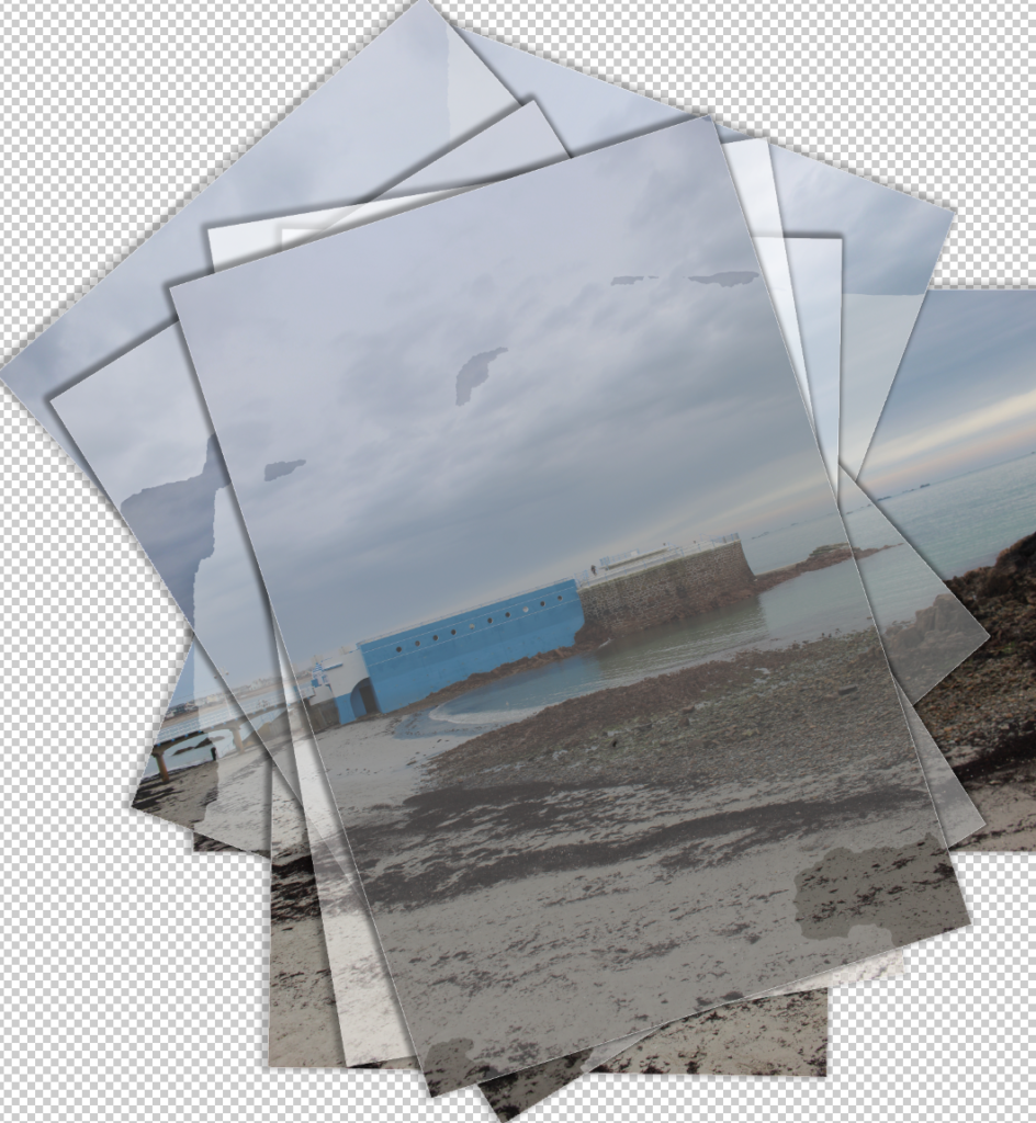
Joiners:
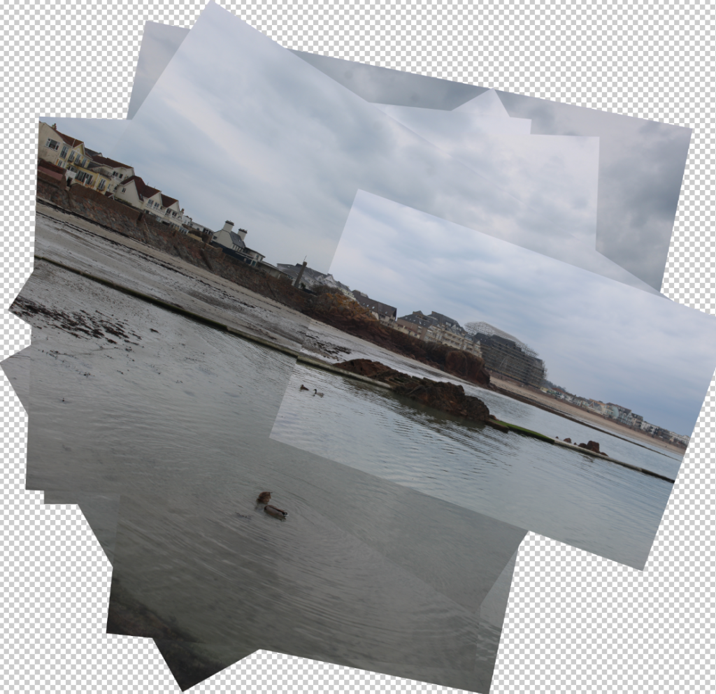
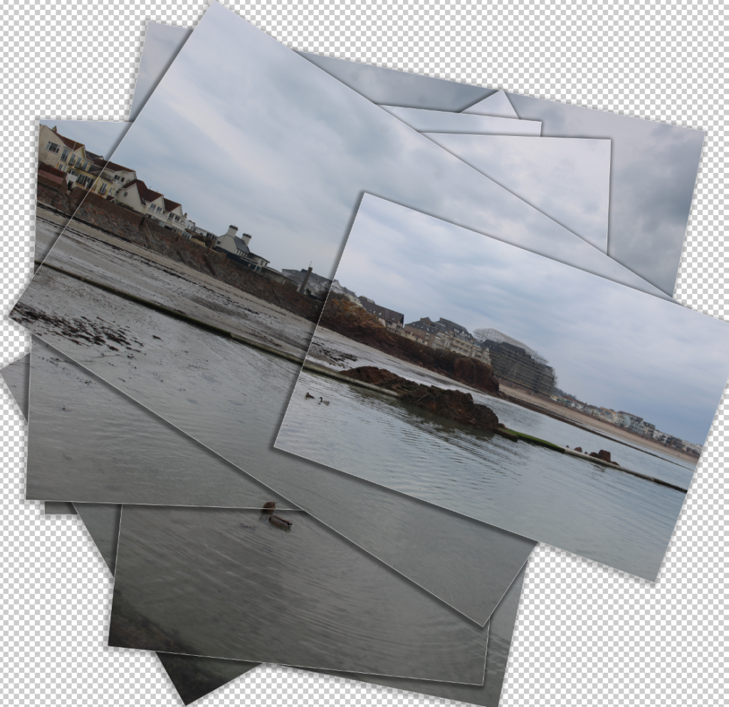
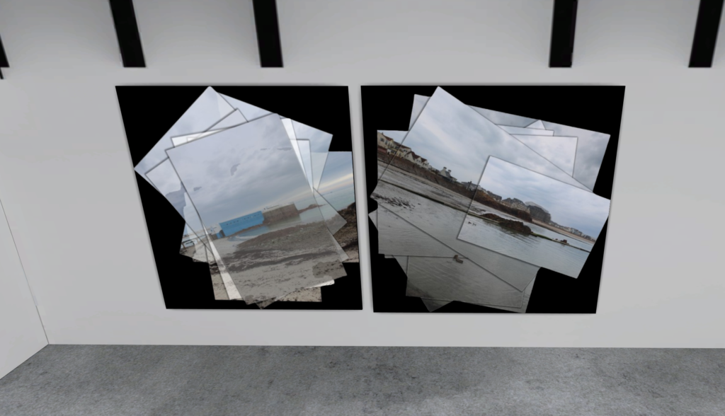
To create my joiners, I took multiple images of one landscape at different angles and merged them together in Photoshop before editing them further.
Images used to create the first joiner
This was the initial result after merging the photos, blending all photos taken into one collage-like image.
This was the final result after applying effects to each image, adding a slight white stroke around each image and a drop shadow to create the impression each picture was printed out and stacked on top of one another to create the collage.
Images used to create the second joiner
The resultant collage after merging all photos, I adjusted some settings on each one individually to create slight contrast between each one and add a weathered effect to them.
Added the same effects, as well as adjusting opacity and other settings to enhance the weathered effect.
Other photos:
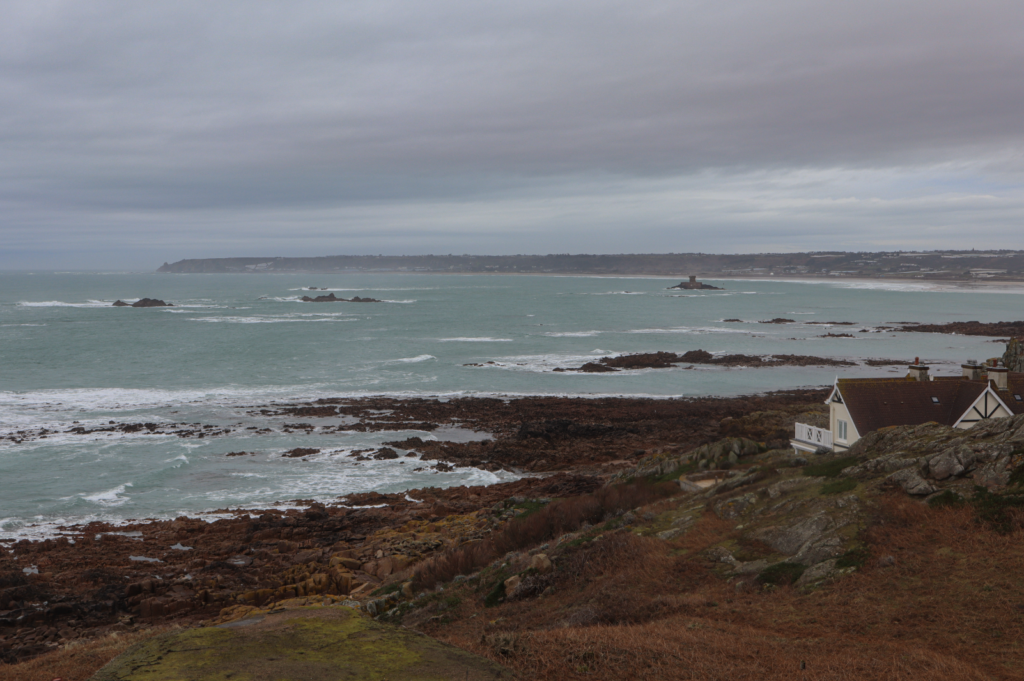
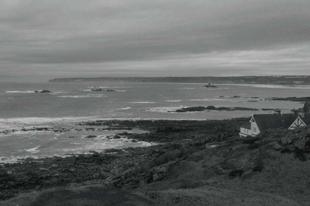
I really liked the composition of this image with the natural rocks in the foreground contrasting with the two buildings positioned on the two thirds in the distance with negative space in the sky, so I wanted to try experimenting with creating tone contrast by making it black and white.
The result after making it black and white, the rocks and landscape around the two buildings are too similar in tone so I will make further adjustments to try have a full range of tones (similar to the zone system).
Final result – decreased highlights and whites, increased exposure and contrast bringing out more contrast. Light tones at the bottom of the horizon, midtones in the sea and darker tones in the rocks/landscape in the background.
Experimenting with composition, cropping to keep the bottom half of the image focusing on natural landscape (rocks, sea) and the top half focusing on man-made buildings which contrast nicely with the sky’s negative space.
I really like the composition of this image since it clearly contrasts natural landscapes vs man-made and it almost seems like the man-made aspects are invading the natural ones, seen with the car out of its usual place parked on the beach and the tower sprouting of the trees creating a clash between these two elements.
Experimenting with black and white, and I like the drama created although I noticed there is little use of the zone system since there is very little dark tones.
Darkening the sky and rocks at the bottom by decreasing exposure and increasing clarity, enhancing contrast between light and dark tones. Lighter tones can be seen in the sand and car, midtones in the sky and tower and dark tones in the trees and rocks.
This image is inspired by the New Topographics, featuring no natural landscape and instead focusing on man-made objects. I like how there is plenty of straight lines in the image (e.g. paint on the floor, scaffolding, fences) since it clearly shows how most of the image is man-made.
Experimenting with black and white in the style of the New Topographics.
Enhancing contrast and increasing drama by adjusting clarity, exposure and contrast as well as removing the van since it stuck out noticeably compared to the rest of the image. Final result creates a gloomy atmosphere whilst maintaining an effective range of dark and light tones.
A panorama is basically a long thin photograph of a big scene. It could be a mountain range, a large lake or a huge vista, usually something that you might not be able to fit into one photo with the lens you have.
A panoramic photograph produced by stitching 6 images together
This effect can be achieved using specialized equipment or software, that captures images with horizontally elongated fields of view. It is sometimes known as wide format photography.
More examples
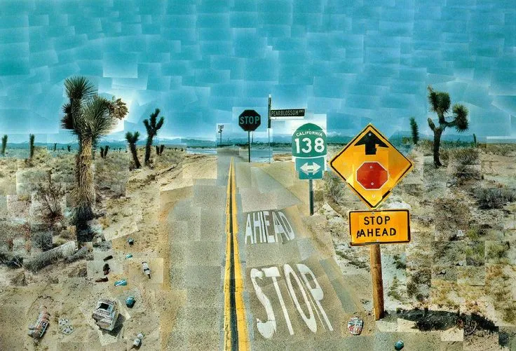
David Hockney and Joiner Photos
David Hockney, an important figure in the Pop Art movement, revolutionised visual art with his inventive technique of creating joiners. This method, which involves piecing together a mosaic of photographs to form a cohesive image, challenges and transcends traditional perspectives in both photography and painting. By fragmenting and then reassembling the visual field, Hockney’s joiners disrupt conventional viewpoints, inviting a deeper exploration into the intricacies of perception and representation.
Joiner photo example
David Hockney Image Analysis
Pearlblossom Highway – David Hockney
This image was created using ~700 images stitched together. Each image captures details up close and has been placed side by side with other images to re-create the actual scene as one big photograph. Hockney’s initial ideas behind these photographs stemmed initially from his deep-seated dissatisfaction with the limitations of traditional photography and its confinement to a single perspective. Hockney’s pioneering spirit and his constant quest for innovation led him to explore the possibilities of capturing the essence of time and space in a manner that more closely mirrored human vision and experience.
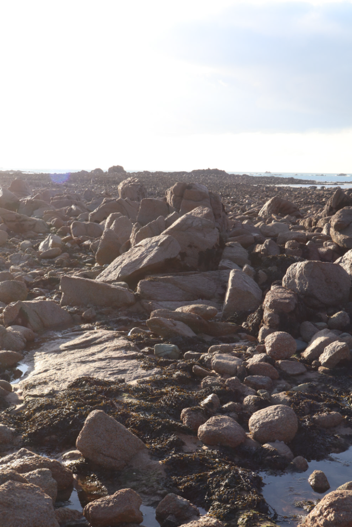
I took my photos on and around Petit Port beach, as well as near the Corbiere cliffsides to try and replicate the style of Ansel Adams.
Settings – I aimed to use high aperture values to try keep as much of the image in focus and detailed as possible, similarly to group f/64. I also kept ISO to a minimum to avoid visual noise and was able to use shutter speed values of around 1/50 and 1/60 since it was very sunny.
Angles/Perspective – I used Ansel Adams’ visualisation method to visualise an image before I took the photograph to see how it would turn out, and using this I was able to have the camera’s perspective focus on rocks, cliffsides and water since these contrast nicely with each other as well as creating shadows which work well with HDR/exposure bracketing and would create lots of drama when experimenting with black and white in editing. I also aimed to have the sky take up roughly the top third of the image, creating further contrast as well as adding some negative space and drama so the entire image isn’t cluttered with excessive detail.
Timings – I went late afternoon/early evening so the sunlight would be at it’s peak in order for me to be able to capture effective images with a wide range of shadows for exposure bracketing, as well as enabling me to experiment with slightly more atmospheric images with the sunset.
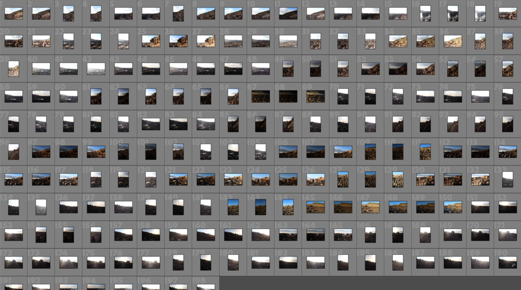
Contact Sheet
Final results after photoshoot – 198 photos total
Selection
During my selection process, I aimed to choose images that had a sense of drama and would present a range of dark and light tones when edited to be black and white. I also aimed to select images with lots of shadows to allow exposure bracketing to bring out details.
Some of my selected photos:
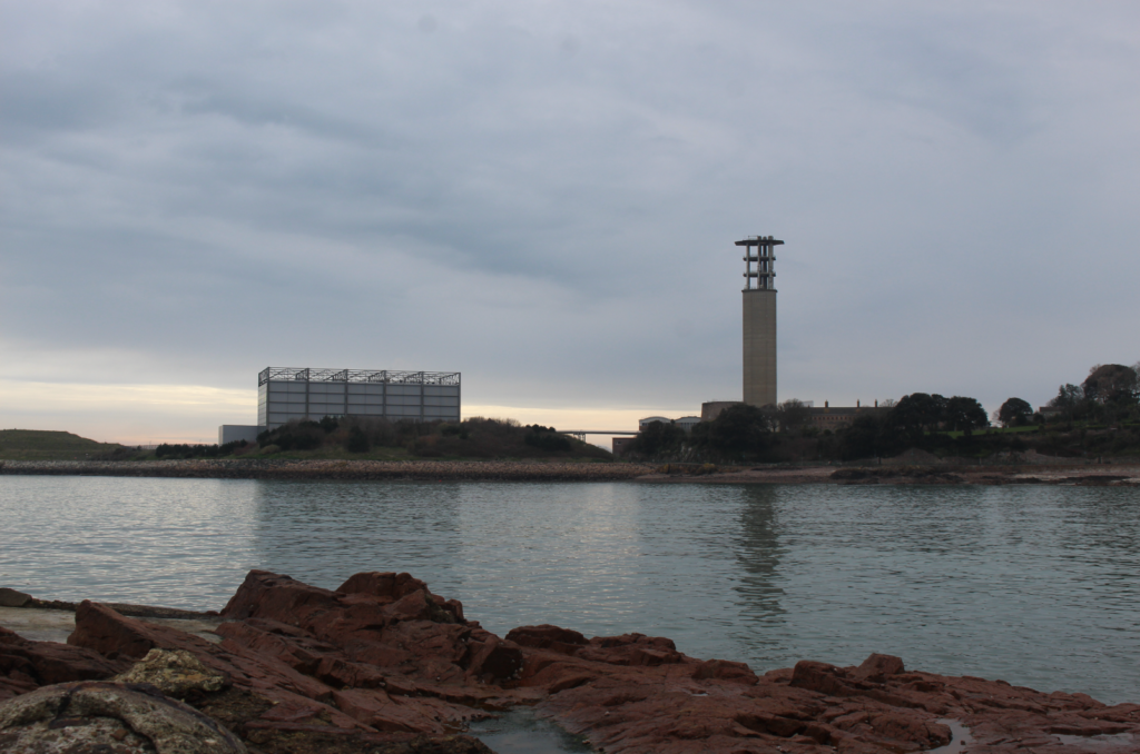
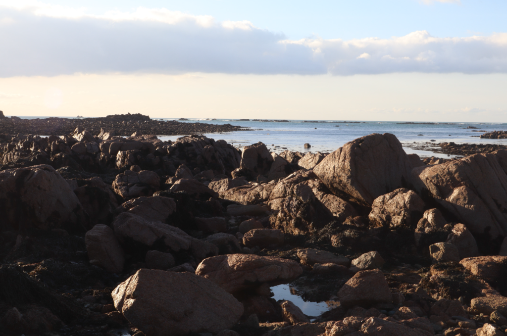
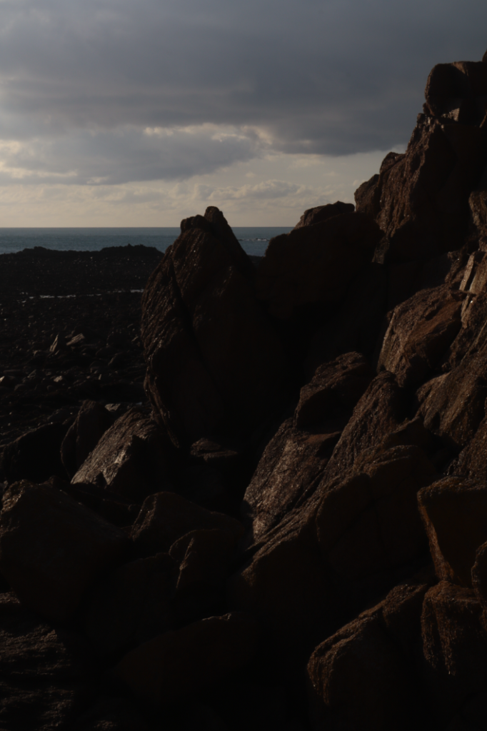
I selected this image since I thought using HDR would bring out lots of detail in the shadows and create an interesting landscape with balanced exposure, similarly to the style of Ansel Adams. I also liked the composition, with darker shadows on the rocks on the left and more sunlight illuminating the rocks on the right as well as the sky being positioned about 2/3 up the image.
I chose this image because I like the light reflecting of the water in the bottom of the picture, as well as the balance of shadows and illumination throughout the rocks. Although the sky is bleached out due to the sun, I will try and use HDR and masking in Lightroom to adjust the sky to add more detail to the sky as well as contrasting it from the foreground.
Editing/Experimentation
I opened this photo in Lightroom and went into develop mode to use the HDR editing, merging 3 versions of the same image at different exposures to capture detail in less exposed areas.
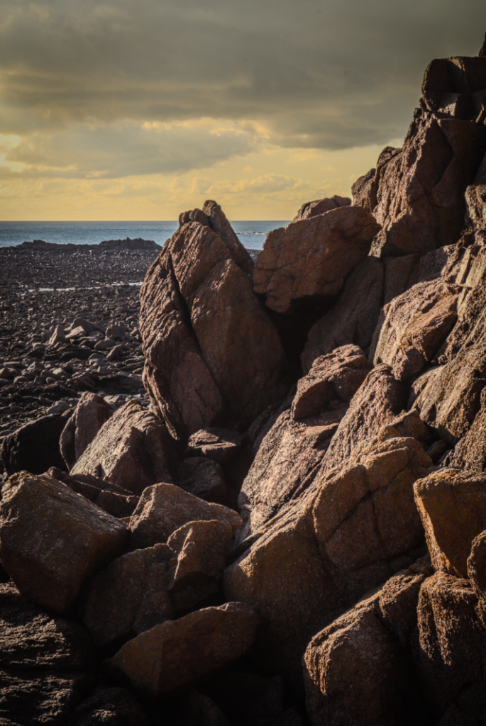
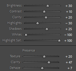
To achieve this effect, I used the golden hour preset, added some dark post-crop vignetting and used the settings above. This adds a nice colour contrast between the orange sky and blue sea, whilst still maintaining good enough exposure to make out details in shadows and have a range of tones from light to dark.
This image was created using HDR photo merge and then decreasing highlights and increasing shadows. The natural light casted onto the rocks creates an effective contrast between the light and shadows on the rocks, as well as complimenting the lighter tones in the sky with the darker tones in the sea nicely.
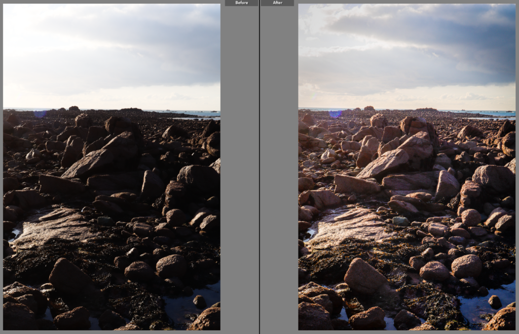
Before vs After
Finally, I added some slight vignette and increased the clarity and decreased the dehaze. The final result maintains good exposure on all parts of the image which when combined with the use of a high aperture brings out every detail in the image.
For this image I first HDR photo merged it, and noticed overall it was quite underexposed.
I then increased the exposure and decreased the highlights to bring more details as well as making the photo more visible.
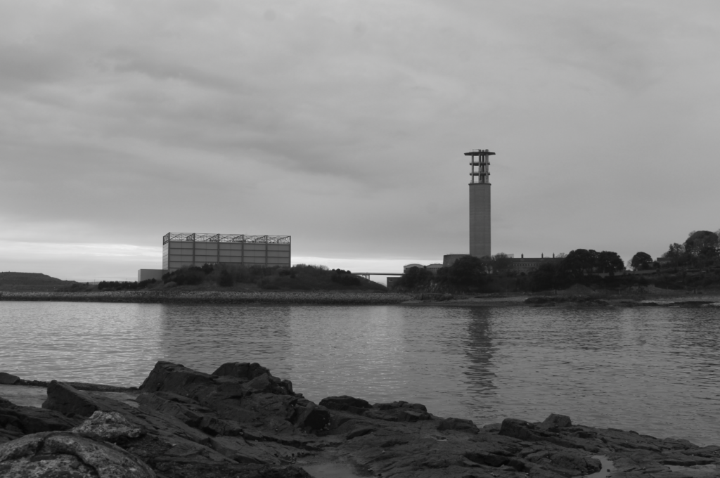
Experimenting with black and white but I don’t like how the sky looks, so I used the masking tool in Lightroom to adjust it and make it contrast more visibly with the lighter tones of the cliff.
Final product, effectively exposed to maintain detail throughout the image as well as having the sky be darker to create a sense of drama.
Before vs after HDR. Noticeably more exposed with more details visible in shadows, creating more drama and taking more influence from the style of Ansel Adams.
Experimenting with black and white, very effective in bringing out the tonal difference throughout the rocks and creating drama although I don’t like the colour of the sky.
Darkening the sky since it was too light and stood out, now creating more balanced contrasts between light and dark tones. Final image has a greater sense of drama.
Original HDR image, with adjustment of exposure and shadows to further bring out detail in areas not very well-illuminated by the sun.
Black and white variation, effective with lighter tones noticeable in the clouds and sky, midtones on some of the illuminated parts of the rocks and dark tones in the shadows created on some rocks from the sun.
Exposure increased on the sky to make lighter tones more noticeable, as well as decreasing highlights and shadows and increasing contrast to bring out darker tones in the clouds.
Initial version of the image using HDR, I like it since the vibrance of the rocks exposed by sunlight contrast nicely with the shadows mainly on the left of the image as well as the sky.
When made black and white, I liked the drama created but noticed detail was lost in the shadows so I will increase shadows/exposure to restore this.
Increased shadows, next I tried to manipulate the sky to make it contrast more nicely with the cliffside and the rocks.
Presentation in ArtSteps
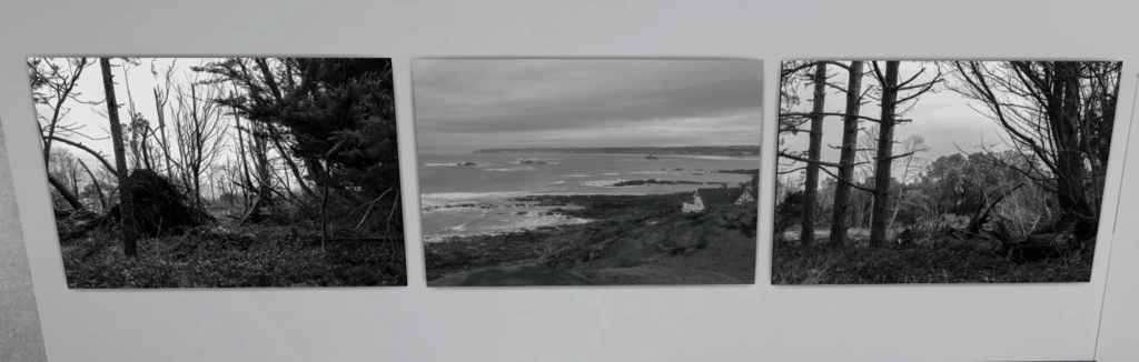
This was how I initially presented the 4 black and white pictures, but I think that presenting 4 images in a line isn’t really effective – furthermore, now presenting them side by side I can see that tones and exposure-wise the second image stands out from the rest which hurts the presentation, as well as the fact all images are landscape apart from one which is portrait.
I ended up splitting the 4 images into 2 diptychs, and I like this one specifically since before the different exposure of the second image took away from the overall visual appeal of the first presentation, but now paired with only one photograph it works better as it contrasts itself from the other image whilst still allowing the two to work together as they are both landscape shots of cliffsides and rocks.
These are the other two images, which work effectively side by side as they were taken of the same scene and feature similar exposure and tonal ranges, but at the same time are two different interesting perspectives with one opting to be landscape to capture more individual rocks and the other being portrait to create more visual emphasis on the cluster of rocks positioned in the middle.
I think this presentation was effective since I like the contrast between the warmer sky and portrait style of the first image and the lighter tones and landscape of the second image is visually appealing, whilst still allowing both images to be presented together as a diptych.
Photoshoot Evaluation
Overall, I found my photos to be effective in presenting a range of tones as well as creating drama while maintaining Ansel Adams’ style of high aperture values and keeping everything well enough exposed to allow every detail to be visible. Editing also allowed for me to create HDR photos and experiment with black and white, helping me achieve my intention behind each image as well as helping to reinforce the atmosphere each individual image is trying to create.
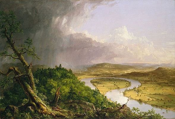
Comparison Against Ansel Adams
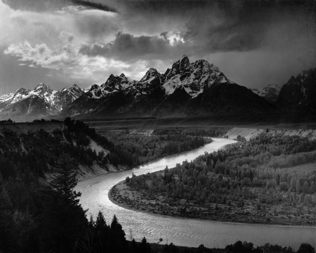
Technical – Both photos were taken outdoors, and thus all of the lighting is natural – both also use a high aperture to create a large depth of field and keep every detail in focus. Finally, there is a visible use of the zone system to have a wide range of different tones from light to dark (also helping to add more drama to the image), so I think I have successfully replicated Ansel Adams’ style.
Visual – Ansel Adams’ image was taken from high up in a mountain range, capturing another mountain range in the distance as well as the river and landscape below all of which uses the zone system to create visible contrast between light and dark tones. My image contains a similar range of light and dark tones, although the sky has been darkened slightly since I found it to be a bit bleached out so it doesn’t have as many lighter tones although the scene itself still has a sense of drama similarly to Adams’ photo.
Conceptual – The idea behind Ansel Adams’ photography was to use high apertures to maintain noticeable detail in every area of the image, showing off the beauty of nature (linking to his work as an environmentalist) and to have a wide range of tones in each image, creating drama. I think both his image and mine make effective use of these techniques.
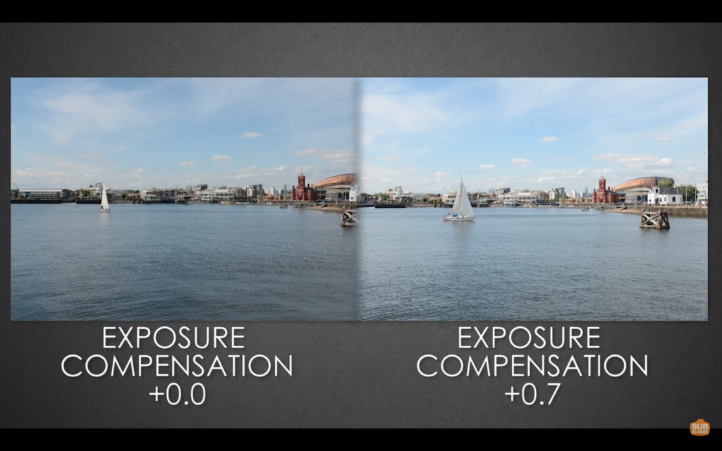
Exposure compensation helps you override automatic exposure adjustments your camera makes in situations with uneven light distribution, filters, non-standard processing, or underexposure or overexposure. It lets you take control of your image’s brightness by manually increasing or decreasing exposure.
Exposure Bracketing
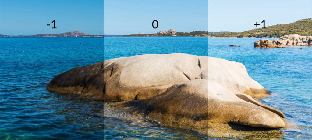
Exposure bracketing is a technique where, instead of taking a single photo, you take three (or more) that are all exposed slightly differently; normally one is correctly exposed, one slightly underexposed, and one slightly overexposed.
HDR Photos
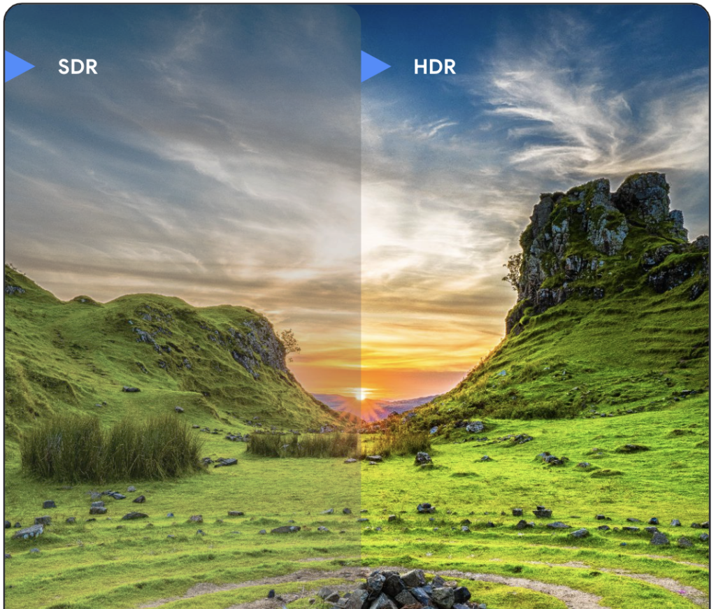
HDR stands for High Dynamic Range and refers to a technique that expresses details in content in both very bright and very dark scenes. It offers a more natural and realistic picture output even with a widened range of contrast.
Example HDR Images
Image 1
The 3 images above were the images taken to create the final HDR product. The first one is -1 underexposed, the second is balanced and the third is +1 overexposed.
This was the final product produced after merging all 3 images, with a few automatic adjustments applied to exposure and contrast.
Image 2
The 3 individual images used to create the HDR version.
Final result, with better visibility of details in less exposed areas.
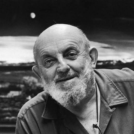
Ansel Easton Adams (February 20, 1902 – April 22, 1984) was an American landscape photographer and environmentalist known for his black-and-white images of the American West. He helped found Group f/64, an association of photographers advocating “pure” photography which favoured sharp focus and the use of the full tonal range of a photograph. He and Fred Archer developed a system of image-making called the Zone System, a method of achieving a desired final print through a technical understanding of how the tonal range of an image is the result of choices made in exposure, negative development, and printing.
Ansel Adams
Childhood
One of Adams’s earliest memories was watching the smoke from the fires caused by the 1906 San Francisco earthquake. Then four years old, Adams was uninjured in the initial shaking but was tossed face-first into a garden wall during an aftershock three hours later, breaking and scarring his nose. A doctor recommended that his nose be reset once he reached maturity, but it remained crooked and necessitated mouth breathing for the rest of his life.
Adams was a hyperactive child and prone to frequent sickness and hypochondria. He had few friends, but his family home and surroundings on the heights facing the Golden Gate provided ample childhood activities. He had little patience for games or sports; but he enjoyed the beauty of nature from an early age, collecting bugs and exploring Lobos Creek all the way to Baker Beach and the sea cliffs leading to Lands End, “San Francisco’s wildest and rockiest coast, a place strewn with shipwrecks and rife with landslides.
At age 14, he was given his first camera during his first visit to Yosemite National Park. He developed his early photographic work as a member of the Sierra Club. He was later contracted with the United States Department of the Interior to make photographs of national parks.
Sierra Club
The Sierra Club’s stated mission is “To explore, enjoy, and protect the wild places of the earth; To practice and promote the responsible use of the earth’s ecosystems and resources; To educate and enlist humanity to protect and restore the quality of the natural and human environment; and to use all lawful means to carry out these objectives.”
Ansel Adams was an official director of the Sierra Club from 1934-1971.
1927
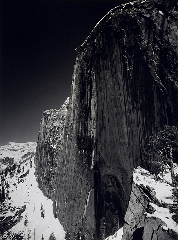
In 1927, Adams began working with Albert M. Bender, a San Francisco insurance magnate and arts patron. Bender helped Adams produce his first portfolio in his new style, Parmelian Prints of the High Sierras, which included his famous image Monolith, the Face of Half Dome, which was taken with his Korona view camera, using glass plates and a dark red filter (to heighten the tonal contrasts). On that excursion, he had only one plate left, and he “visualized” the effect of the blackened sky before risking the last image. He later said, “I had been able to realize a desired image: not the way the subject appeared in reality but how it felt to me and how it must appear in the finished print.” One biographer calls Monolith Adams’s most significant photograph because the “extreme manipulation of tonal values” was a departure from all previous photography. Adams’s concept of visualization, which he first defined in print in 1934, became a core principle in his photography.
“Monolith, the Face of Half Dome” – Ansel Adams
1930s
Bender took Adams on visits to Taos, New Mexico, where Adams met and made friends with the poet Robinson Jeffers, artists John Marin and Georgia O’Keeffe, and photographer Paul Strand. His talkative, high-spirited nature combined with his excellent piano playing made him popular among his artist friends. His first book, Taos Pueblo, was published in 1930 with text by writer Mary Hunter Austin.
During the 1930s, Adams began to deploy his photographs in the cause of wilderness preservation. He was inspired partly by the increasing incursion into Yosemite Valley of commercial development, including a pool hall, bowling alley, golf course, shops, and automobile traffic. He created the limited-edition book Sierra Nevada: The John Muir Trail in 1938, as part of the Sierra Club’s efforts to secure the designation of Kings Canyon as a national park. This book and his testimony before Congress played a vital role in the success of that effort, and Congress designated Kings Canyon as a national park in 1940, despite previous failures to get the creation of the national park approved.
A photograph featured in Sierra Nevada: The John Muir Trail
Kings Canyon Crisis
Kings Canyon was targeted by water supply and power interests including the city of Los Angeles, who wanted to build hydroelectric dams in Kings Canyon. Due to its heavy flow and long drop – 11,000 feet (3,400 m) in less than 80 miles (130 km) – the Kings River has considerable hydroelectric potential, and reservoirs were proposed for Cedar Grove, Tehipite Valley and Simpson Meadow, among other sites. Development interests blocked legislation that would have made the area a national park, but at the same time, the environmental lobby prevented any of these projects from being built.
Later, Ansel Adams was tasked to photograph and document the area, generating publicity for the preservation movement. However, in order to placate the local irrigation districts – who wanted to leave open the option of reservoirs – Cedar Grove and Tehipite Valley were specifically excluded from the new park. On March 4, 1940, President Franklin D. Roosevelt signed the bill to create Kings Canyon National Park, which added the original General Grant National Park to over 400,000 acres (160,000 ha) of the High Sierra above Cedar Grove.
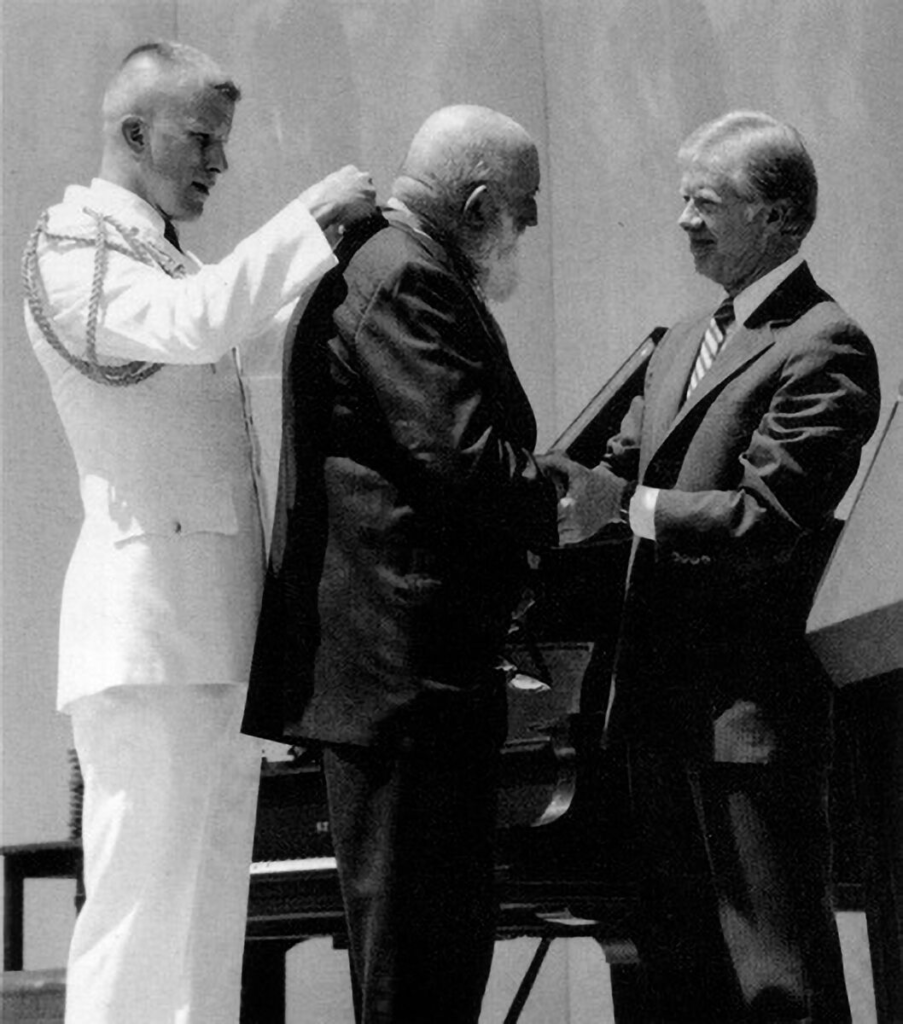
Presidential Medal
For his work and his persistent advocacy, which helped expand the National Park system, he was awarded the Presidential Medal of Freedom in 1980.
Adams receiving his medal, 1980
Visualisation
Ansel Adams on visualisation:
“Visualisation is a conscious process of projecting the final photographic image in the mind before taking the first steps in actually photographing the subject.”
“The term visualisation refers to the entire emotional-mental process of creating a photograph, and as such, it is of the most important concepts in photography.”
“To visualise an image (in whole or in part) is to see it clearly in the mind prior to exposure, a continuous projection from composing the image through the final print.” Visualisation is more accurately viewed as an attitude toward photography . . .”
In simpler terms, visualisation is about imagining a scene and figuring out the best shot before taking a photograph.
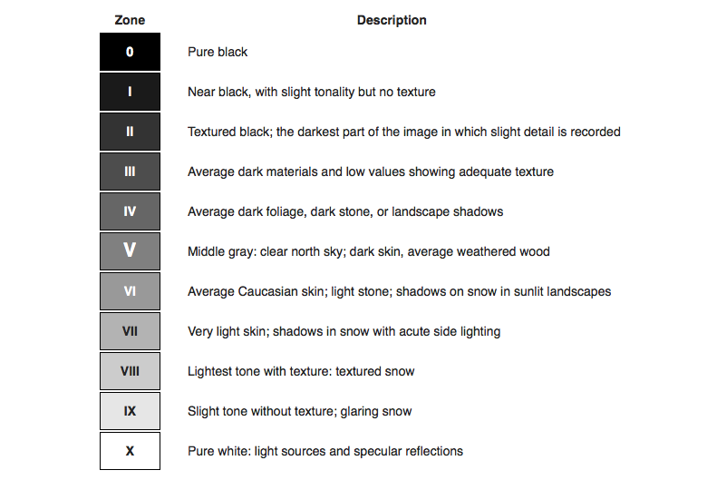
Zone System
The 11 zones in Ansel Adams’ system were defined to represent the gradation of all the different tonal values you would see in a black and white print, with zone 5 being middle grey. Zone 0 is pure black (with no detail), and zone 10 is pure white (with no detail). Each zone represents one f-stop in exposure. There is an 11-stop difference between pure black and pure white, with a 7-stop difference between the darkest black with detail and the lightest white with detail.
A description of each zone in the zone system
Image Analysis
“Monolith, the Face of Half Dome” – Ansel Adams
Technical – The lighting in this image is natural, likely during the day although a deep red-filter has been used to darken the sky. The aperture is definitely high, like f/64 since Ansel Adams liked to capture every single aspect of the image in focus.
Visual – Adams has captured the side of a mountain, taking up roughly 2/3 of the frame with a darkened sky visible in the top left as well as a snowy landscape littered with trees in the bottom left and bottom right. The image uses every zone in the zone system, with zones 0-3 being visible in the sky and zone 10 being seen on the snow in the right side of the image.
Contextual – Adams initially took this photograph using a yellow filter but didn’t like the tone of the sky so redid it using a deep red-filter, and was very pleased with the result. A very high aperture was also used since Ansel Adams and the f/64 Group as photographers liked ‘pure’ images, capturing every little detail of landscapes in focus.
Conceptual – Adams was very keen of ‘visualisation’, capturing an image in his mind’s eye before taking the actual image which is what he did when he positioned himself and pointed his camera at the mountain.
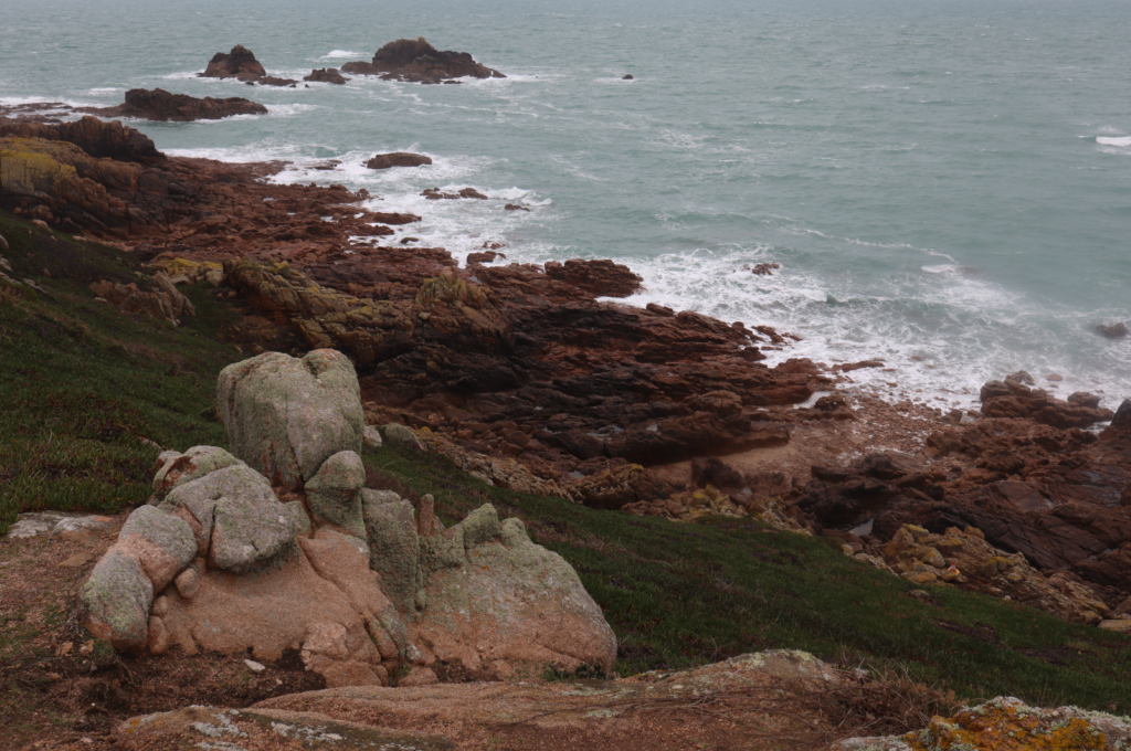
For my photoshoot, I focused mainly on cliffsides and the seascape whilst also experimenting with trees and greenery.
Selection
The pictures I have selected for editing each have a wide range of light and dark tones as well as compositions which create depth and drama that I will experiment with to see how editing can amplify this (e.g. to see if making the images black and white effectively uses the Zone System).
Editing/Experimentation
For my first edits of this image I darkened the sky to create more contrast between light and dark tones as well as create drama, and turned up the contrast and clarity for the foreground.
I then experimented with making it black and white, which I really liked since the darker tones of the foreground contrast effectively with the lighter tones of the sea and midtones of the sky.
With this image I darkened the sky again to create more drama since in the original image the sky was pastel-ly and bleached out.
Black and white variation, showing contrast between the sea, sky and landscape.
Lowered highlights and whites, increased contrast.
Black and white, creating a greater sense of drama.
Decreased contrast and highlights.
I then turned the image black and white in Photoshop, manually adjusting each colour, then increasing highlights, brightness and contrast to create more drama.
Above are the settings I used to create the effect.
Decreased highlights and whites to create more drama in the sky.
Black and white to create more contrast between the sky, sea and rocky foreground and increased contrast to highlight the range of tones in the rocks more.
Settings used to edit the photo.
Decreased highlights, slightly increased exposure and contrast.
Edited to have darker tones in the trees and leaves, midtones in the trees in the background and lighter tones in the sky.
Settings used to edit the image.
Presentation in ArtSteps
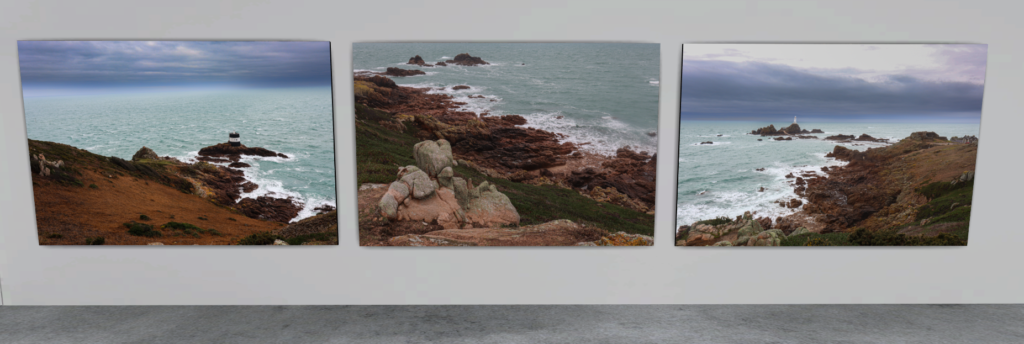
I like how these images work together in a triptych, since they were all taken at the same point of a cliff but of different areas, which makes them work effectively presented as a group since similarities between the photos.
I think these images work together somewhat nicely presented in a triptych since side by side the differences in composition and tonal ranges are clearly highlighted, although I think the middle photograph stands out a bit and doesn’t fit in quite as well as it is of a completely different landscape.
Romanticism was first recognized as a style in literary criticism around 1800, but it really took off as an artistic movement in France and Britain during the early 1800s and continued to thrive until about the middle of the century. This movement focused on imagination and feelings, arising as a reaction to the disappointment with Enlightenment ideals of reason and structure that followed the French Revolution in 1789.
The term sublime refers to art/photography that has the capability to terrify or overwhelm the viewer. Edmund Burke asserts that the feelings of the sublime are triggered by extremes – vastness, extreme height, difficulty, darkness or excessive light. Sublime paintings/photography typically focus on extreme environments such as jagged mountains or rough, stormy seas which invocate feelings of fear as well as excitement.
“Whatever is fitted in any sort to excite the ideas of pain, and danger, that is to say, whatever is in any sort terrible, or is conversant about terrible objects, or operates in a manner analogous to terror, is a source of the sublime; that is, it is productive of the strongest emotion which the mind is capable of feeling.”
The Industrial Revolution and its Impact on Romanticism
The Industrial Revolution had a profound impact on the Romantic movement, shaping its themes, concerns, and artistic expressions. The loss of connection with nature, the alienating effects of urbanization, and the critique of industrial capitalism all influenced the works of Romantic poets and artists.
Many English intellectuals and artists in the early 19th century considered industrialism inhumane and unnatural and revolted – sometimes quite violently – against what they felt to be the increasingly inhumane and unnatural mechanization of modern life. To a large extent, English Romantic intellectuals and artists felt that the modern industrial world was harsh and deadening to the senses and spirit. These intellectuals called for a return, both in life and in spirit, of the emotional and natural, as well as the ideals of the pre-industrial past.
Romantic Artists
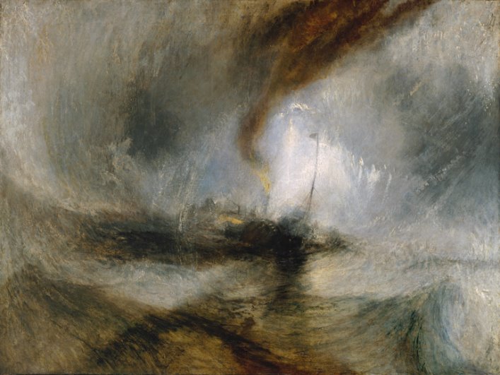
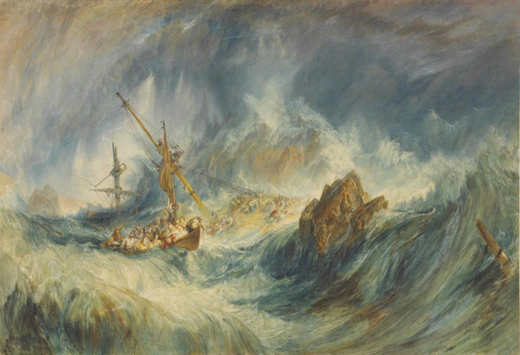
JMW Turner
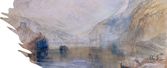
Joseph Mallord William Turner (23 April 1775 – 19 December 1851), known in his time as William Turner, was an English Romantic painter, printmaker and watercolourist. He is known for his expressive colouring, imaginative landscapes and turbulent, often violent marine paintings. He left behind more than 550 oil paintings, 2,000 watercolours, and 30,000 works on paper. He was championed by the leading English art critic John Ruskin from 1840, and is today regarded as having elevated landscape painting to an eminence rivalling history painting.
A Storm – JMW Turner
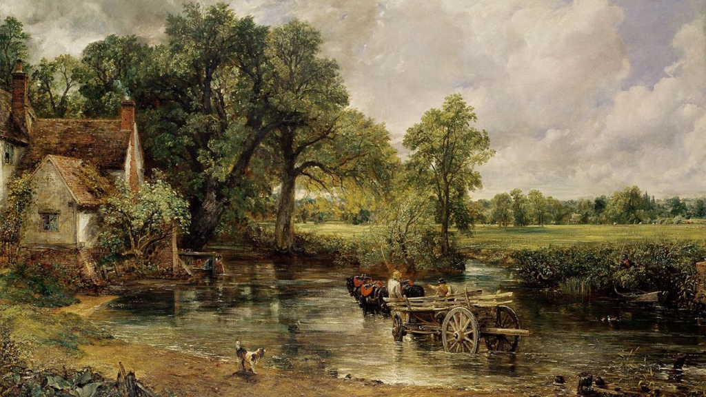
John Constable
John Constable (11 June 1776 – 31 March 1837) was an English landscape painter in the Romantic tradition. Born in Suffolk, he is known principally for revolutionising the genre of landscape painting with his pictures of Dedham Vale, the area surrounding his home – now known as “Constable Country” – which he invested with an intensity of affection. “I should paint my own places best”, he wrote to his friend John Fisher in 1821, “painting is but another word for feeling”.
Constable’s most famous paintings include Wivenhoe Park (1816), Dedham Vale (1828) and The Hay Wain (1821). Although his paintings are now among the most popular and valuable in British art, he was never financially successful. He was elected to the Royal Academy of Arts at the age of 52. His work was embraced in France, where he sold more than in his native England and inspired the Barbizon school.
The Hay Wain (1821) – John Constable, part of the ‘6 foot’ series where he painted landscapes featuring a width of 6 foot
Constable’s father was a land owner and the early industrial revolution was perceived to threaten jobs, creating a contextual link which is relaxed and not portraying the tension associated with the industrial revolution at the time. The typical landscape before this focused on classical landscapes, e.g. Arcadia or fictional landscapes which this painting is defying – most notably with the large amount of canvas dedicated to the sky (since Constable had studied meteorology, shown by him capturing a specific time of day in the painting) and fields, also making the painting more personal as it relates to the landscapes Constable grew up in and is fond of. The painting is also intentionally not ‘finished’ with rough textures and brushstrokes creating more emphasis on the grass and light reflecting off the water.