I had some general design ideas that I wanted to implement throughout my picture stories:
clear establishing shot with supporting images;
bold title that links to images;
a body of text and potentially captions, but mostly pictures;
explore different themes such as: street/café culture, solitary figures and unity (families, couples etc).
Initial Page Layout Ideas:
Picture Story 1:
To start I added some background pictures I had taken of St Malo and reduced the opacity so they wouldn’t take up focus/be significant in telling the picture story, but instead would just fill the empty space.
Then added a title with drop shadow to make it stand out, and placed it off centre since I wanted my pictures to be the main storytelling point and have less text (leaning more towards visual than literal storytelling).
I then adding some supporting environmental portraits around the page, showing the streets and cafe culture of St Malo.
This was the finalised version before adding text, with a landscape shot of a empty street to contrast with the other images and another cafe – by this point, I added drop shadow and a thin white border to all images and liked the effect, but didn’t like the idea of having a title with a caption underneath it and then another bit of negative space for another caption, so I instead opted to fill out on space fully with the title and have a small caption relating to all images in the other.
The final product, which has a caption in a column relating it to typical newspaper styles – the final adjustment I decided to make from here was to make the title more similar to the caption by arranging it as a column.
Complete picture story #1.
Picture Story 2:
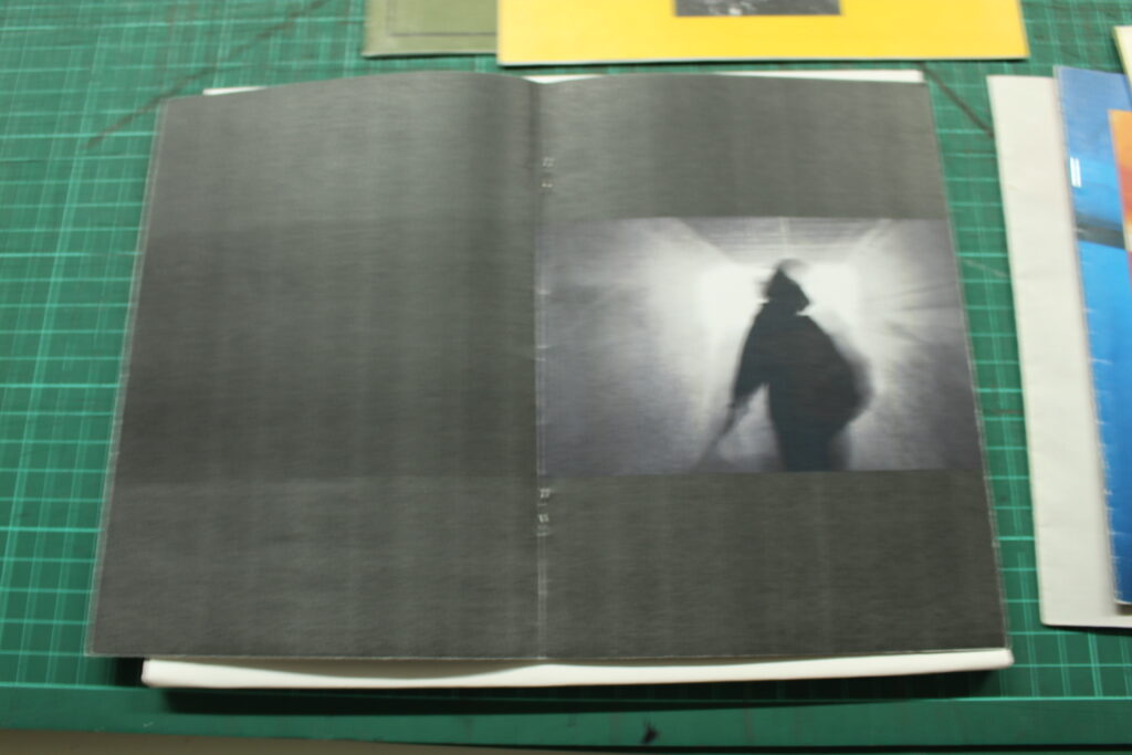
Black background with a title (translates to solitary figures of St Malo).
Re-arranged title and placed establishing shot with a slight white border, all images will be edited slightly to have grain and a vignette for a vintage feel.
Second image, the negative space in the bottom left will be left for a caption introducing my theme.
Caption added, left side of the picture story complete.
Layout idea (with placeholder images), where I will have descriptive captions under the two images on the top right and then another caption to go alongside the picture on the bottom of the right half.
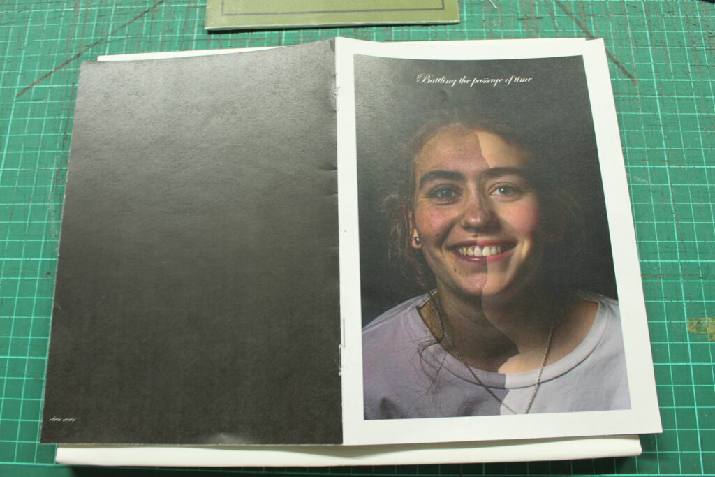
Finalised images added in, I like the layout and photos used so after adding captions and another block of text it will be done.
Title put in italics, and added my name to fill the space as well as a small line to separate it from the title to keep visual clarity.
Feedback/criticism from peers – after reading the suggestions, I decided to keep my ideas as they are since adding extra images isn’t possible without downscaling images, although the feedback on my gaps and the establishing shots will be taken into consideration and I will try adjust the current layout slightly.
Brought the images on the bottom down slightly so the gap between the establishing shot and the image below is equal to the gap between the establishing shot and image to the right, and the gap between the edge of the page is the same for every image. Also added supporting captions for the two images on the top right to fill in the empty space, and planned to fill in the last bit in the bottom right with another caption.
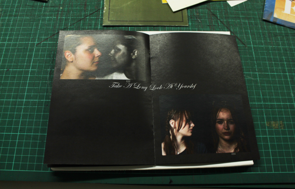
Experimenting with adding an extra image instead and really liked the layout, so I will keep it this way and rewrite the small caption between all the pictures.
Fine tuned the body of text and image layouts, as well as changing the caption going with the four images for a quote that matches the theme of my story.
Final version; edited the name so there’s more emphasis on the title and to avoid confusion between the name and title.
Completed picture story #2.
Picture Story 3:
Initial layout idea was simple, establishing shot on top left, and observed portraits in the top right and bottom right with a title and caption in the bottom left.
Extra images, slightly adjusted layout.
Black background + white borders around images.
Title and name added, I noticed they seem too big so I will shrink them and potentially re-arrange the layout slightly to be able to fit a caption in the remaining empty space + to keep visual clarity and appeal.
Refined version, more negative space present to maintain visual appeal.
Finalised version with a caption.
Picture Story 4:
Starting with a png of a subject from one of my images – I am planning to focus more on graphics than simple layouts and text for this story.
Made the png not black and white since I want images in colour to match the colourful graphic background (the French flag), also added a title.
Re-arranged the graphics so they aren’t slanted since this was too difficult to work text and images around, added detail shot of a street in St Malo in the top right and a supporting body of text.
Added pictures and readjusted layout slightly + changed picture in top right to use that image as the establishing shot.
Refinements – changed the body of text on the right to not be capitalised and aligned differently so it’s more informal, capitalised the title and increased the size slightly.
Changed the establishing shot to better align with the theme and story.
Re-did the png on the left since there were too many jagged edges and it didn’t look great in the first iteration, also changed the red to be more accurate to the red of the French flag.
Finished Picture Stories + Evaluation
#1:
I like the layout of this picture story as well as the pictures used since there is a clear story being told which also corresponds with the title and caption – however, the two different background images used worsen readability and overall visual appeal, and I also wasn’t really happy with the awkward positioning, font and drop shadow for the title.
#2:
I really liked the layout of this one, the left half with the title and smaller name as well as the positioning of the two pictures and caption create a very formal newspaper-like style, and also contrast nicely with the more visual storytelling style of the right half with the 4 pictures of solitary figures and a quote. If I had to make any changes I would experiment with different layouts, maybe trying less images and more text on the right to keep the newspaper-like theme consistent throughout.
#3:
I also liked the layout of this story, with the title name and caption all in one corner leaving room for the rest of the board to just be purely visual storytelling – however, if I had to make changes, I would use a different establishing shot since the empty street and café it shows clashes with the theme, and I would also change the colours and visual style since it is too similar to the previous ones.
#4:
I found the different visual and graphic approach I took to be extremely effective, and I also liked the layout with the woman on the left contrasting with the body of text on the right while still maintaining space in the middle for other images – I also like how there is a clear theme of tourism, as the woman on the left can be assumed to be the character in the story part of a tourist group (like the one seen in the establishing shot), and the other images represent what she would see walking through the streets of the old walled town.
A picture story is a series of photographs used to tell a narrative or convey a specific idea or emotion. It’s a form of visual storytelling that goes beyond a simple collection of images, aiming to create a deeper understanding of a subject or event through the carefully selected and sequenced photographs with supporting captions and text.
Mood Board
Key Features of a Picture Story
Typically, picture stories feature key shots which are visually strong and informative, helping to build the atmosphere and story being told – these are as follows:
Establishing Shot
The establishing shot serves to define the context in which the other pictures have been located. It describes where and sometimes when the event took place. It can also describe mood and other information such as how large the event is how many people were involved, the weather etc.
An example of an establishing shot – this could be one for a picture story on Paris.
Person at WorkShot
These shots aim to identify…
•Who the person is…we should be able to recognise them.
•What is it they are doing….
•How are they doing it…
•In what context are they doing it…
Example of a person at work shot from the JEP, where all the bullet points above can be identified visually in the image.
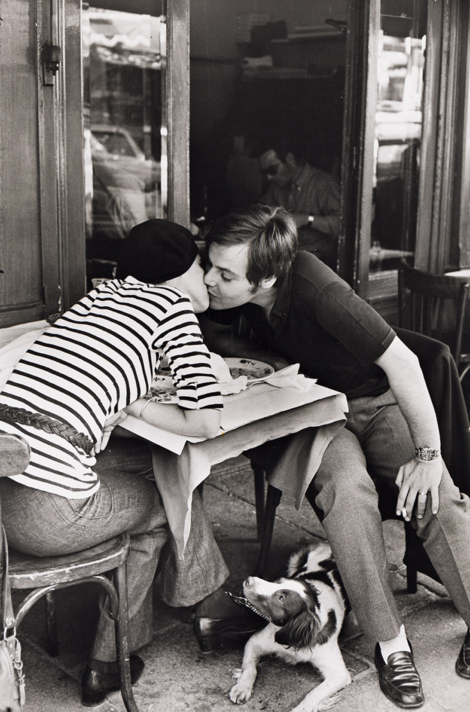
Relationship Shot
This is a shot which shows a relationship between two or more people, no matter what type. These should show…
•What is taking place between them…
•What the nature of the relationship is….
Example from the JEP – the two factors above can be easily identified, as you can tell they are on some sort of date and it is likely they are wife and husband.
Detail Shot
Detail shots adds pace to a picture story which will be discussed later. They can be a good chance to shoot something in an abstract way that gets the viewer thinking about what they are looking at – adding a new dimension to the story.
Environmental Portrait
This is similar to a formal portrait in that the subject often knows they are being photographed but a lot more emphasis is placed on location, with them being placed in an environment associated to them in some way, whether it be a home environment, work or hobby (e.g. pilot in a cockpit, chef in a kitchen).
Formal Portrait
A stage portrait. The photographer decides lighting, posture, distance etc but in a way that still permits the personality of the subject to come through.
Observed Portrait
This when the subject is not as aware of having their picture taken (candid; less formal). There is a lot of crossover between the different portrait styles to you could have an observed/environmental portrait or even an observed/formal portrait taken during a moment when the subject is maybe not aware you’re taking pictures.
Picture Story Analysis
Picture story shown is ‘Country Doctor’ by W Eugene Smith.
Images are cropped to enhance compositions, cut down on negative space and alter framing as well as creating additional focus on a certain subject.
Photo 1
Crop 1
Removed negative space so the people fill the frame more, making the image seem more crowded and clustered – makes it closer to the style of William Klein.
Crop 2
Zoomed in even further and changed aspect ratio to 1:1 (square), little to no negative space and the photo is now fully filled by the people which creates a busy scene (similar to the style of William Klein).
Crop 3
Cropped inwards, image focuses purely on heads of subjects now, panoramic style.
Crop 4
Circular crop, alters framing and shifts the focal point to the two elderly women.
Crop 5
Triangular crop, similar effects as the circular one but captures more heads of the subjects with less focus on their bodies.
Photo 2
Crop 1
Zoomed in to focus purely on the group, with negative space surrounding them and a bit of lines/geometry.
Crop 2
Cropped in even more, focus amplified on the subjects with negative space filling the rest of the frame.
Crop 3
Panoramic crop, subjects in the middle isolates them from surroundings and creates more emphasis on the negative space.
Crop 4
Circular crop zooms into the subjects, with the group on the left and solitary figure on the right as well as negative space throughout the rest of the circle.
Crop 5
Triangular crop changes the negative space to fill mostly the right half of the image alongside the solitary figure, with less negative space on the left as it is filled more by the other people.
Photo 3
Crop 1
Square crop removes lots of negative space, highlighting more focus on the subject positioned in the centre.
Crop 2
Similar square crop but shifted upwards so subject is off-centre, more attention on the lines and geometry in the background.
Crop 3
Horizontal crop adds more negative space and cuts down on the lines and shape, so the image feels less poetic and more raw with focus just on the two visible figures.
Crop 4
Circular crop leaves just the solitary figure as the subject, with a few lines and negative space visible.
Crop 5
Triangular crop achieves similar effects as the circular one.
Photo 4
Crop 1
Square crop cuts down on some of the lines and visual elements to focus more on the subjects.
Crop 2
Cropped to alter the composition so the subjects are centred rather than being on the right third, so more attention is drawn to them rather than the surroundings.
Crop 3
Cropped inwards so subjects are basically fully filling in the frame, much more up-close and William Klein-style image.
Crop 4
Circular crop frames the subjects perfectly and directs all focus to them whilst keeping a bit of extra negative space with the background.
Crop 5
Triangular crop didn’t work since I couldn’t centre it and capture the image effectively, so it looks awkward and ineffective in my opinion.
Photo 5
Crop 1
Square crop that centres the subject.
Crop 2
Cropped in more, less negative space so subject fills the frame more.
Crop 3
Panoramic crop includes negative space and background objects whilst still isolating the subject as there are no other people present.
Crop 4
Circular crop takes away all elements of the image other than the subject, creating emphasis on her being a solitary figure.
Crop 5
Triangular crop centres the subject whilst still maintaining some of the background and atmosphere of the original image.
Photo 6
Crop 1
Simple square crop.
Crop 2
Cropped out other details, more focus on the solitary figure.
Crop 3
Cropped in further, subject fills up frame more now – shot feels much more close-up and personal, similar to Klein.
Crop 4
Circular crop has the subject fill up the whole frame, while still having lines and geometry in the background.
Saint-Malo is a historic port located in Ille-et-Vilaine, Brittany, France. This walled city, situated on the coast of the English Channel, has a rich history of piracy, which brought in a lot of wealth through local extortion and adventures overseas.
As of now, it is a tourist hotspot, with plenty of people walking through the streets of the old town, especially during warmer periods of the year.
A map of St Malo’s old town in Google Maps, satellite view.
History
Established by Gauls in the 1st century BC, the ancient settlement where Saint-Malo stands was referred to as the Roman Reginca or Aletum. By the end of the 4th century AD, the Saint-Servan area housed a significant fort on the Saxon Shore, which safeguarded the Rance estuary from sea invaders beyond the borders. As the Western Roman Empire weakened, Armorica (present-day Brittany) revolted against Roman authority led by the Bagaudae and during the 5th and 6th centuries, many Celtic Britons escaping turmoil across the Channel settled there. The current Saint-Malo can trace its roots back to a monastic community established by Saint Aaron and Saint Brendan in the early sixth century. Its name comes from a figure believed to be a disciple of Brendan the Navigator, Saint Malo or Maclou, who was an immigrant from what is now known as Wales.
World War 2
In World War II, during fighting in late August and early September 1944, the iconic walled city of Saint-Malo was almost completely destroyed by American shelling and bombing.
Colonel Andreas von Aulock, the German commander, refused to surrender when asked to do so by the town’s authorities; he said he “would defend St. Malo to the last man even if the last man had to be himself”.
On 13 August, the walled city was on fire and a short truce was declared to allow French civilians to flee the city. Outlying German positions at St. Ideuc and La Varde fell to infantry attacks. This fighting ended resistance on the north shore of the peninsula. Only the citadel remained. Surrounded by American artillery and under frequent air attack, this last holdout surrendered on the afternoon of 17 August.
Eventually, they surrendered on 2 September when the three-hundred-man garrison ran out of drinking water. The Americans had taken more than ten thousand prisoners during the two-week fight, including von Aulock.
Post-War
Saint-Malo was reconstructed over a span of 12 years from 1948 to 1960.
It serves as a subprefecture of Ille-et-Vilaine. In 1967, the commune of Saint-Servan was combined with Paramé, forming the new commune of Saint-Malo.
Street Photography in St Malo
With St Malo being a tourist destination, there is likely going to be many people in the streets to produce effective street photography images.
An AI overview says:
‘St-Malo, a walled city in Brittany, France, offers a rich backdrop for street photography. Its narrow, cobblestone streets, historic architecture, and vibrant coastal atmosphere provide ample opportunities for capturing the daily life of the city and its inhabitants.’
Examples of St Malo’s Streets:
Contact Sheet
160 total photos
My images were all taken using an authentic street photography camera that had a fixed 18mm lens, so my photographs are mostly more confrontational and up-close rather than observational (meaning I focused more on William Klein’s style of photography).
Map Showing Routes Taken:
Simple Editing and Experimentation
Original image has a strong sense of depth with the path, as well as one figure being in the foreground and the other being further back in the middle ground.
Increased exposure and contrast, black and white.
Linking to the decisive moment with the woman smiling at the bird, as well as composition having each part of the image split across evenly.
Black and white, increased texture.
Original composition shifted a little as I was trying to get used to the camera, but I will fix this with cropping – although I like how the image is taken from the ground up.
I like the objective and very documentary-like style of this image, which I will enhance by making it black and white.
Black and white, decreased highlights, increased texture.
Original image has an effective composition and I like how the subject is looking the way the statue is pointing (links to decisive moment), I will crop it slightly to zoom in more on the statue and subject.
Black and white + cropping, as well as storm clouds preset which adds drama to the sky and enhances the negative space.
I like the William Klein and confrontational style of this image alongside the fact it has little to none negative space, filling the frame and making the image feel crowded.
Black and white, increased texture, increased contrast.
I like the large amount of negative space with the subjects positioned in the middle of the image, as well as the solitary child excluded from the group on the right creating an intriguing scene.
Black and white + cropping.
I found the contrast of the couple on the left third and solitary figure on the right to make an interesting photo.
Black and white, increased shadows and contrast.
Clear sense of depth with a foreground, middle ground and background. Emphasis on the solitary figure in the foreground while still highlighting the crowd around the image, creating an image which blends both the styles of Cartier-Bresson and Klein.
Cropped in, decreased highlights and increased shadows.
Visually pleasing composition with use of negative space.
Cropped inwards, black and white, increased exposure and contrast and texture, decreased highlights.
Solitary figure positioned on the lower end of the image with plenty of lines and negative space around.
Black and white, increased texture, contrast and highlights.
Sense of depth with a foreground and middle ground as well as simple but effective visual storytelling.
Black and white, decreased highlights, cropped down the top part of the image.
I like the geometry and lines with the bricks and railings, but mostly the crowd positioned in the centre creating a Klein-style image.
Black and white, cropped, increased shadows and decreased highlights,
I like how empty this image feels, with the clear focal point being on a solitary figure in the middle, creating contrast between other images of crowds and busy streets.
Black and white, cropped inwards, decreased highlights and blacks.
Sense of depth and three dimensions with the image being taken on a cornerstone, as well as interesting expressions/actions from subjects.
Top cropped down, decreased highlights and whites.
Interesting subjects in the foreground and background (especially with the focal point being on the woman in the front’s vibrant clothing), leading lines with the bricks.
Cropped inwards, black and white, increased shadows and whites.
Focal point on the figures in the middle, more of an observational Henri Cartier-Bresson style image.
Increased shadows and exposure, decreased highlights and blacks.
Another observational image, leading lines with the bricks.
Cropped in, increased shadows, exposure and contrast.
Sense of depth and geometry with the street expanding into the distance as well as leading lines. Clear contrast between busier street in the distance and solitary figure in the foreground.
Decreased highlights, increased shadows.
Lots of shape and geometry around the image, as well as a simple depiction of a family eating ice cream without excessive focus on composition or visual elements (referencing Klein).
Increased shadows and whites, decreased blacks.
Crowded scene as well as slower shutter speed with motion blur on the hand of one of the subjects, showing clear inspiration from Klein.
Increased contrast and shadows, decreased blacks and highlights.
William Klein-style image, being informal and crowded, as well as a sense of depth with foreground, middle ground and background.
Decreased highlights, increased shadows.
Observational image with a solitary figure positioned on the right third, simple but appealing image.
Increased shadows and whites, decreased blacks.
Solitary figure with smaller crowd seen in the background, emphasis created on the subject since the man he is interacting with cannot be seen, only his arm.
Increased shadows and whites, black and white.
Further Development with Best Images
I then wanted to experiment with editing some of my best images further, experimenting with things like grain, vignette and masking.
Observational Image 1:
BeforeAfter
I added some slight grain and vignette since I liked the original image as it was edited, but these effects help to amplify the nostalgic feel further and present the image as more similar to one from Cartier-Bresson or Klein.
Observational Image 2:
BeforeAfter
When taking observational images, I liked focusing on solitary figures, so when editing this I made only the subject black and white to help him stand out from the environment more.
Confrontational Image 1:
BeforeAfter
Experimenting with grain and vignetting again to emphasise a nostalgic atmosphere.
Confrontational Image 2:
BeforeAfter
Making subjects black and white to contrast them from vibrant background, making them stand out more.
I then wanted to experiment with the colour mixer to isolate particular colours while the rest of the image is in black and white.
Image 1:
Keeping blues in colour while removing the rest of colours adds additional emphasis on the main subject, separating the image into her and the smaller group of people in the background which creates a stronger sense of depth.
Image 2:
Keeping only blue in colour removes colour from everything except primarily people’s clothing, which creates a contrast in the image since despite one out of focus figure (taken with a slow shutter speed) taking up the majority of the frame attention is still drawn to people in the background.
Image 3:
With this image I experimented with a unique style, creating less of an emphasis on the people themselves and more on the environment by having only the flowers and pavement in colour.
Image 4:
I then tried the opposite of my previous image, keeping everything black and white except for people and their belongings which is in more of a street photography style, having some visual elements in a Cartier-Bresson style.
Image Analysis + Comparison
Analysis 1:
Technical – Natural (daylight) lighting, aperture f/8, fast shutter speed.
Visual – Black and white with slight range in tones, with shape, form and lines present around the image creating an interesting image out of an ordinary scene.
Conceptual/Contextual – Fast shutter speed alongside a visually poetic scene with geometry, line and shape creates a pleasing composition that reflects the style of Cartier-Bresson – furthermore, there is clear use of the decisive moment, as if the image was taken even a few fractions of a second the subjects wouldn’t have been stood the same way and the scene captured could’ve likely not have been as appealing.
Visual – Less focus on visual elements and creating an intriguing scene with more emphasis on capturing the raw scene as it is – visual elements include lack of colour with a range of light to dark tones ranging from the people to the café itself, as well as a sense of depth with foreground (bench), middle ground (people in café) and background (street).
Conceptual/Contextual – There was less of an emphasis on visual techniques/elements as this was leaning towards being more of a confrontational image in the style of William Klein, so I instead focused on informality and capturing the crowd in the café as they were.
Direct Comparison Against Cartier-Bressonand the Decisive Moment:
Technical – Cartier-Bresson’s image features natural lighting with a lower aperture value to create a shallow depth of field and blur out the background figures – similarly, my image also uses natural lighting as both images are outside street photography pictures, but mine has a slightly higher aperture since the subjects in the background are still in focus and detailed.
Visual – Cartier-Bresson’s picture has a strong tonal range with lights and darks present throughout the image, as well as depth and lines with a visible foreground and background. Similarly, mine has ranges of light and dark tones with the shadows cast from the shop as well as leading lines and geometry from the shop.
Conceptual/Contextual – Henri Cartier-Bresson often employed his technique called the decisive moment into his works, waiting for the perfect moment for elements of the image to align in a compositionally and visually appealing manner to create a formal and poetic final product – in his image above, the image was taken when the child was perfectly in the centre of the image and with the ideal expression, creating an extraordinary scene out of an everyday street; I tried replicating this philosophy in my own work and for this image in particular I found it effective, since both subjects in the image have intriguing stances and expressions which they may not have had if the picture was taken half a second earlier or later, resulting in the final product being an intriguing depiction of an otherwise ordinary street (linking to Cartier-Bresson’s poetic and less raw approach to his photography, in contrast to Klein).
Best Images and Evaluation
Observational (Henri Cartier-Bresson):
Overall, it was difficult to capture observational image with an 18mm so often times I had to capture observational scenes unnoticed but from up close, which differs to Henri Cartier-Bresson’s exact style of being a bit further back and trying to go unnoticed to minimise chances of interference with subjects.
Confrontational (William Klein):
In contrast to observational images, confrontational ones tend to be informal, up-close pictures and typically feature crowds of groups of people – overall I think these turned out quite well compositionally and visually, especially with an 18mm lens capturing scenes much closer and creating more of a connection between the subjects and viewer(s).
References to Artists in my Imagery:
Visually:some flâneur-style imagery with appealing composition and techniques such as depth, lines and form to enhance the image and turn ordinary scenes into interesting photos (Cartier-Bresson), as well as some being close-up and informal, focusing less on compositional mastery and more on capturing raw scenes typically of crowds (William Klein).
Visual references to Cartier-Bresson; observational, poetic.Visual references to Klein; crowded, less emphasis on composition and techniques.
Technically: fixed 18mm lens which led to mostly confrontational images, although observational images captured with a wide lens allowed for more negative space to fill frame and isolate the one or two subjects further, creating more intrigue towards the images.
Conceptually:emphasis on the philosophy of the decisive moment when taking observational images, with some consideration of it for confrontational imagery.
Image 1, Observational – if the image was taken any sooner or later, the subjects wouldn’t have been stood they way they are now, likely resulting in a less interesting image. Image 2, Confrontational – if the image was taken too early or too late, there wouldn’t have been a contrast with the people facing directions and people potentially could have moved resulting in less of a crowd and therefore less of a William Klein-style image.
Next Photoshoot Development Ideas:
– use a different lens with zooming capabilities to be able to focus on capturing both observational and confrontational images, as an 18mm lens is constrictive in terms of observational photography
– greater emphasis on solitary figures/couples/contrast to create effective presentations of multiple images that go together in this style
– greater emphasis on decisive moment and patience to try capture more interesting scenes
Presentation in ArtSteps
For presenting the images, I wanted to match images with similar themes (e.g. solitary figures, couples, crowds) with each other as well as trying to group images with similar styles (e.g. group confrontational images with other confrontational images).
These two work effectively in a diptych since they are both more observational images with a focal point on a solitary figure, but still different enough to create small contrasts that make each image an interesting scene in its own way (e.g. the first one contains a lot more negative space and has the subject positioned in the centre whereas the second one has slightly less negative space and has the subject positioned on the right third.
Similar ideas with this diptych, both being solitary figures although with these two images there is significant contrast since one is more confrontational and the other is more observational.
I chose three images that had two people in them to maintain a theme throughout the triptych, but the differences in environments and composition still allows for each image to be interesting on its own.
I then made a triptych with three confrontational images of solitary figures, which turned out really effective especially with the visible contrast in the environments as well as the middle one standing out due to its significantly more up-close shot and use of a slower shutter speed, clearly referencing techniques used by Klein.
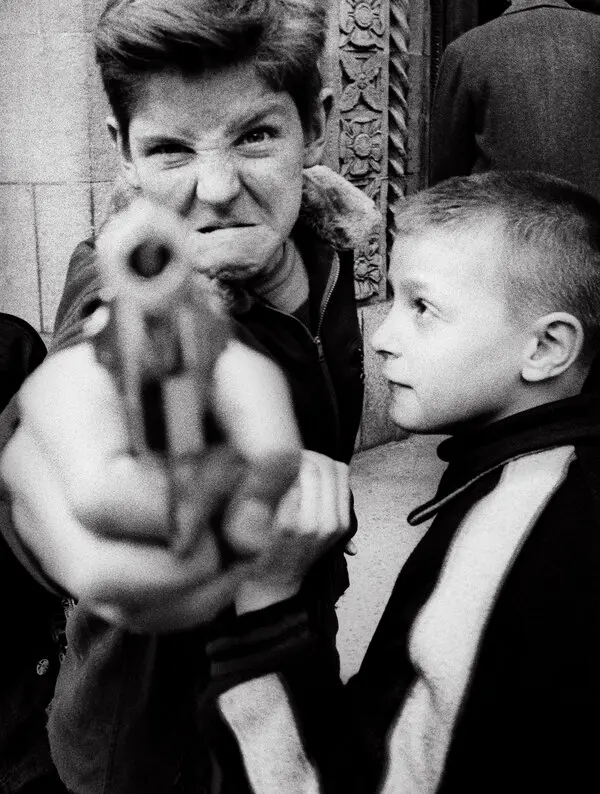
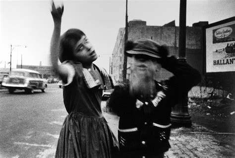
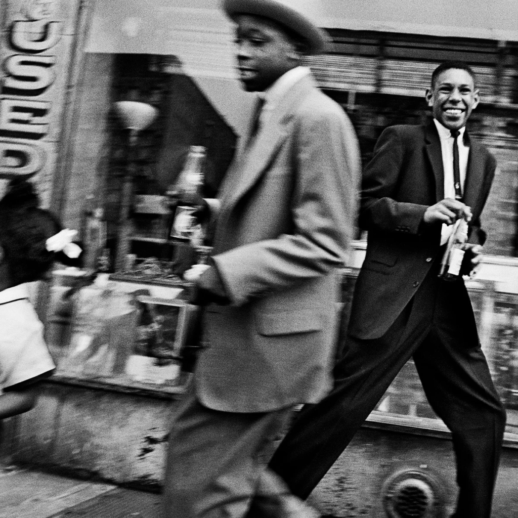
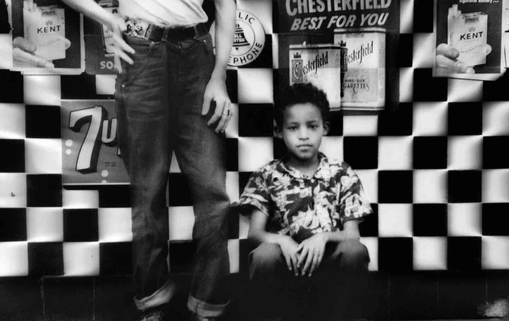
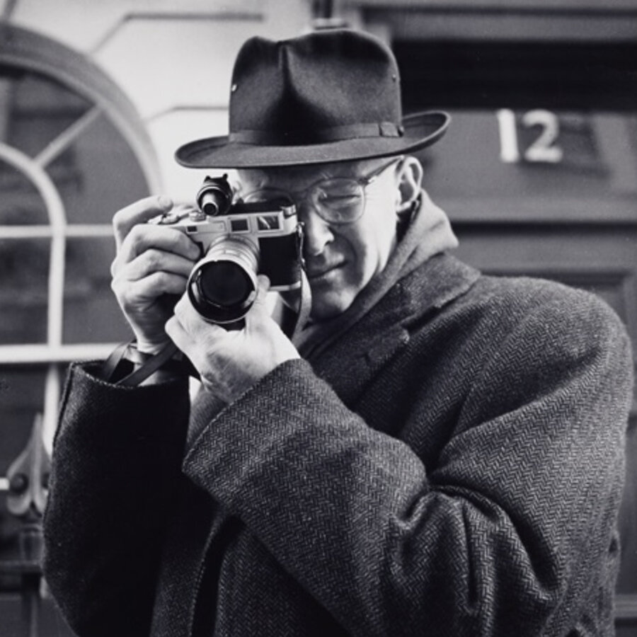
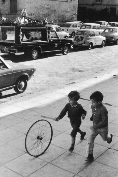
William Klein (April 19, 1926 – September 10, 2022) was an American-born French photographer and filmmaker noted for his ironic approach to both media and his extensive use of unusual photographic techniques in street photography. He enrolled at the City College of New York at the age of 14 to study sociology, later joining the U.S. Army during World War II and was stationed in Germany and later France, where he permanently settled after being discharged – later on, in 1957, he was awarded the Prix Nadar for New York, a book of photographs taken during a brief return to his hometown in 1954. Most well-known for his informal, up-close photographic style, he used techniques such as a slower shutter speed and high amounts of visual noise to give images an authentic feel. He is best known for his revolutionary street photography work, where he took pictures in a confrontational style, taking pictures of crowds or groups of people and presenting scenes as they were to him.
William Klein and one of his most iconic images, where he told the kid with a gun to ‘act tough’ – he often calls this photo a self-portrait , with the tougher kid on the left representing his youth and the kid on the right representing his later years.
Observational vs Confrontational Style
Henri Cartier-Bresson can be described as a flâneur, an idle-man-about-town who strolls through cities and observes without interference. His photographic style was candid, a style where instead of setting up perfect scenes, shots and subjects he waits patiently for things to happen and presses the shutter when all the visual and compositional elements align perfectly to his standards (a term he nicknamed the decisive moment, best seen in the image ‘Behind the Gare Saint-Lazare‘). In contrast, William Klein wasn’t patient and instead was very confrontational, going up close to the scenes and taking snapshots. These often resulted in informal images where realities of scenes were shown since there was no setting up or waiting patiently for perfect moments, although sometimes Klein reports having luck and it being a matter of chance that he would occasionally capture extraordinary scenes (such as the image below, where Klein accidentally created a blur effect and found it so intriguing he then often began replicating this technique in future work).
Henri Cartier-Bresson’s ‘Behind the Gare Saint-Lazare’ vs William Klein, Brooklyn, New York, 1955. Visually, the two photos differ drastically, with one taking a more poetic and artistic approach with careful use of composition and the decisive moment, whereas the other is more up close and literal.
Visual – The man is aligned on the right third, about to leave the frame, which creates a sense of movement in the image alongside the leading lines created by the fences horizontally following the man. Furthermore, there is clear depth and shape in the image as we can see reflections in the foreground, the man and muddle in the midground and the rest of the image in the background.
Technical – All aspects of the image are in clear detail, suggesting the use of a smaller aperture – the image is all in black and white, with a wide range of tones from lighter bleached out negative space in the sky to complete black in the man. A high ISO was likely also used, with visual noise present in the image, which when combined with the lack of colour creates a nostalgic and vintage look.
Contextual/Conceptual – This image perfectly encapsulates Henri Cartier-Bresson’s philosophy of the decisive moment, as if the shutter was pressed half a second earlier or later the outcome would’ve been completely different and the photo wouldn’t have been nearly as interesting as the man either would’ve likely left the frame or wouldn’t be mid-leap. This also ties into a key essence of his photography, patience, as Cartier-Bresson likely saw the scene about to unfold and waited perfectly for the compositional elements to align – he once wrote “I prowled the street all day, feeling very strung up and ready to pounce, determined to “trap” life, to preserve it in the act of living.“ which he shows perfectly in how he immortalised this small moment by turning it into an extraordinary and instantly recognisable photo.
Image Analysis 2 – William Klein (Confrontational)
Visual – The image is in black and white with a wide tonal range, ranging from lighter tones in the sky to midtones in the surrounding area and darker tones in the clothing of the children. Apart from that, there are no real intentional uses of visual/compositional elements, with the photo taking less of an artistic approach and more of a literal and objective scope, with a close-up style that noticeably differs from Cartier-Bresson’s.
Technical – There is a clear use of a slower shutter speed, seen clearly with the blurring of the car on the left but mainly on the two subjects where distortions in their face and hands can be seen due to movement. The image itself is also quite grainy (a theme consistent with all his imagery), which suggests use of a high ISO, again adding an authentic atmosphere to the image when combined with the lack of colour.
Contextual/Conceptual – When Klein took this image, he didn’t mean to have the two children be distorted and blurry, but since then it became one of his most iconic and recognisable photos due to that fact and Klein himself liked the effect so much that he began replicating it in later works. There is no real idea or meaning behind the photo itself as he didn’t want to present particular scenes as something they weren’t using visual and compositional techniques, waiting for the perfect moment, rather just opting take action to photograph scenes as they were to him, up close and personal (the key differentiating factor between his work and Cartier-Bresson’s).
Natural lighting (daylight), smaller apertures (capture detail), fast shutter speeds, high ISO.
Visual elements:
Heavy focus on visual appeal through angles, perspectives and tone, as well as compositional perfection with techniques such as rule of thirds and often separating images into foreground, middle ground and background.
Natural lighting (daylight), wider apertures (less focus on detail), slow shutter speeds, high ISO.
Visual elements:
Less focus on visual and compositional elements, opting to photograph scenes as they are to himrather than wait for all elements to align perfectly to create extraordinary outcomes.
From these few images alone, the contrast between their two styles of photography is very apparent – overall, Cartier-Bresson focuses on distancing himself from the subject(s) and observation, whereas Klein is more close-up with his subjects and confrontational.
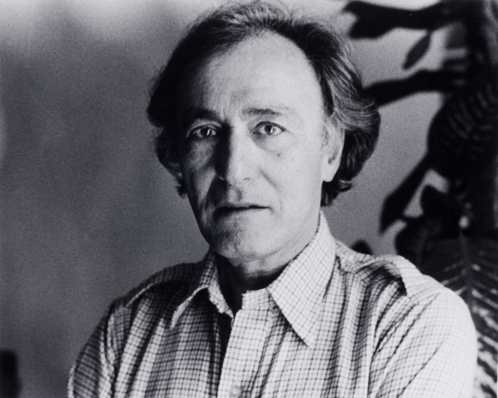
Henri Cartier-Bresson, 22 August 1908 – 3 August 2004
Henri Cartier-Bresson was a French artist and humanist photographer considered a master of candid photography, and an early user of 35mm film. He pioneered the genre of street photography, and viewed photography as capturing a decisive moment. In the 1970s he largely discontinued his photographic work, instead opting to paint.
Some of his street photography work – these images wouldn’t have been produced if Cartier-Bresson hadn’t gone through the decisive moment and chosen to take the picture at the exact time that he did
The Decisive Moment
The ‘Decisive Moment’ refers to the timing, the composition, the totality of a picture, an ordinary moment transcribed as a complete statement; the moment the shutter is pressed.
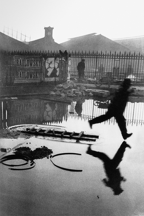
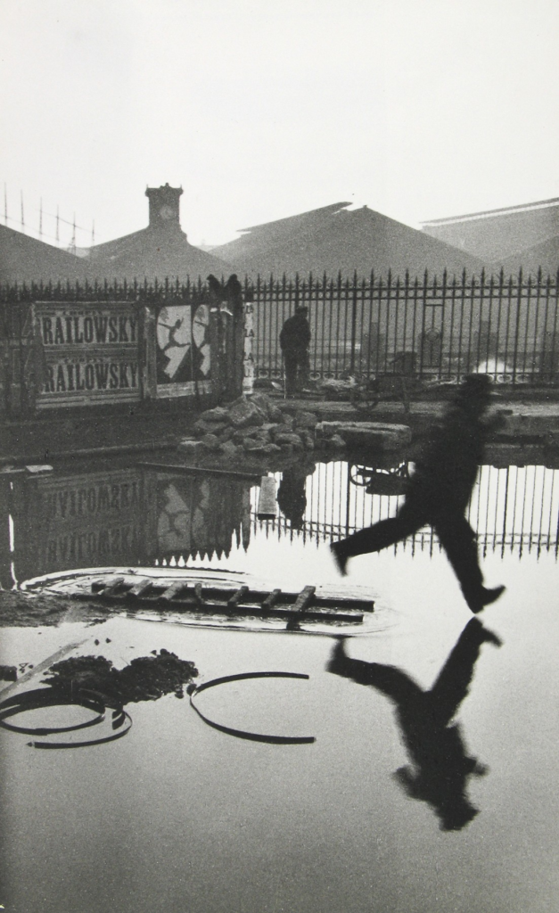
‘Behind the Gare Saint-Lazare‘ – an image largely credited to the origin of the decisive moment
Analysis
Form – The image has what seems to be a person running across a wet street, jumping over a puddle, with buildings and a man visible in the background (all in detail, suggesting a smaller aperture was used). There is clear use of the decisive moment here, as Henri Cartier-Bresson has chosen to take the picture right as the person running is about to exit the frame, perfectly capturing the decisive moment in photographic form. There is also a clear contrast in tones, as the person shown running across the image is completely black whereas the rest of the image has a variety of tones ranging from complete whites in the sky to greys throughout other aspects of the image, amplified by the lack of colour which draws out more attention to detail and the tonal range (linking to the depth which the image holds).
Composition – The photo has been taken at the perfect moment to capture the person right before they exit the frame, again linking to essence of movement as it is clear the person is going somewhere. Other aspects of the image are also all positioned more towards the top of the image rather than the centre, as the centre and bottom are mostly all just water showing reflections of the rest of the image which creates repetition and helps add form and shape to the image – furthermore, the rule of thirds horizontally perfectly splits the image into fore, mid, and background from bottom to top, enhanced by how the subject is positioned him on the right third (adding visual appeal) as well as showing clear movement with him being out of focus (in contrast to the stationary man in the background).
Conceptual, contextual; capturing the moment – The image perfectly depicts the concept of the decisive moment, as if the image was taken even a second too early or too late the person could’ve not been in frame at all, but the exact moment Cartier-Bresson chose to take the photo allows for essence of movement to be shown clearly as well as creating an effective composition, turning an ordinary scene into an extraordinary, interesting and everlasting image. This can be credited to Cartier-Bresson’s choice of camera, the Leica rangefinder, since it’s portable, quick and discreet nature helps capture more candid and natural photos which may not have been possible with other cameras which may have required lots of tweaking/set-up, risking missing the decisive moment.
Why is a camera an extension of the eye?
The camera can freeze and capture a scene whereas the eye cannot. It can create a physical manifestation of a scene which otherwise would have been forgotten with all the things the average person sees on the daily (linking to street photography, creating intriguing and extraordinary images out of everyday ordinary scenes).
What is the physical pleasure in making photographs?
It immortalises memories which can then be looked back upon, creating emotional connections and pictures which hold significance rather than just being pieces of paper.
How can be photography be likened to hunting?
It can be likened in the sense that photographers wait patiently and search for the perfect shot, they ‘hunt’ for their desired scene.
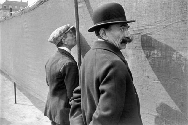
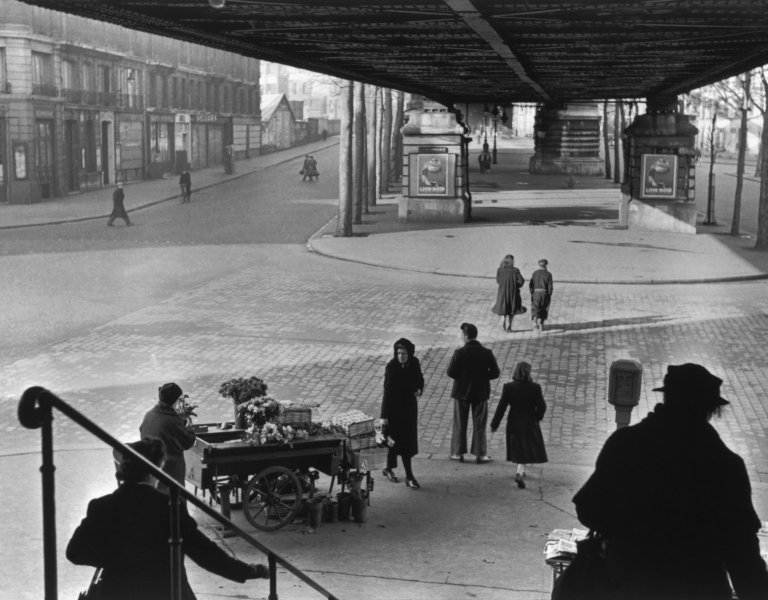
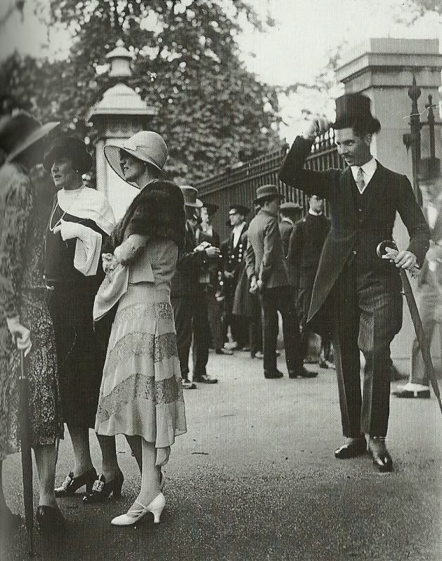
Originally linked to Paris and notable photographers like Henri Cartier-Bresson, Brassaï, and André Kertész, Street Photography gained recognition as a distinct genre in the early 1930s. Although there are earlier examples and some similarities with documentary and architectural photography, Street Photography stands out due to the photographer’s ability to capture the mystery and essence of daily life in the city.
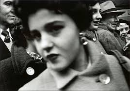
Henri Cartier-Bresson and one of his photos, ‘Behind the Gare Saint-Lazare‘, often credited as one of the most iconic street photography images due to its perfect use of Cartier-Bresson’s decisive moment’ and its compositional mastery.
Early History
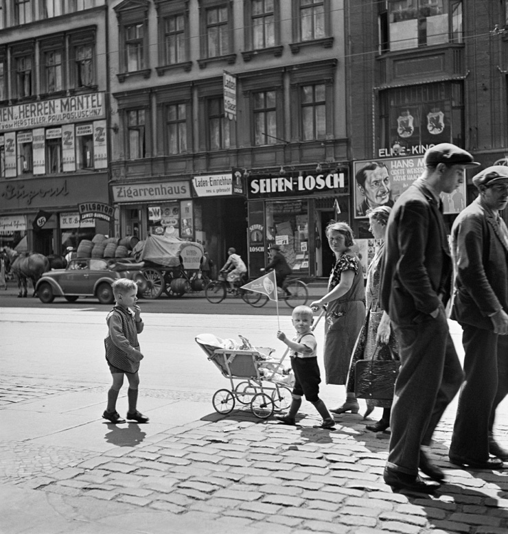
Since the 1830s, people have been snapping photos in the streets, but it wasn’t until the 1920s that street photography really started to evolve in a modern sense. After World War I, life in the city sped up, and with the emergence of illustrated magazines and popular films, there was a strong urge to capture and reflect on fleeting moments. Street photography developed alongside new jobs in reporting and photojournalism. Quick snapshots, taken with fast shutter speeds, began appearing in newspapers and magazines to depict “history in the making.” However, cameras didn’t just document significant events—they also transformed everyday life into something special. A simple photograph could elevate an ordinary moment into art, revealing the beauty in things we often take for granted.
Examples of early street photography work in newspapers.
Quotes from Famous Street Photographers:
In his account of life in Berlin in the late 1930s, the novelist Christopher Isherwood wrote:
“I am a camera with its shutter open, quite passive, recording, not thinking. Recording the man shaving at the window opposite and the woman in the kimono washing her hair. Someday, all this will have to be developed, carefully printed, fixed.”
This quote perfectly captures the essence of street photography, being a documentary and objective style rather than a subjective one; it records moments literally as they are, rather than leaving elements to the imagination of the viewer(s), hence its popularity in newspapers.
Henri Cartier-Bresson also wrote of the camera as an extension of his eye. In this quote he talks about one of things he is most famous for, the creation of the idea of a ‘decisive moment’:
“I prowled the street all day, feeling very strung up and ready to pounce, determined to “trap” life, to preserve it in the act of living. Above all I craved to seize the whole essence, in the confines of one single photograph, of some situation that was in the process of unrolling itself before my eyes.”
Again, this quote describes the nature of street photography, leaning more towards a literal style and recording everyday moments as they are in the moment they happen – this was eventually what lead to Cartier-Bresson’s term, the ‘decisive moment’, in which the photo is taken at the exact moment all the elements of the image align perfectly to create an extraordinary and intriguing image out of an everyday scene (seen most obviously in his most famous image, ‘Behind the Gare Saint-Lazare’).
Contemporary Street Photography (iN-PUBLiC):
Street photography is a style of photography that has stood against the test of time and is still around in the modern age, with an example being iN-PUBLiC.
iN-PUBLiC describe themselves as loving to ‘feature the work of people who are taking candid public photography or perhaps street photography in a new and unique direction’, and was set up in 2000 to promote street photography itself and continue to explore its possibilities. Below are some of the images that feature on the front page of their website:
Stephen Leslie’s ‘Elbows’Ryan Hardman’s ‘Straight Outta Plymouth’
iN-PUBLiC was relaunched in 2020 with a renewed commitment to present the best photography from the public realm that faithfully records everyday life without staging or manipulation – highlighting how despite its origins going back to photographers from as early as the 1830s, this genre of photography and its unique objective style is still appreciated and beloved by many.
More Examples of Work From iN-PUBLiC Photographers:
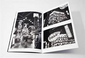
I wanted my zine to have a very consistent style to correspond with the images themselves, as they follow a documentary-like style.
Inspirations for some of my pages
Initial Layout Plan
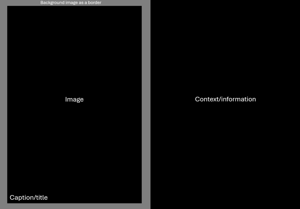
I wanted to have my first two pages of the zine be an image on the left with a caption, and then the opposing page have some context/information about the image as well as the intentions and thought process behind it.
I then wanted this to be follow by a singular image spread over two pages with no text, having purely visual storytelling rather than context/information to describe the scene.
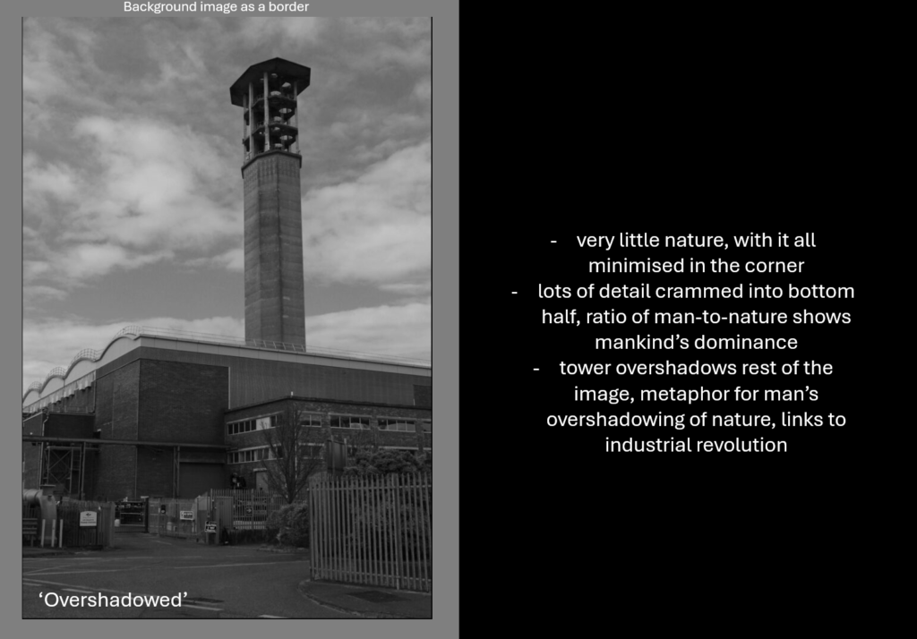
Finally, I wanted a diptych of two similar images with titles in the corner as well as a background image as a border.
This would then repeat in order again one more time (image with caption, double page spread, diptych) before reaching the back page of the zine.
Image Selections
Single Images
For the images that would go alongside a page with context/information, I wanted to pick some of my better images to explain my intention and thought process behind them, as well as giving them an appropriate title.
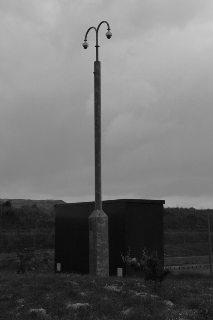
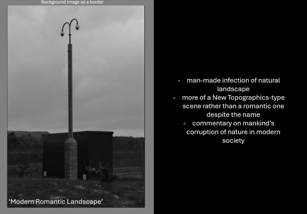
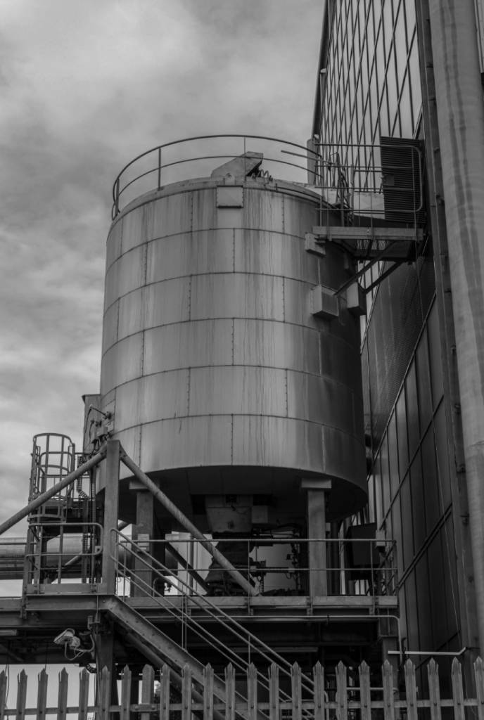
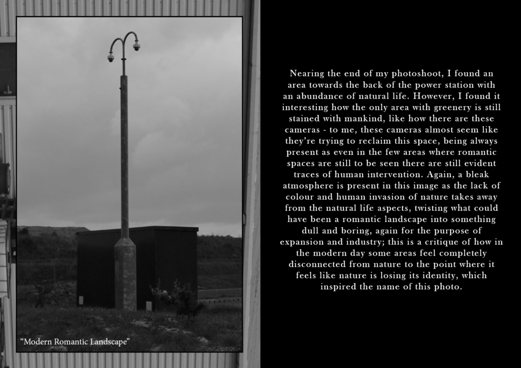
For this image, I took it when I noticed how the light seems like a man-made infection into this natural landscape, almost claiming this scene as mankind’s rather than a romantic one, creating a disconnect between nature and man. When considering a title, I chose ‘Modern Romantic Landscape’ because I liked the irony and how it implies that romantic landscapes in the modern age aren’t natural at all and have human interference which completely takes away from the romanticism aspect.
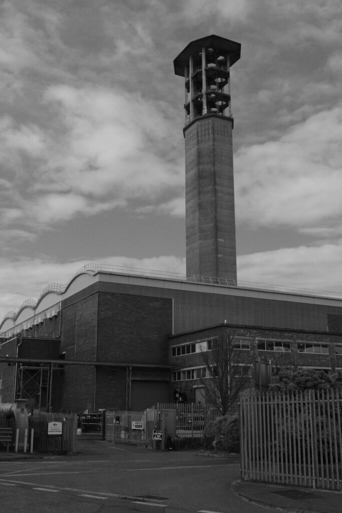
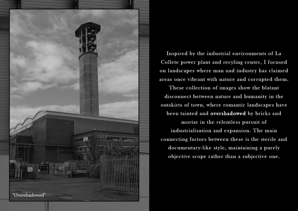
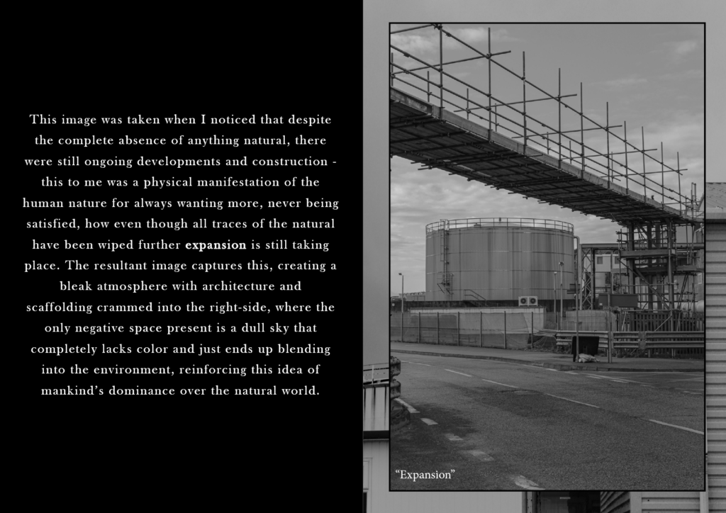
This particular image I took because I liked how there is very little natural aspects in the bottom right corner, with the rest of the bottom half being crammed full in contrast to the top half which is purely sky and negative space apart from the tower. I saw the tower standing over the rest of the scene as a metaphor for mankind’s overshadowing and dominance over nature opposed to the connection they used to have before periods such as the industrial revolution – I chose to title the image ‘Overshadowed’.
Single Images + Context Drafts
Drafts for the pages which will have an image with context and information, alongside notes to help with writing the paragraph when it comes to making the zine.
Double Page Spreads
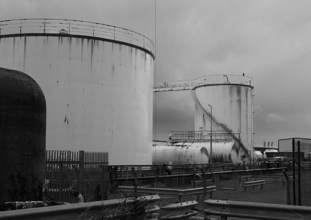
For these pages, I chose images where lots of detail and content is present that would look better displayed in landscape over two pages – I also thought it would be best to not have a caption or title for these images to have nothing else on the double page spread except for the image, so the two pages will look exactly as the images are presented below.
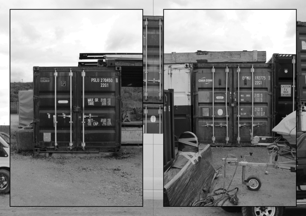
When presented in a two page spread, this image is very effective composition-wise since the first container completely fills out most of the first page in contrast to the second one where it is positioned perfectly in the middle but still has enough negative space to contrast it from the other half.
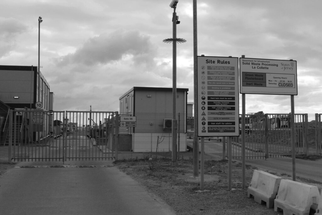
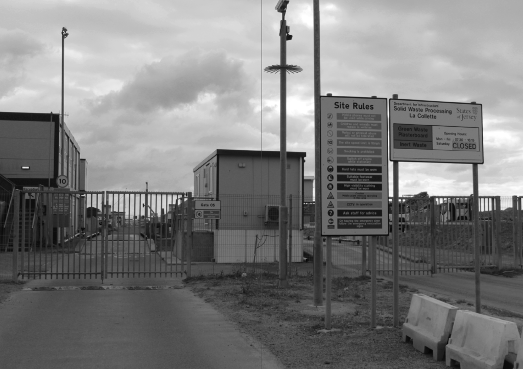
When presented in a two page spread, the first page has the gate and some details but is mostly composed of the negative space from the sky, whereas the second page has less negative space with more of the frame being filled by signs.
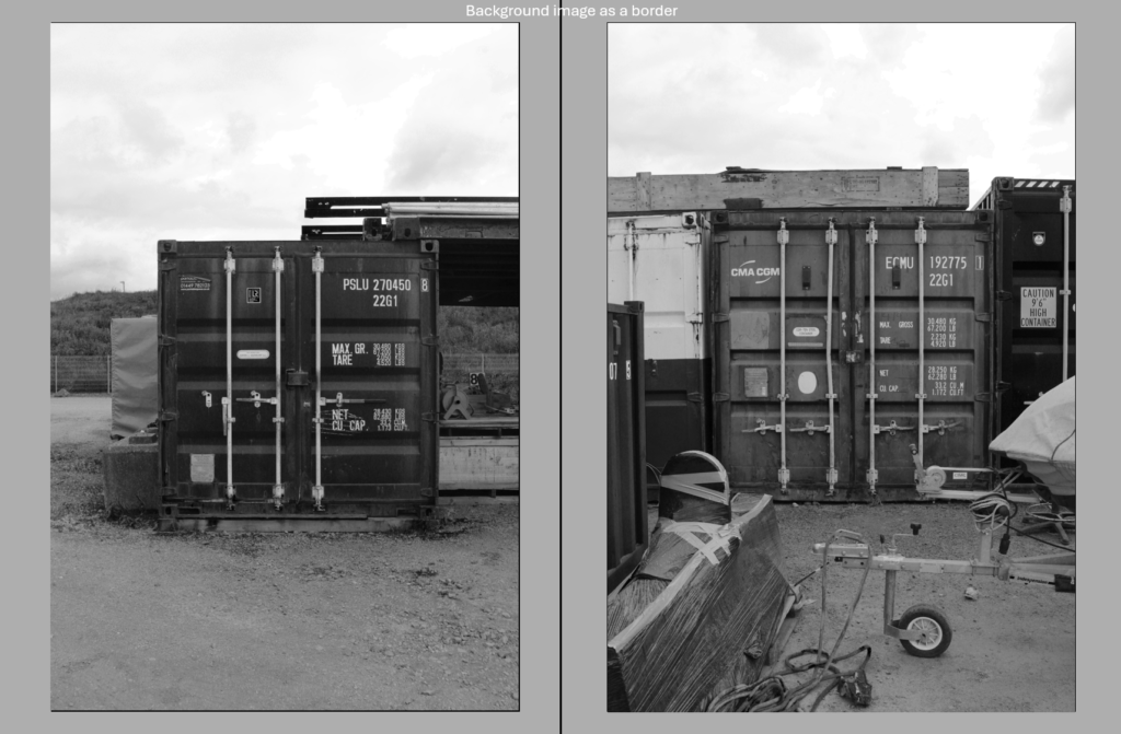
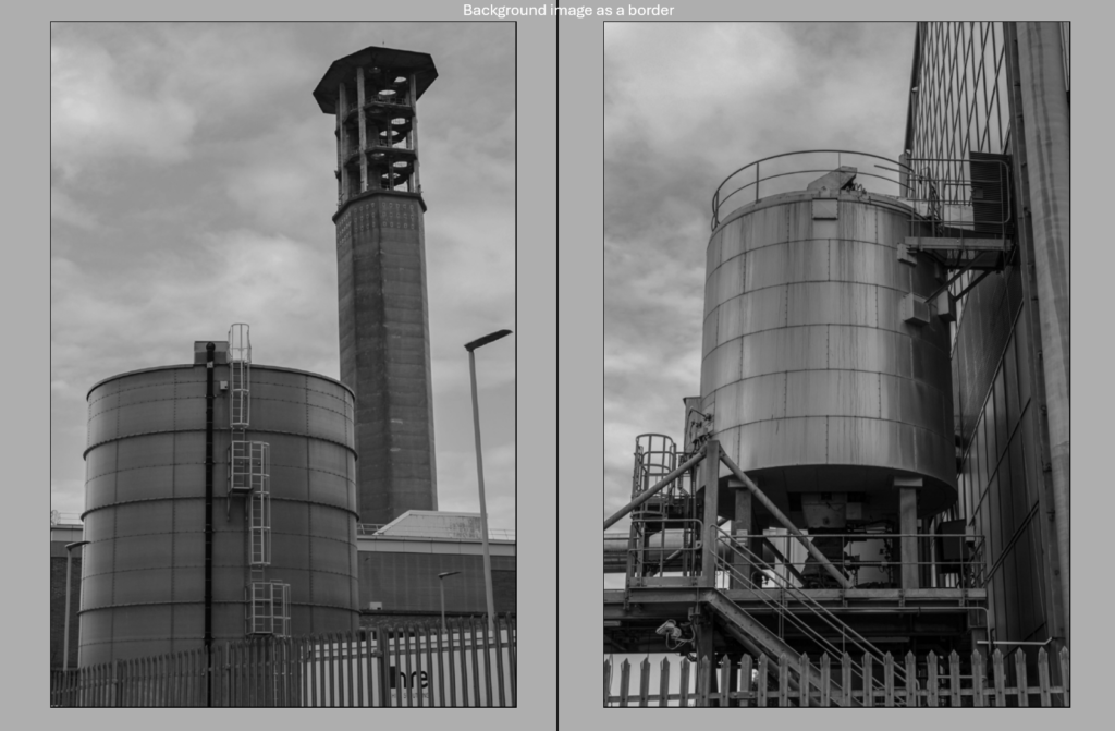
Diptych
For my diptychs, I wanted to pick two pictures which would go well together when presented together, as well as an appropriate image to have as the background.
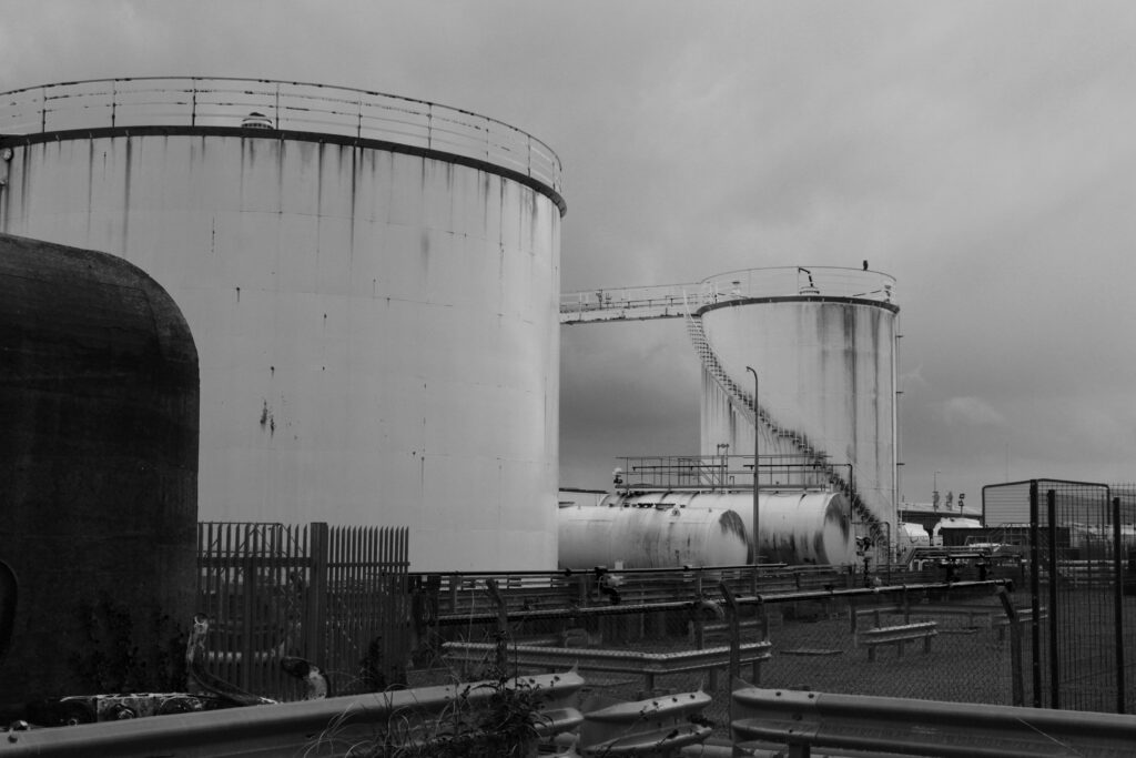
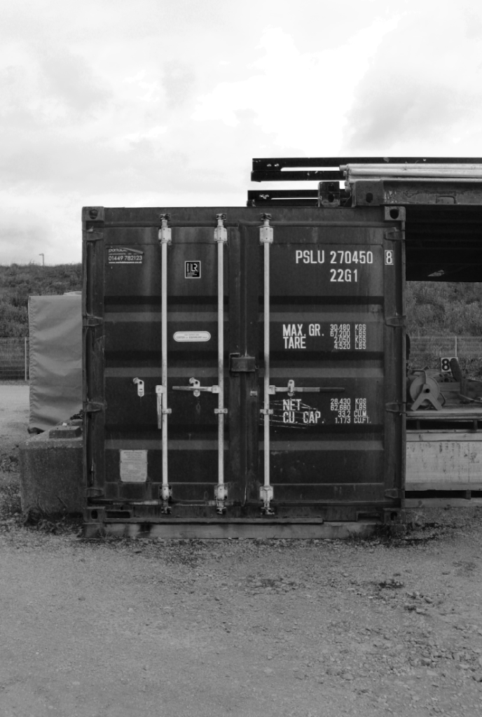
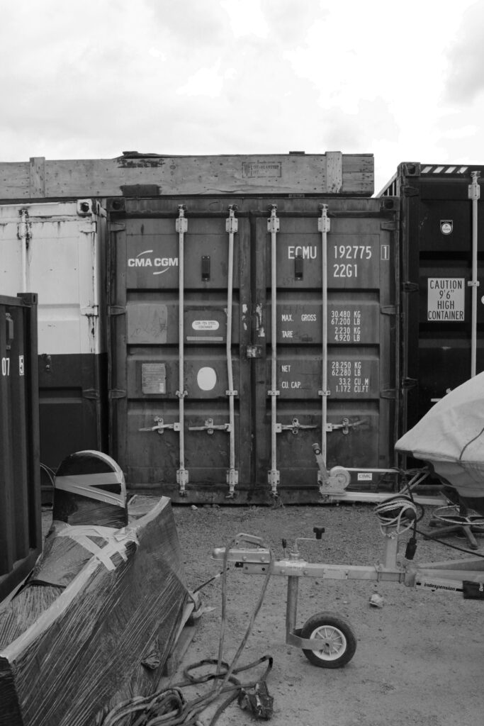
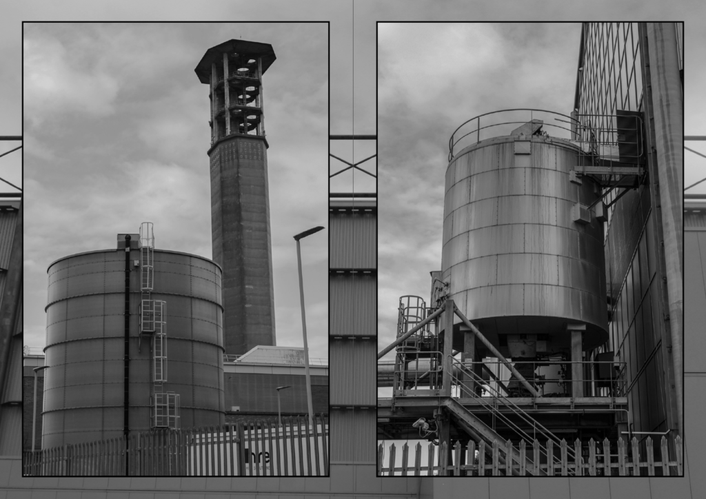
These two pictures go alike in the sense they both feature containers/tanks as their main subjects, although they still are different enough for both of them to be interesting images on their own. The down-up perspective of the first image looking up to the tower has also been used on the second image, making the two images go with each other more.
These two pictures are more alike since they are both taken at the same deadpan angle and are both of storage containers – however, enough contrast is still present, mainly in the foreground where one image has purely negative space whereas the other has more clutter and objects.
Diptych Drafts
Drafts for the diptychs across two pages, the grey border will be replaced with an abstract, close-up New Topographics-style image and subtle black borders will be added to the image to bolden them.
Final Outcome in InDesign
After making initial layouts, selecting images and drafting designs, I started creating the zine in InDesign.
Finalised front cover
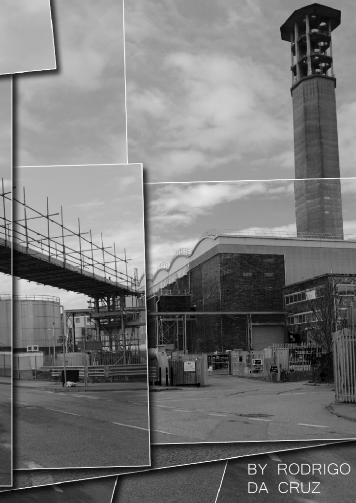
After experimenting with different fonts and colours, I settled on this one since I felt it was the most documentary-like one and fit most with my narrative and images, as well as white to make it bold and stand out from the image. The cover image was chosen since it perfectly summarises the intentions behind my photoshoot and zine, with lots of the frame being filled by tanks and containers and no natural elements being present.
Pages 2 and 3
Abstract image added to border the image itself rather than just one solid colour since I found it more visually appealing, as well as the finalised contextual paragraph and a title for the picture.
Pages 4 and 5
I really liked how this double page spread out since it looks exactly how I wanted it to, with one page being filled to the frame and the other having more negative space.
Pages 6 and 7
Another abstract image added as a background to fill the space rather than it just being one colour. I experimented with adding captions/titles to the images but liked the purely visual aesthetic without any text.
Pages 8 and 9
Second single image – title, background image + information/context added.
Pages 10 and 11
Second diptych – background image + surrounding borders to the images to make them bold and stand out.
Pages 12 and 13
Second double page spread.
Pages 14 and 15
Third and final single image, background image and context.
Back cover
For my back cover, I originally wanted to use the double page spread image of the two containers and have the first half on the front cover and second half on the back cover, but decided against it because I thought the photo would look better in the zine itself. I settled on this design I made in Photoshop for the back cover, a joiner photo of two photos featured in the zine with the impression that they have been printed out and layered on top of each other – I like how this gives it an artificial look and it ties to the zine in the fact that the scene has been built by layering photos, similarly to how the whole area was built by hand from the ground up and in doing so took nature’s place.
Definition: a small-circulation self-published work of original or appropriated texts and images.
Inspirations from Other Students
I liked the simplicity of the cover, as well as the style of one page being a portrait with the other being text corresponding to the person, creating a documentary-like style.
I liked how the cover had no photos and was just text, and how the photos inside the zine were all consistent with the zine’s colour scheme and design.
I liked how the cover was two photos joined together to make one portrait, and how it compliments the style and intention of the rest of the zine.
Initial Design Ideas
Appearance
All images will be black and white and displayed in a very formal and consistent manner, since all images are taken in a documentary-like and sterile manner to fit with the New Topographics theme.
Example ideas
Format, Size + Orientation
All images will be of similar size and orientation to make them work well together as a group and help with the narrative behind the zine.
Narrative + Visual Concept
The collection of images in my zine is exploring the concept of industry and man-made landscapes, showing how Romanticism and nature have been disconnected from humans in a modern society where more and more is being built for the purpose of expansion.
Design and Layout
I will have a consistent design and layout throughout – the zine will feature an image with a caption and context describing the intention behind it, a double page spread of one image and then a diptych of two similar images.
Images and Text
I want to minimise the amount of text to keep my zine as being purely visual storytelling, although some images will have captions with a title and others will have a small paragraph on the opposing page with context and thoughts behind the image.
Title and Captions
My zine will feature a title on the front page, and a few captions along some of the more significant images in the zine.
For my typologies photoshoot, I wanted to create a typology with a focus on the New Topographics.
Contact Sheet
Selection Process
Best Photos
I picked images which were all similar so they would look well when presented as a group. I aimed for pictures which were objective and documentary-like rather than subjective images.
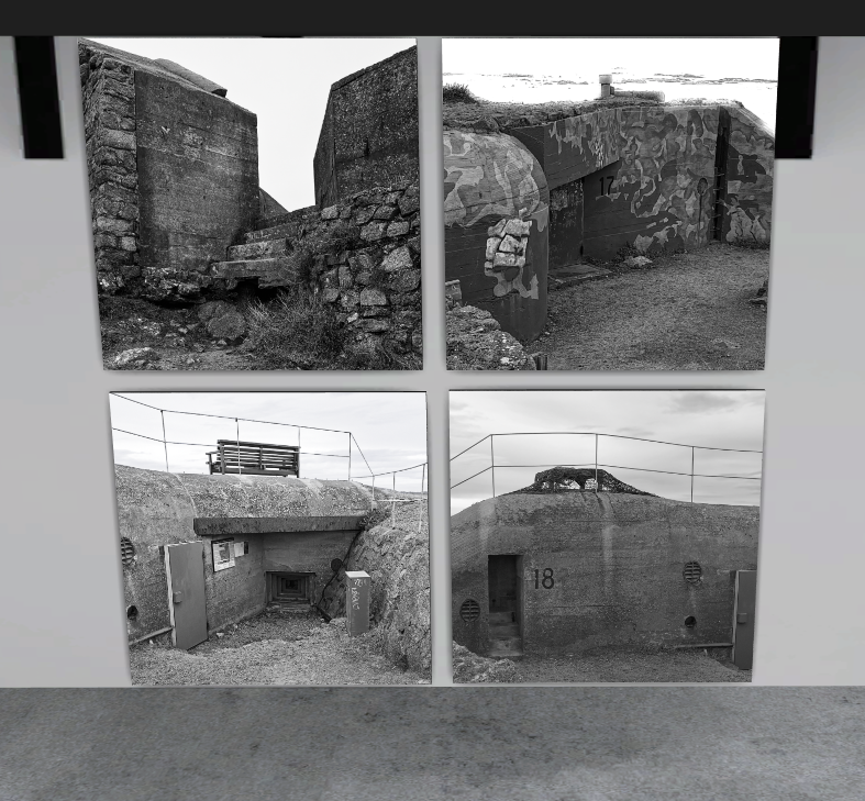
Initial Presentation Ideas
Each image works well with one another as they are all different German bunkers/architecture leftover from WW2, however the sky and sea in some of them are taking away from the objective feel that I was going for so I will likely turn these parts into negative space in editing.
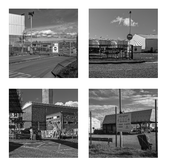
Each image works well as one group since they each feature lots of signage and industrial architecture, which creates an uneasy/restricted environment as well as clearly contrasting with romanticism (reinforcing them as New Topographics style images). However, the sky again adds more of a subjective element to each image which takes away from my intentions so I will make the sky more of a negative space when editing to elaborate on the sense of objectiveness.
Editing
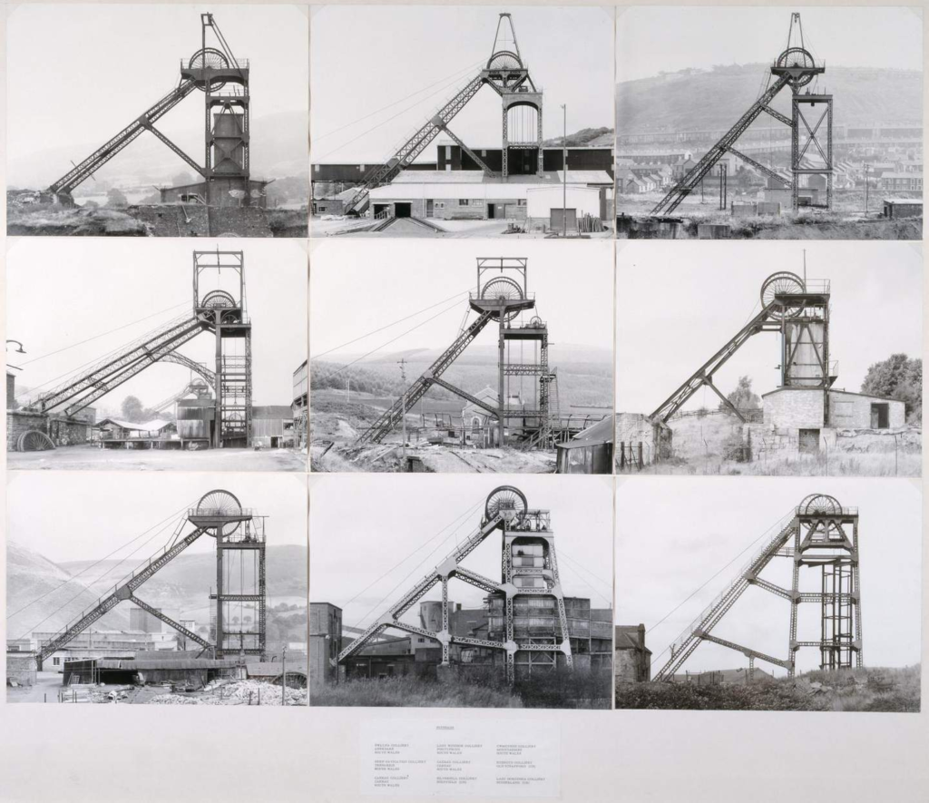
Each image will be in a 1×1 square resolution as well as being black and white (similar to work like ‘Pitheads’ from Hilla and Bernd Becher).
Final Presentation
1
2
Virtual Gallery
Evaluation + Comparison Against Artist Reference
Overall, I think I managed to take a set of effective images and present them in two different typologies where both of them have different themes and different sets of images.
My New Topographics Typology vs Pitheads by Hilla and Bernd Becher
My typology contains 4 images of different scenes in and around La Collete and all of them group together effectively – however, I think ‘Pitheads’ is better visually and conceptually since visually all images have been taken of the exact thing at the same deadpan angle which makes each individual image more significant when presented as a group, in contrast to mine where each image is a completely different scene and so they would work well on their own rather than displayed together.