All posts by lsyvret
Filters
Final Landscape Photography Photoshoots and creative ideas…
Deadline: Photos must be taken by 22nd April (When you come back after Easter)
- (MUST) New Topographics photoshoot – Respond to your chosen New Topographics Photographer and produce a range of images that show your understanding and sense of connection –
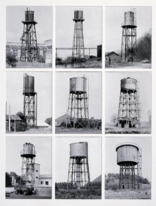
- (SHOULD) Respond to the concept of TYPOLOGIES and photograph a series of landscape / architectural features eg GERMAN BUNKERS in a methodical way…
- (COULD) Either – a closer look at architecture…. OR Complete a night-time photoshoot.
See below for ideas on all photoshoots….

1. New Topographics photoshoot (MUST)
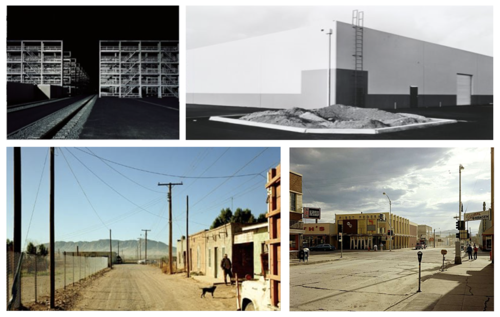
Take a series of photos in response to New Topographics. Your photos should consider:
- Man-altered landscapes
- Deserted spaces
- Harsh lighting
- Minimalistic and formalistic aesthetic
- Straightforward compositions
- Stark geometries and lines
2. Typologies Photoshoot (SHOULD)
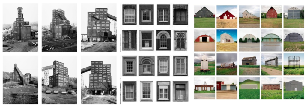
Respond to the concept of TYPOLOGIES and photograph a series of landscape / architectural features eg GERMAN BUNKERS in a methodical way…
- A series of / multiple repetitive photos
- All depicting a particular ‘TYPE’ of landscape / architecture. E.g: A series of photos of bunkers, or a series of photos of homes etc…
- All taken using the same angle /composition / framing
- All edited in the same way
3. A closer look at architecture or night-time photography (COULD)
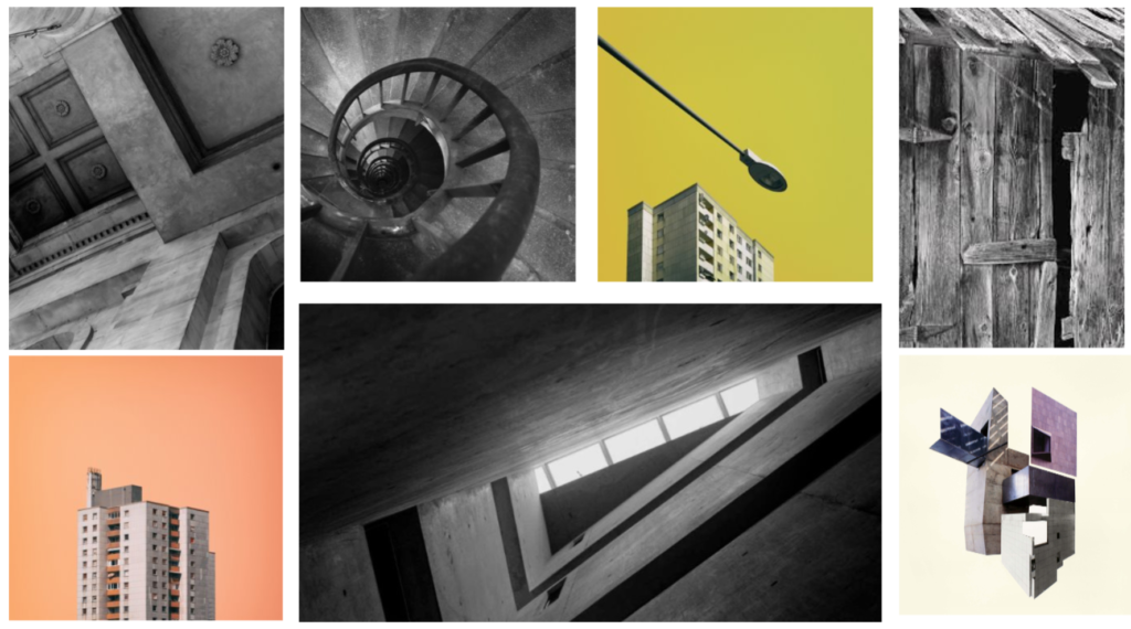
A closer look at architecture:
Consider close up details, different perspectives / angles. This could be modern structures with clean lines and shapes or more rural and rustic buildings
OR… Night Time Photography…
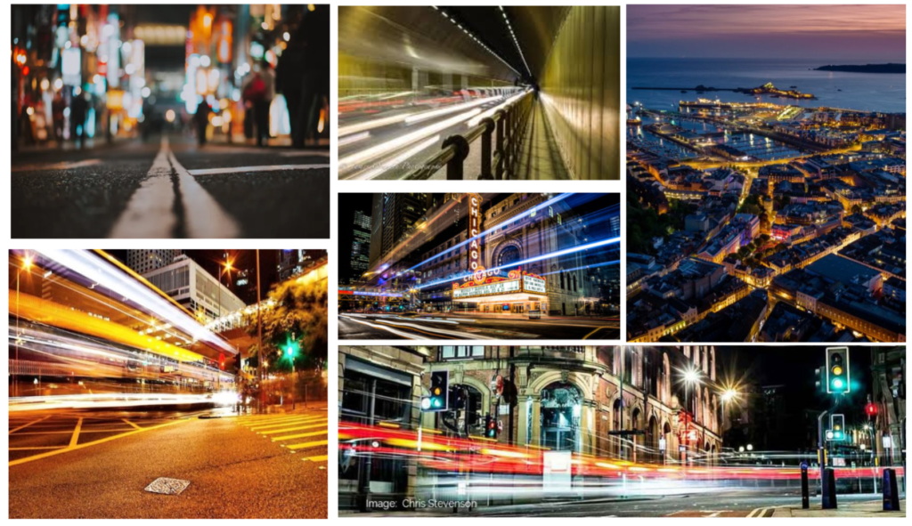
OR night-time photography
Complete a night-time photoshoot…try using long exposures and a tripod / stable surface to capture low light features eg light trails…
Links to more landscape photography ideas…
Landscape Constructions
Constructing a landscape photograph might be different to simply taking one. To construct an image might reveal how and why it has been made. You might construct a photographic image in order to question what a landscape is. What appears natural in the landscape is often the result of careful management. We use nature to construct ideas and stories that reflect our human desires. Constructed landscape photographic images, therefore, reflect the construction of nature itself.
Here are a selection of images by a wide range of artists/photographers. They are all linked by their approach to the construction of landscapes. The artists use photographic techniques to question some of the conventions of landscape photography.
Many of them work with more than one photograph (using layering or collage to build their images). Some use unusual techniques and processes to represent their way of seeing landscapes or their understanding of the forces, like wind and light, at work in nature. Some of the artists use images to question the impact humans have had on the natural world. Some are fascinated by the ways in which we depict and consume nature, whereas others use photography to document a performance or gesture in the landscape. Some of them use analogue techniques, others prefer digital technologies, some even use a combination of both.
None of these artists make straightforward or conventional landscape pictures. Click on each image / link to find out more about the work:
Penelope Umbrico – Sunset Portraits, 2011

Fong Qi Wei – Time in Motion, 2016

Liesl Pfeffer – Untitled, No. 2, 2018

Andy Goldsworthy – Slate throw Blaenau Ffestiniog, Wales, May, 1980

Andreas Gursky – Rhine III, 2018

John Divola – from the Chroma series, early 1980s


Zander Olsen – from the Tree, Line series, 2011


Meghann Riepenhoff – from the Littoral Drift series, 2015

Richard Long – A Thousand Stones Thrown Into The River Yangtze, China, 2010

Bruno V. Roels – Looking fr Paradise (from Fake Billboards), 2018

Vanessa March – Untitled No. 72, from The Sun Beneath the Sky series, 2018

Nick Brandt – Underpass with Elephants (Lean Back Your Life is on Track), 2015

Sohei Nishino – New Hope Creek

Vilde Rolfsen – PLastic Bag Landscapes, 2014

Letha Wilson – Hawaii California Steel (Figure Ground), UV prints on Corten steel, 2017

Anastasia Samoylova – Tropics, 2014

Stephen Gill – Hackney Flowers, 2007

Lorenzo Vitturi – from the series Anthropocene, 2011

Maja Strgar Kurečić – from the Escape Landscapes series, 2017


Aletheia Casey – To Dance With Shadows, 2020

Tracey Moffatt – Spirit Landscapes, 2013

Yichen Zhou – from the ongoing series Daily Talk

Zeinab Alhashemi – from Urban Phantasmagoria, 2014-2016

Kristina Jurotschkin – from Nothing But Clouds, 2017

Hannah Fletcher – What Remains: The Root & The Radical, 2020

Corinne Silva – Garden State, 2015

Victoria Ahrens – Lockdown: A stone’s throw, 2020

Liz Orton – This Connection Should Make Us Suspect

Alexander Mourant – Still from the film A Vertigo Like Self, 2019
Rebecca Najdowski – Interference Pattern, 2018
Marina Caneve – From the series Are They Rocks or Clouds? 2020
Minna Pollanen – From Nature Trail, 2012-2014
Tom Lovelace – Coastal Blocks 8, 2016
Helen Sear – Becoming Forest #7, 2017
Fabio Barile – From Homage to James Hutton #7, 2007
Stefano Canto – Scomposizioni Fotografiche, 2011-15
Martin Seeds – Disagreement iii, Stormont Estate, Belfast, 2018
Mariele Neudecker – And Then The World Changed Colour: Breathing Yellow, 2019
Chloe Sells – from She Said What
Curtis Mann – from Modifications series, 2007-10
Matt Slater – Autumnal Glimpses, No.45, 2019
Aster Reem David – Salt & Light, 2018-ongoing
Brea Souders – from Vistas, 2021
Bindi Vora – from Mountain of Salt, 2021 ongoing
Fabien Barrau – Chicago 2223, 2021
Lewis Bush – Natural History Museum London reclaimed by nature, 2021
Mandy Williams – from Disrupted Landscapes, 2021
Sidonie Hadoux – from Explorations 3, 2019-2021
Viviane Sassen – Axion R02 from Umbra, 2014
Alice Quaresma – New Beginnings, 2019
Marguerite Horay – from Landscape Studies II, 2019
Vltaka Horvat – To See Stars Over Mountains, 2021
Ewa Doroszenko – Exercises of Listening, 2016
Mervyn Arthur – models: materials: tests, 2019
Landscape Photography at The Photographers Gallery


Paolo Pettigiani

Draw into your photos

Maurizio Galimberti

Henk Langerak

Repetition, Geometry, Shapes

Geometric Silhouettes – Scaffolding – like Keld Helmer Petersen

A tutorial on how to edit like like the images below can be found here
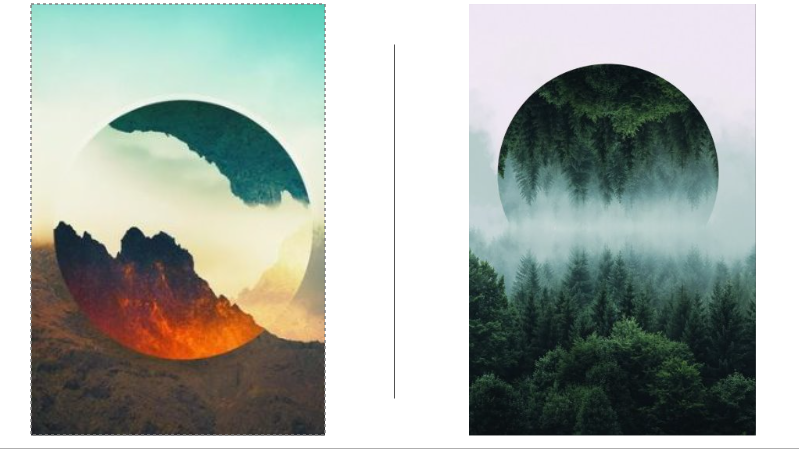
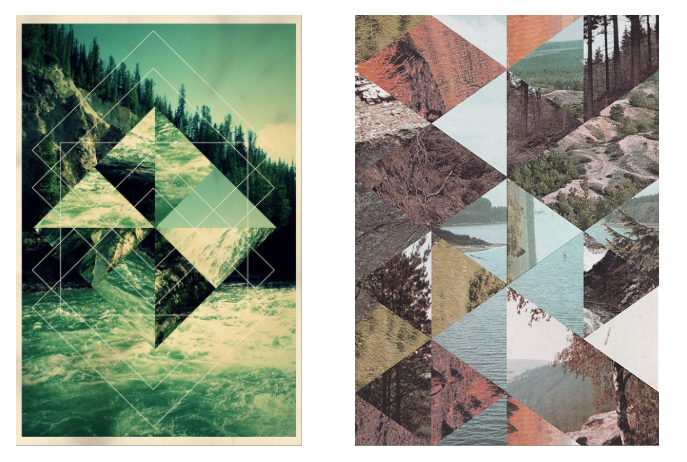
A tutorial on how to edit like Jelle Martens can be found here
Edits like Guy Catling
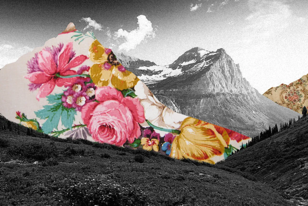
- Once you’ve had a thorough browse through these images, choose 2 or 3 of the artists and try to find out as much as you can about them and their work. As well as reading and making notes you could also start making your own images (still and/or moving) inspired by their work. Making your own photographs is a kind of research.
- You could try identifying some of the themes that connect the images in this gallery above. A theme is a BIG IDEA that connects two or more art works. For example, one theme could be movement. Another could be layers. What other themes can you find?
- Reflect on your own relationship to nature, the natural world, various landscapes and issues connected to the climate emergency. How do you feel about the future of the planet, your access to green spaces, species extinction, pollution and all the other issues related to life on Earth?
- If you live in a town or city your experience of wide open or spectacular landscapes might be quite limited. Perhaps you remember visiting such places during holidays or school trips. Maybe you have lived in another part of the world where the landscapes are very different. Maybe you’ve seen images of landscapes in films, in magazines or on the Internet that are different to the ones where you live. If you live in the countryside, your experience of landscapes might be quite different to that of town or city dwellers. You could create a collage using found images to represent what natural landscapes mean to you.
- You could experiment with creating cameraless images (cyanotype, luminograms or photograms) using cut and torn paper, or other objects and materials, which suggest landscape type compositions.
- Some of the artists included here don’t necessarily think of themselves as photographers. They create performances in natural settings, sometimes referring to these as sculptures or conceptual works of art. A photograph is made as a document because the work of art is not meant to last forever. They are ephemeral. You could experiment with making an ephemeral work of landscape art like this – a walk, a dance, a performance of some sort – in a landscape of your choice. This could be a garden or a nearby park. You could use objects or simply your own body. It’s important not to damage the environment but you could leave a trace of your presence. Take photographs (or get a friend to help you) of your intervention.
- You might want to add a layer of text to your landscape photographs and/or videos, perhaps recording your feelings or documenting other things you saw in the landscape that couldn’t be captured in the image(s).
- Some artists/photographers have created landscape images from unusual materials. How can a plastic bag become a mountainside or waves? Experiment with lighting your choice of materials and framing your shots so that the resulting images are (relatively) convincing landscape photographs.
- Do you have photographs of landscapes that you could cut up and reassemble? Some artists use collage techniques to create new types of images. You could experiment with old 35mm slides, for example, cutting, re-arranging and adding other translucent materials. These could either be re-photographed against a bright background or enlarged on a wall using a slide projector.
- You could experiment with creating a 3D photosculpture made from landscape images. You could even re-photograph your completed sculpture and, using Photoshop or a similar programme, digitally insert it into a real or imaginary landscape.
- How could you photograph a landscape that you’ve never visited or one you can only remember? You could experiment with Google Street View, perhaps revisiting the scene of a family holiday or childhood memory. You could explore the many pictures of a particular place on Flickr, a huge photo sharing site. Some picturesque locations have been visited and photographed millions of times. You could take a look at the Insta Repeat account and try to curate your own galleries of repeated landscape photographs. How has our obsession with social media and the Internet affected our relationship to the natural world?
These are just a few suggestions. There are loads of possibilities. It’s important to experiment, to play, to test new ideas and step outside your comfort zone. Don’t be afraid to try things you’ve not done before. Use your imagination and follow your intuition. How will you construct your landscapes
12B – We can see if you are working on your blog posts!
Wednesday 2nd April:
Well done to CARA and FIN, the only 2 students who worked on their blog on Wednesday.
Thursday 3rd April:
Well done to CARA, FIN, ELIYAH and JOSH who worked on the blog on Thursday.
We can see!
We can see when you are working on your blog and we can also see how much time has been spent on it in total – so we know if you aren’t putting in much effort. No one else in this class has worked on the blog since Tuesday 1st April. Guys – time to step it up! Unfortunately this means you’ve shot yourselves in the foot and will have more to get finished over your Easter Holidays!
Over Easter Holidays:
- Over Easter you have 2-3 photoshoots to complete as Homework (see below blog post here and ShowMyHomework).
- All below blog posts should have been completed before Easter. And….
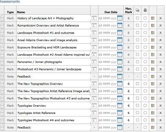
- The New Topographics Overview
- The New Topographics Artist Reference and Image Analysis
- The New Topographics Photoshoot and Outcome (Havre Des Pas Photo Walk)
- Typologies overview (more information if you scroll down the blog:
- Typologies Artist Reference: Complete a case study for Bernd and Hilla Becher (Research who they are and analyse their typology photos).
- After Easter: Upload your Typologies Photoshoot – edits and final images
- After Easter: Upload your second New Topographics Photoshoot – edits and final photos
- After Easter (optional): Upload any other photoshoots you completed as part of your Easter Homework
Mini Photoshoots + Experiments for Rural Landscapes
- At the start of a project there can be a period of time where you are stuck on the computer instead of responding to your theme with immediate photoshoots.
- As you know, taking a variety of photoshoots is key to increasing the quality of your projects. These ideas are aimed to get you taking photographs straight away. Try a new photoshoot every week.
- These can act as mini photoshoots before you decide on your main direction in response to Romanticism and Landscape photography.
Countryside – rural living:
Slow shutter speed water experiments:
You can achieve this using IPhone’s ‘Live’ setting:
- Turn on live photo
- Hold the camera still to take the photo or rest it on something
- Take the photo
- Then go back into the photo and edit the live setting to ‘Long exposure’
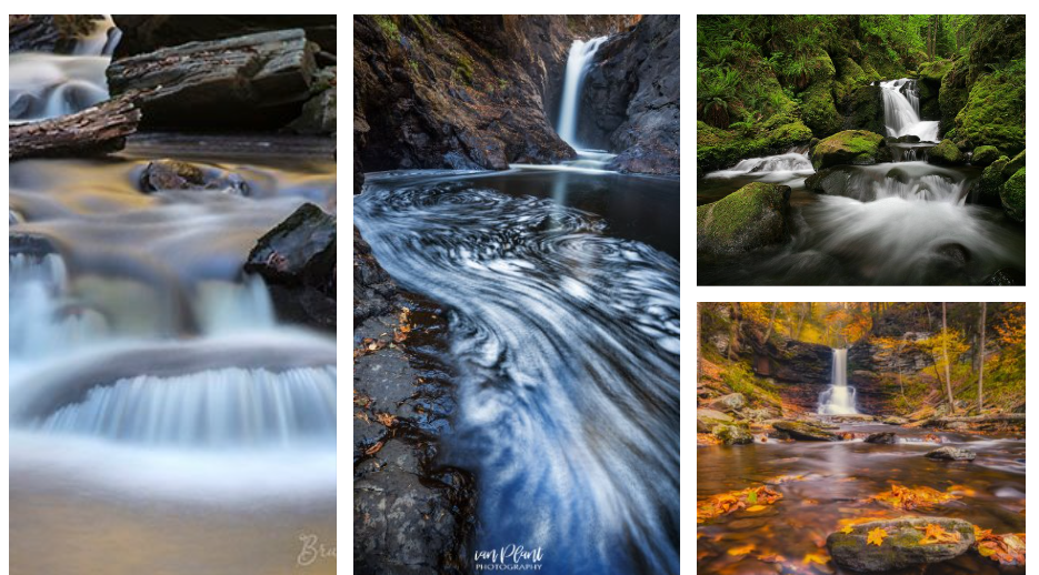
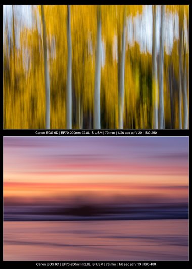
Abstract landscapes – Combine slow shutter speed with intentional camera movement to create landscapes in motion
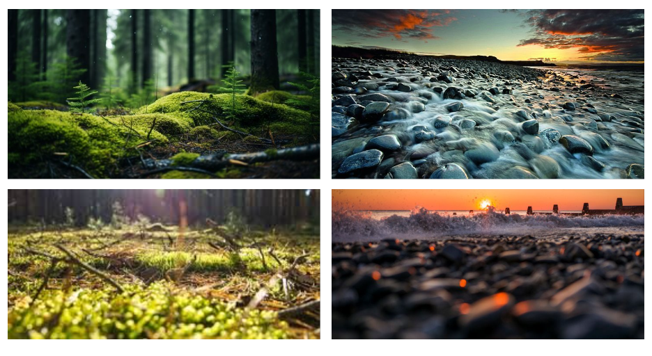
Low perspectives
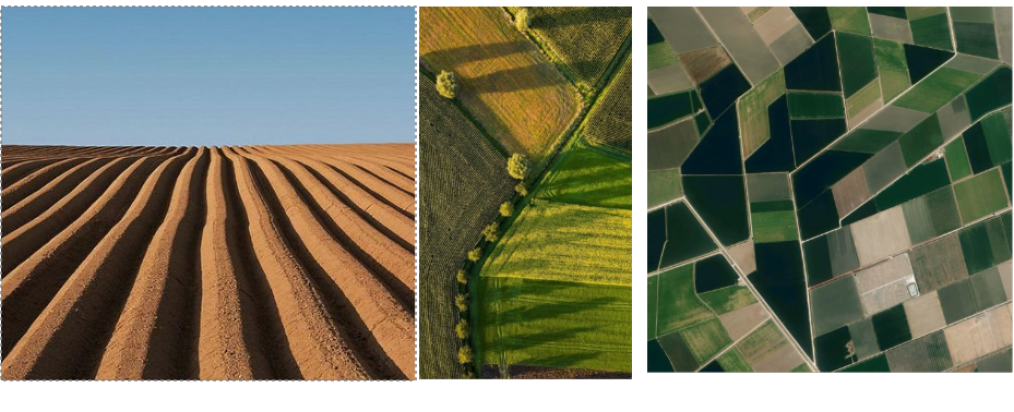
Agricultural lines
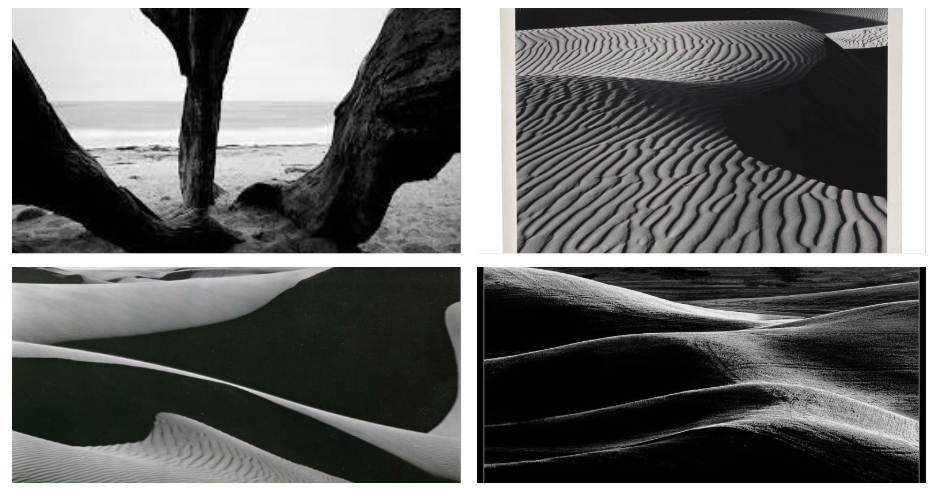
High Contrast, tonal photos.
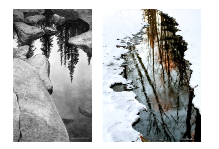
Landscapes in Reflections
Double layered / Double Exposure landscapes
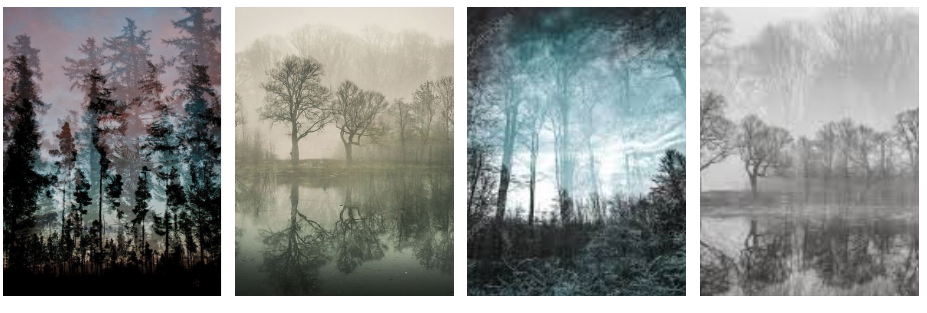
A tutorial on how to edit like like the images below can be found here


A tutorial on how to edit like Jelle Martens can be found here
Edits like Guy Catling

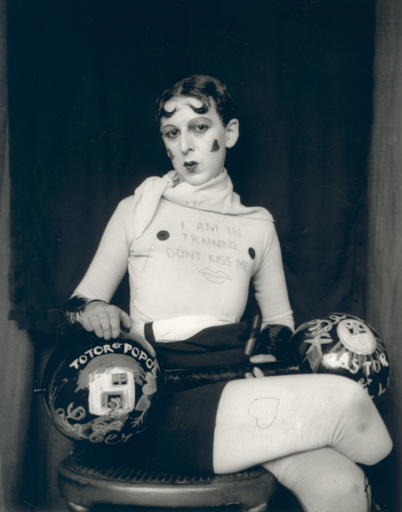
Claude Cahun Research and Analysis Guide
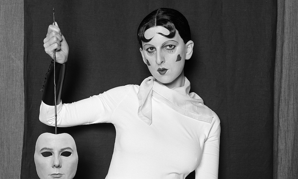
- Research the photographer
About Claude Cahun
Answer these questions:
- What was Claude Cahun known for?i
- What name was Cahun given at birth?
- What was the goal of their work?
- How did Cahun achieve this goal? (Who did they photograph? How are they portrayed? What message are they trying to convey?).
- What is Claude Cahun’s connection to Jersey?
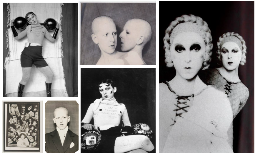
2. Analyse a chosen photo in depth:
Use the template below to help you analyse photos:

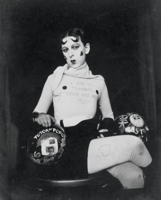
Visual:
- Who is in the image?
- How are they posed? Where is their gaze pointed?
- What are they wearing?
- What are they holding – what does it say- can you find out more about what it says??
- What does the sign say on their chest?
Technical
- Lighting – Do you think this uses artificial or natural lighting? How does the lighting accentuate the figure?
- Aperture – Dess this image have a soft or sharp focus background? What could this tell us about the aperture?
- Angle – What angle has the photo been taken at? What does this contribute?
- Is it a full body shot / half body shot / three-quarter body shot?
Contextual
- Research more on the role of women in the 1920s and 1930s
Conceptual
- How does Cahun’s work react to the role of women / gender in the 20s and 30s?
- What do you think the sign on their chest means?
- Why does the dumbbell have the words he words Totor and Popol? Could Cahun and Moore see their own relationship in these duos? Could it refer to Cahun’s multiplicity of identities? Could it link to their quote: “My soul is fragmentary.”?
- There’s a lot of contradictions in the image… the feminine pose vs the dumbbell… what could Cahun be saying about identity / gender?
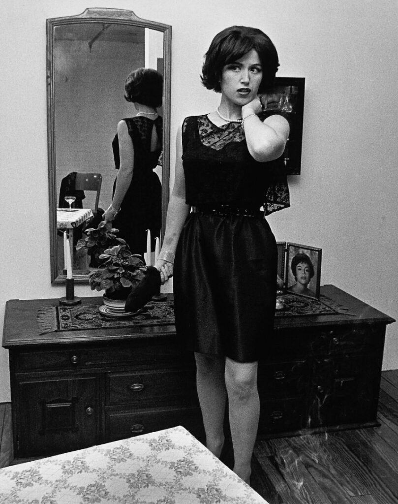
Cindy Sherman Research and Analysis Guide
- Research the photographer
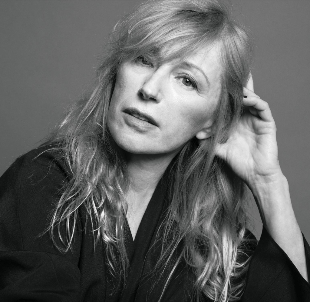
About Cindy Sherman:
Answer these questions:
- What photography movement was Cindy Sherman a key figure of? And what was their purpose?
- What did she do before she became a photographer?
- What are the key goals of her photography?
- How does she achieve this goal (Who does she photograph? What personas are portrayed? What message is she trying to convey through her process?).
- Does Cindy Sherman consider her photos to be self-portraits?
Key words:
- Pictures Generation
- Critique
- Mass media
- Female roles / personas
- Oppressive portrayal of women
- Self Portraits
- Guises
- Deception
- Stereotypes
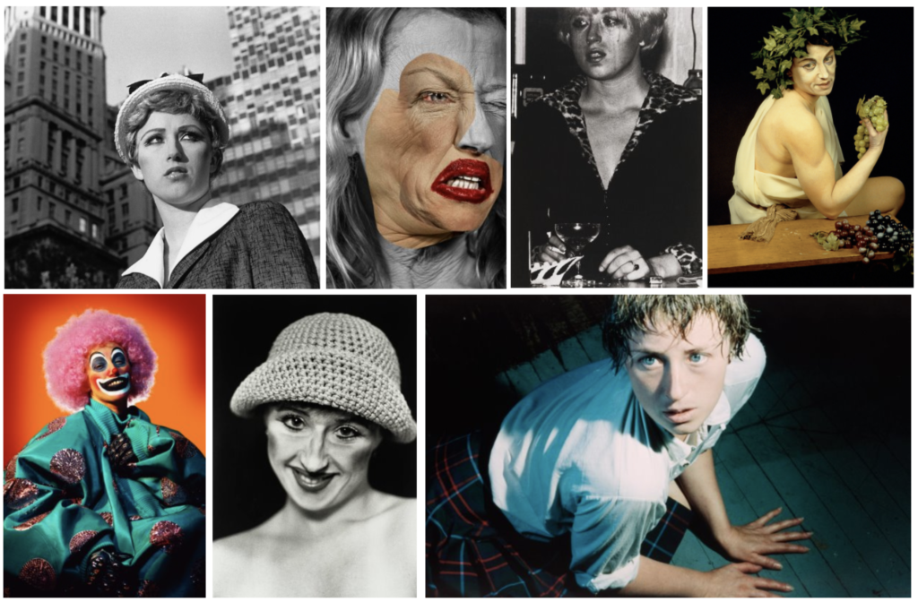
2. Analyse a chosen photo in depth:
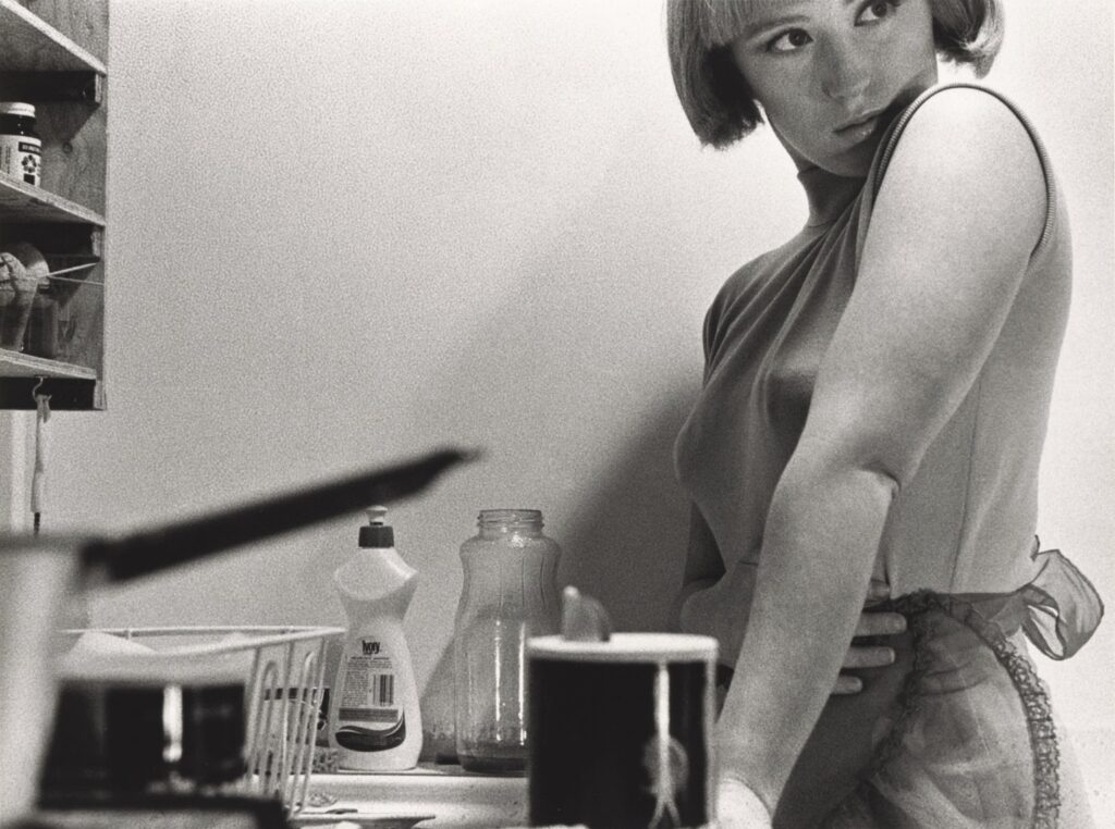
Use the template below to help you analyse photos:

Visual:
- Who is the character that Sherman is adopting and how can you tell this? (what is she wearing etc?)
- What else can you see in the photo and where does it look like the photograph set?
- How is the subject posed? What is the emotion/ mood of the subject?
- How is the subject framed? What does this add to the photo? Is it cramped? Spacious?
- What do you think was going on before the photo was taken?
- What tells you that something might be happening outside the frame?
- How does the title contribute to the photo?
Keywords:
- Housewife
- Feminine stereotypes
- Guarded
- Suspense
- Cramped
- Cinematic
Technical
- Aperture – Notice how the foreground objects are blurred… Does this mean it’s a wide or narrow aperture?
- Shutter speed – could be quite a fast shutter speed as the subject is in focus, with a balanced exposure
- Angle – Has it been taken from a slightly lowered angle or high angle? What does this contribute? Does it make you feel like you’re amongst the setting or outside of the setting.
- Is it a full body shot or half body shot? What does this add? Is it more or less intimate?
Contextual
Use the internet to help you unpack more about the history of how women are portrayed in the media
- Historically, how have women been portrayed in the media?
- What were Sherman’s ‘untitled film stills’ intended to resemble?
Conceptual
- Knowing that the photo is not a housewife, but in fact Sherman herself who is performing… what do you think the Film Stills are saying about cinema and mass media?
- How could it link to the media today?
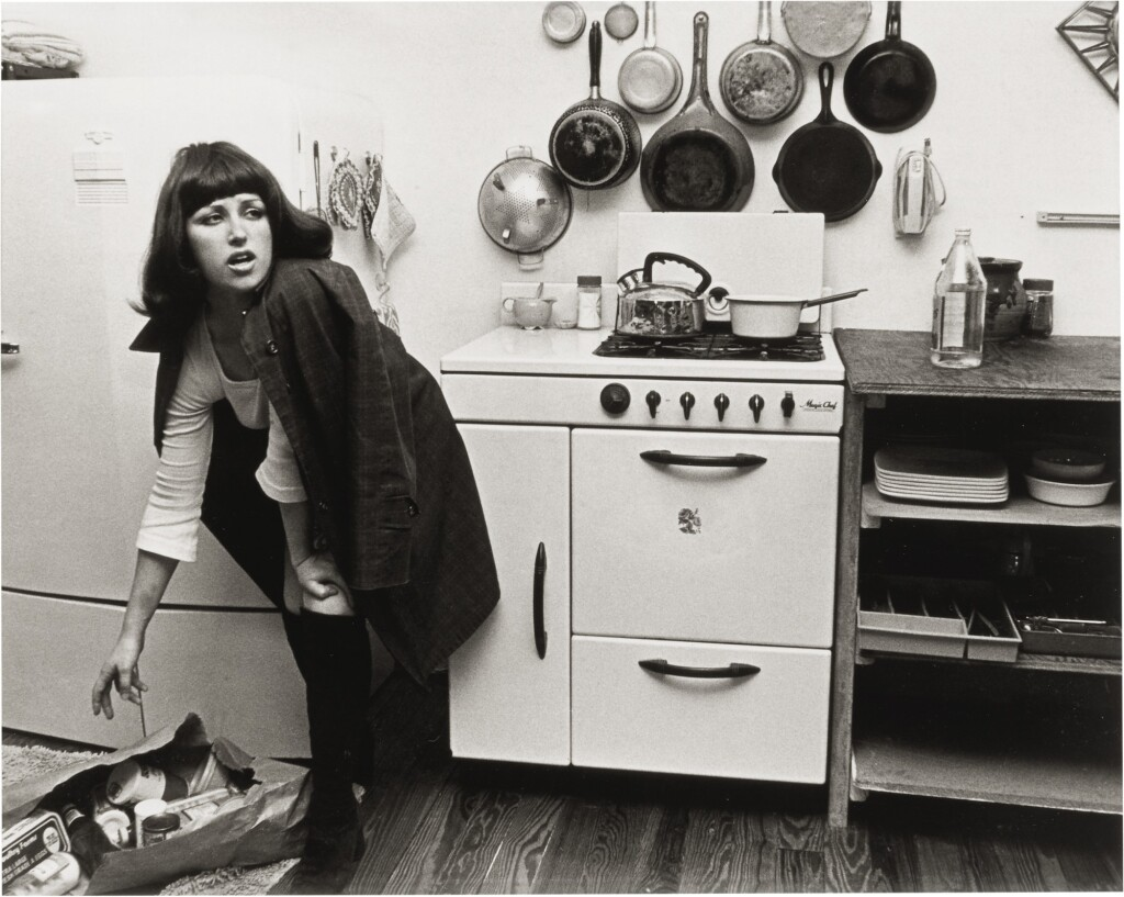
Alternative photo analysis:
Visual:
- Who is the character that Sherman is adopting and how can you tell this? (what is she wearing etc?)
- What else can you see in the photo and where does it look like the photograph set?
- How is the subject posed? What is the emotion/ mood of the subject?
- How is the subject framed? What does this add to the photo?
- What do you think was going on before the photo was taken?
- What tells you that something might be happening outside the frame?
- How does the title contribute to the photo?
Technical
- Aperture -Things in the background are in focus – Does the photo look like it is a wide or narrow aperture?
- Shutter speed – could be quite a fast shutter speed as the subject is in focus, with a balanced exposure
- Angle – What angle has it been taken from? What does this contribute? Does it make you feel like you’re amongst the setting or outside of the setting.
- Is it a full body shot or half body shot? What does this add? Does it feel safe or exposed?
Contextual
Use the internet to help you unpack more about the history of how women are portrayed in the media
- Historically, how have women been portrayed in the media?
- What were Sherman’s ‘untitled film stills’ intended to resemble?
Concept
- Knowing that the photo is not a housewife, but in fact Sherman herself who is performing… what do you think the Film Stills and Sherman’s approach is saying about cinema and mass media?
- How could it link to the media today?
Library of Identity Photographers
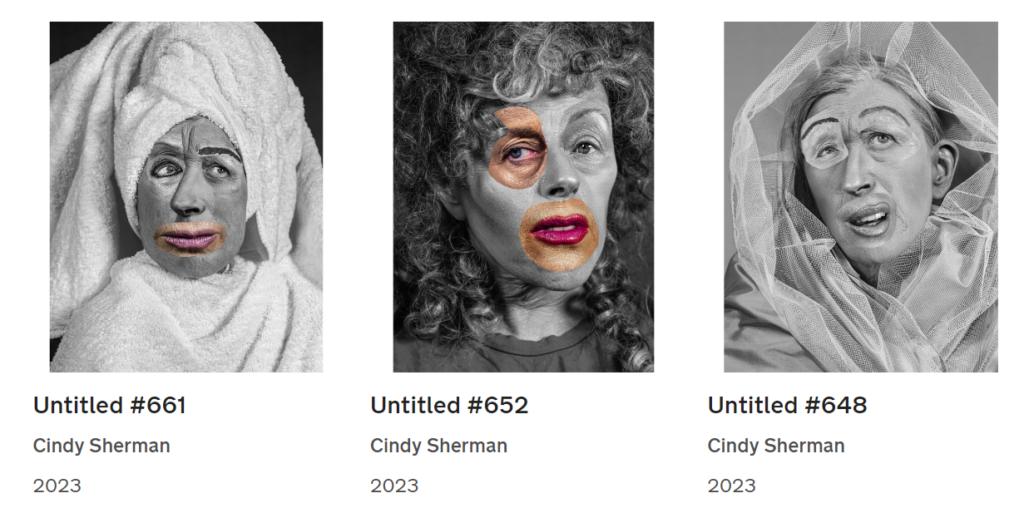
Cindy Sherman:
- Portrayal of gender in media
- montage
Claude Cahun:
- Adopting various identities
Clare Rae
- Figurative environment
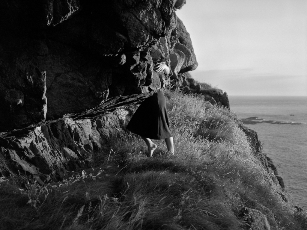
The Human Sculpture/Performance Selfie
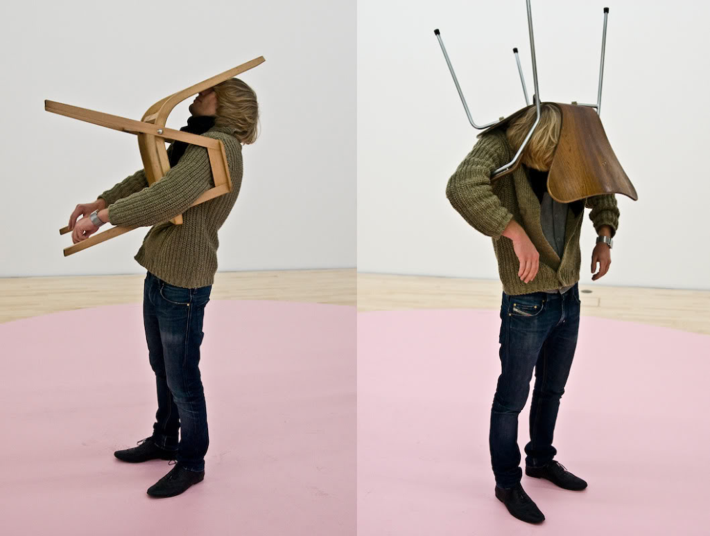
Rather than taking a straightforward self-portrait, some artists have experimented with transforming themselves (and others) into sculptures.
Erwin Wurm – One Minute Sculpture
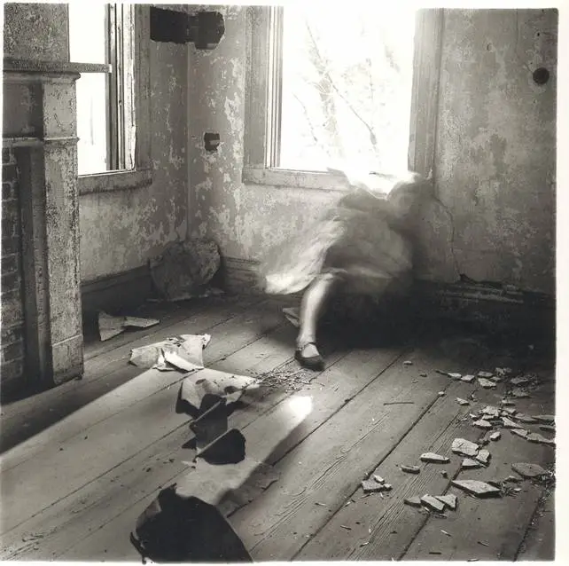
Francesca Woodman
- Long exposure
- Movement
- Memories
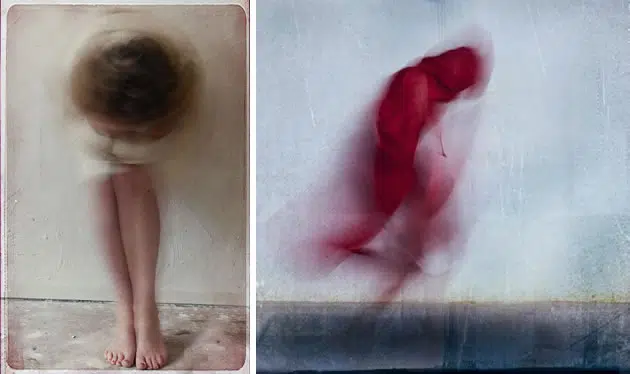
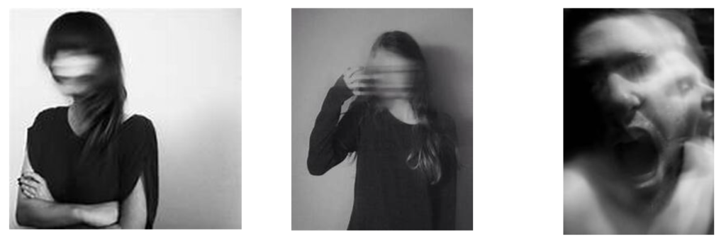
Photograph moving subjects to create blurred, painterly forms, as in these examples by Mirjam Appelhof:
- Long exposure
- Movement
- Memories
- Transience
Other examples of slow shutter speed
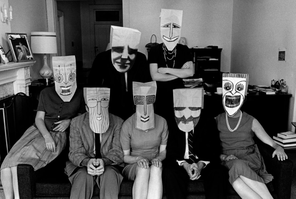
Morath & Saul Steinberg – the ‘Mask’ series
- Disguise
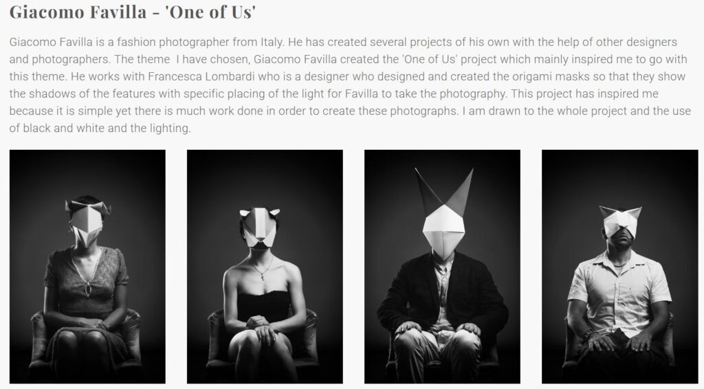
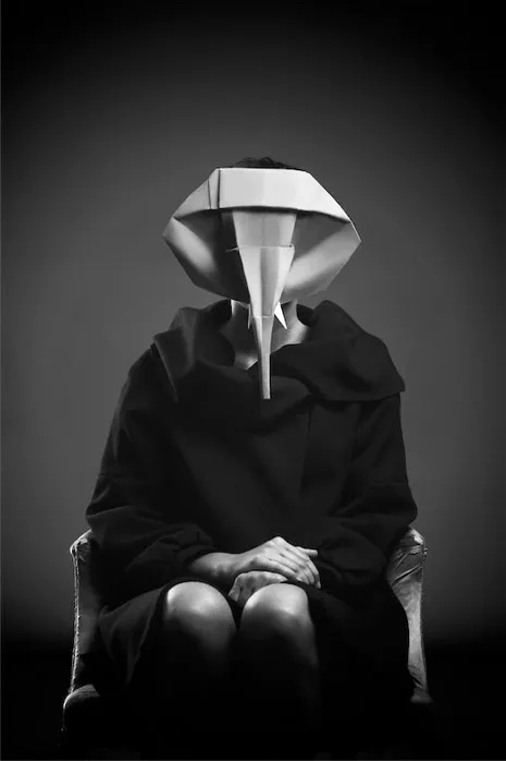
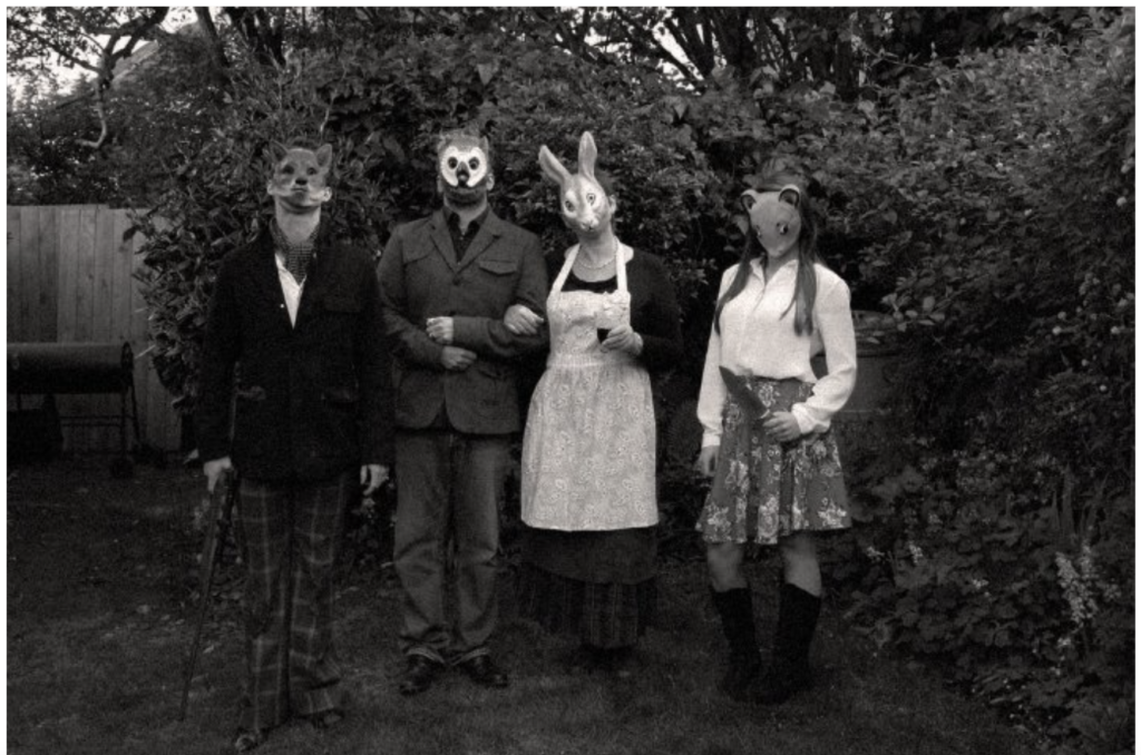
Designer Francesca Lombardi created these enigmatic origami animal masks for photographer Giacomo Favilla’s series called “One Of Us.”
Ralph Eugene Meetyard
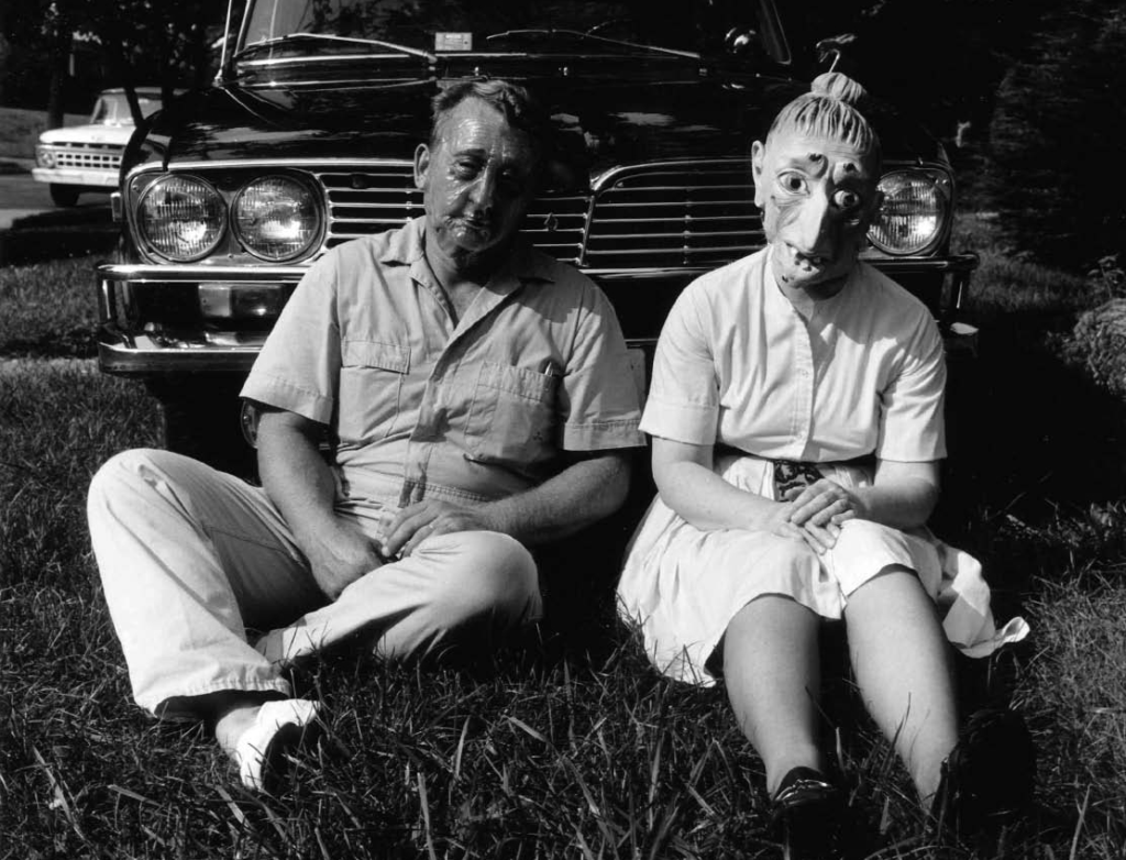
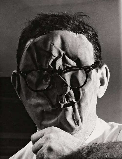
The Mask Selfie
rwin Blumenfeld – Self-Portrait with mask, New York, ca 1958
Student Mask response:
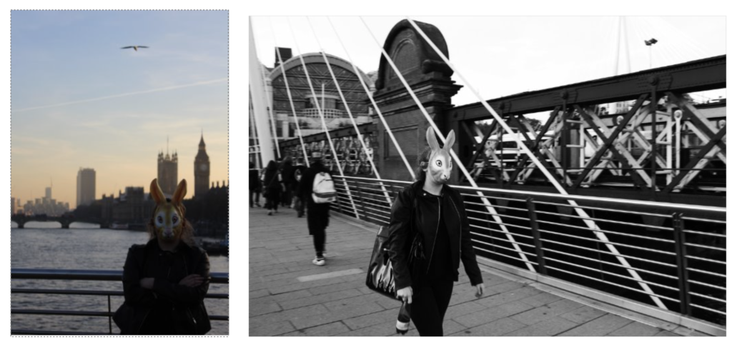
Nikita Pirogov
- Juxtaposition – using a second photography to communicate something about the person in the portrait
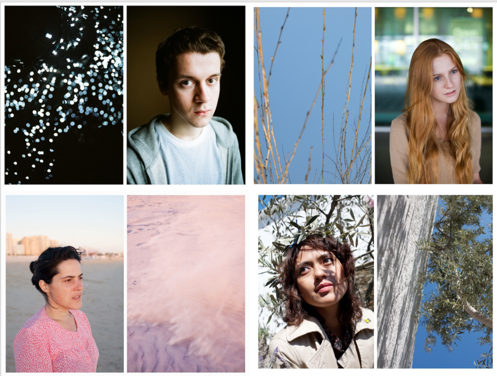
Alicja Brodowicz
- Juxtaposition
- Body / Natural Forms
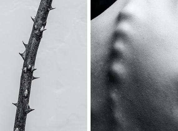
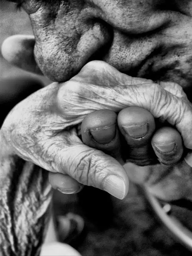
Alban Grosdidier
- Under Water
- Convey feelings of drowning under pressure

Wes Naman – distortion, challenging beauty norms
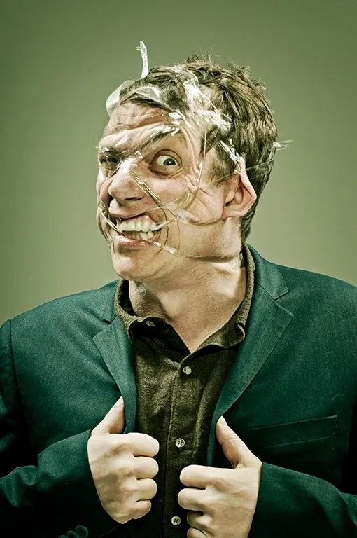
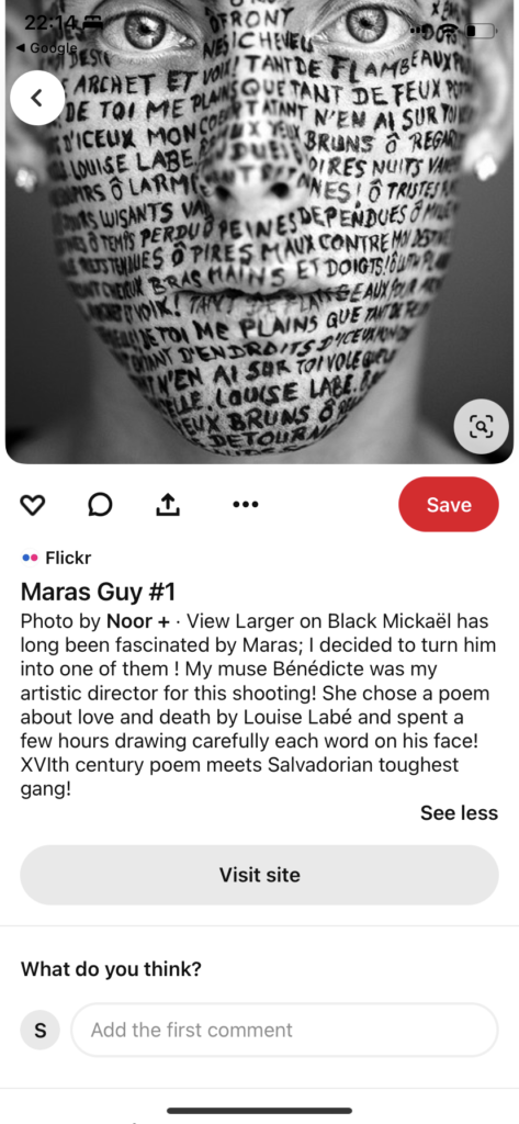
Unknown photographer / Noor+
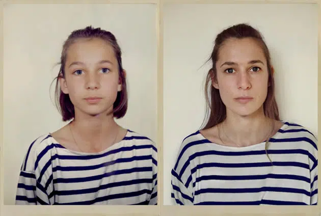
Capture the same scene at different times, as in this photography series by Clarisse d’Arcimoles:
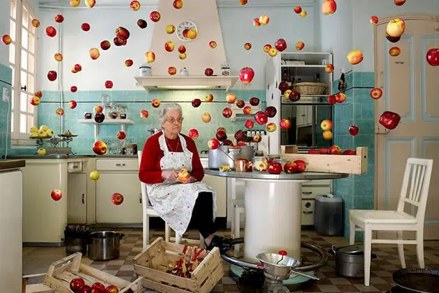
Create a complex ‘unrealistic’ setting and photograph it, as in this composition by Cerise Doucède:
Monty Milburn
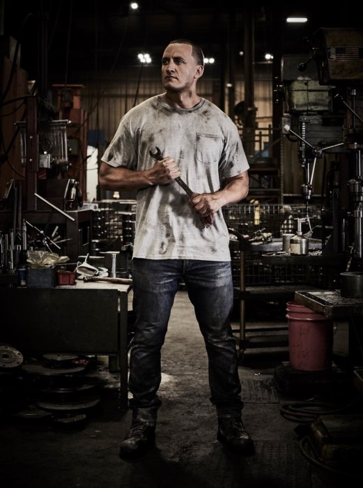
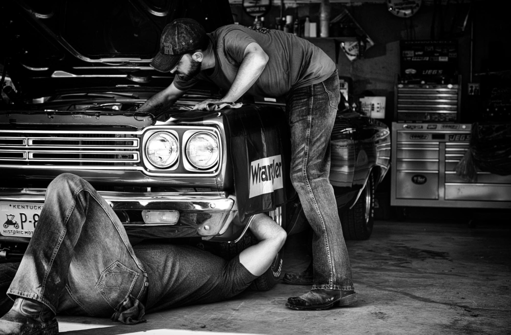
Theo Acwroth
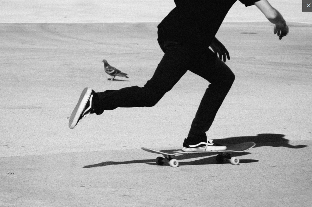
Danny Evans – Project on skaters from Jersey
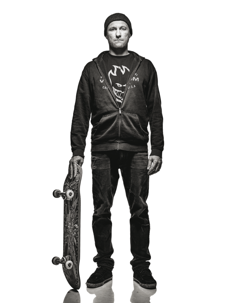
Pete Thompson
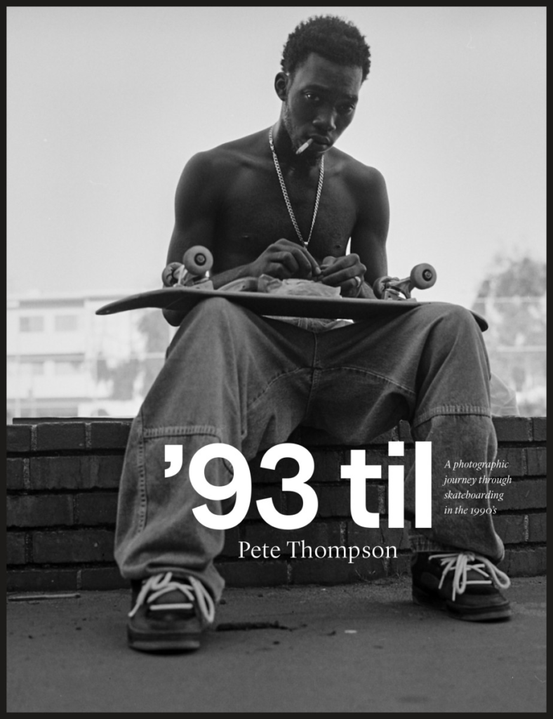
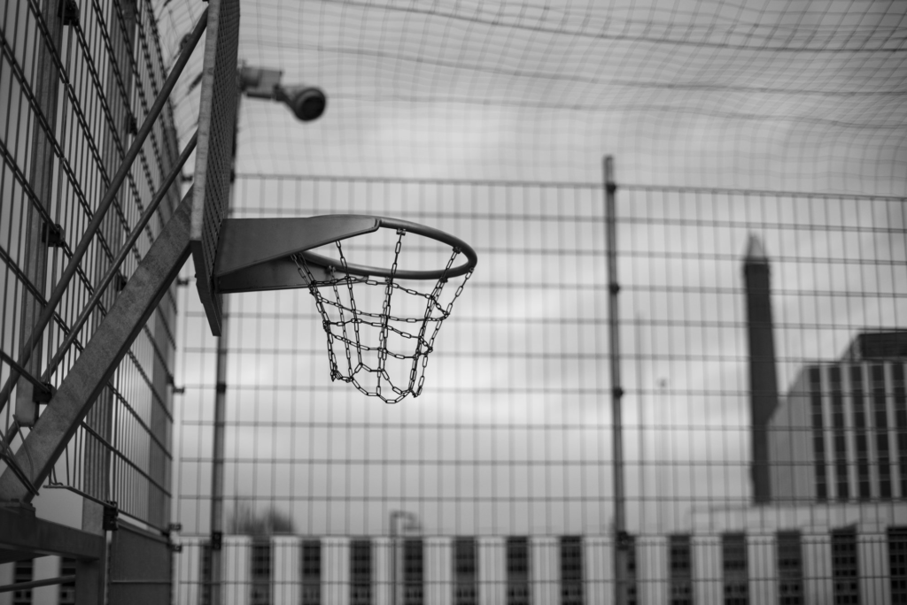
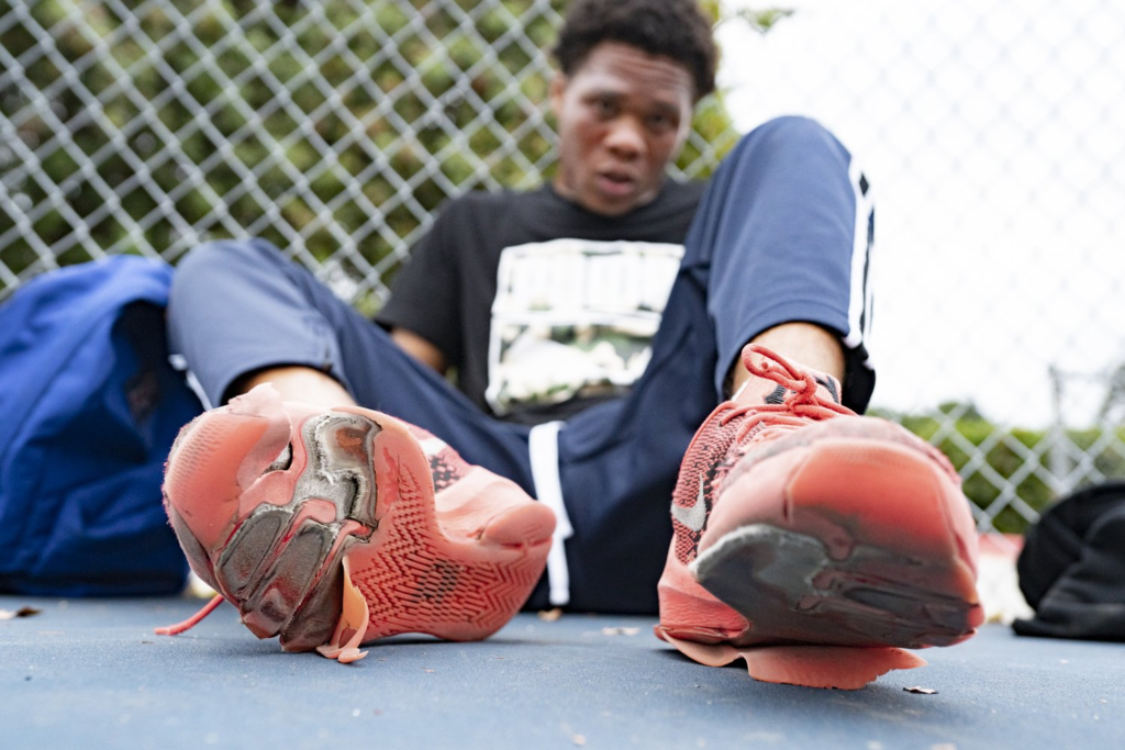
Rob Hammer- Basketball culture
Studio Ideas:
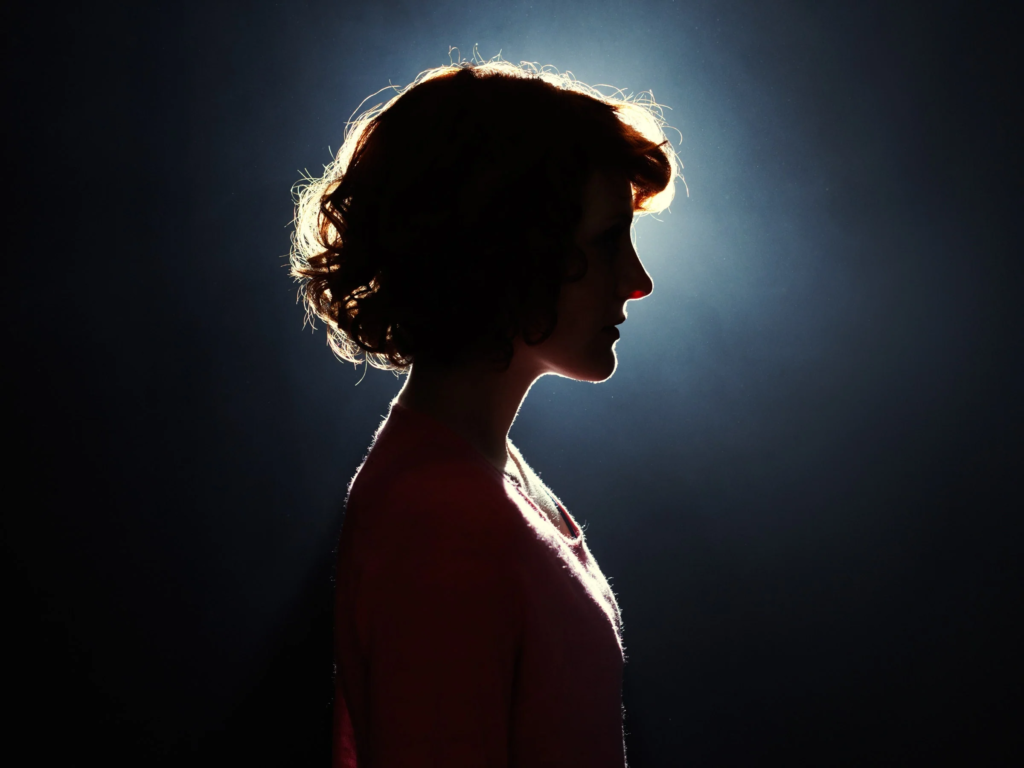
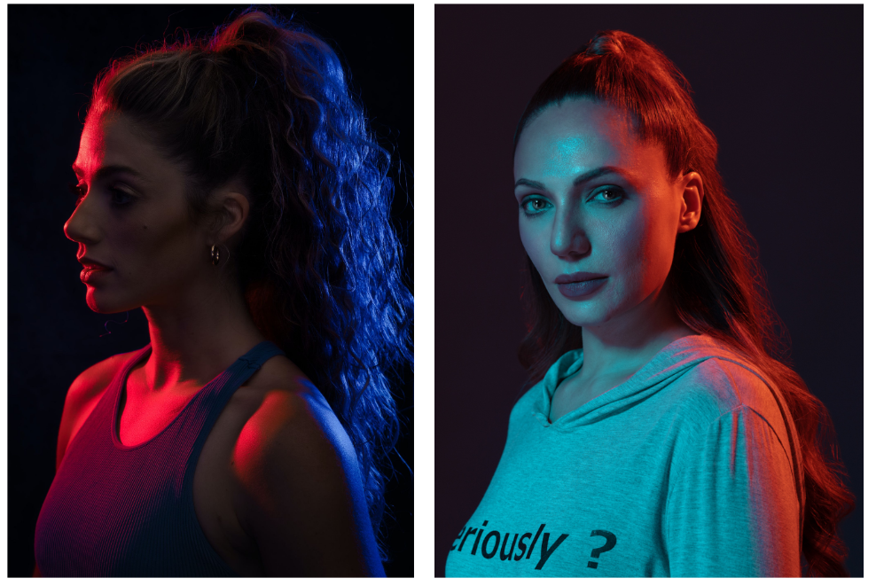
Backlighting
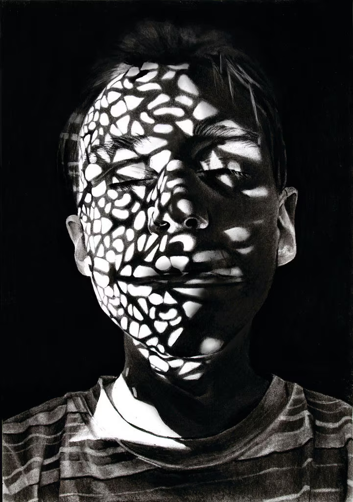
Interesting shadows / lighting
CREATIVE EDITING IDEAS:….
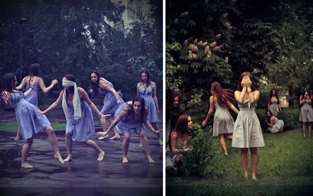
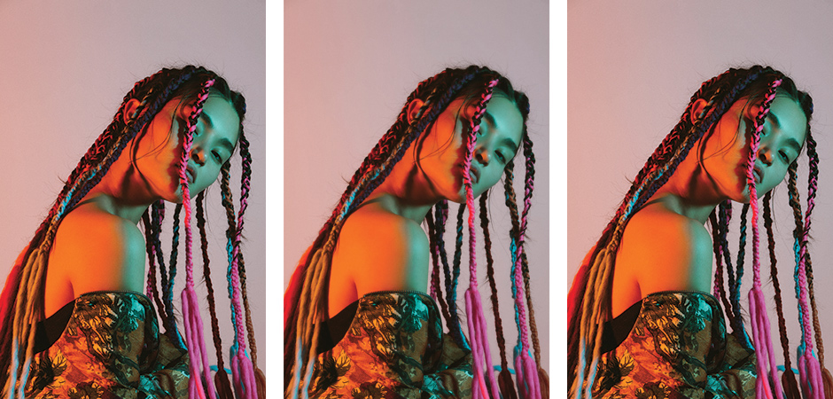
Combine multiple exposures to create the illusion of repeated objects, like these creative compositions by Lera:
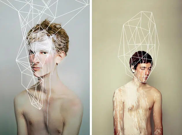
Digitally draw over photographs, as in these portraits by May Xiong:
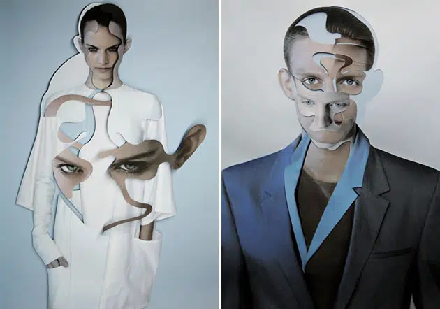
Cut through photographs to expose other layers of photographs below, as in these images by Lucas Simões:
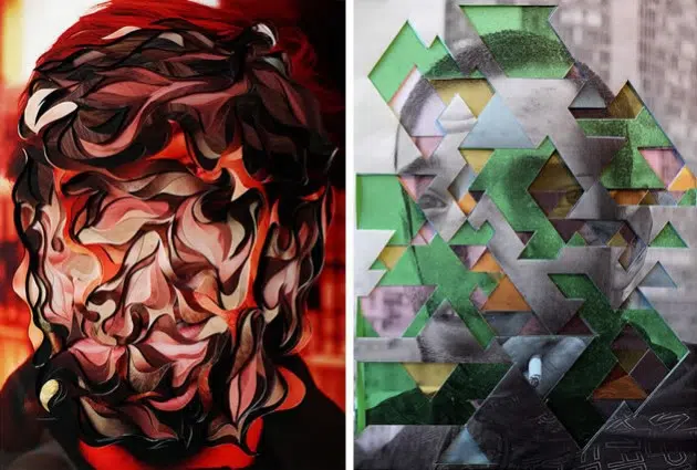
Create layered handmade collages, like these works by Damien Blottière:
Photograph scenes through small gaps or holes, as in these photographs by Reina Takahashi:
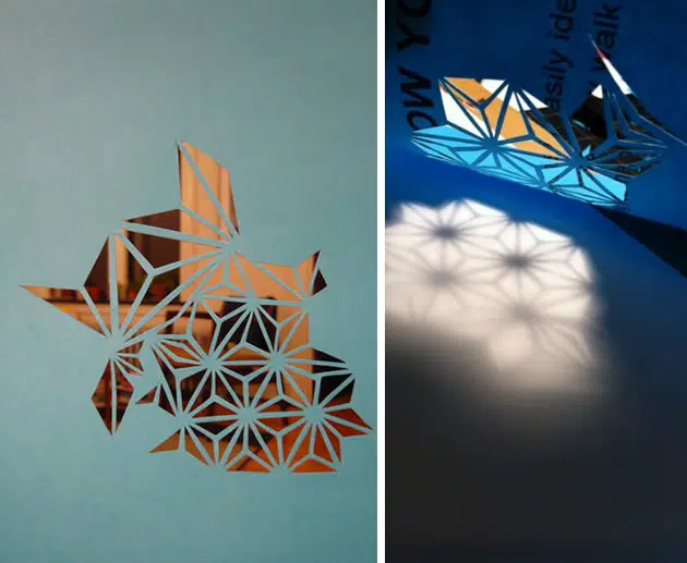
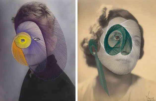
‘Fragments’ – Link to photographer website
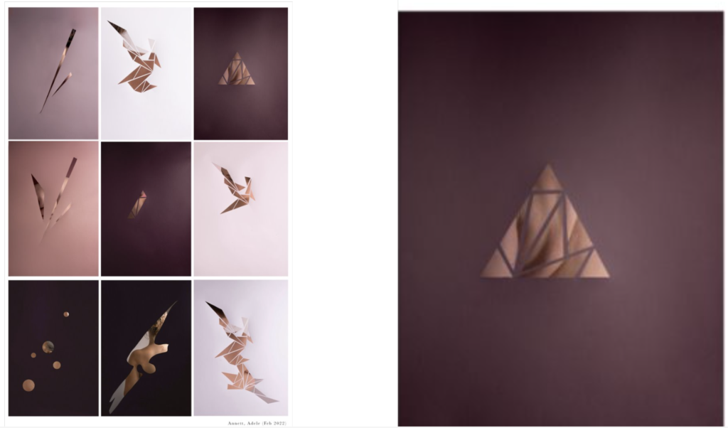
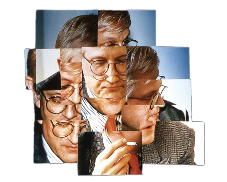
David Hockney
- Distort
Christoffer Relander
- Double exposure
- Express emotion
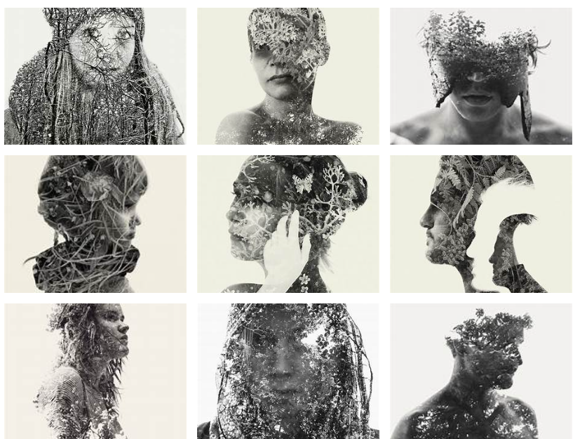
Sakir Yildirim
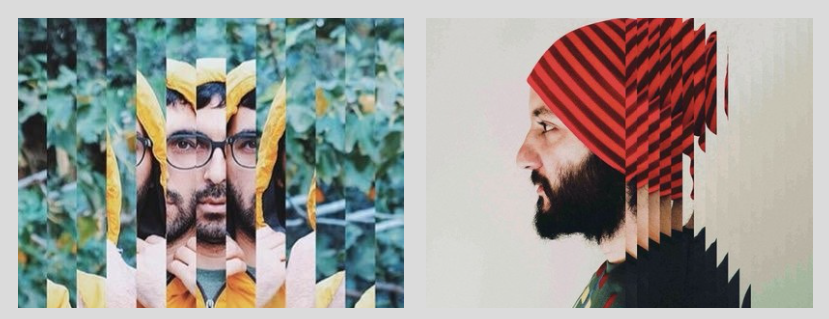
Creative Portraits
Below are some INSTRUCTIONS AND INSPIRATIONS for you to experiment with creative portraiture outcomes.
YOUR BLOG POST/S
Create a Blog Post called ‘Creative Portraits‘ and complete the following:
- Choose a 1-2 styles from the below experiments.
- Research the inspiration behind the particular style and….
- Recreate your own edits in the style you have chosen (using or existing portrait photos or take some more).
Experiments:
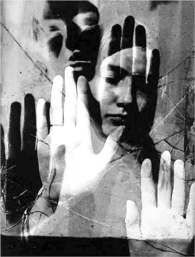
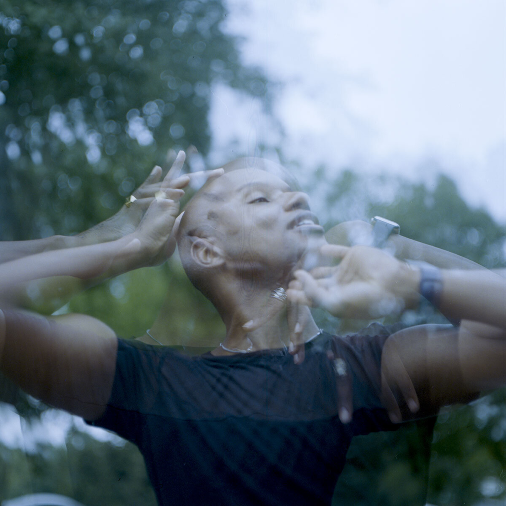
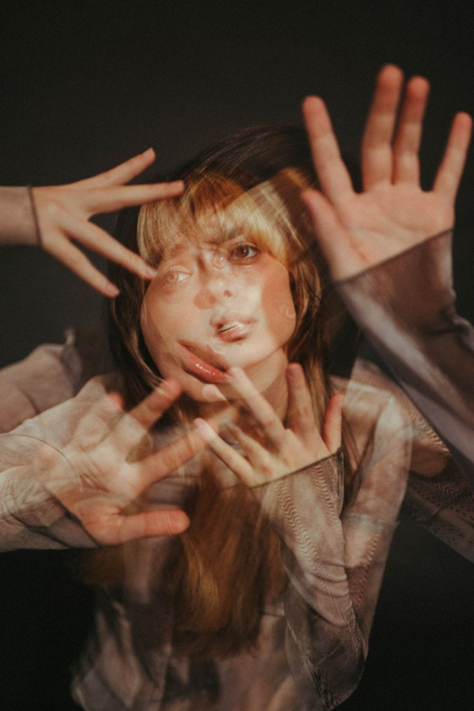
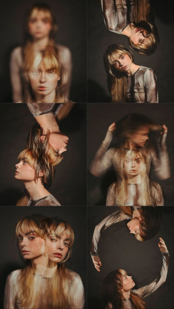
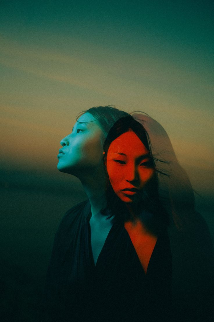
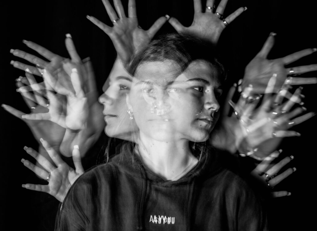
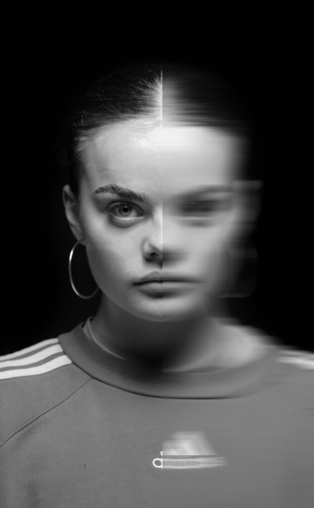
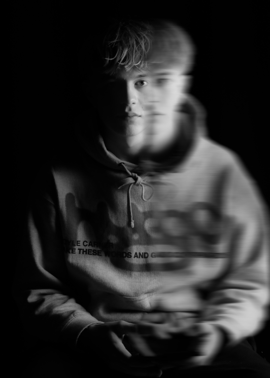
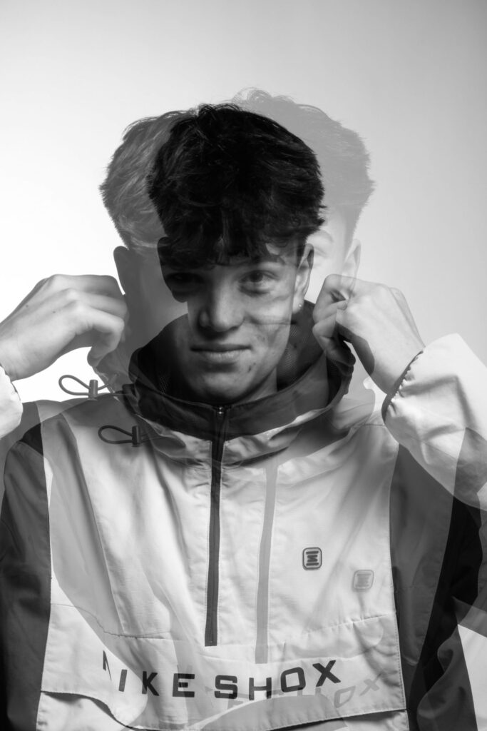
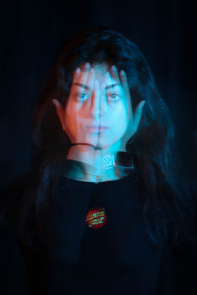
- DOUBLE/ MULTI-EXPOSURE: layer or merge two or three images into one portrait- View Tutorial Here
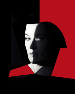
- JUXTAPOSITION: Place two images together to show contrast / similarities / symbolise something. This can be two portraits or a portrait juxtaposed with an object / environment / abstract image
- MONTAGE: Select an appropriate set of portraits and create a montage of layered images in Photoshop as an A3 document.
DOUBLE / MULTI-EXPOSURES
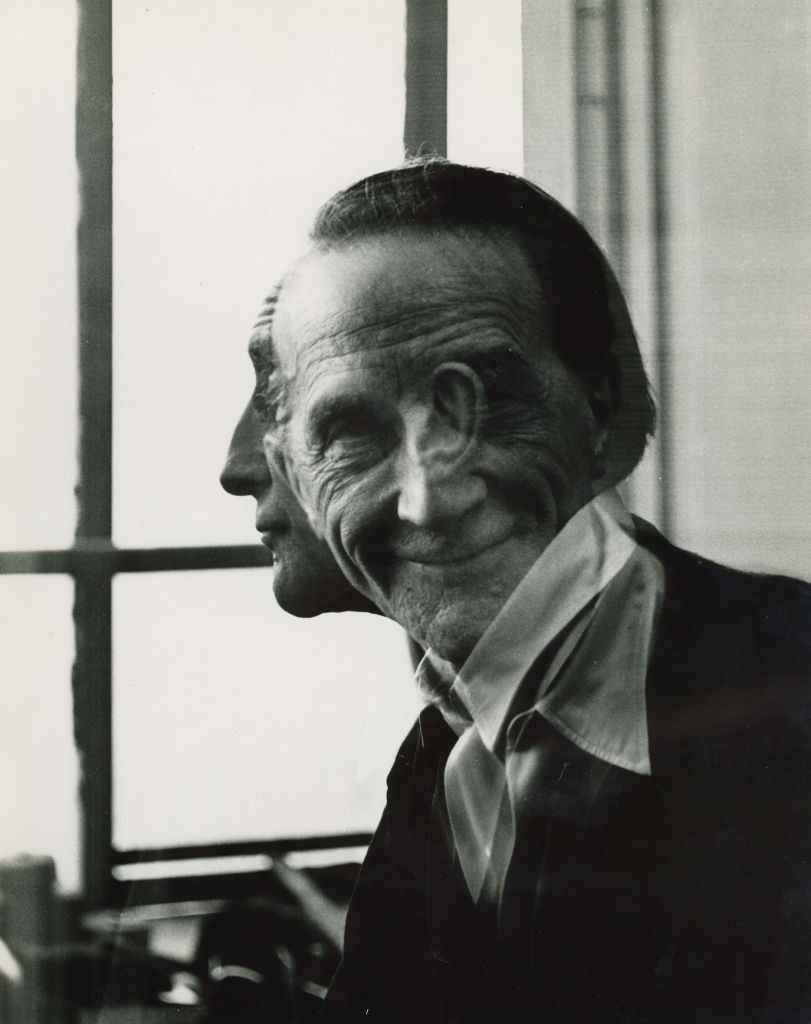
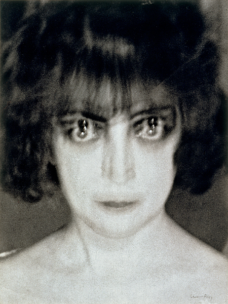
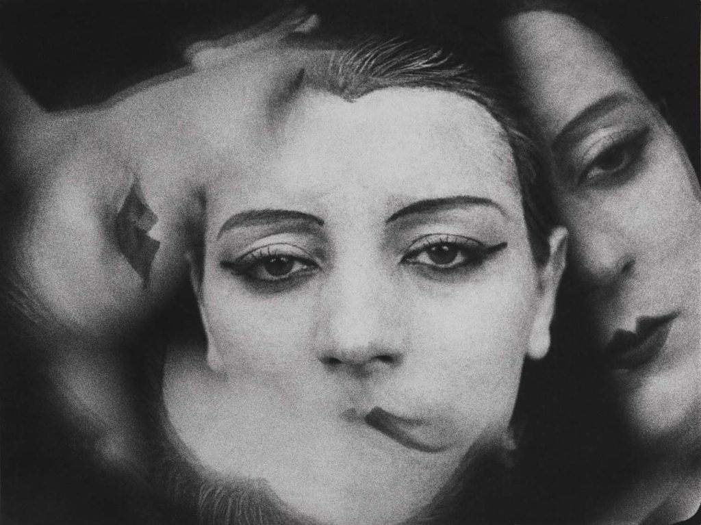
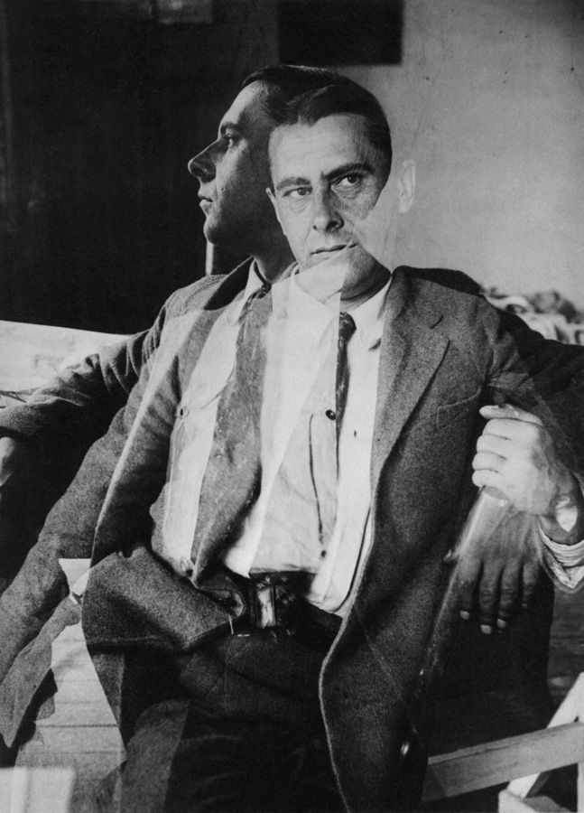
Double or multiple exposures are an illusion created by layering images (or portions of images) over the top of each other. This can be achieved in the camera settings, or on Adobe Photoshop by creating LAYERS and then using BLENDING OPTIONS and OPACITY CONTROL, but also by erasing through parts of layers to reveal parts of other images.
Artist have used these techniques to explore Surrealist Ideas and evoke dream-like imagery, or imagery that explores time / time lapse.
Man Ray:
Alexander Rodchenko:
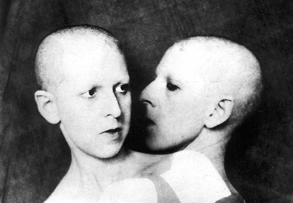
Claude Cahun:
Idris Khan:
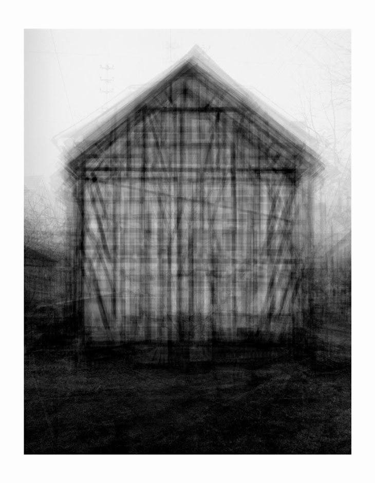
Photographic print
208 x 160 cm
Since 1959 Bernd and Hilla Becher have been photographing industrial structures that exemplify modernist engineering, such as gas reservoirs and water towers. Their photographs are often presented in groups of similar design; their repeated images make these everyday buildings seem strangely imposing and alien. Idris Khan’s Every Bernd And Hilla Becher… series appropriates the Bechers’ imagery and compiles their collections into single super-images. In this piece, multiple images of American-style gabled houses are digitally layered and super-imposed giving the effect of an impressionistic drawing or blurred film still.
Lewis Bush, Trading Zones:
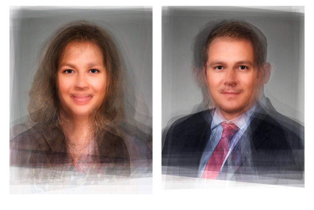
Tiffany Sutton:
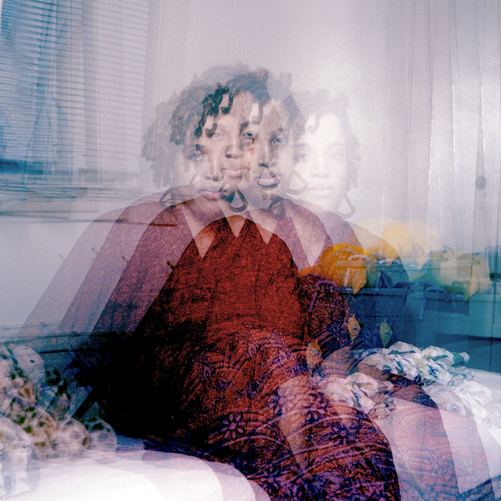
Michael Betzner:
More ideas:
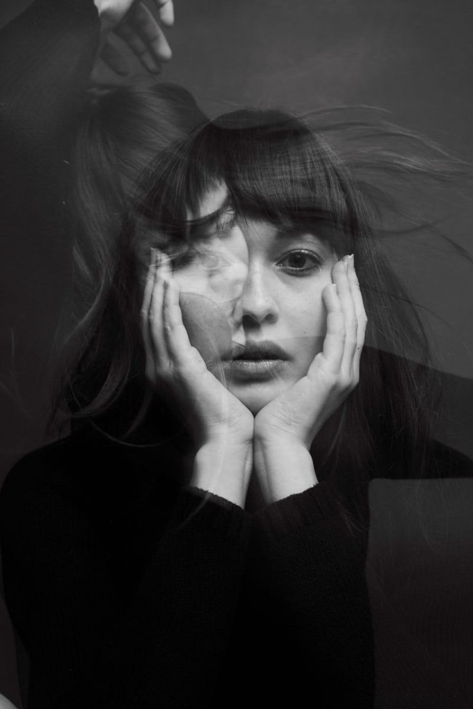
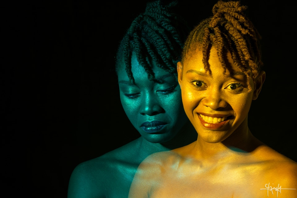
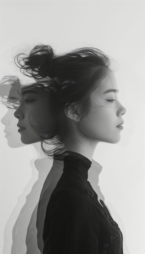
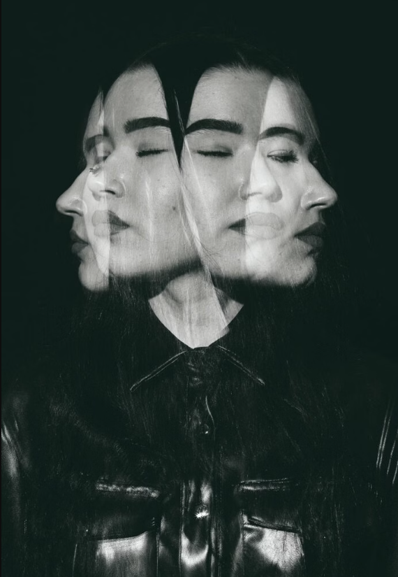
JUXTAPOSITION
Juxtaposition is placing two images together to show contrast or similarities. For inspiration look at some of the page spreads from ED.EM.03 where pairings between portraits of Henry Mullins and Michelle Sank are juxtaposed to show comparison/ similarities/ differences between different social and professional classes in Jersey mid-19th century and early 21 st century.
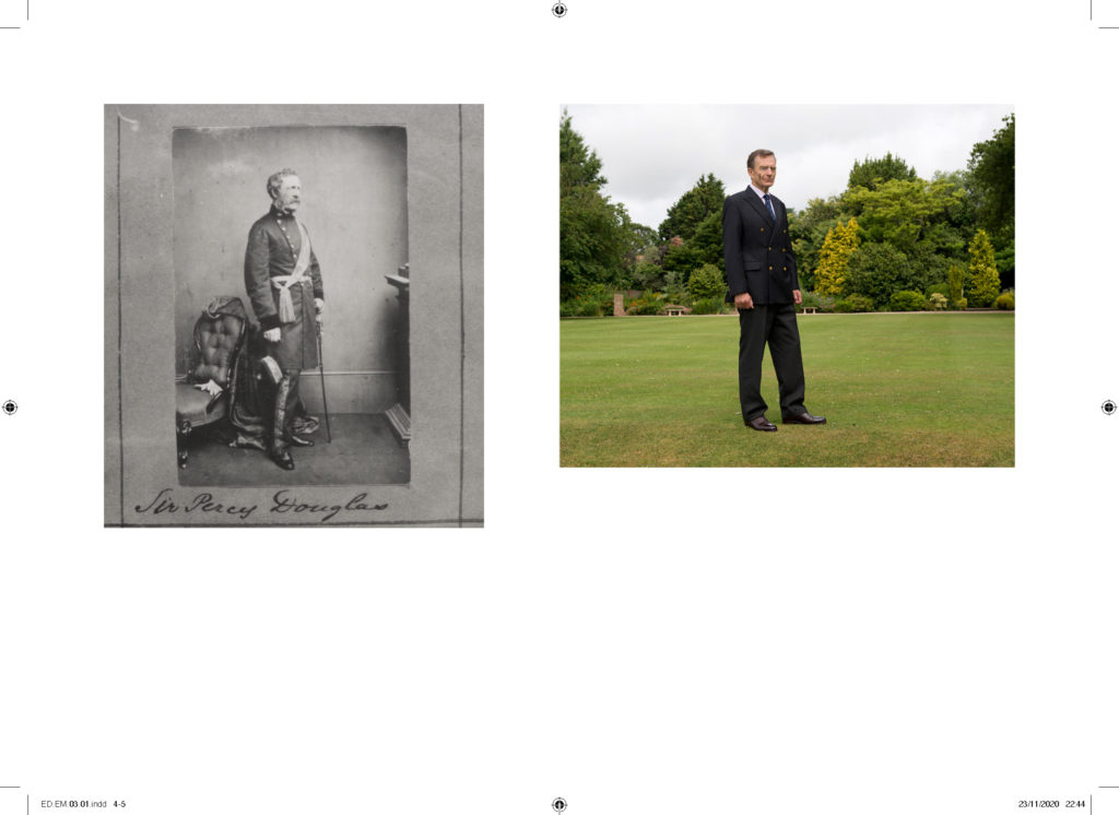
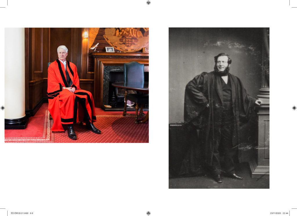
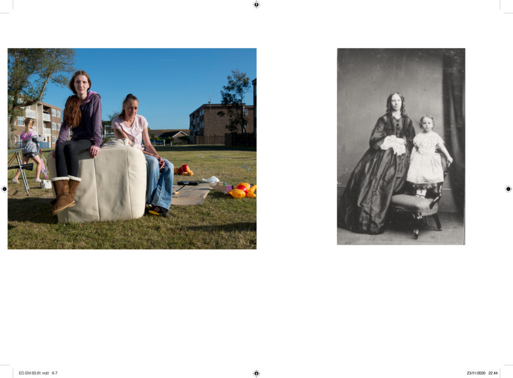
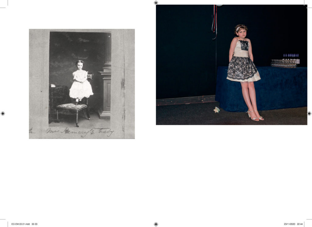
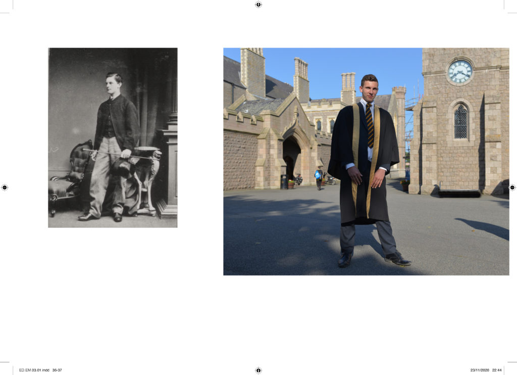
For inspiration look also at the newspapers: LIBERATION / OCCUPATION and FUTURE OF ST HELIER produced by past A2 photography students and the publication GLOBAL MARKET by ECAL.
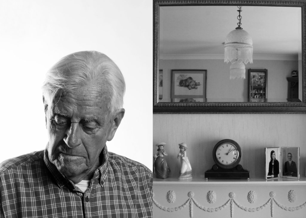
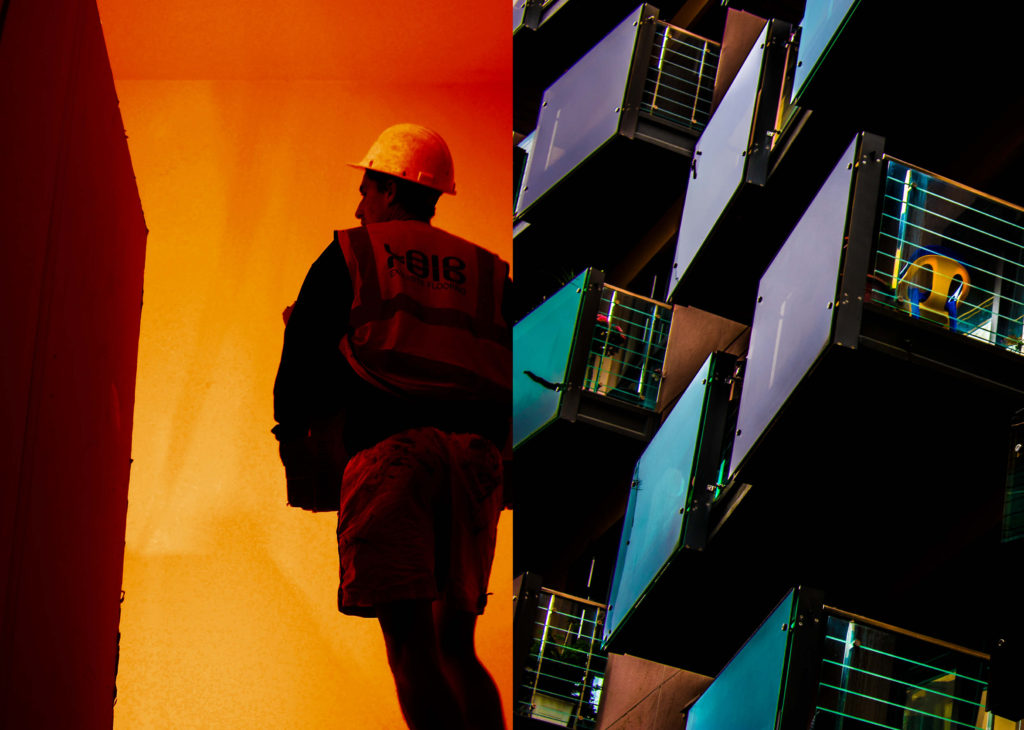
Becque á Barbe: Face to Face: A portrait project about Jèrriais – the island of Jersey’s native language of Norman French. Each portrait is titled with a Jèrriais word that each native speaker has chosen to represent a personal or symbolic meaning, or a specific memory linked to his or her childhood. Some portraits are darker in tonality to reflect the language hidden past at a time when English was adopted as the formal speech in Jersey and Jèrriais was suppressed publicly and forbidden to be spoken in schools.
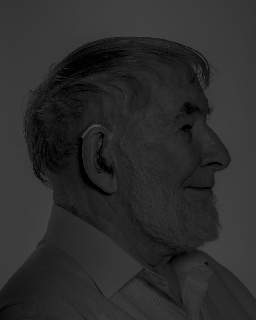
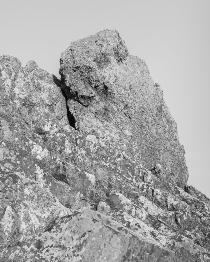
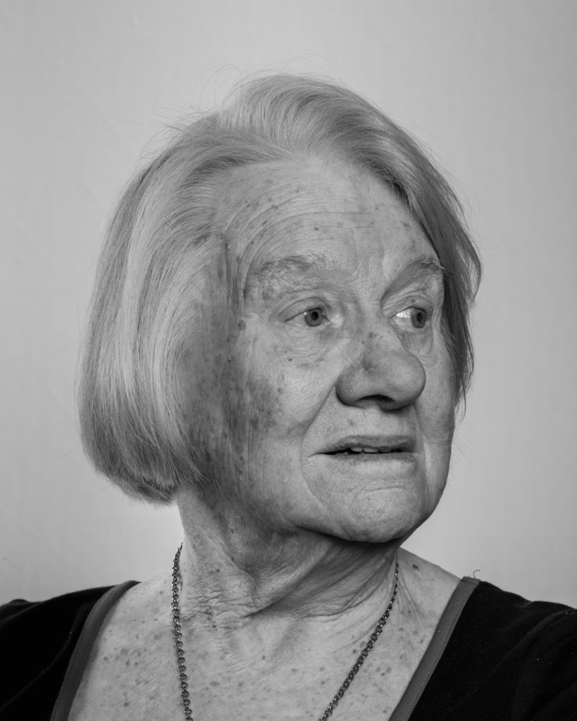
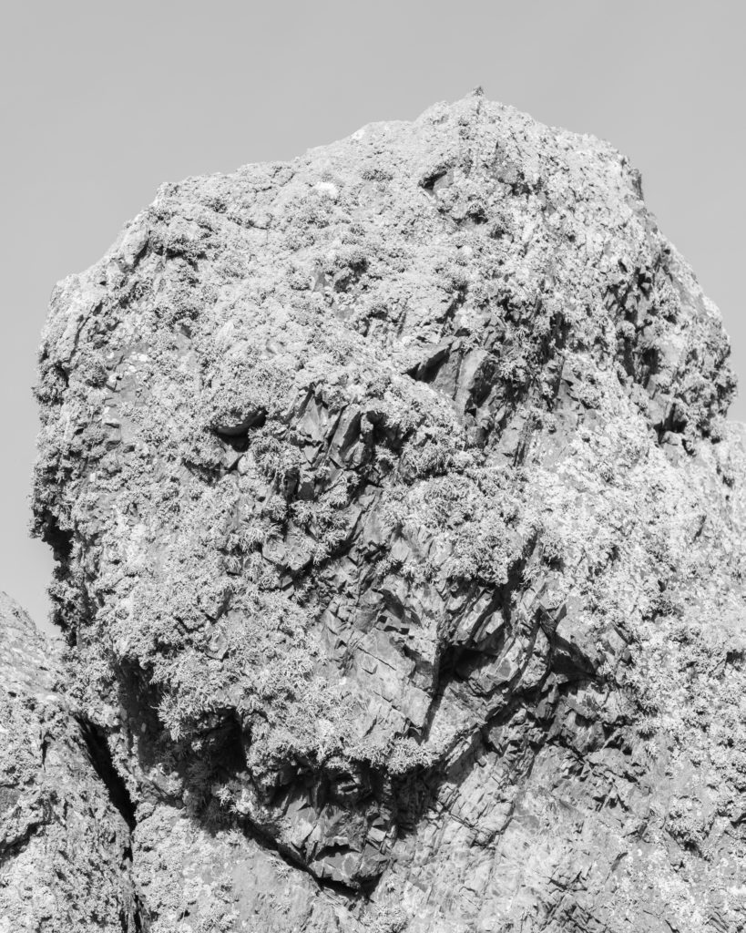
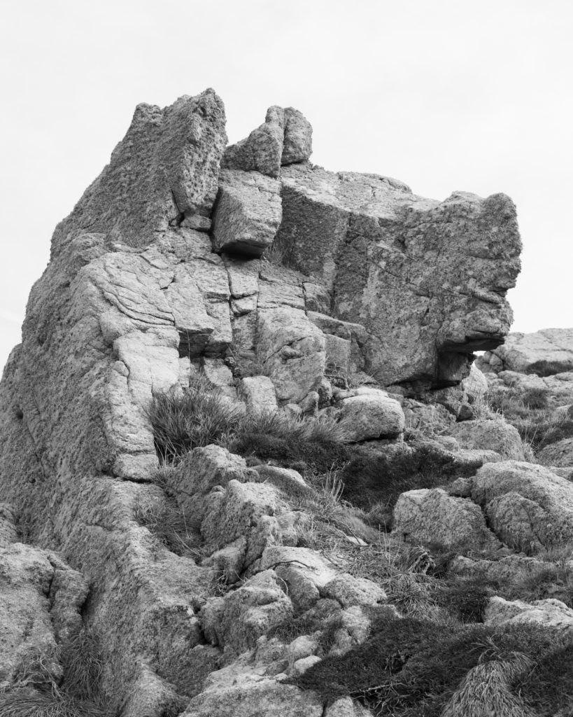
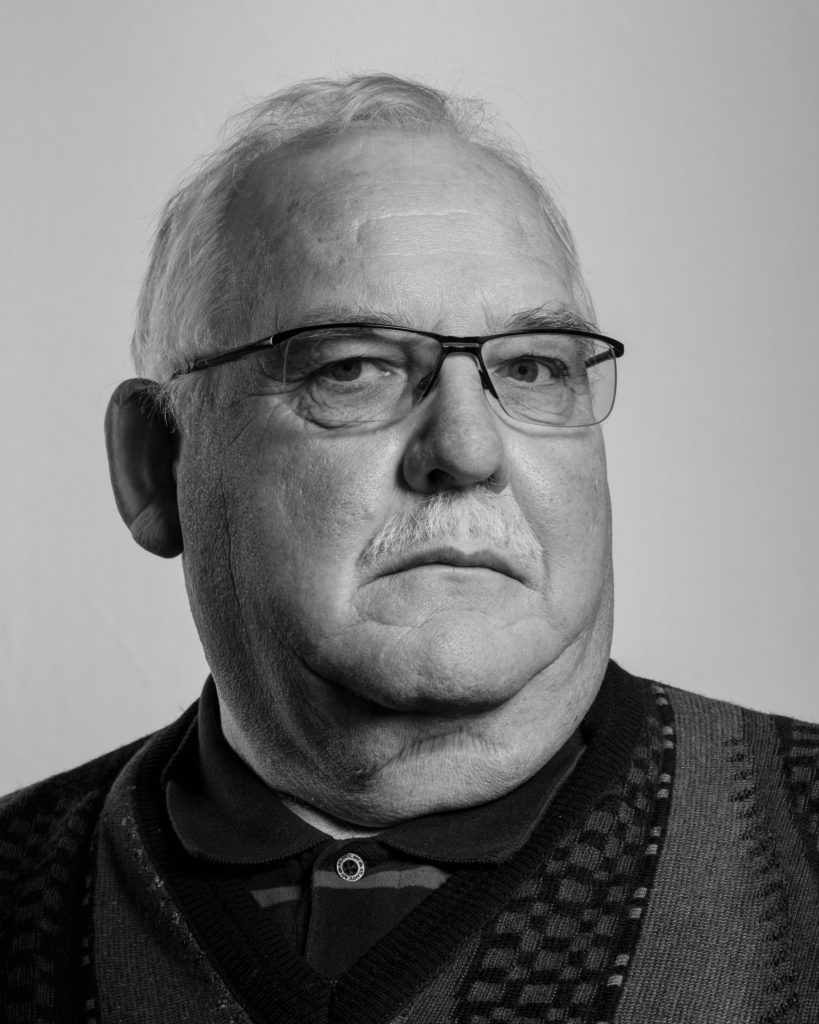
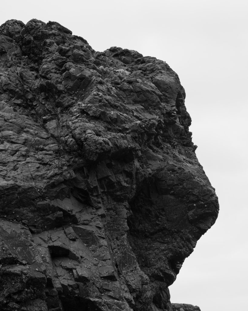
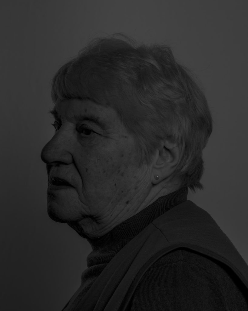
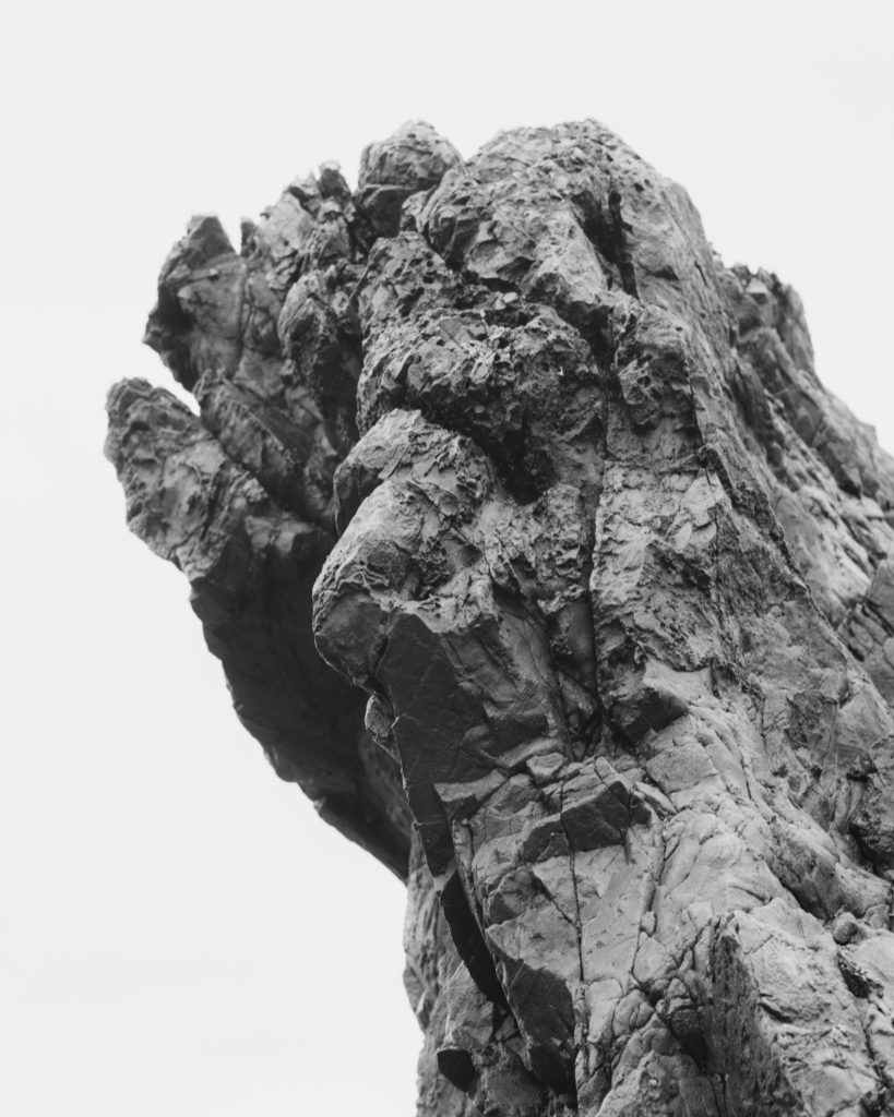
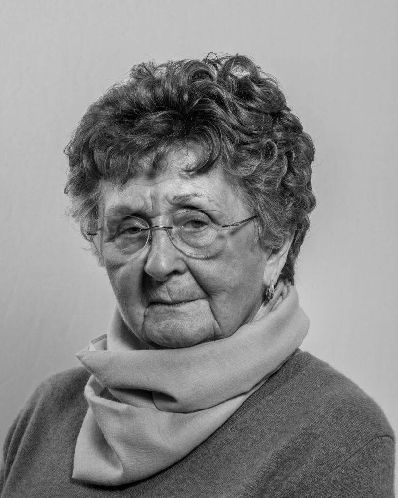
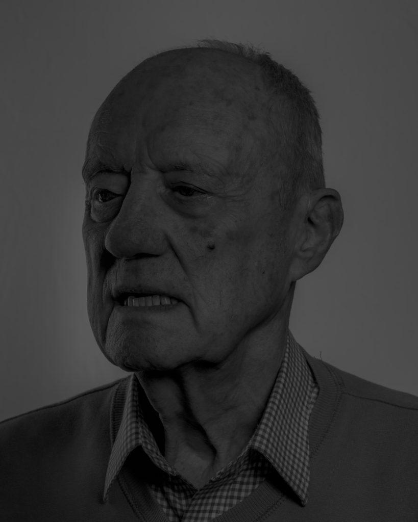
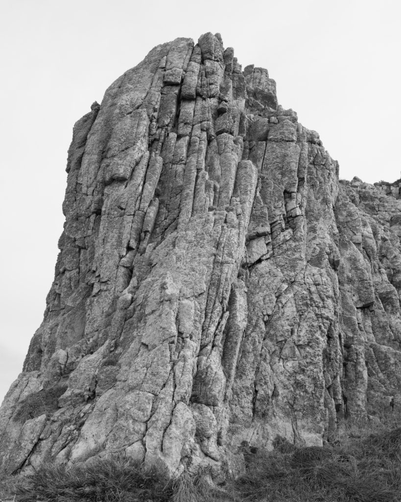
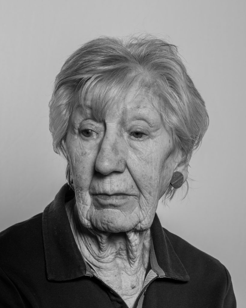
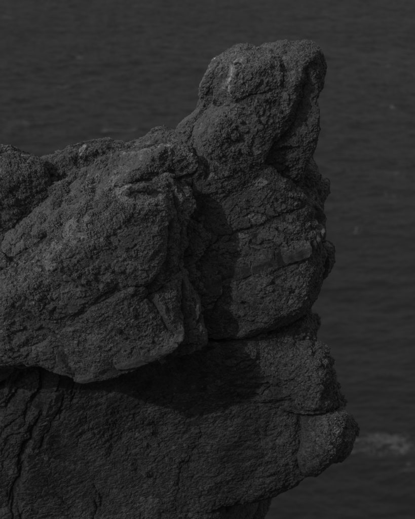
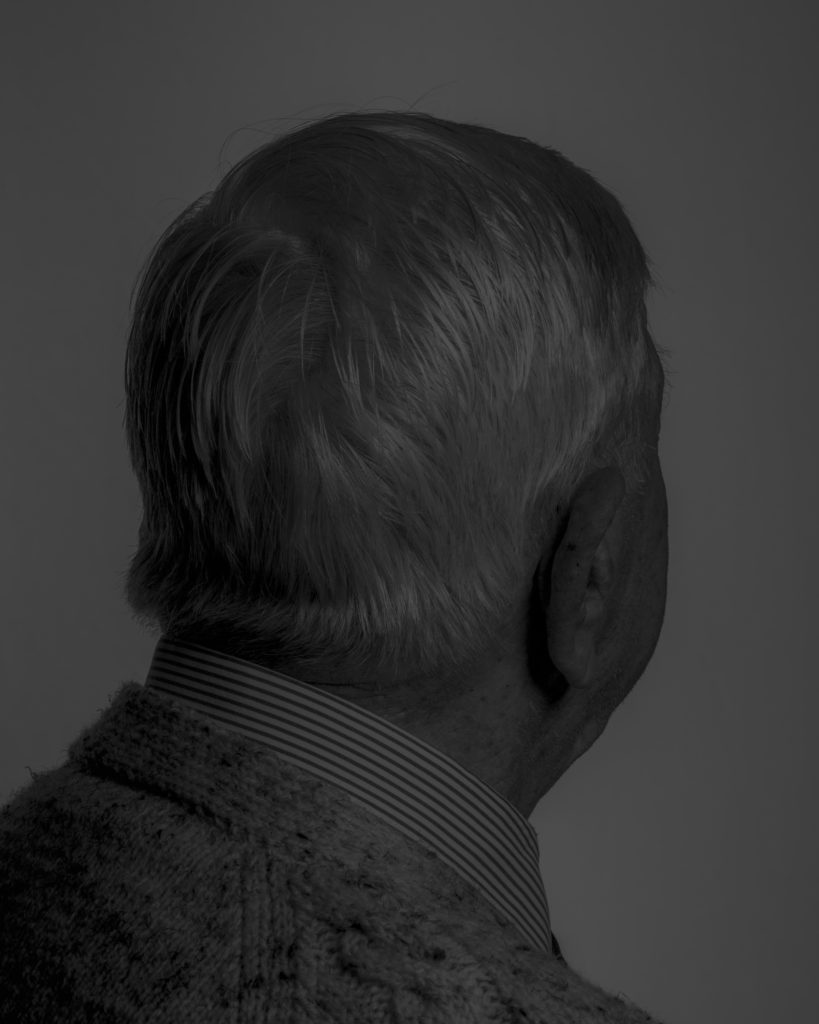
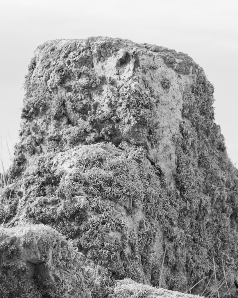
Juxtaposed with portraits of Jèrriais speakers are a series of photographs of Jersey rocks that are all designated as Sites of Special Interest (SSIs); important geological outcrops that are protected from development and preserved for future public enjoyment and research purposes. The native speakers of Jersey French should be classified as People of Special Interest (PSIs) and equally be protected from extinction through encouraging greater visibility and recognition as guardians of a unique language that are essential in understanding the island’s special character.
Nikita Pirogov:

Alicja Brodowicz:
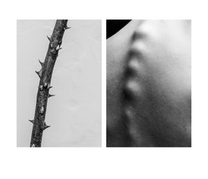
Unknown artist…
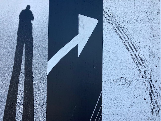
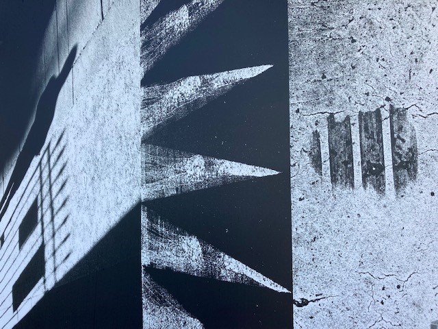
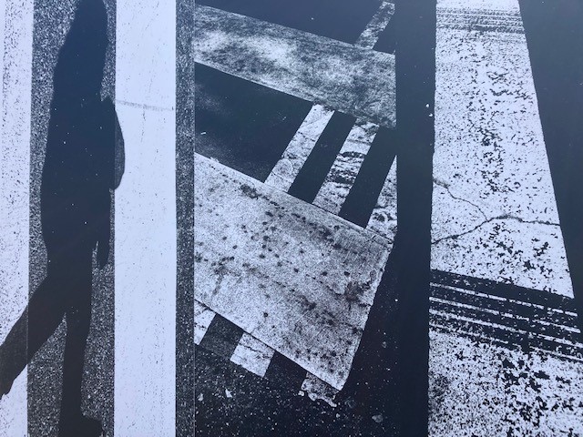
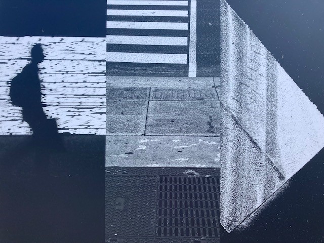
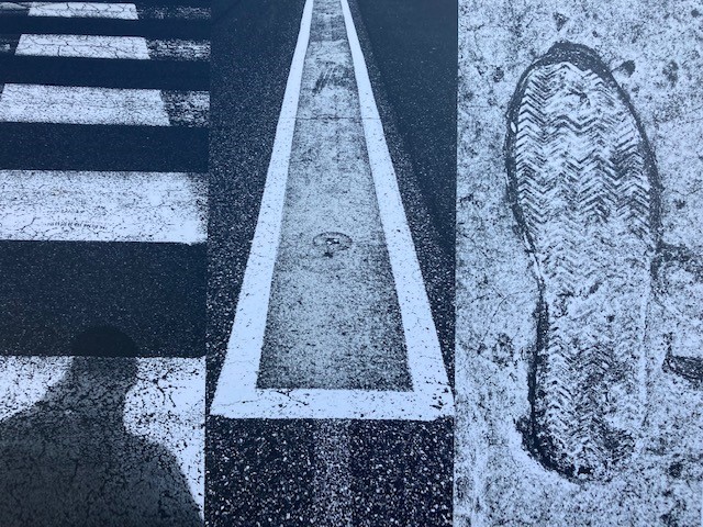
PHOTO-MONTAGE
Photomontage is the process and the result of making a composite photograph by cutting, gluing, rearranging and overlapping two or more photographs into a new image.
Try using textures and frames to add to your process ; you can find some pre-saved examples here
M:\Radio\Departments\Photography\Students\Resources\Frames and textures PHOTOSHOP
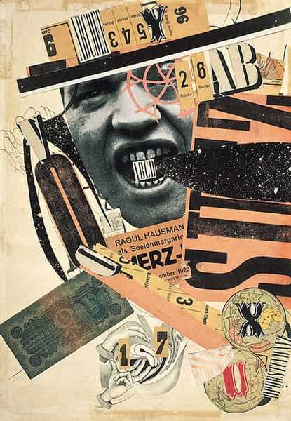
The roots of this process is in Dadaism and political artists such as Hannah Hoch…Known for her incisively political collages and photomontages (a form she helped pioneer), Hannah Höch appropriated and recombined images and text from mass media to critique popular culture, the failings of the Weimar Republic, and the socially constructed roles of women. After meeting artist and writer Raoul Hausmann in 1917, Höch became associated with the Berlin Dada group, a circle of mostly male artists who satirized and critiqued German culture and society following World War I. She exhibited in their exhibitions, including the First International Dada Fair in Berlin in 1920, and her photomontages received critical acclaim despite the patronizing views of her male peers. She reflected, “Most of our male colleagues continued for a long while to look upon us as charming and gifted amateurs, denying us implicitly any real professional status.”
Russian Constructivism
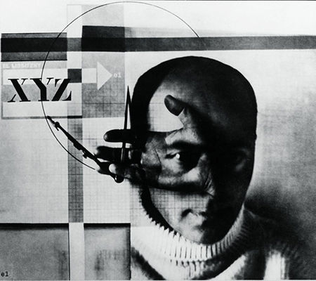
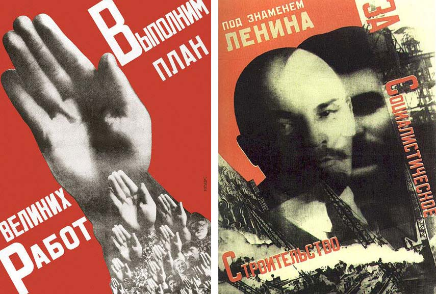
Russian Constructivism was the last and most influential modern art period to flourish in Russia in the 20th-century. Looking back in 1924, the painter Kazimir Malevich wrote: “We have drawn two conclusions from Cubism, one is Suprematism, the other Constructivism…” Like Suprematism, Russian Constructivism was formed in 1914, before the October Revolution in 1917…
John Stezaker :
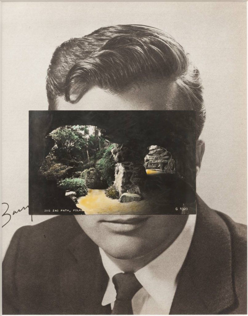
John Stezaker: Is a British artist who is fascinated by the lure of images. Taking classic movie stills, vintage postcards and book illustrations, Stezaker makes collages to give old images a new meaning. By adjusting, inverting and slicing separate pictures together to create unique new works of art, Stezaker explores the subversive force of found images. Stezaker’s famous Mask series fuses the profiles of glamorous sitters with caves, hamlets, or waterfalls, making for images of eerie beauty.
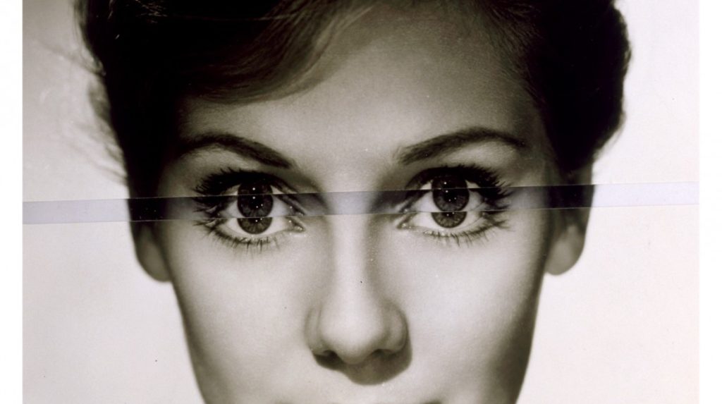
His ‘Dark Star’ series turns publicity portraits into cut-out silhouettes, creating an ambiguous presence in the place of the absent celebrity. Stezaker’s way of giving old images a new context reaches its height in the found images of his Third Person Archive: the artist has removed delicate, haunting figures from the margins of obsolete travel illustrations. Presented as images on their own, they now take the centre stage of our attention
Kensuoke Koike:
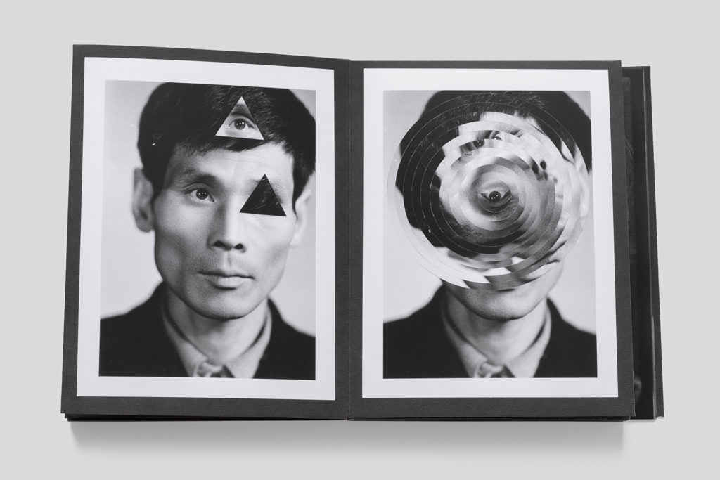
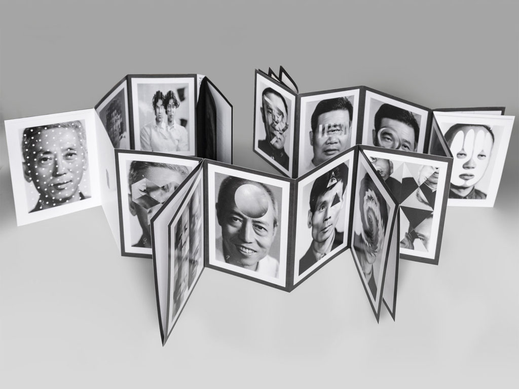
Thomas Sauvin and Kensuke Koike: ‘No More, No Less’
In 2015, French artist Thomas Sauvin acquired an album produced in the early 1980s by an unknown Shanghai University photography student. This volume was given a second life through the expert hands of Kensuke Koike, a Japanese artist based in Venice whose practice combines collage and found photography. The series, “No More, No Less”, born from the encounter between Koike and Sauvin, includes new silver prints made from the album’s original negatives. These prints were then submitted to Koike’s sharp imagination, who, with a simple blade and adhesive tape, deconstructs and reinvents the images. However, these purely manual interventions all respect one single formal rule: nothing is removed, nothing is added, “No More, No Less”. In such a context that blends freedom and constraint, Koike and Sauvin meticulously explore the possibilities of an image only made up of itself.
Jesse Draxler:
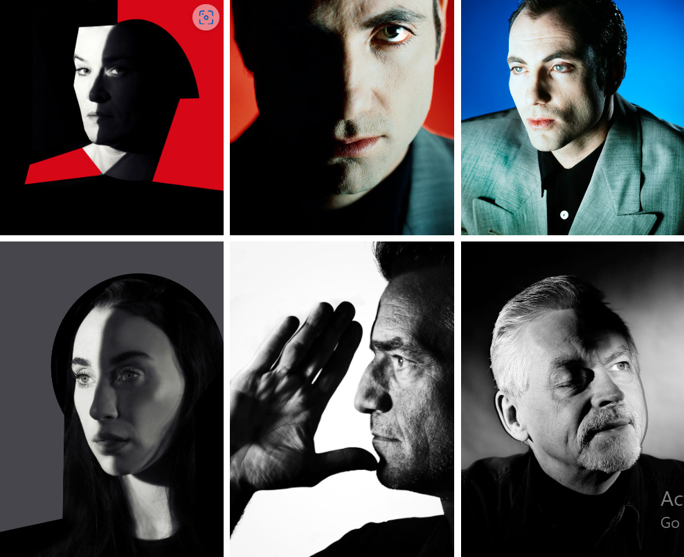
Ole Christiansen (Danish): A special preoccupation has been music photography, portraits, but also – often strongly graphically emphasized urban landscapes which is reflected in his portraiture . Ole has over the years provided pictures for a myriad of books, magazines, record covers, annual reports, etc.
The 3 EEEs
In addition to complete the work listed above, you are expected to show evidence of the following three EEEs on the blog for the work on Creative Portraits
EDITING: For each portrait shoot produce a contact-sheet, select and adjust your BEST 3 IMAGES in Photoshop using basic tools such as cropping, contrast, tonality, colour balance, monochrome. Describe also the lighting setup using an image from ‘behind the scenes’, ie. key light, back light, fill light, use of reflectors, gels etc.
EXPERIMENTING: Complete at least 2 out of these 3 experiments on DOUBLE/ MULTIPLE EXPOSURE, JUXTAPOSITION, AND MONTAGE (see more details below). Make sure you demonstrate creativity and produce at least 3 different variations of the same portrait experiment.
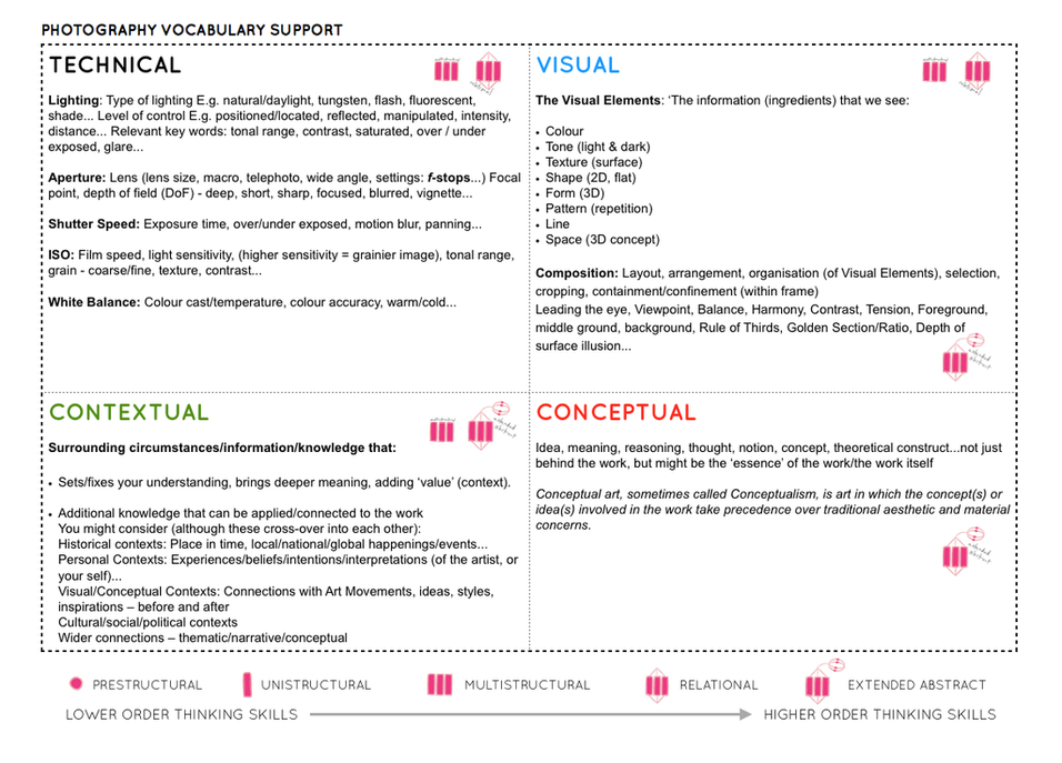
EVALUATING: Compare your portrait responses/ experiments and provide some analysis of artists work and images below that has inspired your ideas and shoots. Use this Photo-Literacy matrix:
Follow the 10 Step Process and create multiple blog posts for each unit to ensure you tackle all Assessment Objectives thoroughly :
- Mood-board, Mind-map of ideas (AO1)definition and introduction (AO1)
- Statement of Intent / proposal
- Artist References / Case Studies (must include image analysis) (AO1)
- Photo-shoot Action Plan (AO3)
- Multiple Photoshoots + contact sheets (AO3)
- Image Selection, sub selection, review and refine ideas (AO2)
- Image Editing/ manipulation / experimentation (AO2)
- Presentation of final outcomes (AO4)
- Compare and contrast your work to your artist reference(AO1)
- Evaluation and Critique (AO1+AO4)
Student exemplars

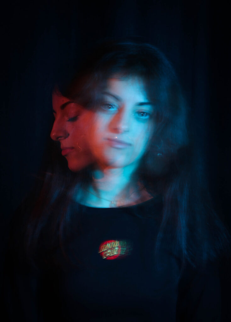

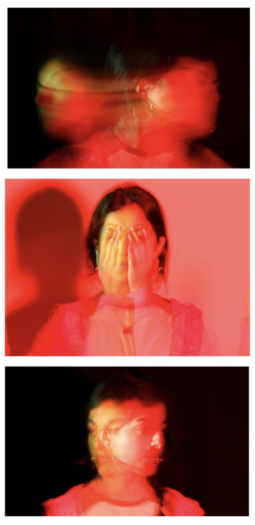
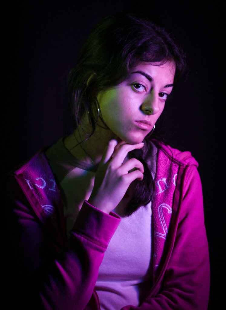
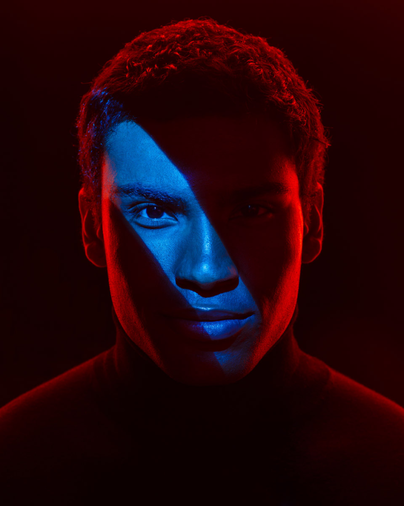
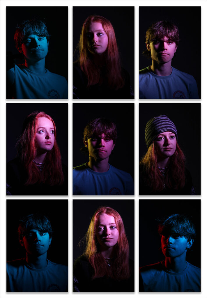
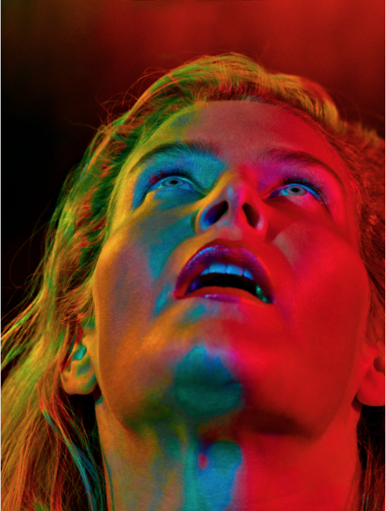
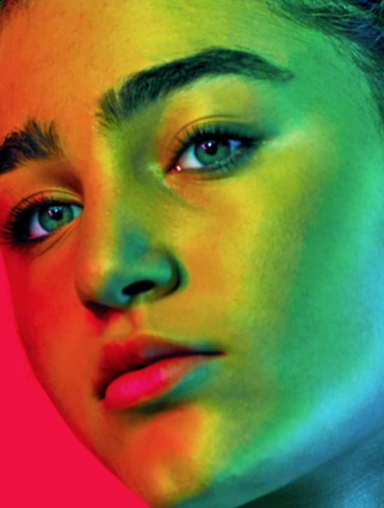
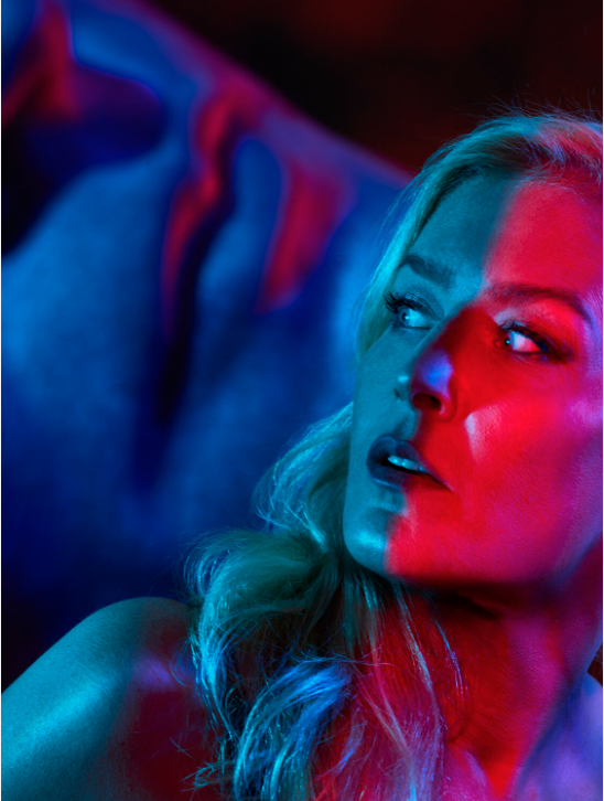
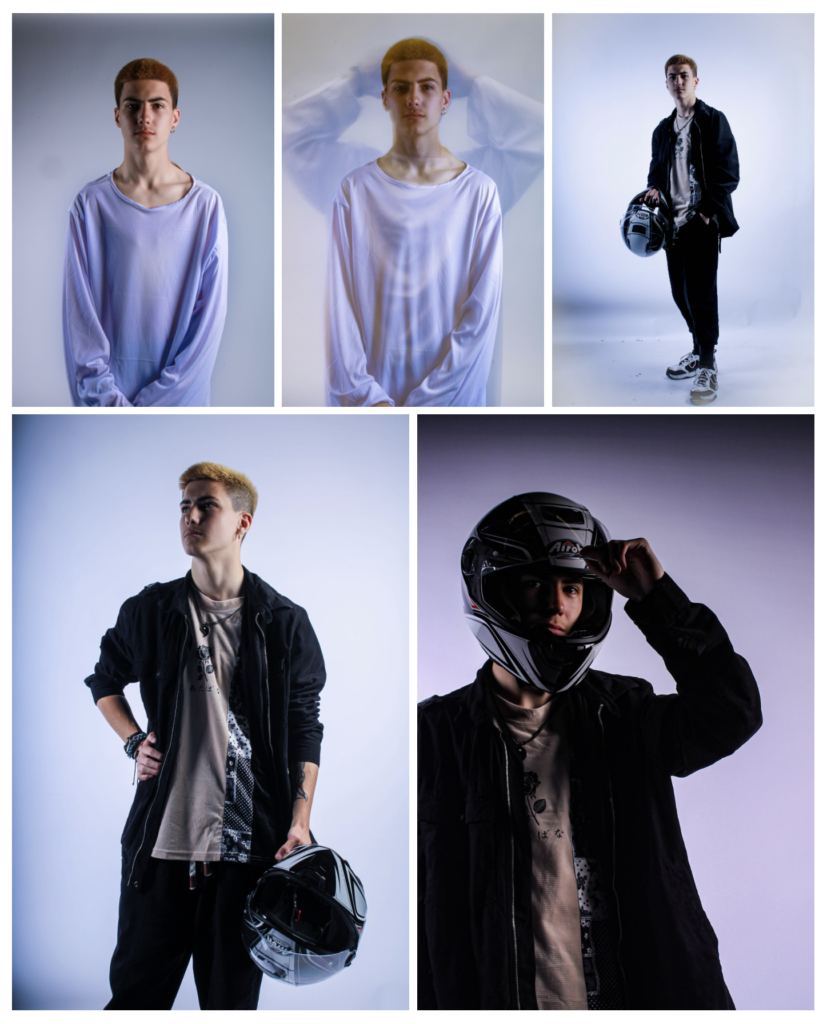
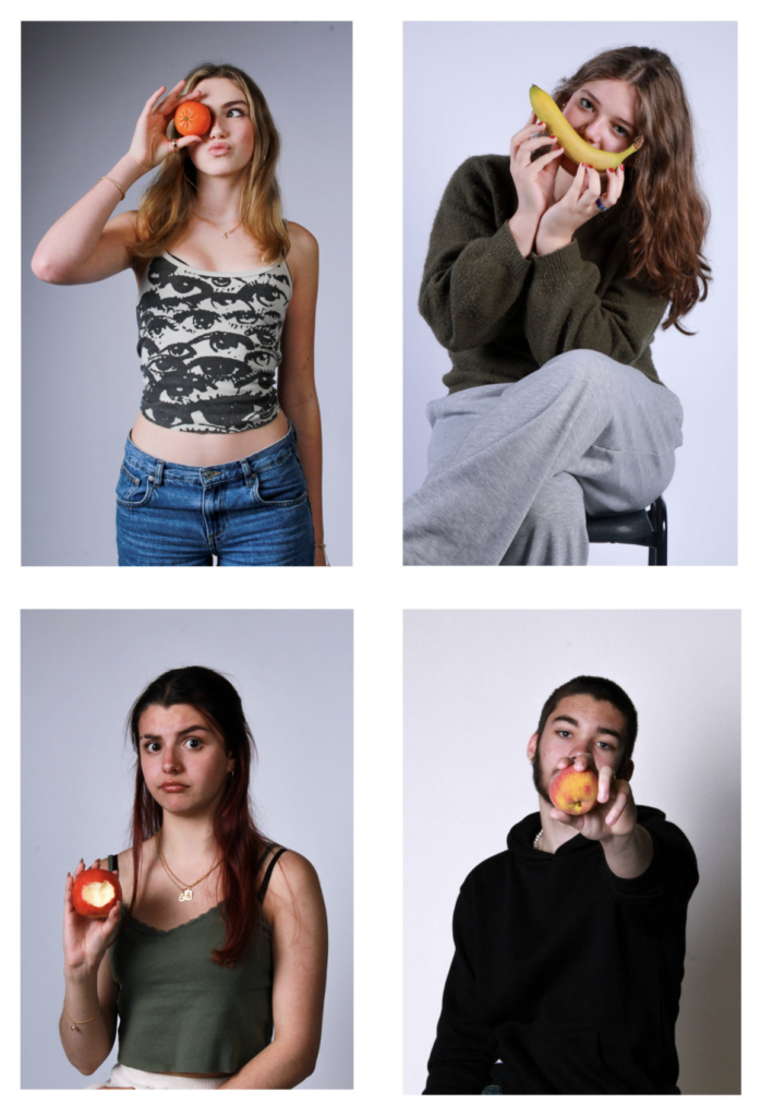
Example Blog Posts
Photoshoot Plan Example
Initial ideas:
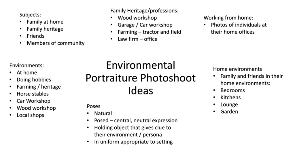
Environments:
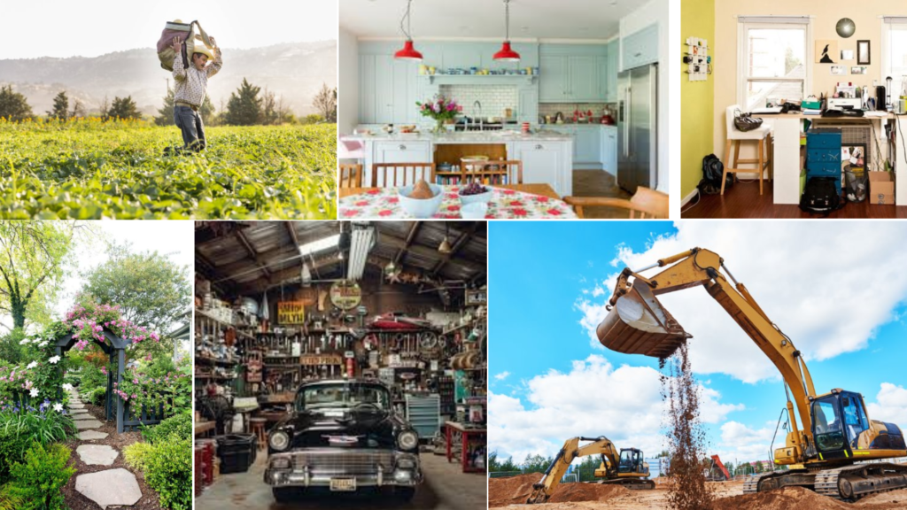
Subject/s: I intend to take photos of my family members.
Environments: Each person will be photographed within an environment that connects to them. E.g:
– Father: will be photographed in his car workshop.
– Mum: will be photographed in her vegetable garden.
– Sister: Will be photographed in her workplace laboratory.
– Cousin: Will be photographed at the rowing club
– Cousin 2: Will be photographed in her band
– Uncle: Will be photographed on his farm
Poses: I intend for the poses to be quite neutral, as if the subject has just paused while in their natural environment.
Gaze: I intend for the subjects to make eye contact with the camera to connect with the viewers more. However, I will also experiment with various different gazes.
Composition: I intend to experiment with various compositions, including central framing and the rule of thirds.
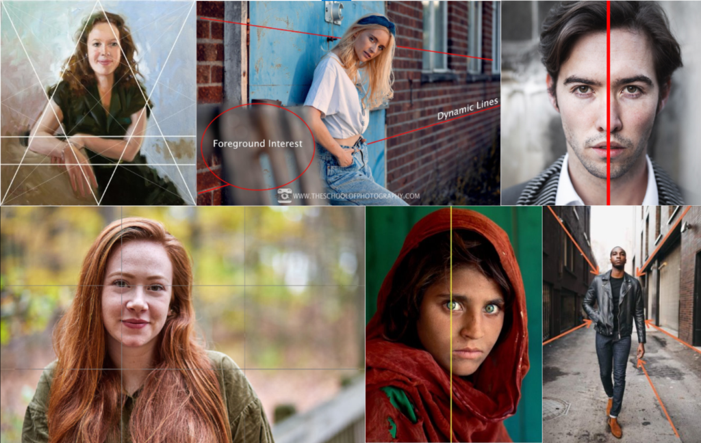
Framing
I will experiment with full body, 1/2 and 3/4 headshots. I will avoid a tighter crop, to ensure that more of the environment is visible.

Orientation:
I intend for most of my portraits to be landscape to show more of the environment.
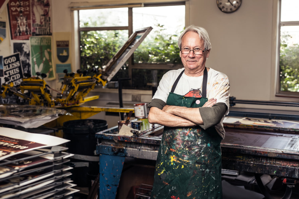
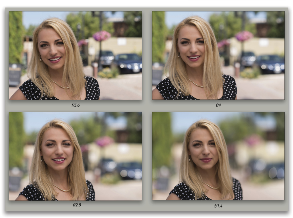
Aperture.
I will experiment with a small / medium aperture to create a long and medium depth of field. This will allow the background to be recognisable and connect people with the environment more.
Artist Research and Analysis Examples
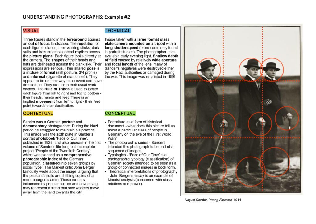
August Sander:
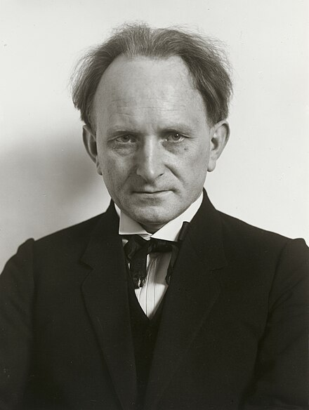
August Sander was a German photographer whose work documented the society he lived in. He was one the most-important portrait photographers of the early 20th century.
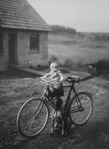
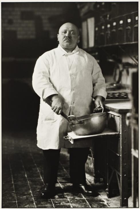
Short Bio:
The son of a mining carpenter, Sander apprenticed as a miner in 1889. Acquiring his first camera in 1892, he took up photography as a hobby and, after military service, pursued it professionally, working in a series of photographic firms and studios in Germany.
By 1904 he had his own studio in Linz, and, after his army service in World War I, he settled permanently in Cologne, where in the 1920s his circle of friends included photographers and painters dedicated to what was called Neue Sachlichkeit, or New Objectivity.
His Photographs:
After photographing local farmers near Cologne, Sander was inspired to produce a series of portraits of German people from all strata of society. He was committed to ‘telling the truth’. His portraits were usually stark, photographed straight on in natural light, with facts of the sitters’ class and profession alluded to through clothing, gesture, and backdrop. At the Cologne Art Society exhibition in 1927, Sander showed 60 photographs of “Man in the Twentieth Century,” and two years later he published Antlitz der Zeit (Face of Our Time), the first of what was projected to be a series offering a sociological, pictorial survey of the class structure of Germany.
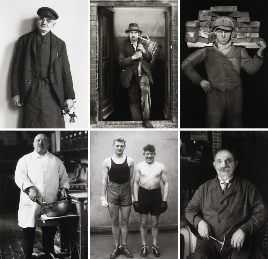
Typologies:
Sanders was one of the first portrait photographer to produce a series of typological studies. ‘The Face of Our Time’ categorised his portraits according to their profession and social class, or ‘types’. As a typology, these photographs prioritized “collecting” rather than stand-alone images. They became a powerful method of revealing a photographic record of the people of his time.
The portraits:
Sanders’ photographs are mostly black-and-white portraits of Germans from various social and economic backgrounds: aristocrats and gypsies, farmers and architects, bohemians and nuns. The portraits often include familiar signifiers (a farmer with his scythe, a pastry cook in a bakery with a large mixing bowl, a painter with his brushes and canvas, musicians with their instruments, and even a “showman” with his accordion and performing bear), but sometimes the visual clues to a subject’s “type” are not so obvious, leaving the title of the work and its placement in one of Sander’s categories to illuminate the subject’s role. The titles Sander assigned to his photographs do not reveal names, and capture one of the project’s many contradictions: Each photograph is a portrait of an individual, and at the same time an image of a type.
“Nothing seemed to me more appropriate than to project an image of our time with absolute fidelity to nature by means of photography,” he once declared.
“Let me speak the truth in all honesty about our age and the people of our age.”
During the war
When the Nazis came to power in 1933, however, Sander was subjected to official disapproval, perhaps because of the natural, almost vulnerable manner in which he showed the people of Germany or perhaps because of the diversity it revealed. The plates for Antlitz der Zeit were seized and destroyed. (One of Sander’s sons, a socialist, was jailed and died in prison.) During this period Sander turned to less-controversial rural landscapes and nature subjects. Late in World War II he returned to his portrait survey, but many of the negatives were destroyed either in bombing raids or, later in 1946, by looters.
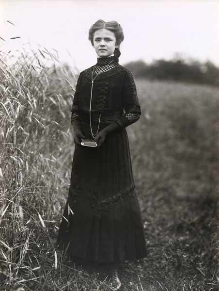
Konfirmandin
In the early portraits such as ‘Konfirmandin (Confirmation Candidate)’, Sander portrays pastoral families in their Sunday-best, an insight on how these communities chose to present themselves to the camera.
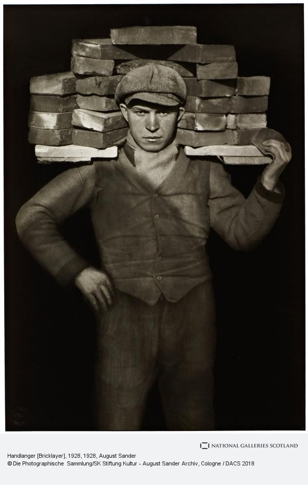
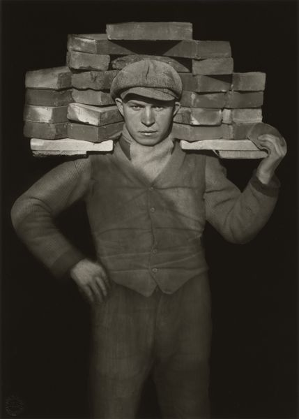
‘Handlanger (Bricklayer)’.
This photograph belongs to ‘The Skilled Tradesman’, one of seven chapters within his ‘People of the 20th Century’ project. The title and subject of this photograph form an archetype of Sander’s sociological documentation of people from a variety of occupations and social classes. Formally, the portrait’s centrality, flat background and conventional framing demonstrate Sander’s investment in photography as a ‘truth-telling’ device; one which represents reality as it is, without formal experimentation and within the boundaries of the history of photographic portraiture. Sander wrote in his seminal lecture ‘Photography as a Universal Language’ that photography was the medium most able to best reflect the ‘physical path to demonstrable truth and understand physiognomy’.
‘Sekretärin beim Westdeutschen Rundfunk in Köln (Secretary at West German Radio in Cologne)’,
When Sander developed People of the 20th Century, he included the group ‘The Woman’. Among these subjects is ‘Sekretärin beim Westdeutschen Rundfunk in Köln (Secretary at West German Radio in Cologne)’, photographed during his work for the German public broadcasting institution ‘Westdeutscher Rudfunk’. The portrait draws comparison to Otto Dix’s ‘Portrait of the Journalist Sylvia von Harden’ painted five years earlier. They both depict a new movement of women at work during the time—simultaneously androgynous and feminine, liberated from the domestic sphere. The portraits are important within the rise of the New Objectivity movement in German art—a reaction against the dominant style of expressionism—seeking a more objective and unsentimental portrayal of the human figure.
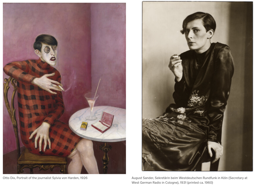
Image Analysis
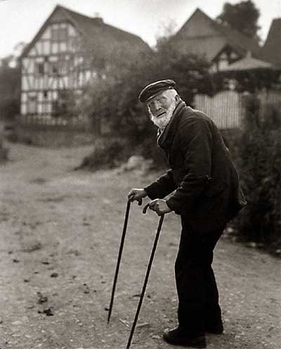
Untitled image, from book: The face of our time, published in 1929
Subject:
This photo consists of an elderly man using his two walking sticks seen in the foreground. He appears to have paused while walking up the lane in the background. We can tell the man is old by his posture, bent and twisted around stiffly to face the camera, as well as the white facial hair.
The subject of the photo looks as if he has been walking along the road and has paused to face the photographer. The subject is positioned to the right of the frame, facing the centre of the frame and towards the negative space to the left. This draws our attention through the photograph to the building in the background, and gives a sense that this is where the man is walking to. His neutral expression gives a sense that this is a natural pose. As if this is not staged, but a photo of a man in his natural environment.
For me, I feel like Sander’s photographical types allow us to connect with the subjects. The eye contact with the camera lures us into the photo, in a neutral and unimposing manner. The subjects seem real, relaxed in their daily routine, and at home in the environment that surrounds them. The photo seems to celebrate everyday types of people, inviting us to get to know the essence of the person in the photo.
The environment:
The house in the background appears to be a traditional Tudor building featuring a façade with white stucco exteriors punctuated with decorative half-timbering or a dark brick-and-stone construction. The traditional building gives a sense that this is a charming and humble environment where the subject lives.
Visual:
This photograph, and all of Sanders’ photographs are black and white. While this is a result of camera limitations of the time, the monotone aesthetic contributes to Sanders’ typographical approach, making each photo appear like it belongs to the same colletion.
The monochromatic aesthetic also enhances the tonal values in the photograph. The dark tone of the shrubbery that sits to the right of the photo with the subject, contrasts the lighter pathway to the left, drawing your eye into the photo and towards the house.
The unkept and rustic texture of the shrubbery and pathway suggests that this is a rural area.
Leading Lines
The main leading line draws your attention from the bottom right corner of the page, up to the subject and then through to the house.
Furthermore, the angle of the walking sticks lead the eye directly to the subject’s face.

Balance:
The line created by the shrubs in the background and cut through the photo, divide the photo into two halves. The bottom half consists of the pathway, a more empty or negative space, to contrast the weight of the details in the top half of the photo.
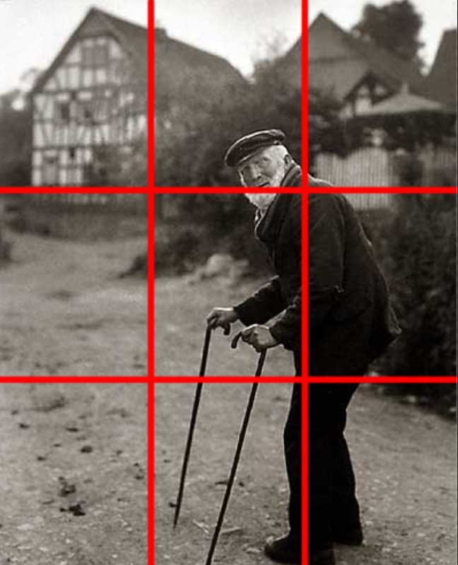
Composition:
Looking closely it could appear that Sander has used the rule of thirds to construct this image. The subject sits on the intersection of the right third, while the house sits within the top left third. The subject occupies 2 thirds of the photo, making it the primary focus.
Angle:
The photo is taken from an eye-level direct perspective. This creates a more intimate connection between the subject and the viewer, it gives a very neutral eye.
Technical
This photo uses natural lighting, contributing to the genuine nature of the photograph. The balanced exposure is free from formal experimentation.
The large aperture in this photo creates a shorter depth of field, bringing our attention to the foreground of the photo – the subject.
Context:

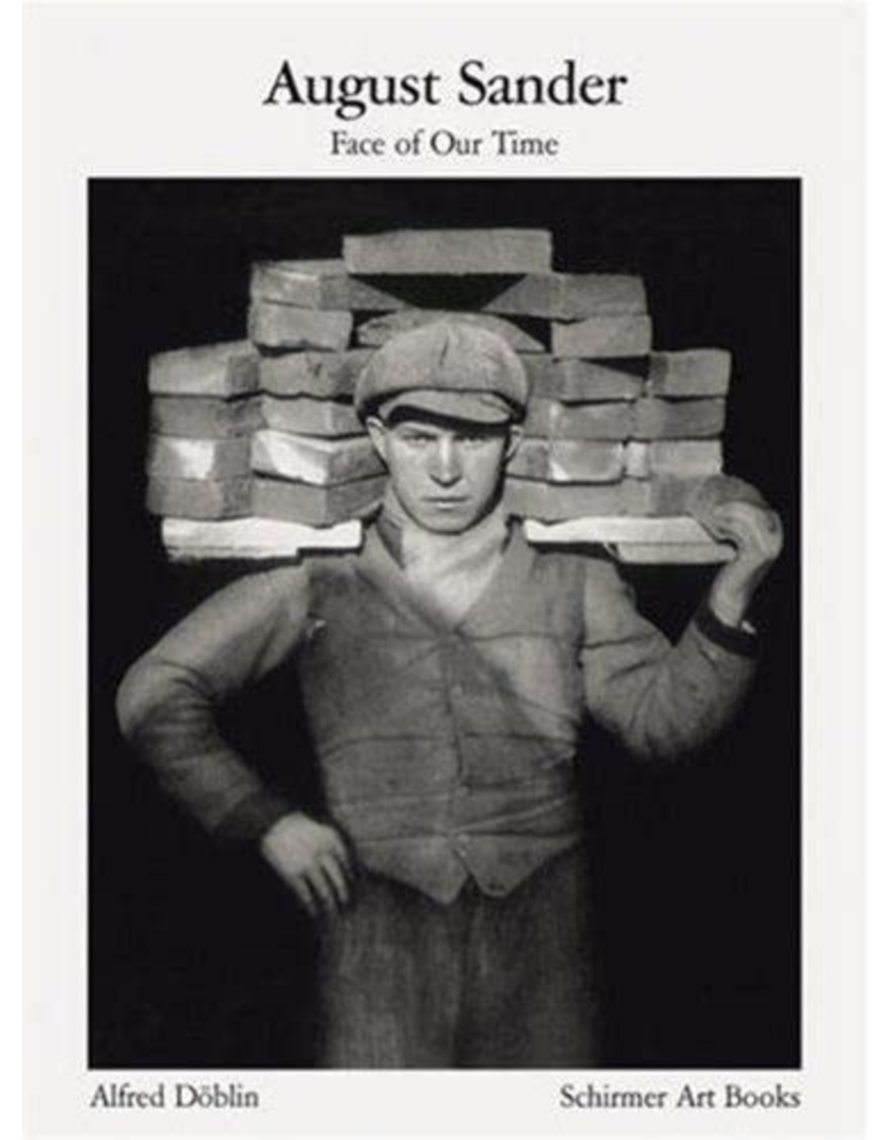
This photograph is from Sanders’ book ‘Face of our time’. The book was first published in 1929, with a foreword by German writer Alfred Dublin. On its first publication, it was advertised as follows: “The sixty shots of twentieth-century Germans which the author includes in his Face of Our Time represent only a small selection drawn from August Sander’s major work, which he began in 1910 and which he has spent twenty years producing and adding fresh nuances to. The author has not approached this immense self-imposed task from an academic standpoint, nor with scientific aids, and has received advice neither from racial theorists nor from social researchers. He has approached his task as a photographer from his own immediate observations of human nature and human appearances, of the human environment, and with an infallible instinct for what is genuine and essential.
Conceptual:
The book is not ‘faces’ of our time, but ‘face’, singular. Suggesting that collectively, these people make one. It could be suggested that Sander’s concept was to unite these people as one collective representation of his time. There is no theory behind the work, just a look at the this period of time, on the face of it.
Another analysis layout:


