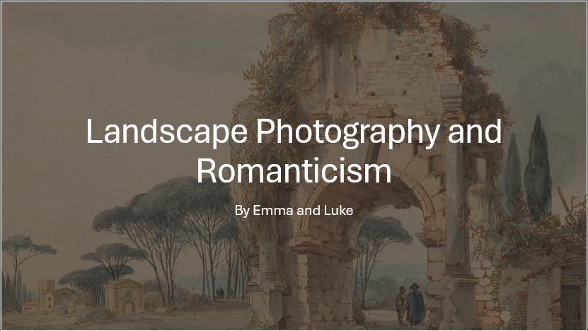

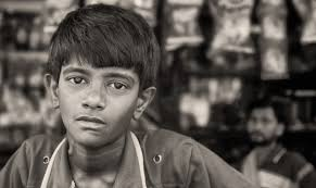
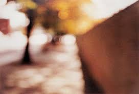
Early Landscape Art (Pre-Renaissance to 16th Century) –
—
Renaissance and Early Modern Art –
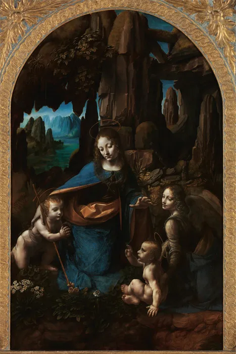
The Renaissance (14th-17th century) brought a shift in perspective in terms of landscapes, Artists began to focus on nature a lot more in a more realistic way, however, these landscapes were most commonly second to human subjects in art works, such as Leonardo da Vinci’s “The Virgin of the Rocks” (1483), where the landscape serves as a setting for the religious narrative but is not the primary focus.
Baroque and the Rise of Dramatic Landscapes (17th Century) –
–
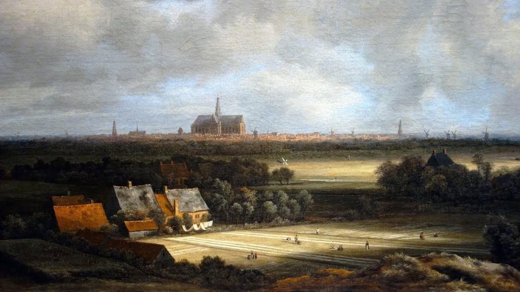
Dramatic Landscape Painting –
The Baroque period (17th century) was used to evoke deep emotions and convey a sense of awe in art, artists such as Jacob van Ruisdael used it within his work to show a vast, expansive sky that dominates the scene. The use of atmospheric effects such as light and weather brings the landscape to life, giving it a grandeur that transcends mere setting. Especially in his work “View of Haarlem with Bleaching Grounds” (1670).
—
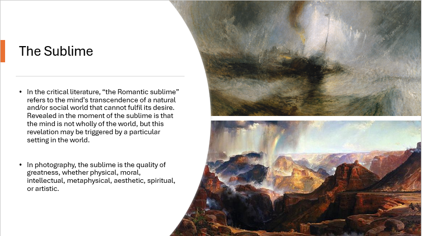
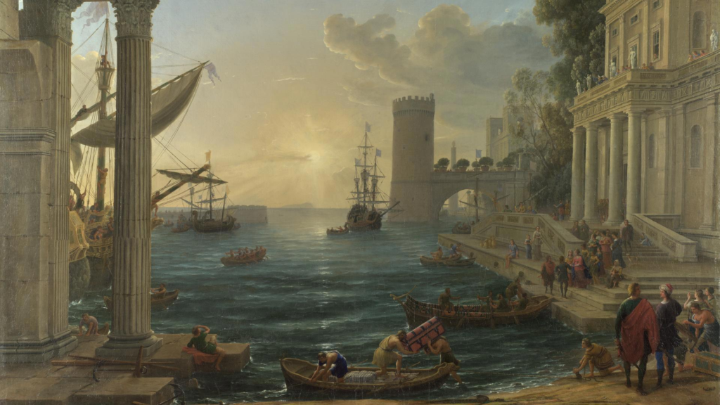
The Sublime –
Philosophers like Edmund Burke introduced the idea of the sublime, which the quality of greatness, whether physical, moral, intellectual, metaphysical, aesthetic, spiritual, or artistic. The term especially refers to a greatness beyond all possibility of calculation, measurement, or imitation. Claude Lorrain’s “Seaport with the Embarkation of the Queen of Sheba” (1648) reflects this sublime quality, with vast skies and dramatic lighting that evoke feelings of awe and reverence.
—
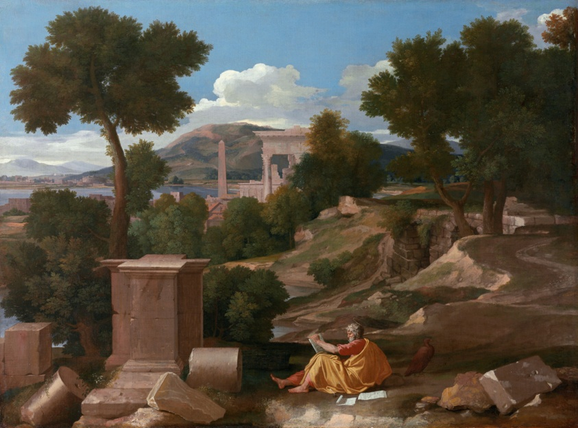
Symbolism in Baroque Landscapes –
Many Baroque landscapes were not realistic depictions but messages often holding religious meaning. In Nicolas Poussin’s “Landscape with Saint John on Patmos” (1640), the landscape becomes more than just scenery—it conveys a deeper meaning, portraying nature as a place of divine reflection or contemplation.
—
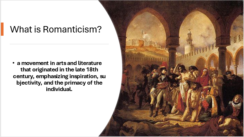
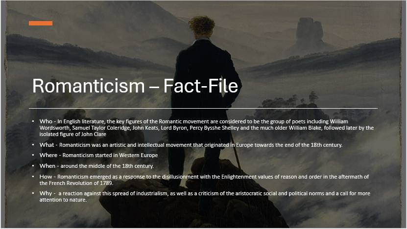
Romanticism (Late 18th – Early 19th Century) –
—
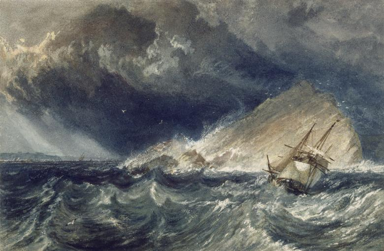
The Embrace of the Sublime –
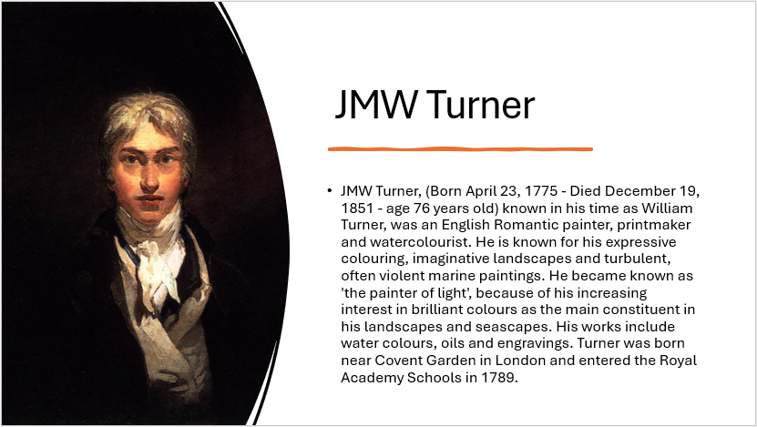
Romanticism, emerging in the late 18th and early 19th centuries, fully embraced the sublime and took it to new emotional and spiritual heights. One artist who embraced sublime in this era was Joseph Mallord William Turner who created the painting (1775-1851) A Ship against the Mewstone.
—
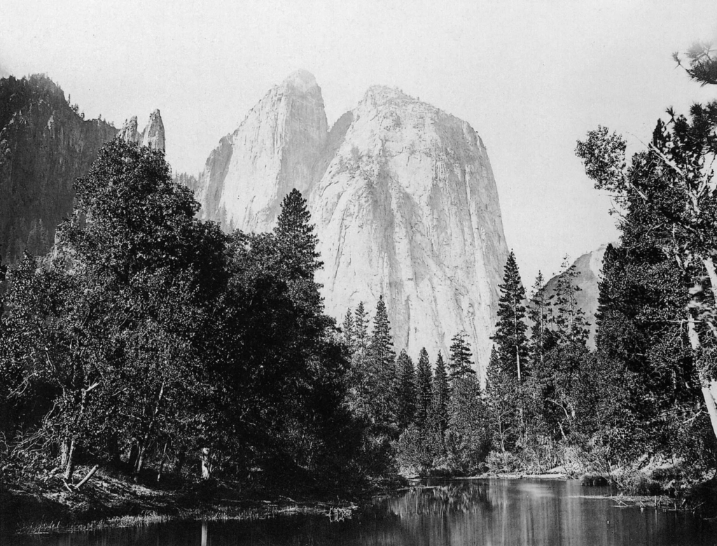
Birth of landscape photography –
When photography was invented in 1839 landscapes were among the first subjects, an example of these early artists is Carleton Watkins who captured the vast American west, his work helped inspire the creation of national parks. An example of one of his images is A 19th-century view of El Capitan in Yosemite Valley, east-central California, U.S.; photograph by Carleton E. Watkins, c. 1866.
—
20th century –
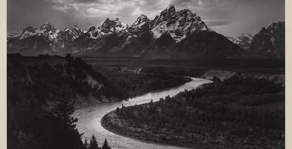
Early 20th century, modernism –
– Ansel Adams used sharp detailed realism in his work, almost sublime, with work such as The Tetons and Snake River, Grand Teton National Park, Wyoming, 1942 Photograph.
– Others experimented with abstraction and surrealism.
—
Modern day –
– Traditional sublime landscapes
– Climate change and environmental crisis
– Conceptual landscape
– Digital manipulation
– Social media impact
What is identity?
Identity is the term used that, in short, makes a person who they are. Your identity can be influenced in many different ways by many different factors, such as – your environment or upbringing with reference to gender identity, cultural identity, social identity, geographical identity, political identity, lack of, loss of identity, stereotypes and prejudices. All of these create and mould the kind of person that you are today and will be in the feature. This in simple terms as the dictionary puts it ‘the distinguishing character or personality of an individual‘.
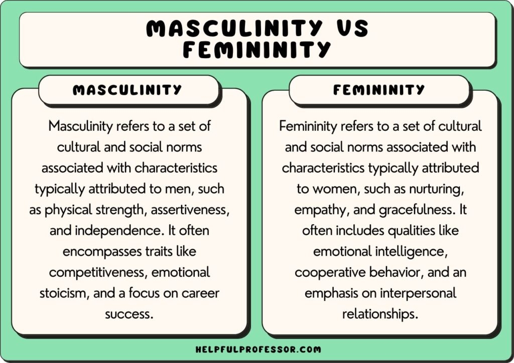
Masculinity vs Femininity
explain how identity can be influenced?
Identity is shaped by “place” in many ways, as our environment influences how we see ourselves and how others perceive us. Gender, cultural, social, geographical, and political identities are often formed by the norms, values, and expectations of the places we belong to. For example, a particular culture or community may define gender roles, while a specific geographic or political context can impact one’s sense of belonging or alienation. Stereotypes and prejudices based on place can further affect how we express our identity, sometimes leading to a loss of self or a struggle to fit in. Thus, our identity is not just personal but shaped by the places and societies we interact with.
Case study – Claude Cahun
Who were they ?
Claude Cahun, (born October 25, 1894, Nantes, France—died December 8, 1954, St. Helier, Jersey), was a French surrealist photographer, sculptor, and writer in which she is best known for her self portraits in which she explored many different personas, but overall using the same style, while spreading the same message with each one. In 1937 she moved to Jersey with her step sister and lover, Marcel Moore and because of this she ended up being captured by the Nazis in the German occupation of Jersey, because of this she died in German captivity in 1954 through illness and from the harsh living conditions she most likely had to go through. Because of the difficult times caused by the struggles and prejudice from this time in history that she had to endure, most likely influenced the ideas and point she was trying to make within her work. As said by Cahun “Masculine? Feminine? It depends on the situation. Neuter is the only gender that always suits me.”, through this she is trying to convey an idea that was not only uncommon in those times, but also unpopular in which she created an idea much more ahead of its time which inevitably, coinciding with her Jewish heritage, resulted in her capture and demise. Cahun’s not so much sacrifice but identity which was abnormal to the world she lived in has helped to shape the way people are treated and the way identity is viewed within the world of photography. Cahun’s lover and step sister, Moore killed herself in 1972. They are both buried together in St Brelade’s churchyard as lasting memories of what they fought for.
Moodboard
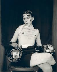
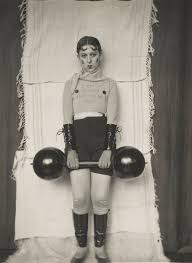
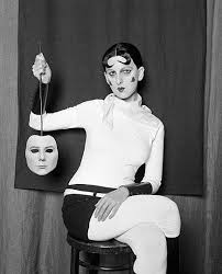
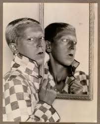
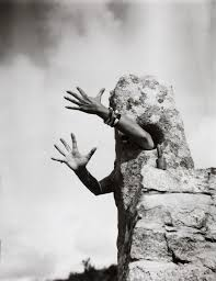
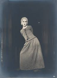
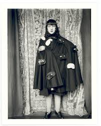
Image analysis –

In the image you can see above we can get a broad yet good idea of how Cahun created her images and the idea she was trying to convey to the viewer of the image. As you can see the image is taken in black and white, which was likely to do with the time period it was taken in, the image is well lighted, it is sharp most likely using a 50 mm lens, she likely used a fast shutter speed in this image and ISO was probably relatively low due to good lighting. I plan to try to incorporate these features throughout my work while also using similar framing, form and other visual features. In the image we can see Cahun is created a more masculine look which is seen throughout her work in which she blurs the lines between masculinity and femininity. Within the image we can see that she has used a mirror, in the use of this simple object, she has created a deeper meaning and shown two sides to the story, in my work I plan to use this in an abstract way that can be interpreted but also has a clear meaning to it.
Quote –
“Masculine? Feminine? It depends on the situation. Neuter is the only gender that always suits me.”
Second artist reference – Clare rae
Who is she ?
Clare Rae, an artist from Melbourne, Australia who produces photographs and moving image works that interrogate representations of the female body via an exploration of the physical environment. Rae visited Jersey as part of the Archisle international artist-in-residence programme in 2017. She was researching the Claude Cahun archive, shooting new photography and film in Jersey, as well as running workshops.
Image analysis –
In the image you can see above Clare Rae has used Cahun as an artist reference trying to convey the same ideas that she did. As you can see the image is taken in black and white, which was likely to do with the artist reference she used, the image is well lighted in an outdoor environment, it is sharp most likely using a 50 mm lens, she likely used a fast shutter speed in this image and ISO was probably relatively low due to good lighting. I plan to try to incorporate these features throughout my work while also using similar framing, form and other visual features. In the image we can see Rae is hiding her face to create a mysterious atmosphere with abstract yet clear ideas. Within the image we can see that she has used rock which fits in with how she creates her work by embodying the natural environment within the image, I plan to take this idea within my work to further convey this idea.
Quote –
“I am the (sublime) space where I am, that surrounds me with countless presences.”
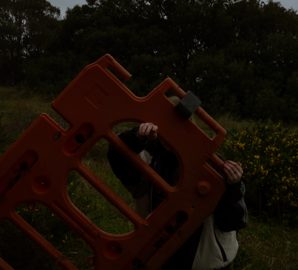
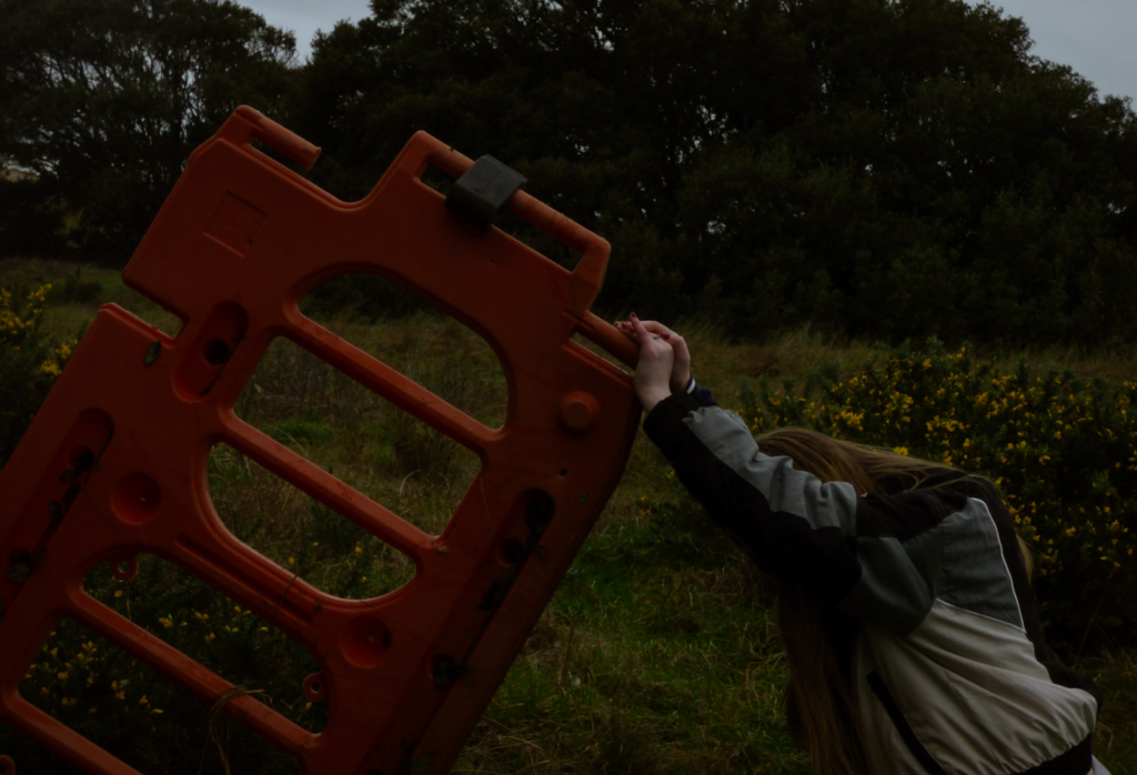
Photoshoot plan –
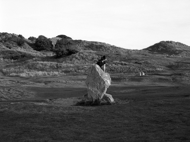
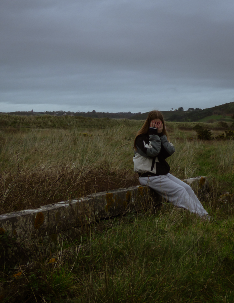
I plan to go down to the sand dunes and use the surroundings as props in my images much like both my artist references did and attempt to use similar visual and contextual elements while it still having a focus on the story I am trying to create. I plan to get the subjects in my image to hide their faces which will create a mysterious and deep image. Much like Clare Rae, I will interrogate representations of the body via an exploration of the physical environment.
Contact sheet
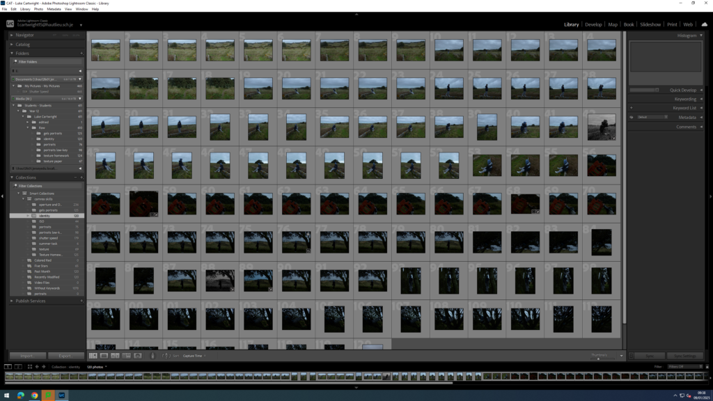
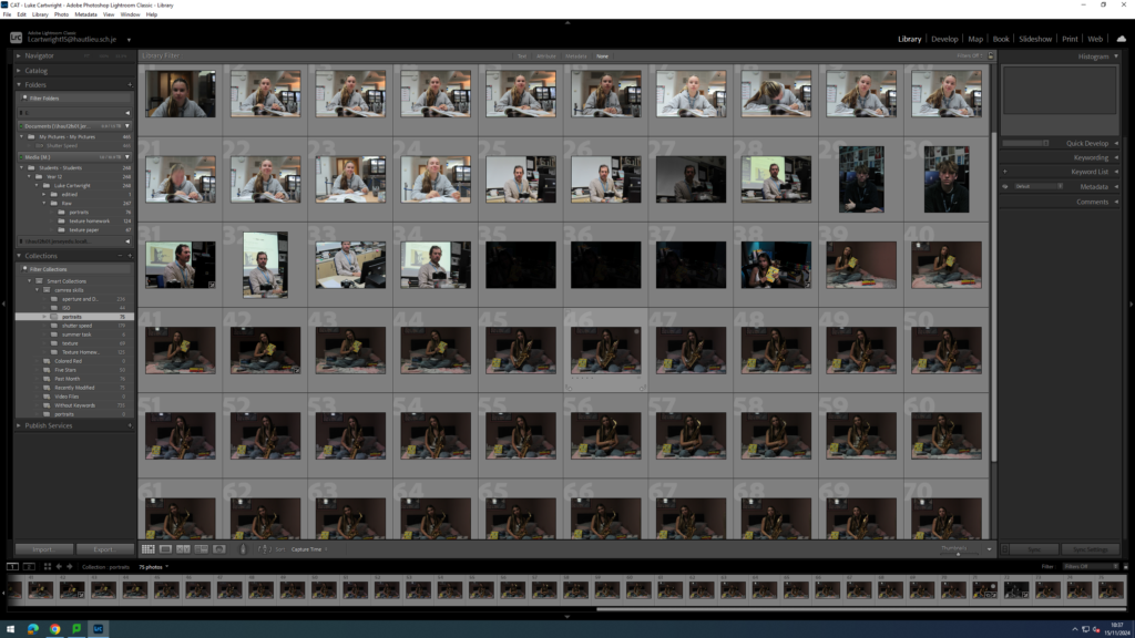
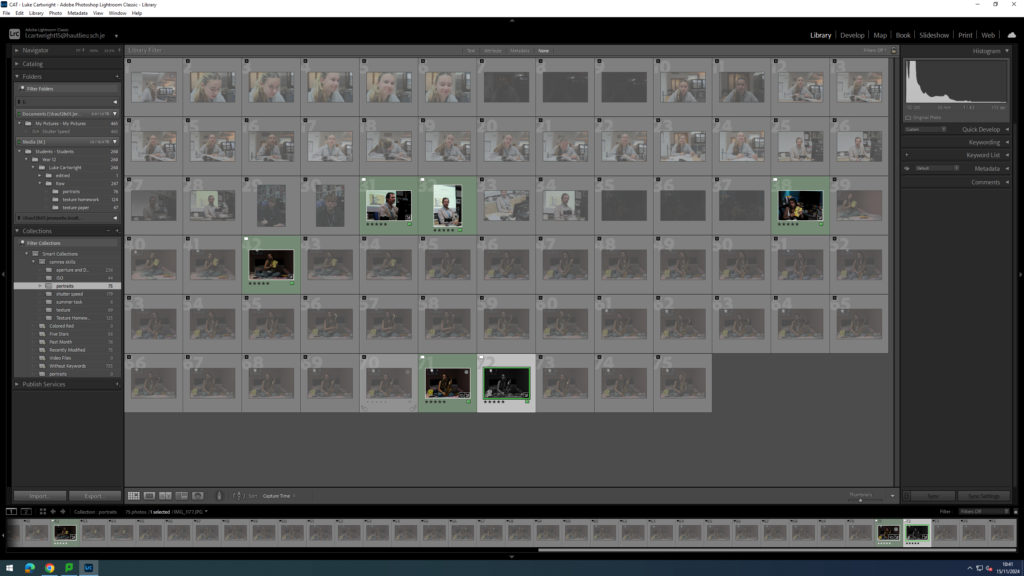
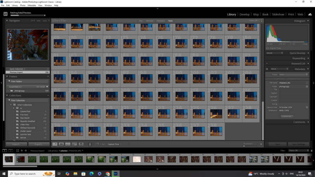
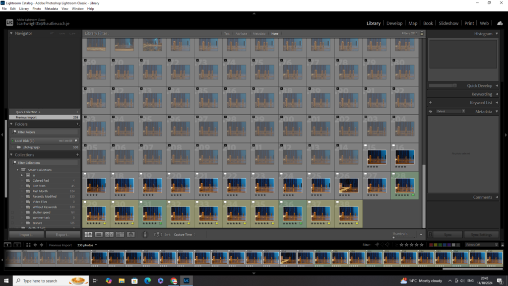
Image selection
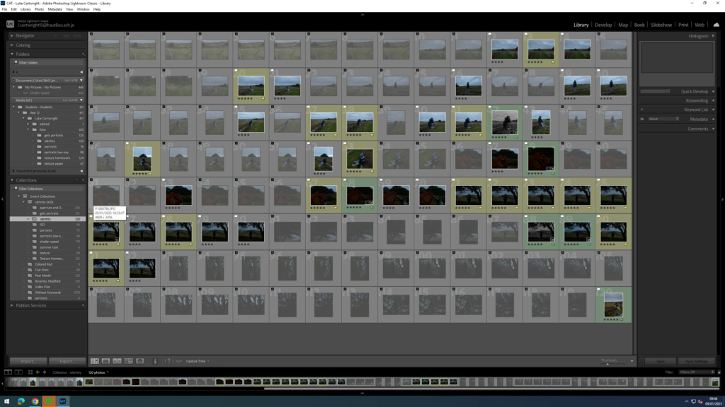
as you can see above I used P and X to flag my images to filter out the bad ones from the ok and good ones, next I rated these images 4 or 5 stars as 4 being ok ones and 5 being good ones, finally I gave them the colour yellow or green, green being the best and yellow being good. I will now edit these images that I selected and present them bellow.
Experimentation
Photoshop –
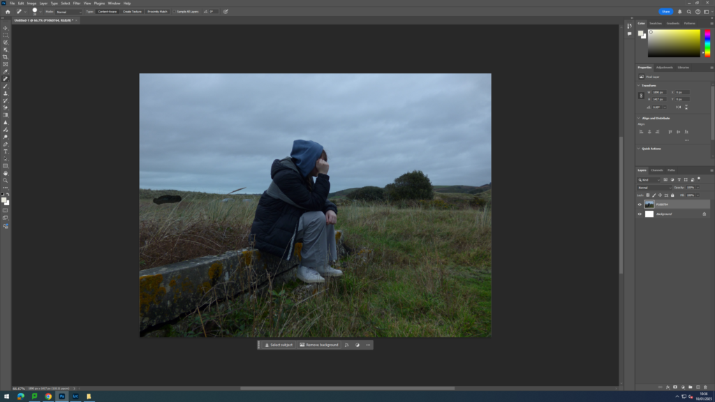
As you can see in the image above I used the spot healing brush tool in photoshop to remove the cars and people in the background of the image.
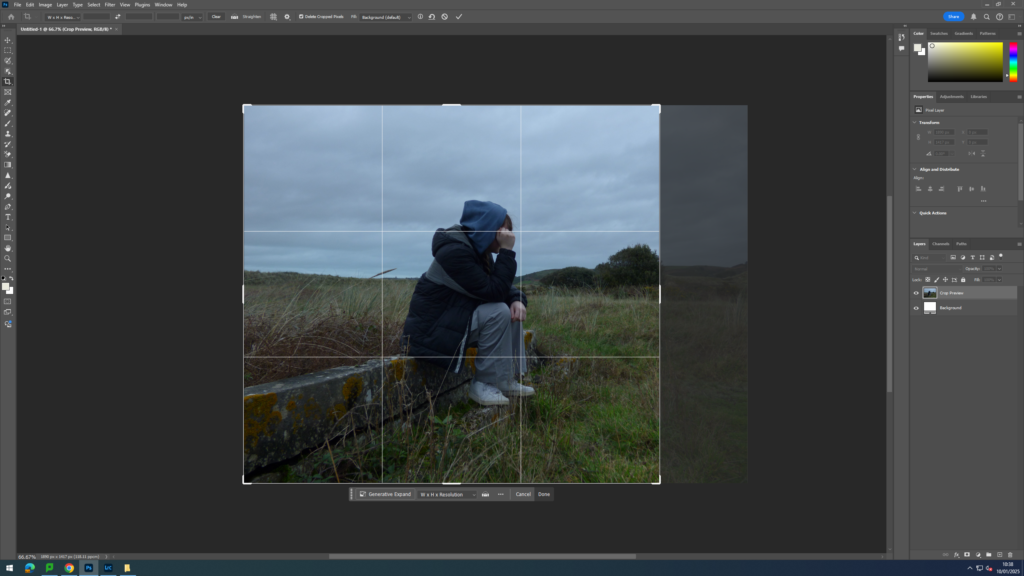
I then used the cropping tool to centre the subject of the image a bit more so the wall more creates line that leads up them.
Lightroom –
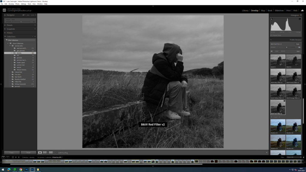
I then went into light room and had a look at some black and white filters that were available just to see if anything worked and found this one (B&W Red Filter V2), if I didn’t find one I liked I would have done this myself.
Outcome –
I then repeated this process throughout my selected images.
Final images

Evaluation
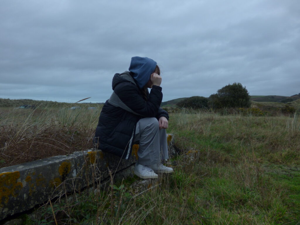
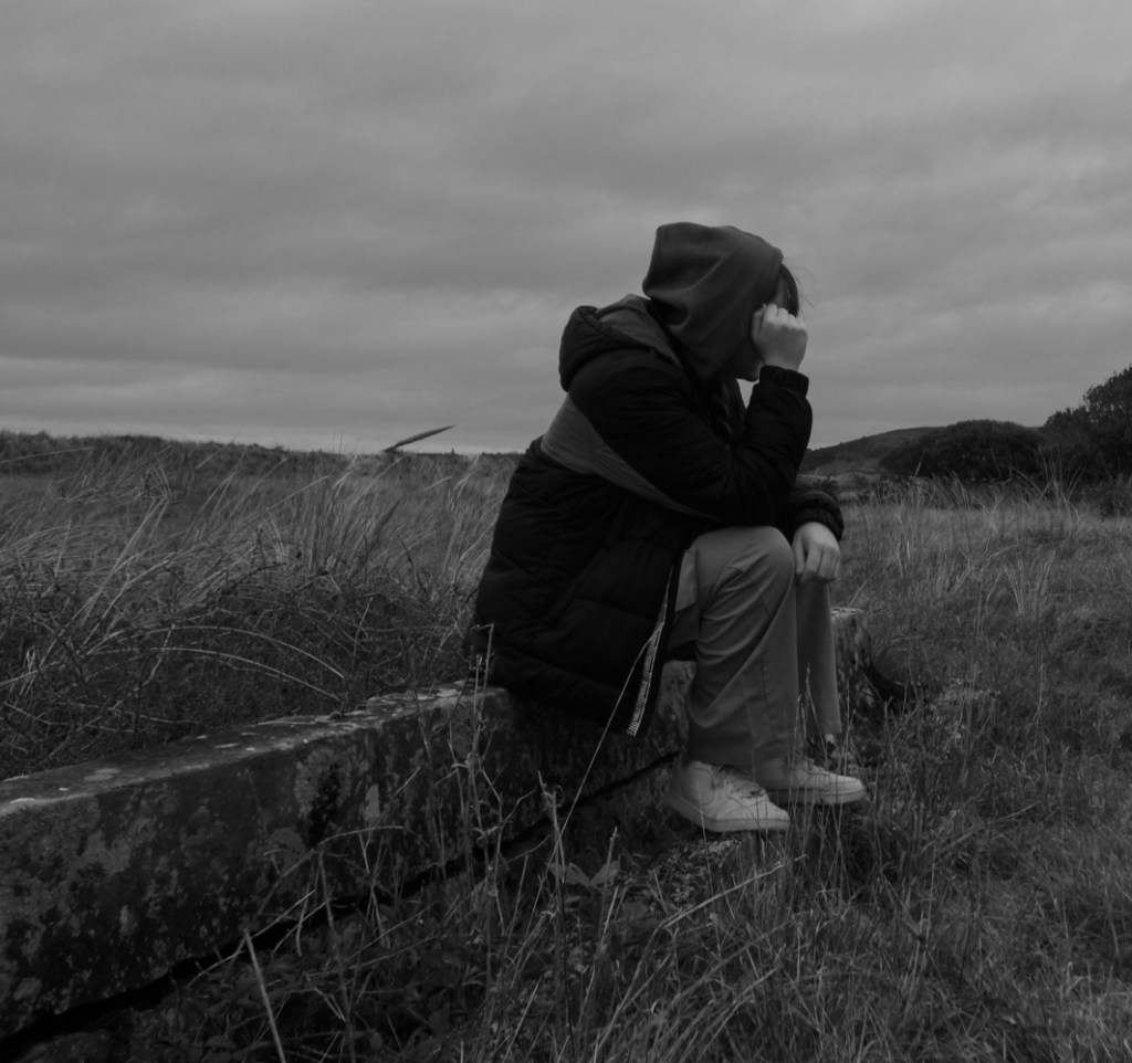
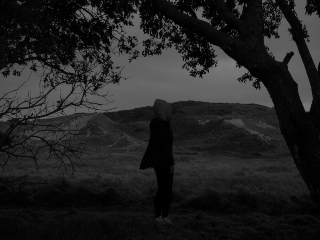
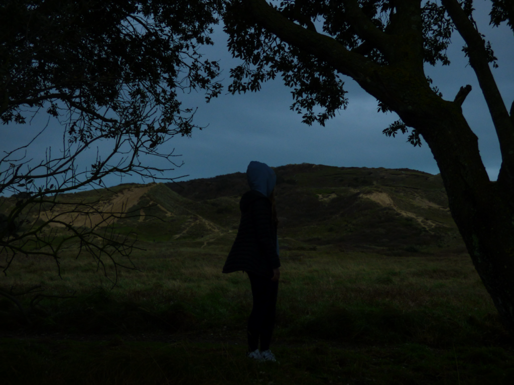
As you can see in the images above I have selected, edited and presented six final images from my identity photoshoot. Although these images may look different in appearance, they hold the same meaning which are taken from my artist references which explored masculinity vs femininity and my experiences.
In all of these images you can see that the subjects are hiding there faces from the camera, I have chosen that they do this to blur the line between masculinity and femininity much like Claude Cahun did in there work, on top of this, in Cahun’s work they had expressionless features on there face in which further imbedded this idea. My second artist reference for this photoshoot was Clair Rae, Rae used herself as an expression of her emotions in her images, often attempting to use the environment around her to do so, although in some images it is only used slightly, I tried to use this idea as much as possible allow interpretation from a viewer of the image, but also allowing me to create my own ideas within the bigger picture. Within the images above I attempted to create the idea of struggle which not only Cahun went through, but people all around the world go through every day for many different reasons.
Overall, I believe that although this was a good photoshoot and got some pretty good images in terms of identity, I could’ve done better and tried to stick more to my artist references and masculinity vs femininity as a whole. In my next photoshoot for this I plan to use this as a learning experience and keep what went well and change what could’ve been done better.
Virtual gallery
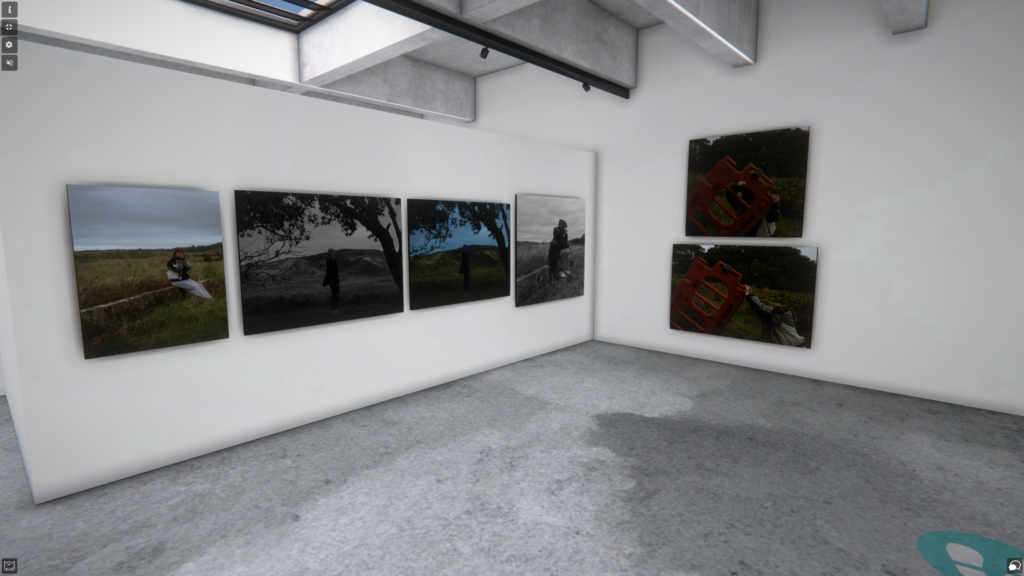
Moodboard


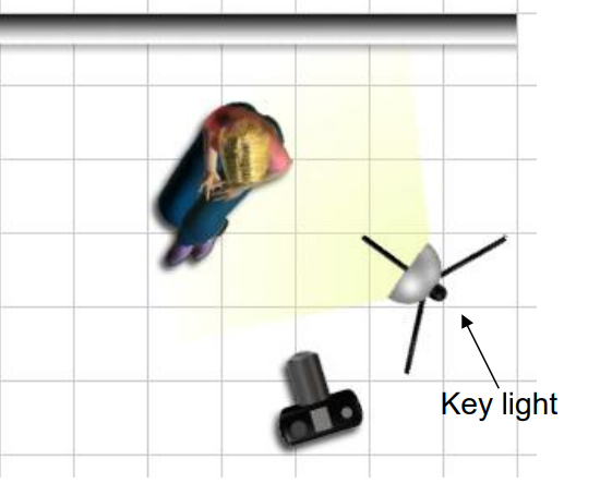
What is studio lighting and why do we use it?
Studio lighting, which is also referred to as strobe lighting is used for portraiture photography to allow for more versatile and unique images to be possible and gives the photographer creative control.
Studio lighting is used for a number of reasons, one of them being that it helps to illuminate an image and the subject that can create unique shadows that cant be created anywhere else, another reason studio lighting is that it allows the photographer to be able to put there idea into action quickly and with the correct tools.
What is low-key lighting?
Low-key lighting is a type of lighting used which create shadows that can be used in many different ways, such as it can be used to invoke emotions and tell a story about the subject of the image.

What is high-key lighting?
High-key lighting is a method of lighting that is used in photography that lights up the subject of it as much as possible, it removes the idea of any emotions and more just puts the focus on the subject which is good for advertising.

What is the difference between 1-2-3 point lighting and what does each technique provide?
1 point lighting – it uses one key light and creates deep shadows and high contrast which is good for moody effects.

2 point lighting – it adds a filler light to the key light that is already being used, this lessens contrast and reduces shadows which provides more balance.

3 point lighting – it adds a back light along with the other lights used which creates an effect where the subject is separate from the background which helps to create depth.

What is fill light?
A fill light is a type of light that is used in 3 point lighting, it is often used in film and media, but it is also used quite a lot in photography while in a studio setting. It helps to light up shadowy parts of the image which in tern gives the effect of less contrast that is visible in the image and helps to create depth.

Artist references
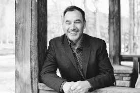
Nadav Kander –
Who is he – Nadav Kander is a London based photographer who was born in December 1961, he is most well known for his landscape but primarily his portraiture photography. In his early life he worked in the south African air force working as a darkroom printer while taking images of aircraft, this was most likely what kicked off his photography journey and turned it into his feature career. In more modern times he is now quite a famous photographer and has won many awards over the course of his life.

Some of his work –

This piece of work is from a set of images taken by Kander of former president of the USA barack obama and was taken in 2012 for the Person of the year award. I believe he has him standing in this formal position along with the averted gaze to give the subject a serious manor and someone to be respected.
—-

This is a photograph of sir David Attenborough who is a famous wild life documentary producer. The formal pose and engagement with the camera represents emotions that people feel while seeing him as they have probably heared of him for most of their lives.
—-
Nadav Kander quote –
“These days, things seem to be so transparent.” – Nadav Kander
Photoshoot action plan
I plan to go to the studio and take pictures while using different types of lighting, I will represent the images of me attempting and succeeding to create these types of lighting.
Photoshoots
—
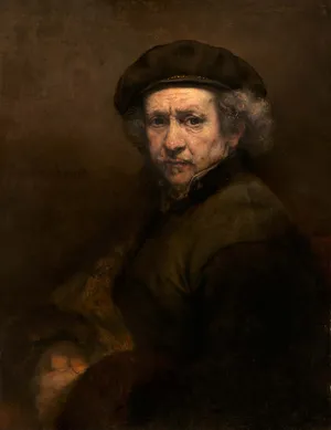
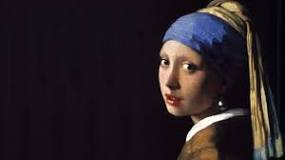
Rembrandt lighting –
—
Contact sheet –

Image selection

as you can see above I used P and X to flag my images to filter out the bad ones from the ok and good ones, next I rated these images 4 or 5 stars as 4 being ok ones and 5 being good ones, finally I gave them the colour yellow or green, green being the best and yellow being good. I will now edit these images that I selected and present them bellow.
Image editing

On the right of the image you can see all I have done is makes some slight adjustments to the contrast and other things like that.

Next you can see I decided to crop the image to centre the subject a bit more.
Final outcome
As you can see above from my final outcome image of Rembrandt lighting I have taken inspiration from my artist reference and my mood board by getting the subject to engage with the camera with a relaxed and professional expression and took the shot with a half-body angle like Nadav Kander did with the subjects of his images, by doing this it allows the viewer to interpret and understand what the image is.
Overall evaluation
Overall I believe that I was successful in not only being able to capture the type of lighting I was looking for, but also being able to capture the idea behind it and was also able to capture ideas from my artist reference.
—
Butterfly lighting –
—
Contact sheet –

Image selection

as you can see above I used P and X to flag my images to filter out the bad ones from the ok and good ones, next I rated these images 4 or 5 stars as 4 being ok ones and 5 being good ones, finally I gave them the colour yellow or green, green being the best and yellow being good. I will now edit these images that I selected and present them bellow.
Image editing

On the right of the image you can see all I have done is makes some slight adjustments to the contrast and other things like that.

Next you can see I decided to crop the image to centre the subject a bit more.
Final outcome


As you can see above from my final outcome images of Butterfly lighting I have taken inspiration from my artist reference and my mood board by getting the subject to engage with the camera with a relaxed and professional expression like Nadav Kander did while also still capturing the shape of the butterfly under the nose. I also decided to use a half body shot as I remembered that is what my artist reference liked to do.
Overall evaluation
Overall I believe that I was successful in not only being able to capture the type of lighting I was looking for, but also being able to capture the idea behind it and was also able to capture ideas from my artist reference.
Virtual gallery representation

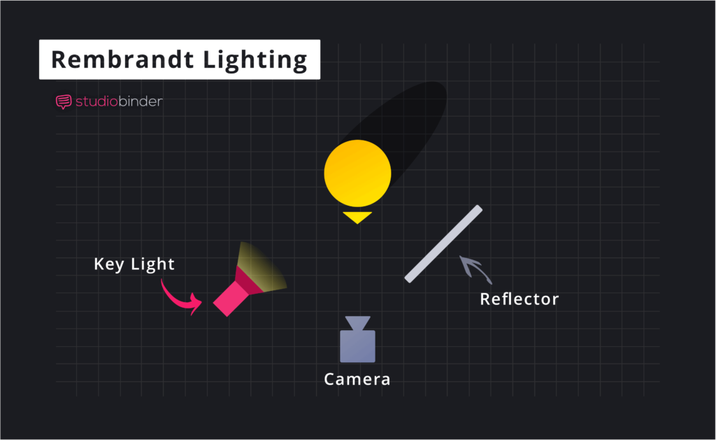
What is Rembrandt lighting?
Rembrandt lighting is a technique that is used in portraiture which is named after named after Rembrandt Harmenszoon van Rijn who was a Dutch painter. It is a method of lighting the face which in doing so makes it so an inverted light triangle is created under the eyes.

Why should you use it?
Rembrandt Lighting should be used because it makes the subject the main focus of the image by creating a lit up face and a dark background, in doing so the eye of the subject of the image is the first thing that you will see giving a unique view point of the image. Using this style of creative writing is something that will help the portrait that you have taken stand out while still being something different from what people usually expect.
Who was Rembrandt?
Rembrandt (born July 15, 1606, Leiden, Netherlands—died October 4, 1669, Amsterdam) was a Dutch painter, he was a very talented artist and was well known for being able to catch people moods in his portraits, he was also well known for the use of shadows in his work.
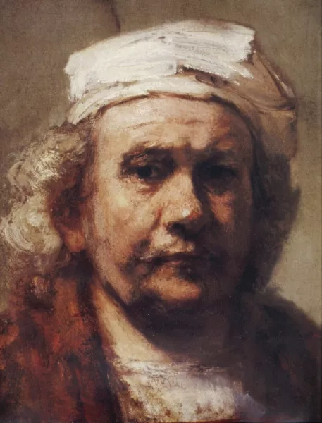
How to create a Rembrandt Lighting set up –
Light: Lighting styles are determined by the positioning of your light source. Rembrandt lighting is created by the single light source being at a 40 to 45-degree angle and higher than the subject. Use cans use both flashlights and continuous lights.
Lens: Use a 35mm or 50mm if space is at a premium – or if you’re looking at including more of the subject than just the head and shoulders. A 50mm works really nicely for portraits and will give a nice depth of field if you’re shooting at a shallow aperture. But a 35mm will give you a wider point of view and is great to fit more of the body in of your subject.
Camera settings (flash lighting)
Tripod
White balance: daylight (5000K)
ISO: 100
Exposure: Manual 1/125 shutter-speed > f/16 aperture
Focal length: 105mm portrait lens
Camera settings (continuous lighting)
Tripod
Manual exposure mode
White balance
ISO: 400-1600 – depending on how many light sources are used
Exposure: Manual 1/60-1/125 shutter-speed > f/4-f/8 aperture
Focal length: 50mm portrait lens
What is butterfly lighting?
Butterfly lighting is a form of studio lighting that is usually used within portraiture photography, as the name suggests the lighting used forms a butterfly shape under the nose of the subject of the image. This is because the light comes from above the camera and you face creates the shadow.
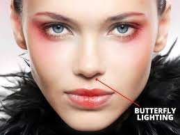
Why should you use it?
Butterfly lighting should be used in photography as it gives an appearance of the subject having a narrow face, on top of this, the camera is centred on the face and they are engaging with the camera, this is beneficial as it creates a different atmosphere than other images than usual, it not only is a great method for making the subject stand out but it also does so in a unique unusual way to what is normal making you images stand out from the rest.
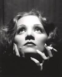
Who created it?
Butterfly lighting was not created by one specific individual but rather developed over time in Hollywood back in the 1930’s, it was mainly used on a person called Marlene Dietrich who was a Hollywood star around that time.
How to create a butterfly lighting setup –
Lighting: Butterfly lighting requires a key light that can be a flash unit or continuous. If continuous, it can be artificial or natural. In other words, you can use strobes, speed lights, LEDs or even the sun.
A butterfly lighting effect refers to the setup and not to the quality of light – it can be soft or hard light depending on the effect you want.
What is Chiaroscuro Lighting?
Chiaroscuro Lighting is an Italian lighting technique that stands for Light Dark, it is a high contrast lighting technique that that uses a low key lighting set up, it uses a single light source to create a dark background with lit subjects.
Why should you use it?
Chiaroscuro Lighting should be used as it provides an abstract contrast that helps to draw attention to the subject and to create a dark shadowy background, doing this can add a more unique look to the images that you take to boost the atmosphere and can help to create an almost three dimensional look to the image.
Who created it?
Chiaroscuro lighting was developed by Leonardo Davinci, Caravaggio, Vermeer, and Rembrandt and was developed by multiple people, it was mainly created in the Renaissance era and is still used today in low key photography.
How to create a Chiaroscuro Lighting set up –
Chiaroscuro in photography: Chiaroscuro using one key light and a variation using a reflector that reflects light from the key light back onto the sitter.
flash “bouncing”, fill-in flash, TTL / speedlight flash, remote / infra-red flash (studio lighting), fast + slow synch flash and light painting c/w slow shutter speeds
Mood board

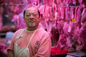
What is environmental portraiture
An environmental portrait is an image take of one or more person / people in there natural environment doing things like there job, a hobby or there lifestyle. It is represented through the background of the image or items shown in the image that have something to do with their lifestyle.
Example environmental portrait with evaluation
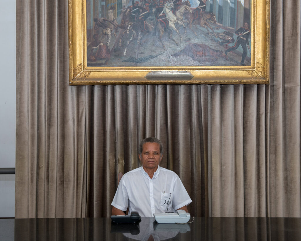
Lighting –
– Lighting used is artificial
– Shining from above him
– Possibly studio lights used
Environment –
– At a reception desk
– Most likely his job
– African American Ethnicity
– Taken in Brazil
– Male
– Most likely in his 60’s
Framing –
– Half-body angle used
– Dead pan
Approach –
– Neutral pose
Gaze –
– Eye contact
– Engagement with camera
Camera settings –
– Wide lens
– Mid-range F-stop
– No Tripod
– Medium shutter speed
– Medium shutter speed
Image info –
In this photo we can see the gold picture frame placed above the subject in the image, we can tell that he is in a place with money, this was most likely done by the photographer to fully capture this mans life style and give us incite into his place of work. This photo was taken in Brazil but there was no date for when it was taken, we can interpret that he works in a reception because of the two phones on his desk and the clean desk which is what you would expect at a front entrance for a more appealing look. I believe the idea behind this image was to capture an everyday person doing there job to capture there mood and lifestyle. With the visual elements of this photograph we can see that colour has been used with the gold frame for insight into the mans life, texture is also represented in this image along with Form (3D) with the curtain behind them.
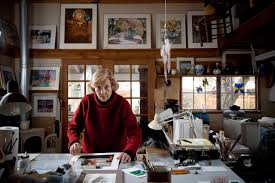
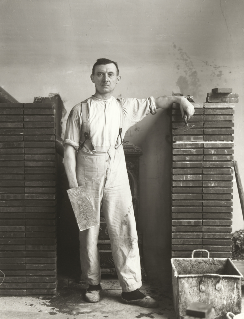
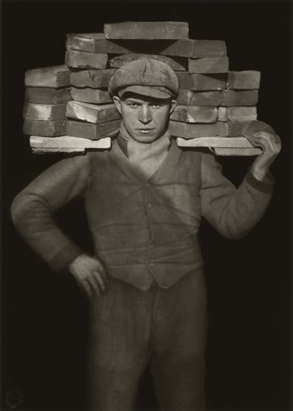
August Sander
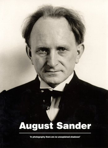
His life – August Sander (17 November 1876 – 20 April 1964), was a German portrait photographer, he wasn’t born into a family of photographer but found it through working in a local mine which was his full time job. His images consisted of a variety of different ages, religions, ethnicities and genders helping to shape environmental portraiture for years to come. He created some notable pieces of work such as, ‘The Farmer’, ‘The Skilled Tradesman’, ‘The Woman’, ‘Classes and Professions’, ‘The Artists’, ‘The City’ and ‘The Last People’.
His technique –
August Sander liked to use Shallow depth of field. generally full body shots to create an idea of model’s job and to include more of background in shot. As we can see in the images below he liked to take pictures of his subjects in a natural position representing there job and/or lifestyle.
——
“I never made a person look bad.” – August Sander
——
Examples of his work –
Who is in the photo?
– August Sander – Master Mason – 1926
how are they posed?
– neutral pose and facial expression
how are they framed?
– Full length body
– Deadpan angle
what is their gaze?
– Eye contact > engagement with the camera
Colour
– Black and white
Who is in the photo?
– August Sander – Handlanger (Bricklayer) – 1928
how are they posed?
– formal (posed) with relaxed facial expression
how are they framed?
– Full body
– Deadpan angle
what is their gaze?
– Eye contact > engagement with the camera
Colour
– Black and white
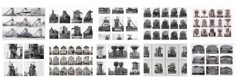
What is typology?
———–
Typology is a a term that we use in photography that, in simple terms, is the study of types. It can be used to see and represent similarities and differences in images.
——-
Here are some examples –
——-
———–
Analysis of Arnold Newman Photography
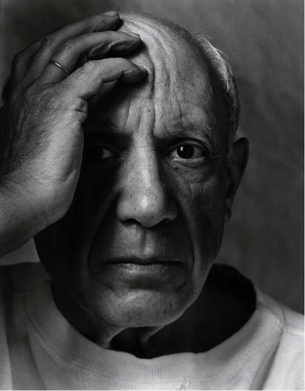
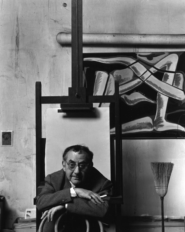
His life – Arnold Newman (3 March 1918 – 6 June 2006), was an American portrait photographer, in his early life he studied art in school, however, later in life he opened a business and stared a freelance photography business, most likely getting his creativity from art in school. He created some notable pieces of work such as, ‘Pablo Picasso, Spanish Painter and Sculptor’, ‘Max Ernst, German Painter and Sculptor’, ‘Marc Chagall, Russian/French Painter’, ‘Isamu Noguchi, Japanese American Artist and Landscape Architect’, ‘Man Ray, American Surrealist Painter’ and ‘Josef Albers, German-American Painter’.
His technique –
Arnold Newman liked to use a variety of different lighting such as natural light, as well as studio lighting setups generally half body shots to have more focus on the background of the image. He also liked to take pictures of the subjects of the image in there natural environment to capture their lifestyle.
——————–
“The photographer must be a part of the picture.” – Arnold Newman
—————-=
Examples of his work –
Who is in the photo?
– Pablo Picasso, Spanish Painter and Sculptor, 1954
how are they posed?
– Formal pose and facial expression
how are they framed?
– Half body
– Deadpan angle
what is their gaze?
– Eye contact > engagement with the camera
Colour
– Black and white
Who is in the photo?
– Isamu Noguchi, Japanese American Artist and Landscape Architect, 1947
how are they posed?
– formal (posed) with relaxed facial expression
how are they framed?
– half body
– Canted angle
what is their gaze?
– Eye contact > engagement with the camera
Colour
– Black and white
Photoshoot plan
I plan to take photos inside and outside of school and take inspiration from August Sander in doing so. I plan to use props in all of my images to give a greater insight into the persons lifestyle or profession.
Photo Shoots
Contact sheet –
Selection process –
as you can see above I used P and X to flag my images to filter out the bad ones from the ok and good ones, next I rated these images 4 or 5 stars as 4 being ok ones and 5 being good ones, finally I gave them the colour yellow or green, green being the best and yellow being good. I will now edit these images that I selected and present them bellow along with the raw images.
Editing
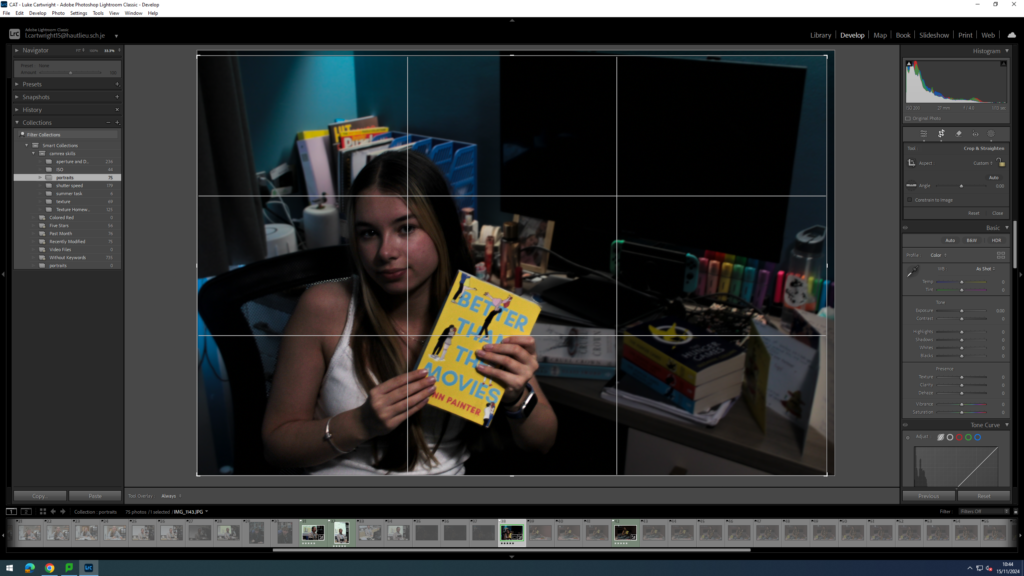
As you can see above I have used cropping to make the image a little smaller, I have done this so the subject is just a little bit closer to the camera in the image to make it more obvious that she is the main subject of the image.
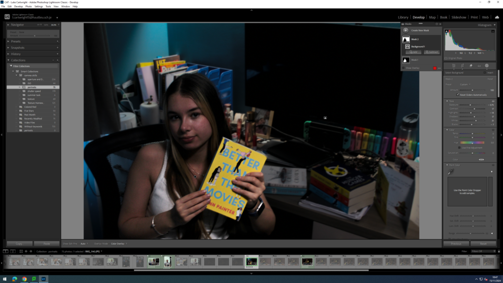
As you can see above I have used two masks to sperate the subject from the background of the image, the reason I did this is because I wanted to have a slight but visible discrepancy between the two to make it even more obvious what the subject of the image is.
Adding to this I decided to keep this image in colour as to me it looked better but I did change one of my edited images to black and white.
Final images And evaluation
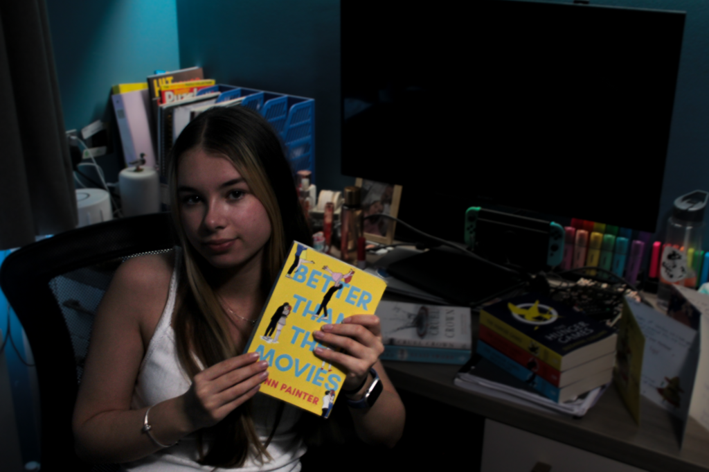
Who –
– The person in the image is Beth – 2024
Lighting –
– Taken indoors
– Artificial light used which is shining down from above
Environment –
– The location is her house in jersey channel islands
– They live a middle class life style
– Female, from Jersey and family history of Jersey, 17 years old
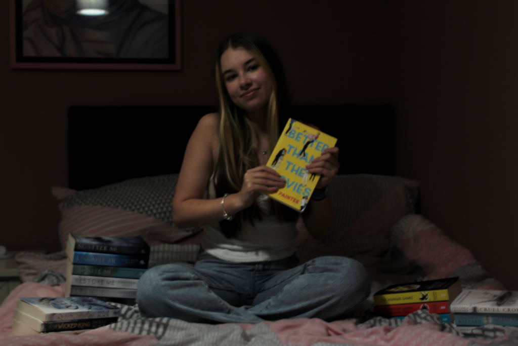
– Books used as props to represent her hobby
Framing –
– Full body
– Canted angle
Approach –
– Neutral pose and facial expression
Gaze –
– Eye contact and engagement with camera
Technical –
– ISO 200, 27mm , f / 4.0, 1/13 sec SS and no tripod used
B&W or colour –
– Colour
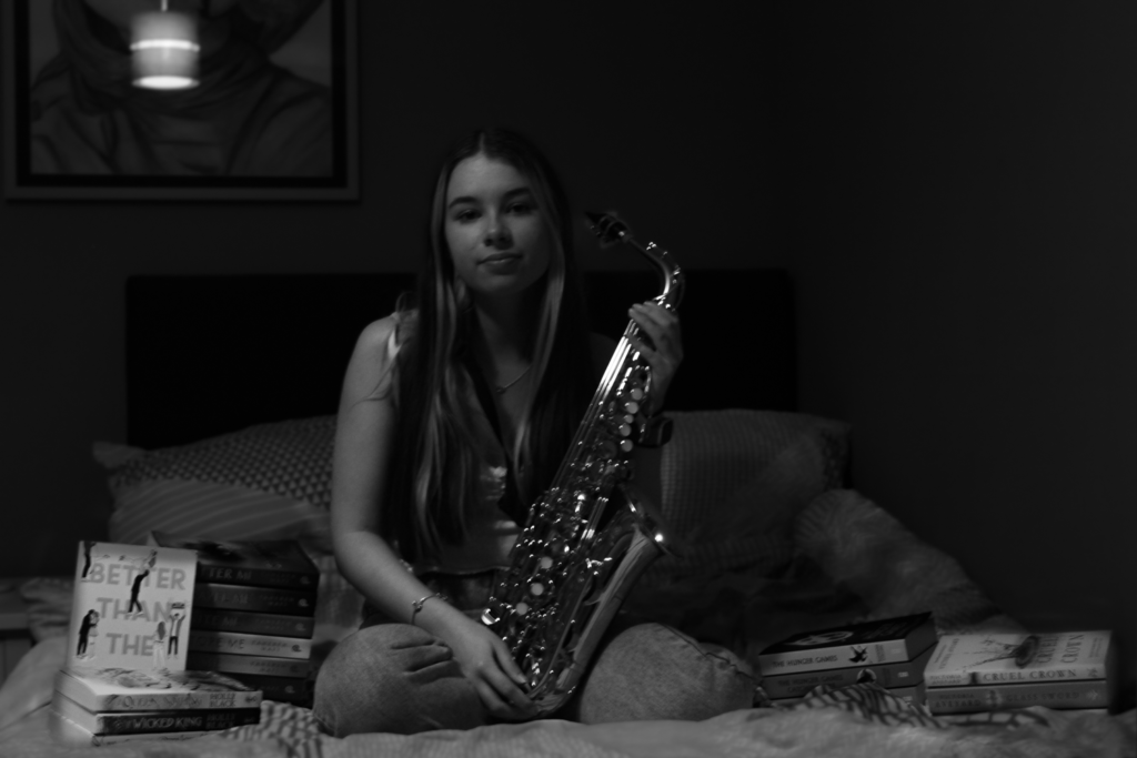
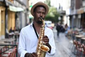
Who –
– The person in the image is Beth – 2024
Lighting –
– Taken indoors
– Artificial light used which is shining down from above
Environment –
– The location is her house in jersey channel islands
– They live a middle class life style
– Female, from Jersey and family history of Jersey, 17 years old
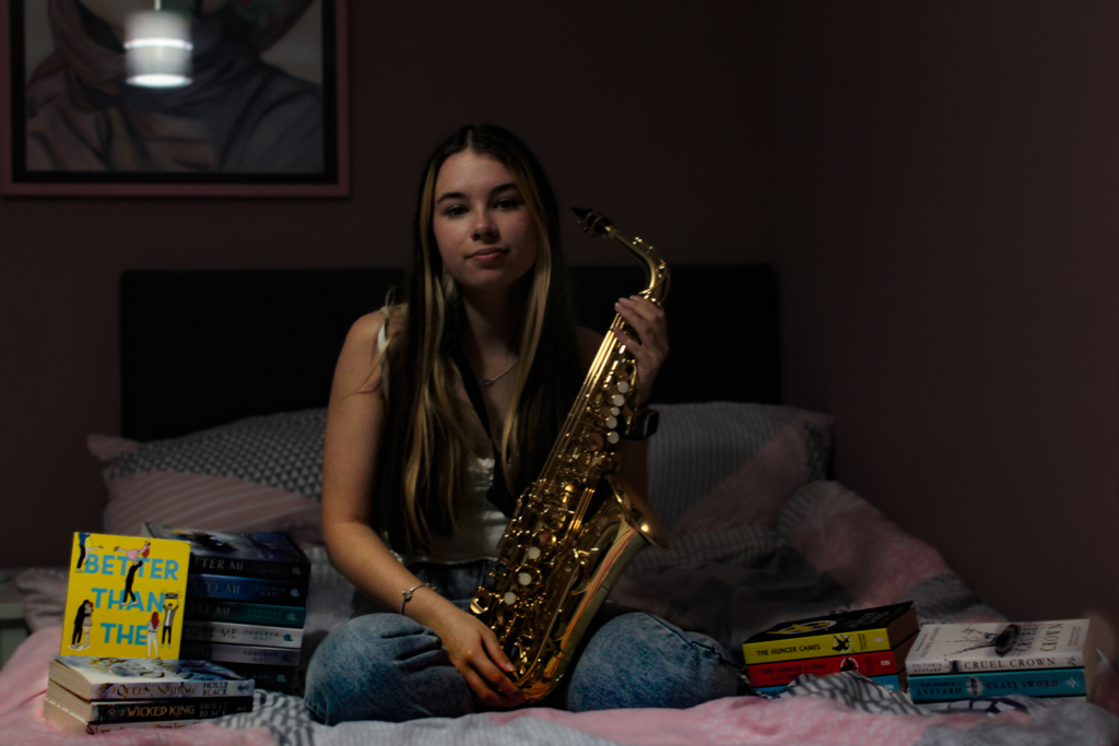
– Books and saxophone used as props to represent her hobby
Framing –
– Full body
– Deadpan angle
Approach –
– Neutral pose and facial expression
Gaze –
– Eye contact and engagement with camera
Technical –
– ISO 200, 30mm , f / 4.5, 1/13 sec SS and no tripod used
B&W or colour –
– B&W
Who –
– The person in the image is Beth – 2024
Lighting –
– Taken indoors
– Artificial light used which is shining down from above
Environment –
– The location is her house in jersey channel islands
– They live a middle class life style
– Female, from Jersey and family history of Jersey, 17 years old
– Books and saxophone used as props to represent her hobby
Framing –
– Full body
– Deadpan angle
Approach –
– Neutral pose and facial expression
Gaze –
– Eye contact and engagement with camera
Technical –
– ISO 200, 30mm , f / 4.5, 1/13 sec SS and no tripod used
B&W or colour –
– Colour
Who –
– The person in the image is Beth – 2024
Lighting –
– Taken indoors
– Artificial light used which is shining down from above
Environment –
– The location is her house in jersey channel islands
– They live a middle class life style
– Female, from Jersey and family history of Jersey, 17 years old
– Books used as props to represent her hobby
Framing –
– Full body
– Deadpan angle
Approach –
– Neutral pose and facial expression
Gaze –
– Eye contact and engagement with camera
Technical –
– ISO 200, 32mm , f / 4.5, 1/13 sec SS and no tripod used
B&W or colour –
– Colour
Who –
– The person in the image is Mr Cole – 2024
Lighting –
– Taken indoors
– Artificial light used which is shining down from above
Environment –
– The location is Hautlieu school in jersey channel islands
– Male, Work as a teacher in Hautlieu school, not sure how old
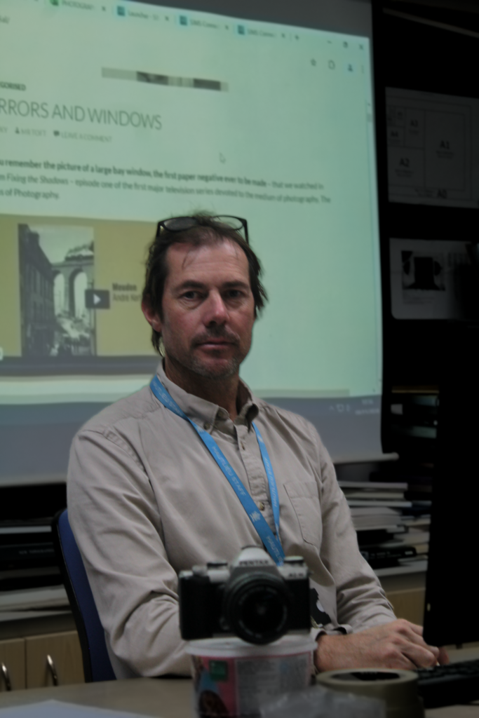
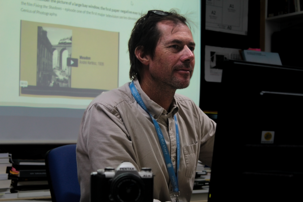
– Camera used as prop in the image to represent his profession
Framing –
– Half body
– Deadpan angle
Approach –
– Formal pose and facial expression
Gaze –
– Eye contact and engagement with camera
Technical –
– ISO 400, 55mm , f / 5.6, 1/40 sec SS and no tripod used
B&W or colour –
– Colour
Who –
– The person in the image is Mr Cole – 2024
Lighting –
– Taken indoors
– Artificial light used which is shining down from above
Environment –
– The location is Hautlieu school in jersey channel islands
– Male, Work as a teacher in Hautlieu school, not sure how old
– Camera used as prop in the image to represent his profession
Framing –
– Half body
– Deadpan angle
Approach –
– Formal pose and facial expression
Gaze –
– Eye contact and engagement with camera
Technical –
– ISO 400, 55mm , f / 5.6, 1/40 sec SS and no tripod used
B&W or colour –
– Colour
Overall evaluation –
In these images I planned for it to be simple while using props such as the saxophone and the camera used in the different photos taken. With these images I took inspiration from August Sander taking ideas such as the props and the simplicity of the images, he also frequently used black and white in his image so I decided to do the same with one of mine to get a greater idea of what my images could look like. I will now represent these 6 images in art steps as a typology.
Typology representation –
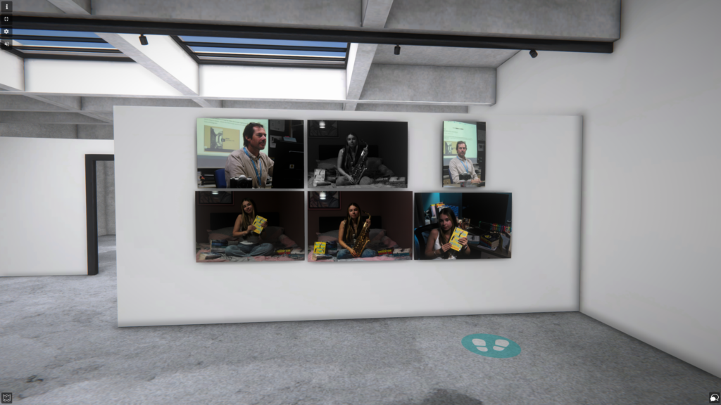
Formal elements of photography
Final images

Final images represented in art steps
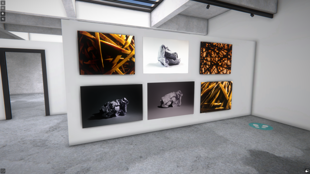
Overall explanation –
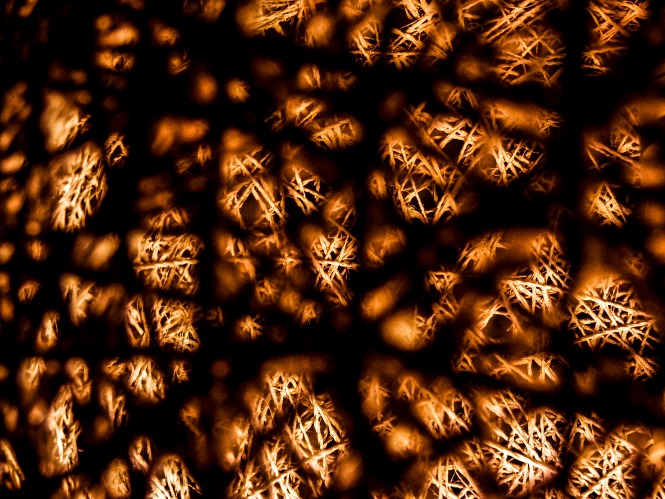
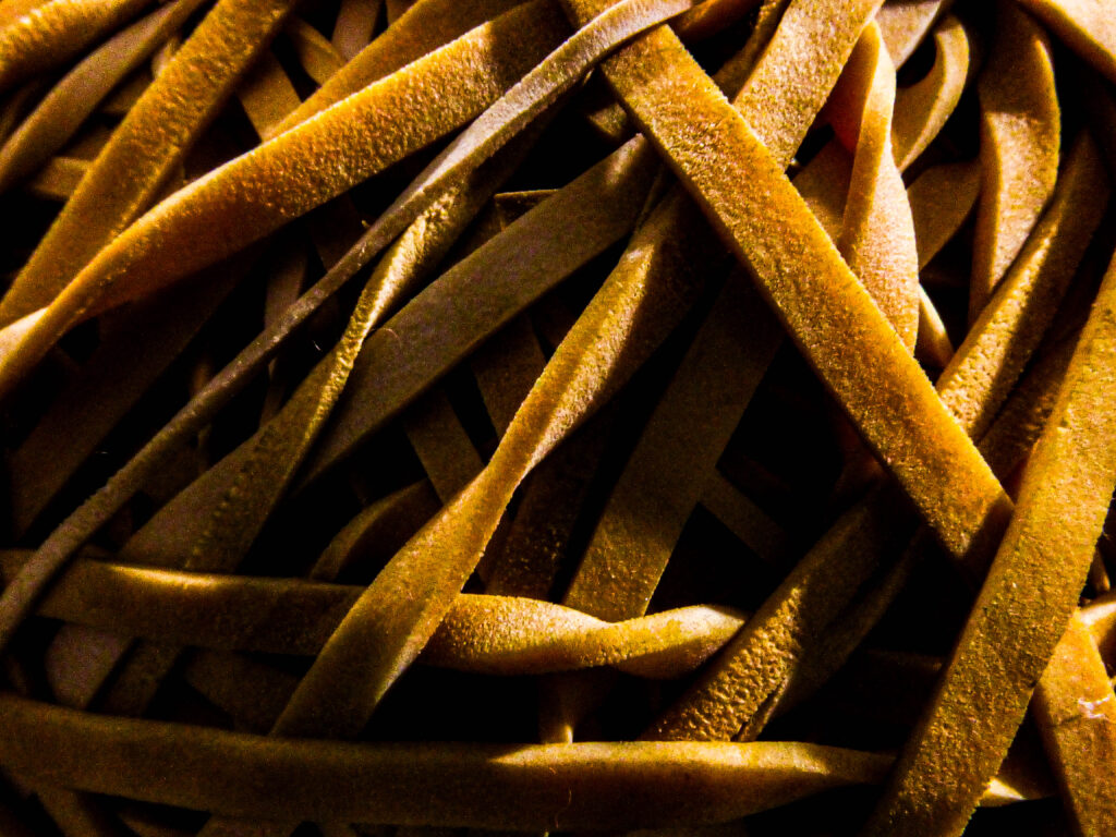
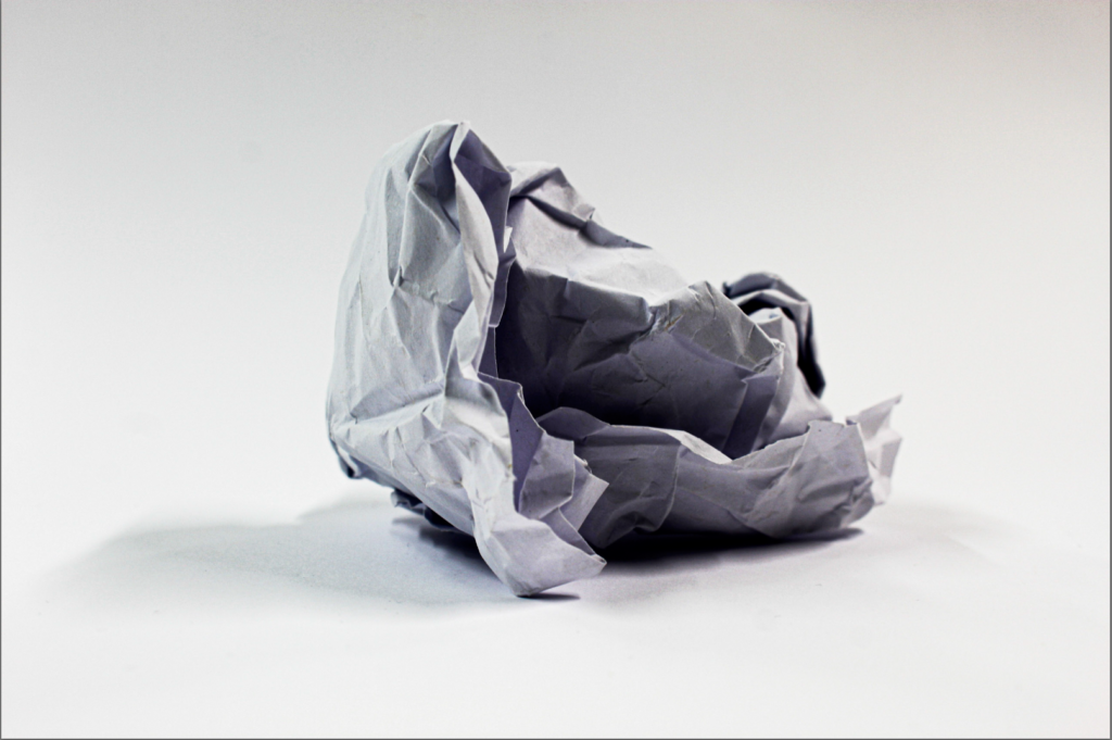
From the images I have taken so far I have been learning how to use a camera and the more technical aspects along with this, above I have represented as images and in a virtual gallery, I have purposefully chosen pictures that represent use of texture and many other formal elements of photography. These images are the best I have taken so far in which put together represent all formal elements being Focus, Line, Light, Repetition, Shape, Space, Texture and Value. These images were all thought of and created through planning and artist references along with some of my own creative ideas. I decided to represent these images in a virtual gallery because I wanted to get more of an idea of the quality of my images in a more professional environment, I also did this because I wanted to represent my images in a more unique way that was is usual to give a more abstract view on my work, doing this also can give more insight to someone viewing my images as they are seeing them in a location where they would usually see other images taken by photographer. In conclusion this intro into photography has helped me greatly to for one understanding my way around a camera but also in to interpreting photos and giving me the ability to see past just an image and view peoples work as art which can be appreciated more, on top of this, the skills I have learned and will learn in the feature of this will help me in the feature past school.
What Are Focus Points
Focus points in photography are areas where the camera focuses to keep them sharp and clear. Photographers can select a single focus point for precise control or let the camera choose multiple points to keep various parts of the scene in focus. These points ensure the key elements of an image are sharp, guiding the viewer’s attention.
Ralph Eugene Meatyard
Ralph Eugene Meatyard (1925–1972) was an American photographer known for his strange and haunting photos. He often used his family and friends as models, having them wear masks or pose in abandoned places, exploring ideas like identity and time. Though he worked as an optician, photography was his creative outlet.
His photos have a dreamlike, almost eerie feel, blending reality and fantasy. Meatyard’s unique style, influenced by books and philosophy, wasn’t widely recognized while he was alive, but today, his work is appreciated for its mysterious and personal touch.
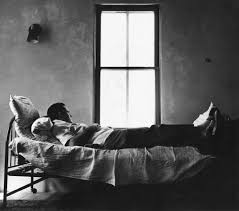
In the image on the left we can see that Ralph has used Aperture to focus on the person on the bed and leave the background more zoned out of the picture, I believe he did this to give the person in the image deeper meaning and almost making them seem disconnected from what is going on around them, his work represents how aperture can be used in photography in such a volatile way.
Saul Leiter
Saul Leiter (1923–2013) was an American photographer and painter known for his innovative use of color photography. He began as a painter but shifted to photography in the 1940s, capturing the streets of New York City with a focus on mood and color rather than dramatic moments. His images often featured reflections and shadows, giving them a soft, abstract quality.
Although he wasn’t widely recognized during his lifetime, Leiter’s work gained appreciation as color photography became more respected in the art world. His unique perspective on everyday urban scenes and painterly eye for composition have solidified his legacy as a significant figure in photography.
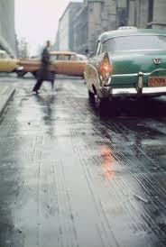
In the image on the left we can see that Saul has used aperture and depth of field to focus on the background of the image rather than the subject of it, I can tell this image wasn’t done using shutter speed as the car behind the man is perfectly clear even though it is moving, like Ralph’s I believe this is representing the man as being disconnected from the world yet again representing how many ways aperture and depth of field can be used in photography.
Uta Barth
Uta Barth is a contemporary photographer born in 1958 in Freiburg, Germany. She is known for her innovative use of soft focus and blurring techniques to explore perception, light, and space. Her work emphasizes color and composition, inviting viewers to engage with the nuances of visual experience.
Barth has exhibited widely in galleries and museums, gaining recognition for her unique style that blends photography and painting. She is also a dedicated educator, teaching at institutions like UCLA, and her contributions to contemporary photography inspire ongoing discussions about vision and representation.
In the image on the left we can see that Uta has used aperture and depth of field to create a blurry image, I believe she has done this to create an image that someone who views it can interpret it how they want to, I also thing she has done this as it is different from the usual sharp images you will usually see from photographers and creating something more abstract and different, this again represents all of the things you can do with aperture and depth of field.
My Contact Sheet
My Selection Process
as you can see above I used P and X to flag my images to filter out the bad ones from the ok and good ones, next I rated these images 4 or 5 stars as 4 being ok ones and 5 being good ones, finally I gave them the colour yellow or green, green being the best and yellow being good. I will now edit these images that I selected and present them bellow along with the raw images.
My Final Images
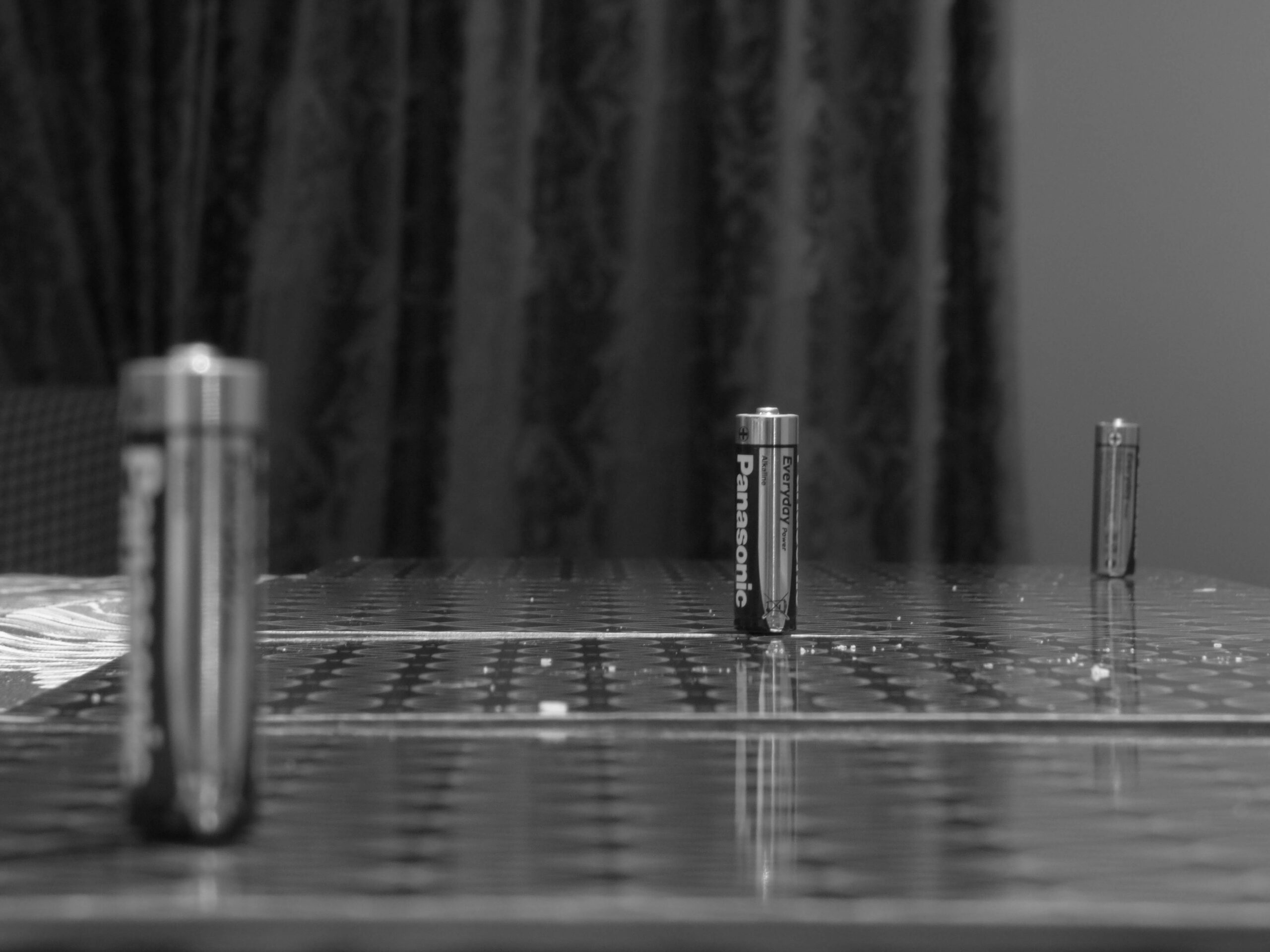
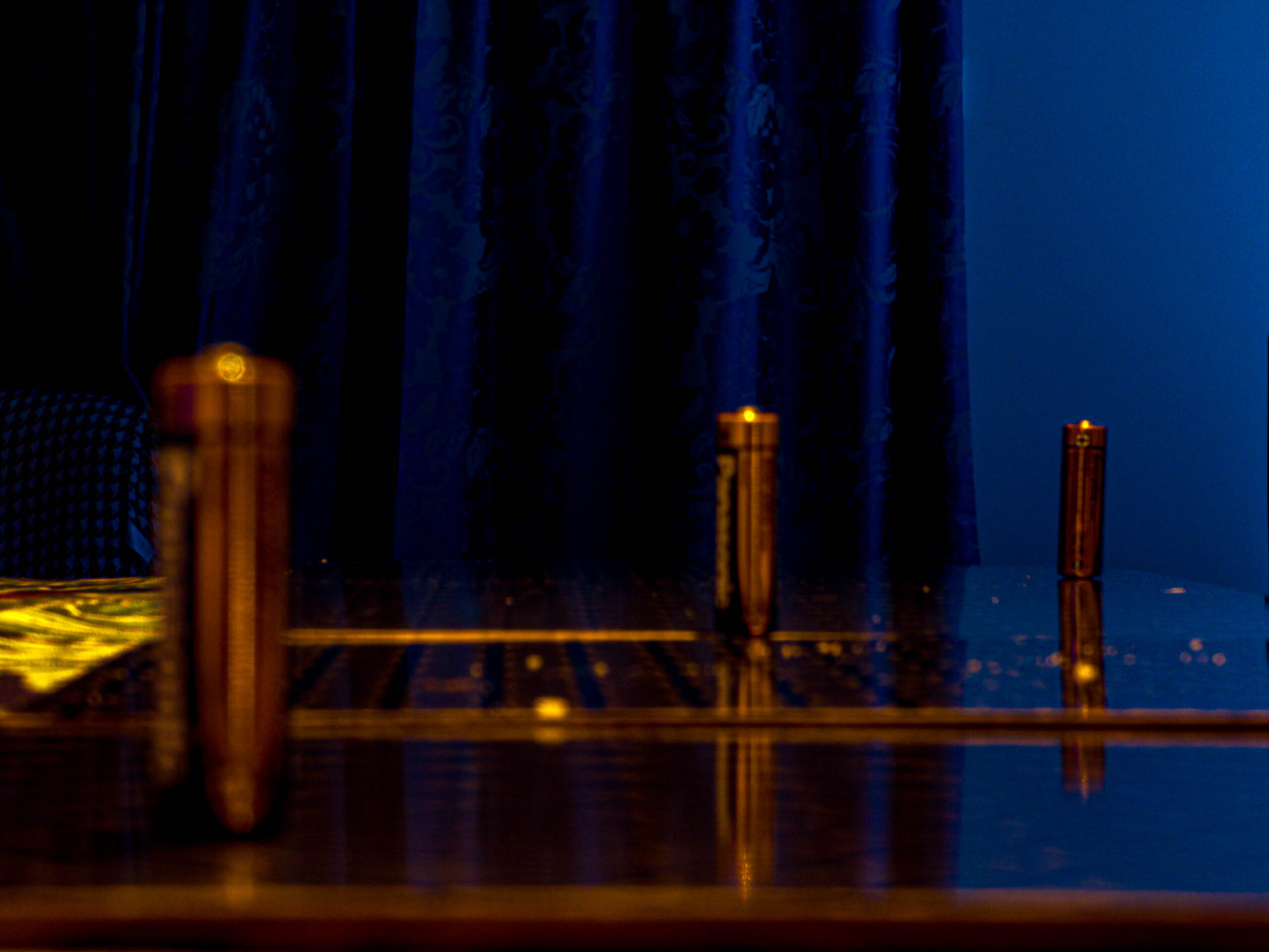
Foreground –
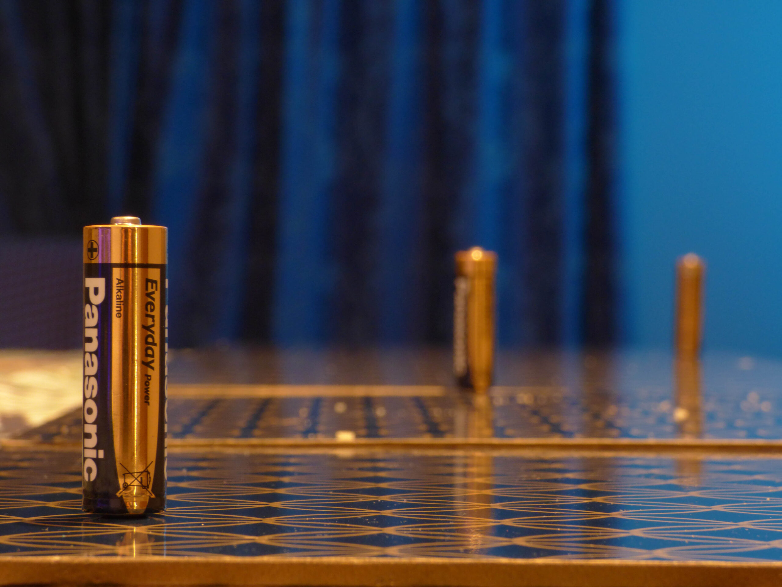
Middle Ground –
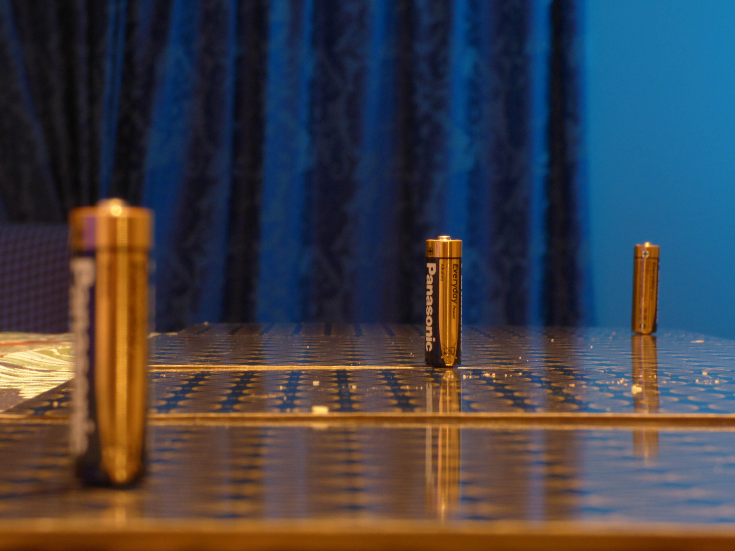
Background –
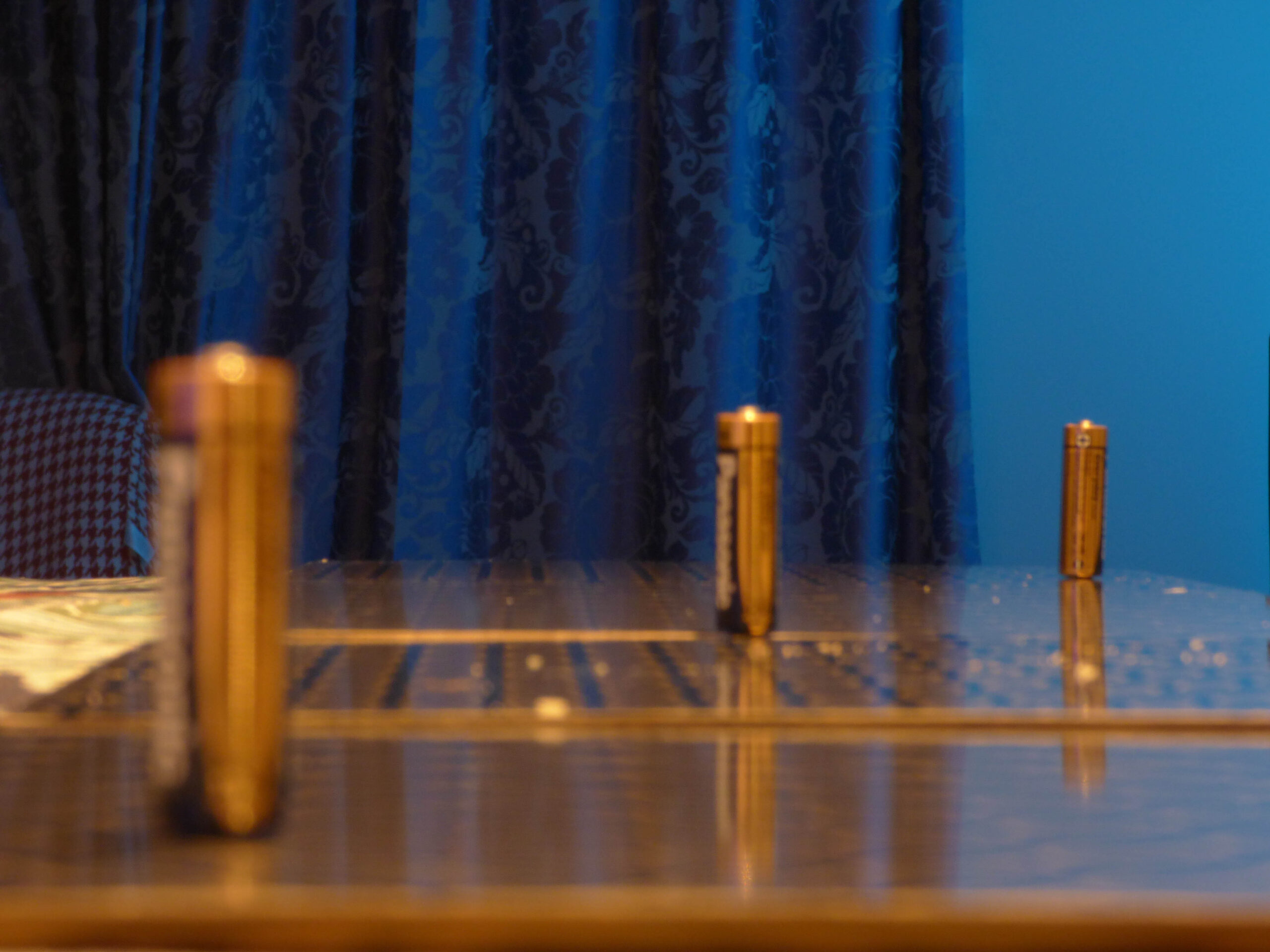
In the pictures above, I took photos of batteries at different distances to show how depth of field works. By changing how far each battery was from the camera, I could highlight how focus shifts through different parts of the image. This technique makes it clear how some objects stay sharp while others get blurrier, depending on the focus point and aperture settings. In my experiment, the closest batteries are in sharp focus, while the ones further back blur out more, which creates a sense of depth. By using different distance increments, it becomes obvious how the depth of field can change the look and feel of a photo, making certain details stand out or helping to show the space and dimension in the shot.
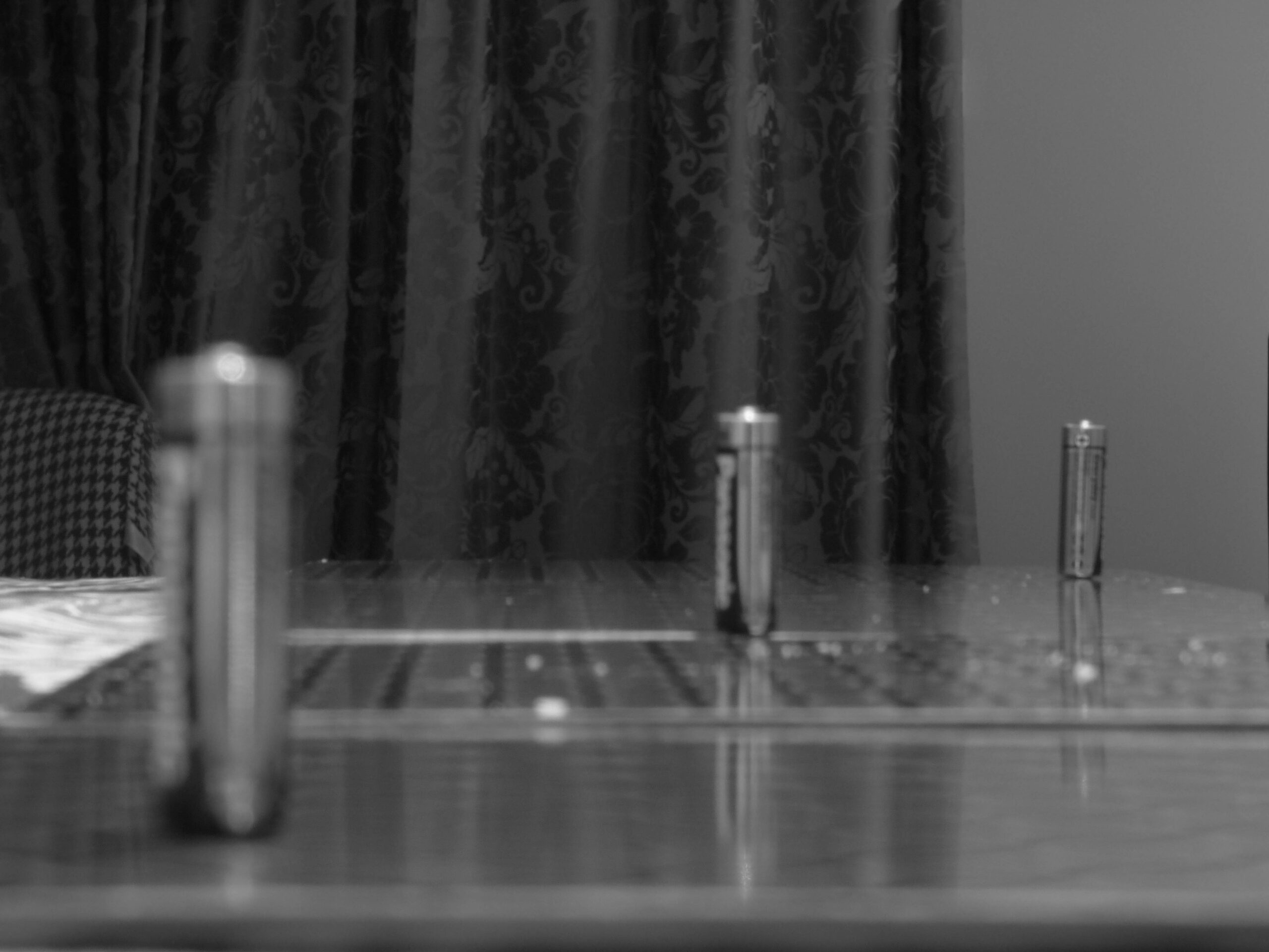
Images In Black-And-White
Foreground –
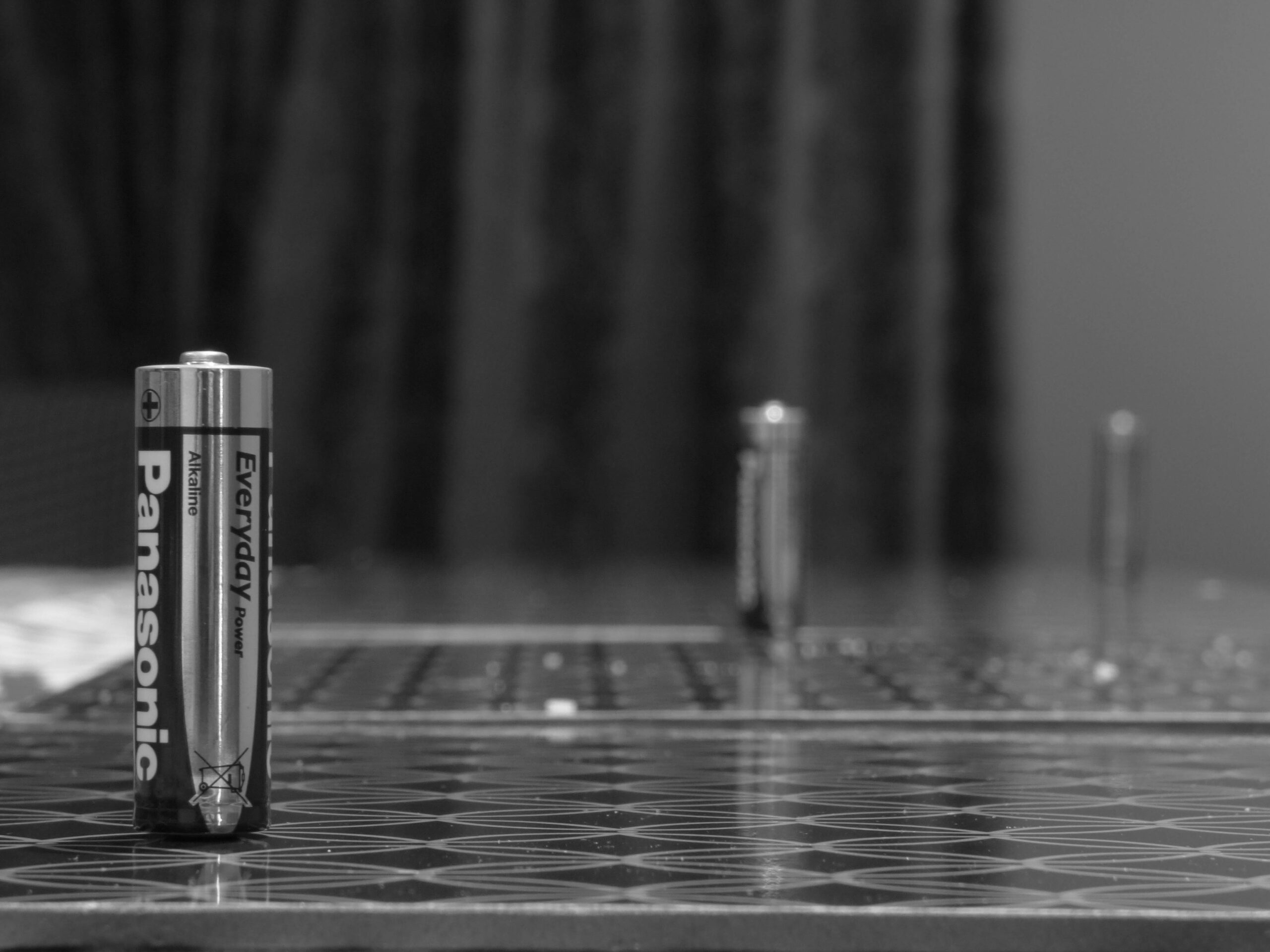
Middle Ground –
Background –
Editing With Reasoning
Foreground –
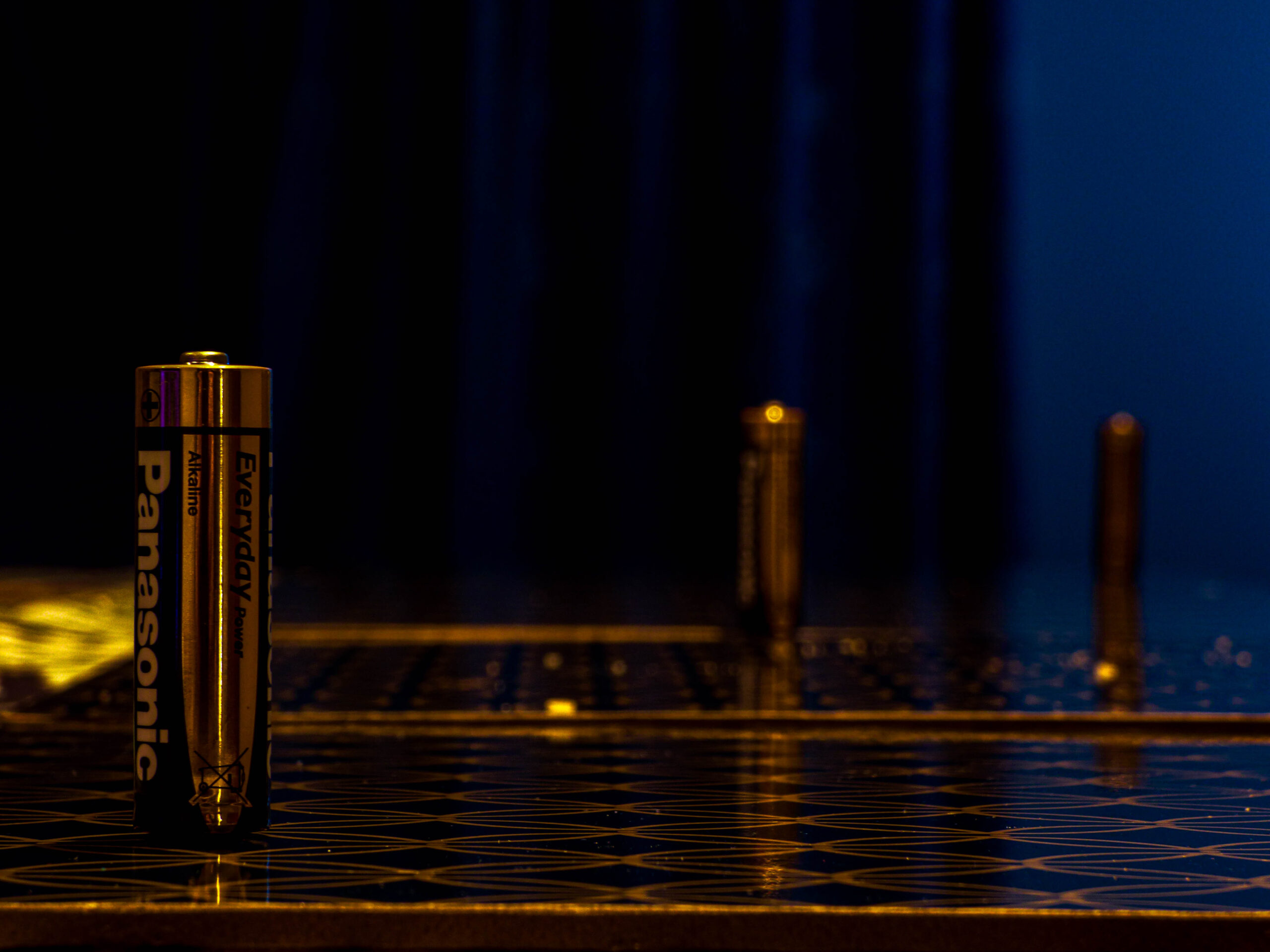
Middle Ground –
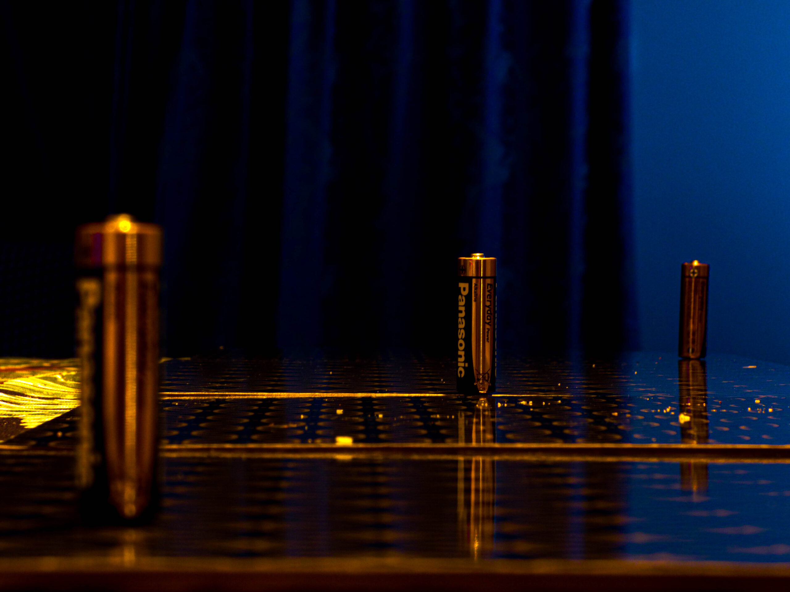
Background –
I chose to edit these pictures to make the focus even stronger on the areas I wanted to highlight. By adjusting the focus during editing, I was able to emphasize specific details and create a clearer distinction between the sharp and blurred parts of the image. This allowed me to direct the viewer’s attention exactly where I intended, while still maintaining the depth of field effect. The edits helped bring out the key elements in the photos, reinforcing how important focus is in shaping the way we interpret an image.