Henri Cartier-Bresson was a French artist and humanist photographer considered a master of candid photography. He was an early user of 35mm film and pioneered the genre of street photography; viewing photography as capturing a decisive moment.
Why is a camera an extension of the eye?
Cameras can be used to capture a scene and freeze a moment in time lived by humans. It can immortalise something experienced and seen by a person in ways that eyes cannot.
What is the physical pleasure in making photographs?
Their is satisfaction in taking a successful picture and therefore creates something that can be shared with humanity. The photographer can also utilise their photos as memories and a log of something to look back on.
How can photography be likened to hunting?
Photographers go out and scout out the perfect photography in a similar way that one may stalk and capture prey. It is a careful and precise activity that connects one to their environment.
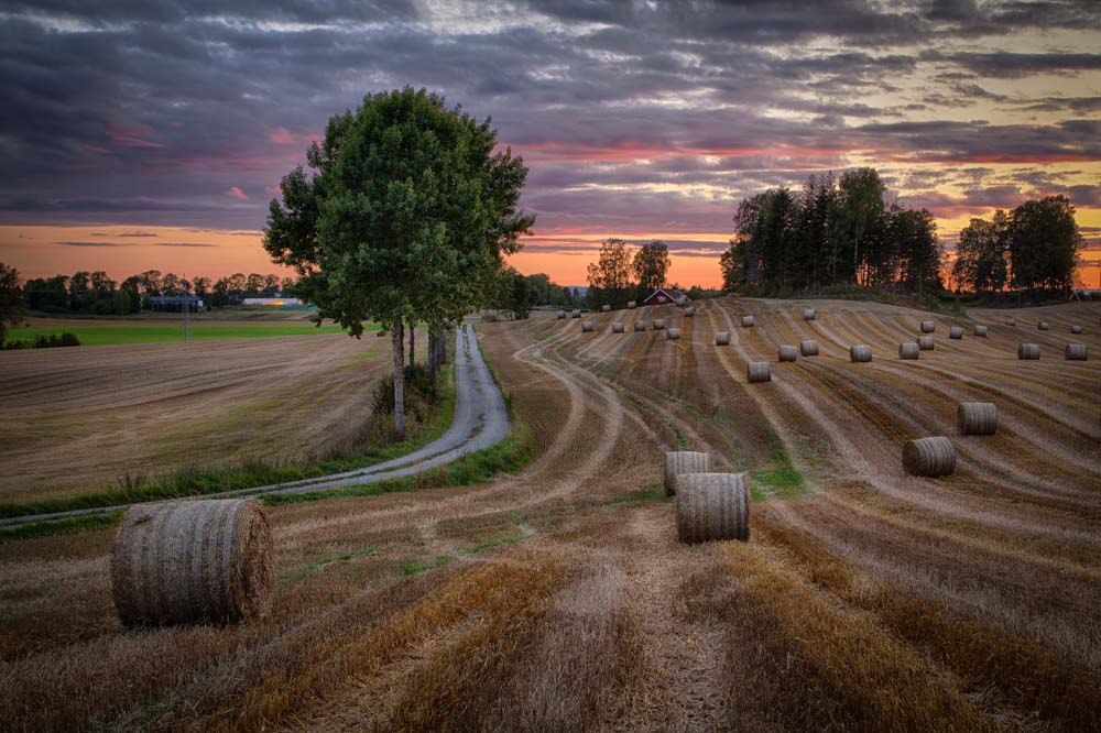
Applying the Decisive Moment
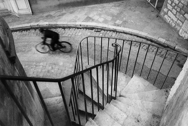
This photograph by Henri Cartier-Bresson’s is a key example of his photographic philosophy, famously defined as the decisive moment. In this image, Cartier-Bresson captures a fleeting instant where form and action unite perfectly, freezing a moment that resonates with visual harmony and narrative energy. At first glance, the photograph shows a cyclist captured mid-motion on a cobbled street at the base of a winding staircase. The perspective is from above, looking down a spiralling stone staircase edged with iron railings. The curved forms of the stairs, railings and path dominate the frame which creates a dynamic visual rhythm. The cyclist, rendered slightly blurred due to movement, is positioned at the bottom of the frame; adding life and contrast to the static architecture. The rule of thirds is used with the cyclist is positioned near the bottom right intersection point, an off-centre place that draws attention while maintaining balance. The railing of the staircase acts as a powerful leading line, bringing the viewer’s gaze down toward the cyclist. The descending staircase forms an organic frame around the cyclist which encloses the action within a harmonious structure. This photograph is a study in geometry in motion with the composition built on curves and spirals rather than straight lines or grids; also incorporating recurring patterns.
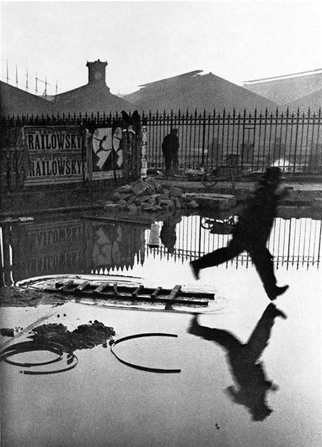
In the composition, the horizonal lines of the railings frame the jumping man; condensing the image and focusing in on the action. The man sits of the right grid line in terms of the rule of thirds, making the overall picture more visually appealing. The removal of colour enhances depth and detail in the image, allowing it to be seen as somewhat nostalgic. The strong tonal range of heavy highlights and shadows furthers the contrast in the photograph. To take this photo, Henri Cartier-Bresson used a Leica rangefinder which allowed him to be an effective street photographer; helping him be discreet and quick when shooting. The photo has high clarity in the foreground and background, suggesting a smaller aperture was used. The strong natural light from the sun reflects onto the puddle which therefore creates balance and frames the shadows in the image. This photo became one of Cartier-Bresson’s most popular photos, revolutionising street photography and candid photos. The decisive moment is obvious with a moment of time being frozen and captured; showing how beauty can be found in the mundane.
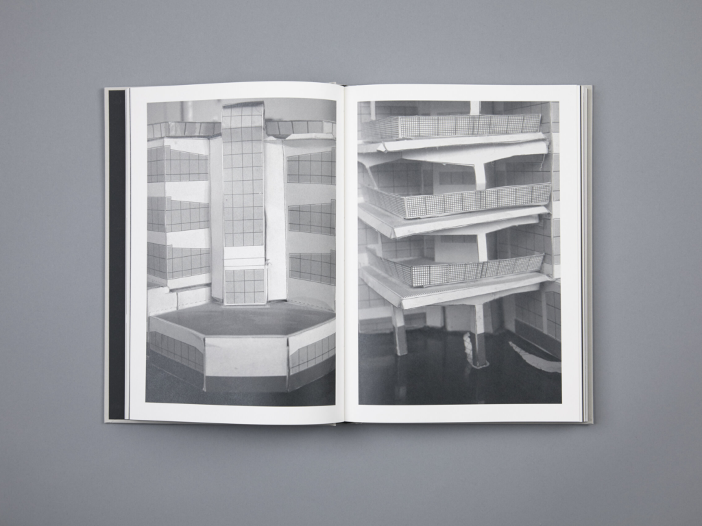
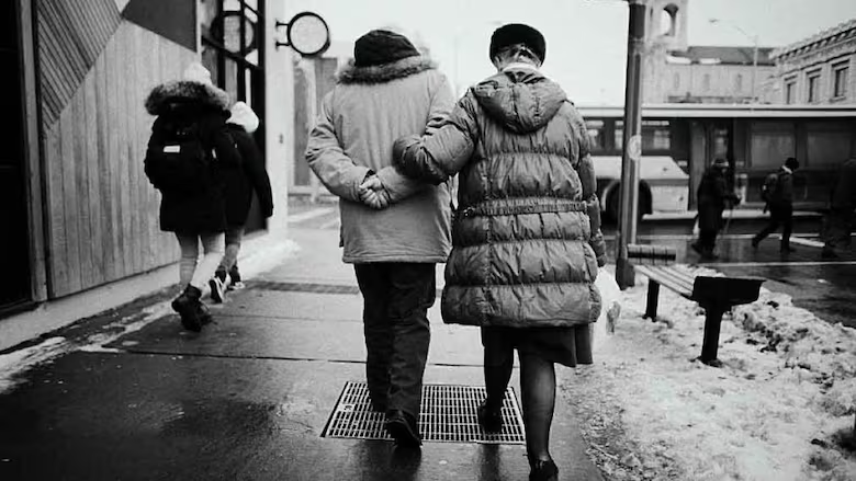
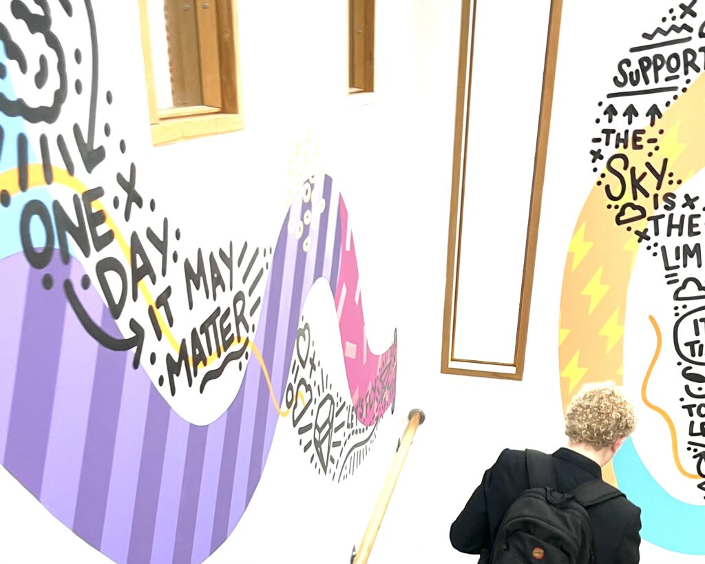
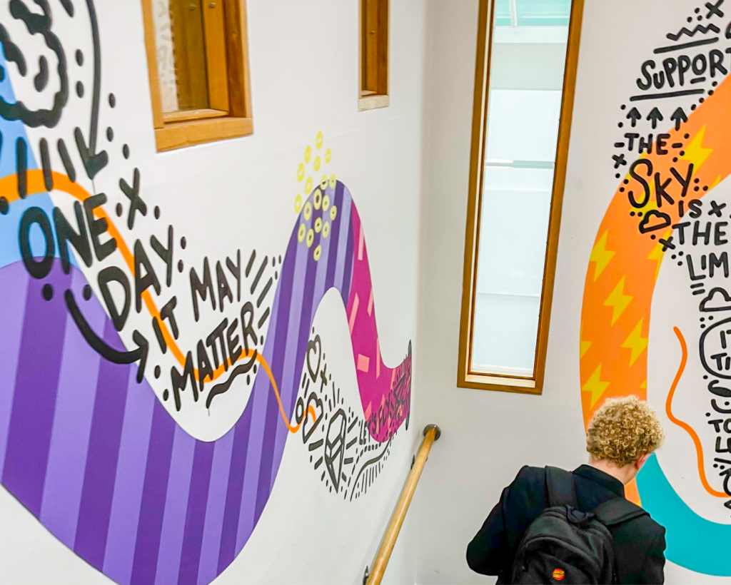
A zine is a small circulation self-published work of original or appropriated texts and images, often reproduced via a copy machine. Zines are created by either a single person or a very small group and are typically photocopied into physical prints for circulation. They are non-commercial publications that appeal to niche audiences that often embody a homemade aesthetic, taking many forms but are generally a mixture of text and images.
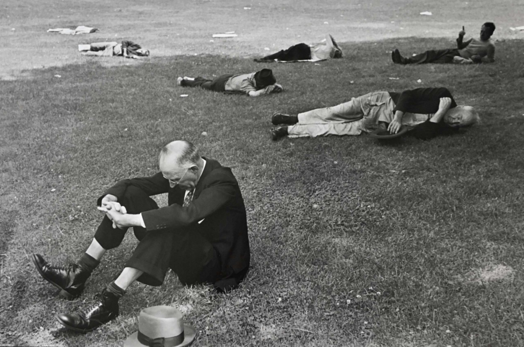
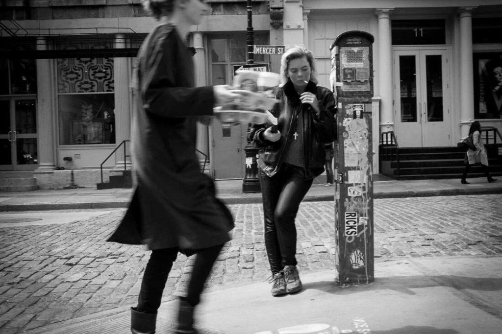
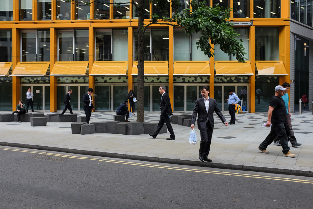
Street photography is a genre that captures candid moments in public spaces, offering a raw and unfiltered glimpse into everyday life. Its roots trace back to the 19th century with pioneers like Charles Nègre who documented Parisian street scenes despite technological limitations. As photographic equipment evolved, so did the ability to capture spontaneous urban moments which lead to the emergence of street photography as a distinct genre.
In David Campany’s essay ’Street Photography between Reportage, Cinema and Theatre’, he explores the multifaceted nature of street photography. He notes that street photography ’hovers somewhere between the posed and the spontaneous, the scripted and the improvised’. This observation highlights the genre’s unique position, blending elements of documentary realism with the unpredictability of everyday life. I agree with Campany’s assessment, as street photography often captures unplanned moments that resonate with narrative depth and theatricality.
Campany further discusses how street photography ’draws upon the conventions of reportage, cinema, and theatre’, suggesting that the genre is not confined to documentation but also engages with storytelling and performance. This perspective aligns with the work of many street photographers who, through composition and timing, create images that evoke emotion and provoke thought.
A contemporary embodiment of this approach is the collective iN-PUBLiC, a group established in 2000 to provide a platform for street photographers. Their mission is to promote street photography and to continue to explore its possibilities; emphasising the ability to see the unusual in the everyday and to capture the moment. Photographers within iN-PUBLiC, such as Nick Turpin and Matt Stuart, show this idea in their work by finding extraordinary moments within ordinary settings; highlighting the humor or irony of daily life.
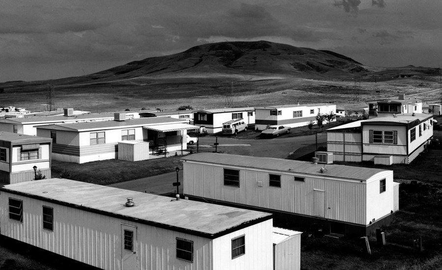
The New Topographics was a photographic movement that emerged in the 1970s, characterized by a shift away from romanticised landscapes and toward a focus on the everyday man-altered environment. Instead of capturing untouched natural beauty, these photographers documented suburban developments, industrial sites, highways and other spaces transformed by human activity. A defining feature of the New Topographics movement was its deadpan aesthetic, an objective and detached approach to photography. The images often lacked dramatic lighting, high contrast or grand compositions and instead favoured a restrained and minimalistic presentation. These photographers deliberately avoided artistic embellishment, capturing their subjects with an almost scientific precision. They chose to depict the mundane and functional such as industrial warehouses, parking lots, suburban housing tracts and anonymous urban sprawl. The New Topographics was largely a reaction against traditional and romanticised landscape photography, particularly the heroic wilderness images of photographers like Ansel Adams and Edward Weston. These earlier photographers celebrated nature in its untouched and pristine state whereas the new topographics sought to depict the landscape as it actually existed, often dominated by human activity. This shift in focus was influenced by the rapid post-war expansion of suburbs, highways and industrial centres which dramatically transformed landscapes in ways that traditional landscape photography had largely ignored. Beyond urbanisation, the movement was also shaped by growing environmental concerns in the 1960s and 1970s as photographers became more aware of the consequences of unchecked development and industrialisation. Additionally, the rise of conceptual and minimalist art played a key role in shaping the movement’s aesthetic with many of these photographers being influenced by the structural repetition and objectivity seen in contemporary art movements. There were also ties to documentary photography, particularly the work of Walker Evans whose photographs of vernacular architecture provided a precedent for the matter-of-fact approach adopted by the new topographics photographers. Despite focusing on seemingly banal or even ugly landscapes, the new topographics photographers found an understated beauty in these spaces. Their images encouraged viewers to reconsider their perception of beauty in the landscape, shifting attention from traditional and picturesque scenes to the everyday environments shaped by human hands. By presenting these spaces in a detached yet thoughtful manner, the New Topographics movement reshaped landscape photography and influenced generations of artists exploring the changing relationship between humans and the environment.
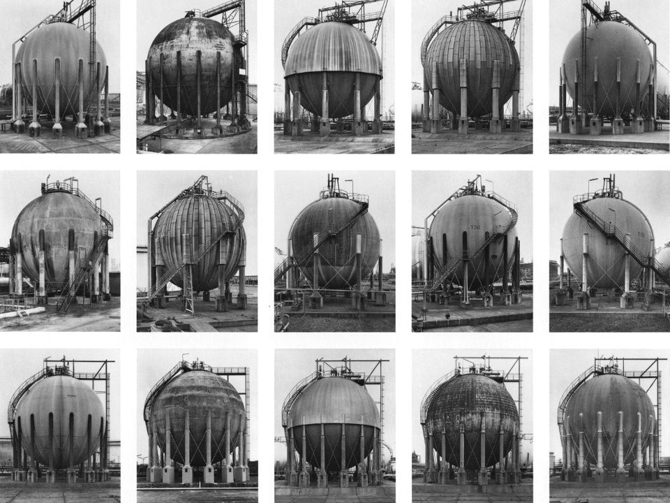
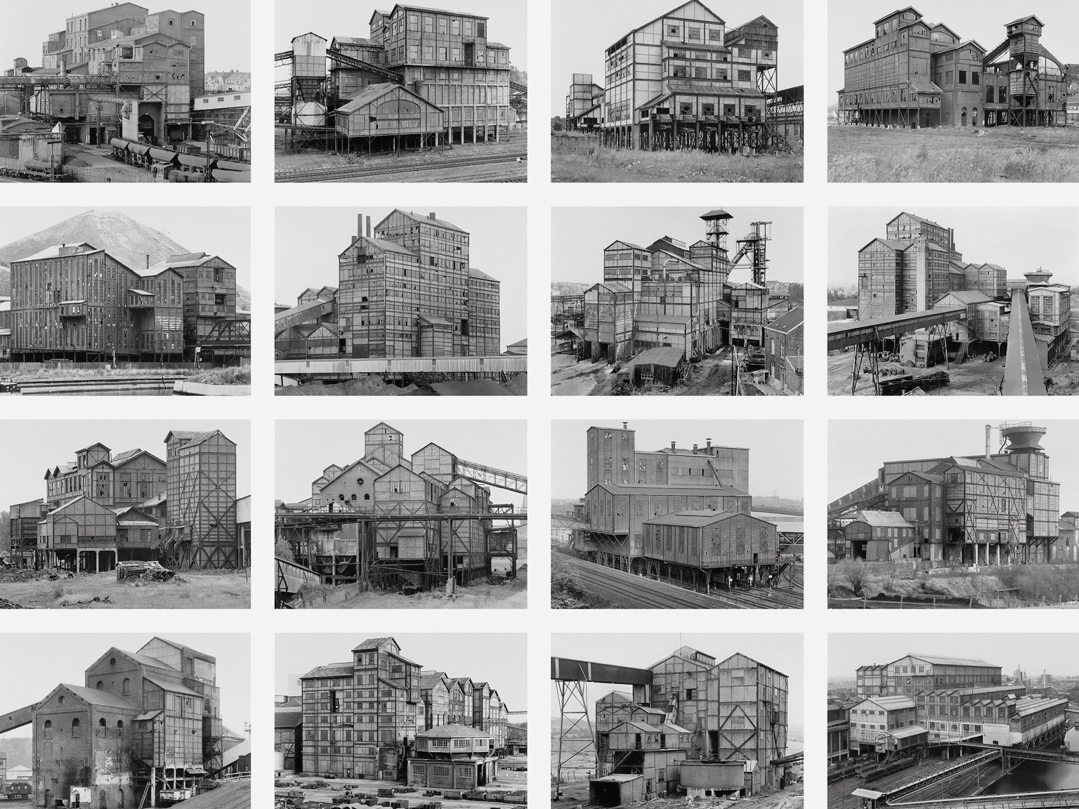
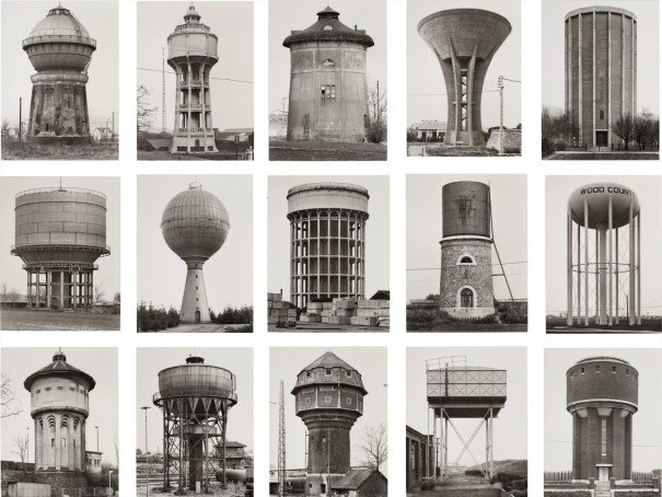
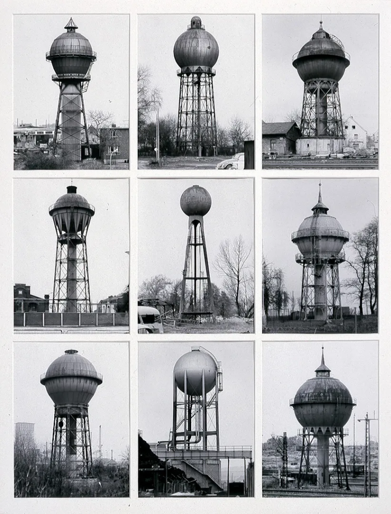
The Bechers
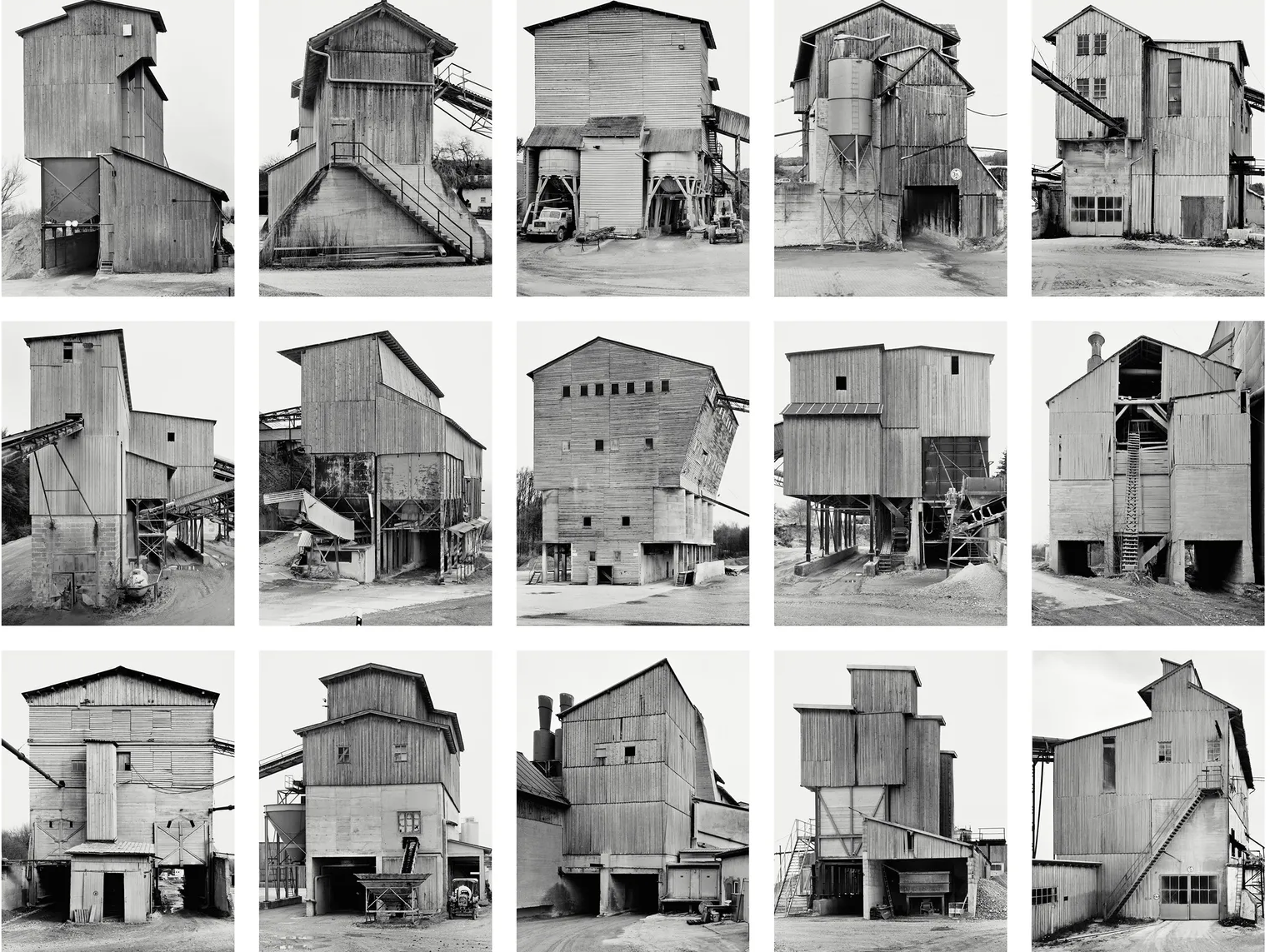
Bernd and Hilla Becher were a German photography duo whose work became synonymous with the New Topographics movement, which emerged in the 1970s. Their methodical and objective approach to documenting industrial structures transformed the perception of landscape photography; emphasising the relationship between human industry and the environment. Bernd Becher and Hilla Becher met at the Kunstakademie Düsseldorf in the late 1950s. Sharing a deep interest in industrial architecture, they embarked on a lifelong project of photographing factories, water towers, coal bunkers and other industrial structures predominantly in Germany but also in other parts of Europe and North America. The Bechers’ approach was rooted in systematic documentation. They employed a strict set of photographic principles including black and white photography, overcast lighting, consistent framing and typologies. This methodology removed personal expression, favouring an objective and scientific representation of industrial landscapes. Their work was heavily influenced by the German tradition of ’Neue Sachlichkeit’ which focused on precise and emotionless documentation. Bernd and Hilla Becher’s meticulous documentation of industrial architecture remains a cornerstone in contemporary photography. Their images serve as historical records of a disappearing industrial era while reshaping the aesthetics of documentary photography. Their work continues to influence artists and architects, reinforcing the significance of industrial structures within cultural heritage and artistic discourse.
Image Analysis
’Water Towers’ are iconic works of industrial photography created by Bernd and Hilla Becher. They used a large format camera in order to achieve high and rich detail in the photos. They employed consistent conditions such as overcast skies, diffused light and frontal angles in order to eliminate shadows and emphasise form. The final image was displayed as gelation silver prints in typologies to highlight repetition and variation. Presented in grids, the water towers’ varied shapes of cylindrical, conical and spherical composition are compared and contrasted. The Bechers’ approach was methodical with structures being centred and the perspectives controlled for a documentary and scientific effect. Being monochrome, the images highlight materiality and texture with metal, concrete and rivets seen to be vividly detailed. Taken mainly in post-war Germany, these images reflect the region’s industrial past and transformation. The Bechers were influenced by August Sander and the New Topographics movement, focusing on unromanticised landscapes. Their works serve as an archive of disappearing industrial architecture, preserving a visual record of working-class history. Their photographs challenges the divide between art and documentation with it positioned at the intersection of documentary photography and conceptual art. The Bechers’ systematic approach emphasizes classification, akin to scientific taxonomy. The images seem objective but invite subjective contemplation about form, function and time. The water towers are monumentalized, appearing as sculptural objects rather than mere utility structures with the Bechers’ work evoking a melancholic sense of loss for a vanishing industrial era. The repetition, seriality and emphasis on idea over individual image align with conceptual art practices.
My Photoshoot
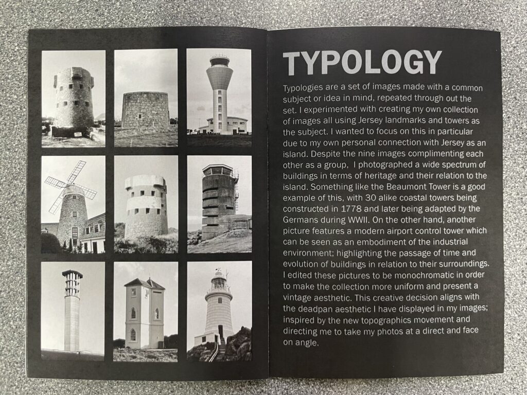
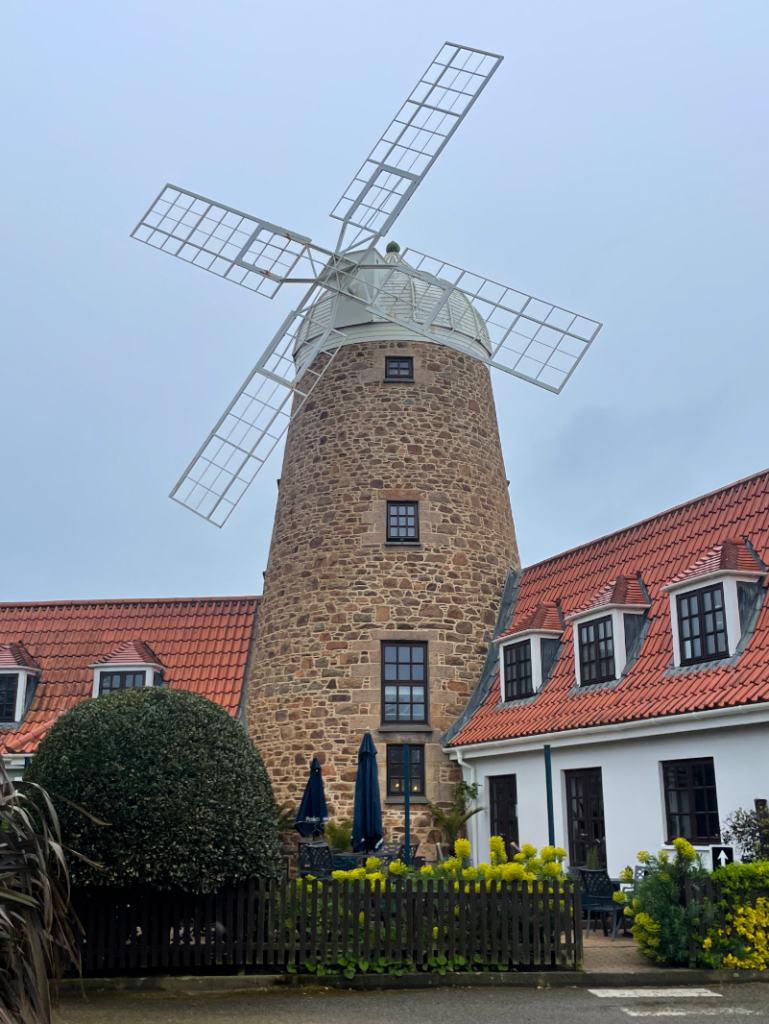
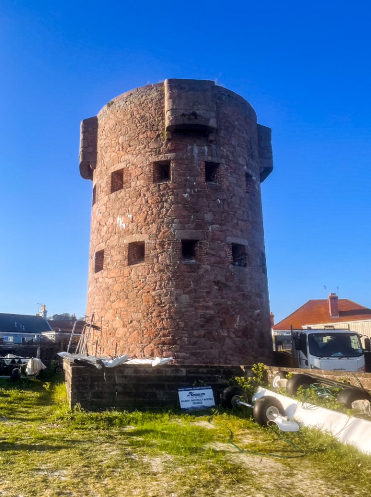
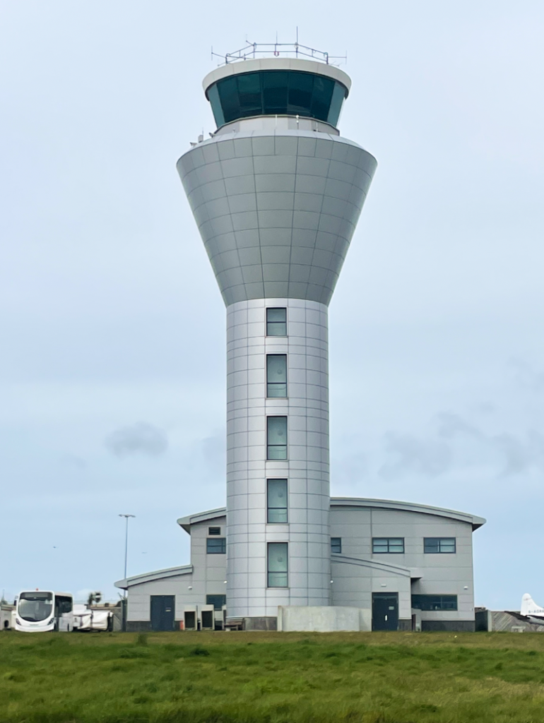
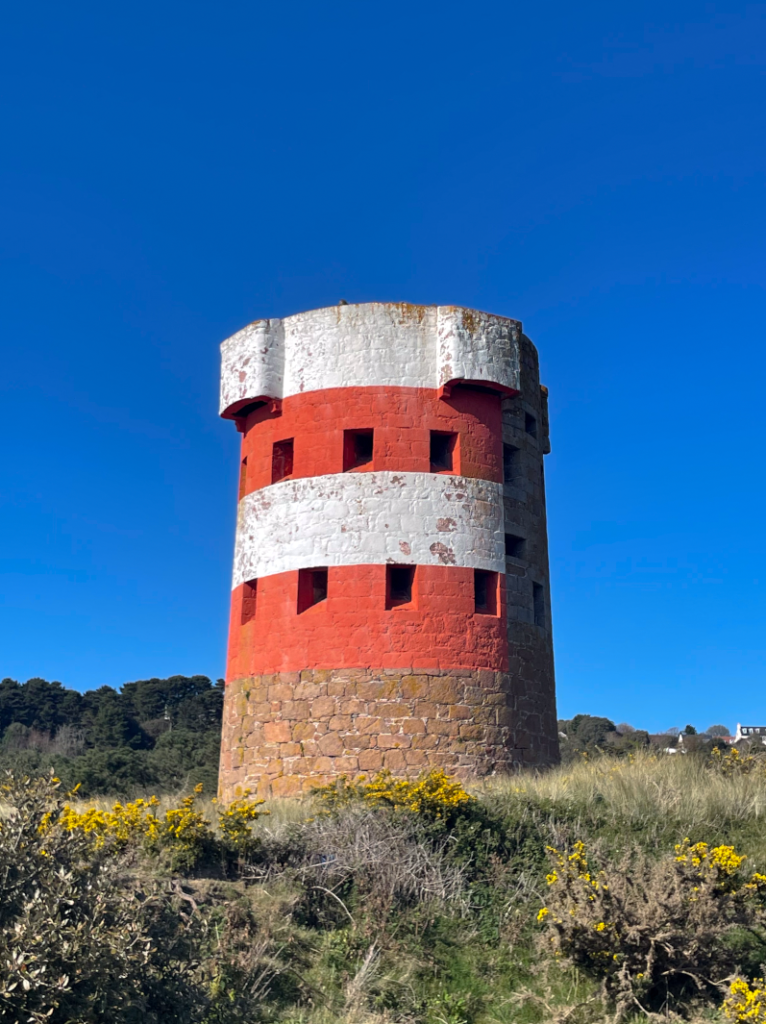
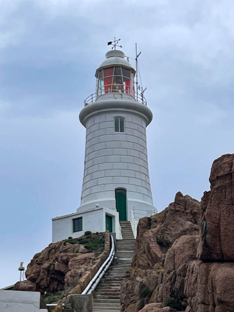
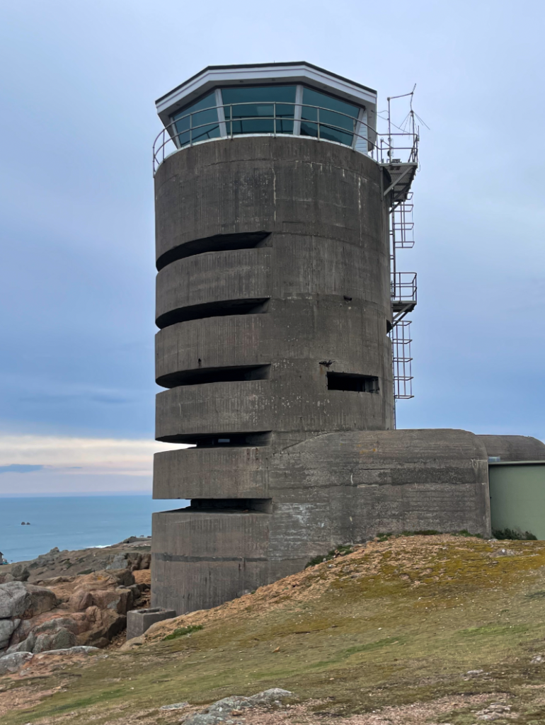
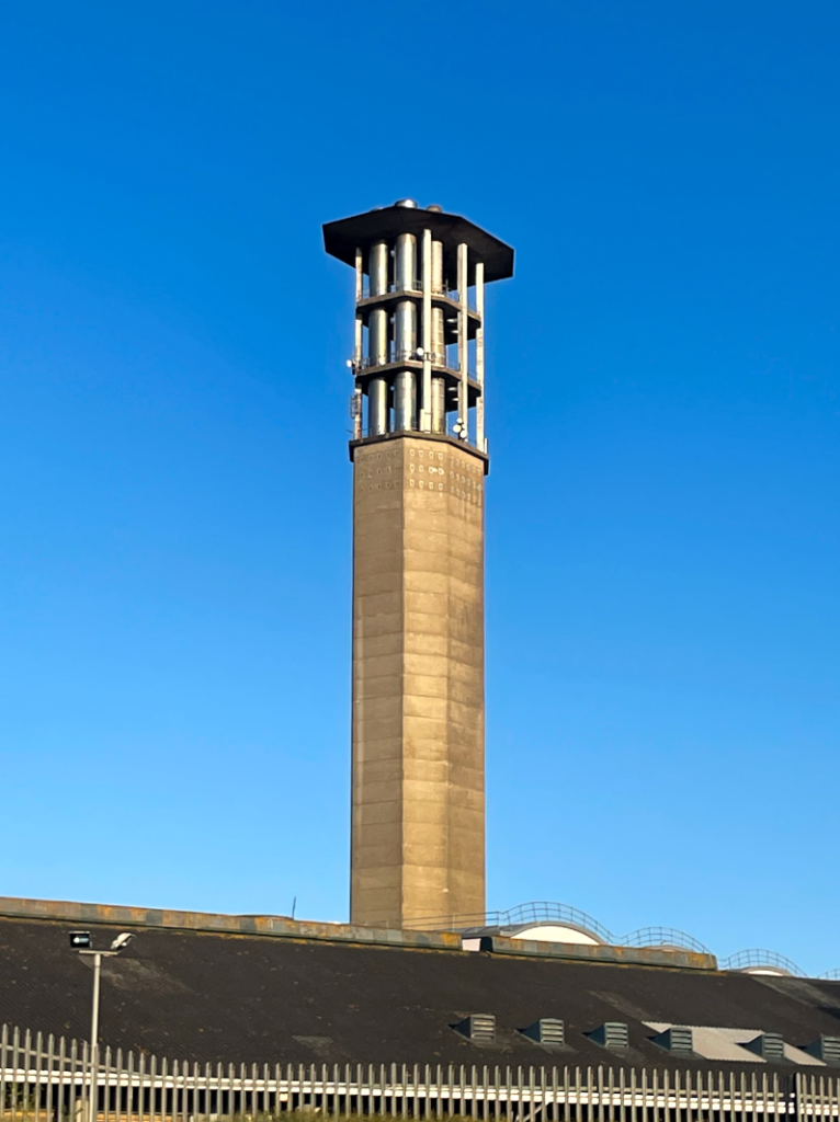
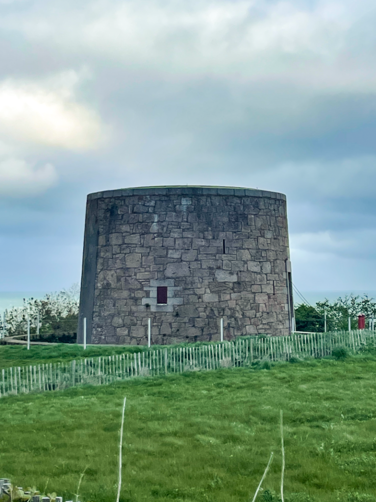
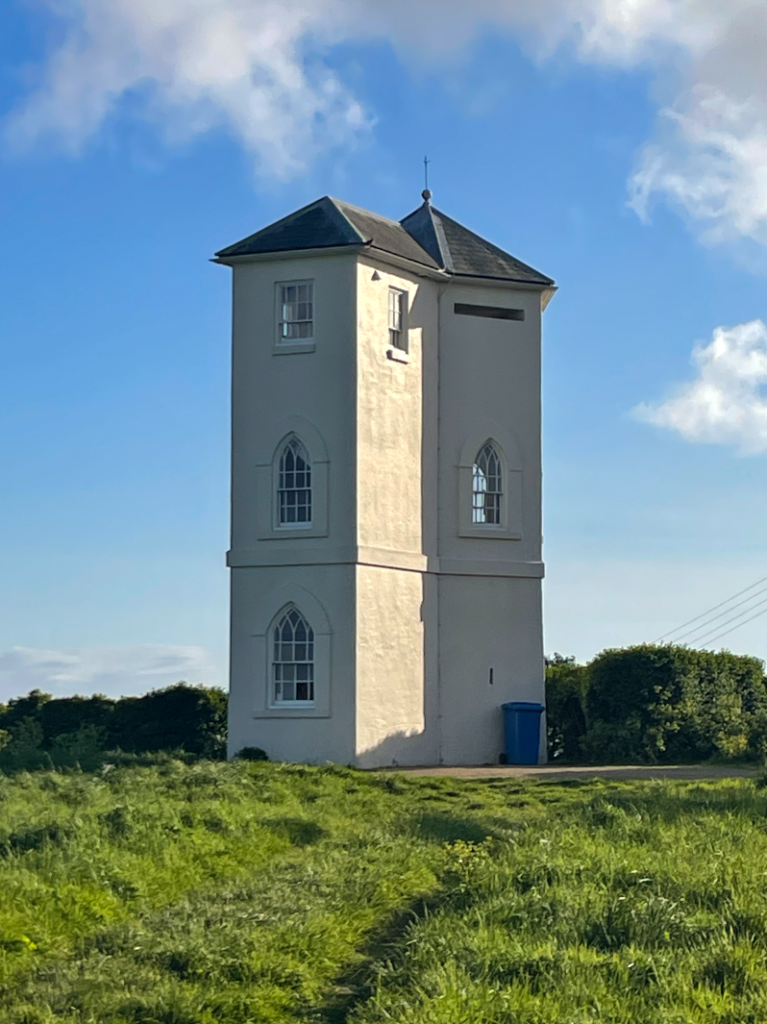
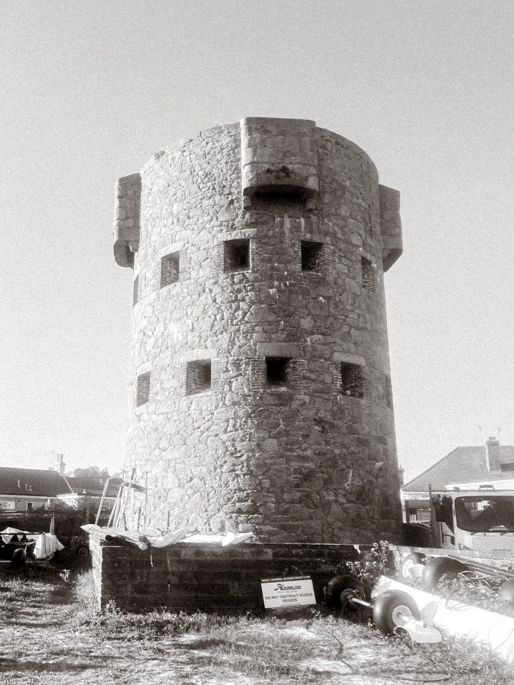
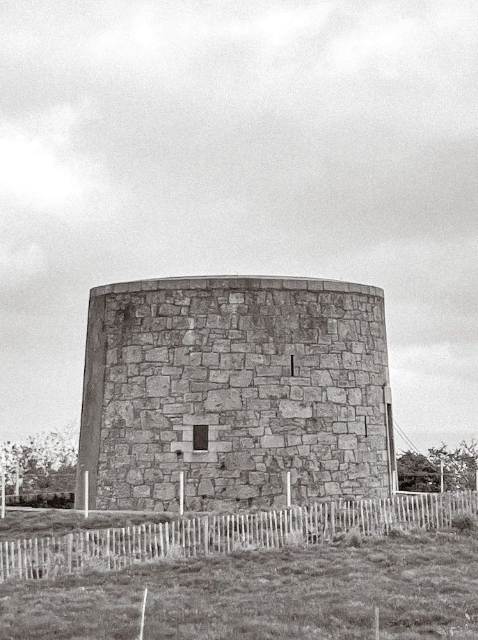
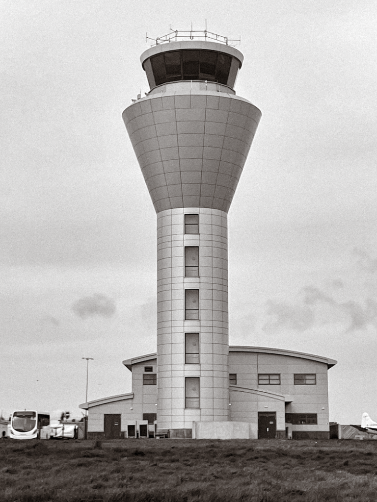
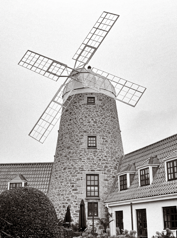
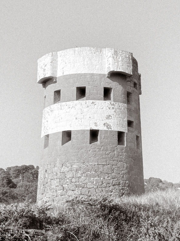
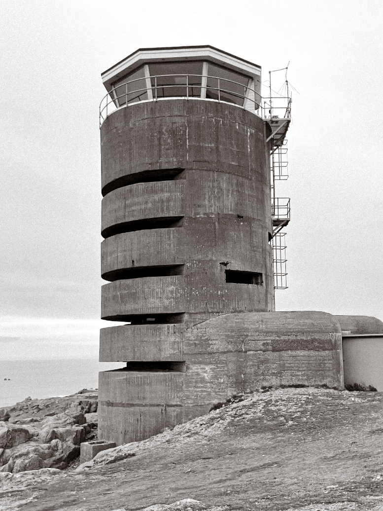
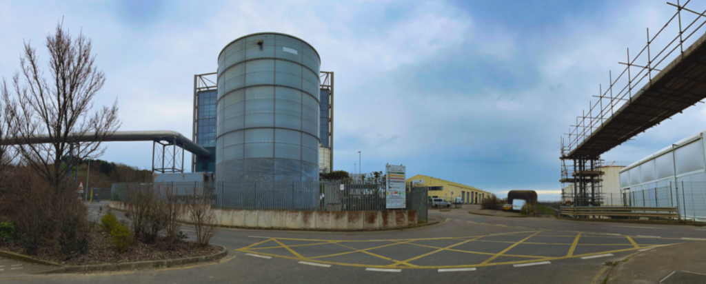
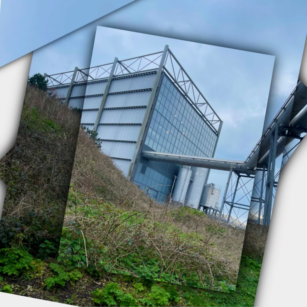
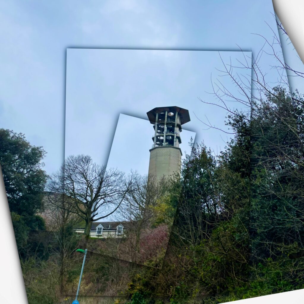
For my photo shoot inspired by the new topographic movement, I decided to explore the land across Jersey and photograph multiple towers and structures associated with the island. I photographed a wide spectrum of buildings in terms of their heritage and relationship to the island. Something like Beaumont Tower is a good example of this with 30 alike coastal towers being constructed in 1778 and later being adopted by Germans during World War II. On the other hand, other pictures feature a modern airport control tower which can be seen as an embodiment of the industrial environment; highlighting the passage of time and evolution of buildings in relation to their surroundings. These images all feature Jersey landmarks as the subject due to my own personal connection with Jersey as an island. Because the new topographic movement presents a raw and authentic approach to photography, all my photos were taken with the building central and at a straight perspective to present while allowing for my photographs to fit together as a typology more effectively; this also aligns with successful techniques of the Bechers’ work.
Subjects
St Peter’s Windmill
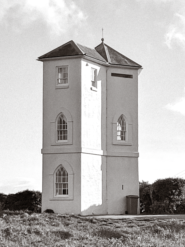
Beaumont Tower
Control Tower
Ouaisne Tower
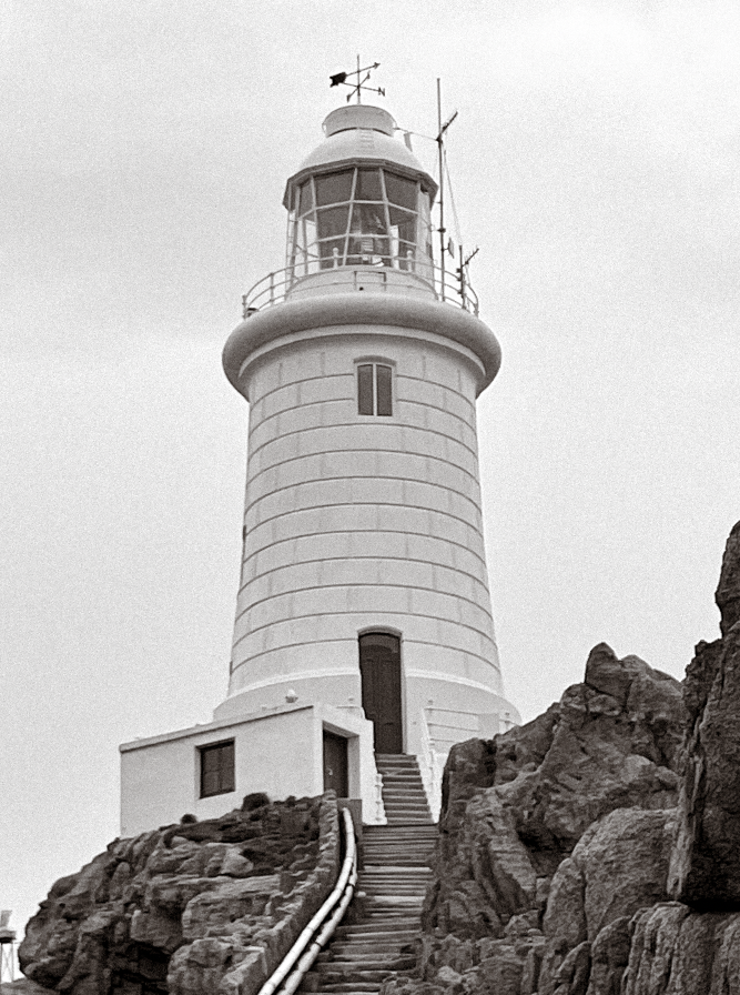
Corbiere Lighthouse
Radio Tower
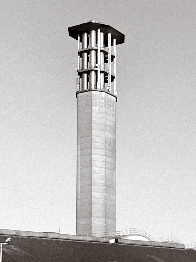
La Collette Chimney
Victoria Tower
Nicolle Tower
Edits and Layout
In first stage of editing, I ensured that my selected images were all at the same distance in terms of the subject’s relationship to their background. Because I took my pictures in daylight, they were all well exposed but had slightly different lighting. I decided to edit the photos into monochrome to counter this and help them fit together as a collection while also adhering to the deadpan aesthetic of the new topographics; making them further sterile. I also added a subtle sepia tone to my photos to give them a vintage-like effect; mirroring the ancient qualities of some of the subjects. With these pictures now uniform, I discovered that I needed to tweak lighting and exposure especially in the foreground of my images; using a gamma correction tool to lighten up the backgrounds and help bring detail back into my pictures which was previously lost due to the lack on contrast in greyscale. To finalise my composition, I formatted these images in a grid; creating a typology of my photographs and the Jersey structures. This further highlights the differences and similarities between the picture’s subjects. Displaying these images as a collection helps to overall create a more visually effective composition, giving viewers plenty to consider and think about in terms of response.
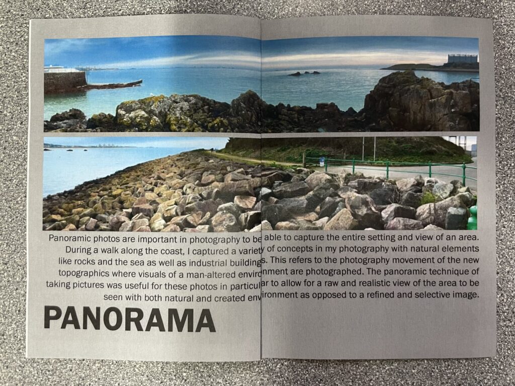
Panoramic photography is a technique of photography, using specialized equipment or software, that captures images with horizontally elongated fields of view. Panoramic landscapes are wide, expansive views that capture a large area of scenery in one image, often showcasing the beauty of nature. Referring to the wide or ultra-wide angled nature of the shot, these images are taken by a specialized camera with a wide lenses or created by stitching together multiple photos from different positions.
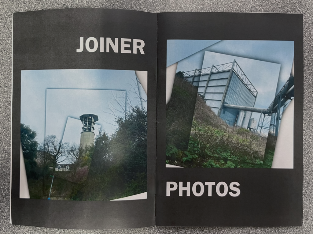
Joiner Photos
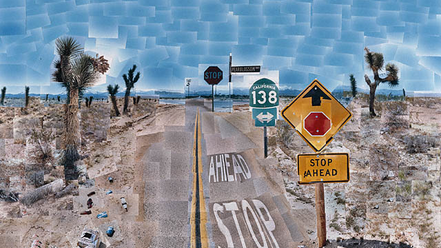
Joiner photography is a photographic technique wherein multiple pictures are assembled into one A joiner photo is a single image made up of multiple overlapping images. It is a photo collage when the artist assembles an image from several overlapping photographs. David Hockney is the most notable artist that uses this technique, creating a piece of art called ’Pearblossom Highway’ which depicts a view of an American Highway. It is a collage compiled from over 700 separate photographs. The artist himself describes his work as a drawing as opposed to a photographic piece.
My Panoramic Photos
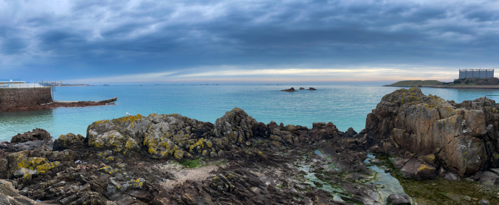
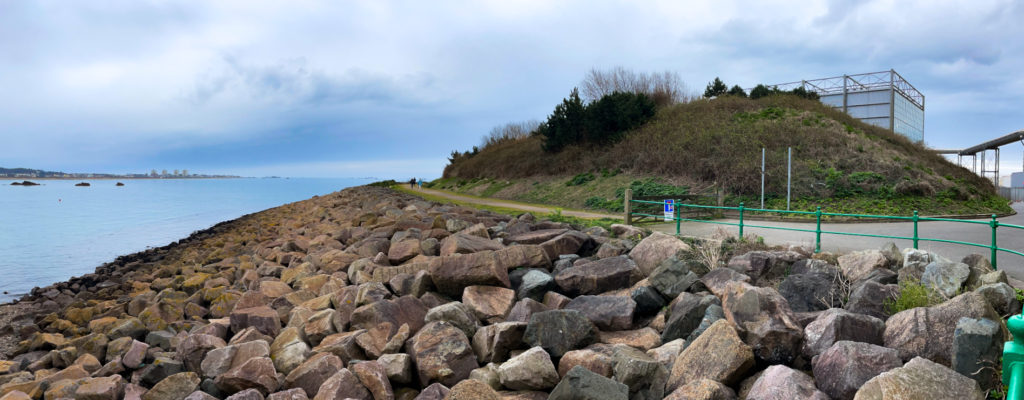
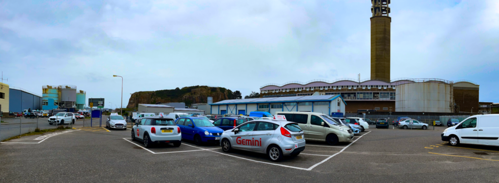
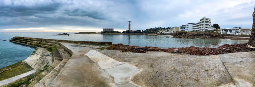
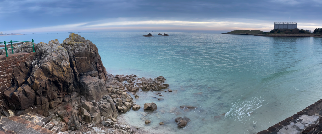
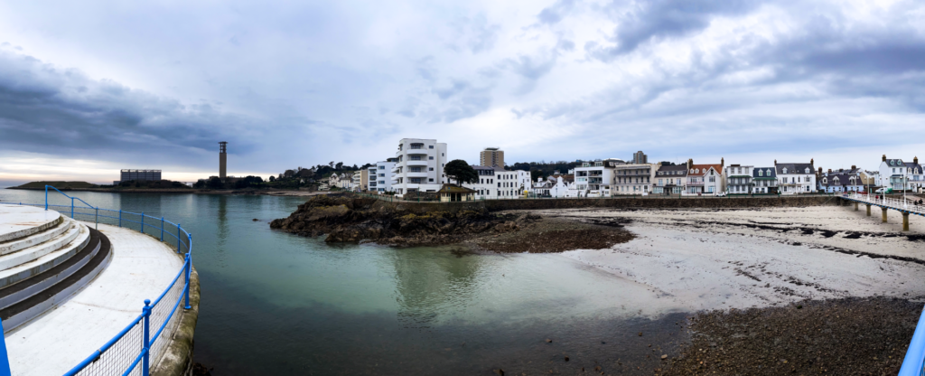
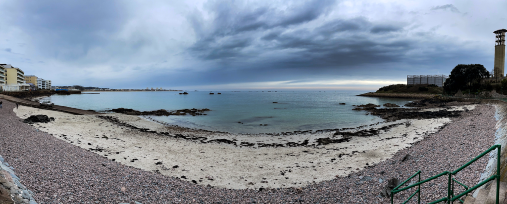
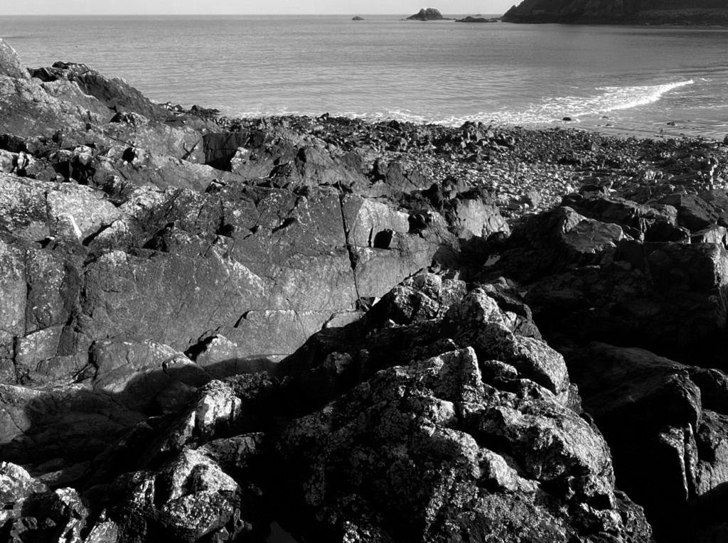
During our class trip to Havre des Pas, I took a collection of panoramic photos in order to be able to capture the entire setting and view of the area. With the walk being along the coast, I photographed a variety of concepts in my pictures with natural elements like rocks and the sea as well as industrial buildings. This referred to the photography movement of New Topographics where visuals of a man-altered environment are photographed. My shots of the recycling centre highlight this theme considering the position of such artificial and modern structures along side and juxtaposing a stunning coastal area. The panoramic technique of taking pictures was specifically useful for this shoot in particular to be allow for a raw and realistic view of the area to be seen with both natural and created environment as opposed to a refined and selective image.
My Joiner Photos
For my joiner photos, I took multiple photographs of a selected structure at a variety of angles and distances. I then brought these pictures into a canvas on photoshop and manually aligned them to match up against each other in the way they would have if it was a singular photo. To make my edits stand out and appear artistic, I added a thin shadow border to each image which helped to create depth in the overall composition.
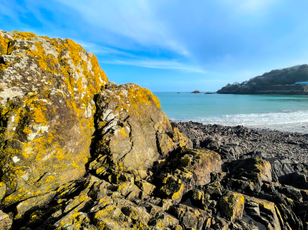
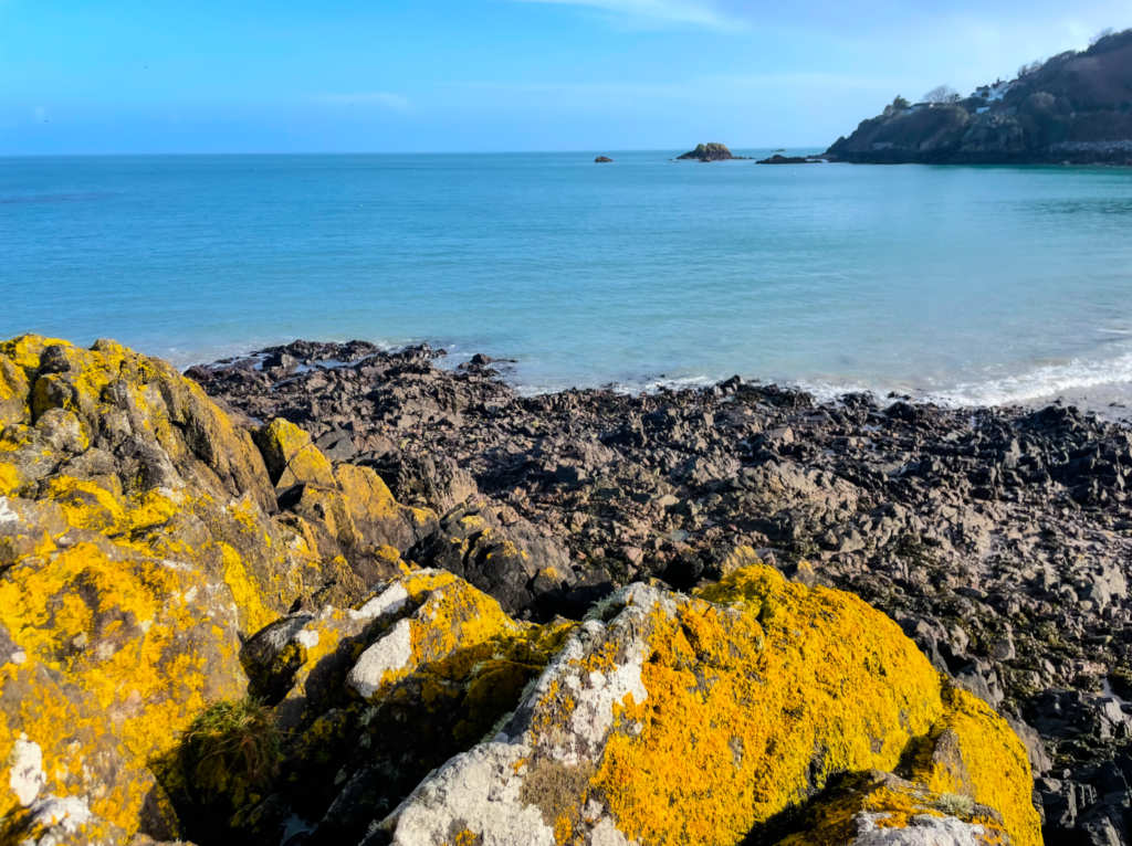
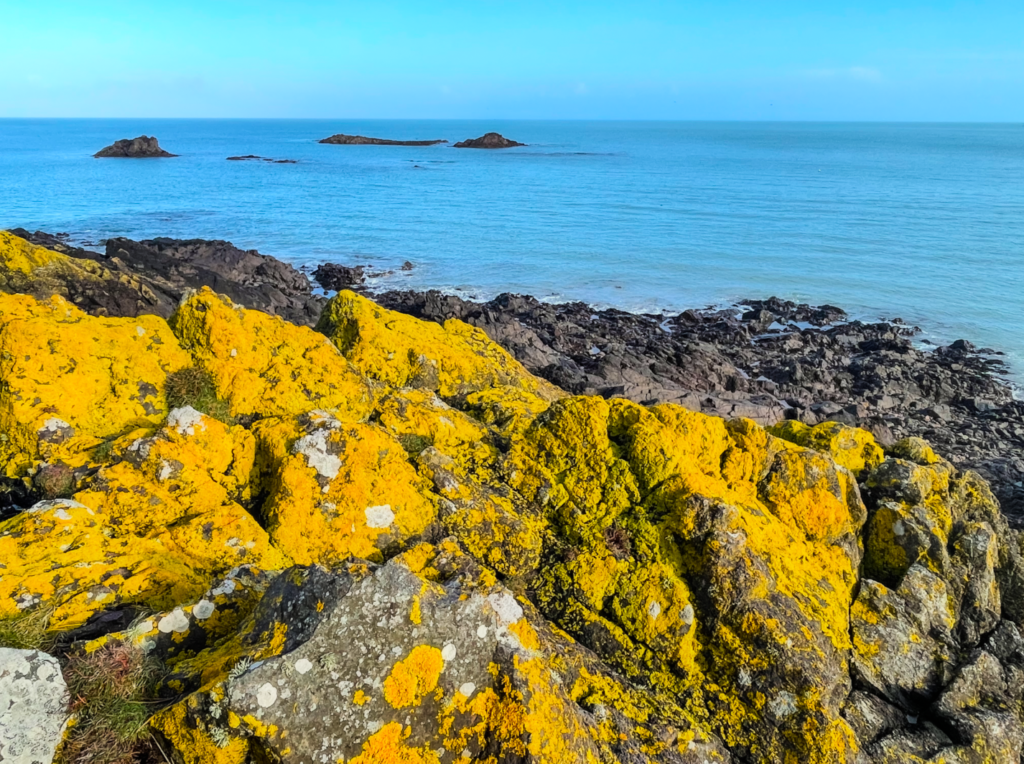
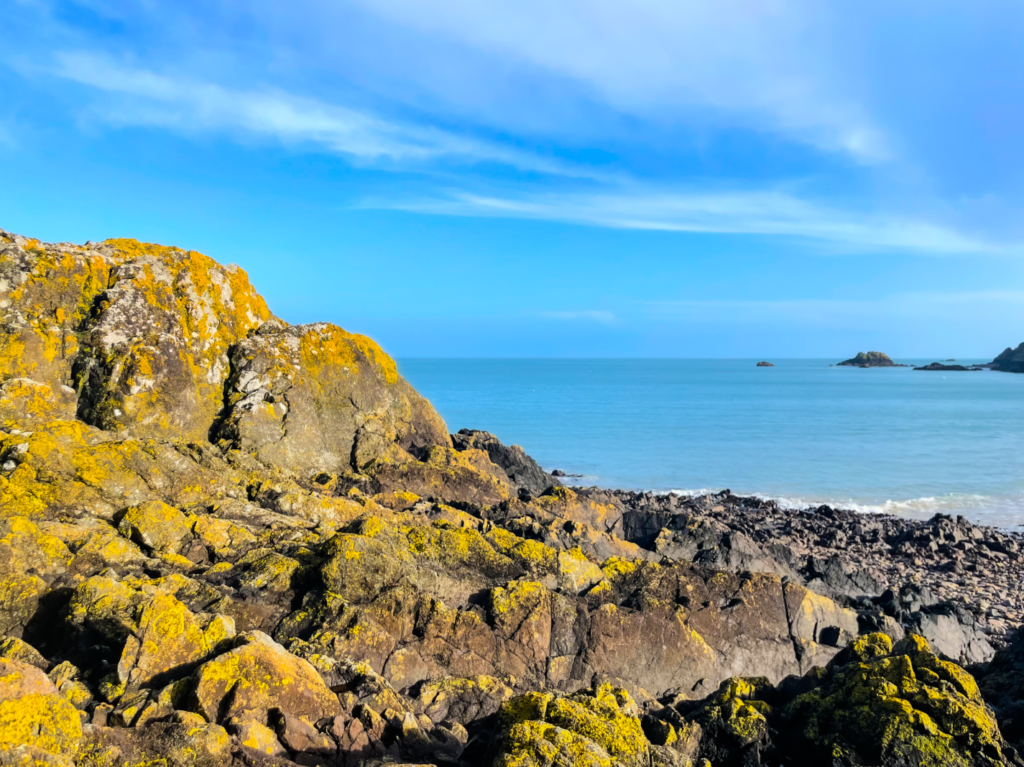
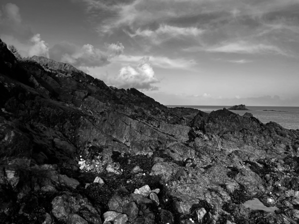
For my photos, I decided to go to St Anne Port as there is a dynamic balance of rock, water and sky; the only three things I want to feature in my photographs. Inspired by Ansel Adams’ composition, I am going to shoot my photos with a shallow focus to include all elements of the landscape in view while making the large and intimidating rocks a focal point. This allows for elements of the sublime to continue to shine through into my pictures while having the influence of Ansel Adams still prominent in my work through the content in which I am focusing on. To emphasise this I am going to shoot my photos from a low angle, positioning myself on the ground and tilting my camera upwards to make the rocks appear larger and therefore more daunting. I will take these on a day which has prominent clouds in the sky to overall make the image more interesting, especially when it comes to editing.
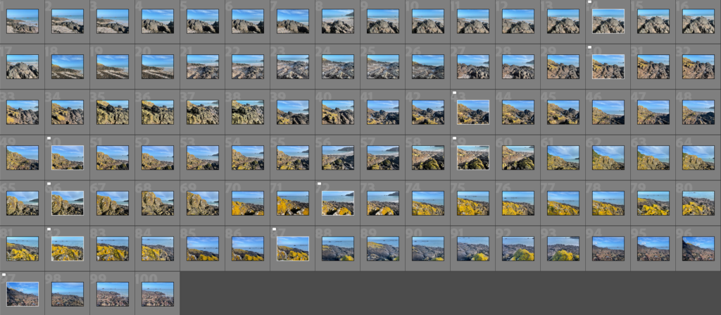
Contact sheet
HDR Edits
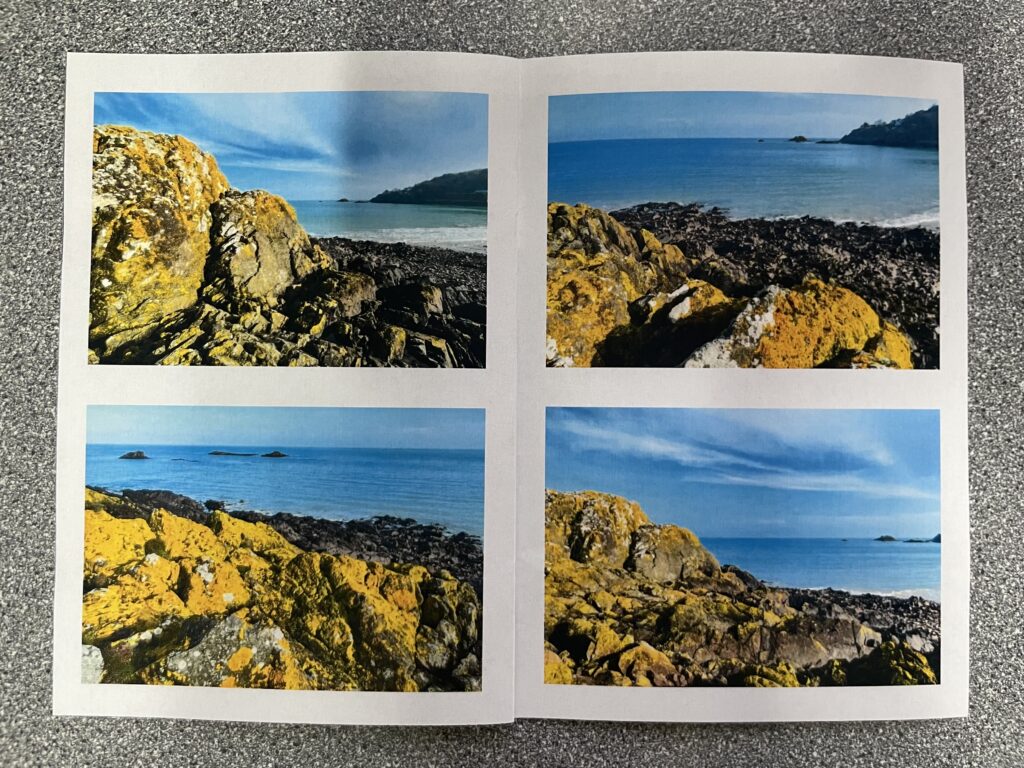
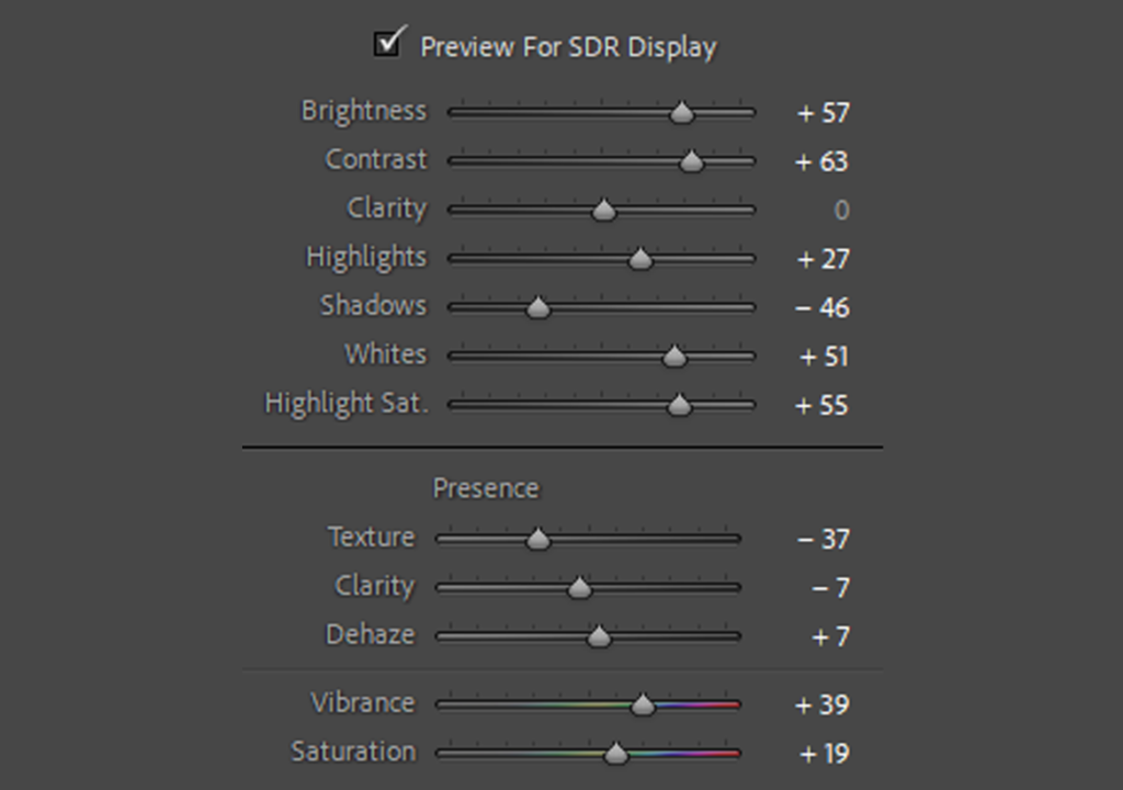
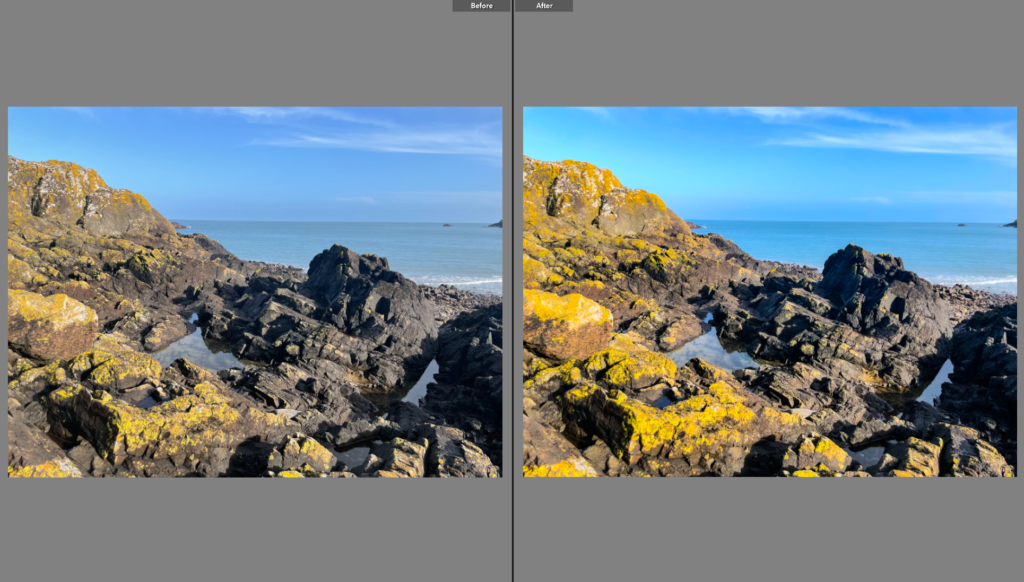
In Photoshop Lightroom, I selected a few of my best images that featured the yellow aspects of the rocks and edited them to appear as HDR photos. I choose these pictures specifically because I wanted to really bring out the vibrancy and beauty of the natural elements of coastal landscapes. These edits helped to extenuate the colours of these photographs, bringing out the contrast between the blue sky and sea and the tense rocks. By toggling with the effects in the SDR Display setting, I was able to find a perfect balance in my photos where the highlights in the waves and clouds had great clarity while not removing depth from the shadows in the foreground. These effects were overall complementary with my work due to the colours and texture of my photographs being heightened to a level that allows for definition to really shine through.
Developing
Settings
Before and After
Final Photos and Edits
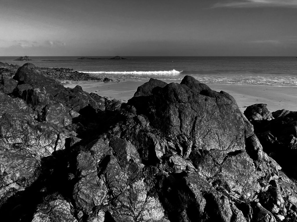
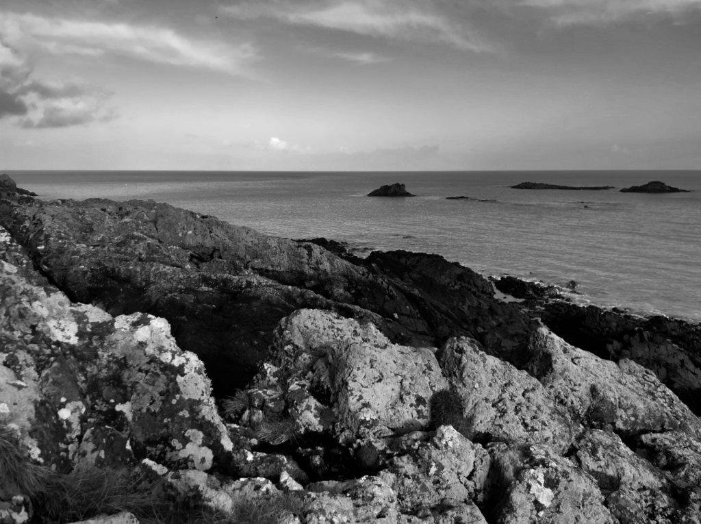
When choosing my final pictures, I considered ones which looked the most like something that would come out of Ansel Adams’ work and finally edited them in black and white to make them appear as a collection while also furthering visuals that highlight my inspiration and intended goal. I edited my pictures with Adams’ technique of the Zone System in mind where he includes a tonal scale of 0-10 in his photographs; including areas where the brightest whites can be seen as well as deep blacks. I made a specific effort to incorporate all these tones in my final pictures and I guaranteed this by increasing levels of highlights and shadows as well as contrast when editing. With this in consideration, I still ensured that I would not lose clarity and texture in the focal points during this process in order to maintain detail seen within nature.
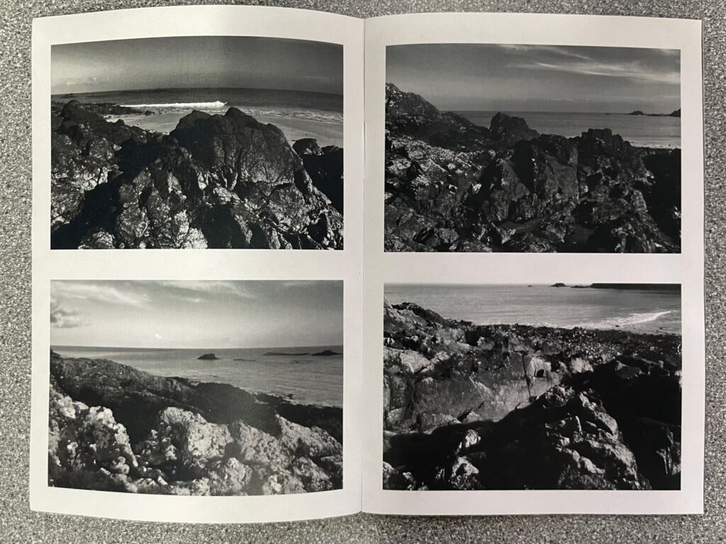
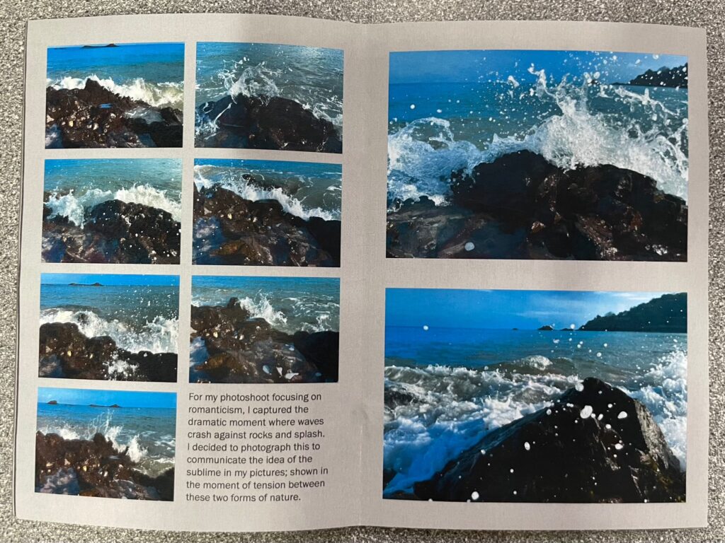
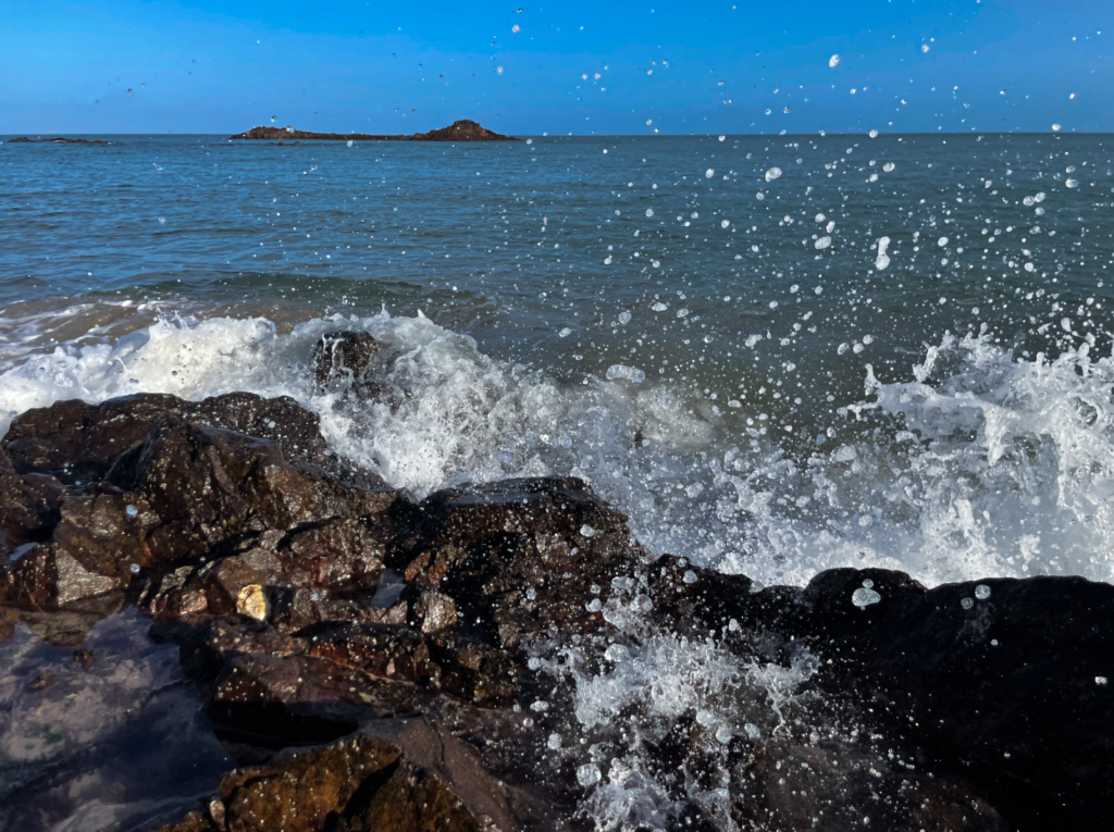
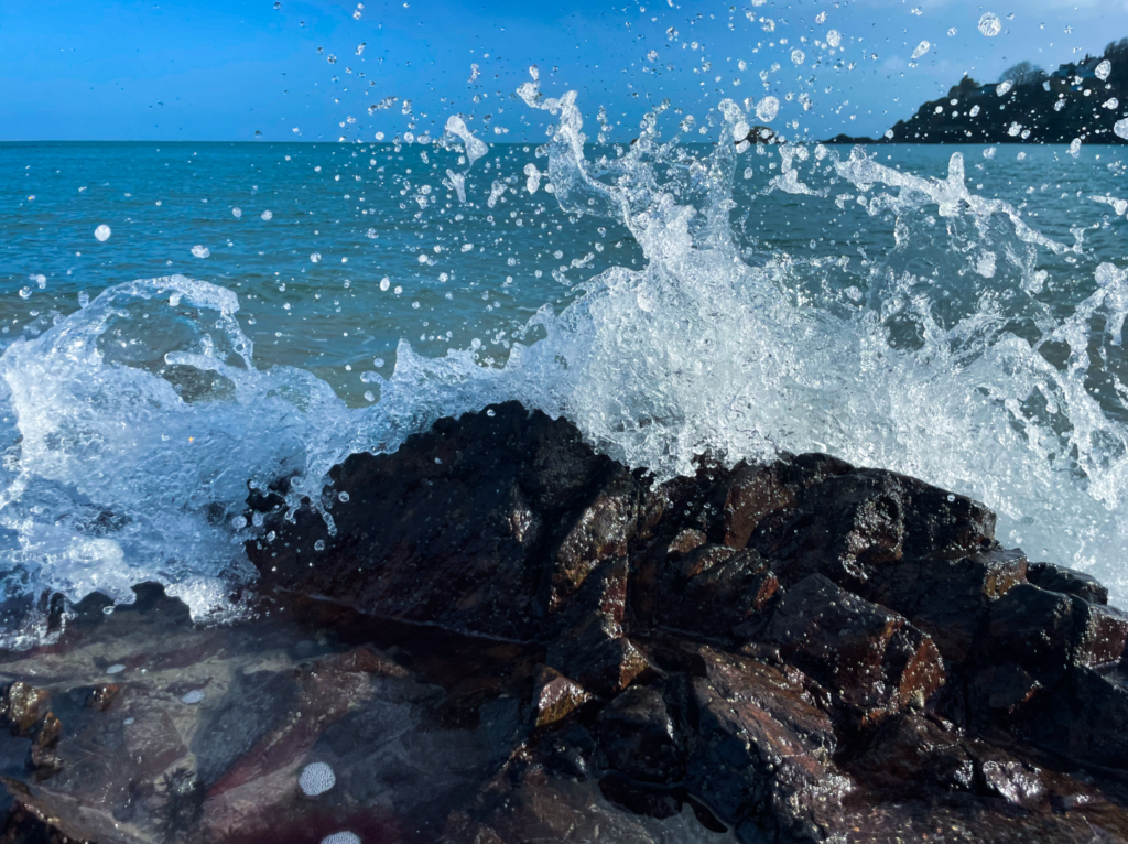
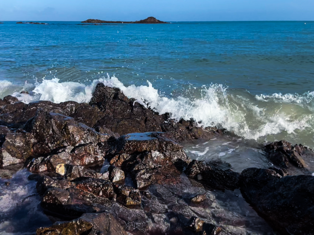
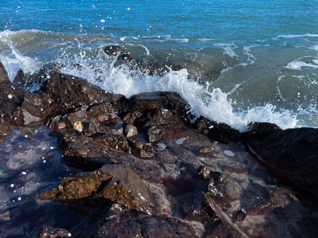
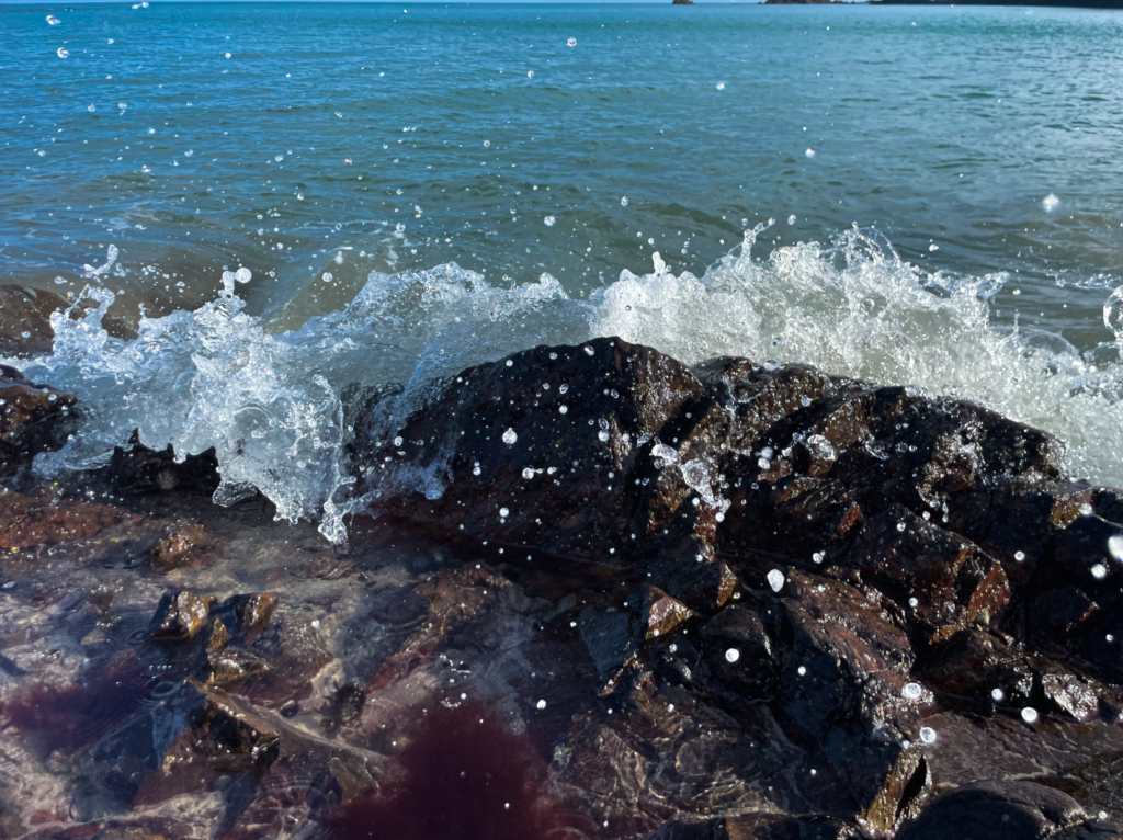
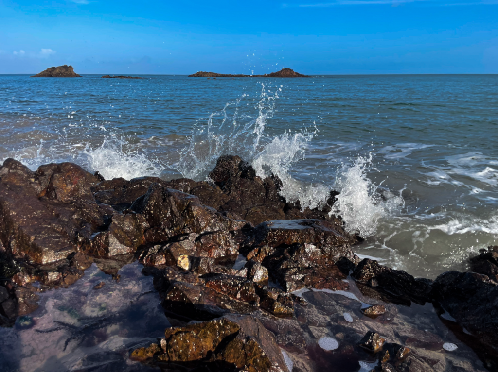
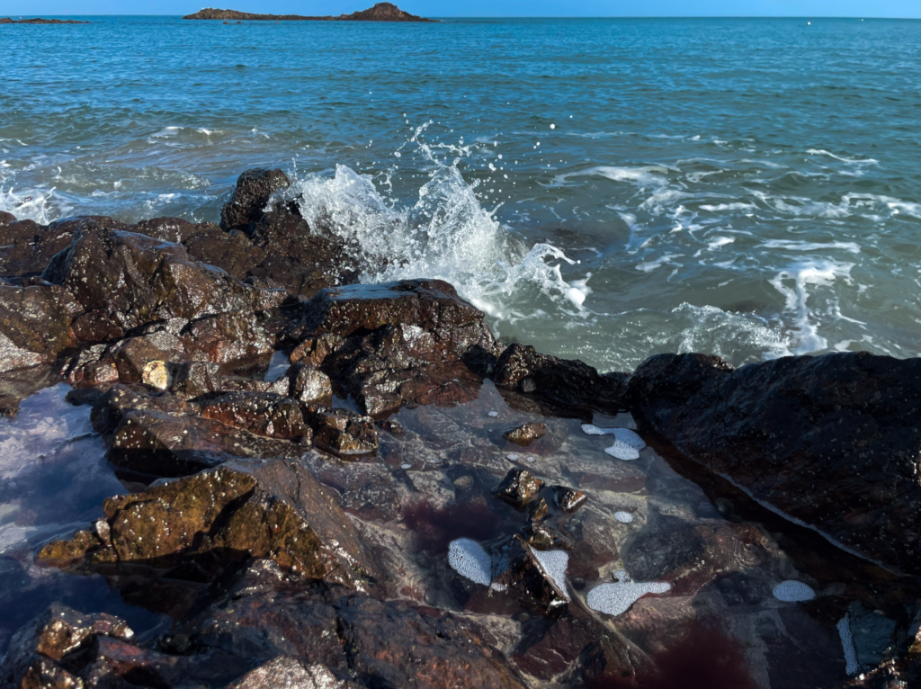
For my photoshoot focusing on romanticism, I decided to go to the beach when it was clear weather and high tide to take pictures close up of the sea against the rocks. I will go down to the shore where the tide begins to wash onto the rocks and surfaces. I plan to go on a day that is particularly windy in order for there to be large waves which I can photograph. I wanted to overall capture the dramatic moment where the water crashes against the rocks and splashes. I decided to photograph this to communicate the idea of the sublime in my pictures; shown in the moment of tension between these two forms of nature. I am going to use a fast shutter speed to capture a sharp moment of the splash so the clarity and definition of the water is effectively enhanced.
Photoshoot
Best and Edited Photos
This selection of pictures definitely turned out the best as they aligned the most with my photoshoot plan and artistic goal. The sublime can be seen clearly as the waves crash uncontrollability and unpredictably against the rocks; enhanced by the crisp shot of the movement of the water. When editing my most effective photos, I first aligned the horizon to ensure the lines did not distract from the focal point. I tweaked the saturation to brighten the blue of the sea and sky to further the contrast between them and the rocks; also making sure to keep a natural balance. Finally, I toggled the highlights and shadows in order to have a large dynamic range in my photographs; bringing in definition to each area of the image.
Creative Edits and Presentation
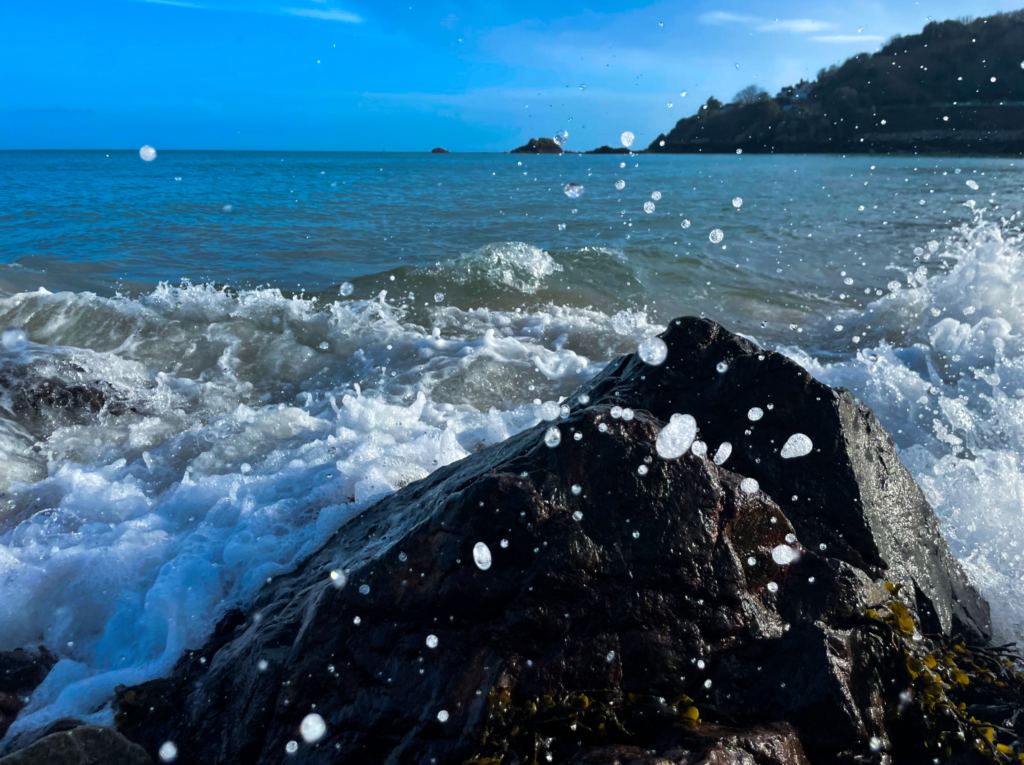
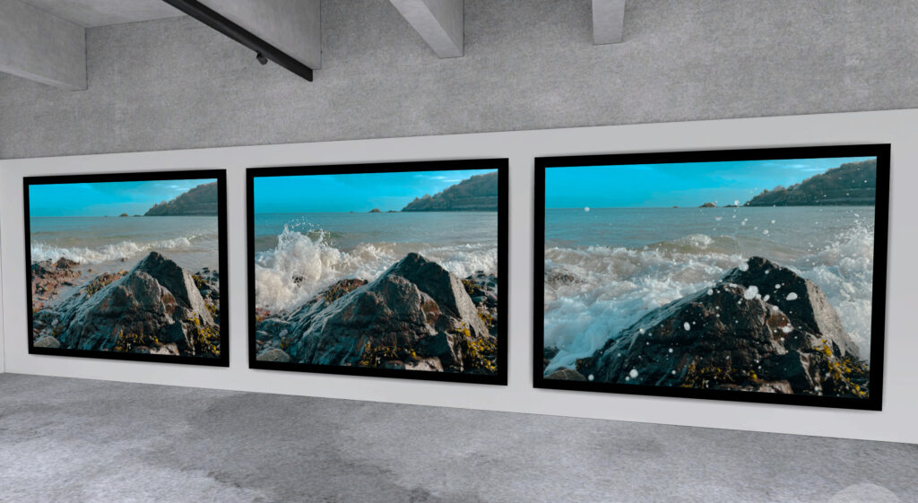
During my selection process, I discovered that I wanted to display these three images together and separately from my other strongest photographs. When taking my photos with fast shutter speed, I noticed that I was capturing different stages of the event of the splash with my camera. I thought this was interesting as it played as a storytelling of the creation of the sublime. It was alluring to see the various levels of tension which came before the visuals of a final photo; displaying the moments leading up to the splash and multiple times of a shot. I was able to communicate an almost stop motion gradual of the event. To separate this triptych of photos further from the rest, despite them having the same format in terms of composition, I edited them on Photoshop Lightroom using a few of the preset photo filters in order to achieve a golden hour tone. Wishing to display these in a horizontal line to solidify my goal of progression in nature, I imported these images onto Artsteps in my own virtual gallery where I then aligned them to be finally presented.
Ansel Adams was an American landscape photographer and environmentalist known for his black and white images of the American West. He helped found Group F/64; an association of photographers advocating for pure photography which favoured sharp focus and the use of the full tonal range of a photograph. He was born in San Francisco four years before the great earthquake of 1906 where he spent his childhood days playing in the sand dunes. This is how he gained an appreciation for nature which would become his primary source of photographic inspiration.
Ansel Adams was deeply inspired by Yosemite National Park with his visits here playing a pivotal role in sparking his interest in photography and ultimately shaping his career. During his time at Yosemite, Adams was captivated by the park’s majestic landscapes, particularly its dramatic granite cliffs and towering waterfalls. He also became interested in the art of visual composition and how light and shadow played on the natural forms of the landscape. His work in Yosemite also led him to become a prominent advocate for the conservation of national parks, working with organizations like the Sierra Club to promote environmental protection when in 1927 he was named Sierra Club’s official trip photographer.
Ansel Adams’ ’The Tetons and the Snake River’ is one of his most iconic photographs, demonstrating his mastery of landscape photography and his dedication to environmental preservation. Adams used a large-format 8×10 camera to take this photo which allowed for remarkable sharpness and tonal range. Developed by Adams and Fred Archer, the Zone System allowed for precise control over exposure and contrast which can be seen in the final photo. A deep depth of field keeps all elements sharp, from the foreground river to the distant mountains. The photograph displays a dramatic contrast between the bright sky and the dark river, achieved through red filters that darkened the blue sky. In terms of composition and framing, the winding river creates a strong leading line, guiding the viewer’s eye toward the rugged peaks of the Tetons. The dramatic interplay of light and shadow enhances the textures of the mountains and river therefore creating a sense of depth while the absence of colour draws attention to textures and tonal gradations; reinforcing the timelessness of the scene. The curve of the river adds dynamism while the mountains act as a stable backdrop with the high vantage point, allowing for a sweeping view to emphasise the vastness of the landscape. Taken in 1942, the photograph was part of Adams’ work for the Department of the Interior; documenting national parks. Adams was an advocate for nature conservation and his work played a crucial role in promoting the preservation of America’s landscapes. The image embodies the untamed beauty of the American West, reinforcing themes of wilderness and national identity. The photograph captures the sublime; a Romantic notion of nature which evokes a spiritual connection. Unlike many landscape photos of this era, there is no human presence seen. The river may symbolize the passage of time and the relationship between land and water. The scene overall suggests the importance of preserving such landscapes for future generations.
Ansel Adams was a dedicated artist-activist, playing a role in the growth of an environmental consciousness in America and the development of a citizen environmental movement with him even being awarded the Presidential Medal of Freedom in 1980. Adams first used his photographs for environmental purposes in the 1930s, especially with his work in Kings Canyon National Park. Kings Canyon was at risk primarily due to the threat of development and commercial exploitation during the early 20th century. One of the most significant early uses of his images for conservation was when they were featured in a Sierra Club report aimed at gaining national park status for the newly proposed Kings Canyon National Park in California.
Ansel Adams was all about visualisation in his photography which referred to the entire emotional and mental process of creating a photograph which Adam’s considers to be one of the most important concepts in photography. It is to visualize an image, in whole or in part, to see it clearly in the mind prior to exposure; a continuous projection from composing the image through the final print. Visualization is more accurately viewed as an attitude toward photography. He also formulated the Zone System which is a photographic technique used for determining optimal film exposure and development, allowing photographers to capture the entire tonal scale in their photographs from featuring areas presenting the brightest whites to the deepest greys.
The initial proposal to create Kings Canyon National Park was denied because of political and economic interests that conflicted with the idea of preserving the area. However, the proposal was eventually approved in 1940 due to the increased public support and awareness, Ansel Adams’ photography and America’s general political shift. The creation of the park was a victory for environmentalists and it ensured that the area’s unique landscape would be protected from exploitation. It also marked the increasing importance of national parks as a means of preserving the nation’s natural heritage for future generations.
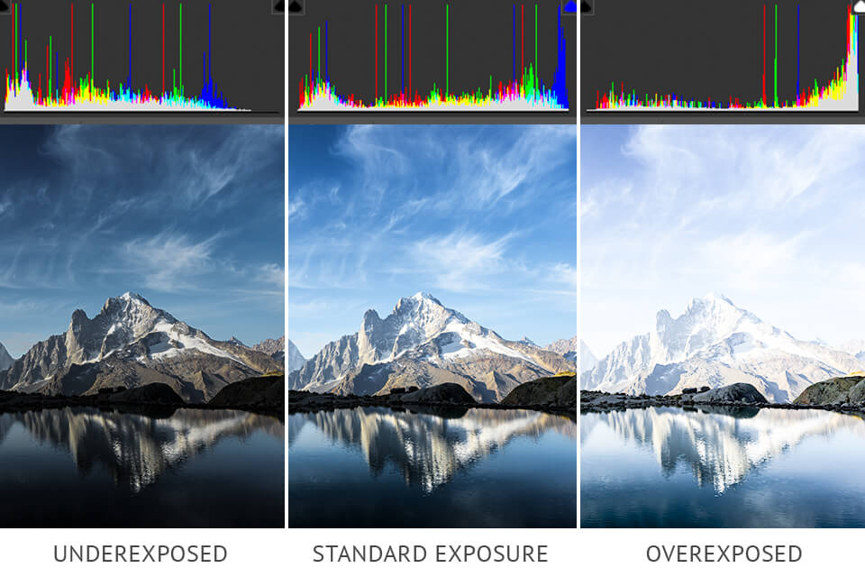
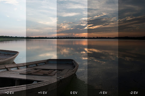
Exposure compensation allows photographers to override exposure settings picked by your camera’s light meter to darken or brighten images before they are captured. Since camera meters work by evaluating light reflected off subjects and are standardized on middle grey, any time a camera is pointed at something very dark the meter will work the opposite way by brightening up the exposure while a very bright subject will cause the meter to darken the exposure. This is done to get as close to the middle grey as possible so that the resulting image is not too dark or too bright. While this works out quite well in most cases, one might experience overexposure or underexposure in more challenging lighting conditions where the camera meter might be adjusting the exposure too aggressively. This is where exposure compensation comes into play, with the photographer manually taking control of the brightness of the image and overriding it using the exposure compensation feature of the camera.
HDR Photos
HDR is an abbreviation for High Dynamic Range. HDR photography is a technique that helps you get details in the brightest and darkest parts of your photographs; more so than if you took just one photograph with your camera. When photographers want to capture photos that exceed the capabilities of their cameras, they use the HDR photo process to capture the full dynamic range of images. By bringing different exposures together, you can make the most of every pixel so images more closely resemble what the human eye can perceive.
Exposure Bracketing
Exposure bracketing is where you take a sequence of photographs with different exposure levels and then blend them together to create a photograph with a much higher dynamic range. It gives you all the details you will ever need in your photographs so you can create the exact image you had in mind. Exposure bracketing is particularly useful in situations where the contrast between the brightest and darkest parts of the scene is too high for the camera’s sensor to capture in a single shot. Common scenarios include landscape photography with bright skies and dark foregrounds. By capturing multiple exposures and blending them together or selecting the best shot, exposure bracketing helps you achieve optimal exposure and preserve details in both the highlights and shadows of the scene.
Romanticism was a cultural movement that emerged in the late 18th century, emphasizing emotion, imagination and the beauty of nature. It celebrated individualism and intuition, often challenging the rational ideals of the Enlightenment. Romanticism sought to express the deep and mysterious aspects of human experience and the natural world. The ideals of Romanticism emphasise the beauty and power of nature, portraying it as wild and sublime. While exploring the supernatural, Romantics also rebel against societal norms and industrialisation. The Enlightenment was an intellectual and cultural movement in the 17th and 18th centuries that emphasized reason, science, individual rights and scepticism of traditional authority. Romanticism was a reaction against this as well as the Industrial Revolution. Romantic thinkers saw the Enlightenment as cold and dehumanizing with the Industrial Revolution having a major impact on Romanticism by fuelling its emphasis on nature, emotion and individualism. As industrialisation led to rapid urbanization and harsh working conditions, many Romantics reacted by idealising nature and rural life.
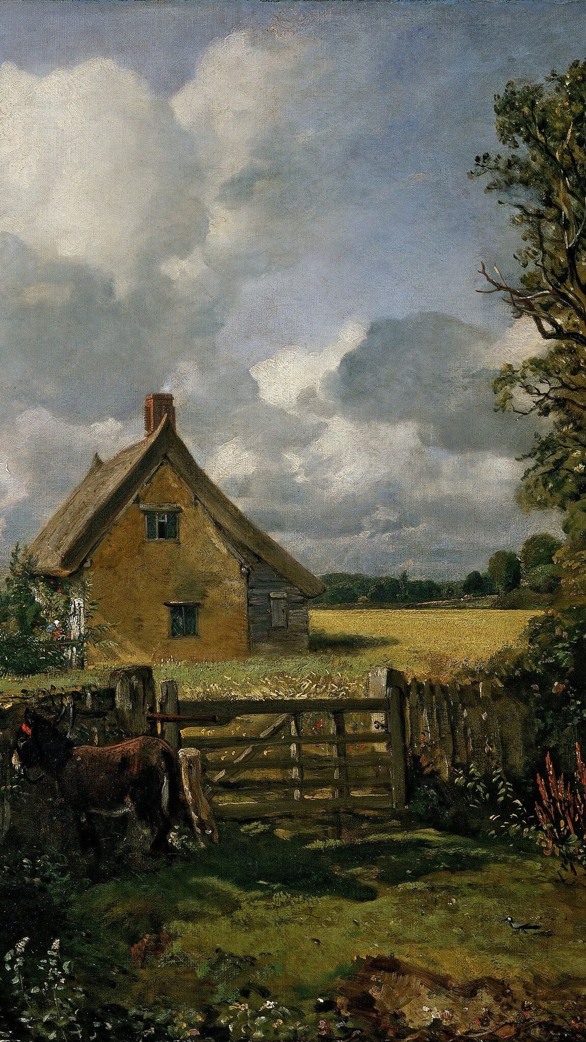
John Constable
John Constable who lived in 1776-1837 was an English landscape painter in the Romantic tradition. Born in Suffolk, he is known for revolutionising the genre of landscape painting with his pictures of Dedham Vale, the area surrounding his home which he invested with an intensity of affection. Although his paintings are now among the most popular and valuable in British art, he was never financially successful. His work was embraced in France, where he sold more than in England.‘The Cornfield’, one of Constable’s most famous painting, is seen on the right. The painting may appear to be traditional and mundane to the modern eye, however back when it was created it was seen as it was new and radical with Constable being ambitious. This painting is personal to him, especially with his father being a land owner, and therefore captures a nostalgic memory of the place. Landscapes were not a popular concept at the time with this considered to be a classical landscape despite the painting having a lack of finish which contrasted the usual strive for perfection of this era. Historically, this painting lies in a time of economic stresses and unemployment among workers with the land being fraught thanks to tension from industrial revolution. The painting, however, is removed from this tension with Constable managing to create beauty in a low moment while building a subtle political undercurrent with the farmers in the back being one with nature. In terms of composition, area of the canvas is given over to the sky with an arch across the foreground leading to parts of the painting. The red accents balance out the green colours with the rough textures of the painting allowing for viewers to really be able to feel the water.
What is The Sublime?
The sublime is a concept in aesthetics that refers to experiences that evoke both awe and terror, often in the face of nature’s vastness or power. It was popularised by philosophers like Edmund Burke who describes the sublime as something that creates a sense of overwhelming danger, stating ‘whatever is fitted in any sort to excite the ideas of pain and danger, that is to say, whatever is in any sort terrible, or is conversant about terrible objects, or operates in a manner analogous to terror, is a source of the sublime’. In terms of landscapes, the sublime is often depicted through untamed and dramatic scenery like towering mountains, deep chasms, violent storms and endless deserts. These places inspire both fear and admiration, making humans feel small compared to the immensity of nature. Romantic painters captured this feeling by portraying lone figures standing before wild landscapes to emphasise the contrast between human fragility and nature’s overwhelming power. An avalanche, for example, can be dangerous and uncontrollable yet also possess a certain beauty that captivates the human mind. The ocean is a perfect example of the sublime with it being deep and unknowable, evoking both fascination and fear. Calm seas can be peaceful and beautiful, but a stormy ocean with crashing waves and howling winds can make people feel powerless before its might. The ocean’s ability to inspire both awe and fear captures the essence of the sublime.
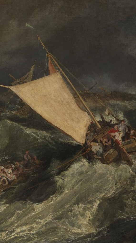
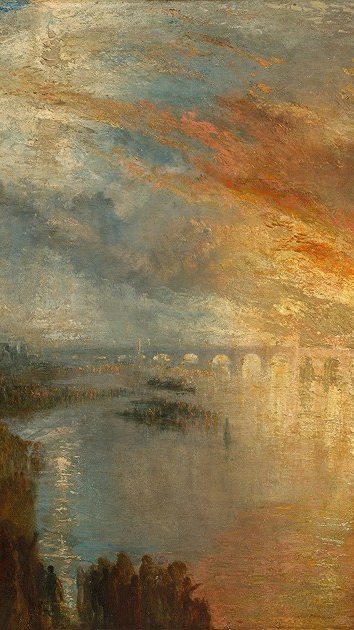
Joseph Mallord William Turner
Joseph Mallord William Turner was a leading figure in the Romantic movement of the late 18th century through to the 19th. For Turner, psychological expression and the liberation of the imagination were of importance in his work. He achieved these goals by painting extreme contrasts of intense light and gloomy clouds with energetic brushstrokes. He created many oil paintings and watercolours portraying compelling forces which also served as settings for historical and modern dramas. He captured events such as the slow creep of glaciers in the Alps, the sudden fall of an avalanche and the swell of the ocean. Human transition is presented also, with images of steamships and other suggestions of industry building the ascendant machine age.