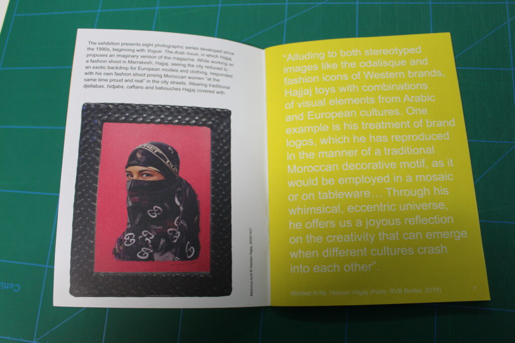
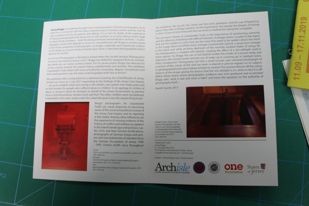
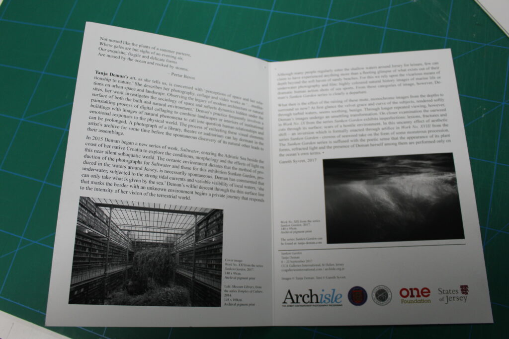
Zine is short for magazine, and a zine is often a self-published work of original photos and text, which are normally the product of a single person, (can be a small group of people) Zines are often printed in editions fewer than 100.
Historically, zines have provided community for socially isolated individuals or groups through the ability to express and pursue common ideas and subjects.
Mood board.
Research zines and newspaper design made by artists and photographer that will provide visual stimulus for your page design. Produce a mood board and consider the following in your analysis:
How you want your design to look
Format, size and orientation
Narrative / visual concept
Design and layout
Rhythm and sequencing
Images and text
Title and captions
Zine design and layout:
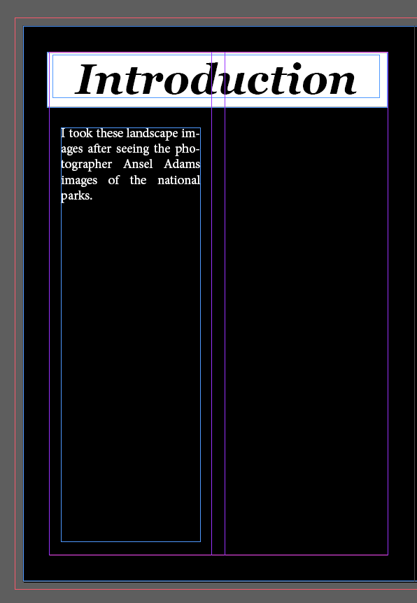
originally I had this page here about Ansel Adams next to this introduction pages. However there was a lot of text and not a whole lot of visual especially when the to pages were next t each other.
this is the unfinished introduction to show that these 2 pages were next to each other
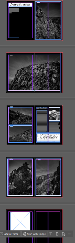
this is now the updated zine since I have moved the position of the Ansel Adams page whilst trying to display my images in different way (one over pages, portrait and landscape orientations.)
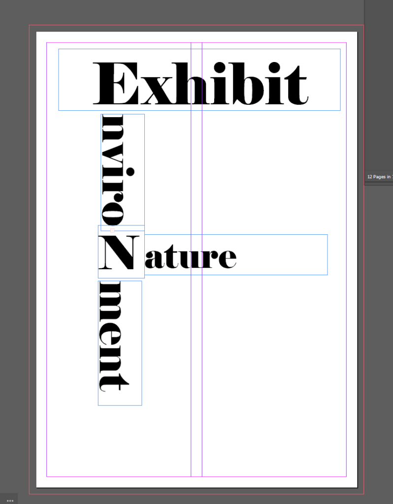
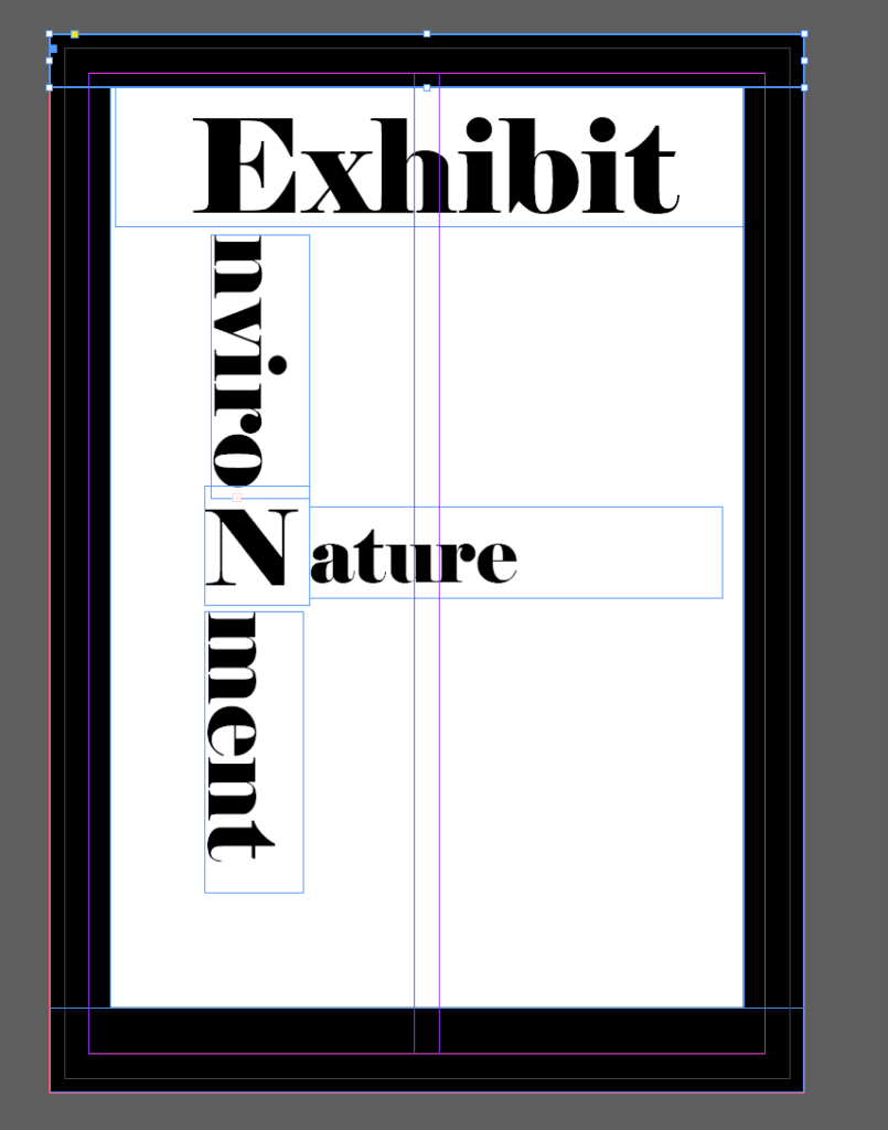
Front Cover Design
When deciding what I wanted to do for the front cover of my zine I decided that I didn’t want an images on the front or back cover of my zine as I wanted all of them to be inside the zine instead of on the cover.
I wanted to have some text going across diagonally across the front cover so I tried doing that and got half way through and realising that it did not look good and I found a few more images that I hadn’t used yet so now the front cover looks like this. ( unfortunately I forgot to get a photo/screen shot of the test that o had done on the front cover)
I decided to change the image on the front cover as I didn’t like how this one looked. However the image that I wanted to use had been cropped into a square by me to avoid the dead space in the image, however I don’t think that I like the blank space on the top and bottom around the image so I am going to try if I can stretch the image out
this is how the front cover looks now that I managed to change how the image sat in the frame I double clicked the image which allowed me to move the image whilst it still fit the frame so I could decide which was the main point of the image that I focused on
I have now printed this zine, however I am creating a new one using the same images but in the style of an exhibition style walk through, which captions and things on the images and this zine above is my creative zine.
For this zine I decided to go for a reverse look in contrast to my original zine where the background was black with eh white boarders, compared to this one which is a white background with black boarders around the images.
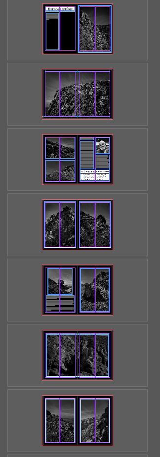
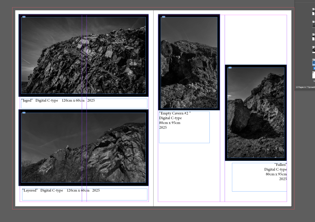
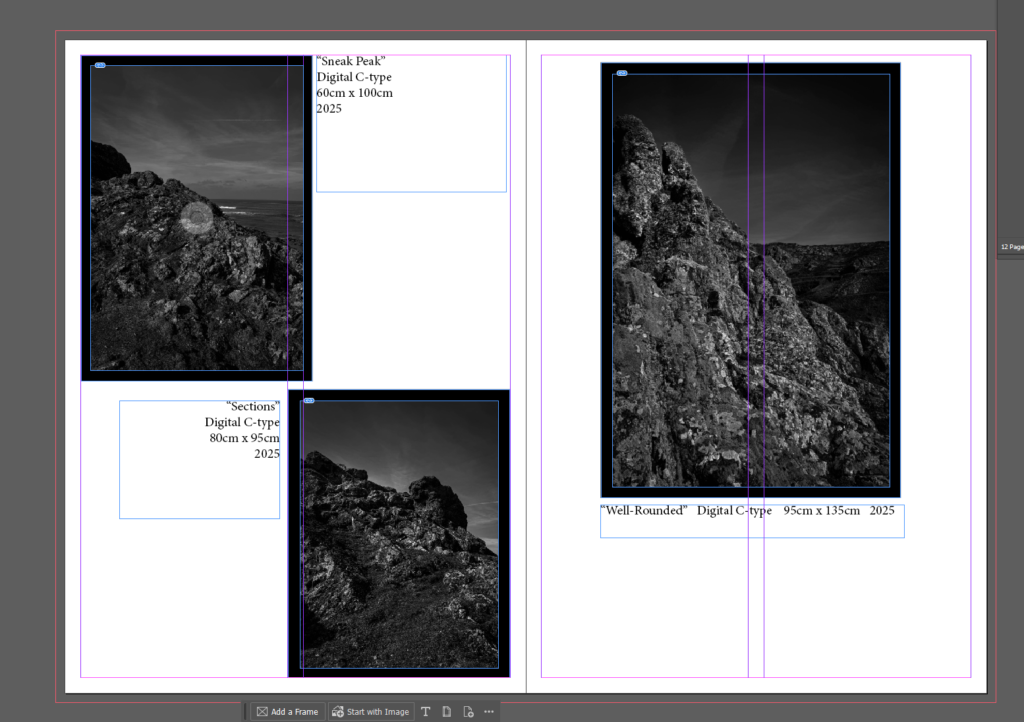
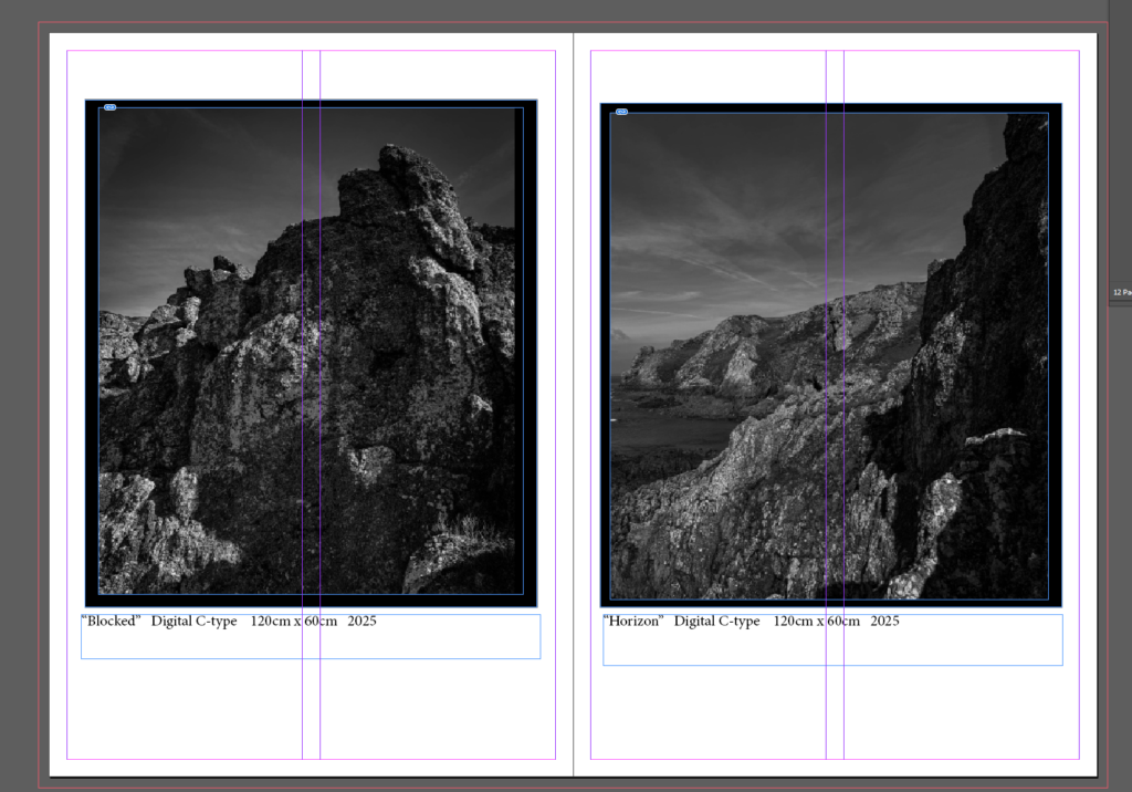
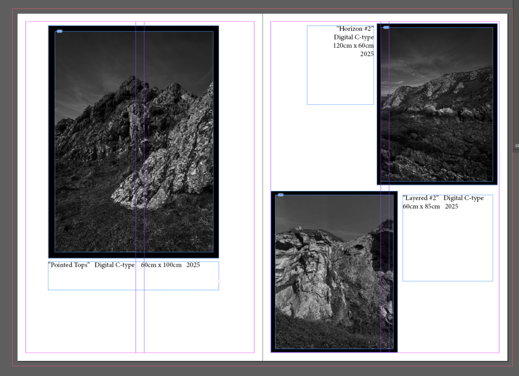
this is all the pages except the front and back cover I tried to keep it interesting by varying the layout of the images on each double page spread as its fairly plain and I wanted to mix it up.
Front cover I’ve try to make some what similar to the first one, whilst obviously being different.
added some boarders so it doesn’t look as plain
and I wasn’t sure what to put so I added one final image across the back.
Typologies are a body of photographs ( more than one or two ) that share a high level of consistency, so they are often placed next to each other to create a series of similar looking images. And grouping them together based on similar characteristics, often showing repetition and patterns. Typologies can be used to explore how small variations within a group can create meaning or convey information about the subject.
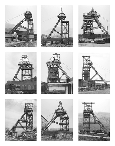
The Bechers
images by Bernd and Hilla Becher
Bernd and Hilla Becher started photographing together in 1959. Most of their work included architecture and had extensive images on water towers, blast furnaces, coal mine tipples, industrial facades and many other industrial architecture pieces.
1. How did they first meet?
Their first meeting was as students at the Kunstakademie Düsseldorf in 1957.
2. What inspired them to begin to record images of Germany’s industrial landscape?
the first area they went to was this area in Germany and it was an area that was going to be demolished and they wanted to preserve and record it for prosperity. – large format film camera technology a lot slower than digital camera ( same as ansel adams)
3. How did the Bechers explain the concept of Typology?
Hilla Becher came up with the concept when she was looking at biology and psychology books on of the people she looked at in particular was Karl Blossfeldt where they showed comparing plants to others and they decided to do that with buildings organising the buildings they were photographing into different patterns which helped them decide on how to make those grids. They would have to wait until the light matched the light in the other images they had to wait for over cast days so that they’re only focusing on the subject of the image rather than the background so the background wouldn’t blend in with the tone of the building. ( white background vs dark building) opposed to romanticism ( realism )
4. Which artists/ photographers inspired them to produce typology images?
Karl Blossfeldt he produced images of flowers and plants and would put them next to each other to compare the plants to each other for his biology students this helped inspired the Bechers to create typologies. August Sander was also an influence.
5. What is the legacy of the Bechers and their work?
why taught at a university which produced many famous photographers who were inspired by being taught by the Bechers and became photographers themselves such as Thomas Struth, Thomas Ruff, Thomas Demand who are all typologists.
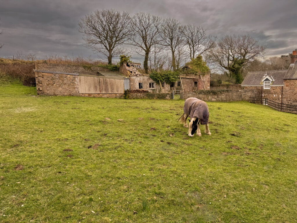
Photoshoot plan
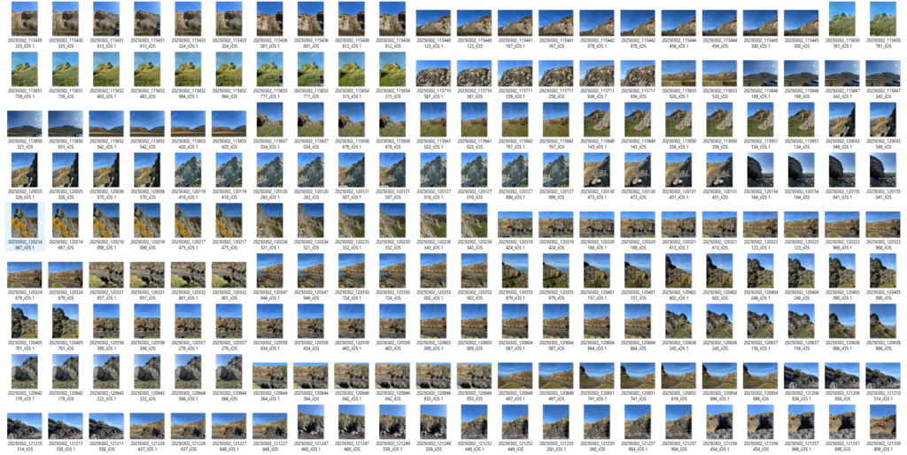
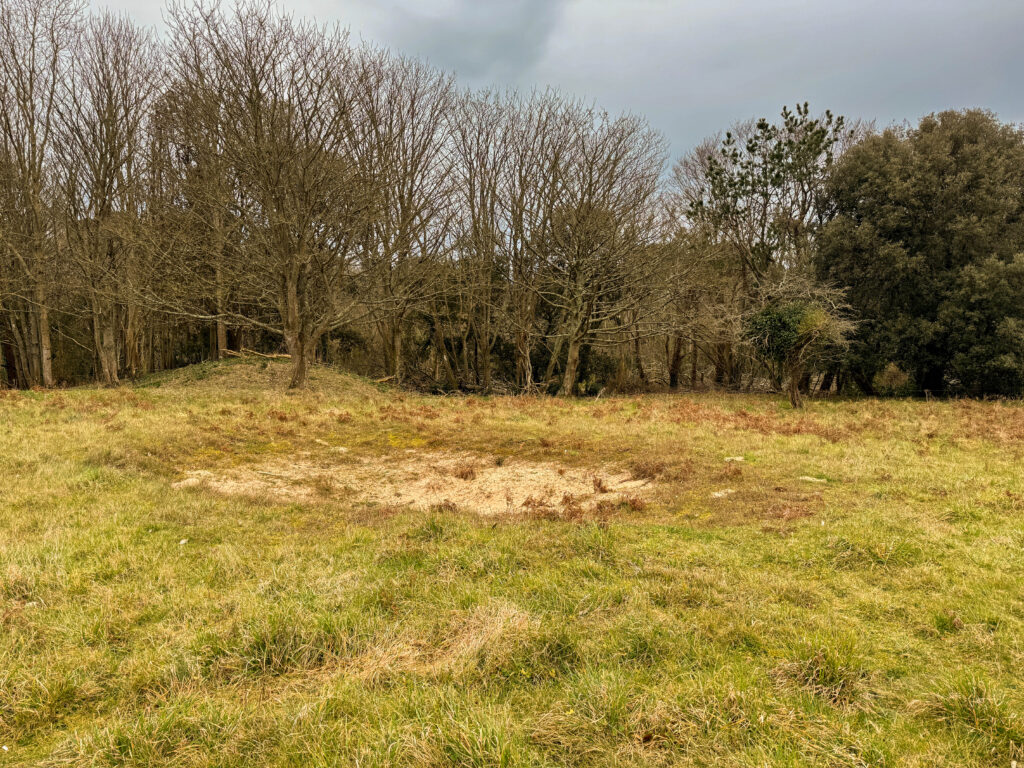
There is a few (38) of the German bunkers by my house so I’m going go down there and take pictures of the bunkers form many different angles to try a replicate how typologyies were taken.
photoshoot
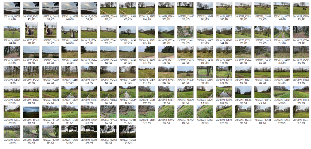
My Own Typologies // edited images
How I made these typologies is that I edited all the images that I wanted to use and opened up an untitled document for a blank canvas to be able to create the boarders and and line the images up with each other. To get all the images into the same untitled document I went in file-open and selected the images that I wanted to use for this typology as shown in the screen shot below and then I dragged the images into the untitled document and held CTRL T to be able to resize the images how I wanted.
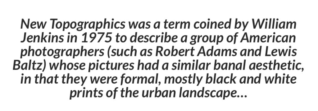
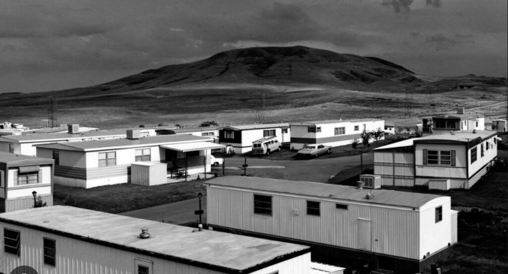
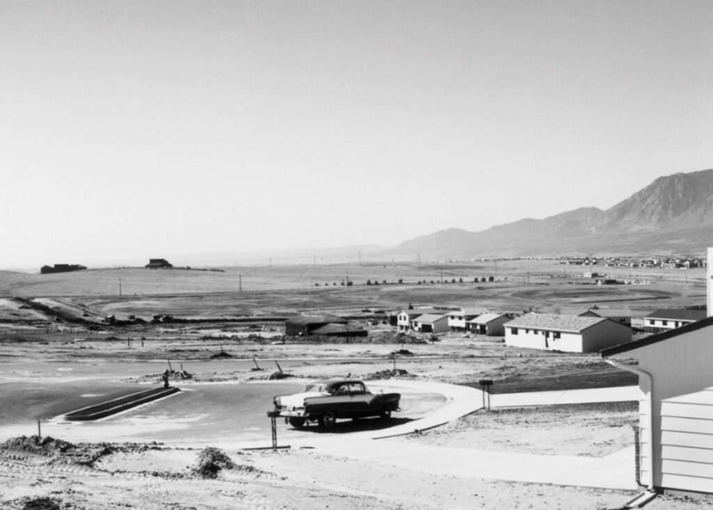
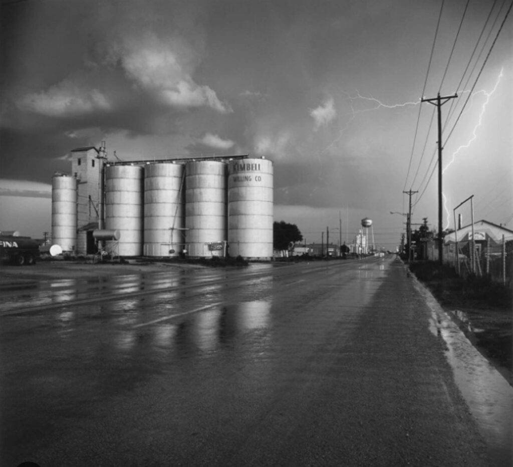
”New Topographics: photographs of man altered landscape” this was an exhibition of contemporary landscape photography held at George Eastman House’s international museum of photography ( October 1975 – February 1976 ) the show was made by William Jenkins which had a lasting effects on aesthetic and conceptual approaches to landscape photography.
This images documentaries built landscape and the natural landscape in America often showing tension between natural scenery compared to the structures of post-war America. The photos often had a documentary feel to them and are devoid of human presence, which give the image a whole new feel of emotion.
Examples of NewTopographics
Images from google.
this images help to also see the vision of the “ growing unease about how the natural landscape is ruined by industrial development – This could link to the romanticism movement.
Have a look at this link or my previous post about romanticism.
Post-war America struggled with economy and the great rise in inflation. As well as after the war ended all the veterans returned home and to make up for lost time got married and started families. However due to the war there were a lot of mental and physical health problems and issues with pharmaceuticals.
Lewis Baltz
An American visual artist and photographer. Was best known for his monochrome images of suburban landscapes and industrial parks which commented on the American dream.
Lewis Baltz was born September 12, 1945 in California. Baltz work focused on trying to find the beauty in the destruction to the natural environment, His pictures can be seen as a reflection show the control and power over human beings. More specifically his work and exhibitions of his ” topographic” work such as “The New Industrial Parks” show the crisis of technology on humans as well as his work titled “Candlestick Point” consisted of 84 photographs which showed a public space taken over by humans leaving things such as debris and litter next to a national park.
During 1980s Baltz moved himself and his work to Europe and this is when his work started to change and turn into large colour prints. In 2002 Baltz became a professor in the European Graduate school in Saas-Fee Switzerland and lived his last years through Paris and Venice but passed in 2014 following illness.
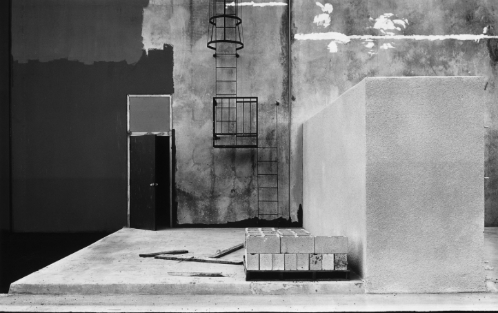
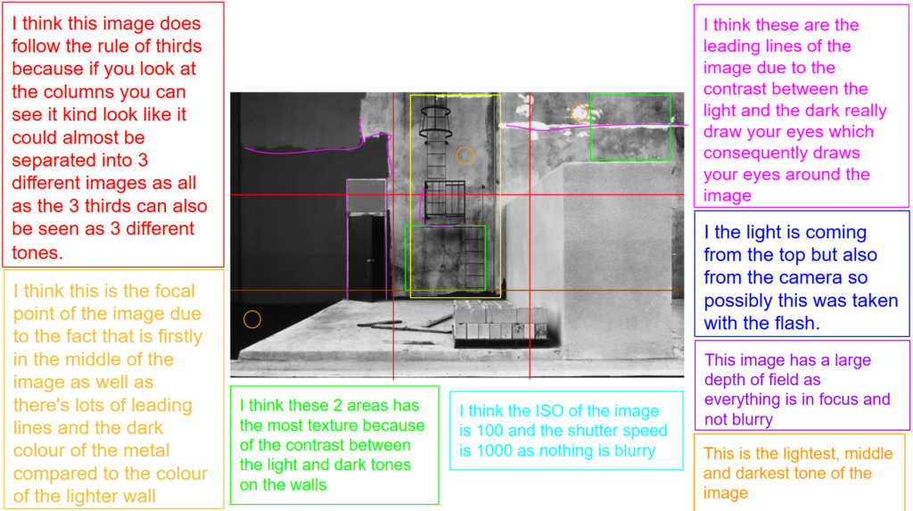
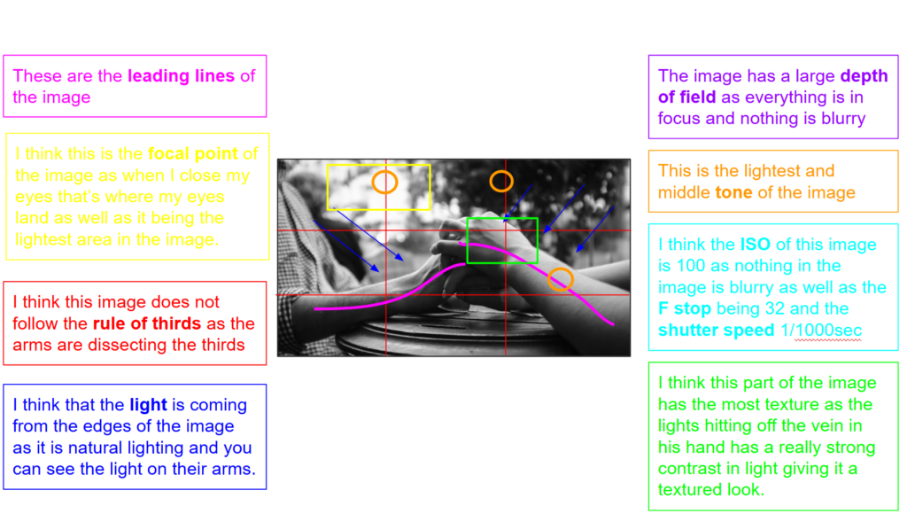
This is image is taken using a digital camera and the genre of this photography is landscape.
The mise-en-scene presents an industrial looking area with a ladder door and it could possibly could even be undergoing construction as there are some cement blocks there. The tone of this image is quite light overall, due to the amount of the concrete which adds a nice juxtaposition and contrast compared to the dark painted area of the right. The use of light in this image is soft, however, I think it is natural lighting as they are outside perhaps on a construction site. The focus distance is long as everything is in focus including all the background and foreground of the image. The depth of field is large as everything is in focus. The leading lines of the images would be the sections of different paint and tones in the image.
I believe the ISO is 100 as everything is in as most of the image is in focus. I believe that the shutter speed is 1000 as everything is clear.
Stephen Shore
Stephan Shore is an American photographer who is known for his images of scenes and objects of banal and is colour photography work.
in 1971 Stephan Shore was the first living photographer to be exhibited at the Metropolitan Museum of Art.
Stephen Shore analysis
Stephen Shore, Beverly Boulevard and La Brea Avenue, Los Angeles, California, June 21, 1975, chromogenic colour print
This is image is taken using a digital camera and the genre of this photography is landscape.
The mise-en-scene presents the Beverly Boulevard in LA California. The tone of this image is quite light overall, if you have a look at the image you can easily tell that it is American as all the colours of the signs and the general colours of the surrounding are red white and blue which are associated with America due to the colours of the flag which shows the patriotism and possibly the pride that they have for their nation. The use of light in this image is soft, however, it is natural lighting as they are outside in standing on the sidewalk. The focus distance is long as everything is in focus other than the mountains in the background so perhaps a setting on his camera was used such as portrait mode. The depth of field is large as everything is in focus. The leading lines of the images would be the straight lines such as the lamp posts in the image draw your eye up towards the top/sky of the image.
I believe the ISO is 100 as everything is in as most of the image is in focus however the background is blurred and grainy. I believe that the shutter speed is 1000 as everything is clear.
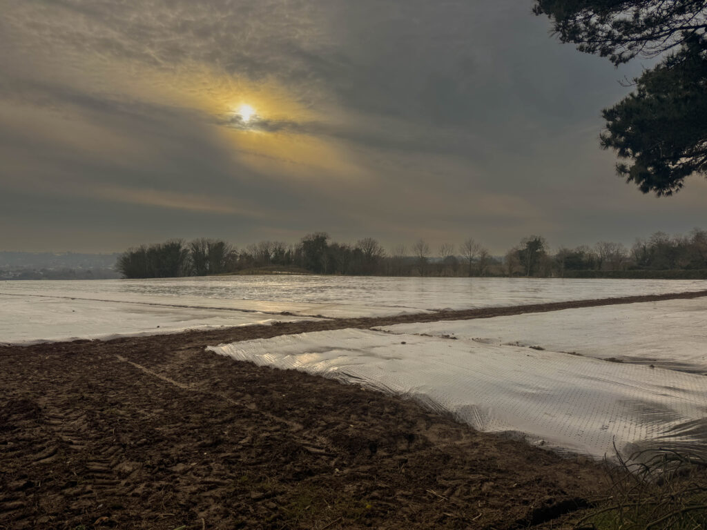
Photoshoot plan
I’m going to go into town and take pictures of a bunch of the different car parks that are around .
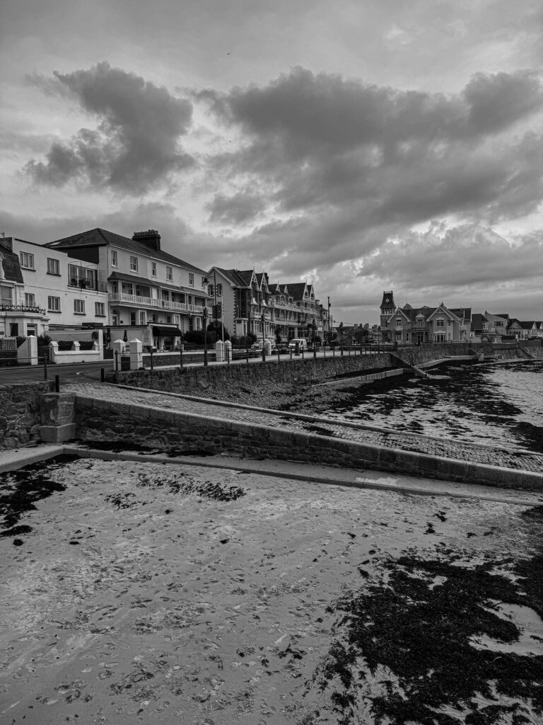
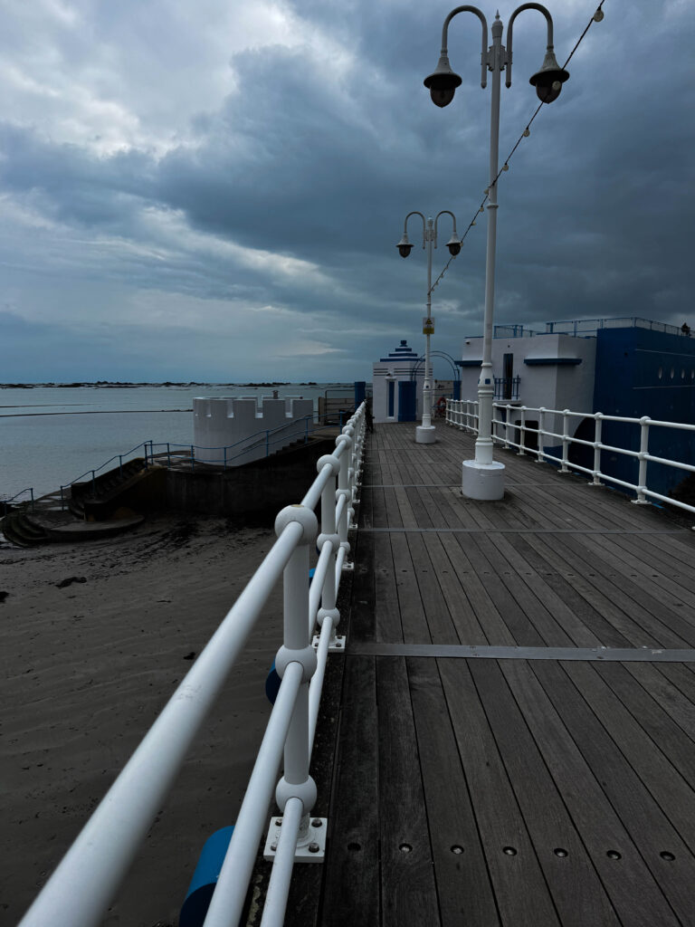
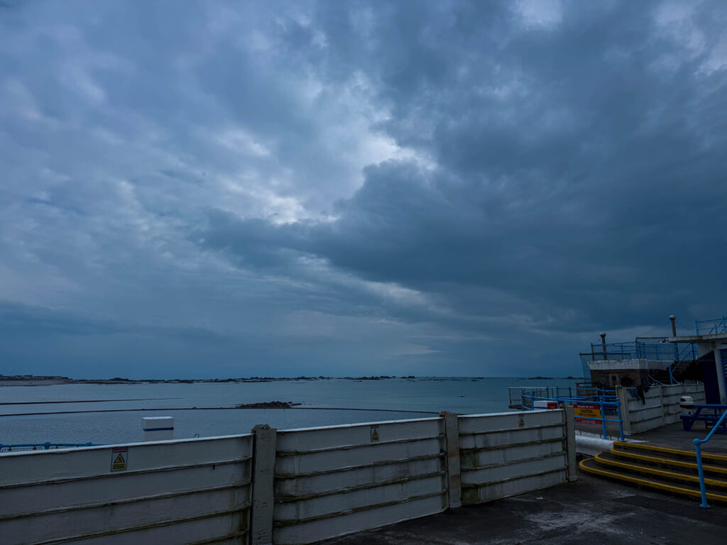
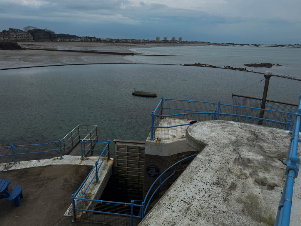
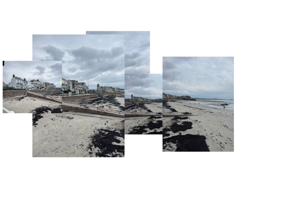
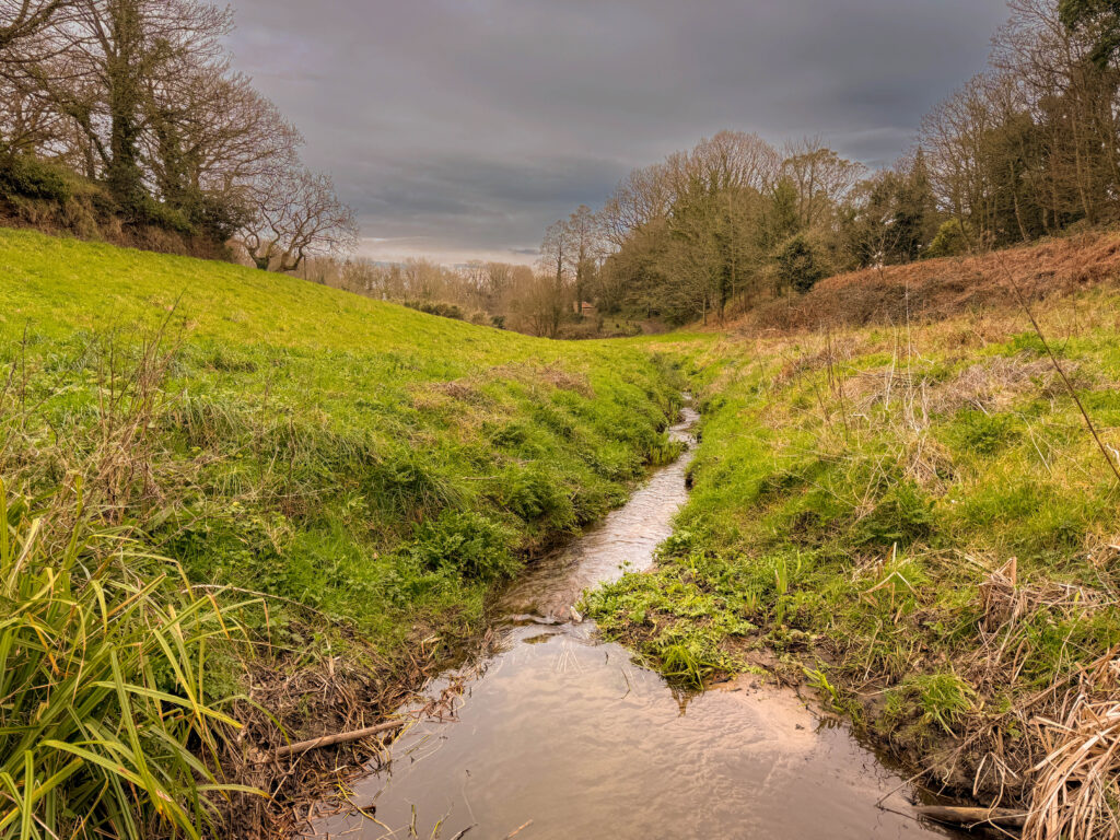
To take these images we all went down to Havre de pas and took some images of the surrounding scenery and the man made structures. This photoshoot was a way to show the comparison of nature in juxtaposition to man-made structures.
photoshoot
Edited images
Joiners
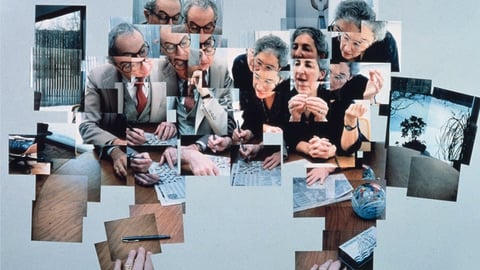
one of the most famous joiner landscape artist is David Hockney known for his collage images of the same scene from different angles and viewpoints.
Joiner images show a fragmented version of the way that the human vision works showing an insight into various different viewpoints in one frame these images can often appear abstract which gives them a unique and artistic feel.
The process of making a joiner image involves taking multiple photos of the same scene from different viewpoints and angles and editing the images and creating a collage or adding them together so that they are overlapping to create and long view of the same scene shown in my own joiner that I made below.
this joiner I made manually on photoshop by creating an untitled document and opening all the images I wanted to use on separate tabs and resized and placed them where I wanted them to be on the document.
David Hockney
David Hockney is considered one of the most influential British artists of the 20th and 21st century, and an important contributor to the pop art movement.
in 1964 Hockney moved to LA where he created his series of images that involved swimming pools using new vibrant colours. However it was in the early 1980’s when Hockney started his photo collages which he called his joiner images first using his polaroid pictures and commercially processed prints, which were normally snap shot images of which he arranged to make composite images of a single subject as the images are all taken from slightly different angles and perspectives.
“Creation of the “joiners” occurred accidentally. He noticed in the late 1960s that photographers were using cameras with wide-angle lenses. He did not like these photographs because they looked somewhat distorted.” – copied from Wikipedia
Hockney Analysis
This is image is taken using a polaroid camera and the genre of this photography is landscape ( joiner).
The mise-en-scene presents a backyard with a pool in the middle with the individual pictures from this taken in all different angles. The tone of this image is quite light overall, due to the amount of the concrete / slabs which adds a nice juxtaposition and contrast compared to the dark shadowed area created by the trees. The use of light in this image is soft, however, I it is natural lighting as they are outside. The focus distance is long as everything is in focus including all the background and foreground of the image. The depth of field is large as everything is in focus. The leading lines of the images would be the sections of the borders between each polaroid image.
I believe the ISO is 100 as everything is in as most of the image is in focus. I believe that the shutter speed is 1000 as everything is clear.
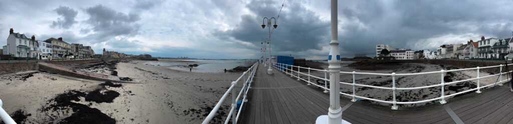
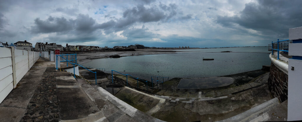
Panoramas
Panoramic photography shows a larger or expanded view of what would normally be a singular image, typically with a larger aspect ratio than a standard lens or frame. Allowing you to depict even whole cityscapes in a singular shot when compared to a show where the photographer has used a regular 50mm lens.
APECT RATIO: normally an image would have a 3:2 ratio or a 4:3 ratio compared to a panoramic image which would have an aspect ratio of 2:1 or wider which is what lets them show more of the scenery.
One technique of creating panoramic images is rotating your camera along a horizonal or vertical plane taking multiple images as you move the camera and these images are then out together by software to create on continuous photo. However, now on your iPhone you are able to use a panoramic mode which pouts the images together for you whilst your taking the image which is how I did my panoramic images.
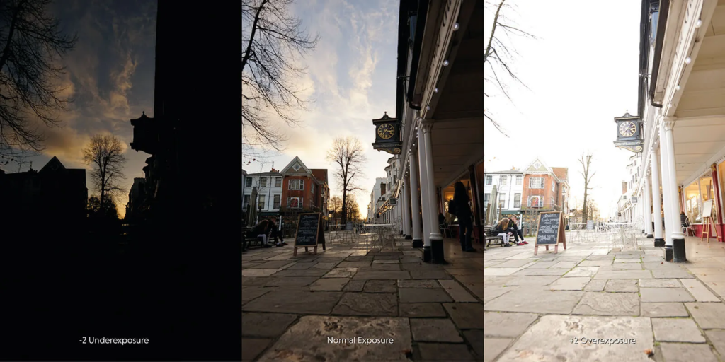
Exposure bracketing is when you take a picture of the same exact thing with different exposures. One tip that makes your exposure bracketing images come out better is using a tripod. Because if you are trying to do this by hand once you have changed the exposure you will often not be able to place the camera back in the same space and the images will not be identical.
This technique gives you a range of options to choose from when you’re editing as a result its much less likely that you’ll end up with a badly underexposed or overexposed photo.
For example:
Bracketing is a good technique for photographer’s to learn as is can help avoid ruining whole photoshoots when you finish shooting to upload the photos and realise that they’re all either too under or over exposed.
There are a few different way to do exposure bracketing but the best way would be to set your camera to the exposure you think is best for that image then move the exposure and bit either side just in case either one of those exposures look better.
HDR stands for high dynamic range. And the term dynamic range describes the ratio between the brightest and darkest parts of the image. And high dynamic range can mean the camera or technique you use to capture a greater dynamic range than SDR.
Examples of what exposure bracketed images look like:
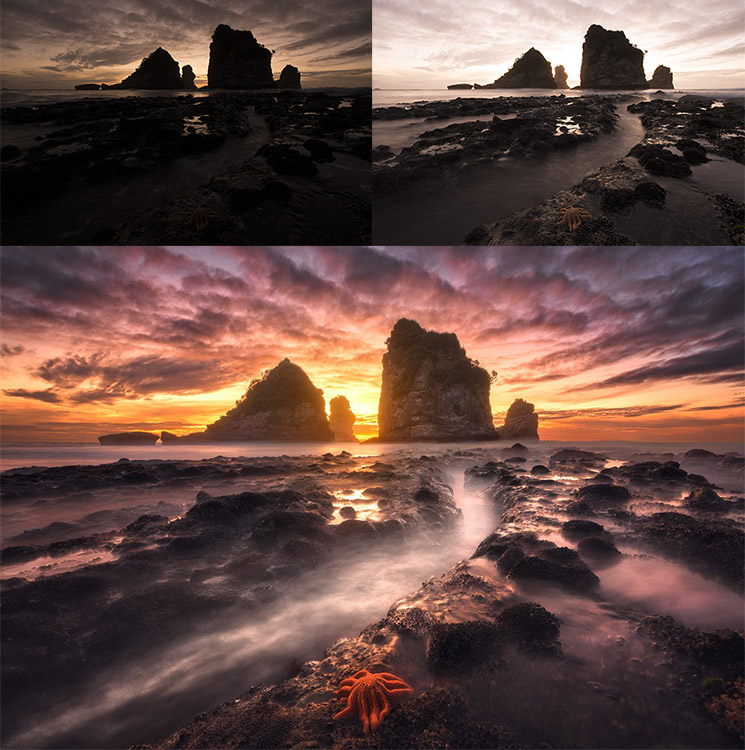
The reason that people decide to use HDR is because the sky and the foreground of the image usually look better in different exposures, so you take 2 images one where you expose the image for the sky and one where you exposed the image for the foreground of the image and they cut and edit them together to create a somewhat surreal looking image. These images can look surreal because that is not how we are seeing that with our eye.
Example with my own images:
before:
here are 3 of my images that I used for exposure bracketing one that was over exposed (left) under exposed (middle) and a middle of the range exposure (right)
so now I will edit them together to create a an exposure bracketed image.
after:
So as you can see on this image I took the sky from the image that was underexposed as it looked better and replaced it with the sky from the overexposed image so that all the rocks still looked nice on the image as well as the sky which required 2 different exposures.
This isn’t the best representation of HDR as the sky on that was relatively clear and quite boring however, you can see a difference between what it looks like now compared to before.
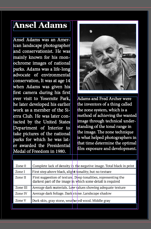
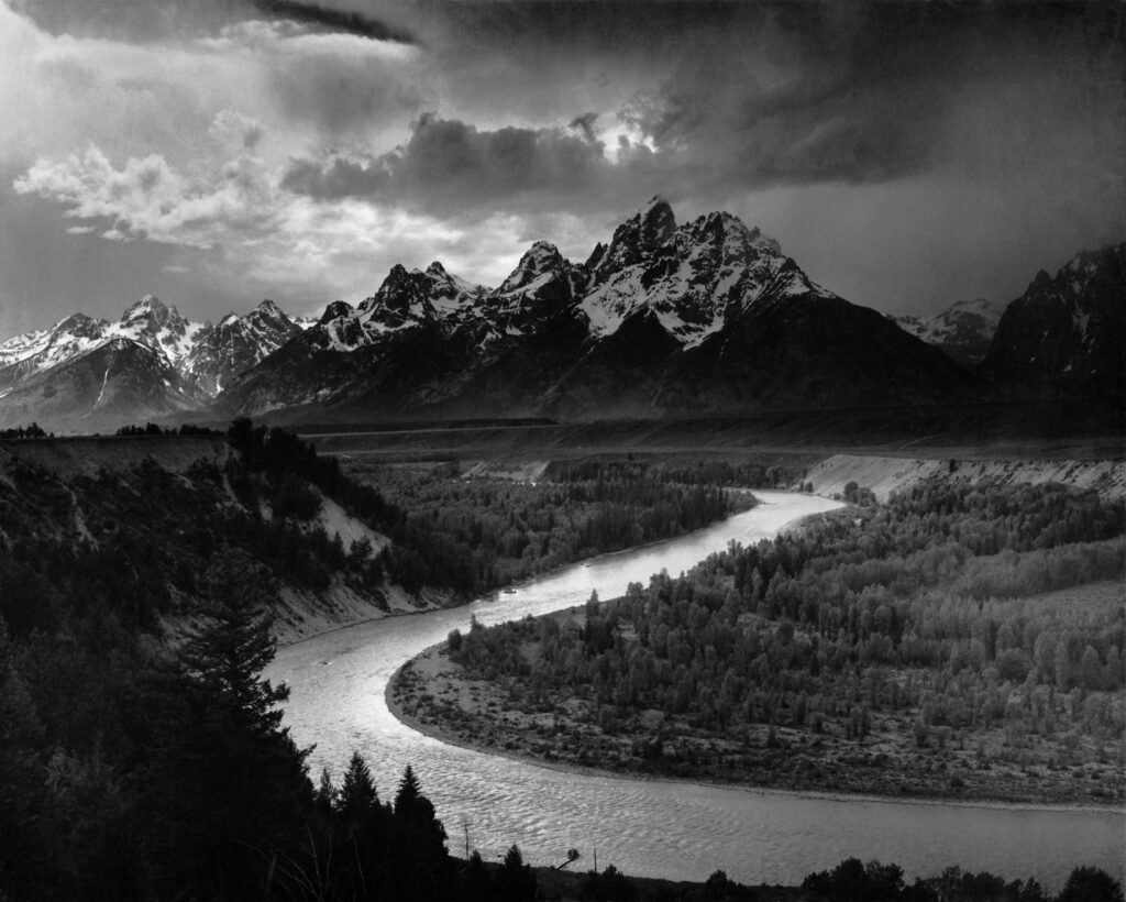
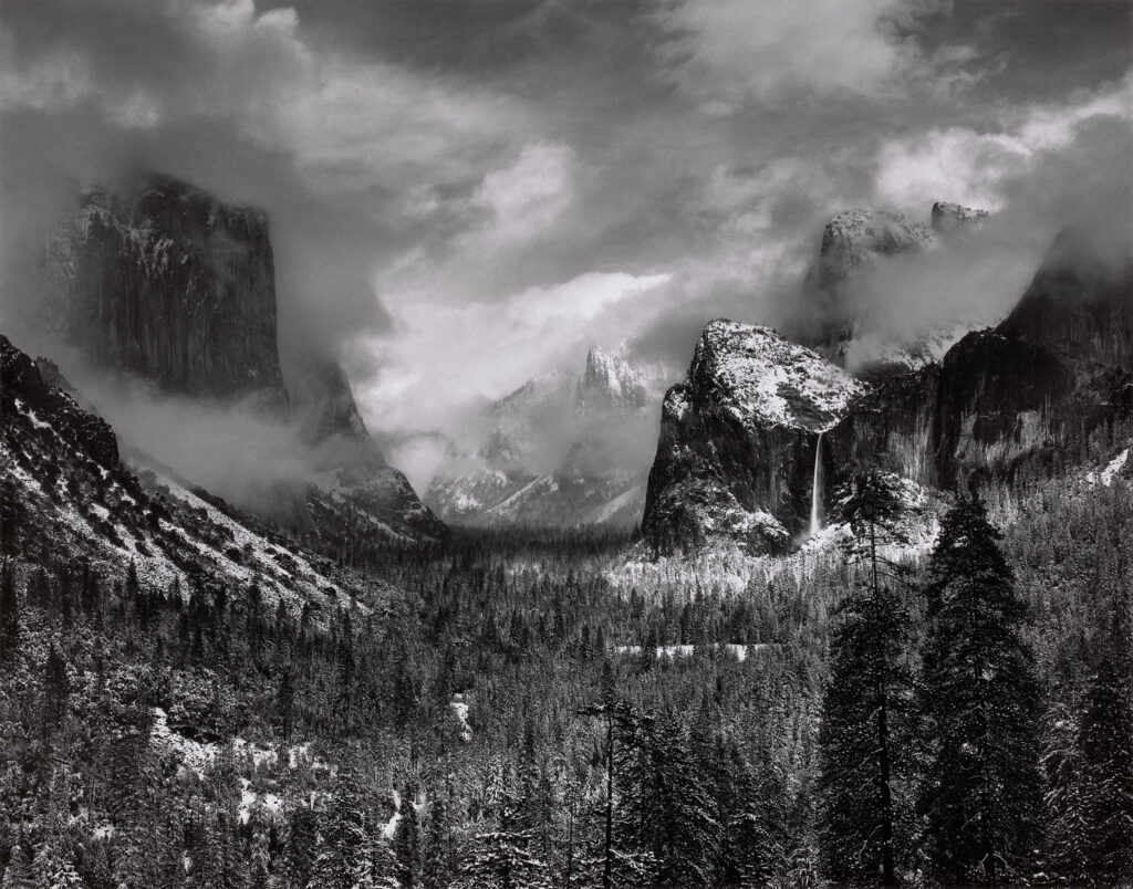
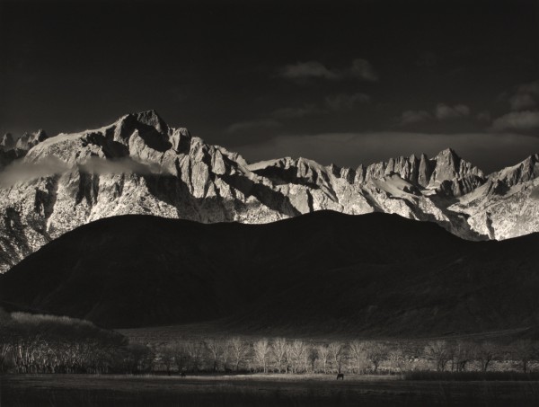
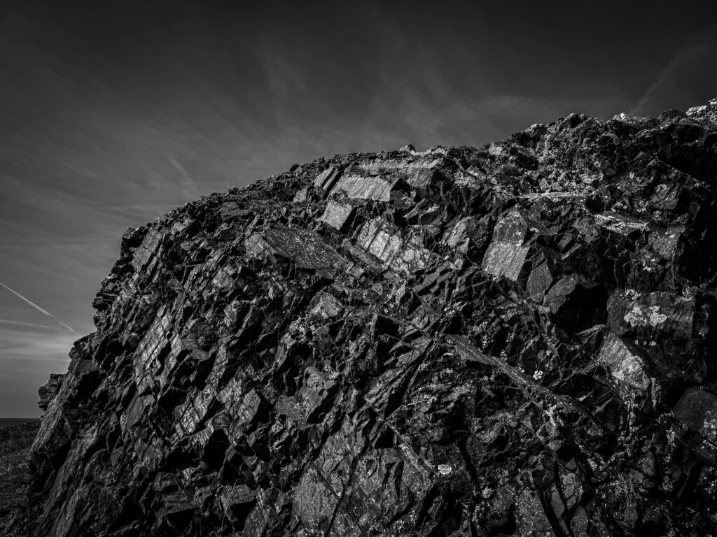
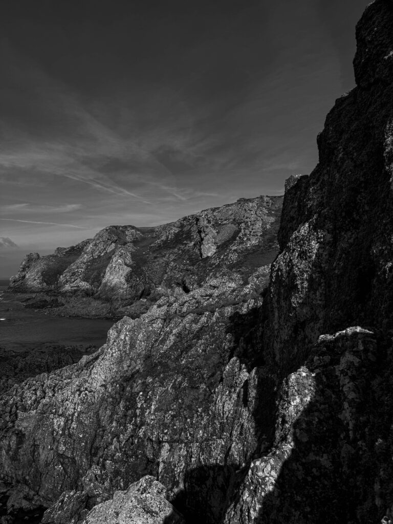
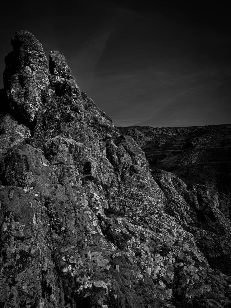
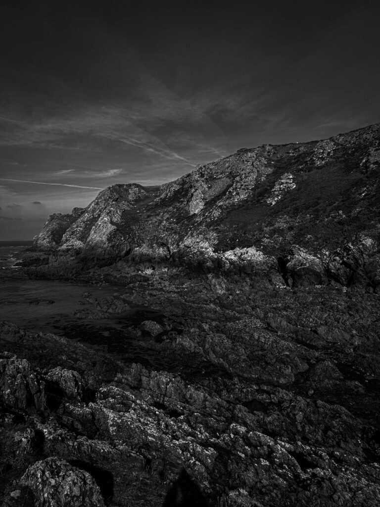
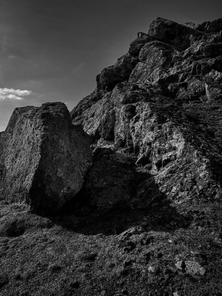
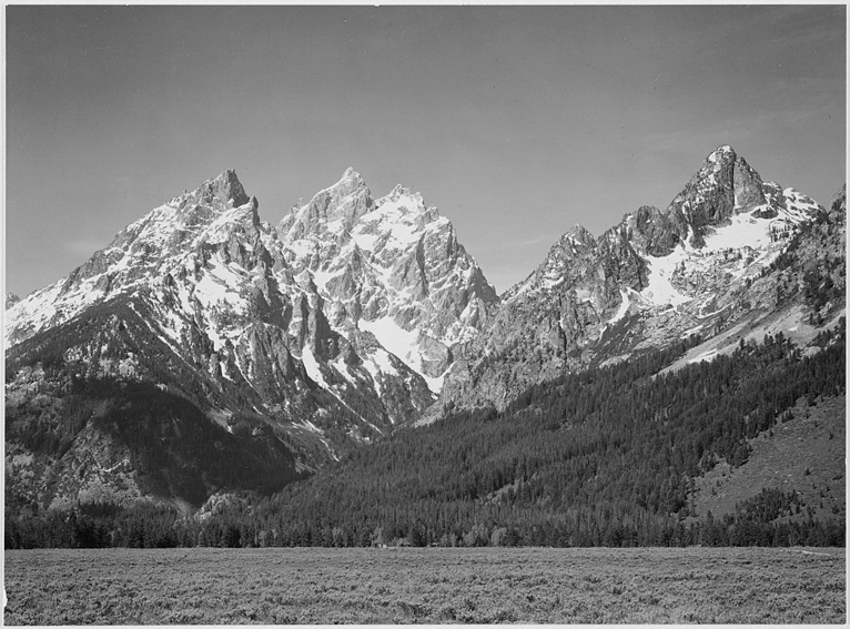
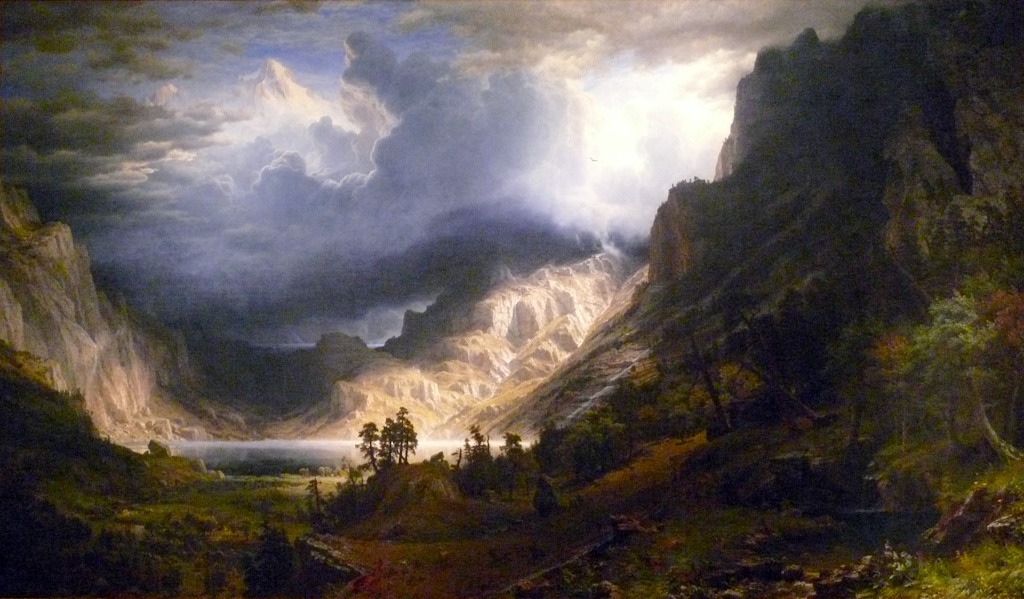
Ansel Adams was an American landscape photographer and conservationist. He was mainly known for his monochrome images of national parks. Adams was a life-long advocate of environmental conservation, It was at age 14 when Adams was given his first camera during his first ever visit to Yosemite Park, he later developed his earlier work as a member of the Sierra Club. He was later contacted by the United States Department of Interior to take pictures of the national parks for which he was later awarded the Presidential Medal of Freedom in 1980.
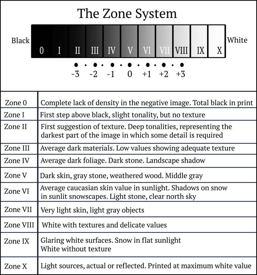
Adams and Fred Archer were the inventors of a thing called the zone system, which is a method of achieving the wanted image through technical understanding of the tonal range in the image. The zone technique is what helped photographers in that time determine the optimal film exposure and development. ” The Zone System provides photographers with a systematic method of precisely defining the relationship between the way they visualize the photographic subject and the final results. ” – Quotation marks pasted from Wikipedia.
F/64
Adams was one of the seven founders of the group f/64 which founded in in the San Francisco Bay Area in the American 20th century which was an association which was advocating for ” pure ” photography which was a style of photography which favoured the sharp focus and the use of full tonal range without the image, as well as a carefully framed image.
The group mainly formed in opposition to the pictorialist movement which was dominant for the majority of the early 20th century. Whereas the f/64 group wanted to encourage a modernist take to photography which focused on precisely exposed images and natural forms.
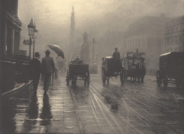
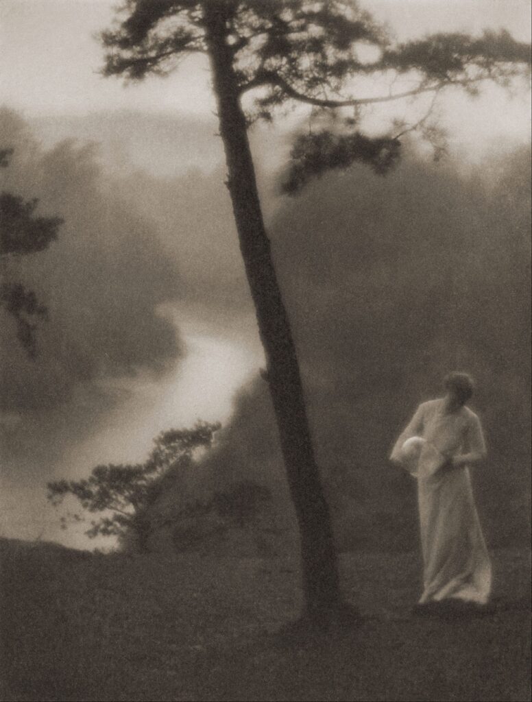
examples of the pictorialist movement:
Adam Analysis
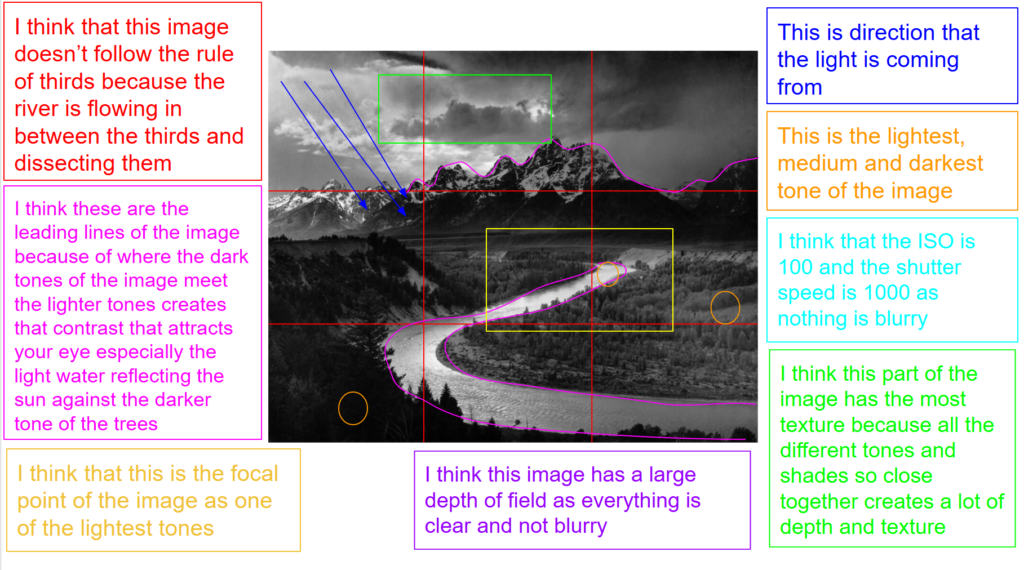
Technical
the type of lighting in this image is harsh natural lighting, with high contrast. As well as the image having a sharp focus. I think the aperture of this image is f/32 as everything is in focus and crisp and nothing in the image is blurry. I think the ISO is 100 due to the clarity of the tones and the good tonal range of the image, you can tell this due to the contrast of the lightest tone in comparison to the darkest tone.
Mise-en-scene
This is image is taken using a film camera and the genre of this photography is landscape.
The mise-en-scene presents the Tetons mountains and the snake river cascading down the middle of the image. The tone of this image has a good range due to the zoning system, however there are some darker spots for example a lot of the forest and a few parts of the mountains. The use of light in this image is harsh, however, it is natural lighting as they are in the Yosemite park. The focus distance is long as the mountains and the river is far away and the depth of field is large as everything is in focus. The leading lines of the images would be the lightness of where the sunlight is hitting the bend of the river the and top of the mountains that are being hit by the light draw your eye along the image.
I believe the ISO is 100 as everything is in as most of the image is in focus however the background is blurred and grainy. I believe that the shutter speed is 1000 as everything is clear.
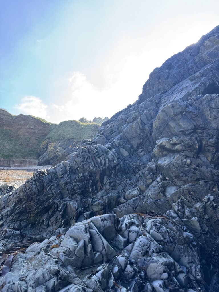
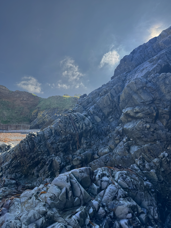
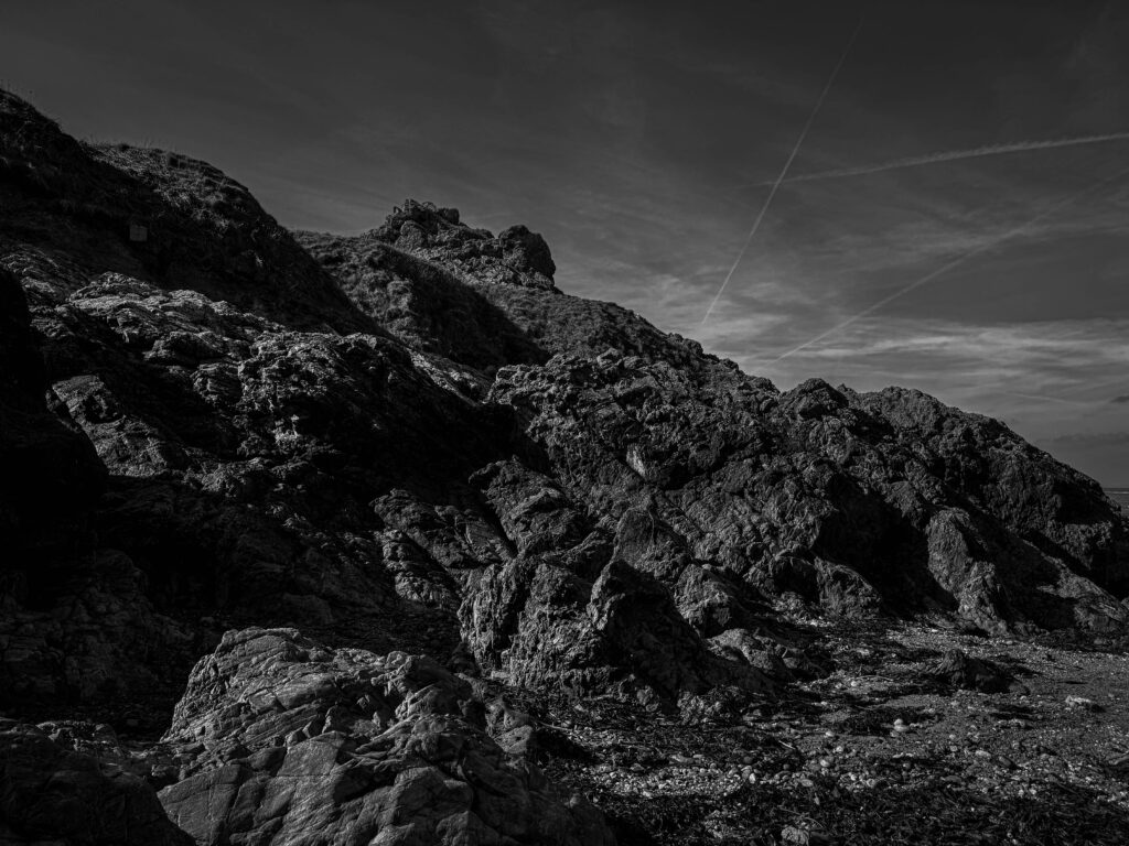
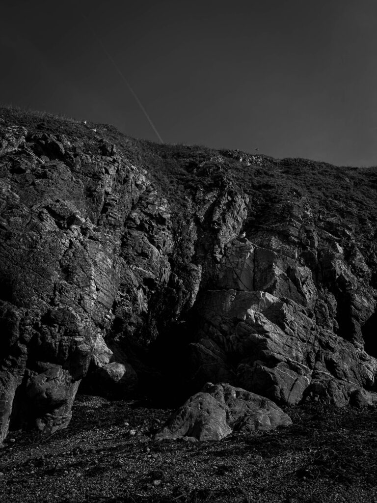
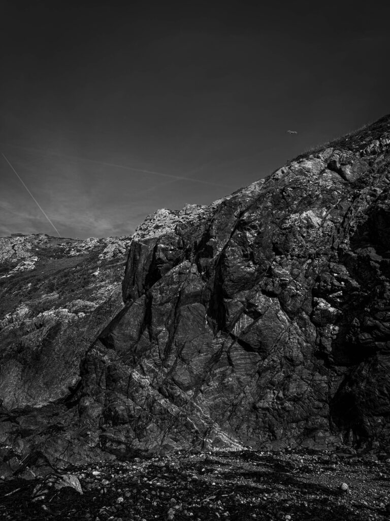
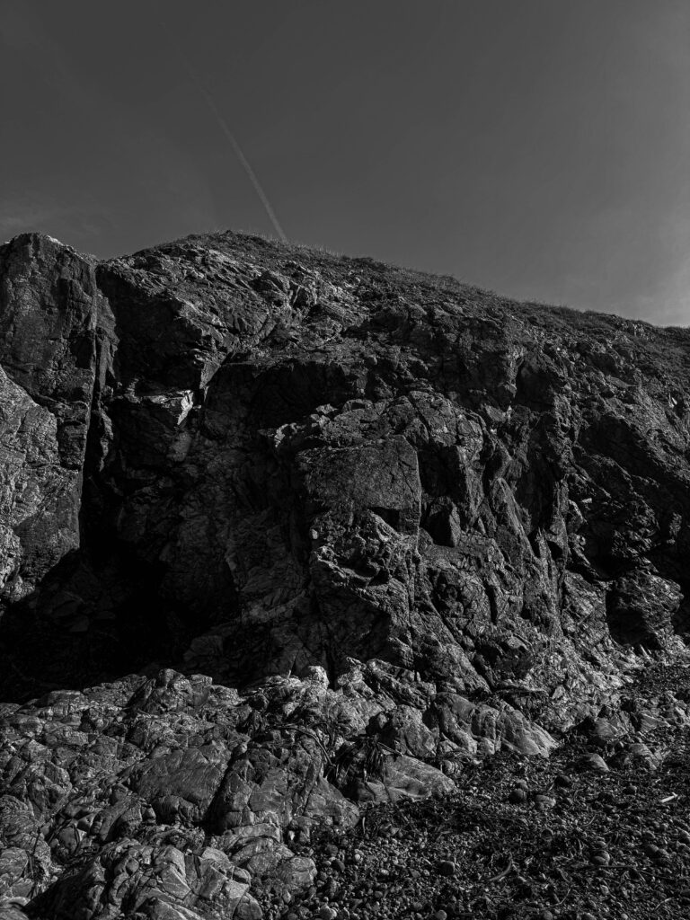
Photoshoot
Edited Images
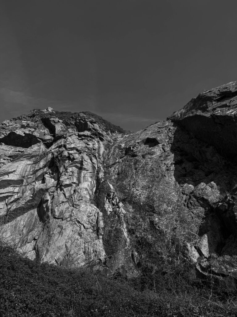
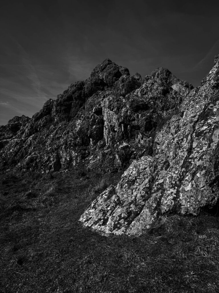
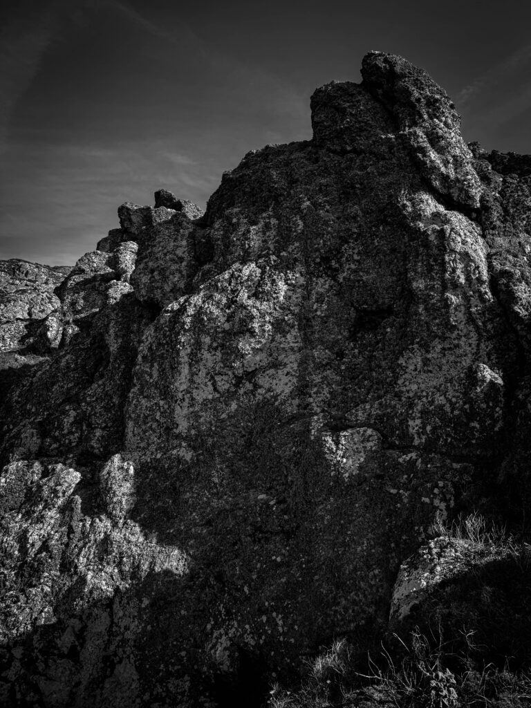
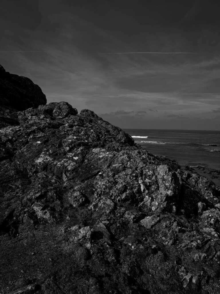
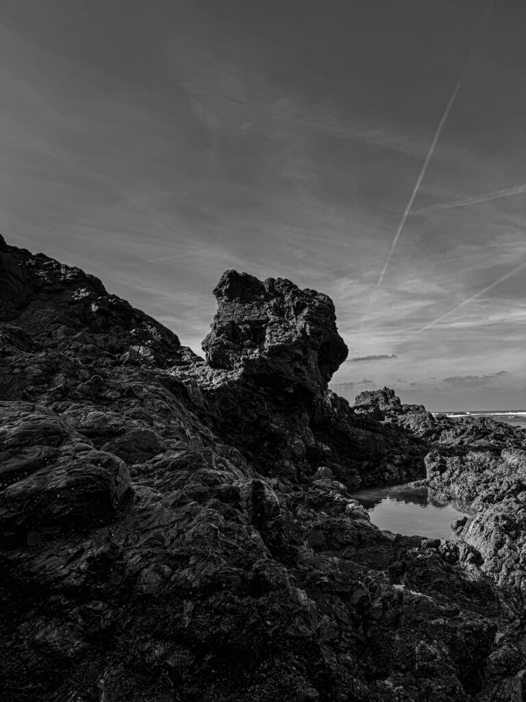
Personally I really like this image because I like the way that the singular rock is the main subject of the image and against the light colour of the sky it looks really nice.
One thing that I have done to edit this image is I created a mask and placed it over a section of the rocks on the left and edited it separately compared to the rest of the image because the way that I edited the whole image made that one area look too dark so I added the mask to be able to lighten it up.
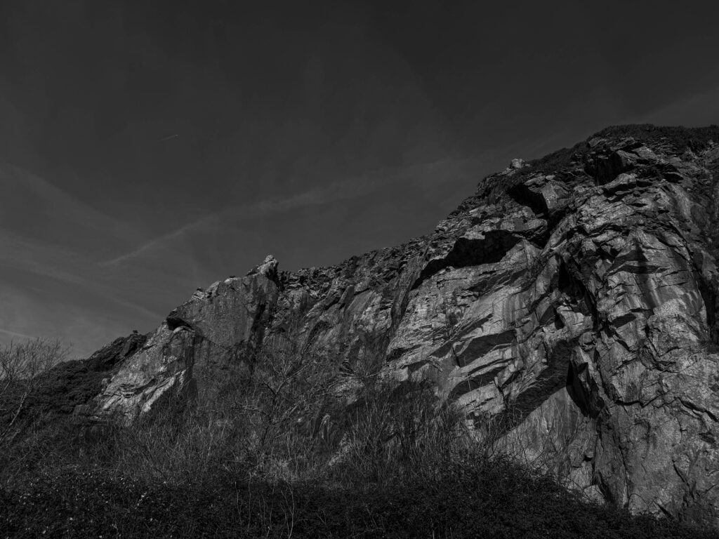
As well as I added vignette to all of the images I took for Ansel Adams to give it an older feel.
“all the visible features of an area of land, often considered in terms of their aesthetic appeal” – Oxford Dictionary
physical elements of landscapes could include geographically defined landforms such as mountains, lakes, rivers, trees. However landscapes could also include man made structures such as city’s and farms, heavily industrial areas such as New York or more rural urban countryside where there is still man made structures like old cottages or small towns.
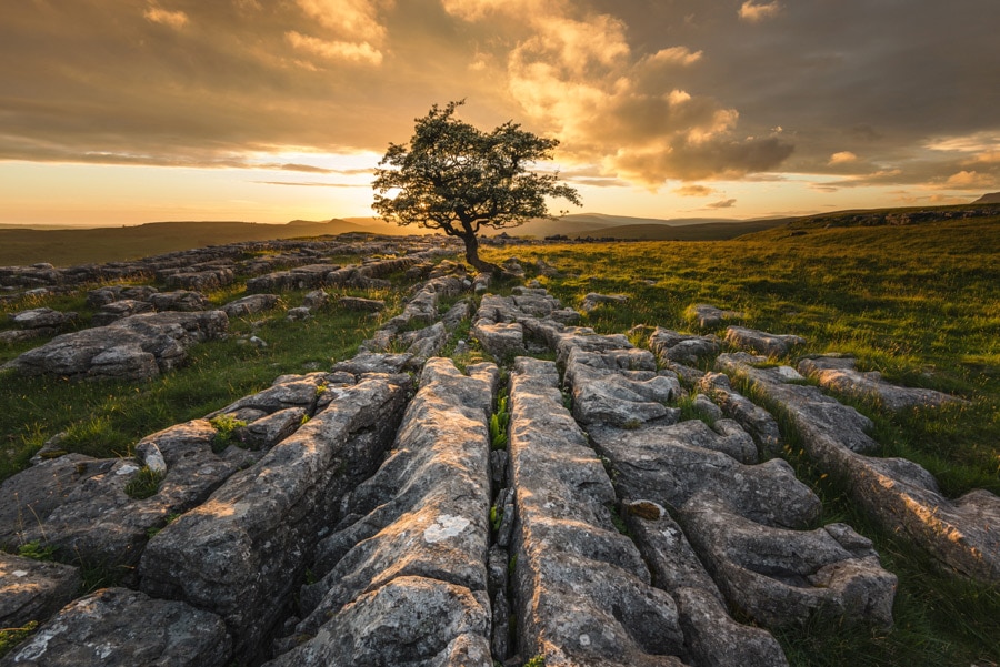
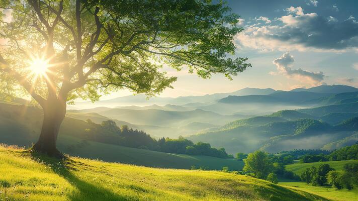
Examples of landscapes
Photography is a great way to be able to show landscapes however it started many many years ago originally with things such as cave paintings.
This was one of the first ever cave painting discovered. Where you can see they are depicting the landscape of the animals around them.
painting and sculptures have been around long before photography and were the first original ways to be able to display what was being seen before photography came along.
When did landscape emerge as a genre in western culture?
After the fall of the Roman Empire the traditional pure landscape painting declined, and was replaced with landscapes seen as a setting of victory and religious and figural scenes. And this continued on till the 16th century when the landscape movement started to become a subject its own right.
However long before the landscape movement became a subject in its own right in the West of the world, it was highly established in China originating in the 6th century.
“In the West during the Renaissance, art was still centered around sharing stories of specifically biblical, mythological and historical themes. Consequently, few examples celebrating scenery alone in art can be found of this period. However, it is important to note that often these stories were told against a natural scenery background.” – pasted from https://blog.artsper.com/en/a-closer-look/a-brief-history-of-landscape-art-and-painting/
take a look at this link as it as a lot of interesting information about the development into Western Culture and how it originated.
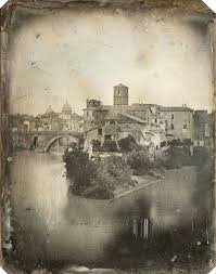
When did landscape photography originate?
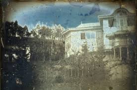
The earliest known landscape photo was taken in 1826 and 1827 by a French inventor, Nicephore Niepce which was actually a picture of an urban landscape.
This is the earliest know landscape image taken by Nicephore Niepce.
Types of photography landscapes:
To get these heading I had an old sheet from GCSE photography where I did a little bit of research about the headings.
Countryside Daguerreotypes – this was an early type of photography mainly taken by French and American photographers such as Sam Bemis and Alexandre Clausel.
Examples of countryside daguerreotypes:
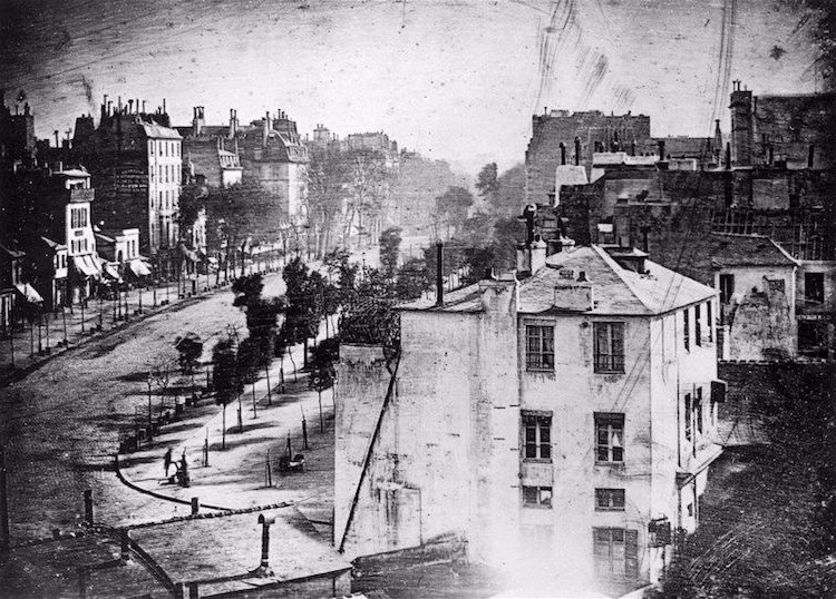
Early portraits of the city – photographers used to take pictures of the early city and landmarks which would then get distributed across the whole world. But since the cameras had such long exposure it was difficult to capture people without them blurring Louis Daguerre.
This image was one of the earliest images taken by Louis Daguerre of the old city’s
Industrial revolution – in the 1800s the world changed as the industrial revolution this changed the landscape of the city and the suburbs leading the factories being built and changing the beauty of the landscape (this upset the romanticism photographer/painters) During this time the romanticists where protesting to help society not get to carried away with the big factory’s and to help preserve the purity of nature.
aerial viewpoints – to get aerial viewpoint photos people would go up in planes to be able to take these shots and they would hang out of the plane to be able to get the shot. In my opinion this is extremely dangerous but the result was worth it. Some viewpoint photographers are James Wallace Black and Nadar.
Image by Nadar: – example of aerial photography
Adding colour to landscapes – in the 1860s photographers starting adding colour to their photos by painting them with inks to dye their photos and then they started experimenting in the dark room process
Modernism – Modernism started after the Industrial Revolution and then the modernism work gradually became more and more abstract focussing on things such as line shape and form
This is an example of modernism where the photographers start to learn and focus more about the power of leading lines
Pictorialism – some photographers wanted to define photography as something unique and not just scientific evidence and they wanted to capture the mood and atmosphere as well as science.
Unconventional Perspectives – in the 20th century photographers wanted to show photography as an art from so they took pictures of the unusual compositions and perspectives, of the modern architecture
Me, Myself and the Landscape – this photography was seen as more of an extension of themselves with the work they produced including autobiographical elements
Example of Me, Myself and the Landscape:
Conceptual Photography – this type of photography choose to focus on the ordinary and was mainly done by German photographers and focuses on defunct structures in a systematic way they photographed the same objects from different perspectives and they laying them out in a grid formation after printing them out
Direct intervention – these photographers thought of themselves as “recorders of the truth” and they choose to see themselves as photographer who construct a scene and preferring to highlight the subjectively which people see the world
A Return to Nature – although people were interested in documenting the city as this was the industrial revolution and they wanted to document the beauty of nature as more and more factories and cities were being built he used a technique called the zone system to receive a tonal balance in his photographs.
Definition – “a movement in the arts and literature that originated in the late 18th century, emphasising inspiration, subjectivity, and the primacy of the individual” – Oxford dictionary
Fact file
The romanticism movement began in Europe towards the end of the 18th century, one of the aims of the movement was to appreciate the nature in society which is why the paintings and photos were all of landscapes, as well as culture in response to the Age of Enlightenment and the Industrial Revolution.
Romanticists showed several key themes to which they were deeply connected to: an admiration for nature and the supernatural, as well as an idealisation for the past, they thought of it as a Nobel era, they also had a fixation with the mysterious and exotic, As they celebrated the heroic and the sublime.
The basic characteristics of romanticism is that it places freedom on the artists to express their ideas.
The Sublime – The romantics viewed the sublime as a “realm of experience beyond the measurable” that is beyond rational thought, that arises chiefly from the terrors and awe-inspiring natural phenomena – Wikipedia
JMW Turner
Joseph Mallord William Turner ( 23 April 1775 – 19 December 1851 ) was an English romantic painter and printmaker.
Turner entered the royal academy of art in 1789 when he was only 14 years old. Turner showed an early interest in architecture, his first watercolour painting of the archbishops palace, Lambeth was accepted for the royal academy summer exhibition in 1790 when Turner was only 15 years old.
This was the first water colour image that was produced by Turner ( exhibited in 1790 )
John Constable
John Constable ( 11 June 1776 – 31 march 1837 ) an English romantic landscape painter. In 1799 Constable convinced his father to let him pursue a career in art and he joined the Royal Academy schools as a probationer, attending life classes and studied and copied old masters.
Some of Constable’s work
“In 1802 he refused the position of drawing master at Great Marlow Military College (now Sandhurst), a move which BenjaminWest (then master of the RA) counselled would mean the end of his career.” – from wikipedia
My Images linking to Romanticism
edited images
I have linked these images to romanticism by trying to make the sky look at bit more stormy and moody as I know during that time they liked the fact that it was scary but it was just cool to see what nature could do.
I particularly like this image because the sky looks the best, and its the cool sky compared to the sort of calm of the potato field
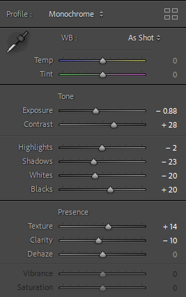
I have edited this image by:
The way i have made the sky in my images different to the way that the rest of the image was is I created a mask over the sky which allowed me to edit it separately to the rest of image making them more moody and dramatic
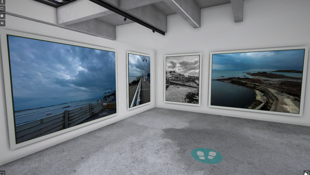
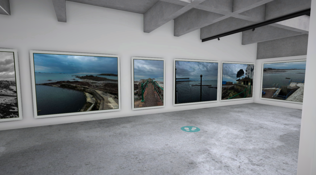
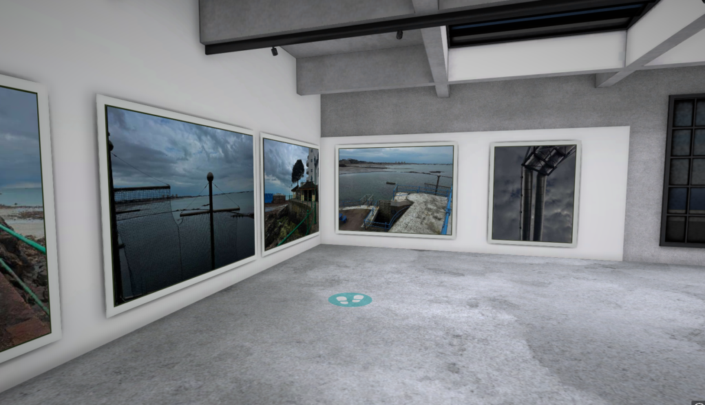
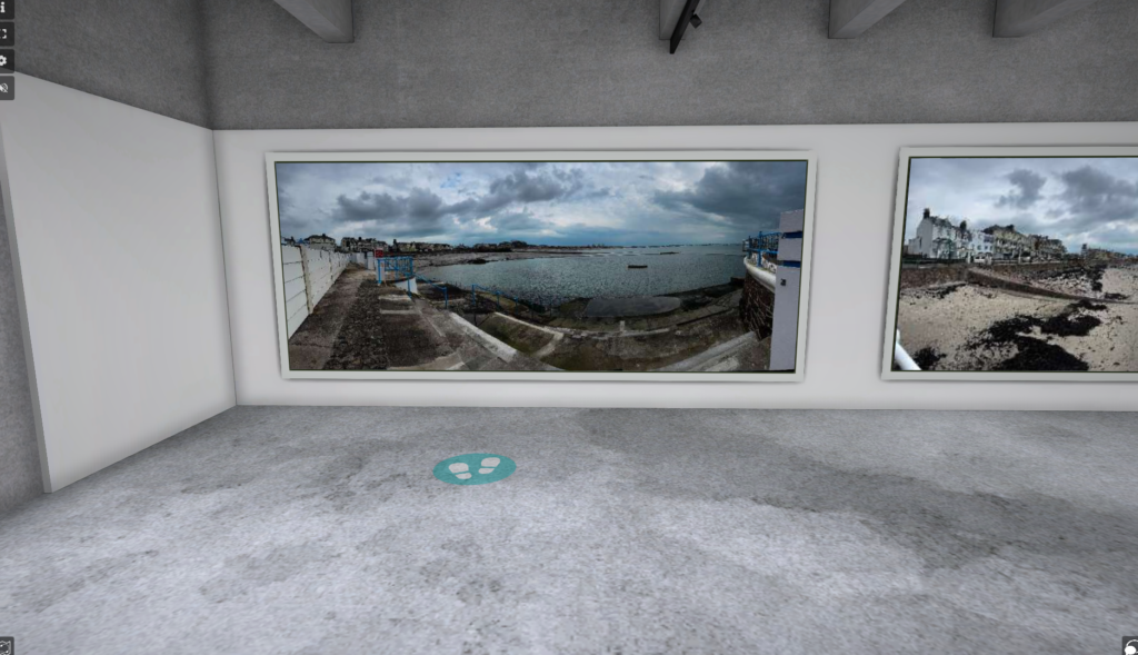
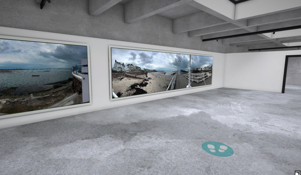
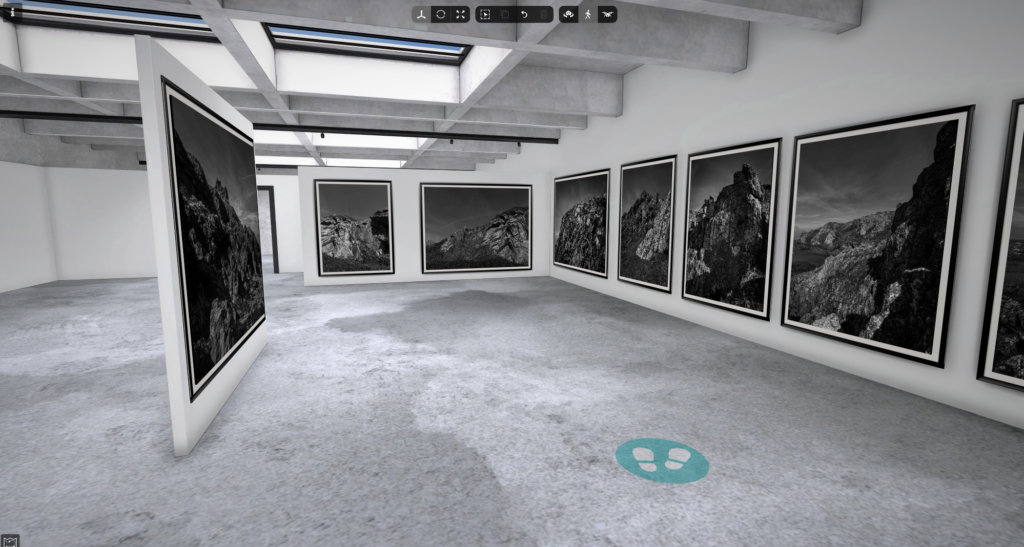
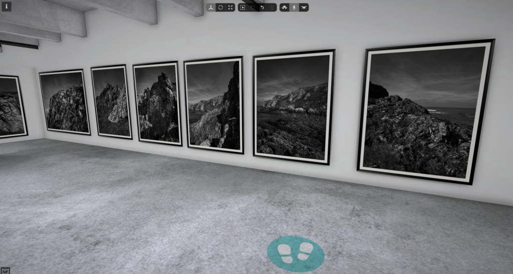
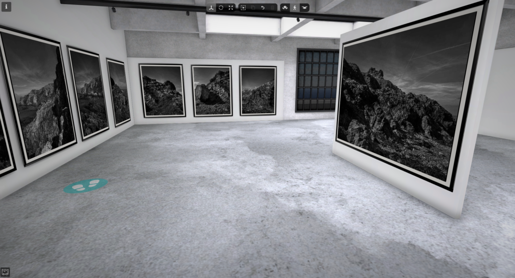
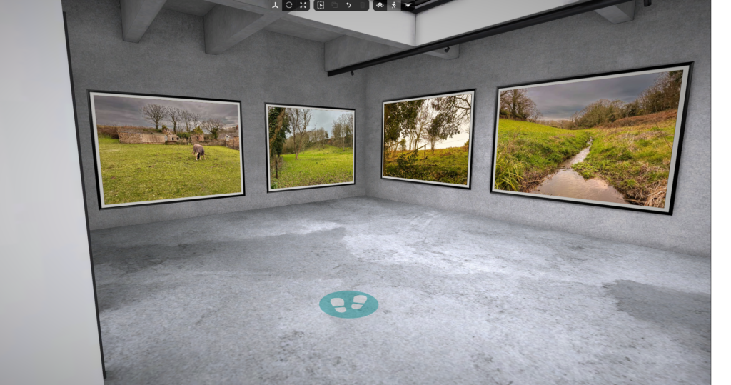
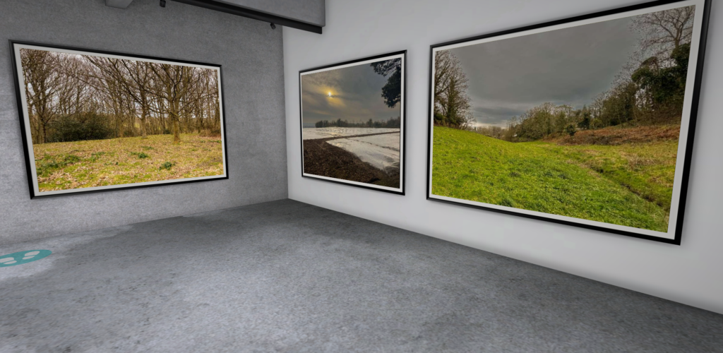
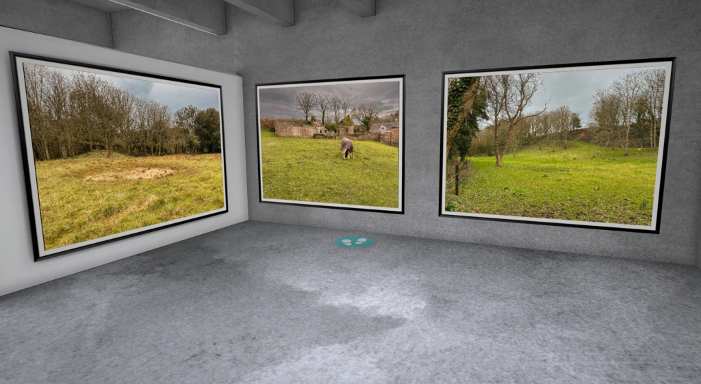
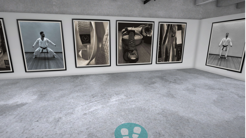
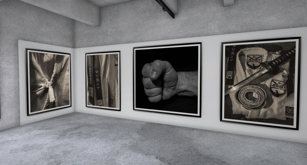
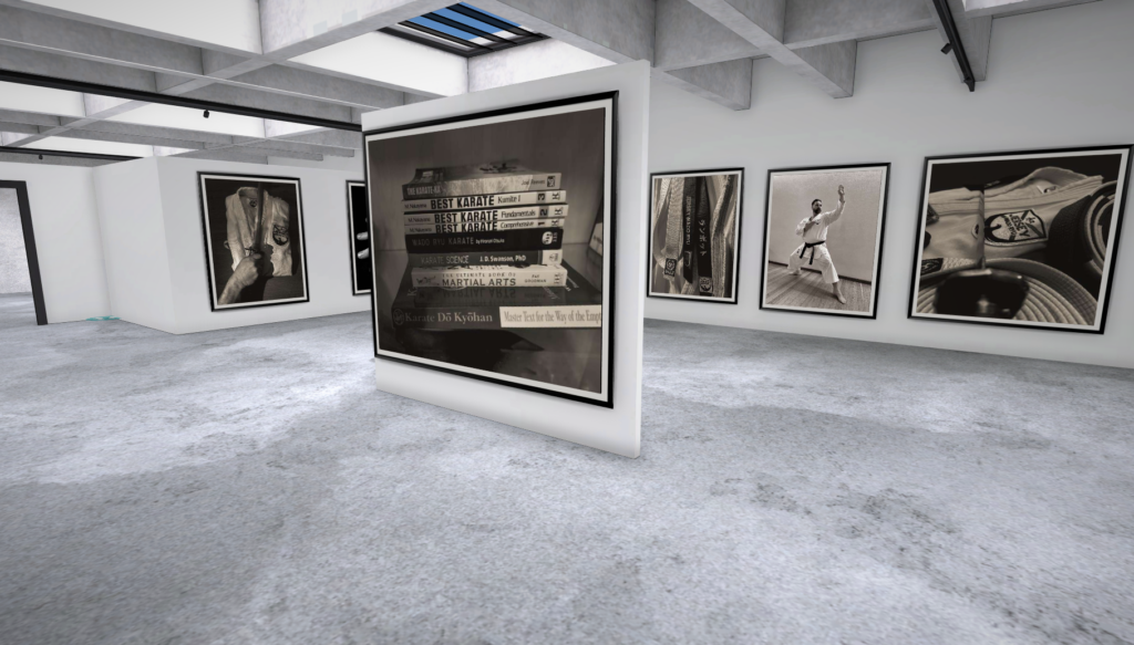
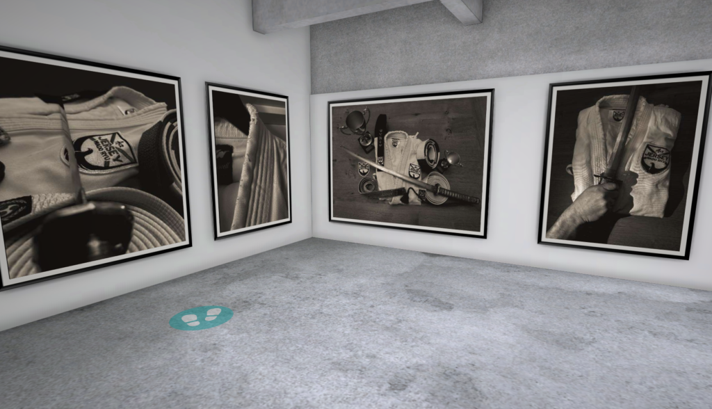
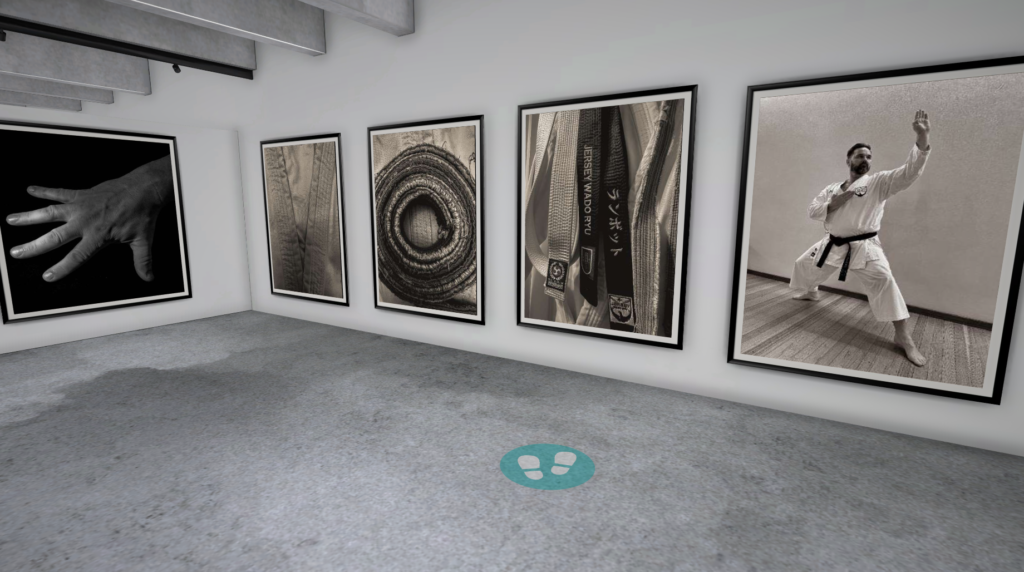
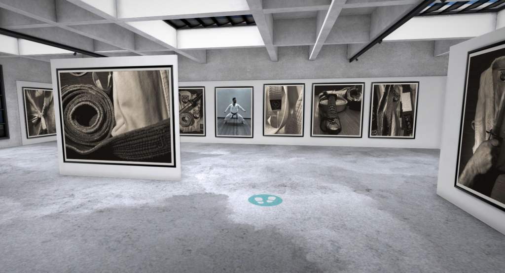
Virtual gallery
To make this gallery I used the website artsteps and entered my images to get a sense of what they would all look like together. and I decided to make them all a bit more uniform by using the same black and white frame.
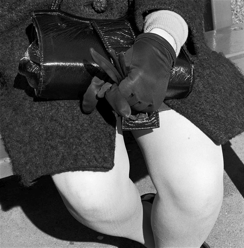
Identity is who you are. It can be beliefs, personality traits, appearance, expression, it is what characterizes a person. It can also be your surroundings, your environment can develop and influence your identity.
image from google
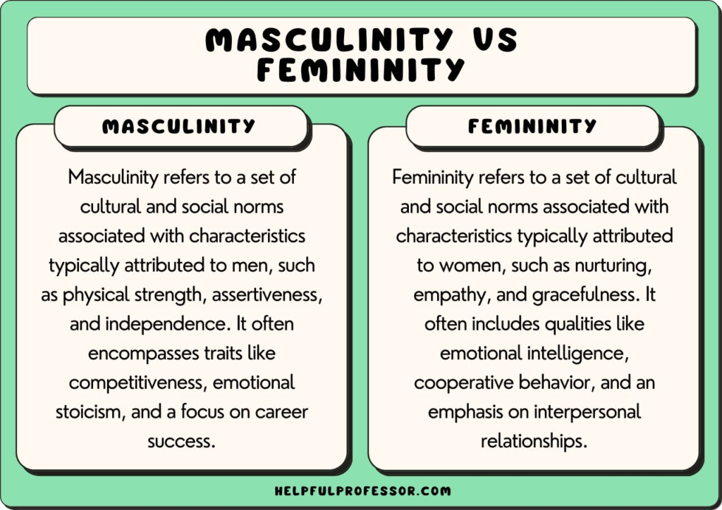
What it femininity ?
Qualities or attributes regarded as characteristic of women or girls – Oxford Dictionary
Femininity is socially seen as traits such as nurturing, sensitivity, sweetness, gentleness, warmth, modesty, empathy, affection, tenderness, and being emotional, kind, helpful, devoted, and understanding have been cited as stereotypically feminine. Sometimes femininity can be linked to sexual objectification and sexual passiveness.
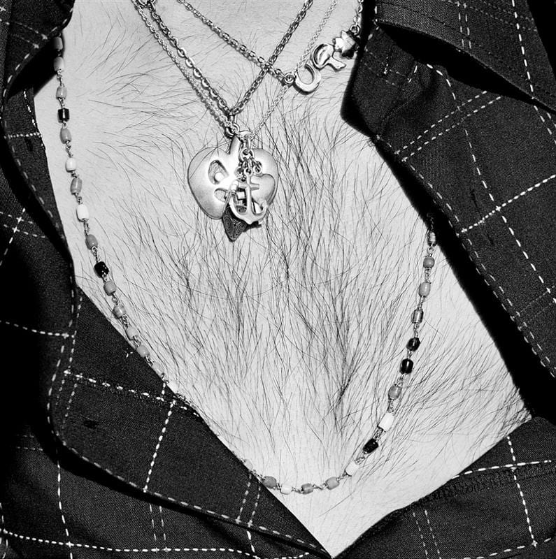
What is masculinity ?
qualities or attributes regarded as characteristic of men or boys – Oxford Dictionary
Masculinity is socially and traditionally seen as traits such as: strength, courage, independence, leadership, dominance and assertiveness. And is usually shown as a contrast and opposite to femininity. Traditionally masculinity can also be seen as being the ‘breadwinner’ of the household or house. However the standards of masculinity vary between different cultures and historical periods.
image from google
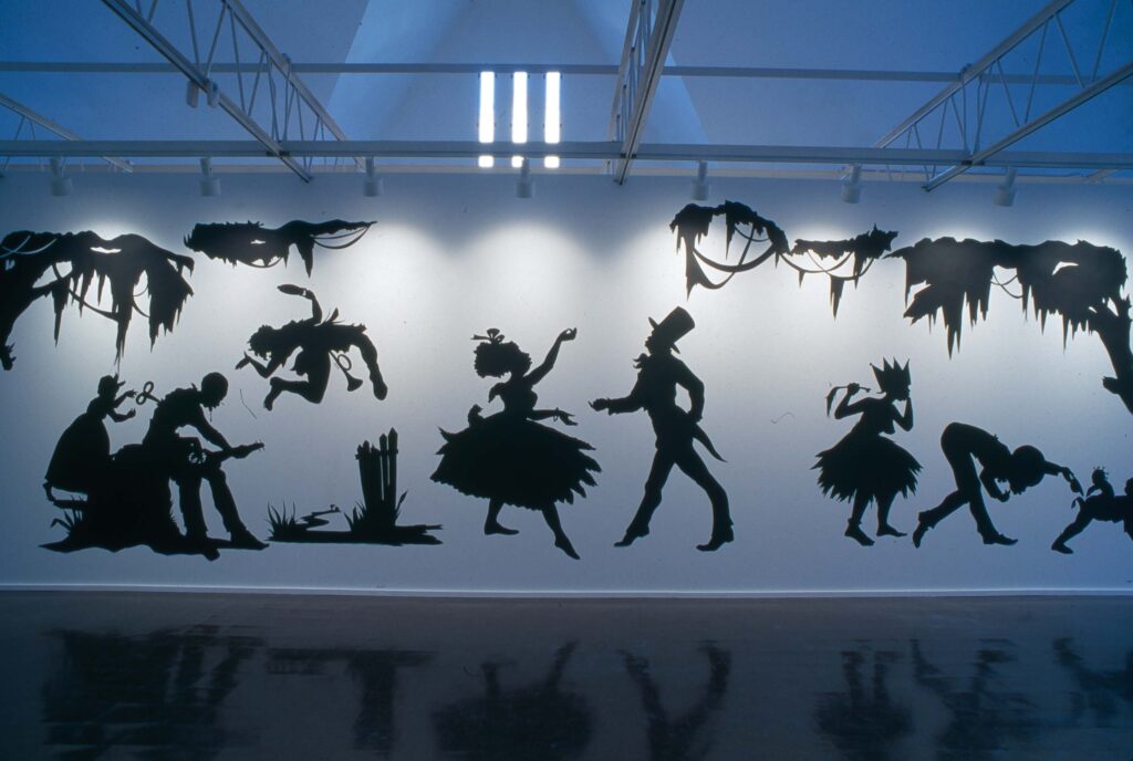
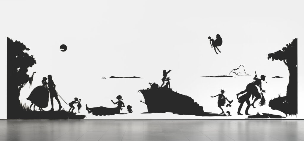
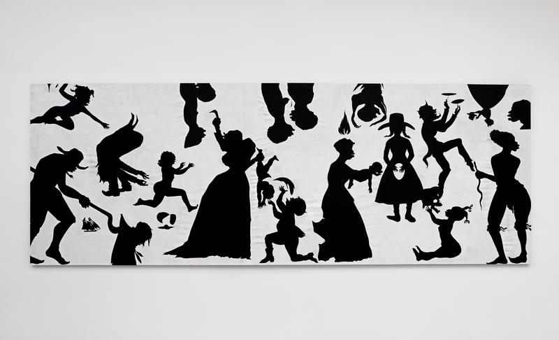
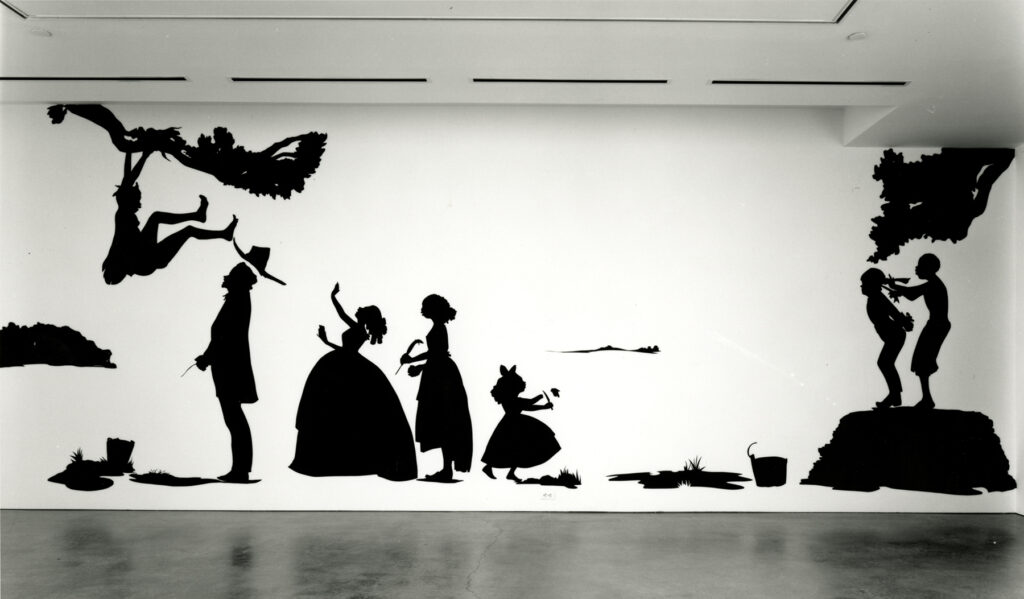
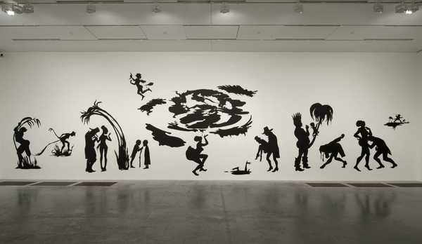
Kara Walker
images by Kara Walker
Kara Elizabeth Walker is an American Contemporary artist. Born on November 26th 1969. The main themes are work explores is race, gender, sexuality and identity. Walker is best known for her room-size tableaux of black cut-paper silhouettes that often address the history of American slavery and racism.
The mural that really brought Walker to the art worlds attention was called “Gone, An Historical Romance of a Civil War as It Occurred Between the Dusky Thighs of One Young Negress and Her Heart” In 1944.
During her early career Walker lived in Rhode Island but later moved to Forte Green, Brooklyn where Walker became a professor of visual arts at Colombia University. As well as Walker is one of the youngest recipients of the MacAurthur fellowship at only 28 years old when she received this honour.
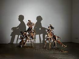
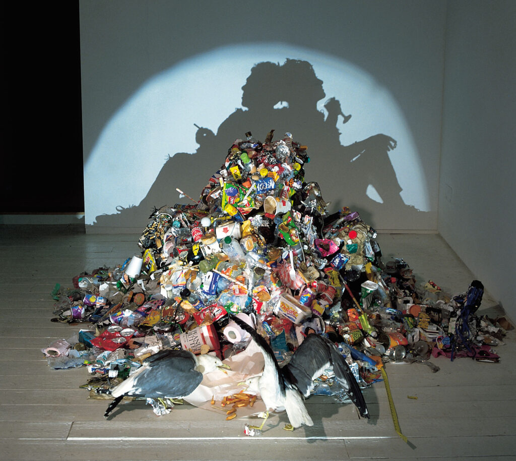
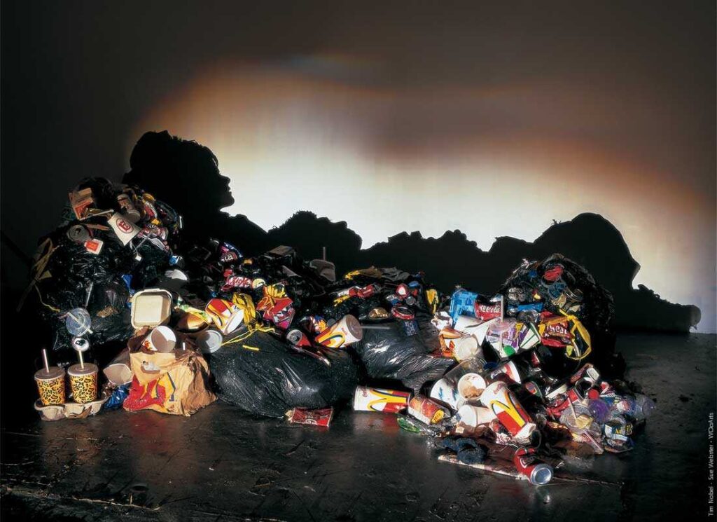
Tim & Sue Noble
images by Tim and Sue noble
Tim and Sue noble are British artists that work and collaborate as a duo.
The work that I am looking at mainly is their shadow work, which is where they use household rubbish to create silhouettes.
Tim Noble and Sue Webster’s work can be divided into the ‘Light Works’ and the ‘Shadow Works’, And Susan states: “We kept them both going side by side. There are two sides to the work; the shiny side and the dark side. That kind of reflects the two personalities within us. which I think that is very powerful as it links to good and evil and which could even be religion.
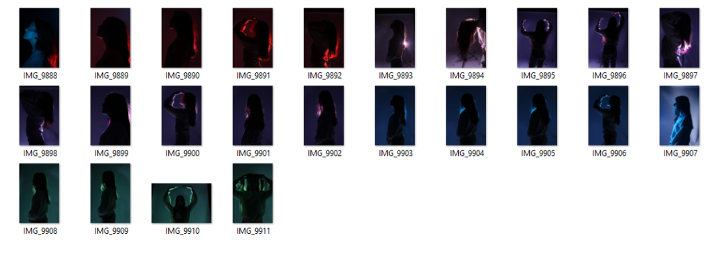
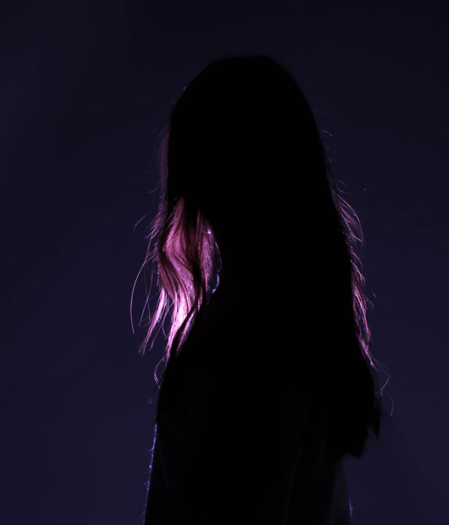
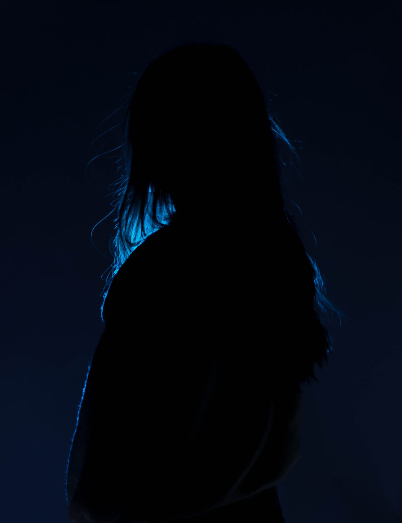
Photoshoot plan
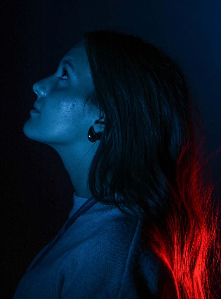
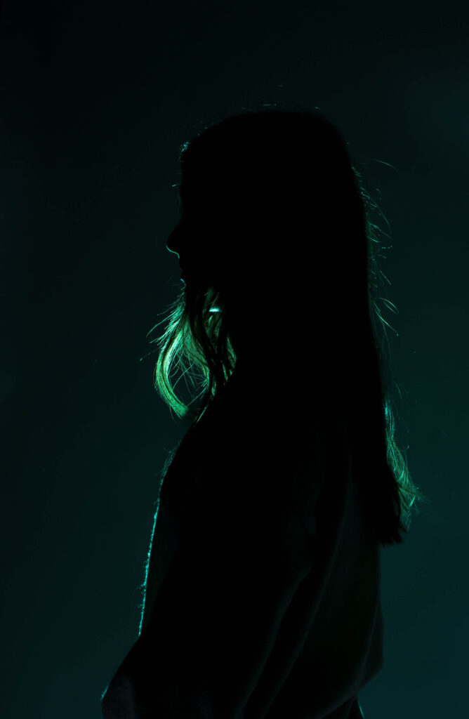
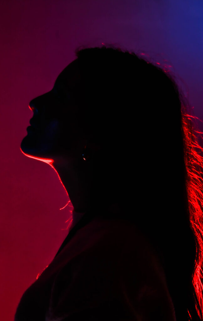
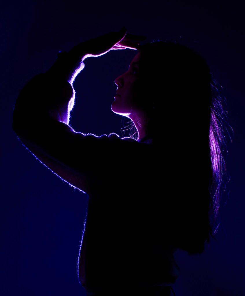
For this photoshoot I took the idea of silhouettes from the artist references above and decided to put my own sort of spin on it, I really enjoyed using the coloured gels so I knew that I wanted to do something using them. And I decided to go for ore of the femininity route for this particular photoshoot. I liked the idea of kind of having the light shine through the hair of the model.
my photos – silhouettes
Edited images
this is my favourite image of the shoot. Because I really like the hand placement, it makes me think of femininity and I feel as if it kind of links to dance and maybe more specifically ballet which is a traditionally a feminine area. As well as the face the coloured gel lighting is very nicely outlining her arm, chin and I like the way that there is still some of the light shining through the hair.
Here is how I have edited this image:
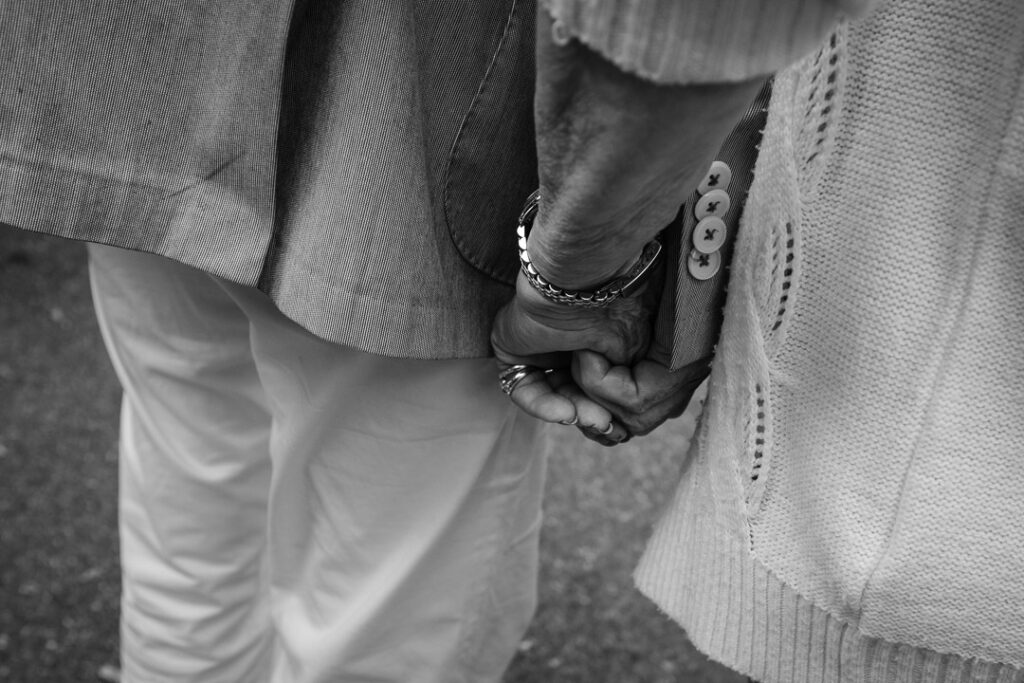
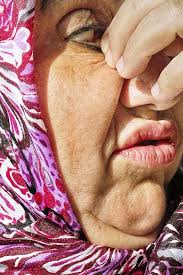
Valerie Jardin
images by Valerie Jardin
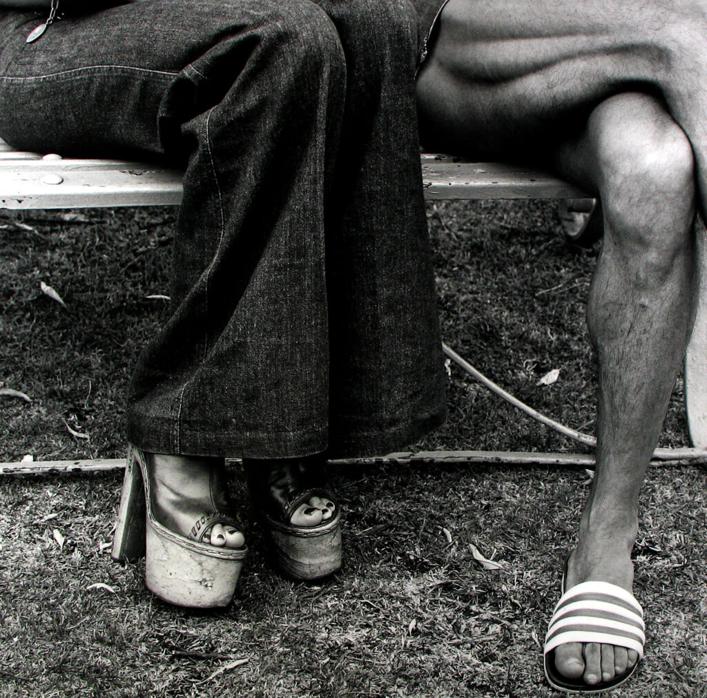
Valerie Jardin is a French photographer whose photography gained a lot of followers due to its strong narrative and proving portraiture doesn’t need to be photos of a face. Jardin leads international workshops for photography has written books and has even published a weekly podcast for a few years. Jardin runs online courses and conferences as she states that she love to help and mentor other photographers .
Jardin has taken many photos all over the world. Her images are mostly classed as street photography which she is most known for.
Jardin analysis
This is image is taken using a digital camera and the genre of this photography is portraiture.
The mise-en-scene presents two people holding hands whilst sitting at a table in a park. The tone of this image is quite light, however there are some darker spots for example the tree in the background, but due the lighting and the colour of their skin the overall tone of the image is light. The use of light in this image is quite subtle, soft, almost hazy looking looking lighting, however, it is natural lighting as they are outside. The focus distance is short as it is a close up photo and the depth of field is large as everything is in focus. The leading lines of the images would be the lightness of where the sunlight is hitting there skin against the contrast of the darker shadows of the parts of the arm that are not being hit by the light draw your eye along the image.
I believe the ISO is 600 as everything is in as most of the image is in focus however the background is blurred and grainy. I believe that the shutter speed is 1000 as everything is clear.
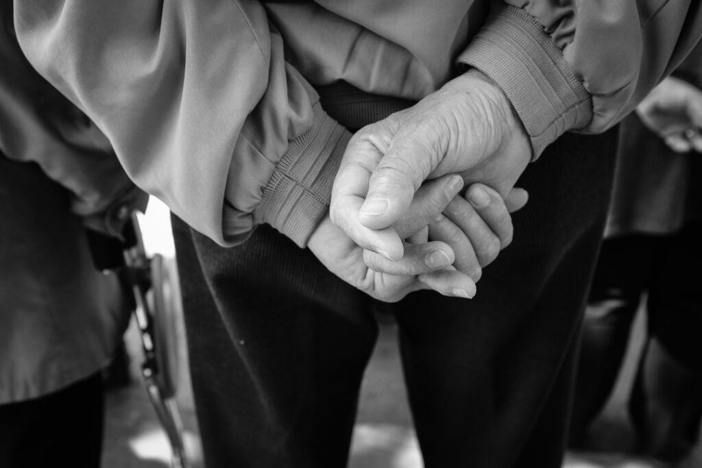
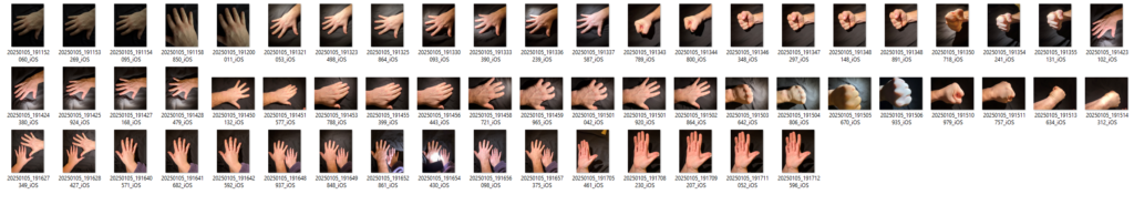
photoshoot plan
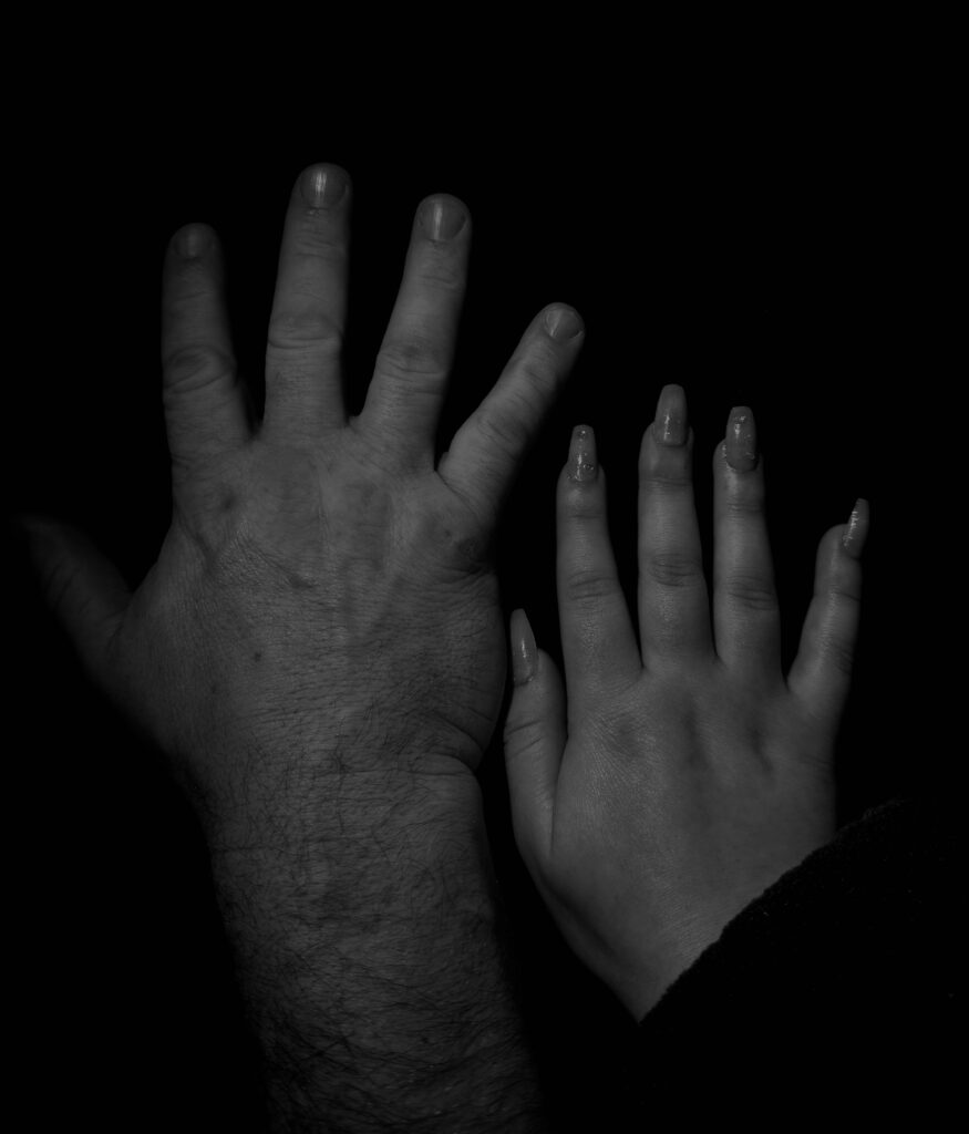
My plan for this photoshoot is too photograph my dads hands as to have some masculine hands and possibly some of maybe my hands next to his to compare the hand of a women in juxtaposition to big man hands.
my photoshoot – hands
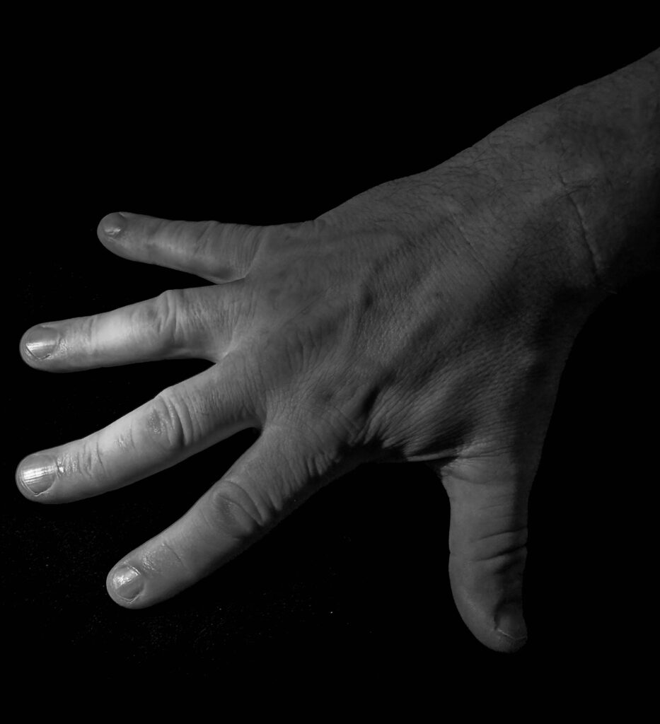
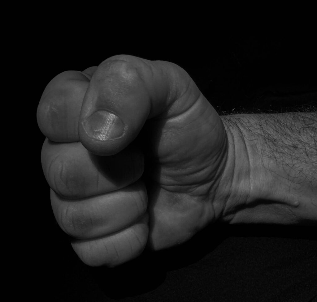
Edited images
This is my favourite image out of the photoshoot that I have done because I some what shows a story behind it, as the signal of the fist is showing strength and power ( traditionally masculine traits) I decided to make these sets of images monochrome as I thought it gave them more of a dramatic affect as well as being a bit of contrast compared to the brightness of the coloured gels.
this is what I have done to edit the image as well as cropping out some of the blank space around the edges to make the hand a bit more central and a bit less empty.
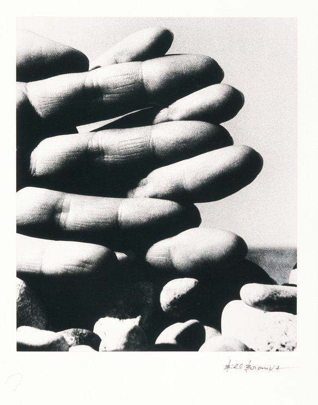
To challenge myself a bit more I decided that I would further my photographer of the hands and move to more parts of the body such as just the torso of just legs. An artist reference for this could be Bill Brandt
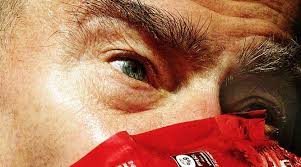
Bill Brandt
Bill Brandt died December 20th 1983. He was born in Germany and then he moved to England. Brandt later denied that he was German and used to claim that he was born in South London. Brandt has held nine exhibitions which include many different places such as: The Museum of modern art in New York, Philadelphia Museum of art and Victoria and Albert museum. In 1984 Bill Brandt’s images were welcomed into the International Photography Hall of Fame and Museum. As well as receiving a English heritage blue plaque in 2010. Brandt made his portrait of Ezra Pound in honour of visiting him after he had just survived tuberculosis.
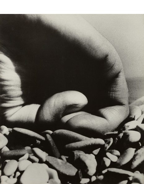
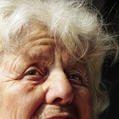
Brandt Analysis
This is image is taken using a digital camera and the genre of this photography is portraiture.
The mise-en-scene presents a close up photo of an eye from an older man. The tone of this image is pretty dark, due to the fact the image is close up and high contrast as well as monochrome. But the wrinkles and texture in the face could also be making it look darker. The use of light in this image is quite harsh, however, it is artificial lighting as they could be in a studio space. The focus distance is short as it is a close up photo and the depth of field is large as everything is in focus. The leading lines of the image would be the wrinkles on the skin of his face as the darker contrast and texture of the wrinkles draw your eyes to those spots.
I believe the ISO is 100 as everything is in as most of the image is in focus however the background is blurred and grainy. I believe that the shutter speed is 1000 as everything is clear.
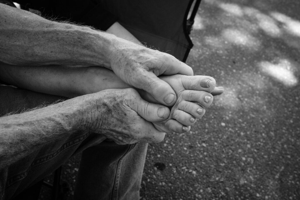
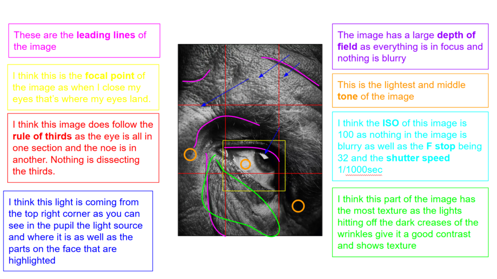
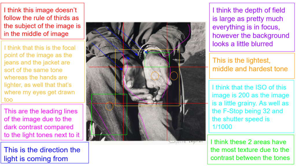
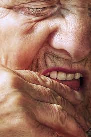
David Goldblatt
Images by David Goldblatt
David Goldblatt was an South African photographer. Goldblatt began his journey with photography when he received a camera from his father as a teenager. David’s first photographs were not amazing so he ask a local wedding photographer for help Goldblatt states: “He would drape several cameras around my neck so that I looked very professional, and my job was to ensure that no guest with a good camera got a good picture . . . I would have to bump or walk in front of them at the critical moment so that my boss was the only person who ended up with good photographs.” a few years later in1962 he became a full time photographer. Throughout his photography career David thought of himself more as a documentarist rather than a photographer/artist. He got around the label of artist by simply calling himself a photographer. He said: “I am a self-appointed observer and critic of the society into which I was born, with a tendency to giving recognition to what is overlooked or unseen.”
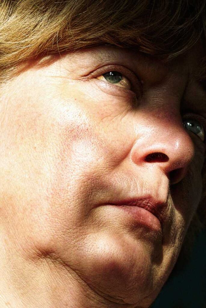
Goldblatt analysis
This is image is taken using a digital camera and the genre of this photography is portraiture.
The mise-en-scene presents a close up photo of a pair of old mans hands in his lap. The tone of this image is medium tone, due to the fact the image is all mainly one tone due to the outfit that the man is wearing. But the wrinkles and texture in the jeans and palms of the hands can give the image depth and make it look slightly darker. The use of light in this image is quite soft, natural lighting, as you can see they’re in an outdoor area. The focus distance is short as it is a close up photo and the depth of field is large as everything is in focus, however the background is slightly blurred an grainy. The leading lines of the image would be the wrinkles and folds in the jeans and around the edge of the hands as they’re areas with shadows compared with much brighter lighting.
I believe the ISO is 200 as everything is in as most of the image is in focus however the background is blurred and grainy. I believe that the shutter speed is 1000 as everything is clear.
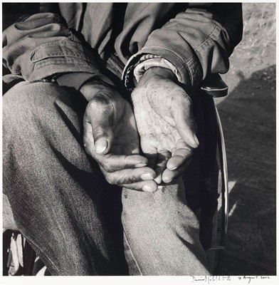
photoshoot 3
edited images
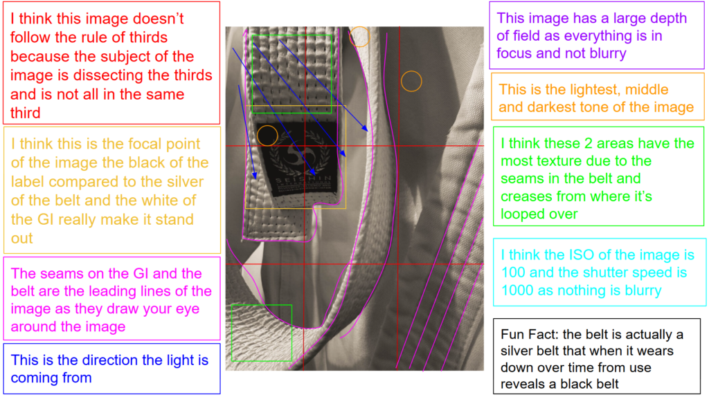
My favourites
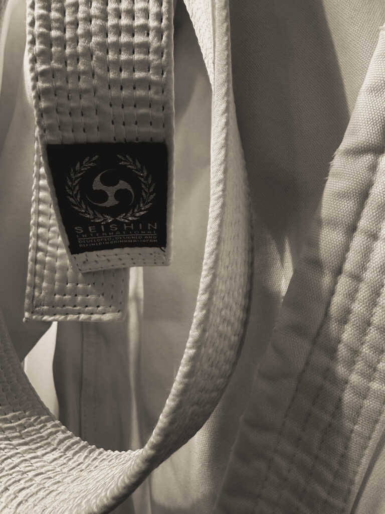
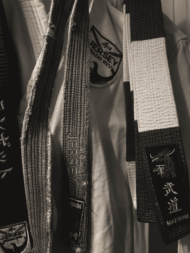
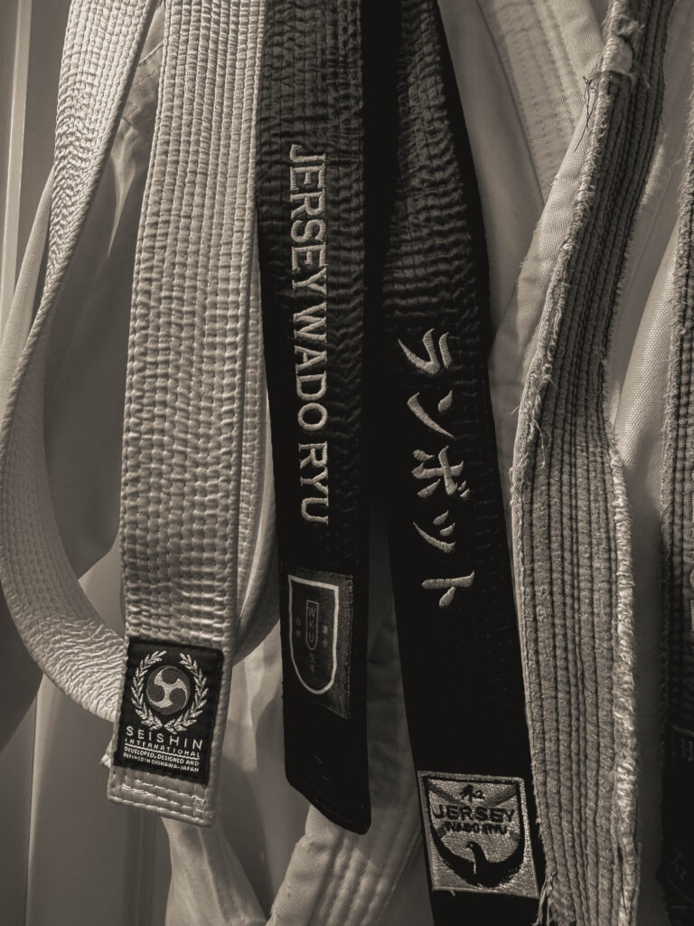
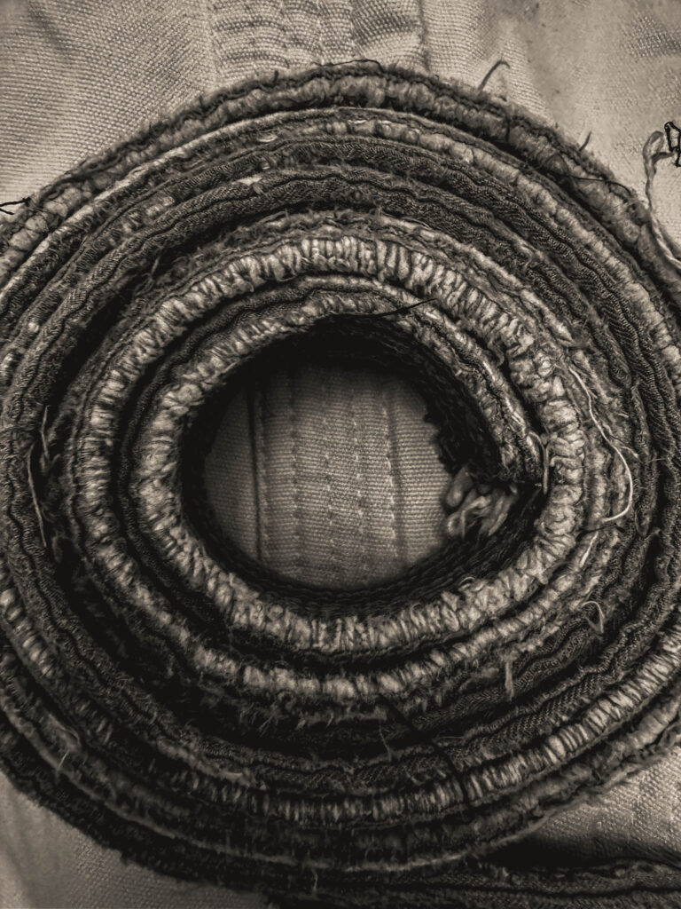
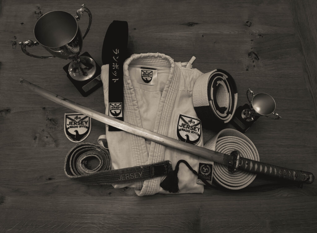
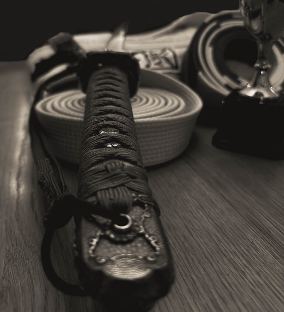
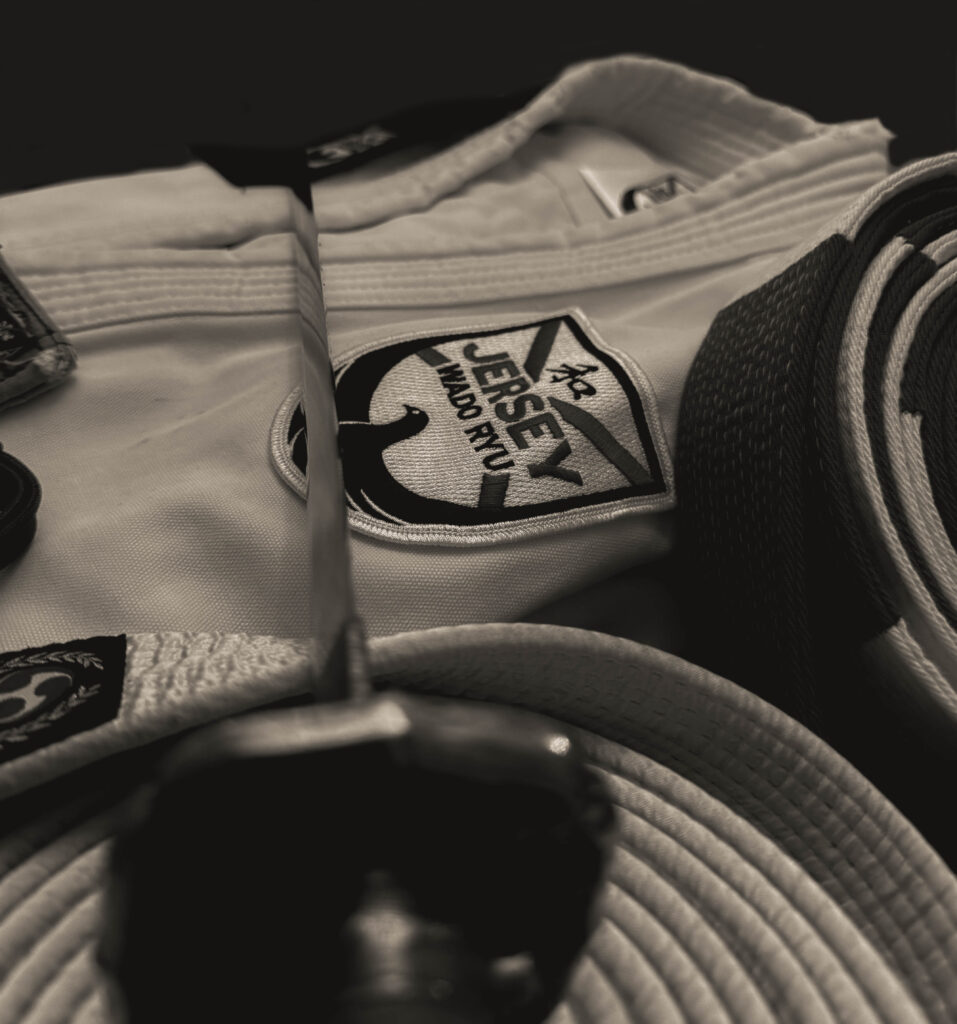
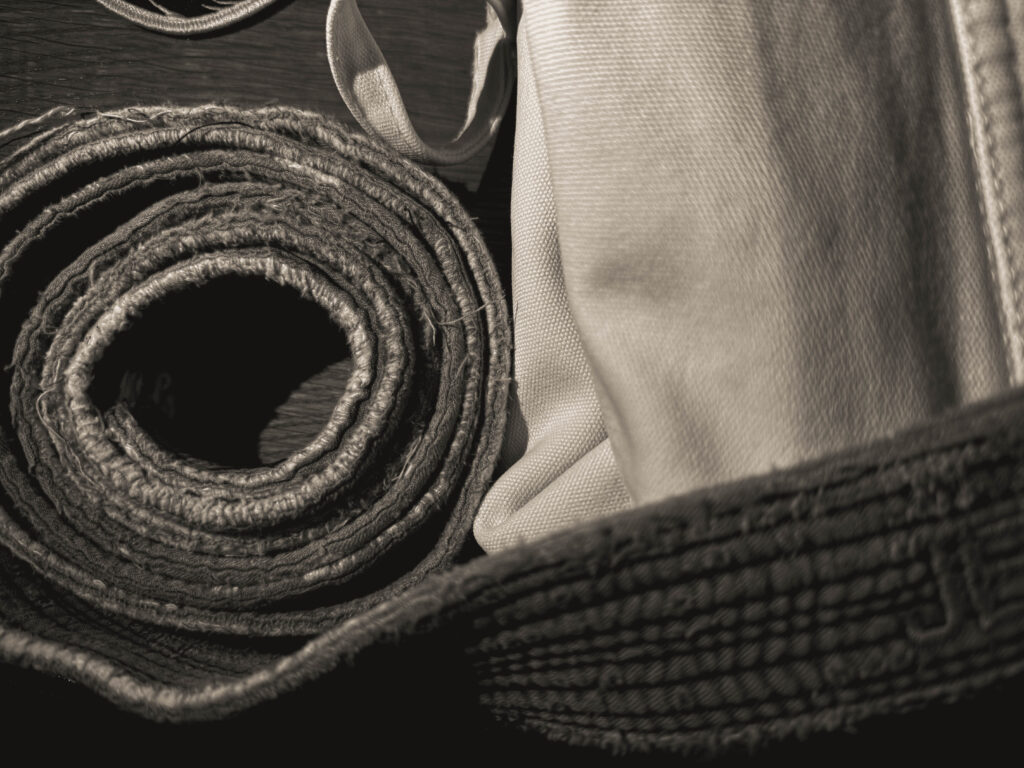
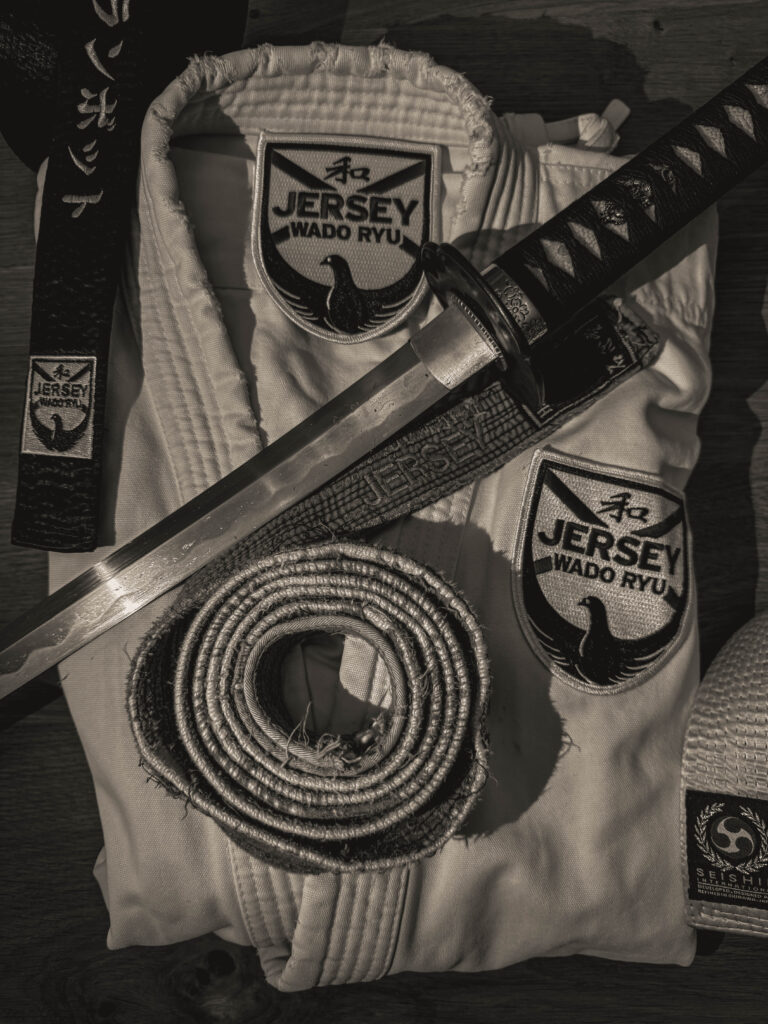
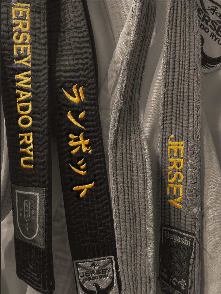
these two images are some of my favourite of this shoot because they are so simple but they still convey this powerful message, especially with the slight rips and sort of imperfections in the GI ( the outfit ) shows that my dad has been doing
Personally I really like this image because I like the contrast between the old worn out belt compared to the lightness and the freshness of the GI, this was one of the first black belt my dad ever got and it shows the life-long commitment and possibly hardships that have happened / been through.
I have edited this image by:
as well as to get this particular monochrome colour I used the filter: BW02
This images above could also be linked to Satoshi Fujiwara, code unknown, by how he get close up and in creases and different perspectives of looking at things.
Satoshi Fujiwara: code unknown
images by Satoshi Fujiwara
analysis of my own image
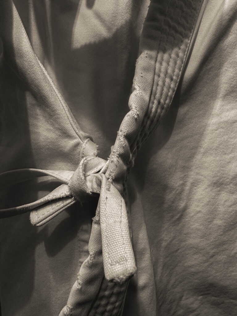
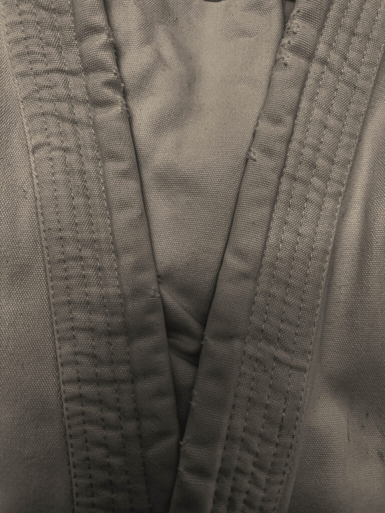
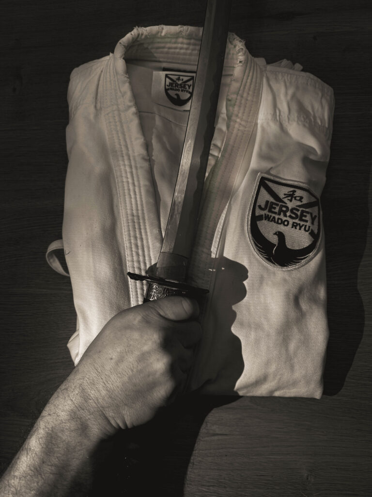
This is image is taken using a digital camera and the genre of this photography is Identity.
The mise-en-scene presents a close up photo of a belt draped over a karate GI. The tone of this image is very light, due to the fact the belt is silver and the GI is white. But the wrinkles and texture in the belt could also be making it look a little darker. The use of light in this image is quite soft,warm as it is artificial lighting because the picture was taken in my home using a wall light. The focus distance is short as it is a close up photo and the depth of field is large as everything is in focus. The leading lines of the image would be the seams on the GI and the actual belt itself would be a leading line as it helps bring your eyes around the image.
I believe the ISO is 100 as everything is in as most of the image is in focus. I believe that the shutter speed is 1000 as everything is clear.
Virtual Gallery
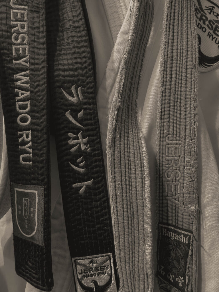
I really like the way this gallery / project has come out I think it really shows my dads identity, as karate has been a big part of his life as he’s been training for 43 years ( he’s only 48! ) and teaching for 36 years since he got his first black belt at 12 years old. He has 2 organisations MMA ( mental martial awareness) which helps people deal with their mental health. And his non-profit karate club which he is the chief instructor of.
The way I made this is that I used some of the hand pictures that I previously took as they were also of my dads hand so I thought that they would be good to include as some of them especially the fist link to this kind of topic that I’m doing. As well as I have added some of my environmental portraits that I took of my dad from when he was in his GI and in his dojo.
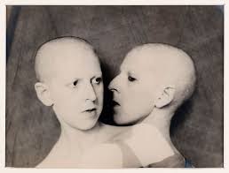
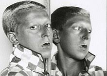
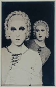
Claude Cahun was a French surrealist photographer, sculptor and writer. Cahun was widely known for her self portraits where she crosses the gender boundary’s between male and female, which challenged the strict gender roles at the time. Cahun had a rather androgynous look which she used to help her switch between the gender, which was new for the time as there were stereotypical gender roles, and the thought for people being gender fluid or transgender or anything like that was not thought of. Cahun writes: “Masculine? Feminine? It depends on the situation. Neuter is the only gender that always suits me. However, Cahun mainly referred to herself using grammatically feminine words however described her gender as gender fluid.
She was born 25th of October 1894 in Nantes to a well-off Jewish family. When Cahun was four years old her mother unfortunately was suffering of a mental illness which led to her mother being put into a permanent place at a psychiatric facility. Cahun attended the University Of Paris, Sorbonne. During this time is when he started her self-portrait photography which was as early as 1912 (which means she was 18) and continued to take photographs of herself through the 1930’s.However, Cahun passed on 8th of December 1954
Many of Cahun’s self-portraits show her with her head shaven and only from the shoulders up eliminating her body which blurs the gender indicators. Which shows that her identity and gender is allowed to be seen, however should not be objectified.
WW2 Activism
Cahun settled in Jersey in 1937, after the fall of France and the German occupation of Jersey and the Channel Islands . Where Cahun became an activist and propagandists and worked producing anti-German fliers. In 1944 Cahun was sentenced to death however it was not carried out as the Island was liberated in 1945, however throughout her time in jail Cahun’s health declined and unfortunately never recovered after being let out and Cahun passed on 8th of December 1954.
Cahun Analysis
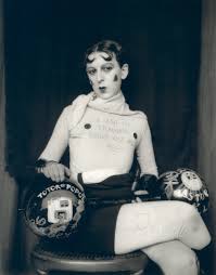
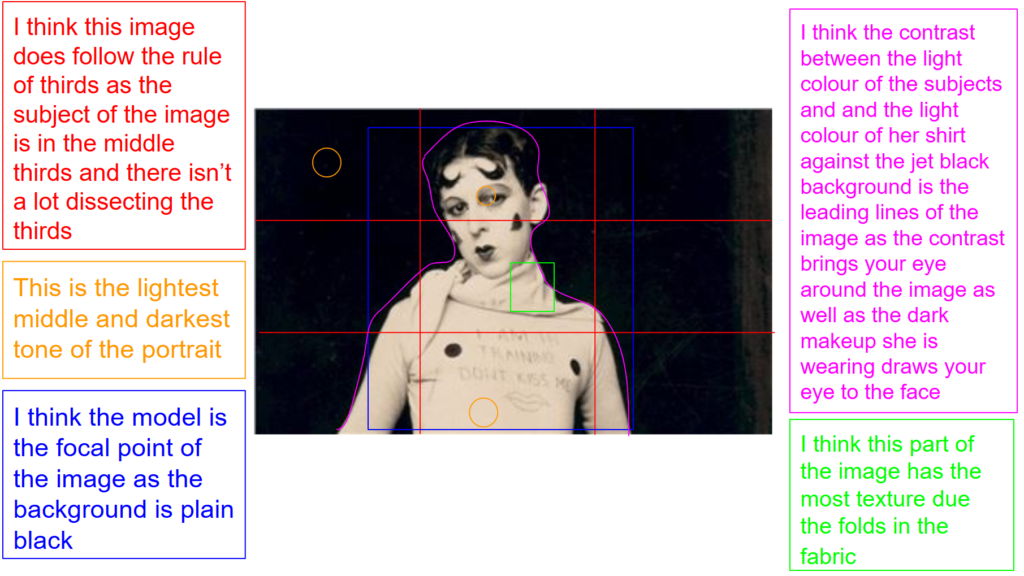
This is image is taken using a film camera and the genre of this photography is portraiture.
The mise-en-scene presents the self-portrait photo of Claude Cahun sat on a chair, with a t-shirt that says don’t kiss me, I’m in training, with a black background. The tone of this image is pretty dark, dues to the background and her hair and makeup being dark as well. The use of light in this image is quite softwarm looking lighting, however, it is still artificial light so this may have been taken in her home or where ever she used as a studio. The focus distance is short as it is a close up photo and the depth of field is large as everything is in focus. The leading lines of the images would be the lightness of her white outfit against the dark black background, as well as the black accessories she is wearing also bring your eyes across the image.
I believe the ISO is 100 as everything is in focus and not grainy. I believe that the shutter speed is 1000 as everything is clear.
Claude Cahun states: “The abstraction, the dream, are as limited for me as the concrete and the real” this demonstrates the fact that during the occupation she felt trapped and possibly isolated. As she has big dreams to be creative and free however they were stopped by WW2 and the occupation of Jersey.