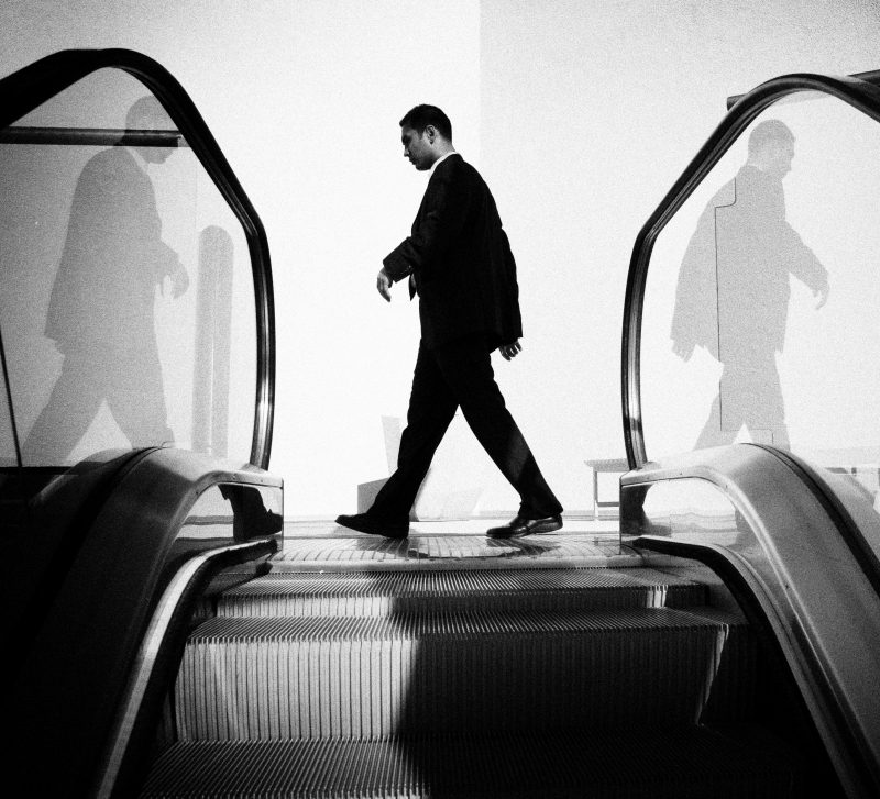
A Typology is a set of images made with a common subject or idea in mind, repeated through out the set. This can include for example, photographing every window in a 10 mile radius, maybe photographing every food imported from Africa on a supermarket shelf or maybe a leaf from every type of leaf near your area.
Artist References
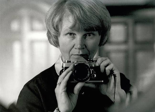
Hilla Becher & Bernd Becher
Who are they?
Hilla Becher was a German artist born in 1931 in Siegen, Germany. She was one half of a photography duo with her husband Bernd Becher. For forty years, they photographed disappearing industrial architecture around Europe and North America.
They won the Erasmus Prize in 2002 and Hasselblad Award in 2004 for their work and roles as photography professors at the art academy Kunstakademie Düsseldorf.
How did they become a duo?
They began collaborating together in 1959 after meeting at the Kunstakademie Düsseldorf in 1957. Bernd originally studied painting and then typography, whereas Hilla had trained as a commercial photographer. After two years collaborating together, they married.
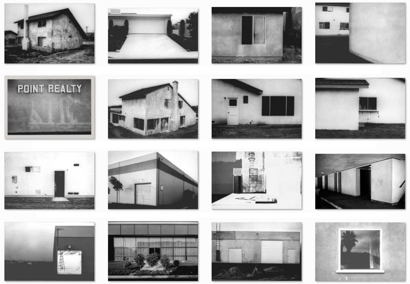
Industrial structures including water towers, coal bunkers, gas tanks and factories. Their work had a documentary style as their images were always taken in black and white. Their photographs never included people.
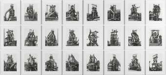
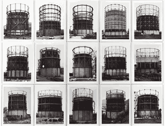
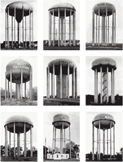
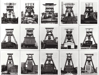
They exhibited their work in sets or typologies, grouping of several photographs of the same type of structure. The are well known for presenting their images in grid formations.
In 1990, they received an award at the Venice Biennale not for photography, but sculpture, due to their ability to illustrate the sculptural properties of architecture.
Bernd and Hilla Becher Gas-holders Germany, Belgium, France, Britain, USA, 1966–93 Each 40 x 30 cm All photographs courtesy Bernd and Hilla Becher
What were the common themes?
Overlooked beauty and the relationship between form and function. Both subjects addressed the effect of industry on economy and the environment.
What were their key works?
Their first photobook Anonymous Sculptures was published in 1970 and is their most well-known body of work. The title is a nod to Marcel Duchamp’s readymades and indicates that the Becher’s referred to industrial buildings as found objects.
The book consisted of an encyclopaedic inventory of industrial structures including kilns, blast furnaces and gas-holders categorised into sections (the pot, the oven, the chimney, the winch, the pump, and the laboratory.)
Bernd and Hilla Becher Water Towers USA, 1988 Black and white photographs Each 40 x 30 cm Collection John Aniello All photographs courtesy Bernd and Hilla Becher
What was their legacy?
They were often labelled as conceptual artists and influenced minimalist and conceptual artists like Ed Ruscha, Carl Andre and Douglas Huebler.
As professors of The Dusseldorf School of Photography, they influenced a generation of German photographers who were their students (including Andreas Gursky, Candida Höfer, Thomas Ruff and Thomas Struth.)
Bernd and Hilla Becher Winding towers Germany, Belgium, France, 1965–98 Each 40 x 30 cm All photographs courtesy Bernd and Hilla Becher
A zine is a small-circulation booklet or magazine, often created by hand or using digital tools through self-publishing. Unlike traditional magazines, zines are characterised by their DIY ethos and independent spirit. They cover a vast array of topics, from personal stories to art, poetry, and music. They’re standout pieces of print media because they can be as varied as the creators behind them.
Zine Definition
‘Zine’ is derived from ‘fanzine’, a contraction of ‘fan magazine’. Traditionally reproduced using photocopiers or home printers, they can be entirely hand-drawn, typed, or digitally designed. These do-it-yourself publications often embody a homemade aesthetic, taking many forms but are generally a mixture of text and images.
What are examples of Zine?
Art Zines: They showcase artwork, photography, and illustrations, serving as portable galleries for artists. They can be thematic, focusing on a specific medium or concept, or a collection of an artist’s recent works. Art zines often include commentary or essays about the artwork, giving readers insight into the artist’s process and vision.
Political Zines: These zines raise awareness, inspire action, and provide alternative perspectives on current events. They can include essays, interviews, manifestos, and resources for further reading or involvement. Political zines have historically played a significant role in social movements, giving activists a platform to disseminate their ideas and rally support.
Personal Zines: Also known as perzines, these are autobiographical, sharing personal stories, experiences, and reflections. They can cover multiple topics, from mental health and relationships to travel and daily life, providing an intimate glimpse into the creator’s world. Perzines often read like diary entries, offering raw and honest insights that foster a deep connection with readers.
Music Zines: They focus on music scenes, bands, and genres. They often feature interviews with musicians, album reviews, concert reports, and discussions about music culture. Music zines have been integral to developing various subcultures, from punk and metal to indie and hip-hop.
Literary Zines: These publications include poetry, short stories, and other scholarly works. They provide a platform for emerging writers and poets to share their work without the gatekeeping of traditional literary magazines. Literary zines can range from experimental and avant-garde to more conventional forms of writing.
Comic Zines: These zines feature original comics and graphic stories. They are a popular format among illustrators and comic artists who want to share their work with a broader audience. Comic zines can be humorous, dramatic, or anything in between, showcasing the versatility of the medium.
What are Exhibition Catalogues?
These are books that describe a temporary exhibition within a museum or art gallery. Some of these exhibitions may travel over a period of years to many different art museums. Eventually the exhibit will be disbanded and all works on loan for the show will be returned to the owners, either private or museums.
How are these Exhibition Catalogues useful?
These catalogues contain images and detailed descriptions of the pieces within the exhibit. Also, they are likely to contain articles on the subject of the exhibit which provide context to the exhibit’s theme. These articles are likely to be written by the exhibition’s curator or other top specialists/researchers within the field.
Also included in an Exhibit Catalogue. They can also include bibliographies and indexes which can lead to additional materials. Some catalogues will include chronologies.
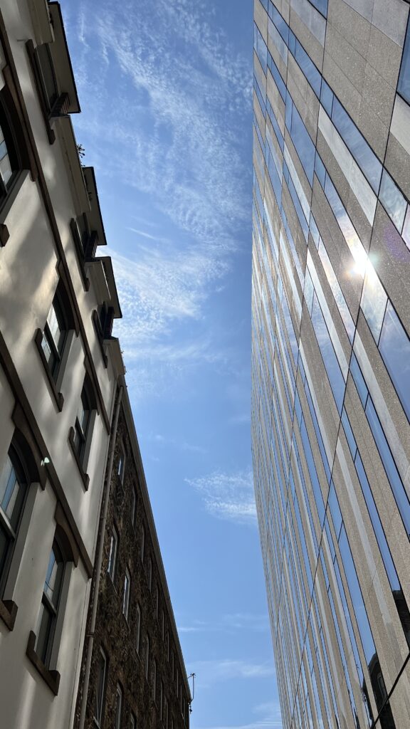
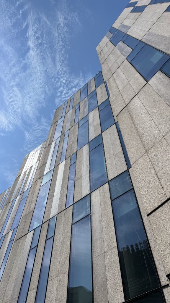
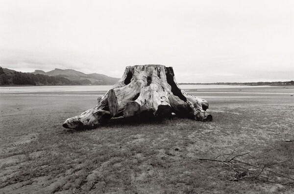
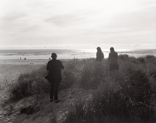
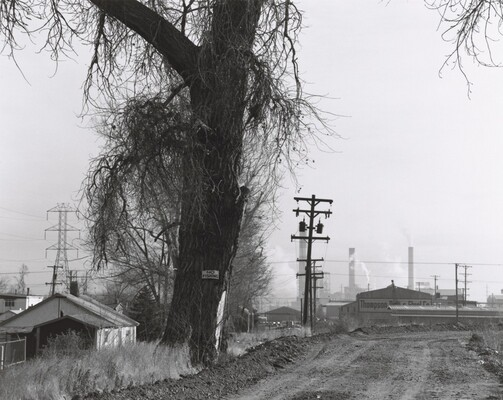
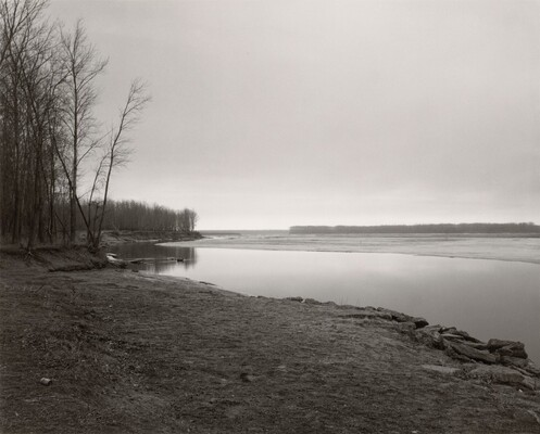
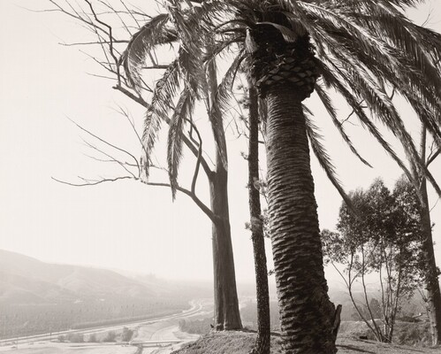
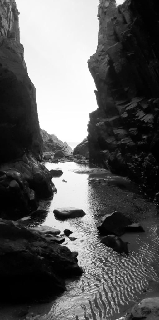
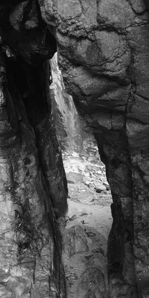
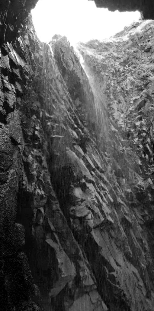
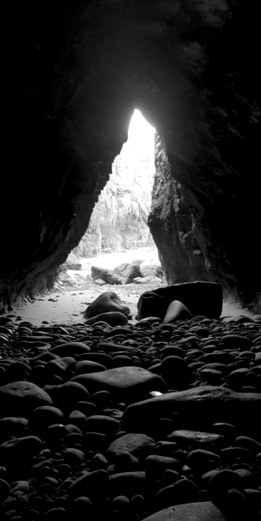
The term New Topographics was coined by William Jenkins in 1975 to describe a group of American photographers whose pictures had a similar banal aesthetic, in that they were formal, mostly black and white prints of the urban landscape.
This Technique in which a scene—usually a landscape—is photographed as if it were being surveyed from afar, practiced most famously by the 1970s ‘New Topographics’ photographers, including Robert Adams, Lewis Baltz, Nicholas Nixon, and Bernd and Hilla Becher.
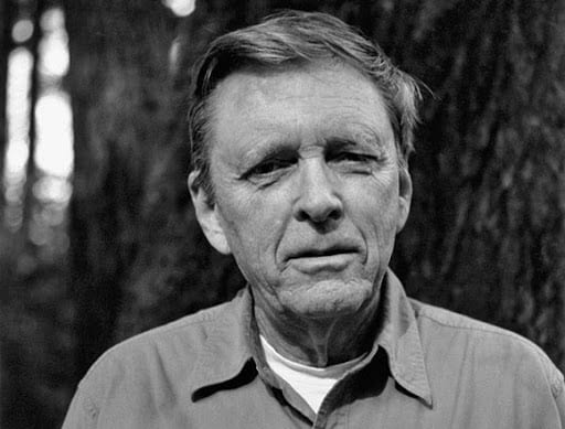
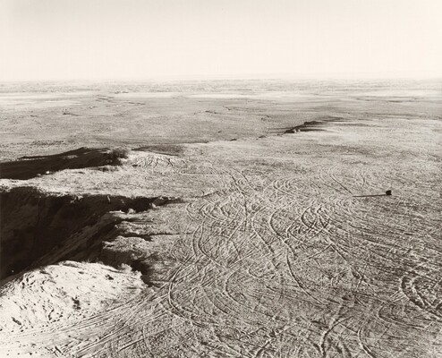
Robert Adams
Robert Adams was born on May 8, 1937 (age 87 years), City of Orange, New Jersey.
Robert Adams is an American photographer who has focused on the changing landscape of the American West. His work first came to prominence in the mid-1970s through his book The New West and his participation in the exhibition New Topographics: Photographs of a Man-Altered Landscape in 1975.
For 50 years, Robert Adams (b. 1937) has made compelling, provocative, and highly influential photographs that show us the wonder and fragility of the American landscape, its inherent beauty, and the inadequacy of our response to it. This exhibition explores the reverential way he looks at the world around him and the almost palpable silence of his work.
Many of these photographs of the American West capture the sense of peace and harmony that the beauty of nature can instill in us—“the silence of light,” as he calls it, that he sees on the prairie, in the woods, and by the ocean. Other pictures question our silent complicity in the desecration of that beauty by consumerism, industrialization, and lack of environmental stewardship. Divided into three sections—The Gift, Our Response, and Tenancy—the exhibition features some 175 works from the artist’s most important projects and includes pictures of suburban sprawl, strip malls, highways, homes, and stores, as well as rivers, skies, the prairie, and the ocean.
While these photographs lament the ravages that have been inflicted on the land, they also pay homage to what remains.
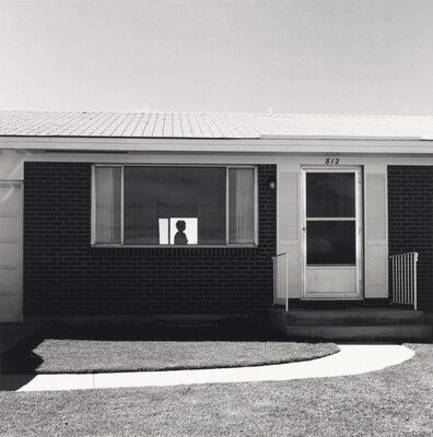
Lewis Baltz
Lewis Baltz was born on September 12, 1945, Newport Beach, California, United States. He died on November 22, 2014 (age 69 years), Paris, France
Lewis “Duke” Baltz was an American visual artist, photographer, and educator. He was an important figure in the New Topographics movement of the late 1970s. His best known work was monochrome photography of suburban landscapes and industrial parks which highlighted his commentary of void within the “American Dream”.
Parking lots, suburban housing and warehouses were all depicted with a beautiful stark austerity, almost in the way early photographers documented the natural landscape. An exhibition at the International Museum of Photography in Rochester, New York featuring these photographers also revealed the growing unease about how the natural landscape was being eroded by industrial development.
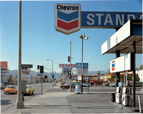
Stephen Shore
Stephen Shore, Beverly Boulevard and La Brea Avenue, Los Angeles, California, June 21, 1975, chromogenic colour print
Foreground vs background | Dominant features
Composition | low horizon line | Square format
Perspective and detail / cluttering
Wide depth of field | Large Format Camera
Colour | impact and relevance
Nationalism vs mobility vs isolation
Social commentary | The American Dream ?
An appreciation of the formal elements : line, shape, form, texture, pattern, tone etc
Technical
Slow Shutter Speed, car on the left is slightly Blurry
Natural light is being used, Cold Clinical feel, distinct Hard-Edged shadows
Visual
Hard Distinct Edges within the environment, Text, Shapes, Horizon
Some alignment to the Rule of Thirds
Horizon is quite low, Composition feels cluttered or closed
Contextual
2 Sides of Life, Urbanization and Industrialization
Cars connected all places together
No one cared about the Impact that the Petrol stations and Cars would have on the environment
Celebration of Transport/freedom but Damaging
Red, White, Blue colours being used connected to the American Flag in California – Nationalism
Logical image but Cold and stericle, makes sense in the Head but truthfully hurts to look at in the Heart
Conceptual
Car creates a sense of Freedom from escaping the Cluttered space and sent off into the Horizon
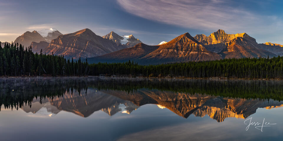
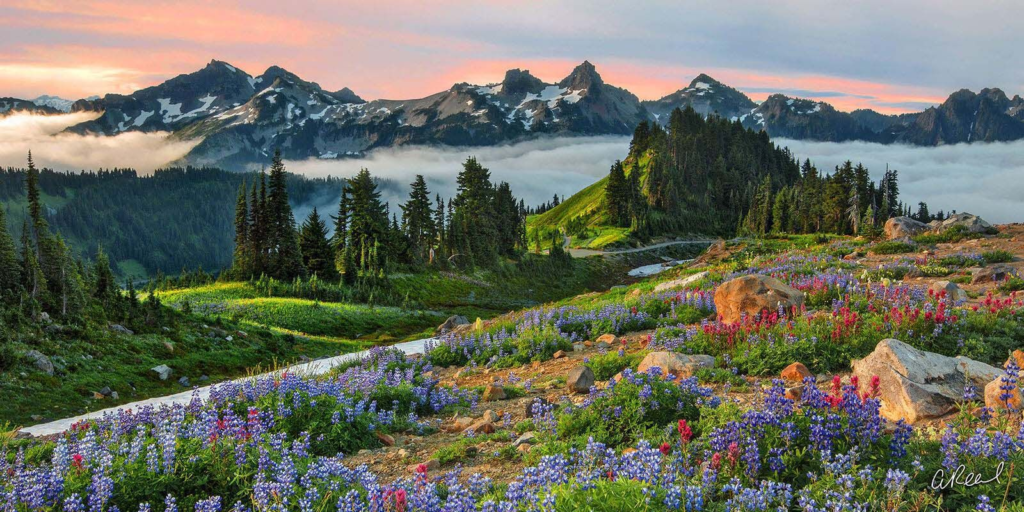
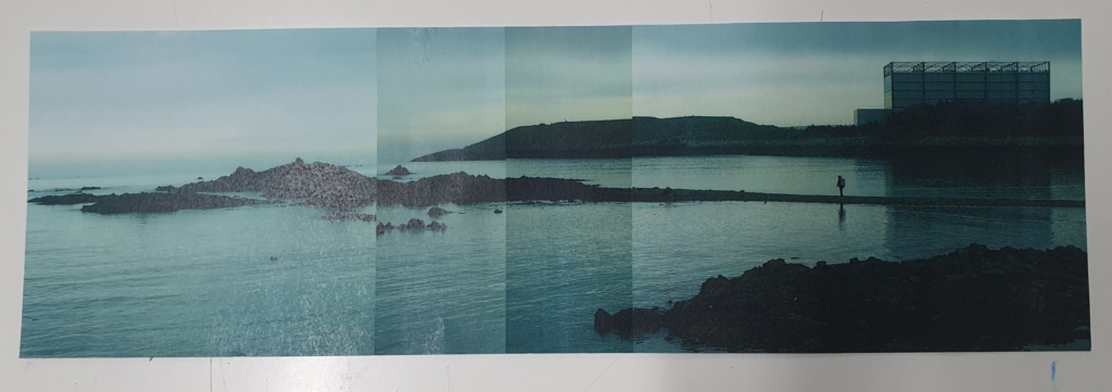
A panoramic photo captures a wide, sweeping view that extends far beyond the typical aspect ratio or field of view in a standard photograph.
To achieve a Panoramic Photograph you need to overlap your photos by about half, so each photo has about half of the scene the last photo had in it. As long as there is a decent overlap, the computer will stitch them together successfully. Shoot a bit wider than you think you will need. It is better to crop in afterward on your panorama, than to not have enough.
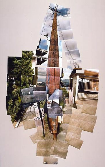
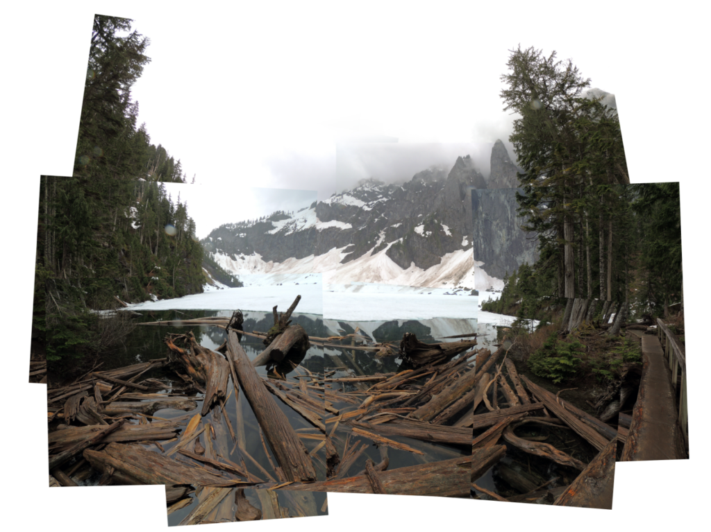
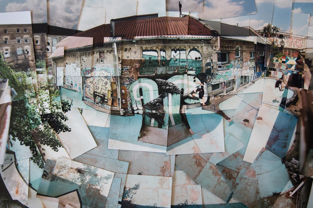
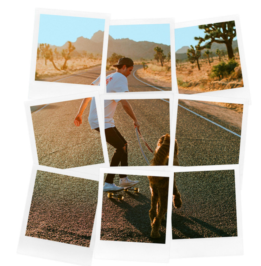
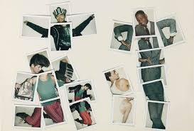
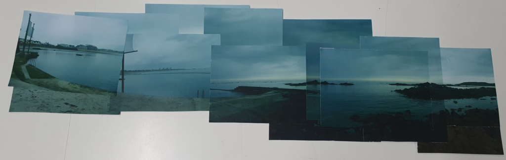
Joiner Photos
Joiner photography is a photographic technique wherein multiple pictures are assembled into one. There are two types of joiner photography, photographic collages and Polaroid collages.
Photographic Collages
A photographic collage is an artwork made by assembling different photographs together.
Polaroid Collages
A Polaroid collage is a photographic collage made using Polaroid photographs.
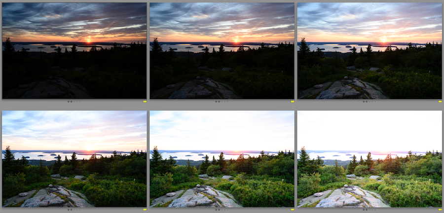
Exposure Bracketing: when you bracket your shots you take exactly the same picture of your subject at several different exposures. One that is slightly under-exposed (negative exposure), and the second one slightly over-exposed (positive exposure)
Exposure Condensation: is how you manually set the exposure for each photo. It can quickly adjust how light or how dark your exposure will be using these controls
Start with 1 stop variations. So, take a shot at -1 on the exposure compensation dial, then turn the dial so it reads -2 and then -3. Repeat, this time overexposing at +1, +2, and +3. You may not use all these images in the final HDR but it’s good to have the data just in case
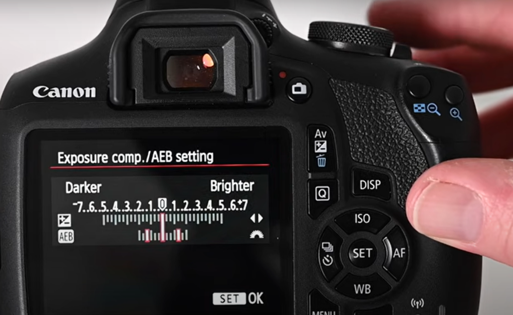
AEB:
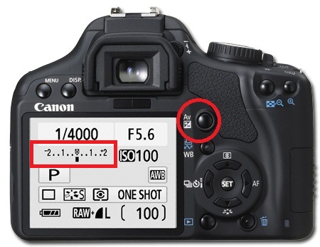
Automatic Exposure Bracketing is when the camera automatically takes three or more shots, each at a different exposure.
Or set the amount of “bracketing” like this…
In the menu, select the second tab and go to ‘Expo. Comp. /AEB
Use the dial on the top of the camera to set the range of exposure you want to capture with your 2nd and 3rd photo
After you have set the exposure range, you will see two extra marks on the exposure metre…
Now take 3 photos and your camera will automatically change the exposure for each one.
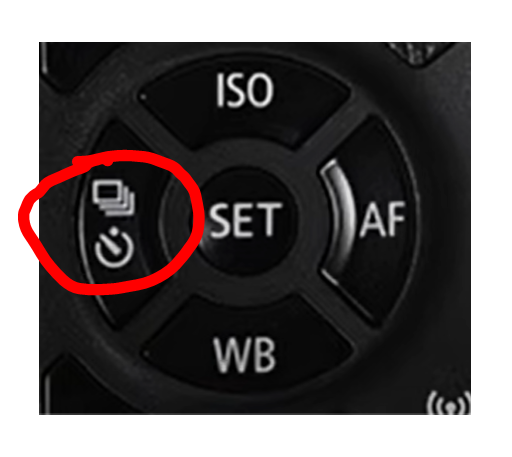
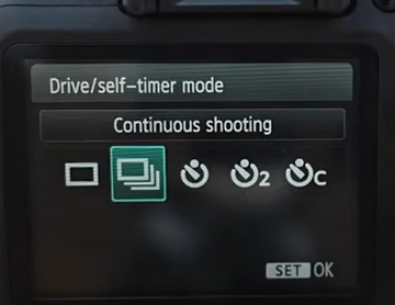
TIP: You can also set the camera to continuous shooting, to take 3 photos in close succession – all you need to do is hold the shutter button down.
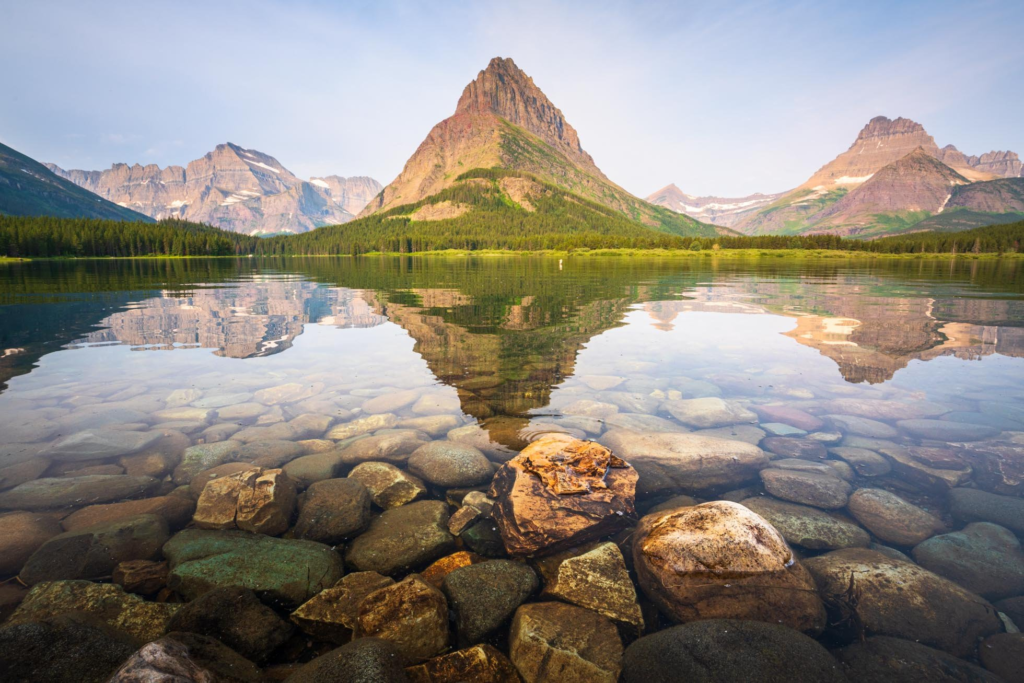
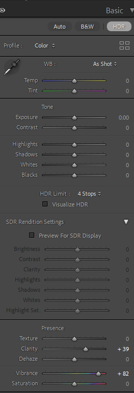
HDR Photos: is a technique that helps you get details in the brightest and darkest parts of your photographs. It can be achieved by taking multiple bracket images and blend them together to create a single beautifully exposed photograph with a full dynamic range of tone.
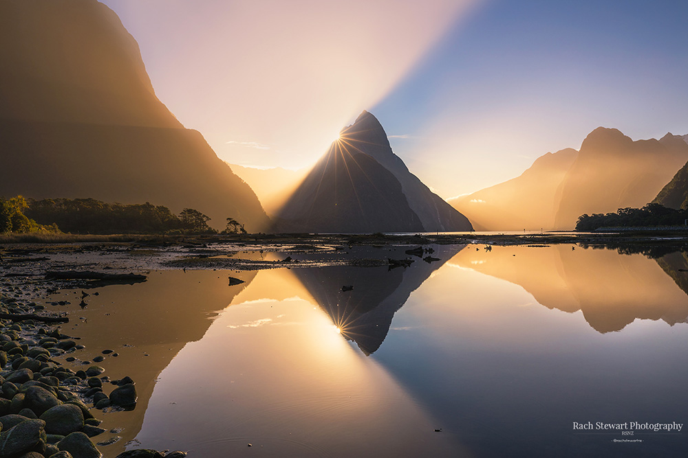
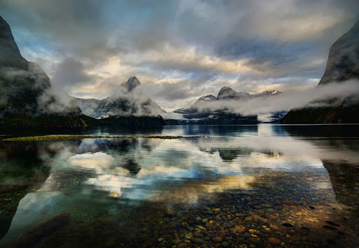
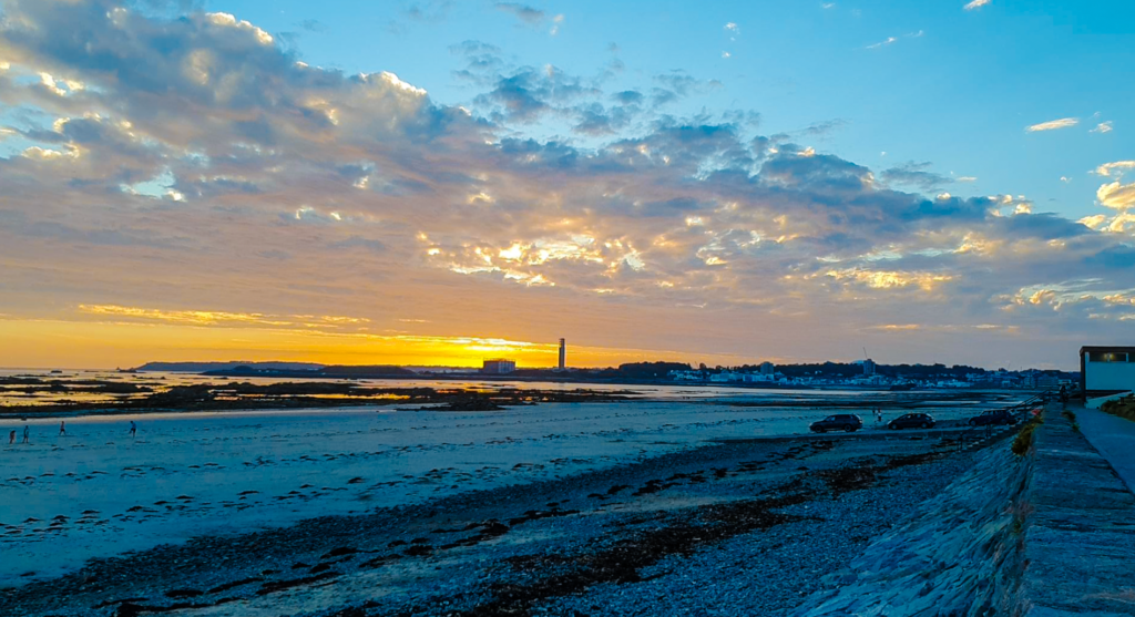
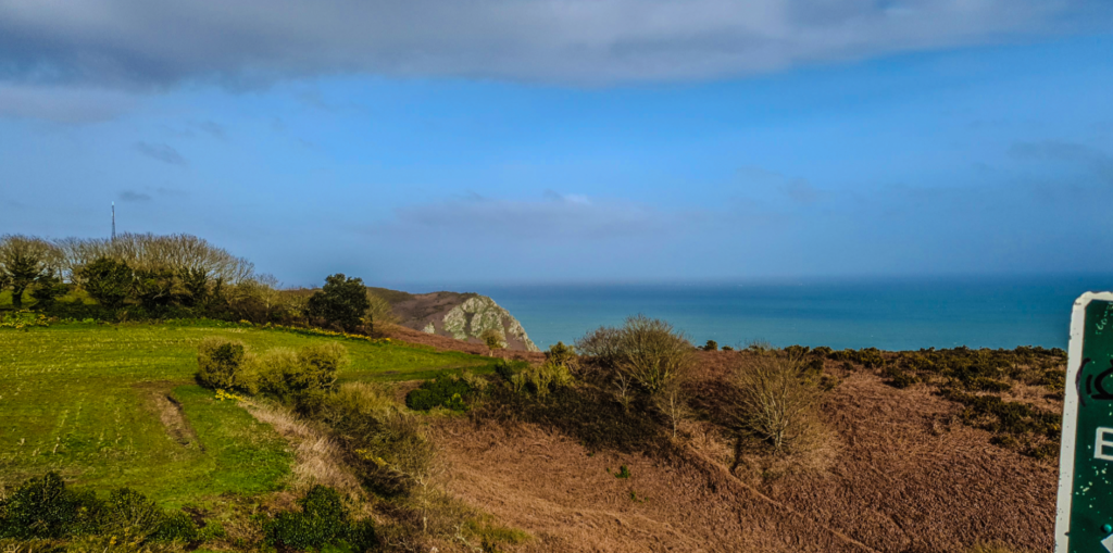
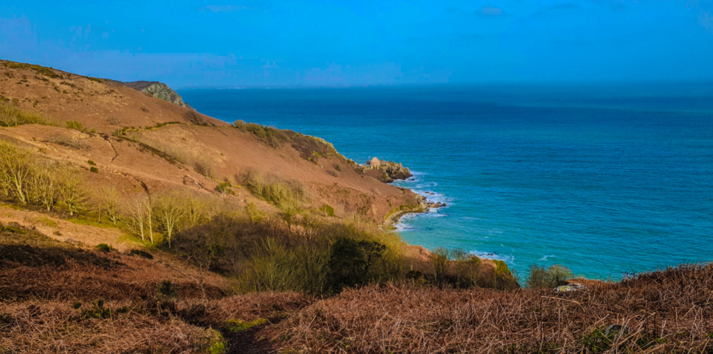
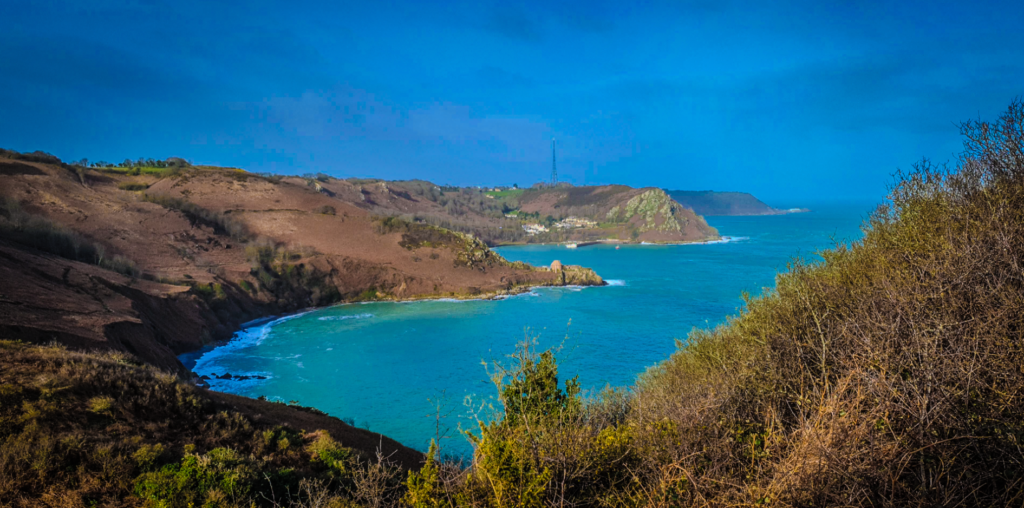
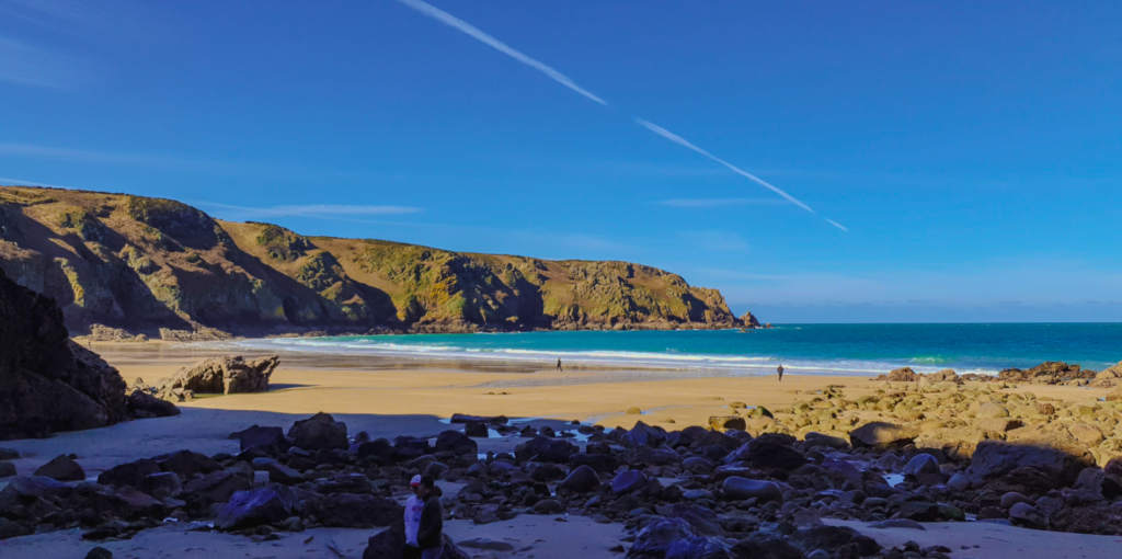
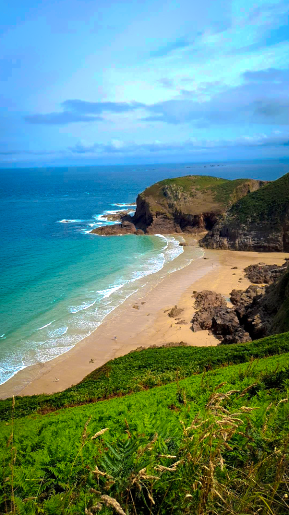
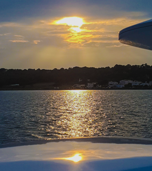
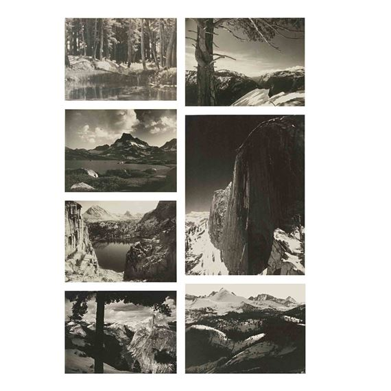
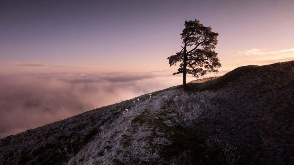
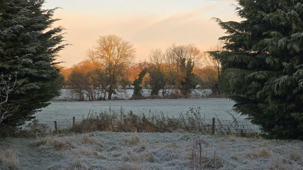
To achieve the following Images, I edited the Vignette, Exposure Bracketing, HDR and Vibrancy
Of course I couldn’t use the same settings for all my Landscape Photos. E.g. using the same Vibrancy setting to make the image too colourful or adding a Vignette to a slightly brighter image which blends in quite well creating a fading effect and using the same Vignette on a different image that is darker wont make it stand out as much.
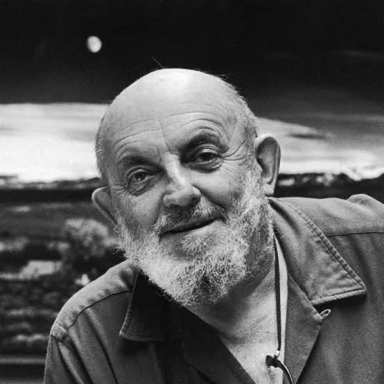
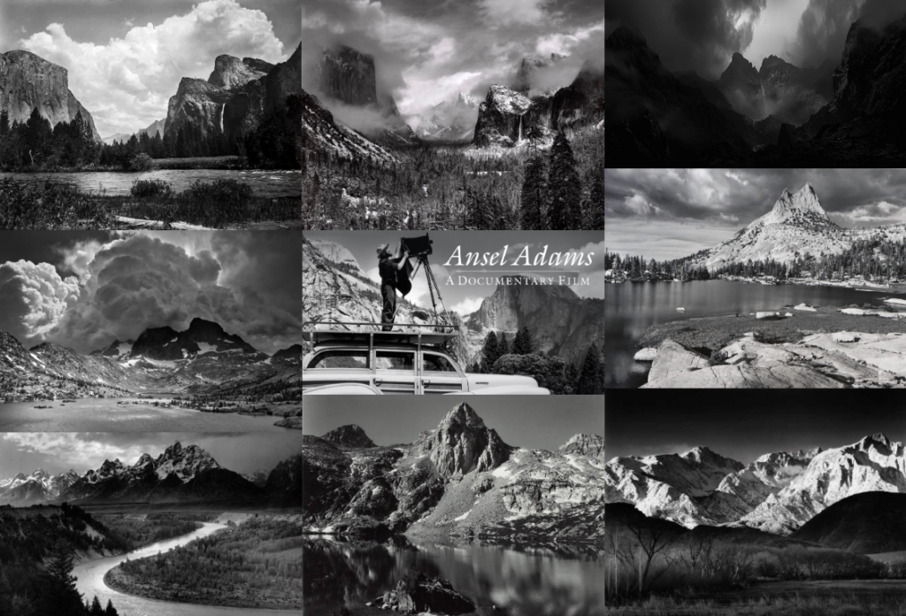
Ansel Easton Adams was an American landscape photographer and environmentalist known for his black-and-white images of the American West. Yosemite National Park was Adams’ chief source of inspiration.
What was his Childhood like?
He was born in San Francisco, California, the son of Charles Hitchcock Adams, a businessman, and Olive Bray. The grandson of a wealthy timber baron, Adams grew up in a house set amid the sand dunes of the Golden Gate. When Adams was only four, an aftershock of the great earthquake and fire of 1906 threw him to the ground and badly broke his nose, distinctly marking him for life. Adams was a hyperactive and sickly child with few friends. Dismissed from several schools for bad behaviour, he was educated by private tutors and members of his family from the age of 12. Adams taught himself the piano, which would become his early passion.
Adams’s love of nature was nurtured in the Golden Gate, but his life, in his words was “coloured and modulated by the great earth gesture” of Yosemite in the Sierra Nevada. During his first trip to Yosemite in 1916, his father gave him his first camera, an Eastman Kodak No. 1 Box Brownie. Yosemite Valley and the Sierra became a career- and life-altering place for Adams and is where he did some of his best work.
“Half Dome, Apple Orchard, Yosemite,” California by Ansel Adams, 1933.
When Adams was 12, after being dismissed from several private schools for being restless and inattentive, his father removed him from school. For the next two years, he was tutored and educated by his father and aunt Mary, who raised him to follow Ralph Waldo Emerson’s direction “to live a modest, moral life guided by social responsibility to man and nature.” He eventually resumed his formal education at Mrs. Kate M. Wilkins Private School, where he graduated the eighth grade on June 8, 1917.
How did Yosemite National Park inspire his career?
In 1919 Adams joined the Sierra Club. The Sierra Club is an environmental organization based out of San Francisco and founded by Scottish-American preservationist John Muir. Traditionally associated with the Progressive Movement, the club was one of the first large-scale environmental preservation organizations in the world. For several years, Adams was caretaker of the Sierra Club’s LeConte Memorial Lodge (now known as the Yosemite Conservation Heritage Centre) in Yosemite Valley. He was deeply influenced by the organization’s environmental credo, and his first published photographs appeared in the Club’s 1922 Bulletin.
His large encompassing landscapes, for which he is best known, are inspired by the archetypal nineteenth-century idealized panorama, which was a typical genre in early painted and photographic depictions of the American West.
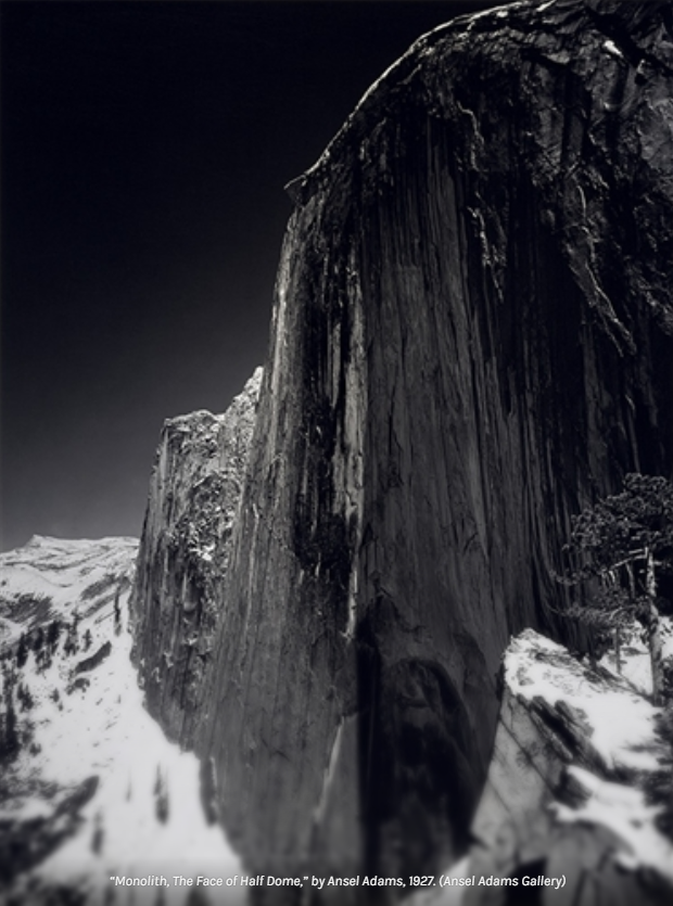
In 1927, Adams took his first High Trip as a member of the Sierra Club and made his famous photograph, Monolith, The Face of Half Dome.
Later that year, with the help of San Francisco insurance magnate and patron of arts Albert M. Bender, Adams published his first portfolio: Parmelian Prints of the High Sierras.
Why was the Kings Canyon at Risk?
In 1941, legendary photographer Ansel Adams was hired to shoot national parks for a photo mural at the Department of the Interior in Washington. With the escalation of World War II, the project was suspended. But before its abrupt end, Adams had created a series of 226 incredible images, including several from the Grand Canyon in 1942.
When was the proposal to create the national park approved?
In 1941 Adams was contracted by the Department of the Interior (DOI) to construct a photo mural of the National Parks, Native American Reservations, and other locations managed by the DOI. As an unremitting activist for the environment, Adams knew that this was an opportunity to showcase the wilderness. During this time, Adams captured his famous photograph The Tetons and Snake River.
“The Tetons and Snake River,” Grand Teton National Park, Wyoming, by Ansel Adams, 1942.
America’s grand old man of photography visited the National Archives in September 1979. Back then, the agency was known as the National Archives and Records Service (NARS). Adams spent the day in the Still Picture Branch examining prints he made four decades earlier.
Ansel Adams visits the National Archives, September 10, 1979. (Records of the National Archives)
Adams examined the prints that were his preliminary work for the DOI photo mural. These included 175 photos of National Parks, monuments, and Native Americans of the Southwest. He also revealed that he was paid $22.50 a day for his work, plus a $9 per diem. In 1979 one of his prints sold for as much as $6,250 (roughly $22,000 in 2019 dollars).
Ansel Adams passed away on April 22, 1984, from cardiovascular disease in Monterey, California, at the age of 82 surrounded by his wife, two children, and five grandchildren.
What Medal did he receive?
In 1980, President Jimmy Carter awarded Adams the Presidential Medal of Freedom, the nation’s highest civilian honour, for “his efforts to preserve this country’s wild and scenic areas, both in film and on earth. Drawn to the beauty of nature’s monuments, he is regarded by environmentalists as a monument himself, and by photographers as a national institution.”
“Yellowstone Falls,” Yellowstone National Park, Wyoming, by Ansel Adams, 1941.
View with Shadowed Ravine, “Grand Canyon from South Rim, 1941,” Arizona (Vertical Orientation), by Ansel Adams.
View of Valley from Mountain, “Canyon de Chelly” National Monument, Arizona, by Ansel Adams, 1942.
“Death Valley National Monument,” California, by Ansel Adams,1942.
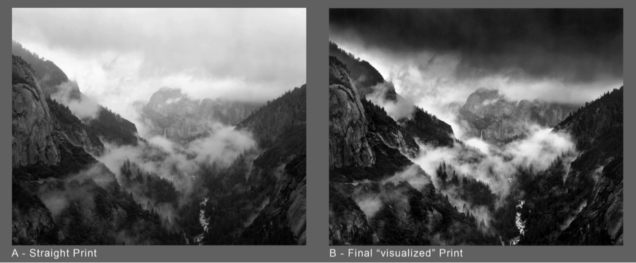
Visualization with Ansel Adams
Visualisation is the concept of interpreting a scene and deciding on the final shot before pressing the shutter. Taking place within the ‘mind’s eye’, as Adams often said, visualisation involves intuitively assessing a subject and choosing the most important attributes to frame and highlight.
In Ansel’s case, his knowledge of technique—knowing what a strong red filter ought to do—enabled him to imagine, or visualize, a final print with a much darker sky than the yellow filter would have afforded. He visualized how he wanted the print to look and used the techniques to execute his vision.
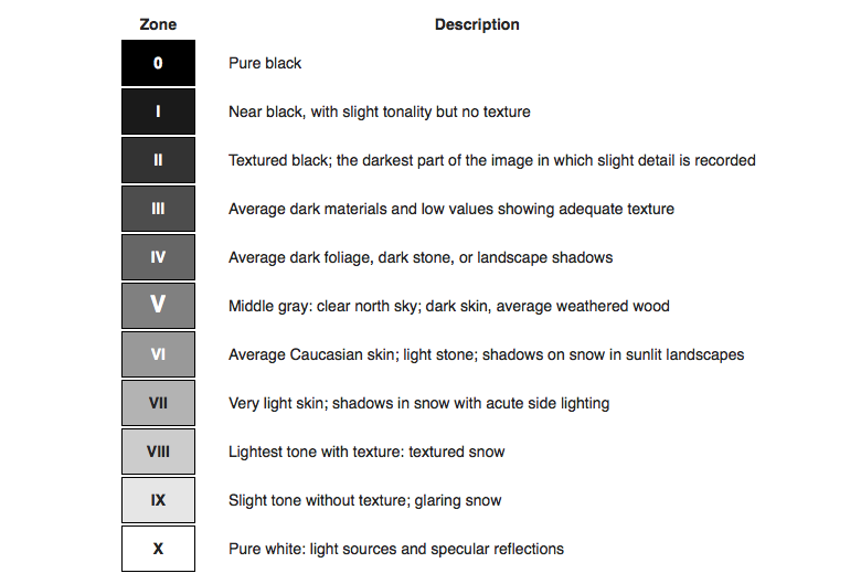
What was the Zone System?
The Zone System is a photographic technique for determining optimal film exposure and development, formulated by Ansel Adams and Fred Archer.
Each zone in the Zone System corresponds to a specific tonal value and exposure adjustment. For instance, Zone V is the middle grey, or 18% grey, which most meters are calibrated to. This zone represents a tonal value halfway between pure black (Zone 0) and pure white (Zone X)
Mood Board
Ansel Adams Photoshoot Response
I edited my Original Images to Black and white and edited each images exposure individually.
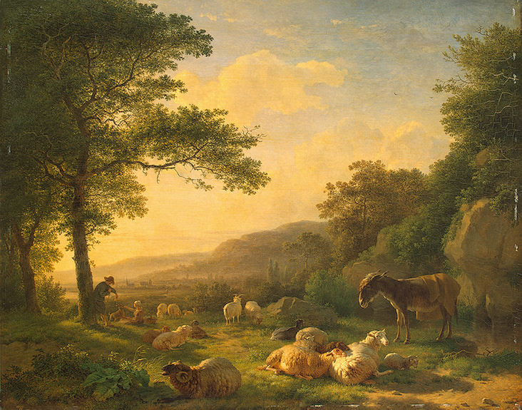
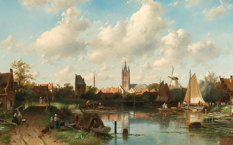
“Landscape” means how a piece of land looks, including hills, trees, rivers, and buildings. It can also refer to pictures of nature or describe the overall vibe of a place, like in business or politics.
When did landscape emerge as a genre in western culture?
Landscape emerged as a genre in Western culture during the Renaissance period, around the 14th to 17th centuries. Artists began to focus more on nature and the environment in their works, moving away from solely religious themes. This shift allowed landscapes to become a popular subject in painting, with artists like Leonardo da Vinci and later, the Dutch masters in the 17th century, contributing significantly to its development. By the 18th century, landscape painting had solidified its status as a distinct genre, especially with the Romantic movement, which emphasized the beauty and emotional power of nature.
When did classical landscapes emerge as a genre?
Classical landscapes emerged as a genre during the Renaissance, particularly in the 15th and 16th centuries. Artists began to depict idealized natural scenes, drawing inspiration from ancient Roman and Greek art. This genre continued to evolve through the Baroque period and into the 18th century, with artists like Claude Lorrain and Nicolas Poussin creating works that emphasized harmony and balance in nature. These classical landscapes often featured dramatic skies, serene waters, and carefully arranged compositions, which became influential in shaping the landscape genre in Western art.
What prompted the rise of Landscape Art during the late 18th / 19th century?
The rise of Landscape Art during the late 18th and 19th centuries was influenced by several factors. One major reason was the Romantic movement, which emphasized emotion and the beauty of nature. Artists began to focus on capturing the sublime aspects of the natural world, showcasing its power and majesty. Additionally, the Industrial Revolution led to rapid urbanization, prompting a longing for the countryside and a simpler way of life. This nostalgia was reflected in art as artists like J.M.W. Turner and Caspar David Friedrich created stunning landscapes that highlighted nature’s beauty and its contrasts with industrialization. Overall, these social, cultural, and emotional shifts played a significant role in the popularity of landscape art during this period.
When did landscape photography originate?
Landscape photography originated in the early 19th century, around the 1830s and 1840s. The invention of photography itself in the 1820s laid the groundwork for this genre. Early photographers, like Carleton Watkins and Ansel Adams, began to capture the beauty of natural landscapes, showcasing mountains, forests, and other scenic views. The development of new photographic techniques and equipment allowed for greater detail and clarity, further popularizing landscape photography as an art form. By the late 19th century, it had become a well-established genre, appreciated for its ability to document and celebrate the natural world.
What is Romanticism?
Romanticism was an artistic, literary, and intellectual movement that originated in the late 18th century and peaked in the early to mid-19th century. It emerged as a reaction against the Enlightenment’s emphasis on reason and the Industrial Revolution’s focus on industrialization and mechanization.
Key characteristics of Romanticism include:
1. Emphasis on Emotion: Romanticism places a strong emphasis on individual feelings, emotions, and the sublime. It values personal experiences and the expression of deep emotions over rational thought.
2. Nature: Romantic artists and writers often celebrated the beauty and power of nature, viewing it as a source of inspiration and a reflection of the human spirit. Nature was seen as a place for solace and spiritual renewal.
3. Individualism: The movement championed the individual and the unique perspective of the artist or writer. It often highlighted the importance of personal freedom and self-expression.
4. Imagination: Romanticism valued imagination and creativity, often exploring themes of fantasy, the supernatural, and the mysterious. It encouraged artists to break away from traditional forms and experiment with new ideas.
5. Historical and Cultural Inspiration: Many Romantic works drew inspiration from history, folklore, and the past, often idealizing medieval times or exploring national identities.
Notable figures associated with Romanticism include poets like William Wordsworth, Samuel Taylor Coleridge, and John Keats, as well as authors like Mary Shelley and Victor Hugo. In visual arts, painters like Caspar David Friedrich and J.M.W. Turner are often linked to the movement. Overall, Romanticism had a profound impact on literature, art, music, and philosophy, shaping the way we understand emotion, nature, and the individual’s role in society.
Fact file about Romanticism:
Who: The movement included a variety of artists, writers, and musicians. Notable figures include poets like William Wordsworth, Samuel Taylor Coleridge, John Keats, and authors like Mary Shelley and Victor Hugo. In visual arts, artists like Caspar David Friedrich and J.M.W. Turner are significant.
What: Romanticism was an artistic, literary, and intellectual movement characterized by an emphasis on emotion, nature, individualism, imagination, and a focus on the sublime. It sought to express the beauty of nature and the depth of human experience.
Where: The movement originated in Europe, particularly in countries like Germany, France, and Britain. It later spread to other parts of the world, influencing various cultures and artistic expressions.
When: Romanticism began in the late 18th century, around the 1770s, and peaked in the early to mid-19th century, roughly until the 1850s. Its influence continued into the late 19th century and beyond.
How: Romanticism emerged as a reaction against the Enlightenment’s focus on reason and the Industrial Revolution’s mechanization. Artists and writers sought to highlight the importance of emotion and the beauty of nature, often using vivid imagery and expressive language.
Why: The movement arose from a desire to break free from the constraints of rationalism and to celebrate the individual experience. It aimed to explore deeper emotional truths and to reconnect with nature and the past, reflecting a longing for a more authentic and meaningful existence.
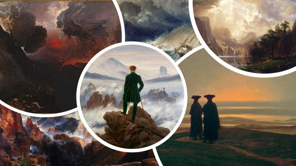
The Sublime
“The Sublime” is a concept in aesthetics that refers to an experience of beauty that is overwhelming and transcendent, often evoking feelings of awe, admiration, and sometimes fear. It is associated with vastness, grandeur, and the power of nature, which can inspire both wonder and a sense of insignificance in the face of something much greater.
In Romanticism, the sublime was a key theme, as artists and writers sought to capture the emotional intensity of experiences that go beyond ordinary beauty. This could be seen in depictions of dramatic landscapes, powerful storms, or monumental mountains, where the beauty of nature is both captivating and intimidating. The sublime often challenges the viewer’s perception and evokes deep emotional responses, making it a significant aspect of Romantic art and literature.
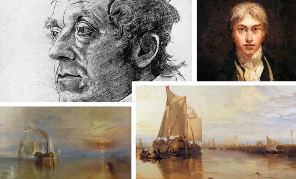
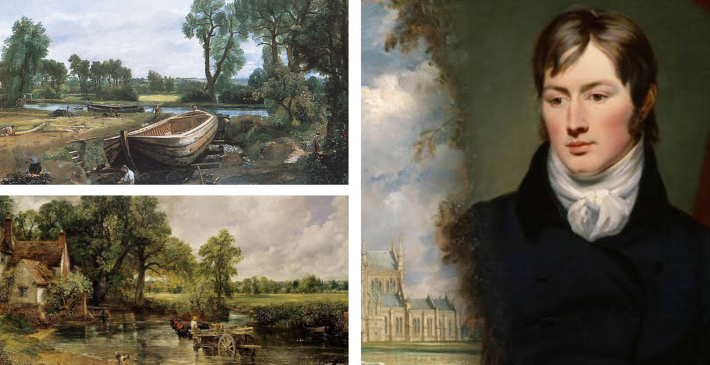
Importance of British Painters
J.M.W. Turner and John Constable are two of the most important British painters of the Romantic era, and they significantly contributed to the development of landscape painting.
J.M.W. Turner: Turner is known for his innovative use of colour and light, often depicting the effects of atmospheric conditions in his landscapes. His works, such as “The Fighting Temeraire” and “Rain, Steam and Speed,” evoke a sense of drama and emotion, capturing the sublime aspects of nature. Turner’s ability to convey movement and the transient nature of light paved the way for future movements, including Impressionism. He is considered a precursor to modern art due to his expressive style and exploration of colour.
John Constable: Constable, on the other hand, focused on the beauty of the English countryside, often painting scenes from his native Suffolk. His works, like “The Hay Wain” and “Dedham Vale,” are celebrated for their realistic portrayal of nature and the changing seasons. Constable emphasized the importance of light and atmosphere, using techniques like plein air painting to capture the essence of the landscape. He is known for his emotional connection to the land, which resonates with viewers and has influenced generations of artists.
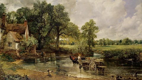
John Constable Painting
Romanticism – Pastoral scene, Known now as a British Cliché, but was once quite radical
Very large landscape – but very low on the genre hierarchy
Constable’s father was a land owner in Suffolk
The painting is of the Stour River where he grew up
Biggest painting for it’s time
This is a time when the land is fraught, there are economic stresses and unemployment among workers
Early industrial revolution – machines were perceived to be taking employment away. There was extreme poverty
But we see none of this here… It’s a beautiful working and thriving landscape
Additional focus on the sky – Constable had studied Meteorology, capturing a specific time of day
Was originally called Landscape Noon
The farmers in the background are at one with nature
Finding beauty in the most humble of landscapes
“The sound of water escaping from mill-dams, willows, old rotten planks, slimy posts, and brickwork, I love such things. … As long as I do paint, I shall never cease to paint such places. They have always been my delight.“
Completed from sketches – cery quickly over 5 months
Green – radical. Very realistic and close to nature. Other artists painted landscapes that were brown… old masters were used to working in rooms with fire and smoke in
Red accent to balance out the green
Broad marks – contemporary for its time – deliberate in creating rough texture that reflected the textures of the landscape. We can feel the water moving across the stream, or the clouds in the sky
It captures the nostalgic memory of the place
Curator of the Louvre called Constable the messiah of landscape painting
Together, Turner and Constable helped elevate landscape painting to new heights, emphasizing the emotional and sublime qualities of nature, which became central themes in Romantic art. Their legacy continues to inspire artists and art lovers today.
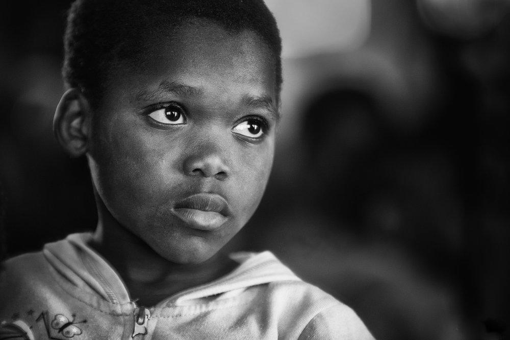
Identity in photography can be seen as the representation of an individual’s or group’s essence through visual imagery. It encompasses various aspects, such as gender identity, cultural identity, social identity, geographical identity, and political identity. Each of these identities can be expressed and explored through photographic work, allowing for a deeper understanding of the subjects and the contexts they inhabit.
Masculinity and Femininity
Femininity and masculinity in photography often manifest through the portrayal of subjects in ways that align with or challenge traditional gender norms. For example, images that depict women in nurturing roles may reinforce femininity, while those showcasing men in assertive or dominant positions may emphasize masculinity. However, contemporary photography increasingly seeks to subvert these stereotypes, presenting a more nuanced view of gender that reflects the complexities of identity.
The influence of place and belonging is significant in photography. An individual’s environment and upbringing shape their perspectives and experiences, which can be conveyed through their work. For instance, a photographer from a particular geographical region may capture the cultural identity of their community, highlighting local traditions and social dynamics. Conversely, the lack of or loss of identity can be explored through themes of alienation or disconnection in photography. Stereotypes and prejudices can also be challenged through visual narratives, prompting viewers to reconsider their perceptions and assumptions about different identities. Ultimately, photography serves as a powerful medium for exploring and expressing the multifaceted nature of identity.
Key Artists with References
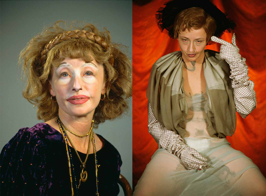
Cindy Sherman and Claude Cahun are two influential artists known for their explorations of identity, gender, and the self through photography.
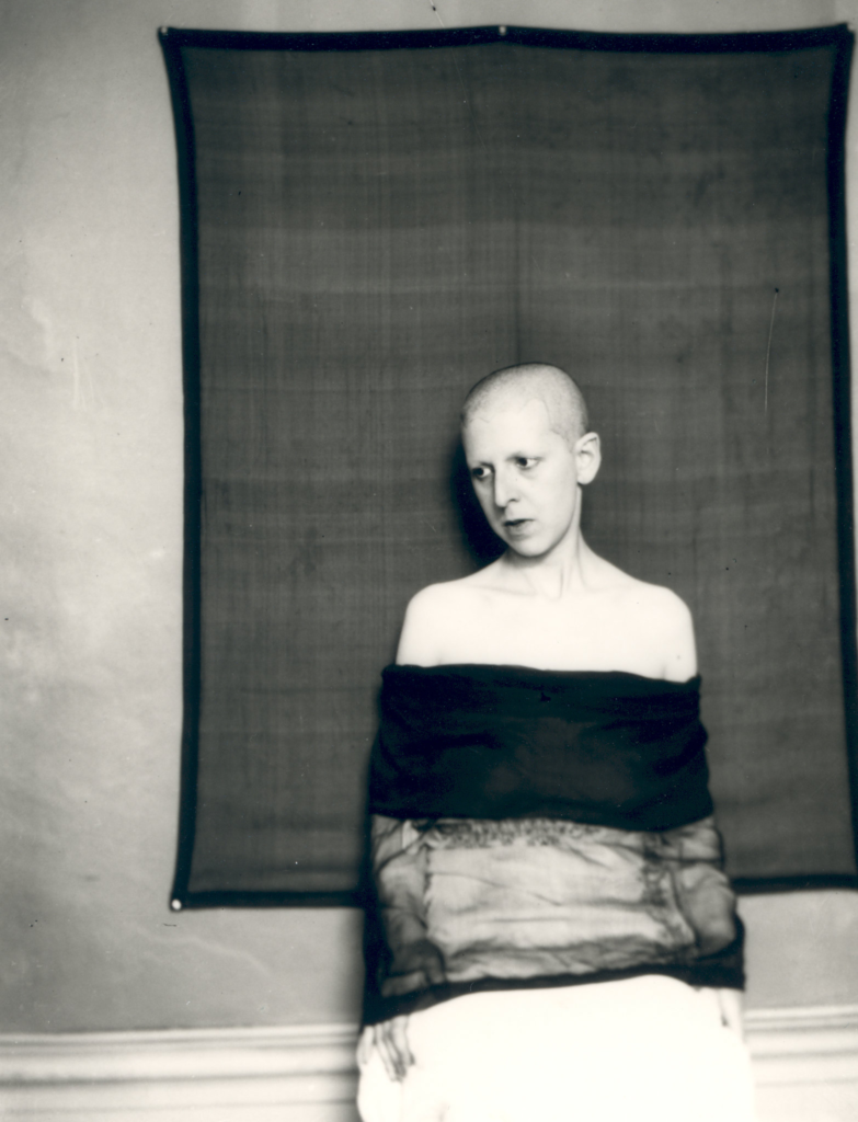
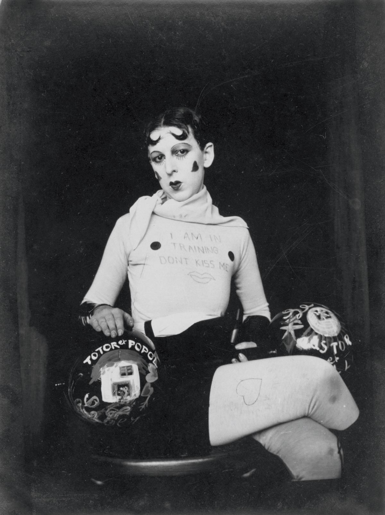
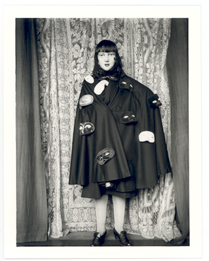
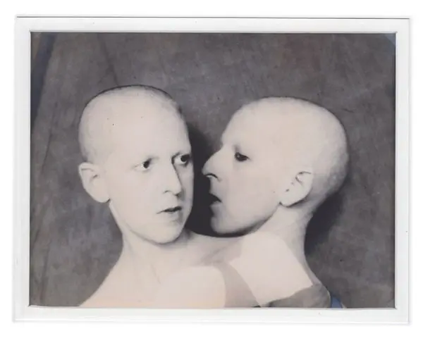
Claude Cahun
Claude Cahun, a pioneering figure in the early 20th century, also focused on identity and gender, but her approach was more avant-garde and surrealist. Cahun’s work often involved self-portraiture as well, but she used it to explore themes of androgyny and the fluidity of identity. In her photographs, she frequently manipulated her appearance, employing costumes, makeup, and props to challenge conventional gender norms. Cahun’s work emphasizes the performative aspects of identity, suggesting that it is not a fixed state but rather a series of roles that individuals play.
Cindy Sherman
Cindy Sherman is renowned for her conceptual self-portraits, where she often adopts various personas and characters. Through her work, Sherman challenges traditional notions of femininity and the representation of women in media and art. By transforming herself into different roles—ranging from the glamorous to the grotesque—she critiques the stereotypes and societal expectations placed on women. Her series “Untitled Film Stills” is particularly notable, as it presents her as the protagonist in staged scenes that mimic film stills, allowing viewers to question the authenticity and construction of identity in visual culture.
Both artists use photography to interrogate the construction of identity, but they do so in distinct ways. Sherman’s work often reflects a critique of popular culture and the roles women are expected to play, while Cahun’s work delves into the complexities of gender and self-representation. Together, they highlight how photography can serve as a powerful tool for exploring and deconstructing identity, encouraging viewers to reconsider their perceptions of gender, self, and the roles imposed by society.
Mood Board
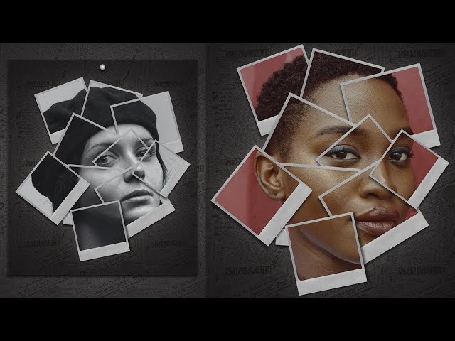
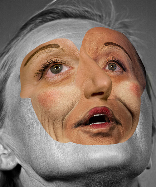
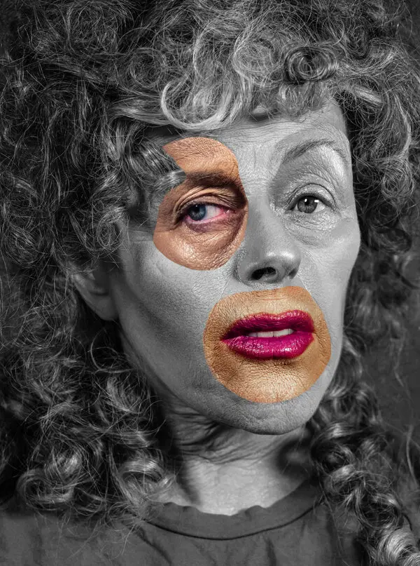
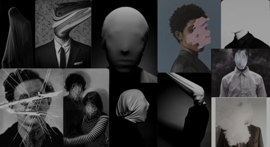
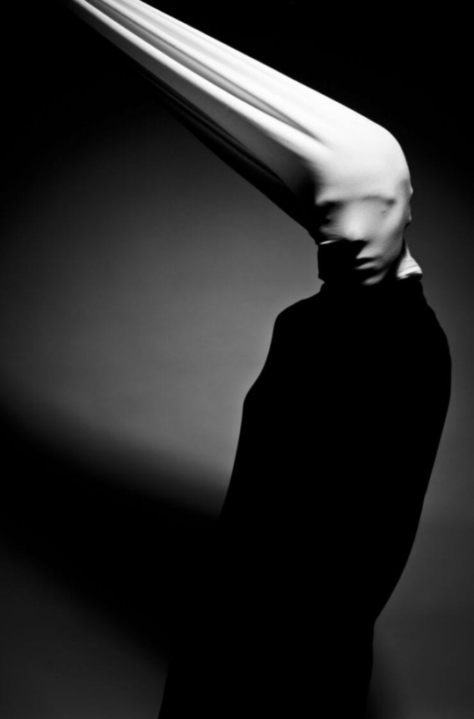
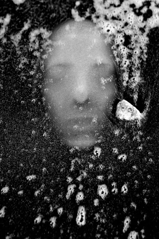
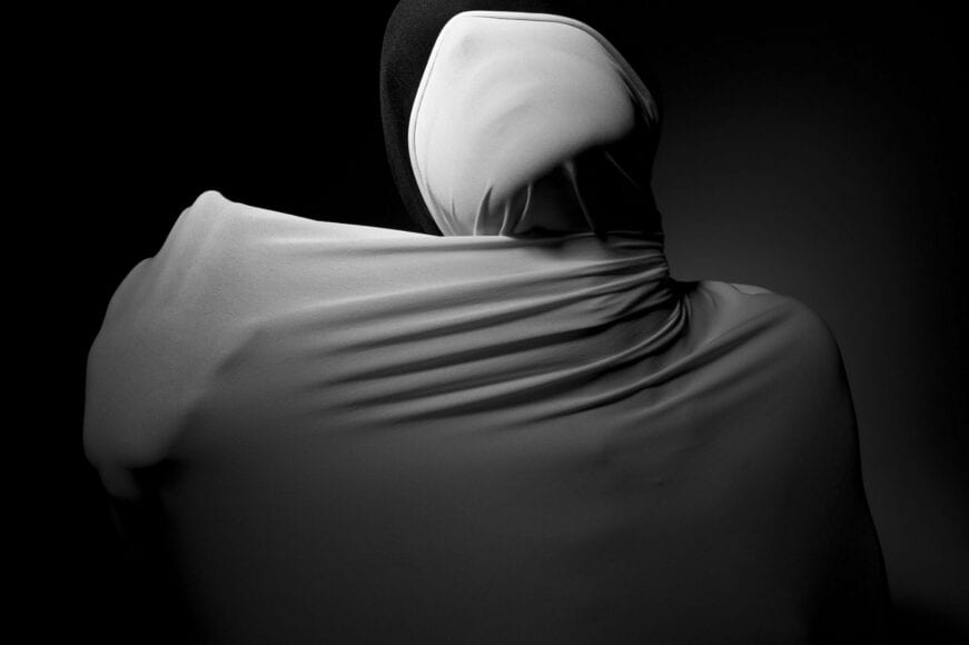
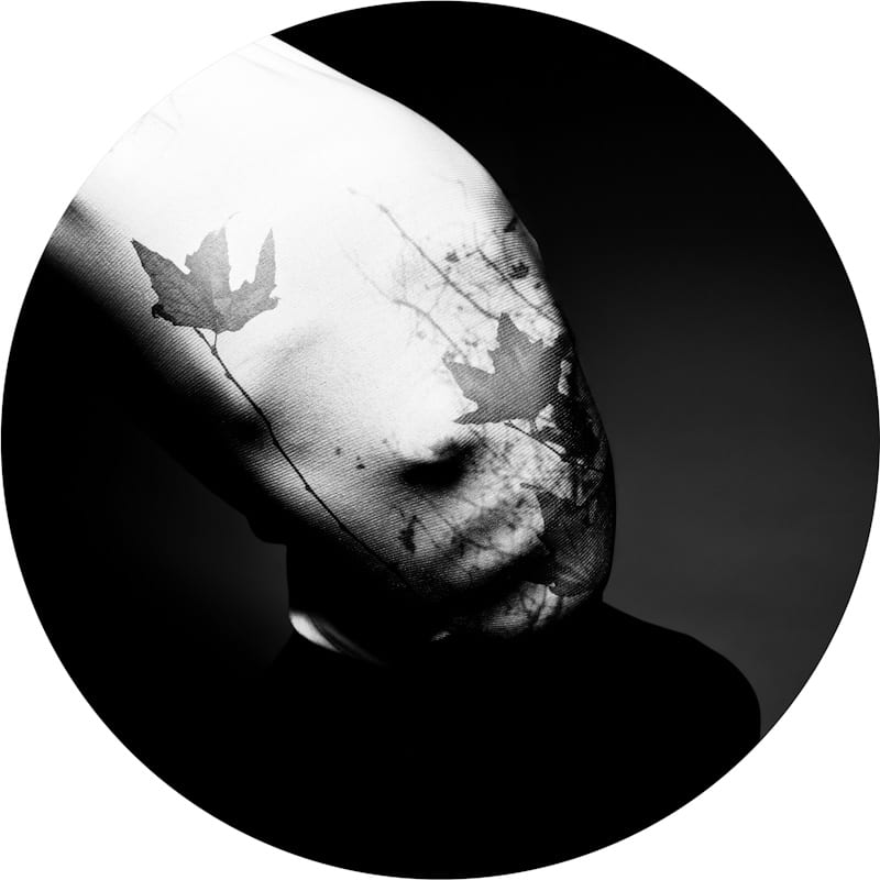
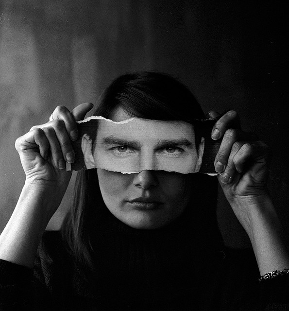
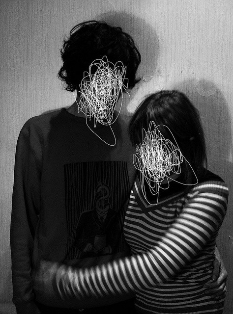
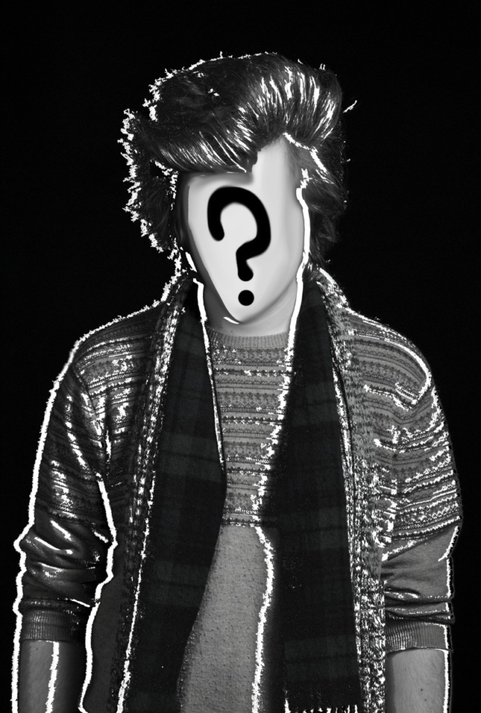
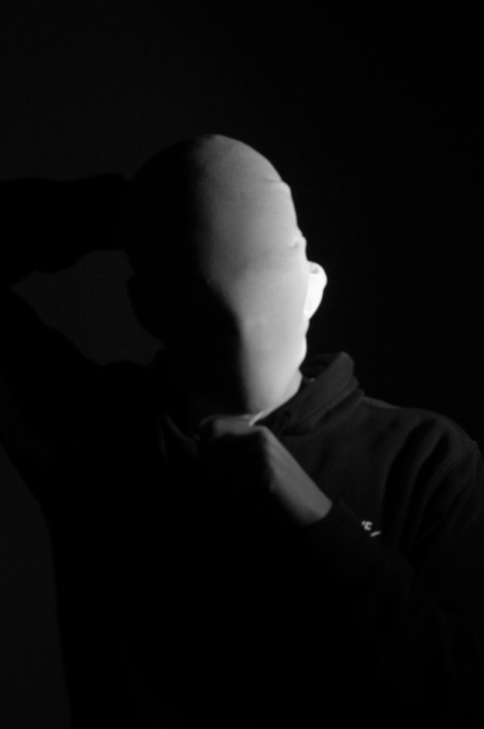
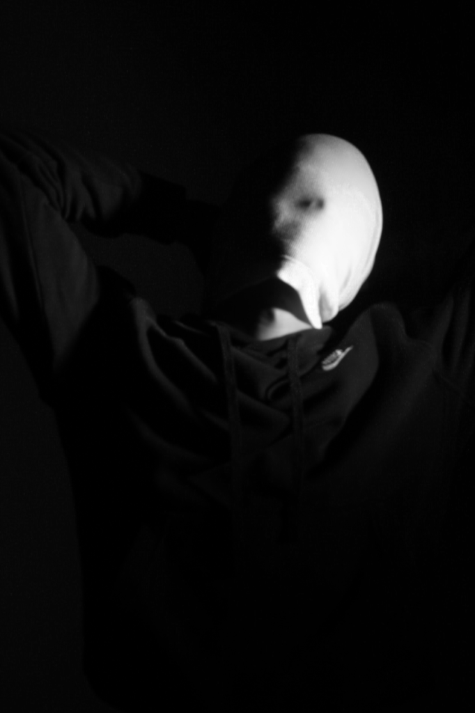
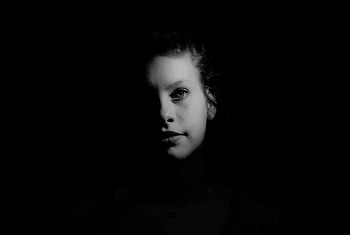
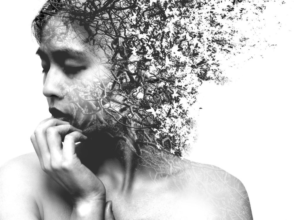
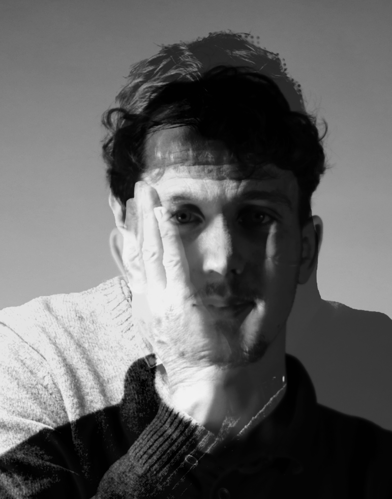
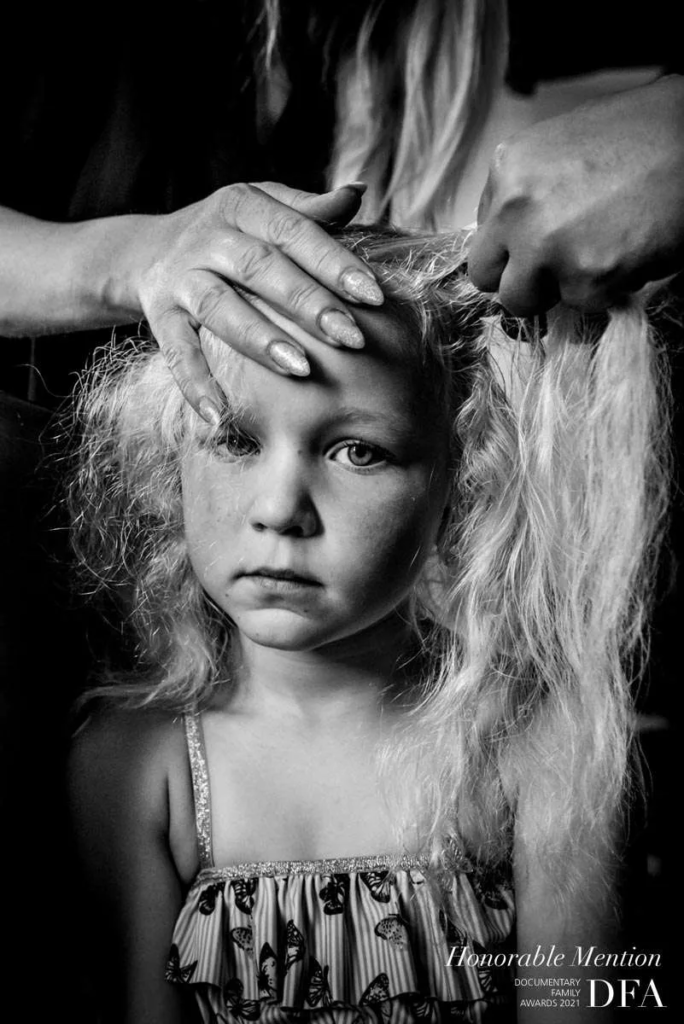
Idea of “Loss of Identity”
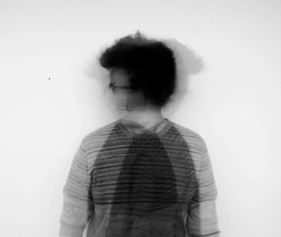
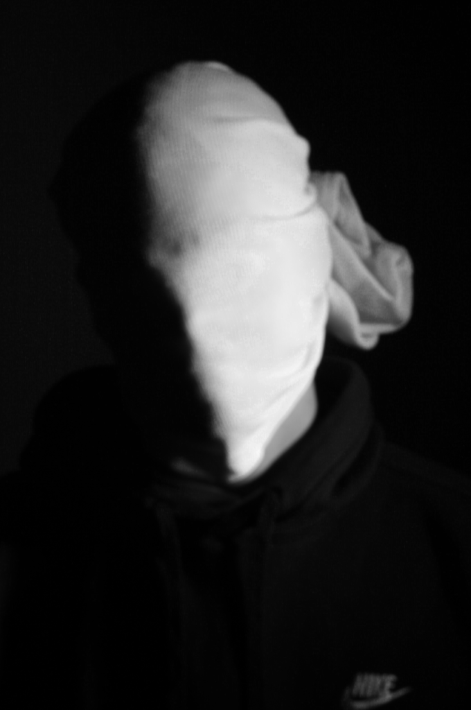
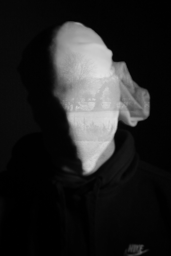
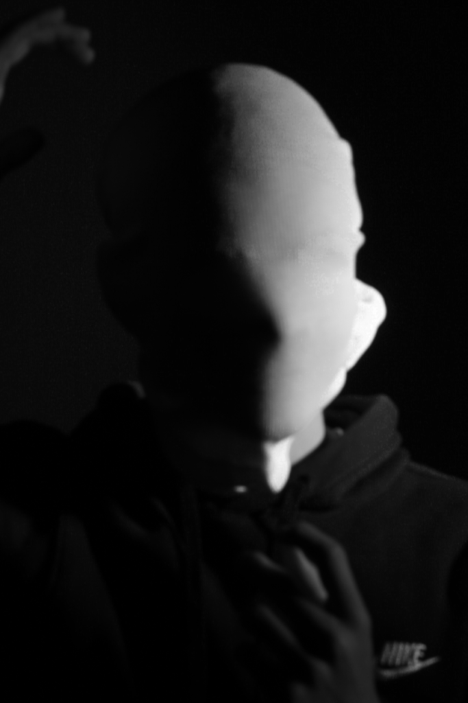
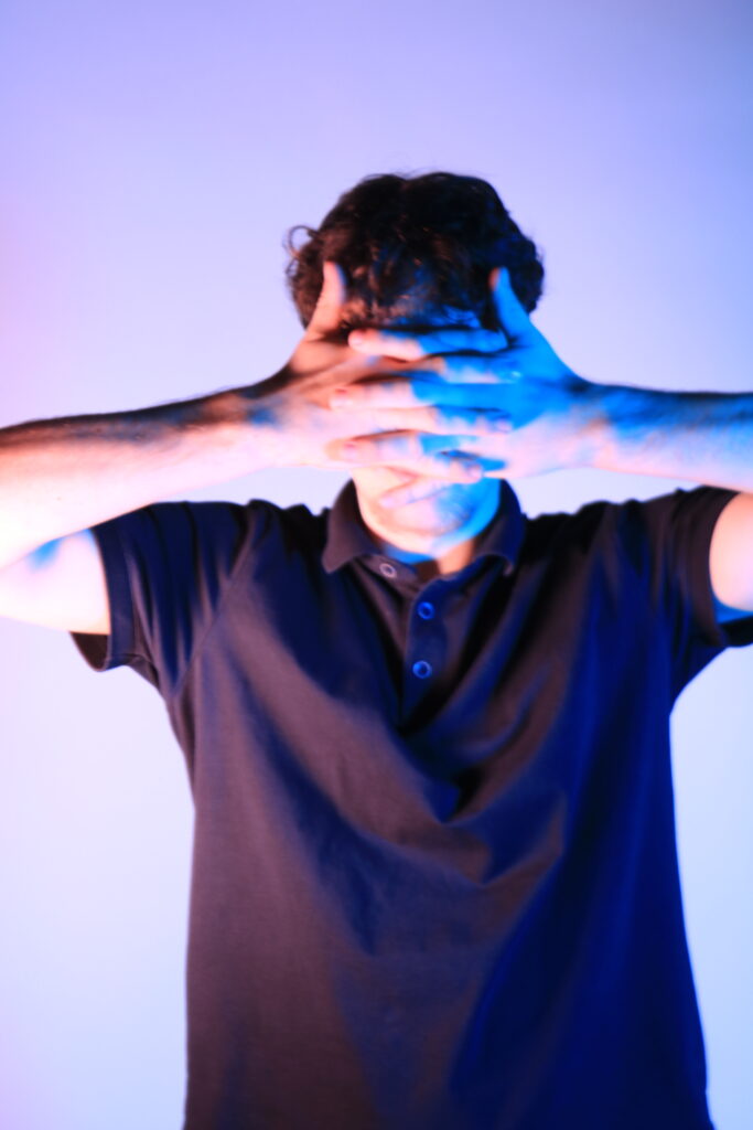
I conducted a lot of research into the theme of “Identity”, and came across these images. They are quite dark and monochromatic and when I asked for my teachers view of these images, he said they almost created the sense of “Loss of Identity”
Researching further into the theme “Loss of Identity” in photography, I found out that it can evoke a range of emotional and conceptual effects. It often creates a sense of disconnection, alienation, or introspection. When photographers explore this theme, they use techniques such as blurred images, fragmented compositions, or abstract representations to symbolize the struggle of individuals to maintain their sense of self in a rapidly changing world.
This theme can also provoke viewers to reflect on their own identities and the factors that contribute to their sense of self. It can lead to a deeper understanding of societal pressures, personal experiences, or cultural shifts that influence identity. Additionally, photographs focusing on loss of identity can foster empathy, as viewers may connect with the feelings of confusion or loss portrayed in the images. Overall, it opens up a dialogue about what it means to be oneself in various contexts.
Artists related to my Theme of Identity
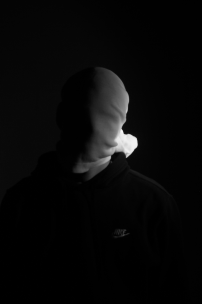
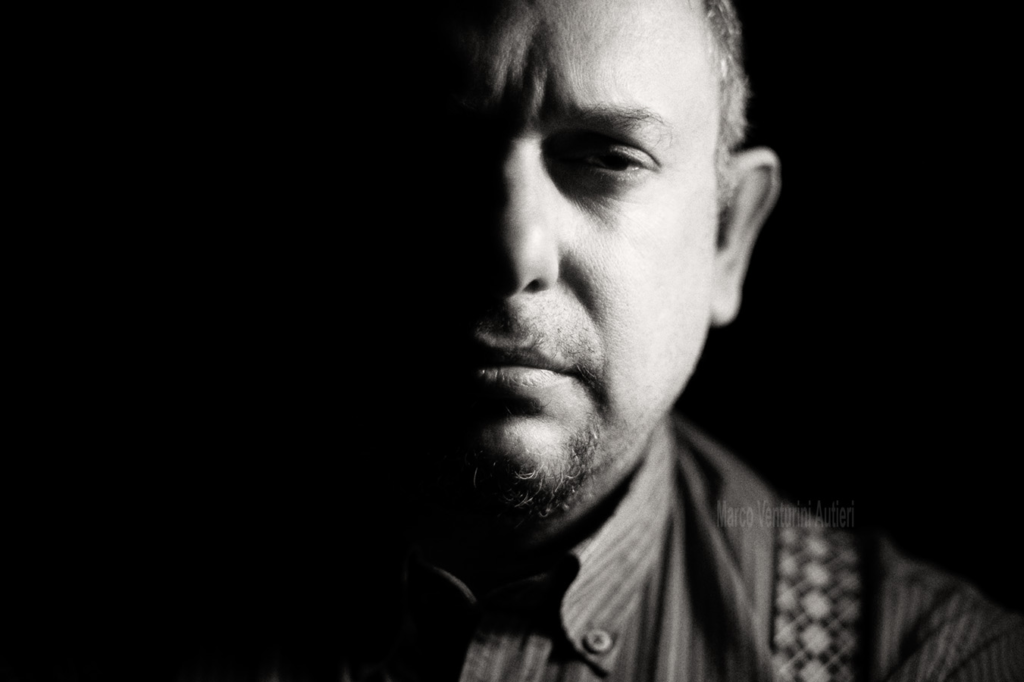
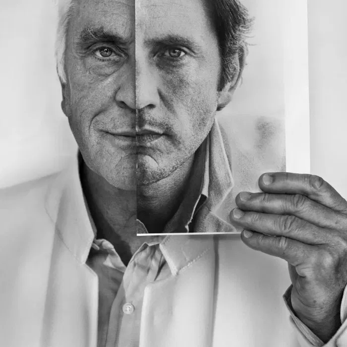
Andreas Poupoutsis
Andreas Poupoutsis is a contemporary photographer known for focusing on themes like identity and memory. His work often blends portraiture with conceptual photography, creating thought-provoking images that evoke emotions. He uses techniques like mixed media and digital manipulation, which add depth to his subjects. His photography reflects personal and collective experiences, encouraging viewers to think about their own identities and how they are shaped by their surroundings.
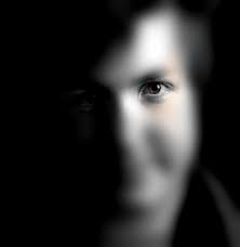
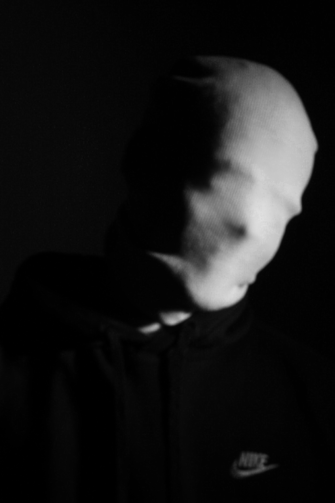
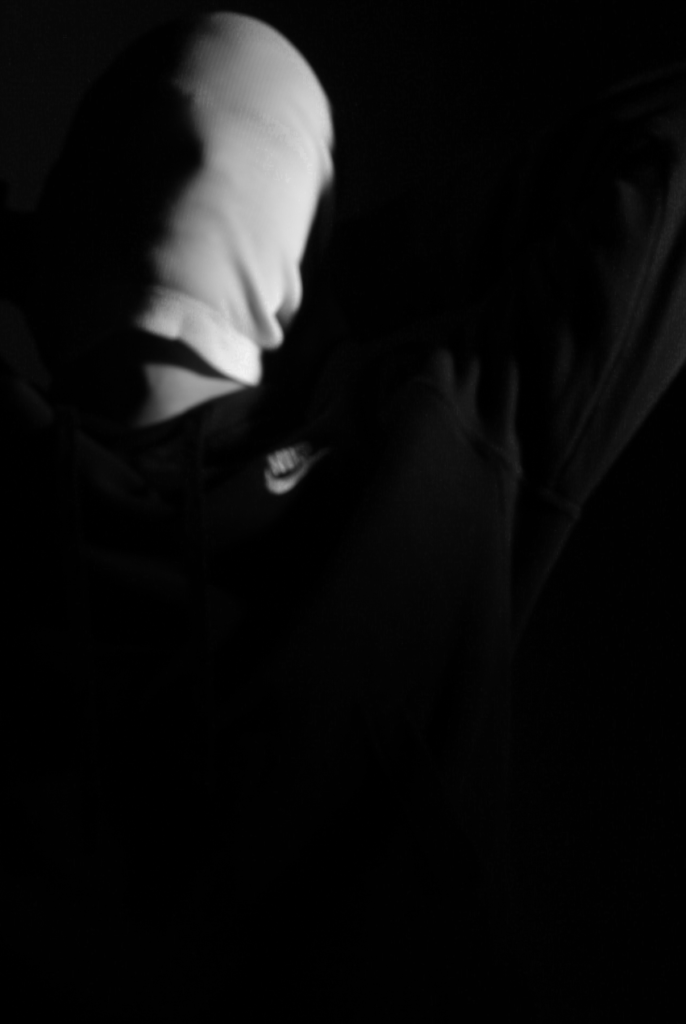
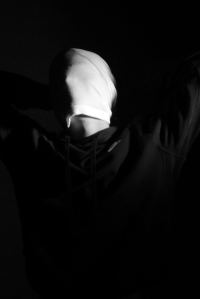
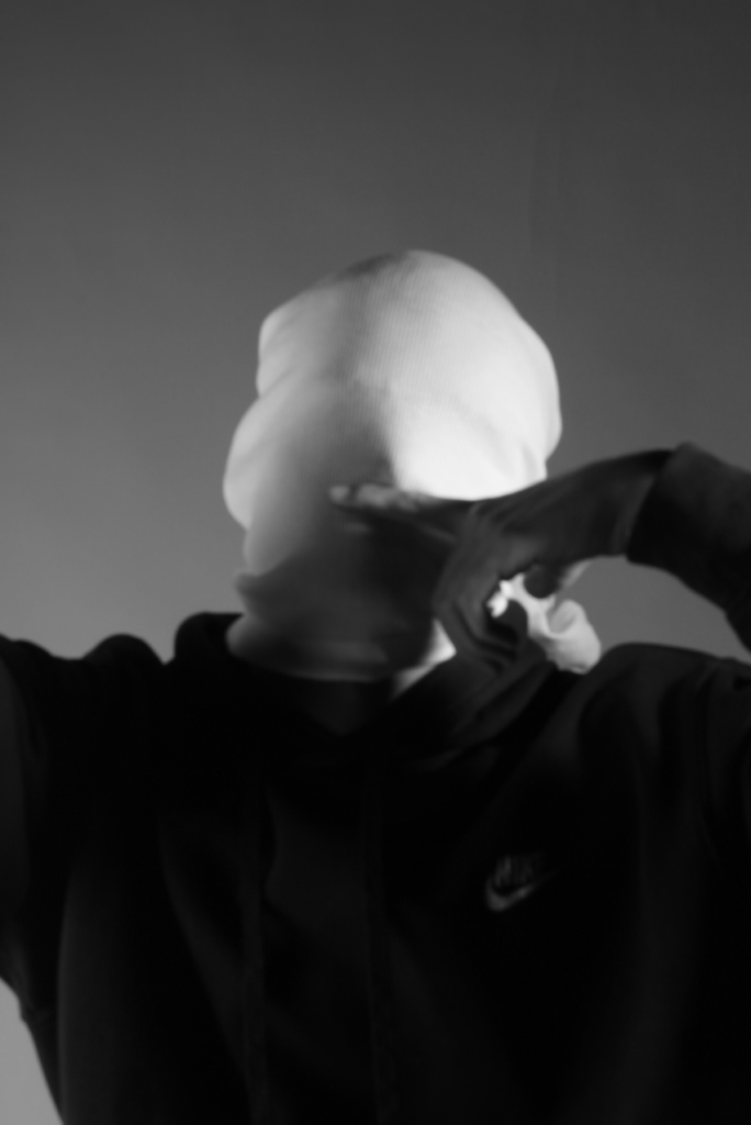
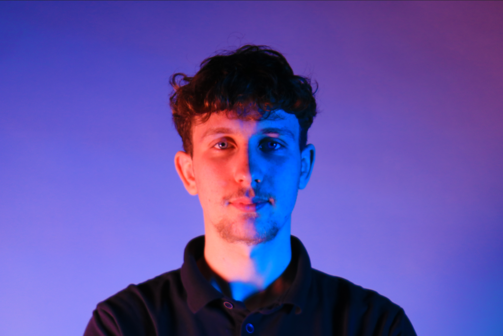
Poupoutsis takes his images from a close-up shot, to make the person in the image the whole focus. The person being the main focus is also created by the background being extremely dark: in the image on the middle it appears to be a vignette effect used, whereas the image on the left is fully black.
He talks a lot about his inspiration for his work and what he did to achieve these creative images.
” “Metamorphosis” would best describe my creative process. I am influenced by Cubism, shapes, shadows and textures. Creating beautiful and abstract images intrigues me. I am fascinated by people’s faces and especially by the transformation they go through in my photographs. We are complex and unique individuals with our own experiences, fears and losses and use our life experience to view the world. Being true to ourselves is one of the most challenging thing we can do. “
He further talks about his fascination with faces and how he prepares himself before his photoshoots to make sure everything is going according to plan.
“As for my fascination with faces, I have always been intrigued by abstract portraits, every face is unique in its own way and that sparks my imagination. At the same time I’m always looking for ways to transform that uniqueness and go deeper into analysing the identities of people.“
“My process is always different depending on the project. It all starts out with an idea which then turns into small sketches. I always have a diary in which I write down all my ideas. Pre-visualising the shoot is also very important and the search for the appropriate materials, textures, urban locations is needed. I prefer studio work because there I have total control of the light.“
Overall, Poupoutsis’s work highlights the power of visual storytelling in exploring human experiences.
Michael Wills
Michael Wills is a notable photographer recognized for his contributions to the field, particularly in documentary and fine art photography. His work often focuses on capturing the essence of human experiences and social issues, using a narrative approach to tell stories through his images. Wills’s photography is characterized by its emotional depth and attention to detail, allowing viewers to connect with the subjects on a personal level. He has explored various themes, including identity, community, and the passage of time, making his work significant in contemporary photography.
Childish
My Photo-Shoot Response
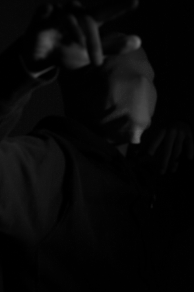
These are my Photoshoot Responses of Andreas Poupoutsis. I tried experimenting with the light and discovered quite a unique and interesting way to manipulate it. I first started adjusting the brightness of the flash and physically moving the light stand and proceeded to take the photos. I was taking Photos of my model and was repeatedly pressing the button for it, giving the flash less time to light up the room. This helped me focus the light only on my model and not the entire room.
I communicated with my model, explaining to them that their body can also convey their emotions, not just the face. This made my images stand out and feel more connected to them. For me at least.
Experimentation/Editing
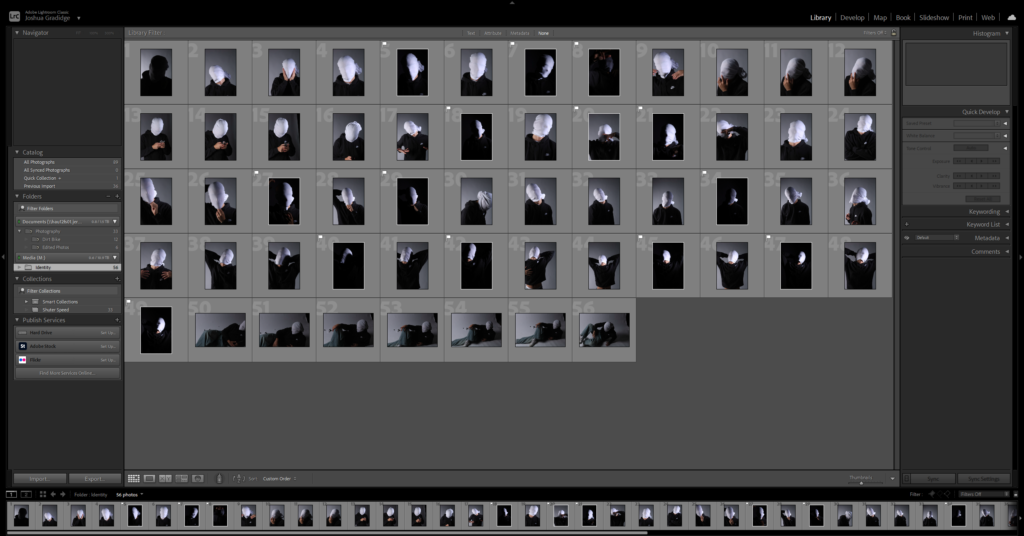
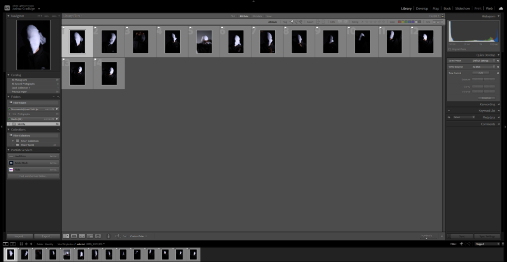
After uploading my Photos to my Hard drive, I used Adobe Lightroom Classic to browse through my photos and see which ones came out…Bad, Good or Great.
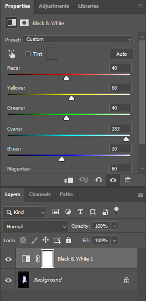
I flagged the Photographs which caught my attention and followed up by moving/editing them further into Adobe Photoshop. I decided to play around a bit with the settings in Photoshop to create these Monochrome based images. The settings that I used was…
BeforeAfter
This is the Before and After of the Original Image with the Black and White Filter applied. All of my Images for the theme of Identity will all have the exact same Black and White filtered applied.
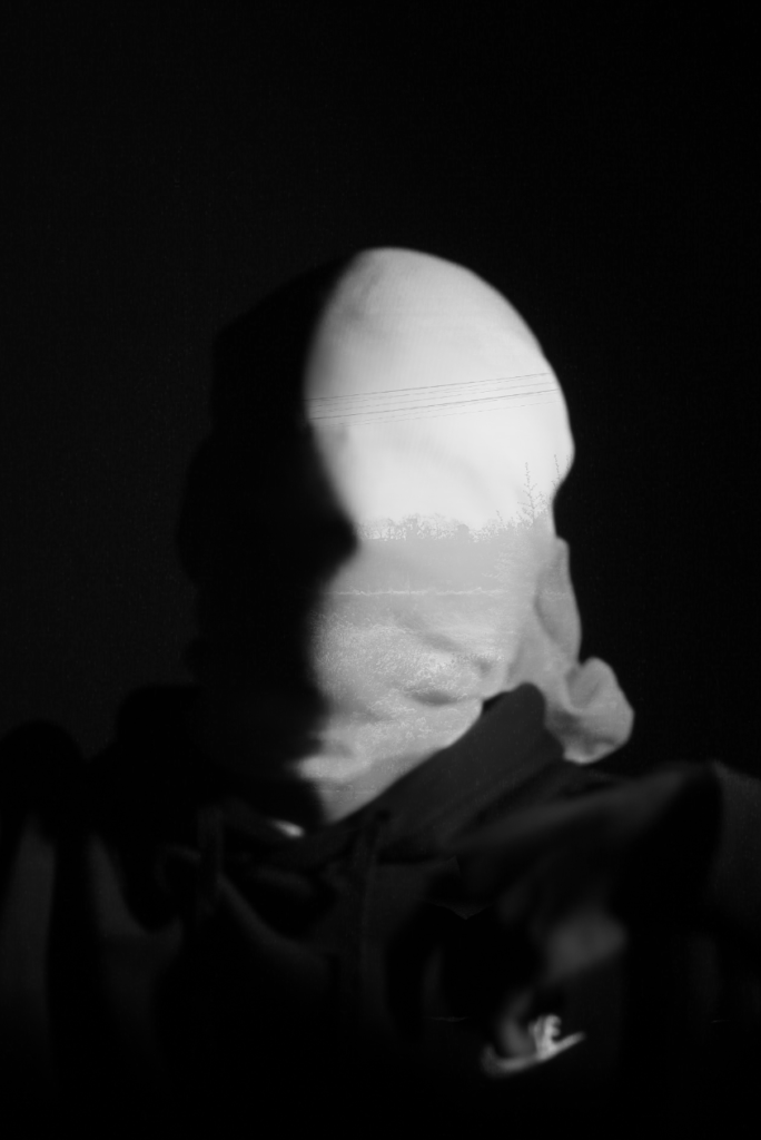
Slowly my photographs started looking like Andreas Poupoutsis. I could see similarities.
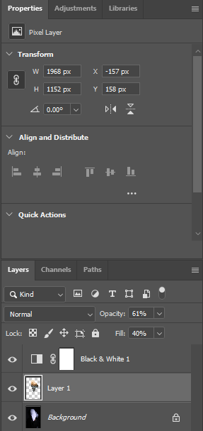
I experimented further by blending in different images such as a Landscape photograph that I took with my Identity Photos. Below is the image used to blend into my Photograph and the settings that I used to do this.
BeforeAfter
This is the Before and After of the Original Image with the blended image applied. I will be implementing this into some other Images.
Its a work in progress but I am slowly getting there.
Final Photos
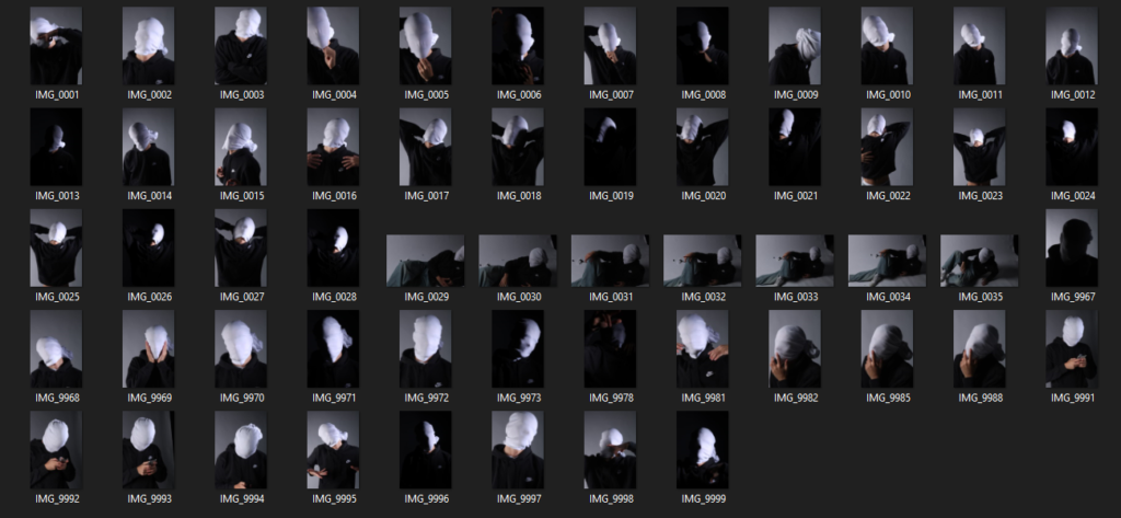
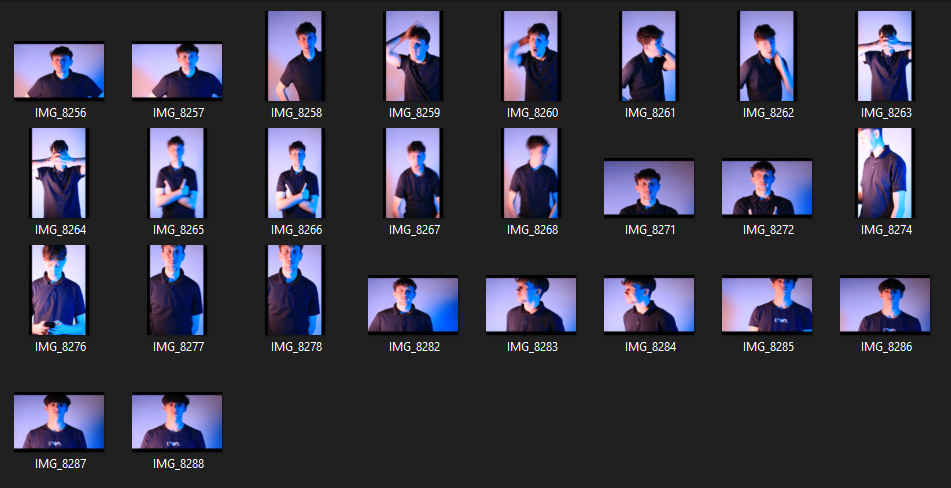
These are my Final images that have been produced/edited. There were 56 Images taken and as I said before I used Adobe Lightroom Classic to browse through my photos and select my Best Images from my Photoshoot. In this case, I chose these 14 images and applied all the filters and overlaying as said in the previous Section.
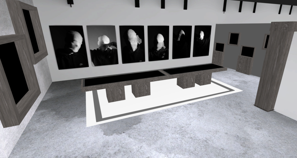
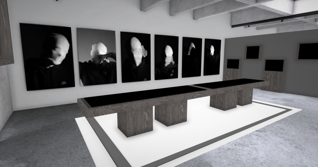
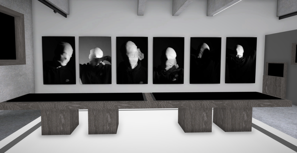
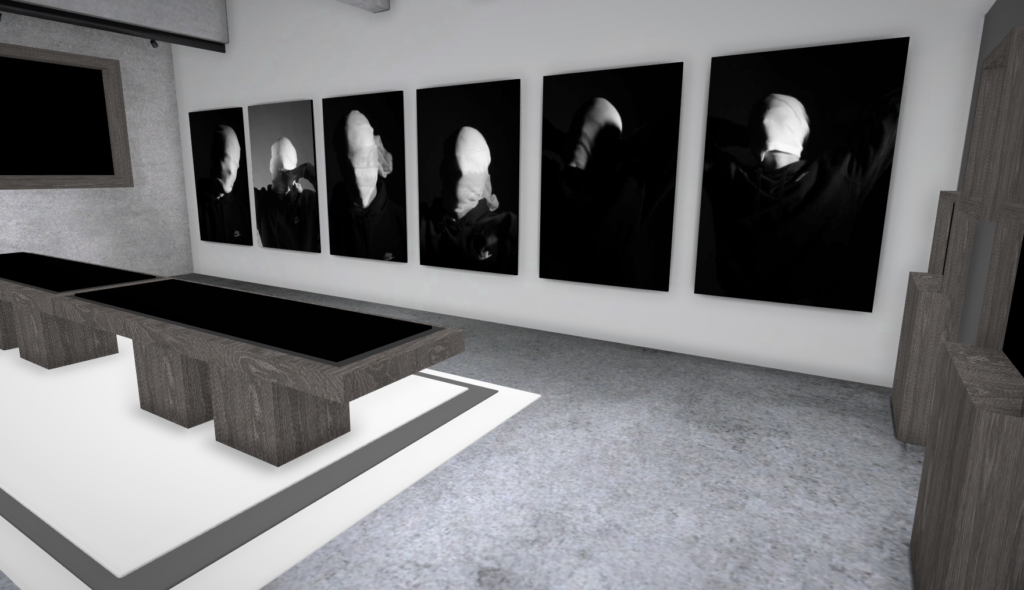
Now comes the hard part. For my Exam I have to choose a certain amount of images to be sent and printed off to be displayed on a visual canvas of our choice. What I mean by this is that Firstly, I need to decide on which images to use. Secondly, I need to decide how big or how small I want my Images to be printed off and Lastly, I need to decide how big I want the canvas that’s going to be holding my images to be cut out.
Chosen Images For Printing
After careful thought and consideration, these are the photographs that I want to be Displayed/Printed.
Andreas Poupoutsis shows his theme of identity through the uniqueness of facial expressions. He takes his images from a close-up shot, and makes the background extremely dark to highlight the figure to being the main focus. These 6 images I think have achieved the closest resemblance of Andreas Poupoutsis work. There is a photograph that utilises a grey background, this was intentional as Poupoutsis uses both a vignette effect for the background or changes the background to be fully black.
I transferred my Images into Art Steps so that I can visualize what my Images would look like in real life at Exhibition/Museum/Display etc..
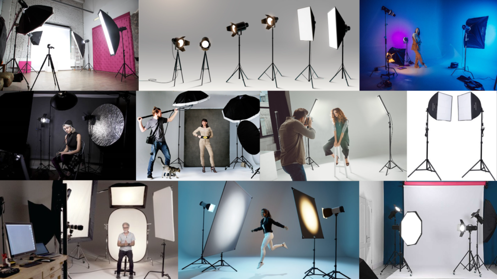
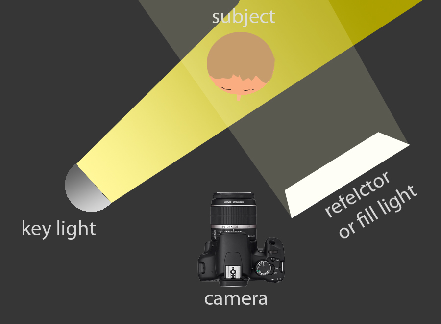
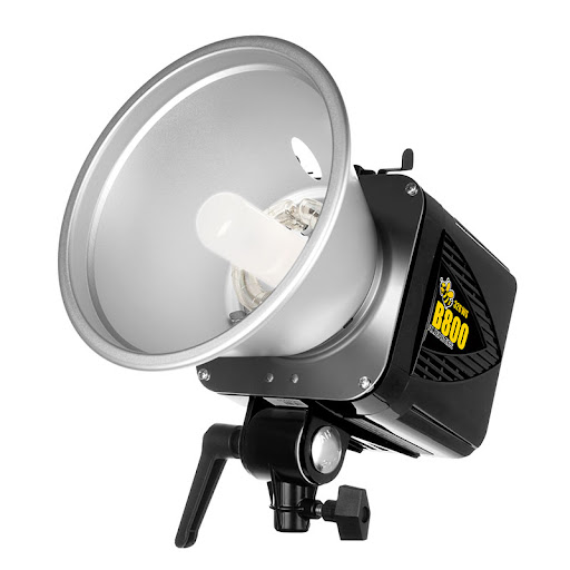
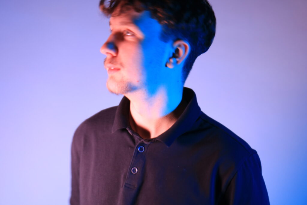
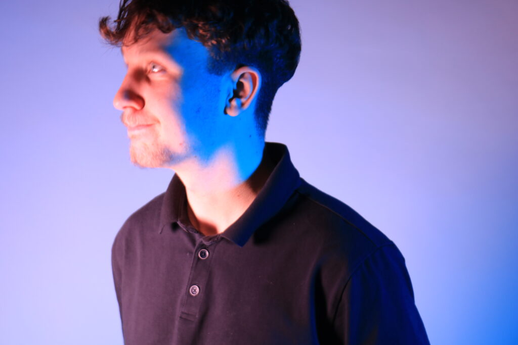
Studio lighting refers to the use of artificial lights in a controlled environment to illuminate subjects for photography. It’s essential because it allows photographers to manipulate light to achieve the desired mood, highlight details, and create professional-quality images. By using different types of lights, such as soft boxes, umbrellas, and strobes, photographers can control shadows, contrast, and colour balance, resulting in more visually appealing photos. This control over lighting is crucial, especially when trying to convey a specific emotion or atmosphere in the image.
For instance, soft lighting can create a warm and inviting feel, while harsher lighting can add drama and intensity.
Additionally, studio lighting enables consistency across a series of shots, which is particularly important for product photography or portrait sessions. The ability to adjust and experiment with the lighting setup also encourages creativity, allowing photographers to explore various styles and techniques. Ultimately, mastering studio lighting can significantly enhance the quality of photographs and help tell a more compelling story through visual imagery.
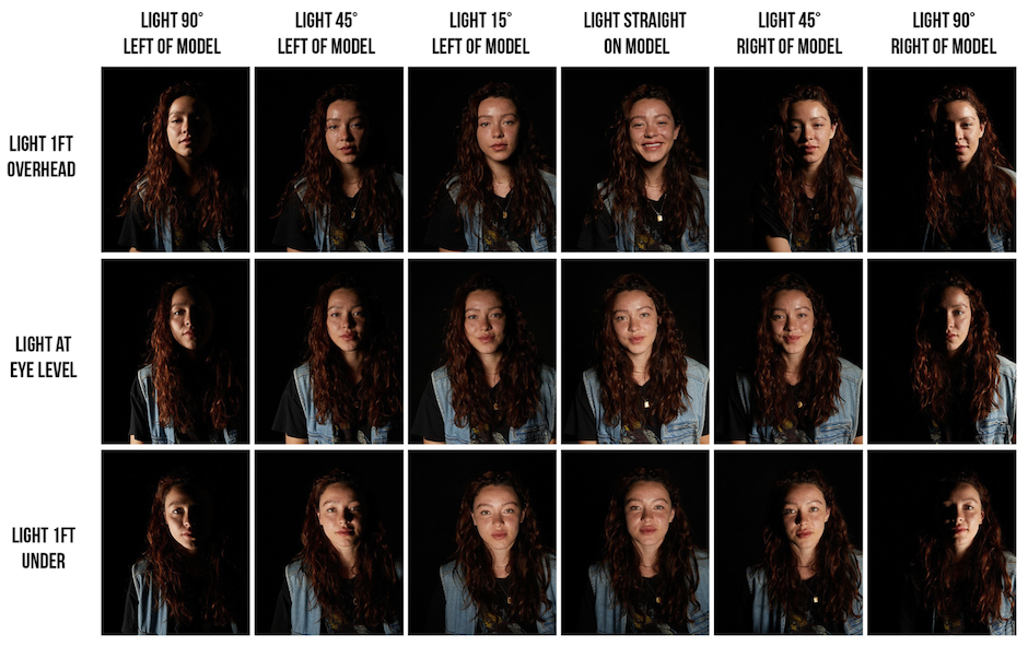
1-2-3 Point Lighting
The difference between 1-point, 2-point, and 3-point lighting lies in the number of light sources used and the effects they create in photography.
1-Point Lighting: This technique uses a single light source to illuminate the subject. It creates strong shadows and highlights, which can produce dramatic effects. It’s often used in portrait photography to emphasize facial features or in artistic shots where mood is more important than detail.
2-Point Lighting: This setup involves two light sources. Typically, one light serves as the key light, providing the main illumination, while the second acts as a fill light to soften shadows created by the key light. This technique balances light and shadow, adding depth and dimension to the subject, making it ideal for interviews or product shots.
3-Point Lighting: This is a more advanced technique that uses three lights: the key light, fill light, and backlight (or rim light). The key light is the main source, the fill light reduces harsh shadows, and the backlight adds separation between the subject and the background, creating a three-dimensional look. This method is commonly used in film and television because it provides a well-rounded and professional appearance, enhancing the overall quality of the image.
Each technique serves a different purpose and can be chosen based on the desired mood and effect in the photograph.
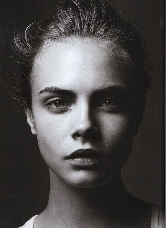
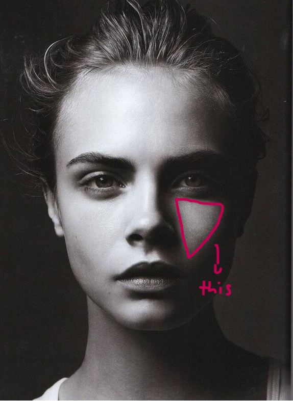
Rembrandt Lighting, Butterfly Lighting, and Chiarascuro
Rembrandt lighting, butterfly lighting, and chiaroscuro lighting are all different lighting techniques that can dramatically change the mood and appearance of a photograph, so understanding them can help create the desired effect in my portraits.
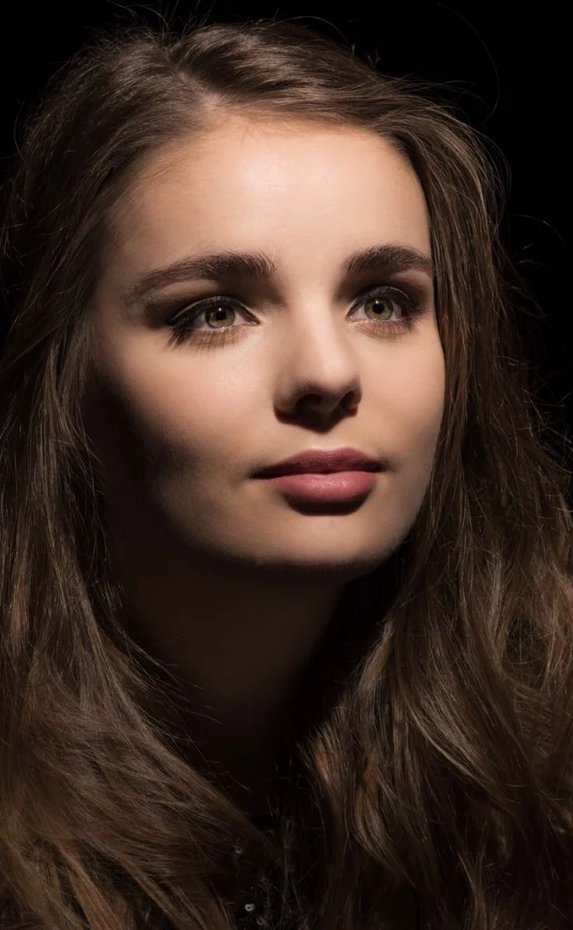
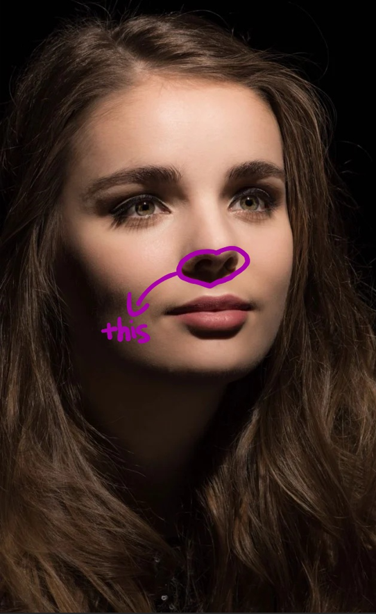
Rembrandt Lighting
This technique is characterized by the triangle of light that appears on the cheek opposite the light source. It involves placing the light source at a 45-degree angle to the subject and slightly above eye level. This creates a dramatic effect with both highlights and shadows, giving depth to the face.
Butterfly Lighting
Also known as “Paramount lighting,” this technique creates a butterfly-shaped shadow under the nose. It involves positioning the light source directly in front of and above the subject’s face. This lighting is often used in beauty photography as it highlights the cheekbones and creates a soft, flattering look.
Chiarascuro
This is a broader artistic technique that uses strong contrasts between light and dark to create a sense of volume and three-dimensionality. In photography, it can involve dramatic lighting that emphasizes shadows and highlights, often used to evoke a particular mood or atmosphere.
Photography Lighting Equipment for Beginners (Extra Info)
The world of studio lighting can be an exciting aspect of photography for some people, while others are intimidated by what seems to be a never-ending stream of equipment and technical information. The Information that I have researched here will help me decide on what Studio Lighting and equipment will be best for my Photography.
Keep in mind, that the items that I have researched are all geared towards portrait photographs.
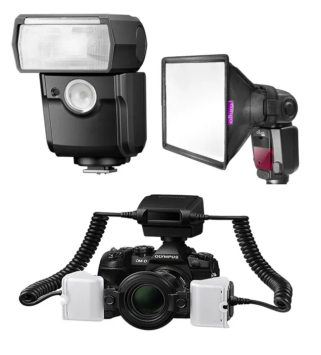
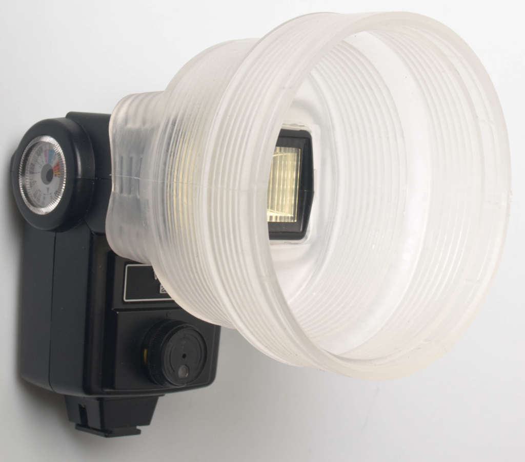
Flash Units and Diffusers
A DSLR has a component on top, called a hot shoe, where you can attach a flash that is purchased separately from your camera. While most DSLRs have an on camera flash that can work well in some situations, it is always great to have a separate flash.
Photography Lighting Equipment for Beginners
With a separate flash, I don’t just have the luxury of a more powerful flash with a better quality of light, I also have the option of attaching diffusers to my flash, and even using my flash off-camera.
Now, if I purchase a flash or the school already has one, it will most likely come with a small, white, plastic diffuser to attach to the top of the flash. This can work very well to diffuse the light, minimizing shadows and red-eye. I also have the ability to turn the flash so that it isn’t pointing straight at the subject, and bounce the light off a ceiling or nearby wall to make the light even more diffused.
Photo Lighting Equipment
A great option is the Light sphere Dome, by Gary Fong. The Light sphere Dome is lightweight, and it has never fallen off of a flash as some diffusers have a tendency to do and it fits both my Nikon and Canon flashes. It a great, multi-purpose diffuser.
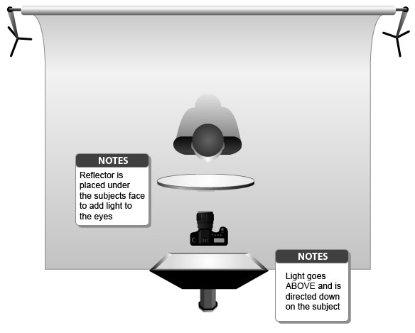
Reflectors
A Reflector provides natural light and they come in various shapes, sizes, and colours, but the silver, circular reflector seems to be the most popular.
How to Choose Studio Lighting
I can use stands to hold my reflector, or, if I have another person on-hand, I can have them assist me in holding and positioning the reflector. It will increase the light on the subject by reflecting the available light. They also work extremely well to fill in the light behind the subject, or, if I am shooting outside and my subjects back is lit, positioning the reflector to face directly will bring out more detail on their face, without creating harsh, unnatural lighting.
Off Camera Lighting
Now, if I am feeling comfortable enough to experiment with off-camera lighting, I can either use separate lights, or I can trigger a flash off camera.
Photography Lighting Kits for Beginners
If I am using a flash, I will most likely need to invest in triggers. Some DSLRs can trigger a flash off-camera through an infrared sensor that is built-in to the camera, but triggers are a bit more reliable.
Basically, there are two components involved with triggers, a transmitter that attaches to the camera, and a transceiver that is attached to the flash. The transmitter communicates with the receiver, allowing you to place the flash off camera on a light stand, and use various umbrellas and soft boxes to diffuse the light.
Cactus Triggers are widely popular, and more affordable than a lot of the other triggers on the market.
Once I have decided how I want my trigger to flash, I should look deeper at various umbrellas and soft boxes. Umbrellas tend to create a more direct pool of light, while soft boxes will create a more even light source.
Basic Photo Lightning Kit
I will need a stand that will hold my flash, and my diffuser. I can scout for a kit that comes with a light stand, a mount for my flash and umbrella, as well as basic reflector umbrellas or just use the schools.
In short, if I am using a flash off-camera, here is what I will need:
Trigger – a transmitter and a transceiver.
Light Stand
Mount – to attach to light stand and hold the flash/umbrella/softbox
Umbrella – or your choice of diffuser
Triggering the flash off-camera is a lightweight, portable method of achieving studio-like lighting. If I am shooting in my house or the studio at school, I may have to look at larger flashes such as Alien Bees. Alien Bees also makes a portable power pack, so if I decide to take my lights outdoors for a shoot, I can with no issues.
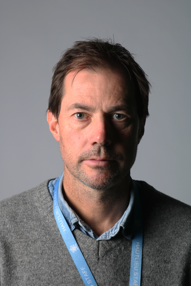
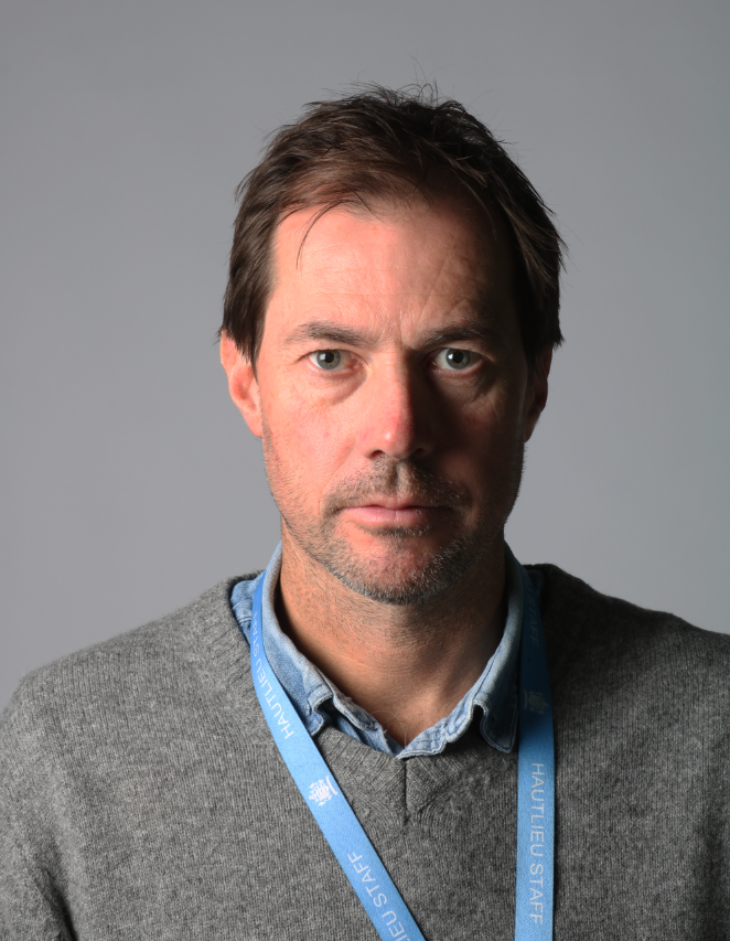
My Rembrandt Lighting, Butterfly Lighting, and Chiarascuro Examples
This is one of my Rembrandt Lighting photographs that I tried experimenting with.
Photo A
This Image uses a bright light high-lighting the left side of the face with no Reflector used. The camera produced a clear image with no faults and has successfully produced the Triangle under the eye and has made the Shadows a lot darker.
Photo B
This Image uses a bright light high-lighting the left side of the face and using a Reflector from the right. The camera produced a clear image with no faults and has successfully produced the Triangle under the eye on the right side of the face and has made the Shadows a lot brighter.
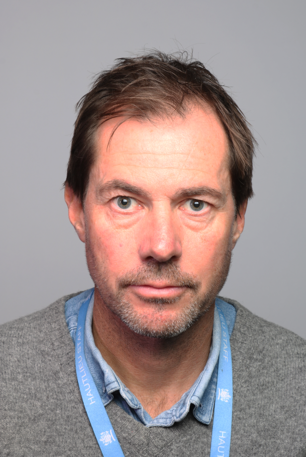
This is one of my Butterfly Lighting photographs that I tried experimenting with.
Both of these Images use the same equipment and settings, I struggled to get a clear dark Butterfly shadow under the nose but it has been successfully produced. At least that’s what I can see.
This is one of my Chiarascuro photographs that I tried experimenting with.
Photo A
This Image uses a bright light high-lighting the left side of the face and using a dimmed light from above. The camera produced a bit of a grain on the image and highlights some shadows and reveals my head and shoulders clearer.
Photo B
This Image uses a slightly darker light for the side of my face and from above. The camera didn’t produce a film grain, which is good as it makes the image look a lot smoother and untouched. The highlights are almost barely visible, some shadows revealing the tone in my Buff aren’t as clear.
Inspirations: Portraiture
Some photographers we were given to look at for Inspiration with our Photographs are Annie Leibovitz, Irving Penn, John Rankin, Nadav Kandar, Richard Avedon, Yousef Karsh, David Bailey, Mario Testino, Steve McCurry, Jill Greenberg, Nick Knight, Tim Walker, Corrine Day, Jane Bown, Rineke Djikstra and Thomas Ruff.
Annie Leibovitz
Annie Leibovitz is known for her stunning portraits of celebrities, often capturing them in intimate and sometimes unconventional settings.
She often uses large-format cameras and natural lighting. Her subjects are usually posed in ways that reveal their personalities. She doesn’t rely heavily on filters but rather focuses on composition and lighting.
Irving Penn
Irving Penn was a master of still life and fashion photography, known for his clean, elegant compositions and use of natural light.
He utilized a variety of cameras, including large-format and medium-format. Penn often uses simple backgrounds and dramatic lighting to enhance the subject.
John Rankin
John Rankin is famous for his bold, provocative style, often pushing boundaries in fashion and portrait photography.
Rankin uses digital cameras. He often employs creative lighting and post-production techniques but tends to keep his images raw and expressive.
Nadav Kandar
Nadav Kandar is recognized for his evocative landscapes and portraits that often explore themes of identity and place.
He often uses medium-format cameras and emphasizes natural light. Kander’s work is characterized by its contemplative nature.
Richard Avedon
Richard Avedon revolutionized fashion photography with his dynamic, expressive images that focused on the personality of the subjects.
Avedon used large-format cameras. His work often captures the essence of his subjects through careful posing and lighting.
Yousef Karsh
Yousef Karsh is celebrated for his iconic portraits of notable figures, using dramatic lighting to convey deep emotion.
Karsh used large-format cameras and dramatic lighting to create powerful images that convey emotion and character.
David Bailey
David Bailey is a legendary fashion photographer known for his raw, energetic style and ability to capture the essence of his subjects.
Bailey often used 35mm cameras and was known for his candid style. His work in fashion photography helped define the swinging ’60s, capturing the essence of youth and rebellion.
Mario Testino
Mario Testino is famous for his glamorous and vibrant fashion photography, often working with top models and celebrities.
Testino often uses digital cameras. He has a keen eye for capturing the personality of his subjects, often using vibrant colours and soft lighting.
Steve McCurry
Steve McCurry is renowned for his striking documentary photography, particularly his iconic “Afghan Girl” portrait.
McCurry often uses 35mm cameras. His iconic “Afghan Girl” photograph showcases his ability to capture human emotion in a single frame.
Jill Greenberg
Jill Greenberg is known for her striking and often controversial portraits, particularly of children and animals, using dramatic lighting and post-production techniques to evoke strong emotions.
Greenberg’s portraits often involves dramatic lighting and post-production techniques. She often captures the essence of her subjects through expressive facial expressions.
Nick Knight
Nick Knight is a highly innovative fashion photographer who blends fine art with commercial photography, often experimenting with digital technology and pushing the boundaries of traditional fashion imagery.
Knight often incorporates digital manipulation and experimental techniques. His images are known for their boldness and creativity.
Tim Walker
Tim Walker is celebrated for his whimsical, dreamlike photographs that often tell a story, using elaborate sets, props, and a sense of fantasy.
Walker uses large-format cameras. His unique sets and imaginative storytelling set his work apart.
Corrine Day
Corinne Day was a pioneer in the grunge aesthetic of the 1990s, known for her raw, unposed style that captured the authenticity of her subjects, often focusing on youth culture.
Day’s documentary-style photography often uses natural light and a raw aesthetic. Her work is characterized by its authenticity and emotional depth.
Jane Bown
Jane Bown was renowned for her intimate and candid portraits of celebrities and everyday people, using natural light and a documentary approach to reveal the essence of her subjects.
Bown often uses a medium-format camera. Her work captures the essence of her subjects with minimal distractions.
Rineke Djikstra
Rineke Dijkstra is known for her striking portraits that often highlight the transition between adolescence and adulthood, capturing her subjects in a way that emphasizes their vulnerability and strength.
Dijkstra uses large-format cameras. Her work often explores themes of identity and transition.
Thomas Ruff
Thomas Ruff is recognized for his conceptual approach to photography, often exploring the boundaries between reality and representation through large-scale images, digital manipulation, and a focus on the medium itself.
Ruff uses digital photography and often experiments with different techniques, including large-scale prints and manipulation. His work challenges traditional notions of photography.
Creative Responses
Gel Lighting
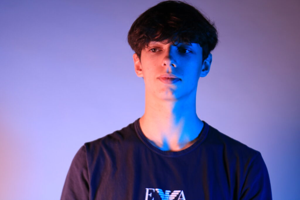
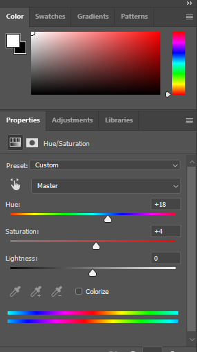
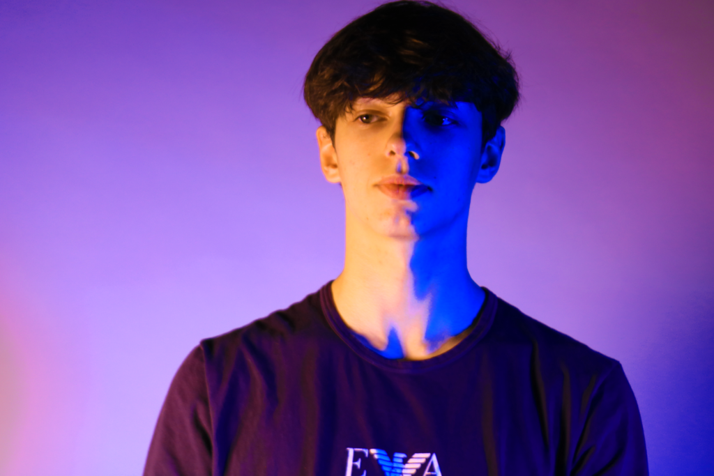
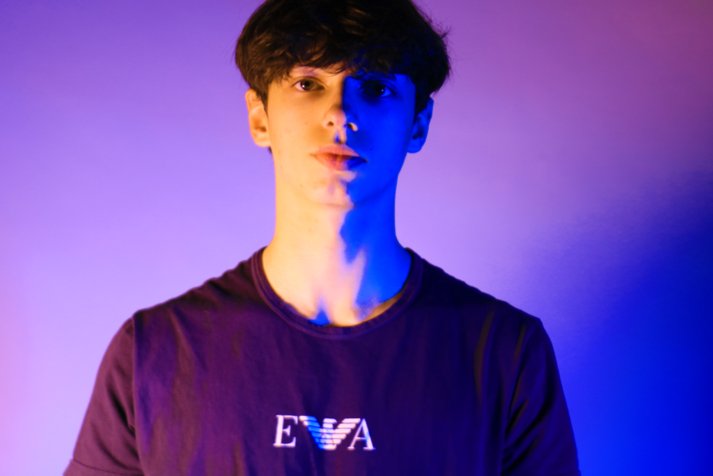
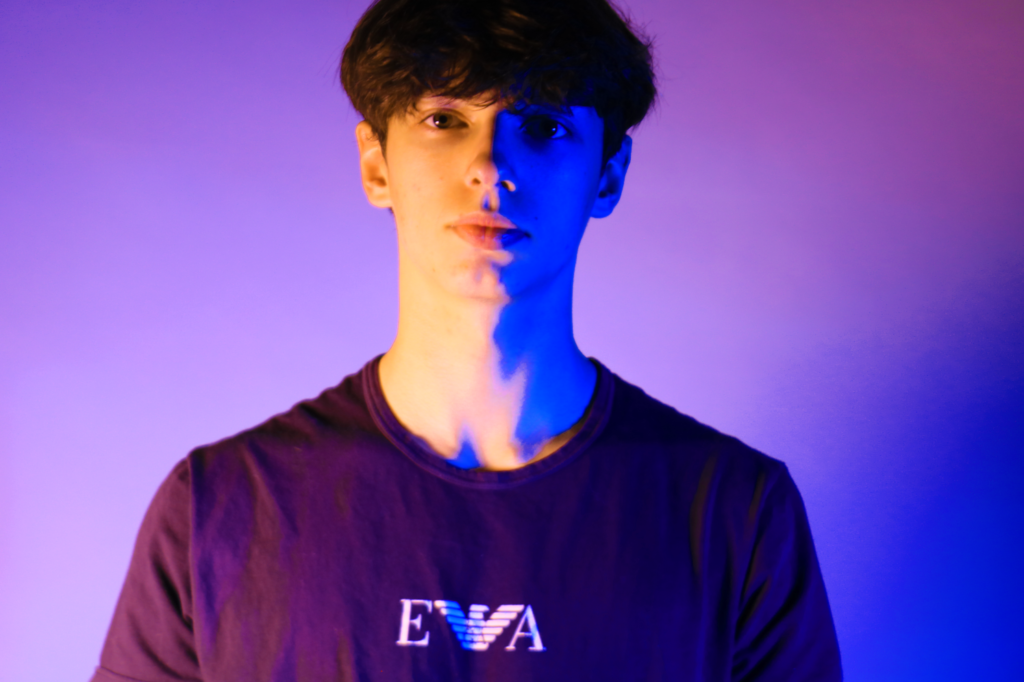
We Experimented with a lighting technique called Gel lighting. Gel lighting in photography refers to the use of coloured gels placed over light sources to create specific colour effects in images. These gels are typically made from thin sheets of coloured plastic or acrylic and can be attached to lights to modify their colour temperature or add creative hues to a scene. Knowing this, it has helped me produce the following photographs.
The reason that we Photographers use gels are for various purposes, including:
1. Colour Correction: To adjust the colour temperature of the light to match the ambient light or to create a specific mood.
2. Creative Effects: To add colour to shadows or highlights, enhancing the overall aesthetic of the photo.
3. Separation and Depth: To add colour behind subjects, helping them stand out from the background and creating depth in the composition.
Best Gel Photographs
Edited Gel Photographs
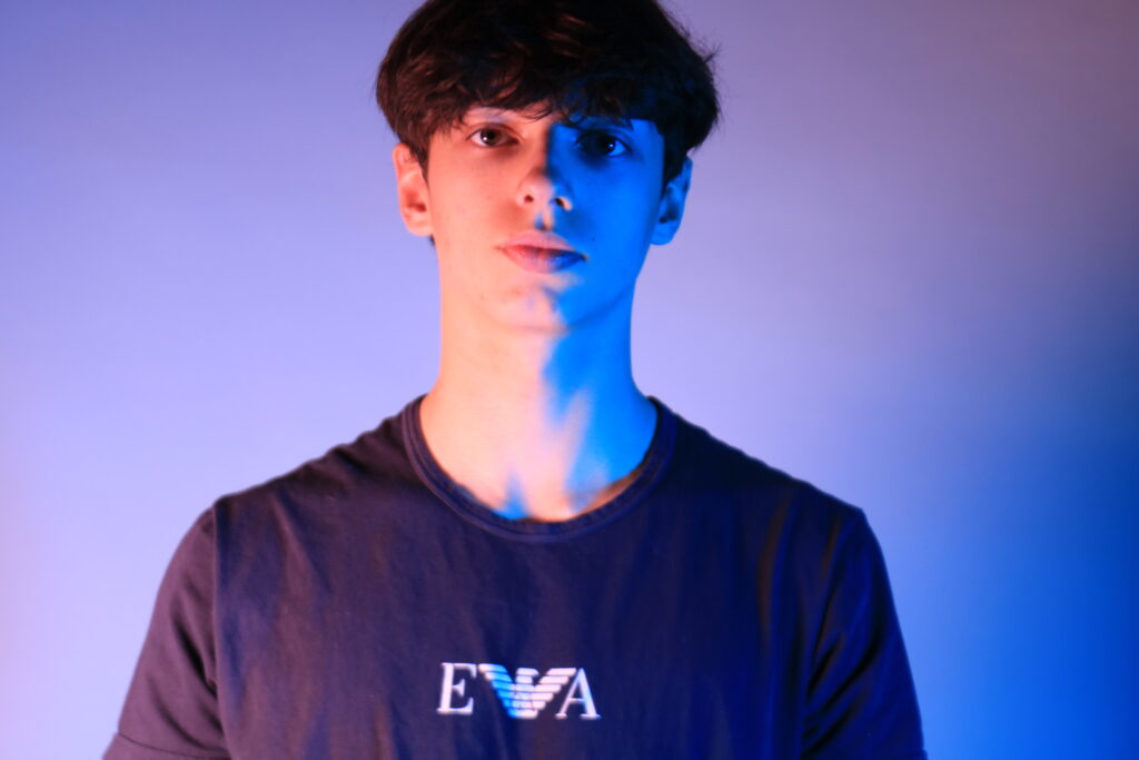
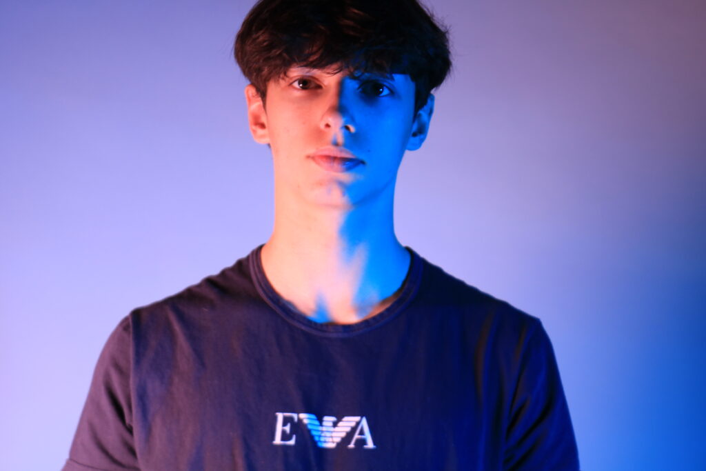
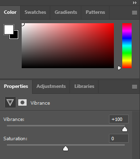
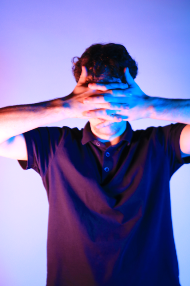
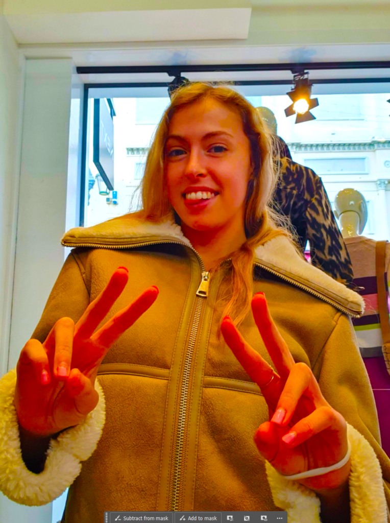
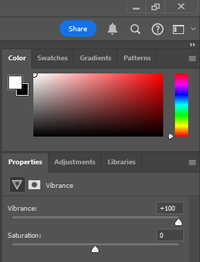
Even though I clearly stated that the Photographs from above are my “Best Gel Photographs”, that doesn’t necessarily mean that I am not going to edit them. So I boosted the Vibrancy to 100 and kept the Saturation to 0, which made the Red mixed Orange stand out a lot more.
I wanted my 2 models to have their own individual colours associated with them. Like with my previous model Eddie, I associated Red and Blue with him, and for my Upcoming model Vincent I associated Orange and Purple. I used the same Gel Plastic colours and the same Vibrancy but I also changed the Hue in the Photograph to produce the following.
BeforeAfterBeforeAfterBeforeAfter
Photo Montages
Juxtaposition
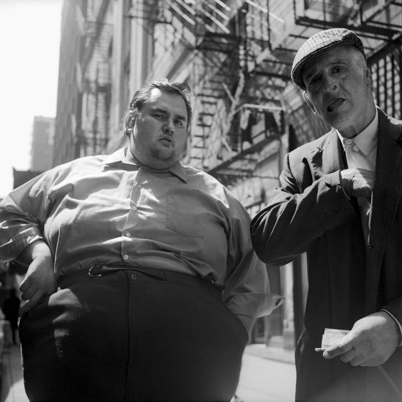
For the purposes of a ‘juxtaposition in photography’ definition, we can say that juxtaposition photography involves combining two or more elements in the same picture, highlighting the interesting contrast between them, to create an eye-catching and thought-provoking image.
Or to be specific, juxtaposition is when you put two opposite things together, and the contrast of those two things becomes interesting.
For example:
Fat person next to skinny person
Tall person next to short person
Dark colors next to light colors
Circles next to rectangles
Old people next to young people
Generally with ‘juxtaposition’ — you are making a statement through the contrast of elements you put in the frame.
My Experimentation
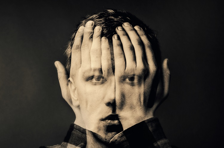
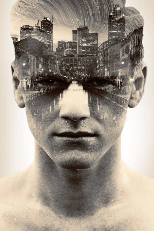
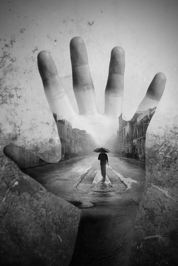
Double Exposure
A double exposure is created by exposing a single frame to two different images. Traditionally, you’d achieve this effect with film cameras, but this technique is now accessible to digital photographers through in-camera settings or via post-processing software like Photoshop.
Double exposure photography allows you to juxtapose contrasting scenes, textures, or subjects, resulting in images that can spark curiosity, ignite the imagination or tell a poignant message.
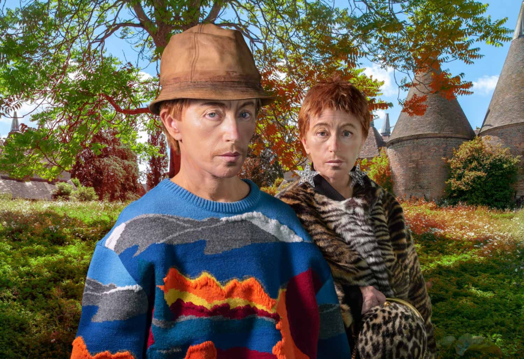
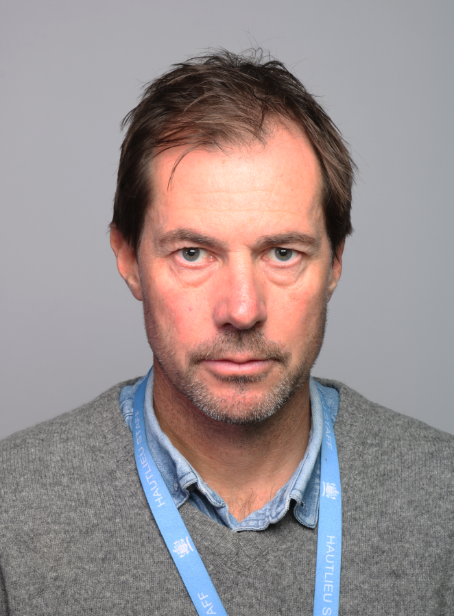
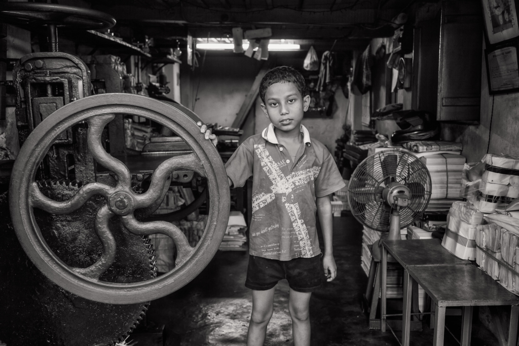
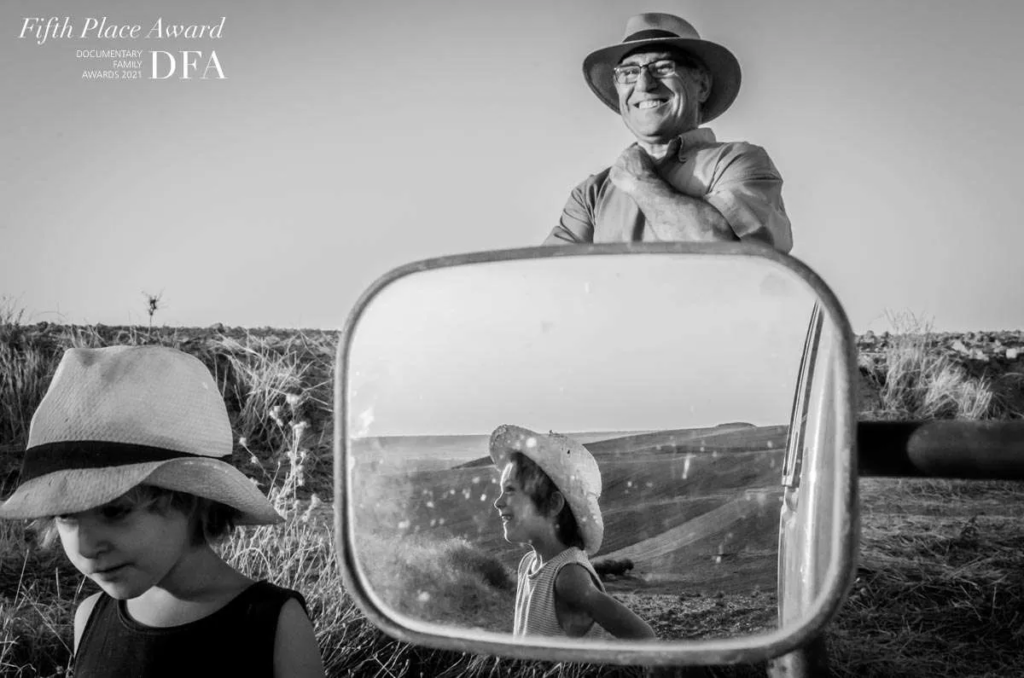
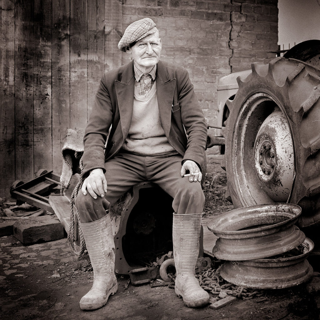
An environmental portrait is a portrait taken in the subject’s usual environment, such as in their home or workplace, and typically illuminates the subject’s life and surroundings. The term is most frequently used of a genre of photography.
By photographing a person in their natural surroundings, it is thought that you will be able to better illuminate their character, and therefore portray the essence of their personality, rather than merely a likeness of their physical features. It is also thought that by photographing a person in their natural surroundings, the subject will be more at ease, and so be more conducive to expressing themselves, as opposed to in a studio, which can be a rather intimidating and artificial experience.
Mood Board of Environmental Portraiture
Common challenges when shooting environmental portraits
If you’re unable to get to the location before the shoot, perhaps the greatest challenge with this type of photography is working with and overcoming the unknown. Often with environmental portraits you don’t really know what you’re dealing with — who you’re photographing, what they look like, what they’ll be wearing, what the location is like or what sort of lighting there is. This means, as the photographer, you have to be able to think on your feet and overcome these challenges when you arrive.
Here are some of the common challenges summarised into these key points here.
Time – Perhaps the greatest challenge on any photoshoot is a lack of time. Often we only have a small window of time, but numerous obstacles to overcome. Even if you’ve researched the location prior to the shoot, you have to be prepared to think on your feet.
Photographing on location – When working on location you don’t know what you’ll be working with until you arrive. Locations may be cluttered, busy with people and generally just not what you expect. Be prepared for this and know that you might have to look for the right space or even rearrange items.
Lighting – Lighting on location is something that many photographers struggle with. In many cases it’s common that you’ll be working with mixed lighting as the available light alone may not be sufficient, while other instances may require purely studio lighting if there is no suitable ambient light, so make sure to be prepared with two or three lights and some modifiers that could work for a variety of scenarios.
Communicating with your subject –As with any portrait, building a connection with your subject is key if you want to get natural-looking results. The key thing here is to be confident as this will help put your subject at ease. Even if you don’t have a lot of time, take a moment to talk to your subject, explain what you’re doing and what you want to achieve. Talk them through the shoot to help them feel comfortable as this will make the experience more rewarding for everyone involved.
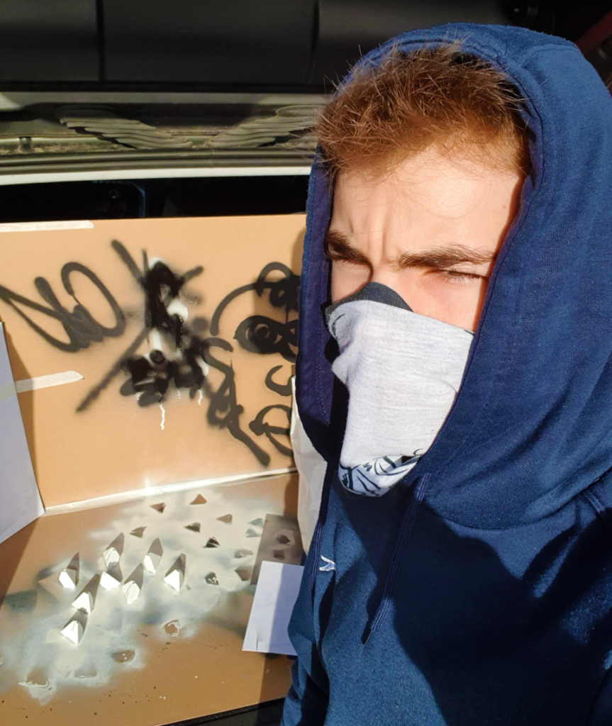
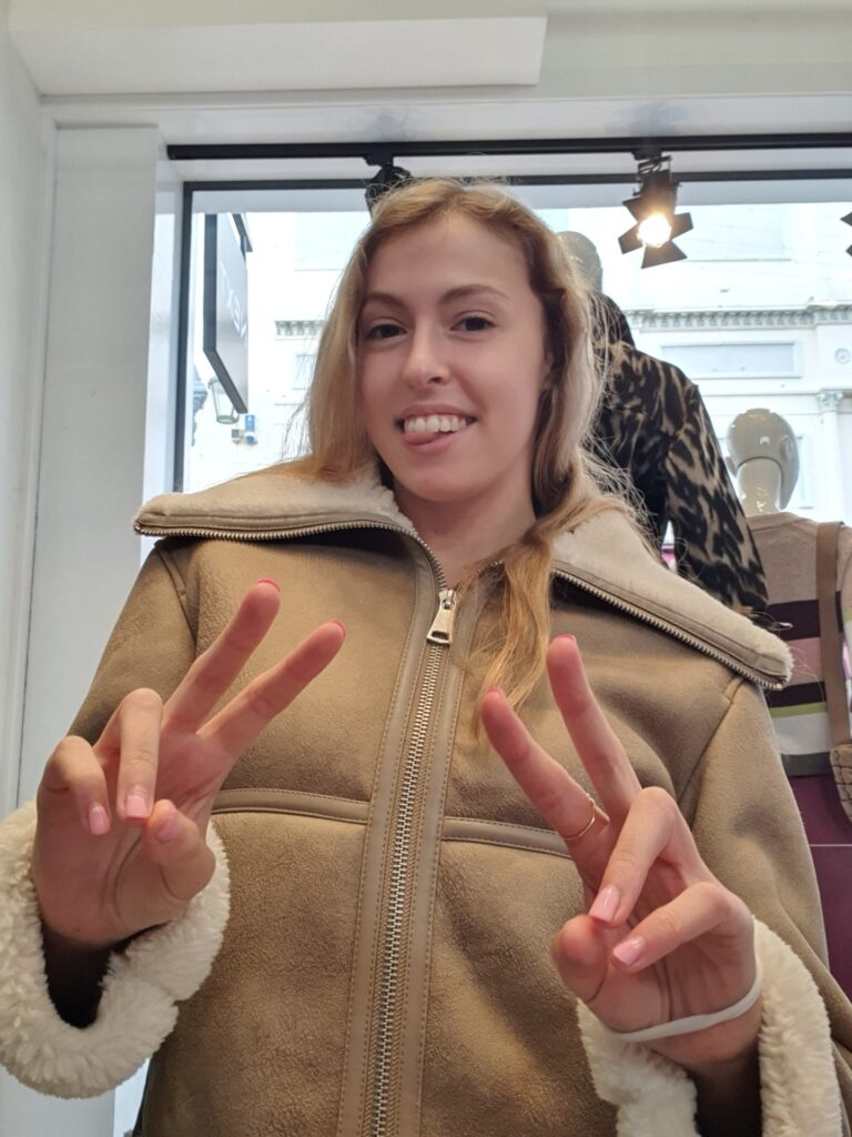
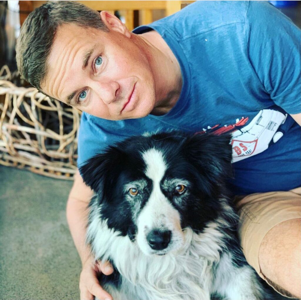
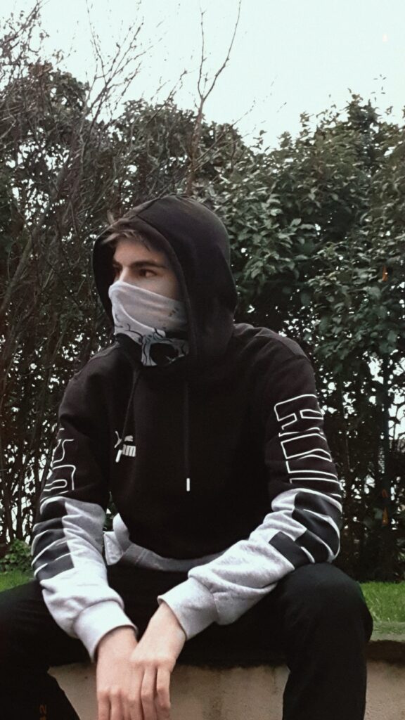
Environmental Photoshoots
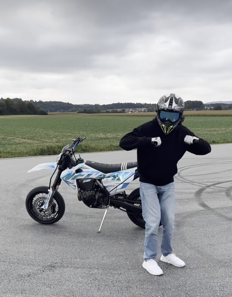
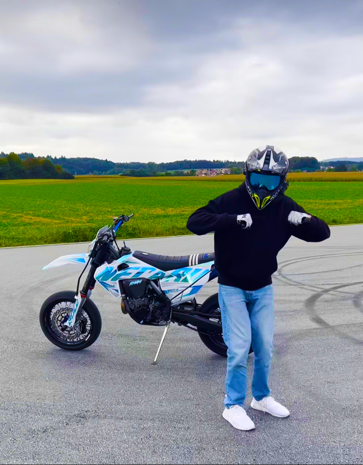
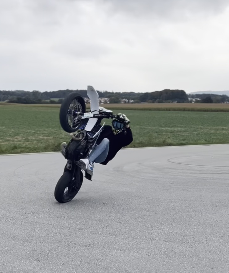
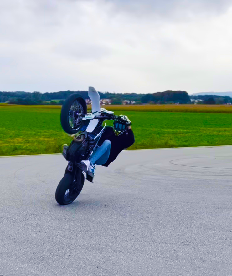
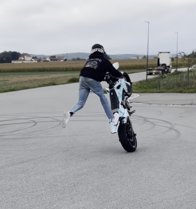
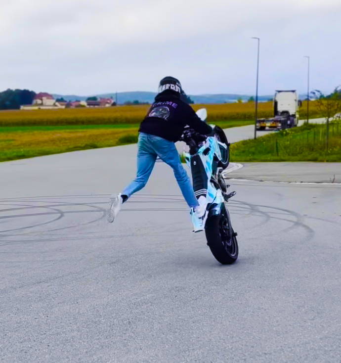
For my Photoshoot I tried to take a Variety of Photographs of people within their Environment. Some have arguable points that they are Portraits while others do not. I.e Motorcycle helmet photos.
I found a website going into detail about Portrait Photography as they said that Portraits are often more dramatic, are less smiley, etc. In portraiture subject often is looking away from the camera or is engaging in some kind of activity. Again, “portraits are more about telling a story”. Almost all of my Photos are telling a Story or engaging in an Activity.
To Back this up further Portrait photography is all about capturing the essence of a person, their personality, and emotions, regardless of what they’re wearing. Helmets can add an interesting element to the portrait, showing a different side of the person being photographed. So, a photograph of someone wearing a helmet can still be considered portrait photography because it’s about capturing the individual, their story, and their uniqueness.
Contact Sheet
Photographs Before VS After
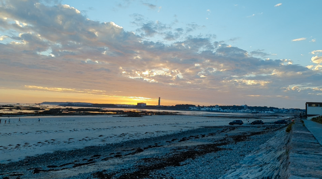
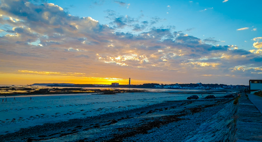
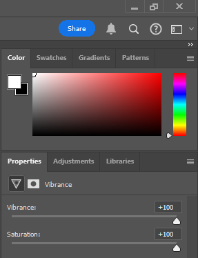
Something that I have noticed with my Dirt Bike Photographs and a few other ones is that they are quite dull and monochromatic. Adjusting the Vibrancy option in Adobe Photoshop added the colour necessary to make my images stand out. These are the settings that I used to achieve this.
And these are the results that have been produced.
BeforeAfterBeforeAfterBeforeAfter
When I used the same Vibrancy for these Photographs it turned my Photographs into an orange colour, almost as if switching on a Thermal filter, which did not look as amazing as I had hoped.
So instead I used a different Vibrancy which produced a much more Eye catching result in my opinion.
And these are the results that have been produced.
BeforeAfterBeforeAfter
Not all my Images needed Editing as they stood out by themselves or I already Edited them before uploading them. Such as…..