All posts by Georgia Martins

Filters

Author:
Category:

New Topography

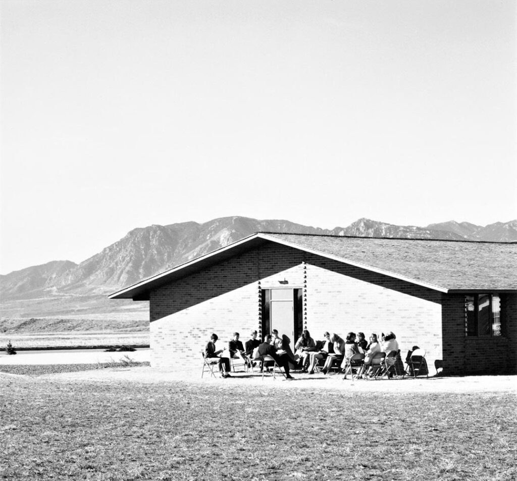
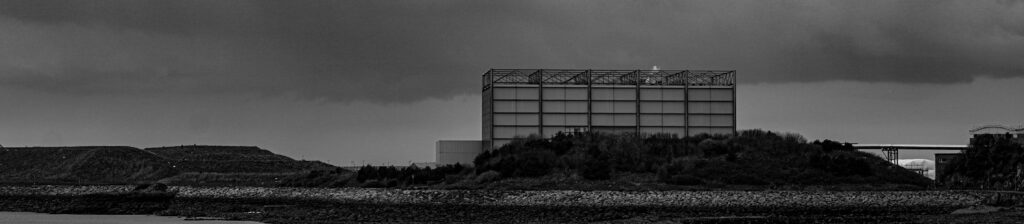
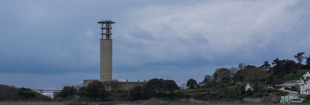
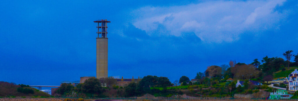
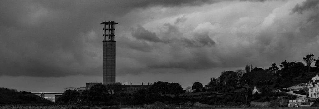
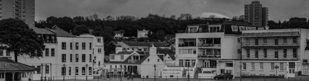
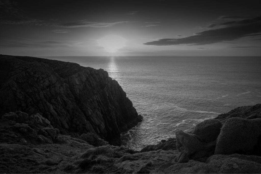
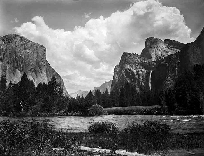
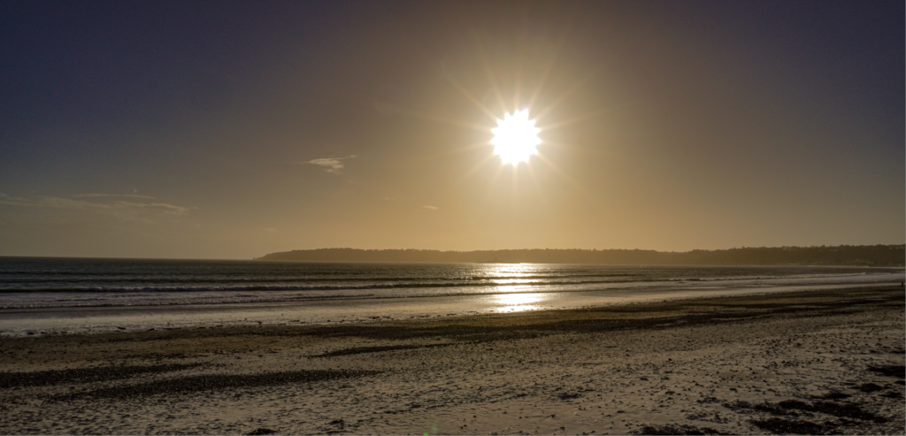
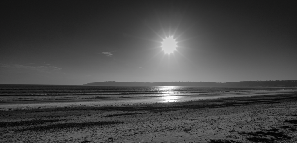
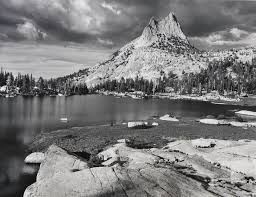
‘This movement, known as the New Topographics, represented a significant shift in the way we view the world around us. It focused on the “man-altered landscape,” revealing the intersection of humanity and nature in a unique and thought-provoking way.’

Artists That Follow Topographics:

  • Robert Adams 
  • Lewis Baltz
  • Stephen Shore
  • Bernd and Hilla Becher

It began in the late 1060s and early 1970s where those photographers decided to use their artistic vision to take images of places that wouldn’t be considered ‘picturesque’ and considered overlooked and unattractive.

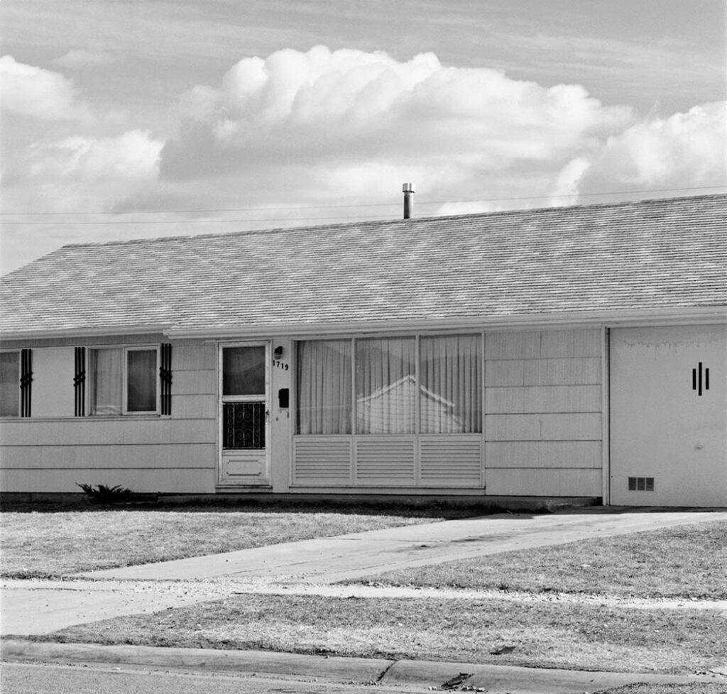
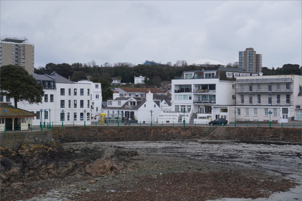
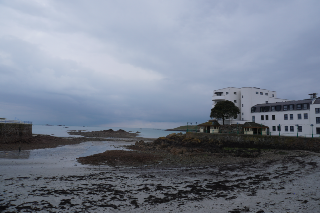
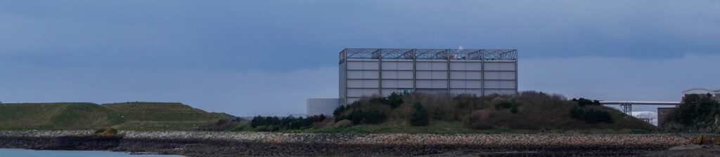
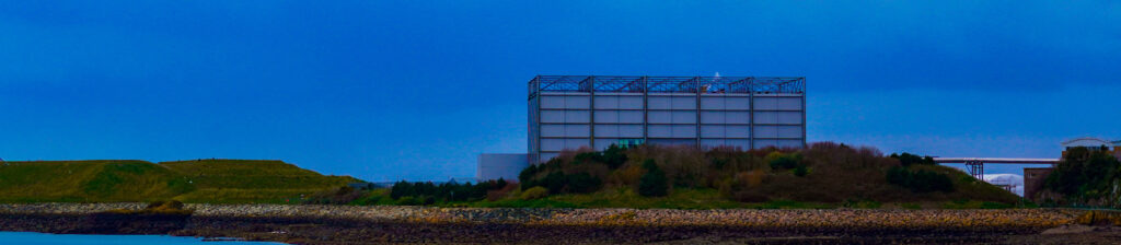
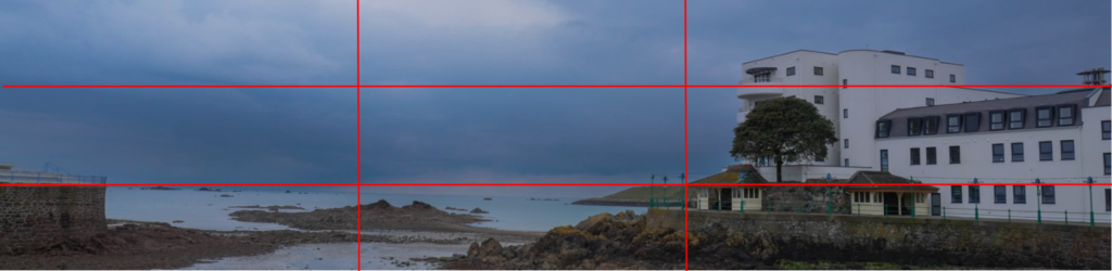
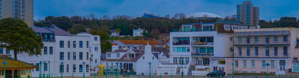
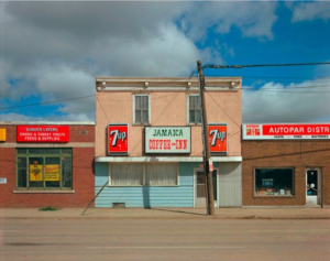
All these photographers prefered subjects that were suburban like: housing, warehouses parking lots etc. They saw those places as ‘beautiful’ as it was something that had been created on the natural land. They took images known as ‘new topographics’ in order to preserve what once wasn’t man made.

Lewis Baltz, The new Industrial Parks near Irvine California, 1974

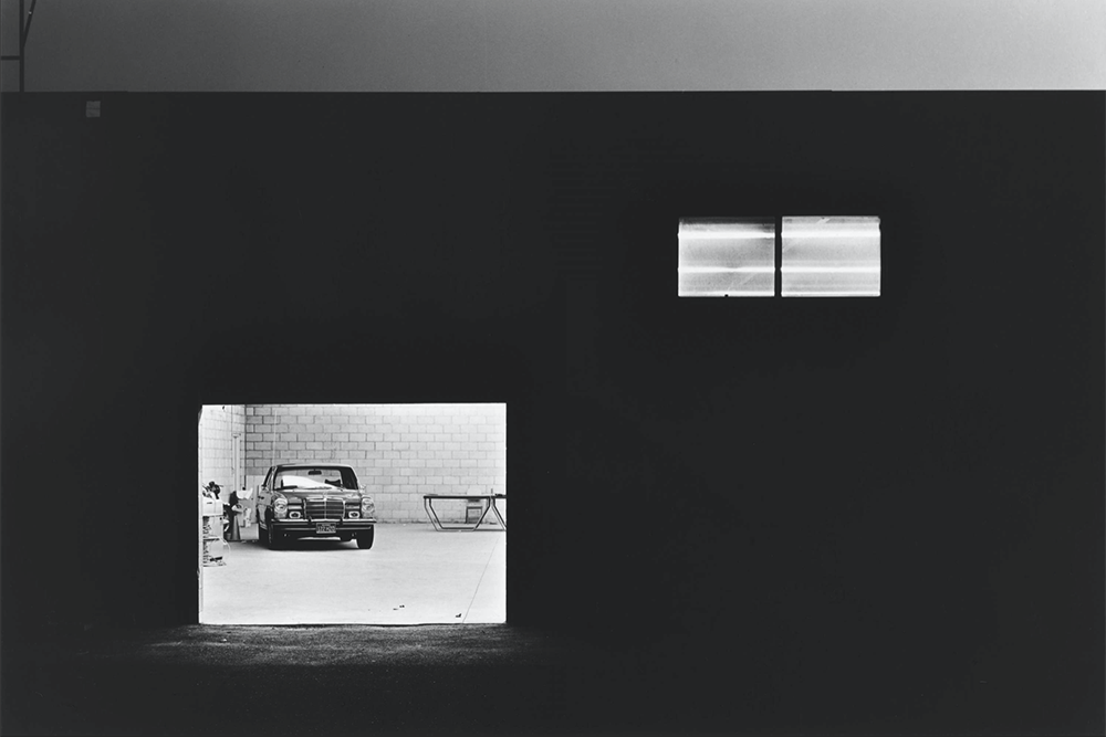
Lewis Baltz had a collection called ‘New Industrial Parks Near Irvine, California’ where he photographed almost uncanny images of alone car parks. In doing this he planned everything that went into it from the different lighting to composition and detail.
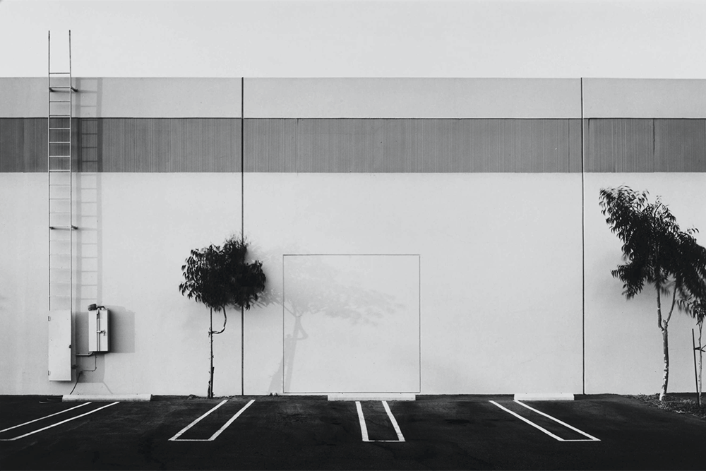
Robert Adams, Newly occupied tract houses Colorado Springs, 1968

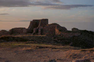
Robert Adams mainly focused on urban and suburban areas in Colorado in doing this, he created a collection called ‘The New West’. Adams’ pictures were described as precise and fastidious justice some of the mortal and venial sins that we have committed against our land in recent decades. The places he takes images of are very casually built, and will therefore acquire character soon enough. 

Panoramics

Contact Sheet

The Selection

I decided to colour code them yellow to be able to tell them apart from the rest of the photos. With this I was able to find images in which I would be able to make my own panoramic images. To help me I’ll be creating a virtual copy so they’ll be differentiated from the original photo.

Seen like this.

Original Images

Editing

  1. I chose to create an edited ‘natural’ version of the image, I did this because before the picture looked dull so in doing this, I enhanced the sky and upped the brightness.
  2. For this image I decided to create a full saturated version to show a HDR effect. This also helps me see a creative outlook on the images even though they’re just panoramics.
  3. I put the last image in black and white to create a juxtaposition between the first two images. In doing this, I had to enhance the image and deepen the contrast so the sky would be more dramatic against the man-made landscape.

I decided to increase the dehazing to give the sky a more dramatic look. This helped me create a contrast between the natural sky and the man-made horizon. In the over saturated image, I managed to make the sky seem unnatural by making it super blue and having the clouds more enhanced. I did the same thing for the black and white version enhancing the sky even more to create a juxtapositional tonal range which is clearly shown in the clouds also referring back to Ansel Adams zone system to help.

I chose to create an overly saturated version of all images as it expands my creativity and shows an almost childlike imagination of a ‘bright’ and ‘colourful’ life. The 2 picture especially creates what I imagine as you’re able to clearly see the vibrant colours of the skyline e.g. the yellows, red and oranges.

These photos show Jersey for how it is as there are a variety of building which show the newer created ones and the older ones. This also shows the man-made land of Jersey as its cluttered with many building, benches, lamp posts etc. The vibrancy of image 1 shows its natural colour way with a little editing, this shows that colour plays a big part of photography because if it were dull colours the image wouldn’t of ‘popped’ as much.

Lastly, I used the rule of thirds to show the contrast between natural land and man-made buildings. I enhanced the sky using a mask to give it a different tone to the rest of the photo, I’d also say I used a dead pan approach when taking this picture because I am eye level to the skyline.

My Favourite

Typologies – Hilla & Bernd Becher

1. How did they first meet?

They began collaborating together in 1959 after meeting at the Kunstakademie Düsseldorf in 1957. Bernd originally studied painting and then typography, whereas Hilla had trained as a commercial photographer. After two years collaborating together, they married.


2. What inspired them to begin to record images of Germany’s industrial landscape?

The first area they went to was somewhere in germany. The reason they focused on these landscapes was because it was going to be an area that would be demolished. They wanted to preserve the area from being knocked down so therefore they wanted to record it for prosperity. the subject was disappearing —> using a large format camera, lot slower than normal cameras, type of camera ansel adams used.


3. How did the Bechers explain the concept of Typology?

Hilla Becher saw it as, almost like making a movie. She came up with that concept she was looking at biology books and she picked up the idea from looking at other disciplines —> Karl Blossfeldt. Started making these pictures in the late 1950s. She got the idea by comparing one thing to another making it sort of —> symmetrical. If it was too bright Bechers would wait for a cloud to dim the lighting or wait another day, season and time setting to get the same background. They wanted an overcast day so they could isolate the building from the sky, similar to photographing people in a white studio. No funny gimmicks being used —> opposite to romanticism they wanted to create images that were real (realism).


4. Which artists/ photographers inspired them to produce typology images?

They drew inspiration from earlier German photographers like Karl Blossfeldt, August Sander, and Albert Renger-Patzsch.


5. What is the legacy of the Bechers’ and their work?

They were often labelled as conceptual artists and influenced minimalist and conceptual artists like Ed Ruscha, Carl Andre and Douglas Huebler.

As professors of The Dusseldorf School of Photography, they influenced a generation of German photographers who were their students (including Andreas Gursky, Candida Höfer, Thomas Ruff and Thomas Struth.)

Bernd and Hilla Becher
Hochöfen (Blast Furnaces), 2007

Havre Des Pas / Harbour Walk Photoshoot

Contact Sheet

The Selection

Further Selection

With the rating system, I decided to categories it by group and what I think looks best. For the 1 star, I chose the images which looked overexposed and just overall not the best. The 2 star category was for images which have high and low exposure shots, this gives me a wide variety but overall not the best quality. For the 3 stars, this was for images in which looked the same or have potential to be edited better. The last two stars (4 and 5) are my favourite pictures I took which I think have potential to be edited even better and create good pieces of work.

The red rating system is so I can be organised with my individual joiner images so I can find them when needed in order

Editing

I decided to take one image from my 1 star selection and see if I could improve it. For this image I chose to edit it originally and then create a HDR image to see how it would look. I made sure the photos were different exposures to see the best effect. When doing this I also created 3 digital copies of the photo so it wouldn’t interfere with the original image. With the original image I edited I used a mask on the sky to emphasise the colour of it without it messing up the bottom of the image. This allowed me to create a deep contrast of light and dark by turning down the whites and upping the blacks.

For this image I just turned the exposure down and upped that shadows so the image would have more depth and have more of a dramatic sky. I also cropped the image so it would be straight and the horizon line would be properly horizontal.

Stephen Shore Image Analysis

CASE STUDY: Stephen Shore, Beverly Boulevard and La Brea Avenue, Los Angeles, California, June 21, 1975, chromogenic colour print

technical:

square image, natural lighting, rule of thirds, maybe slight saturation, non grainy image, white balance = normal

wide depth of field due to large format camera

visual:

cars, signs, petrol station, mountains, lamp posts, pavement

road pointing to the mountain, nature is still there being masked by man made things, leading lines, chevron pointing out to the mountains and out of ‘hell hole’

red, white and blue mentioned a lot in the image, national pride, national colours as part of their branding, reminders of pop art

peace, serenity

concept:

nationalism, branding, pride

driving, needing to go to petrol station to drive, many petrol stations so cars can fuel and keep driving

contextual:

the environment, petrol not as popular due to the fumes, encapsulates the fact america needs cars to get around

taken at down level, sense of order and organise with a bit of clutter, juxtaposition

Photoshoot 2 – Ansel Adams Inspired

Contact Sheet

I went to a variety of places to get some highland landscapes and sea landscapes

The Selection

I then went through and chose what images I liked and want to edit

Further Selection

With the rating system, I decided to categories it by group and what I think looks best. For the 1 star, I chose the images which looked overexposed and just overall not the best. The 2 star category was for images which have high and low exposure shots, this gives me a wide variety but overall not the best quality. For the 3 stars, this was for images in which looked the same or have potential to be edited better. The last two stars (4 and 5) are my favourite pictures I took which I think have potential to be edited even better and create good pieces of work.

The first editing I did was merging the three landscape images into a HDR image. This created a brighter and more colourful image with higher saturation giving it a more of a unreal vibe about it as normally we do not see the world in this amount of saturation.

Taking inspiration from Ansel Adams, I then created a digital copy of the edited image where I then turned into black and white. This made the image more deeper and richer as it focused more onto the darker points of the image like the ground and the darker parts of the sky. The tonal range corresponds to Adams’ zone system where my photo as aspects from tone 0 to 11

These images I think best fit Ansel Adams’ work as it shows a range of colour and tone. This landscape was best as it had a good amount of sky to ground and especially since the sky was being dramatic it made a good contrast. The colours blend together well which emphasises the natural lighting as I didn’t manipulate any settings to get the soft colours. A lot of texture is also seen in the photo: the ground, the ruin building and the sky. This shows a nice contrast of texture in threes, from the clouds, the brick and the gravelly stones / dirt.

These images were also inspired by Ansel Adams as the large rock reminded me of one of his images

The coloured images also reminded me of Ansel Adams’ opinion of just seeing isn’t enough so you whatever you feel take a photograph of it, most of the coloured images are saturated to show how life is a lot brighter than what we normally see. However, in the black and white image I added -25 of vignetting which added a nice boarder to the image which also contrasts to the sun and the brighter sky.

Here I decided to add more depth towards the sky to give it a more dramatic effect creating a deeper shade of blue. I adjusted the colours so the tones in the image would vairey instead of being dull. When editing I made the horizon line straight so te layout would be completely horizontal with this I also cropped the image smaller so there wouldn’t be as many distractions in the photo, this meant taking out unnecessary items like the girl and the bench. With the black and white image, I added viagnette to also give it more depth and an oldish time feel to mach Ansel Adams photographs.

Lastly, I put my favourite images into a virtual gallery to display them. If I were to do this again, I would make sure to take multiple of the same photo to have a different variation that i can edit on because some of the images could turn out blurry and that means I wouldn’t be able to work on them. I’d also try and have a different way of editing to make it more creative but still make it realistic.

Ansel Adams Introduction

Childhood/Family Life:

  • Born – February 20th 1902 in San Francisco, California
  • Grew up in a house set near the sand dunes of the Golden Gate
  • A massive earthquake and fire of 1906 managed to throw him on the floor so hard it broke his nose badly, creating a mark for life
  • After that, his family’s fortune collapsed in 1907 leaving his family in a panic
  • His mother treated him poorly due to trying to get the father to regain all the fortunes however, Charles Adams, father, encouraged and supported Ansel

School Life:

  • He struggled fitting in to school because of his broken nose as a consequence of that Ansel had moved to various amount of school
  • His father and aunt ended up tutoring him leading him to get a ‘legitimizing diploma’ which is the equivalent to have finished ‘grade 8’

Exposure Bracketing

Exposure bracketing is a photographic technique where multiple shots of the same scene are taken at different exposure settings to capture the full tonal range and merge them during post-processing

from google

HDR (high dynamic range) capture is a technique that creates high dynamic range images by taking and combining multiple exposures of the same subject matter at different exposures.

from google

My Own Exposure Bracketing

Merging The Images

Final HDR Image

Romanticism Introduction

‘Romantics celebrated the spontaneity, imagination, and the purity of nature. Along with these elements it also incorporated a deep feeling of emotion as an authentic source of experience which put new emphasis on emotions such as apprehension, horror and terror, and awe.’

‘The sublime involves the formlessness of uplifting spectacles and produces feelings of awe and terror.’

Mini Fact File About Romanticism

  • Major movement in the 18th century because of the Enlightenment
  • It was seen typically as calm, harmony, balance, idealization and rationality of Classicism and Neoclassicism
  • Romantics celebrated the purity and imagination of nature
  • Romanticism photography went on to something that photographers could escape to – almost like a envisioning a new reality

Mini Fact File About The Sublime

  • The Sublime was first seen in philosophy in an essay, ‘Peri Hupsous’, translating to ‘on the sublime’ that meant “power of grand conceptions”
  • Sublime is normally used as an adjective describing something as delightful
  • Artists see the word as, awe-inspiring, life-threatening, edge-of-catastrophe because of nature’s power and beauty
  • One of the artists Ansel Adams saw the sublime and romantic photography as pure