Landscape photography has its roots in, like many other forms and genres of photography, art. Specifically, the romanticism movement of art that began around the start of the industrial revolution – as a sort of rejection and rebellion against the billowing smoke and ugly buildings. The romanticism movement focuses on the beauty of nature and scenery, and this is where landscape photography began.
The first landscape photo was taken around 1826, by an inventor.
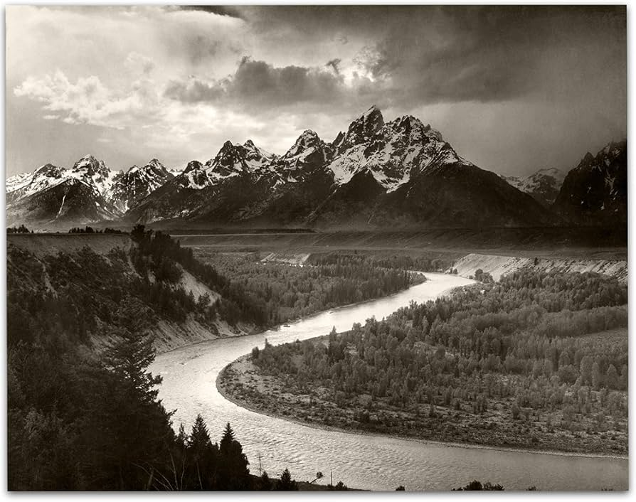
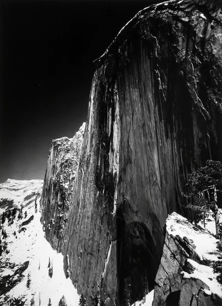
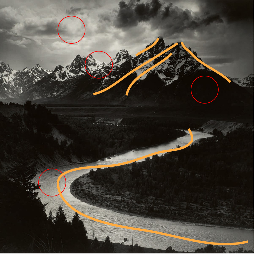
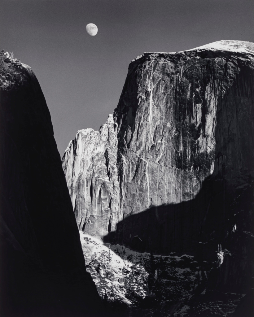
Ansel Adams was a pioneer in landscape photography, taking photos of vast american landscapes.
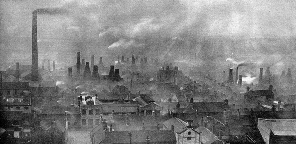
Whilst photographers were taking photos of nature scenery, another type of person was inspired by the industrial revolution, seeing vast structures as inspiring and not ugly, and this was generally the beginning of urban landscape photography.
Countryside Daguerreotypes – these were some of the earliest types of landscape photos taken and were taken by american and french photography.
Western Panoramas – American photographers had a vast natural landscape to photoshoot, so they began to photograph their own landscape.
City photography – suddenly images of the city started to appear – despite the difficulties of city photography due to long exposure shots being necessary, and photos would get blurred.
City portraiture – as tech improved, film became more sensitive and photos of hustling bustling cities became possible.
Industrial revolution – contrasting romanticism, early photographs of the grand industrial buildings began to emerge.
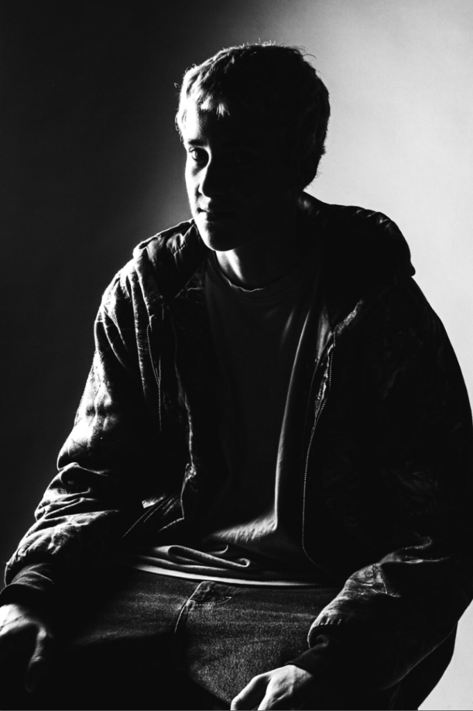
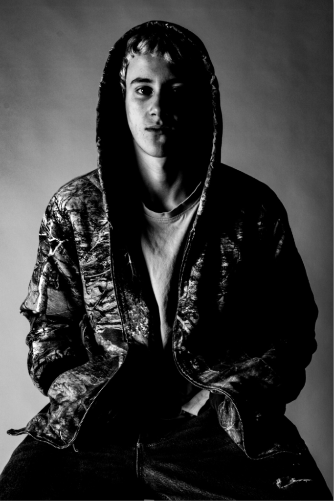
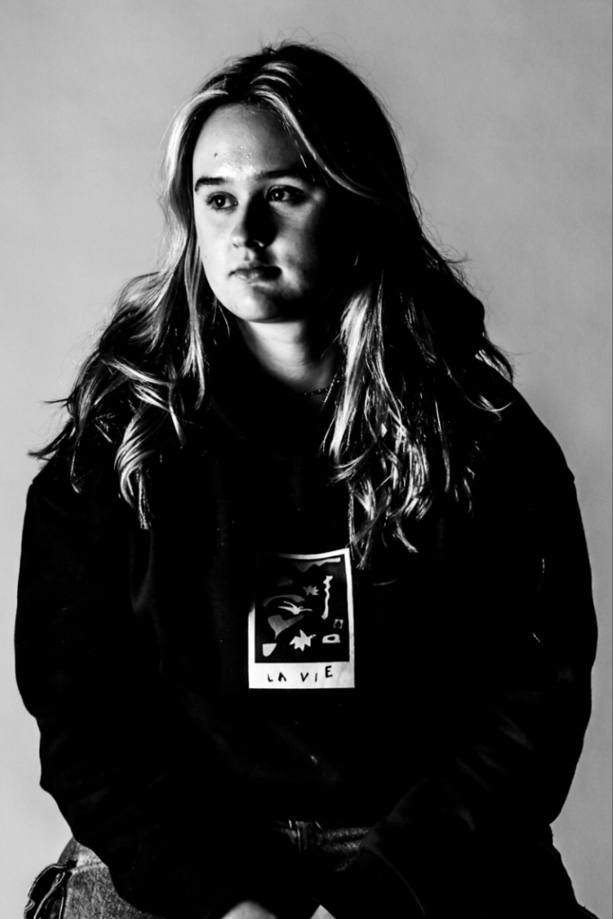
Romanticism in art and photography is about focusing on strong emotions, nature, and individual experience. It highlights beauty, imagination, and sometimes the mysterious or exotic. Think of dramatic landscapes, powerful moments, and emotional expressions. It’s less about strict realism and more about capturing the feeling of a scene. It involves romanticising certain things like nature or a certain lifestyle. For example, in photography, you might romanticise a landscape by capturing the best scenes only and perhaps putting a feeling of otherworldiness/ nostalgia. When you romanticise something, you make it seem better than it really is; in a way, everything humans think about is romanticised: the grass is always greener on the other side. An example of life being romanticised in our minds is thinking about the life of being an underground artist in New York (think Basquiat) is highly romanticised and the image of it looks really appealing/romantic, but in reality it is quite a hard life to live, and that feeling of romanticism that you get when looking at images isn’t necessarily how that person living that life might be experiencing it.
Romanticism placed particular emphasis on emotion, horror, awe, terror and apprehension. Emotion and feeling were central not only to the creation of the work, but also in how it should be read. Romanticism is meant to invoke strong feelings and really glorify the scenes of which it captures.
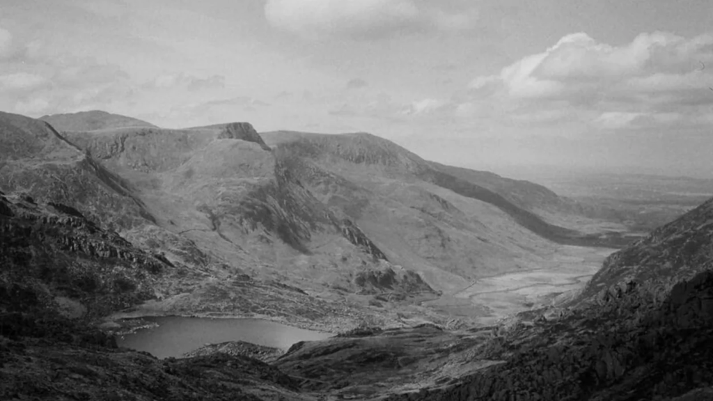
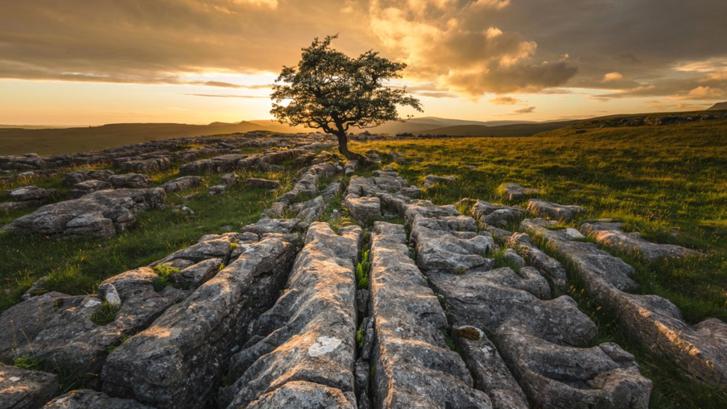
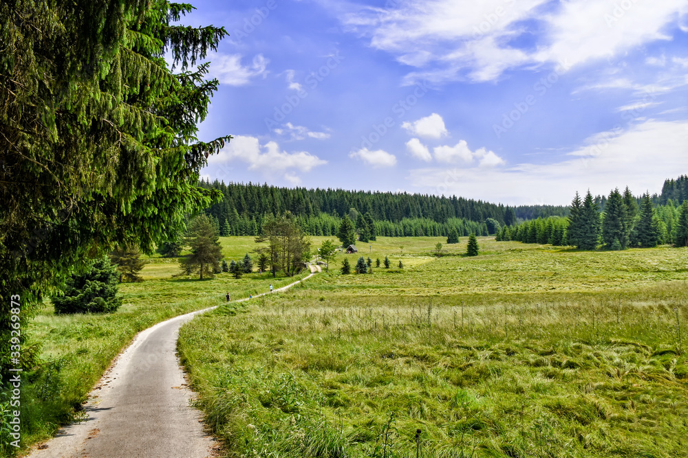
Romanticism can also have a link with landscape and nature . Landscapes became subjects in their own right and were often charged with symbolism. For romantic artists, nature is a source of inspiration and escape, a refuge from the tumult of the modern world. Landscape is often a key focus of romanticist artists because the nature the photos contain is often raw and places people don’t see very often – creating that feeling of longing for a different path or a different feeling towards life.

Who: artist William Blake and the Spanish painter Francisco Goya have been given the name “fathers” of Romanticism by various scholars for their works’ emphasis on subjective vision, the power of the imagination.
What: an artistic movement marked by the emphasis on imagination and emotions
Where: romanticism started In western Europe around the 18th century at this time the artistic and cultural movement was being revived (Neoclassicism)
How: With its emphasis on the imagination and emotion, Romanticism emerged as a response to the disillusionment with the Enlightenment values of reason and order in the aftermath of the French Revolution of 1789.
Why: Romanticism was born as a reaction against the Age of Enlightenment and the Industrial Revolution. The Romanticist movement celebrated rebellion, sensation, emotion, subjectivity, and individuality and it rejected tradition, reason, rationality, and authority.
English romantic painter and water colour specialist , known for his romantic paintings that portray colourful imagery and imaginative landscapes. Joseph Mallord William born 23rd of April 1775 inspired modern art by incorporating a view of impossibility into his paintings by inviting unrealistic colouring and faded scenery to give a sense of romanticism
The Sublime
In the critical literature, “the Romantic sublime” refers to the mind’s transcendence of a natural and/or social world that finally cannot fulfil its desire. Revealed in the moment of the sublime is that the mind is not wholly of the world, but this revelation may be triggered by a particular setting in the world.
The sublime as defined by The Tate is : “Theory developed by Edmund Burke in the mid eighteenth century, where he defined sublime art as art that refers to a greatness beyond all possibility of calculation, measurement or imitation.”
The sublime is in most creative subject areas; photography, fine art, film, writing, poetry and many more.
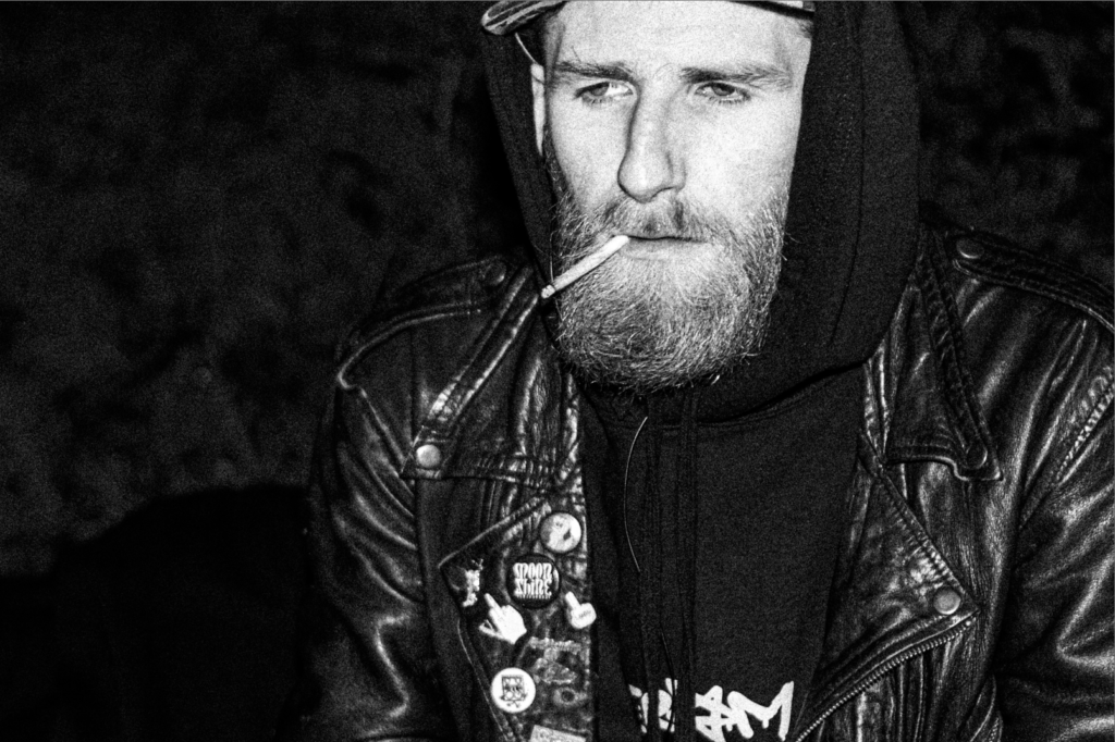
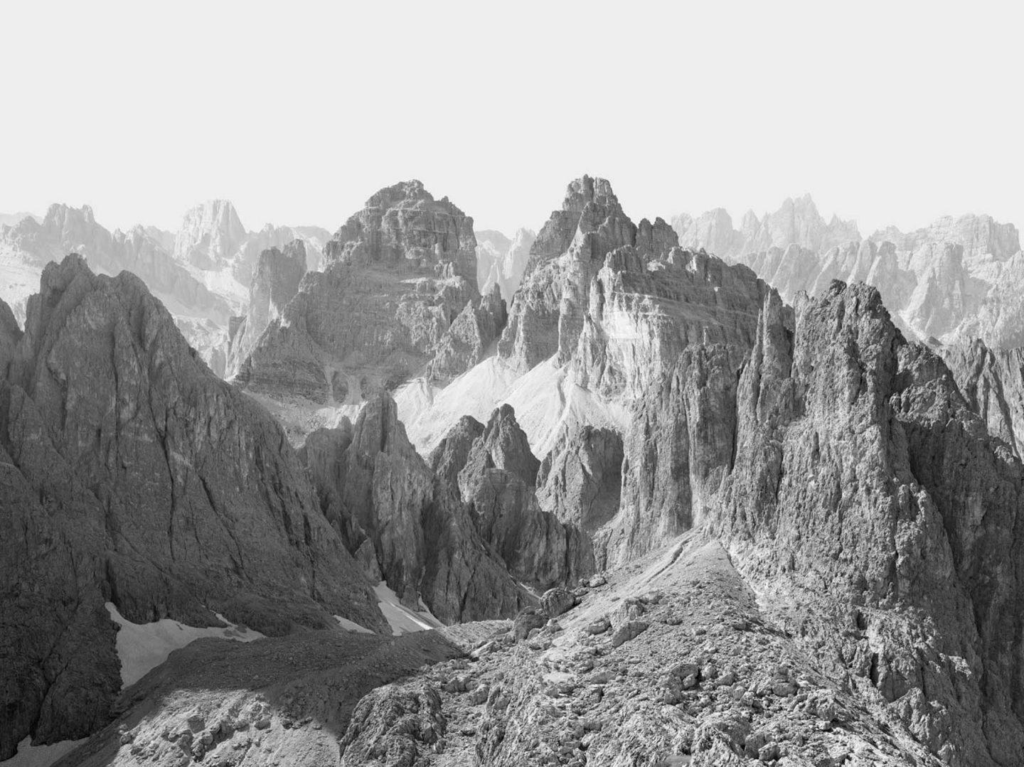
MY PHOTOSHOOT
In the French alps I went to take photos


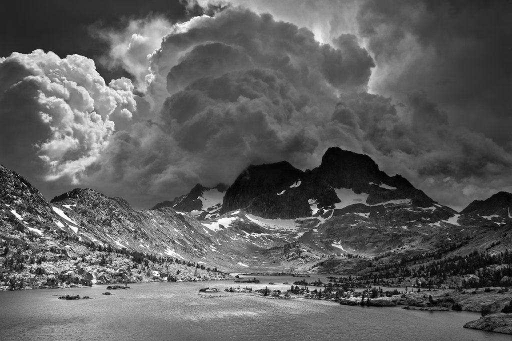
I wanted to create a very moody feel to these images which is why I waited for a day when the clouds were low and were at all different levels between my and trees and those behind. This creates a lot more atmosphere and adds way more depth, emotion and has more elements of romanticism – emotion. These photos feel like a sad rainy day to me. Or maybe that’s just me projecting.