Henri Cartier-Bresson was a French artist and humanist photographer considered a master of candid photography, and an early user of 35mm film. He saw the camera as an extension of the eye…
Why is a camera an extension of the eye?
A camera is considered an extension of the eye because it captures and records visual information much like our eyes do. It uses a lens to focus light, similar to how the eye focuses images on the retina. The camera allows us to frame, focus, and preserve moments that the eye sees, turning brief visual experiences into lasting images. In this way, it enhances our natural vision and helps us share our perspective with others.

What is the physical pleasure in making photographs
The physical pleasure in making photographs comes from the tactile and sensory experience of the process. Holding the camera, adjusting the focus, feeling the click of the shutter, and responding to light and composition all engage the body and mind. There’s a satisfying rhythm in moving, framing, and capturing a moment often described as a blend of intuition and control. This hands-on interaction creates a sense of presence and flow, making photography not just a visual but also a deeply physical and pleasurable act.
How can photography be likened to hunting?
Photography can be likened to hunting in the way it involves patience, observation, and the pursuit of a target. Like a hunter tracks and waits for the perfect moment to strike, a photographer carefully watches for the right light, angle, and expression to capture. Both require skill, timing, and instinct. The “click” of the shutter parallels the trigger of a weapon seizing a fleeting moment. However, instead of taking life, the photographer captures it, preserving the subject rather than consuming it. It’s a hunt for beauty, meaning, or truth.
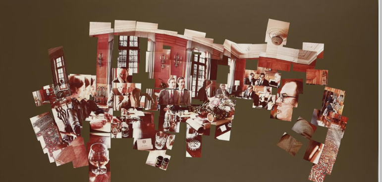
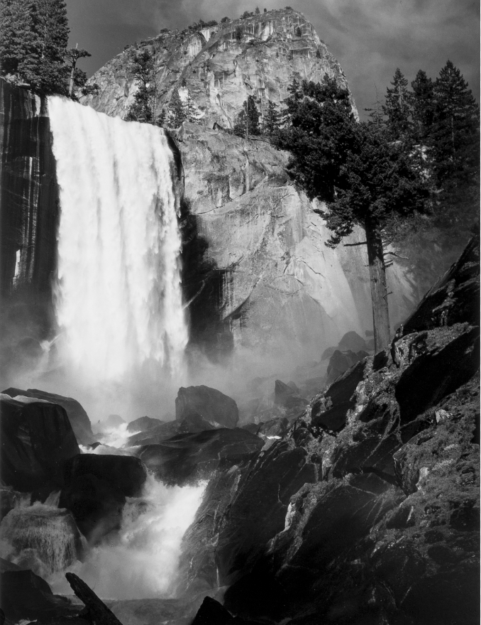
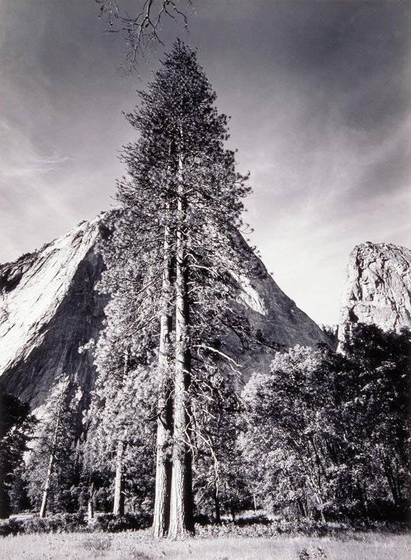
Henri Cartier-Bisson Mood-board

The decisive moment is particularly concerned with the overall structure and composition of the photograph, such as shapes, geometry, patterns, action and movement.

Henri Cartier-Bresson’s L’Aquila, 1951 is a striking black-and-white photograph that captures everyday life in post-war Italy with a quiet sense of beauty and rhythm. It’s a moment frozen in time, filled with character and subtle detail.
Line: In this image by Henri-Cartier Bisson you see hard leading lines portraying the ancient Italian infrastructure. The leading lines further put emphasis on the lady in black as they all lead to her
Henri Cartier-Bresson’s L’Aquila, 1951 is a striking black-and-white photograph that captures everyday life in post-war Italy with a quiet sense of beauty and rhythm. It’s a moment frozen in time, filled with character and subtle detail.
Shape and Form: The photo is built around strong shapes especially the rectangles and lines of the buildings and stone steps. These give the scene structure and stability. In contrast, the people, particularly the women carrying trays or baskets on their heads, bring softer, curved shapes into the frame. This contrast between the rigid background and the flowing human figures makes the scene feel both grounded and alive.
Pattern: There’s a sense of repetition throughout the photo that creates a kind of rhythm like the repeating windows, the steps, and even the similar poses of the women walking. These patterns make the photo feel balanced and cohesive, tying the different parts of the scene together in a very natural way.
Tone: Cartier-Bresson uses the full range of black-and-white tones to give the photo depth. There are bright areas where light hits the buildings and darker areas in the shadows and clothing, which help to create mood and atmosphere. The tones guide your eye around the image and add a sense of realism and texture.
Colour: Even though it’s black and white, the absence of colour actually enhances the emotional weight of the photo. The grayscale tones emphasize contrast and texture, letting the viewer focus more on form, composition, and expression rather than being distracted by bright colours.
Texture: The textures are really vivid you can almost feel the rough stone of the buildings and steps. The soft folds of the clothing and the smoothness of the trays or baskets also come through clearly. This makes the scene feel more tactile and real, as if you could step into it.
Space: The way the photo is composed gives a strong sense of depth. The people in the foreground draw you in, and then your eye moves through the street into the distance, where the buildings and background hills fade into lighter tones. This layering makes the scene feel expansive, while still intimate and focused on daily life.