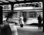
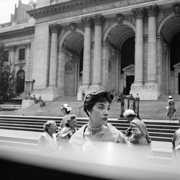
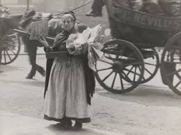
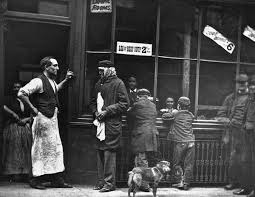
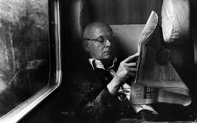
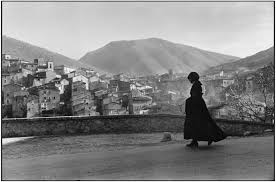
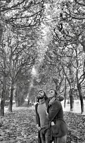
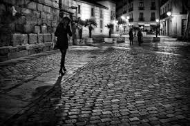
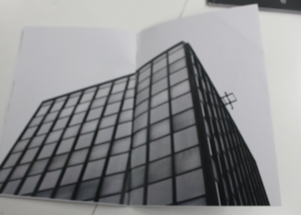
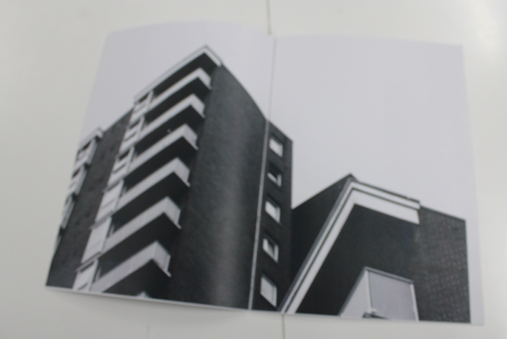
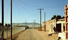
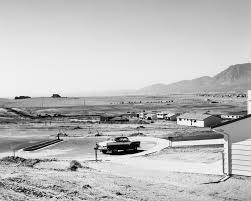
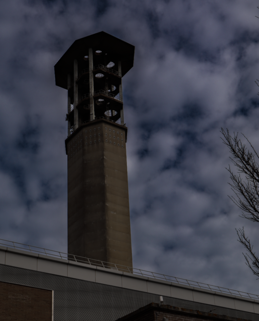
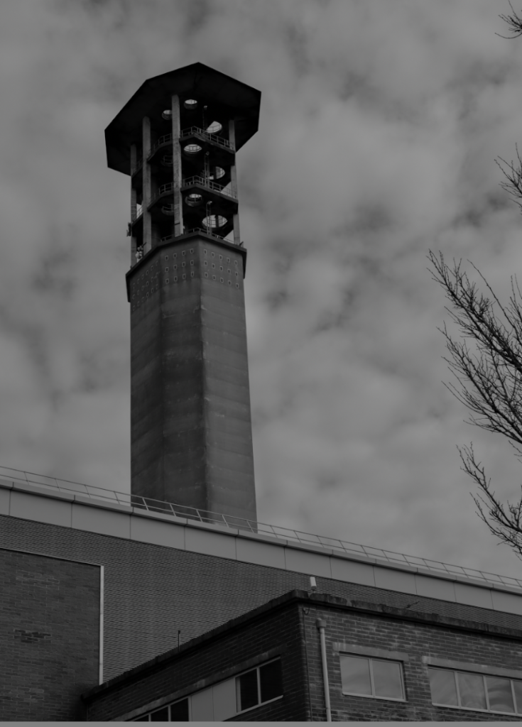
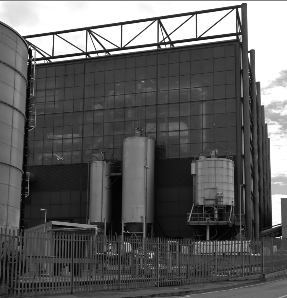
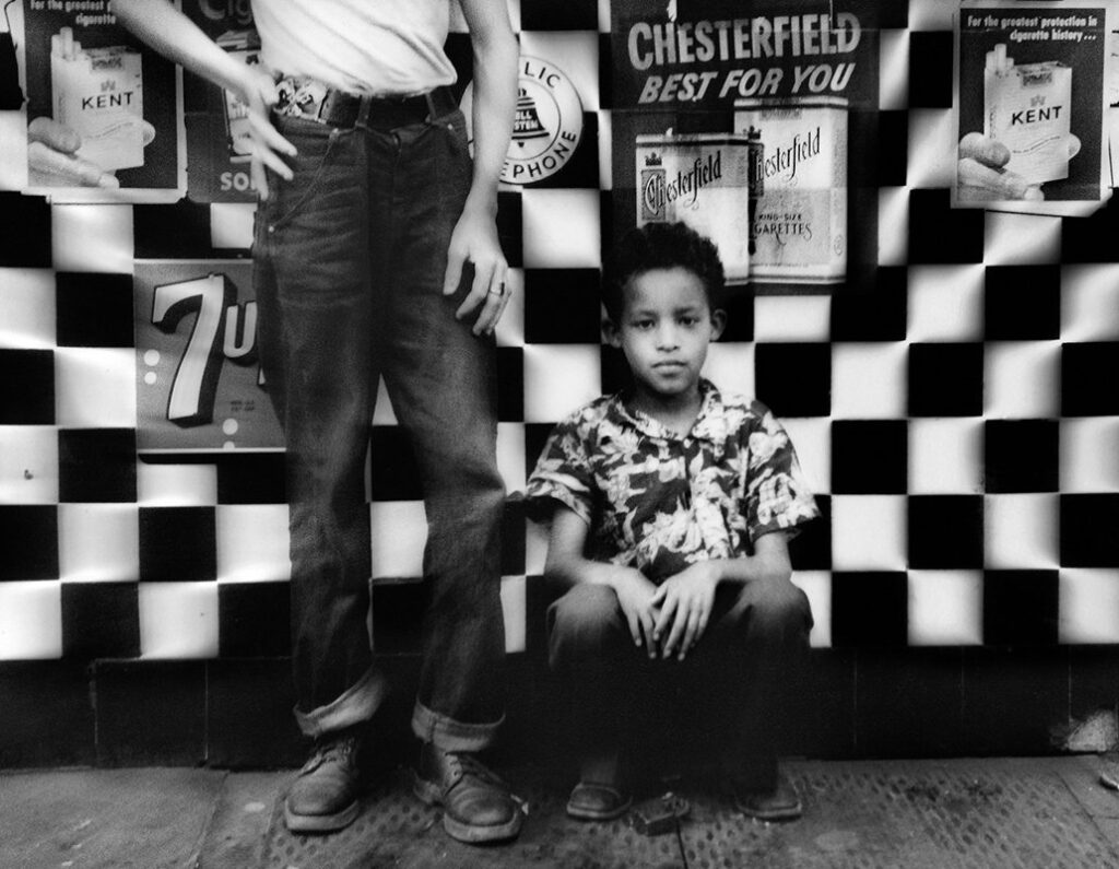
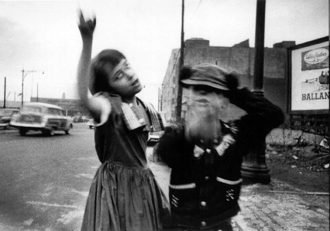
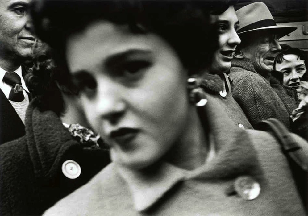
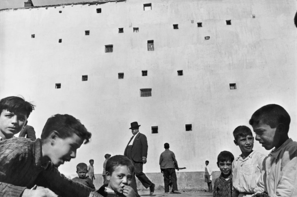
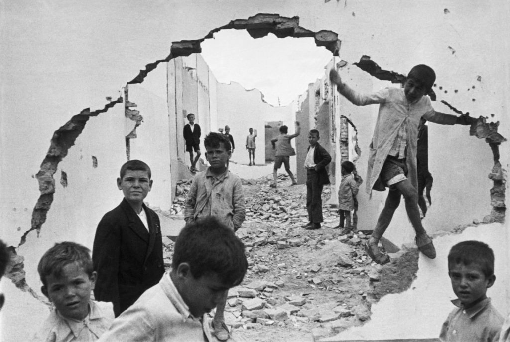
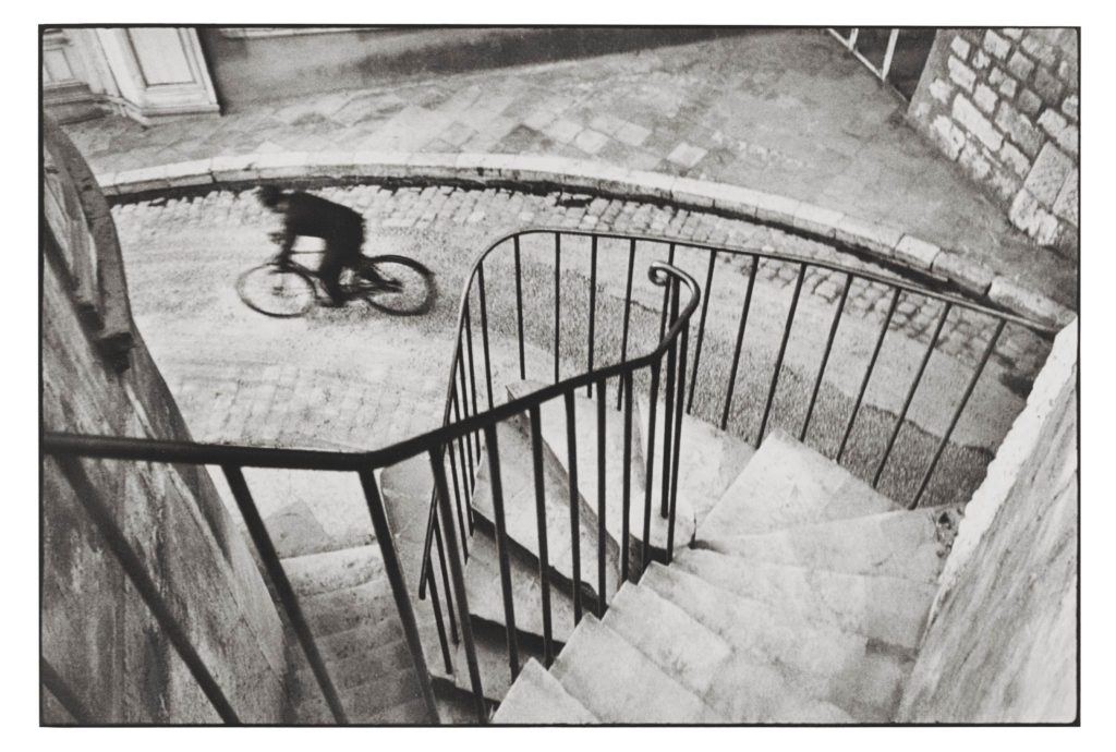
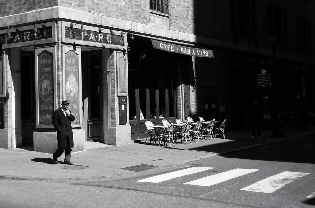
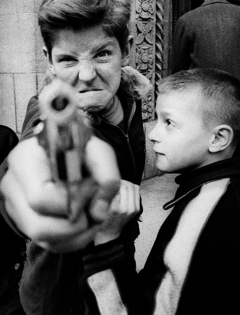
Street photography is about capturing the candid moments in public spaces, which often highlights everyday life, urban environments, and human interactions. It thrives on spontaneity, composition, and storytelling, offering a raw glimpse into the world.
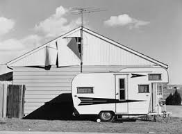
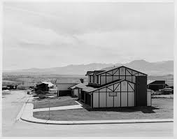
It overlaps with candid photography but doesn’t necessarily require a street or urban setting.Sometimes, it will focus on objects or environments that will evoke the human presence. The genre has evolved and has improved as time has gone on.It has also has advanced in portable cameras, which will allow photographers to document fleeting moments with precision.
Candid Photography is all about capturing spontaneous, unposed moments, often highlighting genuine emotions and interactions.
Key Artists
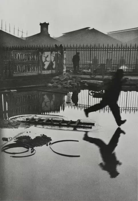
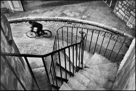
It originated in Paris, and artists such as Henri Cartier-Bresson,Brassai and Andre Kertesz, Street Photography became known as a genre in its own right during the early 1930s.
While there are areas of overlap with documentary and architectural photography, Street Photography is very unique in the way it is associated with the photographer’s skill in catching something of the mystery and aura of everyday city life.
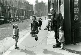
Street Photographers will sometimes engage and get to know their subjects (Brassai,Diane Arbus and Garry Winogrand) but it became more common for the photographer to roam the streets with a concealed 35mm camera.
The Street Photographer is then often likened to the historical figure of the flâneur: namely someone who joins anonymously with the crowd who will observe and record the ways the unsuspecting city dweller interacts with his or her environment.
A History of Street Photography
While the early French developers, formed close associations with the Surrealists, the spontaneity quality that embraces the uneven and spontaneous, Snapshot Aesthetic which was carried across the Atlantic where it lent itself perfectly to the post-war urban experience.
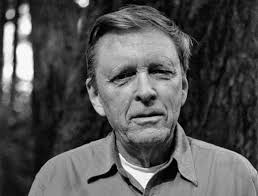
Possibly the most important Street Photographer of all, the Swiss-American Robert Frank, who raised the status of the Snapshot to art and his influence was to make the next generation of American photographers.
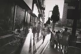
The mid-1960s and early-1970s became the “golden-age” of Street Photography when the likes of the Arbus, Winogrand and Lee Friedlander allowed their own sassy personalities to impinge on the images of their subjects.
Street Photography Quotes
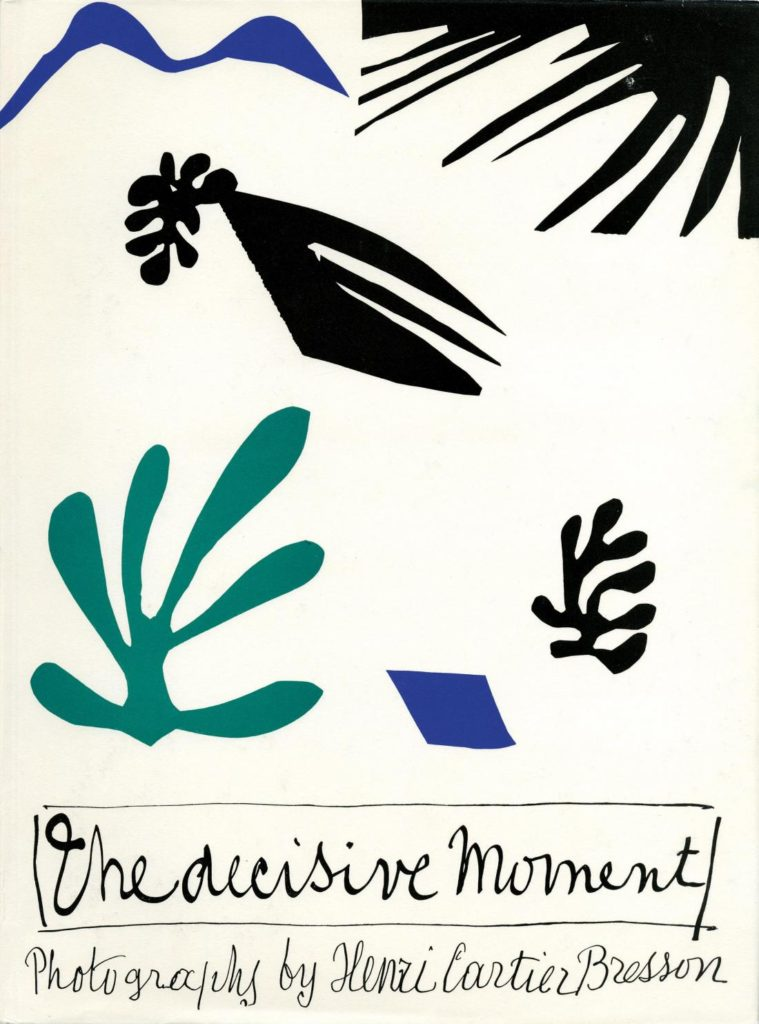
‘For Me The Camera is a Sketchbook, an instrument of intuition and spontaneity’ -Henri Cartier-Bresson
This quote implies his philosophy on photography as an art form driven by instinct and immediacy. He saw the camera not as a rigid tool for documentation but as a means of capturing fleeting moments with precision and emotion.I agree with this statement Cartier-Bresson said because ‘rigid’ implies that its hard and the images will last longer.
‘Basically ,my work has been one long reportage on human life’-Brassai
His approach to photography as a documentation of human existence. He saw his work as an ongoing visual narrative and like a storybook, which captured the essence of everyday life, people, and urban environments. I agree with is quote because images are a documentation of our lives.
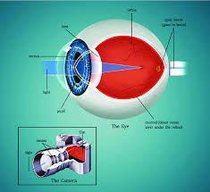
Technology
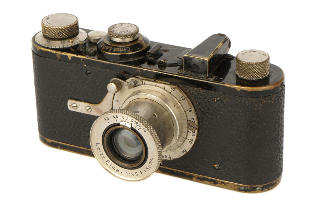
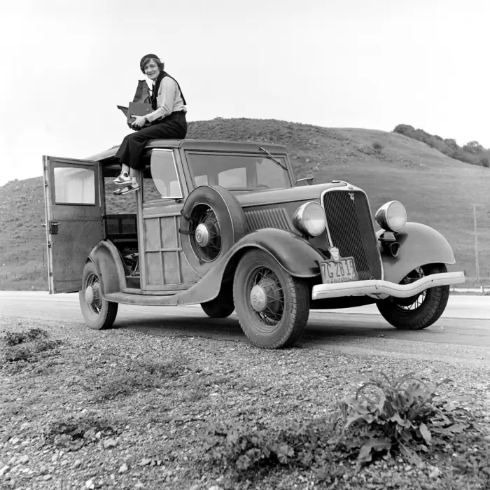
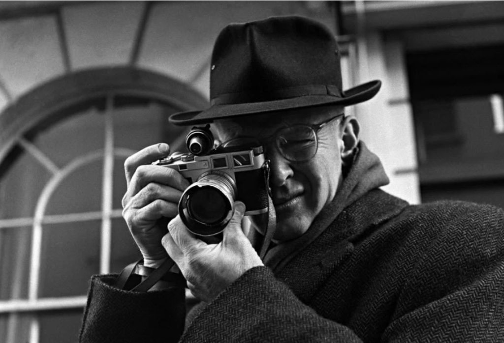
The Leica handheld camera, commercially available as of 1924, was the ticket to allowing a photographer to be on the move, as well as to capturing movement of the world around them.
A 35-mm film camera, the Leica had a wide aperture that required a short exposure time, especially for pictures taken outdoors, and it could advance quickly, which allowed the photographer to take numerous pictures of a subject in quick succession.
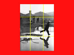
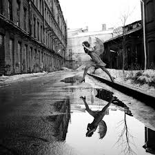
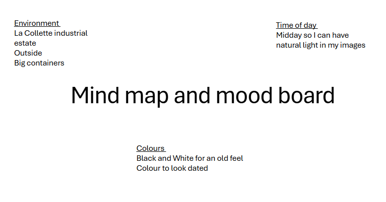
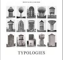
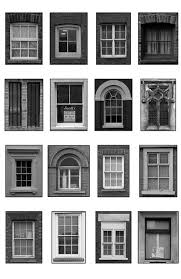
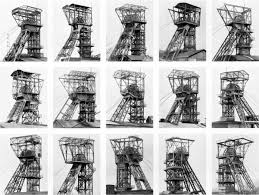
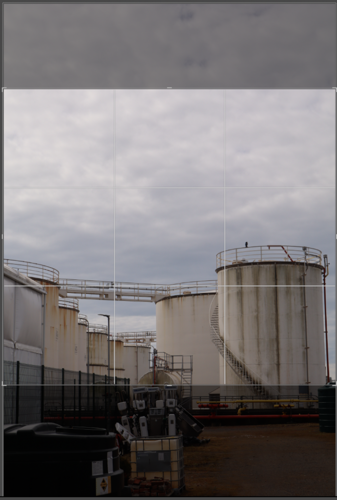
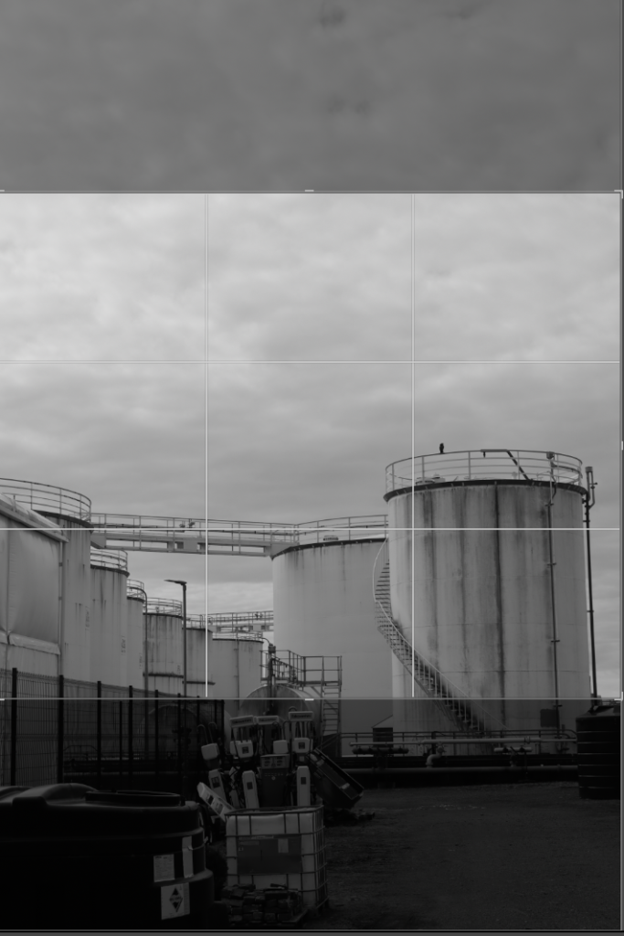
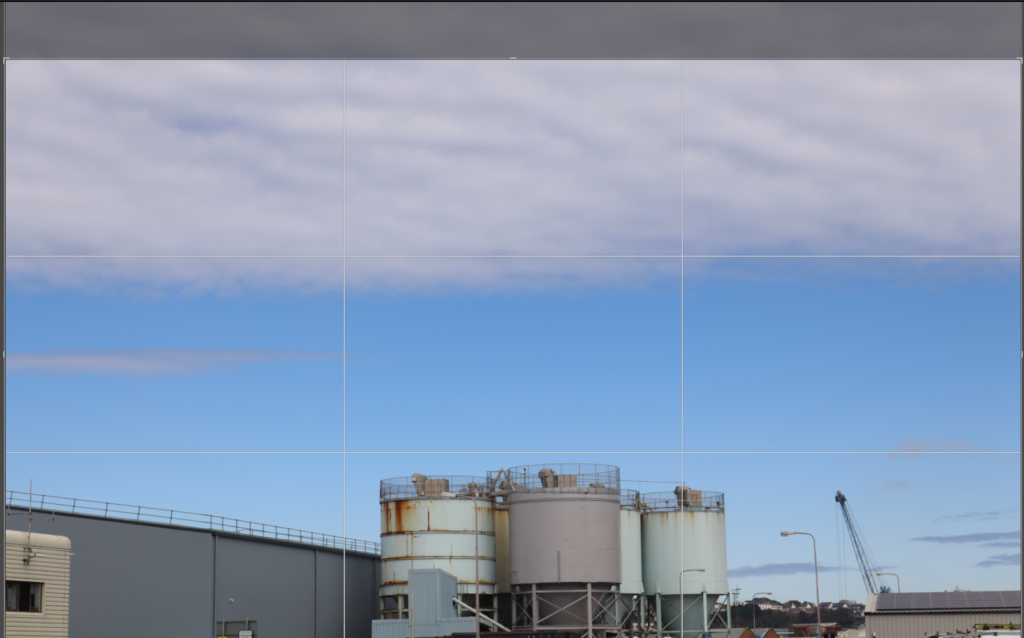
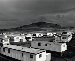
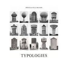
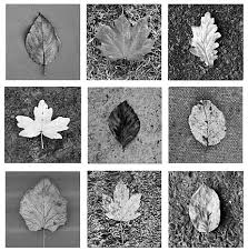
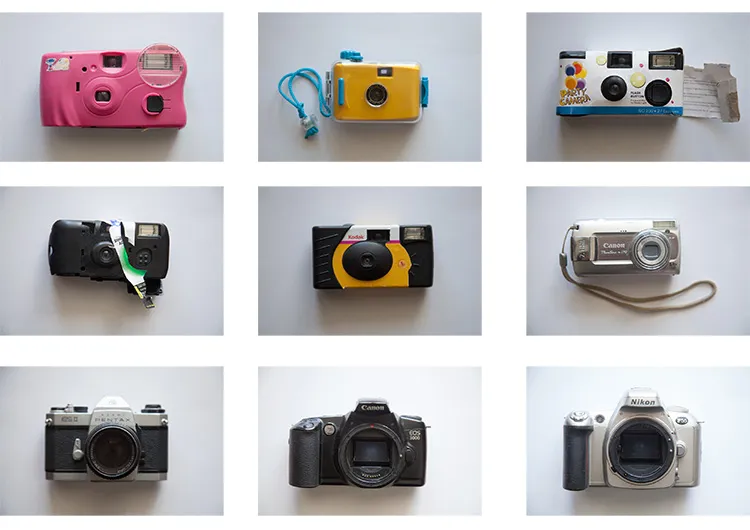
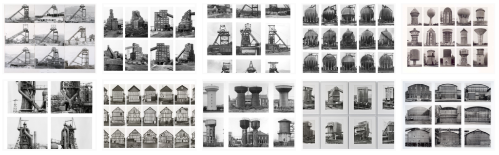
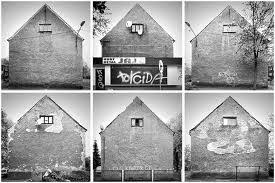
Street Photography Mood-board
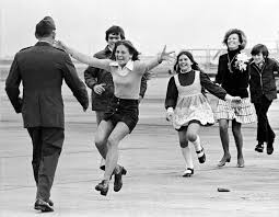
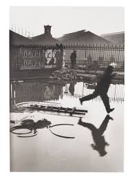
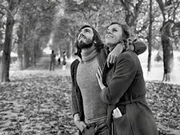
This is an overview of street photography in a nutshell.