Claude Cahun (25 October 1894 – 8 December 1954) was born in Nantes France, Cahun was best known as a self-portraitist and a writer. At birth Cahun was given the name Lucy Renee Mathilde Schwob by her parents, she later changed this when she was older and she identified herself as gender neutral. The goal of her photographs were to challenge the traditional ideas of gender, sexuality, and identity. To achieve these goals she photographed herself but changing her identity/how she looked which was needed to present her goals and show the criticism she has against the society who follows these traditional ideas. She also often worked with Marcel Moore who often helped take her self portraits.
Cahuns pictures are portrayed in a specific manner in order to make the viewers see that she is dressed and presented in such a way that she can be seen as a rejection of traditional ideas of feminine beauty. The message that her pictures are trying to convey is that society distinguishes people from each other which can be separated into groups like Genders however individuals are the ones who play the role into creating or shaping their own identities based on things they express upon or their understanding on certain things which could be based on personal choices or experiences. Cahun in her portraits shows that gender is something you can act as and the things you do which define what gender you want to be rather than someone you are biologically.
Claude Cahun connection with Jersey started early with childhood holidays which were spent in Jersey and Brittany. By 1937 both Marcel Moore and Claude Cahun decided to move from France to Jersey to live where they took up their old names and letting people assume they were sisters. But by 1940 following the invasion of the Nazis they refused to evacuate to England and remained in jersey where they setup an underground resistance campaign following the Nazis invasion of the island. The campaign lasted 4 years before they both got investigated and got locked up in the St Helier prison where they almost got the death sentence. After Jersey got liberated they remained on the island till 1953 where they decided to check if they could live in Paris once again. However Cahun in late 1954 died in Jersey under hospital care.
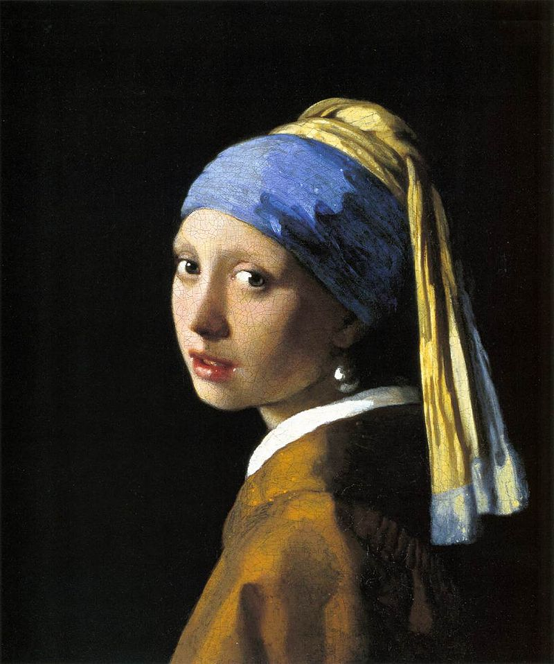
Claude Cahun was described as Cindy Sherman before her time. These two artists both explored similar ideas and criticised society for their perception of gender roles and identity. Cindy Sherman started her work in 1977 compared to Claude Cahun who started in 1912, both of their photograph styles are very similar where they change their appearance to portray different roles of people.
Visual
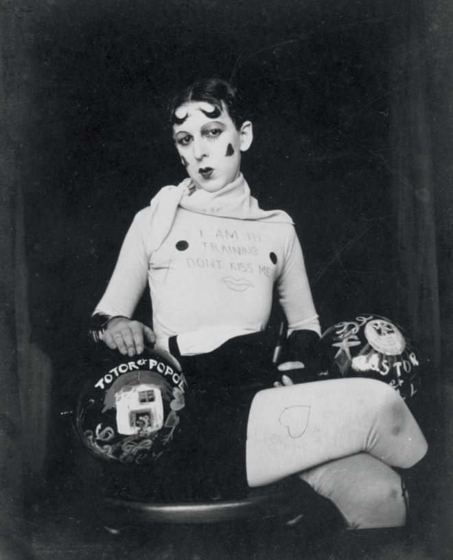
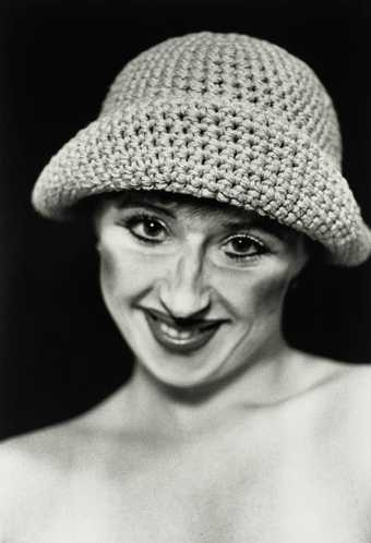
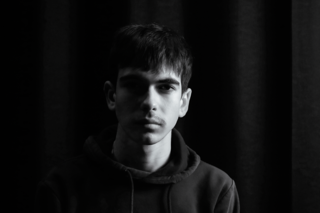
In this image we can see a self-portrait of Claude Cahun posing for the camera, They are posed in such a way that it closely resembles a feminine posture with the crossed legs and straight posture, They’re gaze is also pointed directly at the camera to make that connection with the viewer. They appear to be wearing a long tight shirt with leggings and what appears to be a scarf, the outfit does appear to make her look like a mime especially with the paint/makeup applied to her face. They also appear to be holding something that looks similar to a barbell which is labelled “Totor popol” and the other side of it appears to have “Castor” Written on it. The writing Totor popol may be a reference to the two comic characters by the Belgian cartoonist Herge, Castor and Pollux is a older reference to the twin half-brothers of the Greek myth whose names grace the two brightest stars in the Gemini constellation. The sign on her chest says “I am in training, Dont kiss me” and this could be in relation to the fact that she had styled herself to look as a mime which makes it so the writing in her chest is her communicating with the public as mimes typically cannot speak with their voice.
Technical
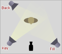
The lighting that Claude Cahun appeared to have used is artificial light as the setting they are in suggests that she’s in a studio environment which makes it easier for the subject to be illuminated easier especially with the angle you want the light to go towards. It also looks like a Wide Aperture may of been used in order to capture all the details in the picture from the details on her face to the writing on the barbell and their chest. The angle this photo may of been taken at is straight on/dead centre as the camera may be on a tripod to shoot the picture on the centre to ensure that Claude Cahun would be the main priority of the photo. The photo is closer to a 3/4 body shot as her body is mostly shown except from the knees down.
Contextual
The roles of women in the 1920s and 1930s were typically working as clerks, teachers and nurses while others were expected to stay home and raise children and make sure the house was maintained and cleaned. Women back then were not really seen as strong or being able to be independent in the eyes of society. With Claude Cahuns image it was taken to criticise societies view and the stereotypes made against women which suggests why she may have the barbell in view to challenge societies view of the strength of women.
Conceptual
Claude Cahuns work made the role of women/gender in the 20s and 30s appear that it was more of a lifestyle that anyone can adapt from rather than someone you are from birth. Her work protested these gender and sexual norms and showed people that they do not need to follow these norms that society expects them to follow. With the feminine pose as well as the barbell she has laid on her lap, she is trying to convey the message that women can do anything that men can do and that your gender or your background shouldn’t prevent you from doing things that you would like to do.