All posts by Derek Marques

Filters

Author:
Category:

Studio Portraits Photos and Contact Sheet

Contact Sheet

I ended up not using a lot of the images that were taken as half of them were either not making eye contact with the camera or were test images and the other half I felt that it didn’t match the standards I was aiming for. However for the ones I did select I felt that they were effective attempts at the different lighting styles.

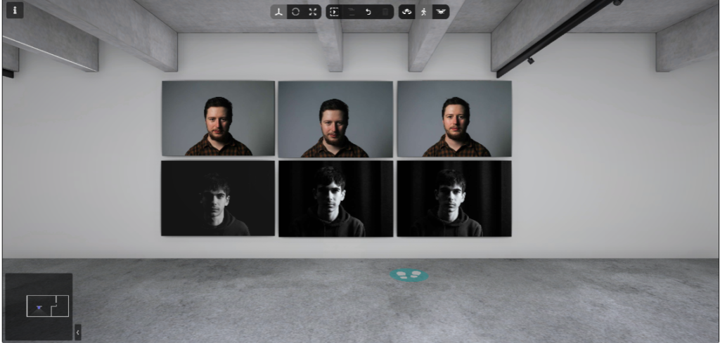
Attempt at Rembrandt Lighting

As you can see from my images I was able to capture the light triangle clearly under the eye which is the key characteristic of taking an image using Rembrandt lighting. You are also able to see the shadows casted under the right cheek and the right side of the nose which helps form that light triangle we are looking for. The strongest image out of these three is the one in the middle as I feel that it is clear to see the light triangle as well as the light intensity of the triangle which makes it easily visible for people to view the photo and identify that the image has used Rembrandt lighting.

Attempt at Chiaroscuro Lighting

As you can see from my images I was able to position the lights in a way where I could increase the amount of shadows and highlights that were casted around my face in order to attract the viewers attention more towards the shape of the face and the details of the face as well. Out of these three I would say the image on the right is the most effective as one side of the face is lit up which allows for those details to be visible and allows for the shape along my chin to be more visible, and the other side of the face which is blacked out which allows for the brighter side to be the main focus so the viewers attention is more towards the shape of the face around the divide in the middle.

Attempt at Butterfly Lighting

As you can see from my images I was able to position the light above the camera in order to cast shadows under the nose and to highlight some parts around the face which is what we want when trying to take pictures using butterfly lighting. Out of the these three I think that the image in the middle is the most effective as there is a clear visual of shadows under the nose and by the subject tilting their head slightly down it helped to create some minor shadows around the under and the top part of the eyelid.

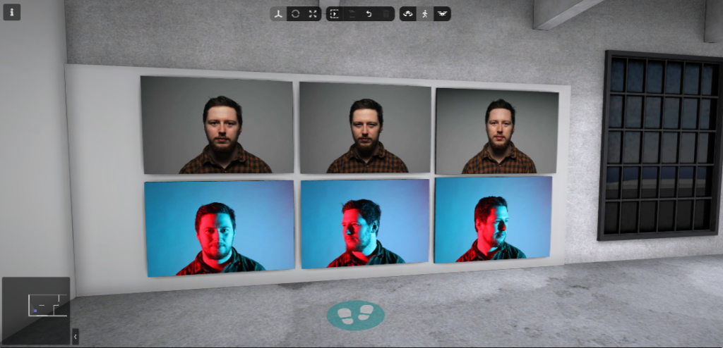
Attempt at using Colour Gels

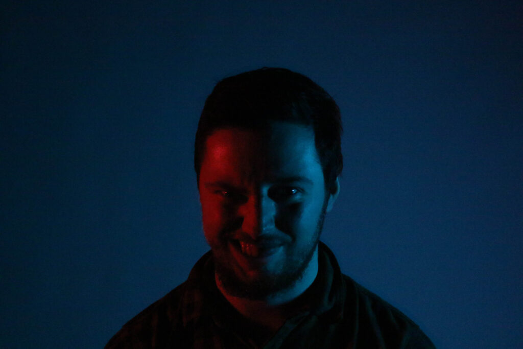
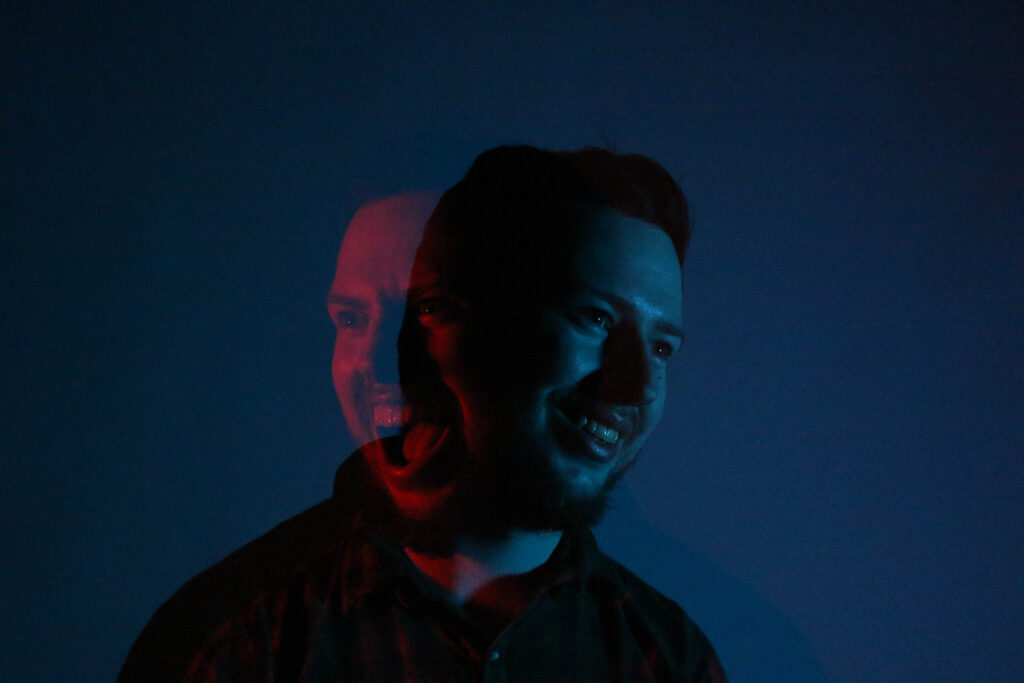
As you can see from my images I was able to put red coloured gel on the left side of the room and a blue coloured gel on the right side of the room which helped create this unique feel to the image. Coloured Gels have made these images standout and look more interesting to look at especially since the red and blue colours clash together nicely alongside each other. Out of these three images I think that the image on the left is more effective as it captures both of the colour gel lights perfectly creating a balance of both the red and blue light symmetrically on the subjects face.

Lighting Techniques

By using studio (artificial) lighting it can help achieve some nice dramatic and intense photos, there are many creative possibilities you can use but some well known ones for studio portraits are Rembrandt lighting, butterfly lighting and chiaroscuro.

Rembrandt Lighting

Rembrandt Lighting is one of the many lighting techniques that are used for portrait photography. Rembrandt Lighting is named after Rembrandt Harmenszoom van Rijn who was a great Dutch painter. This technique refers to a way of lighting a face so that a upside down light triangle appears under the eye of the subject. This style ended up gaining lots of popularity in Hollywood around the early 20th century, Film director Cecil B. DeMille introduced spotlights which allowed for more realistic effects of light and shadows to be created into ‘plain’ studio lighting setups which were generally in use. This eventually became widely used in promotional photographs of film stars as it allowed for dramatic and eye-catching pictures of them to be created.

Why use Rembrandt Lighting?

Rembrandt Lighting is effective as it not only gives your subject an individual look but it also acts as a photographic device to draw the eye. In photography there are many ways you can achieve this with using things like leading lines, depth of field and negative fields which are all methods that are effective to draw the viewers eye to the subject of the image.

Marilyn Monroe
Keanu Reeves

In portraiture the eyes of the subject are almost always the main focus point of the image and Rembrandt lighting shows this as the light triangle is always under your eye which then helps attract the viewers full attention to the subjects eye.

So by using the Rembrandt Lighting technique it becomes a very effective way to draw the viewers attention to focus on the eye of the subject which is the main aim of portraiture.

To take a picture of Rembrandt lighting you want to make sure that the key light is 45 degrees away from the camera while still shining the light at the subject. You could also use a reflector alongside it which will help create more shadows under the cheek which could make it easier to achieve that light triangle under the eye.

Butterfly Lighting

Butterfly lighting is another lighting technique which is primarily used in a studio setting. The name comes from the butterfly shaped shadow which is formed under the nose because the light being used is positioned above the camera. People also refer it as ‘paramount lighting’ or ‘glamour lighting’.

Butterfly Lighting is mostly used for portraits, It’s a light pattern that flatters mostly everybody which makes it one of the most common lighting setups used. Butterfly Lighting was popularly used to take photographs of some of classic Hollywood’s most famous stars which is why people also refer it to Paramount Lighting. With this lighting technique it can highlight the subjects cheekbones and create shadows under them which in some cases can make the subject look thinner.

Key light is essential for Butterfly Lighting and this can either be a flash unit or continuous. If the lighting is continuous it can allow you to use lights like strobes, speed lights, LEDs or in some cases even the sun. The main focus for Butterfly Lighting is not the quality of the light but the setup as for the best effect you would want to make sure your light is creating the right amount of shadows and highlights that you want to achieve.

Chiaroscuro

Chiaroscuro (Italian for light dark) is a visual element in art, it refers to the bold contrast between light and dark. It first appeared in the 15th century on a painting in Italy and Flanders (Holland), it is the effect of light modelling in paintings, drawings and printmaking where the three-dimensional volume is encouraged by high amounts of light and shadows.

Johannes Vermeer, The Girl with the Pearl Earring, 1665—-chiaroscuro as employed by the Dutch Masters

Chiaroscuro in films

Film noir (French for “black film”), was a cinematic term which was used to describe stylish crime dramas made in Hollywood, Specifically ones which highlighted the moral ambiguity and sexual motivation. The classic Hollywood film noir period was popularly used from the early 1940s till the late 1950s. Film noir of that era often used the low key black and white visuals that were previously used in German Expressionist cinematography.

How is it used in photography?

In photography chiaroscuro is used to increase the amount of highlights and shadows which helps attract attention towards the shape of the subject.

To take a photo using the chiaroscuro lighting technique you would want to use a low key lighting setup where a key light will be used as the sole light source in order to achieve those dark backgrounds while also illuminating the subject with high shadow tones and highlights.

Studio Portraits

What is Studio Lighting?

Studio Lighting is artificial light that is used to light up the environment you want to take photos of. This can be used in a range of techniques to create different types of unique images.
People use Studio Lighting to get a range of special effects that can be applied to the subject, some of the effects are named Rembrandt lighting, Butterfly lighting and Chiaroscuro. Each effect involves manipulating the studio lighting to create a balance of light and shadows against the subjects face.

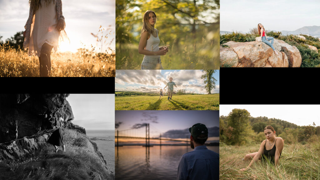
Mood Board

Types of studio lighting

Continuous lighting

Continuous lighting produces a low level of actual light compared to a studio light, its a warmer orange coloured light compared to other studio lights which are less warmer in colour (less orange). If you use this type of lighting you need to make sure to adjust your white balance for tungsten setting so the image comes out to its best quality.

Flash lighting

Flashlight lights have attachments like umbrellas or a soft box which is used to diffuse the light. They are usually linked to the camera so when the user captures an image the flash should immediately flash the light onto the subject. By also using flash lighting it allows for more deeper shadows to be created into the image which allows for more dramatic images which also allows for specific features to be highlighted. Additionally you could use the flash on the camera however it wont produce the effect that your probably aiming for compared to a studio light flash.

Lighting points

Lighting points are how many lights are being used in the image, so if you have one lighting point your using one light to capture your images and if you have two lighting points then you have two lights to capture your image and the same can be said to the three lighting points also.

1 Point Lighting Setup

With a 1 Point Lighting Setup the light is usually placed 45 degrees from the side of the camera and 45 degrees up from the subject which allows for the strongest image to be created of the subject.

2 Point Lighting Setup

With a 2 Point Lighting Setup you setup both lights facing the subject at a 45 degree angle with one angled up and one angled down. The goal of this lighting setup is to eliminate shadows from under the subjects nose and cheeks.

3 Point Lighting Setup

With a 3 Point Lighting Setup you setup two of the lights (The Key Light and Fill Light) so they are facing 45 degrees from the subject similar to the 2 Point Lighting Setup however the third light (Back Light) is placed behind the subject. By using Three sources of light it allows for more control of the shadows casted on the subject, highlights and the overall contrast. Its one of the best and well known lighting setups as it allows for total control of the environment and also allows for you to shape how you want your subject to be viewed as.

Fill Lighting

Fill Lighting is used to fill in any shadows that the key light may create, it is usually placed in front of the subject but on the opposite side of the key lighting. It is primarily used on a 3 Point Lighting Setup. Fill lighting can be useful for revealing more details of a subject that were hidden due to the shadow of the key light.

Coloured Gels

Coloured Gels is a transparent coloured material that is attached on to the red-head lights which can modify the temperature and the feel of the image which is useful if you want to find a type of lighting to suit the subject your taking a picture of or if you want to make your picture look unique or standout more.

It is used for multiple different purposes such as to colour light and for colour correction and it is used in not only just photography but in videography and theatre as well.

Environmental Portraiture Final Images

Evaluation:

Overall, I think that the images that I took were effective and this is because I was able to capture the subject actually doing their work in their usual environment so not only did it make the image feel authentic but you could also see what was happening at the moment and what the subject was doing or in the middle of doing. I also like the environments used as its easy to identify what my subjects usual environment is and the tools/equipment needed to proceed with their work. Editing these images also helped a lot as I was able to bring more detail out which helped show more things in the environment which can make the image look more compelling. However I do feel that I could of attempted to take more images of other different environments as well as using different composition techniques which would of helped to make the image stand out even more.

Typology like representation using art steps:

Editing My Final Images Process

Image #1

What I have done to this image is that I have decreased the exposure of the image in order to make it less brighter which will help capture some more detail around the bright areas as well as increasing the contrast to help reveal more detail all around, I have also increased the temperature of the image to reduce some of the bright white colours along the top of the image.

Here are the settings, I have tried to not adjust the settings too much as I wanted to have a good balance of exposure, contrast and image temperture so the image doesn’t look so unnatural.

I have also cropped the image so it focuses more on the subject as well as also using composition mainly rule of thirds which has helped make the subject occupy most of the image making it the main focus which is what I want.

Image #2

What I have done to this image is that I have increased the exposure as the image before was dark especially the background, I’ve also increased the contrast which allowed for more detail to be seen and pop out.

These are my settings as you can see I have increased the exposure slightly as too much would ruin the details I want to preserve as well as bumping up the contrast a bit to bring out the minor details I would of lost from increasing the exposure.

I did not crop this image as I wanted to retain the perfect symmetry of my subject being at the centre of my image. This helps the subject be the main focus of the image especially as they are right in the centre so its most likely the first thing you see when you view this image.

Image #3

With this image I adjusted the exposure slightly to brighten up the image and then I also increased the contrast in order to preserve more detail, however due to the high ISO this image was taken in, increasing both the exposure and contrast made some details in the image hard to view so to counter this I decreased the Highlights dramatically which helped restore the visibility of the details in this image.

My settings and the values of the Exposure, Contrast and Highlights.

I have also cropped this image to use the rule of thirds which helps direct attention towards my subject first then their environment after. I have kept lots of things in frame in order to make it easier to identify my subjects usual environment.

Image #4

With this image I didn’t adjust the exposure as the image was already bright when I took it, I did adjust the contrast to bring out more detail in things like the engine or the texture on the floor and wall, I also decreased the Highlights a lot as it helped decrease places in the image where it was overexposed primarily in the wall so now it makes the texture on the wall much more visible compared to before I edited it. Last thing I did was decrease the image temperature to remove some faint yellow light that was present before.

My settings that I used to adjust the image to my preference. I tried not to decrease the image temperature too much otherwise it would appear blue which I did not want.

I tried cropping my image to use the rule of thirds composition as this composition style was suited the best for this image however it is not as effective as my other images who utilise this style much better.

Image #5

With this image I adjusted the exposure slightly to give some dark areas of the photos more light and also adjusted the contrast to bring more shadow and detail into the photo. I also decreased the Highlights as some areas of the photo were too bright especially around the face so decreasing the highlights helped reduce the bright areas and bring out some details. I also decreased the temperature slightly as it helped to remove the faint yellow tint you could see in the image due to the lighting.

These are my settings on Light room where you can see my adjustments and how much was needed to be modified to get the appearance that I wanted.

I cropped the image to ensure that the subject is the main focus of the image using the rule of thirds composition, its also cropped really nicely in a way where you can see not only the subject but what he is doing with the vehicle which helps identify what his usual environment is.

Image #6

This image needed a lot of editing done to it as the image quality before the edits were quite grainy and dark due to me accidently leaving the ISO at a high value, to counter this I first made sure to increase exposure slightly to brighten the image and slightly reduce the contrast as adding more contrast to this dark image made it look darker and more grainy. To preserve as much visual detail as I could I turned the highlights all the way down which was needed for this image as it helped uncover the missing details in this image like the corner of the wall on the left side of the image, that was completely white until I adjusted the highlights. I also adjusted the image temperature by turning it down to remove the yellow tint in the image which helped to show more minor details that was missing.

Here are my settings, again exposure and contrast were slightly changed as due to the images high ISO I couldn’t modify these sliders massively as it would end up ruining the image. The highlights had to be turned all the way down for uncovering missing detail and the image temperature at -7 as it removes the yellow tint while keeping that natural image look.
This is a separate edit I had to use in light room called Detail, this helped counter some of the grain and noise that was on the image but it mostly helped for that blurriness I was seeing especially around the metal pole on the left side.

With how this image was taken, I was had to crop it to meet the rule of thirds composition which in return made this image not look too bad. We can clearly see the subject at her workplace interacting with the fridge which takes up around half the image so it makes it easy for the subject to be identified and seen.

Photoshoot and My Contact Sheet

Contact Sheet

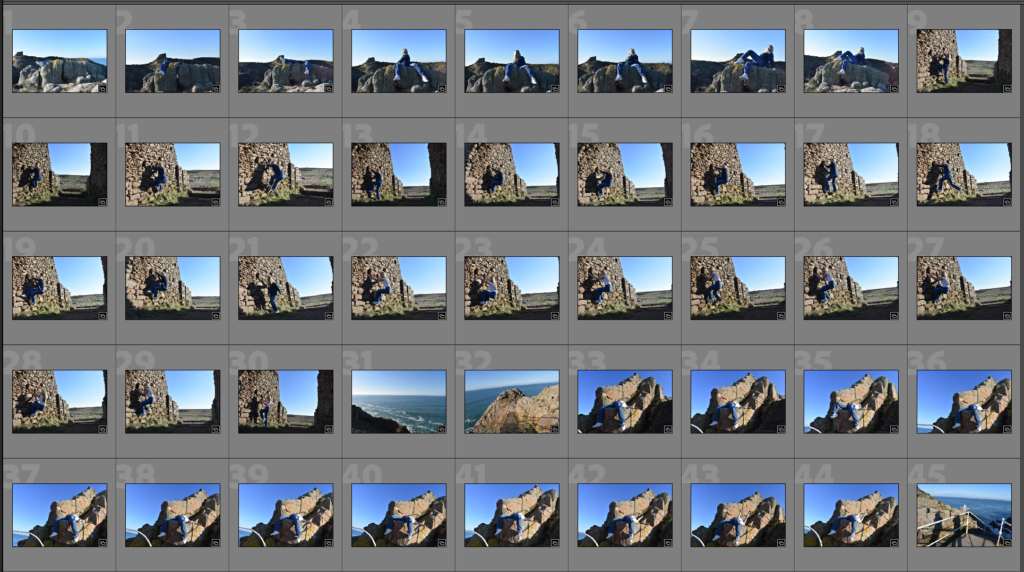
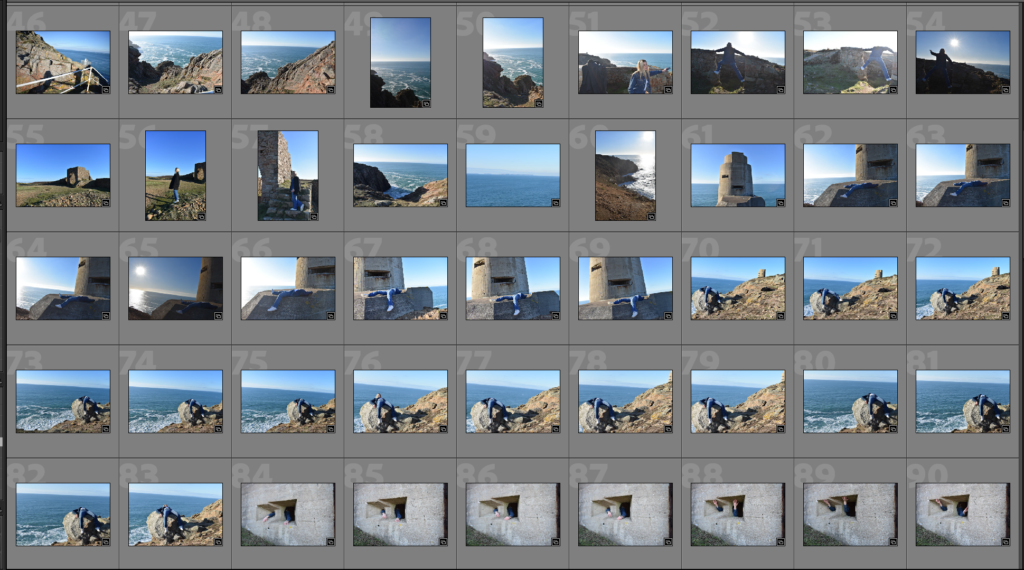
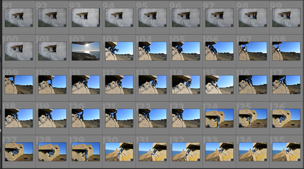
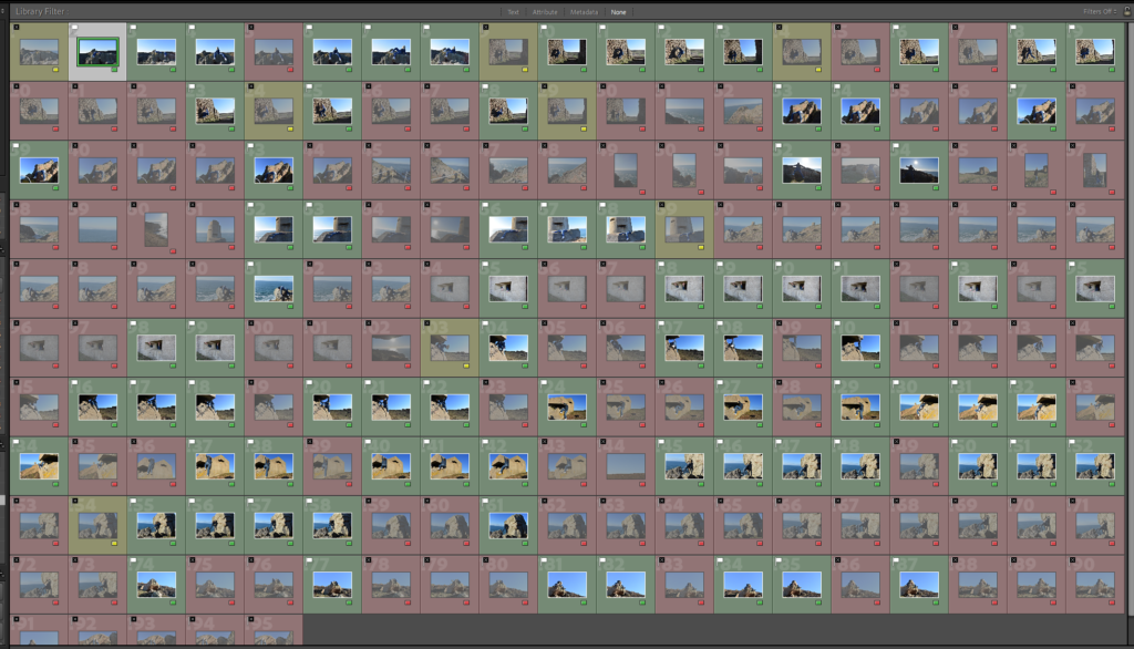
This is my contact sheet where I flagged the images, colour coded and star rated them in order to determine which images I think should be used and which ones I think are not suitable for the project

By making a contact sheet it has helped me determine which images I think are best to be shown as my final images, There were images I colour coded yellow as my subject either appeared blurry or the image quality/angle wasn’t at the standards I wanted. There were images I colour coded red as my subject was looking away from the camera or the image wasn’t very relevant to what I was trying to capture. The images I colour coded green are images I think are worth choosing as my final images as they meet all my criteria and I think will look great when presented.

My Best Photos

I have selected these photos to be edited and used as my final images as they show a clear representation of my subjects usual environment and they are captured in the moment of their work which makes these images feel more genuine. They also show lots of details in the background of their environment.

Photo-shoot Action Plan

Initial ideas:

Environments:

Subjects: I intend to take photos of is my family and friends.

Environments: I will try to capture my subjects in their environment most suited to them. For example: Sister: Will be photographed at her bank or at her home office Dad: Will be photographed at his garage Mum: Will be photographed at home on her patio Sisters boyfriend: Will be photographed at his workshop or his work van Friends: Will be photographed at the football pitch or basketball court

Poses: I intend to make my subjects keep quite a natural face and expression, I may also get them to hold items that will help hint of what their profession is.

Gaze: I intend to make my subjects keep eye contact with the camera in order to make the photo feel more authentic.

Composition: I intend to experiment with various amounts of compositions. Mainly on Rule of thirds and symmetry.

Framing: I intend to get the perfect balance of keeping the subject in frame and in focus while still maintaining the quality of the background behind the subject so the viewer will be able to identify the subjects environment easily.

Orientation: I will be taking most of my pictures in landscape in order to achieve a wider view of the environment.

Aperture: I will experiment with small to medium aperture in order to create a long and medium depth of field which will help me determine which is the best style to take my environmental portraits.

Arnold Newman

Arnold Newman (born in 1918 – 2006) was a American photographer who was most famous for his environmental portraits. For his portraits he made sure he used a carefully framed and well lit setting while also making sure its contents were also visible, this helps symbolize the individuals life and work in the photograph. One of his famous portraits was one taken of a man named Alfred Krupp and he was originally commissioned by Newsweek to take the portrait but he refused at first, This is due to their backgrounds as Arnold Newman is Jewish and Alfred Krupp was a convicted Nazi war criminal. Eventually Arnold Newman agreed to take the portrait as he saw the assignment as some sort of personal revenge. This portrait would then later become one of the most controversial images taken at its time.

Alfred Krupp taken by Arnold Newman – 1963

Technical

Lighting – The photo is positioned in a way where most of the light from the image is at the top while it gets darker between the bottom of the image. The subject is also illuminated to make him the main focus which can make him look more sinister.

Aperture – The photo looks like it was taken with a wide angle lens as we are able to view a great amount of detail in the image, it also uses a low aperture which gives us a large depth of field as we are able to view most things in the images clearly and with ease and it also doesn’t appear blurry.

Shutter speed – The photo looks a bit over exposed as we can notice from the light towards the back which makes things near the light appear slightly blurry.

ISO – The photo does not appear to look very grainy so I assume that a low ISO was used.

White Balance – The picture uses quite warm colours especially on the pillars and the subject.

Visual

The image features a few colours but mainly sticks to using warm colours. The tone of the image is both light and dark, we can see this with the subject where he is illuminated with light which creates some dark shadows at the bottom of the image. We can also see that the subject takes up half of the image and has his fingers interlinked while resting his chin on top and leaning towards the camera and this being done helps create some mystery and uneasy feelings towards the subject which makes us wonder who he is and what he does in his life. We can see a pattern in the background with the pillars which are placed symmetrically with one on the left side and one on the right side which helps us direct our attention to the middle which is the subject.

Contextual

This image is supposed to represent the horrors that were happening in WW2 specifically the time period were Nazis were using Jewish people as slaves. This is easy to see as we can see that the setting appears to be in an industrial building which resembles closely to a train station, the pose and positioning of the subject also makes us uneasy and makes him look sinister to represent the Nazis at the time who were in charge of trafficking the slaves and what to do with them. The subject named Alfred Krupp was actually a convicted Nazi war criminal which makes the photo even more connected to the setting and what it is supposed to represent.

Conceptual

The concept of this image is to show the public the tragedy of the loss of millions of Jewish people during WW2 and how horrible their conditions were, By using a convicted Nazi as the subject of the photo it helped layout the true meaning of the photo and what it really presents. Arnold Newman was said to be furious when he saw this image and this photo allowed Newman to share his hatred towards Krupp with the world.

Environmental portraits

This is my environmental portraiture mind map

Environmental portraiture are pictures taken of the subject in their usual environment, for example a person whose skill and job is baking would have a picture taken of them at the bakery or a person who does boxing for a hobby would have a picture taken of them doing boxing at their training session. These images without explaining anything can help us determine the life’s that these people live and can reveal the type of person they are by what they do in their life. This makes Environmental portraits interesting as it gives the image a meaning and a story behind it which makes these images standout compared to other styles of images.
Why do people use environmental portraits?

People use environmental portraits as it tells a story, by viewing an image of a subject and their environment, which would be easily identifiable as its usually something we see day to day or have heard of, it allows for viewers to give their insights on the subjects personality, their life style, their hobby/job. In some cases it can even make enhance the viewers understanding of the photo as some environmental portraits have a deep and fascinating meaning like the image Alfred Krupp taken by photographer Arnold Newman.

How do I take environmental portraits?

To take a good environmental portrait image you want to make sure you have a subject and their environment (or a background/object which will make the image easy to identify of what the subjects usual environment is) and you also want to make sure that you have a plan in place of what you want to capture. Once you have everything in order you want to position your camera and ensure you have the settings you want to use to capture the image like how much light is being let in or the depth of field you want to achieve. Once that’s all done you can get your subject to look at the camera and pose however you would like and then you can capture the image.

Paper Experiments

I have taken images using paper to try create some unique abstract images. The artist who has inspired my images is named Francis Bruguière.

Francis Bruguière

Francis Bruguière is an American photographer who was famous for creating amazing images using only paper and light. He was introduced to photography by Alfred Stieglitz (Photographer and modern art promoter) in 1905 where after studying painting in Europe he became acquaintances with Stieglitz who accepted him as part of the photo-secession. He experimented with many different options with his photographers and in 1927 he created the Cut-paper abstraction piece which became really popular. He was able to capture this image by cutting up the paper and folding it in a way which is used to make unique details and make it look 3D, he would then use light to shine through the paper which would then result in shadows being created against the paper which resulted into making some amazing images.
Cut-paper abstraction – 1927 by Francis Bruguière

My Texture Photoshoot:

As you can see there is a lot of images that weren’t selected as I felt like they weren’t really up to quality compared to Francis Bruguière’s work. Some of these images also didn’t contain the 3D appearance I was looking for.

My Favourite Images

I selected these images as they looked the most appealing compared to the rest, you can also see how they’re structured in a way that gives it that 3D look and you can also see the amount of shadows it creates against the paper and floor.

My Favourite Images Edited

With these images I edited them by changing the image temperature up to around the mid 20s which gives it this yellow tint which brings out more detail in the image and also matches the kind of colour Francis Bruguière’s photo uses, I also turned up the contrast high in order to get a better visuals with the shadows, as well as slightly increasing the exposure to give the image more light. I also lowered the highlights of the photo to make it less bright in some areas to increase detail. The final results after applying these changes are these images where its easy to identify the shadows in the image as well as preserving the detail of the paper pattern.