Robert Adams is an American photographer who was focused on changing the landscape of the American West, He participated in the exhibition New Topographics in 1975 which gained him recognition and even resulted into him winning a few awards.
Early life
Robert Adams moved with his family multiple times throughout his childhood, he contracted polio at the age of 12 in 1949 but was able to make a healthy recovery. Adams enrolled in the University of Colorado in 1955 for his first year and then transferred to the University of Redlands California the next year where he received his PhD in English Literature. In 1963 he moved back to Colorado where he began teaching English at Colorado College and in that same year he decided to purchase a 35mm camera which he used to take pictures of nature and architecture. He learned photographic techniques from Myron Wood who was a professional photographer who lived in Colorado and in 1966 he decided to only teach part time in order to devote more of his time to photography. Around 1970 he began working as a full-time photographer.
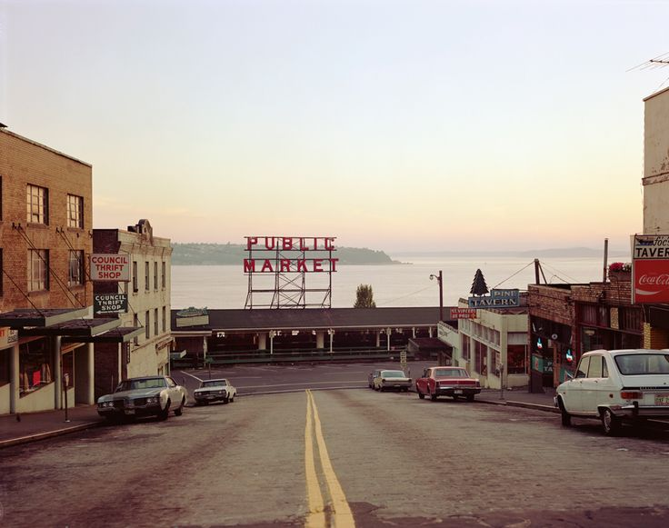
New Topographic
Roberts Adams took part of the New Topographic Exhibition and ended up having his photos presented alongside ten other contemporary photographers, Robert Adams photos typically consisted of suburban neighbourhoods which consisted of rows or groups of houses close together or close up. Robert Adams was probably so invested into New Topographic photography as he was inspired by the man-made structures and the shift of the natural world around them slowly being replaced by big groups of buildings and houses.
Image Analysis

Technical
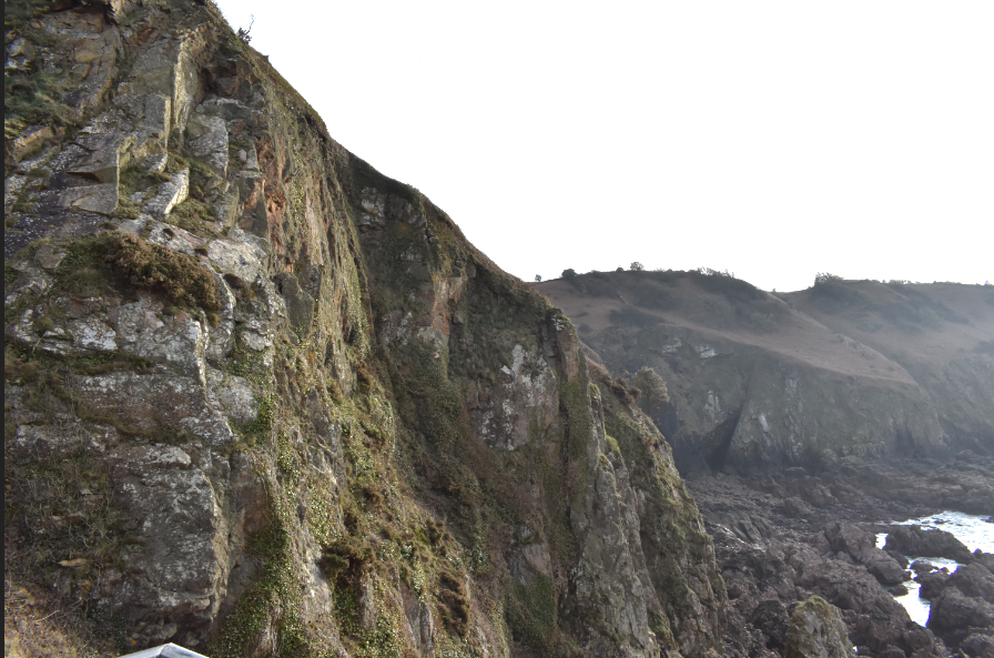
With this image we can see that the photo uses natural light and it has a good level of exposure as all areas of the photos are easily visible. The aperture used in this image is probably a Wide Angle in order to capture the mobile homes in the lower part of the image and to also capture the mountains in the upper part of the image. This photo may have also used a long shutter speed as it looks like the sun may not be projecting too much light due to how cloudy the sky is in this photo. The Photo also looks like it uses a low ISO setting as there is a minimal amount of grain in the image.
Visual
The image is taken in a black and white colour scheme which utilises a wide range of tones, for example we can see the shadows in the bottom of the mobile homes are very black while the colour of the walls of the mobile homes are very white which shows us the contrast of light that can be seen around the image. Texture can also be seen in this image like the walls of the mobile home where you can see the line patterns of the metal or the roof of the mobile homes where you could presumably see the build up of dirt. The view point of the image you would assume to be around the bottom of the image as the image is about new Topographics so the main focus would be on the mobile homes however Robert Adams purposely left the mountains in the background of the image to shift the persons eyes more towards that area to show them the divide between the natural landscape and the human made structures. Robert Adams even framed the image in a way so that the mobile homes would only take up one half of the image and the mountains would take up another half of the image.
Contextual
This photo taken by Robert Adams was a part of the New Topographics: Photographs of a Man-Altered Landscape Exhibition. The main aim of the New Topographic was to show the change from the natural landscapes around us to the shift towards man made structures. These photos focused heavily on industrial buildings, new homes, neighbourhoods, newly constructed roads and anything else relating to the changes happening to the natural landscape.
Conceptual
Robert Adams photo (particularly this one) was different compared to the other photographers who took photos for the new Topographics. Robert Adams instead of doing a close up shot of the man made structures, he instead decided to only capture the structures as half of the image while the other half of the image was occupied by the big mountain in the background. By doing this it makes his image more meaningful as he’s not just capturing the man made structure dead on but instead he is making a comparison in a way, by showing the natural landscape in the background created with no human intervention that is now starting to be built on and will soon become something which could remove the natural aspect of the landscape.