
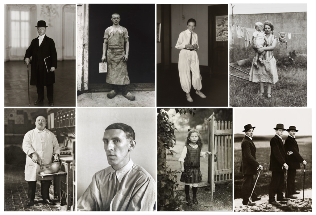
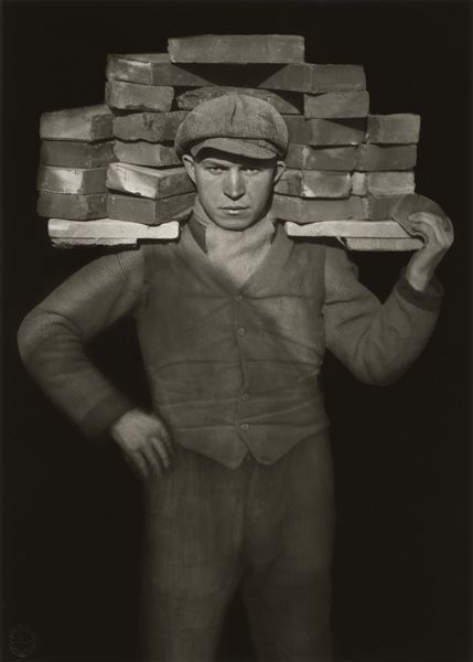
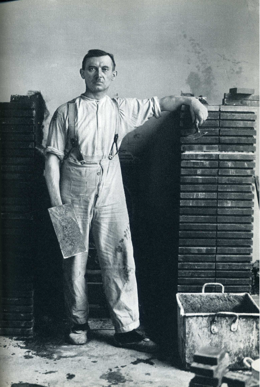
Bernd and Hilla Becher
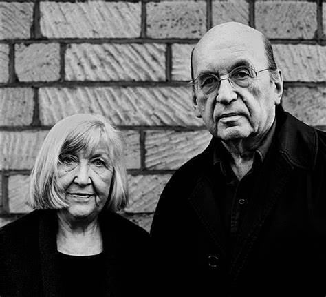
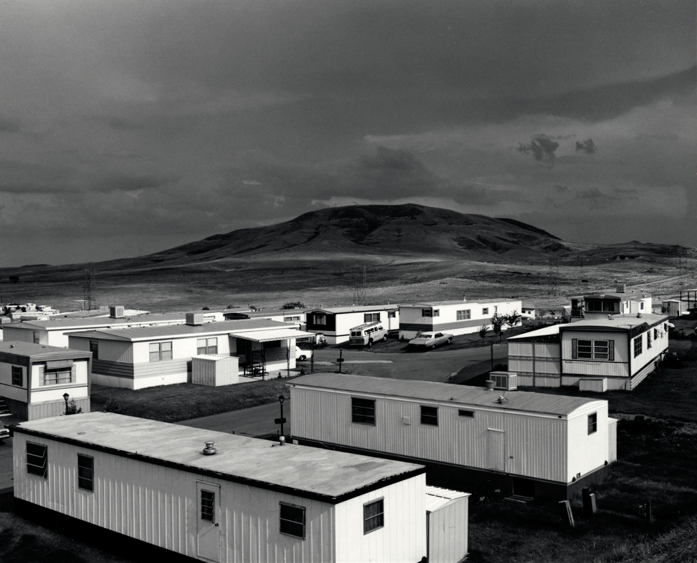
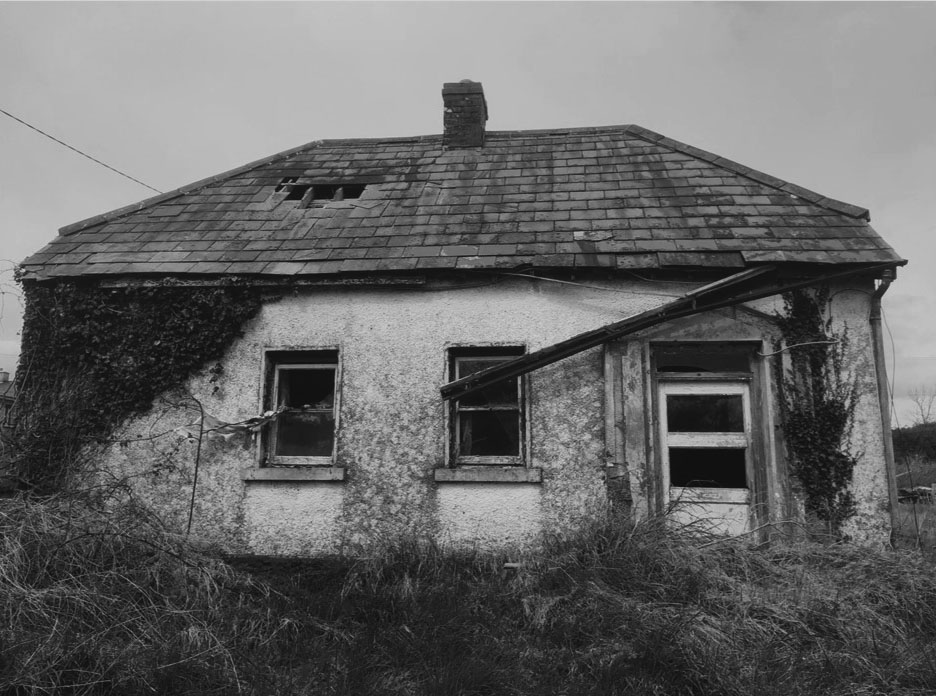
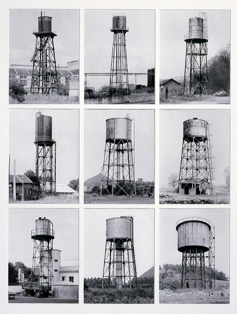
Hilla and Bernd Becher are key names in the photography typology world. Their aim was to preserve landscape especially buildings soon to be demolished. They tried to capture disappearing subjects to document the changing world and how that period of history’s landscapes stood out as it as the building of the country after WW2. They were married from 1961and travelled together in a VW campervan taking images.
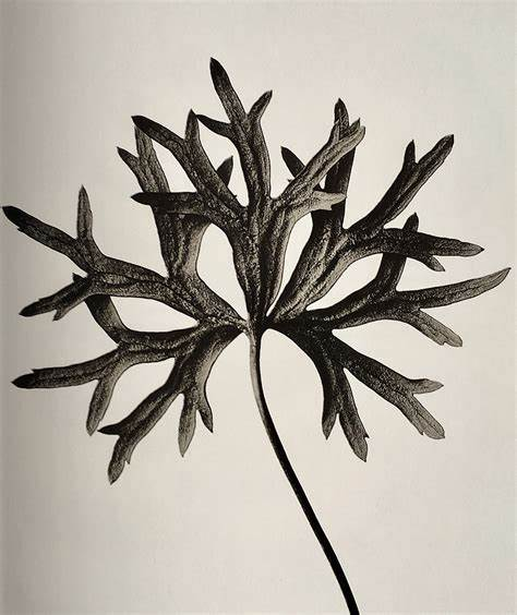
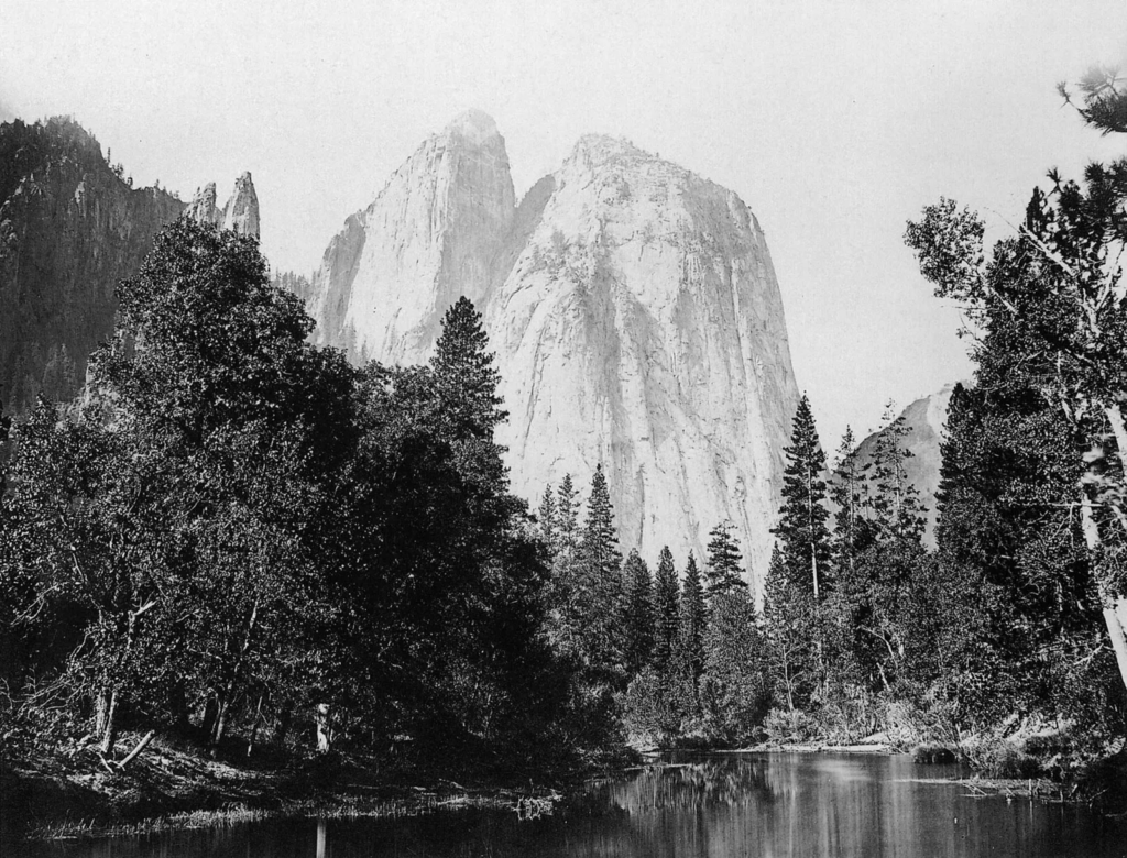
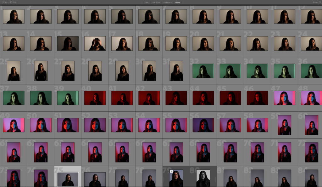
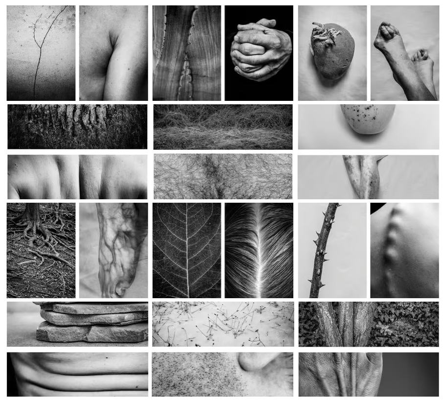
They used a large format camera to take the shots however it was time consuming as it would only take one shot at a time. They took 8 different angles of each of the structures they photographed. Hilla reports being inspired by looking at biology books specifically by Karl Blossfeldt who created a book of images of dried plants on a white background for his art students to draw pencil drawings from.
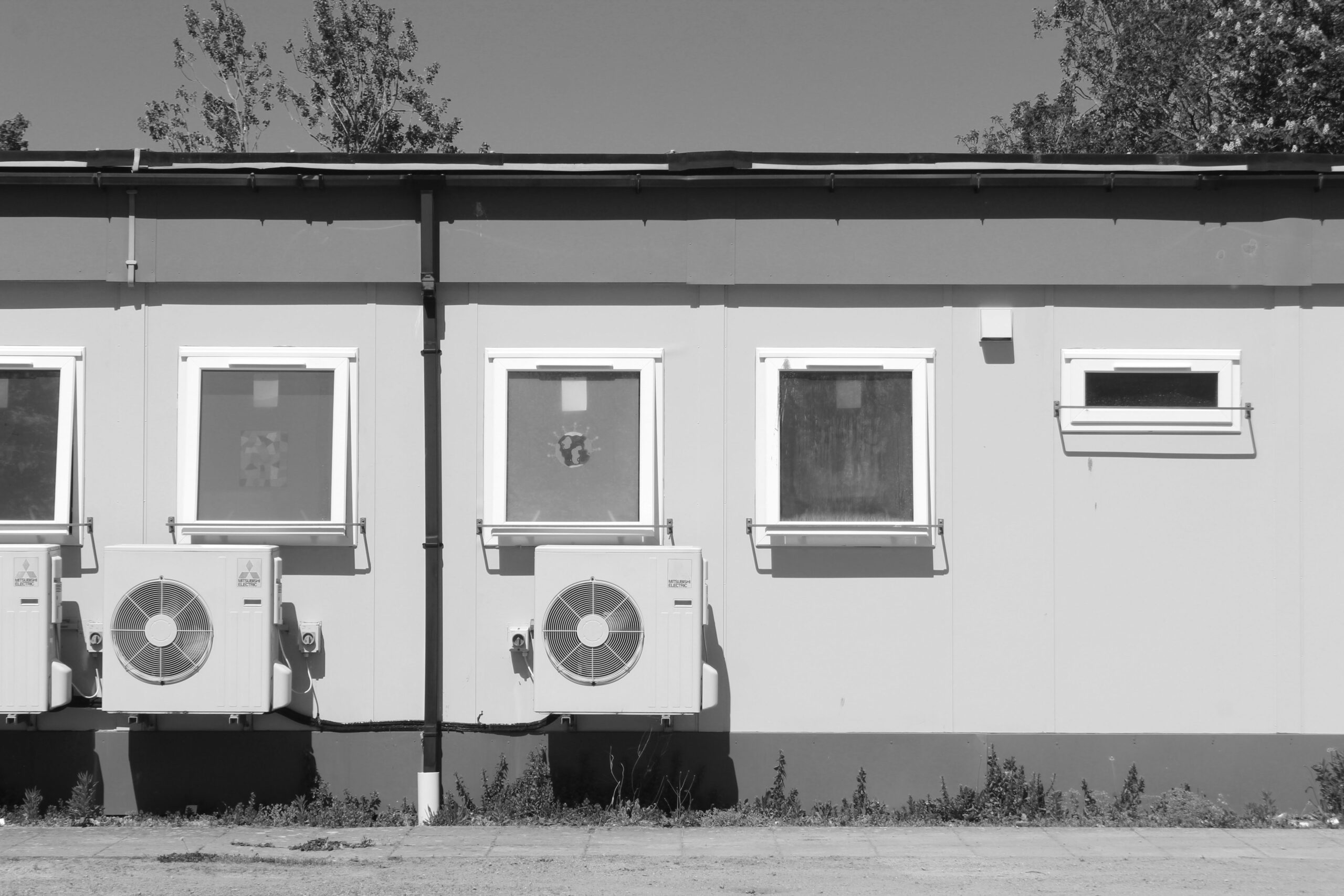
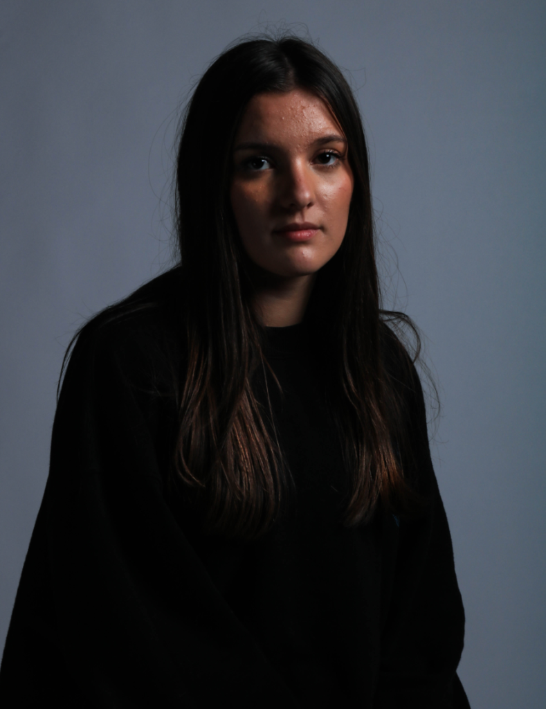
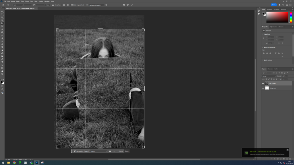
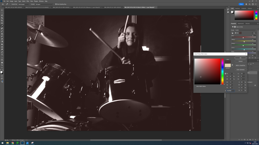
Hilla and Bernd Becher aimed to recreate the style of photography with the white background and grey tones in the buildings to contrast the background. If the lighting was too bright they would wait for a cloud or another day or a different season. They wanted for it to be a grey day for less shadows and white sky in background. The Bechers put the images together in a grid pattern to show similar patterns in architecture.
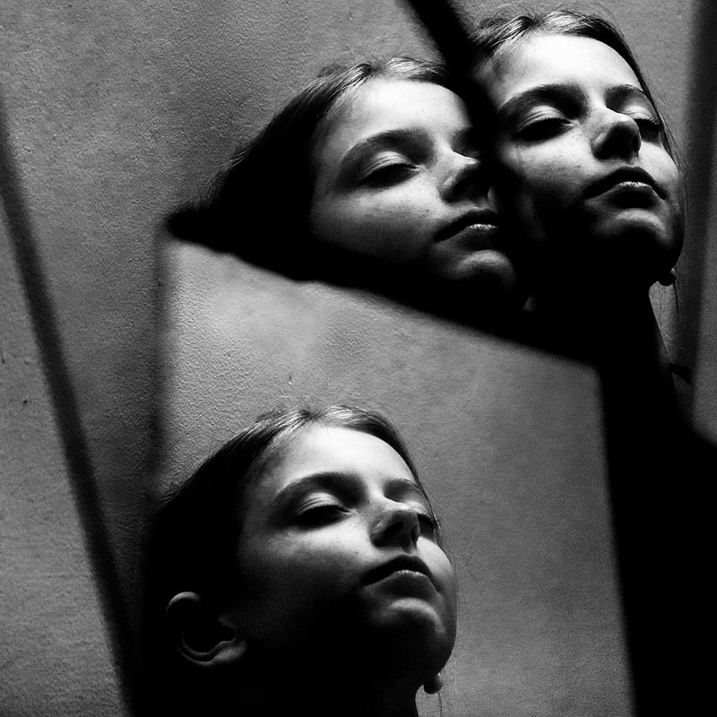
They ended their photography career with the legacy of being opposed to romanticising. Make realistic images “as close to what the subject wanted to be” and inspired many to look differently at what photography could represent and be a form of documentation and art simultaneously.

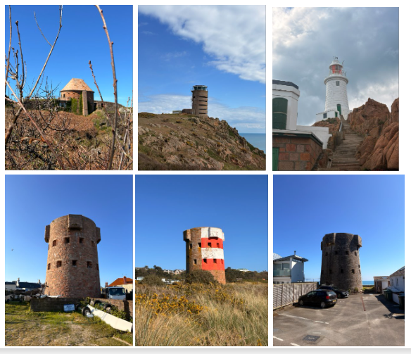
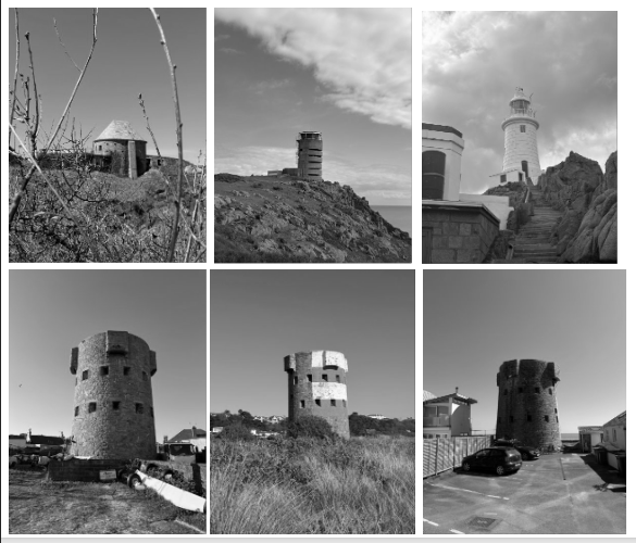
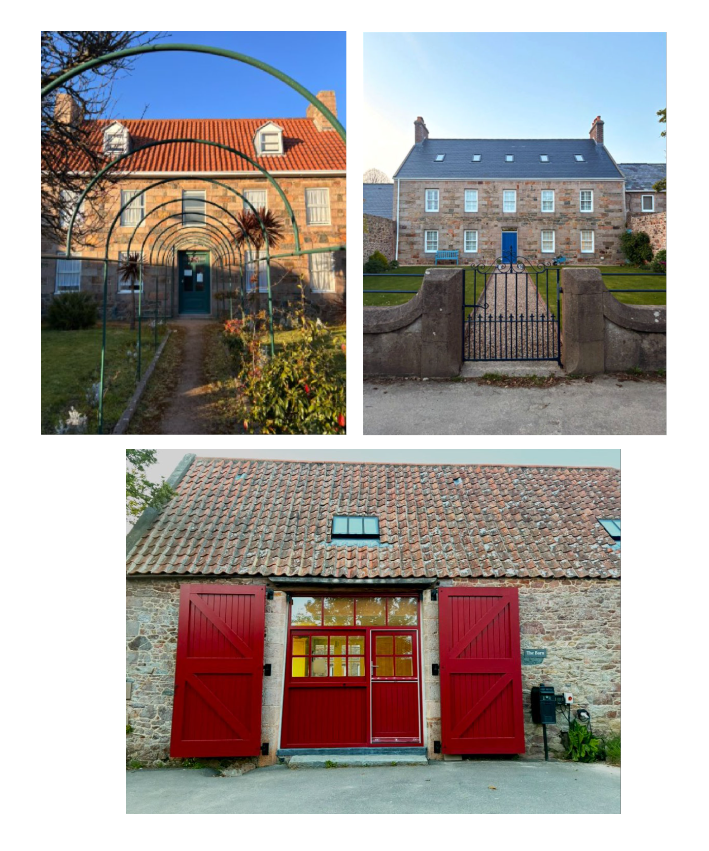
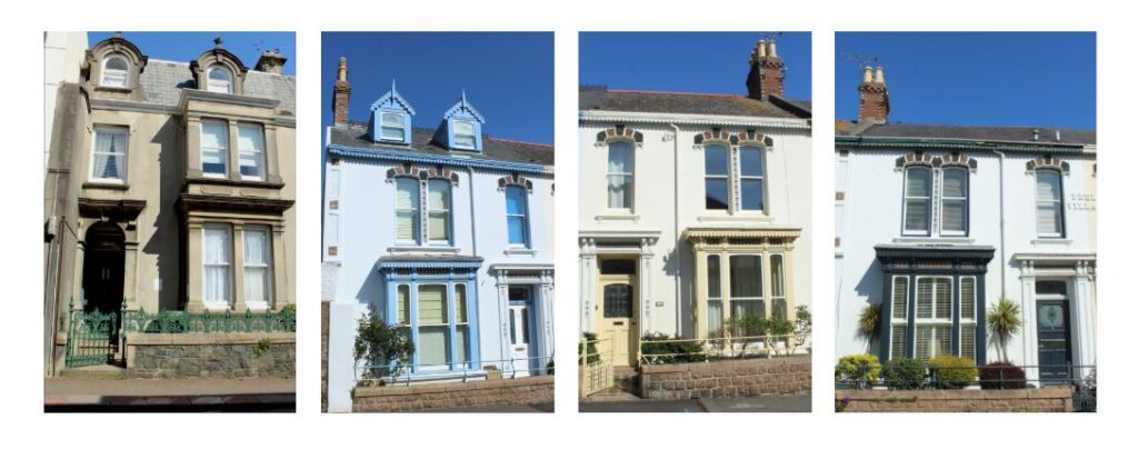
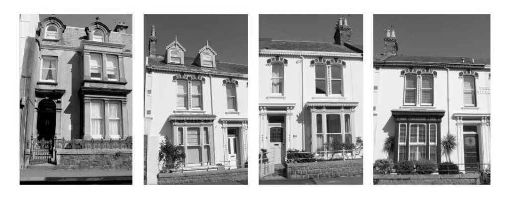
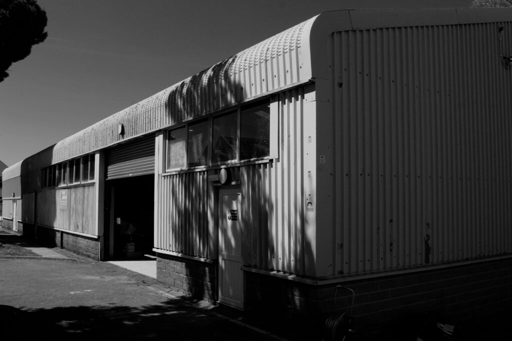
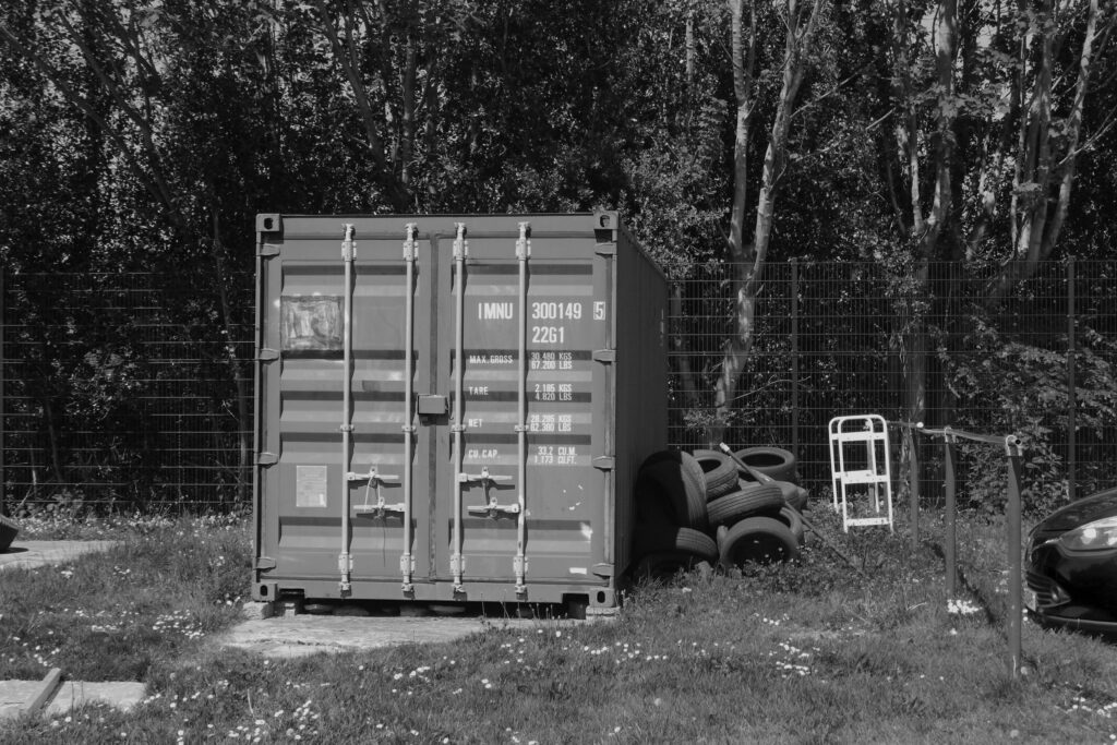
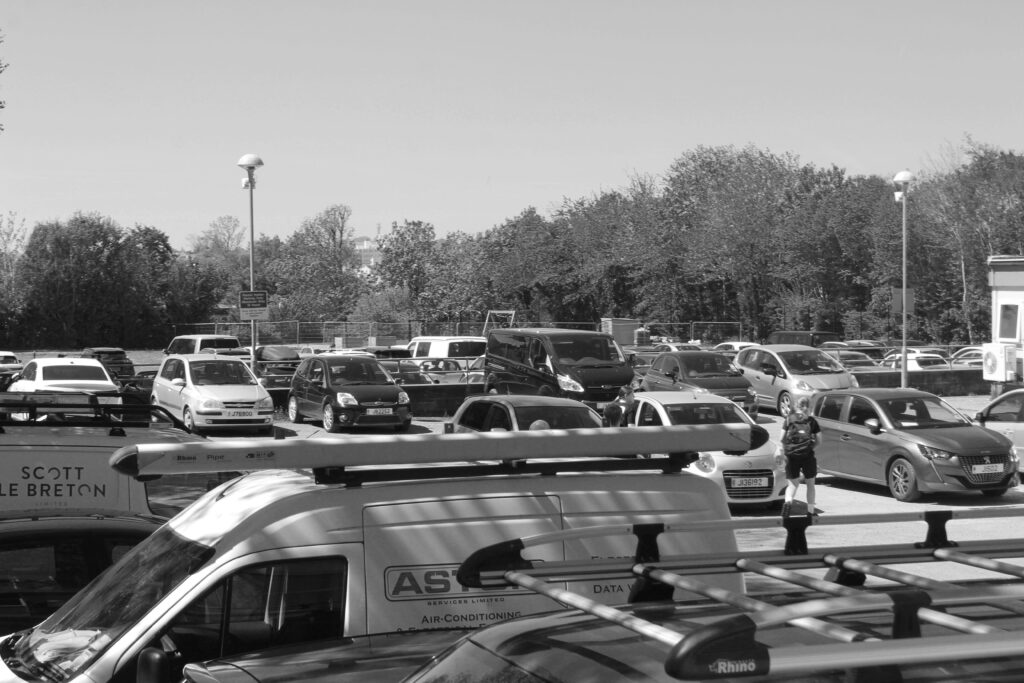
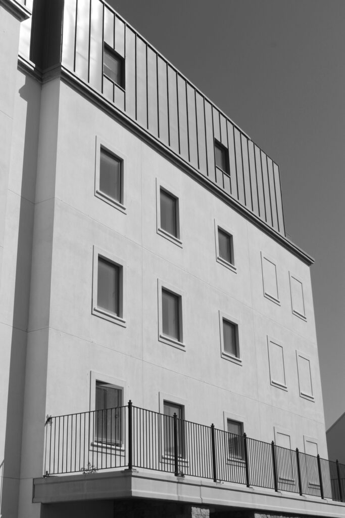
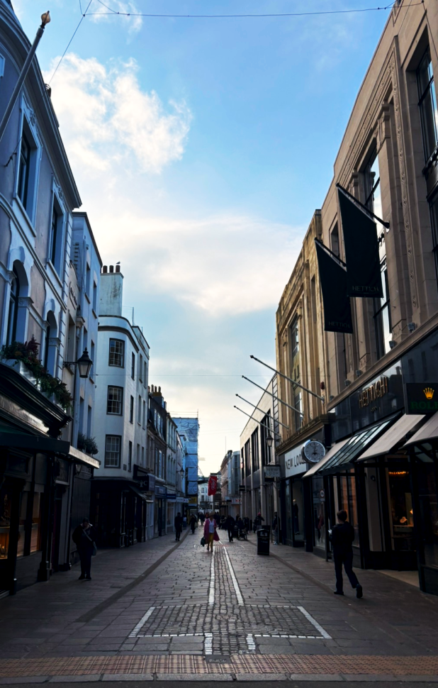
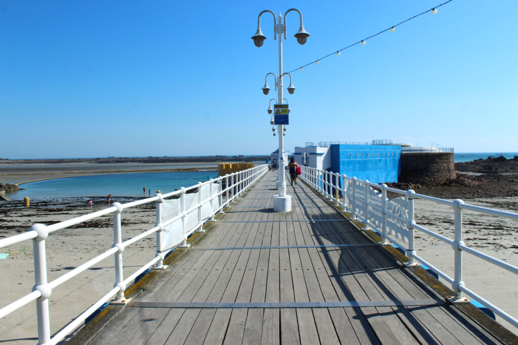
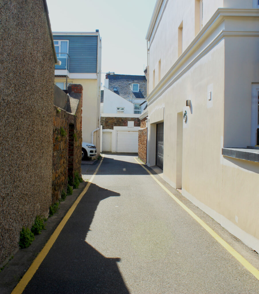
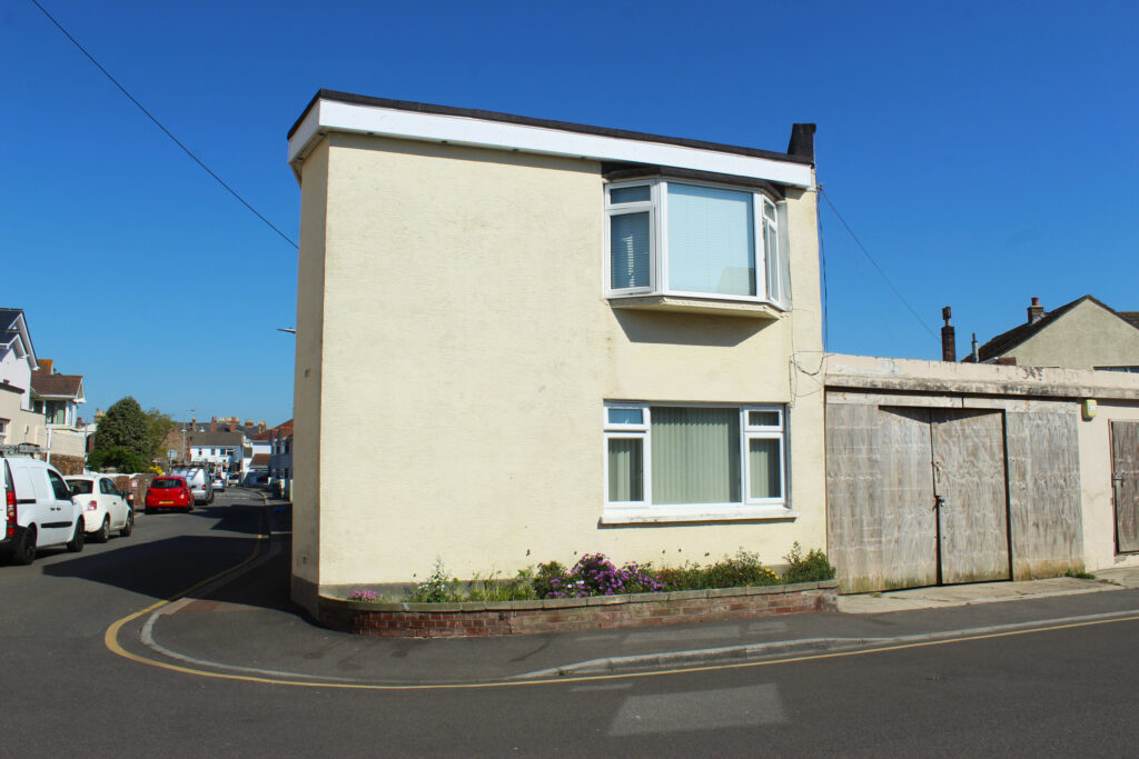
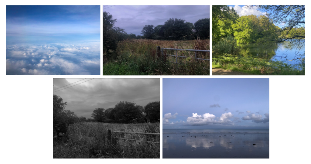
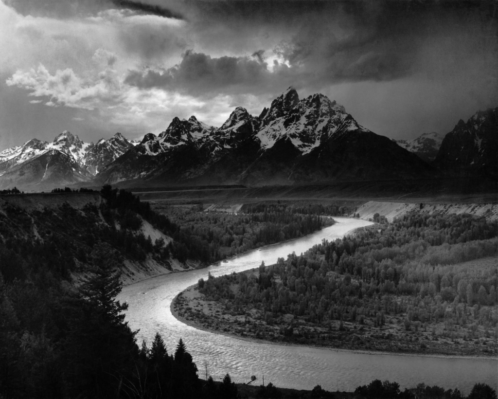
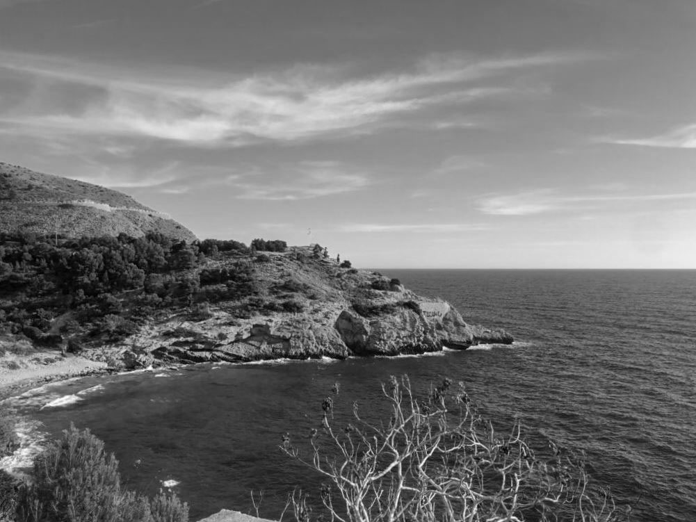
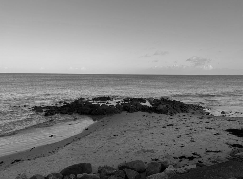
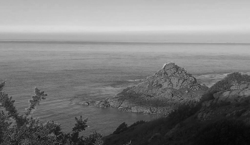
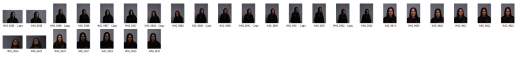
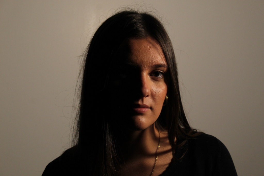
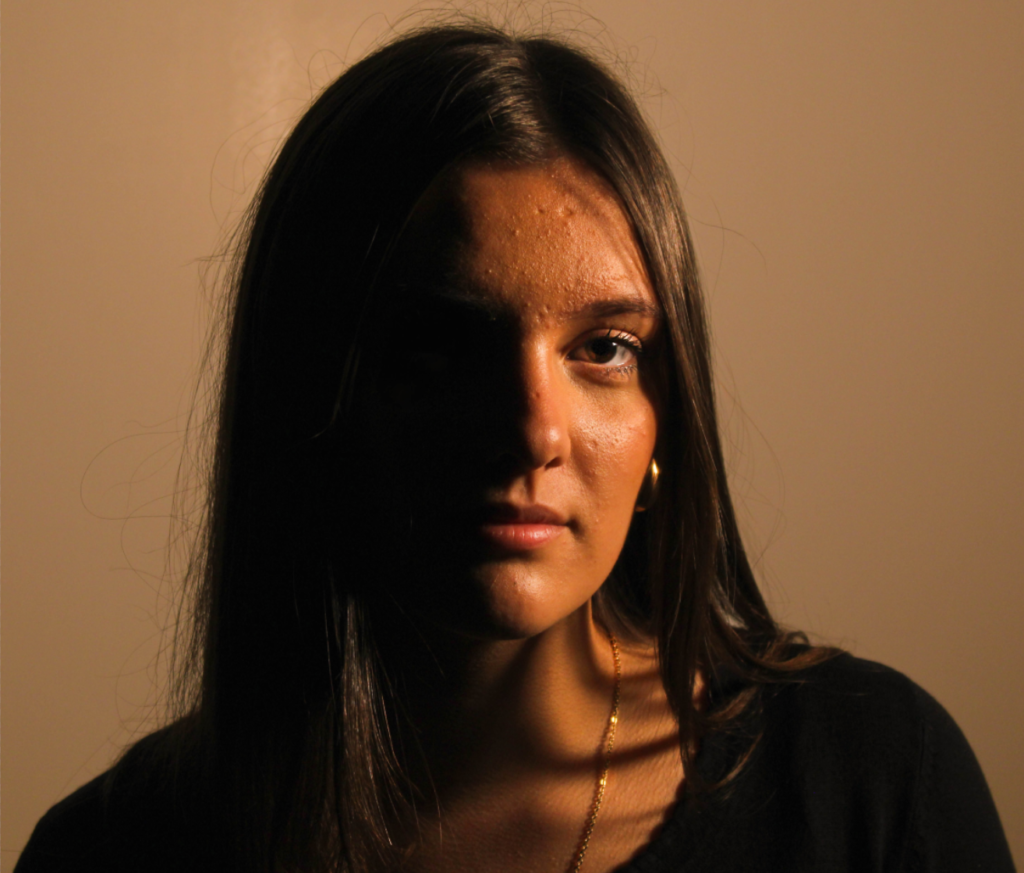
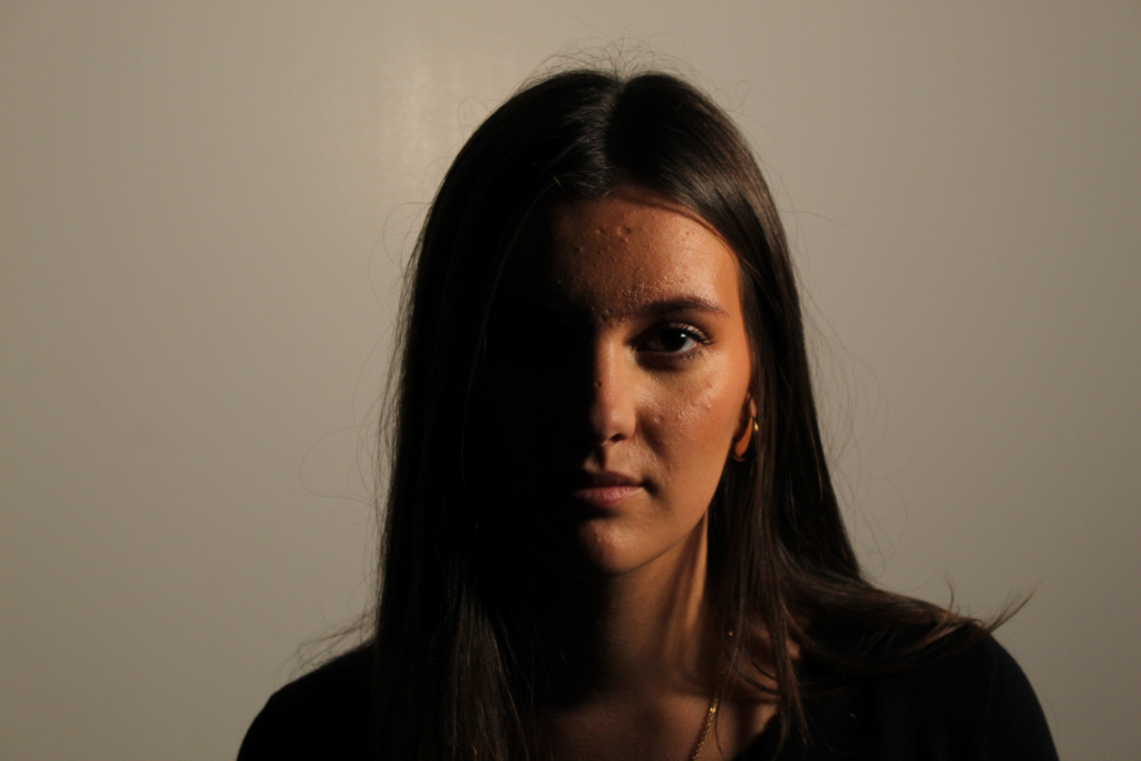
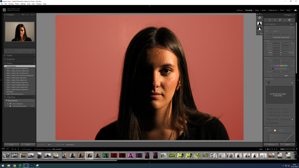
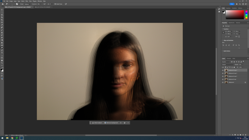
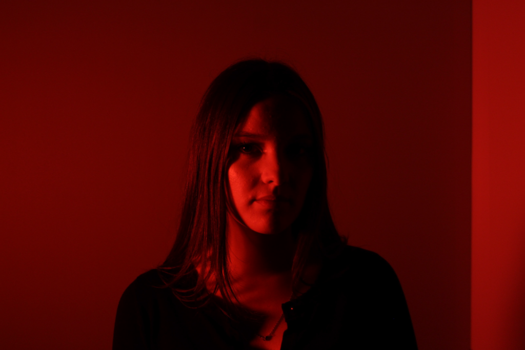
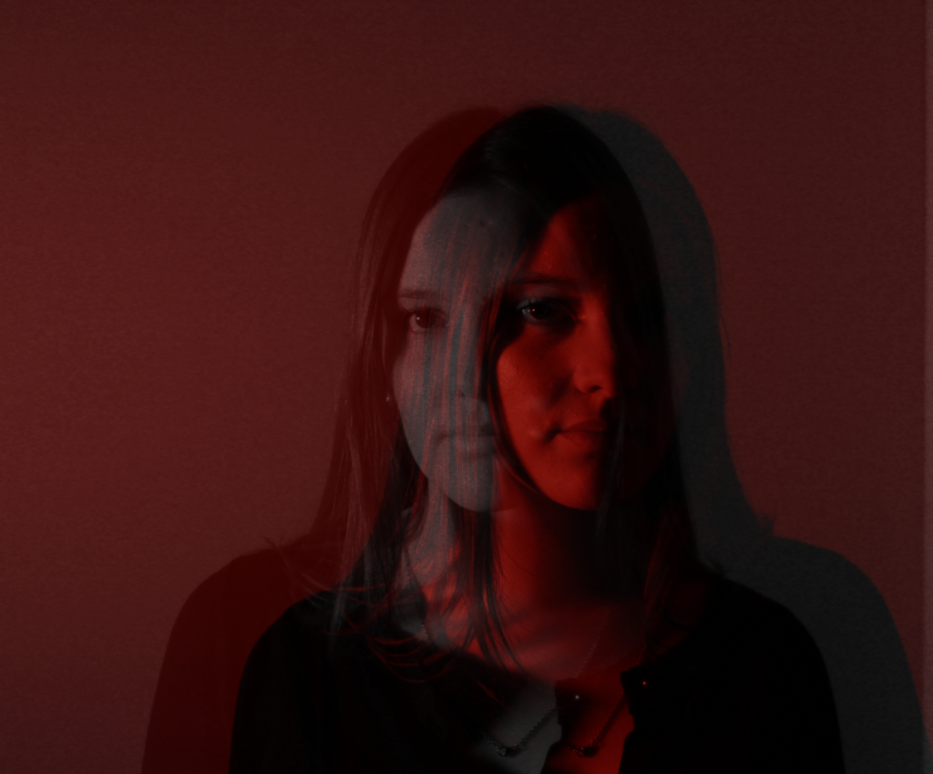
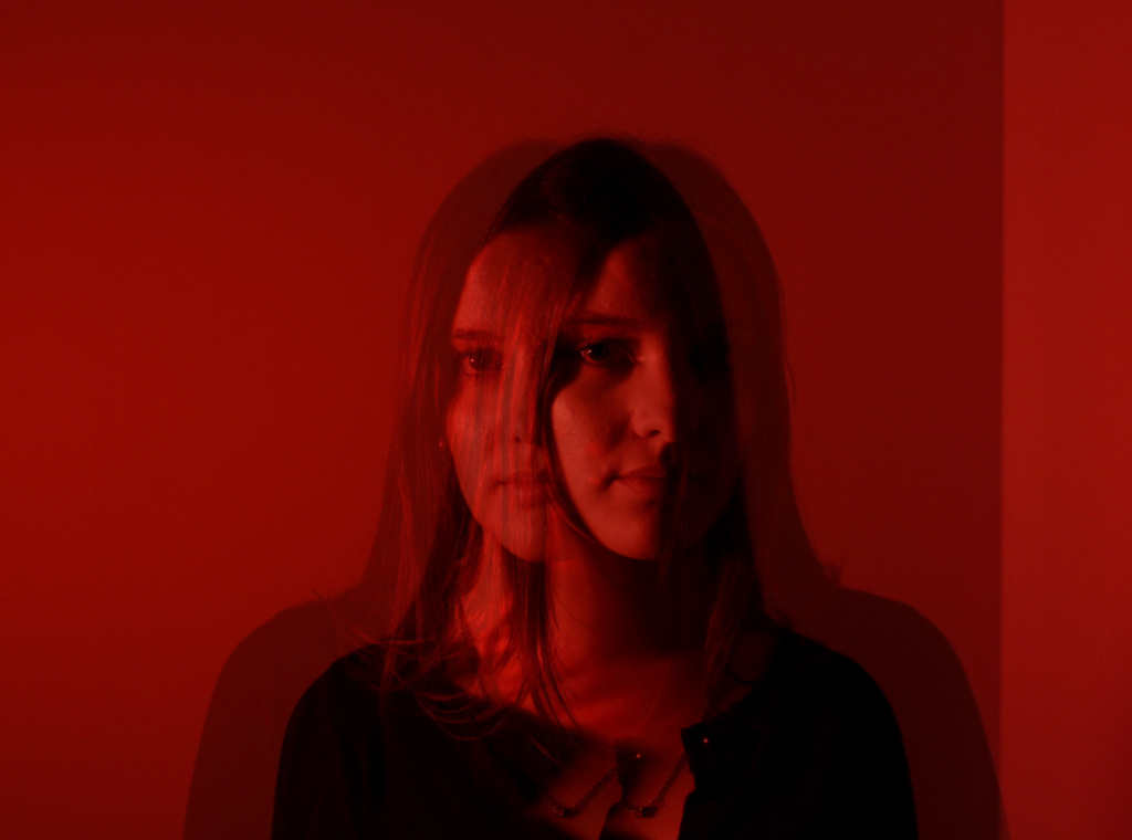
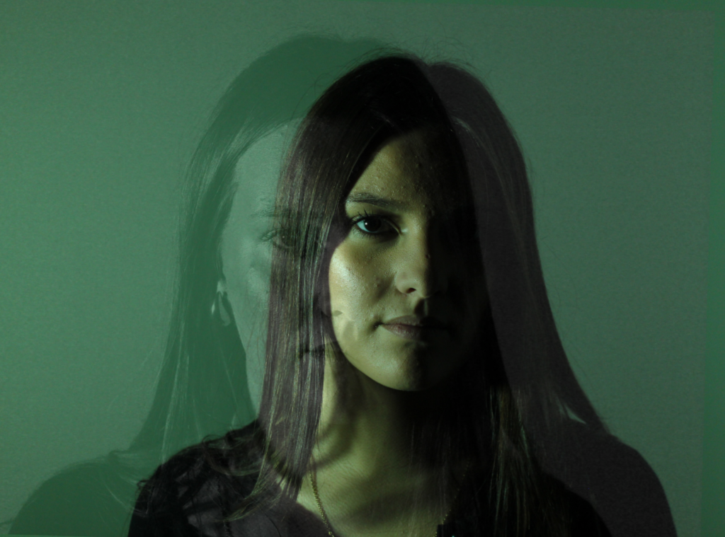
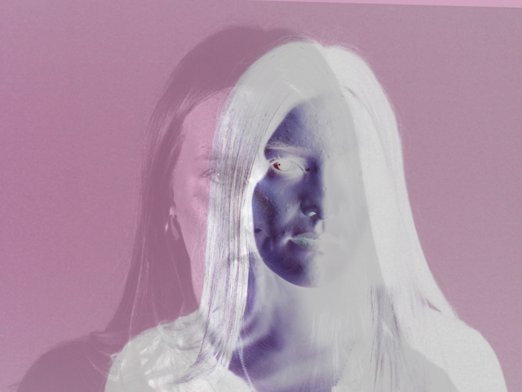
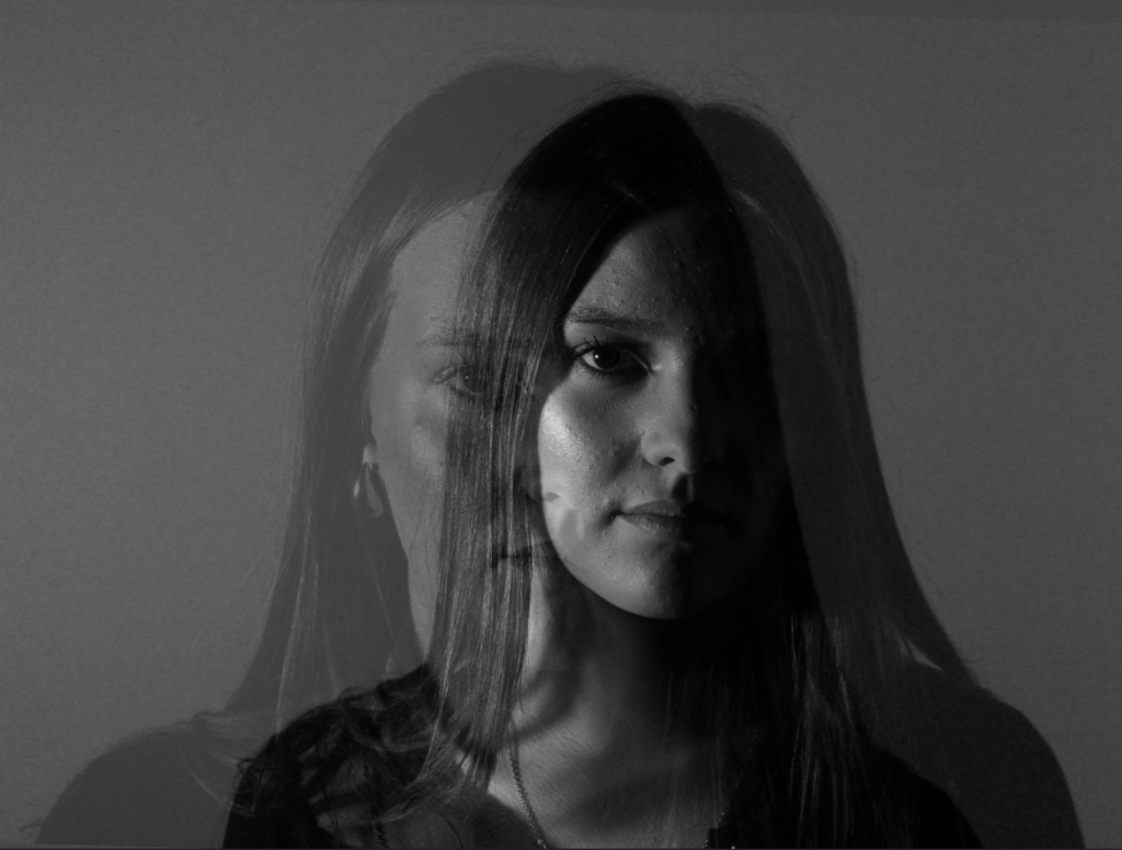
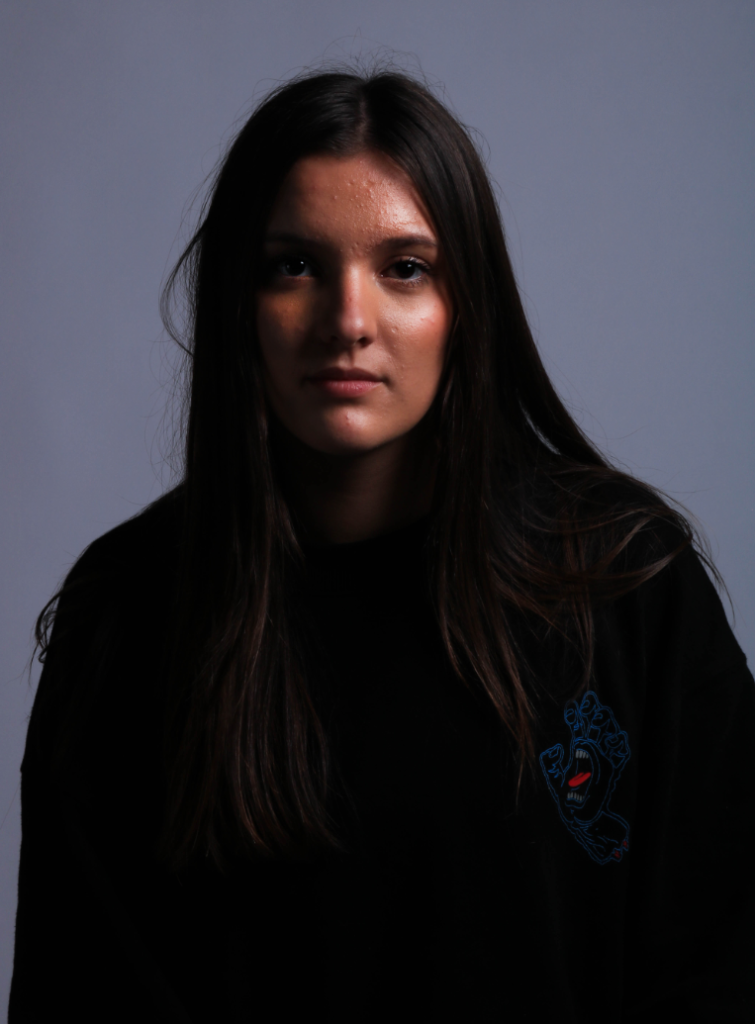
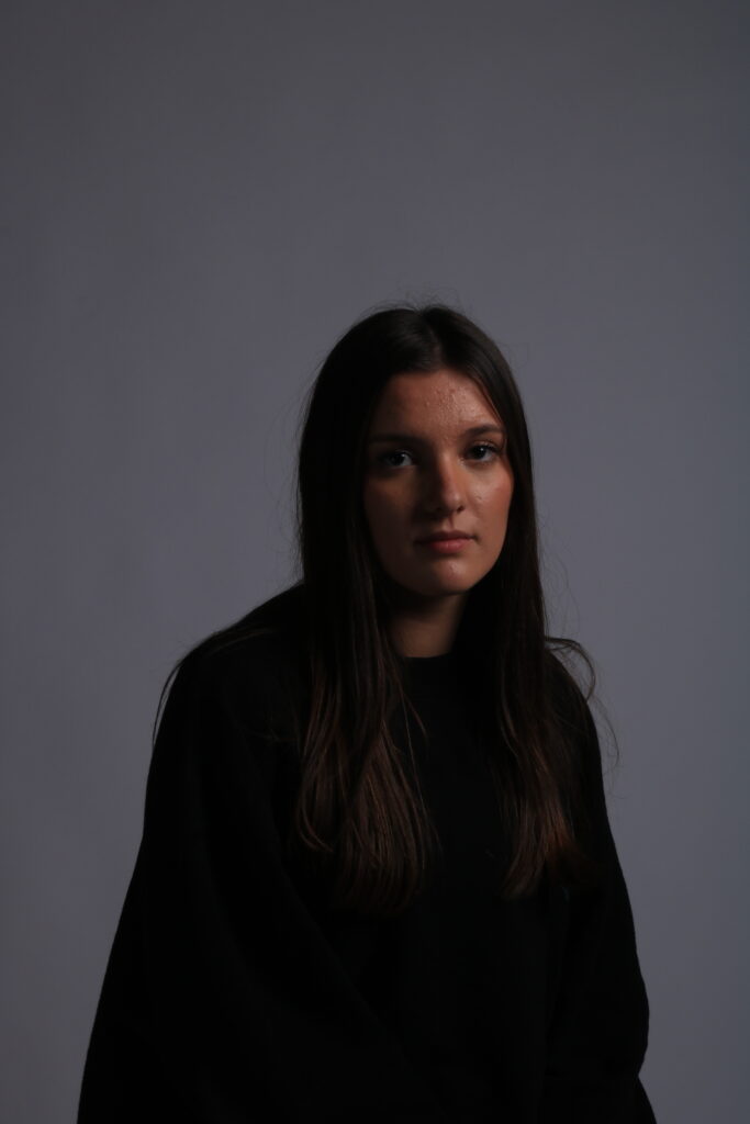
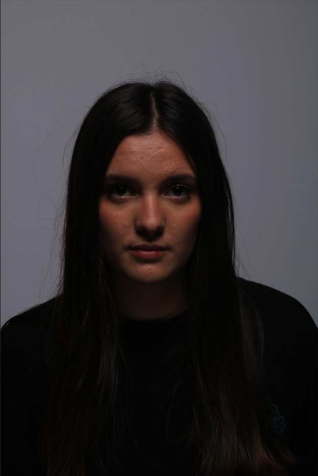
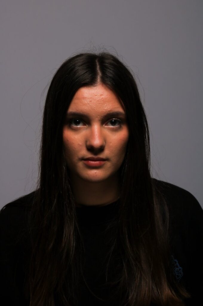
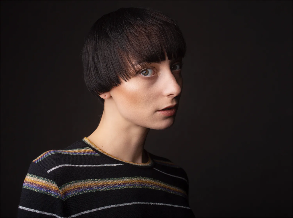
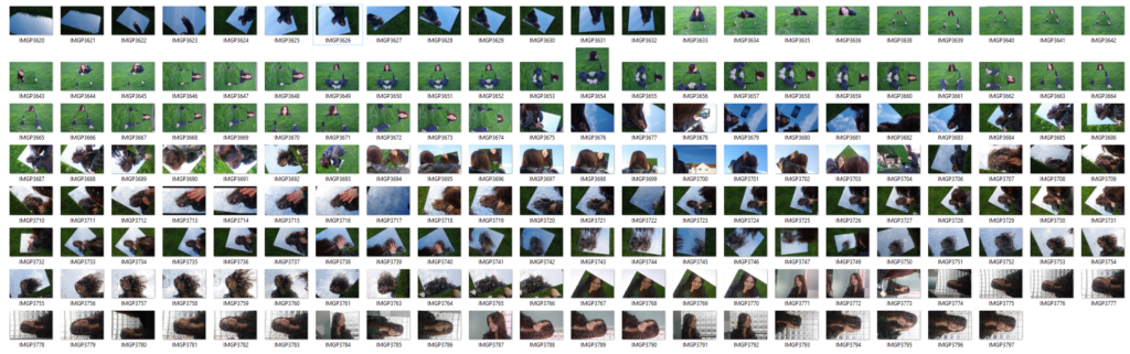
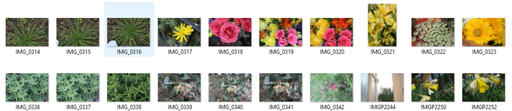
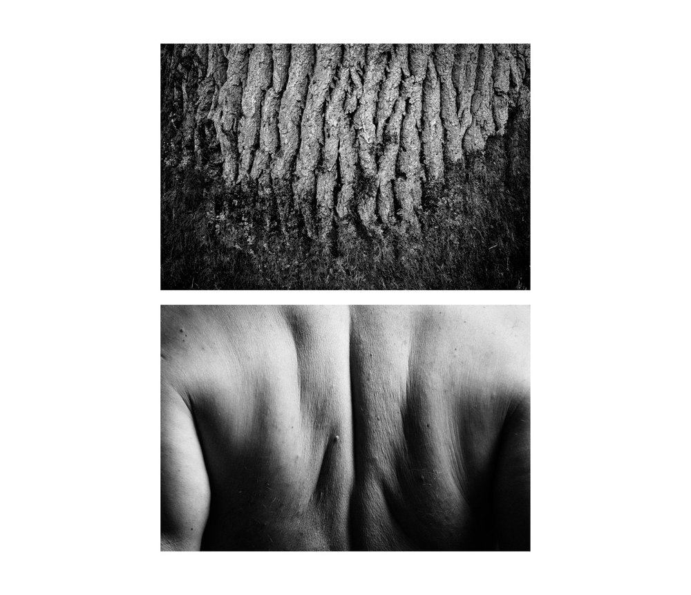
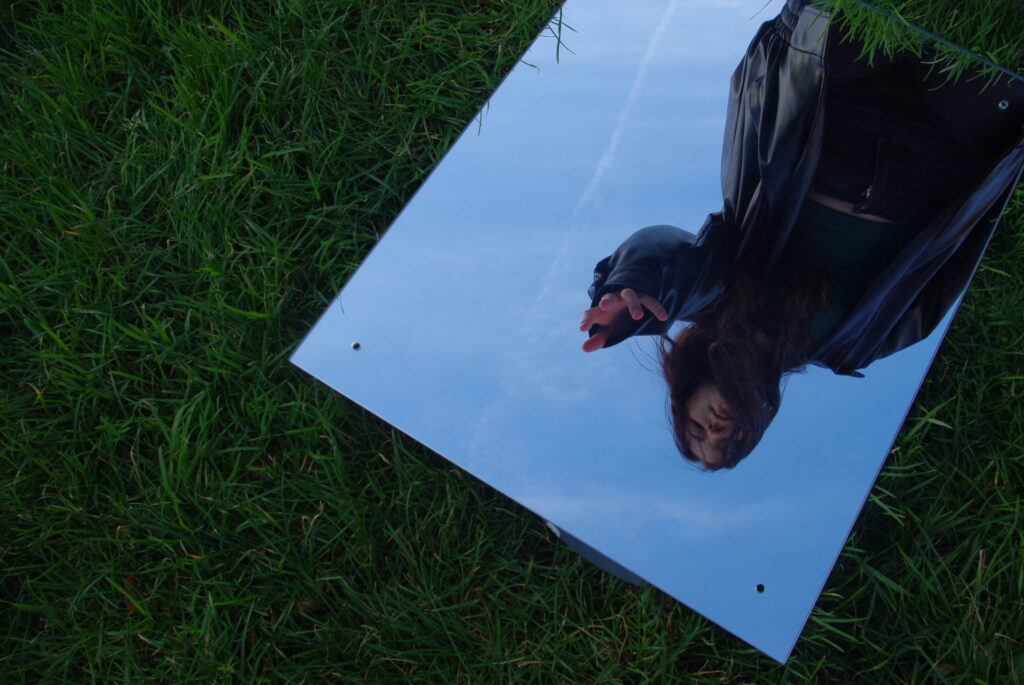
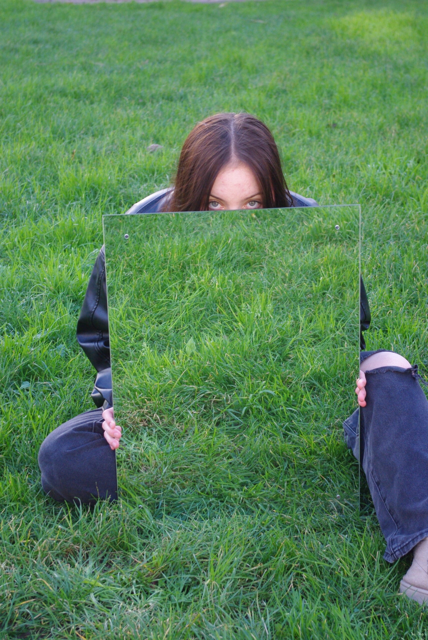
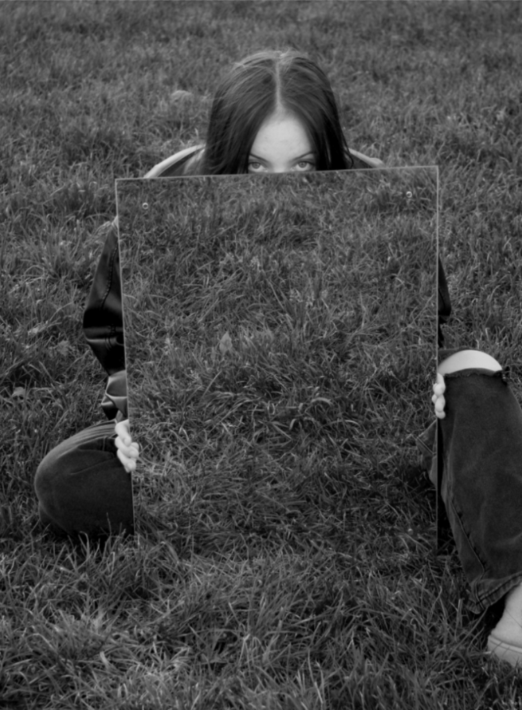
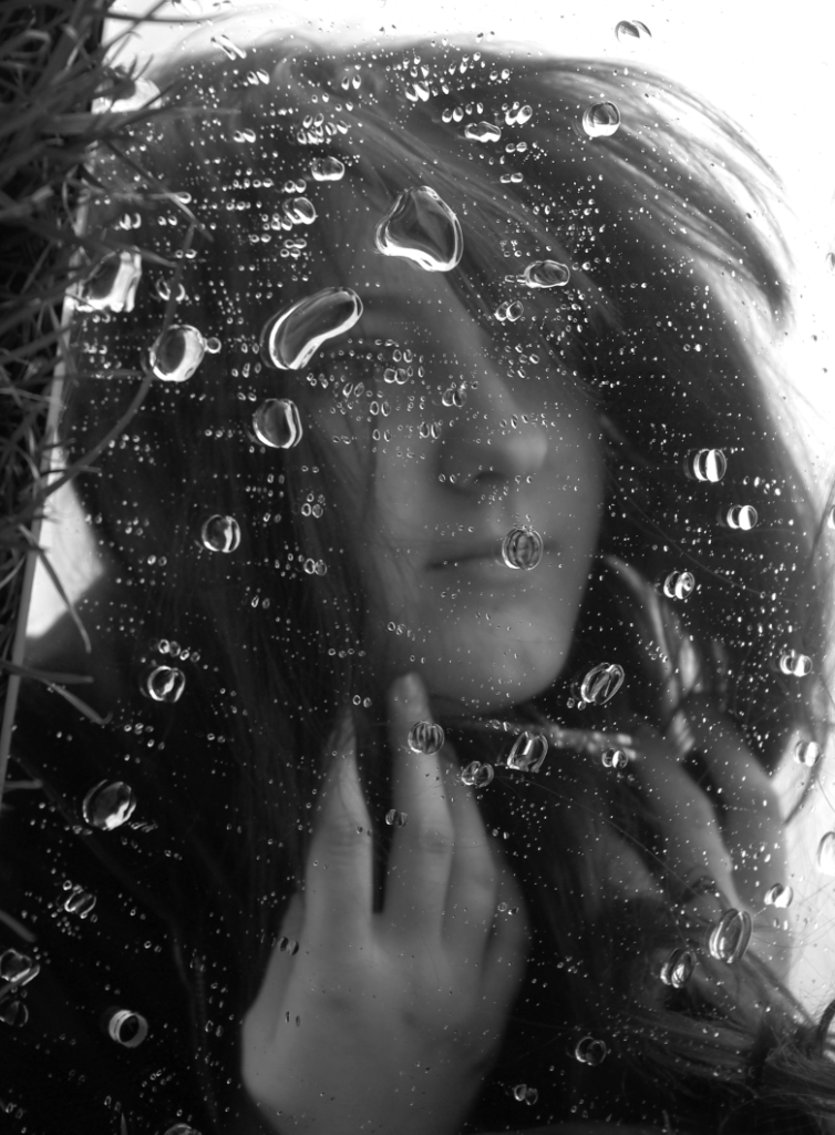
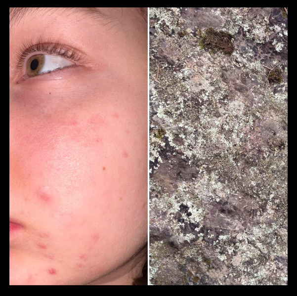
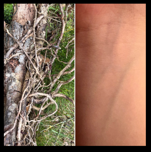
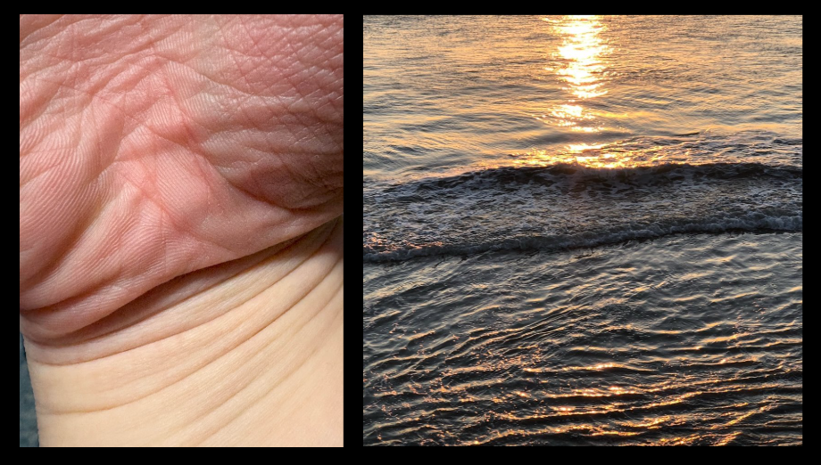
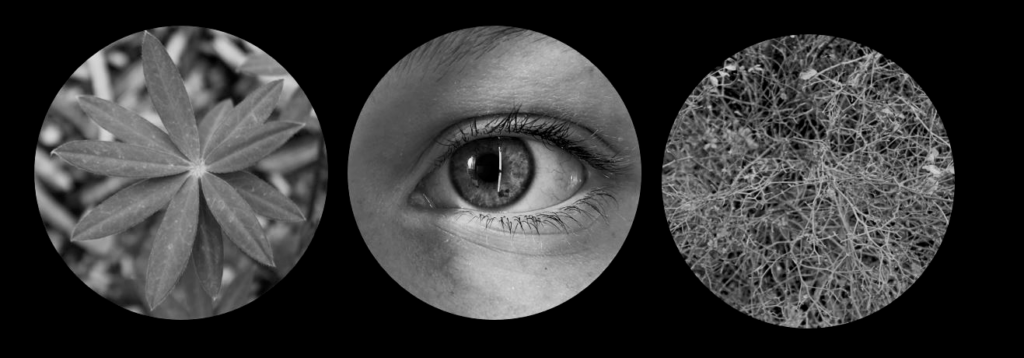
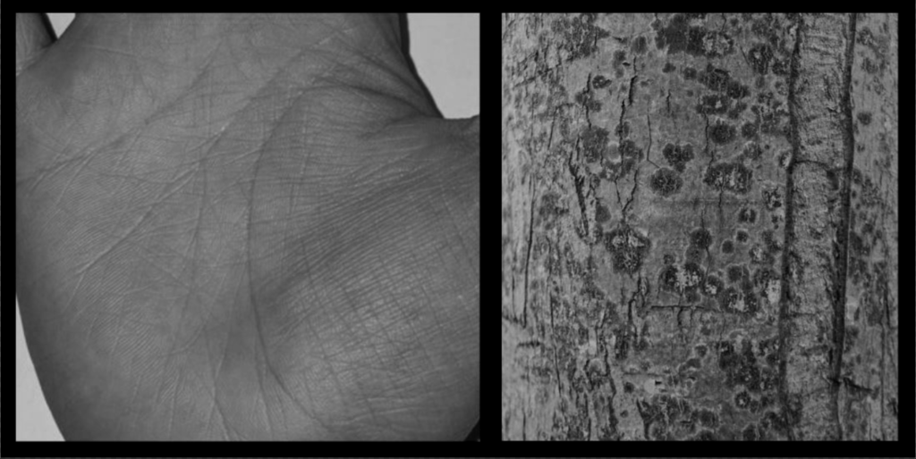
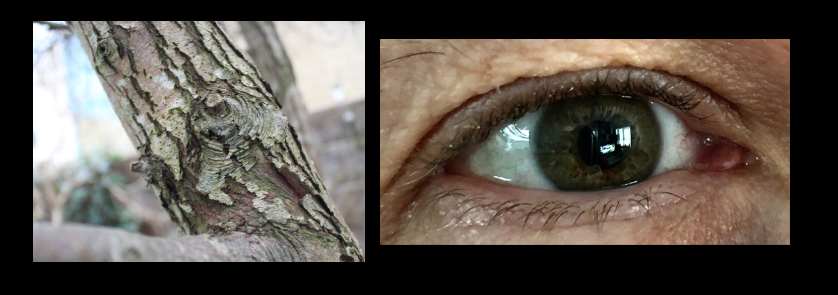
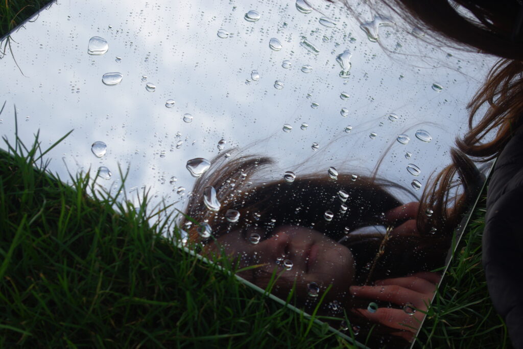
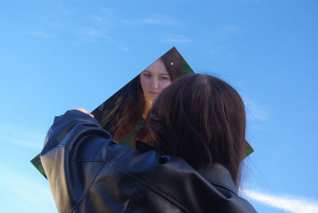
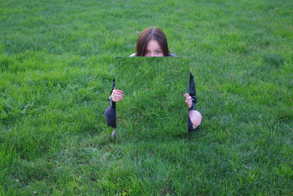
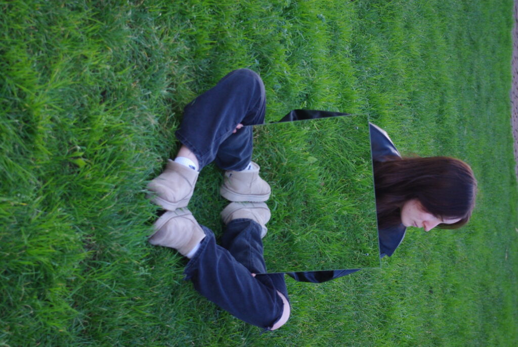
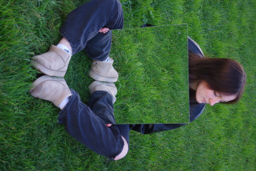
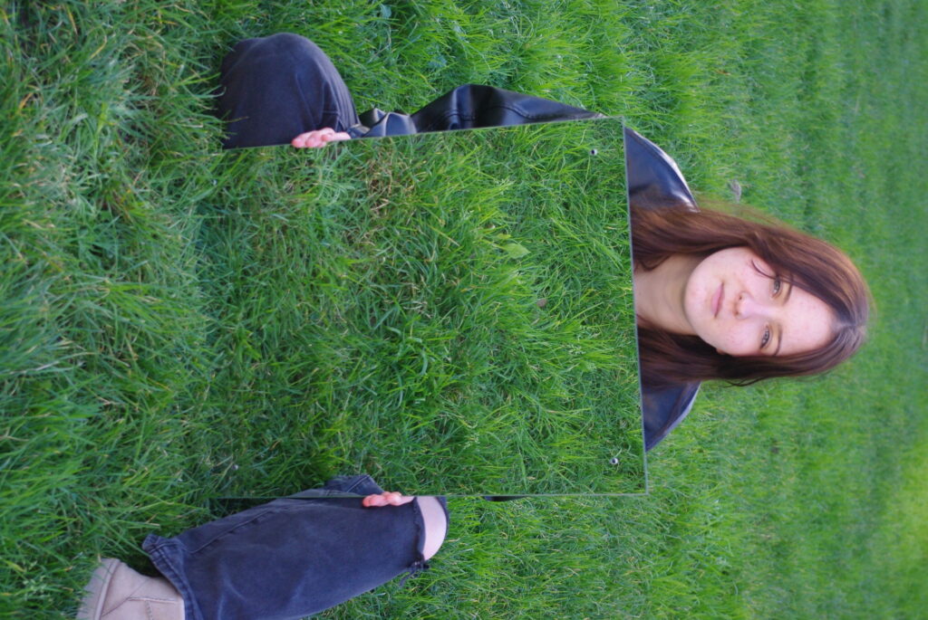
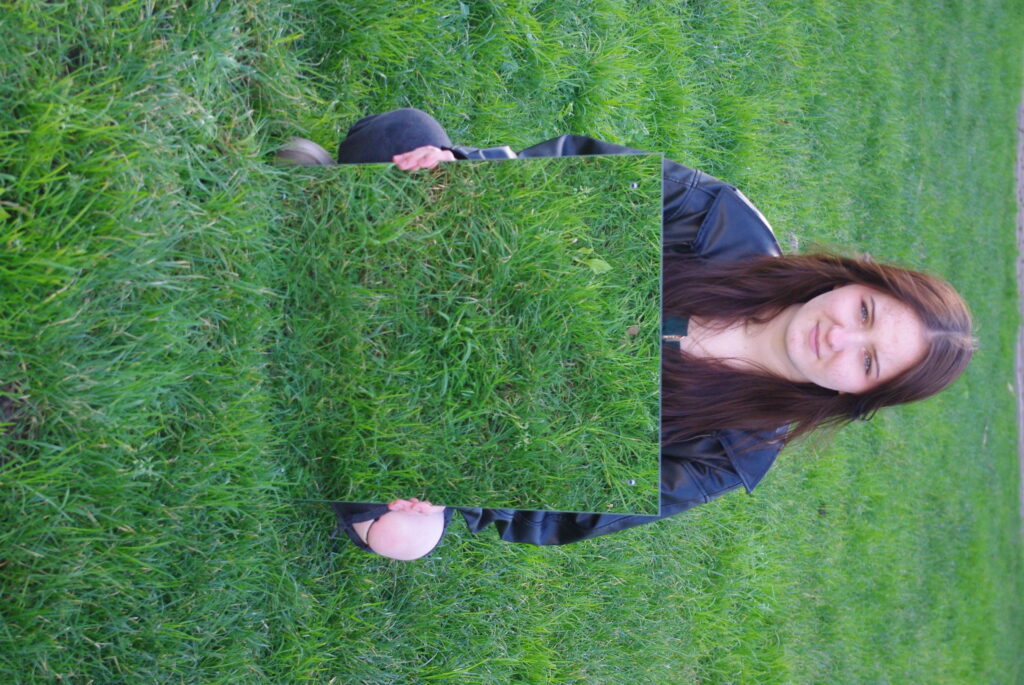
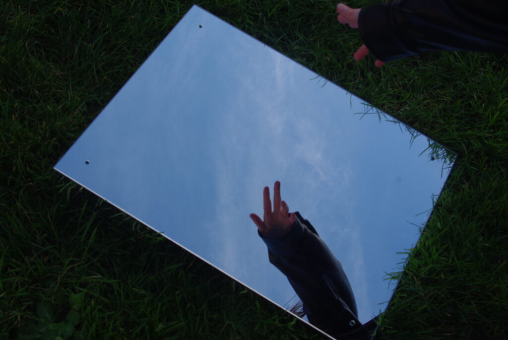
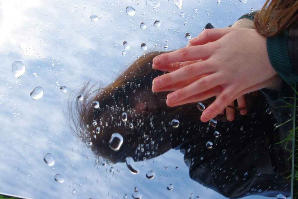
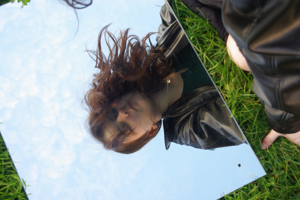
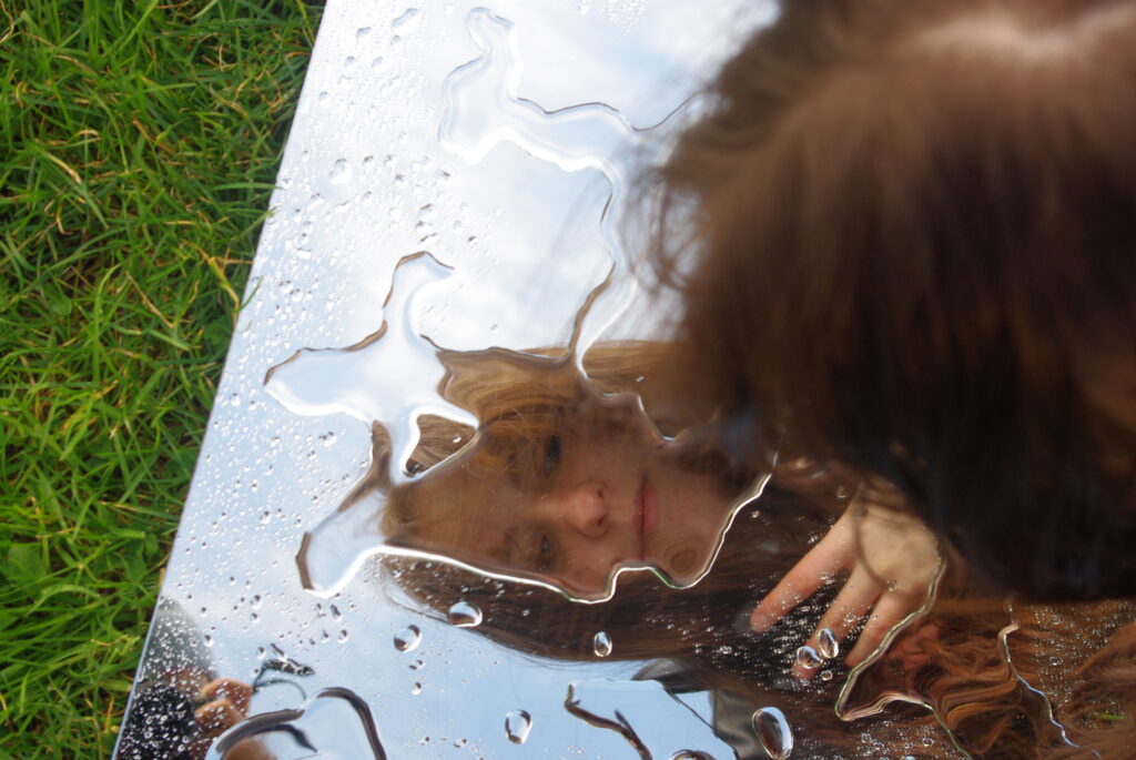
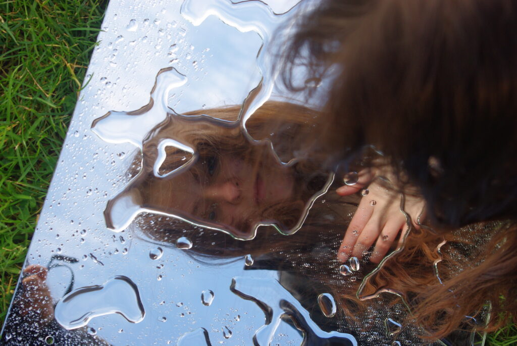
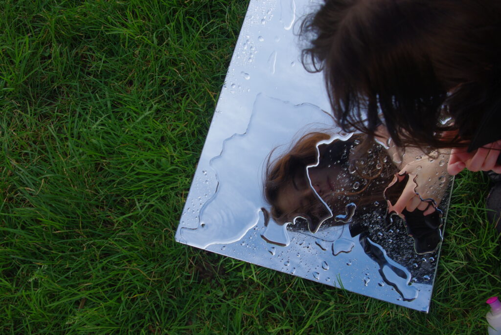
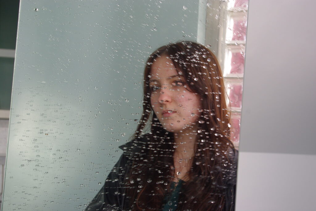
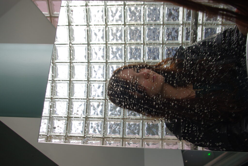
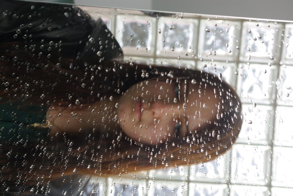
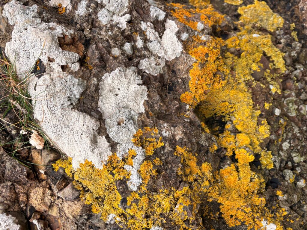
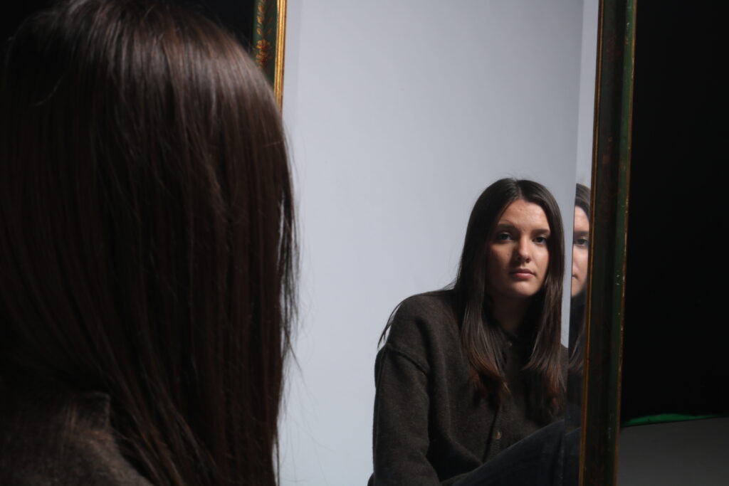
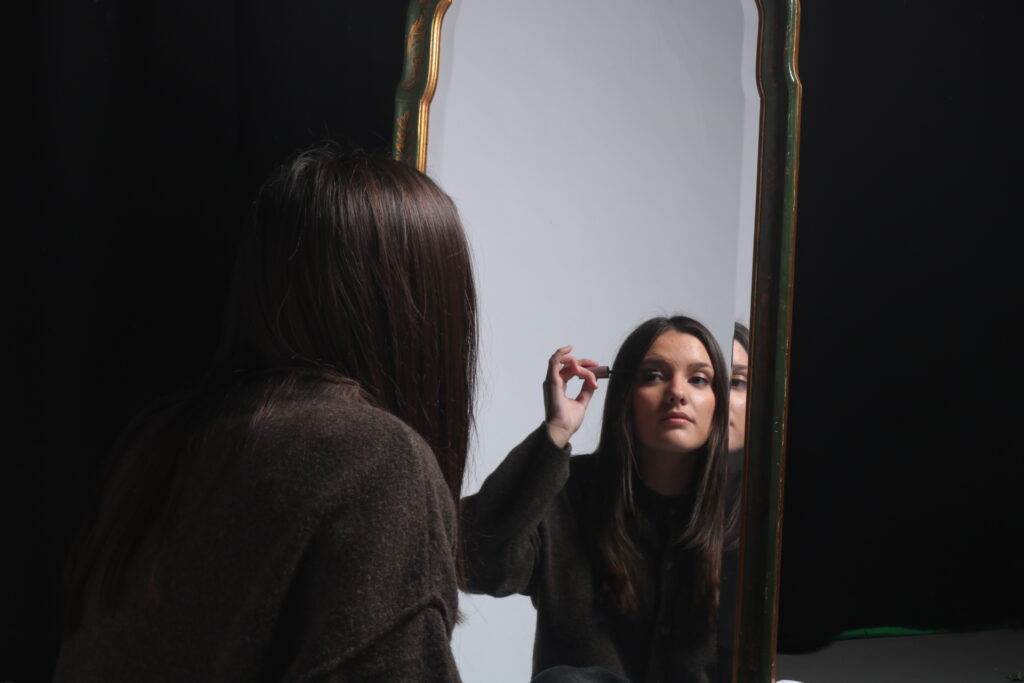
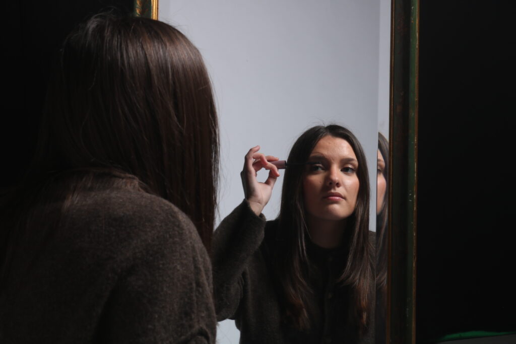
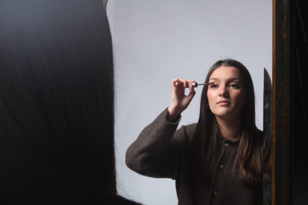
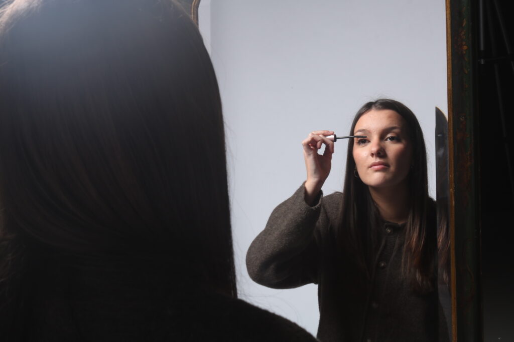
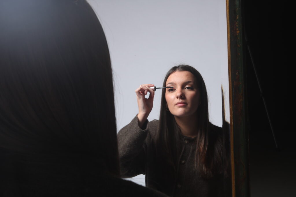
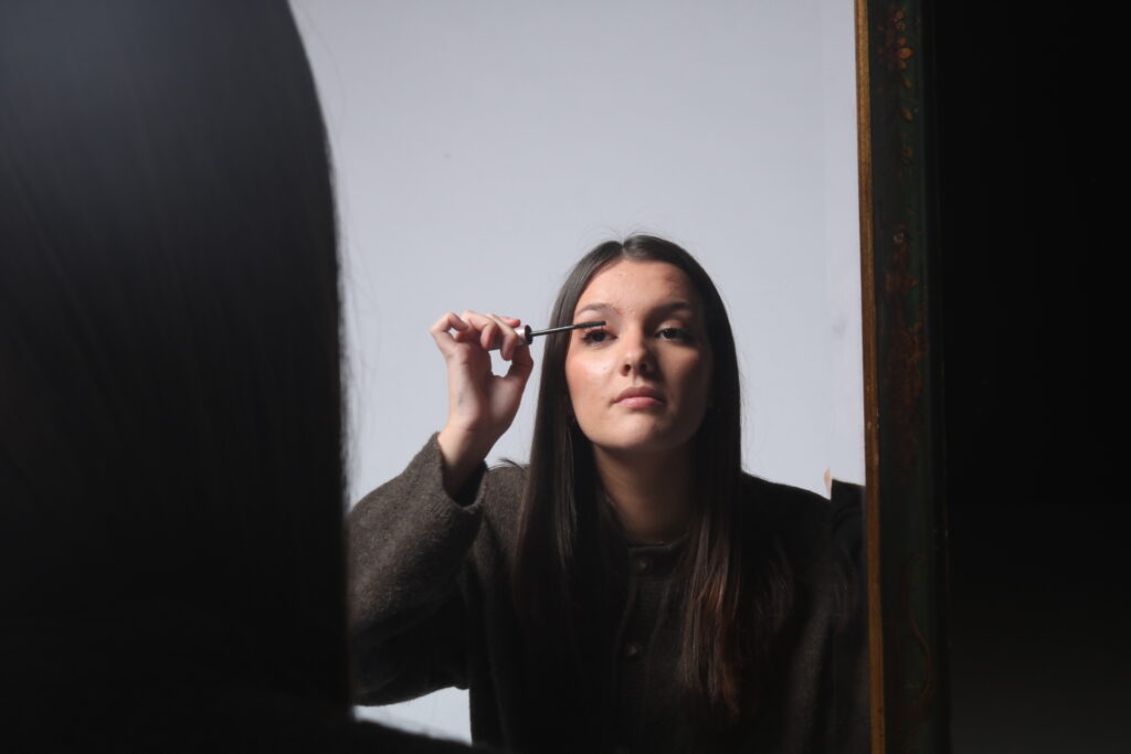
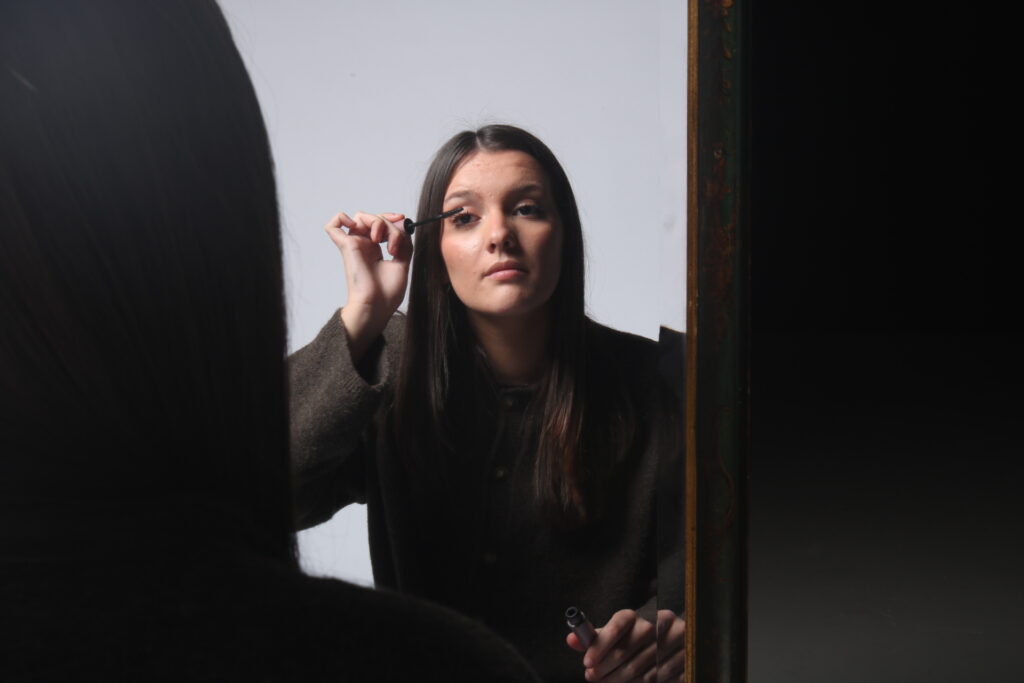
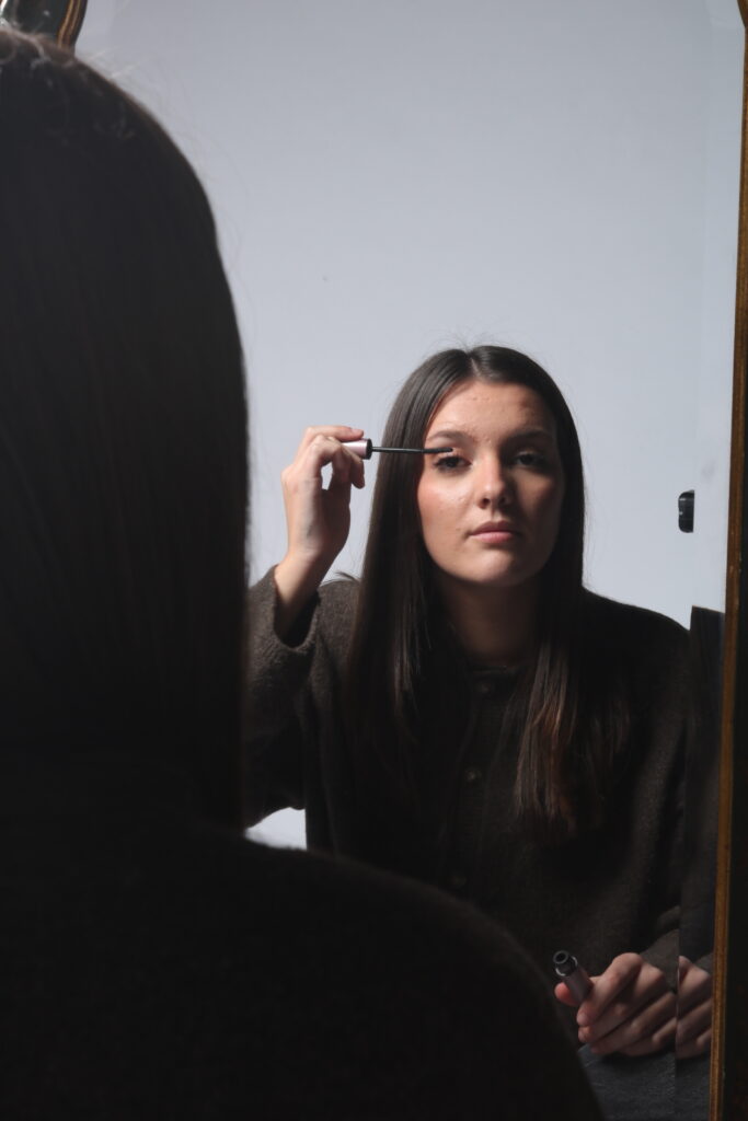
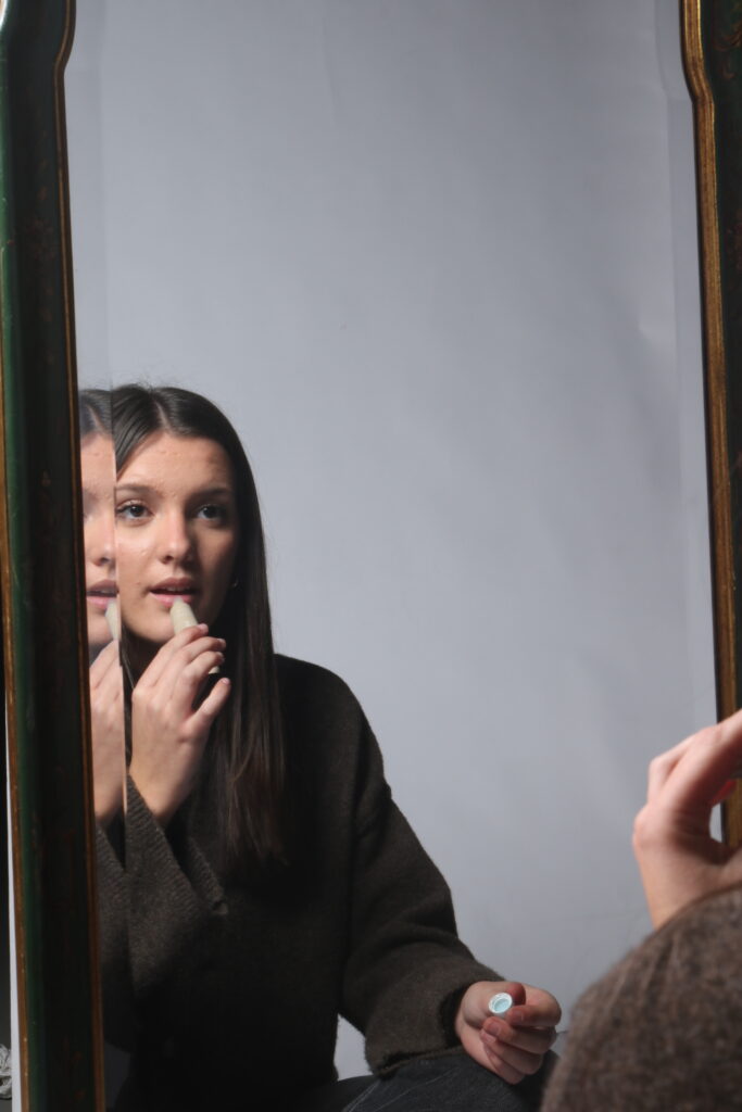
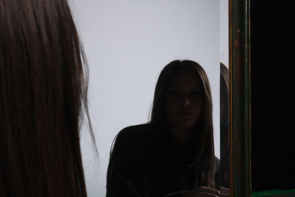
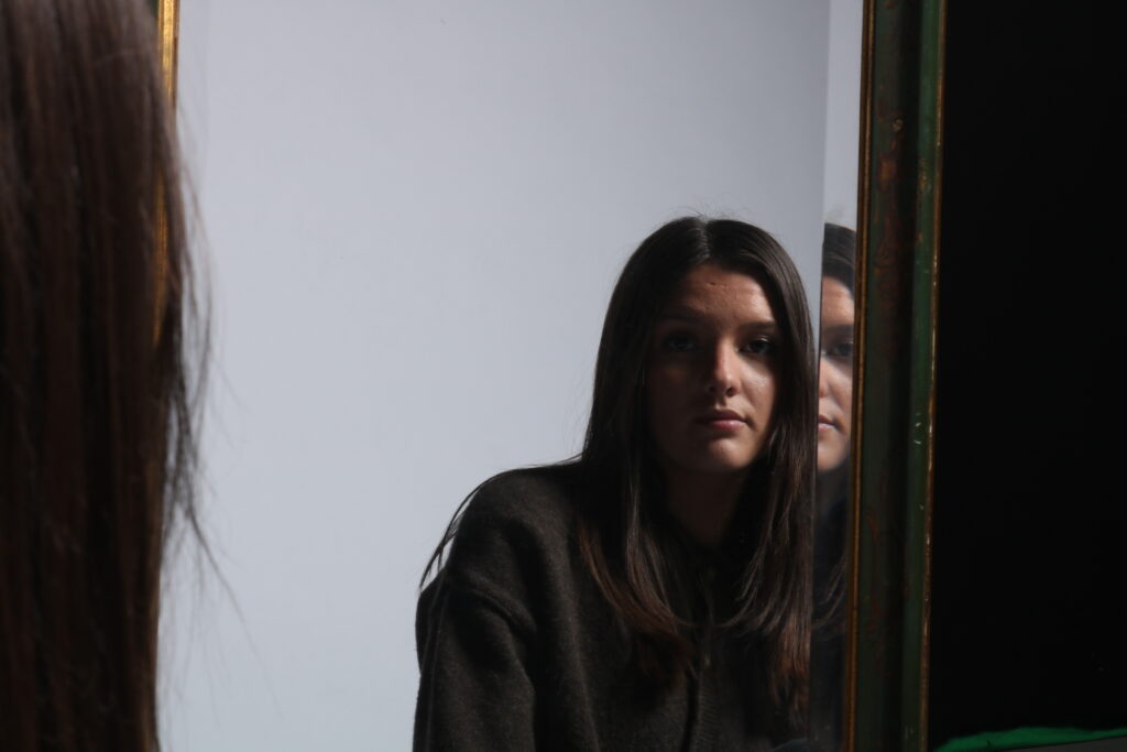
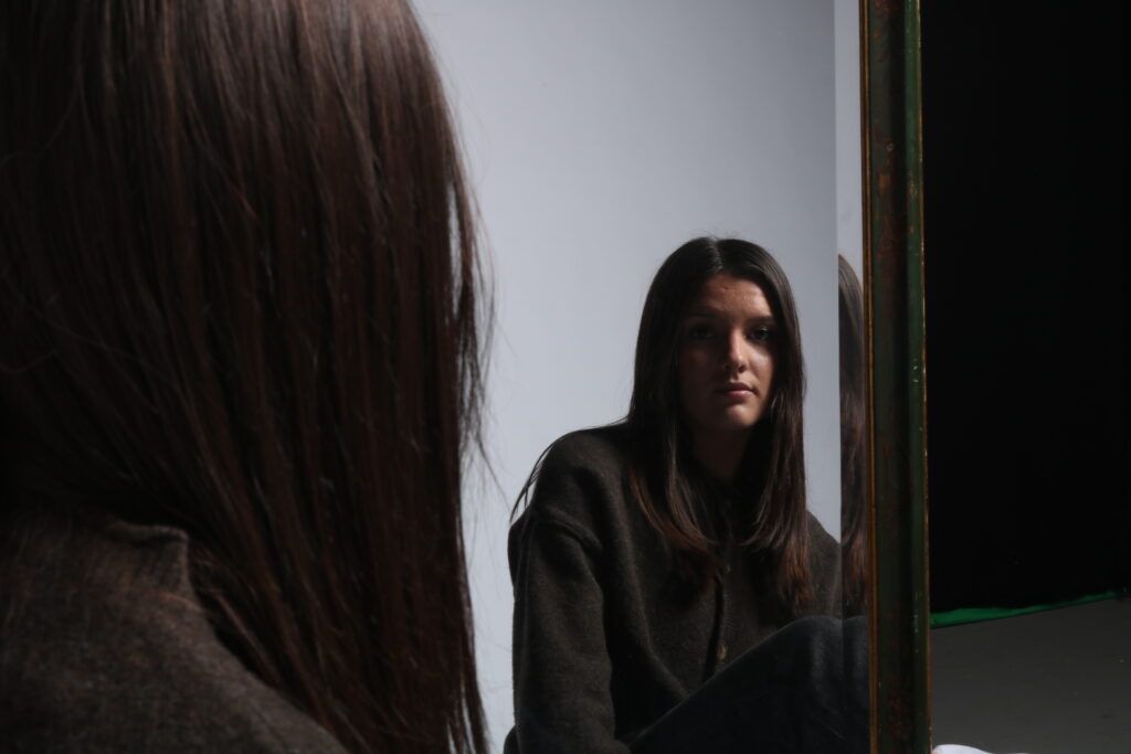
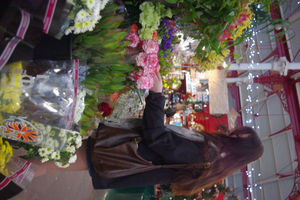
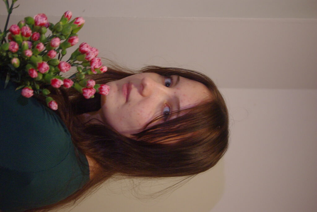
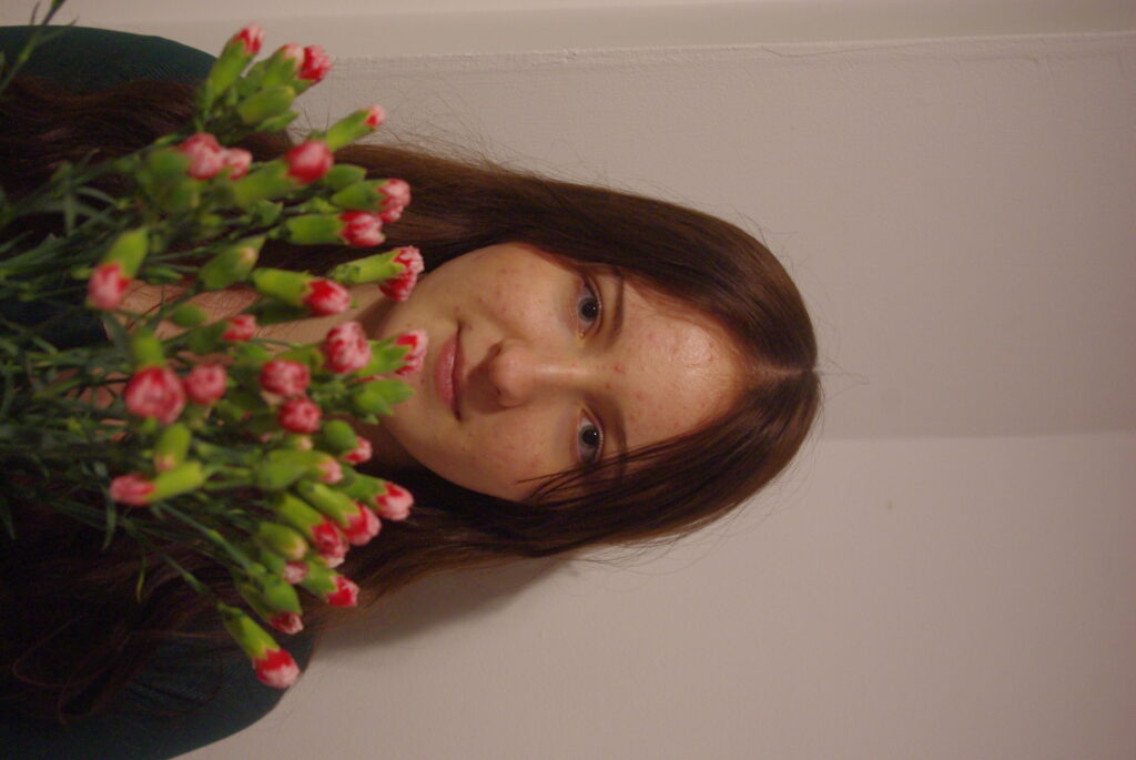
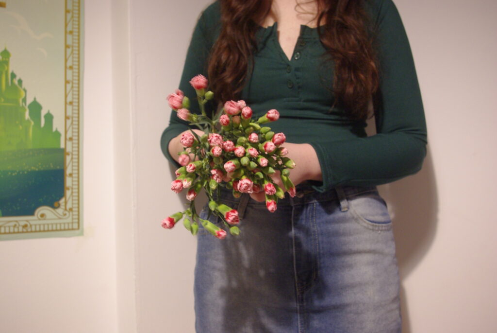
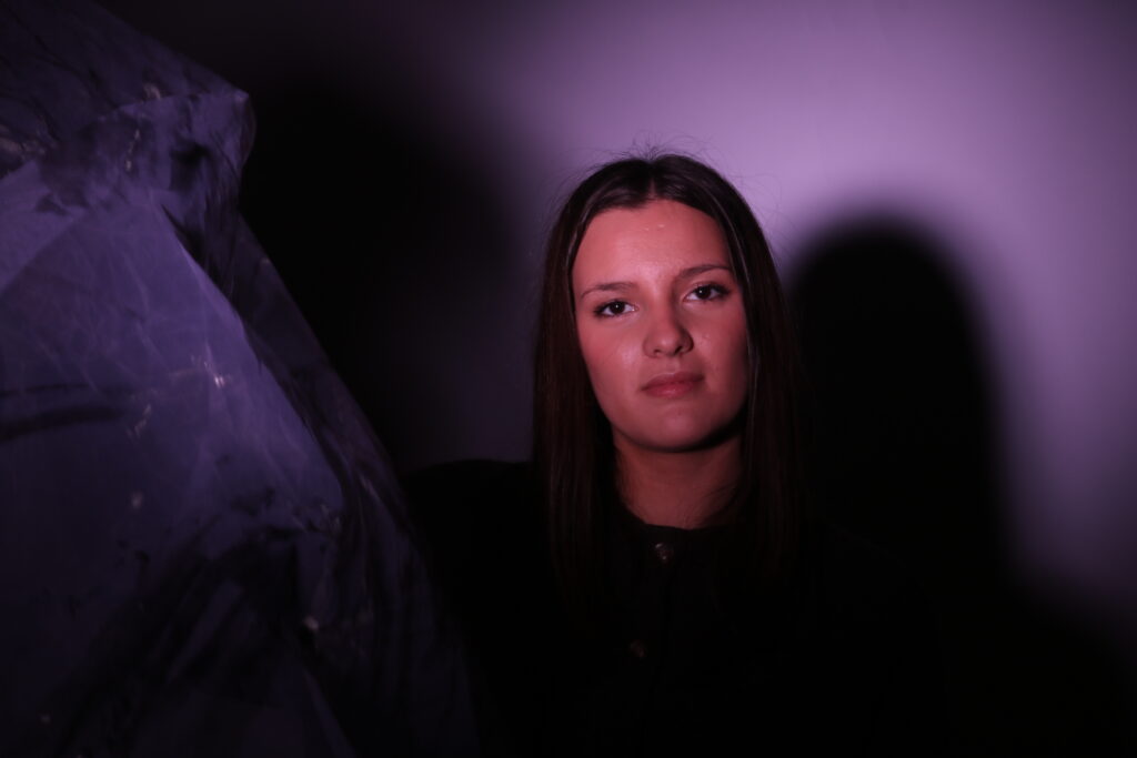
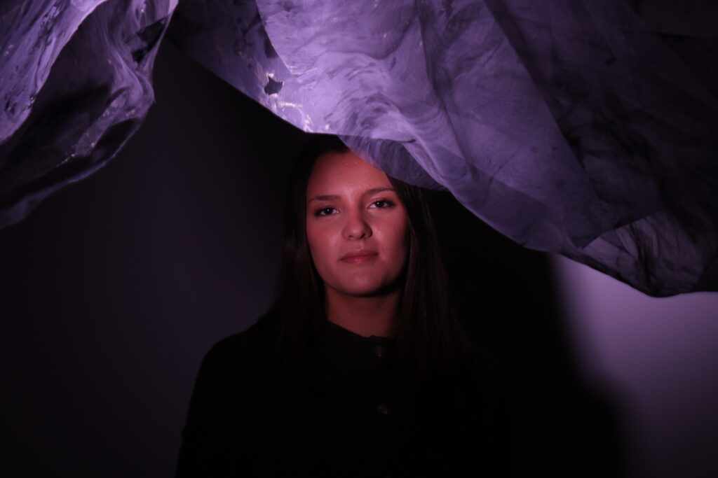
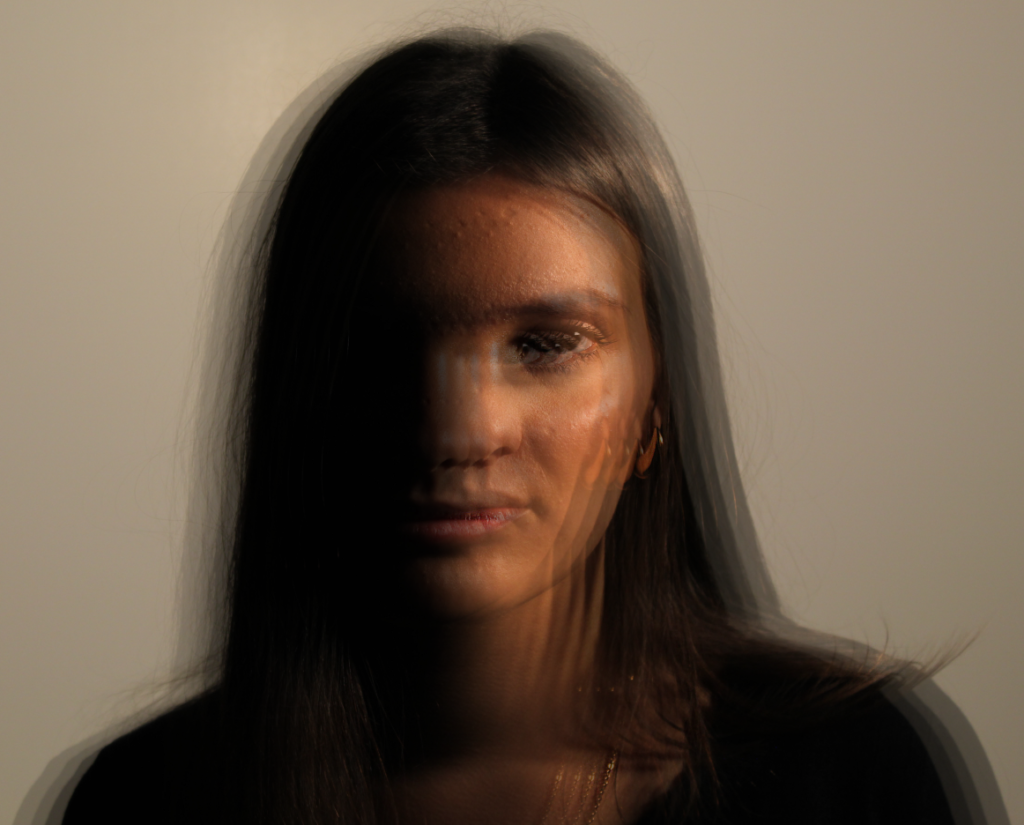
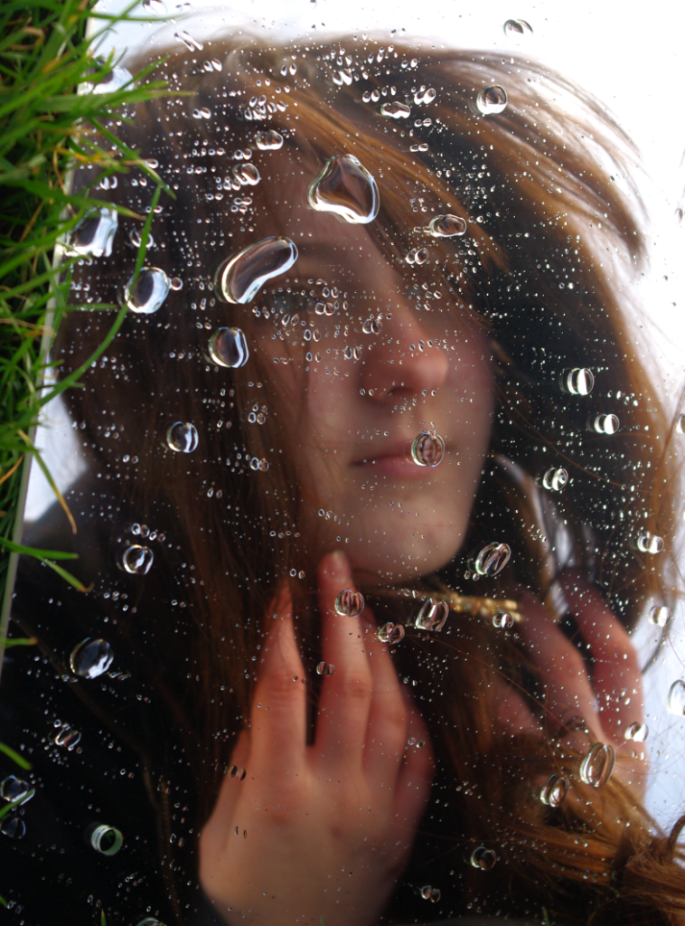
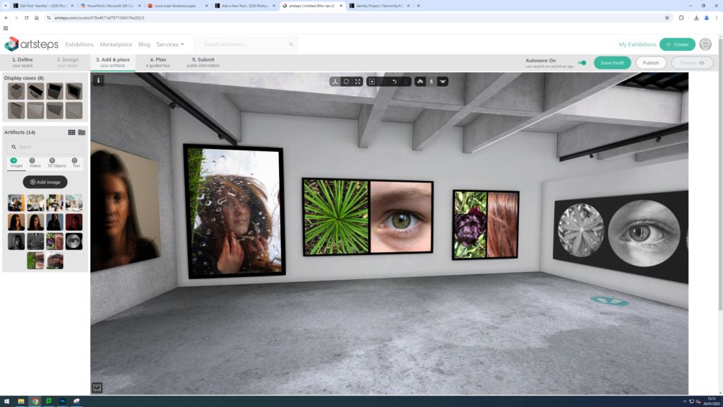
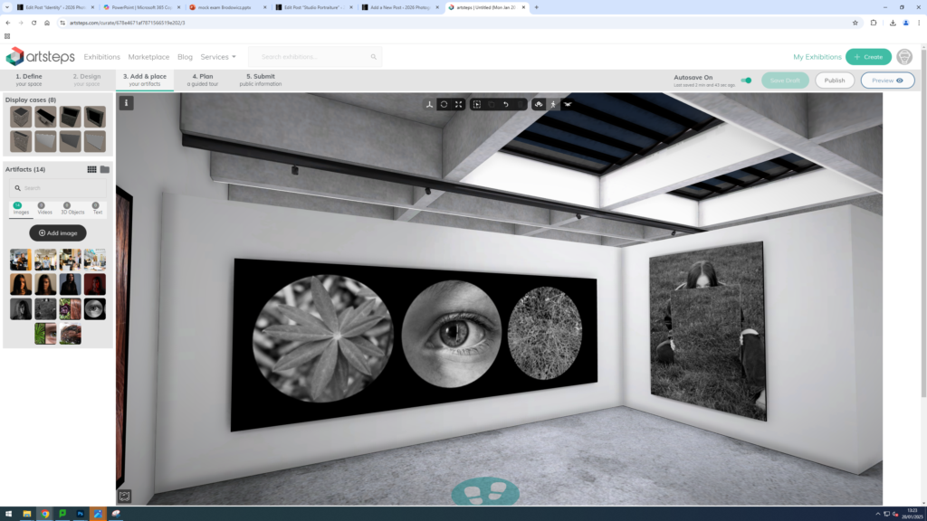
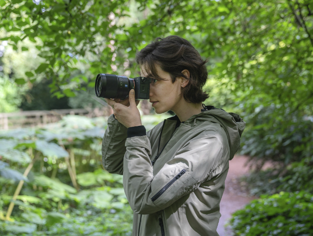
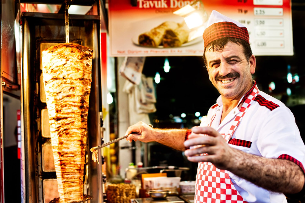
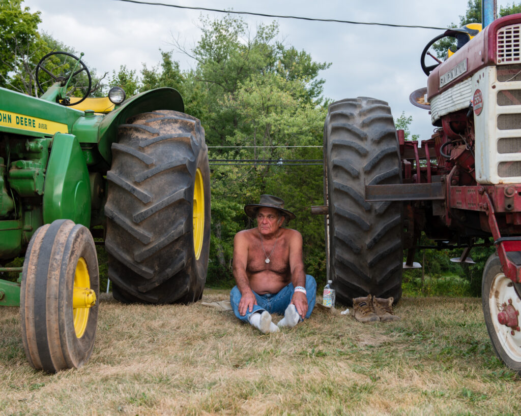
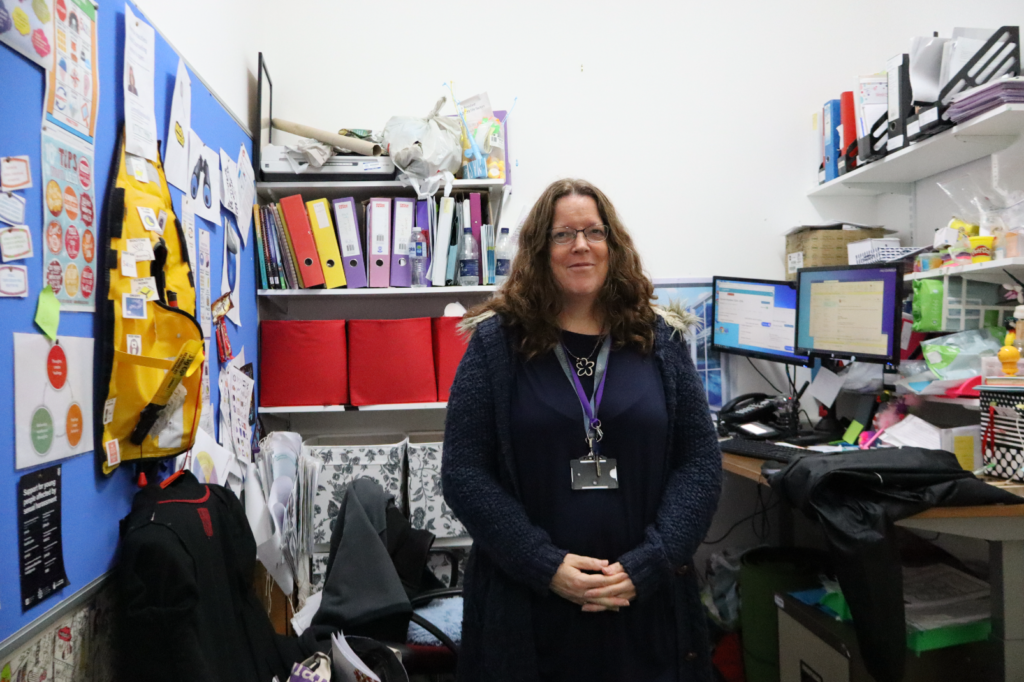
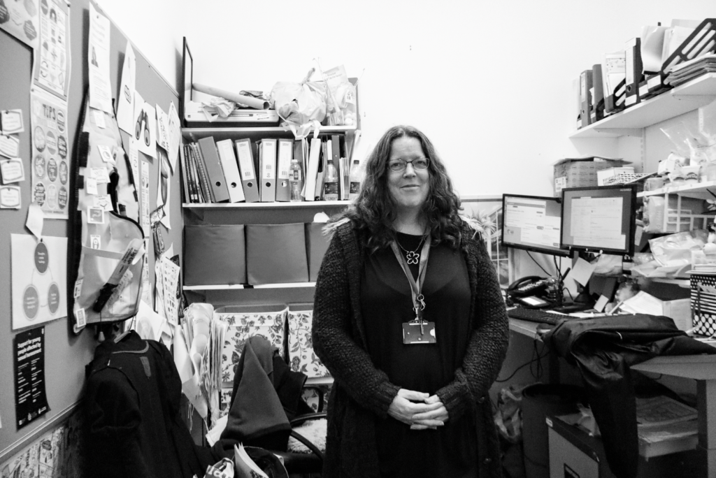
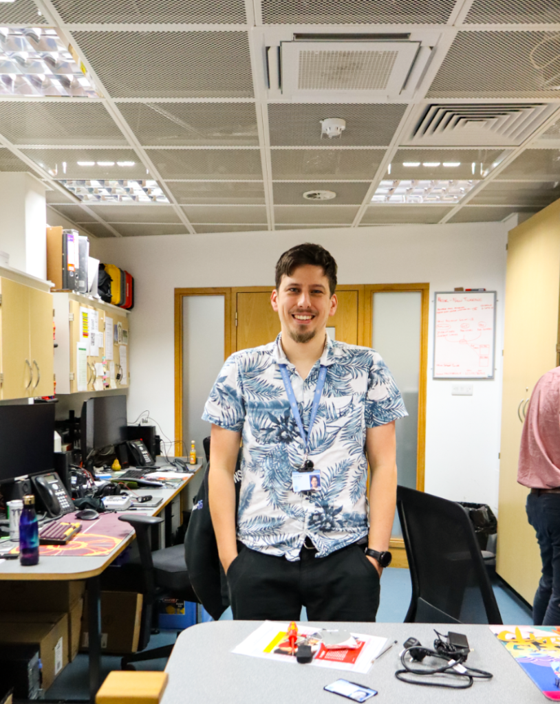
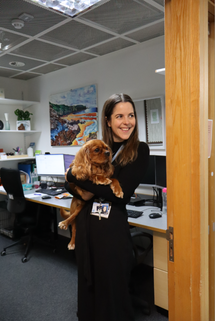
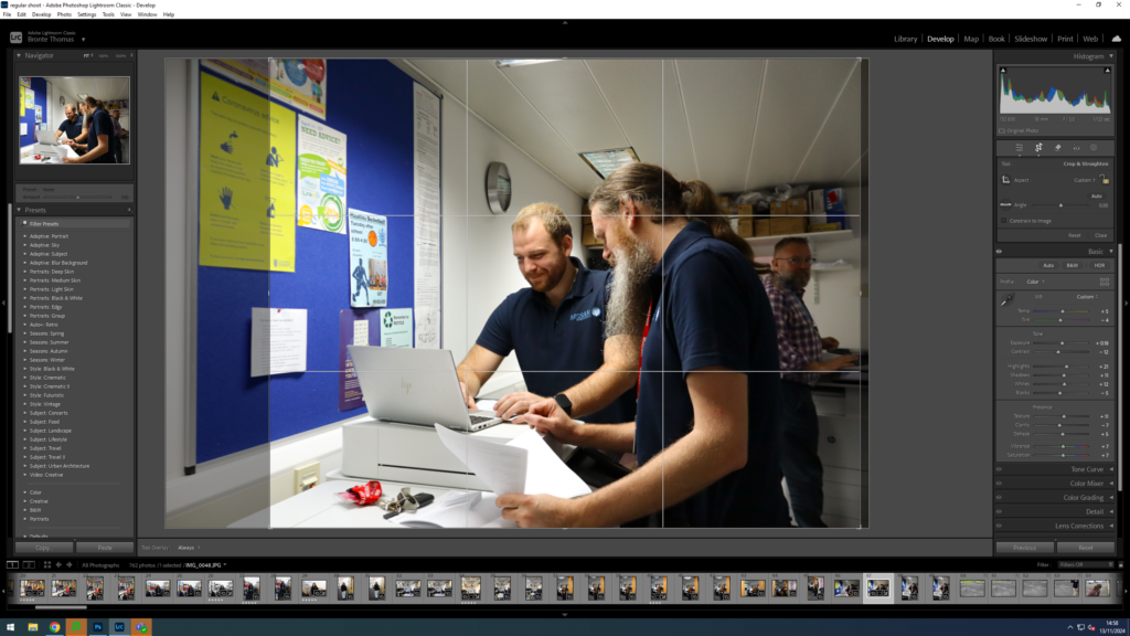
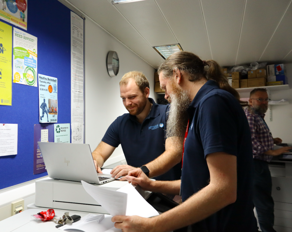
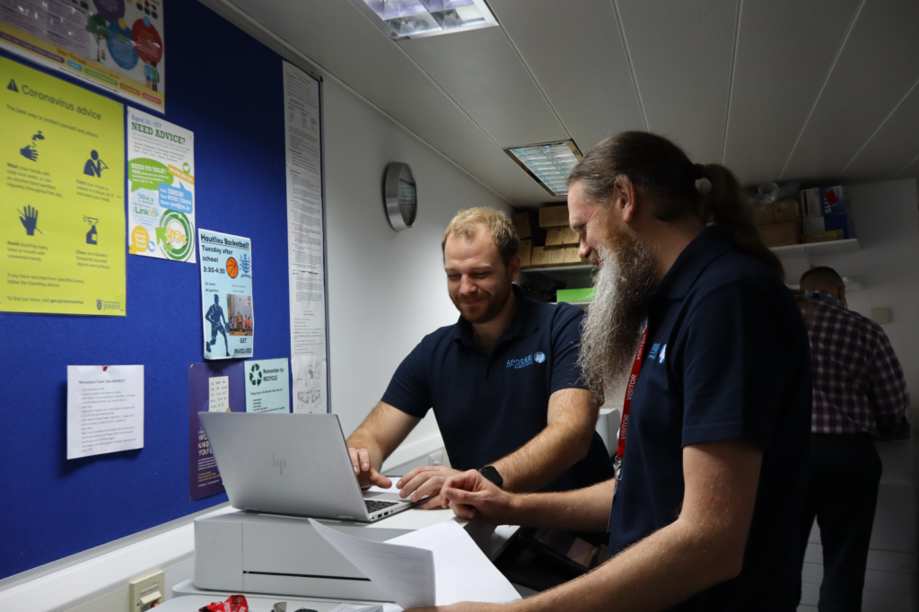
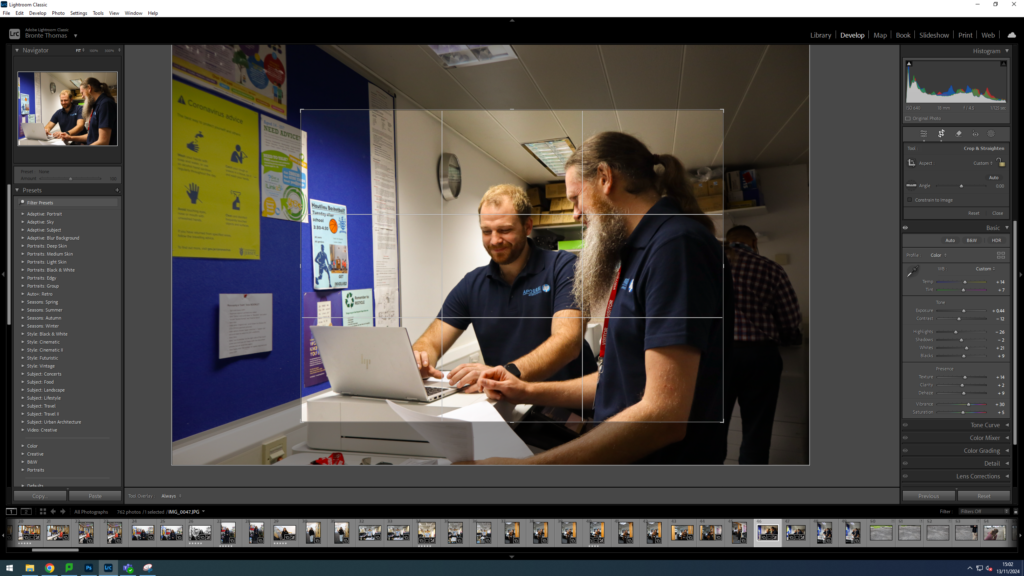
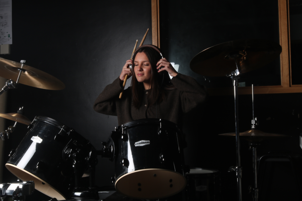
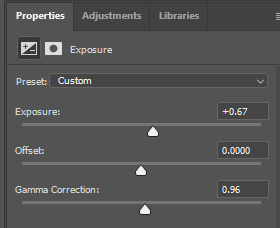
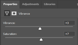
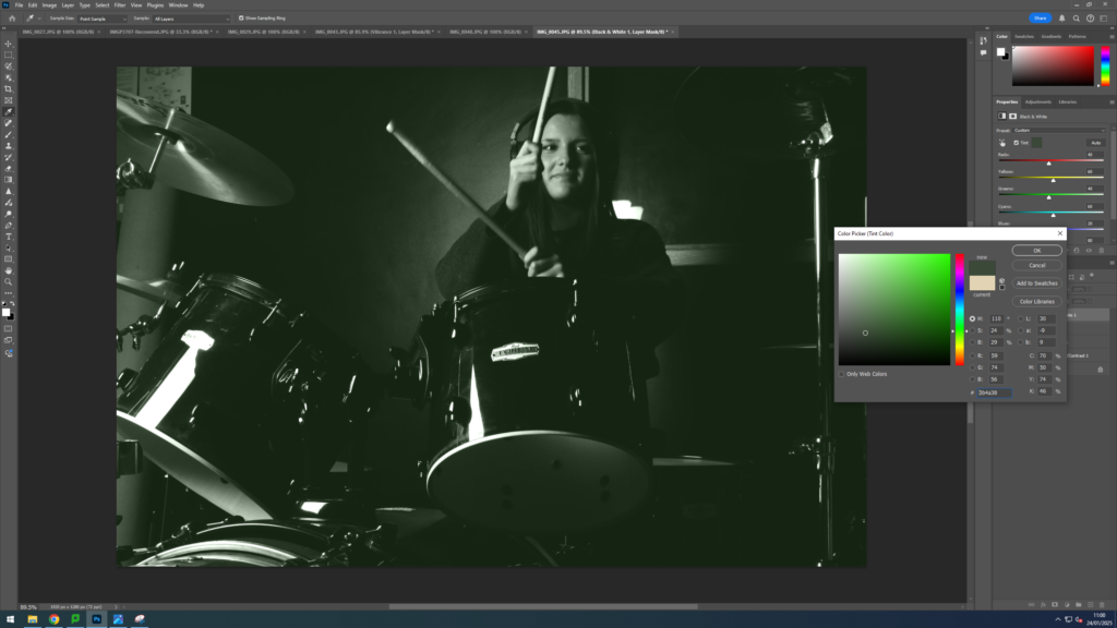
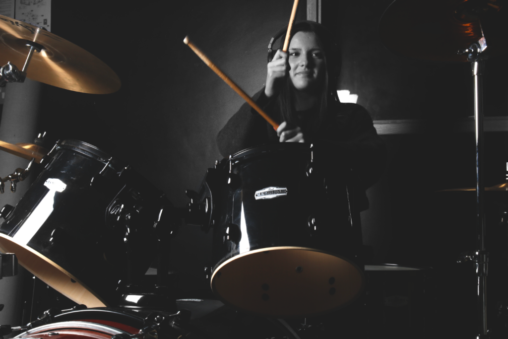
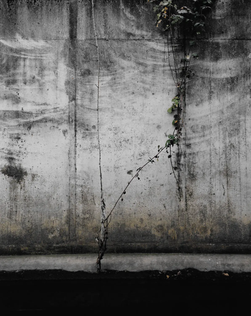
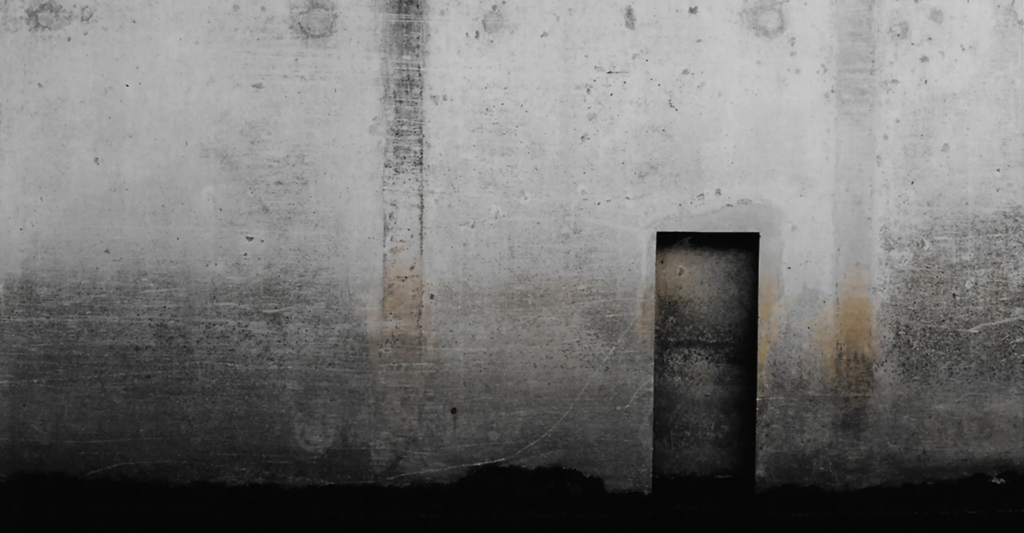
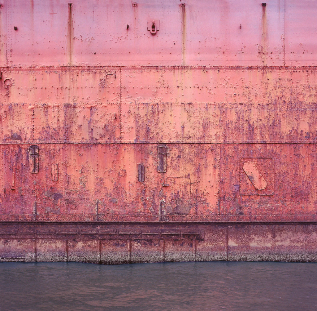
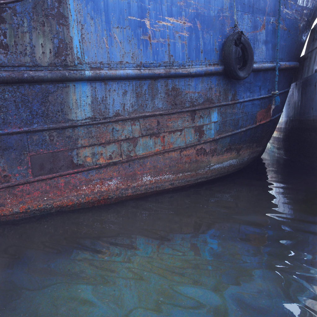
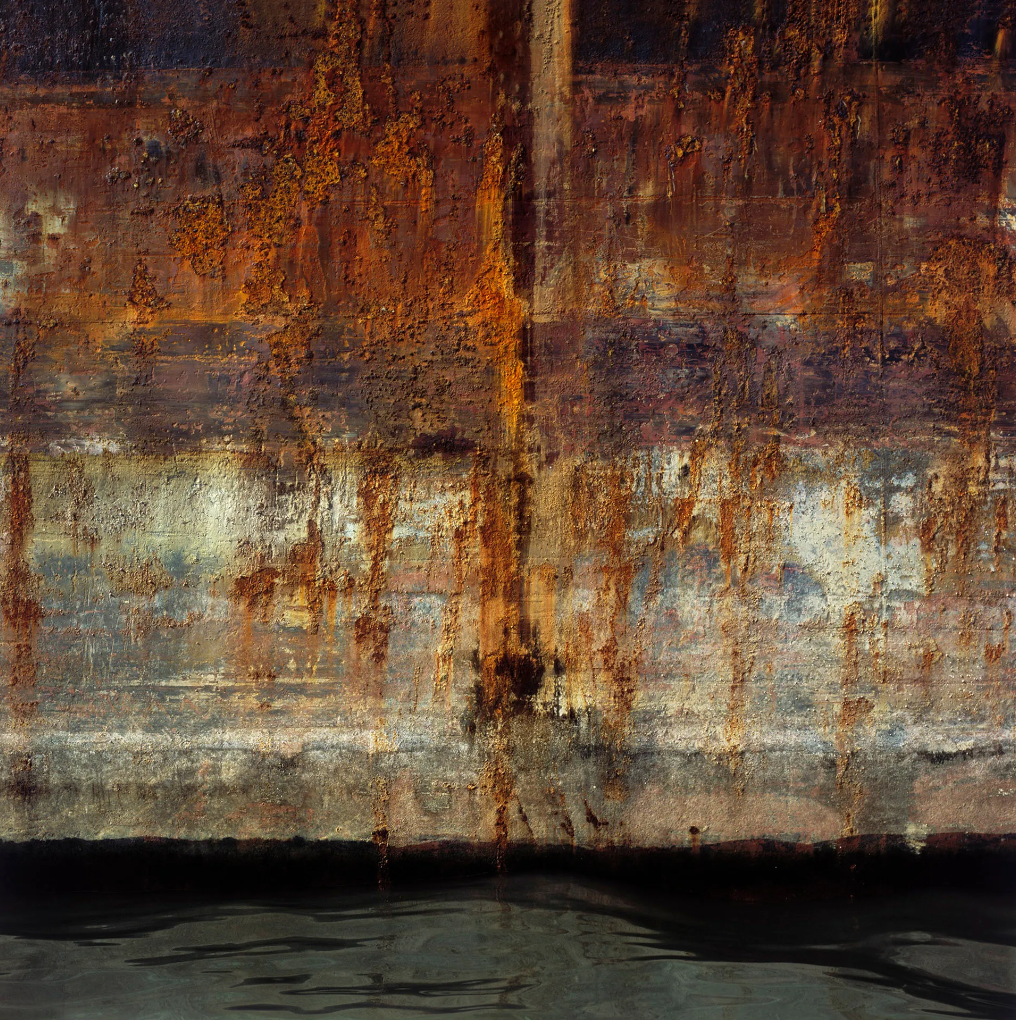
Fort the last typology I thought it looked good in both black and white and colour
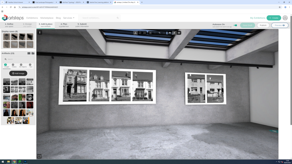
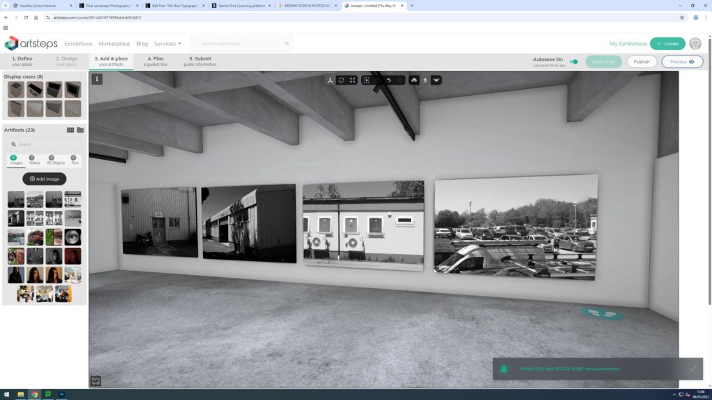
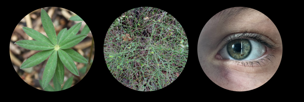
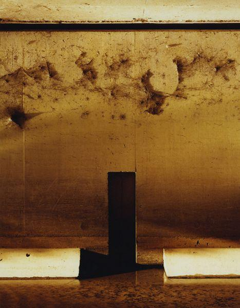
I made a virtual gallery to display the photos side by side and chose a dark wall to be able to see the borner better.


