All posts by Alisha Abreu

Filters

Author:
Category:

Arnold Newman analysis

Arnold Newman was one of the most accomplished portrait photographers of the twentieth century known for his environmental portraits of artists and celebrities such as Pablo Picasso, Igor Stravinsky, and Marilyn Monroe.

He was also known for his carefully composed abstract still life images. In 2006, he was inducted into the International Photography Hall of Fame and Museum.

Image Analysis

Visual:

In the image the sitter is the main focal point and he is very central. He’s framed by concrete pillars, giving off a cold, industrial sense, he is also leaning into the photo with clasped hands and strong eye contact to give him a sinister and confident look.

The background looks very industrial and it looks as though the sitter is in ownership or in charge of the environment. The lights on the ceiling are leading lines from the top of the image to the sitter’s portrait. The light on the top of the photo contrasts the dark lighting on the bottom which creates balance. The image has a very strong contrast which exaggerates the sinister atmosphere. The sitter appears elevated above the background which further enhances the ownership.

Technical:

The lighting could be artificial which creates a strong contrast on the sitter’s face making him look more sinister and darkening his gaze. The photography probably used a medium aperture as the image has a sharp foreground and a slightly softer background but we are still able to identify some of the environmental details. The shutter speed could be quite fast as the subject is in focus, with a balanced exposure, the angle of the image is also in eye level with the subject which makes us feel like we are sitting opposite from him which makes us feel more intimidated and it seems more confrontational.

Contextual:

In 1963, Jewish photographer Arnold Newman was commissioned by Newsweek to take a portrait of Alfred Krupp, a convicted Nazi war criminal.

Alfred Krupp was a German industrialist who ran the Krupp empire, a major arms manufacturer during World War II. Convicted as a war criminal for his company’s use of slave labour, the majority of the men and boys who perished were Jewish and Krupp holds a particular place of hatred amongst its people, he was later pardoned. Despite his pardon, Krupp remained a controversial figure, and his reputation as a ruthless businessman and war profiteer followed him.

At first, Newman refused, but eventually, he decided to take the assignment as a form of personal revenge. The resulting portrait became one of the most controversial and significant images of its time.

When preparing to take the photo, Newman asking Krupp to lean forward slightly, when Krupp did this he also clasped his hands together under his chin. When he moved, the light hit his face perfectly and when Newman saw this he stated that ‘he felt the hair stand up on the back of his neck’.

Concept:

The portrait captured the essence of Krupp’s character, making him look like the embodiment of evil. Upon seeing the portrait, Krupp was furious. Nevertheless, the image was published and became one of Newman’s most famous works. The portrait served as a powerful reminder of the atrocities committed during World War II and the individuals who were responsible for them. The circulation of the photo brought Krupp out from the shadows and allowed Newman to share his hatred for his man with the world.

Environmental Portraiture

Mood board

What is environmental portraiture?

An environmental portrait is a portrait executed in the subject’s usual environment, such as in their home or workplace, and typically illuminates the subject’s life and surroundings. The term is most frequently used of a genre of photography.

Great portraits of this sort will capture people’s interaction with their natural surroundings to tell strong stories that generate an emotion in the viewer, giving insight into where these people are, what they do and who they are.

Arnold Newman is often credited with being the photographer who articulated and who consistently employed the genre of environmental portraiture, in which the photographer uses a carefully framed and lit setting, and its contents, to symbolize the individual’s life and work; a well-known example being his portrait of Igor Stravinsky in which the lid of his grand piano forms a gargantuan musical note representative of the melodic structure of the composer’s work. Newman normally captured his subjects in their most familiar surroundings with representative visual elements showing their professions and personalities. A musician for instance might be photographed in their recording studio or on stage, a Senator or other politician in their office or a representative building. Using a large-format camera and tripod, he worked to record every detail of a scene.

Contact Sheet

This is my contact sheet for all of the photos I have taken for this environmental portraiture project. I have chosen the school as the main environment and found different people throughout the school in their separate spaces.

Final photos before and after editing

I chose this photo as one of my final photos because I think it really captures the canteen lady in her natural environment in which she spends most of her time in. The fact that she is laughing also gives off the sense that she is happy in this environment.

I decided to lower the brightness and higher the contrast as there was too much light and I want people to focus more on the subject of the image. I also cropped the image to get rid of any negative space or extra people in the background. I turned up the vibrancy of the image to make it really stand out.

This photo of Mr. Price shows him in his natural environment which is his own office.

All I did to this photo was bring the brightness up a little bit and bring down the contrast to make the subject stand out. I also cropped the image down to get rid of negative space and I centred his face so that it is in the top middle of the photo.

In this image I brought up the saturation and brought down the brightness. This really brought out his features and the background

I decided to crop this image to get rid of the negative space and make sure that his head in completely centred in the middle of the image.

This image of Ava captures her doing her favourite hobby. I brought the brightness and contrast down. I increased the vibrancy and only slightly lowered the exposure and gamma correction. In the background I blurred some of the things that could distract the viewers from the main aspects of the image.

To crop this image I used the rule of thirds and placed the 3rd line on her eye.

Evaluation

In my opinion, I think I captured these people’s environments pretty well, although I could’ve used some variation of environments as I did mostly just use the school environment. I could learn how to do more advanced editing to my images to make them really stand out.

Visual (formal) Elements

What are visual elements?

A visual element is any characteristic that we can see, including line, shape, repetition, space, texture, colour, and value/ tone. The design principles for using these elements include balance, gradation, repetition, contrast, harmony, dominance, and unity.

Line

An element of art defined by a point moving in space. Line
may be two-or three-dimensional, descriptive, implied, or
abstract. Lines are useful for dividing space and drawing the eye to a specific location. Line can be used to suggest shape, pattern, form, structure, growth, depth, distance, rhythm, movement and a range of emotions.

Shape

Shape is a primary characteristic of visual elements, alongside size, colour, texture, and position in the frame. Regular shapes stand out and capture the viewer’s attention, especially if they have hard edges and well-defined corners. Among the four types of shapes, they are the most eye-catching.

Form

Where light and shape collide to create images with depth and what I like to think of as touch ability. Form makes an image lifelike, so the photo stands out, because the viewer feels that they can reach in and touch the person or object. To create depth in a photo, you need form.

Repetition

Repetition in photography refers to the technique of integrating recurring elements, patterns, or themes in a composition to produce a sense of rhythm and balance in an image.

Space

The rule of space in photography is simply the act of adding visual space in front of the direction that an object is moving, looking or pointing to imply motion and direction and to lead the eye of the viewer. Positive space is the actual subject while negative space (also called white space) is the area surrounding the subject. The latter acts as breathing room for your eyes. Too little negative space results in cluttered and busy photographs with every element in the photo screaming for the viewer’s attention.

Texture

Texture refers to the visual quality of the surface of an object, revealed through variances in shape, tone and colour depth. Texture brings life and vibrancy to images that would otherwise appear flat and uninspiring. Texture in an image can be regarded as any visual pattern, either repeating or non-repeating.

Value/ Tone

Tone is simply the lightness or darkness of an object. Sometimes referred to as value, tone is one of the most powerful design elements. ​ In any painting, photograph or design, the area of highest contrast between light and dark will always demand maximum attention. Value in photography represents how dark or light color and its hue can be. Values are comprehended with a visual like a gradient or scale. When your photograph has a lot of tonal variants, you will end up with low contrast.
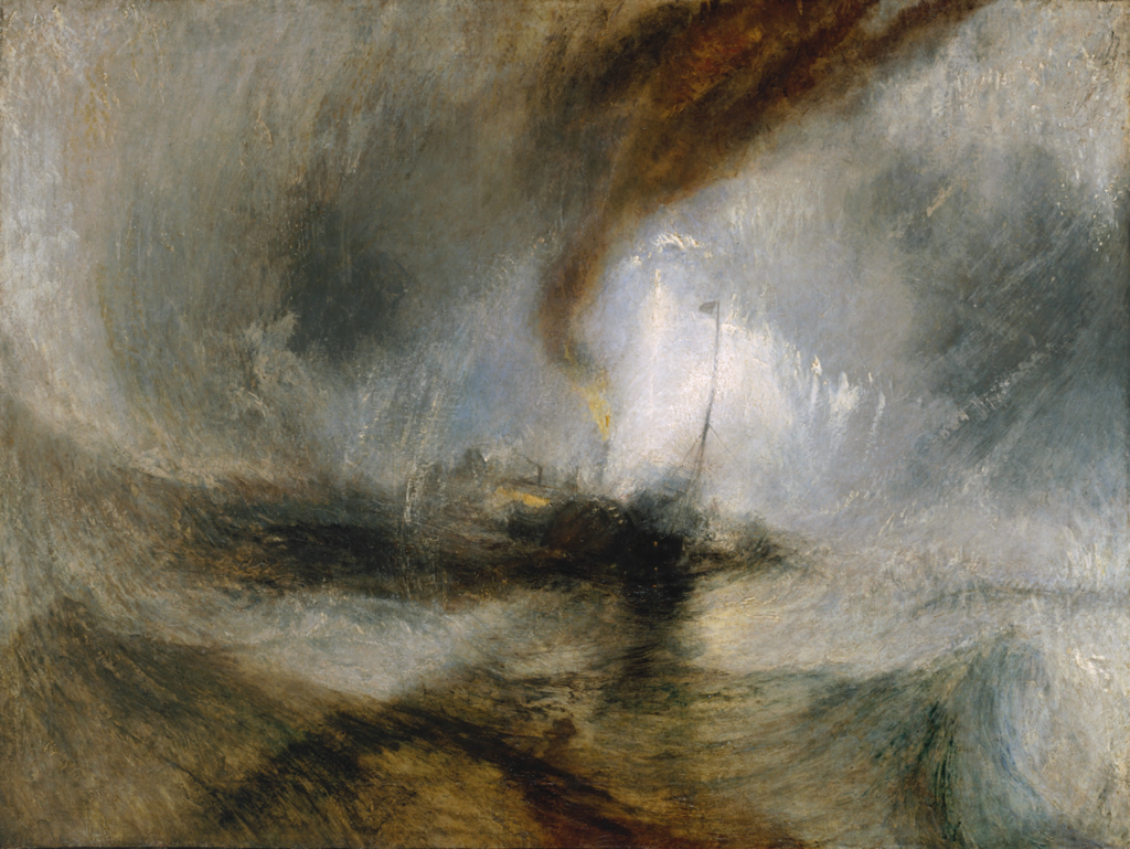
Colour

We use colour in photography to create visual contrast, direct attention, evoke mood, and more. Of all the Elements of photography, colour is perhaps the most complex, but also, often has the most immediate impact. Colour can impact our viewers’ emotional response to an image.

Focus, Control and Aperture

Aperture

The aperture is the opening in the lens that allows light to enter the camera and onto the sensor or film. The size of this opening can be adjusted by changing the aperture settings. Take a look at the picture of a lens aperture above. Notice the adjustable blades that can move to adjust the size of the opening.

Focusing on a camera

Manual focus (MF) is the function to let the photographer adjust the focus manually instead of the camera. Although autofocus (AF) shooting is more typical in digital cameras, MF is effective when focusing is difficult with autofocus, such as in macro shooting.

Focal length

Focal length is the distance (measured in millimetres) between the point of convergence of your lens and the sensor or film recording the image. The focal length of your film or digital camera lens dictates how much of the scene your camera will be able to capture.

Depth Of Field

Depth of Field refers to the distance between the closest and farthest objects that appears acceptably sharp in a photograph. In other words, it’s the area in front of and behind the subject that appears in focus. It helps distinguish the foreground from the background to create a focal point that draws the eye and tells it where to look.

Ralph Eugene Meatyard

Ralph Eugene Meatyard was a visionary photographer known for his dreamlike black & white photographs of family members in masks, elegant portraits of bohemian friends and radical experiments in abstraction. Meatyard liked to experiment with ‘No focus photos’ which are blurry photos.

These would mean that he had probably used manual focus on his camera to capture these blurry photos. He also took quite a few photos of ‘Zen Twigs’. With his study of “Zen Twigs” Meatyard examined the mysterious forms of tree branches photographed close-up with a low depth of field. The camera’s focus on the twig detail contrasts with the obscured shapes of the background.

Texture / Paper Experiments / Final Photos

Jerry Reed

Jerry Reed is an English photographer who claims his objective is to sustain the interest of the viewer through his photographs. He focuses heavily on a contrast in the shadows from the light on the paper, giving a very two-toned effect.

The series is based on paper sculptures meticulously crafted by Reed, explorations in architectural forms and spatial relationships. Reed makes his photos black and white to remove the distraction of colour and to help the viewer focus on other aspects of the photo, such as the subject, the textures, shapes and patterns, and the composition.

In his series, “Paper Work”, Jerry Reed’s B&W photographs of close-up paper arrangements become abstract designs through careful directional lighting.  His constructions are sensually textured, elegant studies of form and tonality.

Paper experiment photoshoot

This is my contact sheet for all of my paper experiment photos. I tried to use different shapes and sizes of scrunched up paper to create different textures. I used the studio to take these pictures using the ring lights at different angles. The only thing I kind of struggled with taking these photos is the aperture and what ISO to use for my photos. These photos are just scrunched up pieces of paper, or cut up paper shaped into different forms to create dimension and let the light go in in different areas of the paper.

Edited (before and after)

For this photo I turned it black and white to get rid of distractions of colours to get the viewer to focus on the texture of the dried up leaves and the form of it.

This is a before and after of a texture photo I took. I decided to enhance the colour to really bring out the texture in it. It isn’t easy to see here but I also cropped the photo so it was a square so that it could be more focused on one area of the photo only. I turned the brightness and contrast up to make it more clear.

In these photos that I took of some fake flowers and leaves, I decided to make the photo black and white as I thought there was too much going on which all the colour and now the viewer can just be focused on the main aspects of the image. I made the hue and saturation higher. I also cropped my image so that it didn’t have as much negative space and the viewers would be able to focus on only the main aspect of the image.

This photo that I took represents many of the formal elements, for example:

Line: This is included to divide the space and suggest patter, form, depth, distance and rhythm.

Shape: This makes the photo stand out as it captures the viewers attention as it has sharp edges and well-defined corners.

Repetition: The same shape is used repeatedly which creates a sense of rhythm and balance in the image.

Texture: The texture on the film around the shapes brings life and vibrancy to the image so it doesn’t appear flat and uninspiring.

In these 3 photos, I had edited the first one in 3 different ways. The first photo I increased the saturation, vibrancy and the hue to make the colours really stand out more. In the second one, I added a gradient map over the top of it and used a mixture of blue and a pale pink to show the contrast between the colours and shadows. These colours also bring out more texture than you could see in the original photo. In the last photo, I decided to make it black and white to remove the distraction of colour so that the viewer could focus on the other aspects of the photo, like the texture and the shapes.

My Final Photos

These are my favourite final photos. I think they create a good variation of the formal elements. The texture in all of them creates a sense of dimension in the photos and the ones in black and white make sure that the viewer isn’t distracted by the bright colours and takes more time to notice the little features of the photos to get it more in depth. In the photos which are not black and white, I decided to enhance the colour as it makes the texture of them come out even more. The photo in the top right and the photo of the trees have a lot of shape which stands out and captures the viewer’s attention, along with repetition to produce a sense of rhythm and balance.
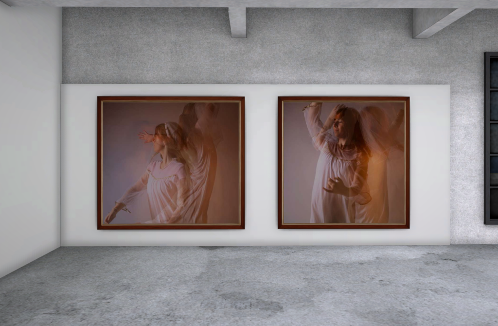
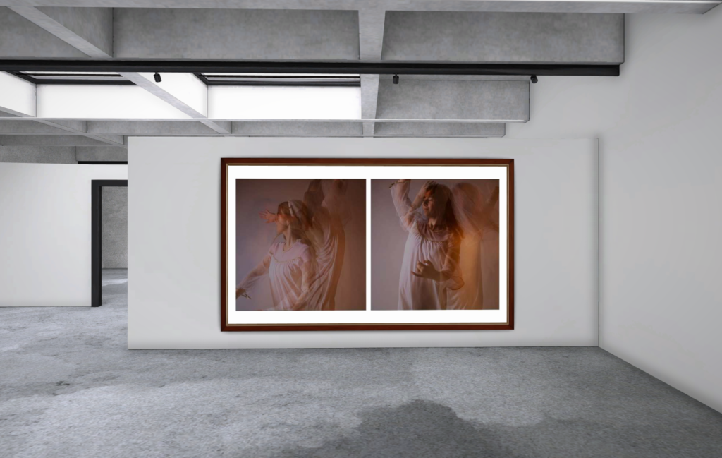
ArtSteps Gallery

I decided to put these photos together as they kind of give off the same concept and are both in black white so the viewer is not distracted by the colour of the photo. both these photos are based off of nature which makes them look good together. The two photos together really compliment each other and all the dark lines makes the images stand out to the viewers. I decided to get three different types of leaves to really show the difference between them but how well they work together. The dark tones bring out the texture in each photo and can really grab the viewers eye.

I believe that these three photos work really well with each other as they are all in colour and they all give off the same vibe. All have a lot of repetition within them which creates a sense of balance and rhythm. I think the colour in each of them enhances the amount of texture in each photo which can really grab the viewers eye and make them more intrigued in the photo. The green and blue tones in all photos give off a sense of calmness and relaxation which is another reason why I think these photos work really well with each other.

Adobe Lightroom

Purpose Of Lightroom

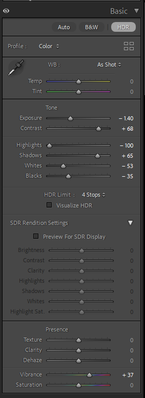
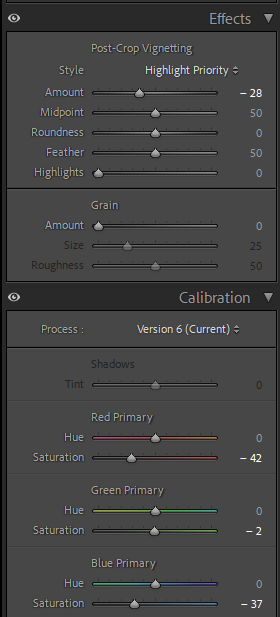
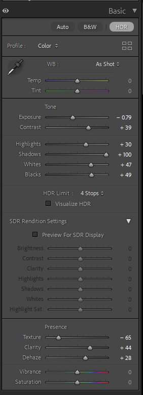
Adobe Lightroom is a photo editing and storage application available through the Adobe Creative Cloud. This program allows users to quickly and easily edit their photographs with tools to alter contrast, balance colour, and change brightness on mobile devices immediately after taking the picture.

Catalogue

When I had first opened Lightroom, I had to create a personal catalogue that I named after my name and it was saved in the video data drive.

This is where everything for my images in Lightroom are stored.

Importing Images

After creating my catalogue, I had to import some of my own images into Lightroom. I did this by pressing the ‘Import’ button in the left-hand corner.

Collections

I then had to create a collection which would store all of my shutter speed experiment photos. This helps as it will be much easier to find all of my edited shutter speed photos and I can store all of my photos into separate collections so they are all sorted out and easier to find.

Selection

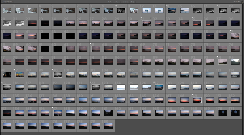
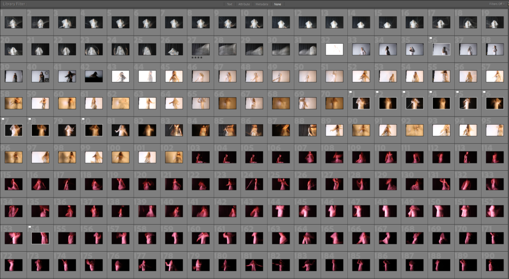
After creating a collection with all my photos in it, I had the option to rate all of my photos in different ways. I was able to flag my selected images, by either using the X key (bad) or the P key (good), these could be filtered out by pressed the flagged button to see which ones you chose for good. Another option was rating all the photos out of 5 stars.

(Images with white flags are the ones I chose for good with ratings underneath)

Develop Mode

Develop mode is used when needing to do very specific editing on only one image, this is different to library mode as it would only allow you to make small adjustments to more than one image.

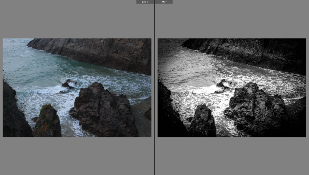
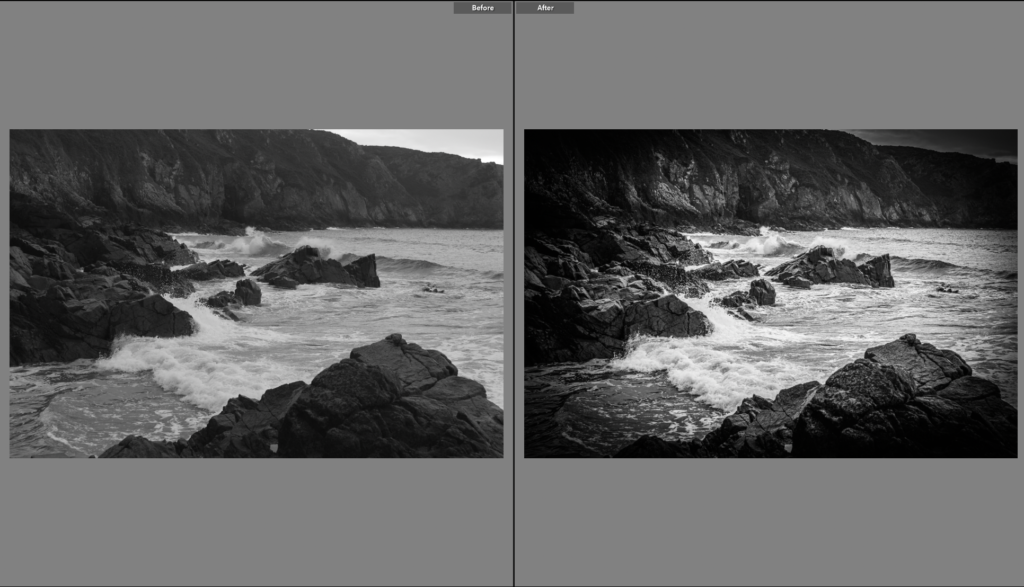
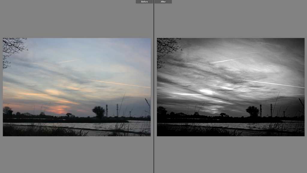
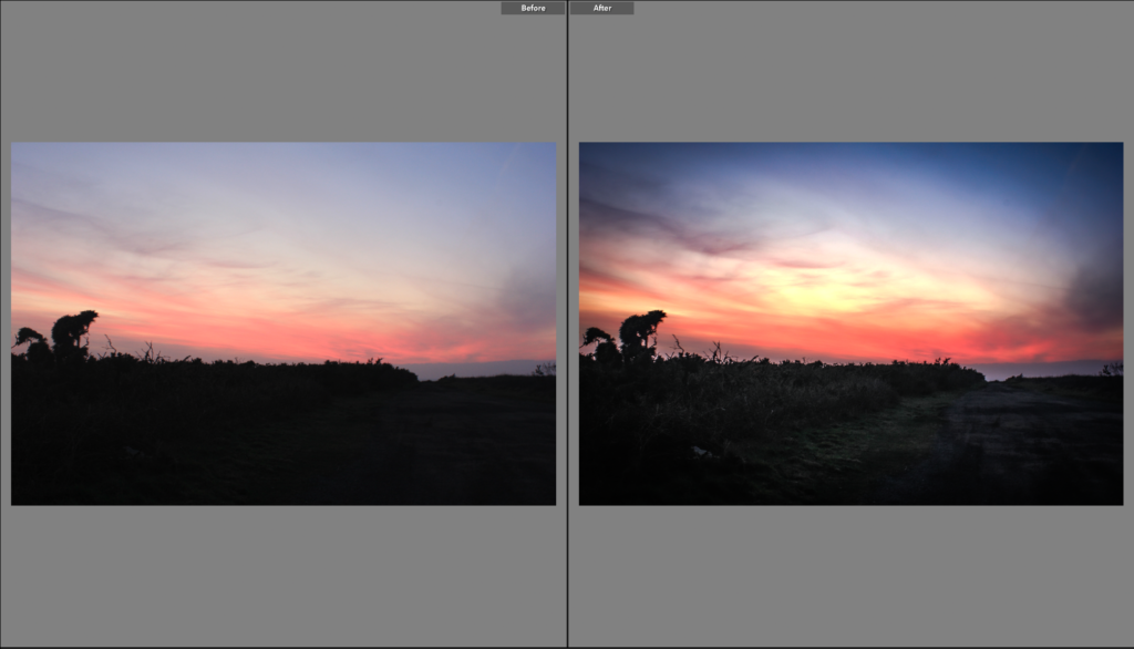
At the bottom of the screen there is an option to see your photo before and after you make changes to it. This could help me identify what still needs to be changed and what I should keep the same to make the photo better.

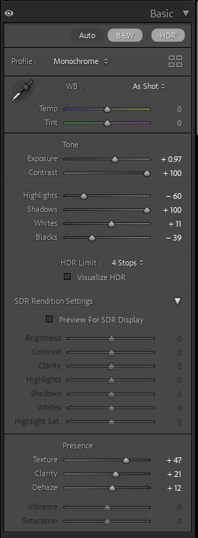
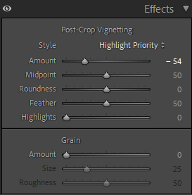
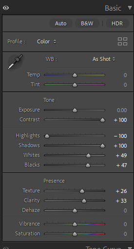
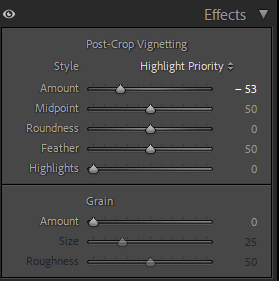
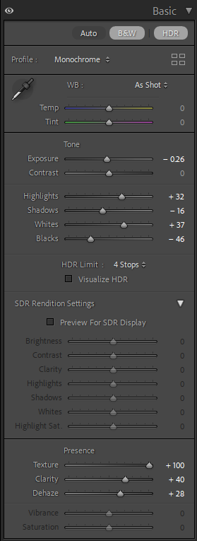
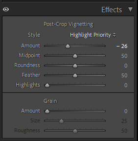
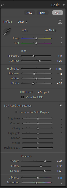
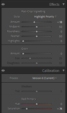
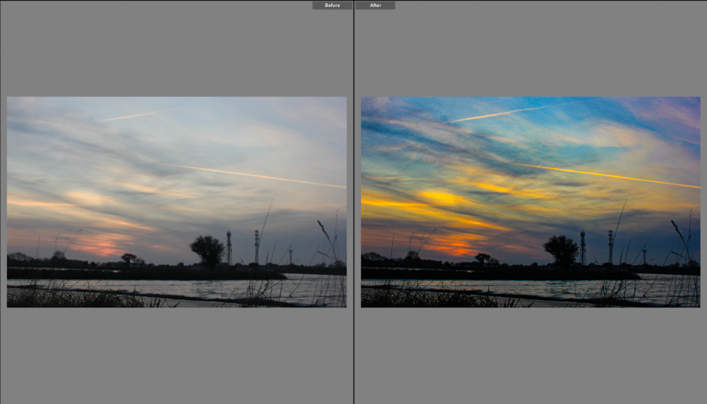
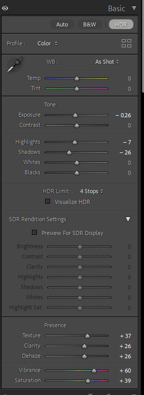
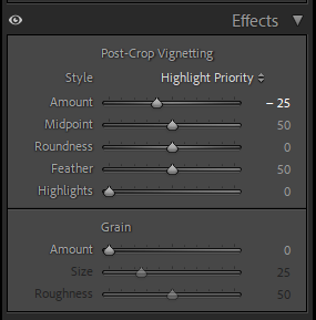
As you can see in my before and after photos, I had changed my photo to a black and white scheme. Develop mode includes many pre-sets which are used to make fast edits of your photos or you can just edit the photos manually with the tabs on the right-hand side.

Contact Sheets

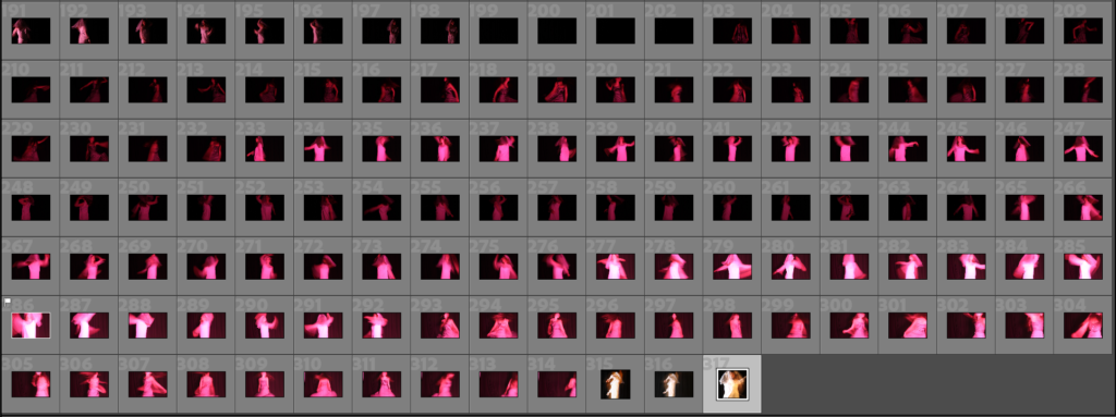
This is my contact sheet which has all of my photos from my shutter speed experiment.

William Klein

William Klein was an American-born French photographer and filmmaker noted for his ironic approach to both media and his extensive use of unusual photographic techniques in the context of photojournalism and fashion photography. He was well-known for his unique contact sheets where he drew over and colour coded images to identify and group them, showing his thought process behind his pictures and clearly identifying what he considered his strongest work.

Origin of Photography

Camera Obscura

The camera obscura is around 200 years old and its name comes from the Latin words ‘Dark Room’.

What is it and how does it work?

It is a darkened box with a convex lens for projecting the image of an external object on to a screen inside.

A large curtain surrounds the darkened chamber and there is a large lens mounted in a wooden panel. the lens then focuses the light from outside down onto a mirror which is held at a 45 degree angle behind it on the inside. The mirror then reflects the rays of light onto a piece of paper that is laid out flat on the base inside a wooden box. to be able to see the image you would have to cover yourself with a black cloth to stop any light from getting in.

Why does this make it hard to dictate the origins of photography?

The camera Obscura existed before 1839, in 1839 the commercial process came out as Louis Daguerre developed the daguerreotype. This makes it problematic as people will wonder which one came first.

Nicephore Niepce

Henry Fox Talbot

Henry Fox Talbot was credited as the British inventor of photography. In 1834 he discovered how to make and fix images through the action of light and chemistry on paper. These ‘negatives’ could be used to make multiple prints and this process revolutionised image making. Photogenic drawings were basically contact prints on light-sensitive paper, which unfortunately produced dark and spotty images. In 1840 he modified and improved this process and called it the calotype. The mousetraps are sturdy little wooden boxes with a brass tube housing a lens at one end, and a sliding wooden panel at the other. Into the wooden panel at the back Talbot would stick a piece of normal writing paper that he had made chemically sensitive to light.

Daguerreotype

The daguerreotype was the first commercially successful photographic process (1839-1860) in the history of photography. Named after the inventor, Louis Jacques Mandé Daguerre, each daguerreotype is a unique image on a silvered copper plate. The daguerreotype wasn’t as successful as Talbot’s system because the daguerreotype had serious limitations. The mirror-like surface of the image could only be viewed from a narrow angle. Further, the process produced a one-of-a-kind image that did not permit printing duplicates.

Richard Maddox

Richard Leach Maddox, a British physician and photographer, invented the gelatin silver dry glass plate negative in 1871. The dry plate process quickly replaced the wet plate collodion process that required the mixing of dangerous chemicals and immediate exposure of the wet plate.

Muybridge’s famous Motion Studies

Muybridge worked closely with Senator Leland Stanford on experiments to record horses in motion, trying first to answer the question of whether or not all four feet are off the ground during the trot. In 1873 he successfully captured that event in Sacramento, using Leland Stanford’s horse Occident as his subject. Muybridge is known for his pioneering chronophotography of animal locomotion between 1878 and 1886, which used multiple cameras to capture the different positions in a stride; and for his zoopraxiscope, a device for projecting painted motion pictures from glass discs that predated the flexible perforated film strip used in cinematography. From 1883 to 1886, he entered a very productive period at the University of Pennsylvania in Philadelphia, producing over 100,000 images of animals and humans in motion, occasionally capturing what the human eye could not distinguish as separate moments in time.

George Eastman

In the 1880s, Eastman developed a convenient method of preparing ready-to-use plates. Improvements led to flexible, roll film as well as photo processing and printing done by mail order. Millions of people worldwide captured memories using cameras and film, leaving all the chemistry to Kodak. In 1881, with the financial backing of Rochester businessman Henry Strong, Eastman formed the Eastman Dry Plate Company (reincorporated as the Eastman Dry Plate and Film Company in 1884 and as Eastman Kodak Company in 1892).

ISO

What is ISO? How does it affect your camera?

ISO controls the amount of light your camera lets in, so it tells you how light or dark your photos will be. Low values, such as ISO 100, are best for a sunny outdoor shoot. For shooting at night or indoors with dim lighting use an ISO of 1600 or higher. As you increase your ISO number, your photos will grow progressively brighter. For that reason, ISO can help you capture images in darker environments, or be more flexible about your aperture and shutter speed settings.

High/ Low ISO

The lower the ISO number, the more light is needed to properly expose the image. The higher the ISO number, the less light is needed. ISO 200 requires much more light than ISO 6400.

What effect can a High/ Low ISO have on your camera?

The higher the ISO number, the higher your camera’s sensitivity, and the less light you need to take a picture. The trade-off is that higher ISOs can lead to degraded image quality and cause your photos to be grainy or “noisy.” At the lowest (base) ISO setting, your images will have the least amount of noise and the highest dynamic range, giving you the most flexibility in post-processing.

What is meant by visual noise?

Noise in photography can be defined as a random variation in the image signal. Noise can be caused by a number of factors, including poor lighting conditions, high ISO settings, long exposure times, and heat.

When might you want to use a high ISO?

High ISO is generally well suited to low-light situations, especially when a fast shutter speed or a narrow lens aperture is essential to achieving a creative goal. Sometimes a little noise can actually even add character to your images.

My photos

The photos on the right were taken at an ISO of 6400 and shutter speed of 1/20 of a second. This makes the photo look brighter and less textured whereas the photos on the left were taken at an ISO of 100 at 1/20 of a second which gives the photos more dimension if in a lighter room.

Shutter Speed

What is shutter speed?

Shutter speed is the speed at which the shutter of the camera closes, determining the period during which the sensor is exposed to light. A longer exposure time allows more light to reach the sensor, resulting in a brighter image – controlling and adapting shutter speed is crucial for capturing either sharp images of moving things or exploring creative blurring in moving things.

Fast shutter speed

Fast shutter speeds, at 1/500th of a second or faster, will freeze and capture quick-moving action – so you get a clean image of a subject that would otherwise be blurred.

Slow shutter speed

A slow shutter speed can help you illuminate a darker scene, as it brings more light through the lens. But with a faster shutter speed, the lens is open for a shorter length of time, so less light enters the lens. That makes low light a challenge and demonstrates the importance of a well-lit scene.

Eadweard Muybridge

Muybridge would take his photographic discoveries on tours across America and Europe. During his lifetime he advanced the chemicals that develop film. He quickened camera shutter speed to a fraction of a second. And by aiming dozens of lenses at the same subject, he found ways to stop time and stretch it like elastic.

This is one of Eadweard Muybridge’s work in which he has used fast shutter speed to capture every moment of the horse’s jump.

Harold Edgerton

Edgerton experimented with shutter speed by synchronizing strobe flashes with the motion being examined (for example, the spinning of engine rotors), then taking a series of photos through an open shutter at the rate of many flashes per second, Edgerton invented ultra-high-speed and stop-action photography in 1931.

This piece shows how Edgerton used slow shutter speed to capture the movement of the racket.

Hiroshi Sugimoto

Sugimoto refers to his signature photographic style as “time exposed.” He plays with shutter speeds other photographers struggle to master. His goal with these experiments is, in part, to create time capsules of events and to reveal the paradoxes of time. Sugimoto’s signature style is his use of an 8 x 10 large-format camera combined with extremely long exposure times. This style exemplifies Sugimoto’s mastery of photographic techniques and has contributed to his fame and recognition as an artist.

Sugimoto’s photographs reveal his reverence for technique. They are primarily in black and white, and often made with an analogue large-format camera. These are images made with intent; carefully planned, and often slowly executed. Sugimoto’s work engages with the history of photographic materials and processes.

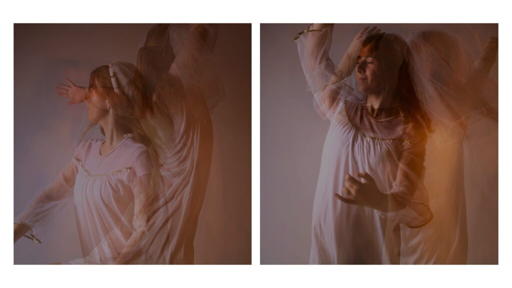
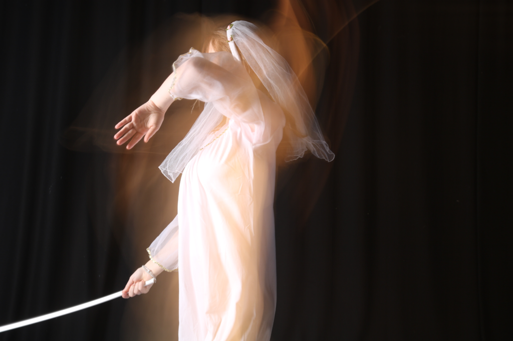
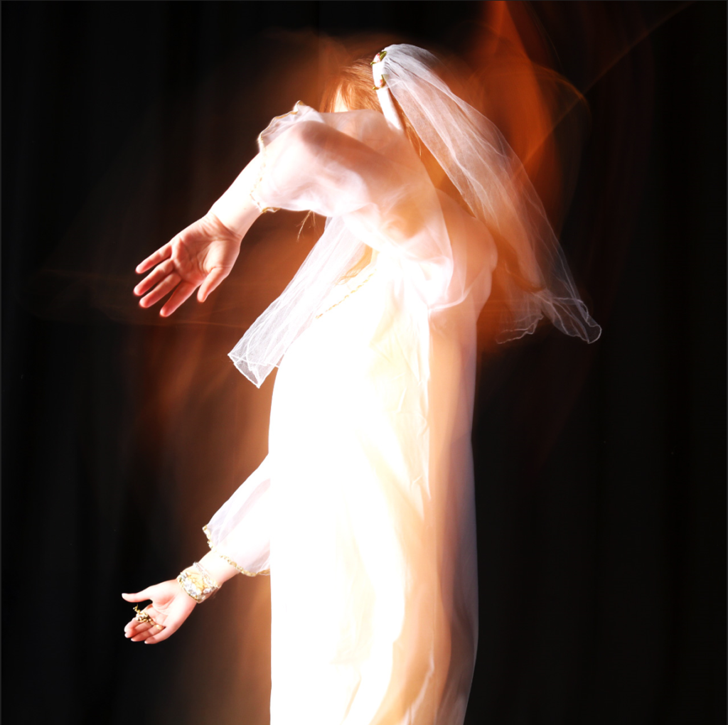
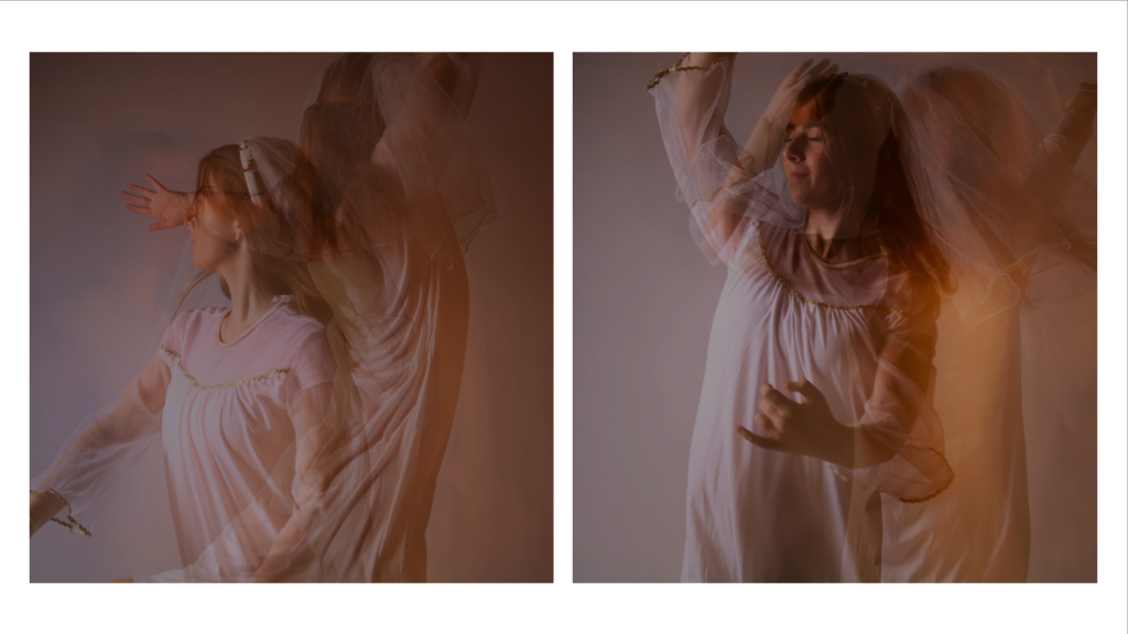
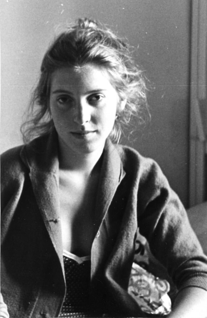
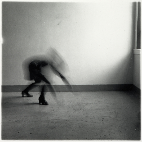
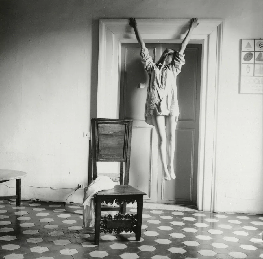
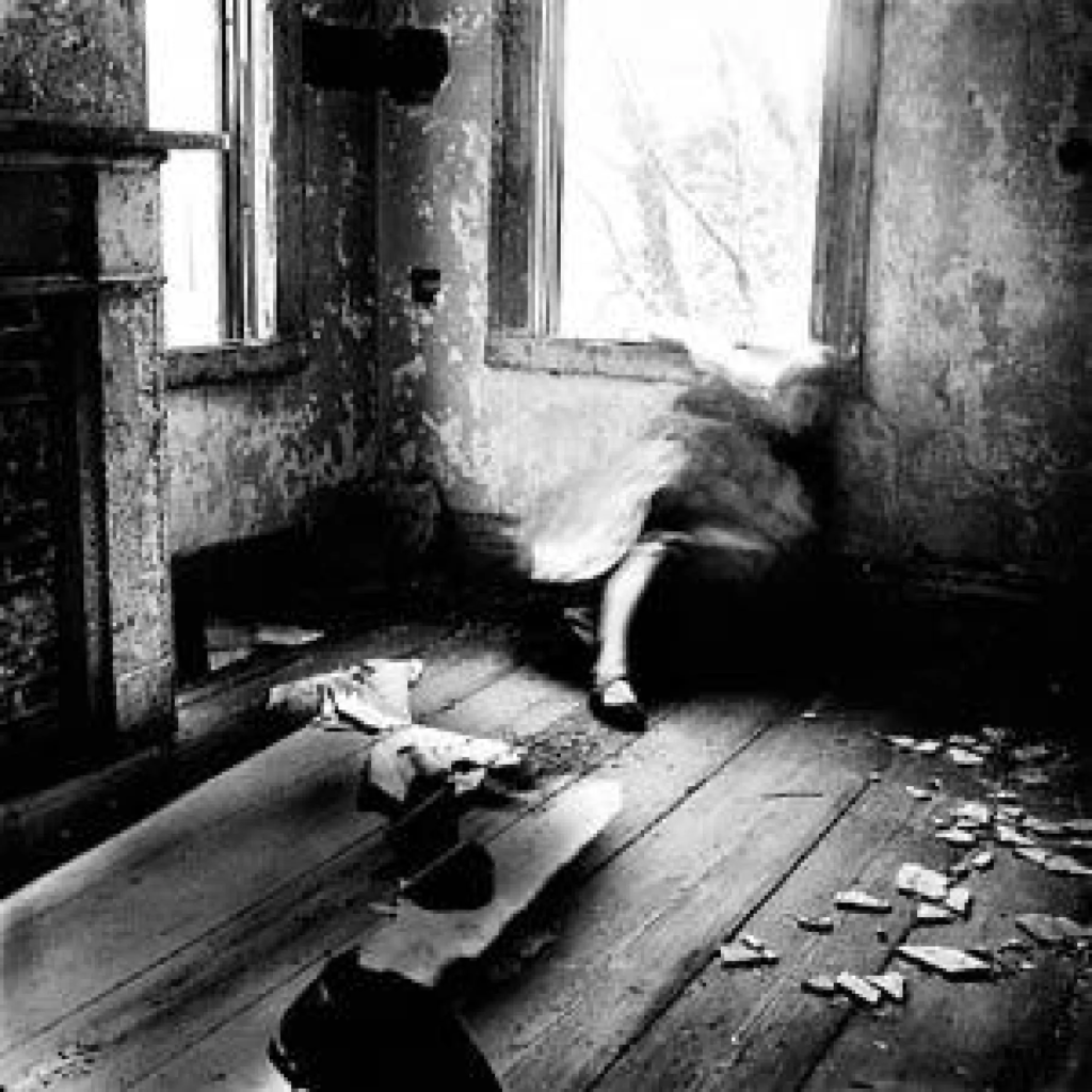
Francesca Woodman

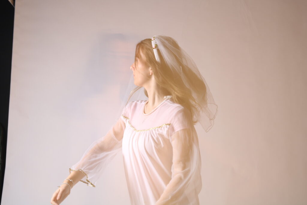
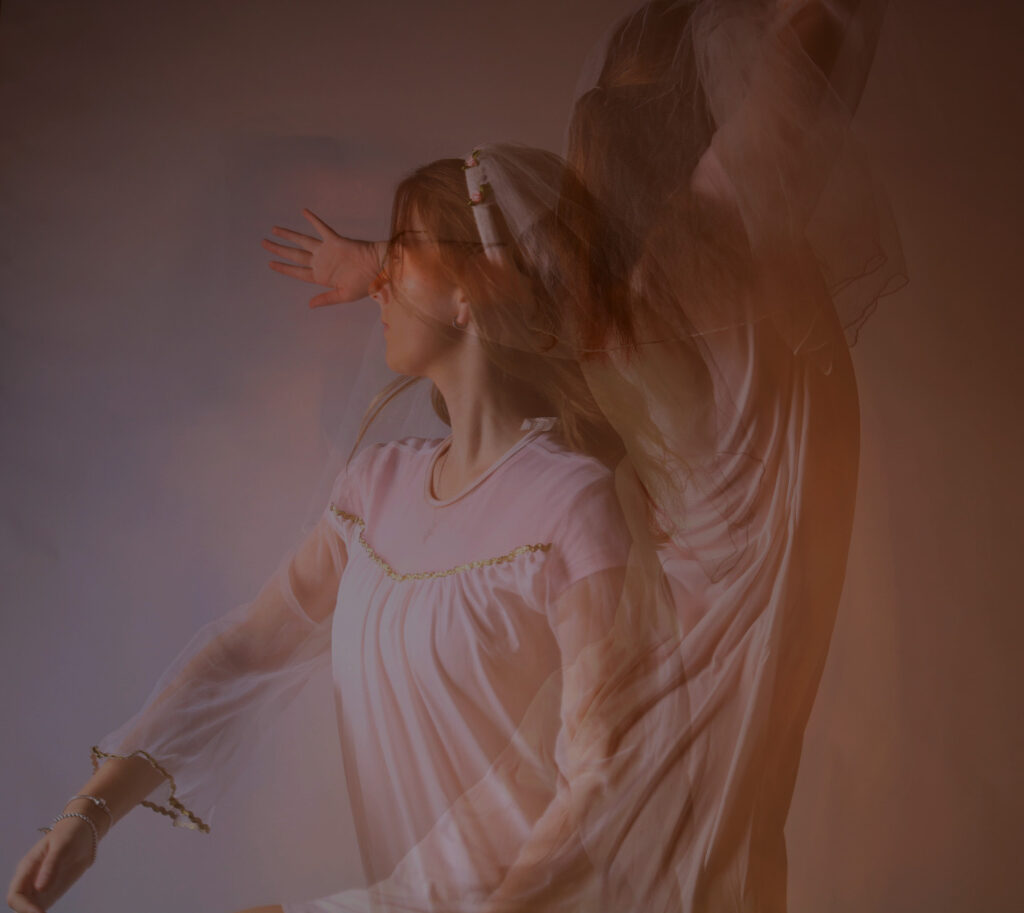
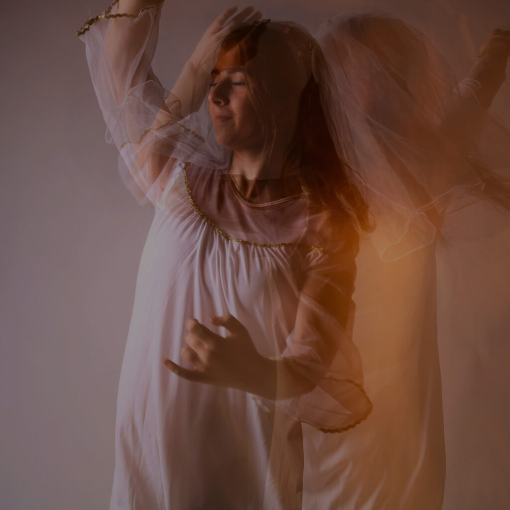
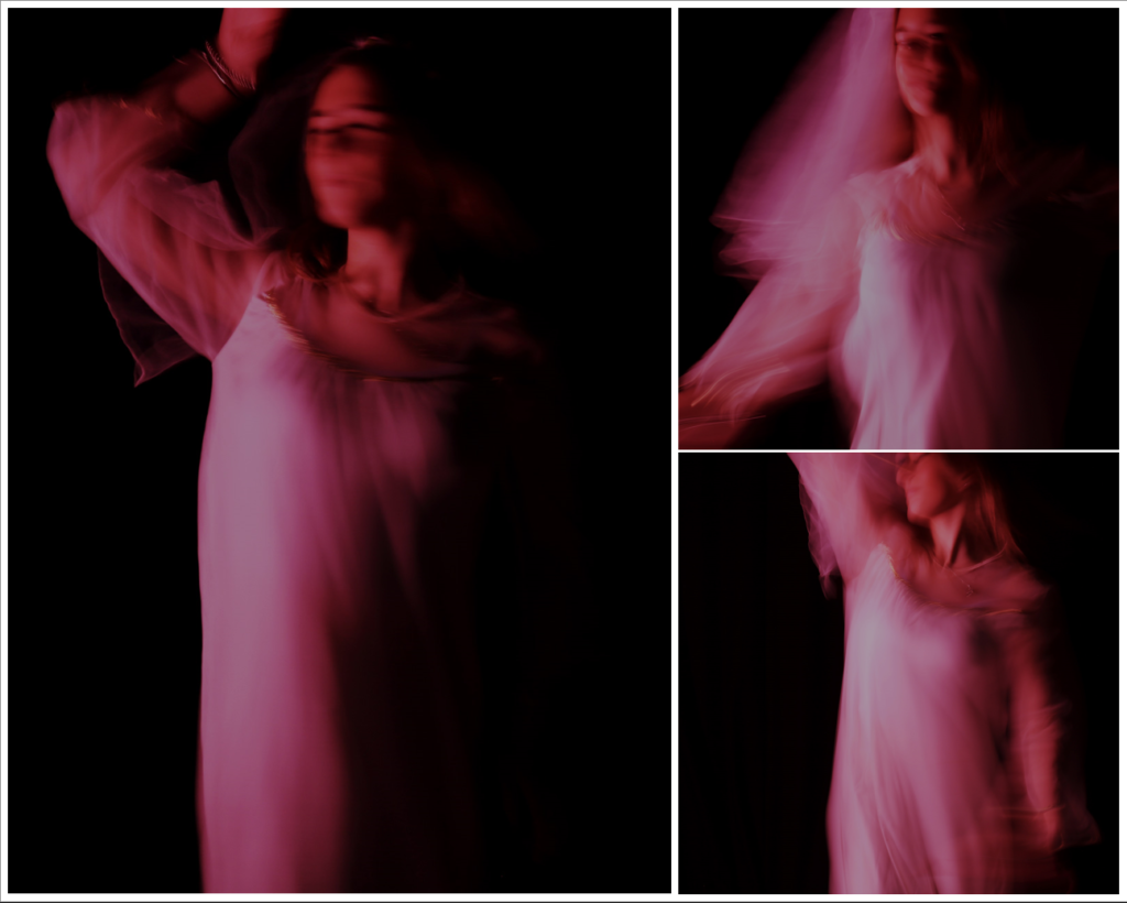
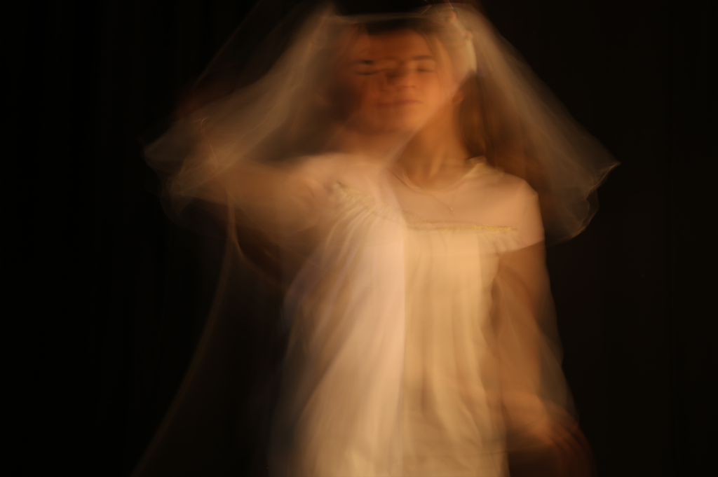
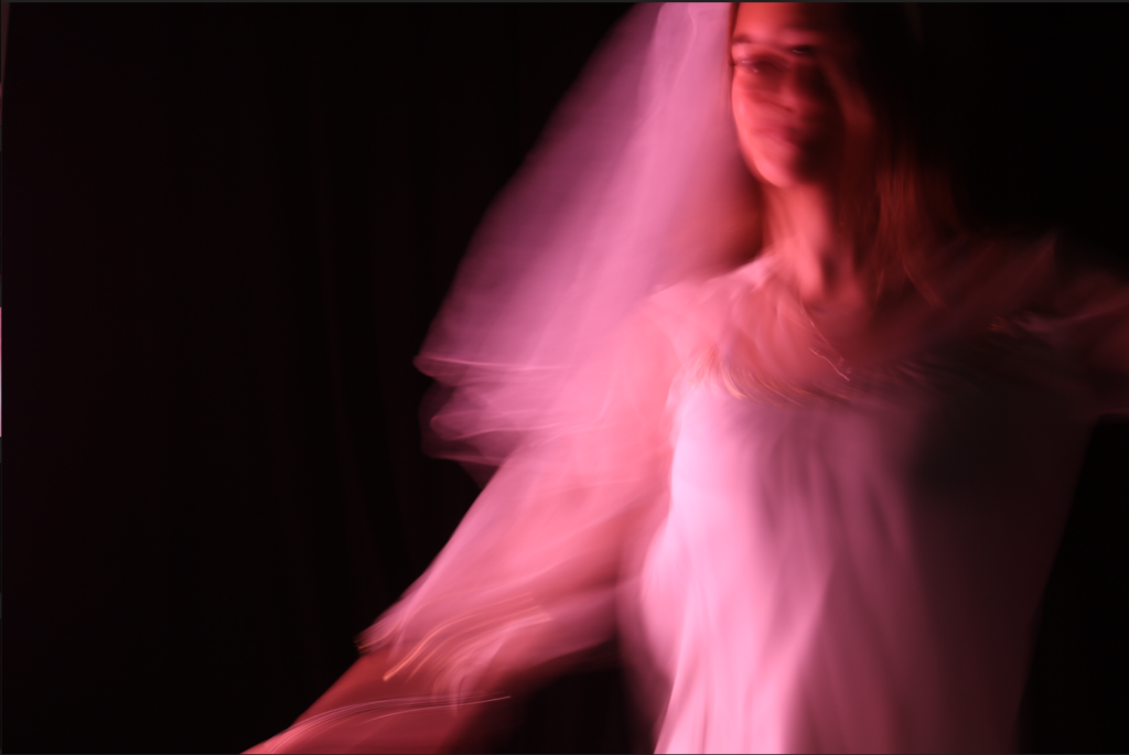
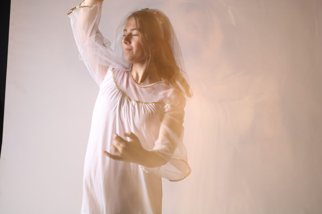
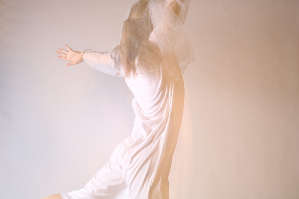
Woodman used long shutter speed and double exposure when photographing so that she could actively feature in her own work. This also meant that she could capture different stages of movement, in a way that could trace the pattern of time. As a result, her image is blurred, which suggests motion and urgency. Woodman uses long shutter speeds from 1/2 – 5 seconds, as a self portrait photographer this is important and very clever, Woodman uses long shutter speeds to suggest her slow progression through life with a mental illness. as she has long shutter speeds her photographs show the movement of her body (motion blur).

During her career, Woodman produced over 800 black and white photographs. She featured as the subject in many of them, sometimes partially clothed, naked, disguised, hidden or a blur. She used ordinary objects and materials, such as mirrors and pegs, to transform her body parts into distorted and surreal versions.

Effects of changing shutter speed

A slow shutter speed can illuminate a darker scene, as it brings more light through the lens. With a fast shutter speed, the lens is open for less time, so less light can enter. That makes low light a challenge and demonstrates the importance of a well-lit scene. Slower shutter speeds get you blurry lights and motion-blur effects. Think blurry headlights on a highway or artsy light trails. Conversely, faster shutter speeds let you freeze motion with little to no blurriness. Picture an athlete running on a field, perfectly sharp and paused in time. If you’re shooting in lower light, however, faster shutter speeds can require you to increase your ISO which can add unwanted noise or grain to your image.
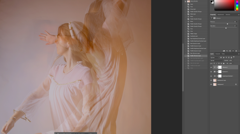
Class Photoshoot

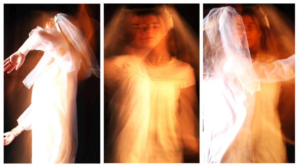
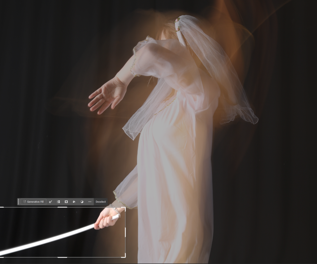
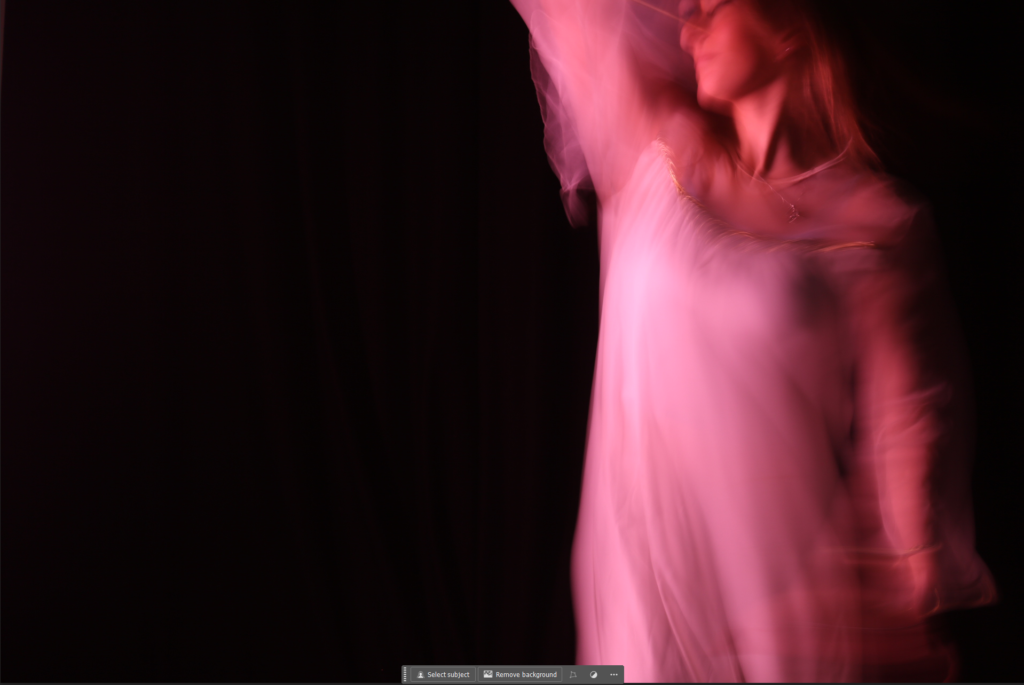
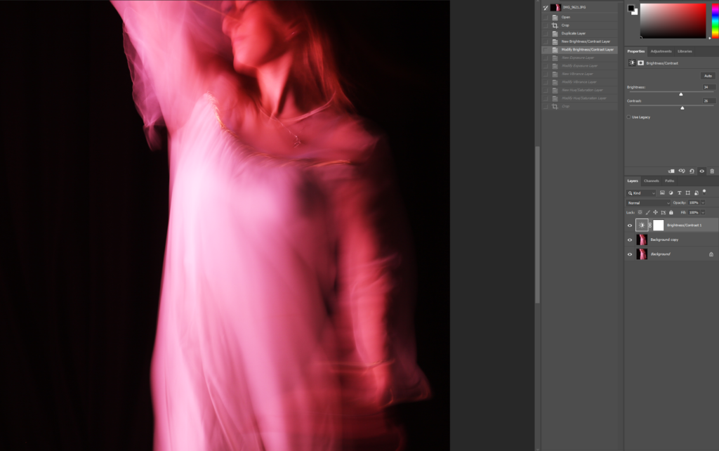
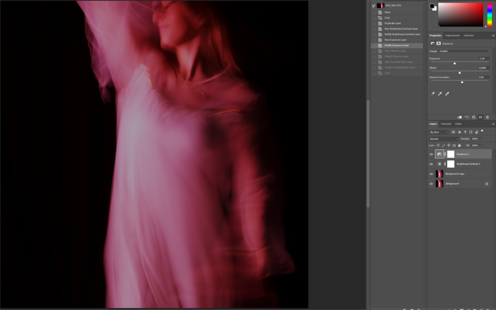
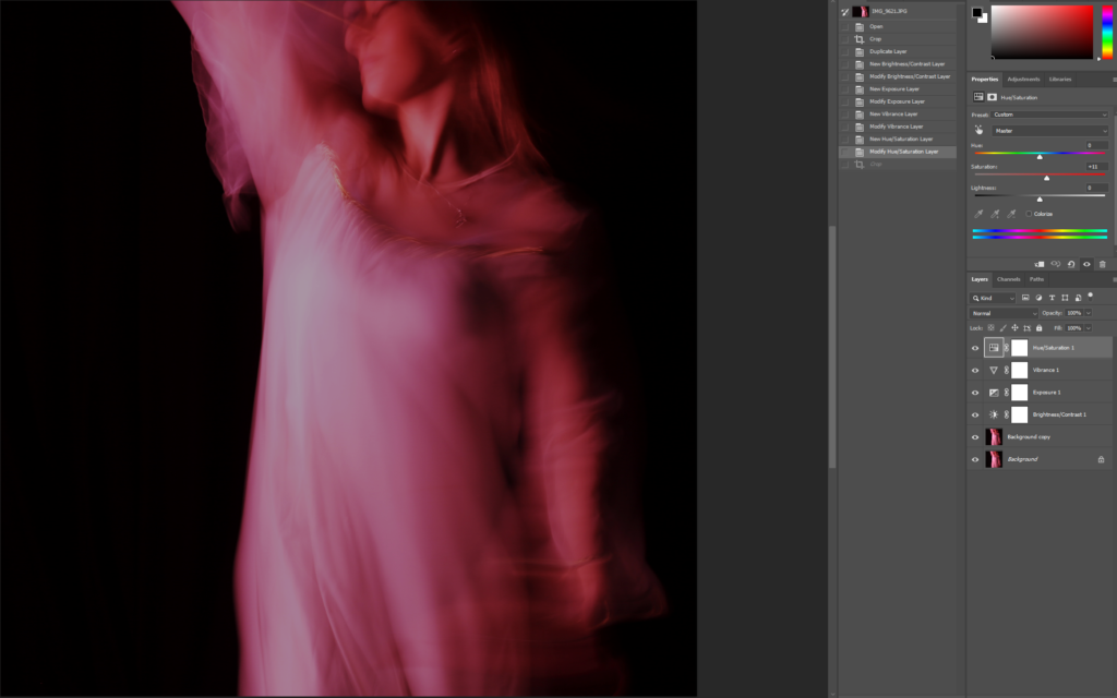
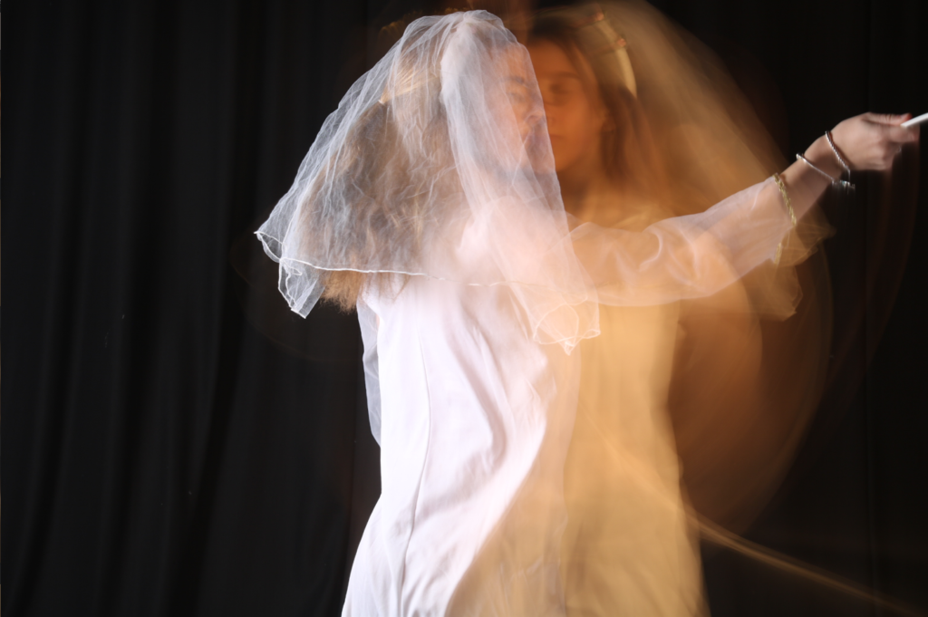
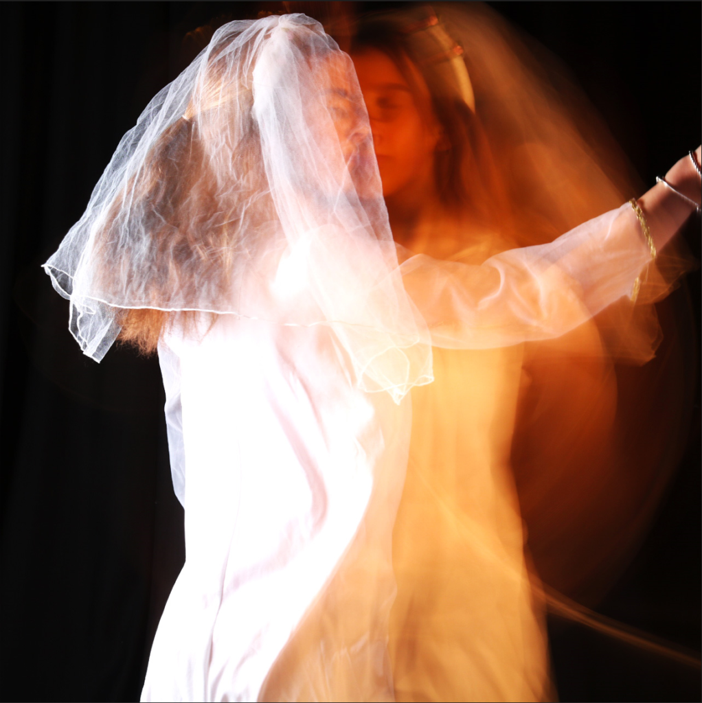
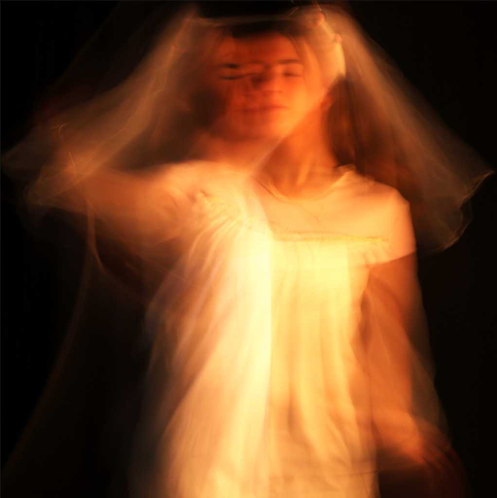
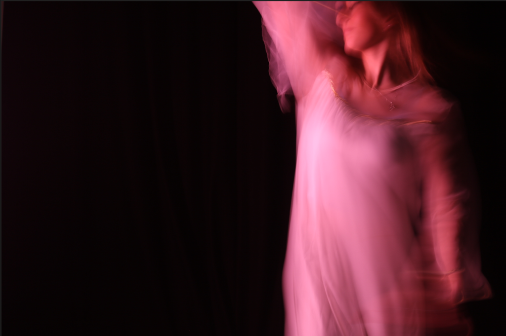
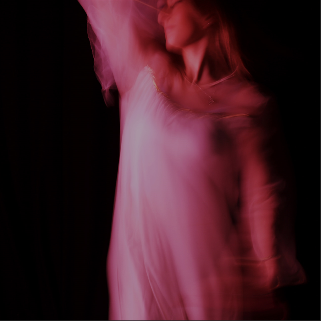
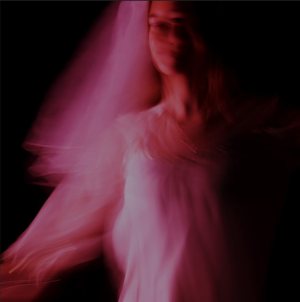
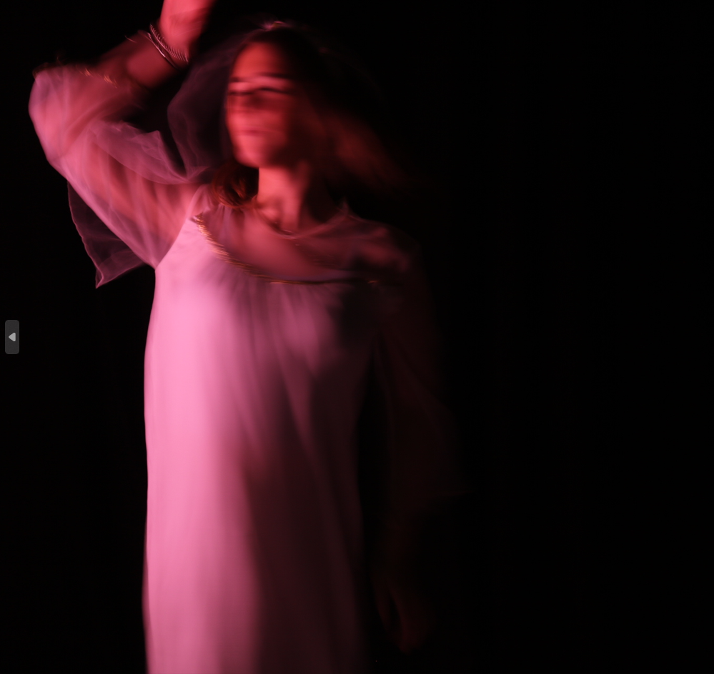
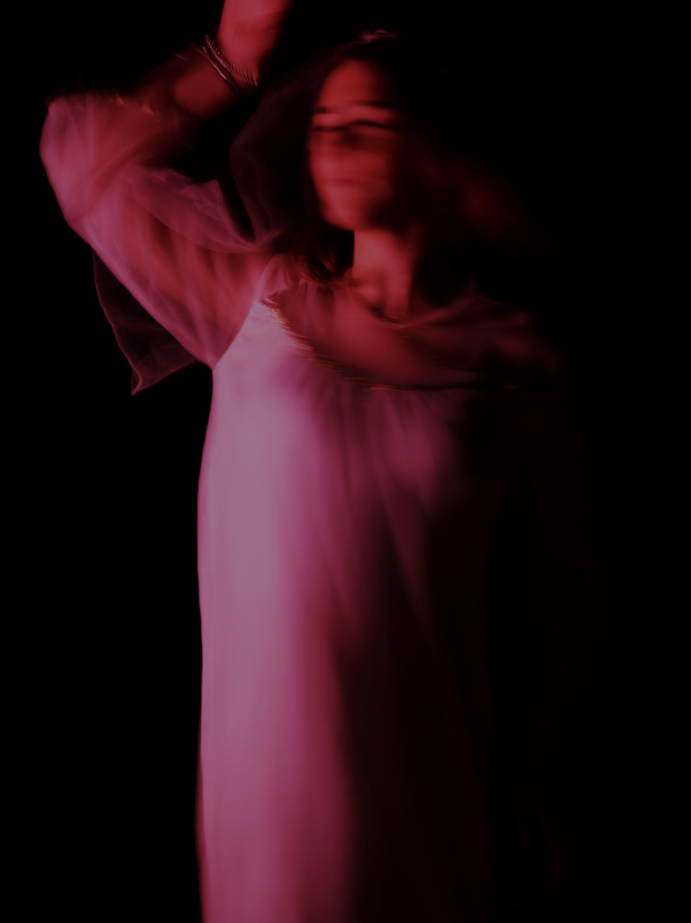
These are some images from our class photoshoot that is presented in the style of Francesca Woodman, in which we used a slow shutter speed to create almost a ghostly image in black and white.