

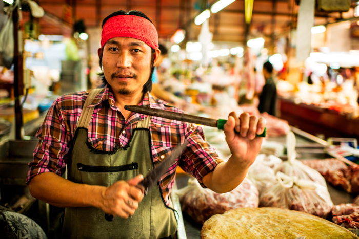


What are Environmental Portraits ?
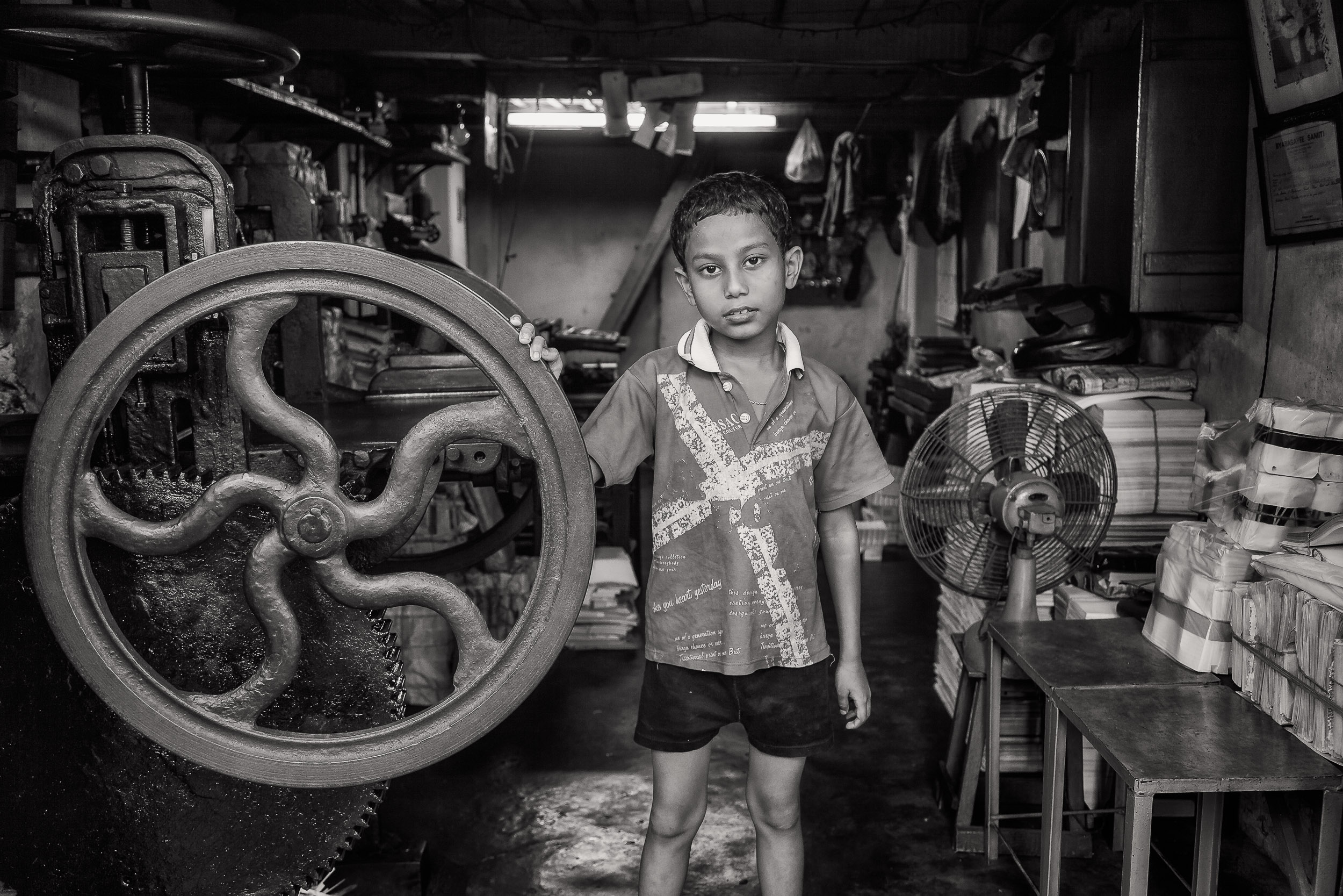
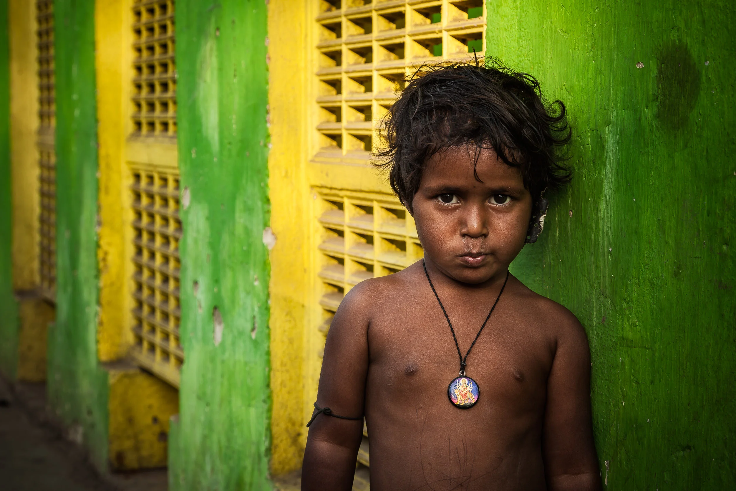
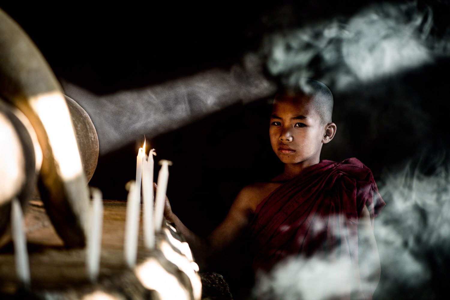
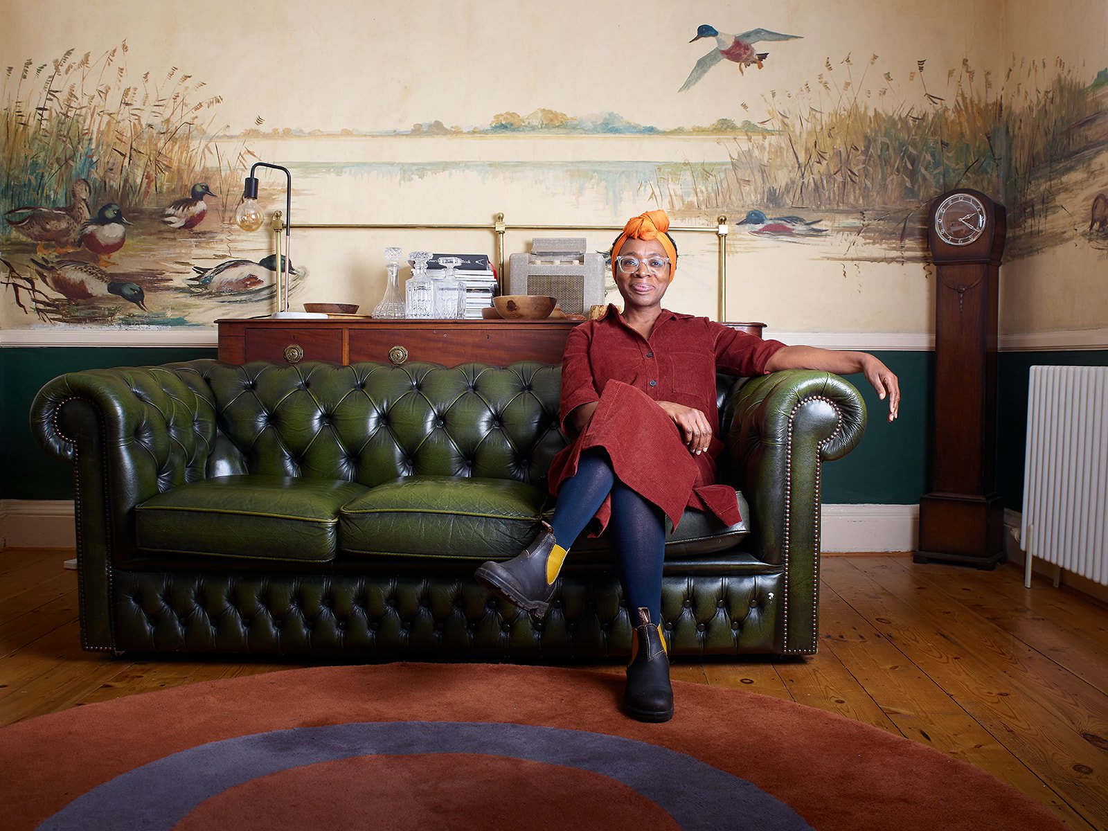
An environmental portrait is a type of portrait taken in the subject’s everyday setting, like their home or workplace. This style of photography aims to showcase not just the person but also their life and the environment around them. When you capture someone in their own space, it’s believed that you can reveal more about their character and truly reflect their personality, rather than just focusing on their physical appearance. Additionally, being in a familiar environment can help the subject feel more comfortable, allowing them to express themselves more naturally compared to the often intimidating atmosphere of a studio.
Artist Analysis
Arnold Newman
Who is he ?
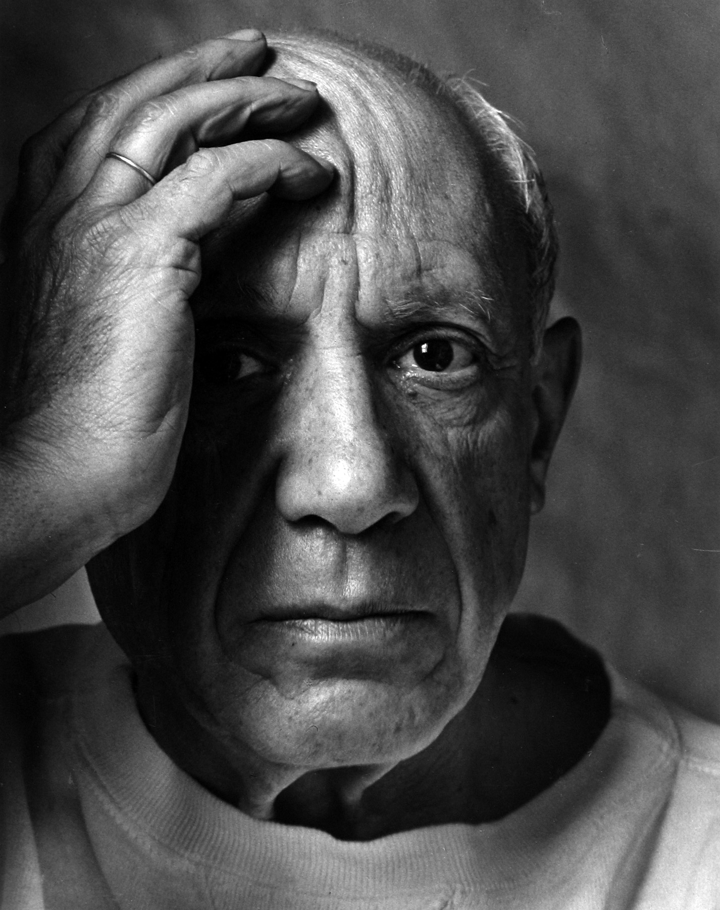
Arnold Abner Newman, born on March 3, 1918, and passing away on June 6, 2006, was a renowned American photographer. He gained fame for his “environmental portraits,” which captured artists and politicians in their own settings. Additionally, he was recognized for his skilful abstract still life photography. In 2006, he was honoured with induction into the International Photography Hall of Fame and Museum.
Newman’s work
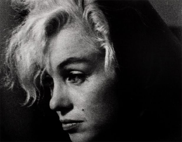
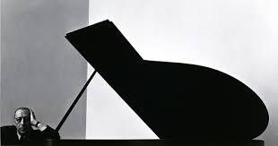

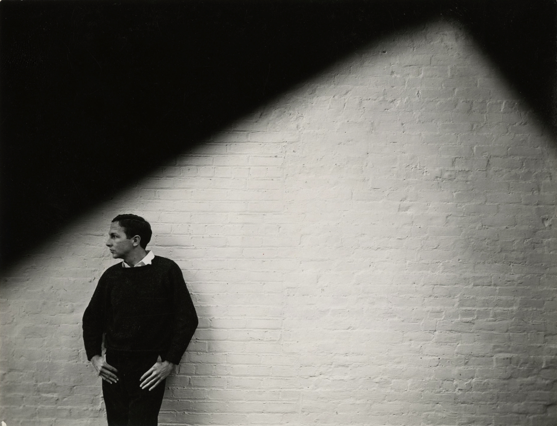
.jpg)
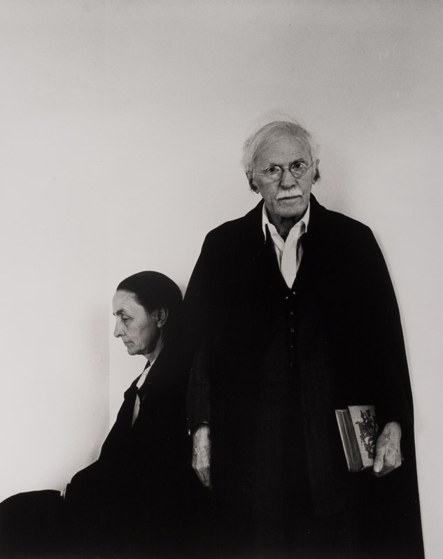
Image Analysis

This image shows an almost villain looking old man staring directly into the camera, creating an uncomfortable atmosphere. The two pillars either side exaggerate the rule of thirds in this image and place Krupp in the centre bottom of the image. The lighting along the celling creates leading lines that take the viewer to the industrial, train station background.
Visual – The sitter ( Krupp ) is the main focal point of the image, he is leaning forward suggesting how he is confident he is and how he is probably the owner and not a worker. Krupp’s wrinkly face and hands highlights his age and worn appearance, it also shows how he has seen and been through a lot in his life. Krupp is fully centre with lights leading to him and pillars either side to show how he is the centre of attention. The relatively bland colours create a strong contrast between the dark and light patches of the image. The photo has little negative space and is extremely cluttered which could allude to how messy and cramped his past life was. Krupp seems raised from the background showing how he could be more important than average.
Technical – The dim lighting, probably artificial, creates and eerie atmosphere. Furthermore the cold tone of the lighting emphasises the serious, uncomfortable scene. Moreover because of this lighting technique, each side of his face is lit up whereas the front of his face is left in darkness, this reinforces how mysterious Krupp is. The background is blurred however some of the background details are still identifiable, Krupp is in focus, this is through using a medium to shallow depth of field and a middle to low f/stop. The shutter speed is most likely fast as he is fully in focus with a balanced exposure. The angle the photo was taken at is directly facing him at eye level which allows the view to connect better with him.
Contextual – Arnold Newman was a Jewish photographer who was asked by Newsweek to capture a photo of Alfred Krupp who was not a military man but an industrialist who owned and ran the war factories. Newman didn’t want to take the photo but then agreed to it in the end and saw it has his small bit of revenge for what Krupp did.
Conceptual – Newman didn’t want to take the photo but then agreed to it in the end and saw it has his small bit of revenge for what Krupp did. When Newman asked Krupp to lean forward for the photo he naturally without being asked put his hands together and put them to his chin. Newman seeing this took the photo without hesitation, however Krupp hated this photo that was now famous world wide. This was Newman’s revenge.
Further Artist Analysis
August Sander
Who is he ?

August Sander (November 17, 1876 – April 20, 1964) was a notable German photographer known for his portraits and documentary style. His first book, Face of Our Time, came out in 1929. Many consider Sander to be the most significant German portrait photographer of the early 1900s. While he also captured landscapes, nature, architecture, and street scenes, his portraits are what he is most famous for, especially in his series People of the 20th Century. This series was created to represent a diverse slice of society during the Weimar Republic.
Image Analysis
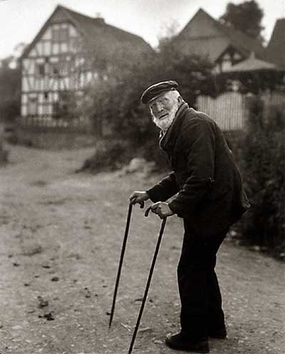
The image shows an older man using two walking sticks, prominently featured in the foreground. He seems to have stopped for a moment while making his way up the lane in the background. You can tell he’s elderly by his hunched posture and the white hair on his face. In the photo, the man looks like he’s been walking down the road and has taken a break to look at the camera. He’s positioned on the right side of the frame, facing towards the centre and the empty space on the left. This composition leads our eyes to the building in the background, suggesting that this is his destination. His calm expression makes it feel like a candid shot, capturing him in a genuine moment rather than a posed picture.
Visual – All of Sanders’ photographs, including this one, are in black and white. This choice stems from the limitations of cameras back then, but it also gives a unique style that ties all his photos together, making them feel like part of a single collection. The black-and-white look really brings out the different shades in the image. The dark bushes on the right side stand out against the lighter path on the left, which naturally leads your gaze toward the house. The wild and rough texture of both the bushes and the path hints that this scene is set in a countryside area.
Technical – This picture makes great use of natural light, which adds to its authentic feel. The exposure is well-balanced and doesn’t rely on any fancy techniques. The wide aperture used here results in a shallow depth of field, which helps focus our eyes on the main subject in the foreground.
Context – This image comes from the book ‘Face of Our Time’ by August Sander. The book was originally published in 1929 and features a foreword by the German author Alfred Dublin. When it was first released, it was promoted with the following description: “The sixty photographs of Germans from the twentieth century included in Face of Our Time are just a small part of Sander’s larger project, which he started in 1910 and has been developing for twenty years. Sander didn’t take on this huge personal project from a scholarly perspective or with scientific tools, nor did he seek guidance from racial theorists or social scientists. Instead, he approached it as a photographer, relying on his own direct observations of human nature, appearances, and environments, guided by a strong sense of what is authentic and important.”
Conceptual – The book isn’t about the ‘faces’ of our time; it’s about a single ‘face.’ This implies that all these individuals together represent one unified identity. It seems like Sander’s idea was to bring these people together as a single representation of his era. There’s no deep theory behind the work; it’s simply an observation of that time, at first glance.

These red lines are strong leading lines that show how his walking sticks are used to frame his face in the image. Furthermore because of this framing the view is immediately drawn to the main subject, his face. The red line going across the image shows how the large amount of negative space below the red line is counter acted by the vast detail above the line.
Photoshoot plan
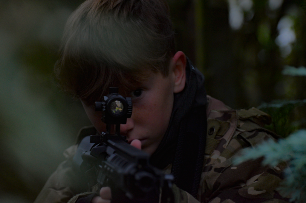
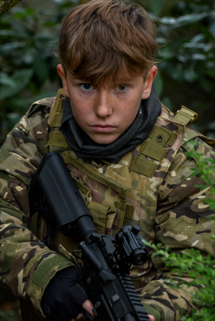
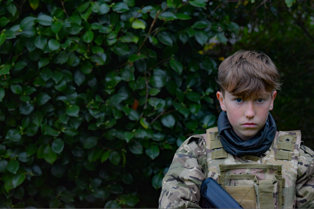
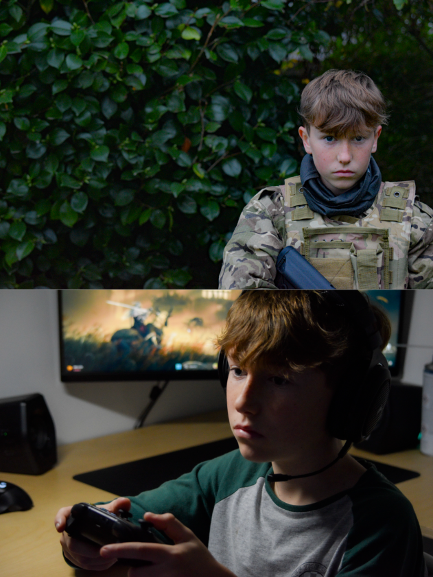
For my photoshoot I plan to photography my younger brother doing one of his hobbies. He plays airsoft so I plan to get him to dress up in his full gear and I’m going to use my garden and surrounding trees to frame him in the photo. I also want to capture photos of him from many different angles and him in different places and positions. I intend for him to have a serious, straight face for the photos as I think this would look the best. I want to use a mix of landscape and portrait orientated photos as I want to use the landscape photos to capture more of the environment and then portrait so all of the focus is on my subject.
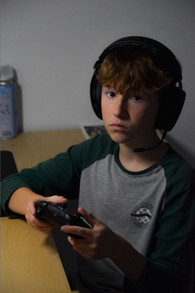
Furthermore my brother also does gaming so I’m going to use him for a second photoshoot and capture him gaming. I want to get different angles and poses. I want to use the same mix of landscape and portrait photos when I’m taking them to include the environment and a focus on the subject. I intend for him to have a serious, straight face, almost like he’s concentrating on the game.
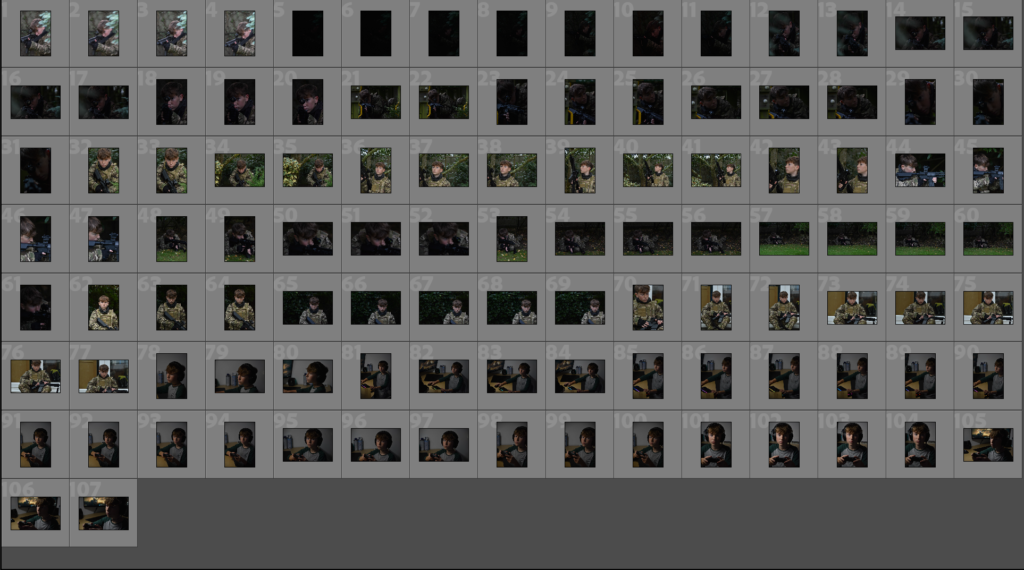
My Contact Sheet
Selection Process
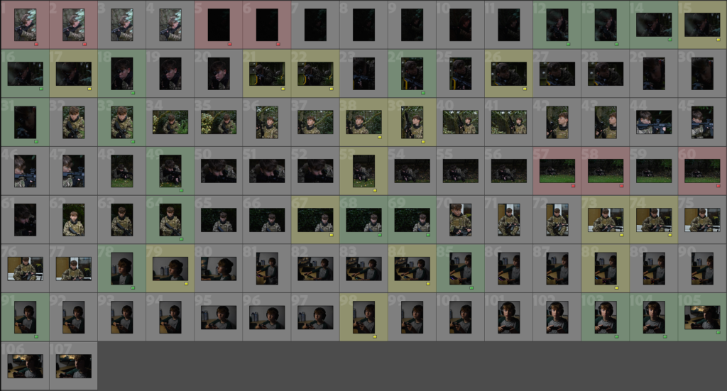
I used three colours to grade which photos are good, okay and bad. It also gave me an idea of which photos I want to work with and edit.
My chosen photos
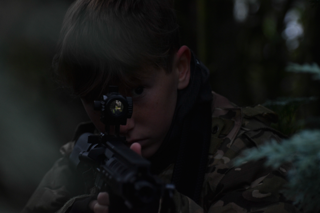
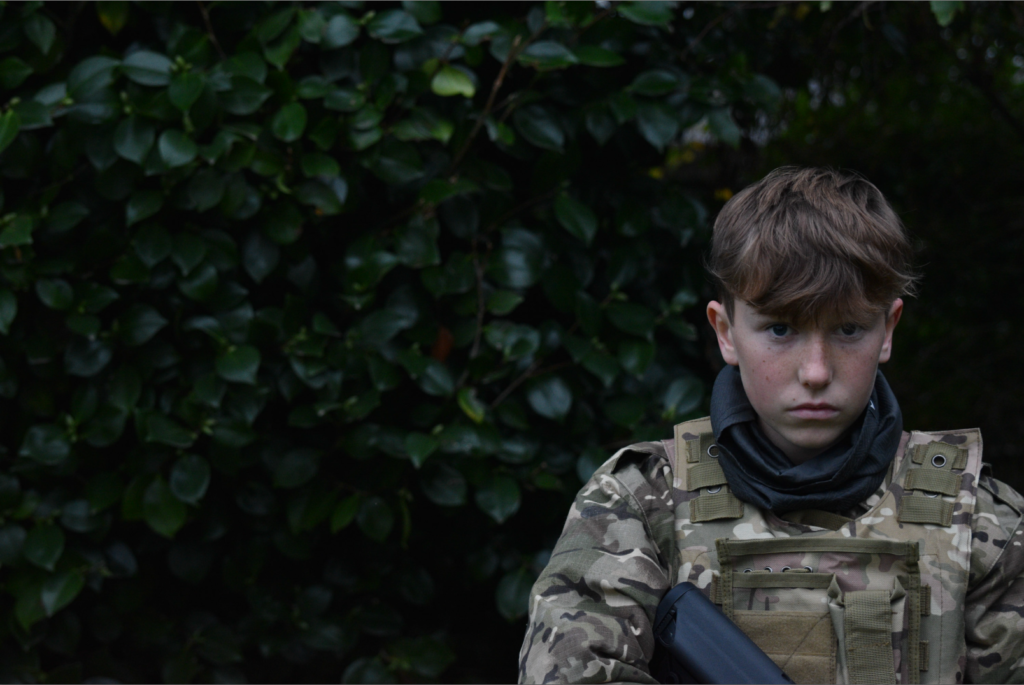

Second Photoshoot
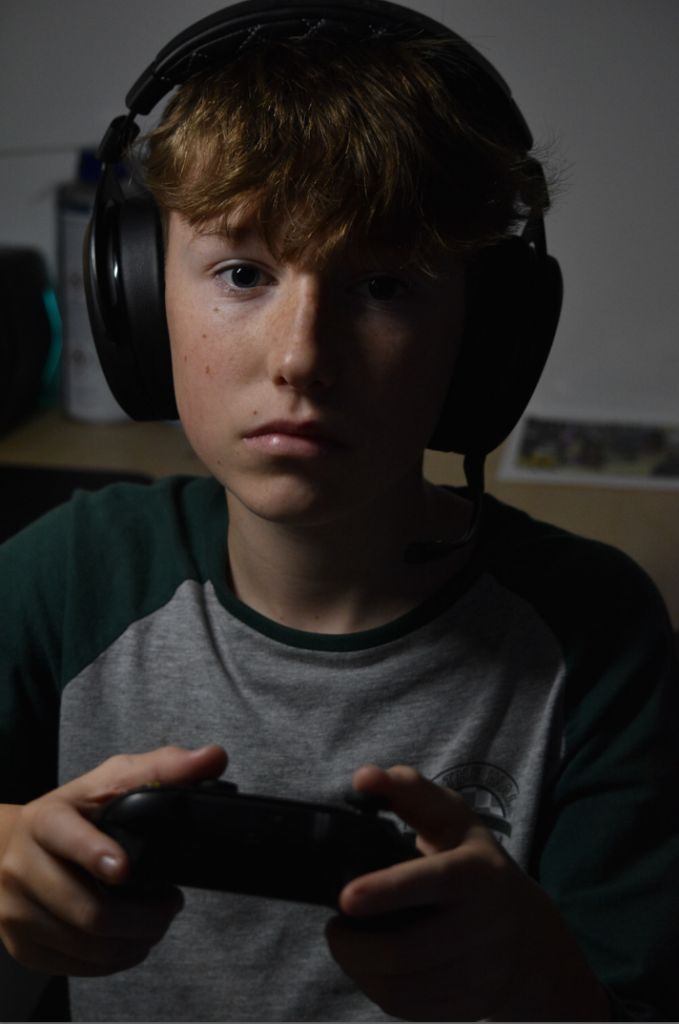
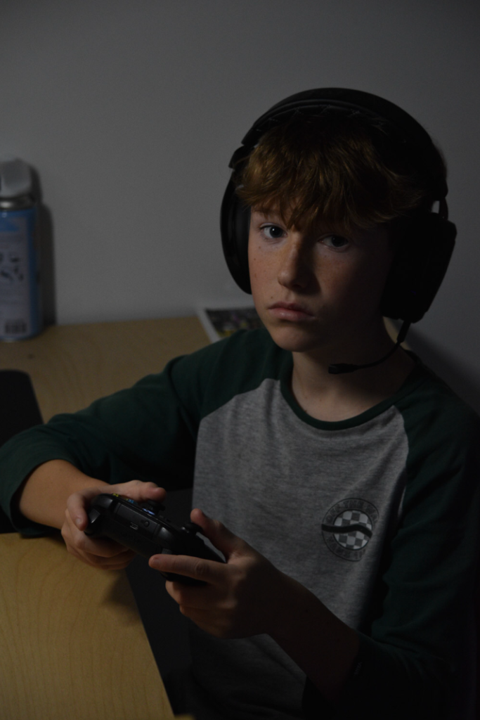
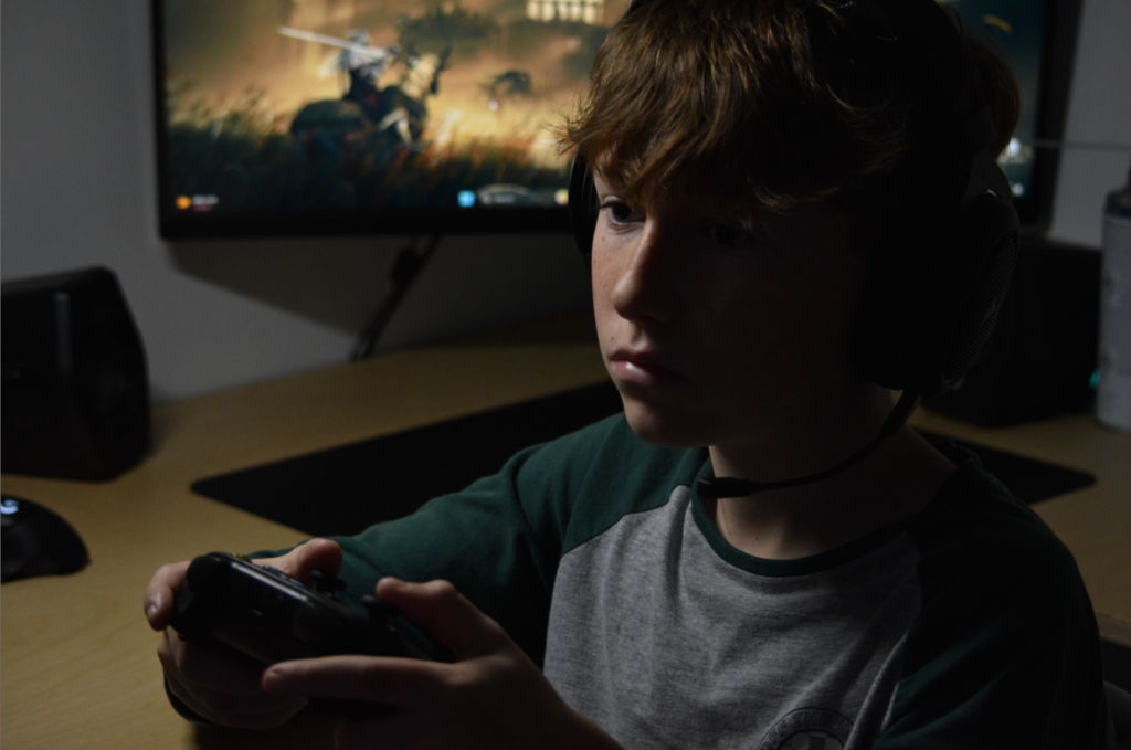
Editing
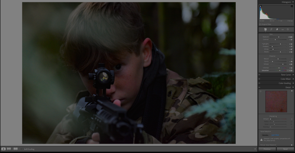
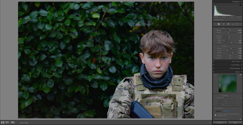
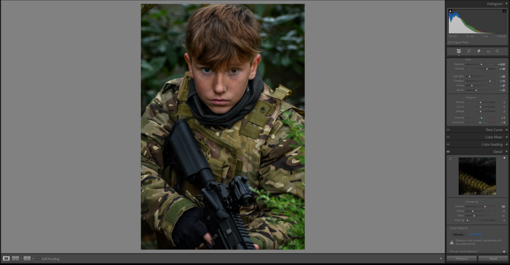
Second Photoshoot
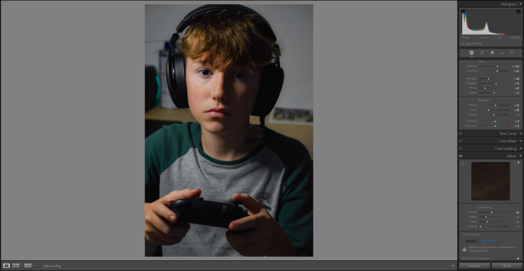
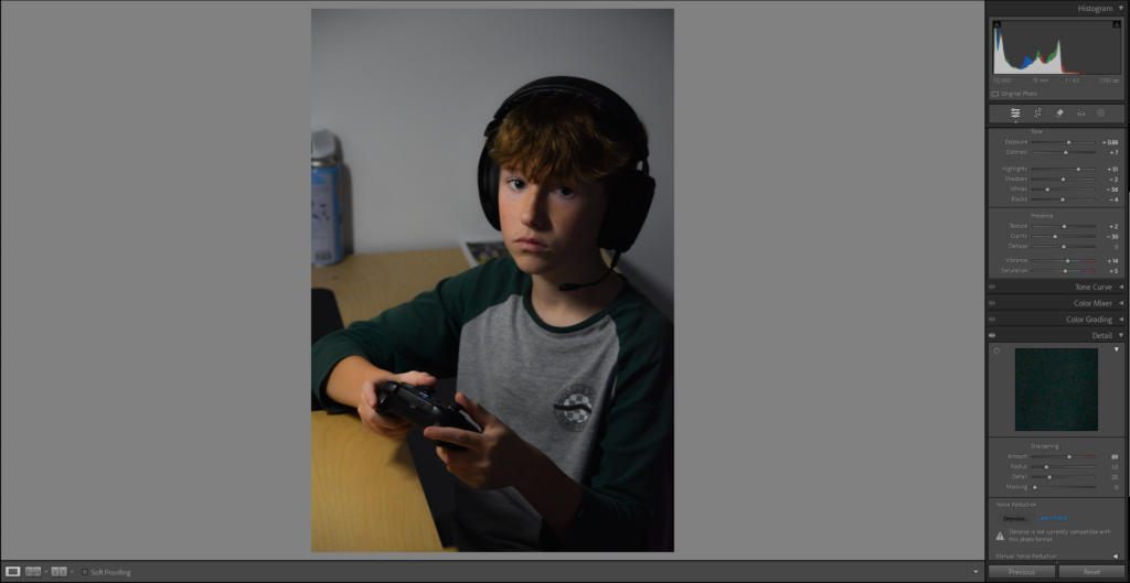
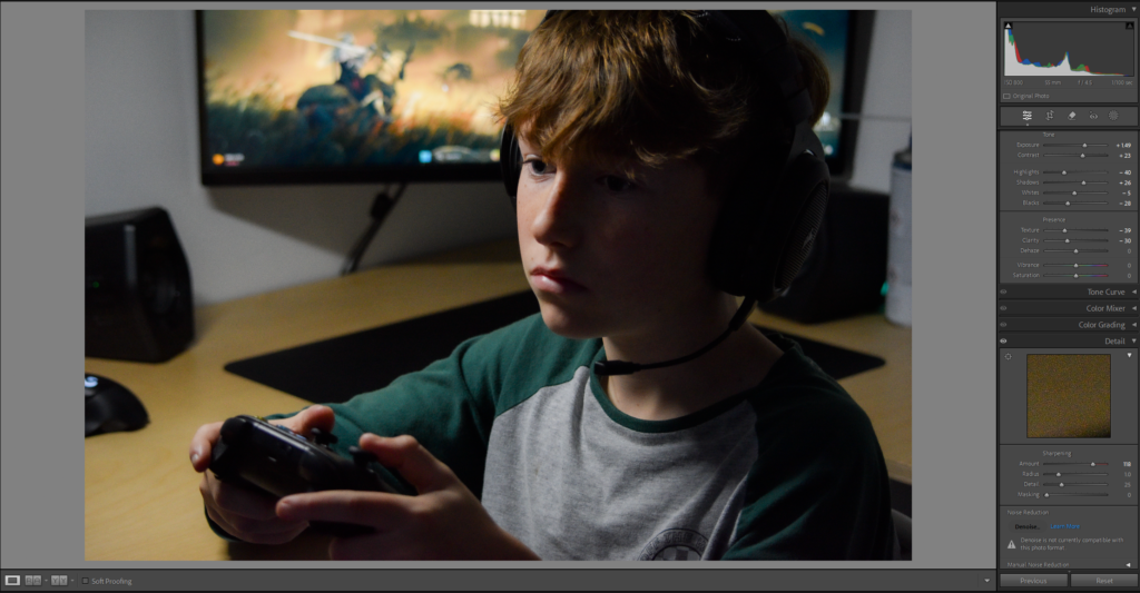
Edited Chosen Photos
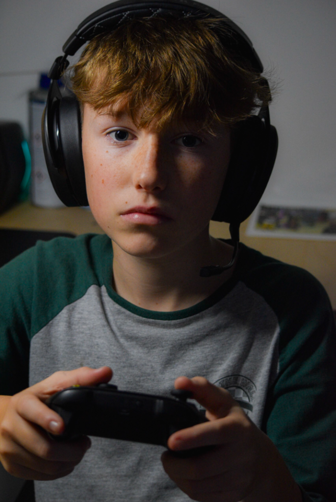
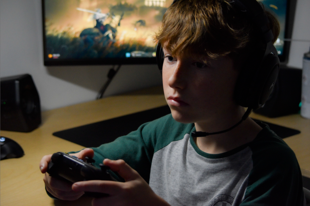
Composition Experiments
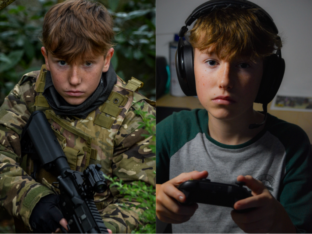
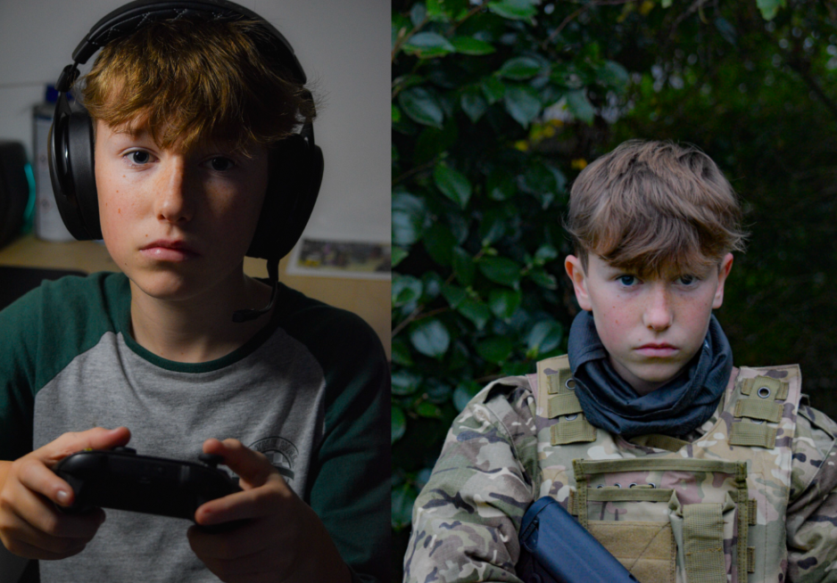
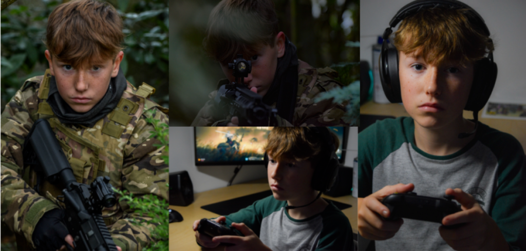
Final Composition
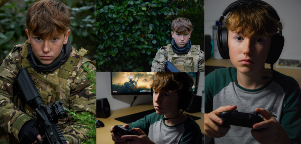
Evaluation
In my opinion I think this photoshoot went really well and I’m super happy with the outcome. The photos I produced is exactly what I was aiming to do originally and in the photoshoot plan. I think the editing process went really well and really enhanced my already good photos. To improve my next photoshoot I might consider shooting photos in better light or cropping in while editing.
Art Steps
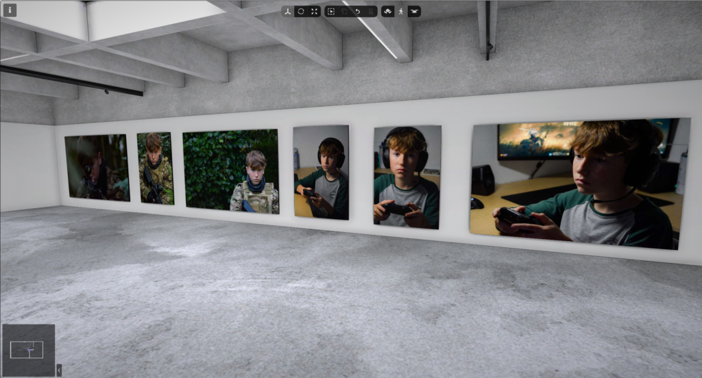
I used Art Steps to create a realistic gallery of my best, edited photos.