Texture
Texture in photography means the visual quality of the surface of an object, disclosed through variances in shape, tone and colour depth.
Edward Weston
Edward Weston (1886–1958) was an American photographer who played vital role in the development of modern photography. He generated pictures of landscapes and objects in black-and-white, transforming them into current images that were ahead of the time he was in time. He used his professional photographic skills that were wide-ranging, but he was well known to many as a professional of black-and-white images.
Texture was important to Weston. Using large format cameras, he took pictures of objects and landscapes that had shape, tone and colour depth which are key for a good texture photo. His use of lighting and contrast brought out every exquisite detail, giving his photographs a textured but almost three-dimensional quality. The focus on texture made bland, regular objects abstract and atheistically pleasing.
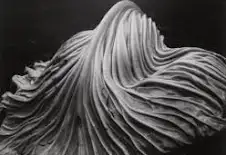
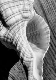
Above are examples of Edward Weston’s work
I took inspiration from the use of composition and shadows from what would otherwise be a normal every day object and turn it into something abstract and atheistically pleasing.
My Texture Photoshoot
Contact Sheet
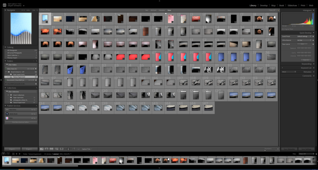
As you can see above I took 147 images from the camera of some objects until I found the one that I wanted to use, I then continued to take many of photos of one object with different camera settings and different lighting conditions to achieve the ideal result I wanted.
Photos I didn’t like
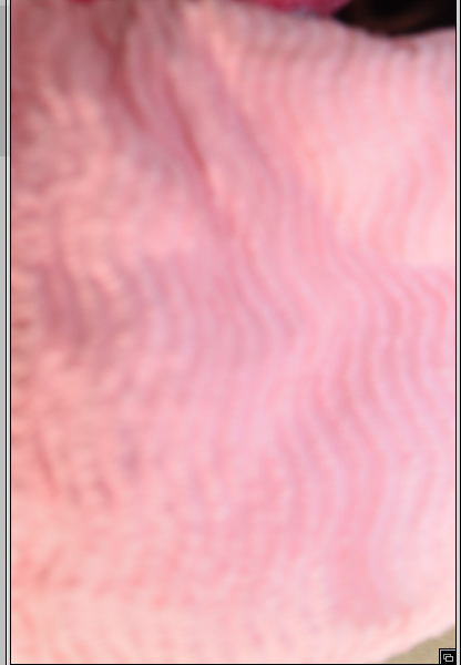
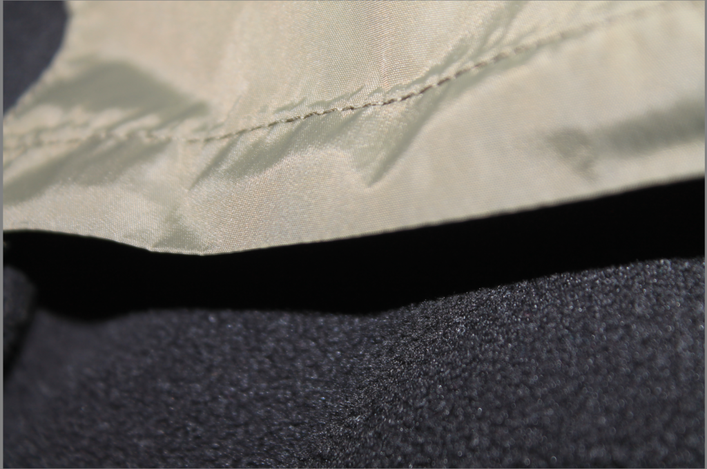
I didn’t like this photo due to some visual noise that was taking part which gives this photo a degraded quality. This photo was taken at an ISO of 400. It also has a wide aperture of 3.5.
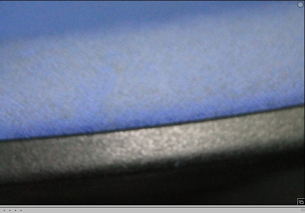
I didn’t like this photo due too much visual noise and really bad degrading quality. Taken at an ISO of 6400. It also didn’t match the theme is was going for.
Lastly, I also didn’t liken this photo due too being too dark. This is what happens when you don’t have enough light in your room, in the camera or in the photo. It gives no proper final image.
Selection Process
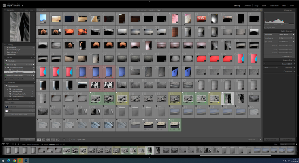
As you can see above I pressed P to keep the images I wanted to use for my final photos. I used X to get rid of the images i didn’t wanted to use for the future. Then I gave a rating for the images, they all had a rating out of 5.The images with 4 and 5 stars are the images I wanted to use for my final photos. The photos I didn’t like I rated 1-3 stars. Finally I gave them the colour yellow or green, green being the best and yellow being average . Red was for very bad photos. I will edit the images so I can present final photos.
Editing My Best Images:

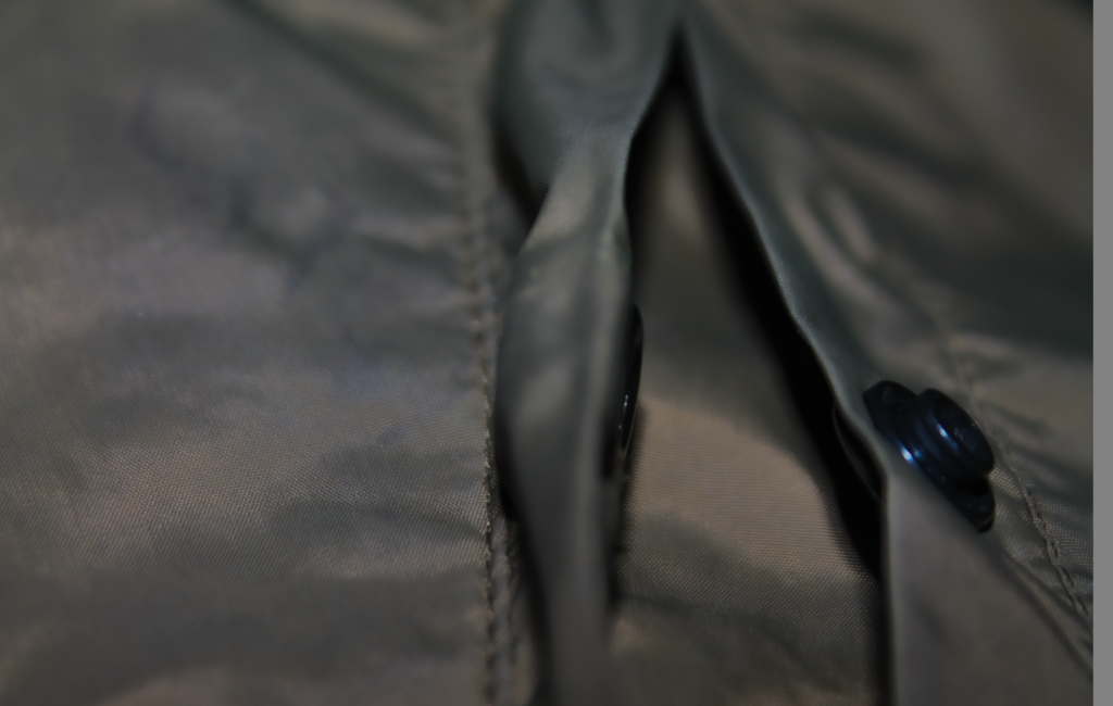
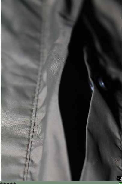
These are my three best images that have been edited.
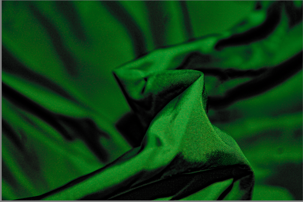
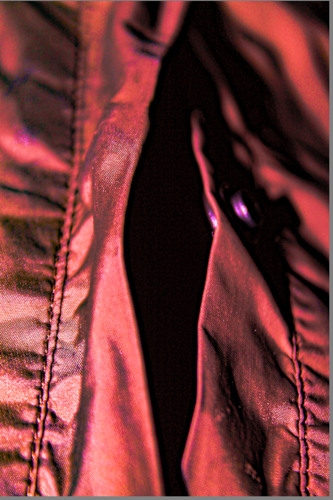
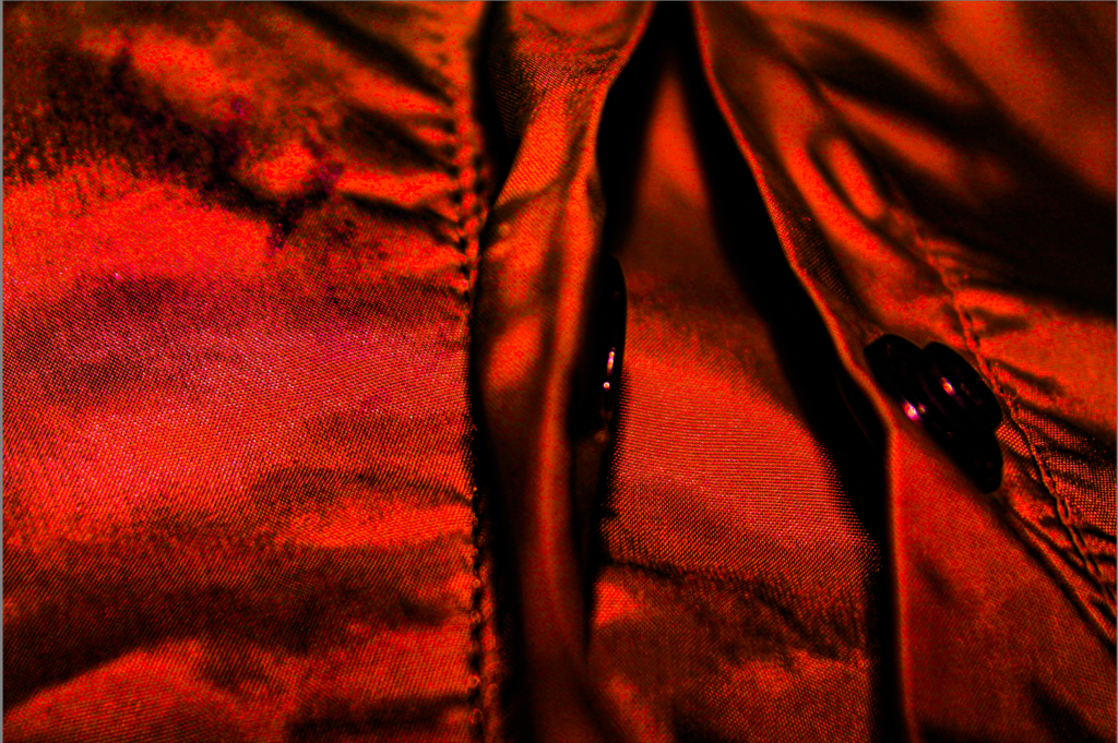
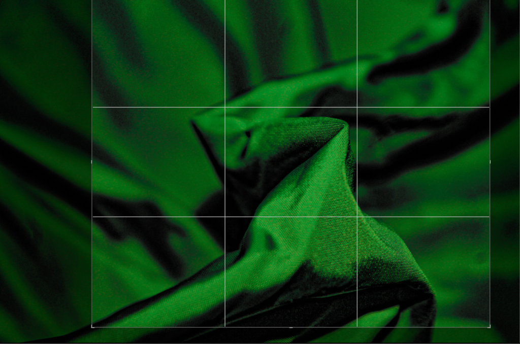
This image started with more negative space on the left than on the right. To create a more balanced outcome, I cropped the image as above.
When cropping, I made sure to maintain the line that runs from the bottom left corner of the photo, to the top right.
For this image I also enhance the contrast and tone, to exaggerate the texture.
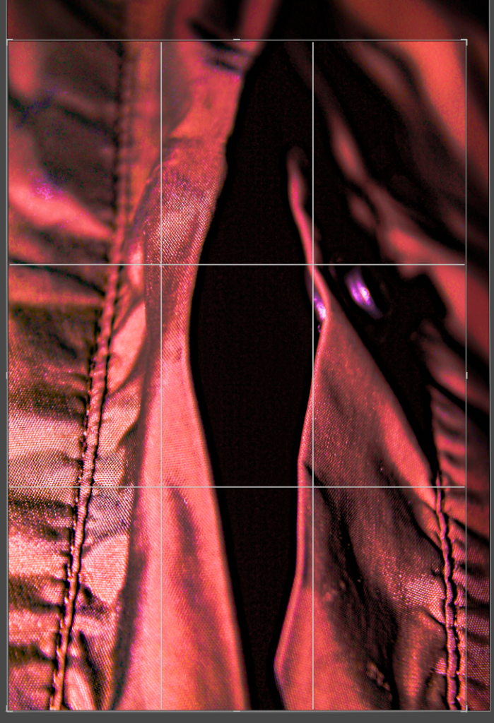
This image had lots of negative space on the right rather than the left. For the image to be more balanced I had to crop it to get the best result.
When cropping I mad sure that the photo was balanced on both sides, so the photo would look aesthetically pleasing to the eye.
Also, for this image I made sure to to zoom into the texture to go for the best results.
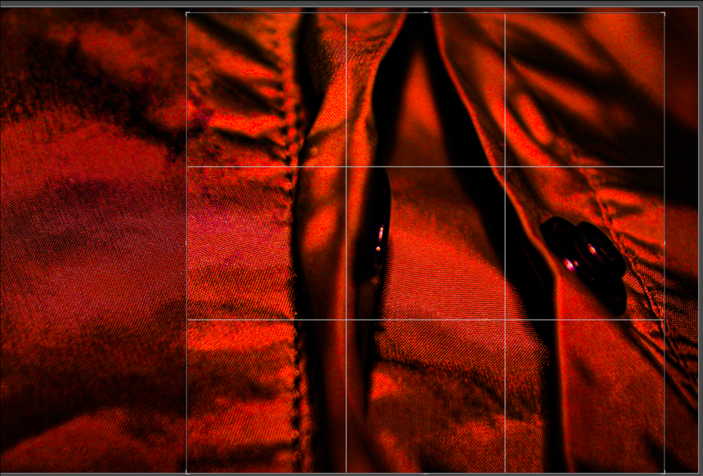
In this image I had to get rid of most of the negative space on the left side on the photo rather than the right. To get the best result this photo need to be cropped.
As I was cropping this photo I need to make sure that the photo was balanced, so the photo looks pleasing to the eye.
For this image I also had to enhance the contrast and tone, to exaggerate the texture.
Black and White Final Images
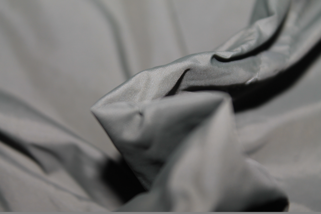
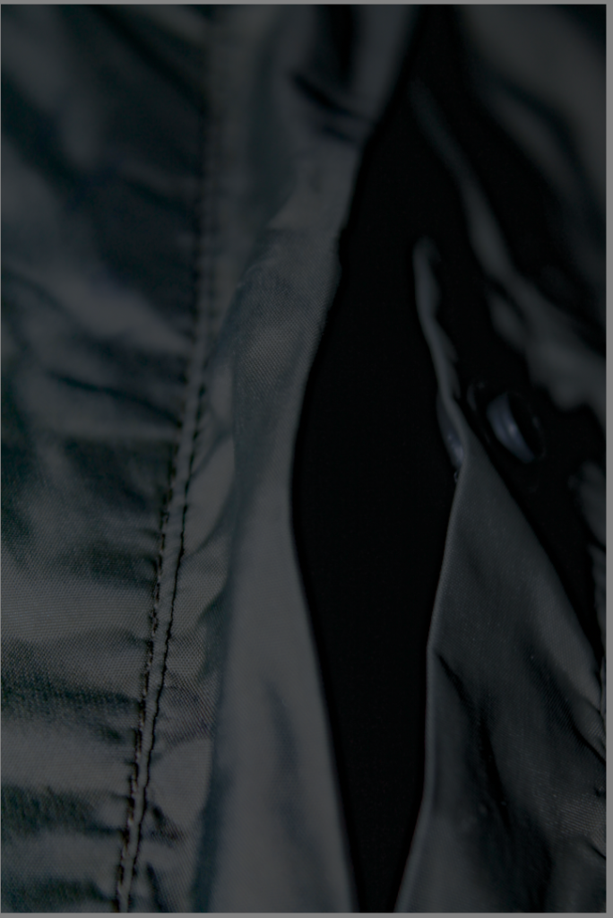
These are the photos edited
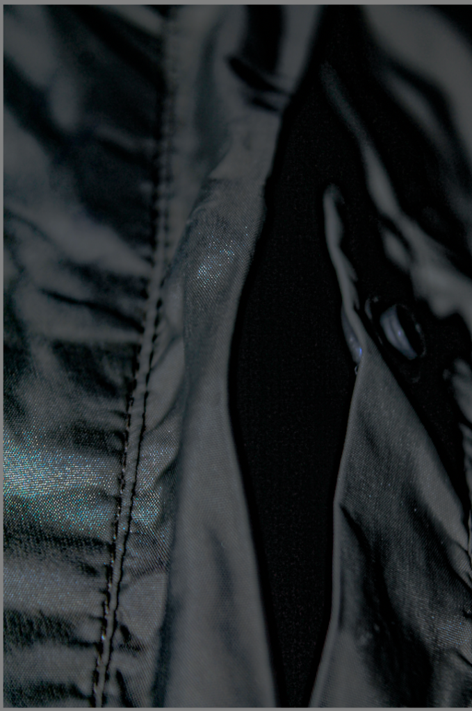
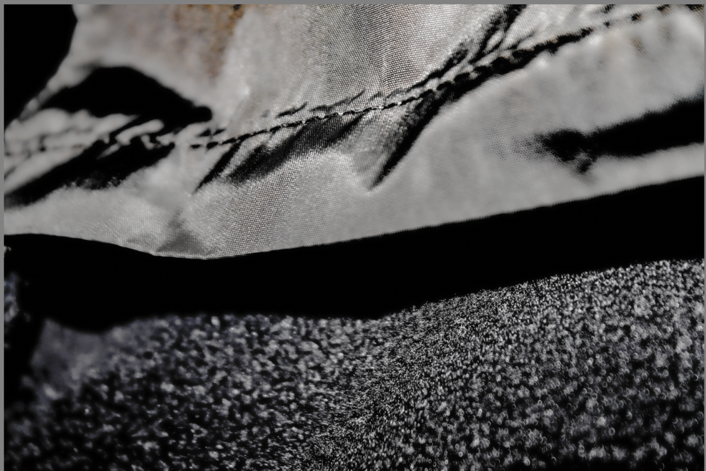
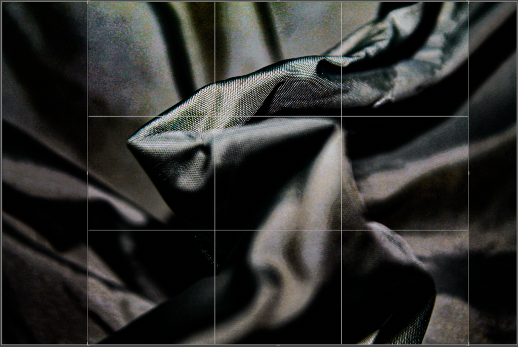
This photo had to get rid of some of the negative space due to be being unbalanced either side. This means the photo is not equally distributed on each side that is the reason I had to crop it. I originally started with negative space left than on the right.
When cropping, I made sure to keep the line that runs from the bottom left corner of the photo, to the top right.
I enhanced texture to see the material on the coat.
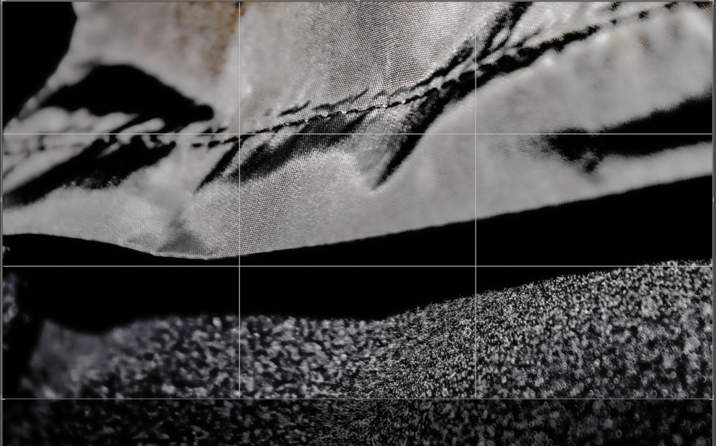
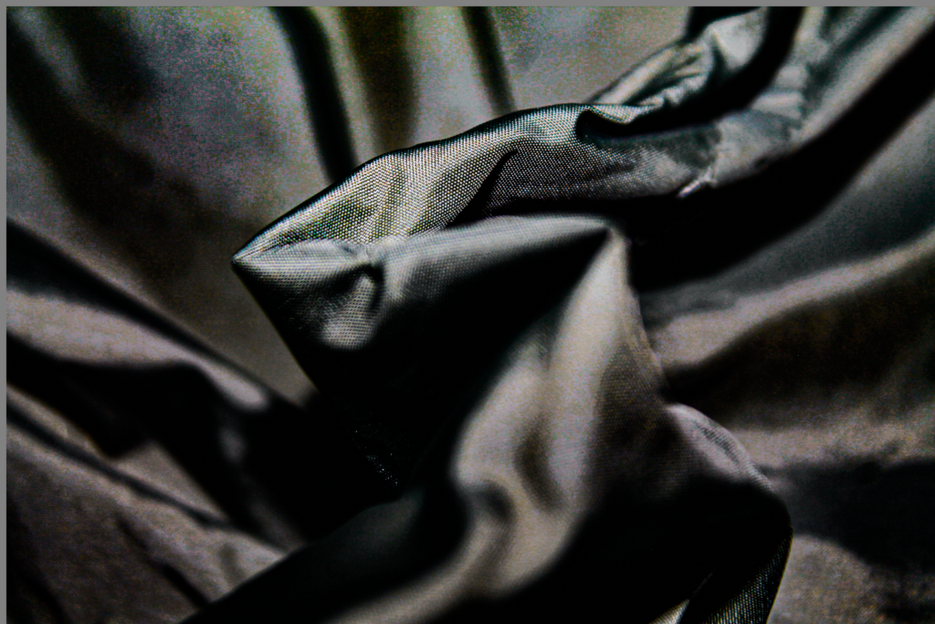
In this photo I had to slightly crop it due to the sides of the photo not being proportional. If I hadn’t cropped the photo, the photo would look unbalanced and there would be too much negative on the foreground of the photo.
After being cropped the photo looks more visually pleasing.
For this image I also had to enhance the contrast and tone, to exaggerate the texture.
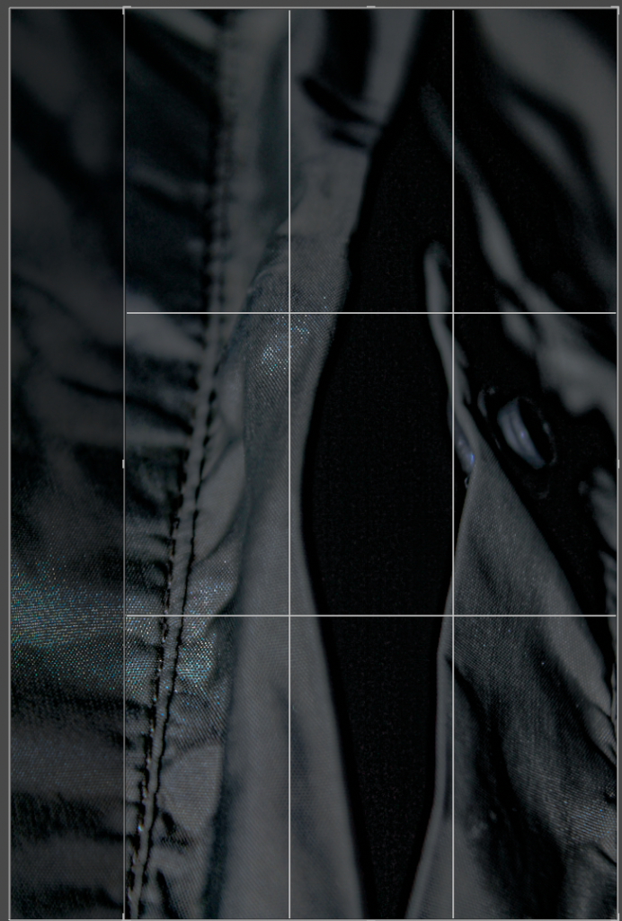
In this photo I had to slightly crop it due to the sides of the photo not being proportional. If I hadn’t cropped the photo, the photo would look unbalanced and there would be too much negative on the background of the photo.
After being cropped the photo looks more visually pleasing.
For this image I also had to enhance the contrast and tone, to exaggerate the texture.
Photos Edited Into A White Filter


Edited Photos
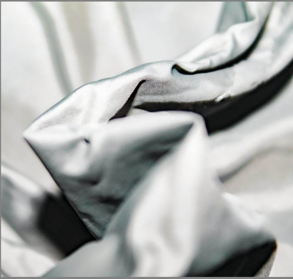

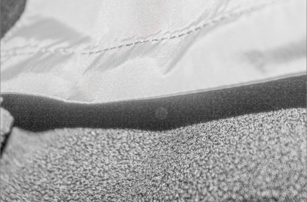
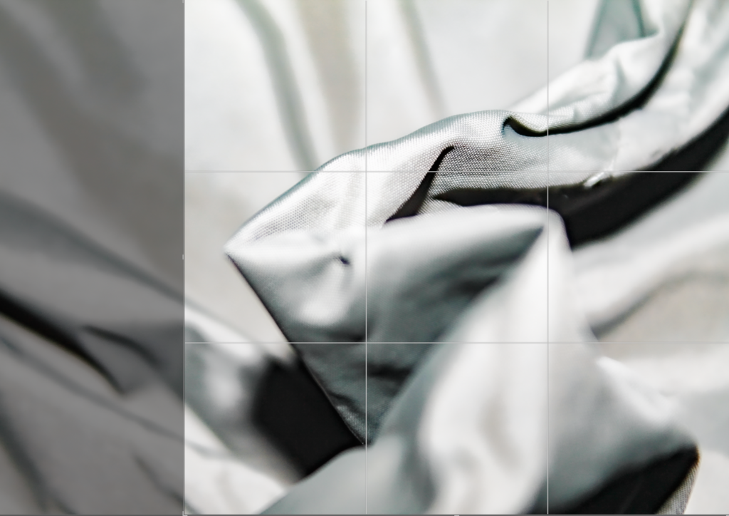
In this photo I had to slightly crop it due to the sides of the photo not being proportional. If I hadn’t cropped the photo, the photo would look unbalanced and there would be too much negative on the background of the photo.
After being cropped the photo looks more visually pleasing.
For this image I also had to enhance the contrast and tone, to exaggerate the texture.
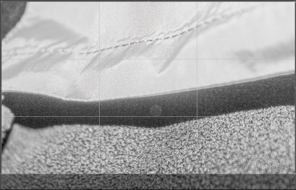
This image is in white, so it has no proper colour. This photo has been edited with a white filter on adobe Lightroom.
In this photo I had to slightly crop it due to the sides of the photo not being proportional. If I hadn’t cropped the photo, the photo would look unbalanced and there would be too much negative on the background of the photo.
After being cropped the photo looks more visually pleasing and nice to look at.
For this image I also had to enhance the contrast, exposure ,dehaze, clarity and tone to exaggerate the texture.
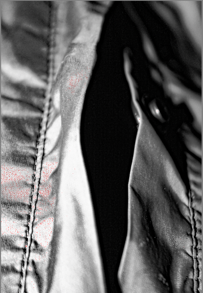
As you can see above there are 6 photos edited on Adobe Lightroom. They are both edited in Black and White with a filter . By using black and white it influenced me to chose an Artist like Edward Weston. By doing this it made me think that the most simple colours in the world can make very interesting photos. I think I did this task successfully by these photos being abstract and aesthetically pleasing.
My Final 6 Photos


These are my final 6 photos due to a mixture of a light and dark tone. By having a light tone it makes the photo produced have a sharp with a strong contrast. By having a dark tone many photographs seem to have less impact and less visual vibration. By having some straight lines in the photos it means these lines have geometric quality and also have centre of attention. The texture on all of these photos means that the coat looks quite rough to touch and feel. The images that I took had lots of negative space around it so I had to crop it to make the photos balanced on each side.

A better blog post…more of this please!