What is texture?
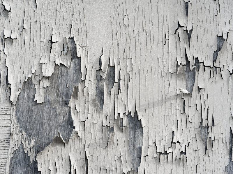
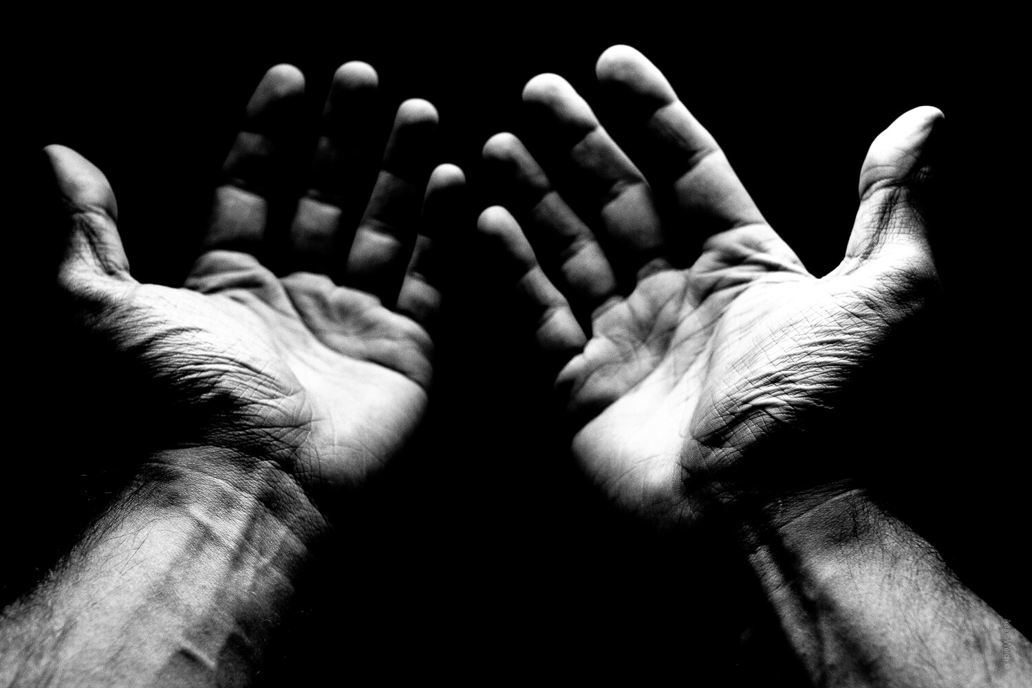
Texture in photography is all about how the surface of an object looks visually. It shows up through differences in shape, tone, and colour depth. Adding texture makes photos more lively and exciting, turning what could be dull images into something really engaging.
Formal elements and what are they?



Marc Anderson
Marc Anderson is famous for his nature photography, especially his amazing close-up shots of tree bark. His pictures highlight the complex details of the bark on trees.

Marc Anderson’s photos:
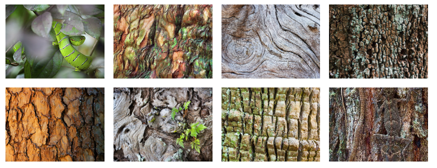
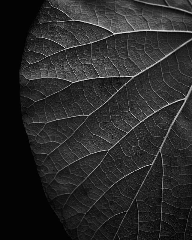
Marc Anderson’s photos are eye-catching, yet they focus on the texture of tree bark. He takes the photos at an eye level angle. The images are taken close up/macro, to focus your attention on the textures and patterns created by the tree bark. It seems likely that he used a high f-stop number, which keeps everything in sharp focus with little to no blurring.
My Inspiration
Francis Bruguière
Bruguière spent his life trying out different photography techniques like multiple-exposure, solarization, and photograms, along with exploring how regular film reacts to different light wavelengths. However he was most famous for his intricate abstract paper photography. Bruguiere cut up sheets of paper and placed them in random positions so he can capture the cuts and curves within the paper.

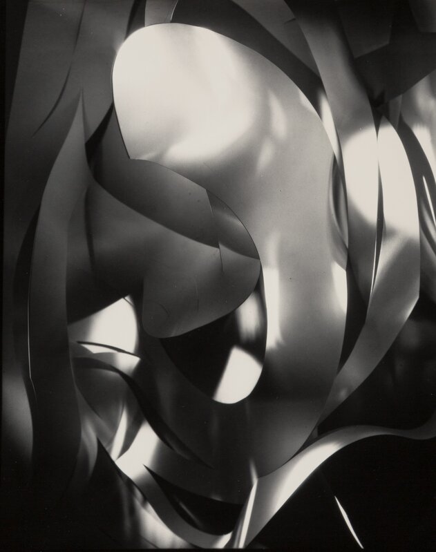


These photos, from Francis Bruguière, are a unique look into paper photography, the cuts and angles of the paper show some depth and texture of something so simple. The abstract approach to these images makes them very mysterious and will leave the viewer wondering what the image is of. Moreover the macro effect further enhances the abstraction of these photos. The light in these photos are carefully angled to show a strong contrast between the dark shadows and bright highlights, this creates a strong sense of balance, pattern and texture within the image. The images are monochrome, which increases the depth of this image and makes the view look at the entire image instead of being distracted by colour.
My Photoshoot
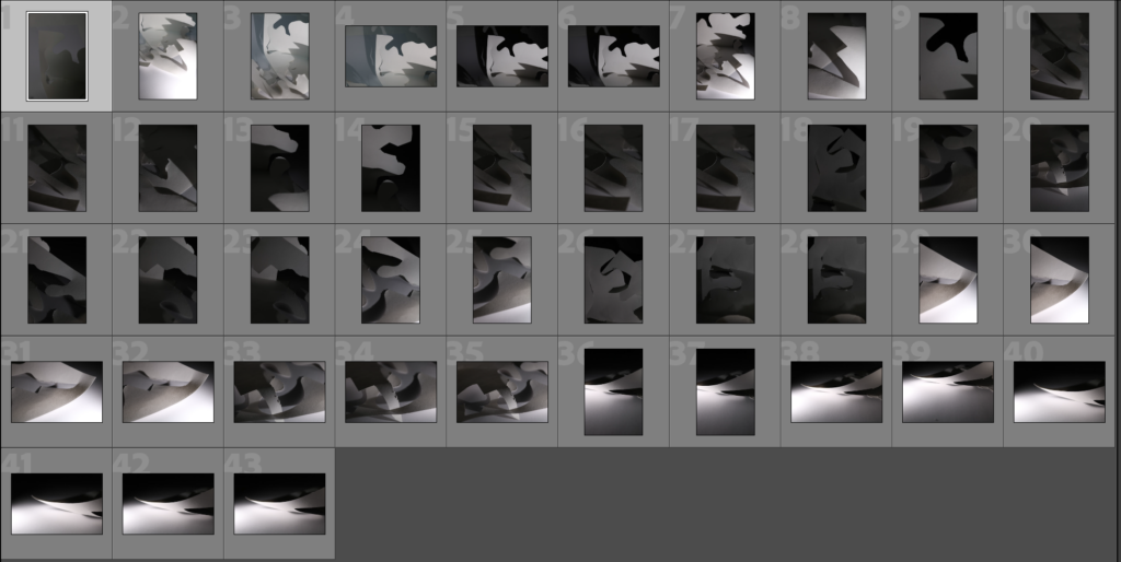
Selection process
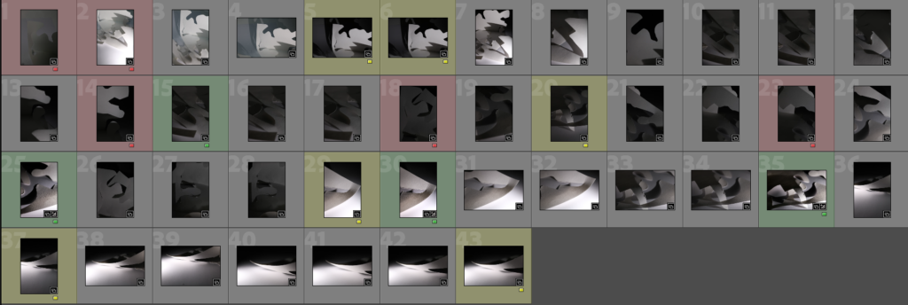
I used the colouring in feature in Lightroom to show which photos were strongest, okay and not good.
My best photos
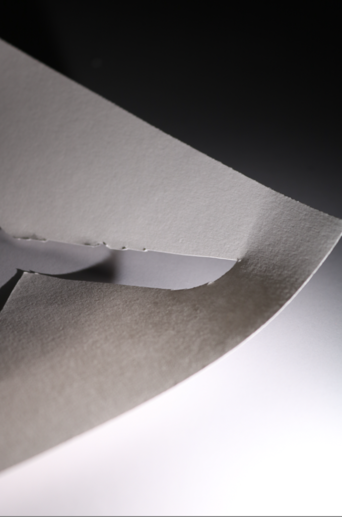
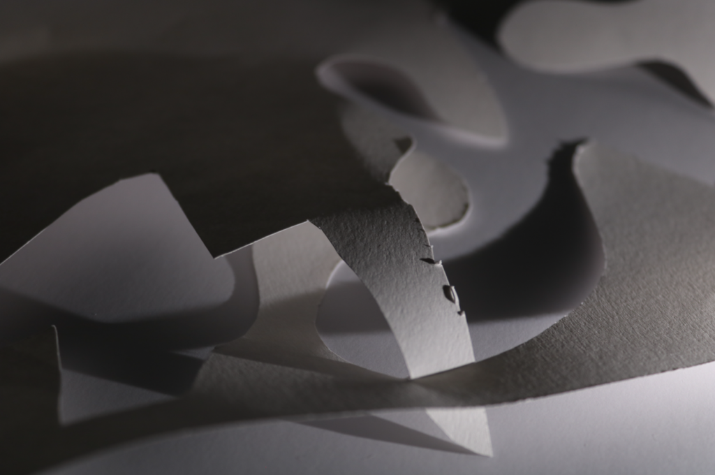
Editing
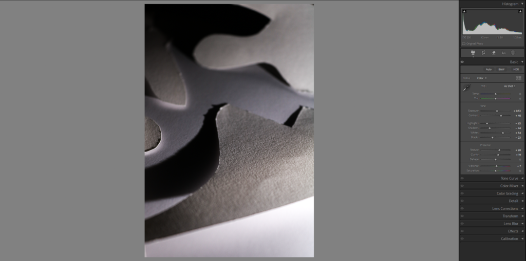
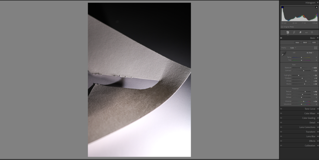
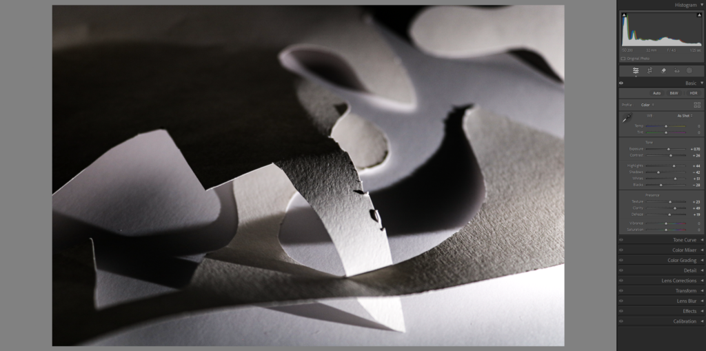
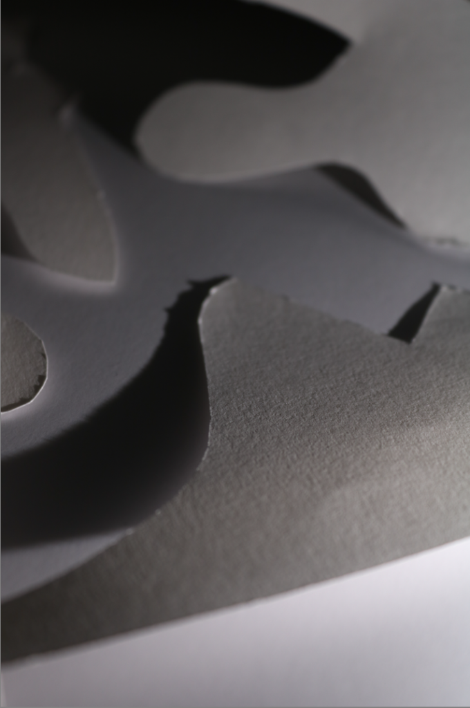
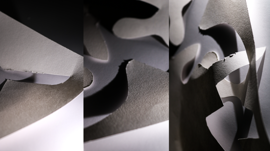
In these edits I increased the contrast to make the black and white parts standout and I also increased the sharpness and texture so you can really see the texture in the paper.
My second photoshoot

Selection process

I used the same colour coordination technique as my first photo shoot.
My best photos
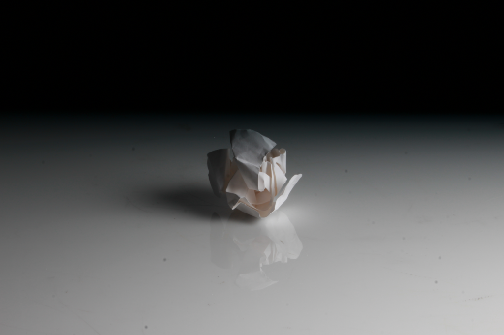
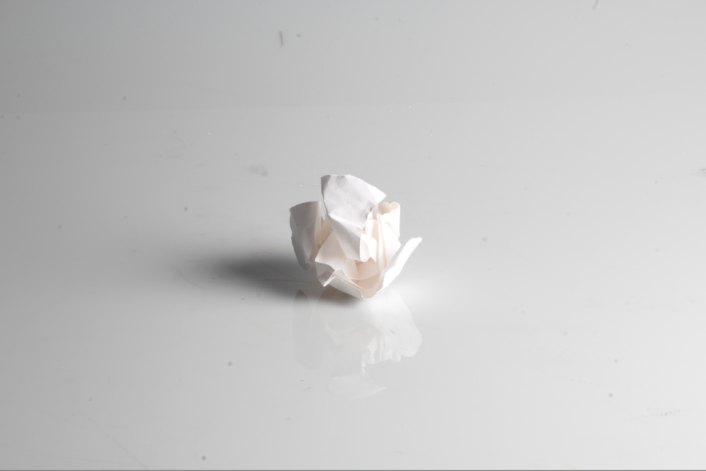
Editing
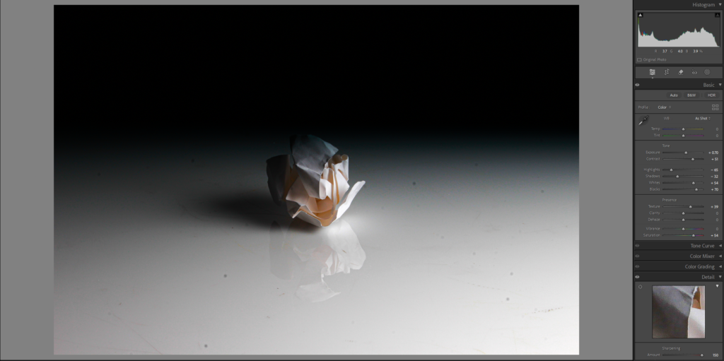
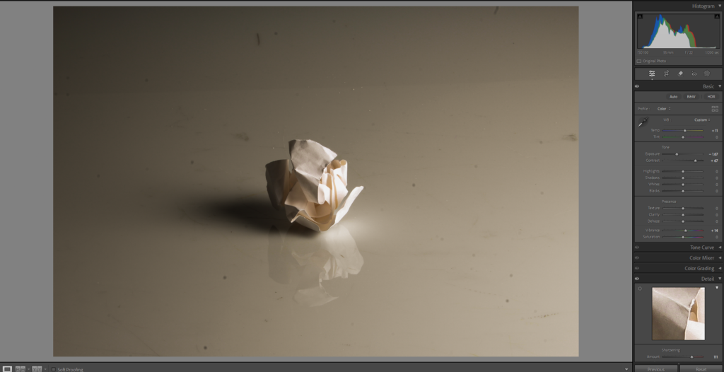
I increased the black and whites to really bring out the contrast. Furthermore I increased the texture and sharpness to really show the creases and folds in the paper.
Final images
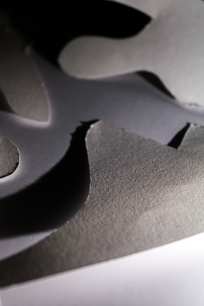
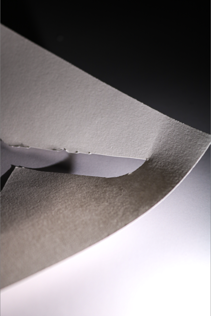
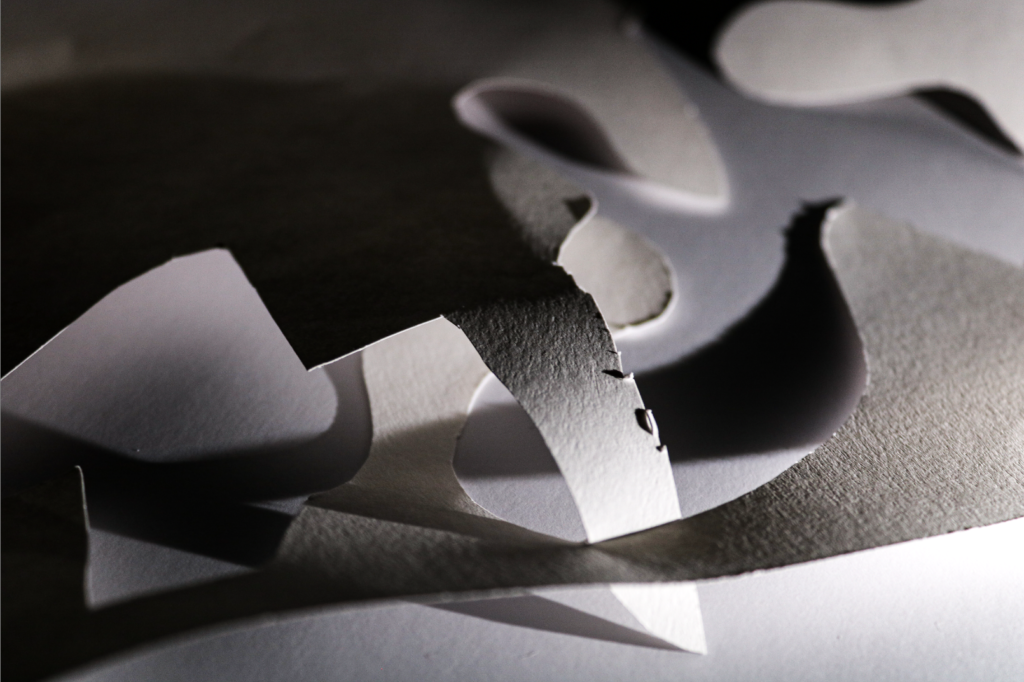
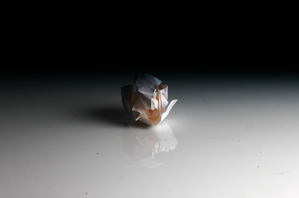
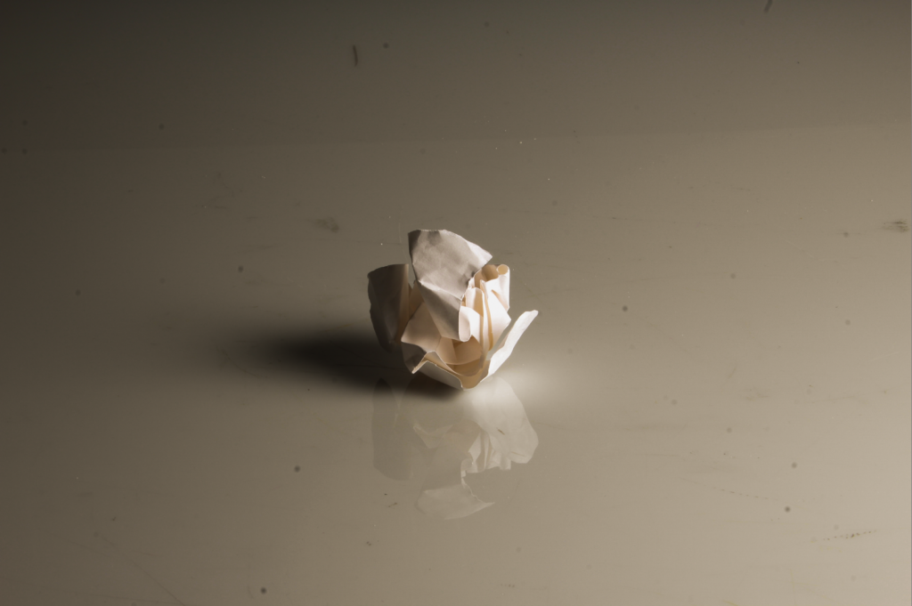
Art steps gallery
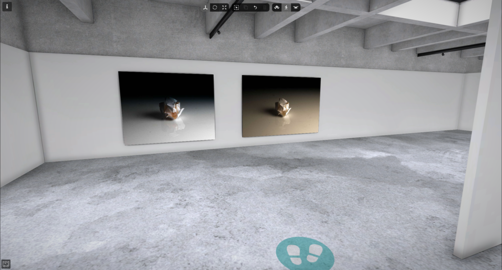
Overall thoughts and evaluation for above photos
I believe the photoshoot turned out really well. I was able to take some close-up shots that showed the texture of the paper in great detail. After editing, the images looked even better, and I’m super pleased with how they came out. Furthermore I managed to use the artificial lighting effectively to show off the small details in the paper and really highlight the texture, corners and creases in the paper. Moreover my Art steps gallery shows off my paper ball photos really well.
Compositions:
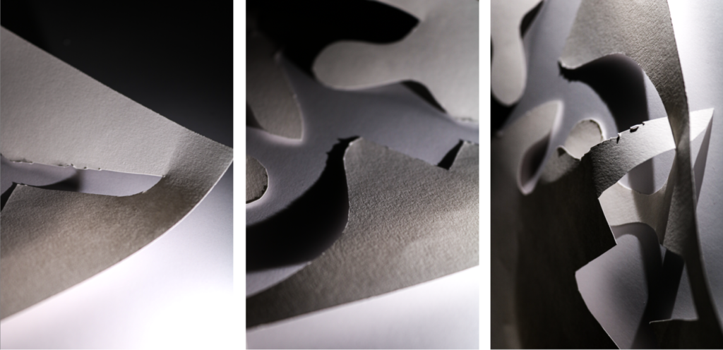
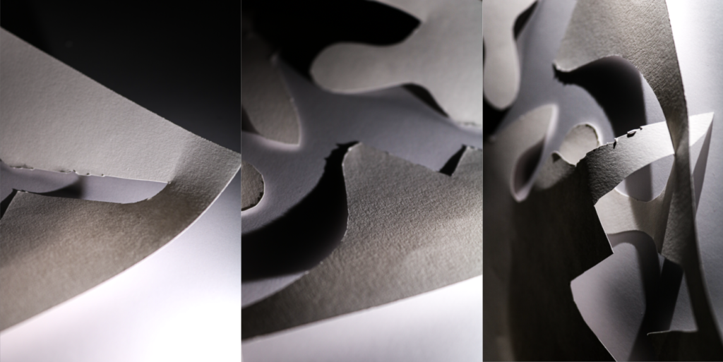
I tried a couple different Positions with my three photos so I could make a decision on my favourite one.

Further editing
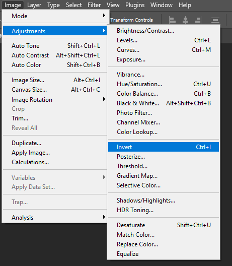
First I started experimenting with inverting colours.
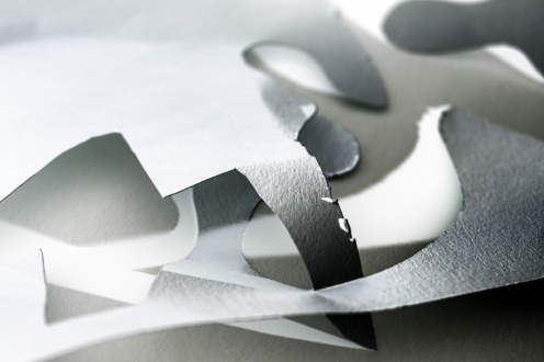
Inverting the colours gave a interesting and different perspective on my image.
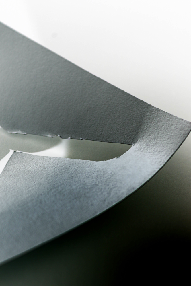
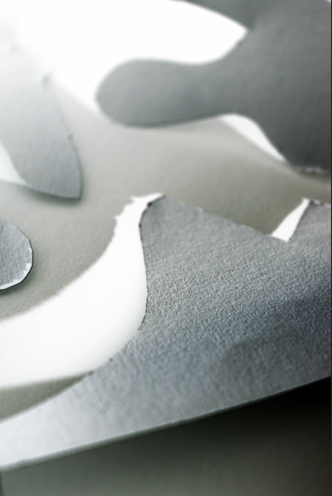
I inverted the colours on the other two images as well.
Final composition inverted
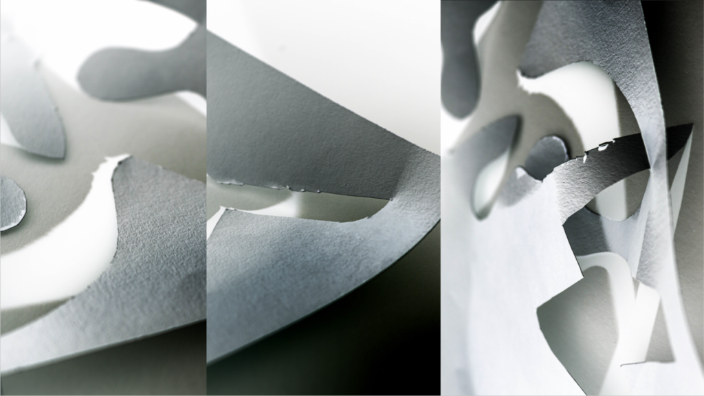
My final photos and final inverted photos combined
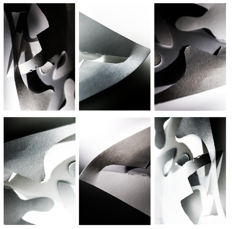
All my final photos in Art Steps
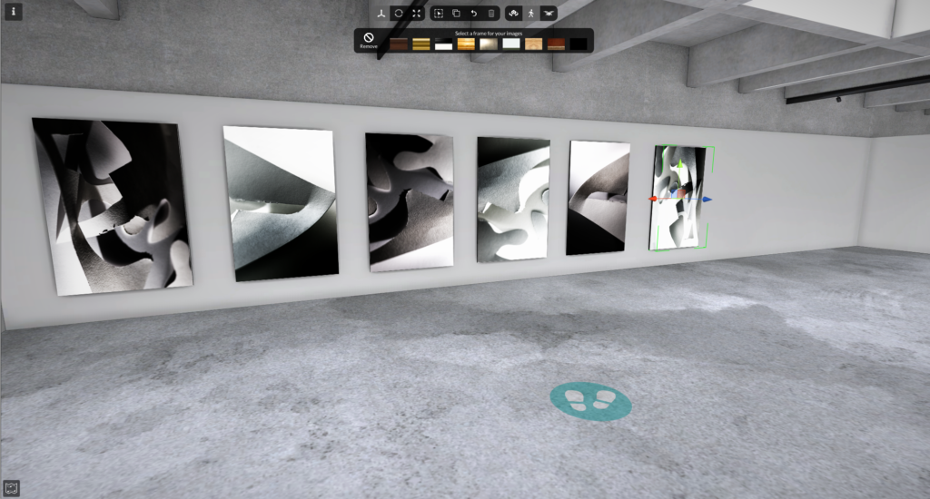
My final selection of paper photography, combines 3 images that have been duplicated and inverted. The tight cropping of the photos further shows off the cuts, creases and texture within the paper, it really draws the views eyes to the sharp corners and cuts. All the photos have a reduced saturation, with increased contrast to really show off the tonal value, further more the shadows and highlights are better shown off due to the strong saturation adjustment. While some images are cooler in tone, some are warmer. This allows the image to be more balanced and gives the photos more variation and contrast within the tone. The Repeated photos in the grid add a balance to the final presentation, especially with three inverted photos which complement the original photos really well. The macro focus on the cuts of paper add an interesting and detailed pattern and a greater depth of detail. Moreover this even further exaggerates the tone.