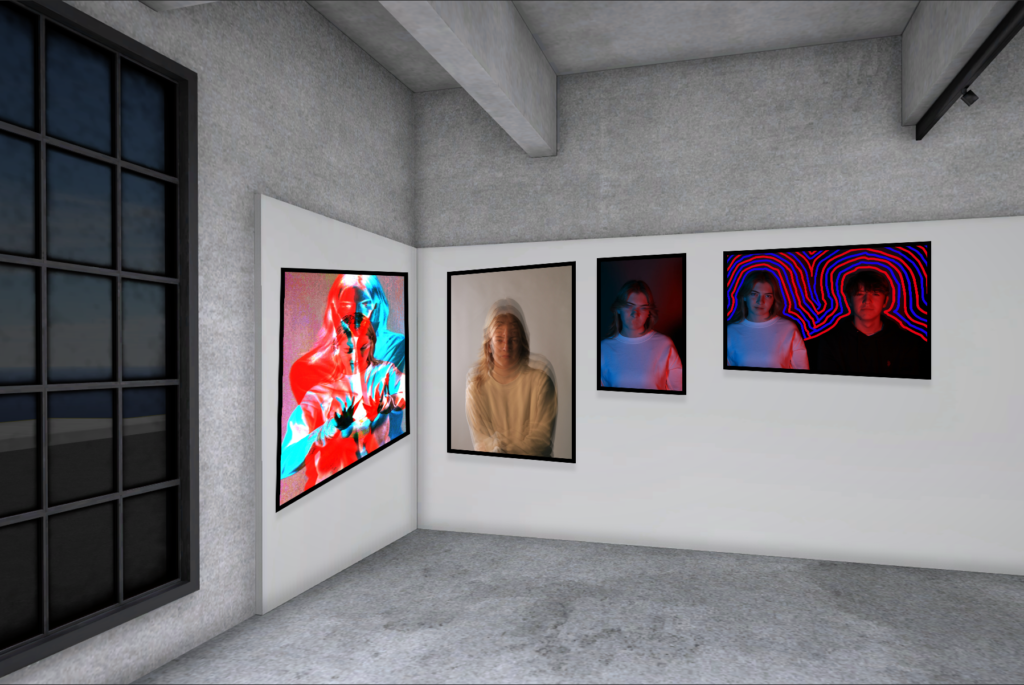
I used images from the studio lighting photoshoot to be able to create these images. Whilst doing that I also used coloured gels to give the images a different look to them making none the same.
I put all the images into lightroom where I would be able to see all of them in better detail. This also helped me choose which photos I wanted to use and which ones I didn’t. We used a range of poses to see which ones would look the best and different shutter speeds to see how it would look against the coloured gel.
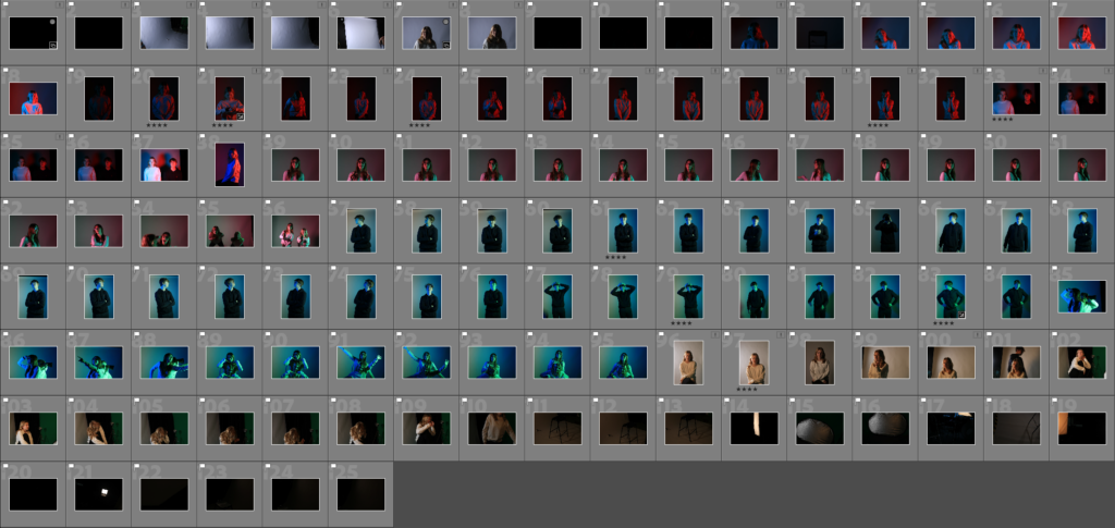
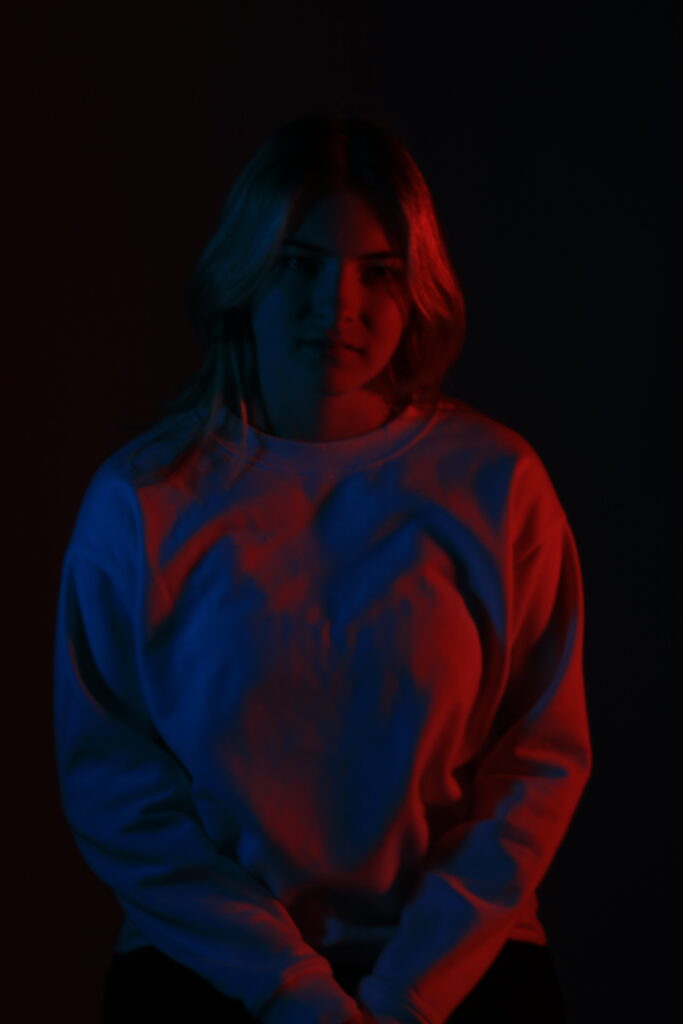
I went through the images and chose 9 final ones to edit. I chose these pictures because I felt I had the most creative freedom to do something with it. I inspired colours from Spider-man using the red and blue and making Emma pose as if she’s just found out she’s been bitten. Using other movies the blue and red reminded me of Star Wars, good vs. evil. I made Luke and Emma pose on either side of the light to show the contrast
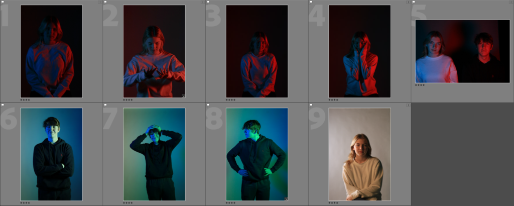
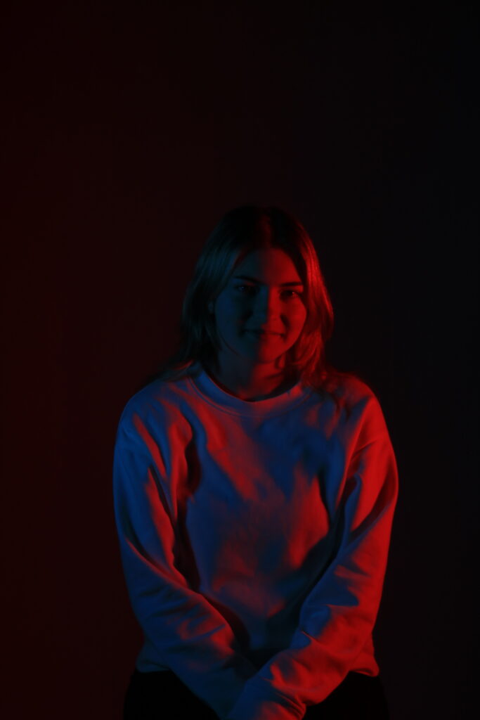
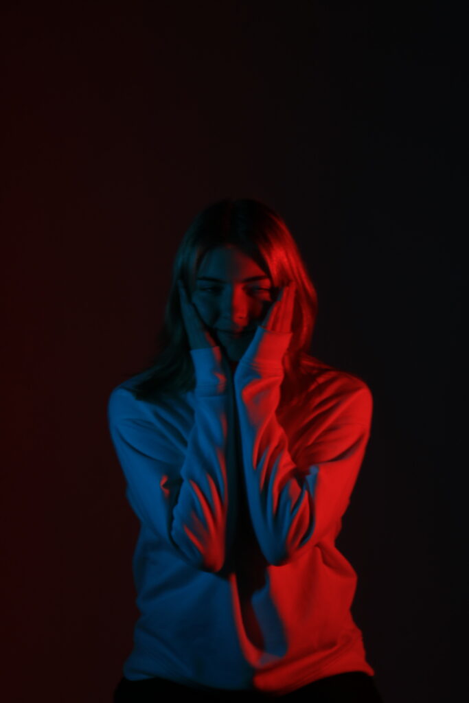
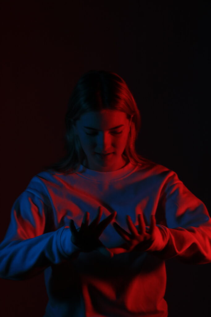
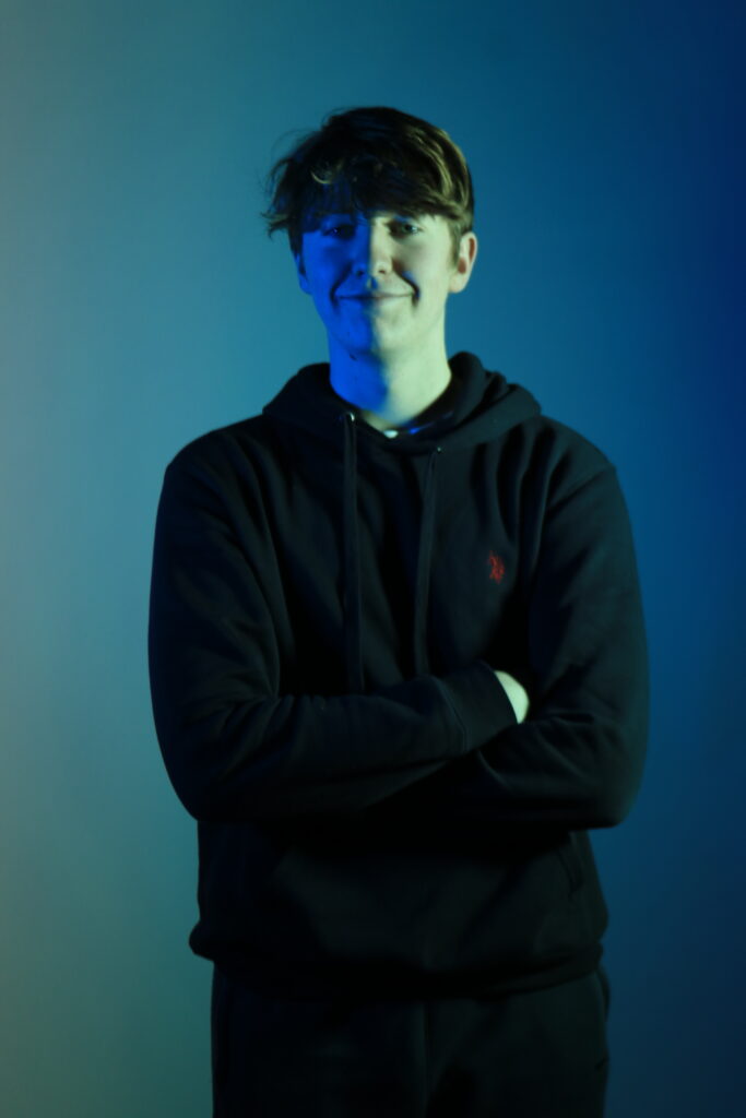
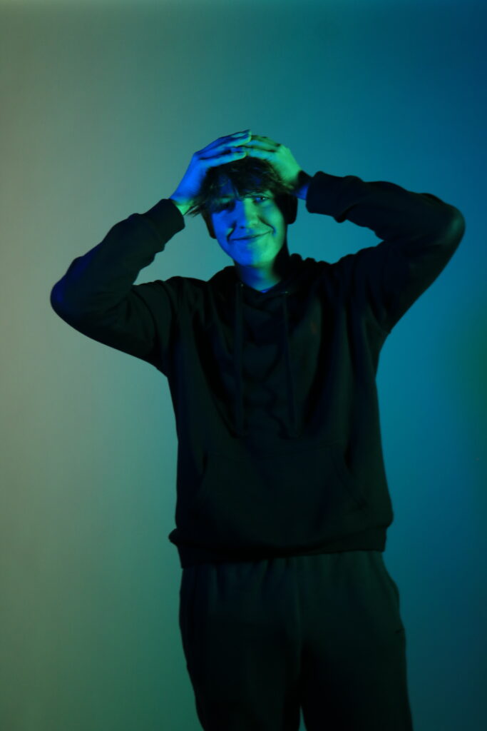
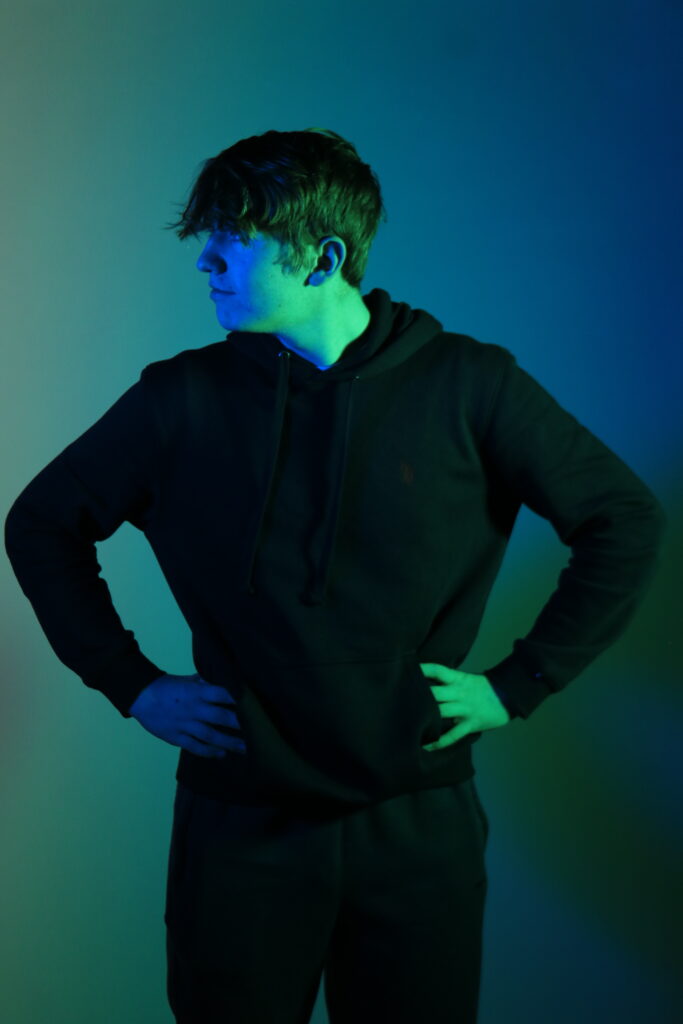
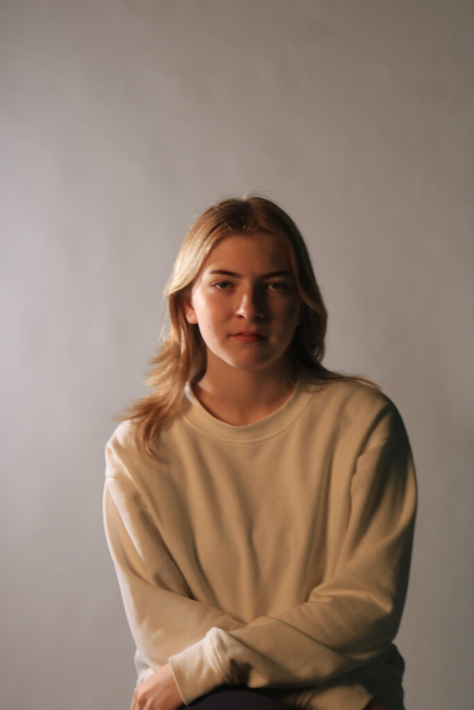
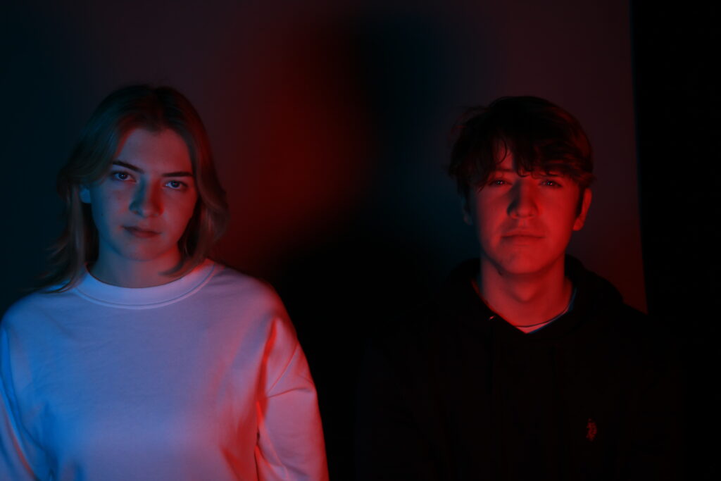
Creative Portrait Edits
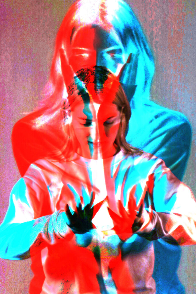
Here I used two images and layered them. I then turned down the opacity of one creating a split effect. I also used a high saturation setting to create the vibrant colours, I like this image because you can still see both pictures even if they are layered. The clothing from each picture are also opposite colours which adds a nice contrast.
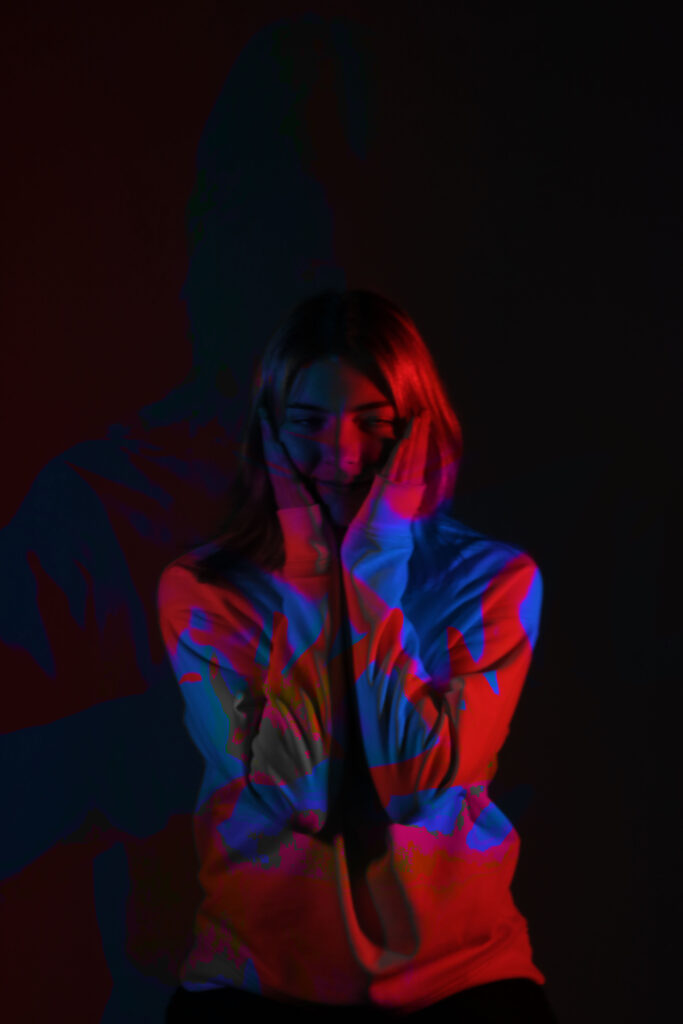
In this image I used the same technique as the one before to create the overlay effect. This created a cool layering of colours on the clothes and in the background giving the picture depth and tone.
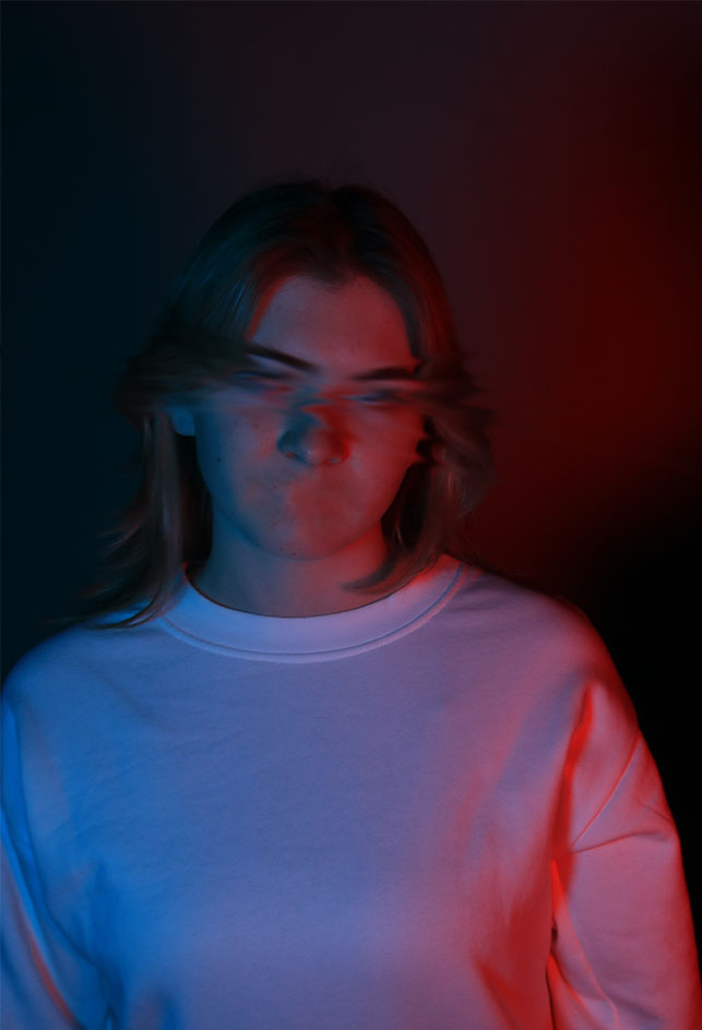
With this image I used the smudge tool where I would use it to almost erase her eyes and used the spot blemish tool to fully erase her mouth to give it a creepy look. The harsh lines of red and blue on her eyes give a nice contrast to the blended blue and red on her jumper.
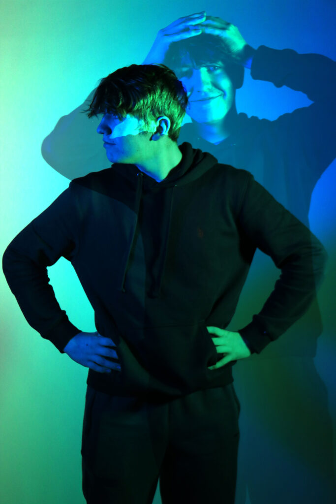
I went for a more simple look just overlaying one image on another however, both images are completely different creating strong contrast between both pictures.
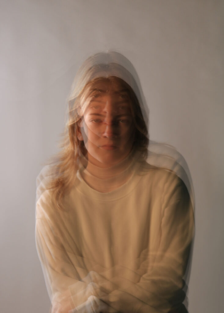
For this image I layered multiple of the same image and either moved them up or down to create the desired effect. I then lowered the opacity to create a multi-exposure look like Alexander Rodchenko
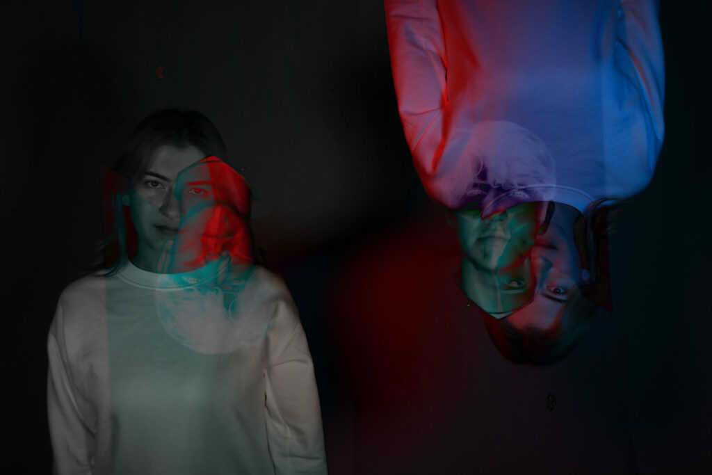
For this image I decided to overlay the same image and flip it upside down. I also turned the original image black and white so the upside image with the selected overlay setting would be visible and create a cool effect, curating a contrast between pictures.
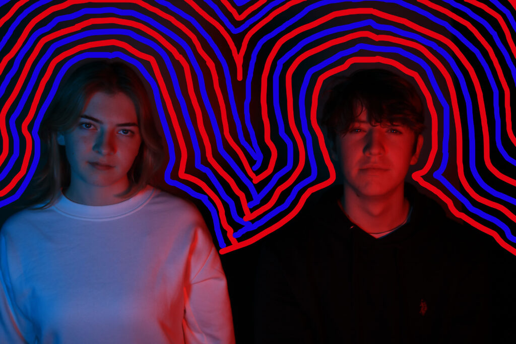
Lastly, I used the original image of the red and blue and decided to incorporate the colours by surrounding them in the neon versions of them, this created a ‘trippy’ effect.
