
I wanted my zine to have a very consistent style to correspond with the images themselves, as they follow a documentary-like style.
Initial Layout Plan
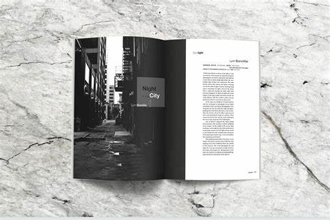
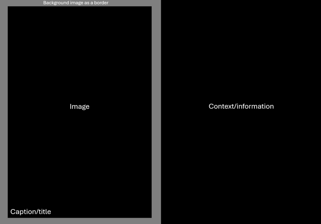
I wanted to have my first two pages of the zine be an image on the left with a caption, and then the opposing page have some context/information about the image as well as the intentions and thought process behind it.
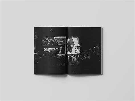
I then wanted this to be follow by a singular image spread over two pages with no text, having purely visual storytelling rather than context/information to describe the scene.

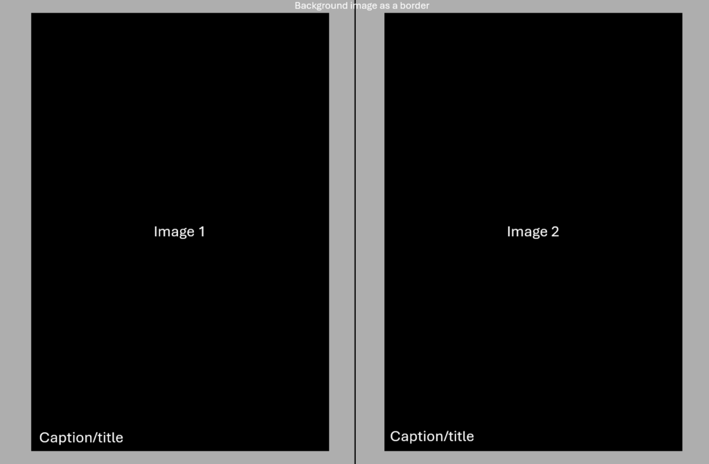
Finally, I wanted a diptych of two similar images with titles in the corner as well as a background image as a border.
This would then repeat in order again one more time (image with caption, double page spread, diptych) before reaching the back page of the zine.
Image Selections
Single Images
For the images that would go alongside a page with context/information, I wanted to pick some of my better images to explain my intention and thought process behind them, as well as giving them an appropriate title.
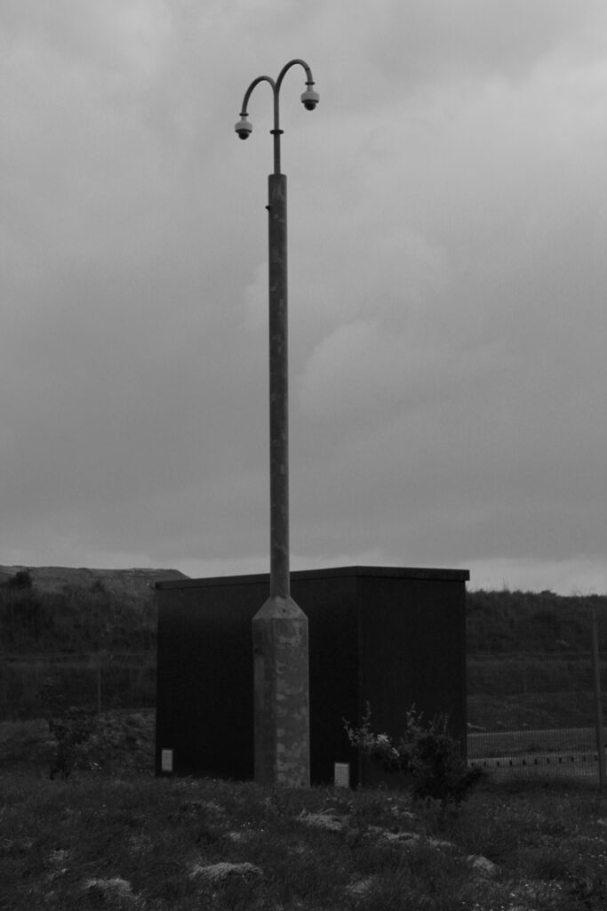
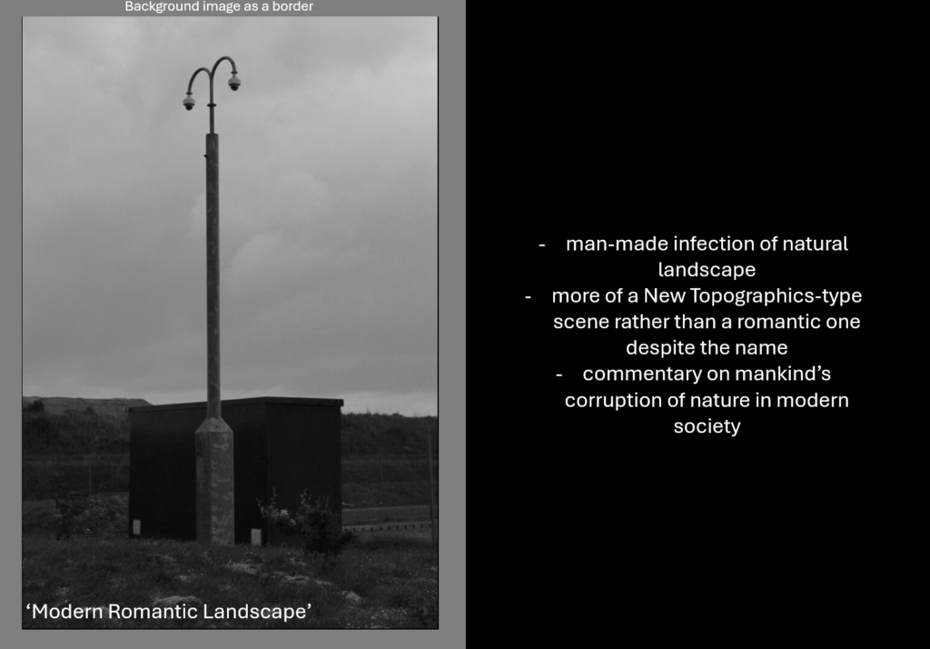
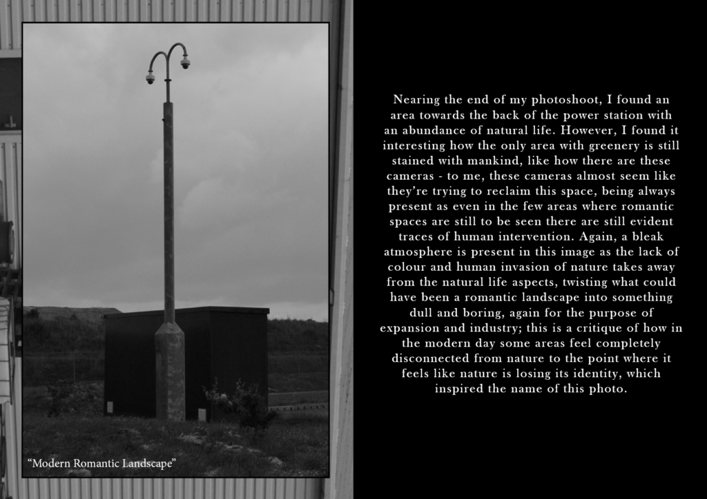
For this image, I took it when I noticed how the light seems like a man-made infection into this natural landscape, almost claiming this scene as mankind’s rather than a romantic one, creating a disconnect between nature and man. When considering a title, I chose ‘Modern Romantic Landscape’ because I liked the irony and how it implies that romantic landscapes in the modern age aren’t natural at all and have human interference which completely takes away from the romanticism aspect.
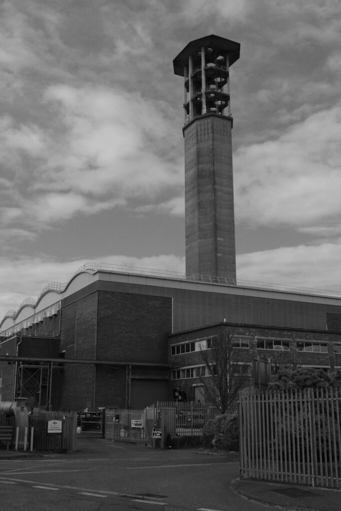
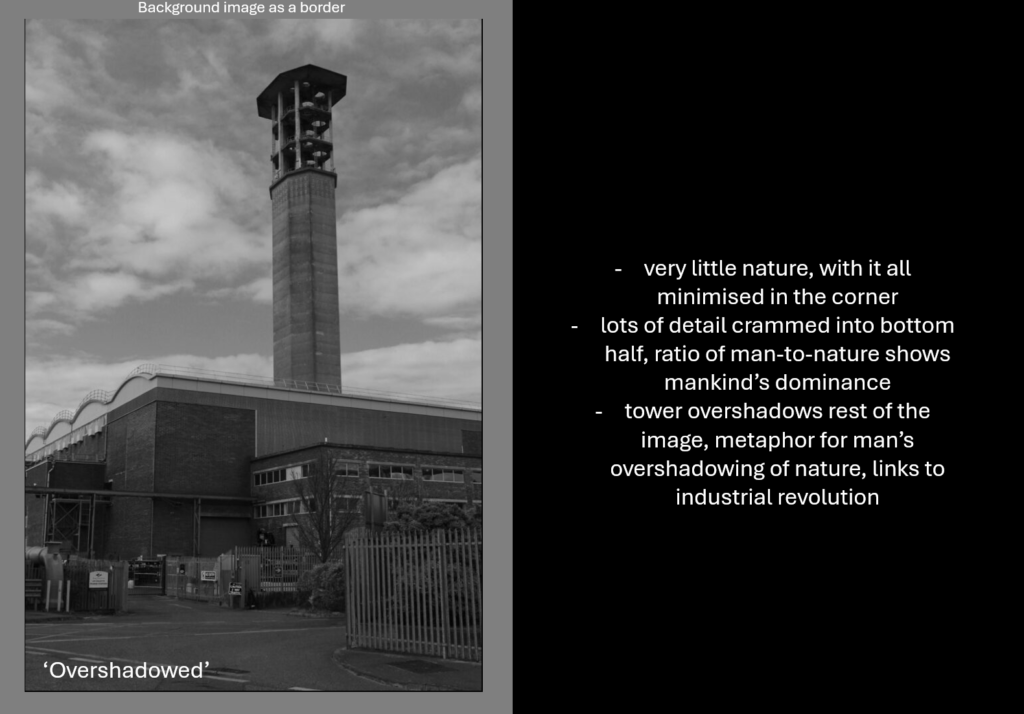
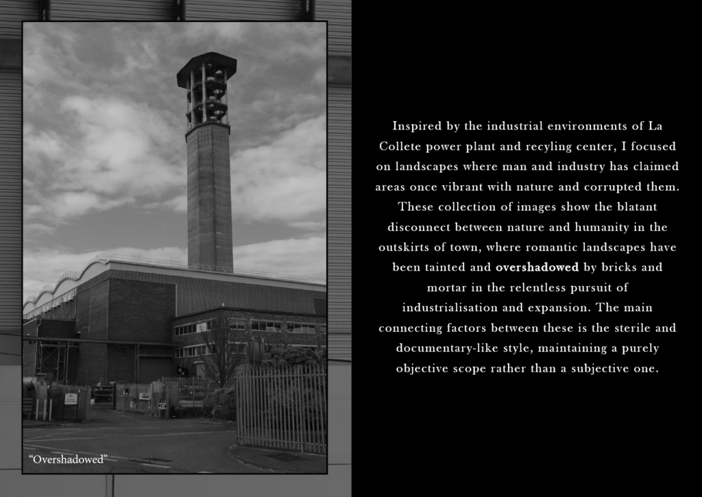
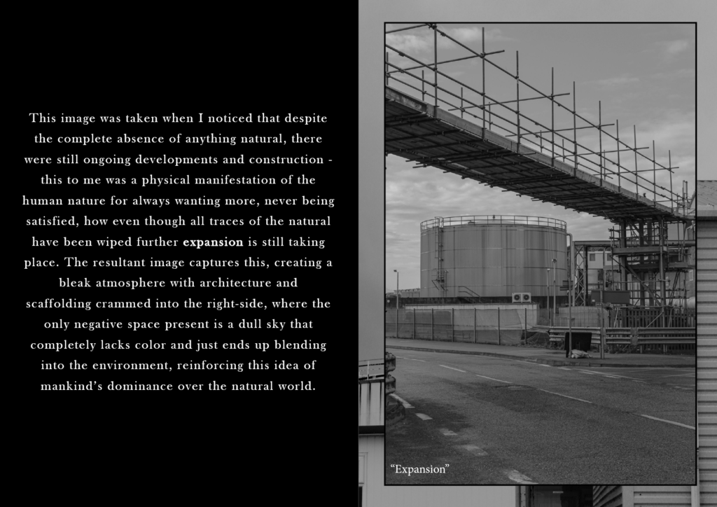
This particular image I took because I liked how there is very little natural aspects in the bottom right corner, with the rest of the bottom half being crammed full in contrast to the top half which is purely sky and negative space apart from the tower. I saw the tower standing over the rest of the scene as a metaphor for mankind’s overshadowing and dominance over nature opposed to the connection they used to have before periods such as the industrial revolution – I chose to title the image ‘Overshadowed’.
Single Images + Context Drafts
Drafts for the pages which will have an image with context and information, alongside notes to help with writing the paragraph when it comes to making the zine.
Double Page Spreads
For these pages, I chose images where lots of detail and content is present that would look better displayed in landscape over two pages – I also thought it would be best to not have a caption or title for these images to have nothing else on the double page spread except for the image, so the two pages will look exactly as the images are presented below.
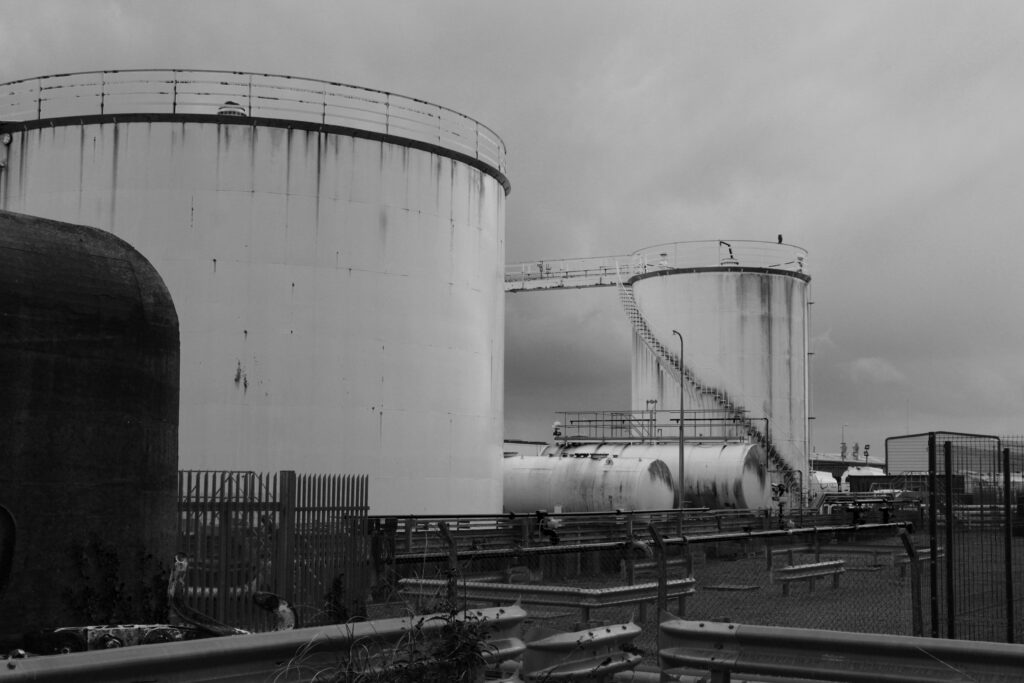
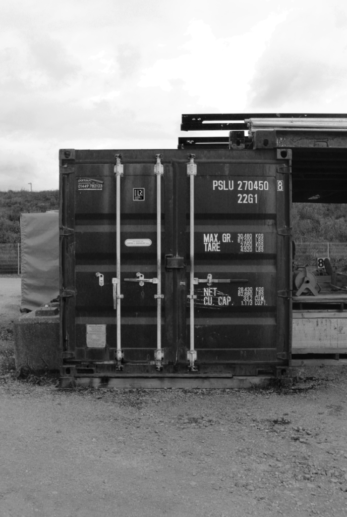
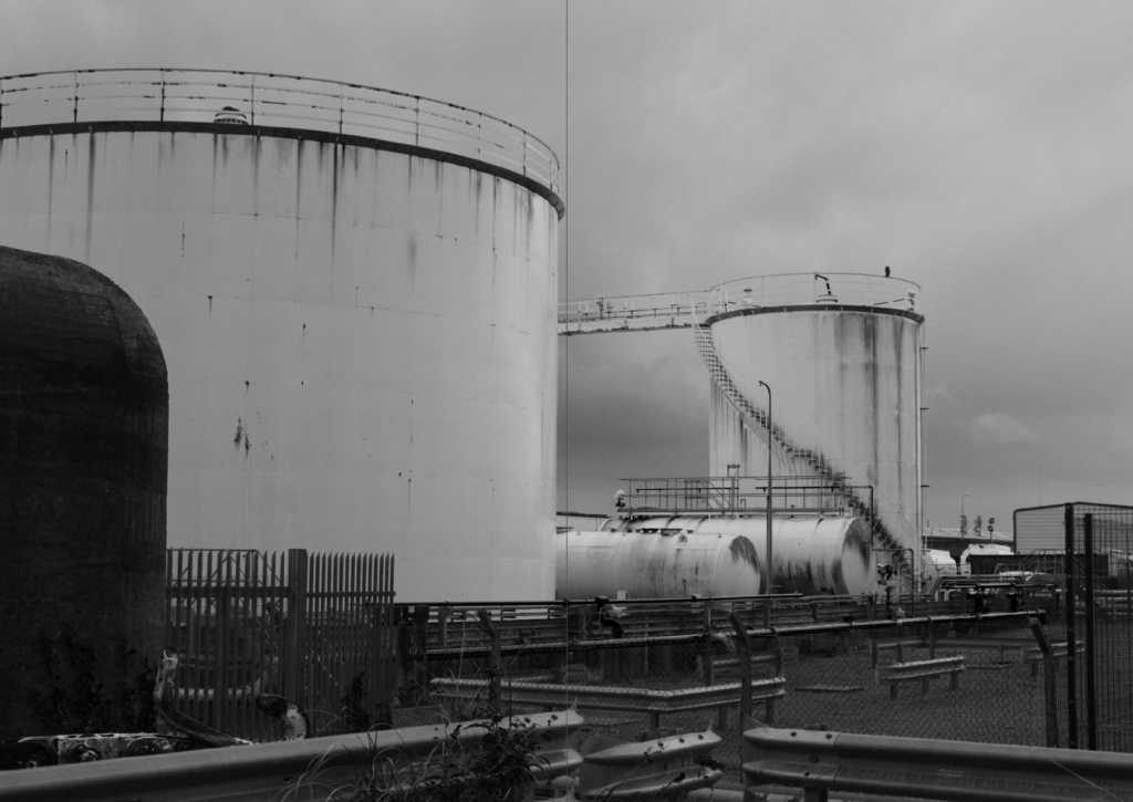
When presented in a two page spread, this image is very effective composition-wise since the first container completely fills out most of the first page in contrast to the second one where it is positioned perfectly in the middle but still has enough negative space to contrast it from the other half.
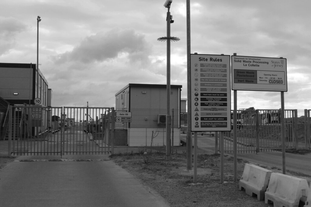
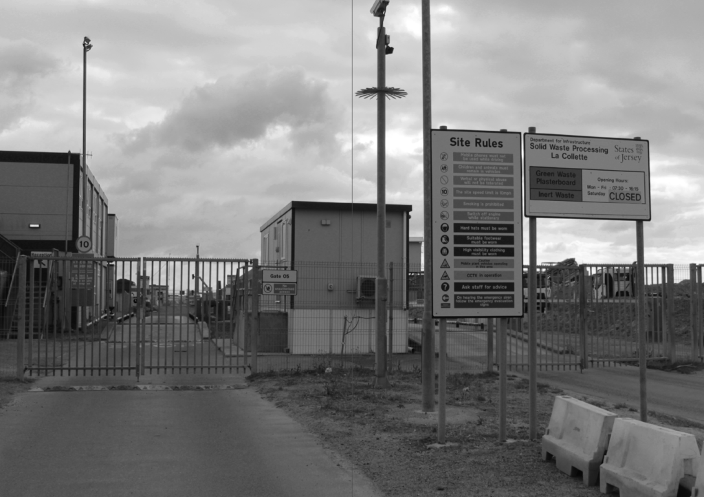
When presented in a two page spread, the first page has the gate and some details but is mostly composed of the negative space from the sky, whereas the second page has less negative space with more of the frame being filled by signs.
Diptych
For my diptychs, I wanted to pick two pictures which would go well together when presented together, as well as an appropriate image to have as the background.
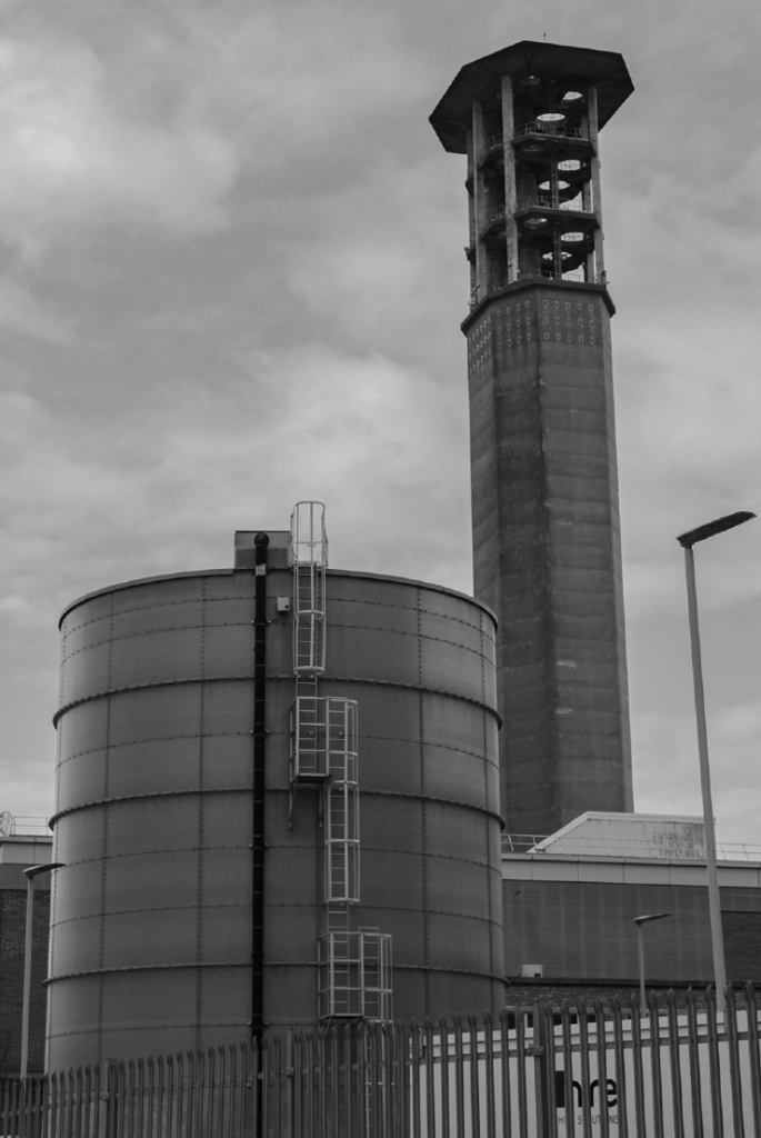
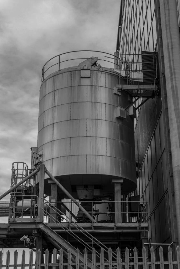
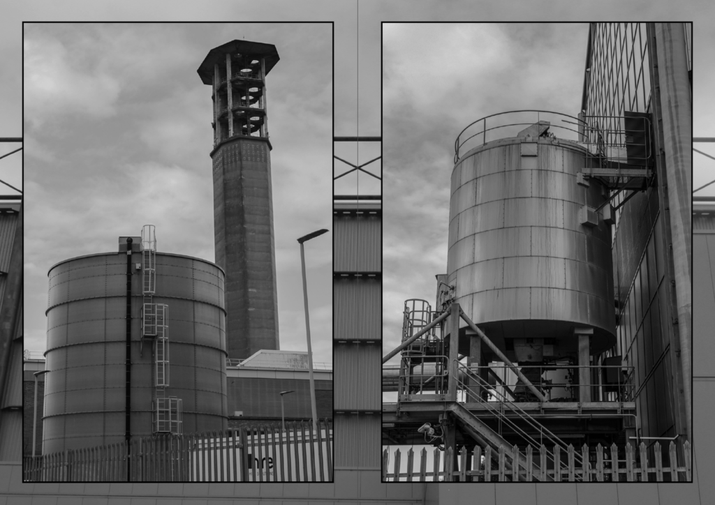
These two pictures go alike in the sense they both feature containers/tanks as their main subjects, although they still are different enough for both of them to be interesting images on their own. The down-up perspective of the first image looking up to the tower has also been used on the second image, making the two images go with each other more.
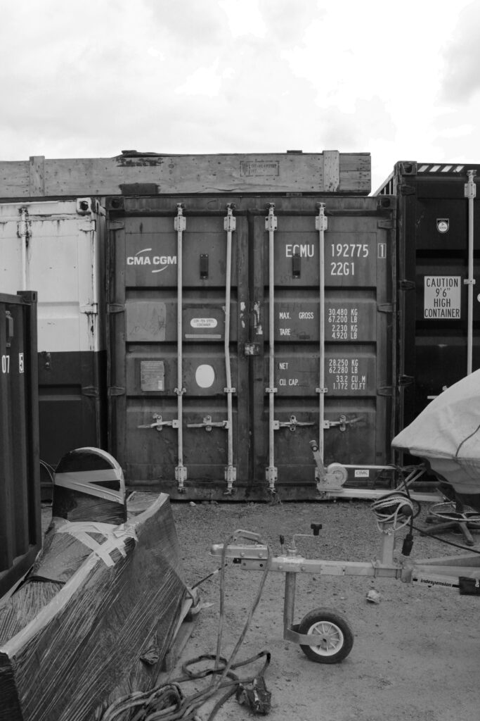
These two pictures are more alike since they are both taken at the same deadpan angle and are both of storage containers – however, enough contrast is still present, mainly in the foreground where one image has purely negative space whereas the other has more clutter and objects.
Diptych Drafts
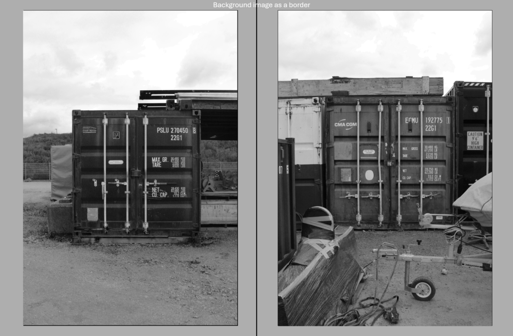
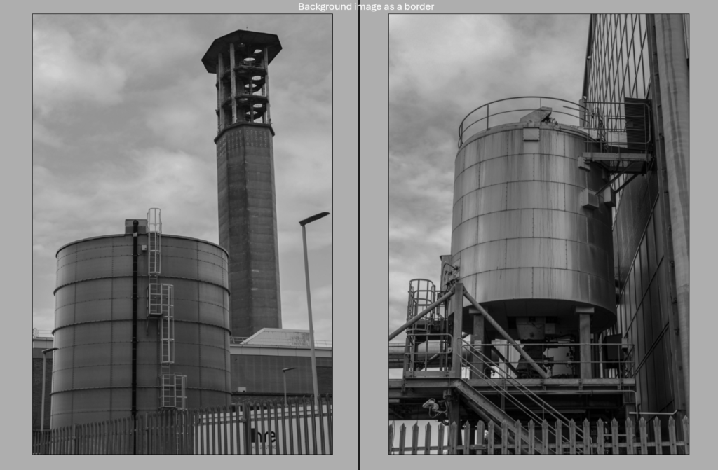
Drafts for the diptychs across two pages, the grey border will be replaced with an abstract, close-up New Topographics-style image and subtle black borders will be added to the image to bolden them.
Final Outcome in InDesign
After making initial layouts, selecting images and drafting designs, I started creating the zine in InDesign.
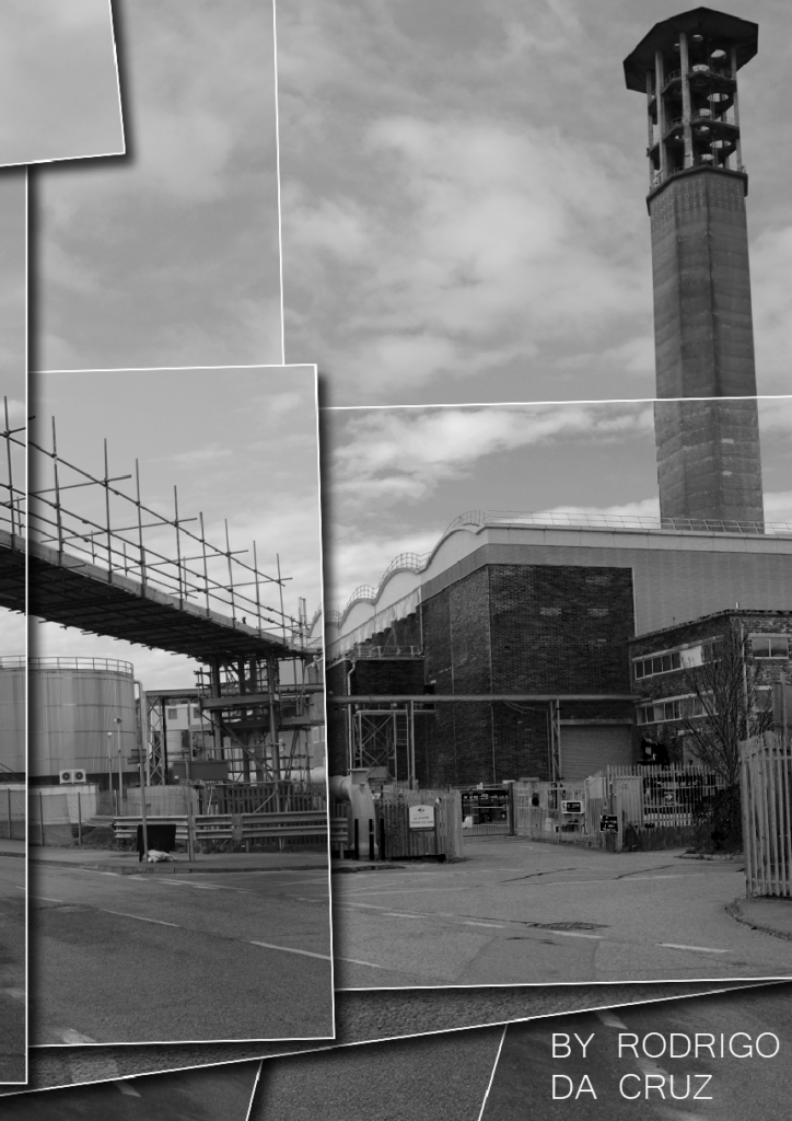
After experimenting with different fonts and colours, I settled on this one since I felt it was the most documentary-like one and fit most with my narrative and images, as well as white to make it bold and stand out from the image. The cover image was chosen since it perfectly summarises the intentions behind my photoshoot and zine, with lots of the frame being filled by tanks and containers and no natural elements being present.
Abstract image added to border the image itself rather than just one solid colour since I found it more visually appealing, as well as the finalised contextual paragraph and a title for the picture.
I really liked how this double page spread out since it looks exactly how I wanted it to, with one page being filled to the frame and the other having more negative space.
Another abstract image added as a background to fill the space rather than it just being one colour. I experimented with adding captions/titles to the images but liked the purely visual aesthetic without any text.
Second single image – title, background image + information/context added.
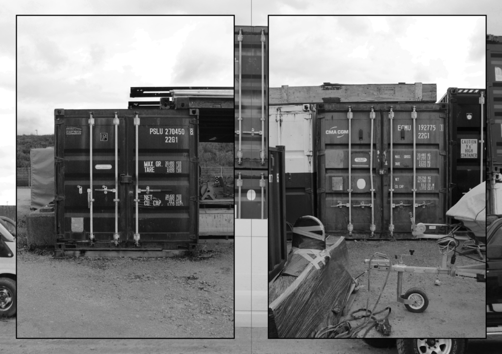
Second diptych – background image + surrounding borders to the images to make them bold and stand out.
Second double page spread.
Third and final single image, background image and context.
For my back cover, I originally wanted to use the double page spread image of the two containers and have the first half on the front cover and second half on the back cover, but decided against it because I thought the photo would look better in the zine itself. I settled on this design I made in Photoshop for the back cover, a joiner photo of two photos featured in the zine with the impression that they have been printed out and layered on top of each other – I like how this gives it an artificial look and it ties to the zine in the fact that the scene has been built by layering photos, similarly to how the whole area was built by hand from the ground up and in doing so took nature’s place.