
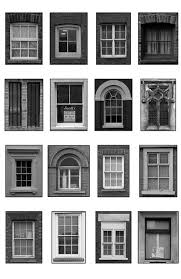
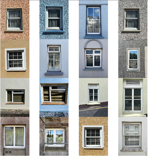
Robert Adams- Case Study

Introduction to the Photographer
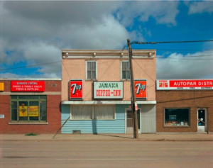
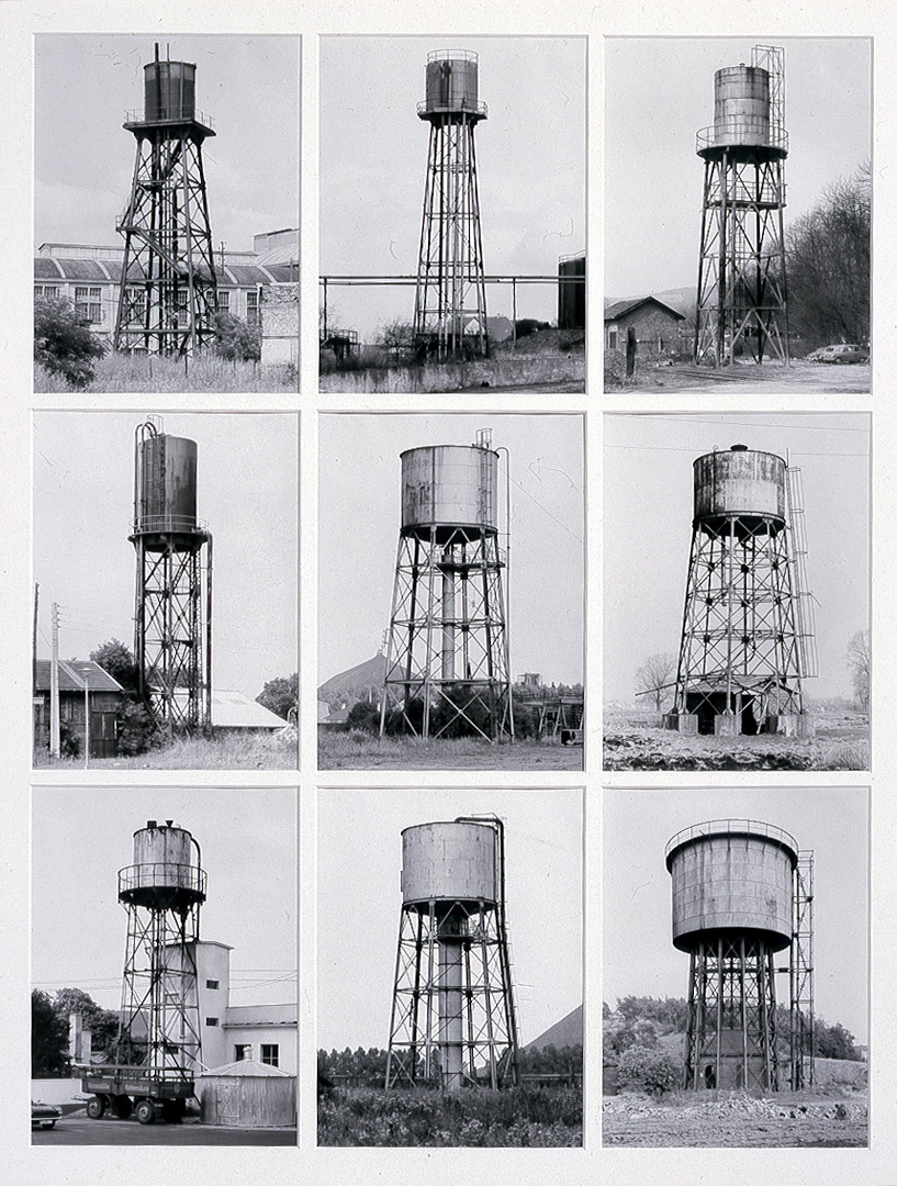
Robert Adams (born 1937) is an American photographer best known for his images documenting the changing landscapes of the American West. Originally a literature professor, he turned to photography in the 1960s as a way to explore the impact of human expansion on nature. His work is closely associated with the New Topographics movement, which rejected traditional, romanticized views of the landscape in favour of a more neutral, documentary approach.
His photography is both critical and contemplative, capturing the tension between nature and human intervention. His images often highlight the environmental consequences of industrialization, and deforestation while maintaining a subtle, poetic quality through careful use of light and composition.
Types of Images He Captures
Adams’ work focuses on human-altered landscapes, particularly in the American West. Some key themes include:
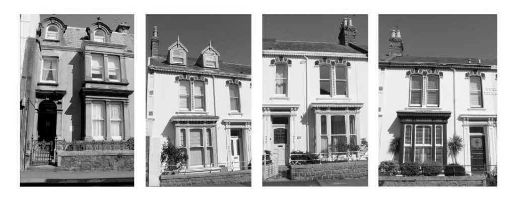
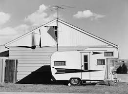
- Suburban Expansion – Housing developments, shopping malls, and roads replacing open land. Example: The New West (1974) documents the rapid suburbanization of Colorado.
- Deforestation & Environmental Impact – Images of cleared forests, barren landscapes, and environmental degradation caused by human activity.
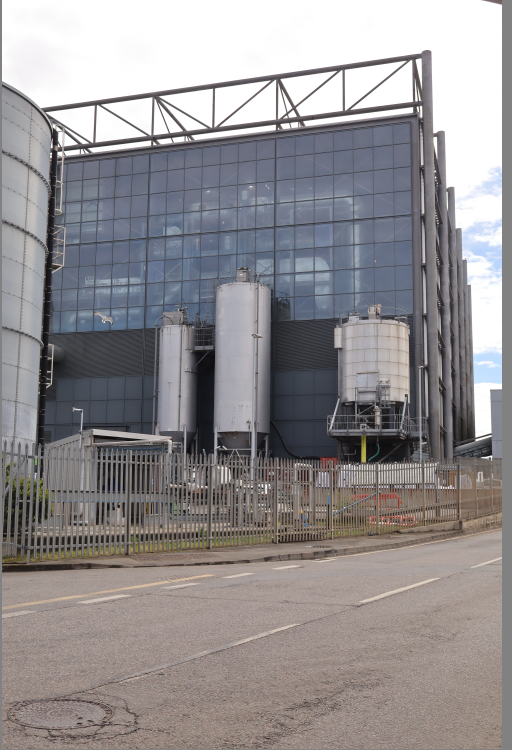
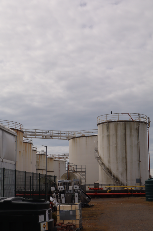
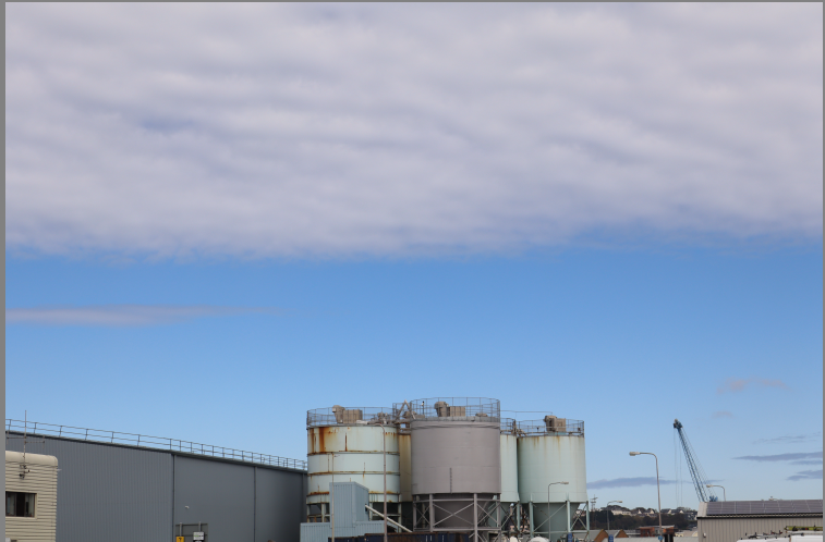
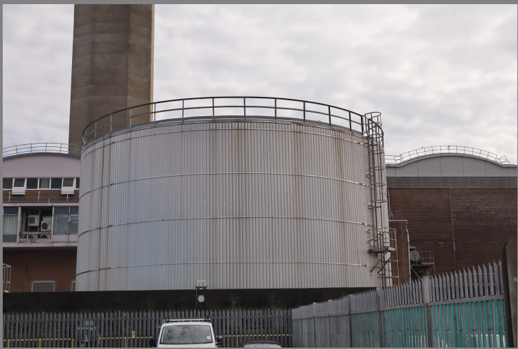
- Industrial and Urban Scenes – Photographs of highways, factories, and commercial spaces, often showing the contrast between human structures and nature.
- Light and Atmosphere – Despite the sometimes bleak subject matter, Adams’ use of natural light adds depth and a quiet beauty to his images, reflecting both loss and resilience.
Image Analysis

Technical
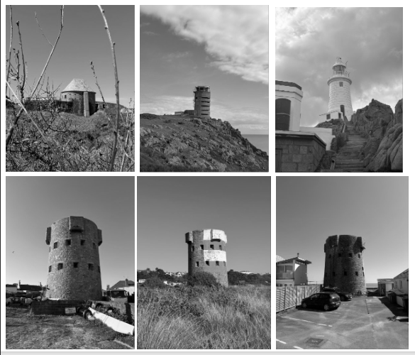
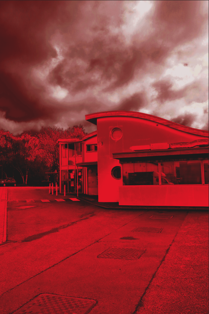
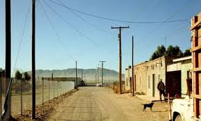
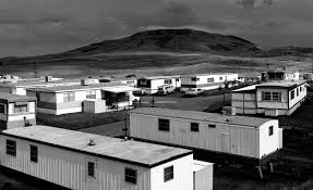
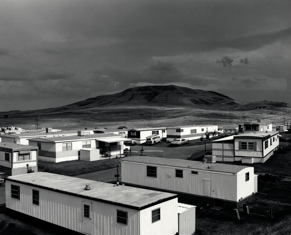
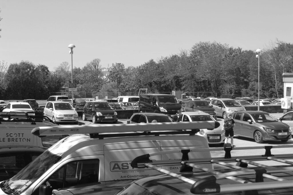
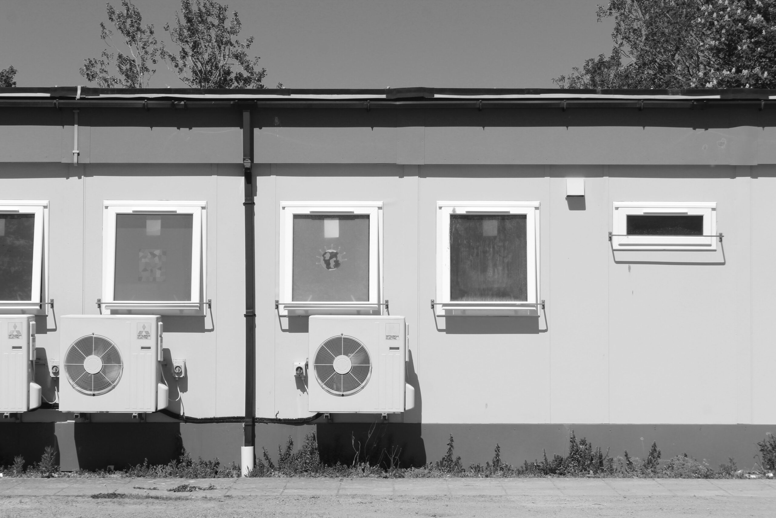
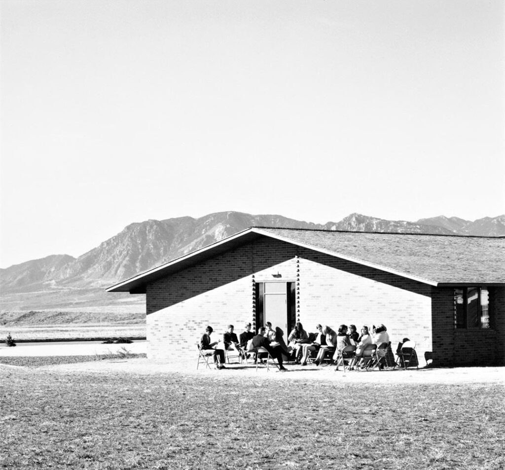
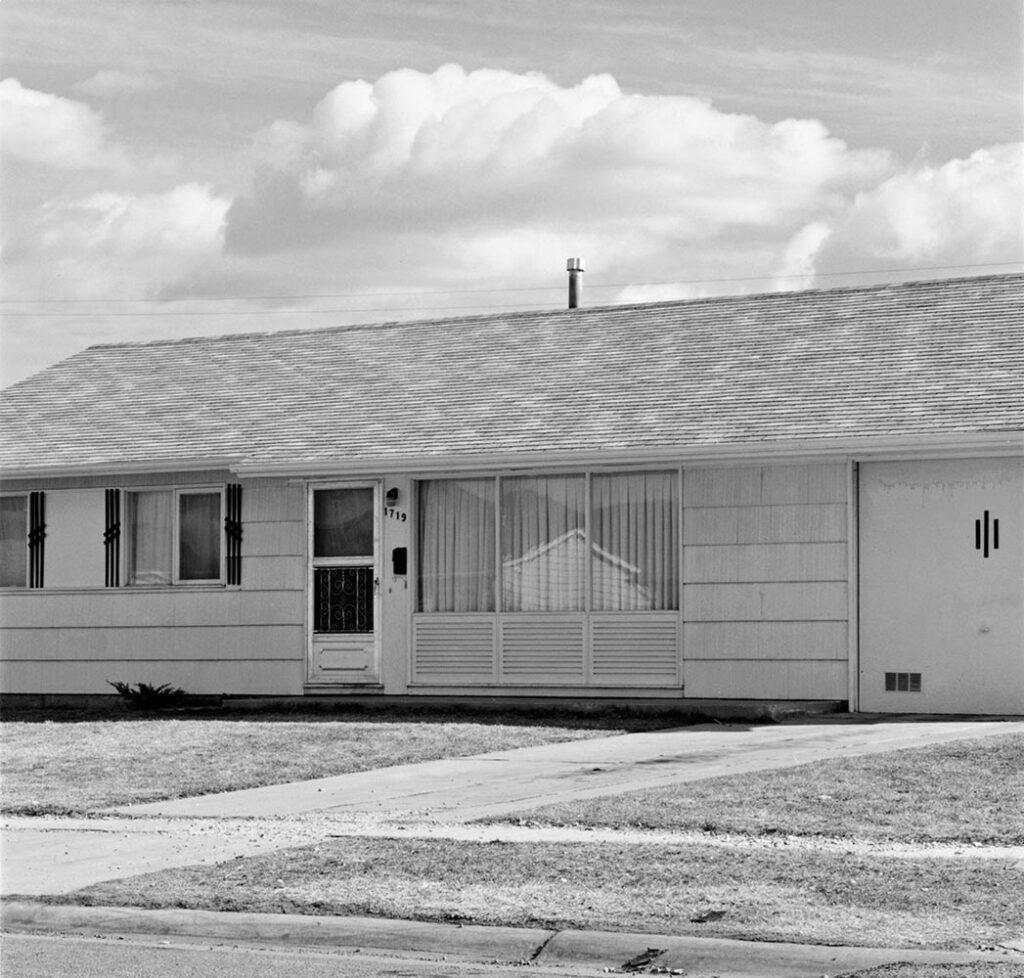
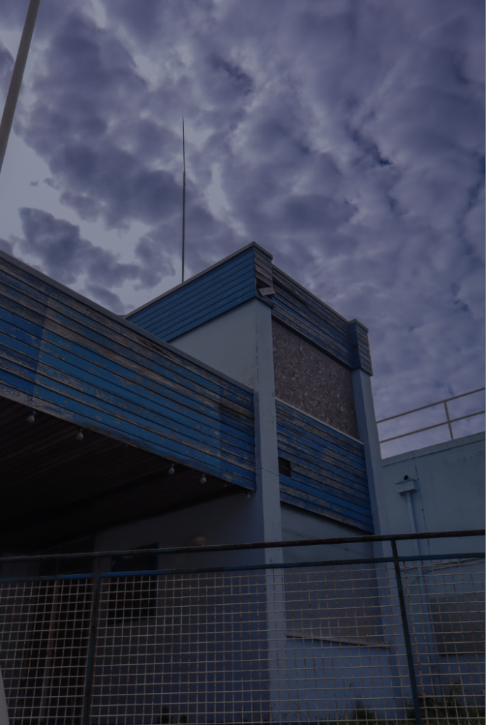
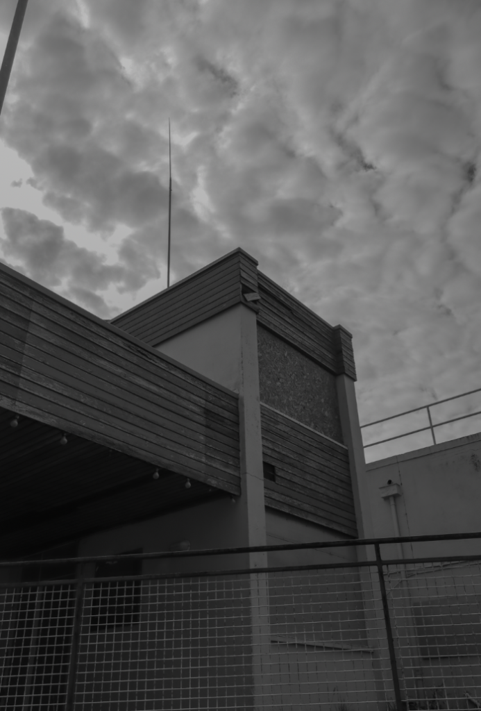
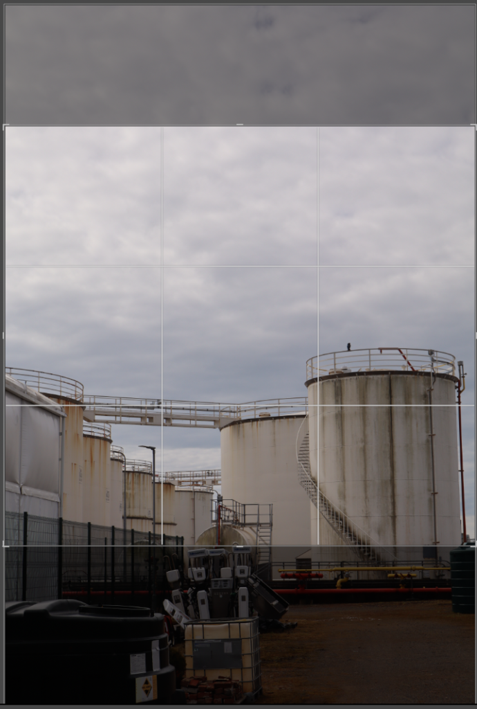
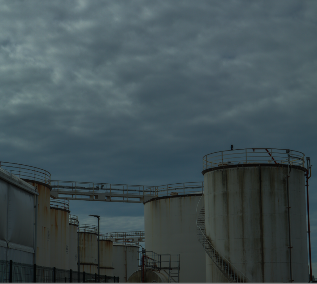
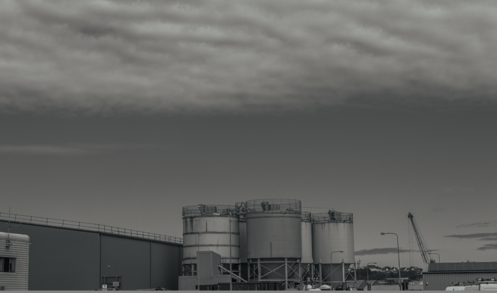
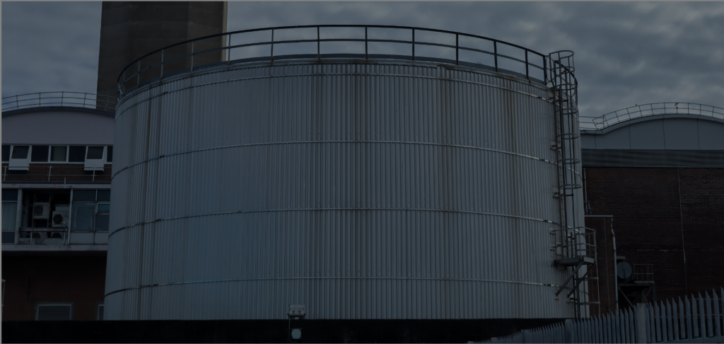
This black-and-white photograph demonstrates precise technical execution, likely taken on film due to its smooth tonal transitions and slight grain. The sharp focus across the entire scene ensures that both the foreground and background elements are clearly defined, emphasizing the interaction between the built and natural environments. The lighting is soft and diffused, casting subtle yet effective shadows that enhance depth and texture. The composition is carefully arranged, with structured, geometric forms in the trailers contrasting against the rolling landscape in the distance.
Visual
The image relies on a strong contrast between human-made structures and the organic landscape. The trailers form a repetitive pattern of rectangular shapes, which is subtly broken by the presence of winding roads and scattered vehicles. The sky, filled with dark, heavy clouds, adds a sense of atmosphere and suggests an impending change. The absence of colour shifts the focus toward shape, structure, and tonal contrast, reinforcing a detached, observational quality. The way the image leads the eye from the trailer park toward the distant hills creates a sense of scale and perspective.
Contextual
This image aligns with the New Topographics, as it combines human-altered environments with natural landscapes. The trailer park setting suggests temporary or transitional living, reflecting how suburban expansion has altered rural areas. This theme is central to many photographers associated with topographics, such as Robert Adams, Lewis Baltz, and Stephen Shore, who sought to capture ordinary, often overlooked landscapes without romanticizing them.
Rather than presenting nature as untouched or idealized, the image highlights the way built environments invade open landscapes. The distant hills appear secondary to the presence of the trailers, reinforcing the theme of human intervention in natural spaces. The lack of dramatic lighting or strong emotional cues is characteristic of New Topographics photography, which aims to document places as they are, rather than how they are traditionally perceived.
Conceptual
At its core, this image explores the expansion of human settlements, the impermanence of modern living, and the evolving relationship between people and their surroundings. The contrast between temporary structures and the vast open land raises questions about the impact of development on rural areas. The absence of people creates a sense of emptiness, reinforcing the idea of isolation or detachment from the environment. Instead of making a clear judgment, the image adopts an observational tone, allowing the viewer to reflect on how urbanization and suburban expansion have reshaped modern landscapes.
Stephen Shore- Artist reference
Stephen Shore, born in 1947, is an American photographer widely recognized for his pioneering work in colour photography. He became a key figure in the New Topographics movement, which emerged in the 1970s. Shore is best known for capturing the ordinary aspects of daily life, particularly through images of suburban landscapes and urban settings. His use of colour and large-format cameras helped redefine how photography could document everyday environments.
Themes and Style:
- Color Photography: At the time Shore started his career, black-and-white photography was still dominant in fine art. However, he embraced color photography, which allowed him to present everyday scenes with a new sense of vibrancy and realism.
- Focus on the Everyday: Shore’s work is often centered around the banal, unremarkable scenes of daily life. This includes motels, parking lots, and gas stations—places typically ignored in traditional art. His photos highlight the ordinariness of American culture, creating a sense of detachment while drawing attention to the beauty of these overlooked spaces.
- Large-Format Cameras: Using large-format cameras, Shore captured images with incredible sharpness and clarity. This level of detail contributed to the sense of objectivity in his work, making the viewer see the subjects as they are, without embellishment.
- Documentary Influence: Shore’s photography carries the influence of documentary photography, but instead of focusing on people, he chose to document the spaces they inhabit. His images avoid traditional notions of beauty and focus on presenting scenes in a straightforward, almost impersonal manner.
His Most famous pieces:
- “Uncommon Places” (1982): This collection features color photographs taken across the United States, capturing everyday scenes like suburban developments, roadsides, and motels. Shore’s compositions are both meticulous and full of life, and the use of color contrasts with earlier trends in fine art photography, helping to reshape the way photographers viewed the ordinary world.
- “American Surfaces” (1976): In this series, Shore documents his road trip through the U.S., photographing diners, motels, and highways. The work explores themes of American culture and identity, focusing on unremarkable yet significant moments in the journey through the country.
Connection to New Topographics:
Shore is often linked to the New Topographics movement, a group of photographers in the 1970s who sought to document landscapes in a way that was neutral and devoid of romanticism. The New Topographics photographers rejected the traditional view of nature as pristine and beautiful, instead focusing on how humans have altered the environment.
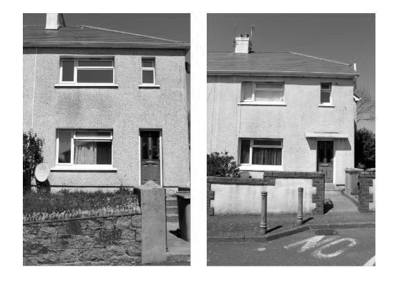
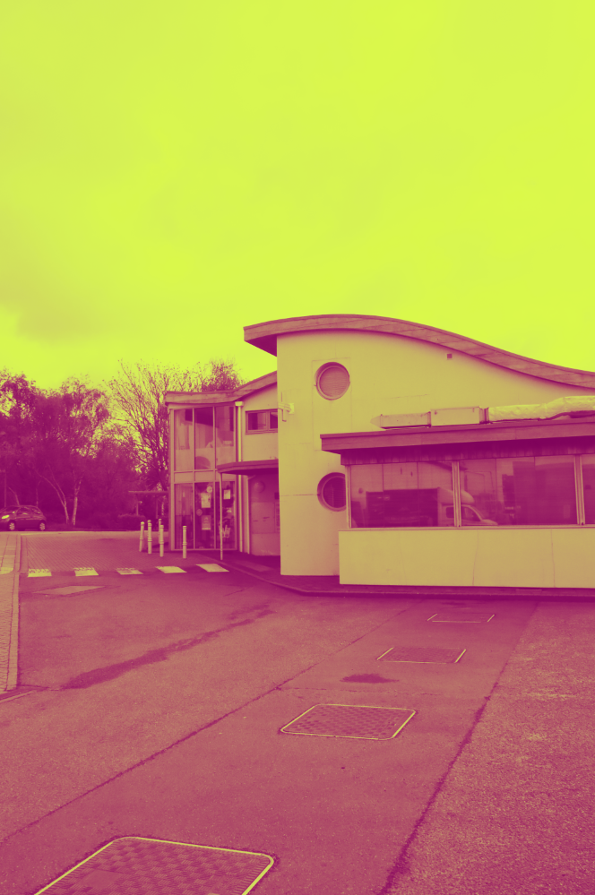
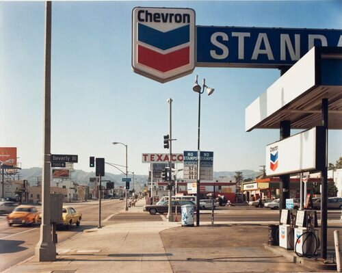
Stephen Shore, Beverly Boulevard and La Brea Avenue, Los Angeles, California, June 21, 1975, chromogenic colour print

Technical
- The photograph is taken using a large-format camera, producing sharp details and an extensive wide depth of field, ensuring clarity throughout the scene from foreground to background.
- Natural daylight creates an even, neutral tone across the image, with cool lighting and a clear sky contributing to the stark, detached aesthetic.
- The hard-edged shadows emphasize the geometric forms of the gas station structures, reinforcing the rigid, structured environment.
- The square format and precise framing create a sense of order, yet the low horizon line allows the sky to dominate the upper portion of the image, contrasting with the cluttered foreground.
Visual
- The foreground is busy and cluttered, filled with cars, signage, and urban elements, while the background opens into distant mountains, offering a sense of escape.
- The composition uses leading lines created by the road and sidewalk, guiding the viewer’s eye toward the centre, where various gas station signs overlap.
- The horizon line is set low, giving prominence to the sky while compressing the lower half of the image, enhancing the sense of congestion and overdevelopment.
- There is a strong use of geometric shapes and linear elements, such as the rectangular signs, road markings, and structured architecture, contributing to an almost mechanical, impersonal feel.
Contextual
- The image reflects themes of industrialization, suburban sprawl, and car dependency. The gas stations symbolize a society built around mobility and consumption, yet they also highlight environmental consequences tied to the oil industry.
- The sense of nationalism is reinforced through the dominant colours—red, white, and blue—which appear in the branding of Chevron, Texaco, and other American corporations. This suggests a patriotic connection between capitalism, mobility, and national identity.
- The photograph subtly critiques suburban expansion, with cars and gas stations becoming symbols of how people are pushed further from natural spaces, relying on automobiles for daily life.
- The signage, advertisements, and corporate branding reflect a culture driven by commerce, where even the visual landscape is shaped by consumerism.
Conceptual
- The contrast between urban congestion and the distant mountains suggests a tension between human development and nature, reinforcing themes of escape vs. entrapment. The mountains in the background may symbolize a longing for open space and freedom, yet the heavily structured foreground reminds us of urban constraints.
- The road and signs act as visual directives, subtly guiding the viewer toward an unseen destination. This can be interpreted as a commentary on direction and progress—are we being led toward opportunity or further into urban confinement?
- The American Dream is both celebrated and critiqued—on one hand, the image portrays a society built on movement and prosperity, but on the other, it suggests that this same system leads to environmental damage, overcrowding, and a loss of connection to nature.
Formal Elements
- Line: The road, signs, and shadows create strong linear elements that structure the image and guide the viewer’s eye.
- Shape & Form: The rigid, rectangular structures of the gas station contrast with the organic, soft forms of the mountains in the background.
- Texture: The smooth, polished surfaces of the cars and signs contrast with the rougher textures of the road and distant hills.
- Pattern: Repeating elements, such as the signs and gas pumps, reinforce the industrial and commercial nature of the scene.
- Tone: The clear sky and strong light create high contrast, with deep shadows adding a sense of sharpness and definition to the composition.


