
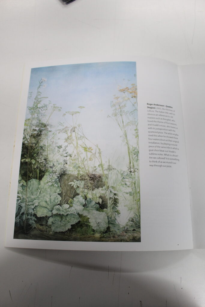
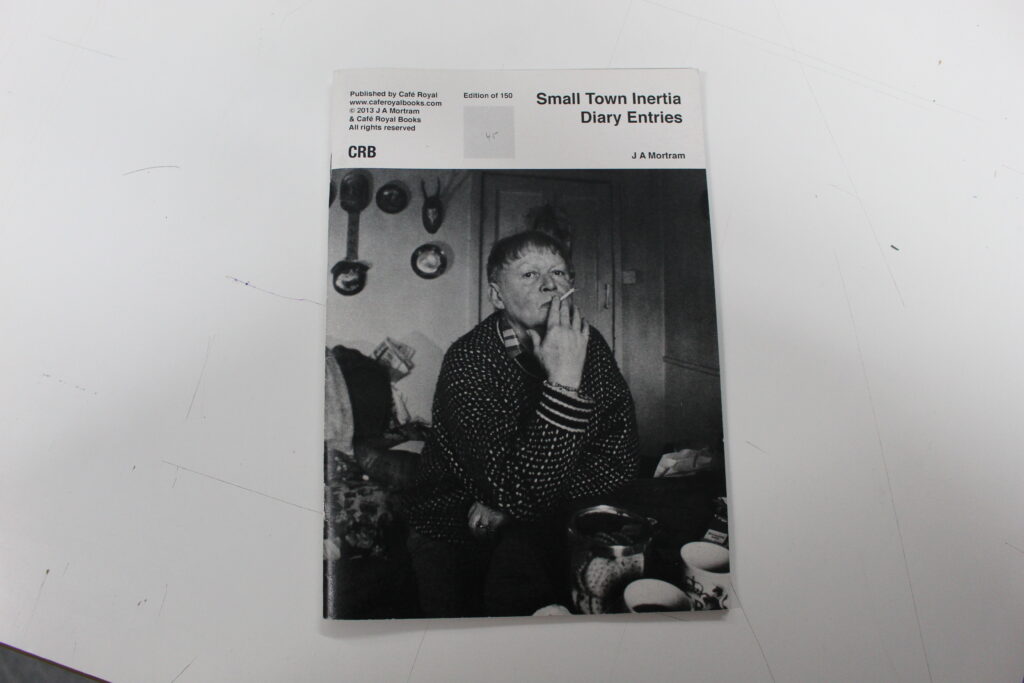
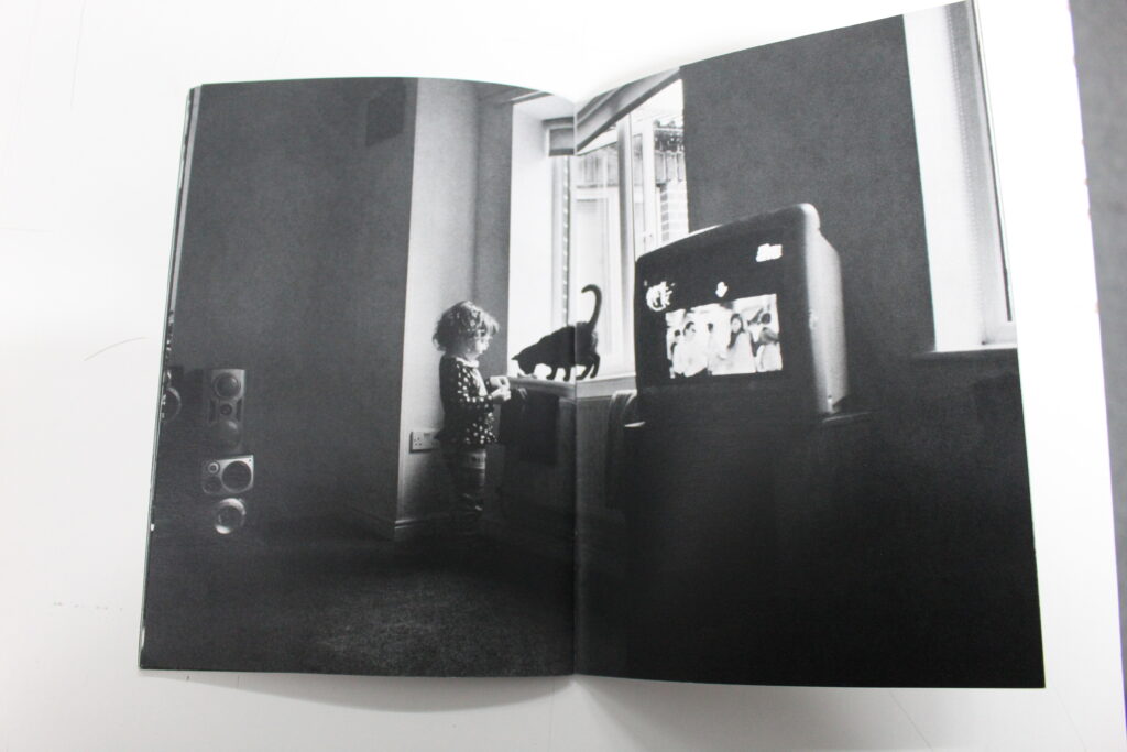
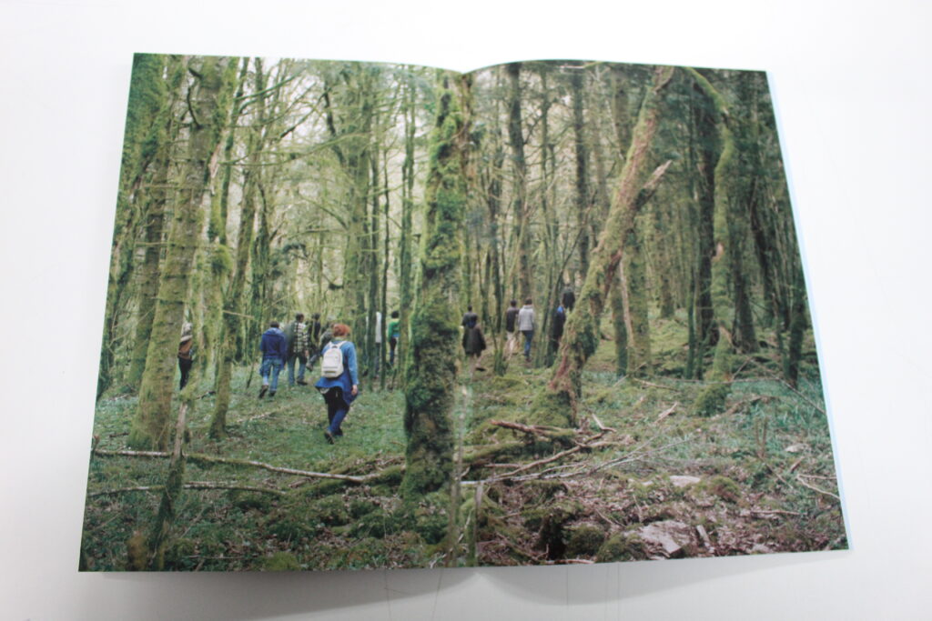
What is a zine?
Zine is short for magazine, and a zine is often a self-published work of original photos and text, which are normally the product of a single person, (can be a small group of people) Zines are often printed in editions fewer than 100.
Historically, zines have provided community for socially isolated individuals or groups through the ability to express and pursue common ideas and subjects.
Mood board.
Research zines and newspaper design made by artists and photographer that will provide visual stimulus for your page design. Produce a mood board and consider the following in your analysis:
- How you want your design to look
- Format, size and orientation
- Narrative / visual concept
- Design and layout
- Rhythm and sequencing
- Images and text
- Title and captions
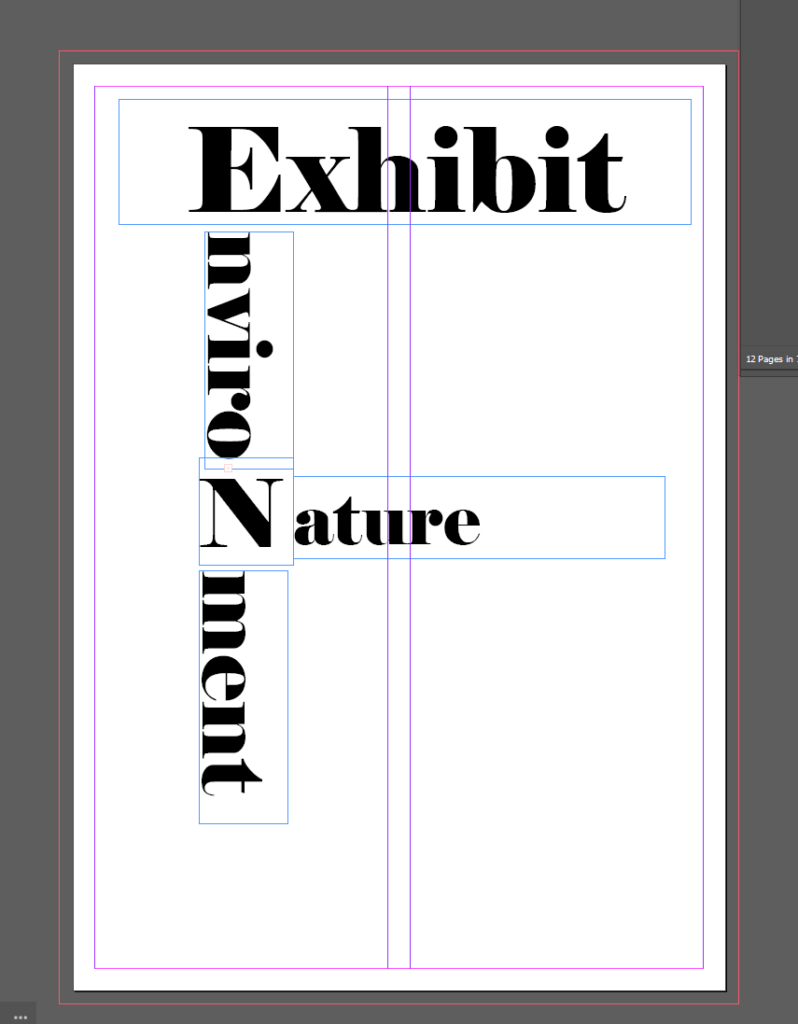
Zine design and layout:
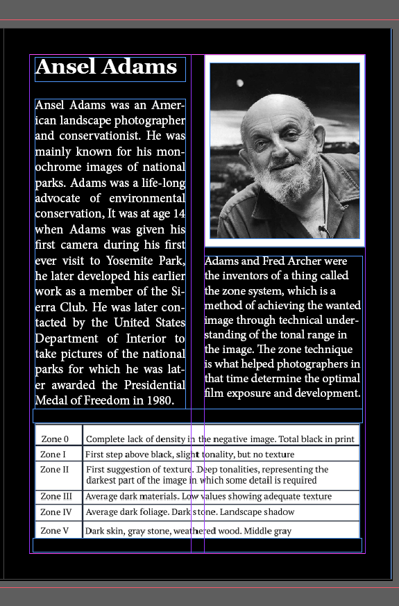
originally I had this page here about Ansel Adams next to this introduction pages. However there was a lot of text and not a whole lot of visual especially when the to pages were next t each other.
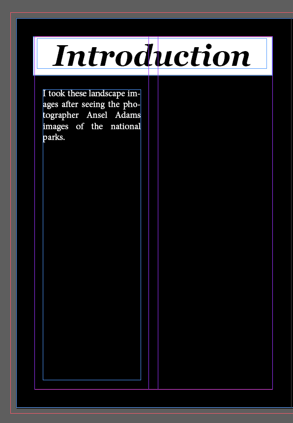
this is the unfinished introduction to show that these 2 pages were next to each other
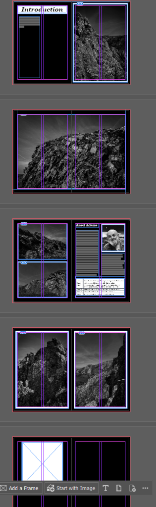
this is now the updated zine since I have moved the position of the Ansel Adams page whilst trying to display my images in different way (one over pages, portrait and landscape orientations.)
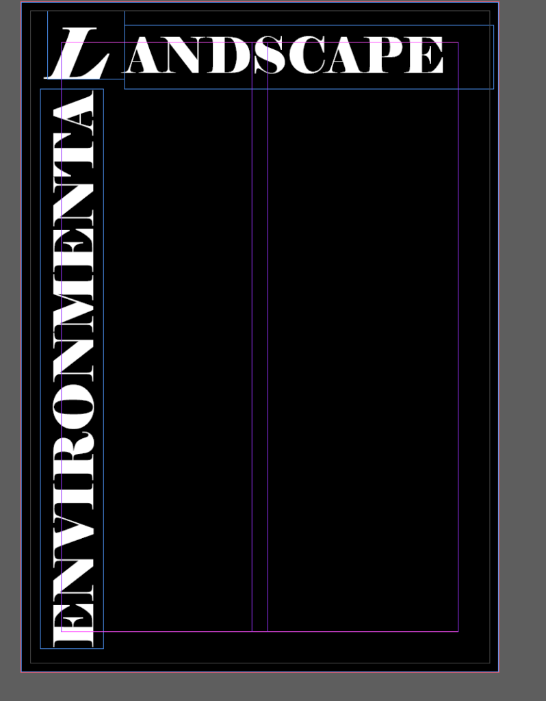
Front Cover Design
When deciding what I wanted to do for the front cover of my zine I decided that I didn’t want an images on the front or back cover of my zine as I wanted all of them to be inside the zine instead of on the cover.
I wanted to have some text going across diagonally across the front cover so I tried doing that and got half way through and realising that it did not look good and I found a few more images that I hadn’t used yet so now the front cover looks like this. ( unfortunately I forgot to get a photo/screen shot of the test that o had done on the front cover)
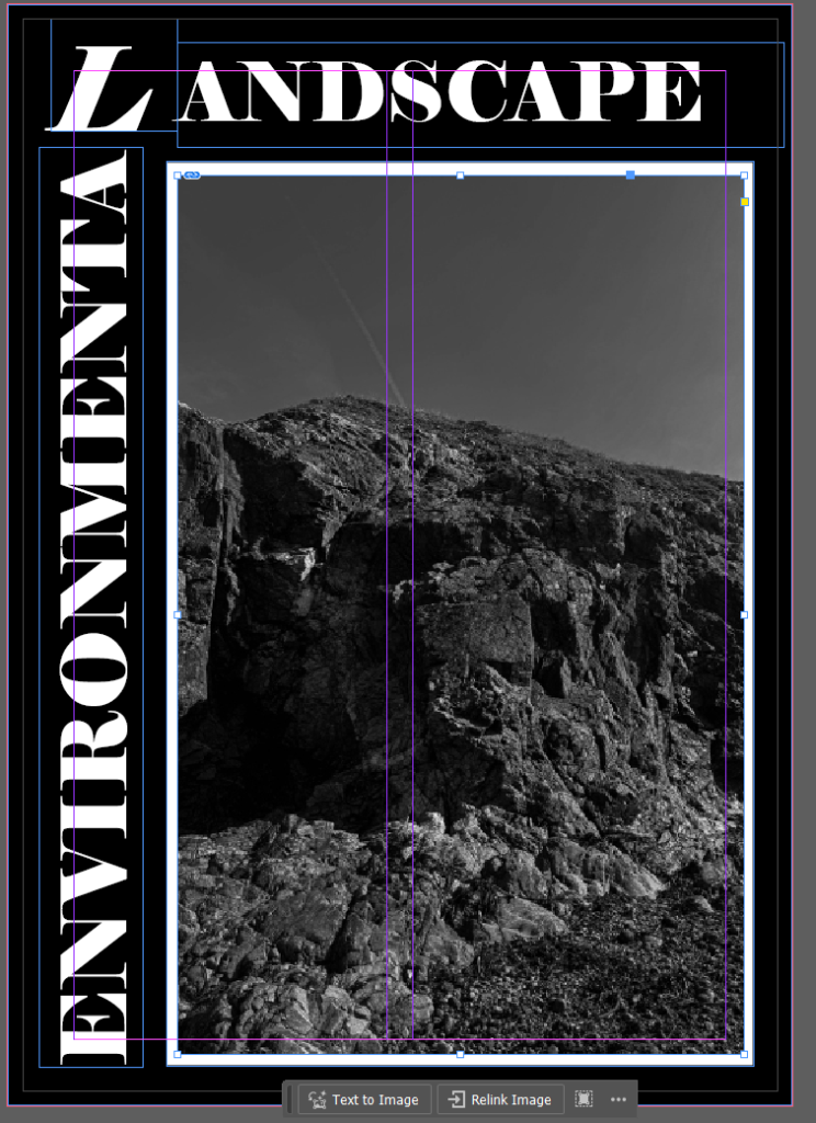
I decided to change the image on the front cover as I didn’t like how this one looked. However the image that I wanted to use had been cropped into a square by me to avoid the dead space in the image, however I don’t think that I like the blank space on the top and bottom around the image so I am going to try if I can stretch the image out
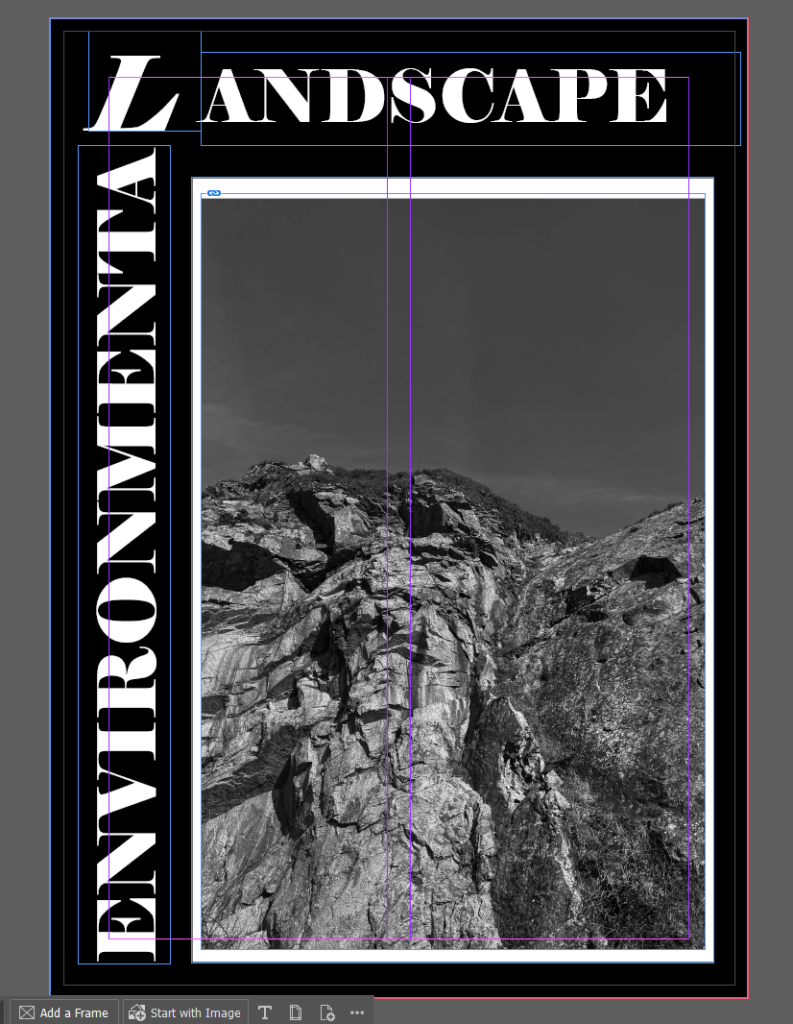
this is how the front cover looks now that I managed to change how the image sat in the frame I double clicked the image which allowed me to move the image whilst it still fit the frame so I could decide which was the main point of the image that I focused on
I have now printed this zine, however I am creating a new one using the same images but in the style of an exhibition style walk through, which captions and things on the images and this zine above is my creative zine.
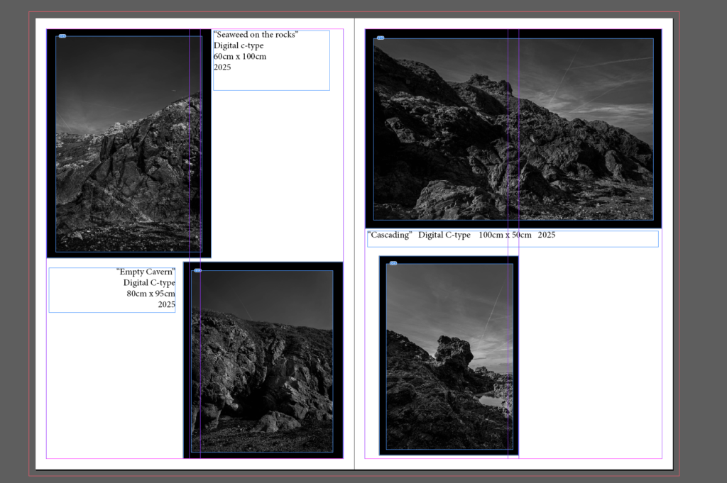
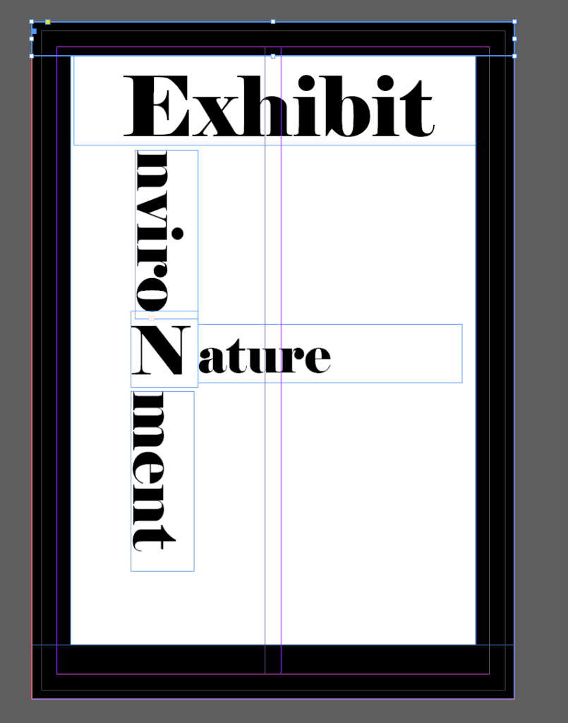
For this zine I decided to go for a reverse look in contrast to my original zine where the background was black with eh white boarders, compared to this one which is a white background with black boarders around the images.
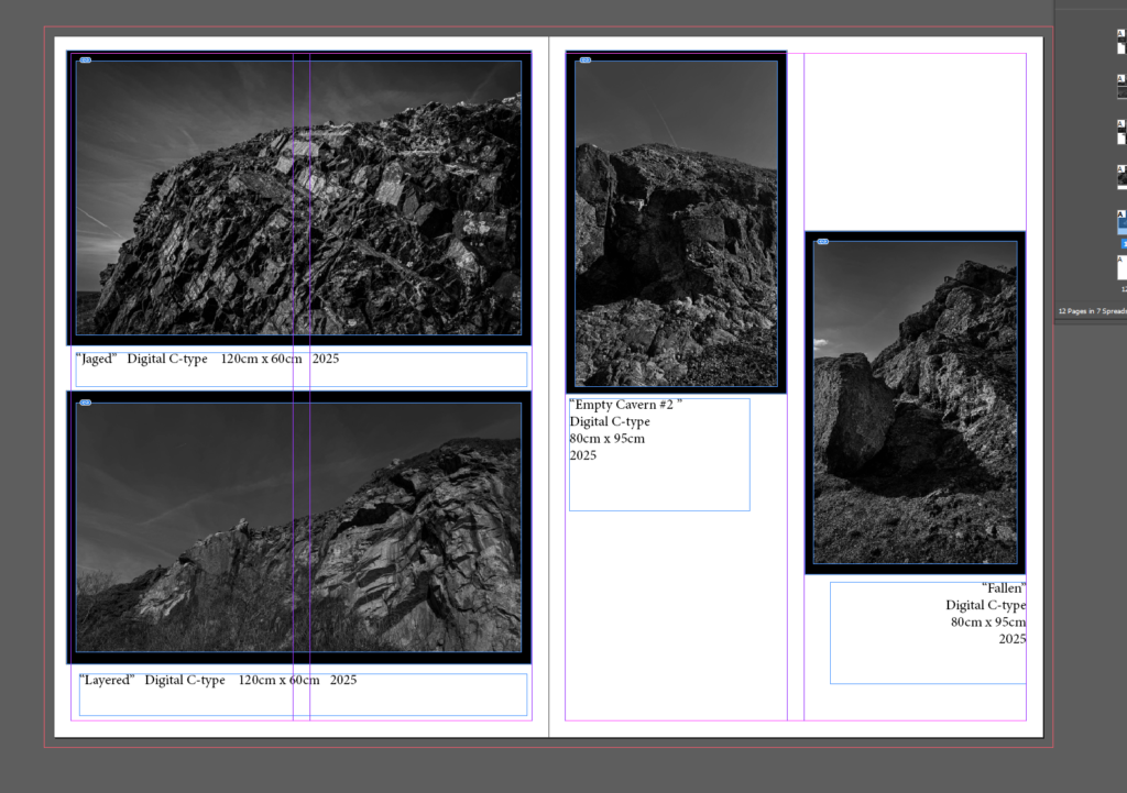
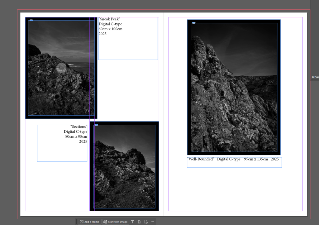
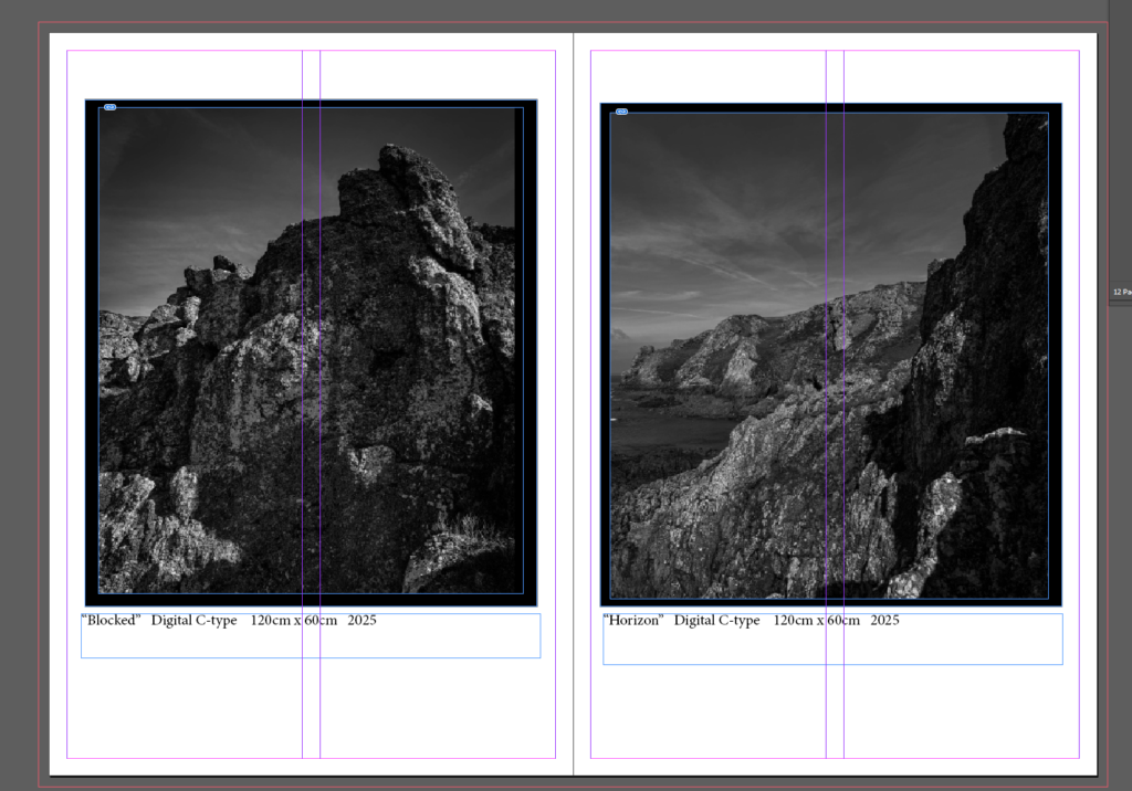
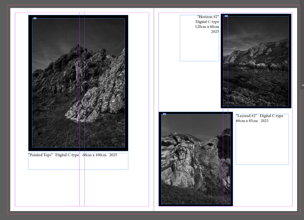
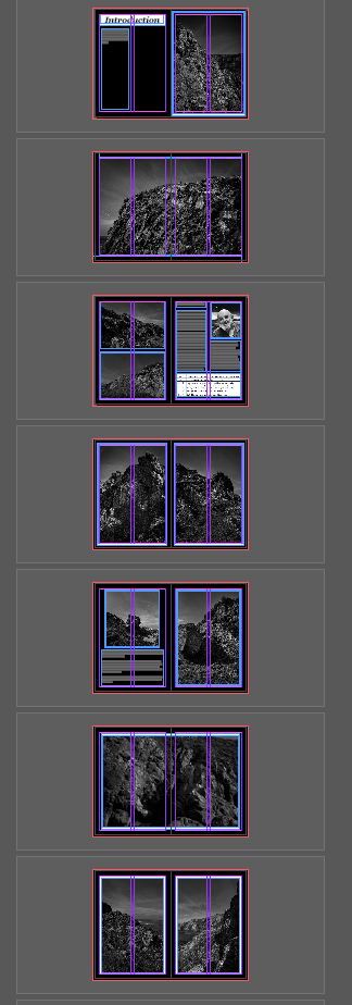
this is all the pages except the front and back cover I tried to keep it interesting by varying the layout of the images on each double page spread as its fairly plain and I wanted to mix it up.
Front cover I’ve try to make some what similar to the first one, whilst obviously being different.
added some boarders so it doesn’t look as plain
and I wasn’t sure what to put so I added one final image across the back.