Contact Sheet
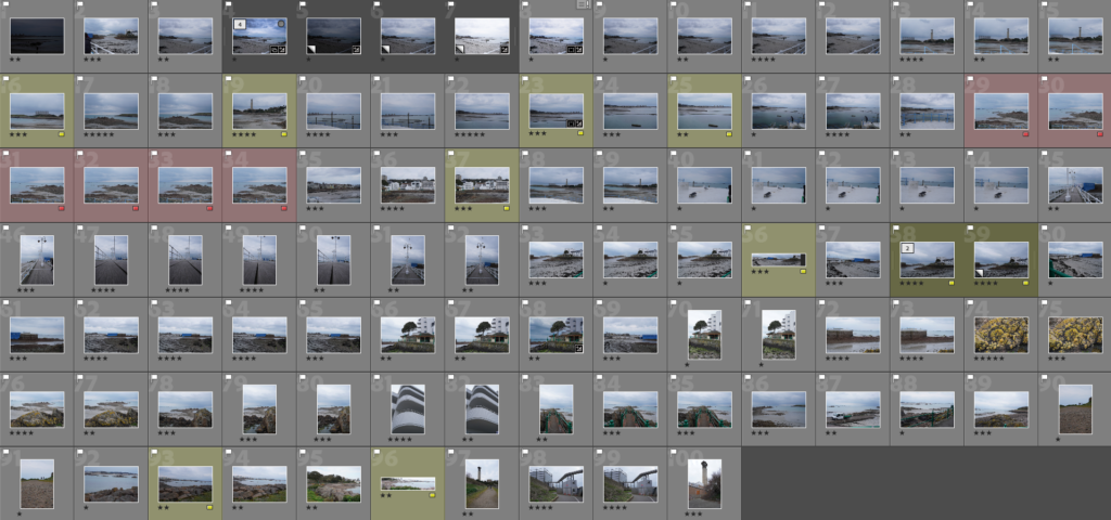
The Selection
I decided to colour code them yellow to be able to tell them apart from the rest of the photos. With this I was able to find images in which I would be able to make my own panoramic images. To help me I’ll be creating a virtual copy so they’ll be differentiated from the original photo.

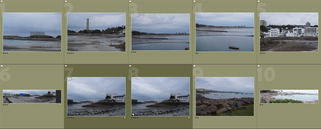
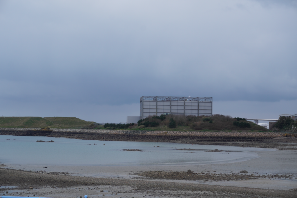
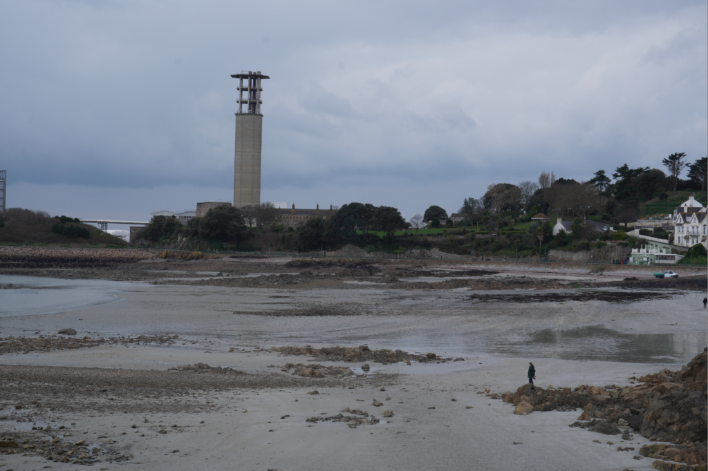
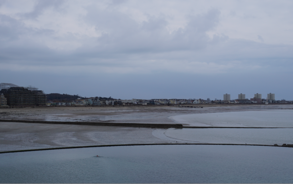
Original Images
Editing
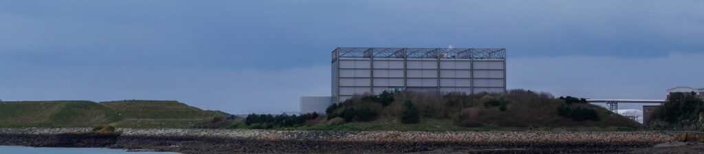
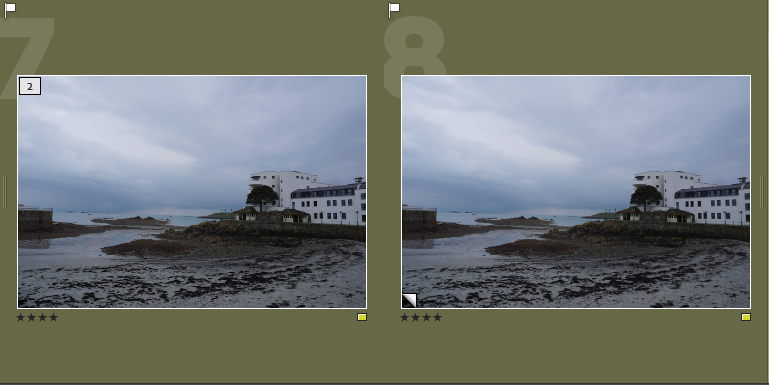
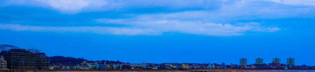
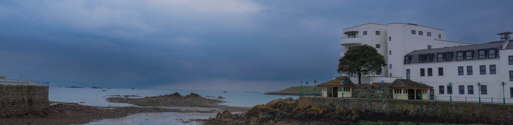
- I chose to create an edited ‘natural’ version of the image, I did this because before the picture looked dull so in doing this, I enhanced the sky and upped the brightness.
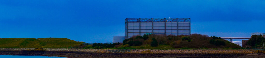
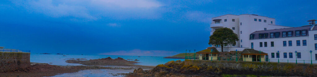
- For this image I decided to create a full saturated version to show a HDR effect. This also helps me see a creative outlook on the images even though they’re just panoramics.
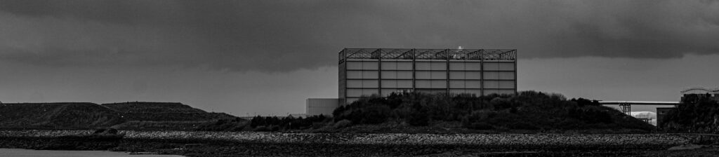
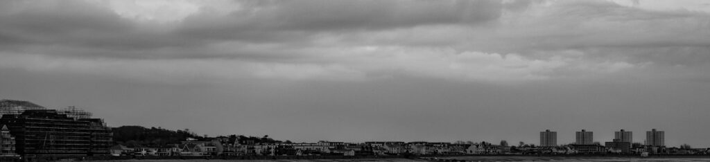
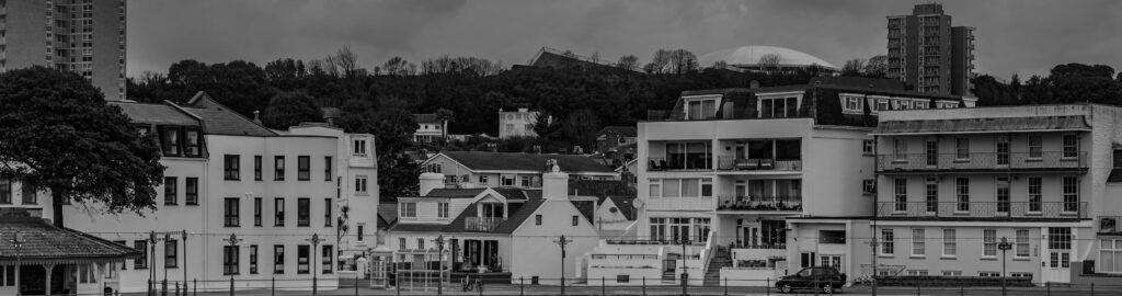
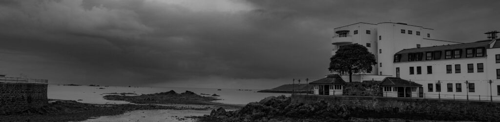
- I put the last image in black and white to create a juxtaposition between the first two images. In doing this, I had to enhance the image and deepen the contrast so the sky would be more dramatic against the man-made landscape.
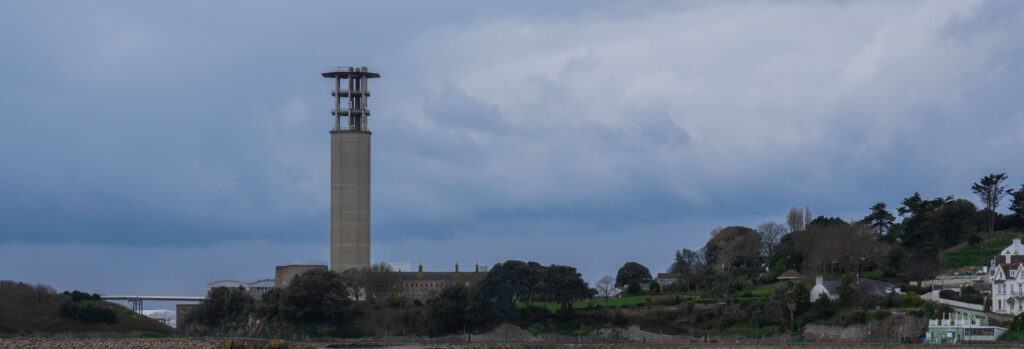
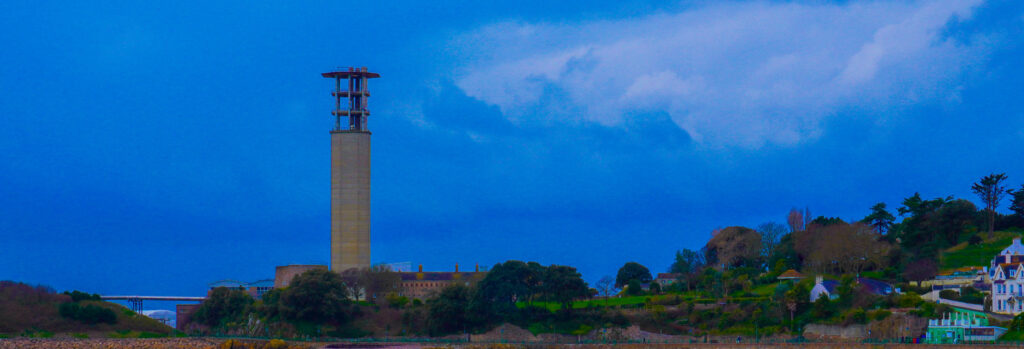
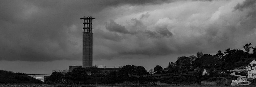
I decided to increase the dehazing to give the sky a more dramatic look. This helped me create a contrast between the natural sky and the man-made horizon. In the over saturated image, I managed to make the sky seem unnatural by making it super blue and having the clouds more enhanced. I did the same thing for the black and white version enhancing the sky even more to create a juxtapositional tonal range which is clearly shown in the clouds also referring back to Ansel Adams zone system to help.

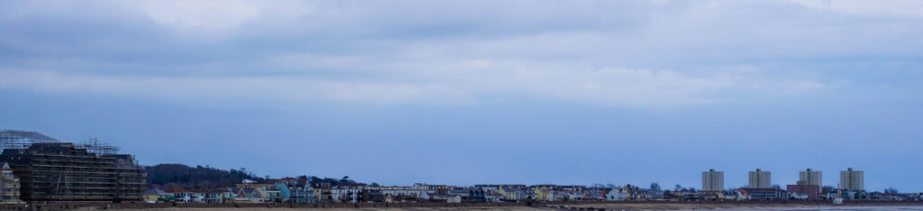
I chose to create an overly saturated version of all images as it expands my creativity and shows an almost childlike imagination of a ‘bright’ and ‘colourful’ life. The 2 picture especially creates what I imagine as you’re able to clearly see the vibrant colours of the skyline e.g. the yellows, red and oranges.

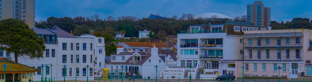
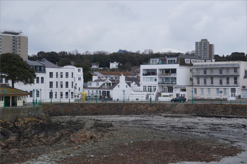
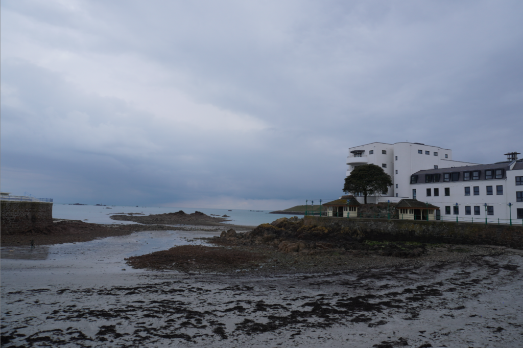
These photos show Jersey for how it is as there are a variety of building which show the newer created ones and the older ones. This also shows the man-made land of Jersey as its cluttered with many building, benches, lamp posts etc. The vibrancy of image 1 shows its natural colour way with a little editing, this shows that colour plays a big part of photography because if it were dull colours the image wouldn’t of ‘popped’ as much.
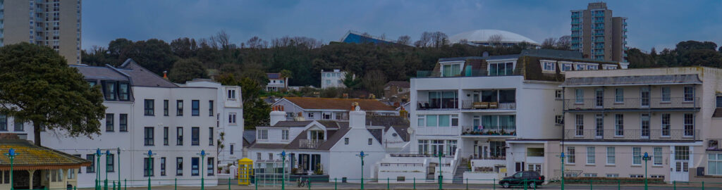
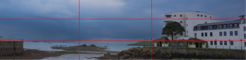
Lastly, I used the rule of thirds to show the contrast between natural land and man-made buildings. I enhanced the sky using a mask to give it a different tone to the rest of the photo, I’d also say I used a dead pan approach when taking this picture because I am eye level to the skyline.
My Favourite