

Week 1 w/c tues 22nd april
- Develop and complete New Topographics Photoshoot / edits
- Develop and complete Typologies Photoshoot / edits
- Final Landscape Photo-shoot and Creative edits
- https://hautlieucreative.co.uk/photo26al/2025/04/02/easter-homework-final-landscape-photography-photoshoots/
Week 2 w/c mon 28th april
- Develop and complete New Topographics Photoshoot / edits
- Develop and complete Typologies Photoshoot / edits
- Final Landscape Photo-shoot and Creative edits
- Select and Edit final landscape images and save them into PRINT FOLDER
- https://hautlieucreative.co.uk/photo26al/2025/04/02/easter-homework-final-landscape-photography-photoshoots/
Week 3 w/c tues 6th may
- Select and edit final images : landscapes
- Select and Edit final landscape images and save them into PRINT FOLDER
- All final images must be added to PRINT FOLDER by THURSDAY 8th MAY 4pm
ZINE
Week 4 + 5 w/c mon 12th may – Fri 23 May
DESIGN & LAYOUT
Complete the following blog posts
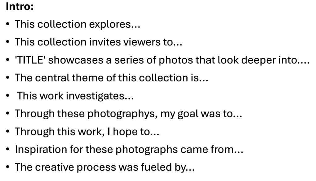
The zine must include the following:
- Title/ theme of exhibition
- Works: Final set of images from various tasks/ assignments from landscape project.
- Curatorial text: Information about the context/ meaning of the work. Reflect/ comment on concepts explored – see subheadings below
- Subheadings: Romanticism, The Sublime, HDR, ‘Joiners’, Panoramic, New Topography, Typology – choose those that are relevant to your final images.
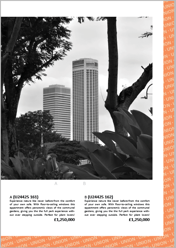
- Image captions: Title, medium (Digital C-type, Monochrome) dimensions, year produced, editions, price. Option to provide extended information for each or some of the final images, eg. place where images were made, genre, subject-matter, composition, techniques.
- Biography: write a short description of yourself (education, artistic influences) and your photographic practice (style, methods.)
- Gallery mock-ups: Option to produce a gallery mock up of a how your images are hanging on the walls in the gallery.
Blog Posts:
Mon-Tue: Zine research
Wed-Fri: Introduction to InDesign
Blog Post 1: ZINE RESEARCH & PLANNING
RESEARCH: Zines and newspaper design made by artists and photographer that will provide visual stimulus for your page design. Produce a mood board and consider the following in your analysis:
- How you want your design to look
- Format, size and orientation
- Narrative / visual concept
- Design and layout
- Rhythm and sequencing
- Images and text
- Title and captions
(remember to refer to these bullet points when describing, explaining and evaluating your zine / exhibition catalogue)
PLANNING: Imagine you are planning an exhibition in a gallery space in St Helier and are asked to produce an exhibition catalogue that are used to promote you and your artistic practice, as well as a providing information about the individual works for sale.
Blog Post 2: ZINE DESIGN & LAYOUT
Produce a blog post that includes screen grabs of your design process in InDesign. Make sure you annotate and describe your creative thinking and decision making.
InDesign
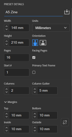
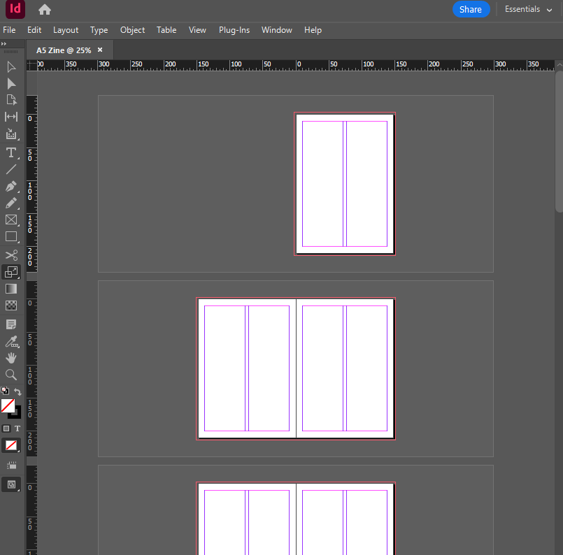
Create new file
- width: 148mm
- height: 210
- pages: 16
- make sure ‘Facing pages’ is ticked…. this makes it into a booklet
- orientation: portrait
- columns:2
- column gutter: 5mm
- margins: top, bottom, inside, outside: 10mm
- bleed: top, bottom, inside, outside: 3mm

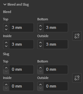

What does all this mean?
Bleed is the term for extending the content on the page a little further past the trim area so that you don’t end up with slivers of white showing around the
The slug is the area outside the bleed and is extra space for any notes you may need that you wouldn’t want to print.
Your document should look something like this….
TIPS:
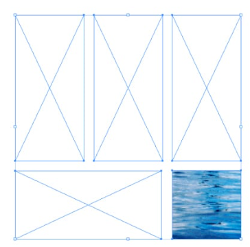
Use the rectangle frame tool to plan where you want your content to go… This will also determine the size of your content

Hold SHIFT + W to preview your work

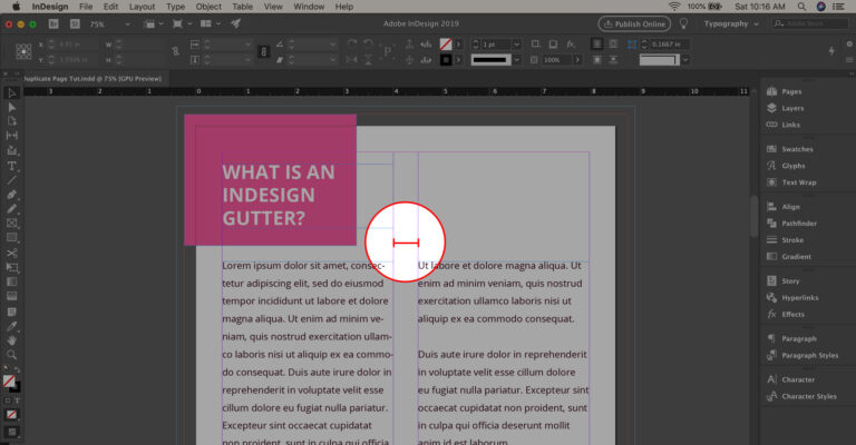
Click an image once:
If you click an image once, you will notice it is blue. This means you are only adjusting the size of the content frame (not the image itself)
Click and image twice:
If you click an image twice, you will notice it is red/orange. This means you are adjusting the image within the content frame. (the content frame will stay the same size).
Hold CTRL while resizing image:
If you hold CTRL while clicking the image, you can adjust both the image size and content frame size at the same time.
Hold Shift while resizing an image:
Holding shift while resizing an image will maintain its proportions.
Automatically Resize to fit frame by right clicking on the image, select ‘Fitting’ – ‘Fit Content Proportionally’

Written Content:
- Title/ theme of exhibition:
Think of a title that is concise, catchy and clearly links to your set of photos.
To make it easier, stick to displaying one a group of photos that have a consistent theme or narrative. (For example, one zine for New Topographics or and one zine for the Sublime… rather than trying to blend multiple themes that don’t work together).
- Curatorial text:
– Information about the context/ meaning of the work. Reflect/ comment on concepts explored – see subheadings below
– Subheadings: Romanticism, The Sublime, HDR, ‘Joiners’, Panoramic, New Topography, Typology – choose those that are relevant to your final images.
- Image captions: Title, medium (Digital C-type, Monochrome) dimensions, year produced, editions, price. Option to provide extended information for each or some of the final images, eg. place where images were made, genre, subject-matter, composition, techniques.
- Biography: write a short description of yourself (education, artistic influences) and your photographic practice (style, methods.)
Photo Literacy:
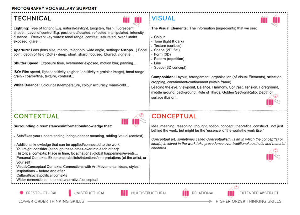
General Photography Terminology:
– Frame
– Balance
-Shutter Speed
-Exposure
– Aperture
– Depth of field
– Focus
-Foreground
-Background
– Composition
– Contrast
– Perspective
– Angles
– Exposure Compensation
– Tone
– Values
– Highlights
– Shadows
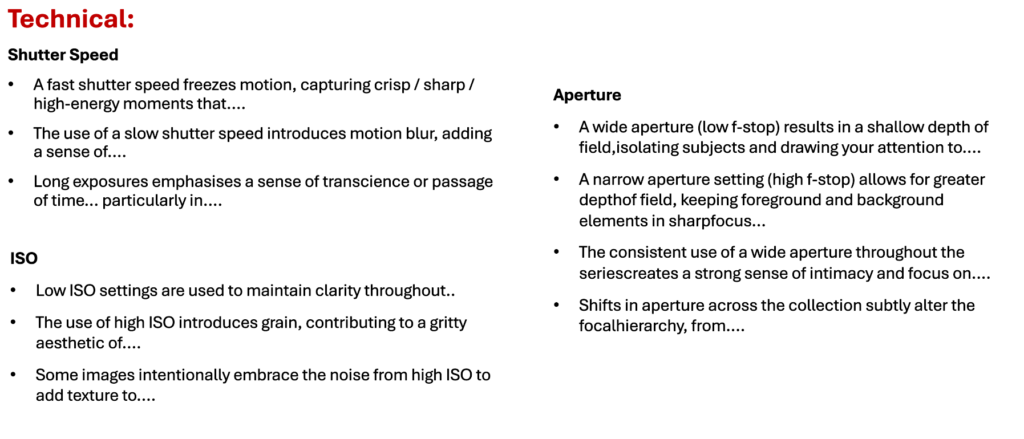
Camera Techniques:
– Shutter Speed
– Aperture
-ISO
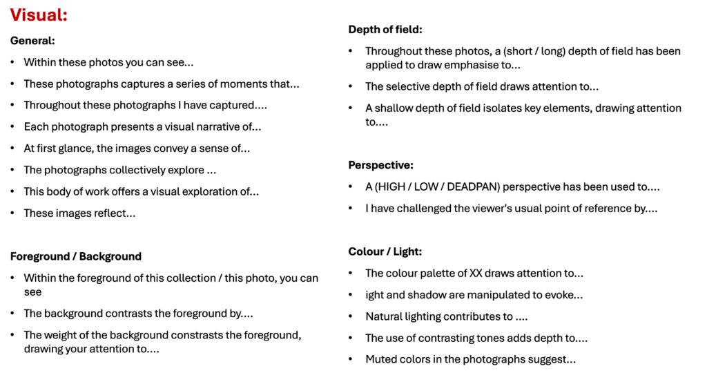
Visual:
-Depth of field
– Frame
– Focus
– Perspective
– Leading Lines
– Foreground
– Background
– Balance
– Panoramic
Colour / Tone
– Highlights
– Shadows
– Contrast
– Monotone / Monochrome
-Saturated
– Sepia
– Black and White
– Vibrant
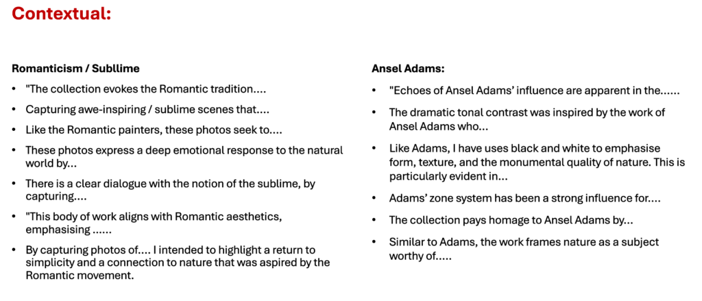
Romanticism
– Nature
– Emotion
– Idealisation
– Purity
– Subjective truth
– Sublime
– Terror
– Nature
Ansel Adams:
– Zone System
– Visualisation
– Tone
– Dramatic
– Environmentalism
– Wild
Beauty of nature
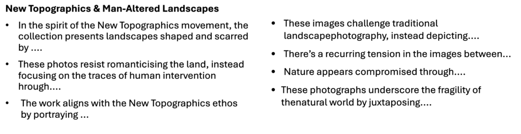
New Topographics:
– Man-Altered Landscape
-Objective
– Banal
– Deadpan Easthetic
(photos taken at right
angles)
– Tension (between nature
and the man-made)- Neutral Style- Rejection of emotion /
Romanticism
– Sterile
-Functional
– Documentary
– Humanity in nature
– Interrogation of landscape
-The traditional untouched naturescape is replaced
– Organic edges infiltrated with harsh edges
– Conflict of humanity and nature
-Juxtaposition
– Hollow
– Straight angles,
– centre framing
Typologies:
- Objective
– Deadpan Aesthetic (photos
taken at right angles)
– Neutral Style
– Rejection of emotion /
romanticism
– Sterile
– Functional
– Repetetive
– Orderly
– Mechanical
– Documentary
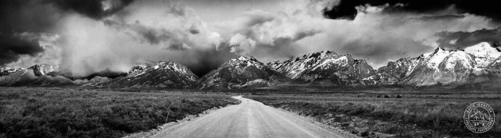
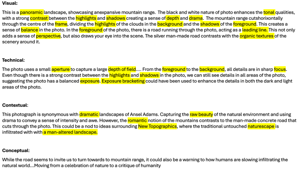
EXAMPLE USE OF PHOTO LITERACY WHEN TALKING ABOUT A LANDSCAPE PHOTO:
Sentence starters
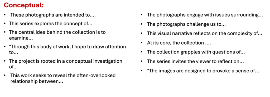
Inspiration…
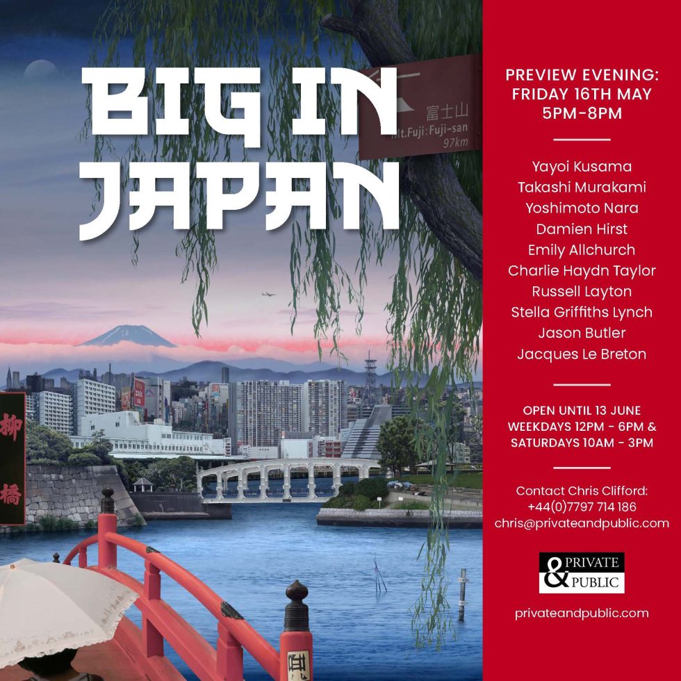
Click on image below and explore a real exhibition catalogue here for the upcoming exhibition, Big in Japan at Private & Public Gallery in St Helier.
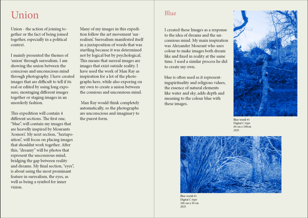
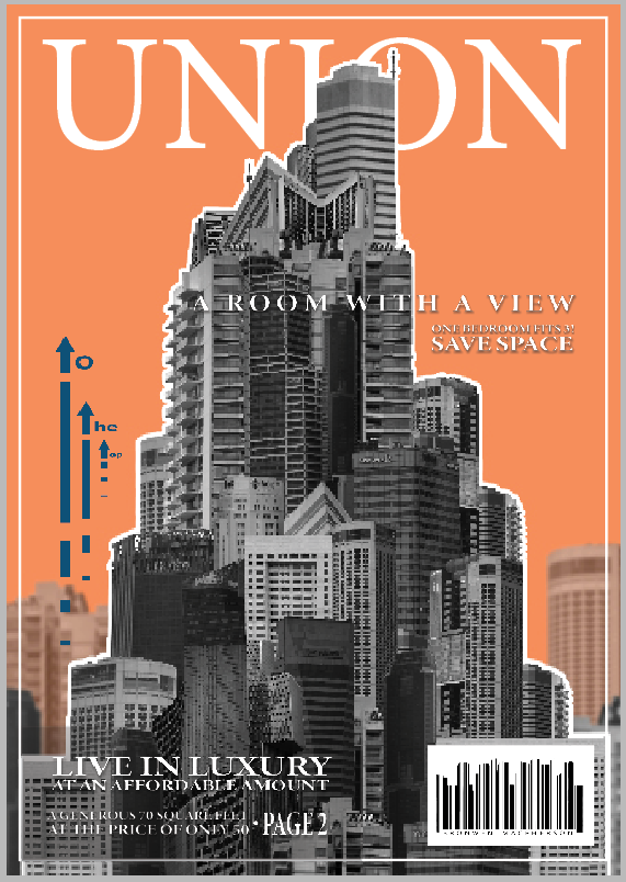
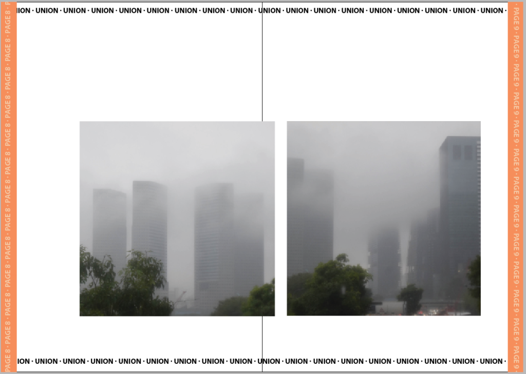
See recent exhibition catalogue produced by Joey here in his photography exam based on the theme of UNION.
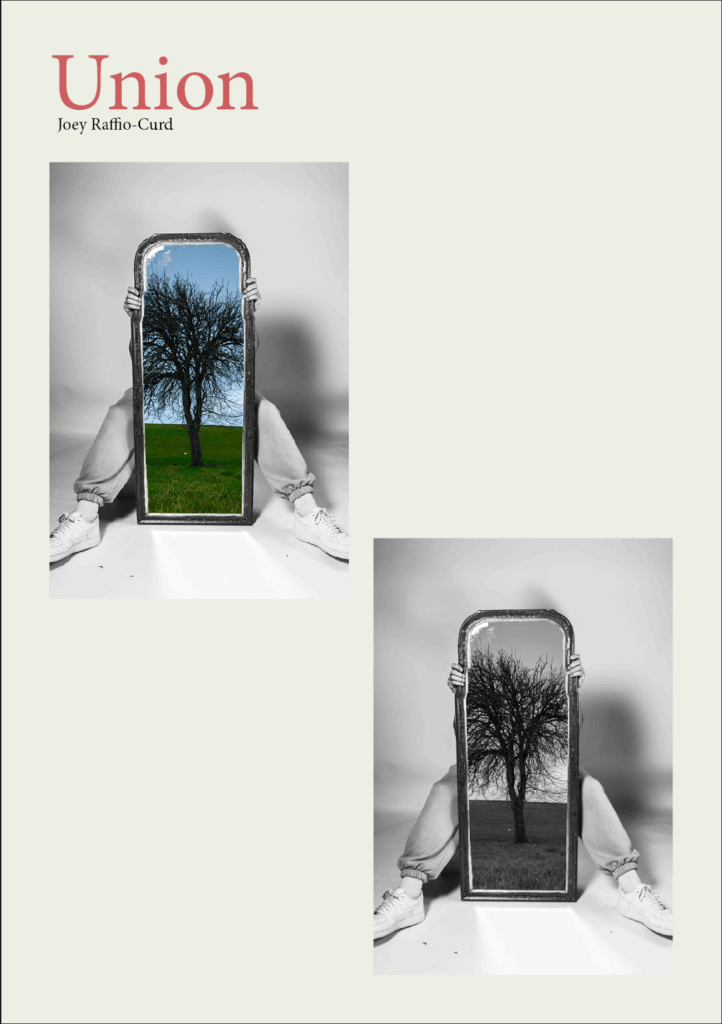
For the front cover I used my strongest image, in black and white and in colour to allow viewers to understand what kind of photos will be in the exhibition . I’m calling this exhibition ‘union’ as that is what my whole project is based on. I might change the name later to a more create one. I also coloured every page slightly yellow to give the exhibition catalogue an ‘ancient’ look, as well as making white images easier to see. I’ve also made titles red instead of the traditional bold because I think it looks better and makes the pages less cluttered and clearer.
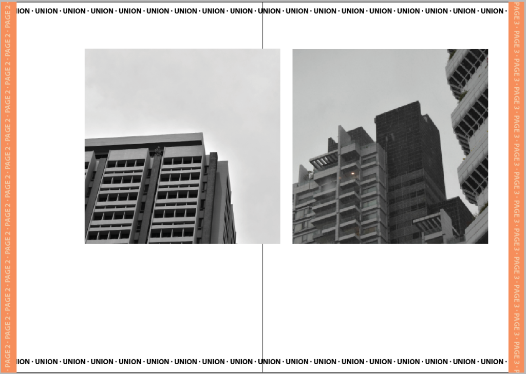
For the first and second page I placed where I want my images to be (in a logical manner), as well as adding some text which I will improve towards the end. I did this for the book, to get an Idea of what it will look like:
See a variation of a zine produced by Bronwen here in her photography exam based on the theme of UNION.
The cover is the only part of the book that resembles a magazine. I had a clear vision for how I wanted the cover to turn out which I think helped it turn out well. I tried to make it appear like a magazine that you would purchase despite the rest of the zine made to appear more like a free hound out to sell a product.
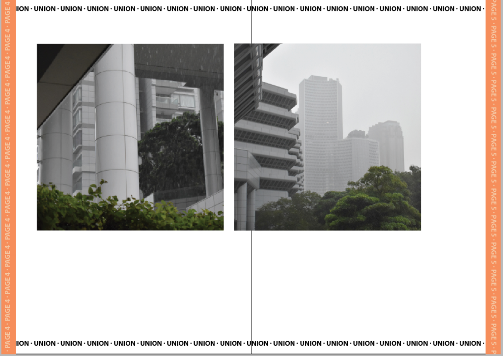
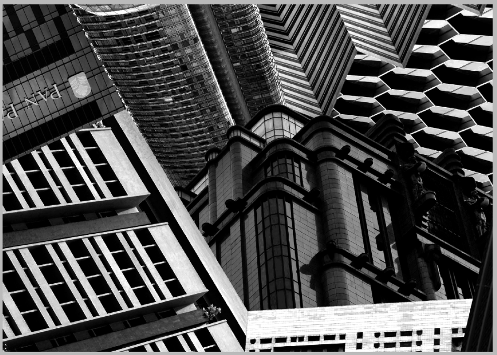
I wanted to start with the clearest pictures first which were these two I took in the style of Kenneth Frederick where the angle encourages upward growth. I matched these two images also due to their similar angles, shapes and lighting. In the next pair the weather had begun to change for the worse. I matched these two because they had a similar foreground and all the buildings were a similar style.
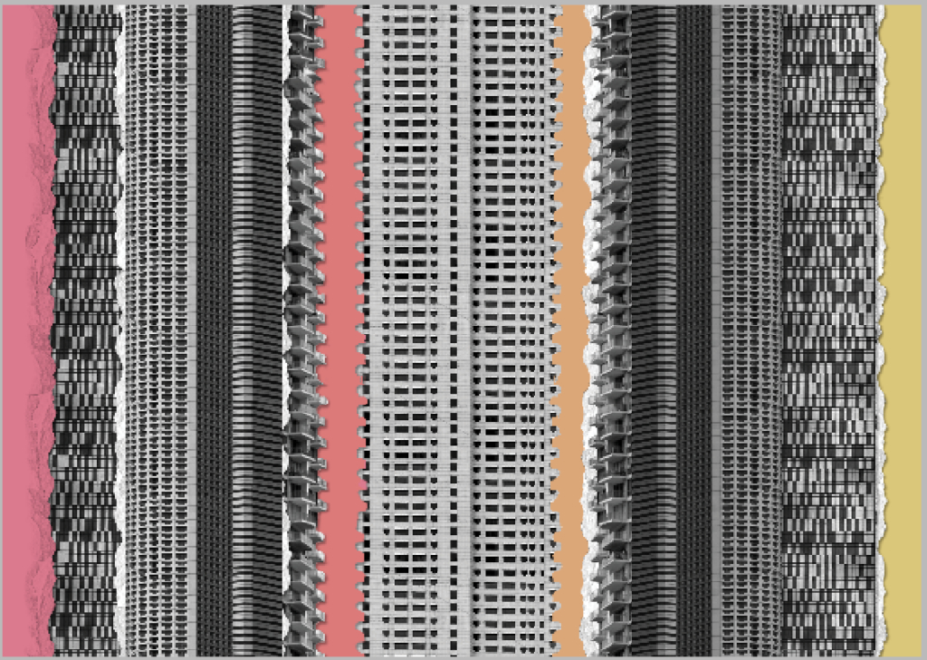
For the first intersection I wanted to use the most colourful edit. I decided to extend this edit and make it look like a more traditional collage by adding colour card and tearing. I think this captures the chaotic miss-match of densely build locations as well as identity-less advertising.
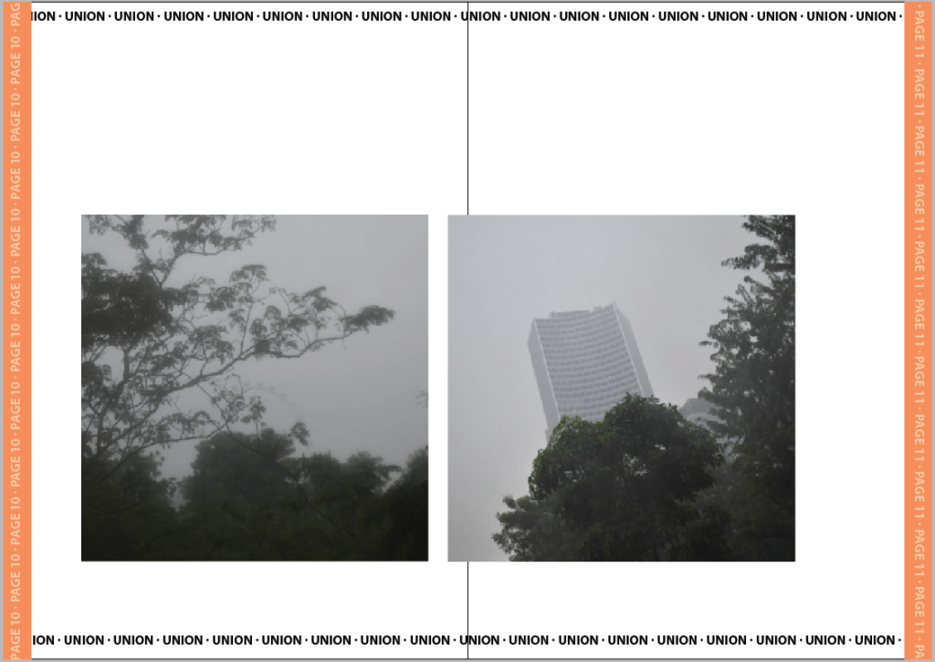
In the first pair, I matched these two images together because of their similar fog levels. I didn’t put these as the last buildings however because they are still identifiable buildings. For the final buildings I put these two last because there is less focus on the buildings and more on the space around with the trees and even a fairest wheel. I matched both of these because they are equally foggy and focus the least on the buildings.
For the second intersection I chose the messier and duller of the two. I think that the overwhelming choice of buildings is representative of the choice pushed by advertisements.
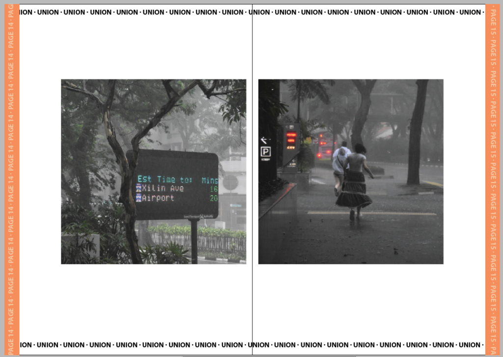
For the final pair I chose these two because they both have colour and show the weather effects on the ground like its been disillusioned by the buildings. They show leaving both with the mention of an airport and visual que of running. I tried to set it up like they’re running from the obsceneness of the cities/effects they’ve caused such as poorer weather.
For the final page I wanted to contrast it with the previous by using another advert but this time clearly marked as one. I like this juxtaposition and Its complete missing the point or ignorance of the rest of the images isn’t an irregular occurrence in marketing.
Evaluation
I think the zine turned out well. If I was going to adapt it further I would have created actual adverts for the intersections and maybe even adjusted the background so the pages didn’t look so blank. I don’t mind this space though as I think it helps the images stand out better but it is something I would have liked to experiment with further. The strongest section of the zine is defiantly the cover page because I spent much longer on each detail. Had I made the zine any longer I think I would have instead tried making a full A4 photobook instead where I could add some additional layout and sizes of images but for the small selection I made I think keeping each image to the same dimensions helps make the zine look more cohesive. I made sure to arrange each set of images differently also so that each page feels unique despite having the same template otherwise which I do think was a good choice as my previous draft with all the images arranged the same felt repetitive and tedious to get through. I did like the dullness of the repletion in relation to the narrative of the zine however I figured I could still tell the same narrative while making the arrangements more interesting.

Something to read: Something Tactile: Why Photographers Should Create Zines
Café Royal Books is a small independent publisher of photography photobooks or zines, and sometimes drawing, solely run by Craig Atkinson and based in Southport, England. Café Royal Books produces small-run publications predominantly documenting social, historical and architectural change, often in Britain, using both new work and photographs from archives. It has been operating since 2005 and by mid 2014 had published about 200 books and zines and they are held in major public collections
https://www.caferoyalbooks.com/

Editions Bessard is a paris-based independent publishing house created by pierre bessard in 2011. Focusing on working with artists, writers and curators to realise intellectually challenging projects in book form.


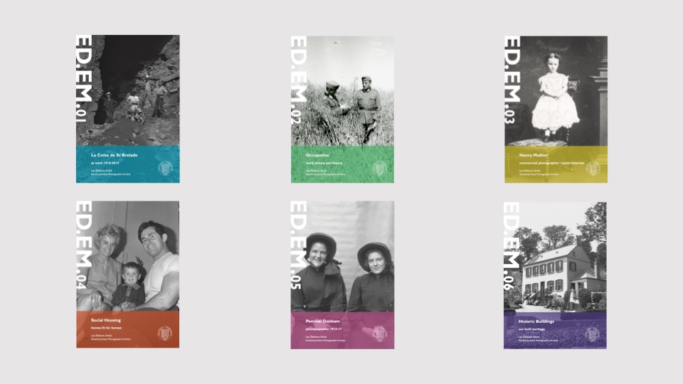
The new imprint Éditions Emile is named in honour of Emile F. Guiton, the founding father of the The Société Jersiaise Photographic Archive. The first set of publications is a series of small photo-zines comprising of 48 pages with an average of 30-40 images and a short text providing further context. With plans to publish three editions annually, each issue of ED.EM. will take a fresh look at a specific collection within the archive, by pairing it with either another collection or contemporary work, in order to re-contextualise the images, keeping the collections active and relevant for new audiences both in the island and beyond.
PRINTING & EVALUATING
Complete the following blog posts
Mon – Wed: Complete zine-design
Thur-Fri: Print and evaluate
DEVELOPING > Show variation of design
- Create 2-3 examples of alternative layouts for your photo-zine using Adobe InDesign and complete a visual blog post that clearly shows your decision making and design process using screen-prints.
- Make sure you annotate!
See examples of previous students blog charting his zine design process, here.
https://hautlieucreative.co.uk/photo20al/wp-admin/post.php?post=31481&action=edit
PRESENTATION > EVALUATION
Print, fold and bind final photo-zine and hand in for assessment.
Write an overall final evaluation (250-300 words) that explain in some detail how successfully you developed your project in response to themes of EXPLORE, SEEK OR CHALLENGE with specific focus on constructing a narrative presented as a photo-zine. Consider the following:
- Did you realise your intentions?
- How did you develop a narrative?
- Zine; including any contextual/ artists references, links and inspiration between your final design and theme.
FINAL OUTCOME: ZINE / Exhibition Catalogue
Week 5 w/c mon 19th may
Mount and display final images / create virtual gallery / evaluate project
HALF TERM
What to print…
You must select, edit and print a range of landscape images that show…
Your ability to sequence a set of images eg Typologies
Your ability to respond to key photographers / types of landscape photography
Your ability to edit, manipulate and enhance a range of images
Your ability to curate a personal exhibition of your work…
(this will feature in your exhibition catalogue made in InDesign too)
PREPARE AND SAVE IMAGES FOR PRINTING:
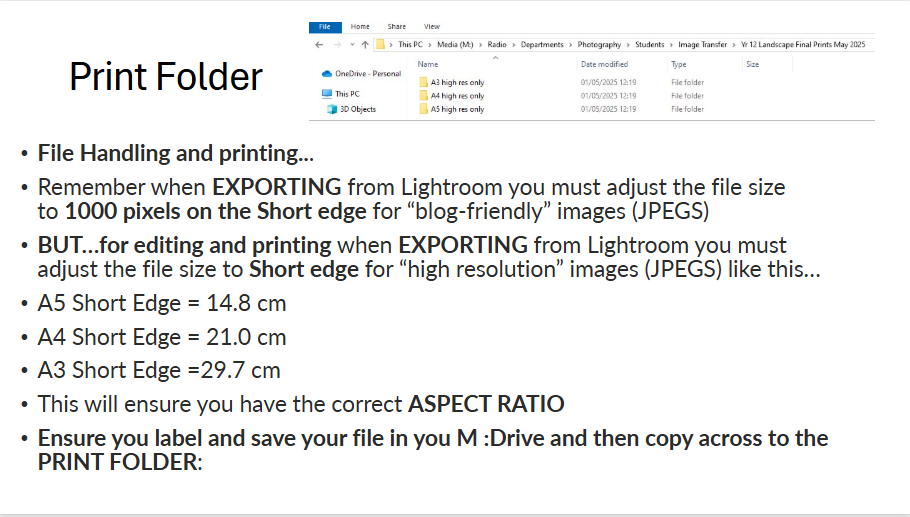
File Handling and printing...
- Remember when EXPORTING from Lightroom you must adjust the file size to 1000 pixels on the Short edge for “blog-friendly” images (JPEGS)
- BUT…for editing and printing when EXPORTING from Lightroom you must adjust the file size to Short edge for “high resolution” images (JPEGS) like this…
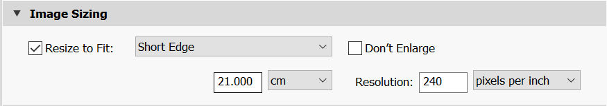
- A5 Short Edge = 14.8 cm
- A4 Short Edge = 21.0 cm
- A3 Short Edge =29.7 cm
This will ensure you have the correct ASPECT RATIO
Ensure you label and save your file in you M :Drive and then copy across to the PRINT FOLDER / IMAGE TRANSFER
If working in photoshop:
ADOBE PHOTOSHOP > NEW DOCUMENT + PRINT PRESETS on to help arrange images on the correct size page (A3, A4, A5)