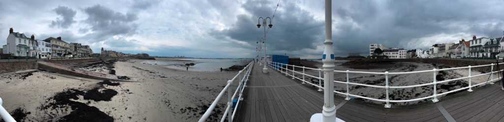
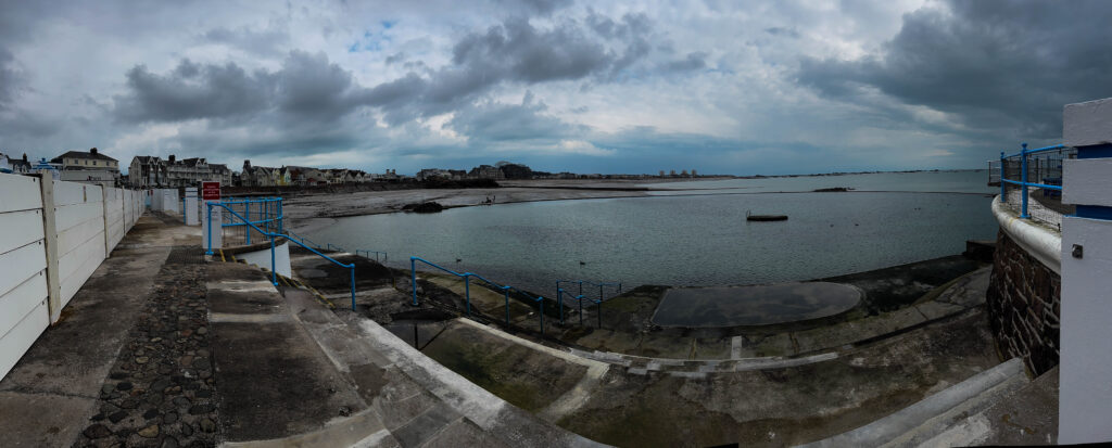
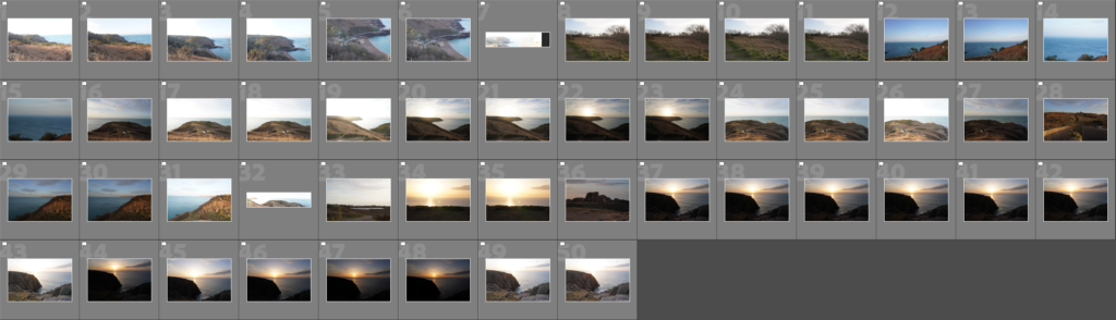
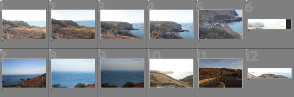
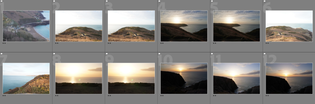
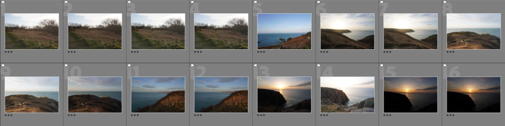
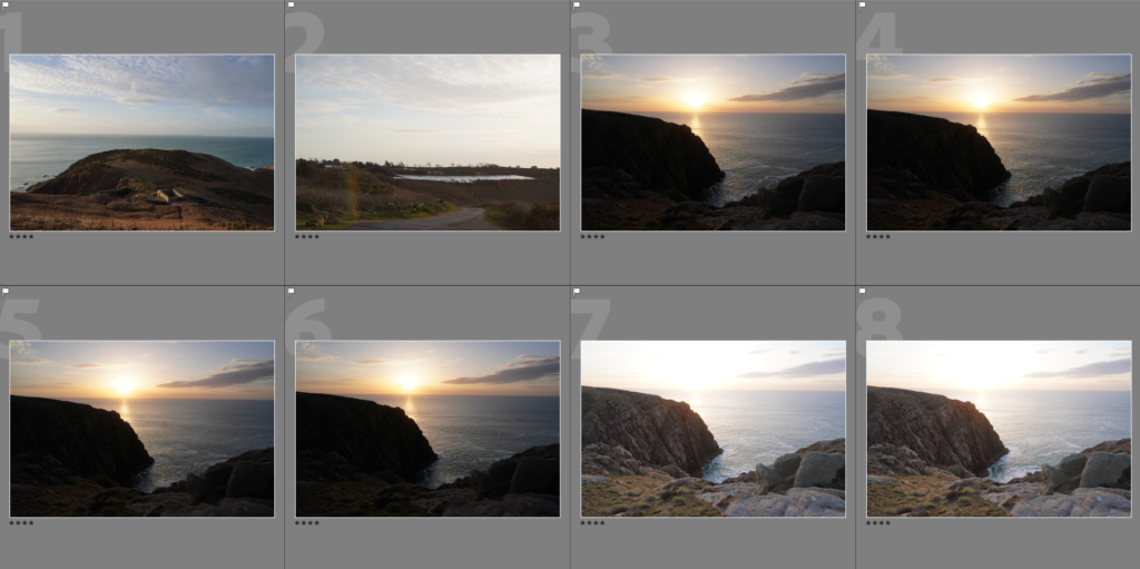
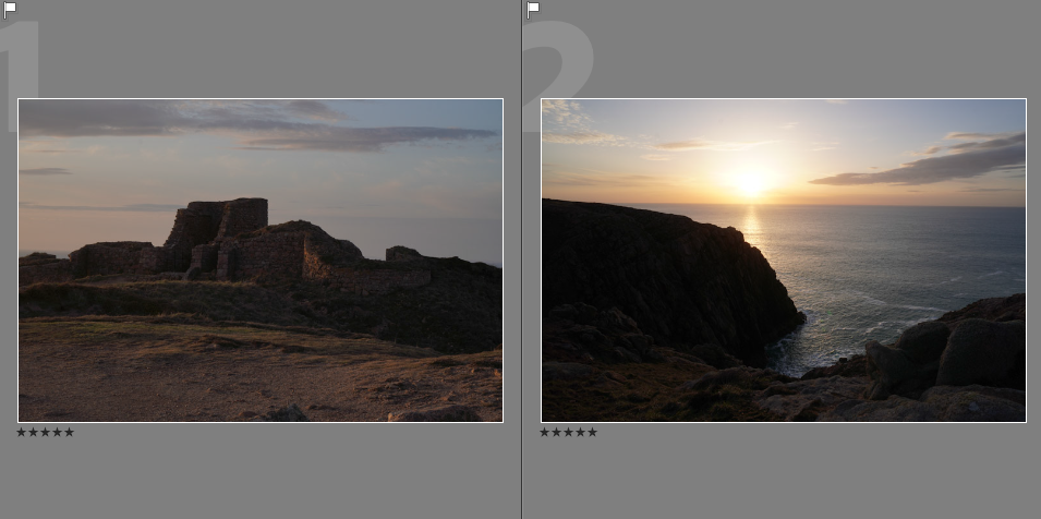
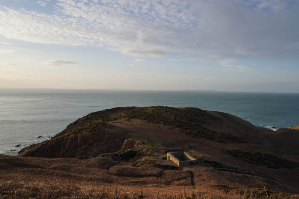
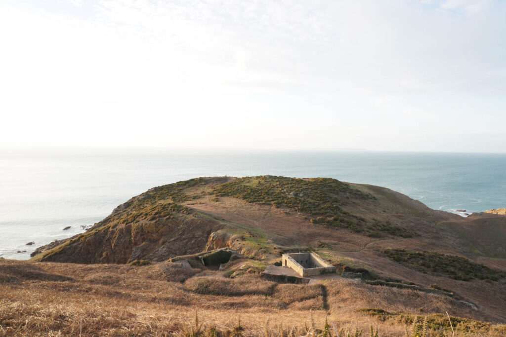
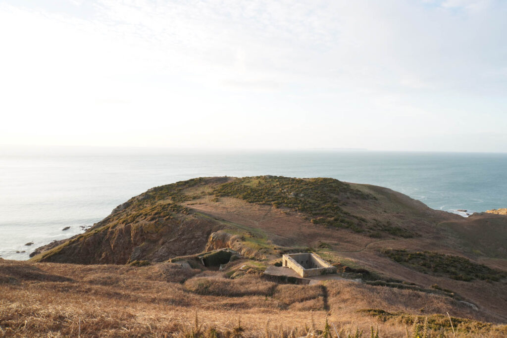
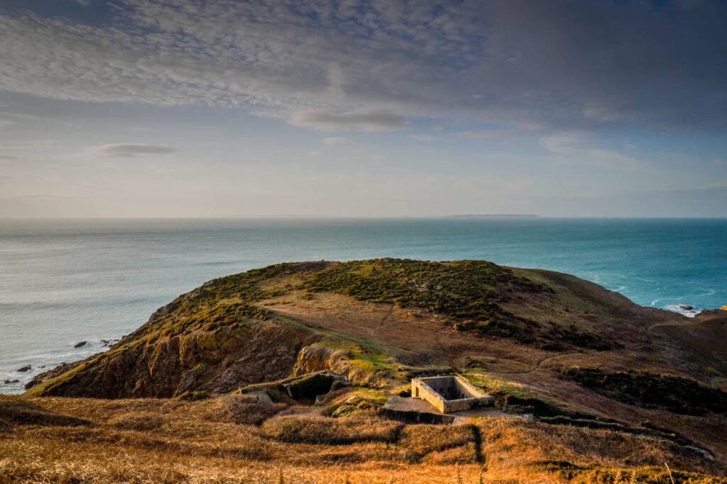
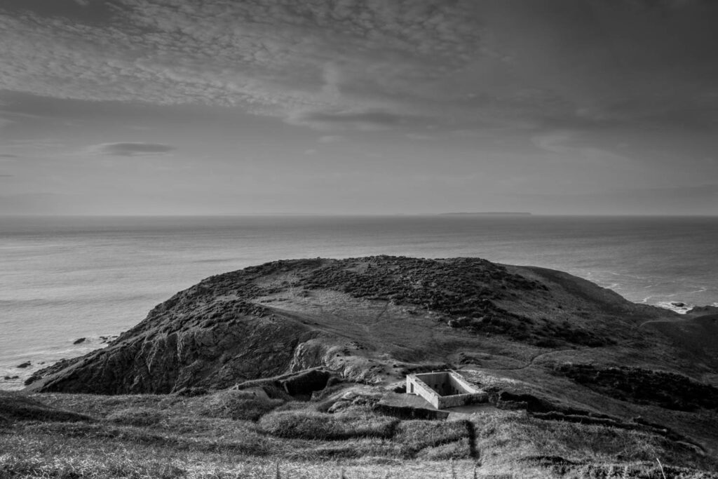
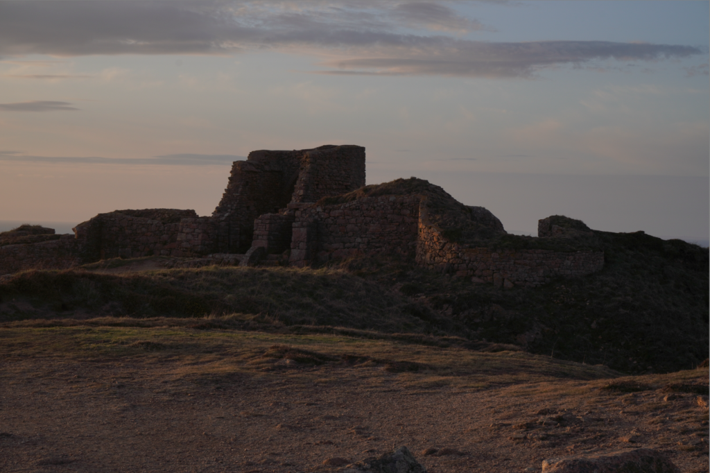
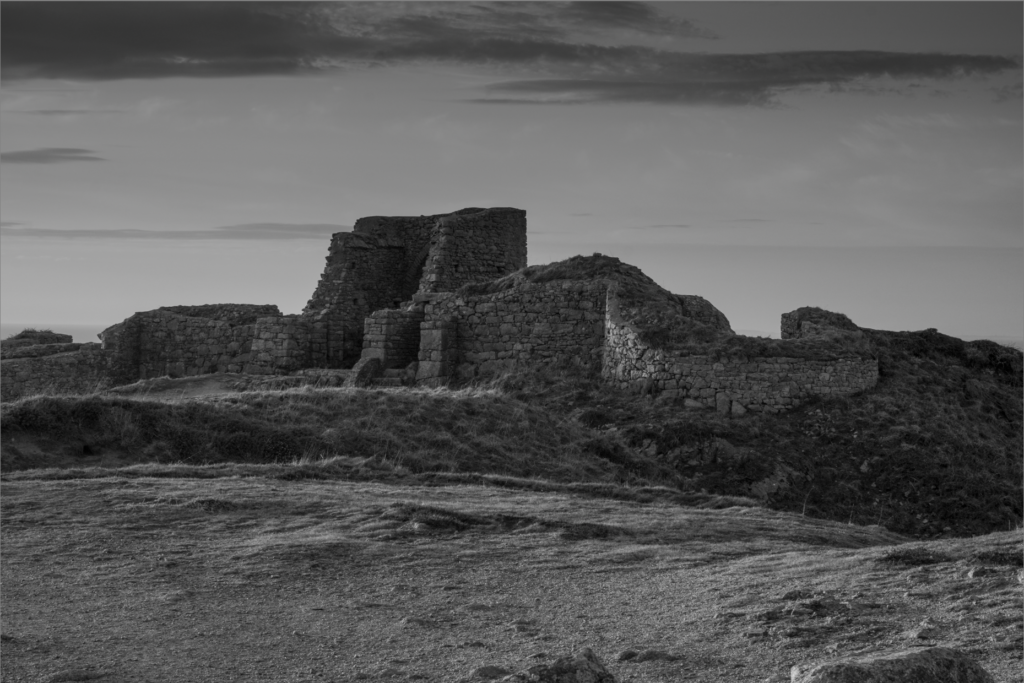
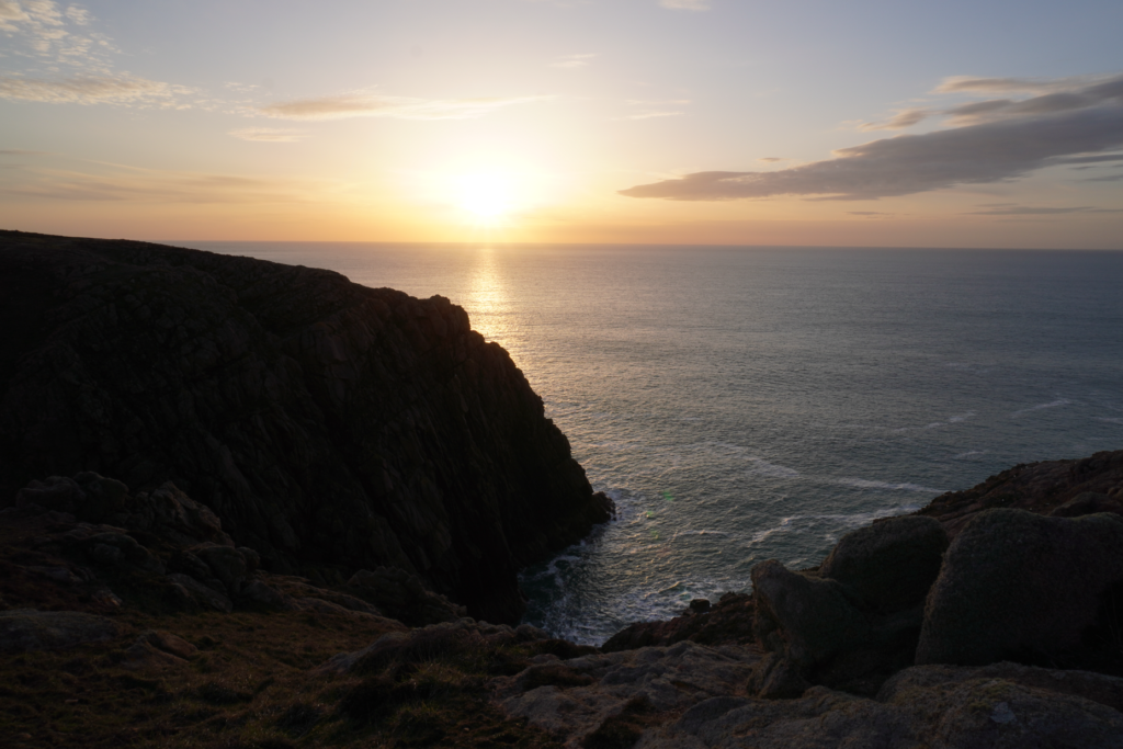
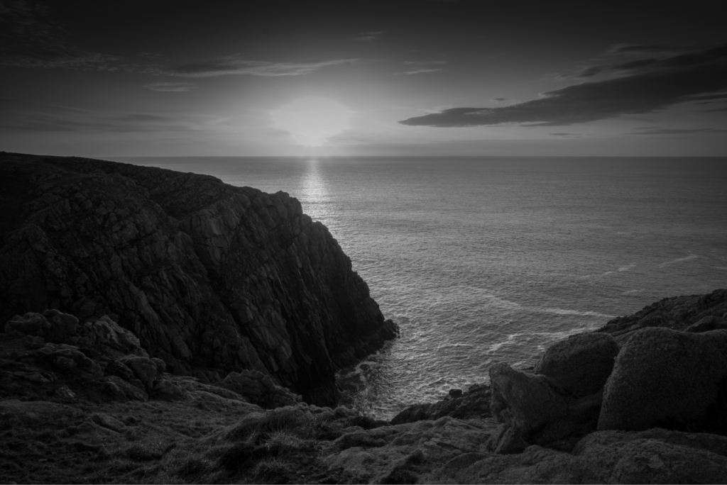
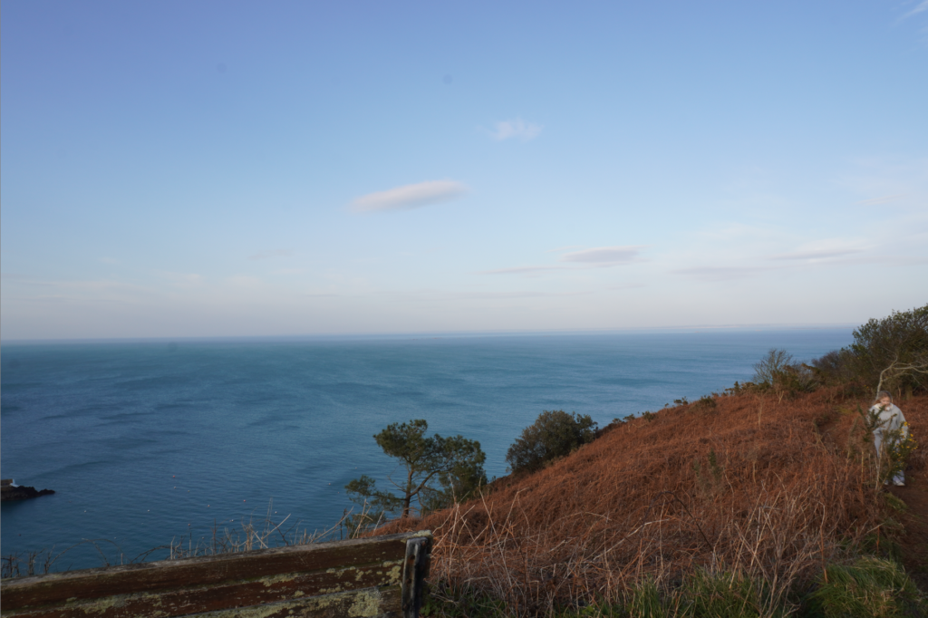
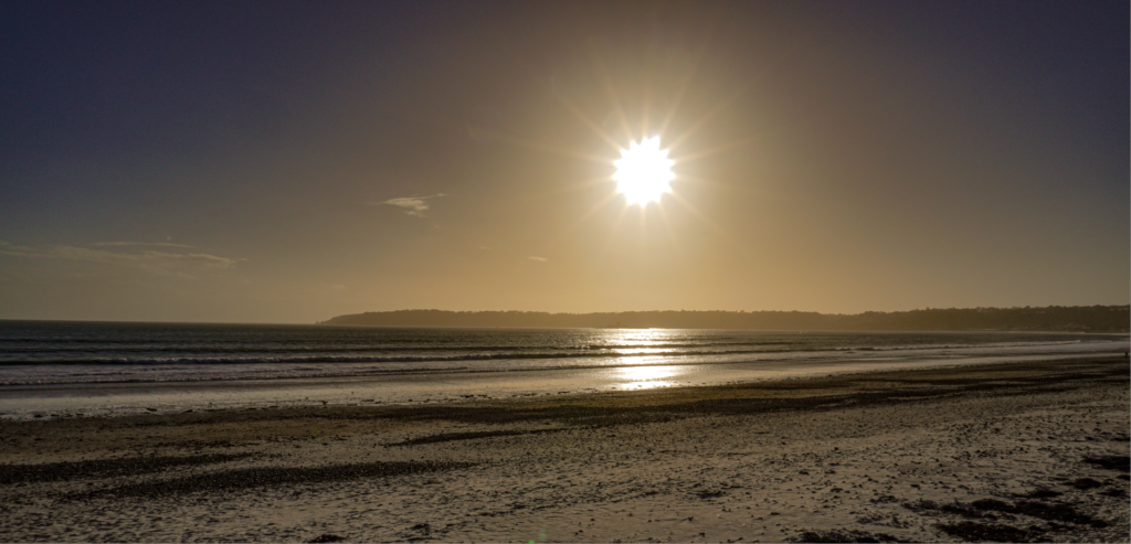
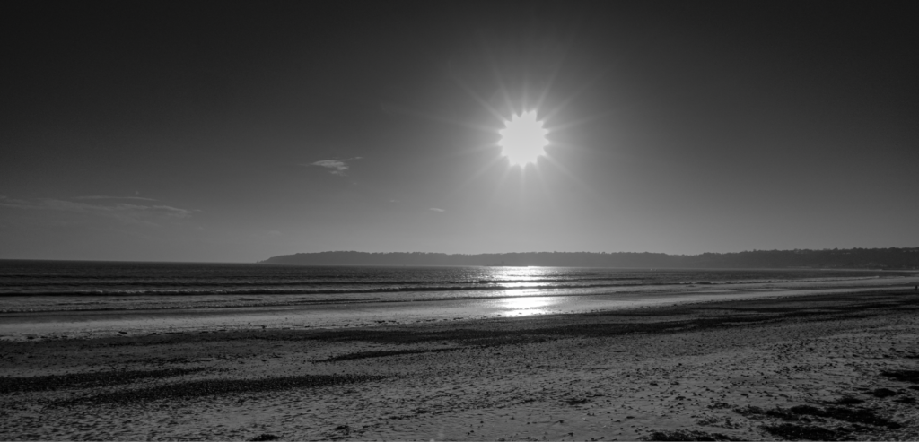
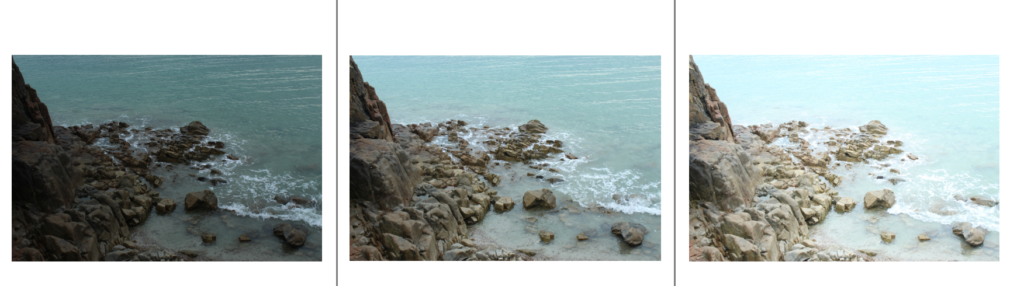
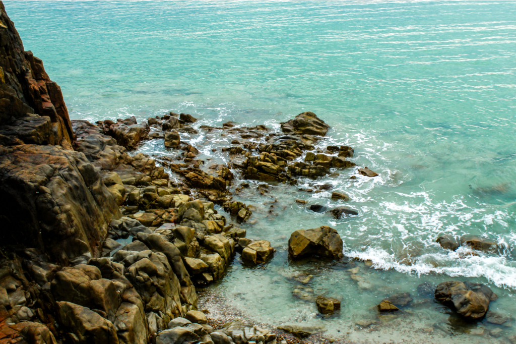
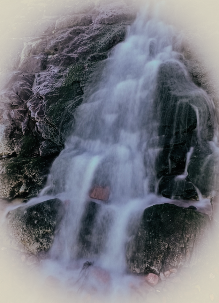
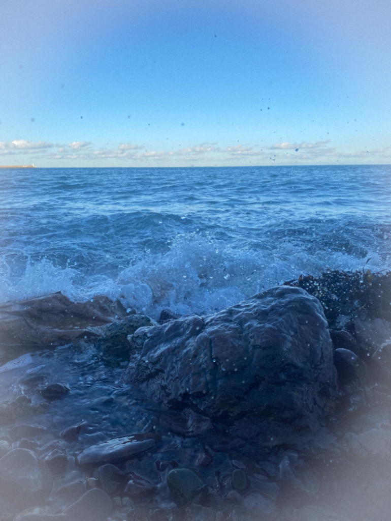
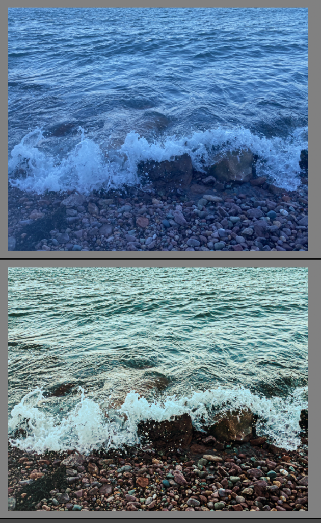
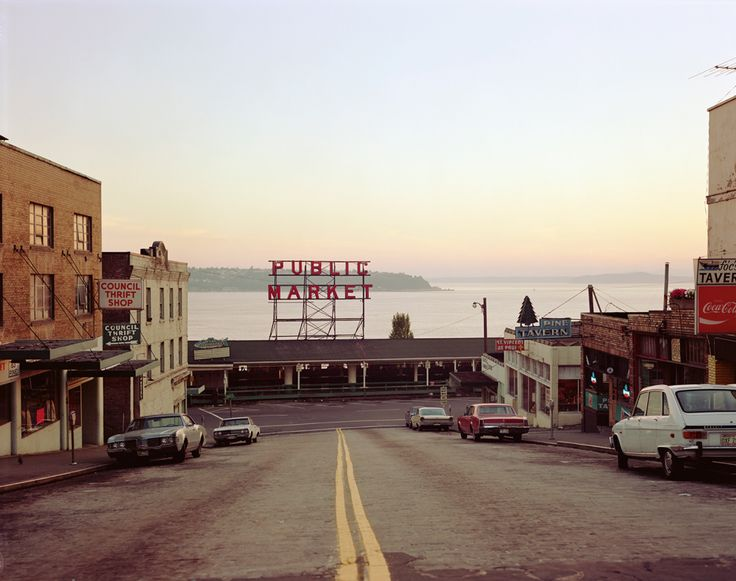
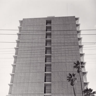
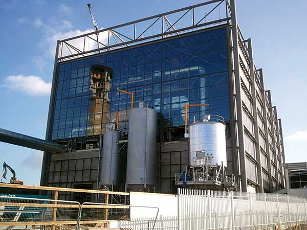
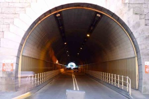
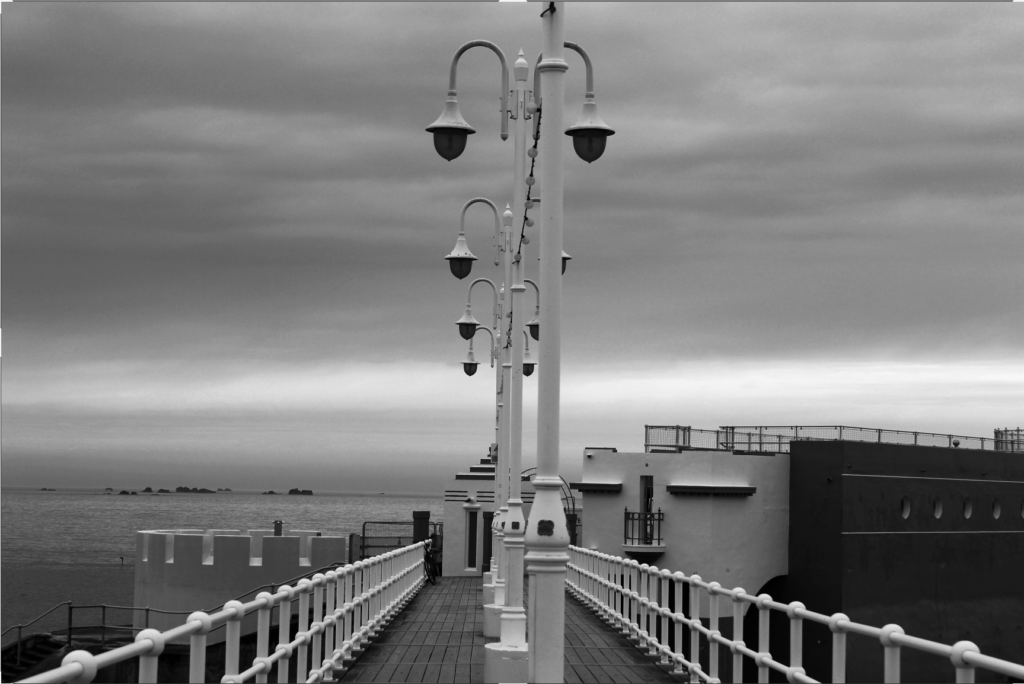
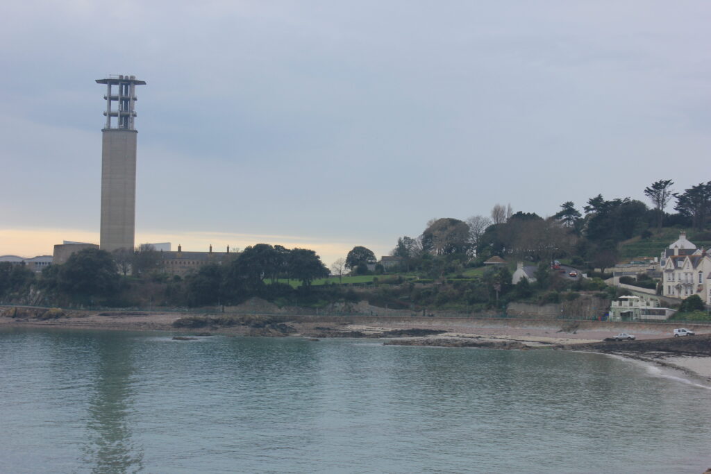
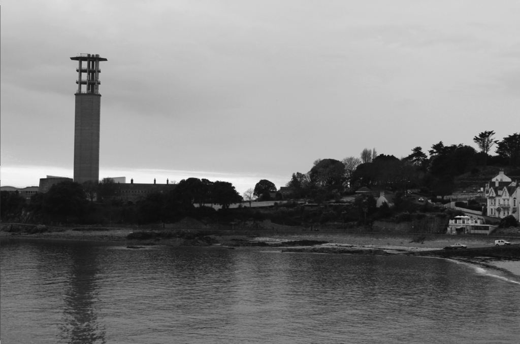
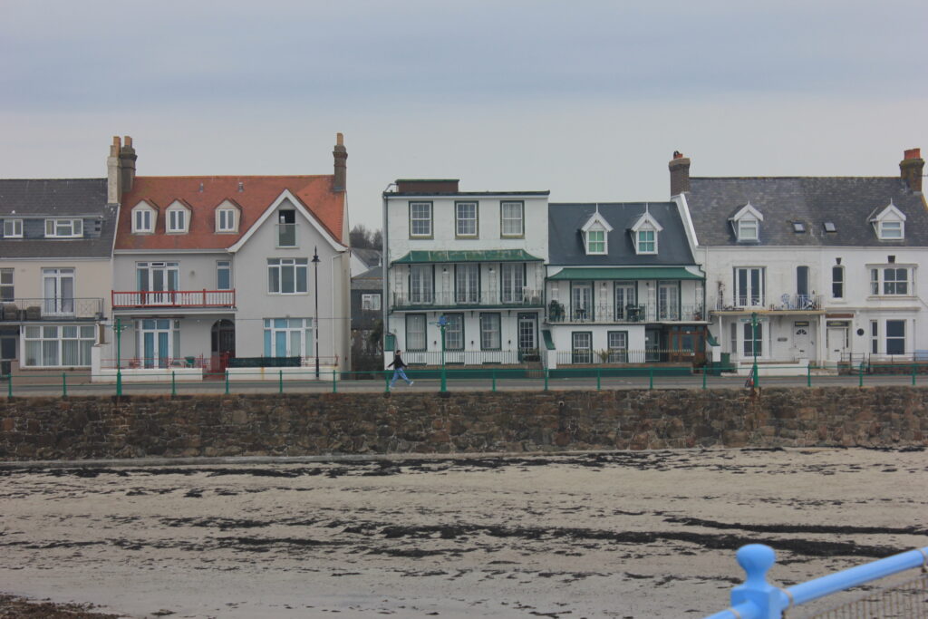
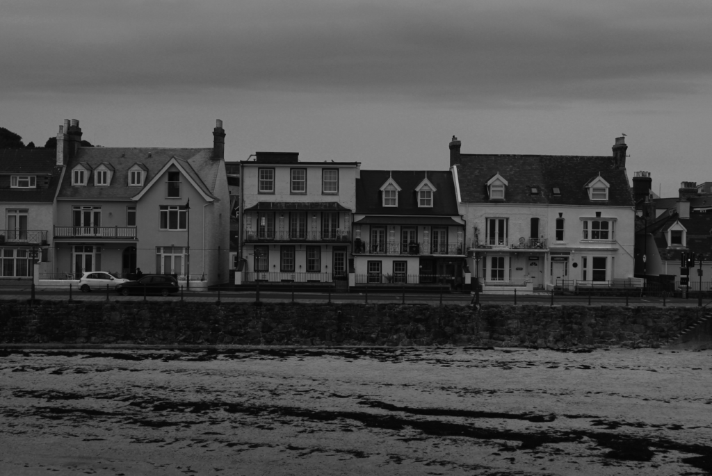
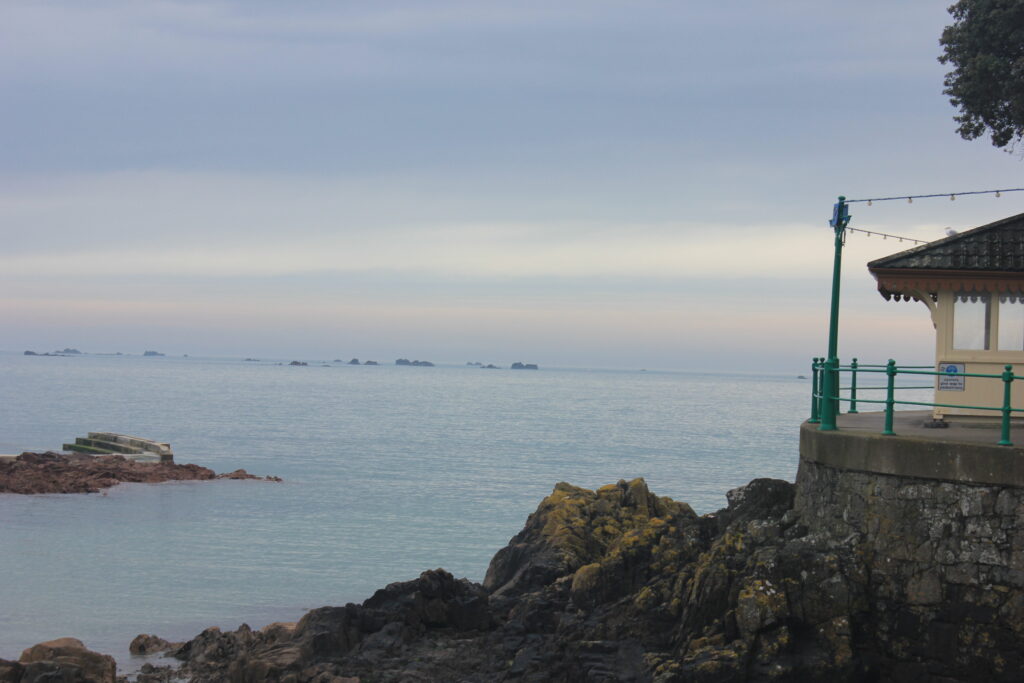
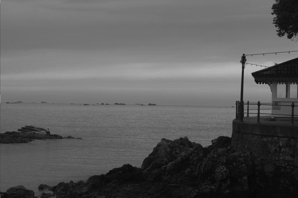
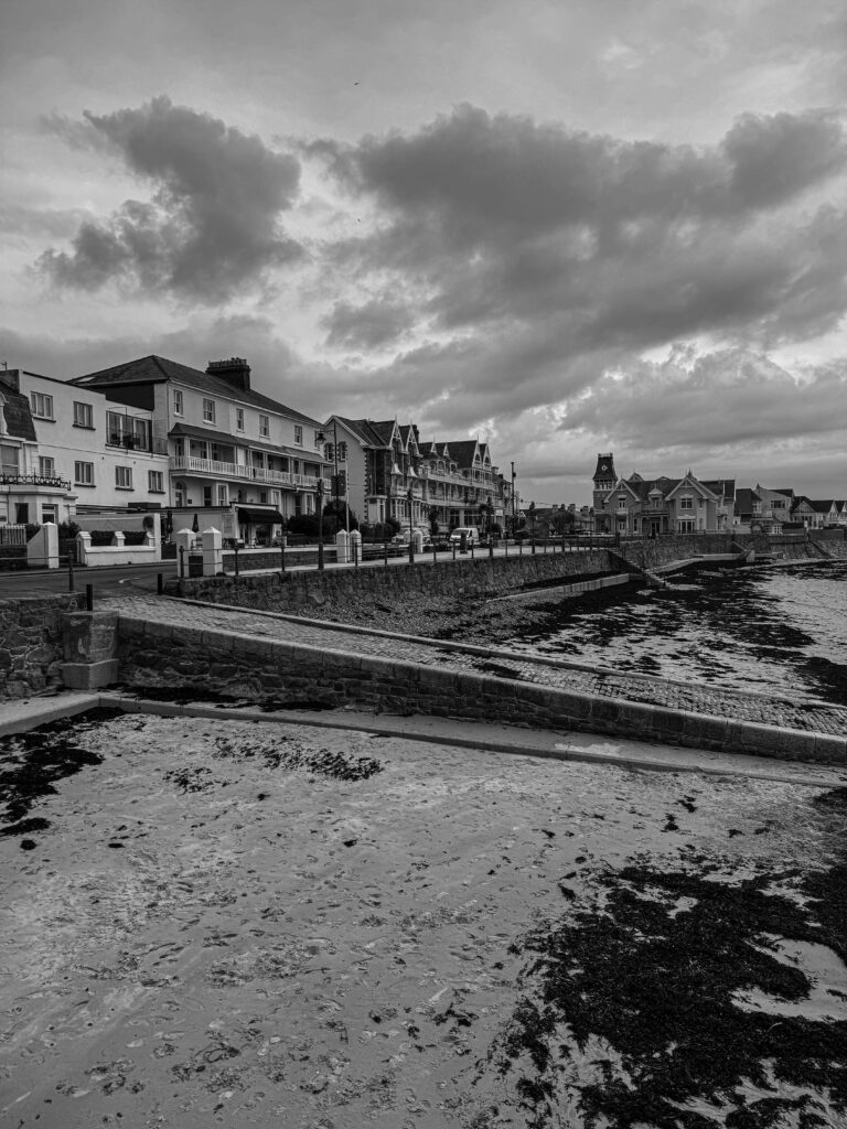
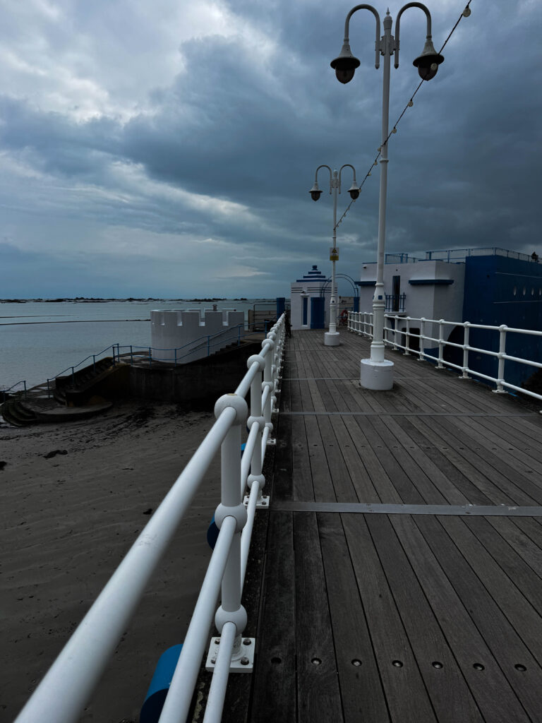
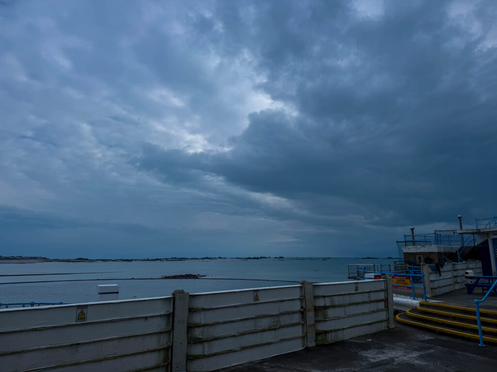
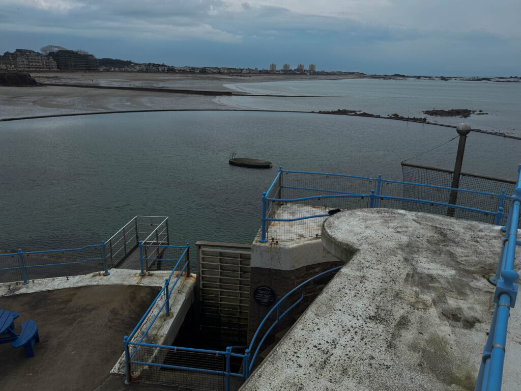
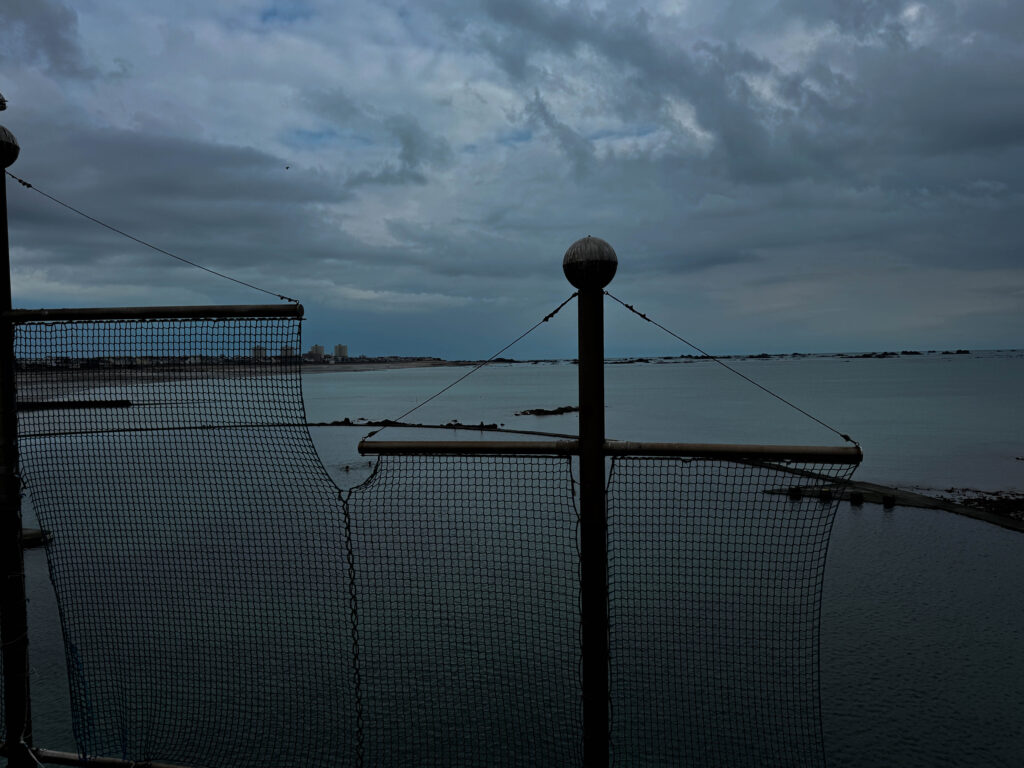
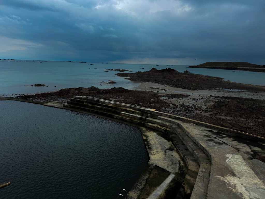
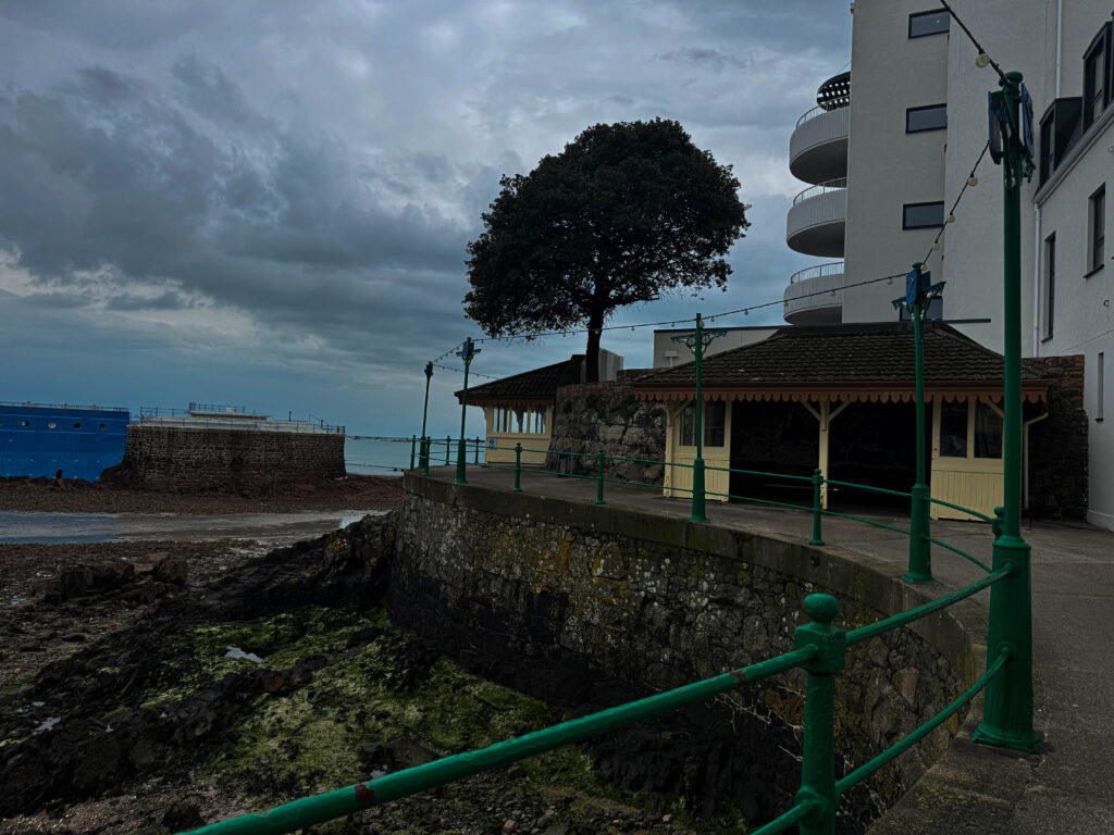
To take these images we all went down to Havre de pas and took some images of the surrounding scenery and the man made structures. This photoshoot was a way to show the comparison of nature in juxtaposition to man-made structures.
photoshoot
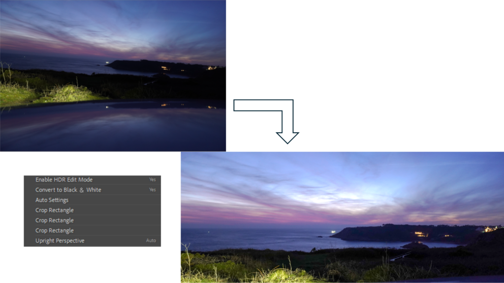
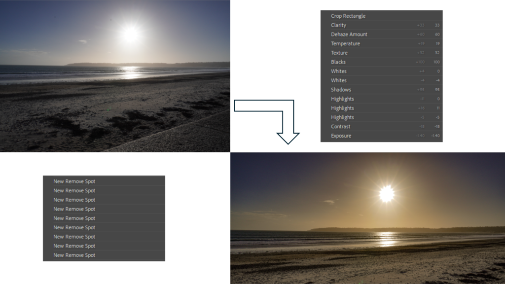
Edited images


Joiners
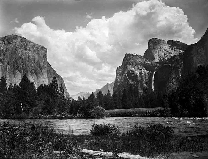
one of the most famous joiner landscape artist is David Hockney known for his collage images of the same scene from different angles and viewpoints.
Joiner images show a fragmented version of the way that the human vision works showing an insight into various different viewpoints in one frame these images can often appear abstract which gives them a unique and artistic feel.
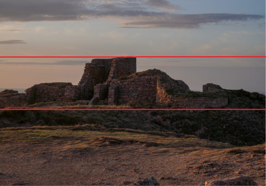
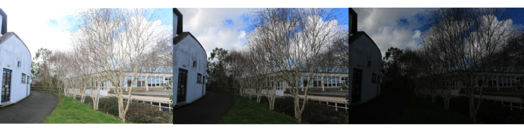
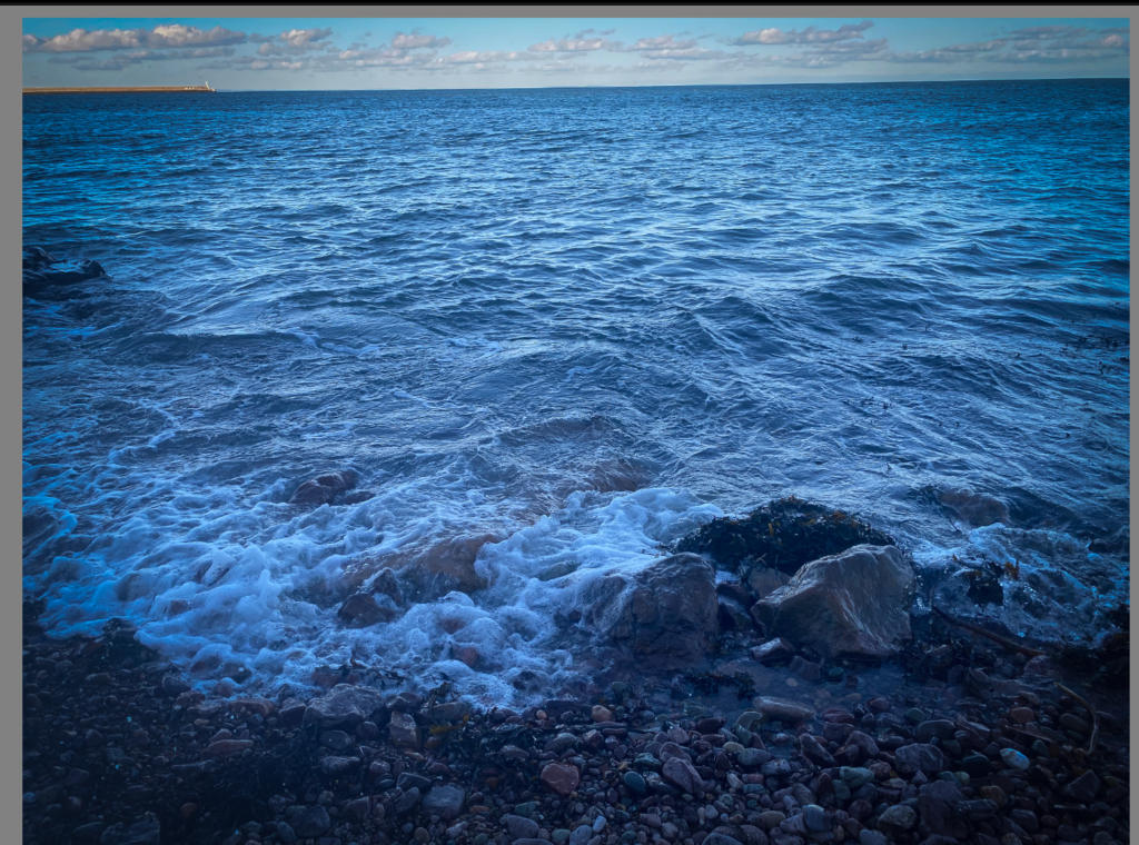
The process of making a joiner image involves taking multiple photos of the same scene from different viewpoints and angles and editing the images and creating a collage or adding them together so that they are overlapping to create and long view of the same scene shown in my own joiner that I made below.
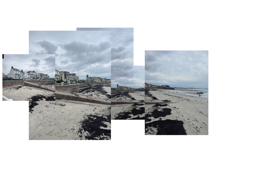
this joiner I made manually on photoshop by creating an untitled document and opening all the images I wanted to use on separate tabs and resized and placed them where I wanted them to be on the document.
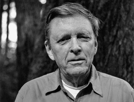
David Hockney
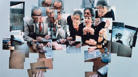


David Hockney is considered one of the most influential British artists of the 20th and 21st century, and an important contributor to the pop art movement.
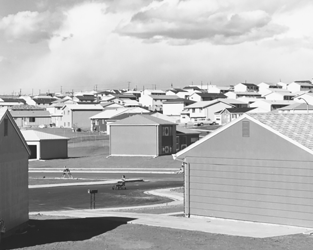
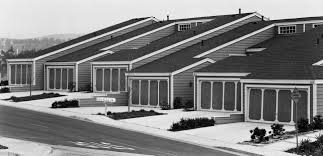
in 1964 Hockney moved to LA where he created his series of images that involved swimming pools using new vibrant colours. However it was in the early 1980’s when Hockney started his photo collages which he called his joiner images first using his polaroid pictures and commercially processed prints, which were normally snap shot images of which he arranged to make composite images of a single subject as the images are all taken from slightly different angles and perspectives.
“Creation of the “joiners” occurred accidentally. He noticed in the late 1960s that photographers were using cameras with wide-angle lenses. He did not like these photographs because they looked somewhat distorted.” – copied from Wikipedia
Hockney Analysis

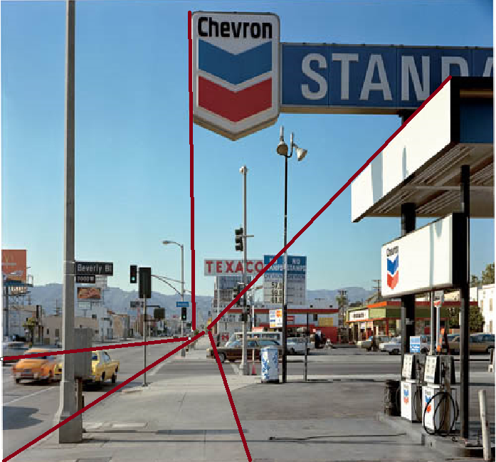
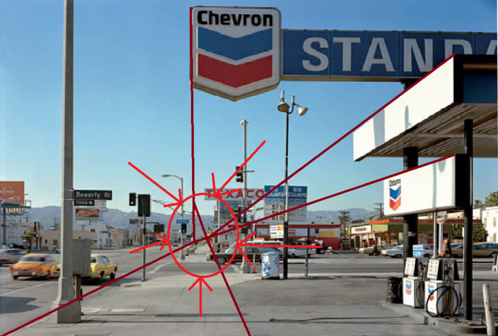
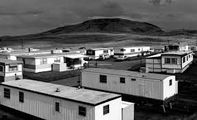
This is image is taken using a polaroid camera and the genre of this photography is landscape ( joiner).
The mise-en-scene presents a backyard with a pool in the middle with the individual pictures from this taken in all different angles. The tone of this image is quite light overall, due to the amount of the concrete / slabs which adds a nice juxtaposition and contrast compared to the dark shadowed area created by the trees. The use of light in this image is soft, however, I it is natural lighting as they are outside. The focus distance is long as everything is in focus including all the background and foreground of the image. The depth of field is large as everything is in focus. The leading lines of the images would be the sections of the borders between each polaroid image.
I believe the ISO is 100 as everything is in as most of the image is in focus. I believe that the shutter speed is 1000 as everything is clear.
Panoramas
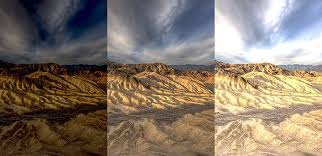
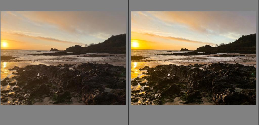
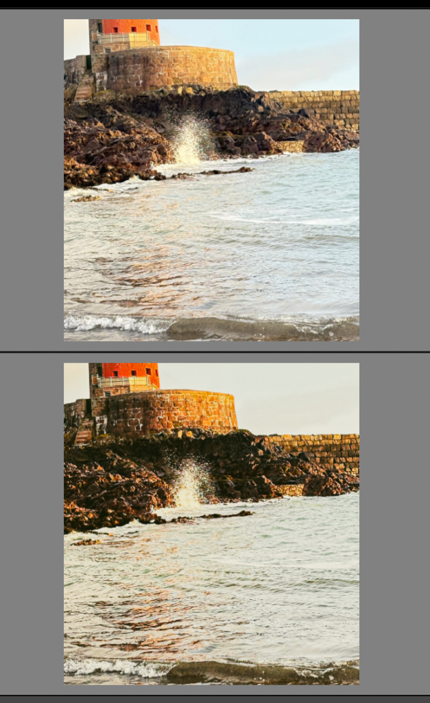
Panoramic photography shows a larger or expanded view of what would normally be a singular image, typically with a larger aspect ratio than a standard lens or frame. Allowing you to depict even whole cityscapes in a singular shot when compared to a show where the photographer has used a regular 50mm lens.
APECT RATIO: normally an image would have a 3:2 ratio or a 4:3 ratio compared to a panoramic image which would have an aspect ratio of 2:1 or wider which is what lets them show more of the scenery.
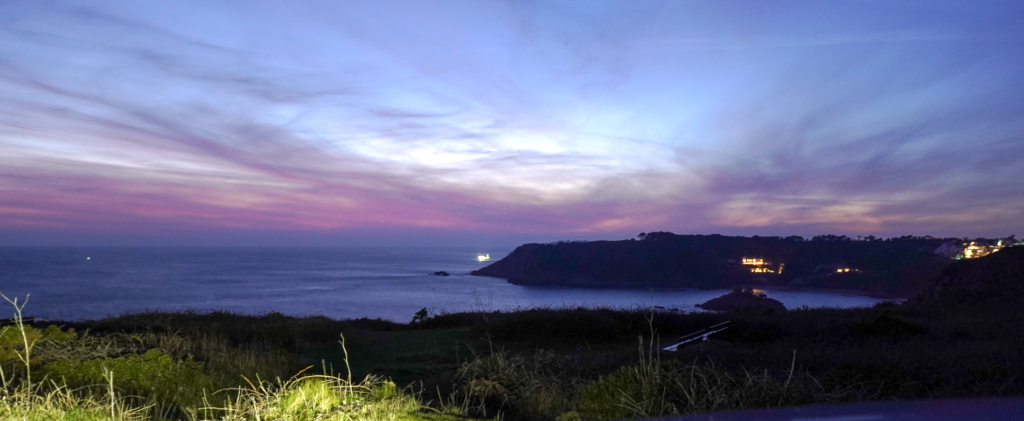
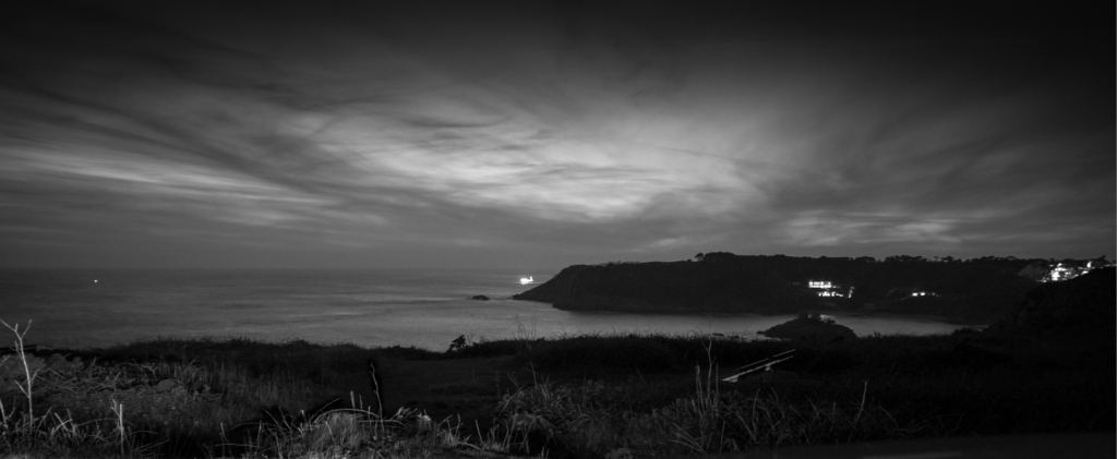
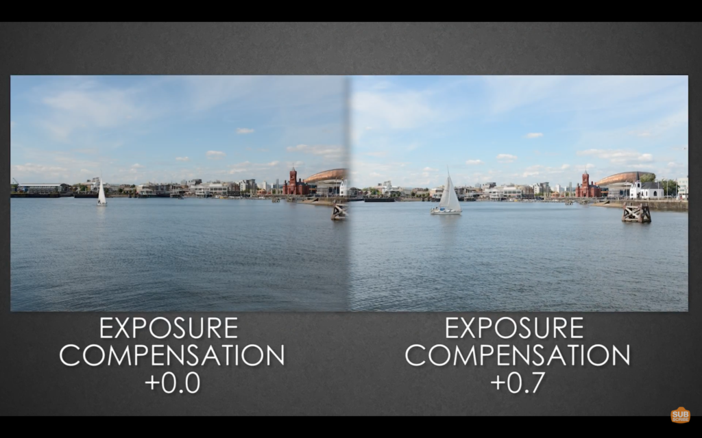
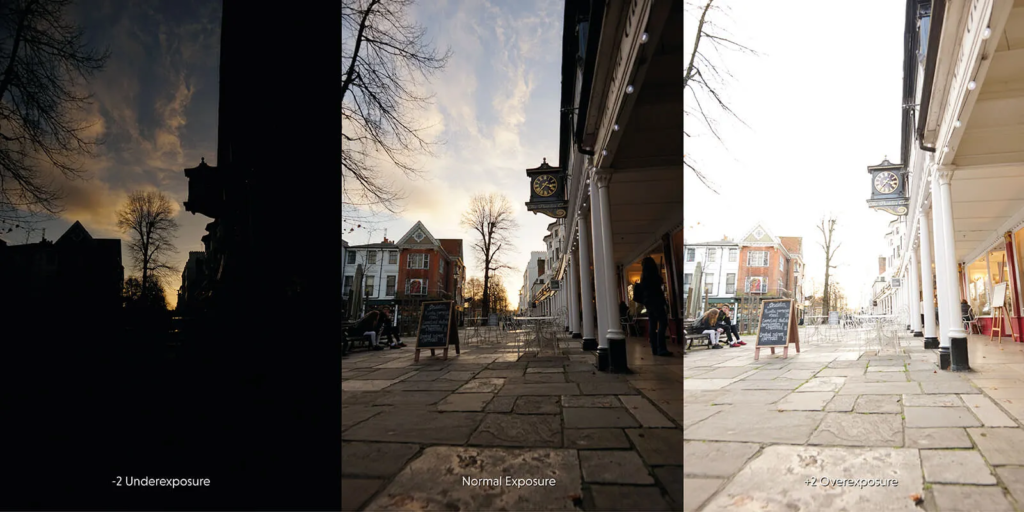
One technique of creating panoramic images is rotating your camera along a horizonal or vertical plane taking multiple images as you move the camera and these images are then out together by software to create on continuous photo. However, now on your iPhone you are able to use a panoramic mode which pouts the images together for you whilst your taking the image which is how I did my panoramic images.