For this photoshoot, I took pictures around Havre Des Pas and the industrial recycling area with a focus on panoramas and joiners.
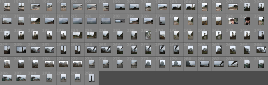
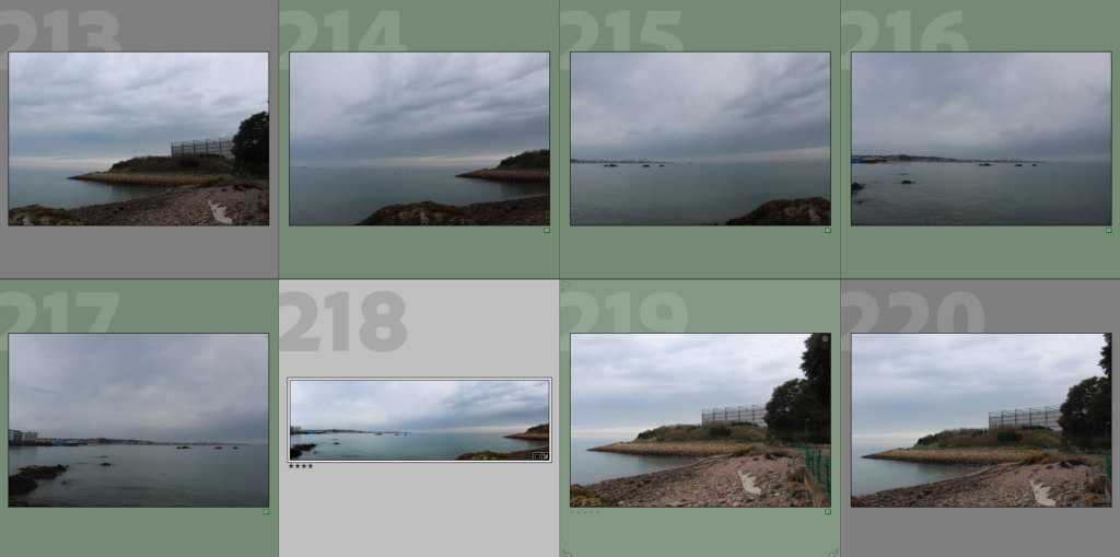
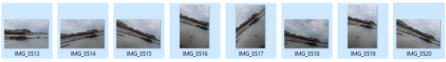
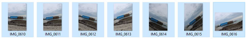
Contact Sheet
Selection Process
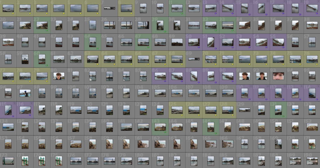
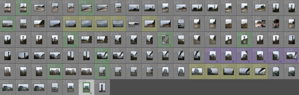
After importing my images, I selected my images to be used for panoramas (yellow), joiners (purple), and other images I liked (green).
Editing
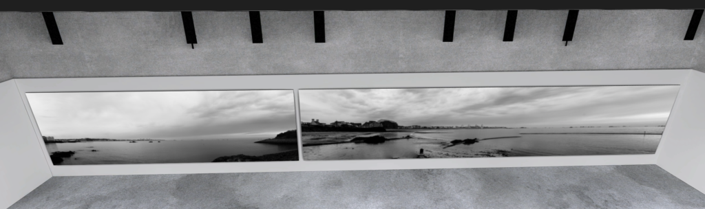
Panoramas:
To create my panoramic images, I merged a series of image taken back-to-back of a landscape into one singular wide image using Lightroom.
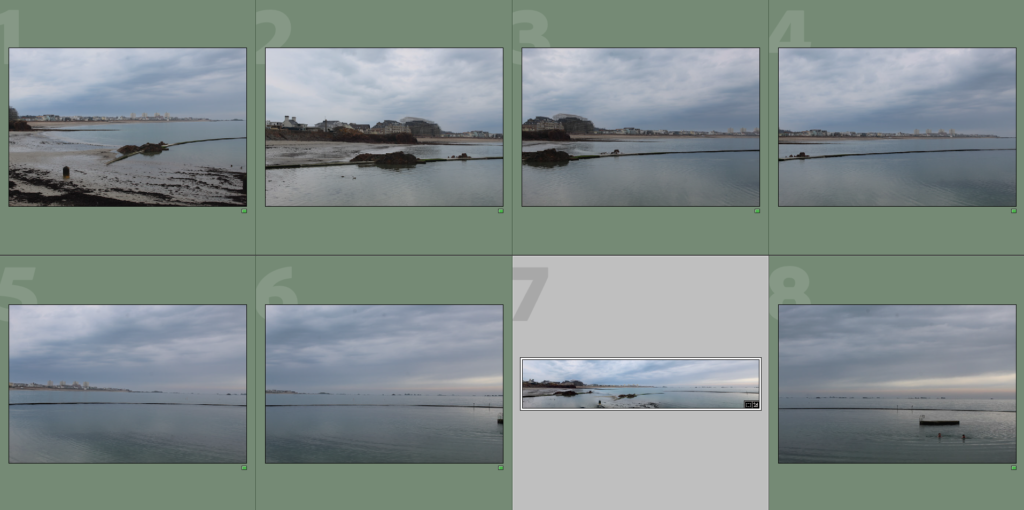
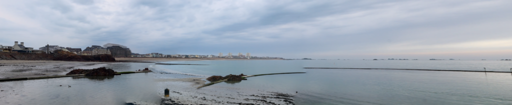
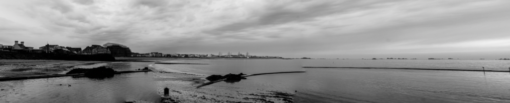
This blends all 7 images together, creating a wide panoramic shot of the left side of Havre Des Pas. I found it effective since the left side captures some buildings in the distance as well as the beach, which contrasts nicely with the right side being mostly the sea.
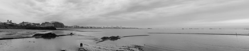
Making it black and white I can see there is visibly a lack of contrast between light and dark tones, with most of the image being the same grey colour.

I decreased the blacks and increased whites and contrast, noticeably creating more contrast between the lighter tones in the sky, midtones in the sea and darker tones in the buildings and rocks.
I find this image effective with how much of it is taken up by the sky and the sea, creating a clear contrast with the rocks and buildings visible in the distance on the left as well as the rocks on the right.
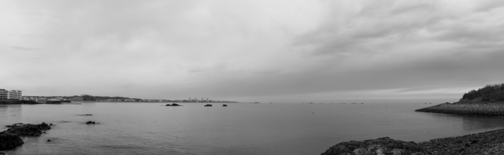
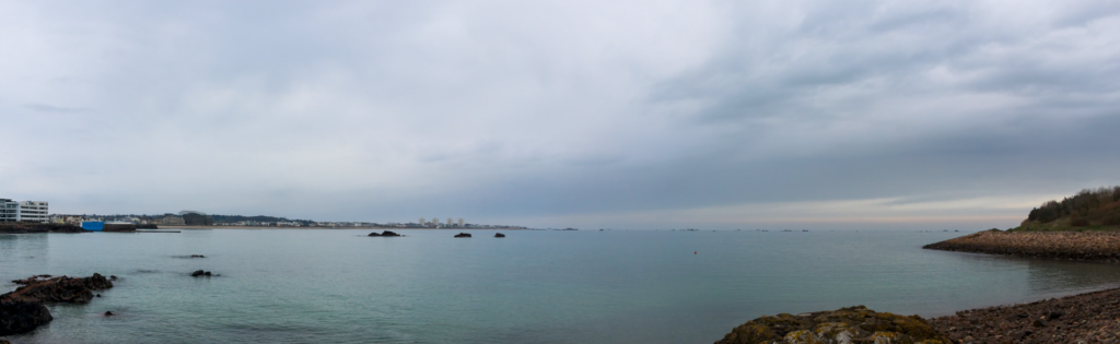
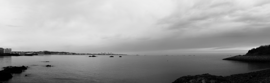
Making the images black and white shows the contrast between light and dark tones, although the contrast isn’t very obvious between the sea and the sky which takes away from the drama of the photos.

Increasing highlights and decreasing shadows, allowing for the sea to contrast more with the sky and creating a sense of drama with the darkened landscape.
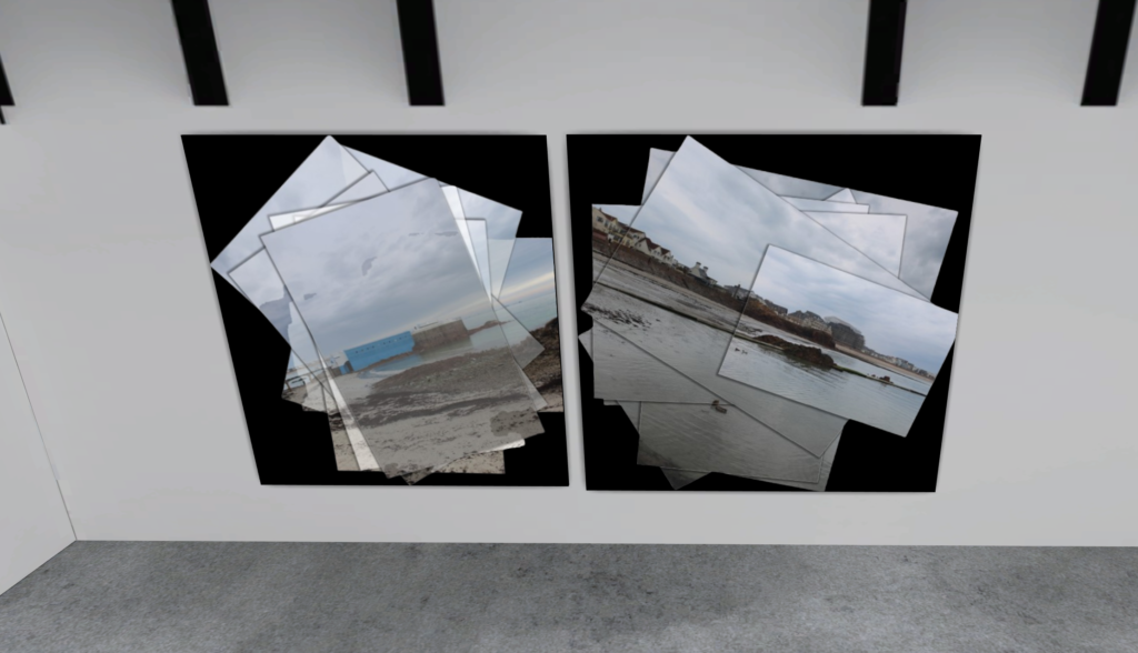
Joiners:
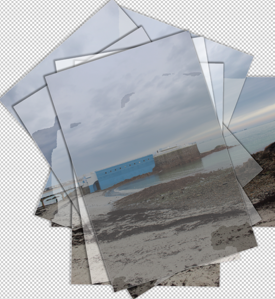
To create my joiners, I took multiple images of one landscape at different angles and merged them together in Photoshop before editing them further.
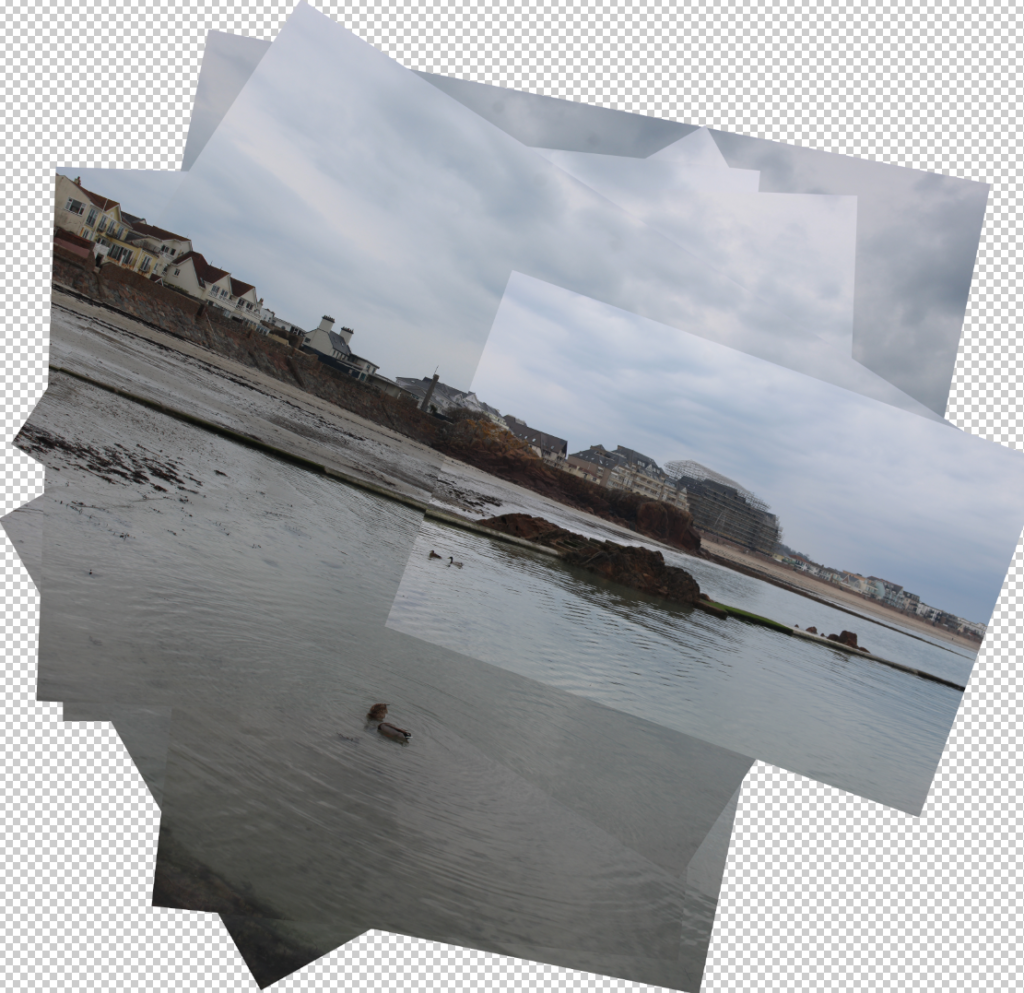
This was the initial result after merging the photos, blending all photos taken into one collage-like image.
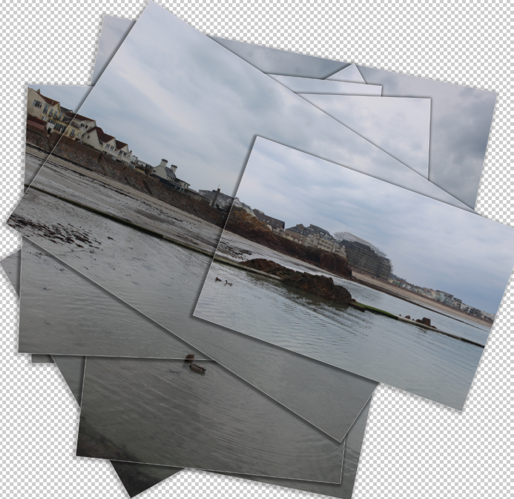
This was the final result after applying effects to each image, adding a slight white stroke around each image and a drop shadow to create the impression each picture was printed out and stacked on top of one another to create the collage.
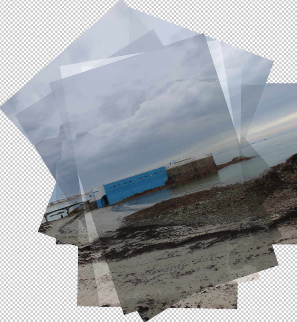
The resultant collage after merging all photos, I adjusted some settings on each one individually to create slight contrast between each one and add a weathered effect to them.

Added the same effects, as well as adjusting opacity and other settings to enhance the weathered effect.
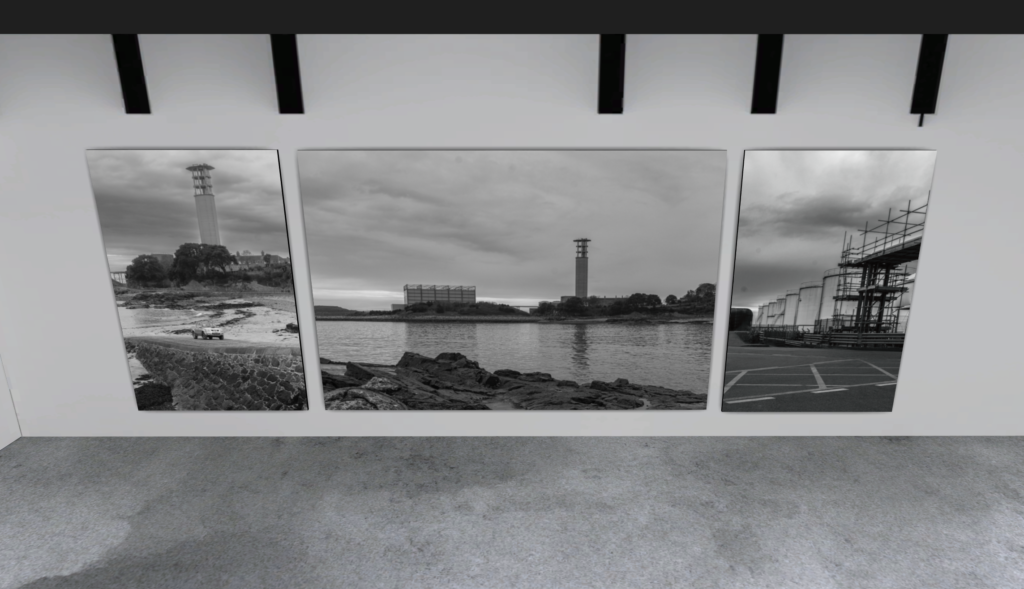
Other photos:
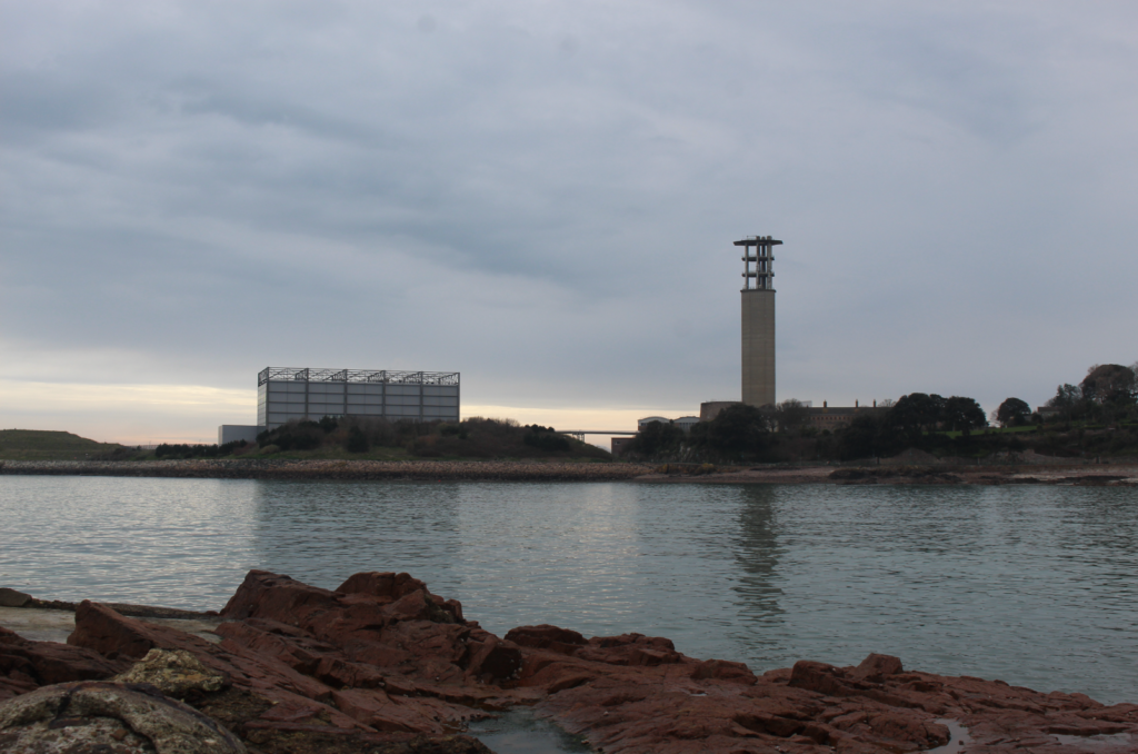
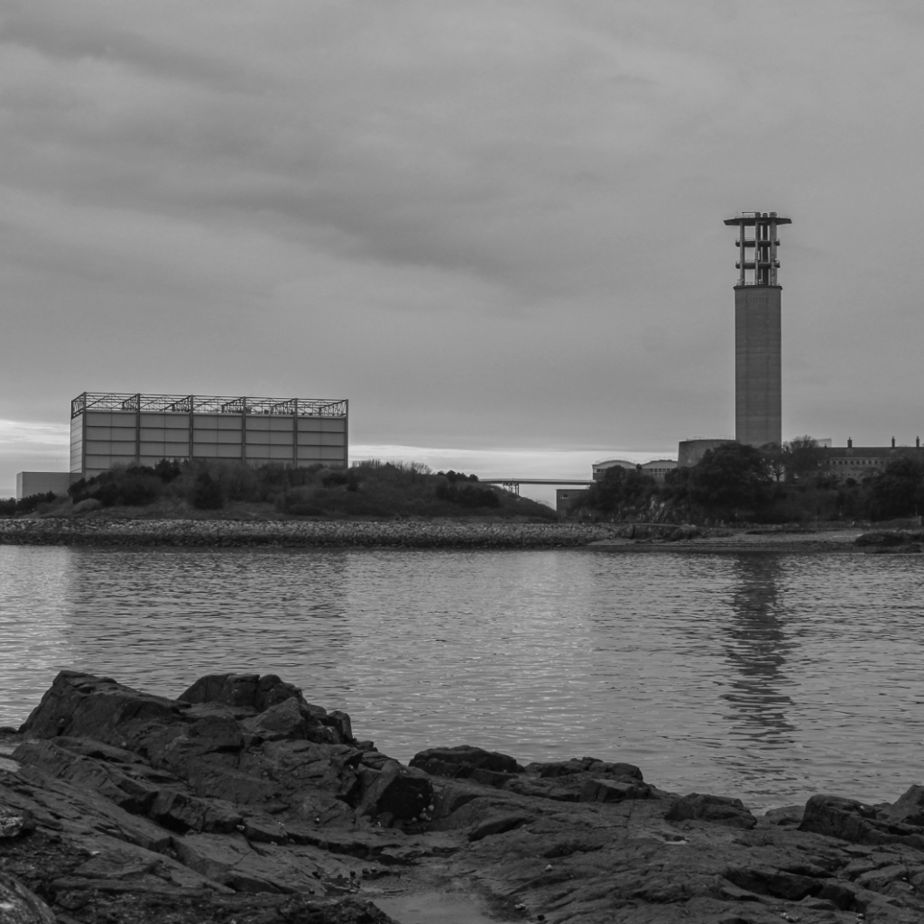
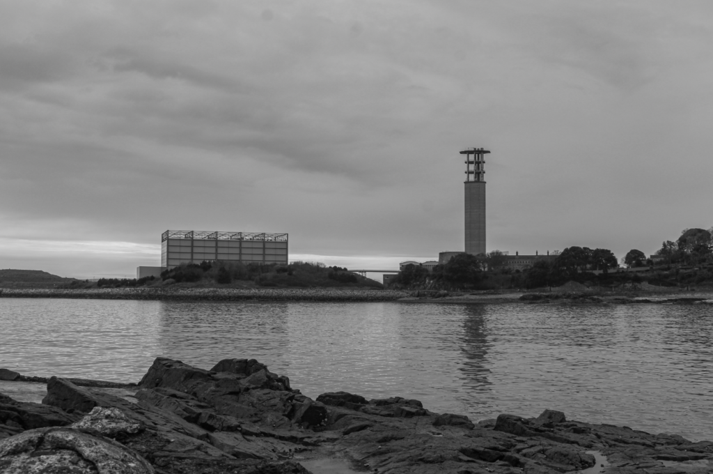
I really liked the composition of this image with the natural rocks in the foreground contrasting with the two buildings positioned on the two thirds in the distance with negative space in the sky, so I wanted to try experimenting with creating tone contrast by making it black and white.
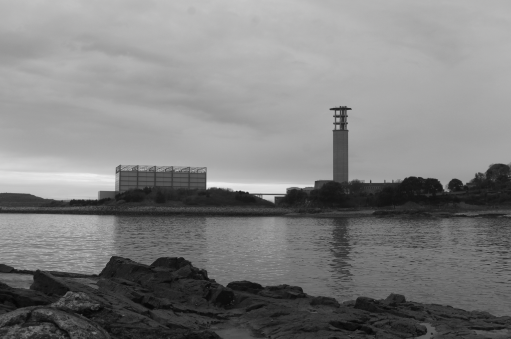
The result after making it black and white, the rocks and landscape around the two buildings are too similar in tone so I will make further adjustments to try have a full range of tones (similar to the zone system).

Final result – decreased highlights and whites, increased exposure and contrast bringing out more contrast. Light tones at the bottom of the horizon, midtones in the sea and darker tones in the rocks/landscape in the background.
Experimenting with composition, cropping to keep the bottom half of the image focusing on natural landscape (rocks, sea) and the top half focusing on man-made buildings which contrast nicely with the sky’s negative space.
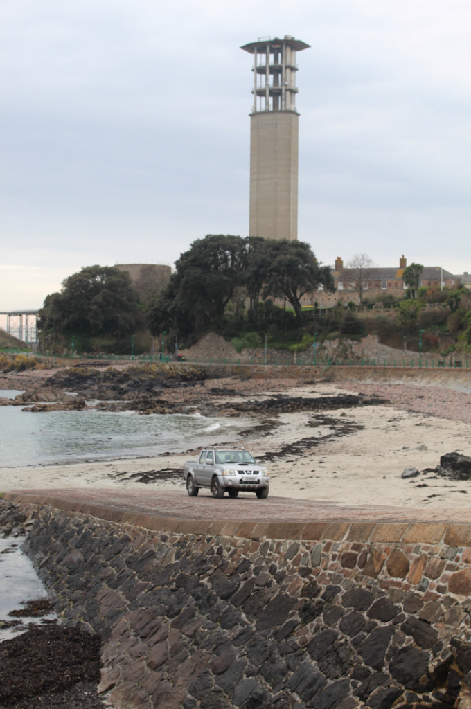
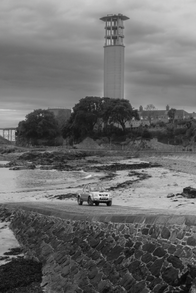
I really like the composition of this image since it clearly contrasts natural landscapes vs man-made and it almost seems like the man-made aspects are invading the natural ones, seen with the car out of its usual place parked on the beach and the tower sprouting of the trees creating a clash between these two elements.
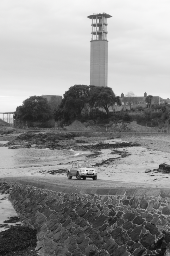
Experimenting with black and white, and I like the drama created although I noticed there is little use of the zone system since there is very little dark tones.

Darkening the sky and rocks at the bottom by decreasing exposure and increasing clarity, enhancing contrast between light and dark tones. Lighter tones can be seen in the sand and car, midtones in the sky and tower and dark tones in the trees and rocks.
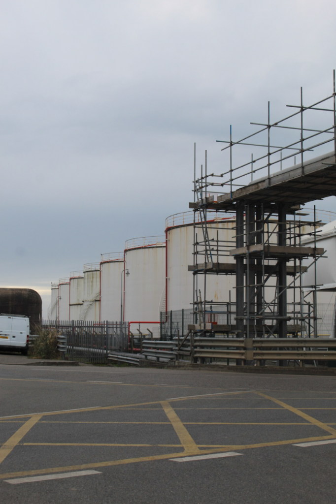
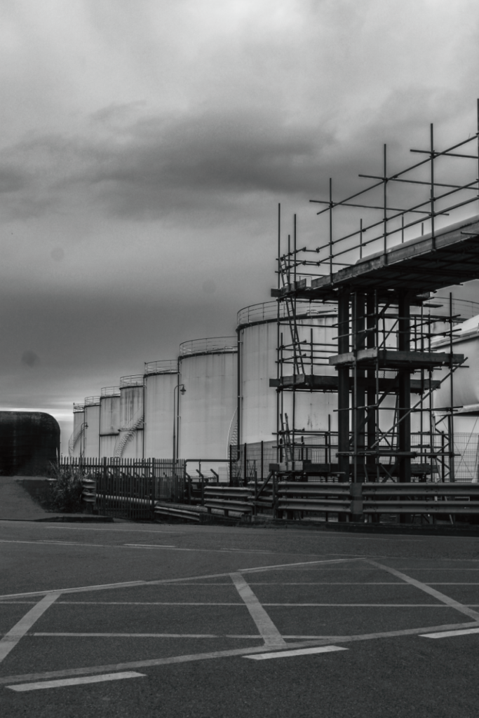
This image is inspired by the New Topographics, featuring no natural landscape and instead focusing on man-made objects. I like how there is plenty of straight lines in the image (e.g. paint on the floor, scaffolding, fences) since it clearly shows how most of the image is man-made.
Experimenting with black and white in the style of the New Topographics.

Enhancing contrast and increasing drama by adjusting clarity, exposure and contrast as well as removing the van since it stuck out noticeably compared to the rest of the image. Final result creates a gloomy atmosphere whilst maintaining an effective range of dark and light tones.
Final Images
Panoramas:
Joiners:

Other:
Presentation in ArtSteps