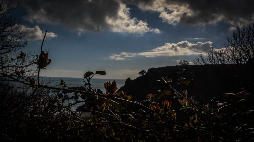
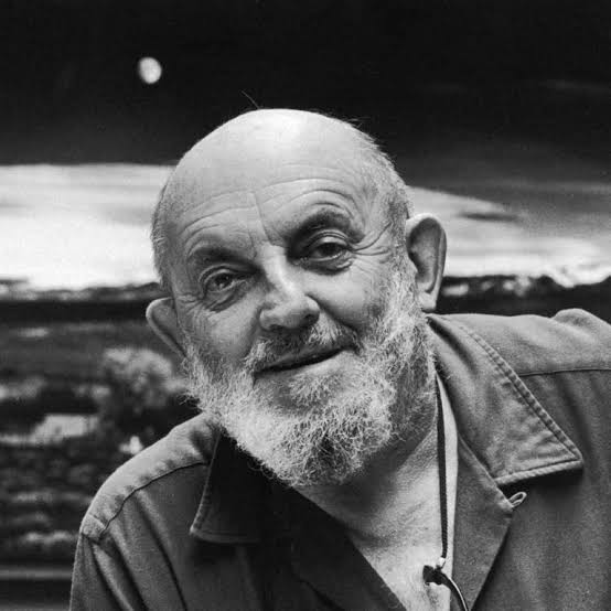
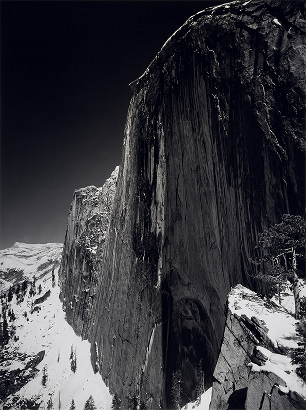
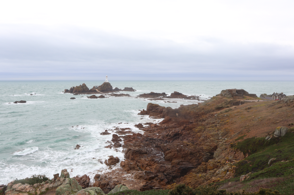
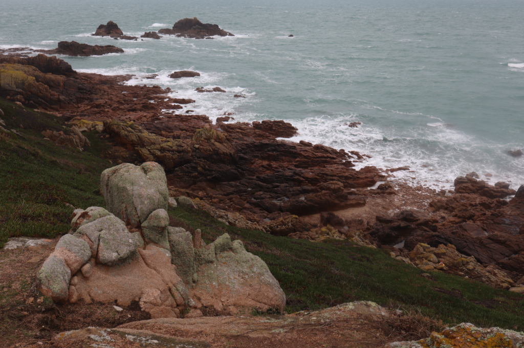
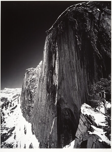
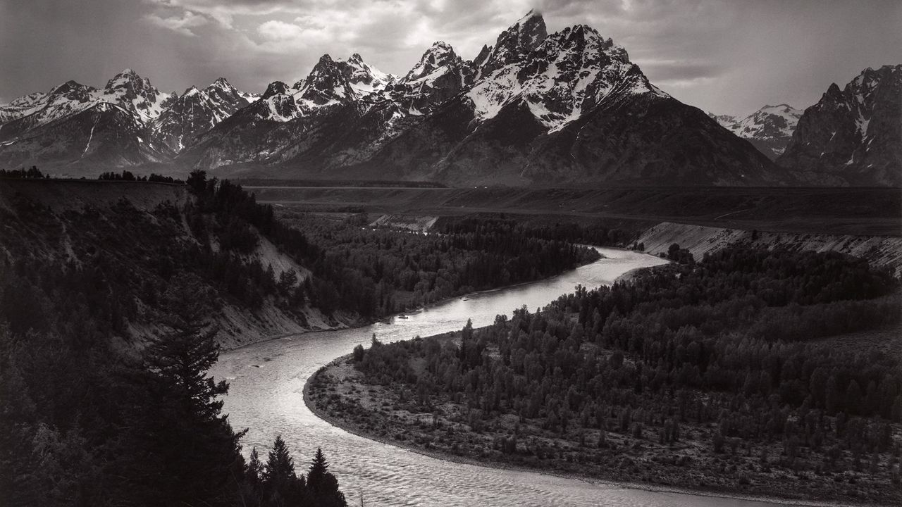
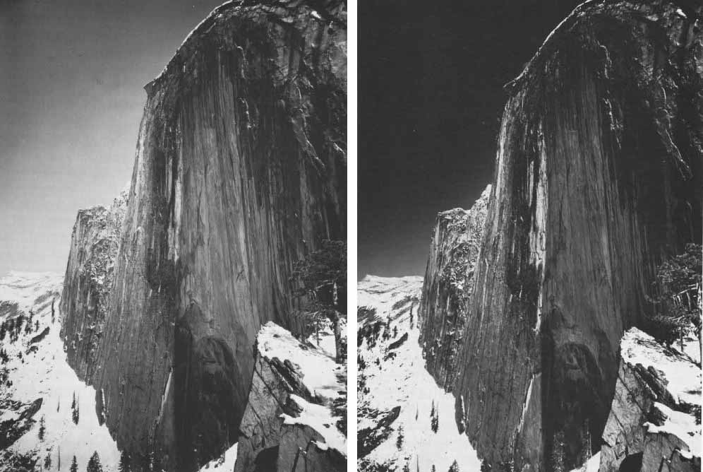
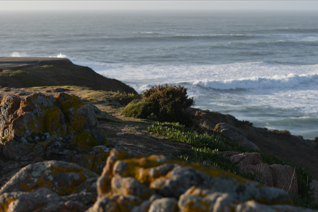
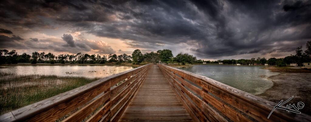
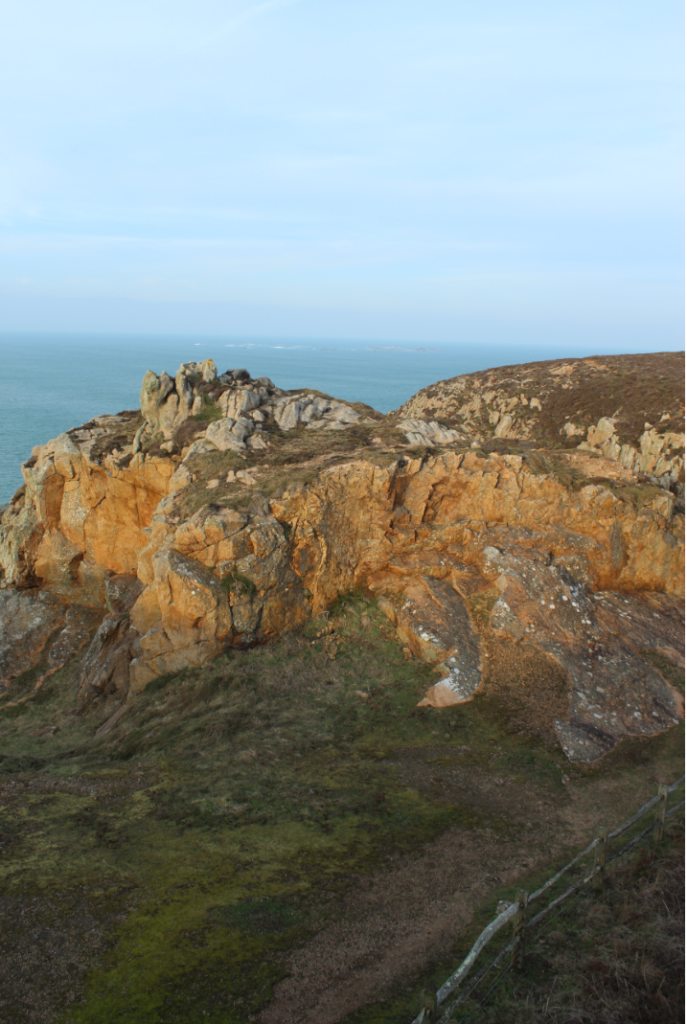
My Photoshoot is inspired by Ansel Adams and the work that he did. To achieve similar images like these I prioritised on taking pictures of jerseys coast, jerseys coast was perfect as I was able to create similar images like Ansel Adams by taking photos of the cliff side.
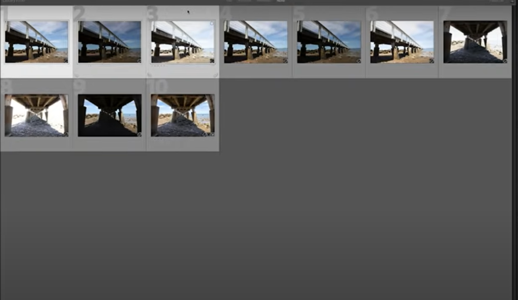
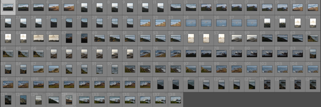
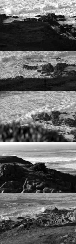
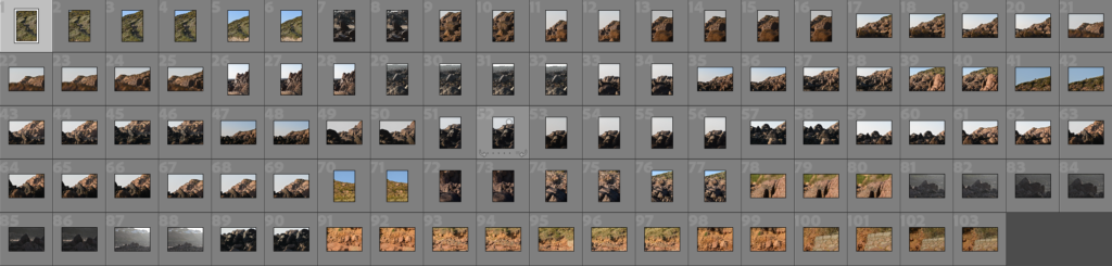
Contact Sheet

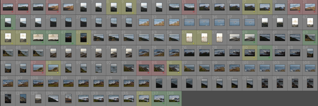
There were many images that I liked but the majority I felt weren’t up to the standards that I was looking for. Some pictures that were not selected for use were either low light which was due to the exposure settings not being set right or I was not satisfied with the view that I captured. The images that I did select I was very happy with as it matched Ansel Adams style and the view or the angle the photo was taken was perfect for the standards that I had set.
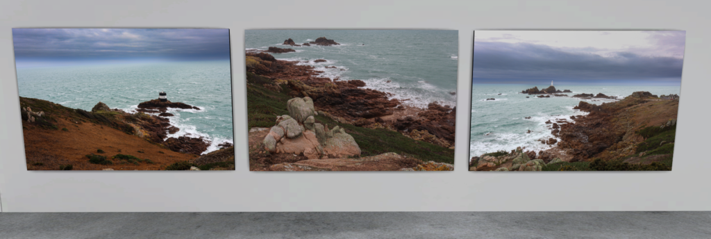
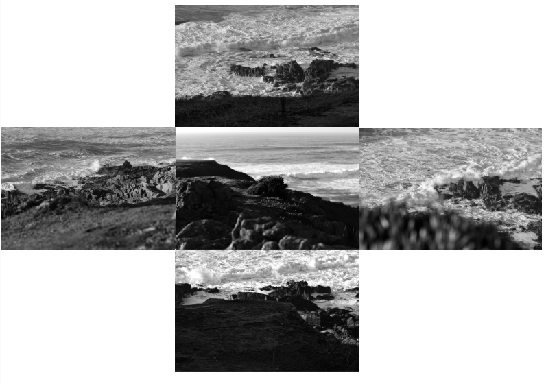
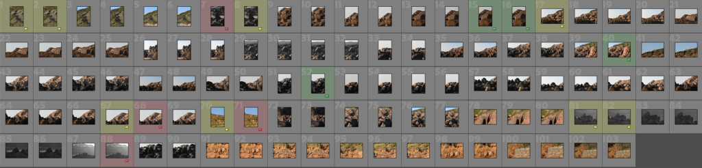
My Top Choices


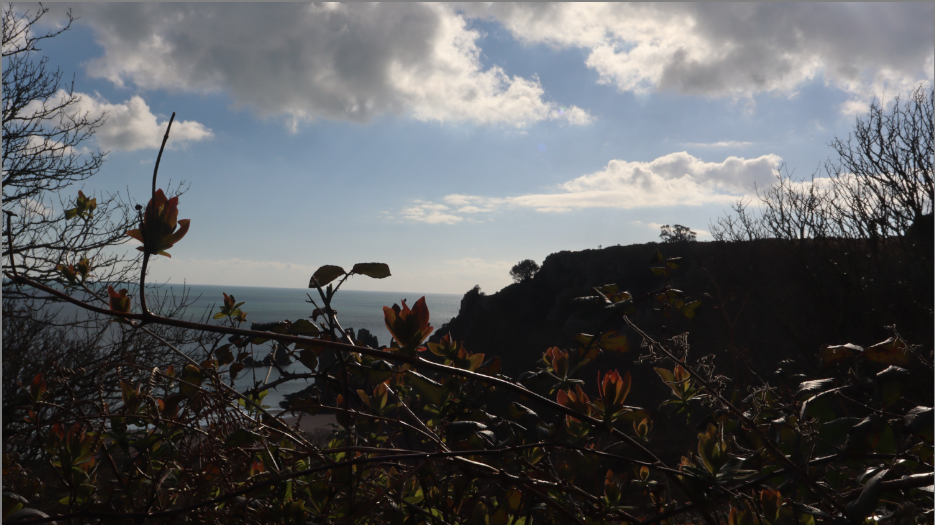
I have selected these photos as my top choices as I believe that they look the most appealing, I also think that they match up closely to Ansel Adams style, they also have lots of potential especially when edited as I will be able to bring out more details and enhance things like the lighting or shadows to make the photo become more effective and striking to the peoples eye.
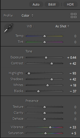
Editing Process
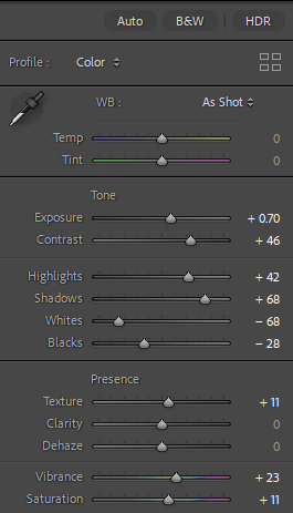
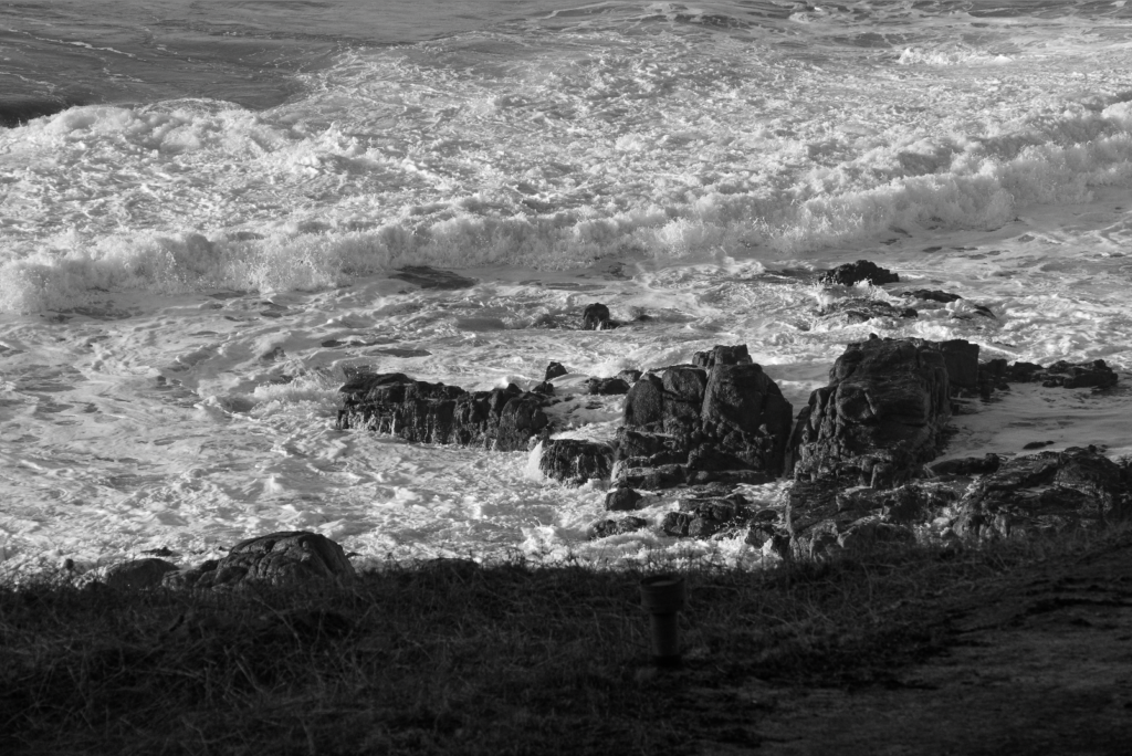
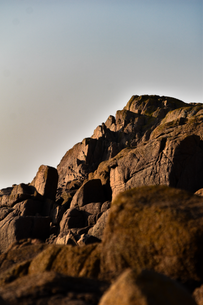
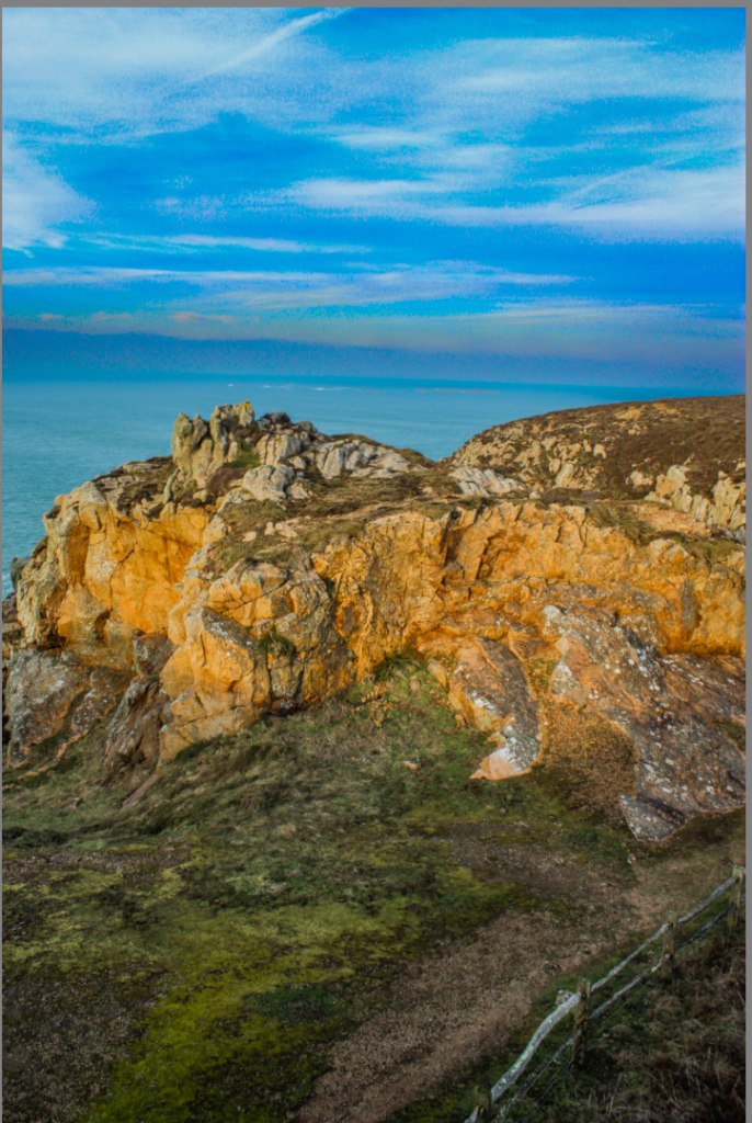
Photo #1

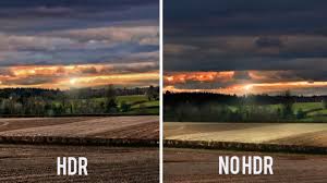
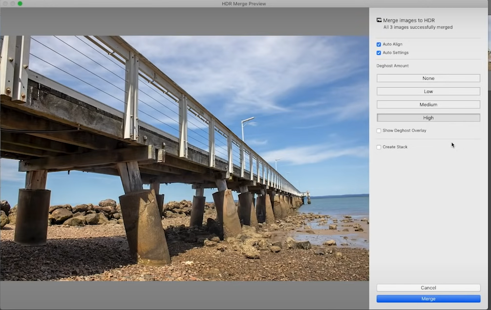
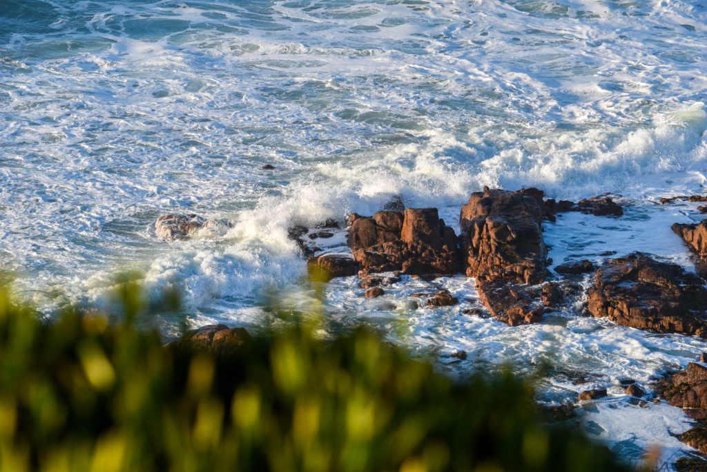
With this photo I converted it into a HDR image in order to bring back details in the sky and the lighting from the sun that was hitting the floor. To further enhance this image I adjusted the vibrancy and dehaze to make the image look more colourful, I also adjusted the brightness to make the image more brighter so that the details and the scene of the photo looked more appealing to look at. I decided to leave this image in colour as I believe that it looks more appealing in colour than in black and white.
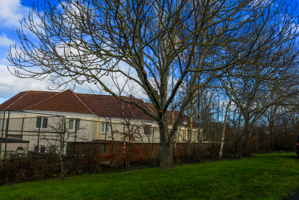
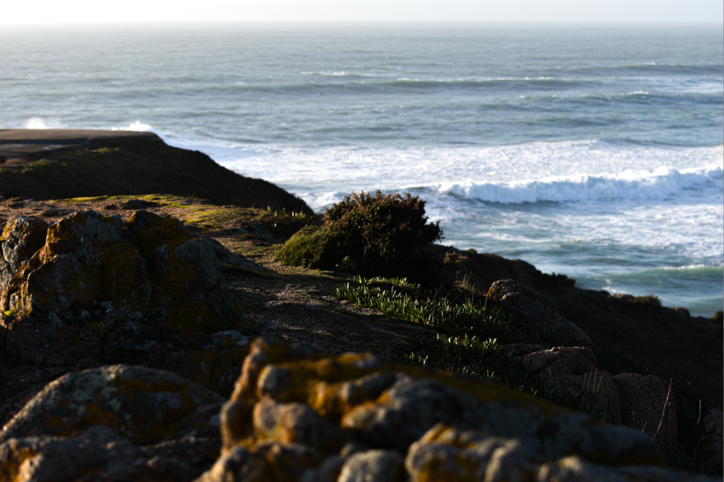
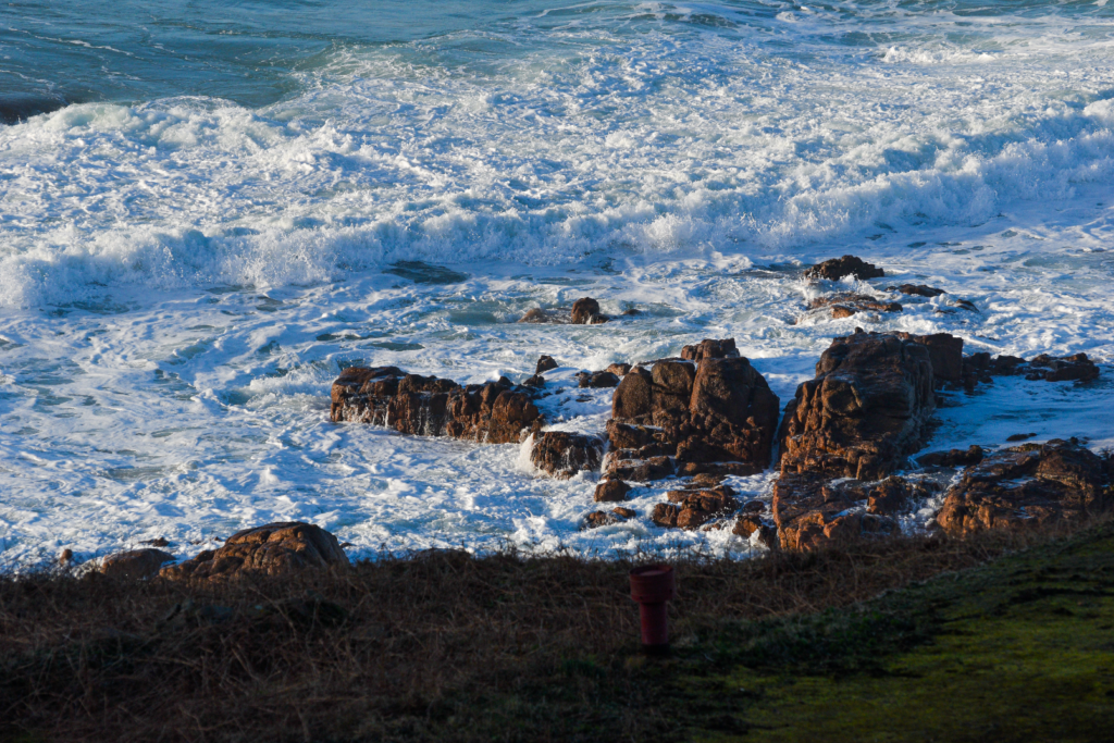
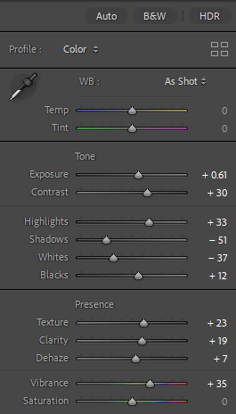
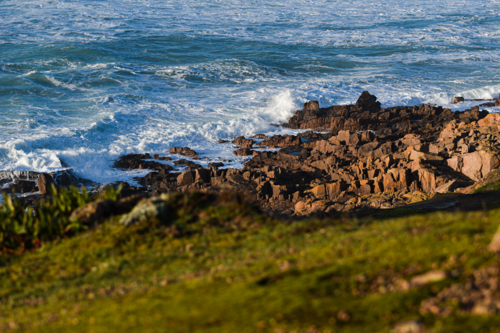
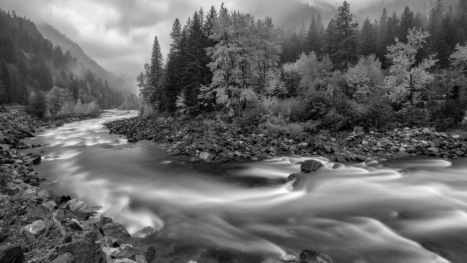
Photo #2

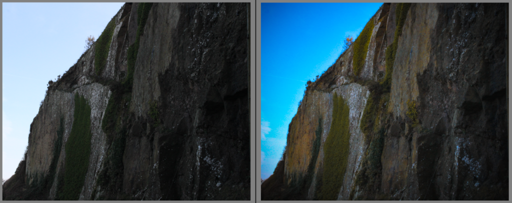
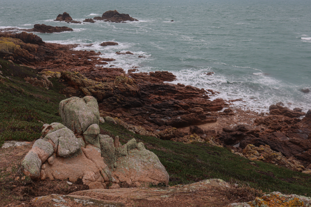
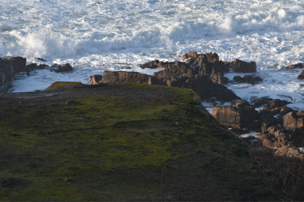
With this photo I adjusted the exposure and brightness settings in order to brighten up the image as there were some areas which were underexposed so by adjusting those settings it helped to brighten up those areas and made it much clearer to view. I also adjusted the vibrancy and saturation to bring out more colour on that big patch of grass and the plants at the top which in my opinion helps to bring out more detail and clarity in those areas.
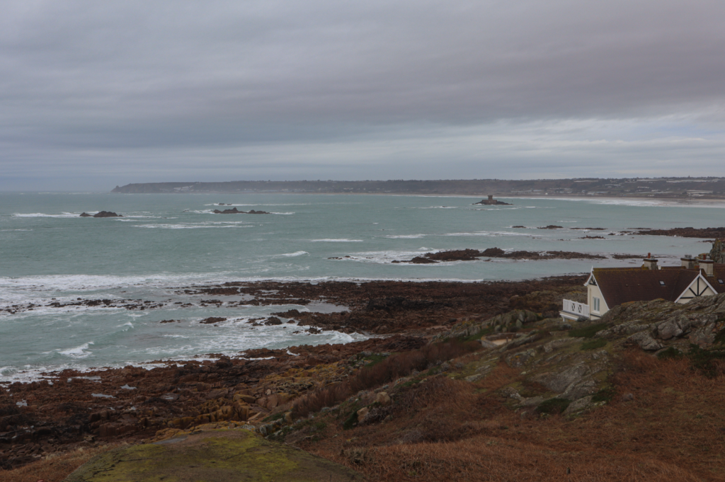
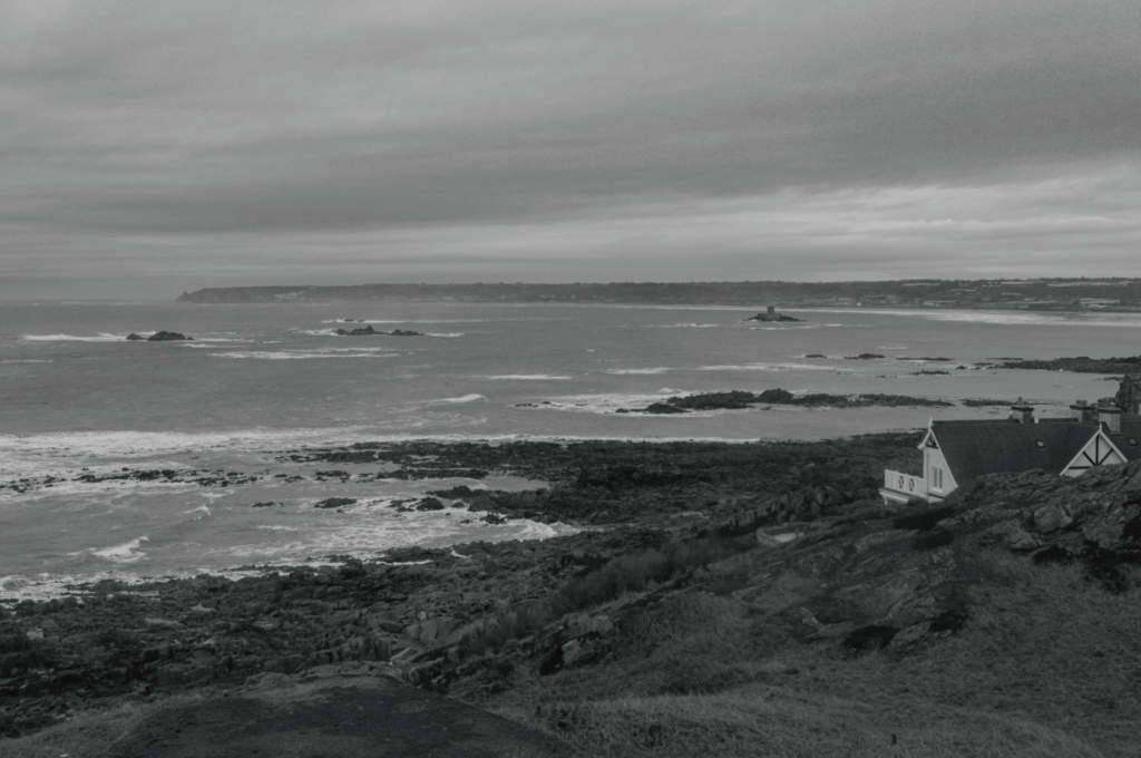
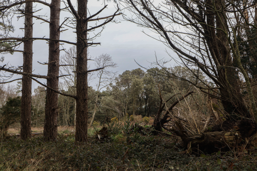
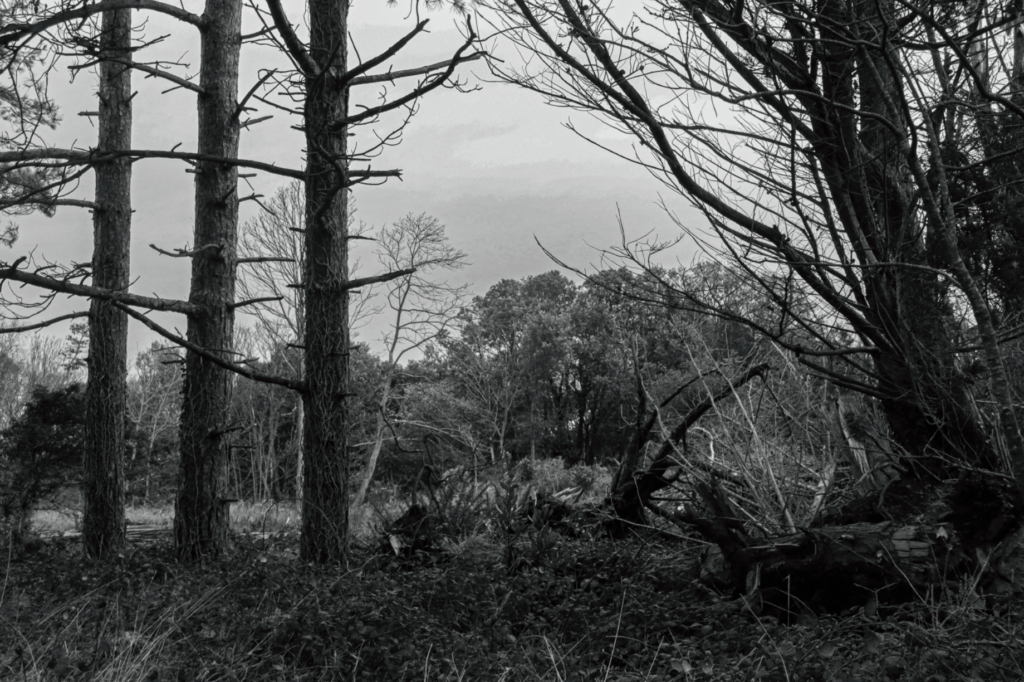
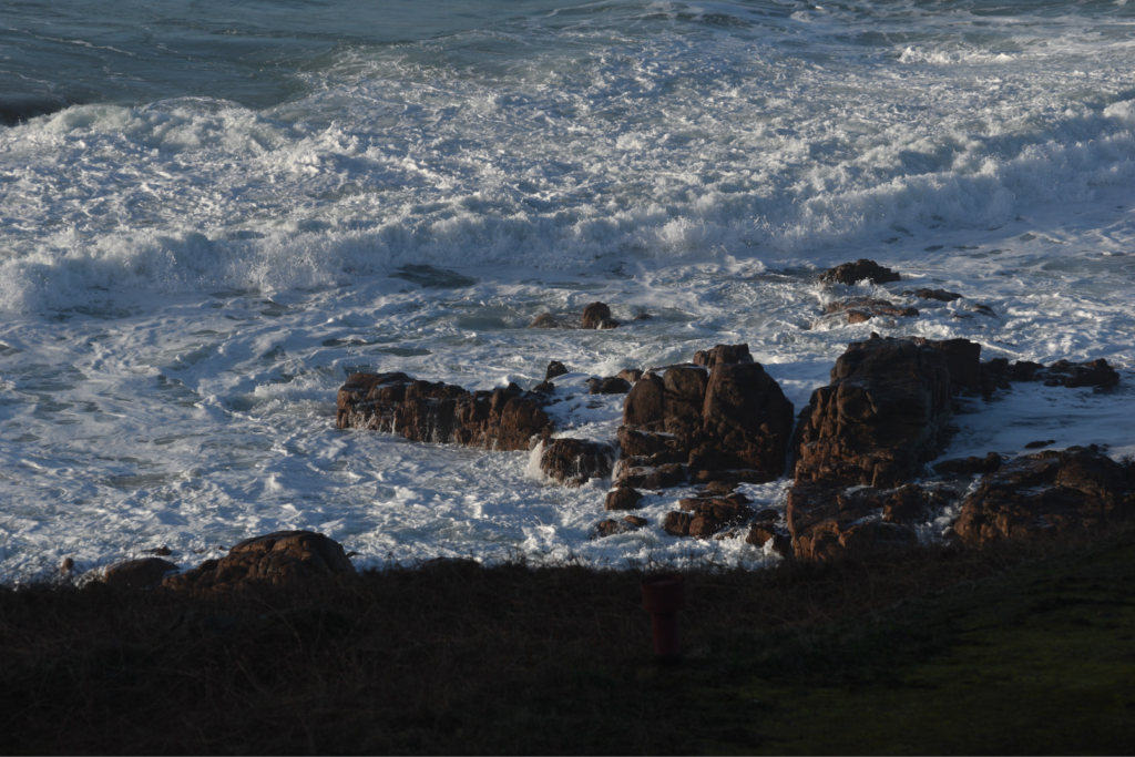
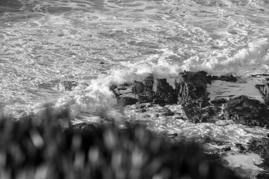
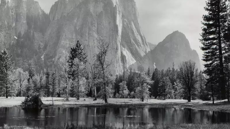
Photo #3

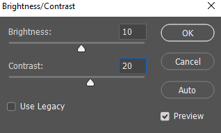
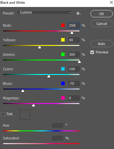
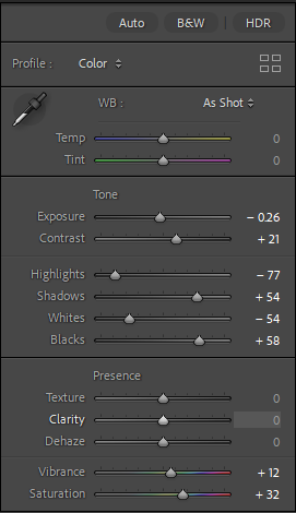
With this photo I decided to set it to a black and white colour scheme to match with Ansel Adams photos but also because I feel that it comes off more effective and appealing in black and white rather than colour. The only sliders I adjusted was the black and white in order to achieve that dramatic effect that Ansel Adams achieves with his photos. I adjusted the blacks all the way down in order to make the dark areas even more darker and adjusted the white slightly to brighten up the lighter areas so its more detailed and clearer to view.
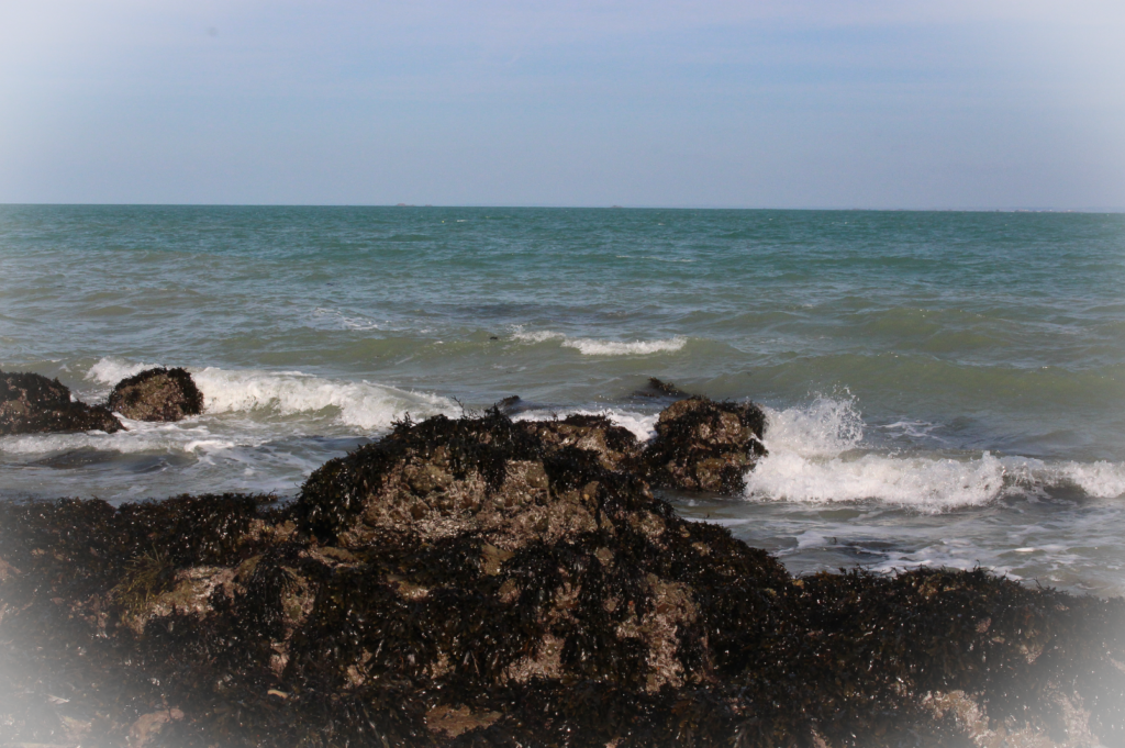
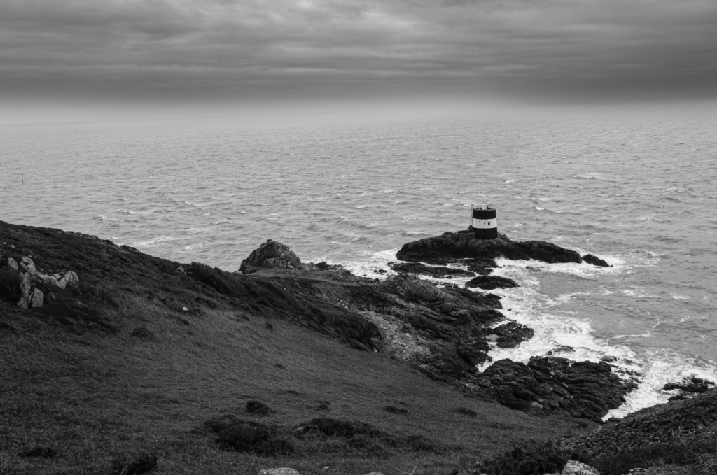
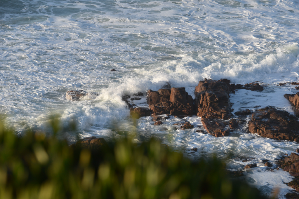
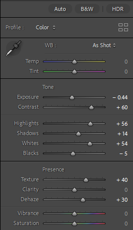
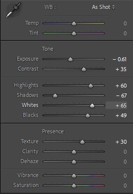
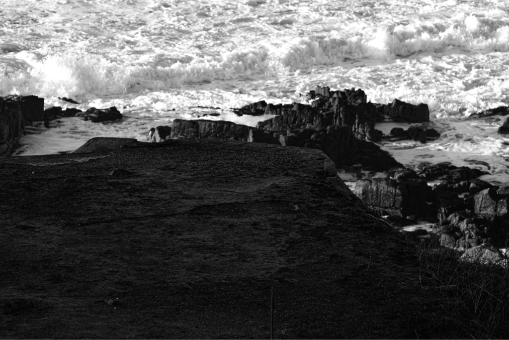
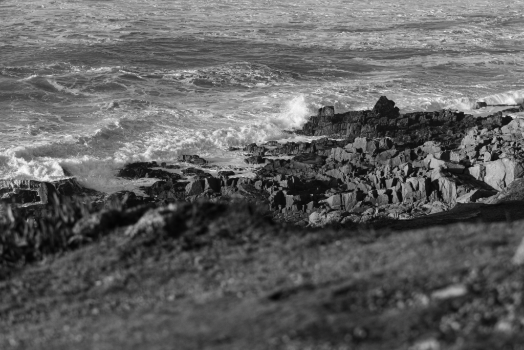
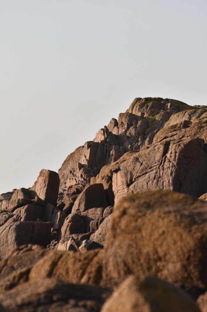
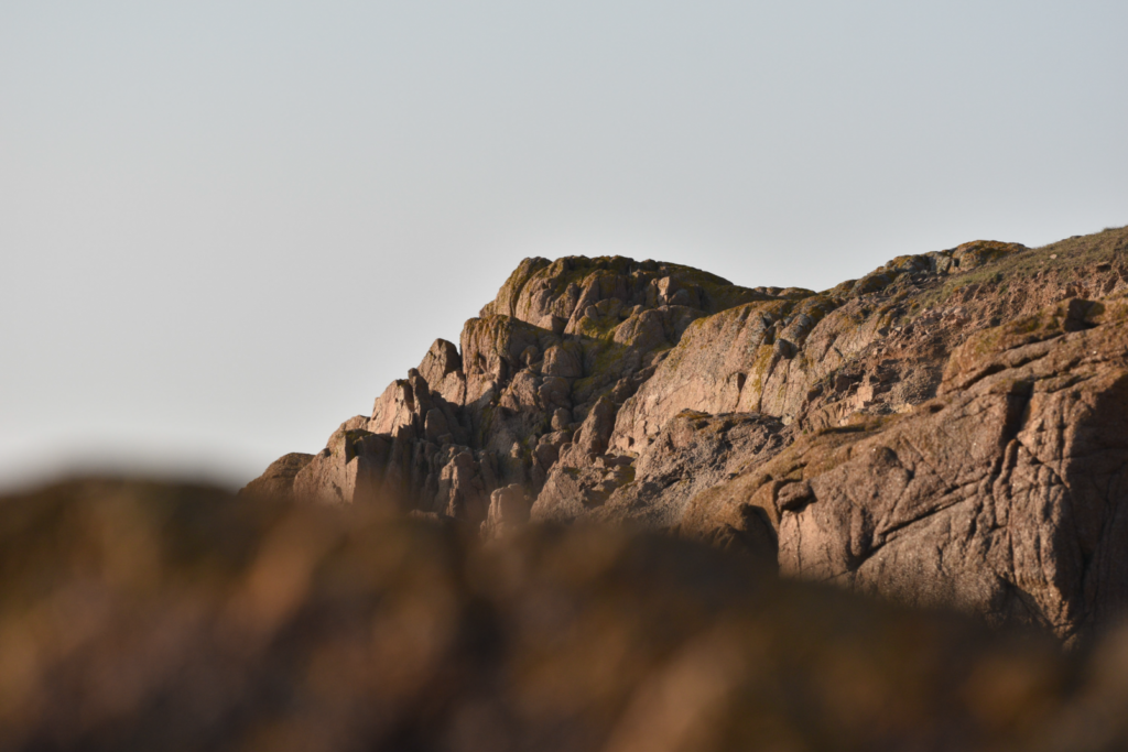
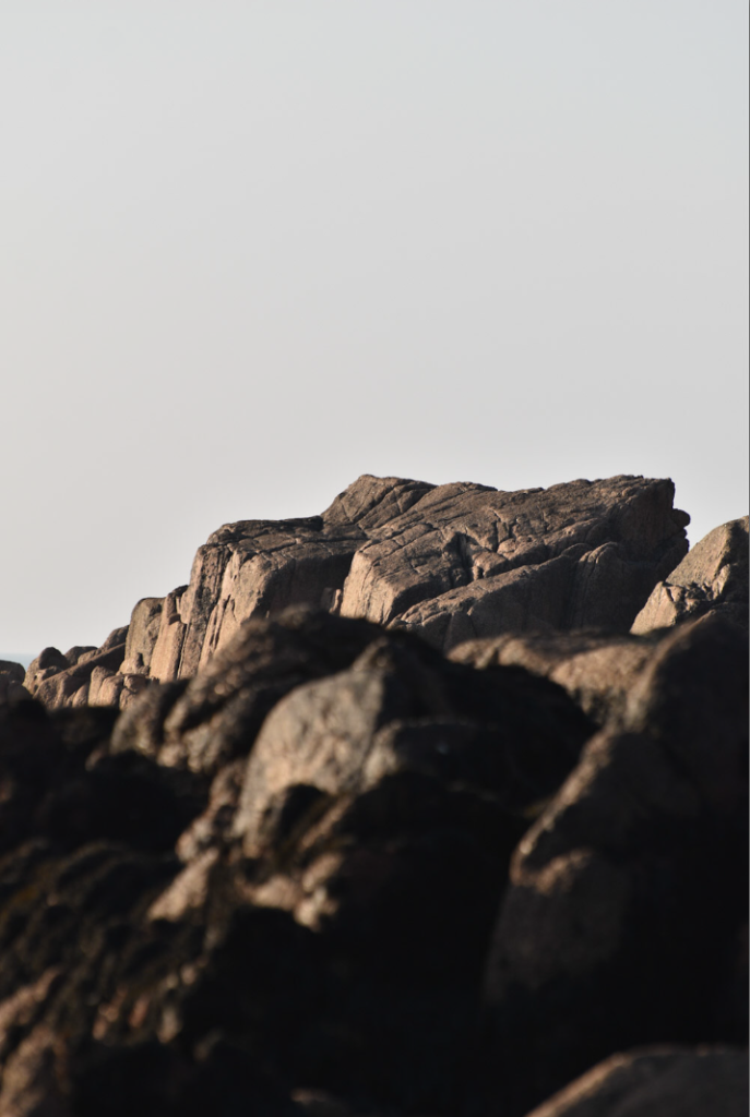
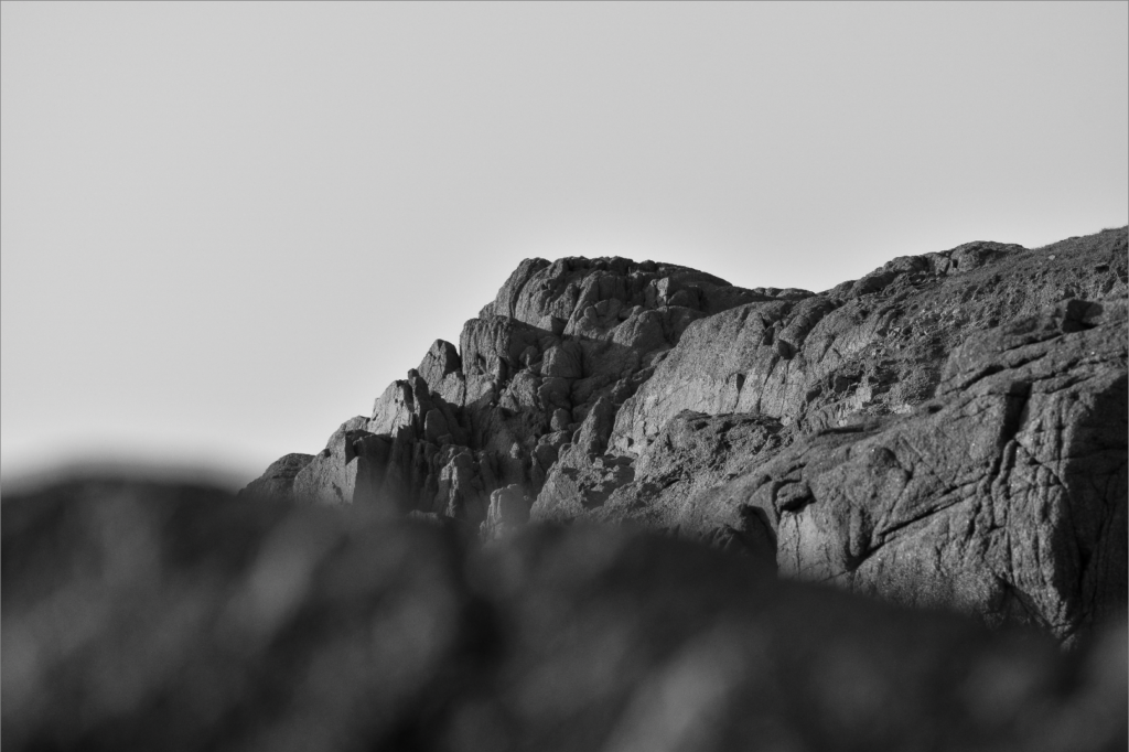
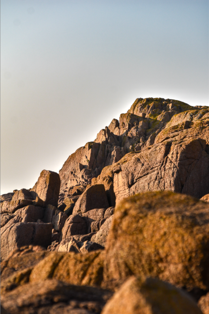
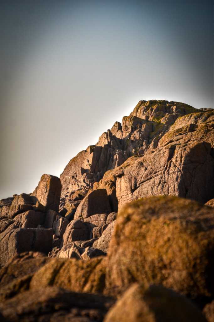
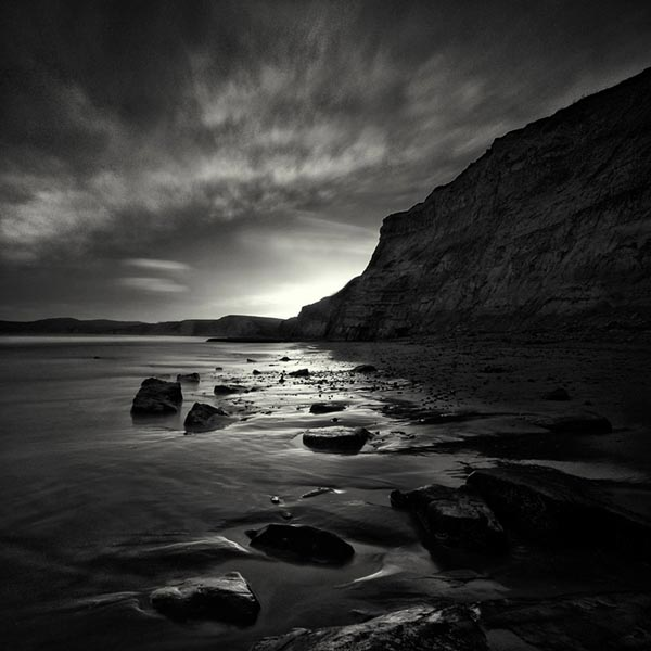
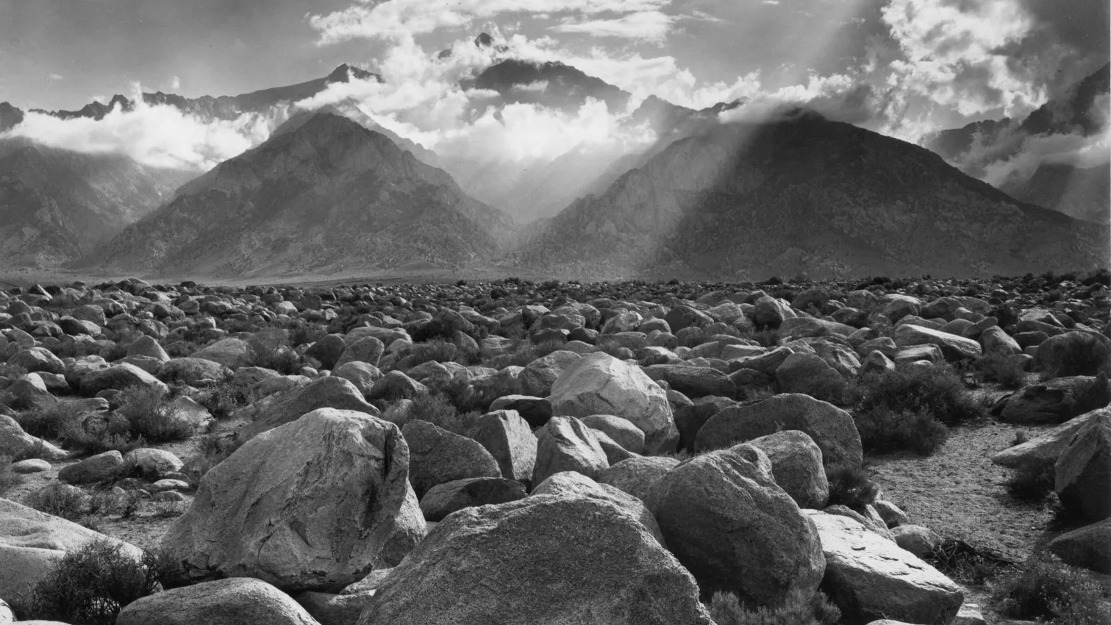
Photo #4

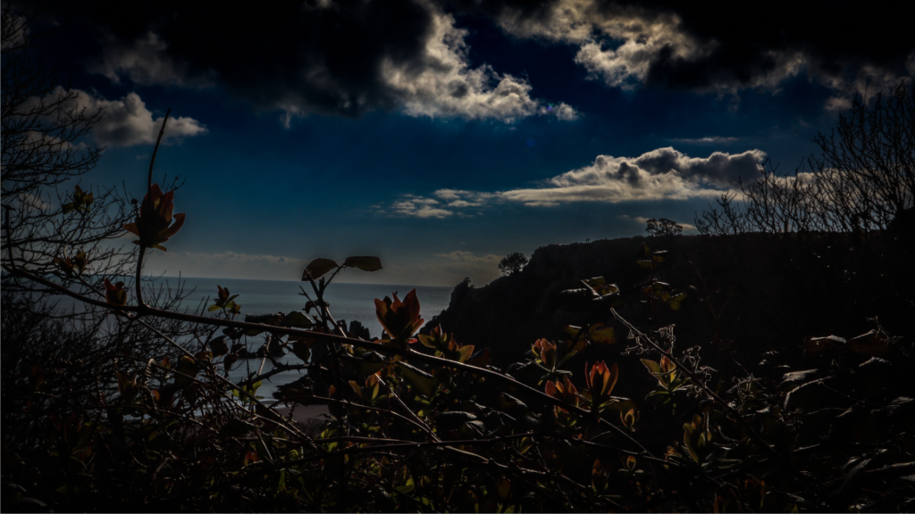
With this photo I also decided to set it in black and white as I believe that it looks more appealing and eye catching. I adjusted the black and whites by lowering the black levels significantly and turning up the white levels slightly. I also lowered the shadows to make those dark areas even darker and turned up the brightness to bring more light out around the illuminated rocks and the sky. This photo is one of my favourites as I believe that it utilises the zone system well and I also think that it looks the most dramatic which was my aim for these photos.
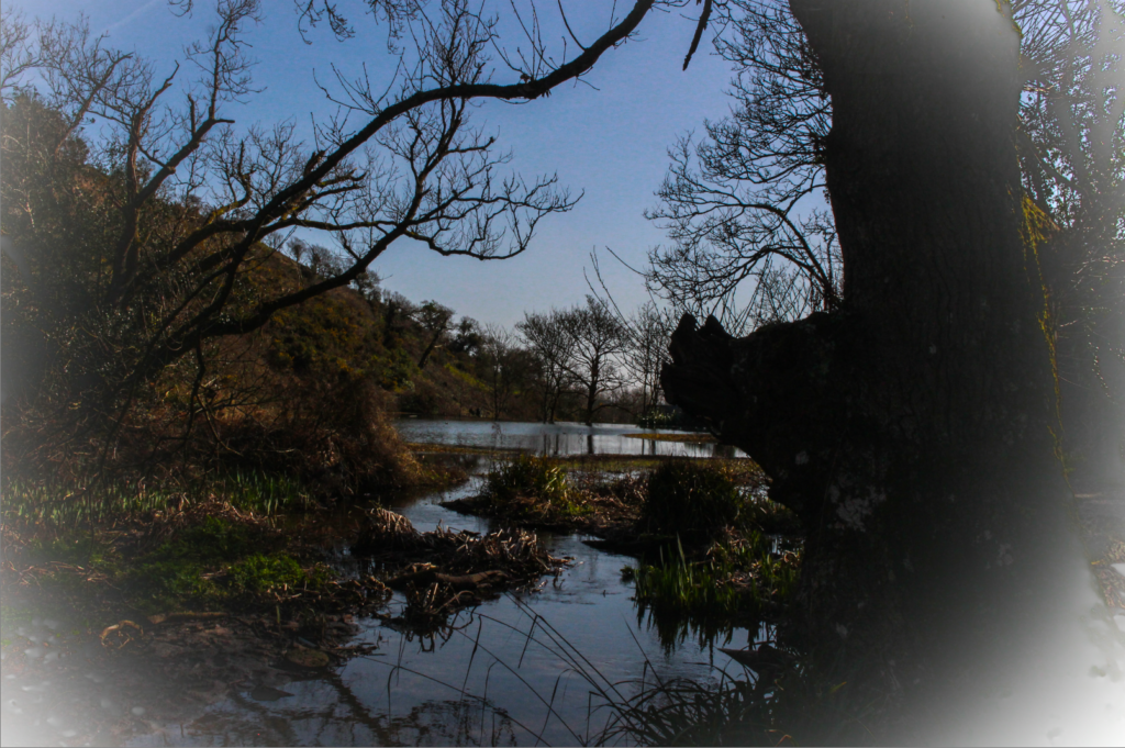
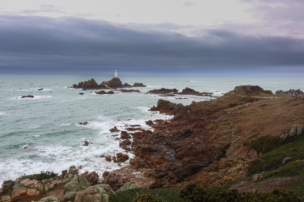
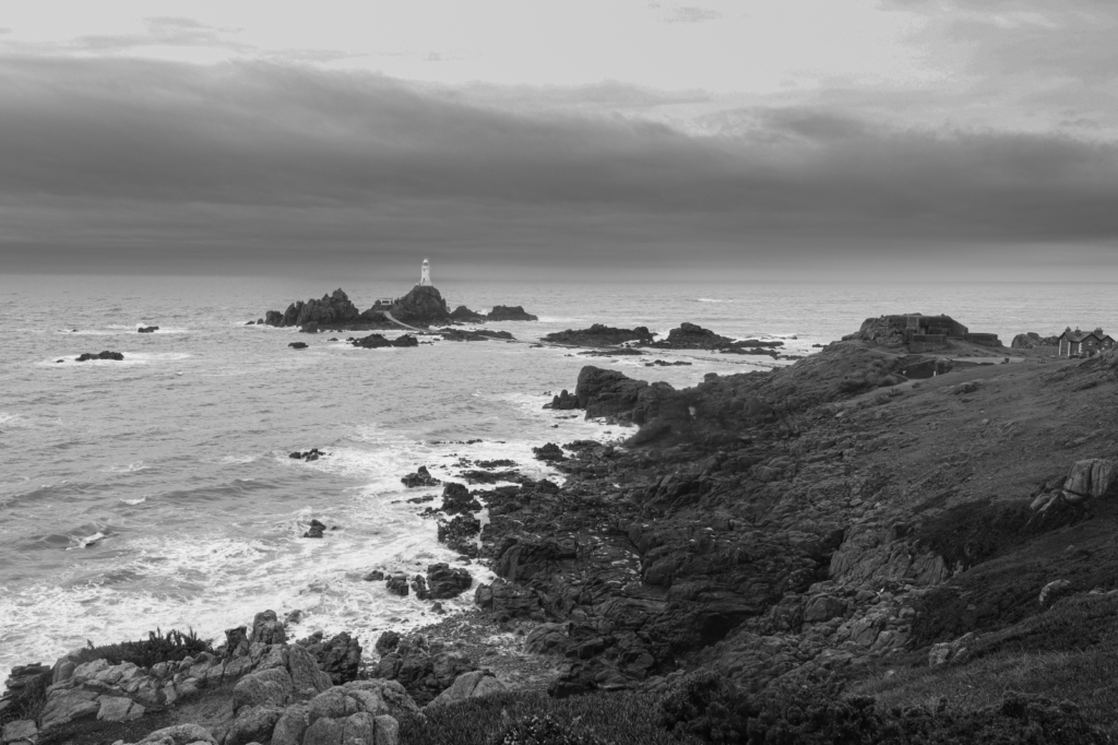
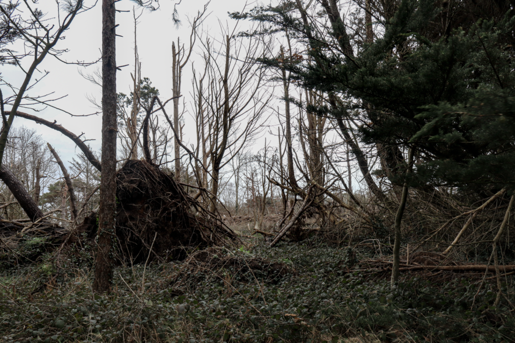
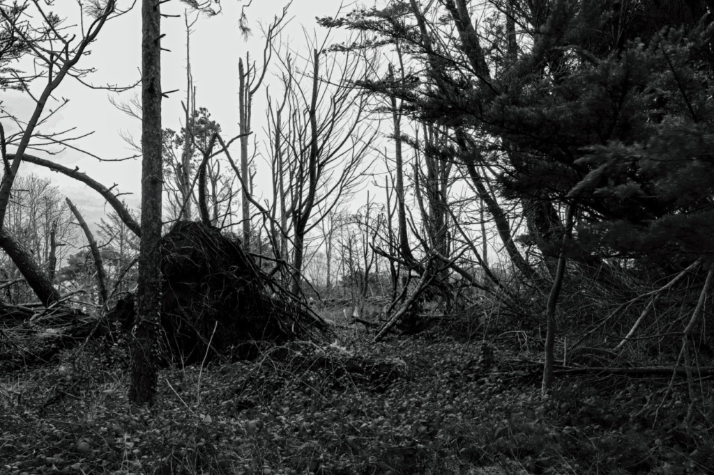
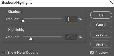
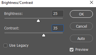
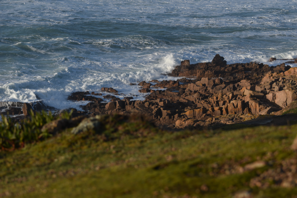
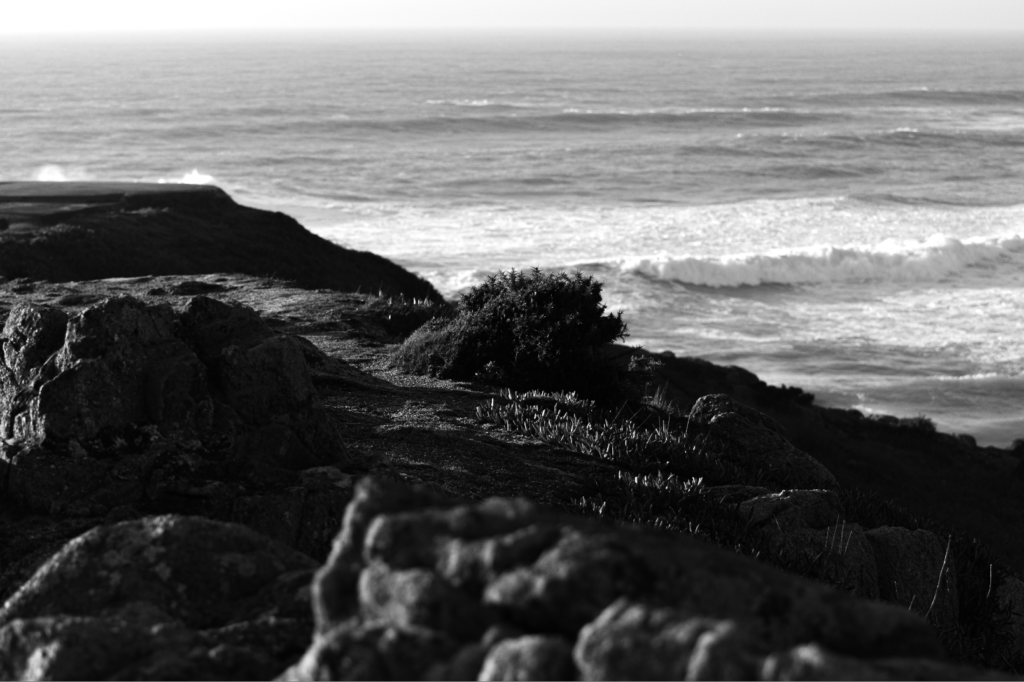
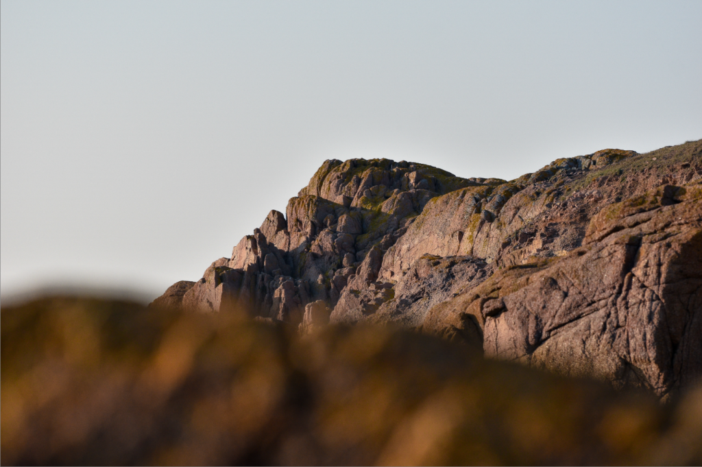
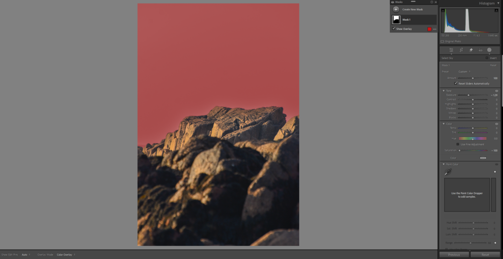
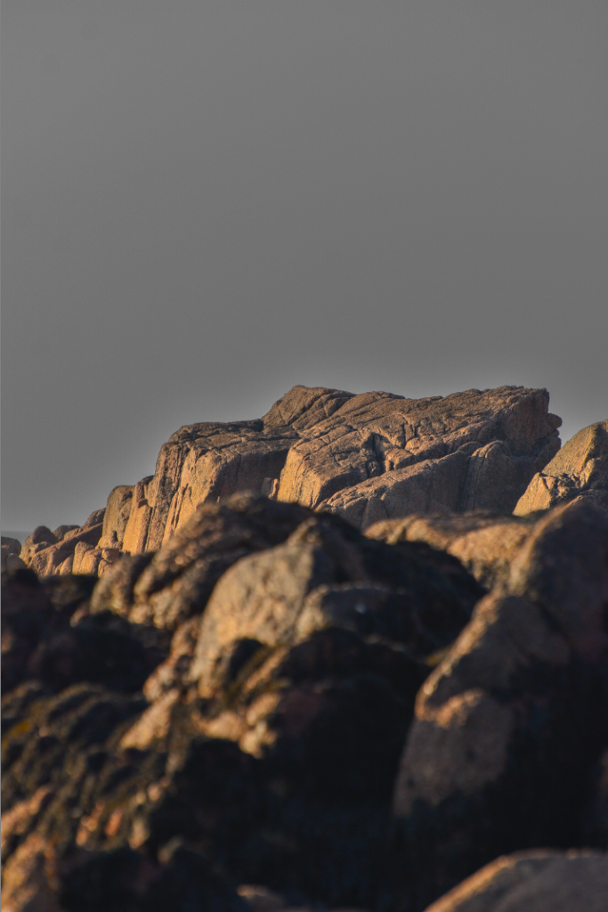
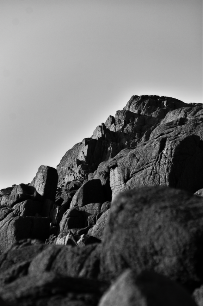
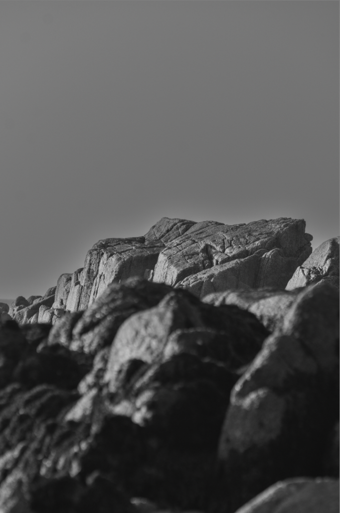
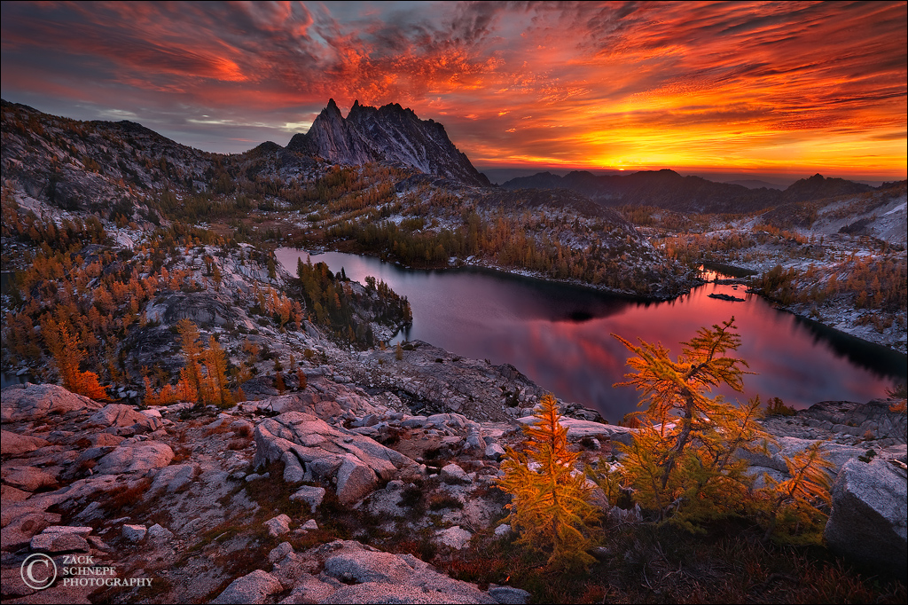
Photo #5

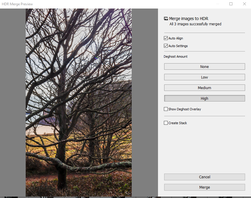
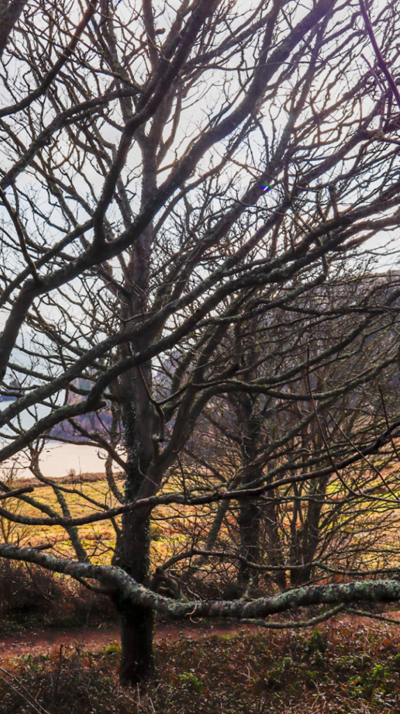
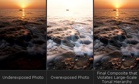
With this photo I decided to set it in black and white as I believe that it looks objectively better than in colour. I adjusted many sliders in this photo in order to achieve this final result, the photo to begin with was slightly over exposed and some bright areas ended up being too dark like around the cliff. To fix these issues I made the photo into a HDR image which brought some details out in the photo, fixed some of the areas that were supposed to be brighter and it fixed some of the overexposed areas. After fixing these issues I made it black and white and adjusted the black levels all the way down as well as decreasing the shadows slightly to make those dark areas darker, next I adjusted the brightness and contrast to brighten up the image overall to make it clearer to see and adjusted the contrast up to ensure that the shadows were truly dark. Its important that the darker areas of the photos are really black to utilise the zone system but to also achieve that dramatic effect in my images.
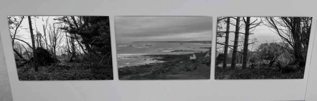
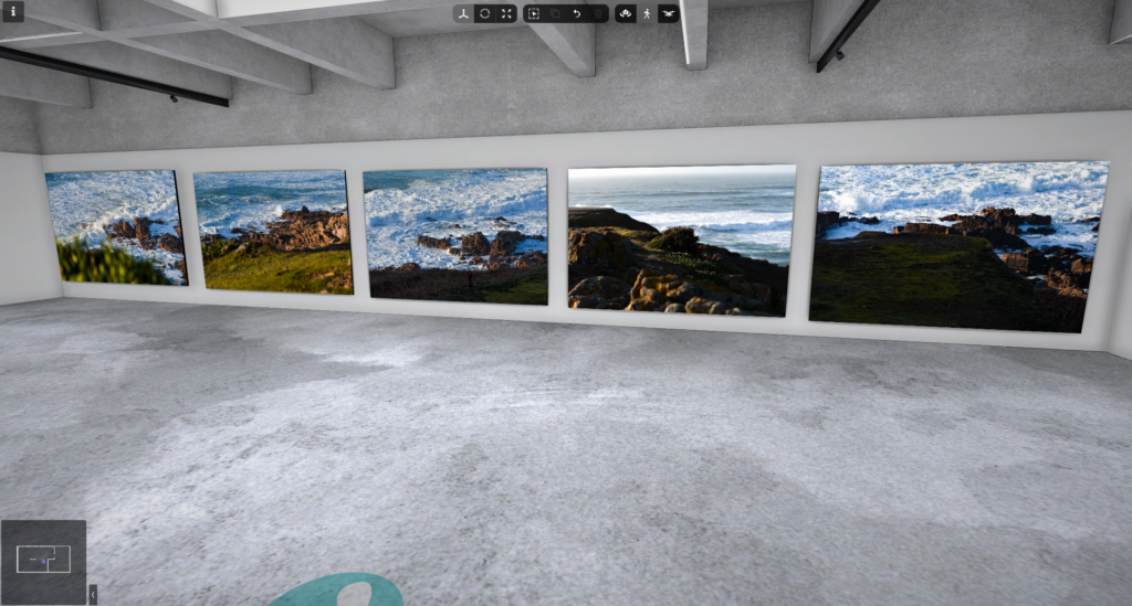
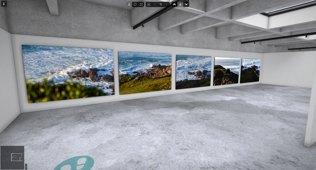
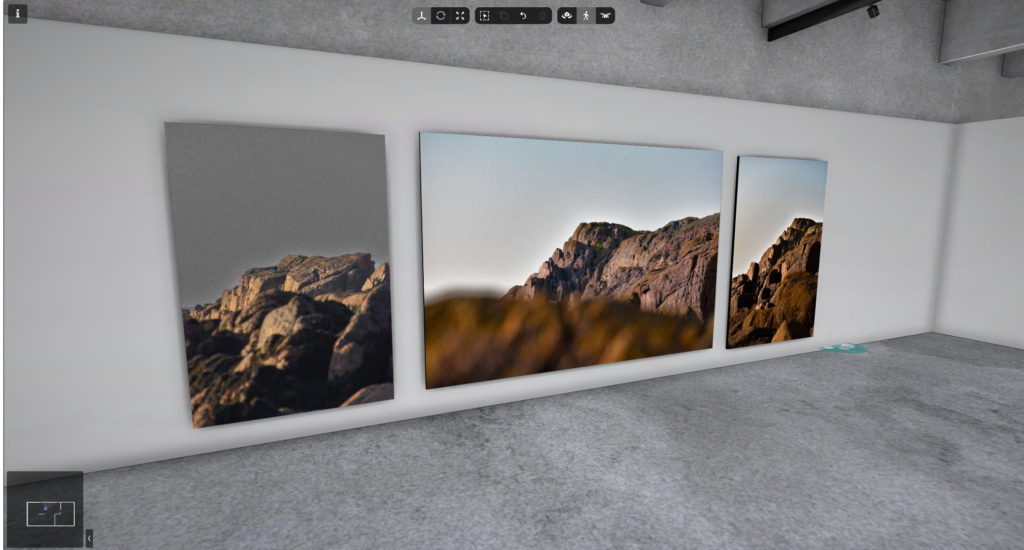
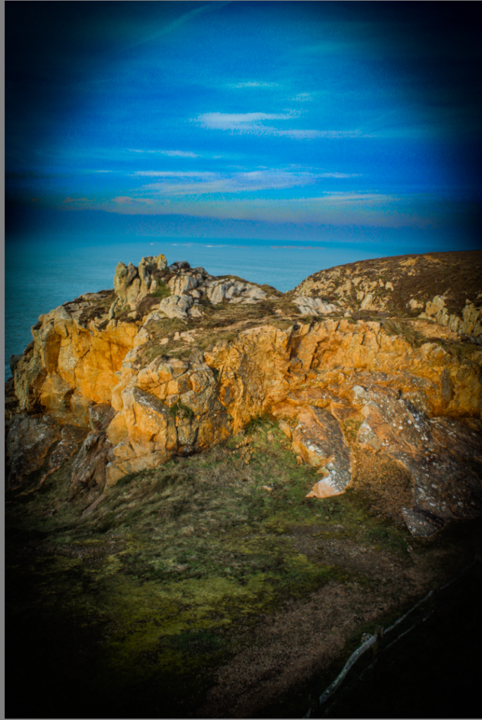
Final Images


Overall I think that my final images have turned out to look really good and presentable. The images in colour capture the landscape really well with the detail of the ground and the natural sunlight being shown clearly and the vibrant colours in the grass and the sea have been displayed beautifully. The images in black and white contains amazing characteristics with most of them utilising a dramatic black and white colour scheme to match Ansel Adams style but also utilising the zone system well with having the bright areas of the photo being really white and the darker areas like the shadows being really black making the images more effective and inviting to look at. The landscapes in the photo were perfect for this project as its similar in a sense to the type of images Ansel Adams took but it also allowed me to edit them and utilise methods like the zone system and HDR which really improved the quality and maximised the potential of these images.


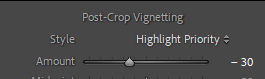


![Exposure Bracketing Photography [COMPLETE GUIDE]](https://phlearn.com/wp-content/uploads/2018/11/2-stop.jpg)