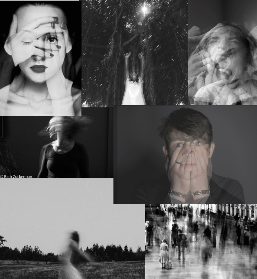
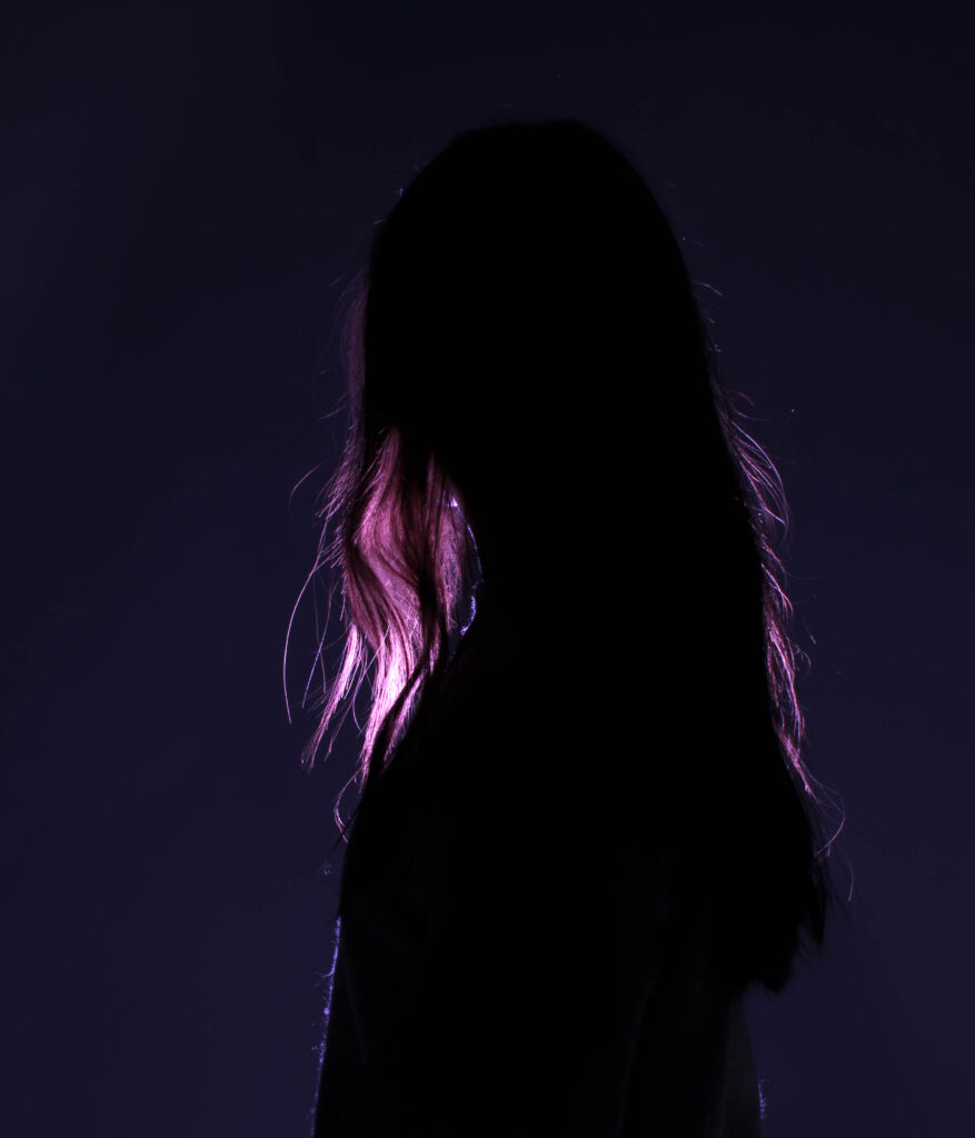
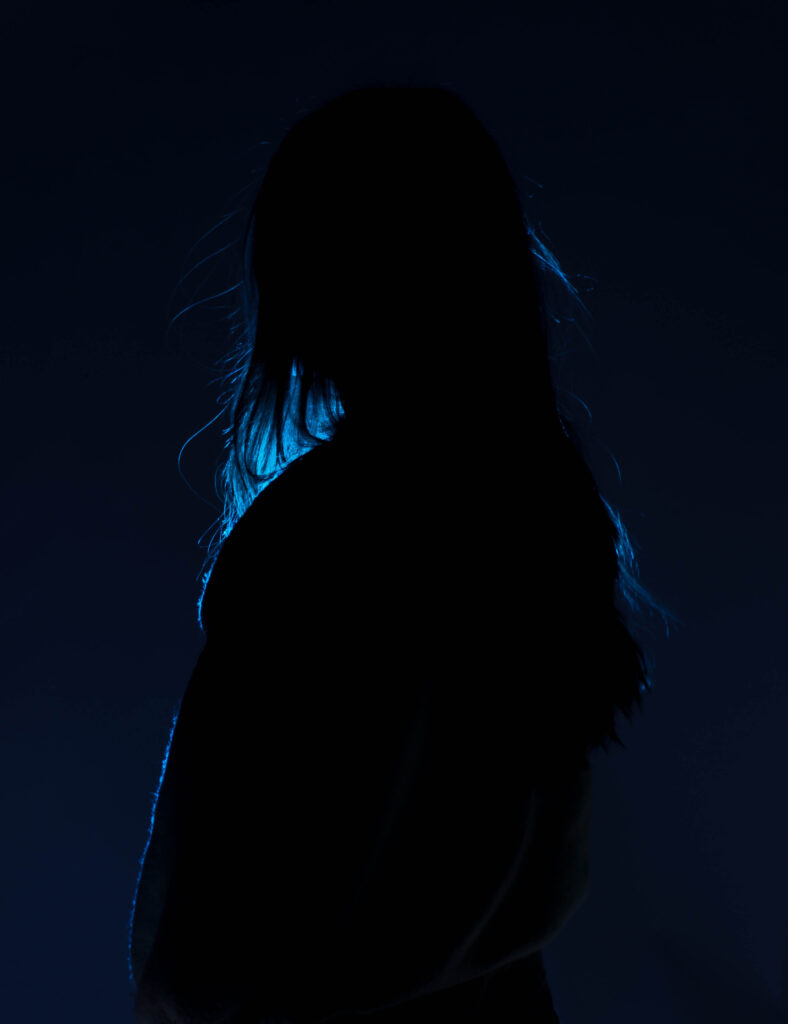
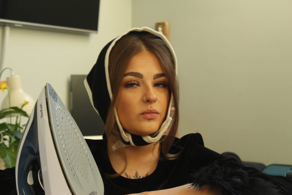
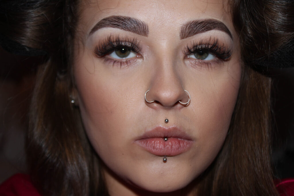
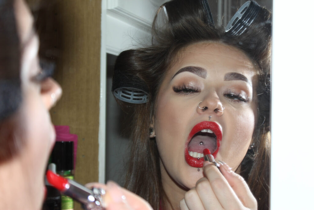
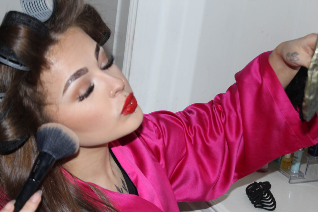
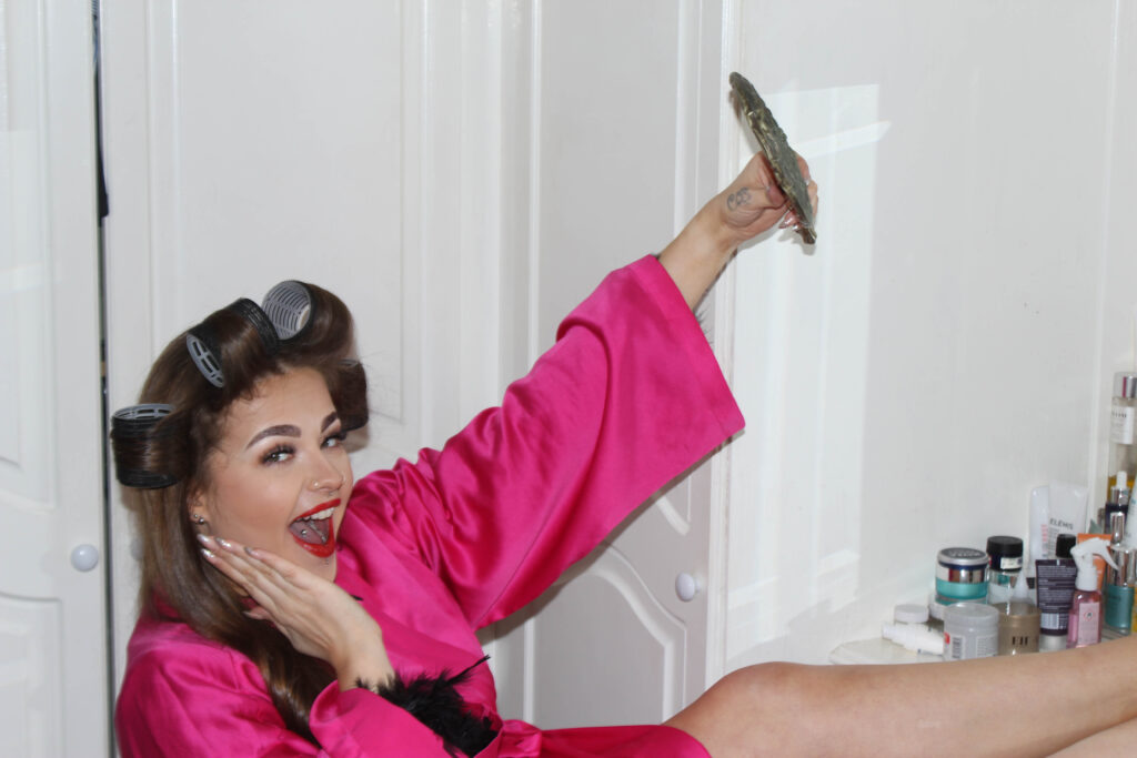
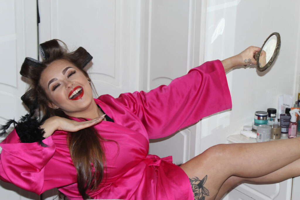
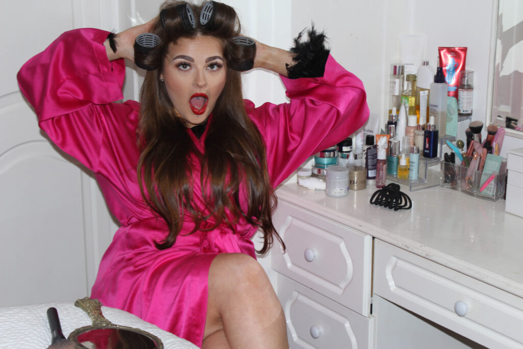
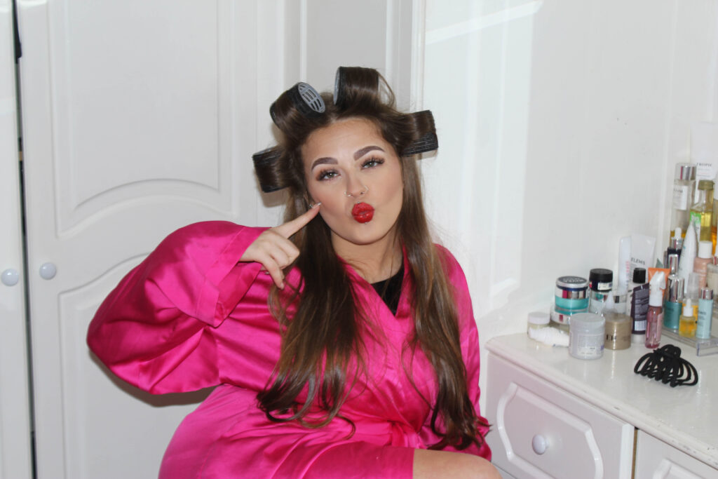
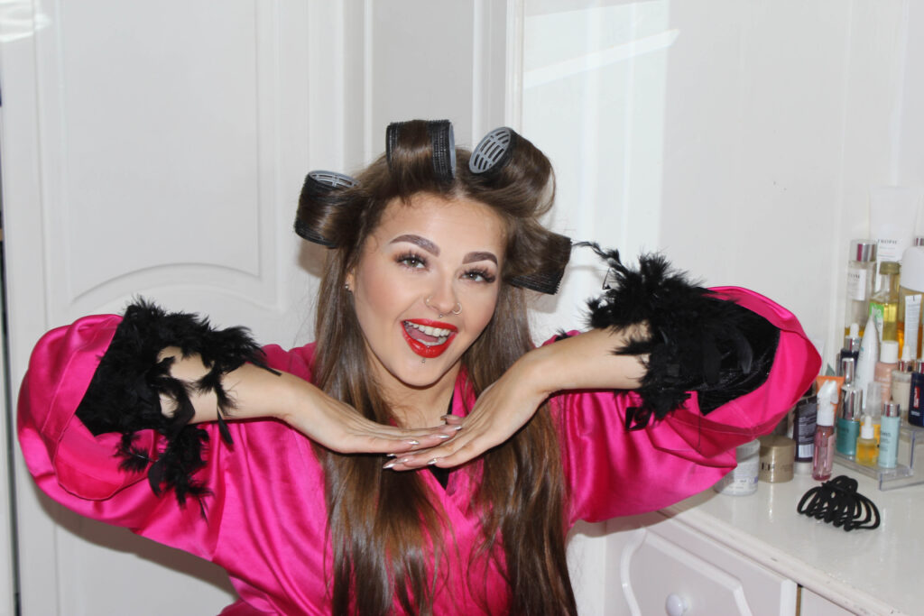
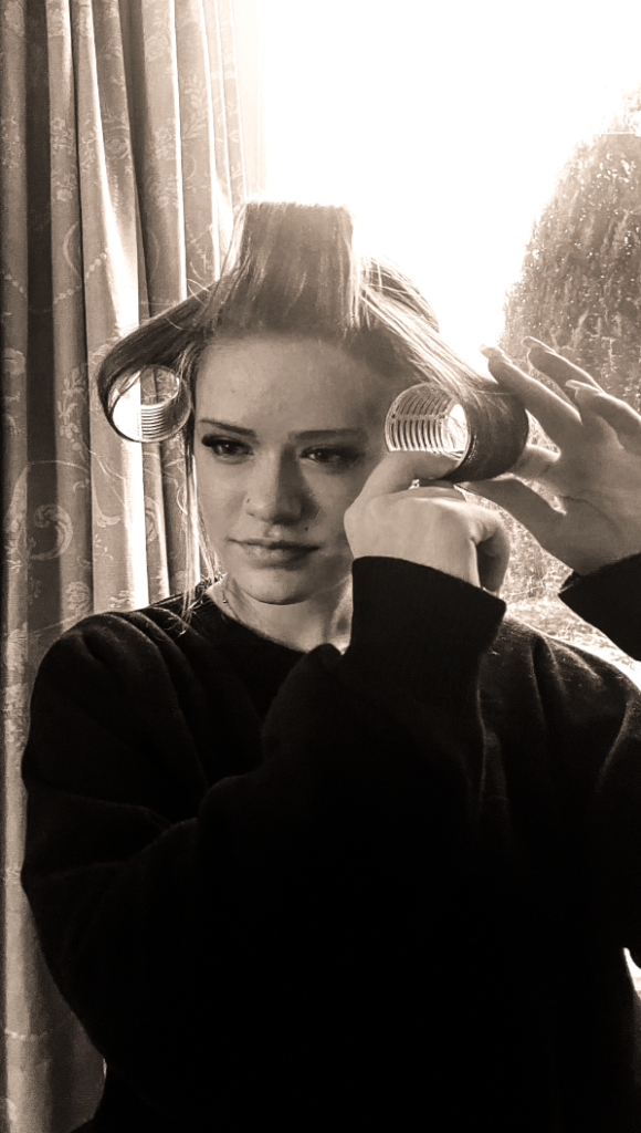
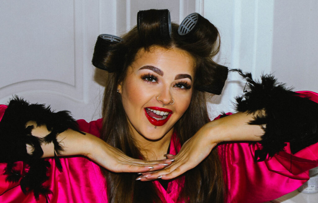
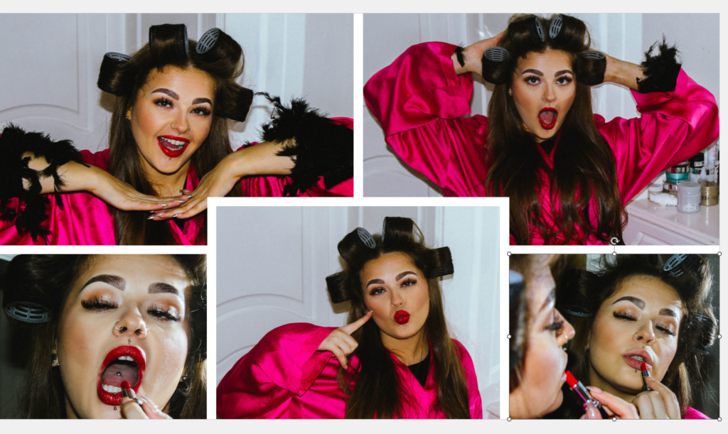
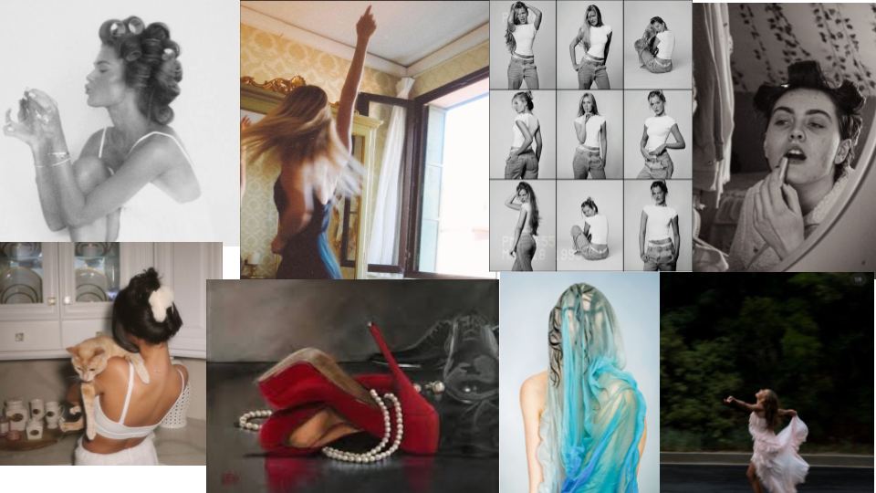
This is my mood board for identity. ive chosen many photos with slow shutter speed to make some creative and intresting photos. my artist reference which relates to what my identity prodject is going to follow is Francesca woodman. her photos are imaginitve and create ghostly ideas.
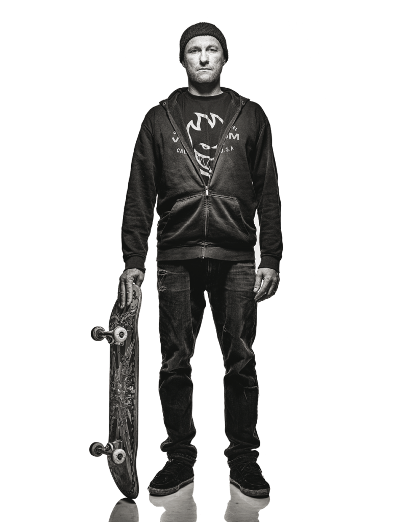
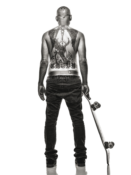
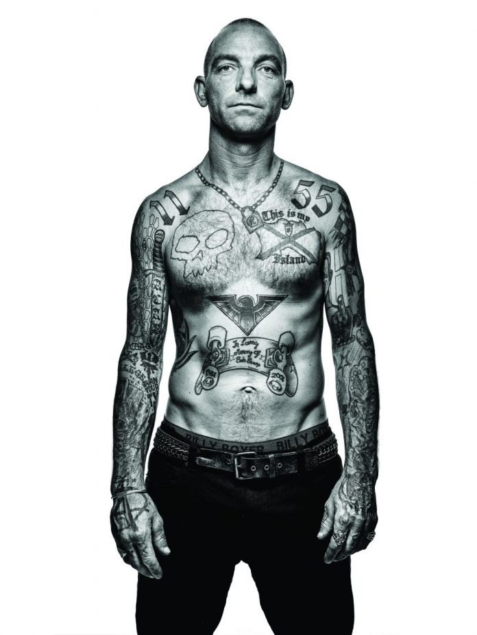
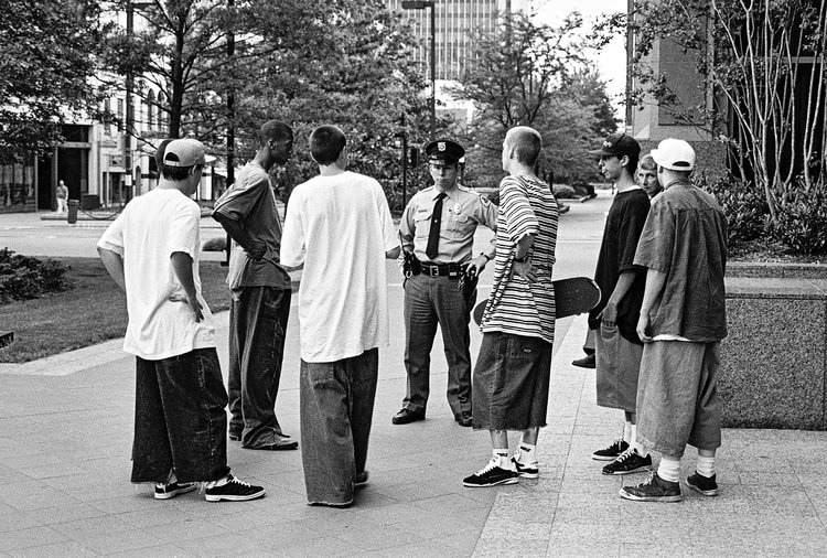
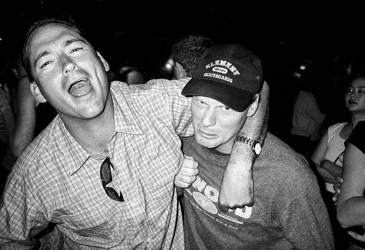
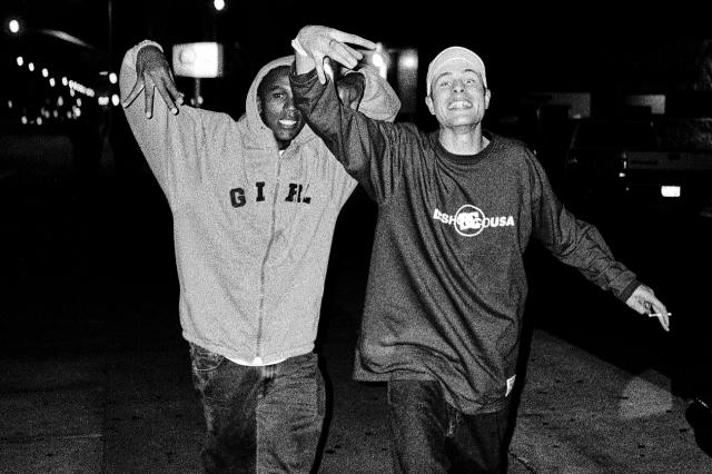
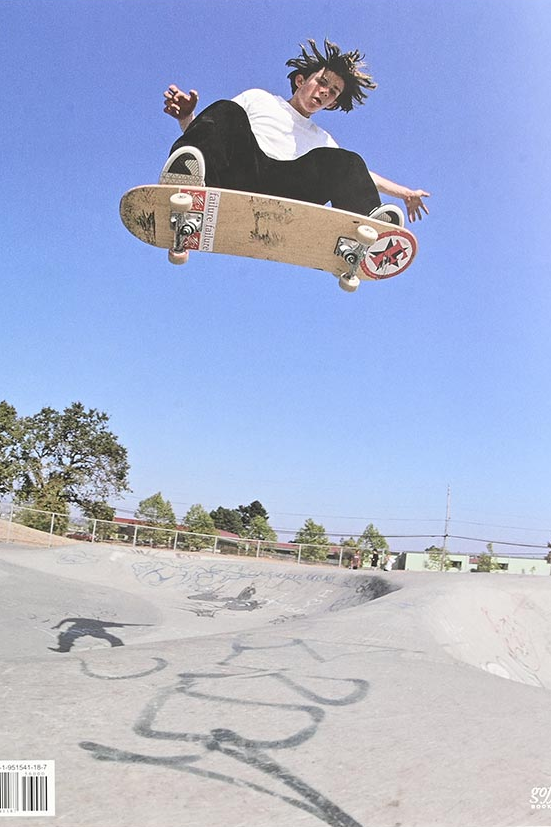
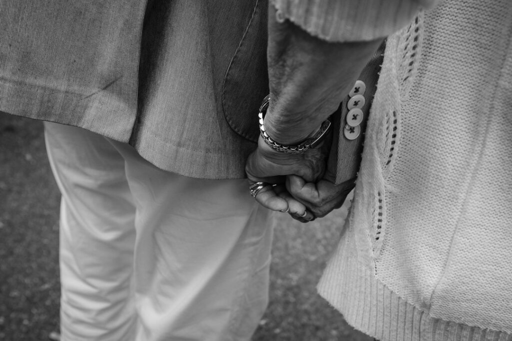
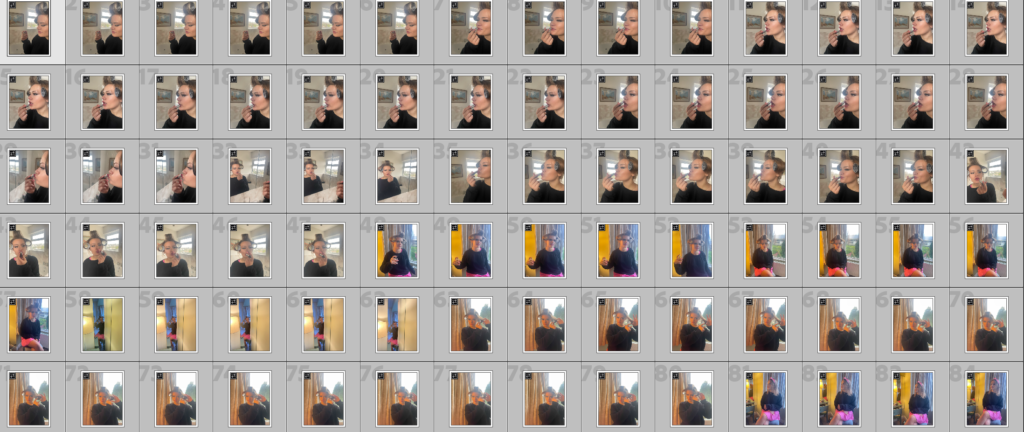
Danny Evans is a jersey photographer who did a project on the skateboarders from the island. Capturing the grit, scars and tattoos. This has inspired to me to my own project on the skateboarders in jersey.
Danny Evans is a freelance photographer with over 18 years of experience. He focuses on commercial photography, especially advertising and fashion. His work has been featured in magazines and on billboards in places like Singapore, Australia, Europe, and the UK. Danny is based in Jersey, where he runs his own studio. His unique lighting and set designs make him stand out, and he’s also known for working on fashion shoots for Gallery Magazine in Jersey. In 2023, Danny created an exhibition called “FLUX” at ArtHouse Jersey. This project combined photography, film, and tech to show off sustainable fashion designs from local and international creators. It was all about mixing art and technology to explore modern fashion. Danny started out using old-school film cameras like the Nikon FM but has moved on to advanced digital equipment, including the high-tech Phase One camera system. He’s always upgrading his gear to make sure his work is top-notch. Overall, Danny is passionate about turning everyday settings into amazing photos and is super dedicated to his craft. This has made him popular with both local businesses and big brands.
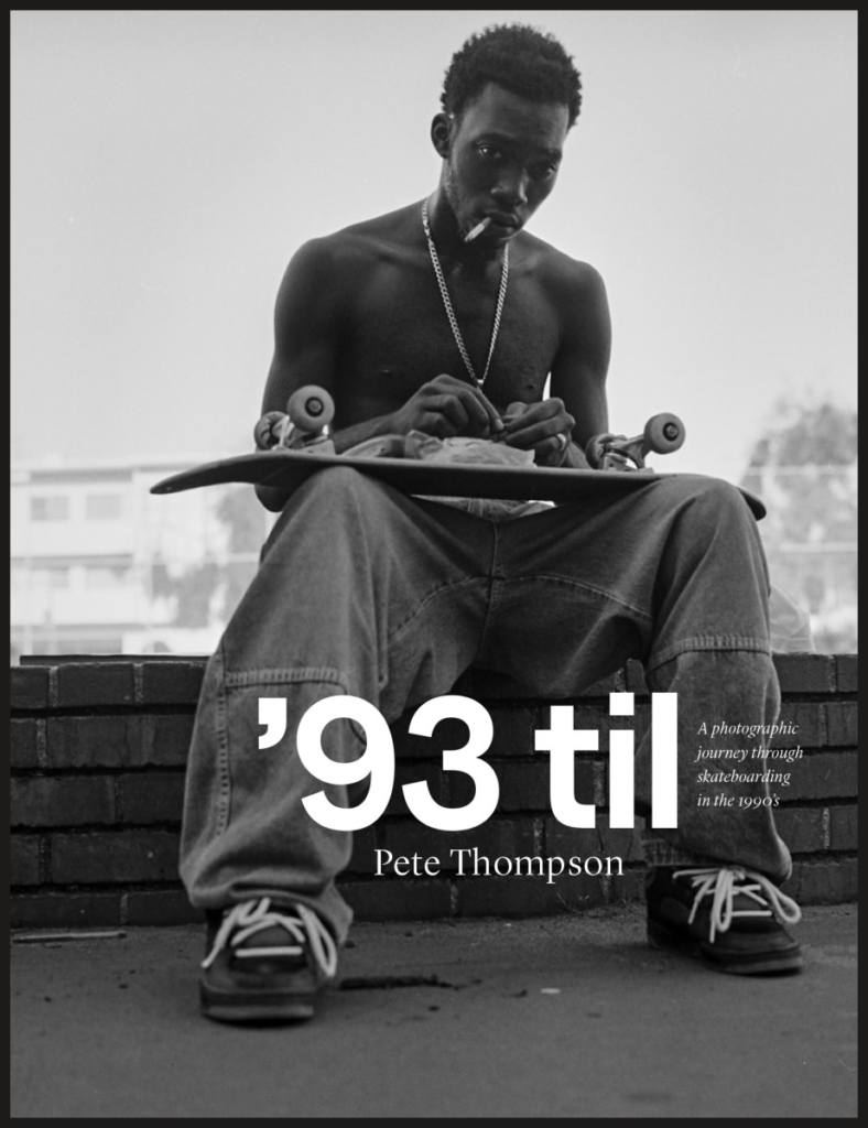
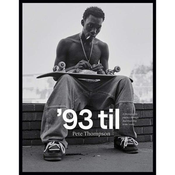
Pete Thompson
Pete Thompson was a skateboard photographer for 13 years in the 90s – capturing the boom of a huge movement without realising. He worked for different magazines like Transworld Skateboarding and SLAP. He even got the role of Senior Photographer at one of these roles. His photography career began with a Konica Pop point-and-shoot 35mm in the 80s – taking photos of his friends at the skatepark.
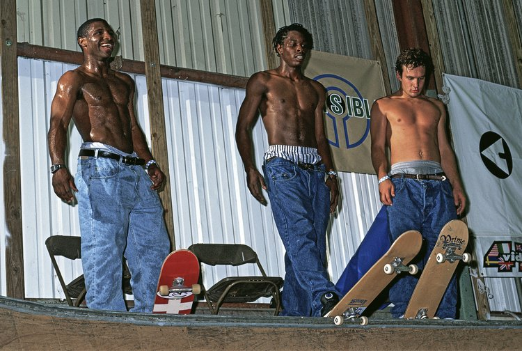
He has compiled the entire experience of skateboarding in the 1990s into one nostalgic book called ‘93 til. (I own this book and this was how I was introduced to this photographer). A lot of the philosophy of skateboarding is the desire to capture and document the life – and this is true for photography as well. Pete Thompson was clearly motivated by this desire. His photos are full of friends and good times – just hanging out and skateboarding for the fun of it. He worked with pro skateboarders like Tom Penny, Nyjah Huston, and Tony Hawk – and many others. He travelled the USA and Europe with these pro skateboarders documenting their journey along the way. In an interview with him, he speaks about how they would use the main bulk of the film roll for taking skate photos, and then there would often be a few shots left at the end – he says after a while he felt guilty for wasting these, and begun to take random shots of his friends with the last few on the roll – and these turned out to be some of his favorite photos – I like this.
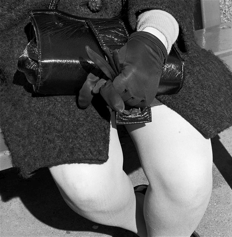
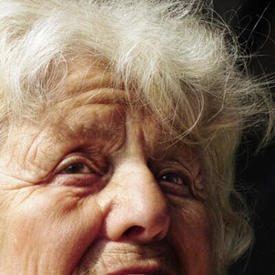
Photo Analysis.
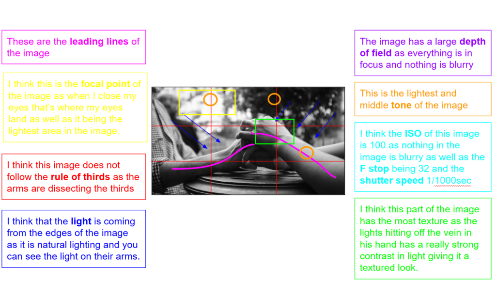
This is a film photograph of a skateboarding doing an ollie at a skatepark. The genre of this style of photography is portrait/action/identity. The mise-en-scene presents a lot of empty sky – taken up only by a skateboarder doing a large air. The floor takes up probably half the image and has curved concrete which creates an interesting shape to look at. This all creates a simple composition, with the image split into the thirds.
The colour is desaturated, although the sky is vibrant. The musty, dry looking air makes it feel like midsummer, and you can tell its hot, and dry. For example, if you look at the trees they aren’t a bright green but more of a hazy washed out green. The use of light has an old school feel – being a bit washed out. It is clearly taken in the height of summer’s heat – the photo almost has a heat effect. The whole image is very bright and slightly overexposed which creates a vintage, washed out feel.
The focus distance is infinite – the whole image is in focus and there seems to be an extremely wide depth of field. I believe that the photographer has used the rule of thirds – the image is split into three sections vertically – the floor, the sky and the skater – pretty much exactly follow the rule of thirds. I believe that the ISO is 400 – due to the amount of grain, and I believe that the shutter speed is quite high – a minimum of 1/250 because that is how high it needs to be for an action shot to not be blurry. The shot probably has an aperture of probably f/5.6 because of the wide depth of field, and the high amount of light that the other two settings let in.
As Pete Thompson says “Driven by my curiosity of photography. I always just wanted to be shooting something;” I think this is great way to describe a lot of the culture of photography and especially skateboarding. His work has a lot of black and white (not this image) – this is representative of the era he spent most of his career skateboarding – I think he has chosen to make his whole “‘93 til” book black and white because it helps non-skateboarders to understand the cultural significance of the image – a lot of these moments were future defining for the sport and even sport photography in general, without the black and white, it does not convey as well that these are vintage images of a different time – and people may not realise the impact they had. I think this says a lot about the use of colour and tone in photography in general – you have to consider what you want your image to convey and how you’re going to do that. I really admire this work, not only because I am a skateboarder, but also because I can see the thought – and often the lack of thought – he put in while taking the photo and editing it.
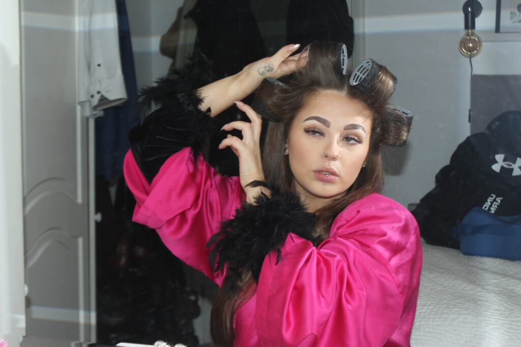
PHOTOSHOOT PLAN
My plan is to go down to the skatepark and just talk to the skaters and take natural photos to truly convey identity. I will use a 50mm Canon lens. I love taking photos that tell a story and show life. I think to do this I should also take photos of small details of the people and also things like the scenery and architecture of the skatepark. I think I will go at night and use my flash and a high shutter speed to create a freeze frame effect. I think my photos will end up being more similar to Pete Thompsons’ than Danny Evans’.
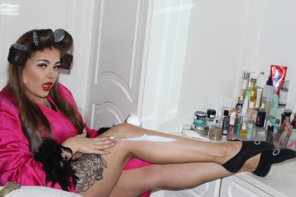
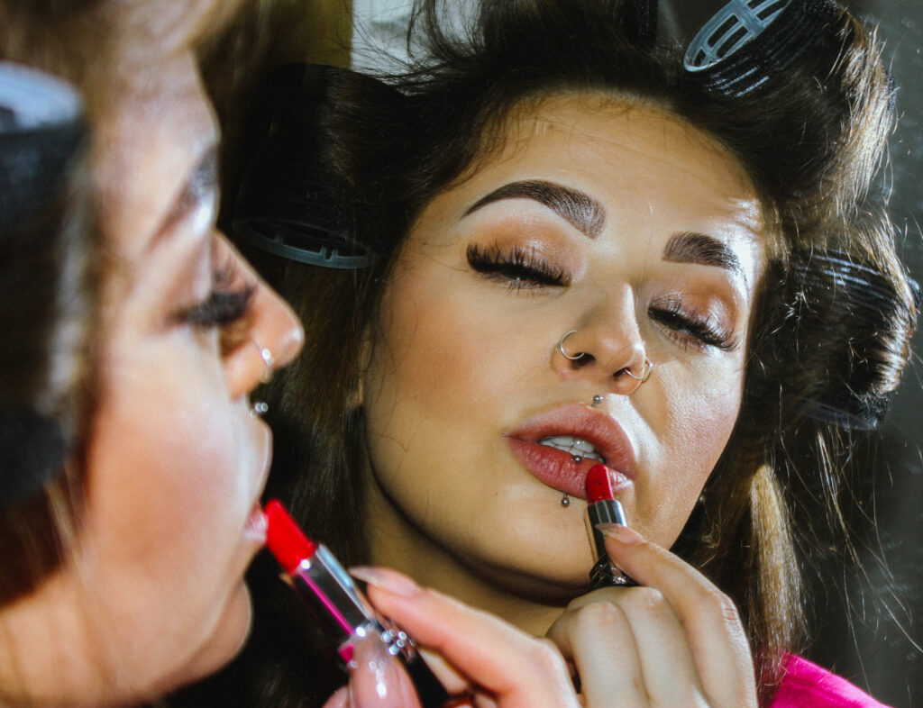
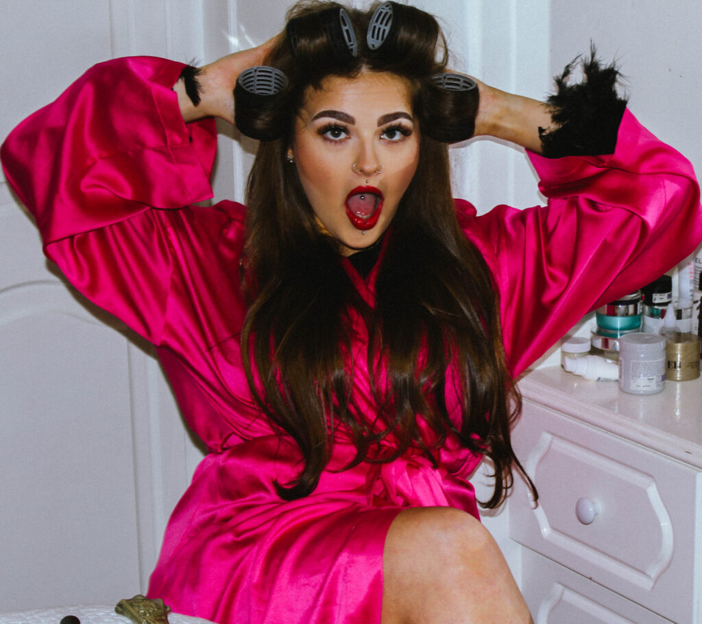
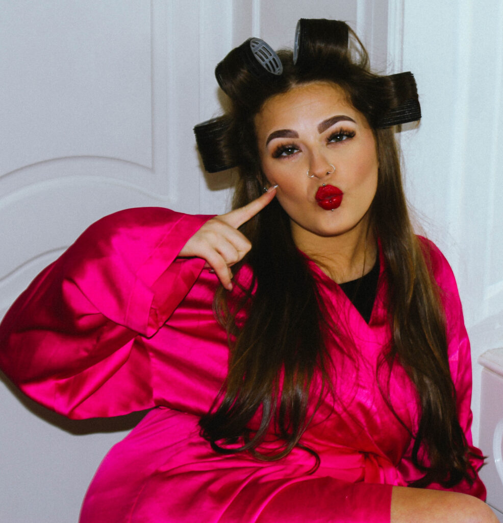
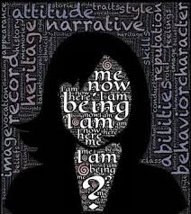
Identity is who you are. It can be beliefs, personality traits, appearance, expression, it is what characterizes a person. It can also be your surroundings, your environment can develop and influence your identity.
image from google
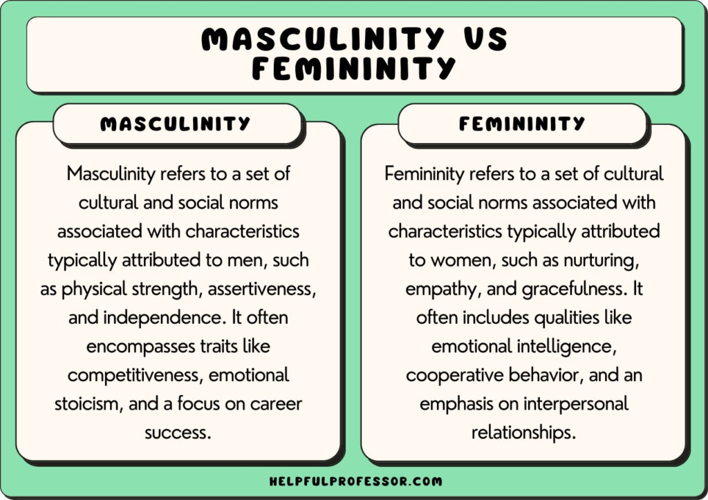
What it femininity ?
Qualities or attributes regarded as characteristic of women or girls – Oxford Dictionary
Femininity is socially seen as traits such as nurturing, sensitivity, sweetness, gentleness, warmth, modesty, empathy, affection, tenderness, and being emotional, kind, helpful, devoted, and understanding have been cited as stereotypically feminine. Sometimes femininity can be linked to sexual objectification and sexual passiveness.
What is masculinity ?
qualities or attributes regarded as characteristic of men or boys – Oxford Dictionary
Masculinity is socially and traditionally seen as traits such as: strength, courage, independence, leadership, dominance and assertiveness. And is usually shown as a contrast and opposite to femininity. Traditionally masculinity can also be seen as being the ‘breadwinner’ of the household or house. However the standards of masculinity vary between different cultures and historical periods.
image from google
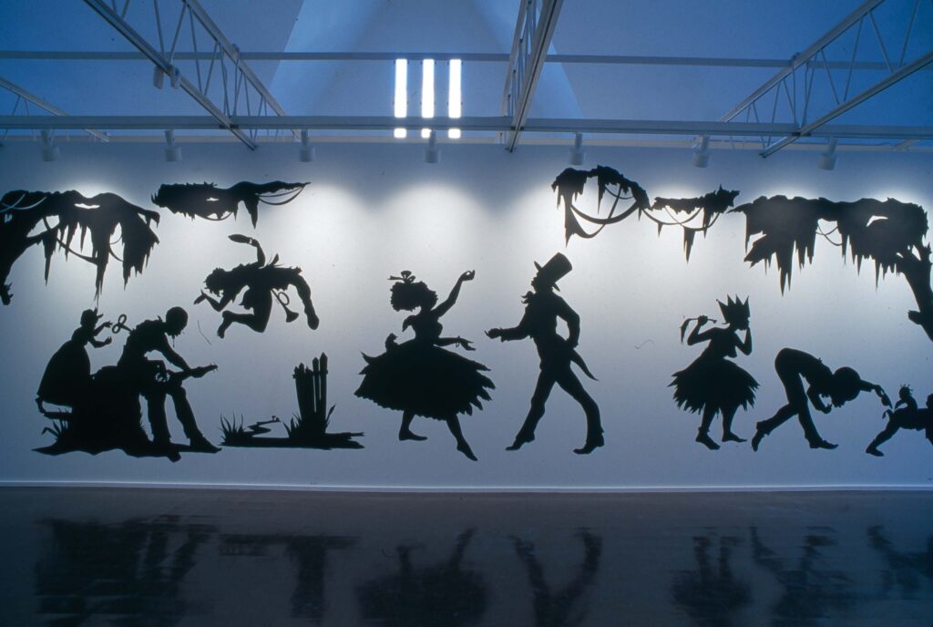
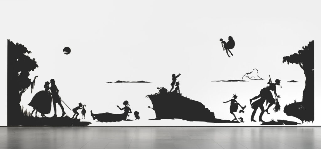
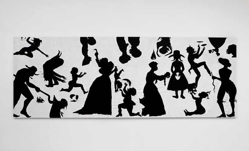
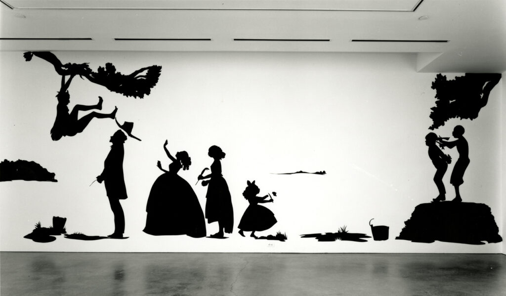
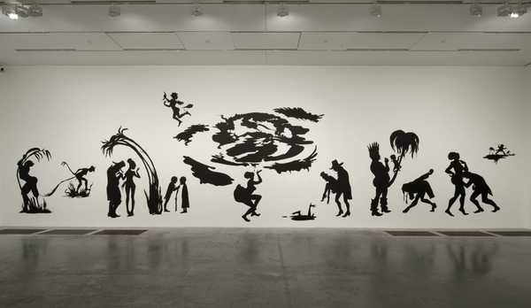
Kara Walker
images by Kara Walker
Kara Elizabeth Walker is an American Contemporary artist. Born on November 26th 1969. The main themes are work explores is race, gender, sexuality and identity. Walker is best known for her room-size tableaux of black cut-paper silhouettes that often address the history of American slavery and racism.
The mural that really brought Walker to the art worlds attention was called “Gone, An Historical Romance of a Civil War as It Occurred Between the Dusky Thighs of One Young Negress and Her Heart” In 1944.
During her early career Walker lived in Rhode Island but later moved to Forte Green, Brooklyn where Walker became a professor of visual arts at Colombia University. As well as Walker is one of the youngest recipients of the MacAurthur fellowship at only 28 years old when she received this honour.
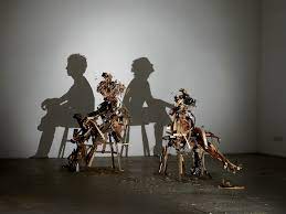
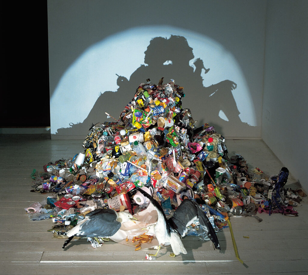
Tim & Sue Noble
images by Tim and Sue noble
Tim and Sue noble are British artists that work and collaborate as a duo.
The work that I am looking at mainly is their shadow work, which is where they use household rubbish to create silhouettes.
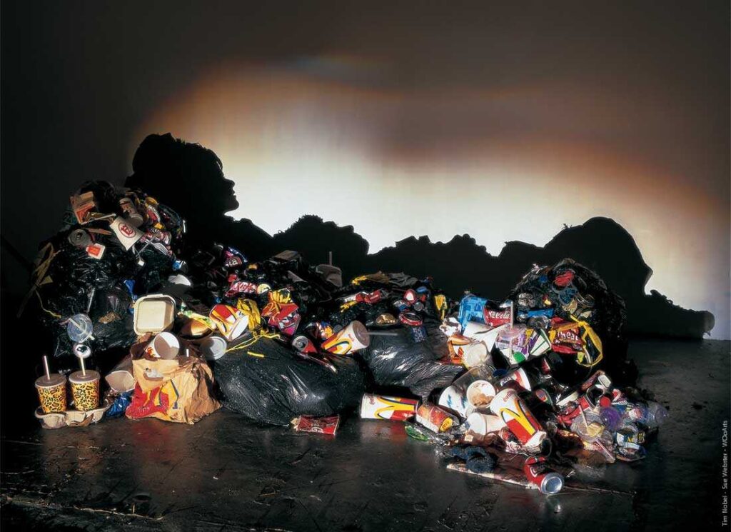
Tim Noble and Sue Webster’s work can be divided into the ‘Light Works’ and the ‘Shadow Works’, And Susan states: “We kept them both going side by side. There are two sides to the work; the shiny side and the dark side. That kind of reflects the two personalities within us. which I think that is very powerful as it links to good and evil and which could even be religion.
Photoshoot plan
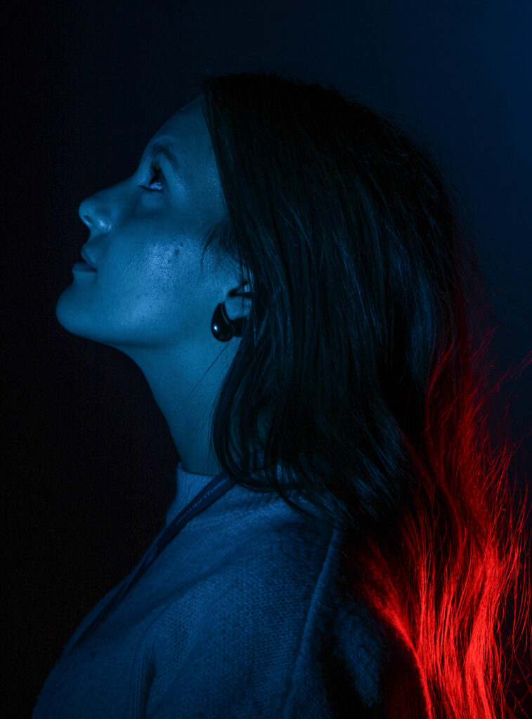
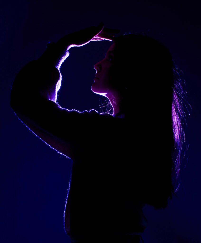
For this photoshoot I took the idea of silhouettes from the artist references above and decided to put my own sort of spin on it, I really enjoyed using the coloured gels so I knew that I wanted to do something using them. And I decided to go for ore of the femininity route for this particular photoshoot. I liked the idea of kind of having the light shine through the hair of the model.
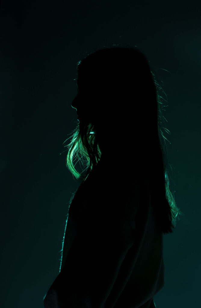
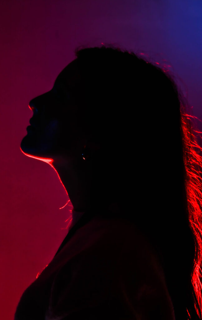
my photos – silhouettes
Edited images
this is my favourite image of the shoot. Because I really like the hand placement, it makes me think of femininity and I feel as if it kind of links to dance and maybe more specifically ballet which is a traditionally a feminine area. As well as the face the coloured gel lighting is very nicely outlining her arm, chin and I like the way that there is still some of the light shining through the hair.
Here is how I have edited this image:
Valerie Jardin
images by Valerie Jardin
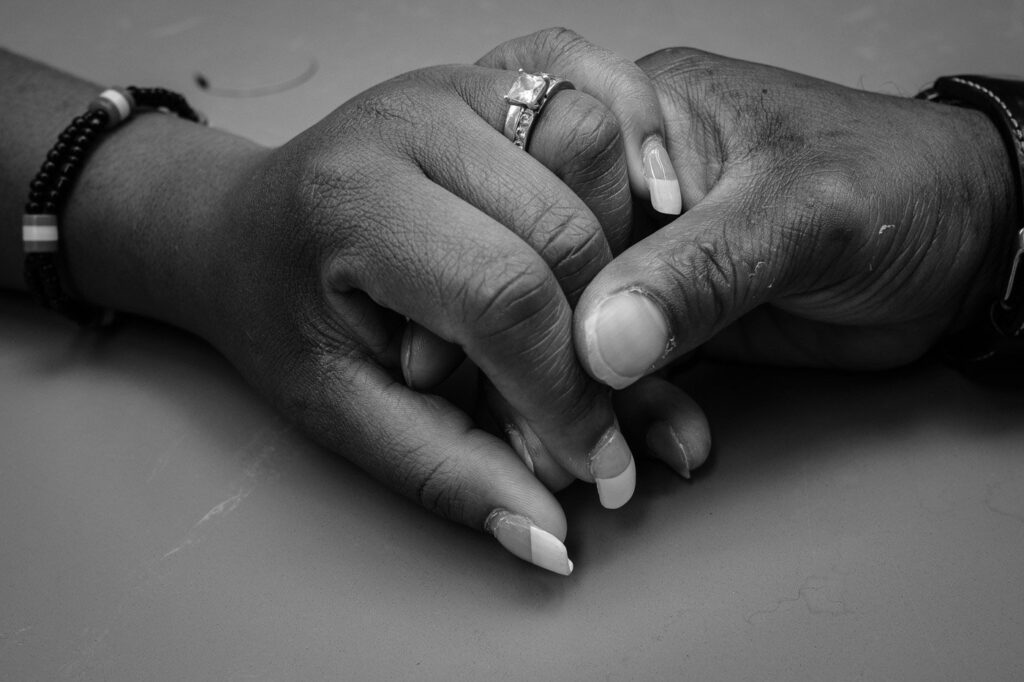
Valerie Jardin is a French photographer whose photography gained a lot of followers due to its strong narrative and proving portraiture doesn’t need to be photos of a face. Jardin leads international workshops for photography has written books and has even published a weekly podcast for a few years. Jardin runs online courses and conferences as she states that she love to help and mentor other photographers .
Jardin has taken many photos all over the world. Her images are mostly classed as street photography which she is most known for.
Jardin analysis
This is image is taken using a digital camera and the genre of this photography is portraiture.
The mise-en-scene presents two people holding hands whilst sitting at a table in a park. The tone of this image is quite light, however there are some darker spots for example the tree in the background, but due the lighting and the colour of their skin the overall tone of the image is light. The use of light in this image is quite subtle, soft, almost hazy looking looking lighting, however, it is natural lighting as they are outside. The focus distance is short as it is a close up photo and the depth of field is large as everything is in focus. The leading lines of the images would be the lightness of where the sunlight is hitting there skin against the contrast of the darker shadows of the parts of the arm that are not being hit by the light draw your eye along the image.
I believe the ISO is 600 as everything is in as most of the image is in focus however the background is blurred and grainy. I believe that the shutter speed is 1000 as everything is clear.
photoshoot plan
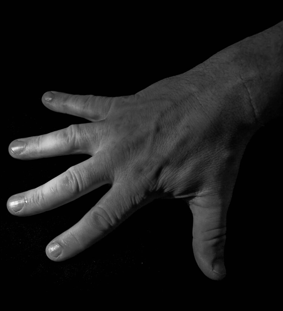
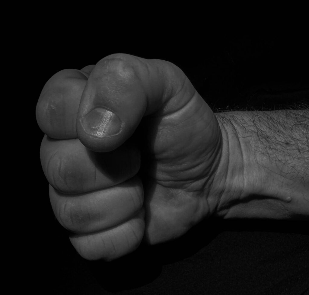
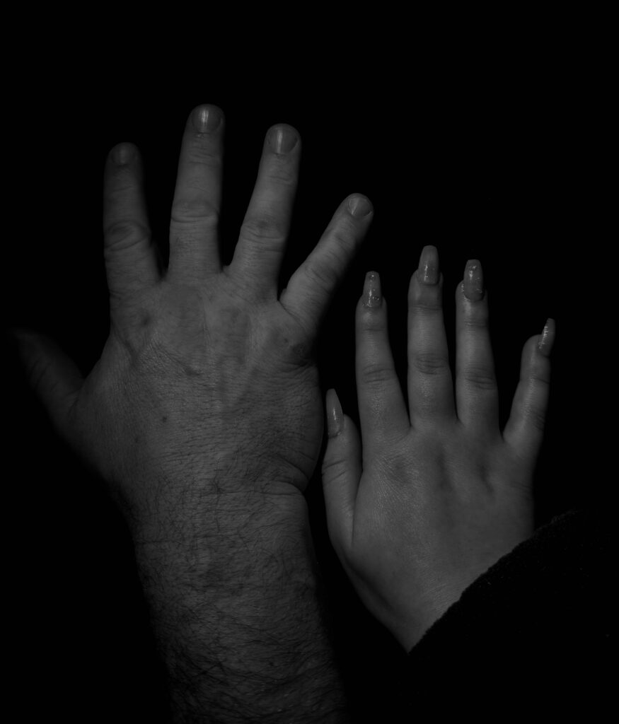
My plan for this photoshoot is too photograph my dads hands as to have some masculine hands and possibly some of maybe my hands next to his to compare the hand of a women in juxtaposition to big man hands.
my photoshoot – hands
Edited images
This is my favourite image out of the photoshoot that I have done because I some what shows a story behind it, as the signal of the fist is showing strength and power ( traditionally masculine traits) I decided to make these sets of images monochrome as I thought it gave them more of a dramatic affect as well as being a bit of contrast compared to the brightness of the coloured gels.
this is what I have done to edit the image as well as cropping out some of the blank space around the edges to make the hand a bit more central and a bit less empty.
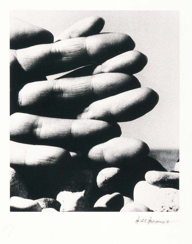
To challenge myself a bit more I decided that I would further my photographer of the hands and move to more parts of the body such as just the torso of just legs. An artist reference for this could be Bill Brandt
Bill Brandt
Bill Brandt died December 20th 1983. He was born in Germany and then he moved to England. Brandt later denied that he was German and used to claim that he was born in South London. Brandt has held nine exhibitions which include many different places such as: The Museum of modern art in New York, Philadelphia Museum of art and Victoria and Albert museum. In 1984 Bill Brandt’s images were welcomed into the International Photography Hall of Fame and Museum. As well as receiving a English heritage blue plaque in 2010. Brandt made his portrait of Ezra Pound in honour of visiting him after he had just survived tuberculosis.
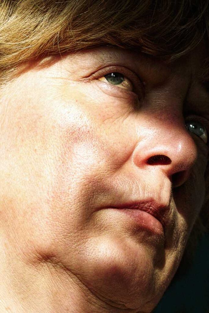
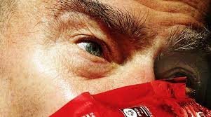
Brandt Analysis
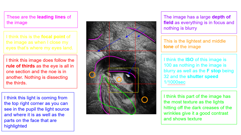
This is image is taken using a digital camera and the genre of this photography is portraiture.
The mise-en-scene presents a close up photo of an eye from an older man. The tone of this image is pretty dark, due to the fact the image is close up and high contrast as well as monochrome. But the wrinkles and texture in the face could also be making it look darker. The use of light in this image is quite harsh, however, it is artificial lighting as they could be in a studio space. The focus distance is short as it is a close up photo and the depth of field is large as everything is in focus. The leading lines of the image would be the wrinkles on the skin of his face as the darker contrast and texture of the wrinkles draw your eyes to those spots.
I believe the ISO is 100 as everything is in as most of the image is in focus however the background is blurred and grainy. I believe that the shutter speed is 1000 as everything is clear.
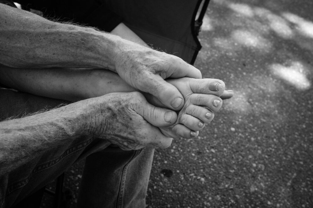
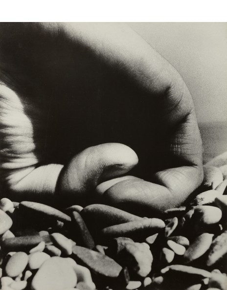
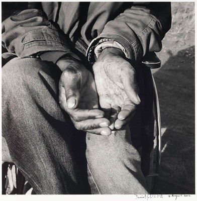
David Goldblatt
Images by David Goldblatt
David Goldblatt was an South African photographer. Goldblatt began his journey with photography when he received a camera from his father as a teenager. David’s first photographs were not amazing so he ask a local wedding photographer for help Goldblatt states: “He would drape several cameras around my neck so that I looked very professional, and my job was to ensure that no guest with a good camera got a good picture . . . I would have to bump or walk in front of them at the critical moment so that my boss was the only person who ended up with good photographs.” a few years later in1962 he became a full time photographer. Throughout his photography career David thought of himself more as a documentarist rather than a photographer/artist. He got around the label of artist by simply calling himself a photographer. He said: “I am a self-appointed observer and critic of the society into which I was born, with a tendency to giving recognition to what is overlooked or unseen.”
Goldblatt analysis
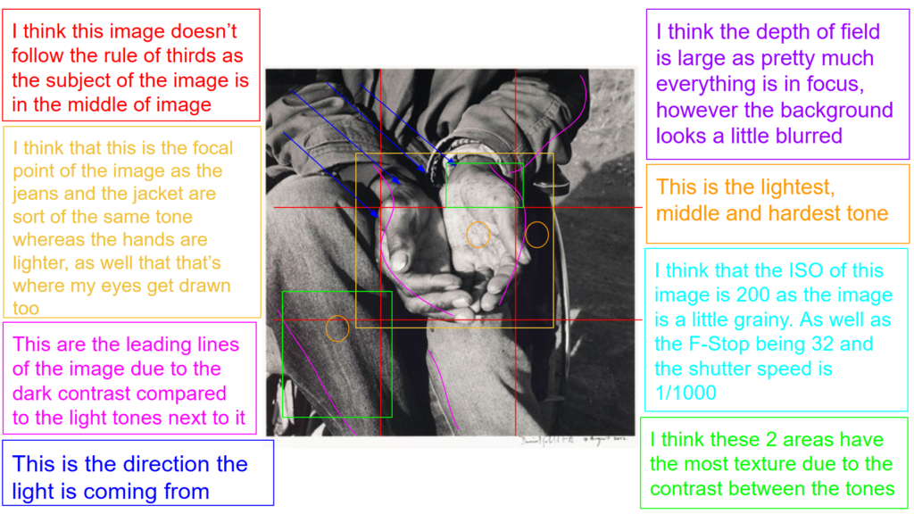
This is image is taken using a digital camera and the genre of this photography is portraiture.
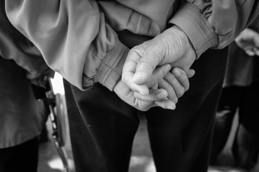
The mise-en-scene presents a close up photo of a pair of old mans hands in his lap. The tone of this image is medium tone, due to the fact the image is all mainly one tone due to the outfit that the man is wearing. But the wrinkles and texture in the jeans and palms of the hands can give the image depth and make it look slightly darker. The use of light in this image is quite soft, natural lighting, as you can see they’re in an outdoor area. The focus distance is short as it is a close up photo and the depth of field is large as everything is in focus, however the background is slightly blurred an grainy. The leading lines of the image would be the wrinkles and folds in the jeans and around the edge of the hands as they’re areas with shadows compared with much brighter lighting.
I believe the ISO is 200 as everything is in as most of the image is in focus however the background is blurred and grainy. I believe that the shutter speed is 1000 as everything is clear.
photoshoot 3
edited images
My favourites
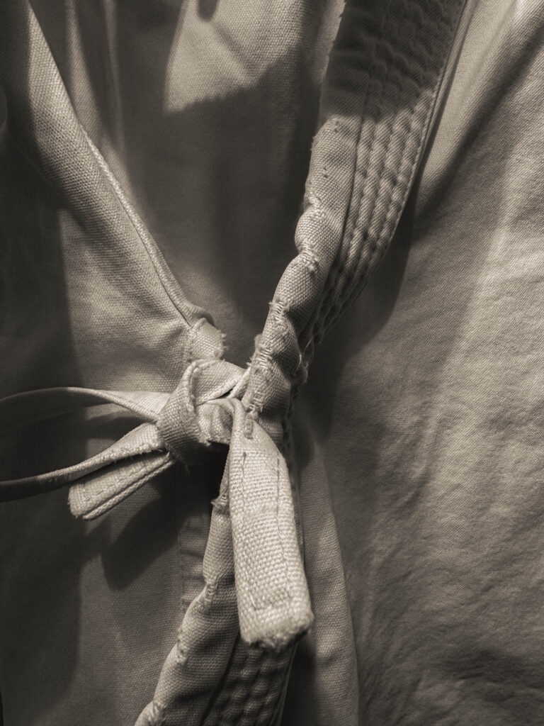
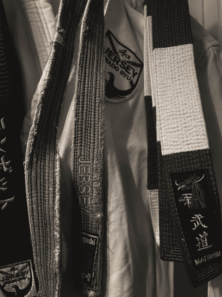
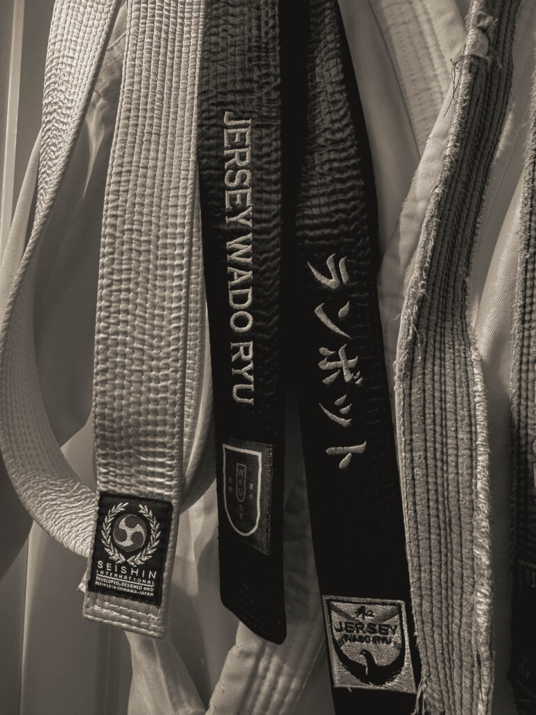
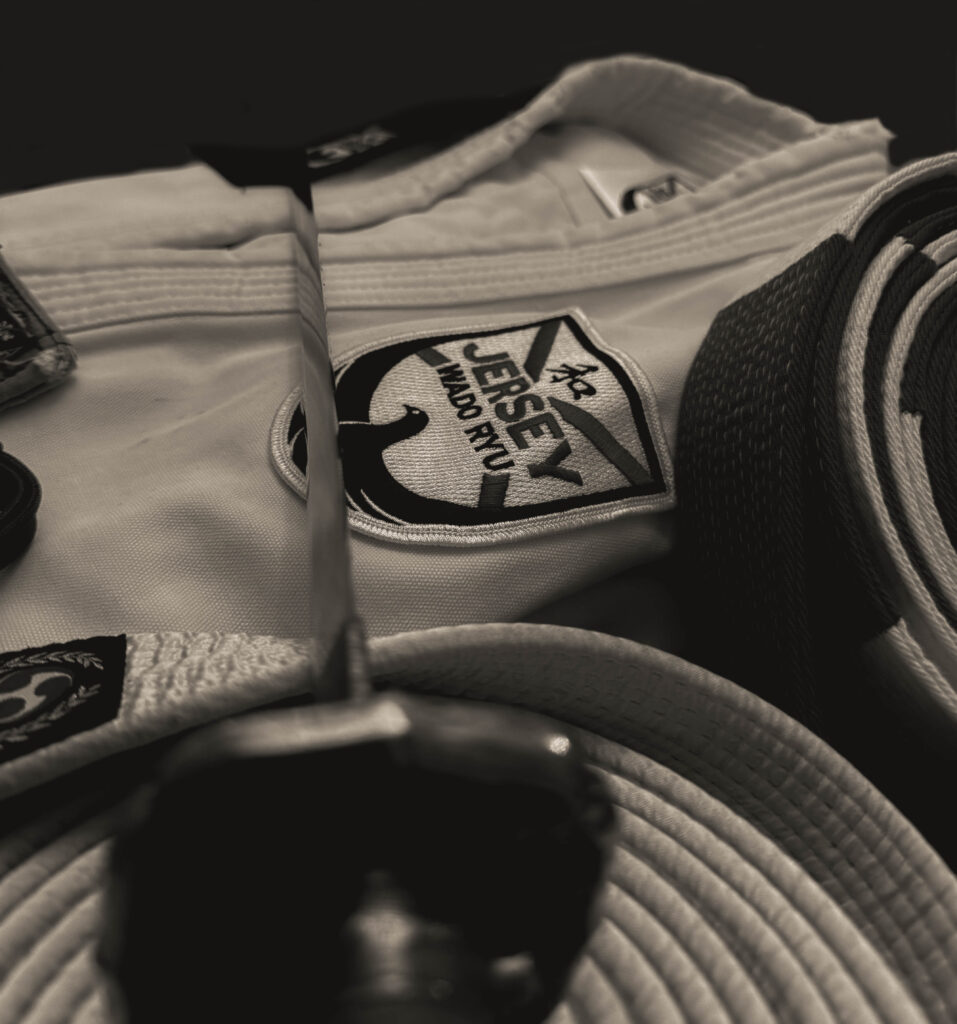
these two images are some of my favourite of this shoot because they are so simple but they still convey this powerful message, especially with the slight rips and sort of imperfections in the GI ( the outfit ) shows that my dad has been doing
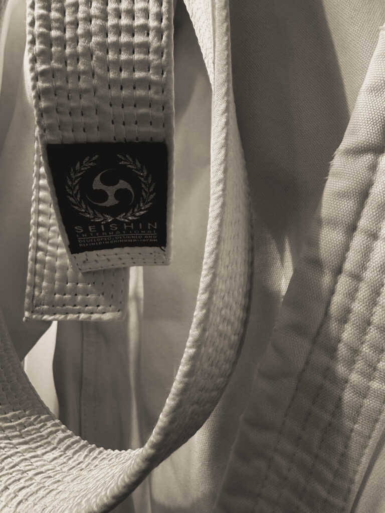
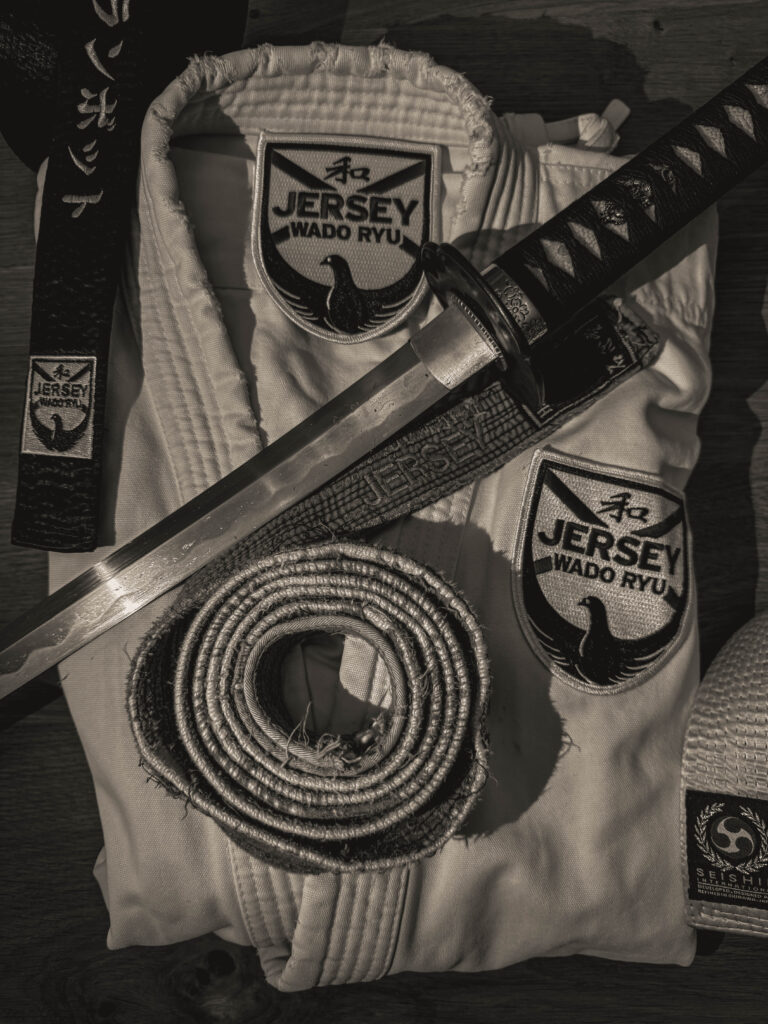
Personally I really like this image because I like the contrast between the old worn out belt compared to the lightness and the freshness of the GI, this was one of the first black belt my dad ever got and it shows the life-long commitment and possibly hardships that have happened / been through.
I have edited this image by:
as well as to get this particular monochrome colour I used the filter: BW02
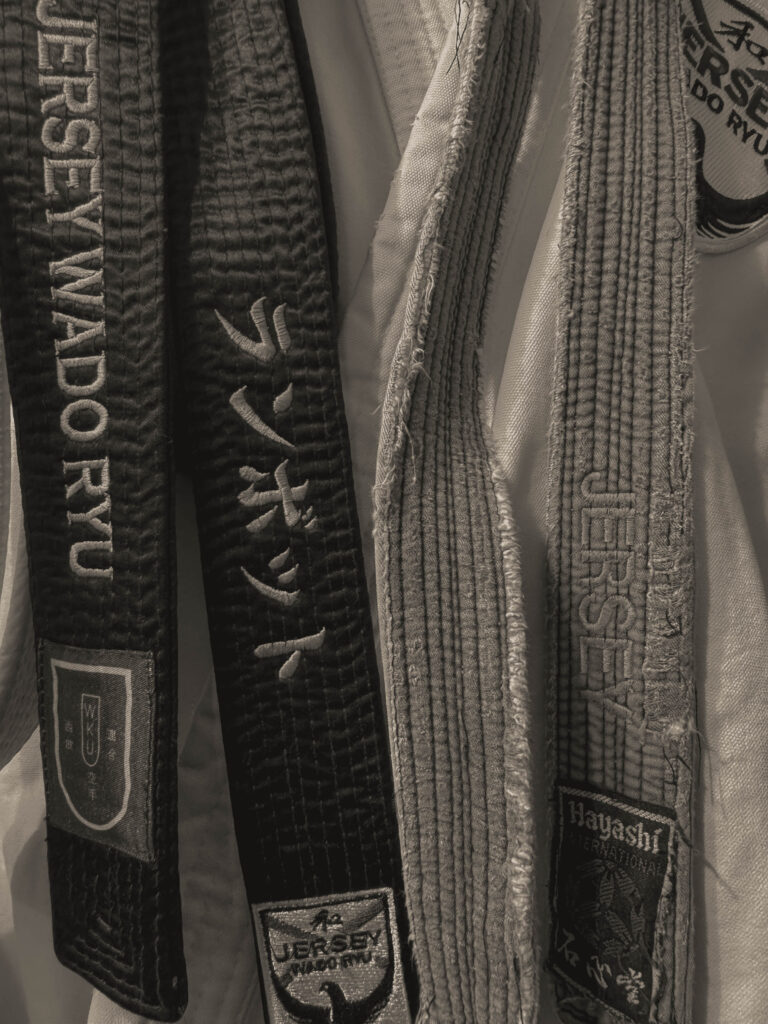
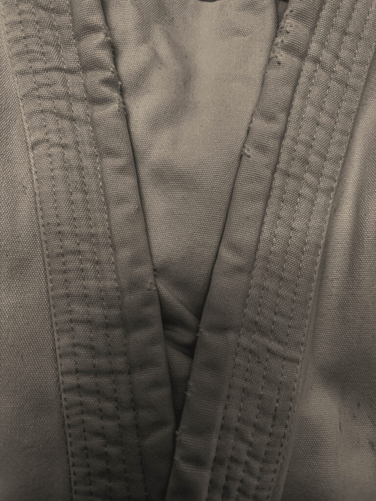
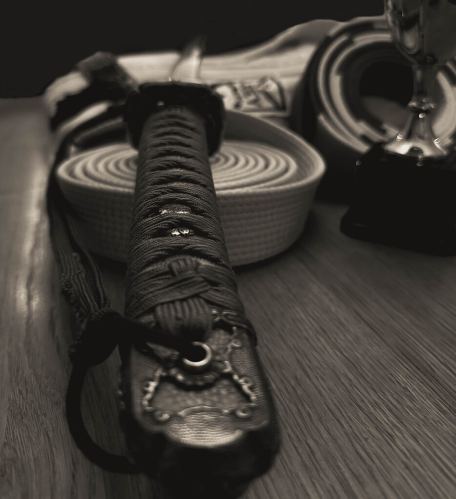
This images above could also be linked to Satoshi Fujiwara, code unknown, by how he get close up and in creases and different perspectives of looking at things.
Satoshi Fujiwara: code unknown
images by Satoshi Fujiwara
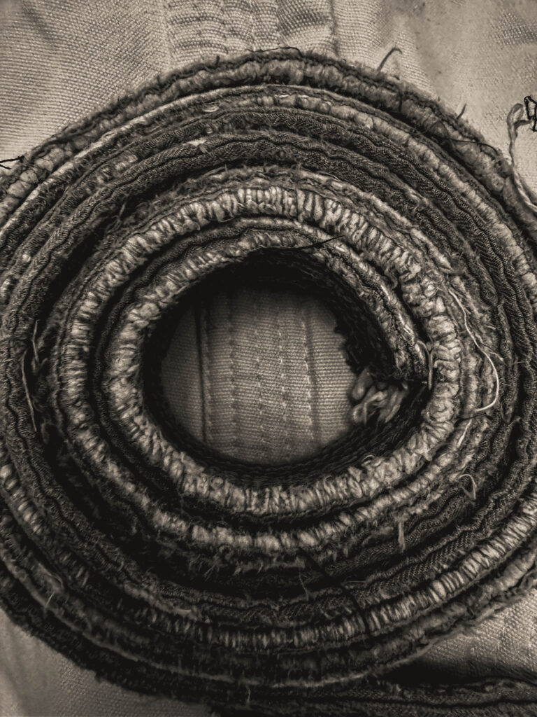
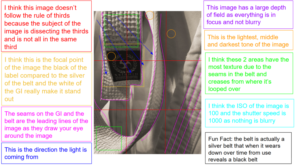
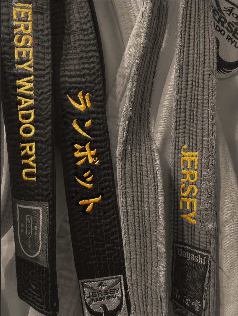
analysis of my own image
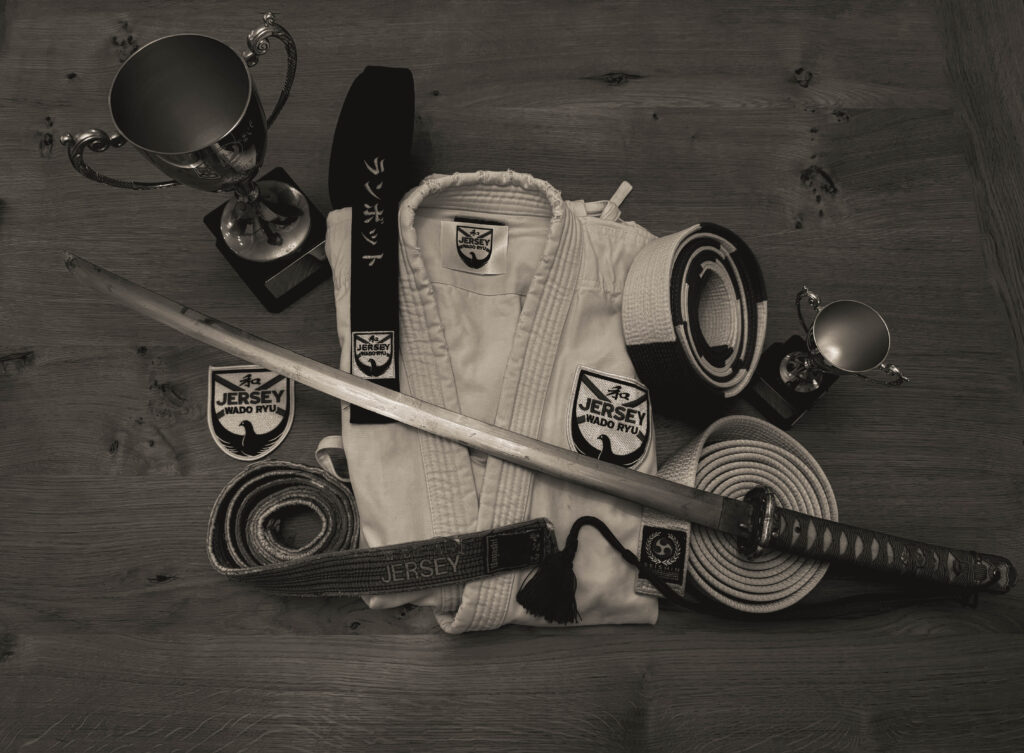
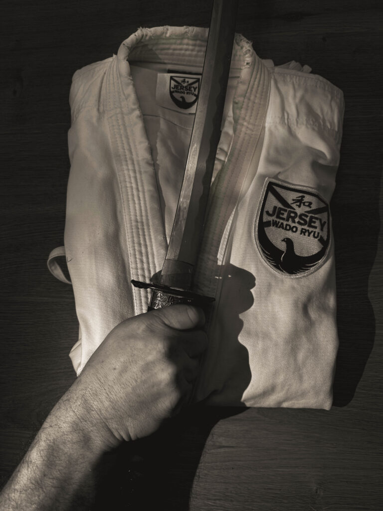
This is image is taken using a digital camera and the genre of this photography is Identity.
The mise-en-scene presents a close up photo of a belt draped over a karate GI. The tone of this image is very light, due to the fact the belt is silver and the GI is white. But the wrinkles and texture in the belt could also be making it look a little darker. The use of light in this image is quite soft,warm as it is artificial lighting because the picture was taken in my home using a wall light. The focus distance is short as it is a close up photo and the depth of field is large as everything is in focus. The leading lines of the image would be the seams on the GI and the actual belt itself would be a leading line as it helps bring your eyes around the image.
I believe the ISO is 100 as everything is in as most of the image is in focus. I believe that the shutter speed is 1000 as everything is clear.
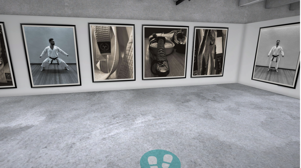
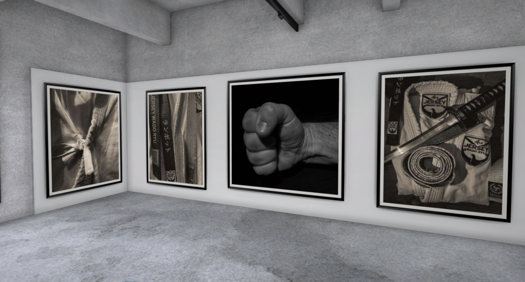
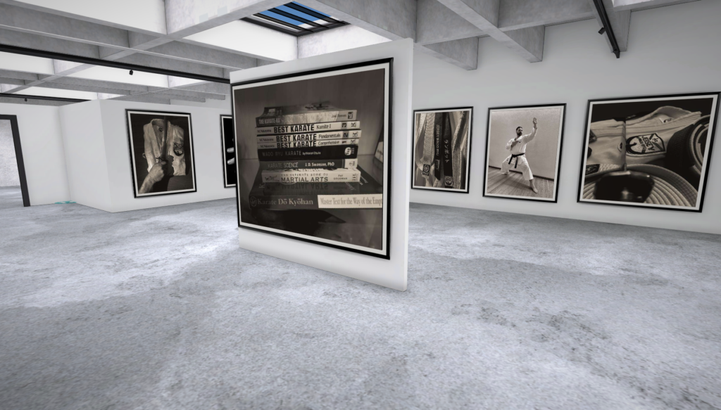
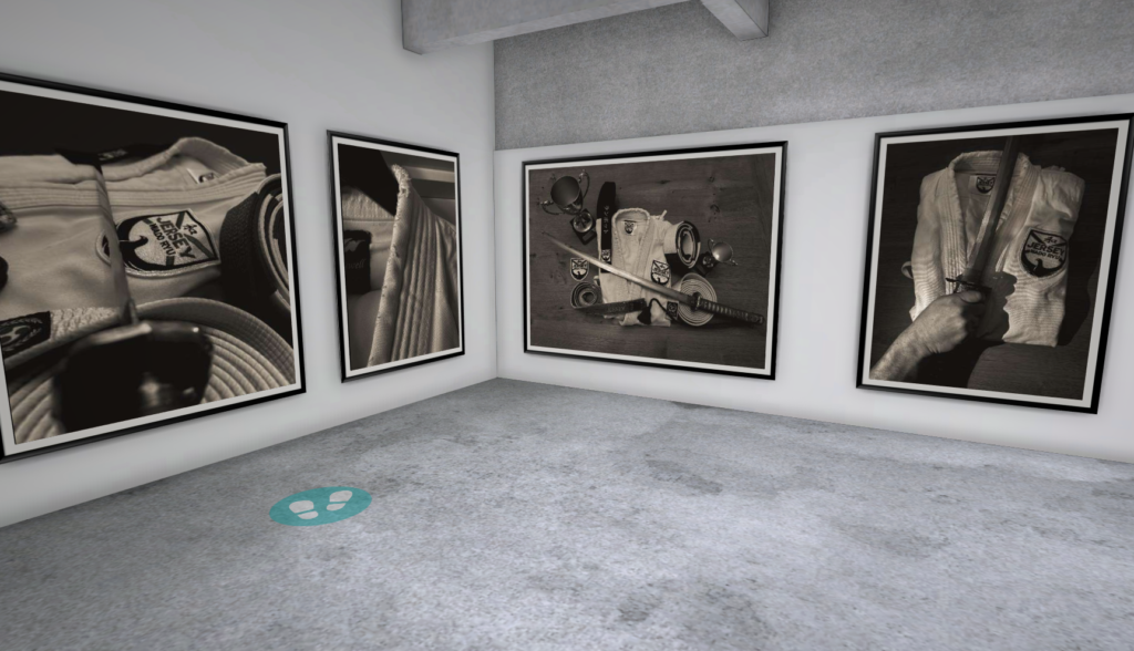
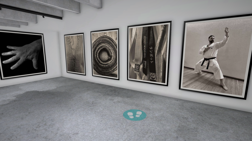
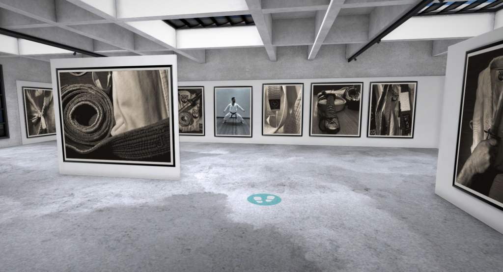
Virtual Gallery
I really like the way this gallery / project has come out I think it really shows my dads identity, as karate has been a big part of his life as he’s been training for 43 years ( he’s only 48! ) and teaching for 36 years since he got his first black belt at 12 years old. He has 2 organisations MMA ( mental martial awareness) which helps people deal with their mental health. And his non-profit karate club which he is the chief instructor of.
The way I made this is that I used some of the hand pictures that I previously took as they were also of my dads hand so I thought that they would be good to include as some of them especially the fist link to this kind of topic that I’m doing. As well as I have added some of my environmental portraits that I took of my dad from when he was in his GI and in his dojo.
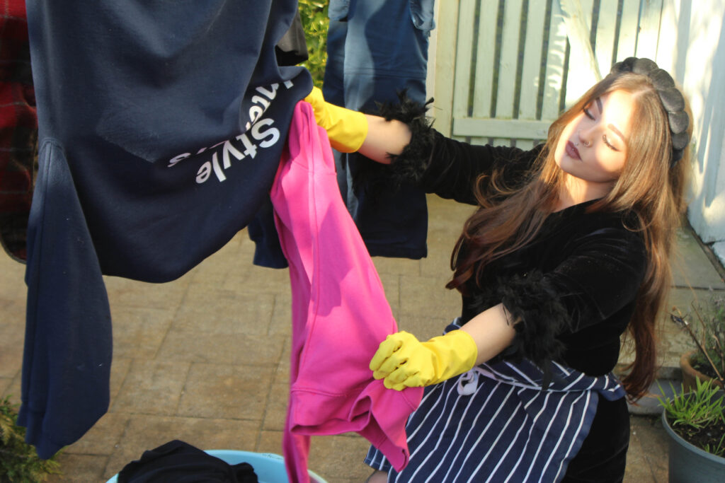
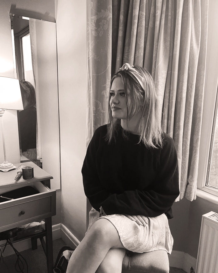
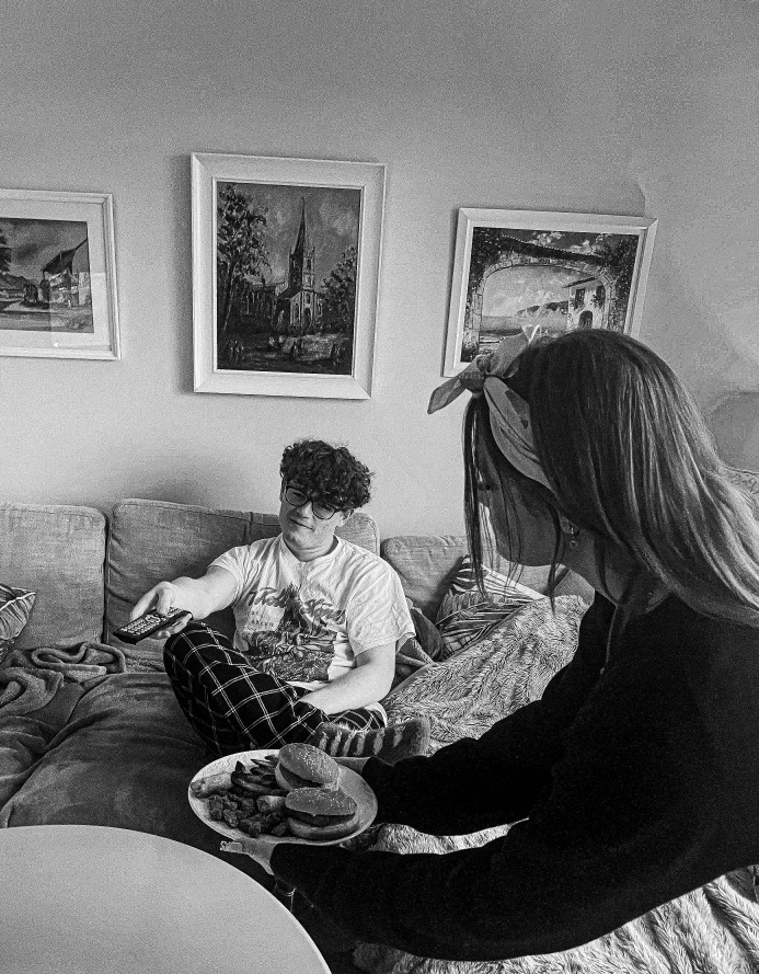
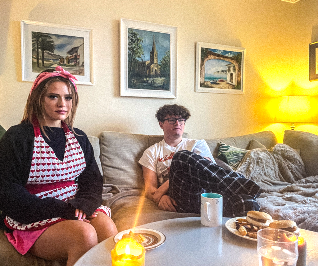
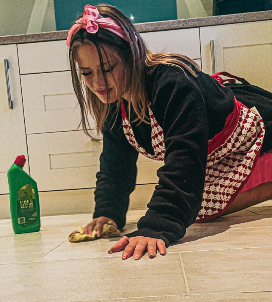
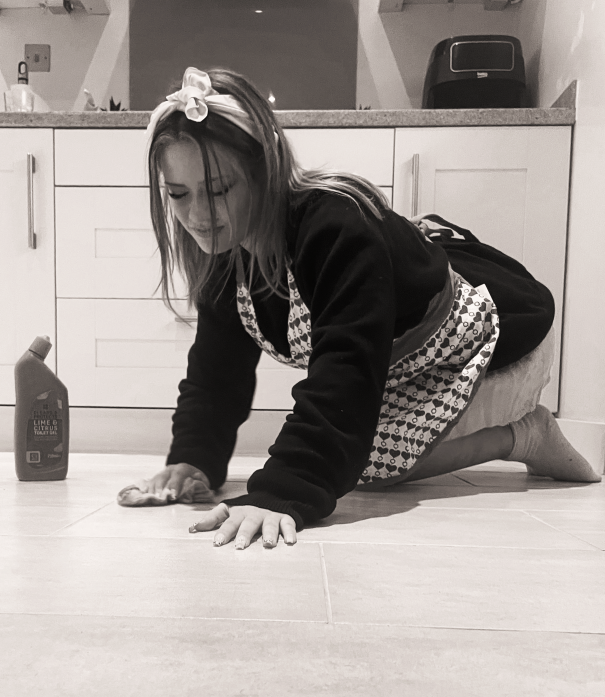
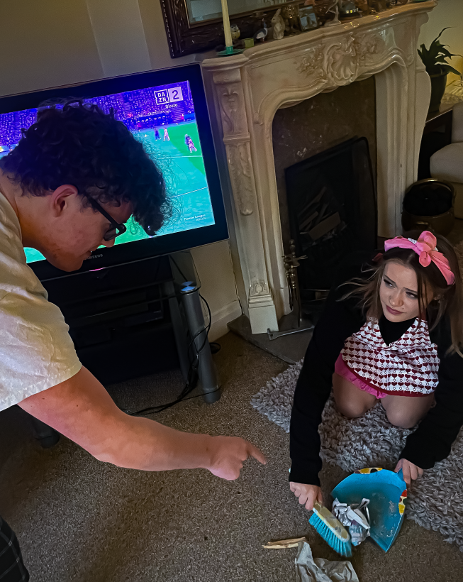
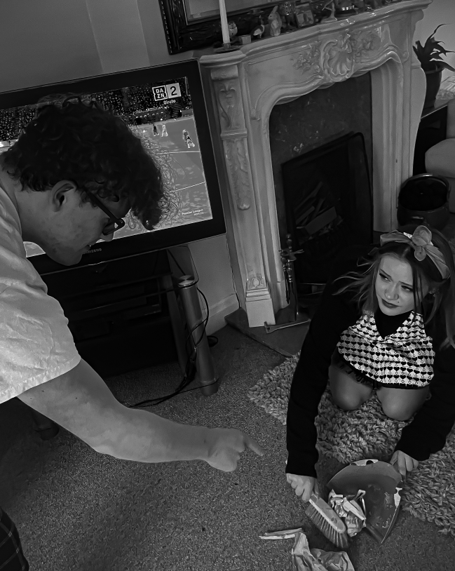
In this image I had Emily serve him food to show how women’s main purpose was to ‘serve men.’
I set this up so he had a lot of food and she had whatever was left over to symbolize the superiority men had over women. I also had Emily look straight into the camera to create the sense that she is almost trapped; whilst he was sat oblivious watching television.
Here again, I added a grainy filter to attempt to give the image a vintage feel.
Second Photoshoot- Editing
I chose my favorite images them edited them in the same way in order to explore ideas for my final images.
Editing 1
Editing 2
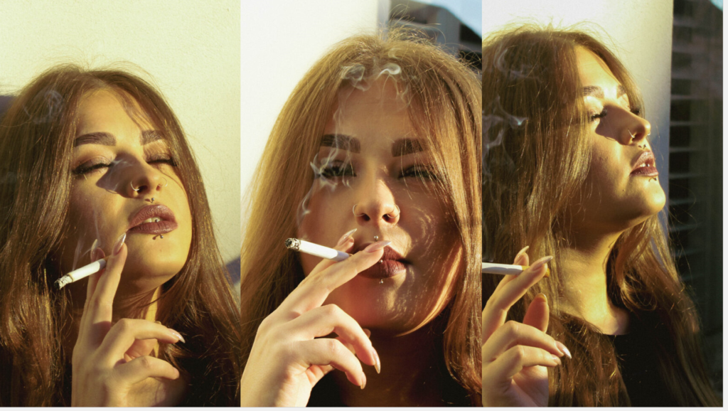
I think these 3 images work the best together.
Image Layout
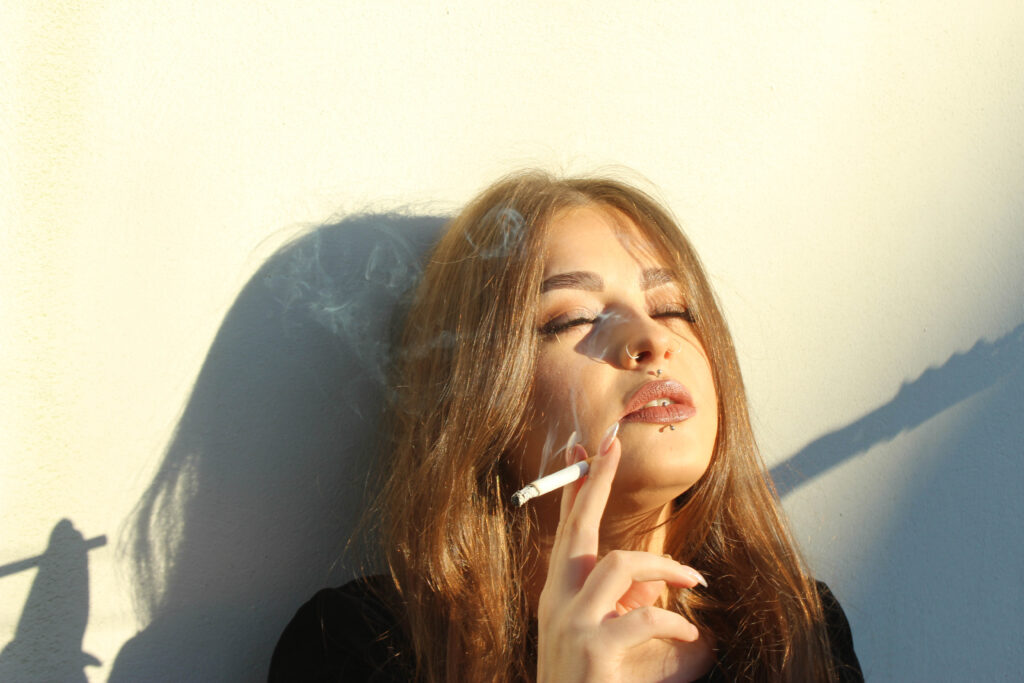
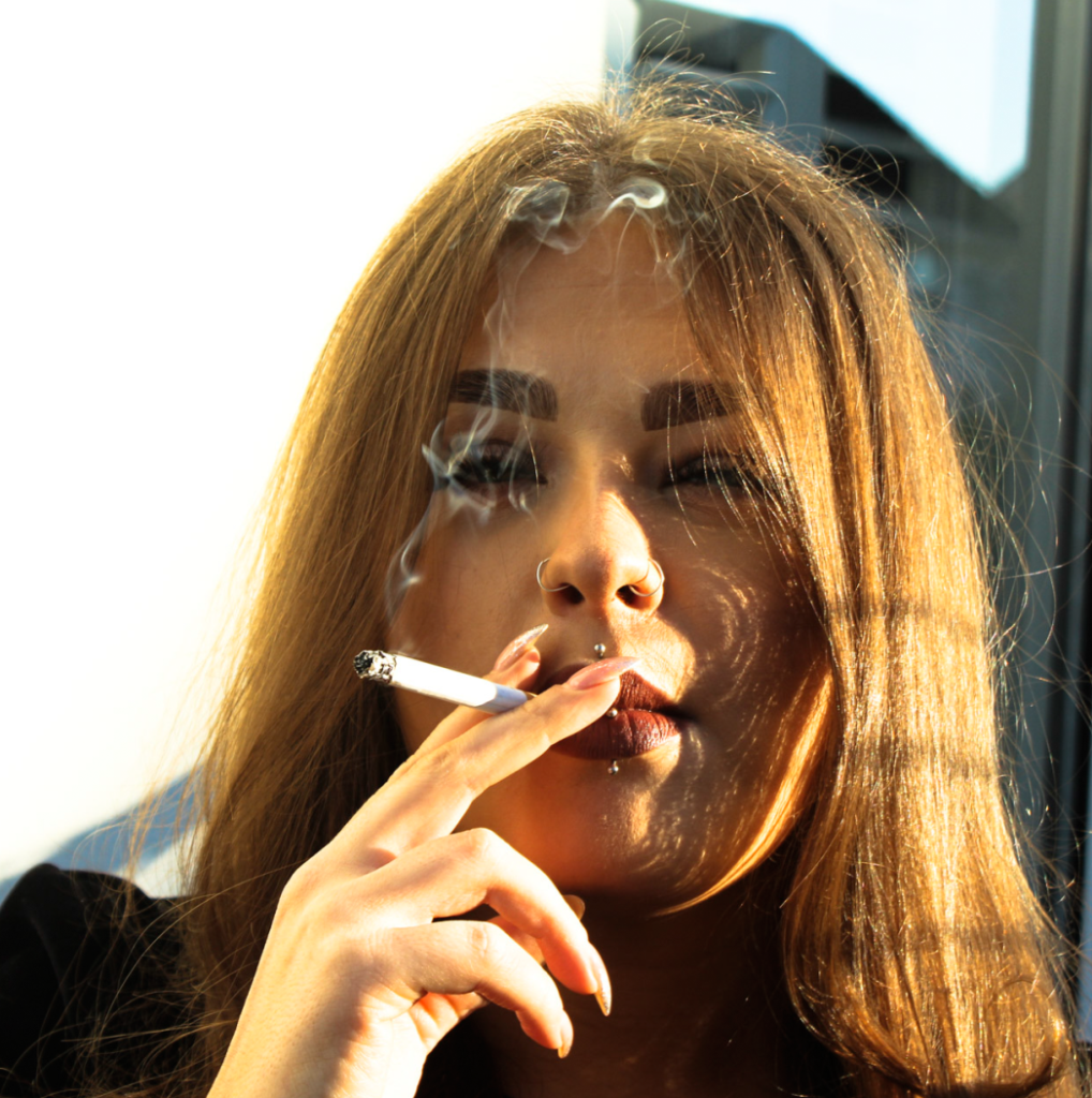
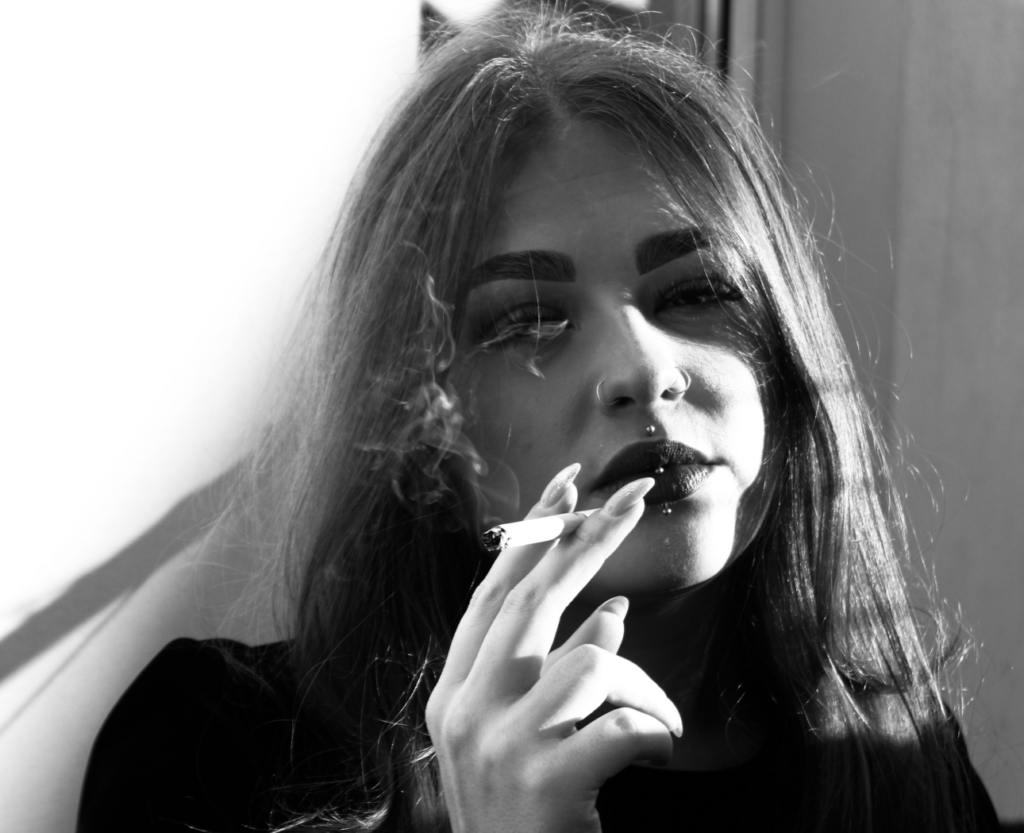
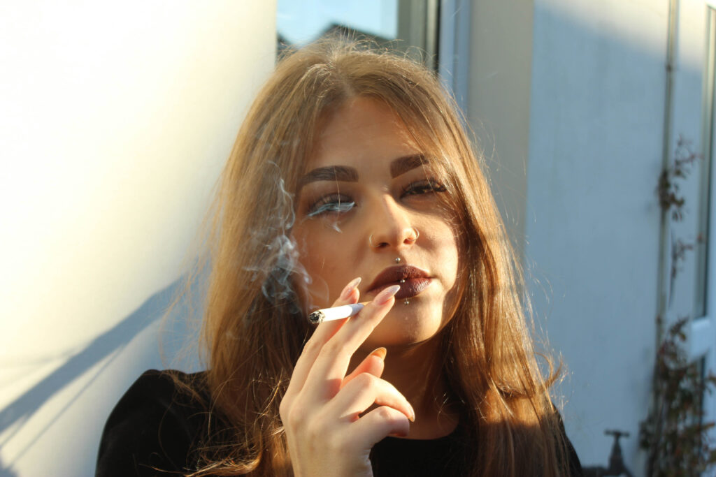
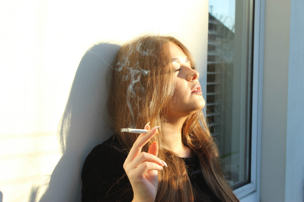
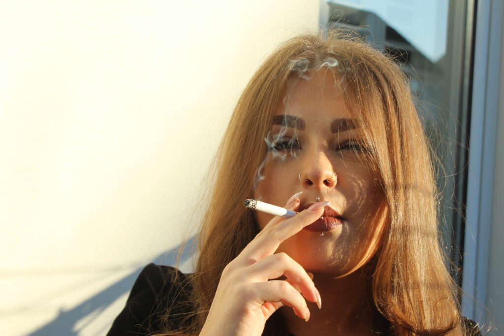
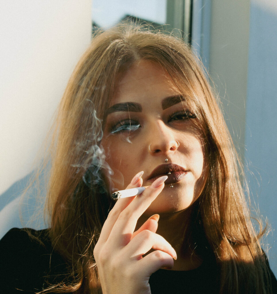
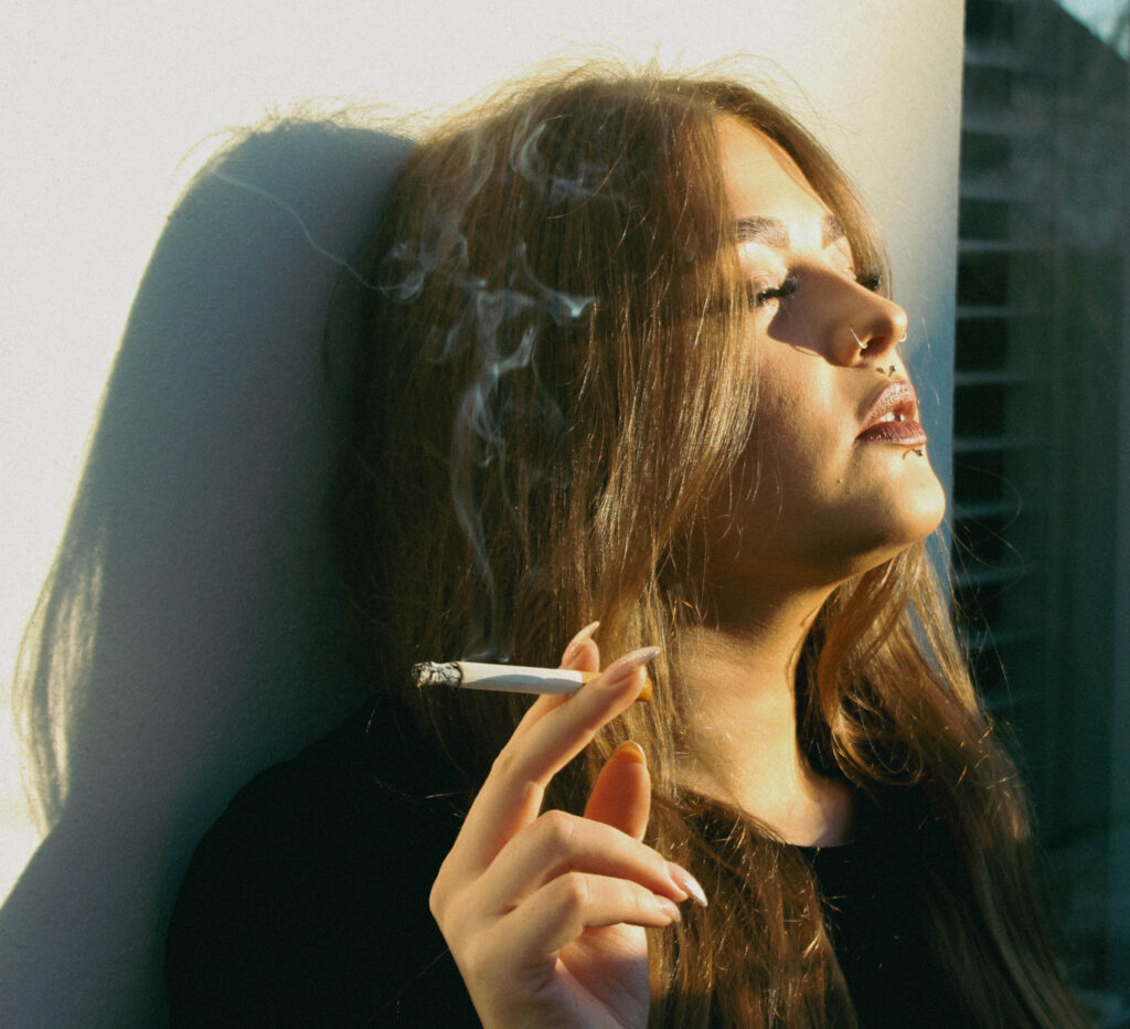
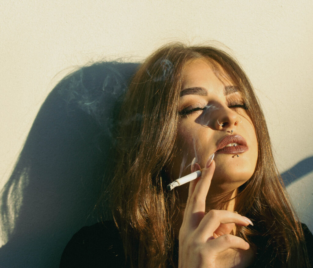
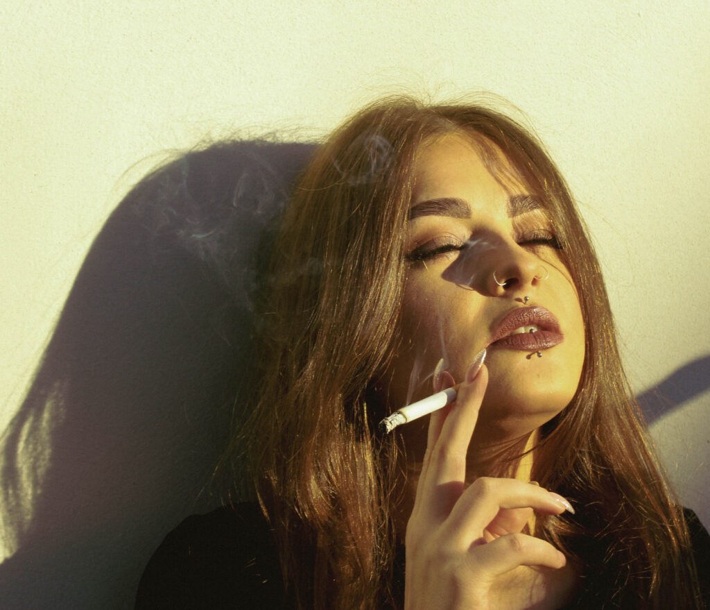
I chose this layout because it creates a strong visual flow. The larger image on the left draws attention first, setting the tone with its dramatic lighting and intense expression. The two smaller images on the right complement it by showing different angles and variations of the same character, adding depth and reinforcing the theme of the ‘ brooding’ or ‘mysterious’ woman.
The placement of the images also helps balance the composition. The central focus on the cigarette and the drifting smoke creates a sense of continuity throughout.
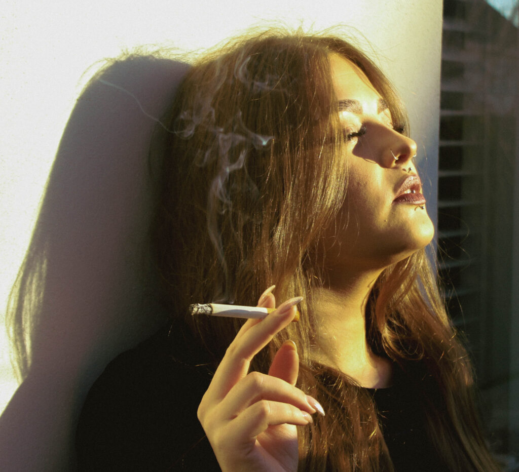
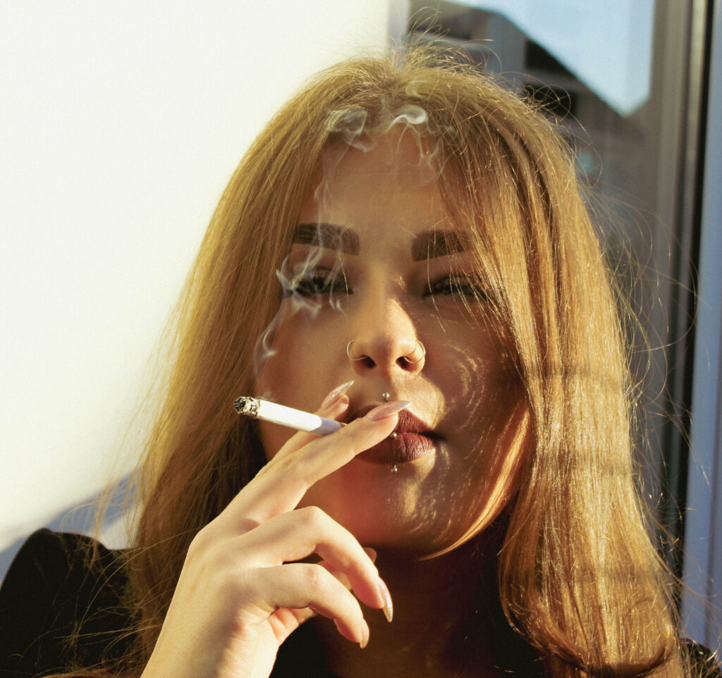
Final Images- Option 2
Editing and image selection
Image Selection & Layout
I used PowerPoint to experiment with what images I wanted to include and the layout of the images and this layout was my favourite.
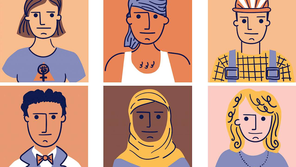
Identity is the distinctive qualities or traits that define an individual and make them unique. It is usually something people associate themselves with, and it helps people to understand who they are as individuals. Identity can be influenced by the people you surround yourself with, and the place in which you have grown up in, as it can change your view on your own identity and the people surrounding you. There are many factors that affect what you view your identity as, like your specific culture can be a key identity for someone who celebrates it or their religion can also be a strong part to their identity.
Femininity
Femininity is a set of behaviours and roles that are generally associated with women and girls. This is a typical social structure used to define people who act in a girly or feminine way, and are used to stereotype women.
Masculinity
Masculinity is a term used to show the traits used by men like strength, assertiveness, leadership, courage, and dominance. Masculinity is known to be social expectations suitable for a man. It is a set of attributes that are typically linked with men and boys to stereotypically make them feel as though they should be masculine through society.
Gender Identity
Gender identity is how a person feels and understands their own gender, which may not match the sex they were assigned at birth. It can include identities like male, female, non-binary, or genderfluid. Gender identity is different from sexual orientation, as it’s about who someone is, not who they’re attracted to. People express their gender through things like appearance, behavior, and pronouns. Respecting a person’s gender identity is important for supporting their rights and dignity.
Cultural Identity
Cultural identity is the feeling of belonging to a particular cultural group, shaped by things like traditions, language, values, and shared experiences. It connects people to their heritage and how they see the world. This identity can be influenced by factors like ethnicity, nationality, family, and community. It plays an important role in how people understand themselves and how they relate to others. Cultural identity can change over time based on personal experiences and exposure to different cultures.
Social Identity
Social identity is how individuals see themselves based on their membership in different social groups, such as those defined by age, gender, race, ethnicity, religion, nationality, or social status. It helps people understand their place in society and shapes how they interact with others. A person’s social identity can influence their beliefs, values, and actions, and also affect how they are treated by others. It provides a sense of belonging and can boost self-esteem, but it may also lead to biases or conflicts if differences between groups are focused on too much.
Geographical Identity
Geographical identity is how people see themselves based on where they come from or live. This could be their hometown, country, or any specific place that affects their values, experiences, and way of life. It’s shaped by the environment, culture, language, and traditions of that place. Geographical identity helps people connect with others and understand their place in the world. For example, someone might feel a strong connection to their city or country, which influences how they see themselves.
Political Identity
Political identity is how people see themselves based on their political beliefs and values. It’s shaped by views on issues like government, rights, and social values, and is often tied to political parties, leaders, or movements they support. Things like upbringing, education, and personal experiences influence political identity. It affects how people get involved in politics, make choices, and interact with others who have similar or different views. Political identity helps people feel connected to a political group or cause and gives them a sense of belonging in society.
Loss/Lack of Identity
A loss of identity is when someone feels disconnected from who they are or where they belong. This can happen if they’re unsure about their values, beliefs, culture, or role in life. It often happens after big changes, like moving to a new place or facing difficult situations. People who experience this might not know their purpose or how they fit in, which can make them feel isolated, insecure, or unsure of themselves. Finding or rebuilding their identity often involves rediscovering what’s important to them, connecting with supportive people, or trying new things.
Stereotypes and Prejudices
Stereotypes are wrong ideas about a group of people based on things like their race, gender, age, or sexuality. These ideas assume that everyone in the group is the same, ignoring differences between individuals. For example, thinking all teenagers are troublemakers or that older people don’t know how to use technology. Stereotypes can be harmful because they lead to misunderstandings about others.
Whereas, prejudice is when you have a negative opinion about someone just because of their group, like their race, gender, religion, or nationality, without knowing them personally. It’s often based on unfair assumptions made before getting to know the person. Prejudices can lead to treating people unfairly. For example, thinking someone is untrustworthy just because of where they come from is a form of prejudice.
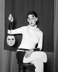
Claude Cahun was born in France October 25th 1894 she is most remembered for her incredible work as a photographer, sculptor and writer.
Cahun was born in Nantes, into a well known Jewish Family. Cahun attended a private school in surrey after experiences with antisemitism in high school. She later attended University of Paris, Sorbonne where she began making photographic self-portraits as early as 1912( aged 18) and continued taking images of herself throughout the 1930s.
Cahun’s work evolved writing, photography, sculpture and theater, of which the most remembered are the highly staged self portrait. During the 1920s Cahun produced as astonishing number of self- portraits in various costumes such as aviator, dandy, doll, body builder, vampire, angel,…
Cahun used mirrors, collages and doubling in her photos to reflect the diversion from social norms.
Analyse
Visual:
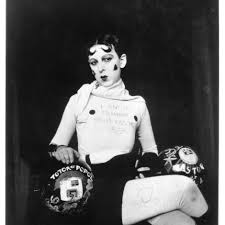
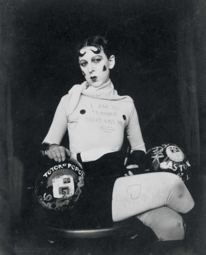
This image a self portrait taken by Claude Cahun she was also the model for it. She is posed in an unnatural way her hand is on her head and she is standing on one foot, she is looking directly at the camera which makes the image look more intimate. She is wearing a white shirt saying ” I AM IN TRAINING DONT KISS ME” which I’ve found that it serves as a poignant parody of the virginity complex arisen from societal and family pressures. she is also wearing black shorts grey ish ballerina shoes and wearing the leather like material around her wrists and her legs she’s also wearing white tights and a white scarf. She’s holding a circular black object with her left hand and with the other she has it positioned on her head.
Technical
The lighting in the picture isn’t very bright however I think the lighting that she used was artificial since the shiny materials have a strong light reflecting on them. All parts of the picture are equally illuminated. The aperture used was a high setting the whole picture is in focus meaning it had sharp focus . I would say that this photograph was taken in a eye level angel this contributes to the viewers being able to see the whole body which indicates that is a full body shot.
Contextual
In the 1920s British society remained intensely gender and class ridden however women began having more job opportunities due to better education and gained of political rights At the time many women worked as teachers, clerks and nurses while others stayed at home and took care of the children.
Conceptual
Claude Cahun’s work challenges the rigid gender roles and societal expectations of the 1920s and 1930s by rejecting the common stereotype of identity and femininity. Her self- portraits use costumes and unisex poses to show that gender is no more than a performance. By refusing to participate in the traditional ideas of femininity and instead creating their own image as not defined by their gender, The “I’m training don’t kiss me shirt” rejects social expectations of women of objects of pleasure, declaring autonomy over their body and identity.
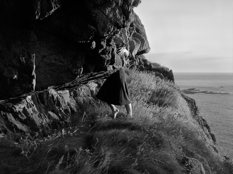
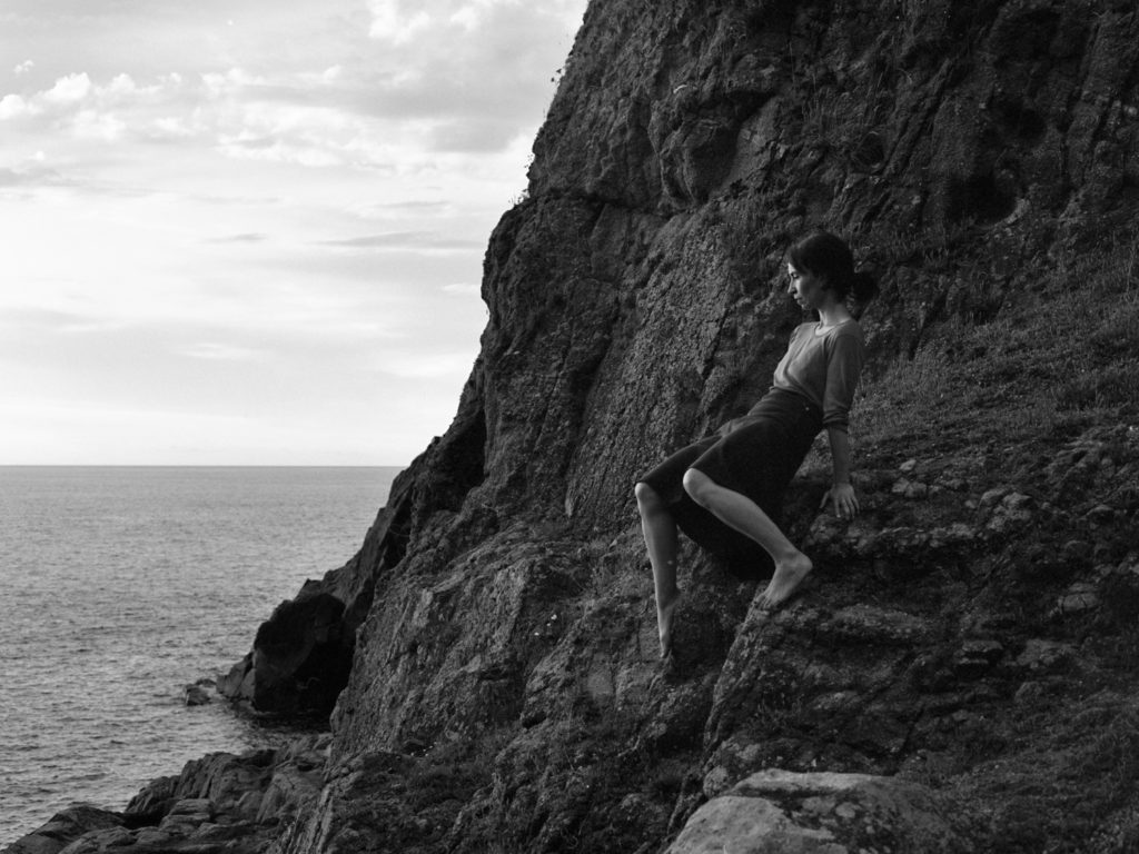
Clare Rae is an artist from Melbourne, Australia (b. 1981) who produces photographs and moving images work which explore the representations of the female body using exploration of the physical environment. Rae visited jersey as part of the Arch isle international artist-in-residence programme in 2017. She was interested in the Claude Cahun archive and was researching into it as well shooting new photographs and film in jersey as well as even running workshops. From the research she produced she formed a new body of work called Entre Nous (Between us). The work was produced after being heavily inspired by Claude Cahun and it was even exhibited at the Centre for Contemporary Photography in Melbourne Australia, 22 March – 6 May 2018.
In these series of photos she produced named “Never standing on two feet” she explains that she took Cahuns engagement with the physical and Cultural landscapes of jersey and was inspired to take similar photos. She commented on her work saying that like Cahuns, her photographs depict her body in relation to place with this instance being jerseys costal geography and Jerseys Neolithic ritual monuments. The photographs also include a moving body to contrast and unsettle the traditional representations of the female figure in the landscape.
Clare Rae has always discussed and expressed her interests in artists such as Claude Cahun, Francesca Woodman and Jill Orr. She also talks about how she researches on areas that she’s interested in and takes inspiration from as well how she produces her image and the analysis behind them. With these methods it makes her photography that she takes very interesting to get into.
Visual
In this image we are able to see a self-portrait of Clare Rae where she appears to be gripping on to the rocks for support. She is looking away from the camera but towards the sea to indicate that she is becoming aware of her surroundings. She is posed in a way where most of her torso is hidden and appears to blend in with the rocks. We can also see that she’s wearing a dark coloured skirt and a light coloured top to maybe create some type of contrast. She also appears to be on a rocky hill near the sea to create some connection between her body and the place the photograph is taken at. She also appears to be holding herself up on the rocks and not sitting on them to show that she may be continuing to go further down or across.
Technical
The lighting used in this photo is natural light as it was taken outside. It was most likely taken with the sunlight being projected onto the rocks so the subject would be well illuminated. It also looks like a wide aperture was used due to the amount of detail we are able to see in the image from the ripples of the sea to the shape of the rocks in the hill. The photo may of been taken at a low angle to capture the rocks underneath the subject and show how far down the hill goes. The photo also appears to be a full body shot as her whole body can be see in the image with the exception of her right arm.
Contextual
Clare Rae has great interests in artists such as Claude Cahun, Francesca Woodman and Jill Orr. When coming to jersey and discovering the work of Claude Cahun she decided that she wanted to take inspiration and create her own series of photos inspired from Claude Cahun. Following the same ideas as Claude Cahun where she took her photos to criticise the gender roles of women in the 20s/30s, Clare Rae has taken images with a moving body which unsettles the traditional representations of the female body.
Conceptual
These series of photos that Clare Rae created were to show the public that her work is more invested into the feminist act of self representation compared to Cahuns who used self-portraiture to subvert the dominance of the male gaze in photographic depiction of the female body in landscape photographs. She uses the performing body and gesture in order to disturb the traditional representations of the female figure in landscapes. She used Jerseys costal sites and monuments in order to create a visual dialogue between her body and the environments around her.
Chosen Artist Reference
I have chosen Clare Rae to be my inspiration for my series of photos as I find that the photos that she has taken are intriguing and unique and its something I would like to replicate in my own photos and add on furthermore.
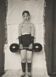
Claude Cahun (25 October 1894 – 8 December 1954) was born in Nantes France, Cahun was best known as a self-portraitist and a writer. At birth Cahun was given the name Lucy Renee Mathilde Schwob by her parents, she later changed this when she was older and she identified herself as gender neutral. The goal of her photographs were to challenge the traditional ideas of gender, sexuality, and identity. To achieve these goals she photographed herself but changing her identity/how she looked which was needed to present her goals and show the criticism she has against the society who follows these traditional ideas. She also often worked with Marcel Moore who often helped take her self portraits.
Cahuns pictures are portrayed in a specific manner in order to make the viewers see that she is dressed and presented in such a way that she can be seen as a rejection of traditional ideas of feminine beauty. The message that her pictures are trying to convey is that society distinguishes people from each other which can be separated into groups like Genders however individuals are the ones who play the role into creating or shaping their own identities based on things they express upon or their understanding on certain things which could be based on personal choices or experiences. Cahun in her portraits shows that gender is something you can act as and the things you do which define what gender you want to be rather than someone you are biologically.
Claude Cahun connection with Jersey started early with childhood holidays which were spent in Jersey and Brittany. By 1937 both Marcel Moore and Claude Cahun decided to move from France to Jersey to live where they took up their old names and letting people assume they were sisters. But by 1940 following the invasion of the Nazis they refused to evacuate to England and remained in jersey where they setup an underground resistance campaign following the Nazis invasion of the island. The campaign lasted 4 years before they both got investigated and got locked up in the St Helier prison where they almost got the death sentence. After Jersey got liberated they remained on the island till 1953 where they decided to check if they could live in Paris once again. However Cahun in late 1954 died in Jersey under hospital care.
Claude Cahun was described as Cindy Sherman before her time. These two artists both explored similar ideas and criticised society for their perception of gender roles and identity. Cindy Sherman started her work in 1977 compared to Claude Cahun who started in 1912, both of their photograph styles are very similar where they change their appearance to portray different roles of people.
Visual
In this image we can see a self-portrait of Claude Cahun posing for the camera, They are posed in such a way that it closely resembles a feminine posture with the crossed legs and straight posture, They’re gaze is also pointed directly at the camera to make that connection with the viewer. They appear to be wearing a long tight shirt with leggings and what appears to be a scarf, the outfit does appear to make her look like a mime especially with the paint/makeup applied to her face. They also appear to be holding something that looks similar to a barbell which is labelled “Totor popol” and the other side of it appears to have “Castor” Written on it. The writing Totor popol may be a reference to the two comic characters by the Belgian cartoonist Herge, Castor and Pollux is a older reference to the twin half-brothers of the Greek myth whose names grace the two brightest stars in the Gemini constellation. The sign on her chest says “I am in training, Dont kiss me” and this could be in relation to the fact that she had styled herself to look as a mime which makes it so the writing in her chest is her communicating with the public as mimes typically cannot speak with their voice.
Technical
The lighting that Claude Cahun appeared to have used is artificial light as the setting they are in suggests that she’s in a studio environment which makes it easier for the subject to be illuminated easier especially with the angle you want the light to go towards. It also looks like a Wide Aperture may of been used in order to capture all the details in the picture from the details on her face to the writing on the barbell and their chest. The angle this photo may of been taken at is straight on/dead centre as the camera may be on a tripod to shoot the picture on the centre to ensure that Claude Cahun would be the main priority of the photo. The photo is closer to a 3/4 body shot as her body is mostly shown except from the knees down.
Contextual
The roles of women in the 1920s and 1930s were typically working as clerks, teachers and nurses while others were expected to stay home and raise children and make sure the house was maintained and cleaned. Women back then were not really seen as strong or being able to be independent in the eyes of society. With Claude Cahuns image it was taken to criticise societies view and the stereotypes made against women which suggests why she may have the barbell in view to challenge societies view of the strength of women.
Conceptual
Claude Cahuns work made the role of women/gender in the 20s and 30s appear that it was more of a lifestyle that anyone can adapt from rather than someone you are from birth. Her work protested these gender and sexual norms and showed people that they do not need to follow these norms that society expects them to follow. With the feminine pose as well as the barbell she has laid on her lap, she is trying to convey the message that women can do anything that men can do and that your gender or your background shouldn’t prevent you from doing things that you would like to do.