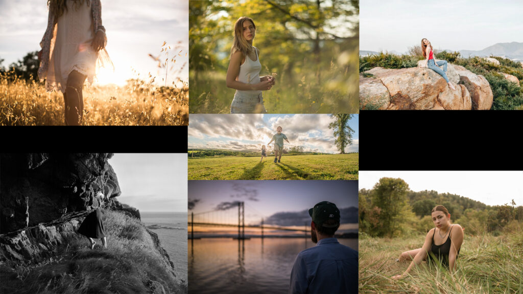
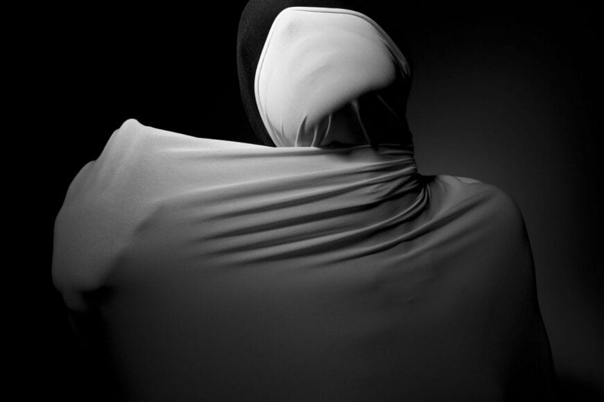
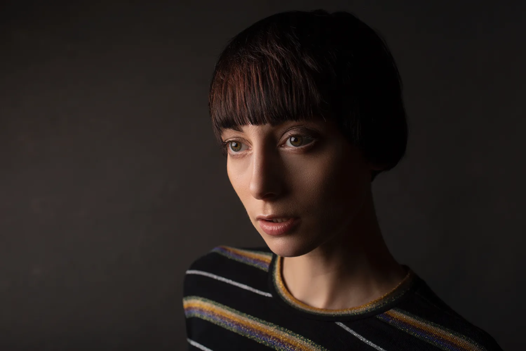
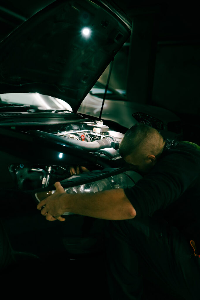
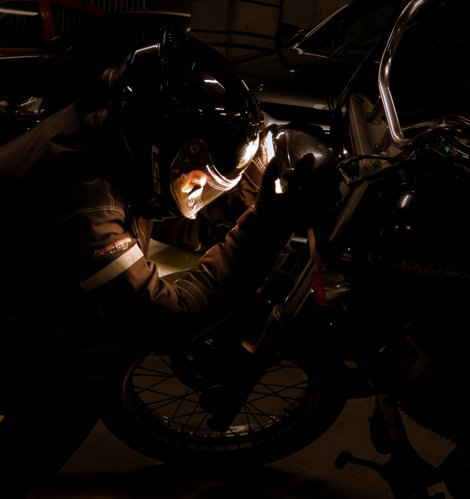
I have added these images to my mood board for inspiration as they mostly match the style I am going to be going for in my own photographs. To match Clare Rae’s photos I will be taking my photos in an outside environment with the scenery and landscape visible to give it more detail and more meaning. I will also be attempting to add on to her style and maybe try taking a different approach to the photos such as trying new positions.
Image Ideas
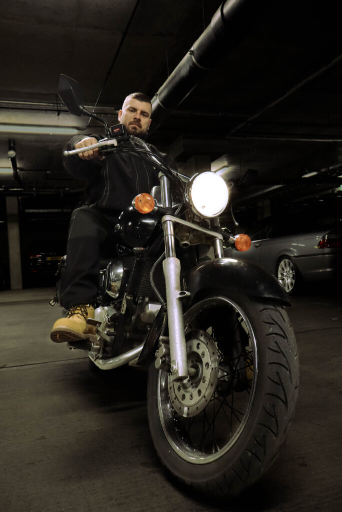
For the images I want to achieve I will be aiming to try find different and unique landscapes which can help make the image standout more alongside the subject. I will be taking most images with a wide aperture to ensure the whole landscape and subject can be viewed clearly. I will also try and attempt to make my subject do various amounts of poses and stand or move in different positions which I believe could produce some interesting photographs, to follow similarly to Clare Rae I will try to get my subject to reveal more of their limbs rather than their head or torso which can be effective in the right environment. I may also want to take close shots to keep as much detail as I can into my images and make it look appealing to the viewer.
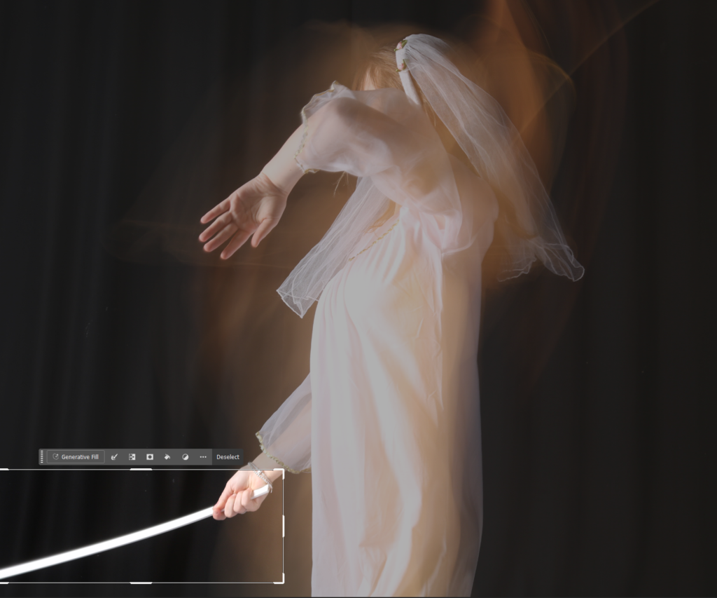
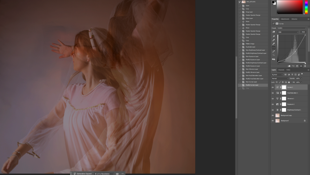
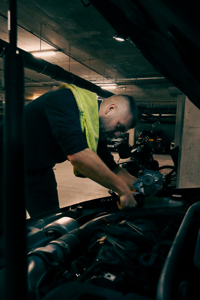
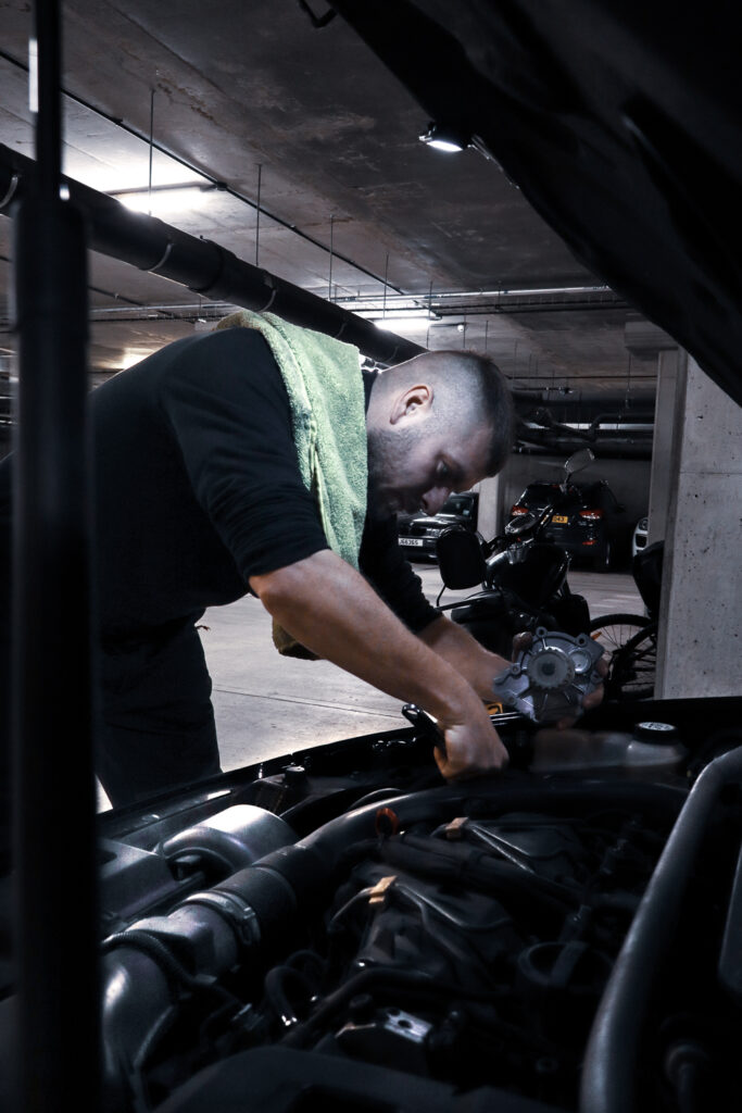
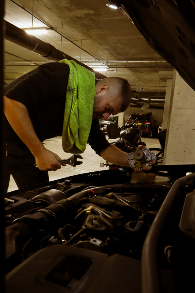
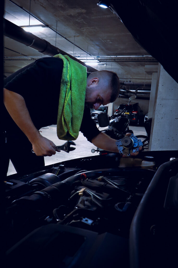
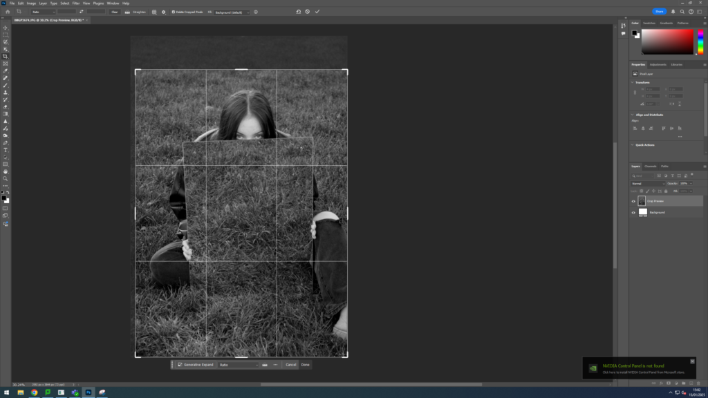
First, I cropped the photo to square, and then I selected what I wanted to remove from the photo and selected ‘generative fill’ which then edited it into just a hand without holding anything.
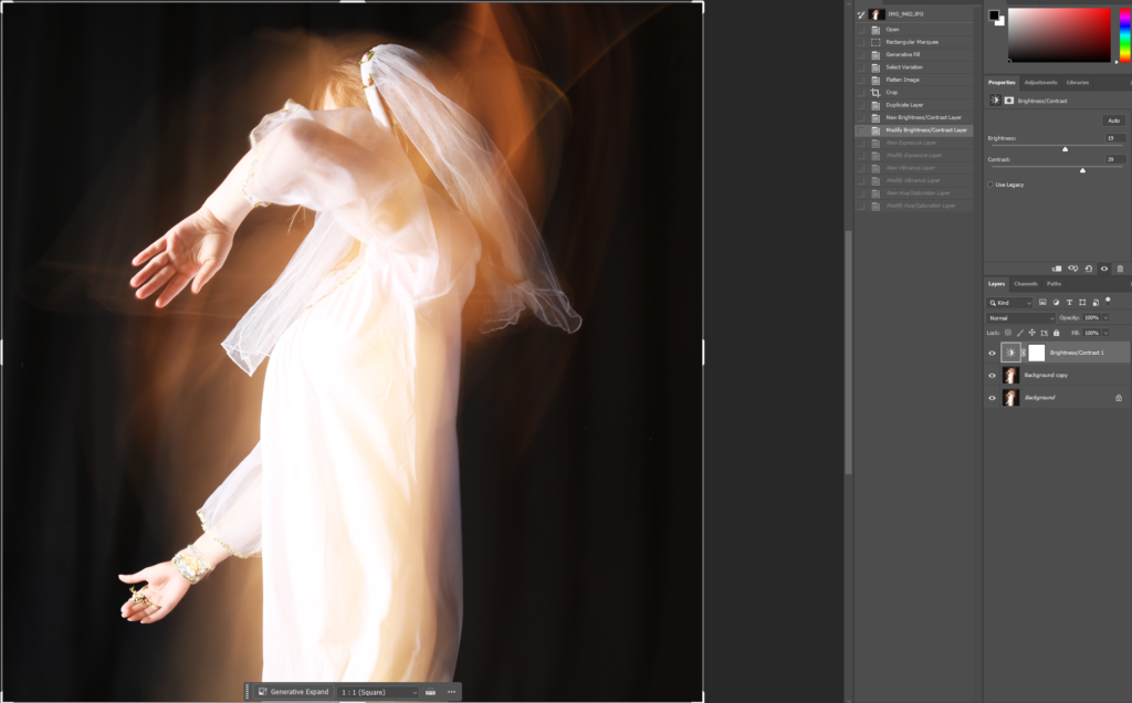
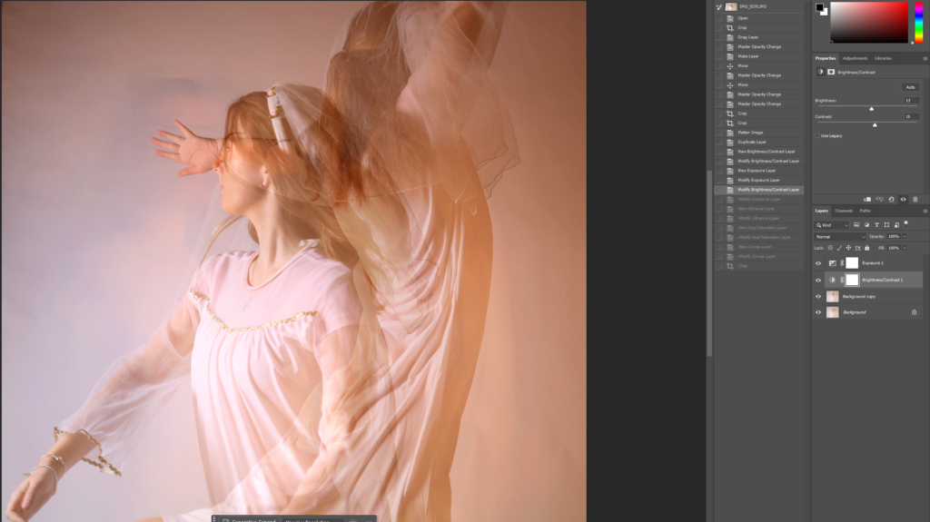
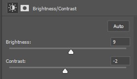
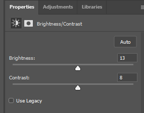
I then duplicated the layer, in case I made any mistakes, and I adjusted the brightness and contrast.
I then duplicated the layer, in case I made any mistakes, and I adjusted the brightness and contrast.
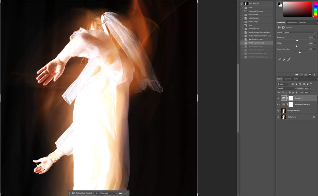
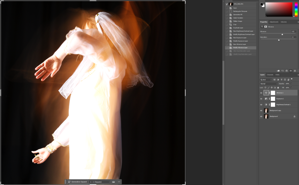
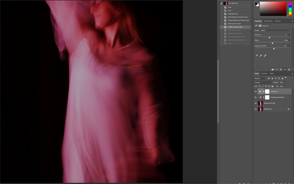
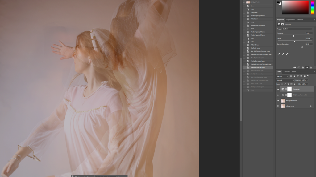
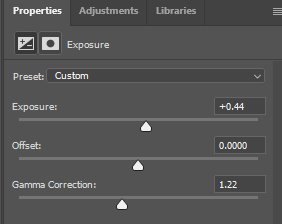
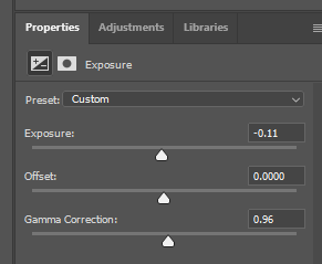
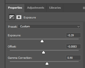
After that, I modified my exposure and gamma correction.
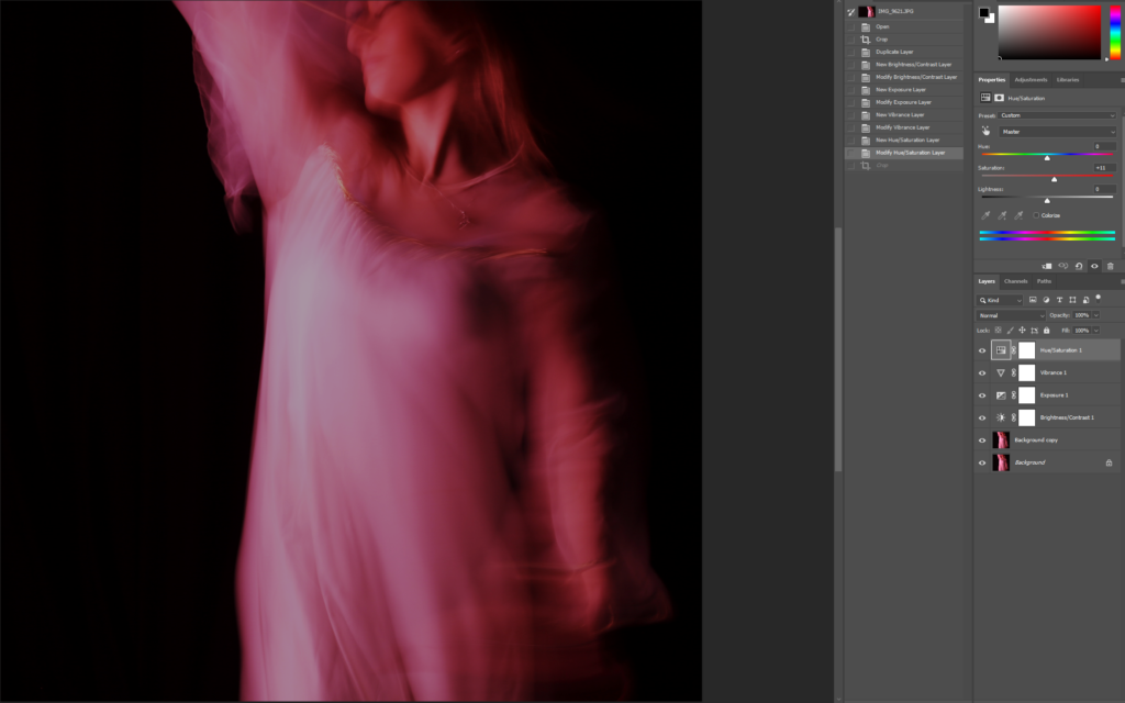
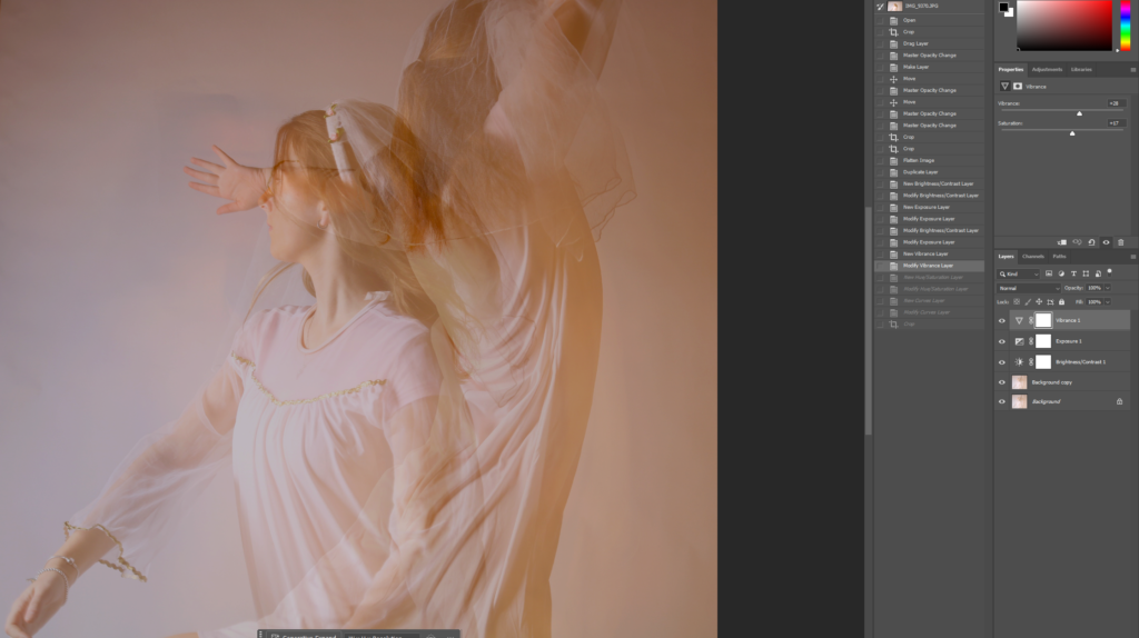
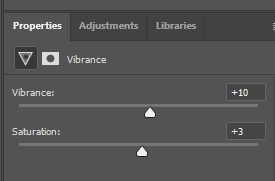
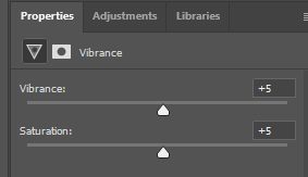
Then I decided to change the vibrance of the image.
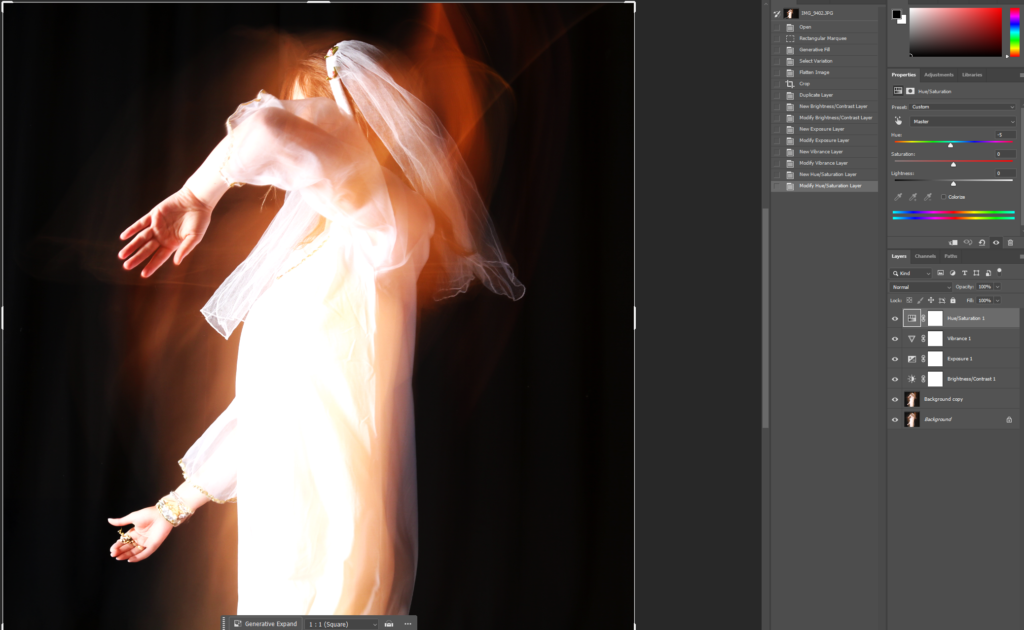
I then moved on to switching up the hue of the image, just slightly, to give the photo some dimension.
The three images were all edited the same way so that I could guarantee that they work well and look good together.
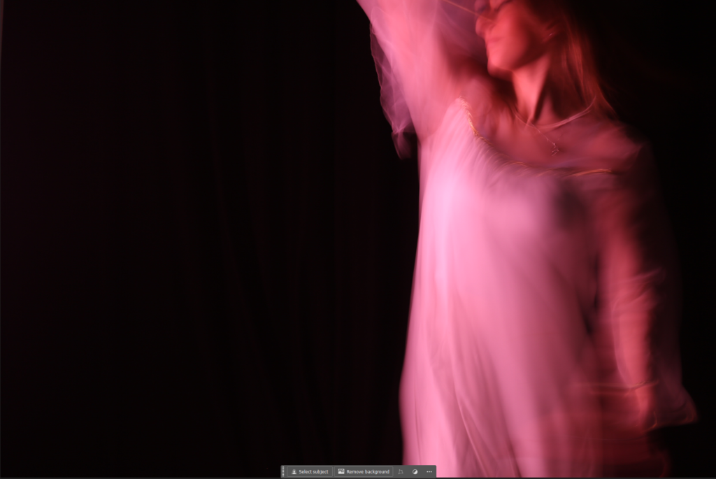
The femininity images had the same concept to editing except different settings.
I cropped it to square and modified the brightness and contrast, increasing both of them to brighten up the image.
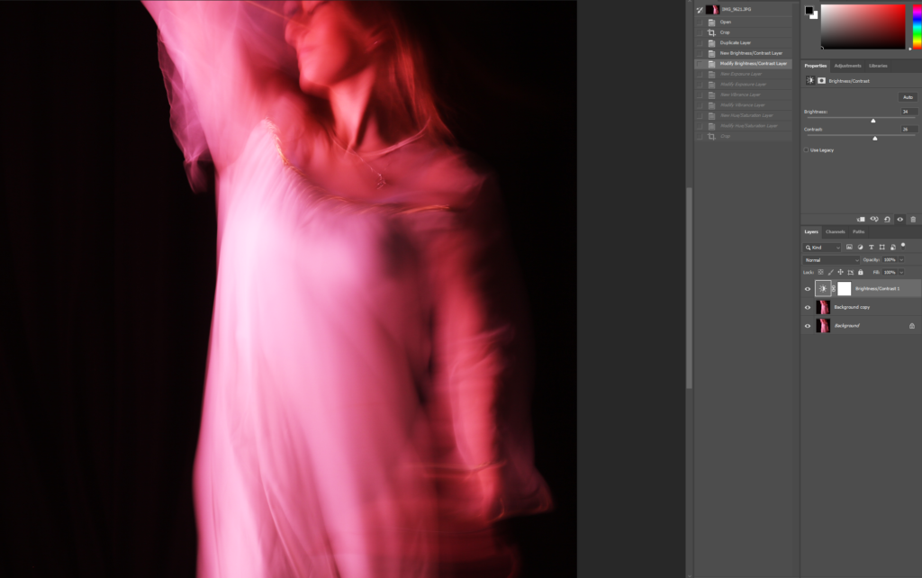
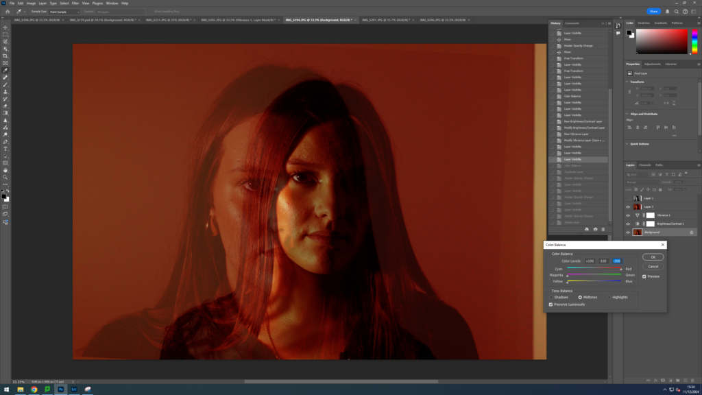
I then moved on to adjusting the exposurewhich I reduced, and the gamma correctionwhich I increased. This gave a more eerie effect to the image, while still keeping the pink tint.
I then increased the saturation which brought back more of the pink colour that I lost when doing the gamma correction and exposure.
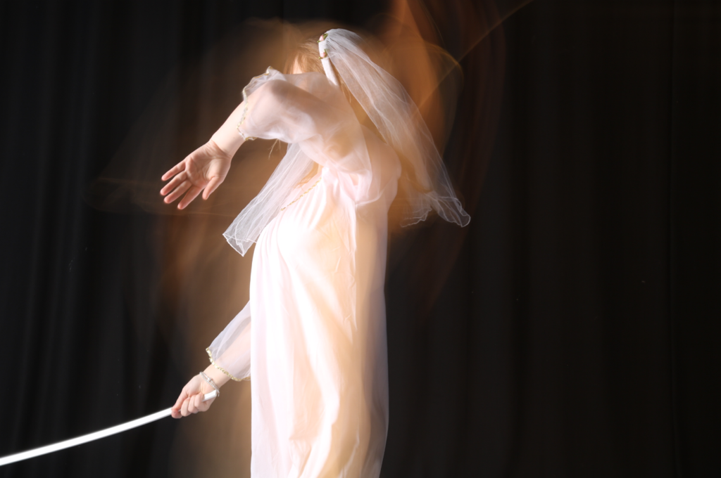
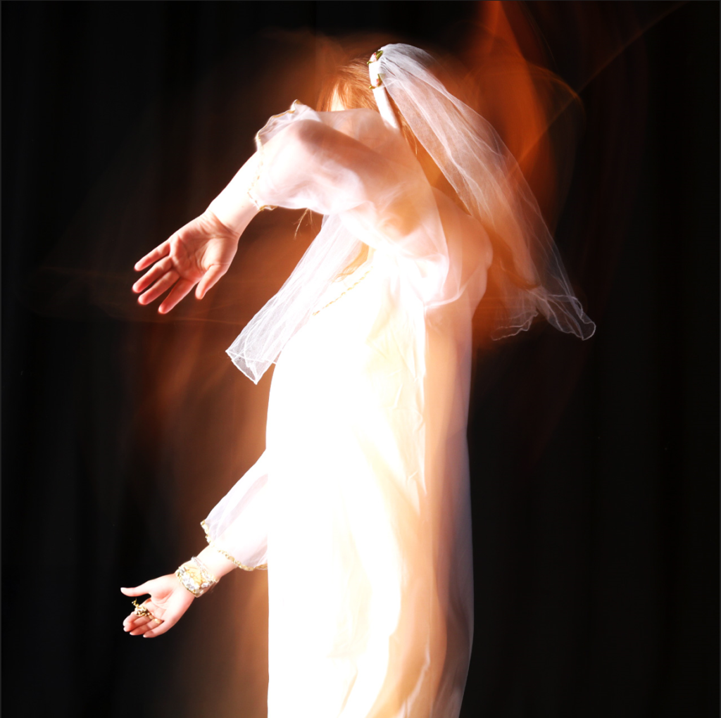
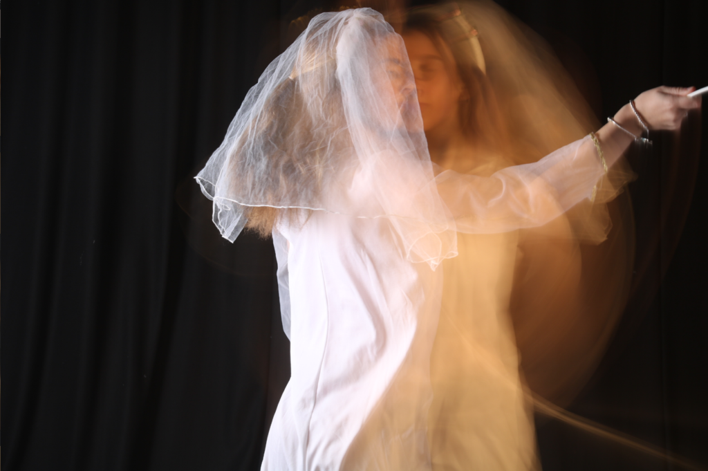
I started off with this photo.
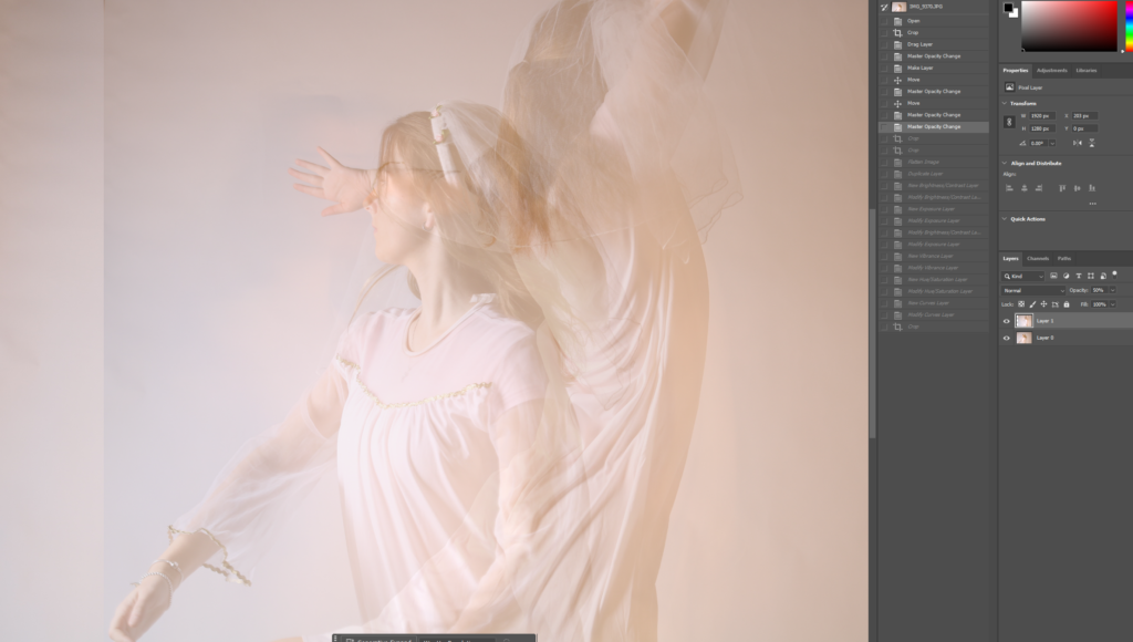
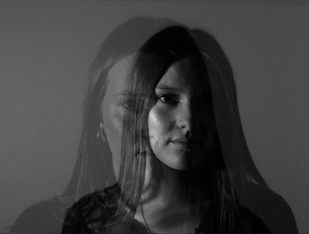
I then decided to add on another image on the top and blend them together by reducing the opacity on the top layer.
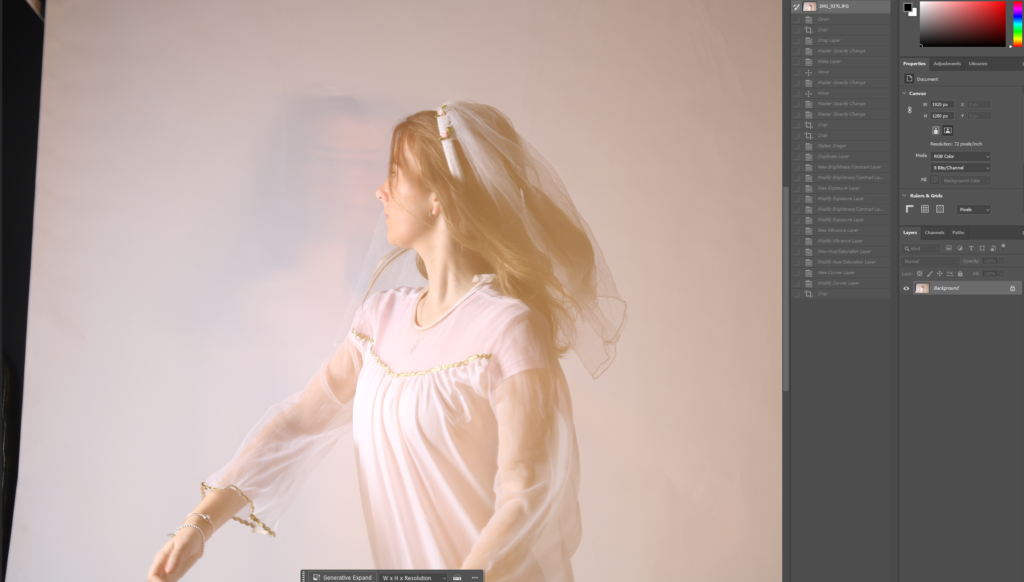
pped the image to get rid of negative space and so that it is square. I also flattened the image to make it all one layer.
After that, I adjusted the brightness and contrast to make it a little darker as it was too light.
I decreased the exposure and increased the gamma correction to improve the quality of my image and also give it an angelic effect.
I modified the vibrance by increasing both the vibrance and saturation to give it a little tint.
I then adjusted the curves to adjust the contrast and the lighting of my image.
Before and After Editing
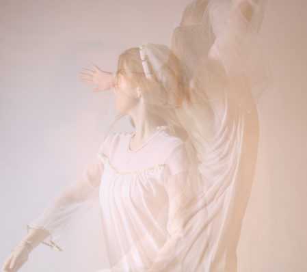
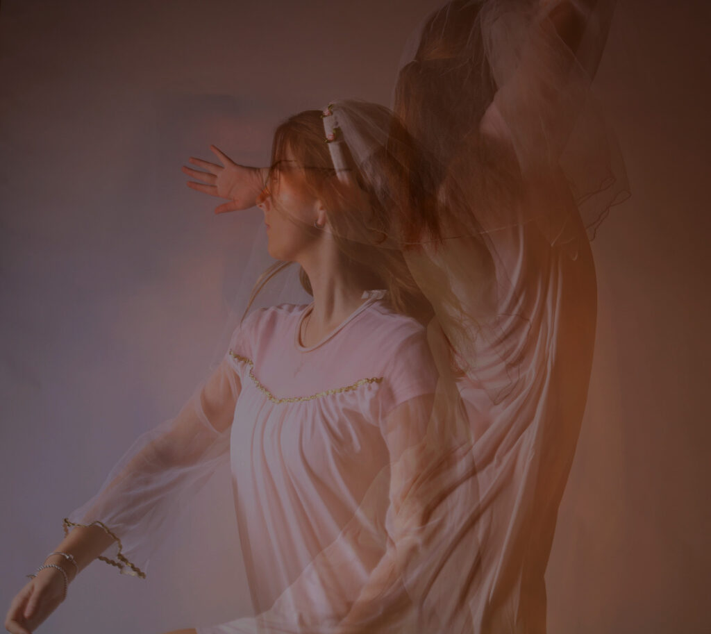
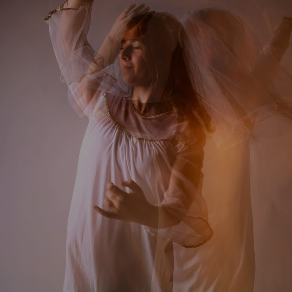
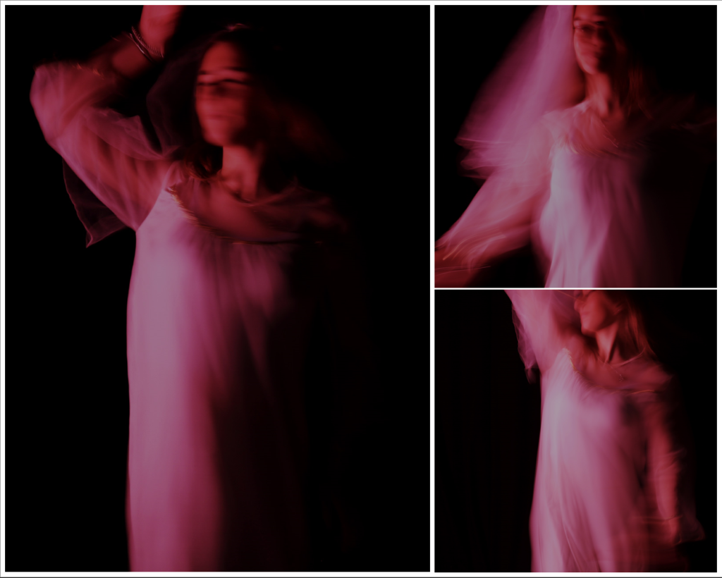
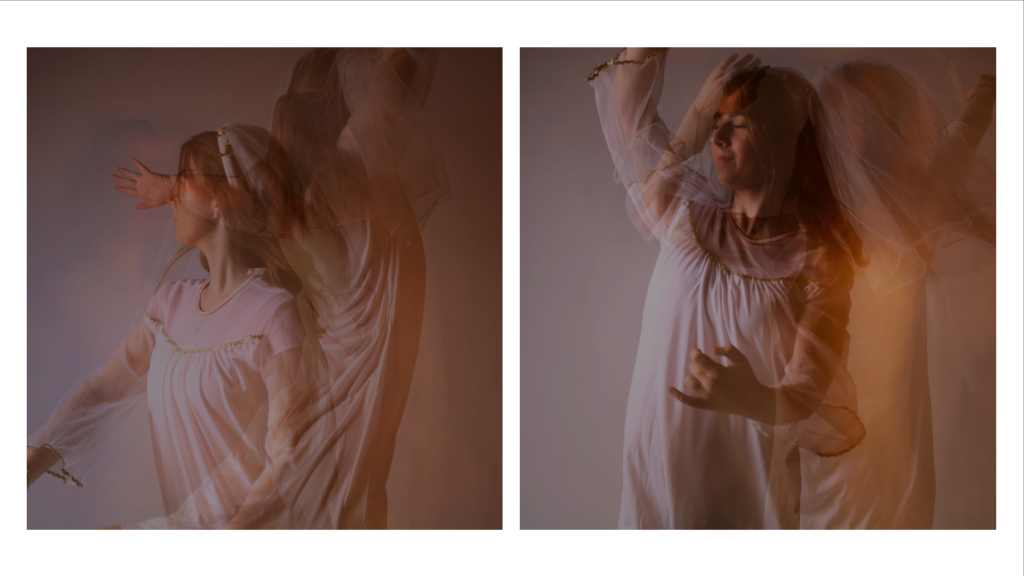
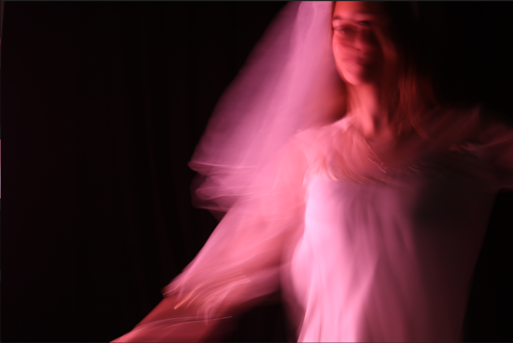
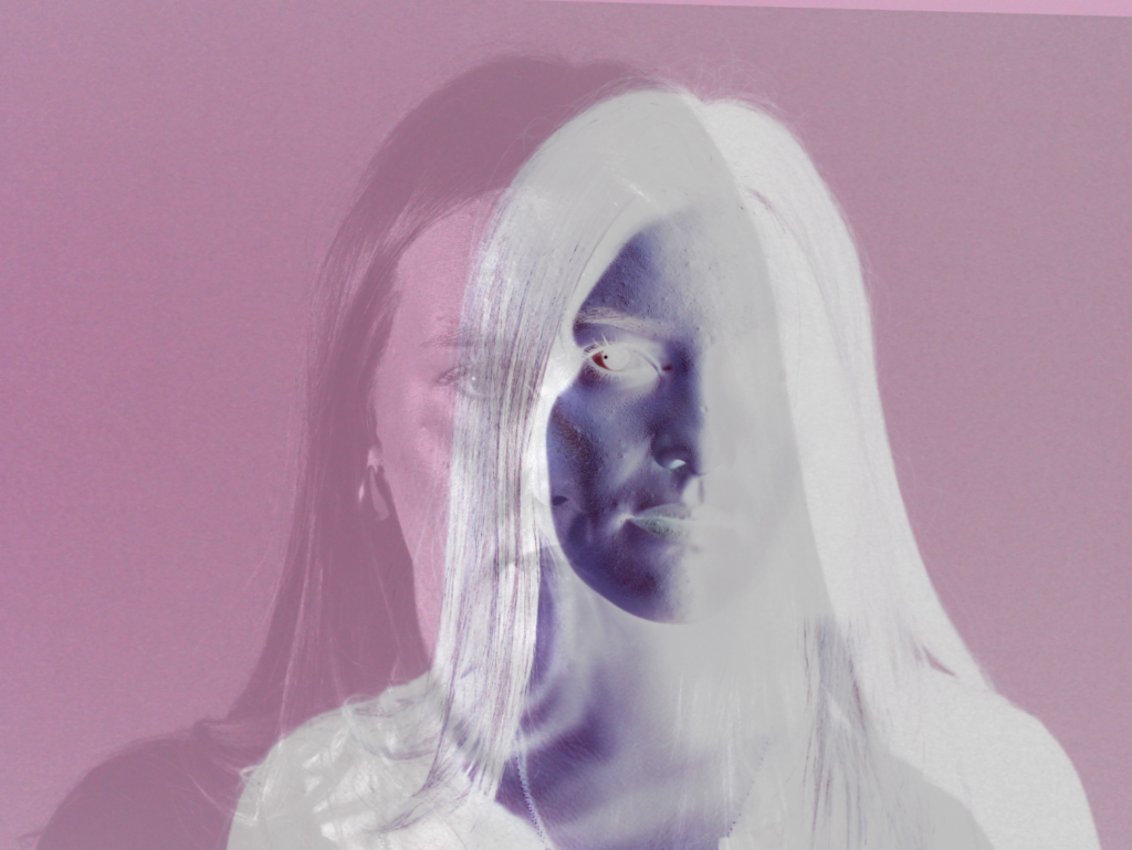
With these images, I brought up the brightness and contrast, exposure, vibrance and the gamma correction to create this soul effect. I reduced the hue only slightly to make the image look more like fire. I cropped it into a square with the subject in the middle of the image.
In this set of images, I went for the theme of femininity. I increased the brightness, contrast, gamma correction, vibrance and the saturation. I reduced the vibrance saturation, and the exposure. I cropped two of them to squares and one of them to get rid of negative space throughout the image.
With these images, I increased the brightness, contrast, vibrance, saturation and gamma correction and reduced the hue saturation slightly.
Presentation
This is how I would want my final photos to be presented.
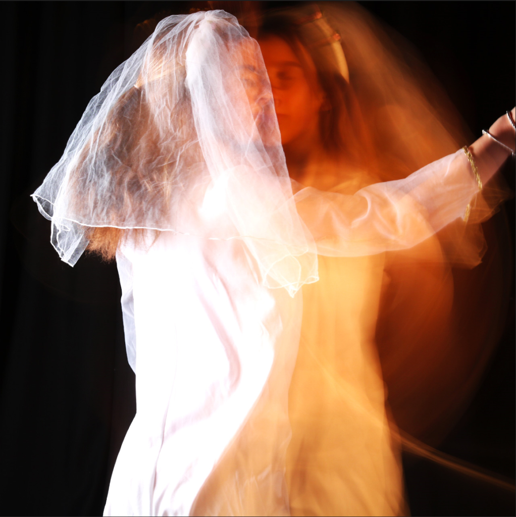
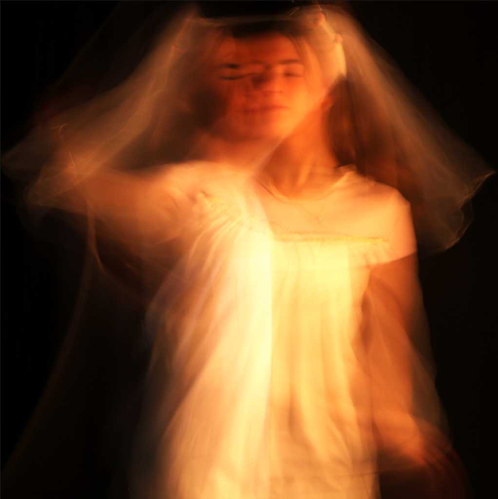
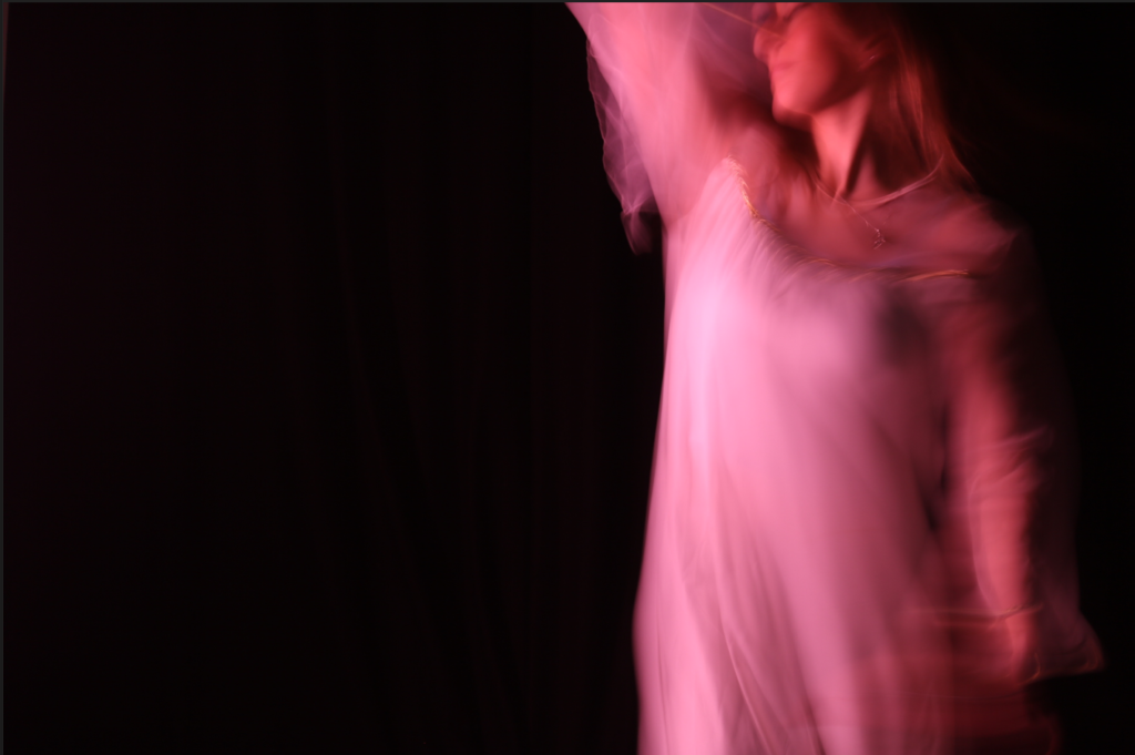
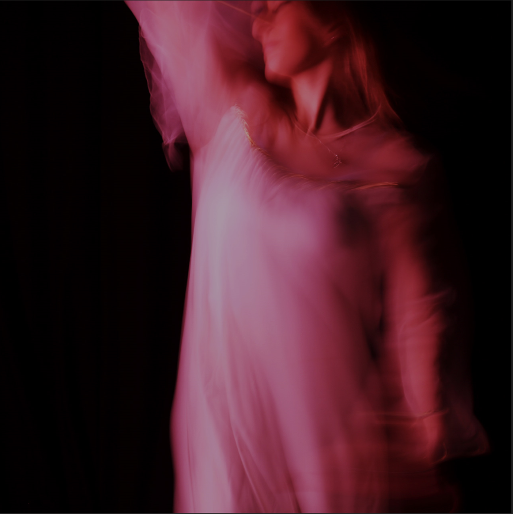
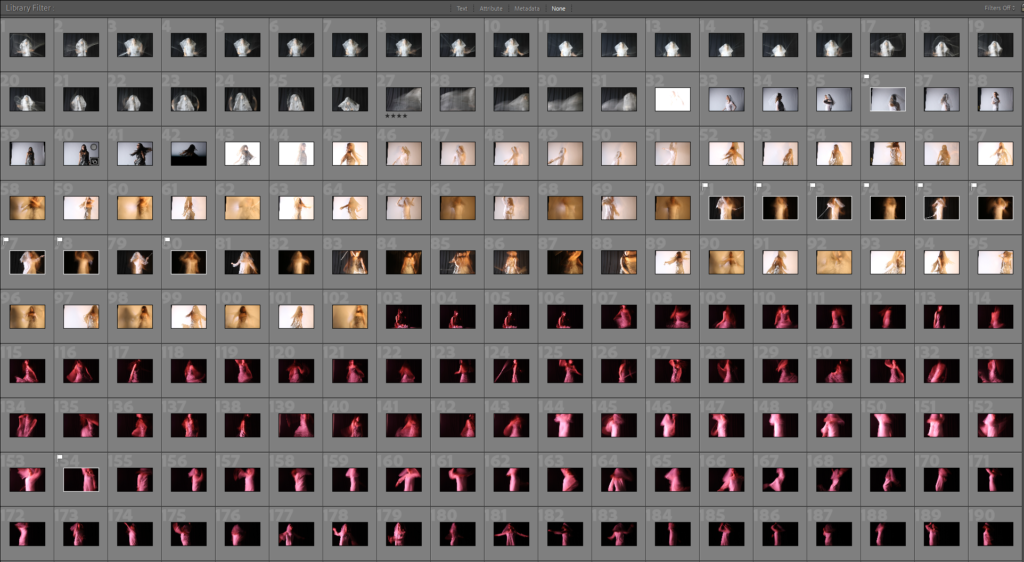
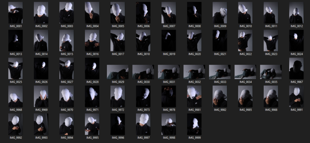
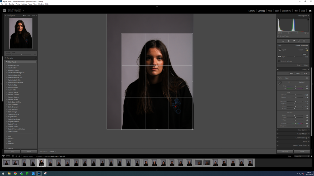
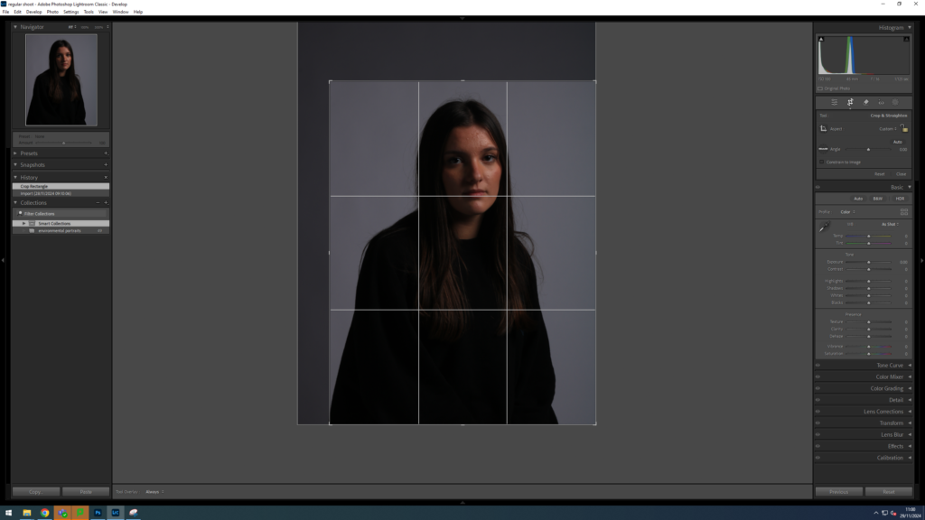
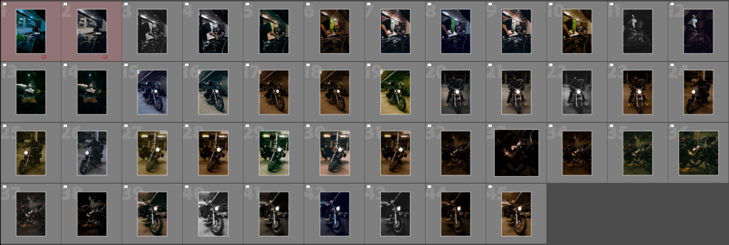
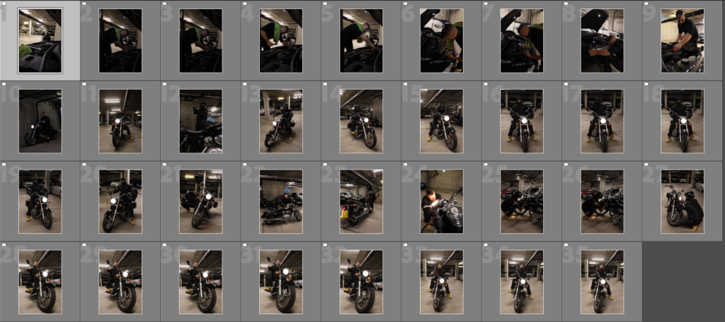
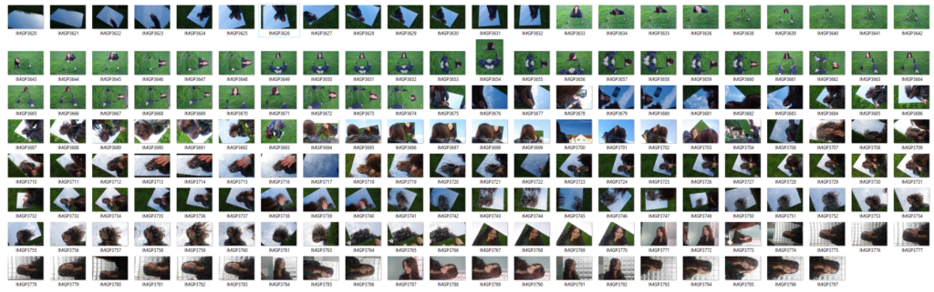
In my photoshoot, I started off with 102 photos, using black or white backgrounds and a slow shutter speed. Most of these photos are 1/2 body photos or 1/4 body photos. I then took another 215 photos using a black background but with pink studio lighting, still using a slow shutter speed. I ended up with 317 photos in my contact sheet.
I then narrowed it down to 19 photos by flagging them, which will be the photos I use for my editing and some possibly for my final photos.
Identity in photography can be seen as the representation of an individual’s or group’s essence through visual imagery. It encompasses various aspects, such as gender identity, cultural identity, social identity, geographical identity, and political identity. Each of these identities can be expressed and explored through photographic work, allowing for a deeper understanding of the subjects and the contexts they inhabit.
Masculinity and Femininity
Femininity and masculinity in photography often manifest through the portrayal of subjects in ways that align with or challenge traditional gender norms. For example, images that depict women in nurturing roles may reinforce femininity, while those showcasing men in assertive or dominant positions may emphasize masculinity. However, contemporary photography increasingly seeks to subvert these stereotypes, presenting a more nuanced view of gender that reflects the complexities of identity.
The influence of place and belonging is significant in photography. An individual’s environment and upbringing shape their perspectives and experiences, which can be conveyed through their work. For instance, a photographer from a particular geographical region may capture the cultural identity of their community, highlighting local traditions and social dynamics. Conversely, the lack of or loss of identity can be explored through themes of alienation or disconnection in photography. Stereotypes and prejudices can also be challenged through visual narratives, prompting viewers to reconsider their perceptions and assumptions about different identities. Ultimately, photography serves as a powerful medium for exploring and expressing the multifaceted nature of identity.
Key Artists with References
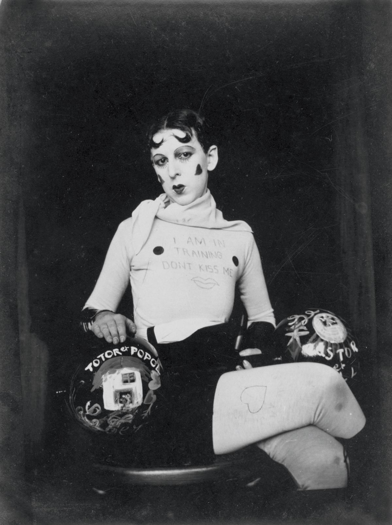
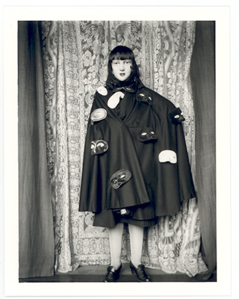
Cindy Sherman and Claude Cahun are two influential artists known for their explorations of identity, gender, and the self through photography.
Claude Cahun
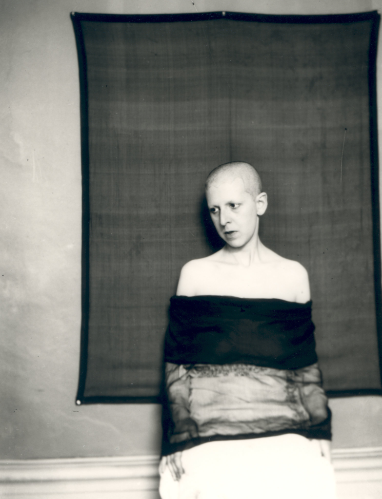
Claude Cahun, a pioneering figure in the early 20th century, also focused on identity and gender, but her approach was more avant-garde and surrealist. Cahun’s work often involved self-portraiture as well, but she used it to explore themes of androgyny and the fluidity of identity. In her photographs, she frequently manipulated her appearance, employing costumes, makeup, and props to challenge conventional gender norms. Cahun’s work emphasizes the performative aspects of identity, suggesting that it is not a fixed state but rather a series of roles that individuals play.
Cindy Sherman
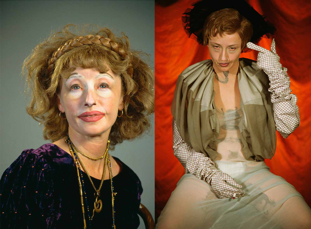
Cindy Sherman is renowned for her conceptual self-portraits, where she often adopts various personas and characters. Through her work, Sherman challenges traditional notions of femininity and the representation of women in media and art. By transforming herself into different roles—ranging from the glamorous to the grotesque—she critiques the stereotypes and societal expectations placed on women. Her series “Untitled Film Stills” is particularly notable, as it presents her as the protagonist in staged scenes that mimic film stills, allowing viewers to question the authenticity and construction of identity in visual culture.
Both artists use photography to interrogate the construction of identity, but they do so in distinct ways. Sherman’s work often reflects a critique of popular culture and the roles women are expected to play, while Cahun’s work delves into the complexities of gender and self-representation. Together, they highlight how photography can serve as a powerful tool for exploring and deconstructing identity, encouraging viewers to reconsider their perceptions of gender, self, and the roles imposed by society.
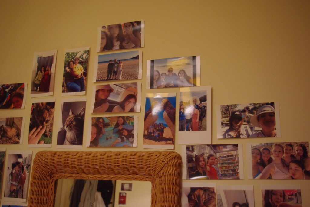
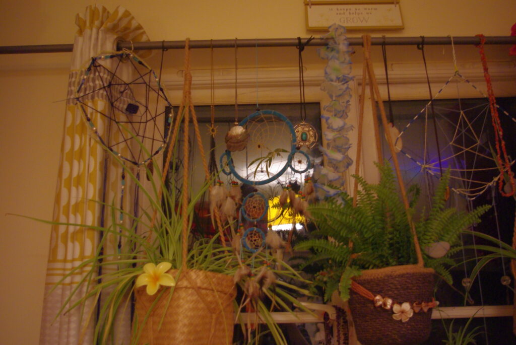
Mood Board
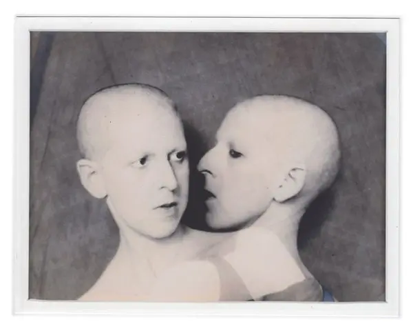
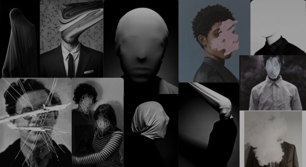
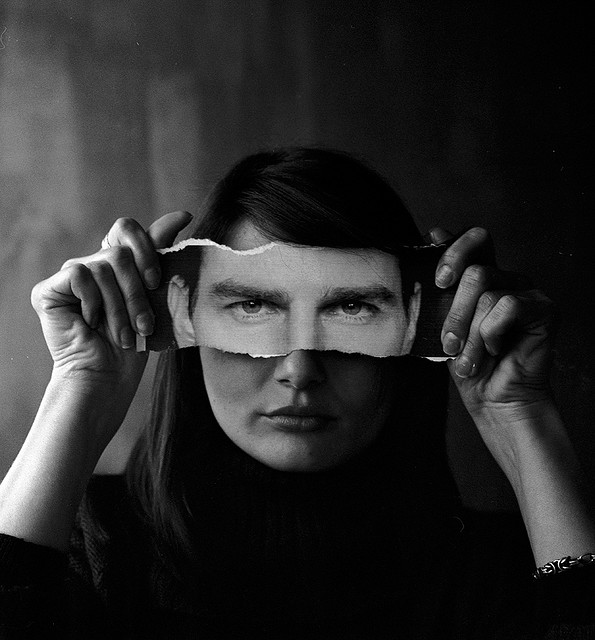
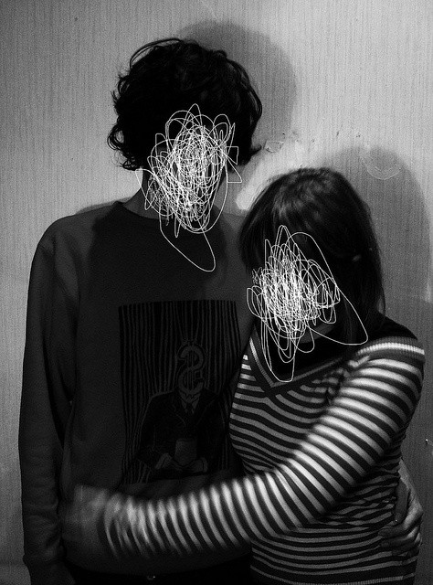
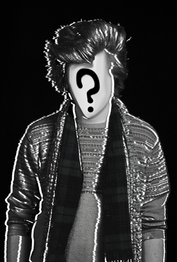
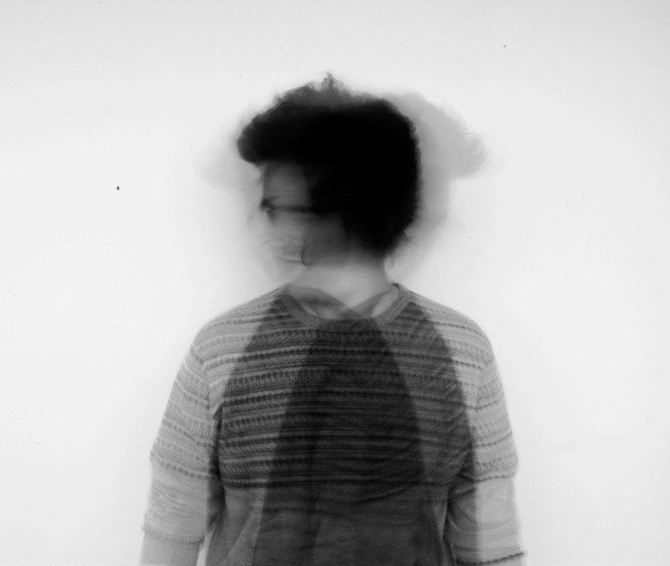
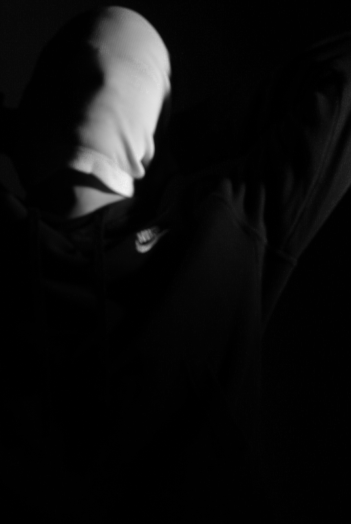
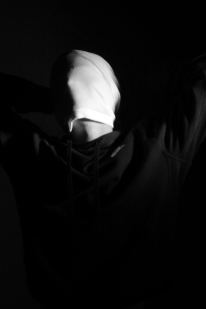
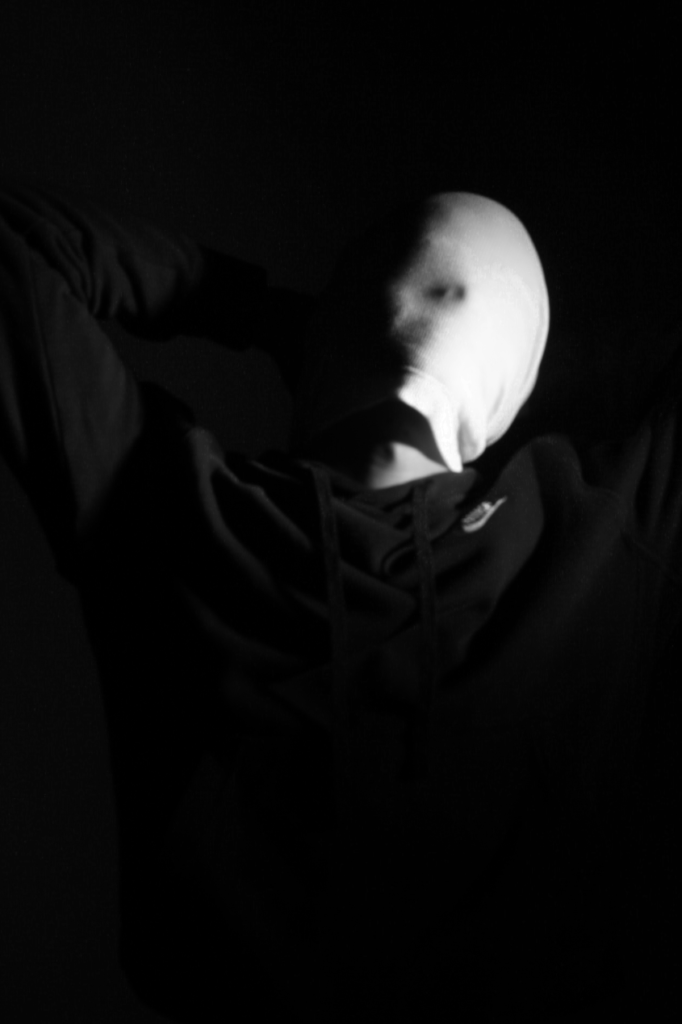
Idea of “Loss of Identity”
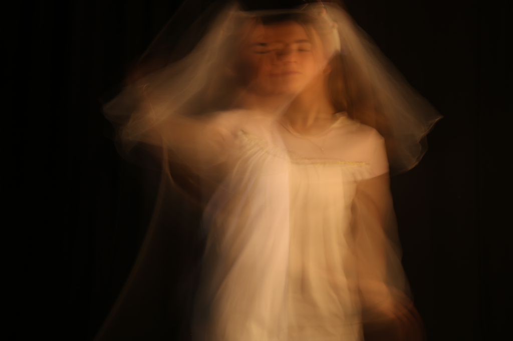
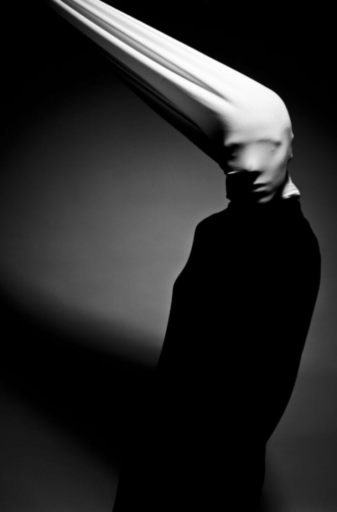
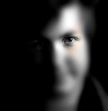
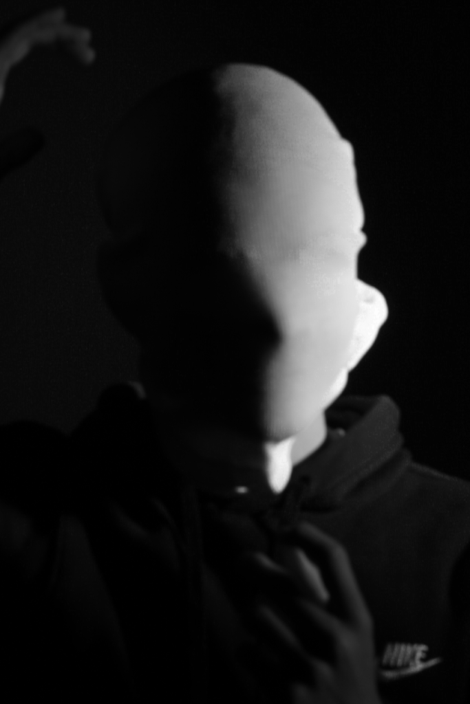
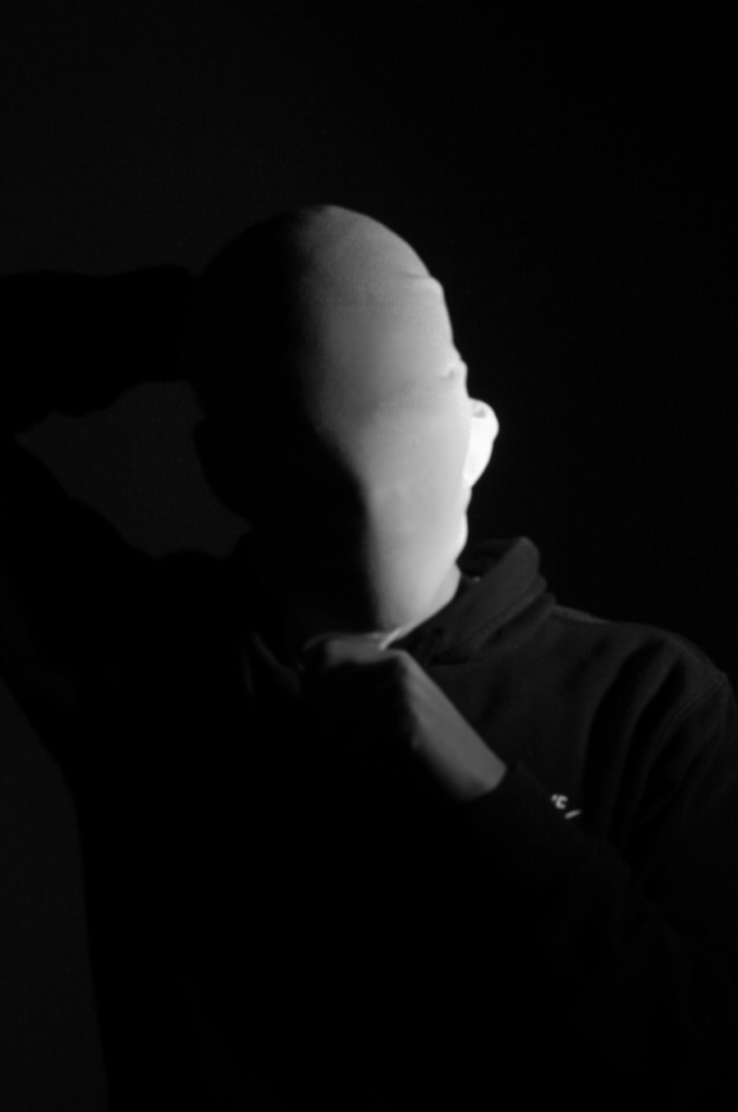
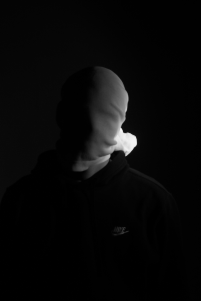
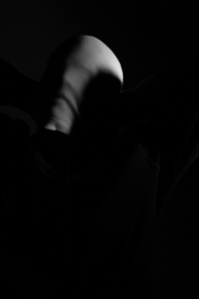
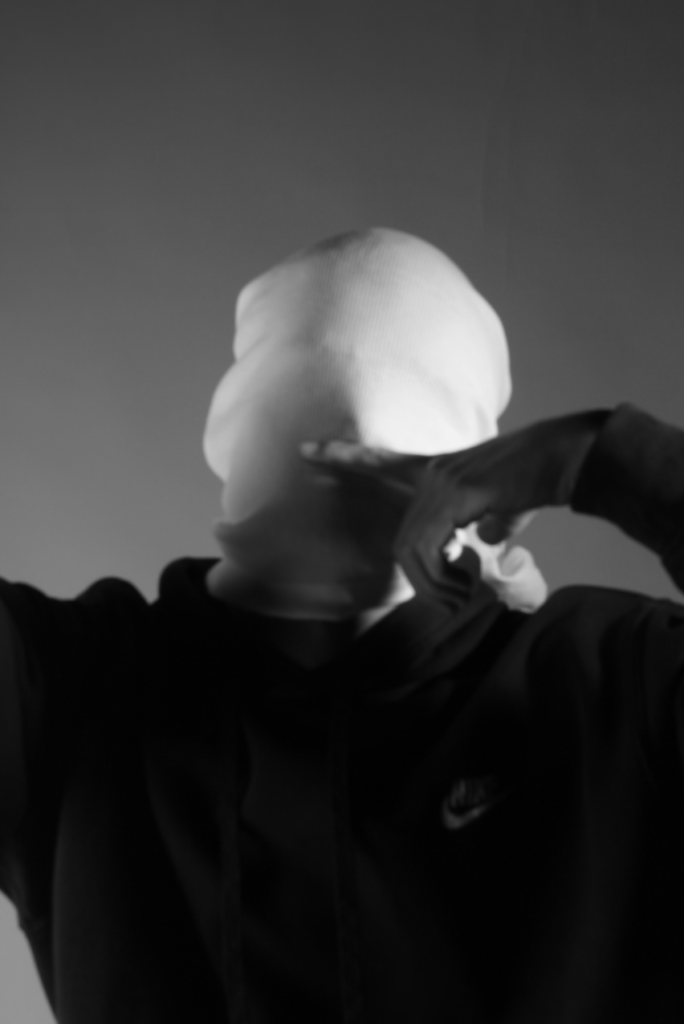
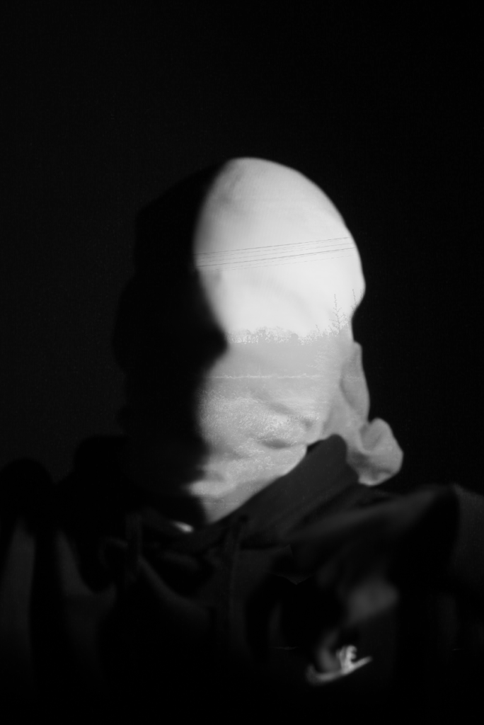
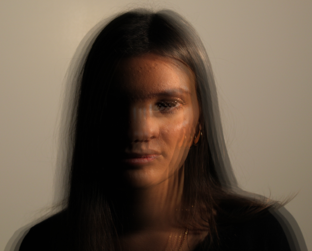
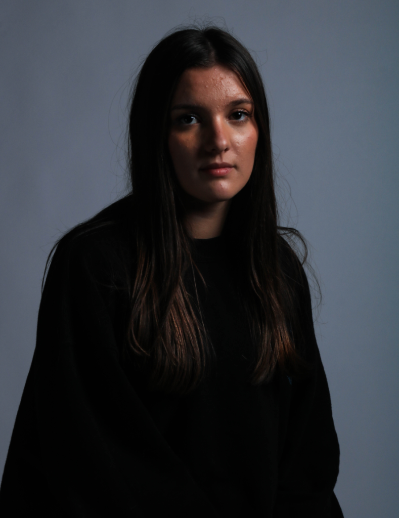
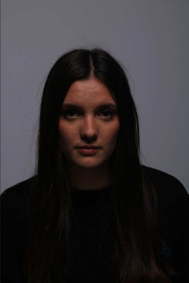
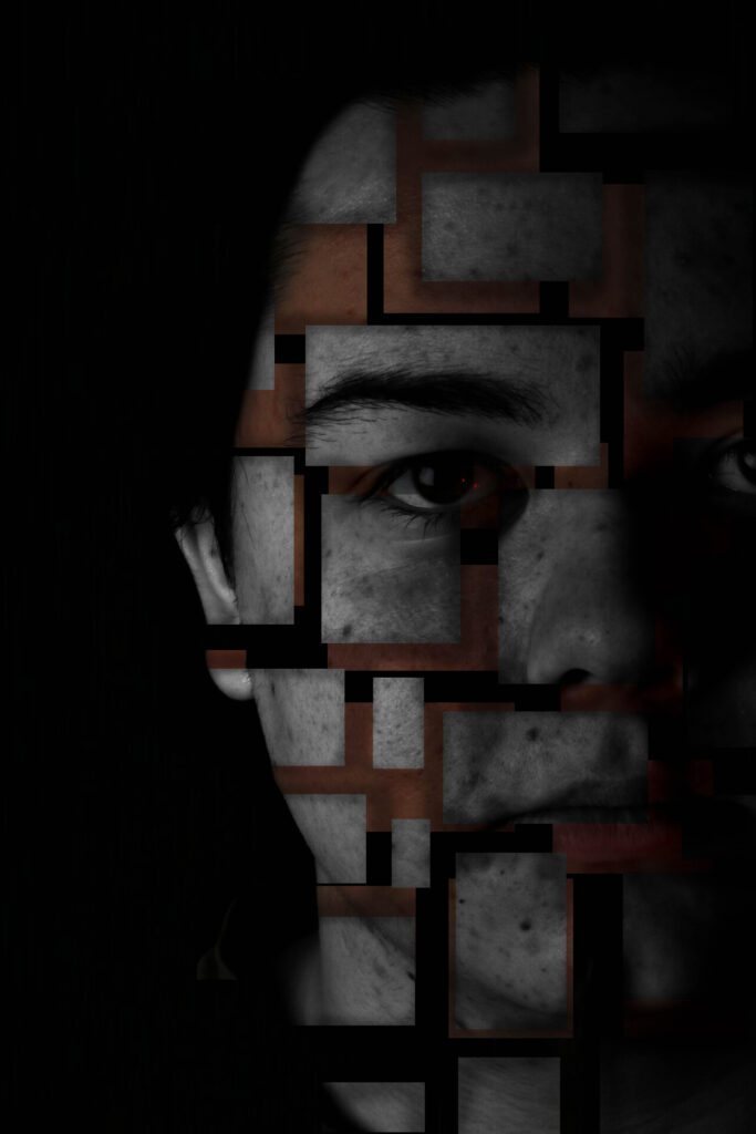
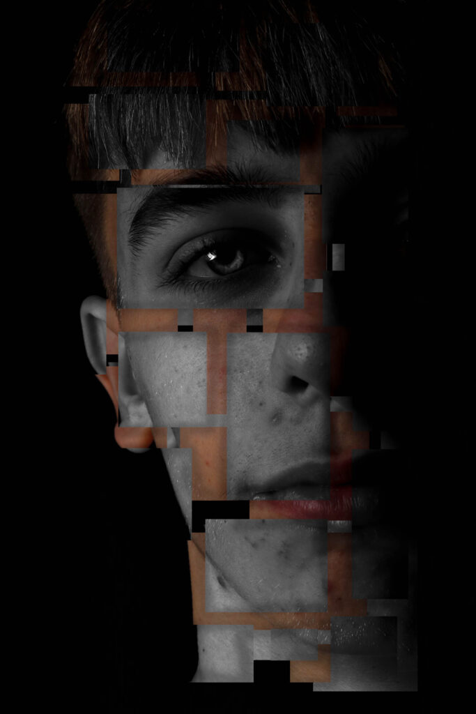
I conducted a lot of research into the theme of “Identity”, and came across these images. They are quite dark and monochromatic and when I asked for my teachers view of these images, he said they almost created the sense of “Loss of Identity”
Researching further into the theme “Loss of Identity” in photography, I found out that it can evoke a range of emotional and conceptual effects. It often creates a sense of disconnection, alienation, or introspection. When photographers explore this theme, they use techniques such as blurred images, fragmented compositions, or abstract representations to symbolize the struggle of individuals to maintain their sense of self in a rapidly changing world.
This theme can also provoke viewers to reflect on their own identities and the factors that contribute to their sense of self. It can lead to a deeper understanding of societal pressures, personal experiences, or cultural shifts that influence identity. Additionally, photographs focusing on loss of identity can foster empathy, as viewers may connect with the feelings of confusion or loss portrayed in the images. Overall, it opens up a dialogue about what it means to be oneself in various contexts.
Artists related to my Theme of Identity
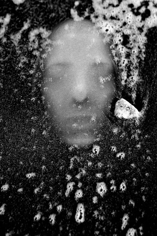
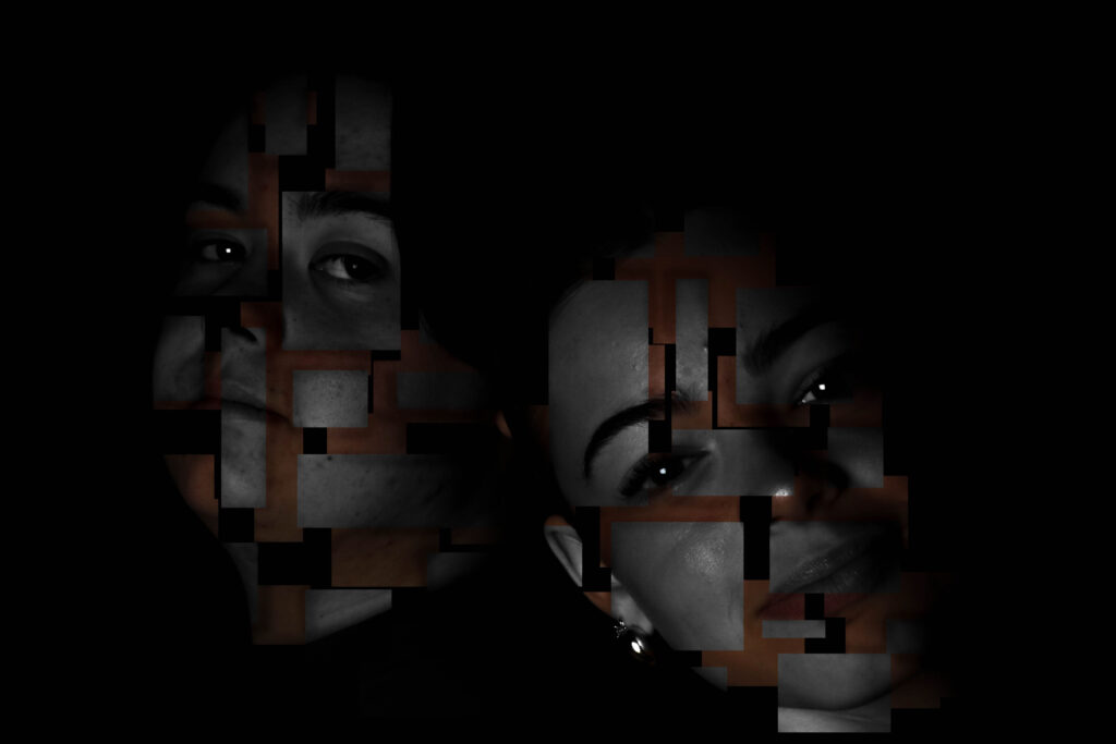
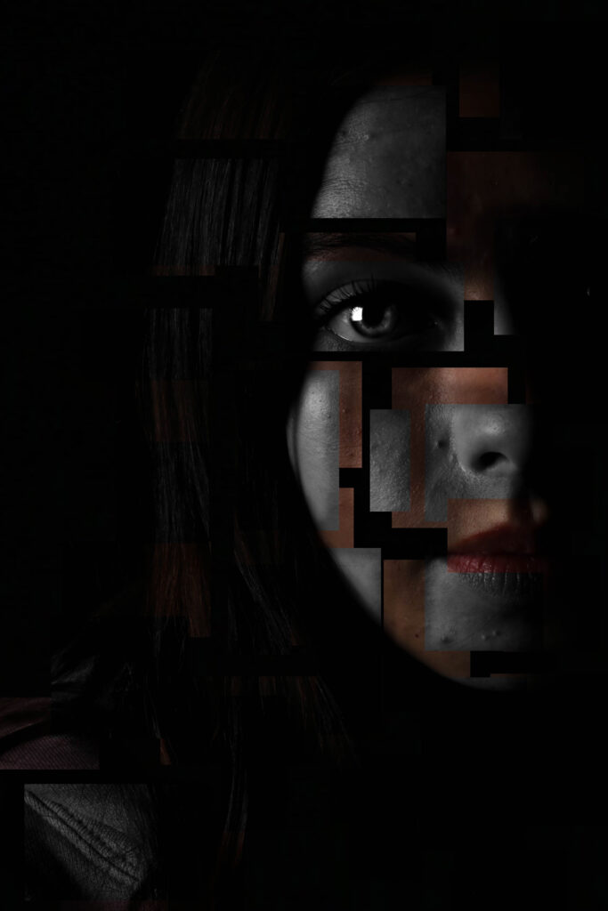
Andreas Poupoutsis
Andreas Poupoutsis is a contemporary photographer known for focusing on themes like identity and memory. His work often blends portraiture with conceptual photography, creating thought-provoking images that evoke emotions. He uses techniques like mixed media and digital manipulation, which add depth to his subjects. His photography reflects personal and collective experiences, encouraging viewers to think about their own identities and how they are shaped by their surroundings.
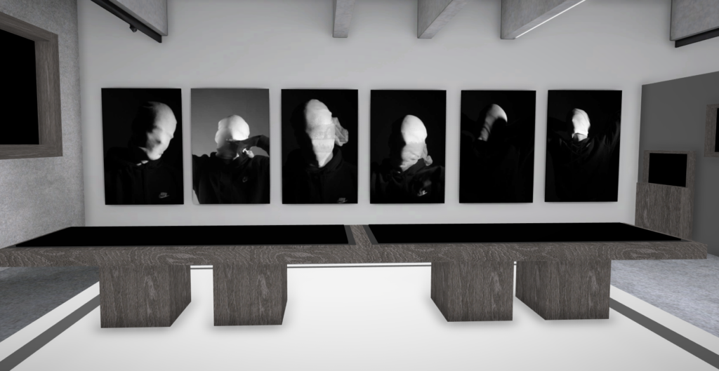
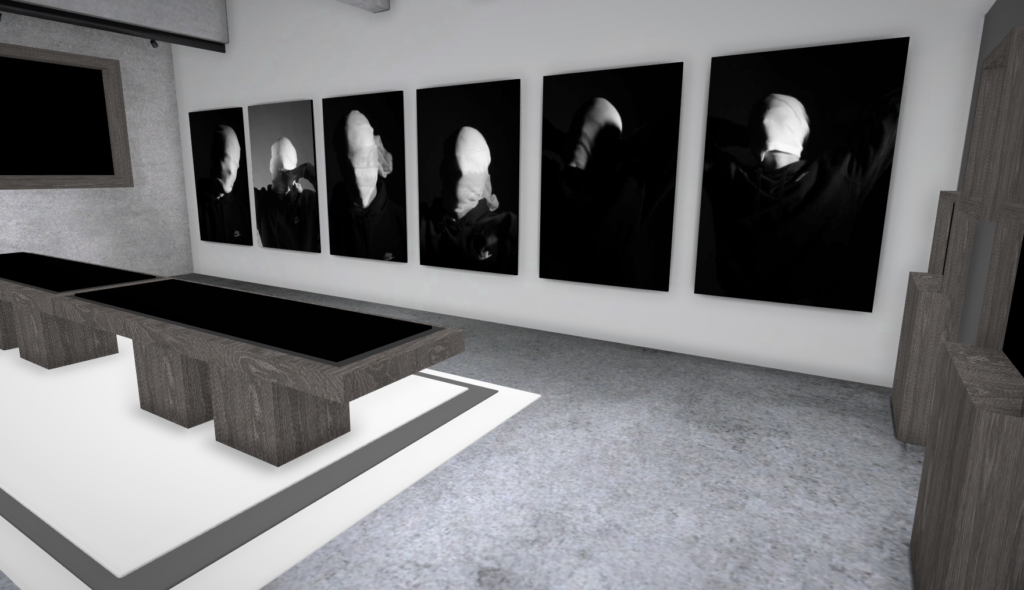
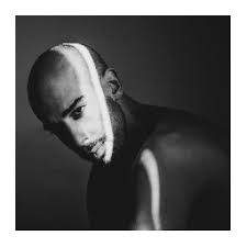
Poupoutsis takes his images from a close-up shot, to make the person in the image the whole focus. The person being the main focus is also created by the background being extremely dark: in the image on the middle it appears to be a vignette effect used, whereas the image on the left is fully black.
He talks a lot about his inspiration for his work and what he did to achieve these creative images.
” “Metamorphosis” would best describe my creative process. I am influenced by Cubism, shapes, shadows and textures. Creating beautiful and abstract images intrigues me. I am fascinated by people’s faces and especially by the transformation they go through in my photographs. We are complex and unique individuals with our own experiences, fears and losses and use our life experience to view the world. Being true to ourselves is one of the most challenging thing we can do. “
He further talks about his fascination with faces and how he prepares himself before his photoshoots to make sure everything is going according to plan.
“As for my fascination with faces, I have always been intrigued by abstract portraits, every face is unique in its own way and that sparks my imagination. At the same time I’m always looking for ways to transform that uniqueness and go deeper into analysing the identities of people.“
“My process is always different depending on the project. It all starts out with an idea which then turns into small sketches. I always have a diary in which I write down all my ideas. Pre-visualising the shoot is also very important and the search for the appropriate materials, textures, urban locations is needed. I prefer studio work because there I have total control of the light.“
Overall, Poupoutsis’s work highlights the power of visual storytelling in exploring human experiences.
Michael Wills
Michael Wills is a notable photographer recognized for his contributions to the field, particularly in documentary and fine art photography. His work often focuses on capturing the essence of human experiences and social issues, using a narrative approach to tell stories through his images. Wills’s photography is characterized by its emotional depth and attention to detail, allowing viewers to connect with the subjects on a personal level. He has explored various themes, including identity, community, and the passage of time, making his work significant in contemporary photography.
Childish
My Photo-Shoot Response
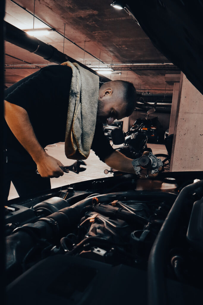
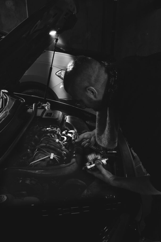
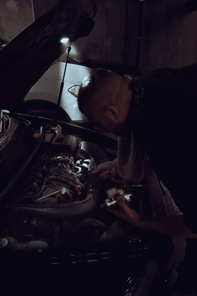
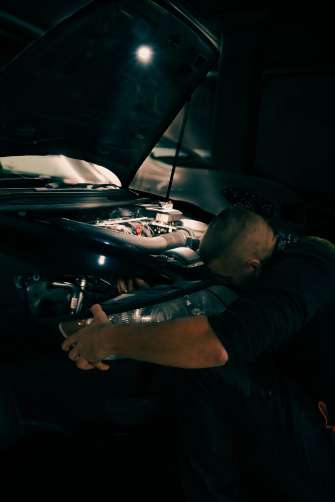
These are my Photoshoot Responses of Andreas Poupoutsis. I tried experimenting with the light and discovered quite a unique and interesting way to manipulate it. I first started adjusting the brightness of the flash and physically moving the light stand and proceeded to take the photos. I was taking Photos of my model and was repeatedly pressing the button for it, giving the flash less time to light up the room. This helped me focus the light only on my model and not the entire room.
I communicated with my model, explaining to them that their body can also convey their emotions, not just the face. This made my images stand out and feel more connected to them. For me at least.
Experimentation/Editing
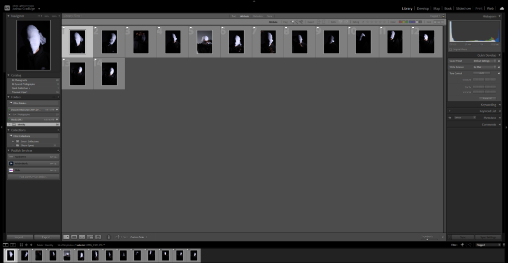
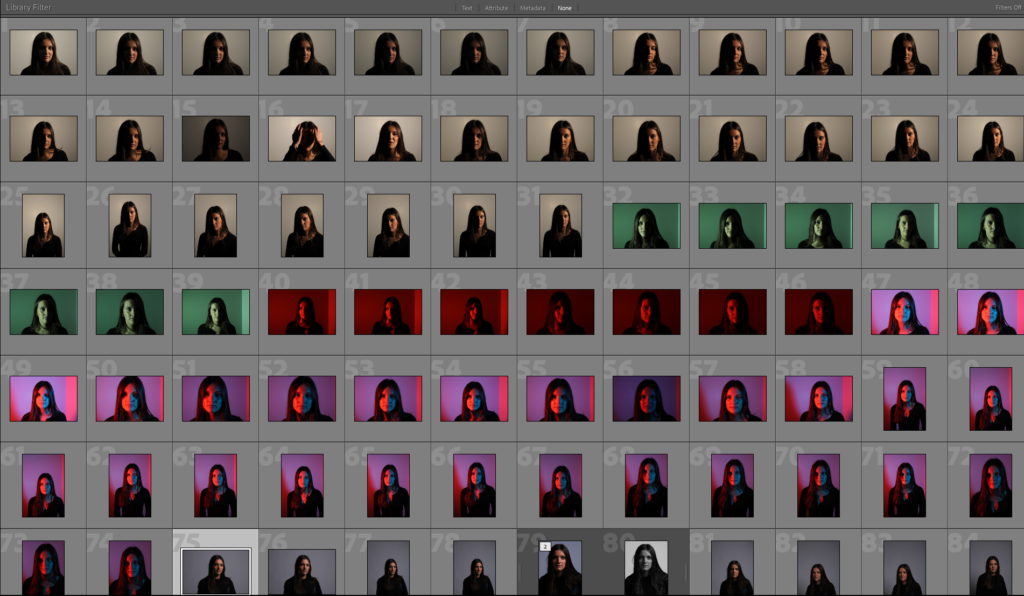
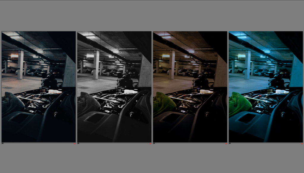
After uploading my Photos to my Hard drive, I used Adobe Lightroom Classic to browse through my photos and see which ones came out…Bad, Good or Great.
I flagged the Photographs which caught my attention and followed up by moving/editing them further into Adobe Photoshop. I decided to play around a bit with the settings in Photoshop to create these Monochrome based images. The settings that I used was…
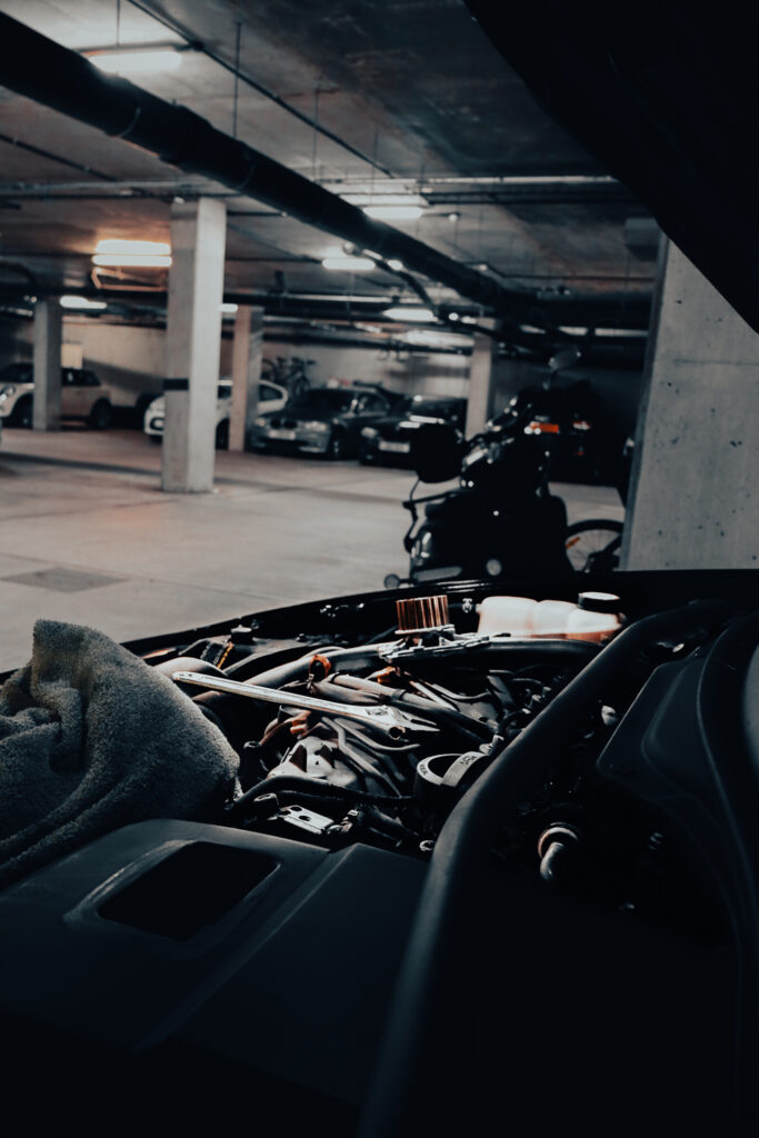
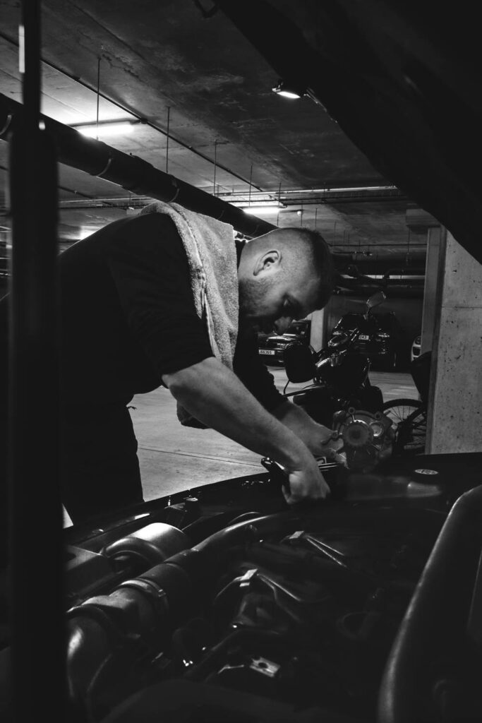
BeforeAfter
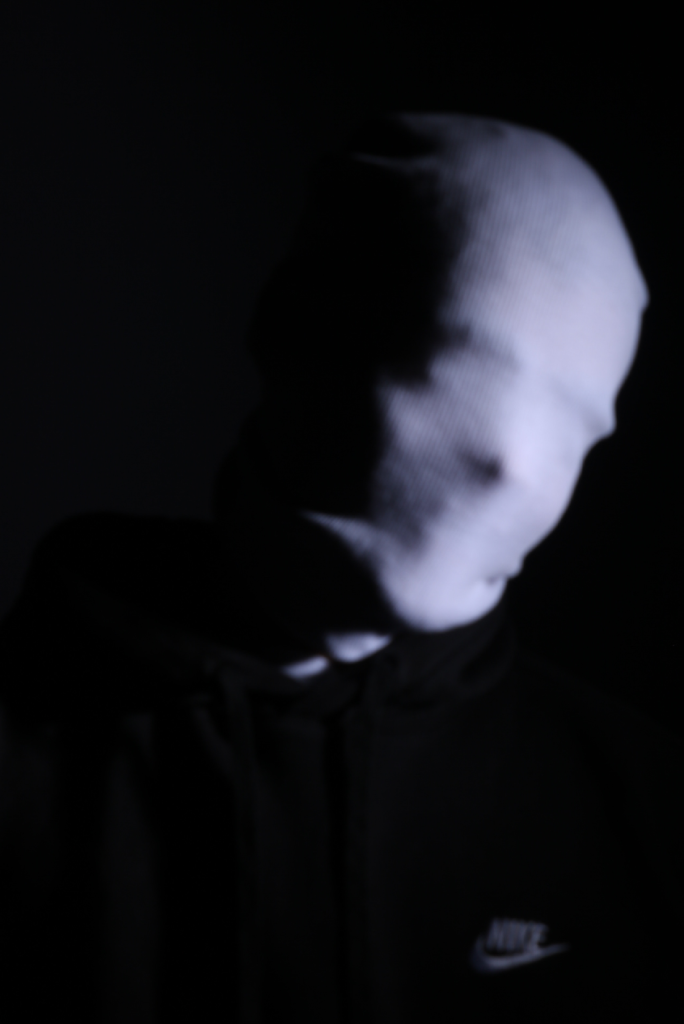
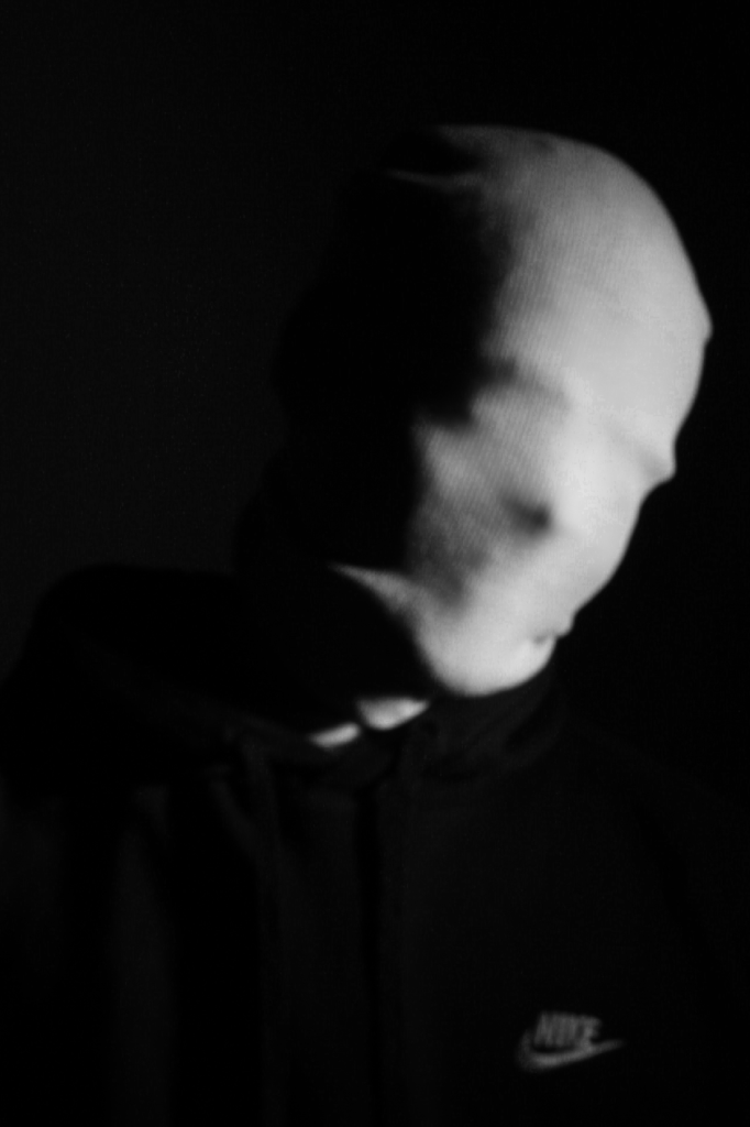
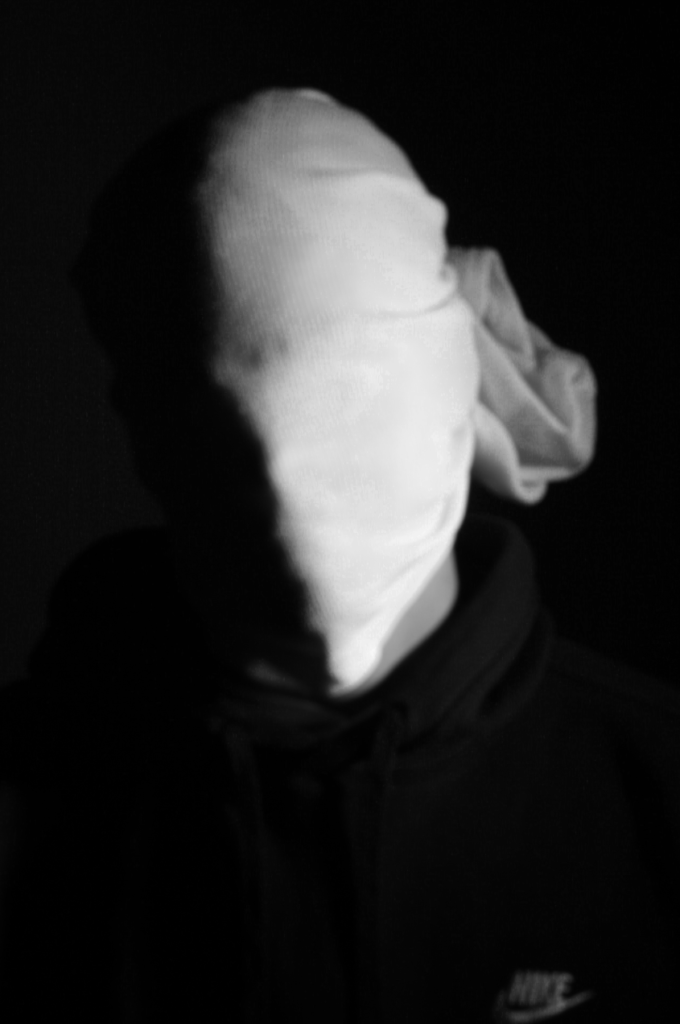
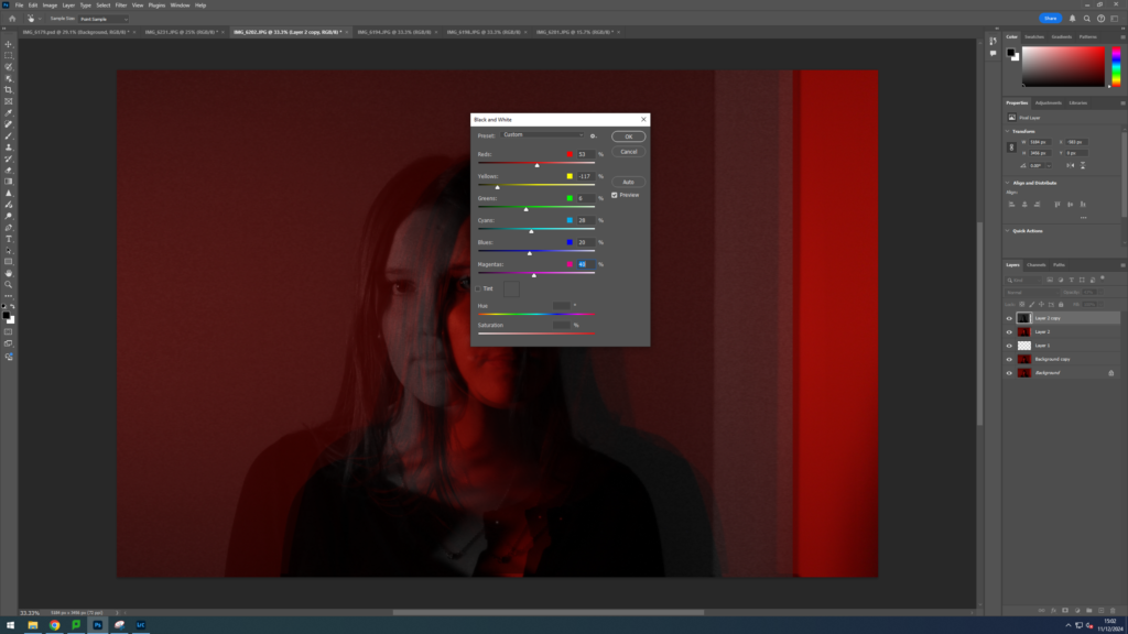
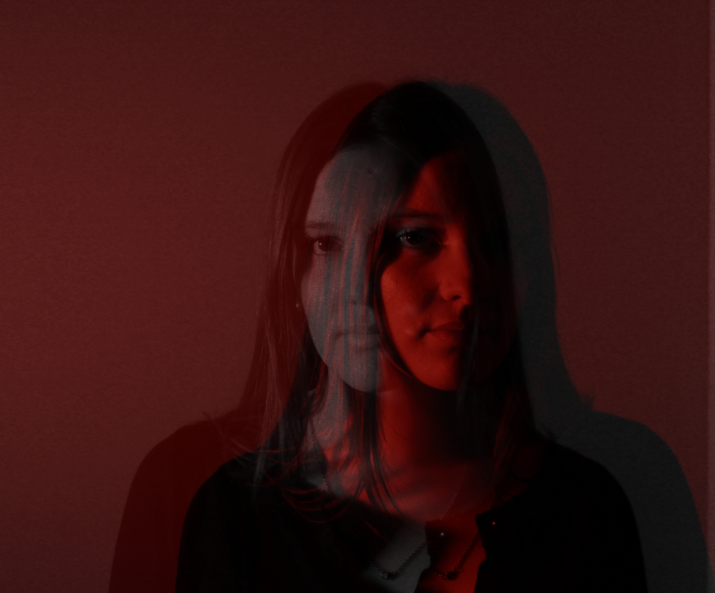
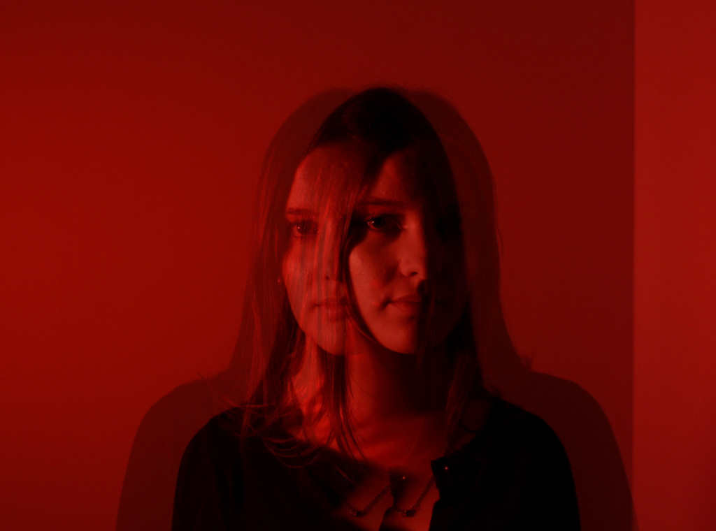
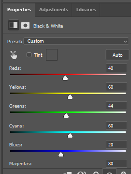
This is the Before and After of the Original Image with the Black and White Filter applied. All of my Images for the theme of Identity will all have the exact same Black and White filtered applied.
Slowly my photographs started looking like Andreas Poupoutsis. I could see similarities.
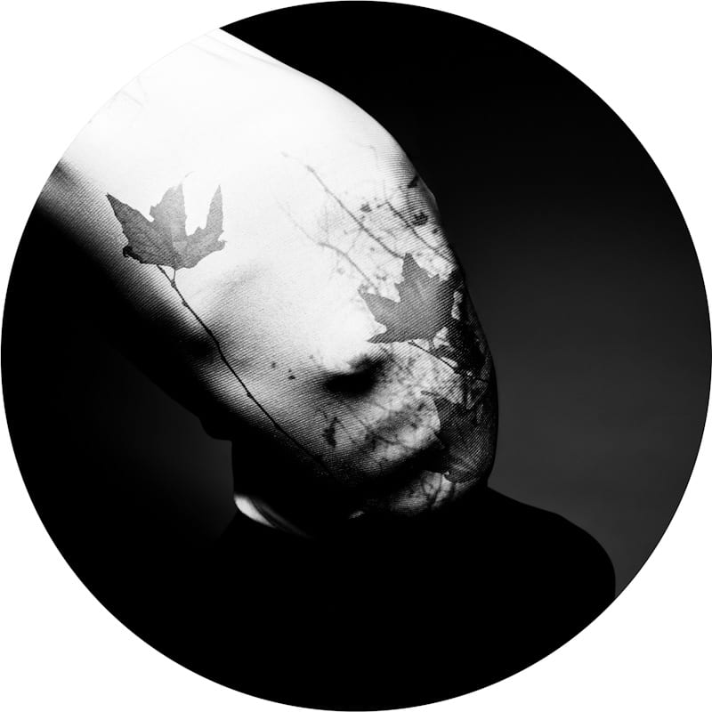
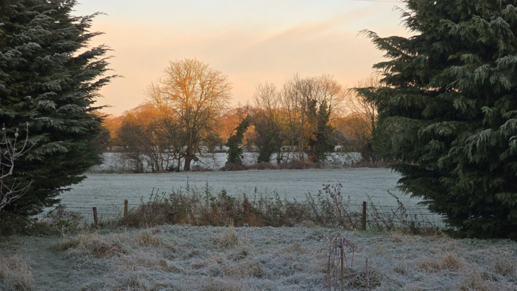
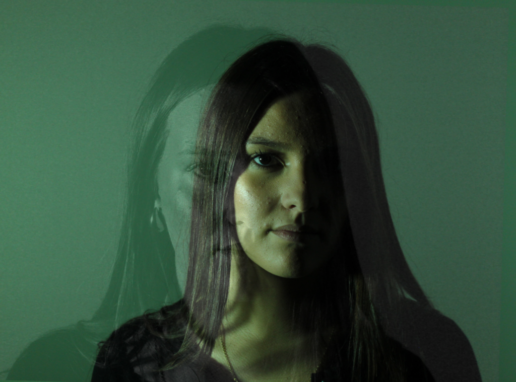
I experimented further by blending in different images such as a Landscape photograph that I took with my Identity Photos. Below is the image used to blend into my Photograph and the settings that I used to do this.
BeforeAfter
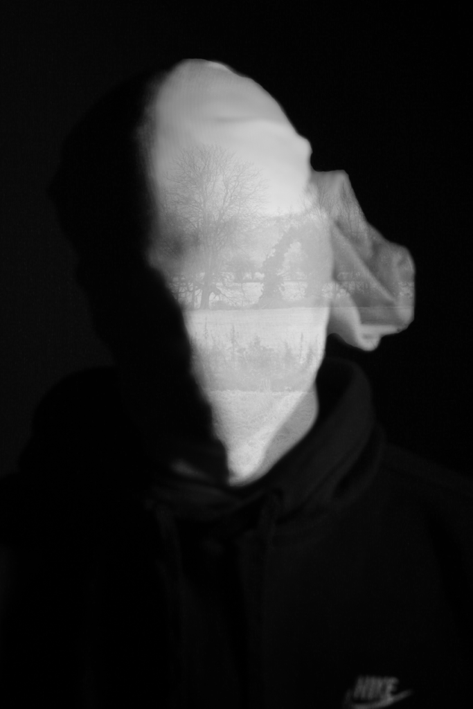
This is the Before and After of the Original Image with the blended image applied. I will be implementing this into some other Images.
Its a work in progress but I am slowly getting there.
Final Photos
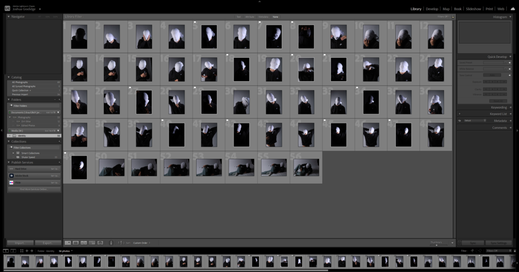
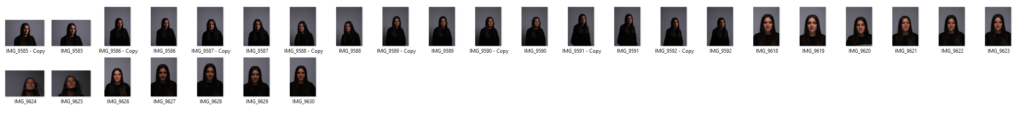
These are my Final images that have been produced/edited. There were 56 Images taken and as I said before I used Adobe Lightroom Classic to browse through my photos and select my Best Images from my Photoshoot. In this case, I chose these 14 images and applied all the filters and overlaying as said in the previous Section.
Now comes the hard part. For my Exam I have to choose a certain amount of images to be sent and printed off to be displayed on a visual canvas of our choice. What I mean by this is that Firstly, I need to decide on which images to use. Secondly, I need to decide how big or how small I want my Images to be printed off and Lastly, I need to decide how big I want the canvas that’s going to be holding my images to be cut out.
Chosen Images For Printing
After careful thought and consideration, these are the photographs that I want to be Displayed/Printed.
Andreas Poupoutsis shows his theme of identity through the uniqueness of facial expressions. He takes his images from a close-up shot, and makes the background extremely dark to highlight the figure to being the main focus. These 6 images I think have achieved the closest resemblance of Andreas Poupoutsis work. There is a photograph that utilises a grey background, this was intentional as Poupoutsis uses both a vignette effect for the background or changes the background to be fully black.
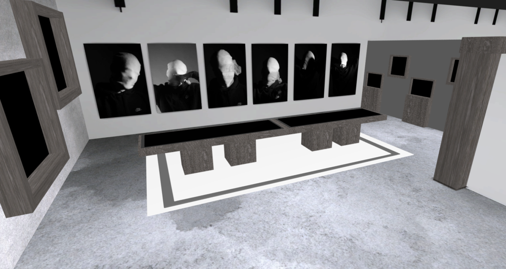
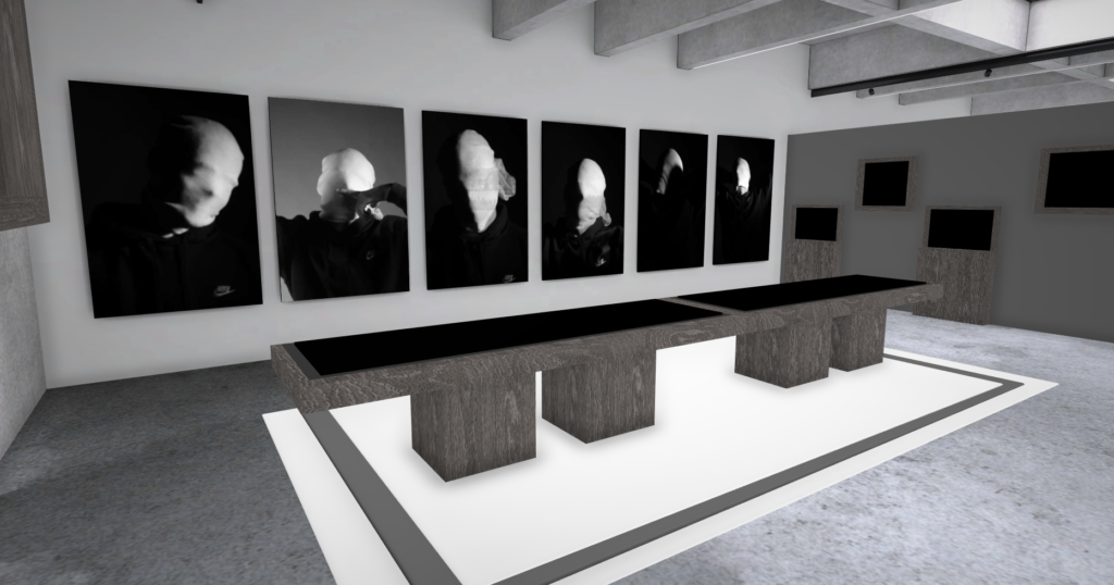
I transferred my Images into Art Steps so that I can visualize what my Images would look like in real life at Exhibition/Museum/Display etc..
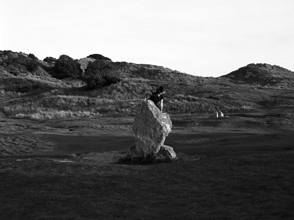
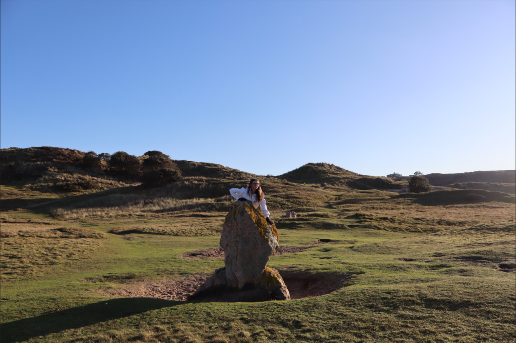
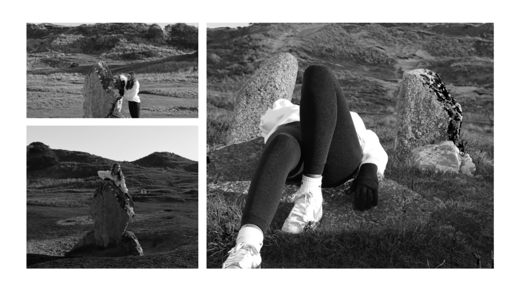
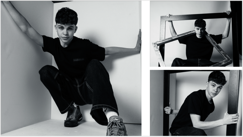
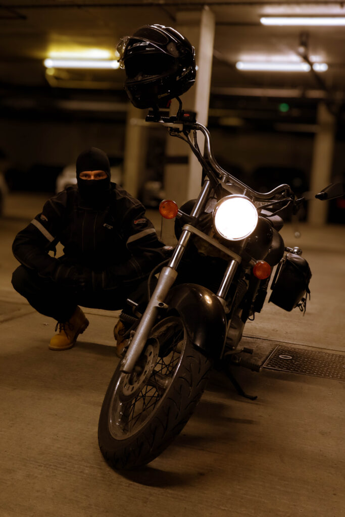
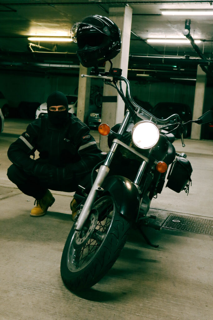
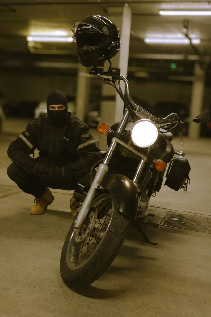
These are the specific 3 photos I have taken inspiration from and I am going to try and replicate in my photoshoot.
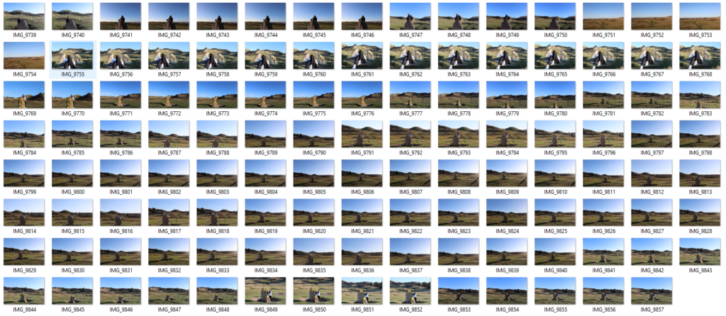
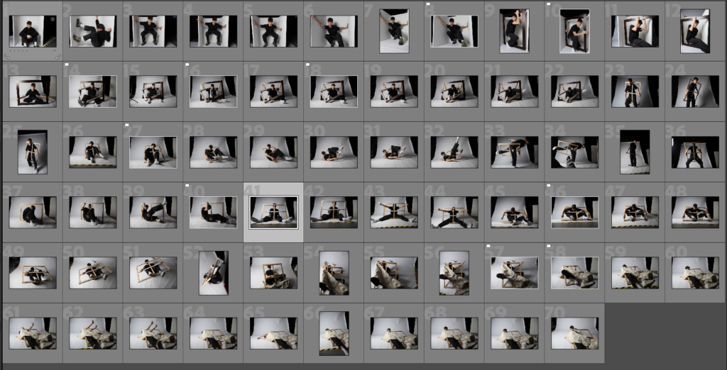
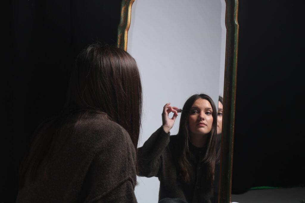
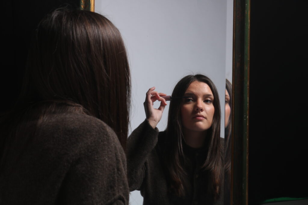
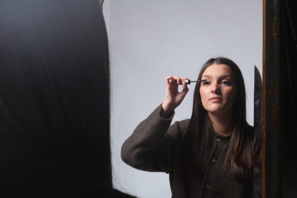
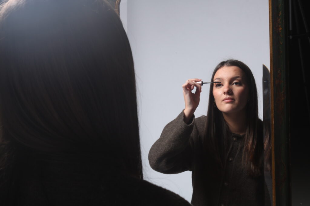
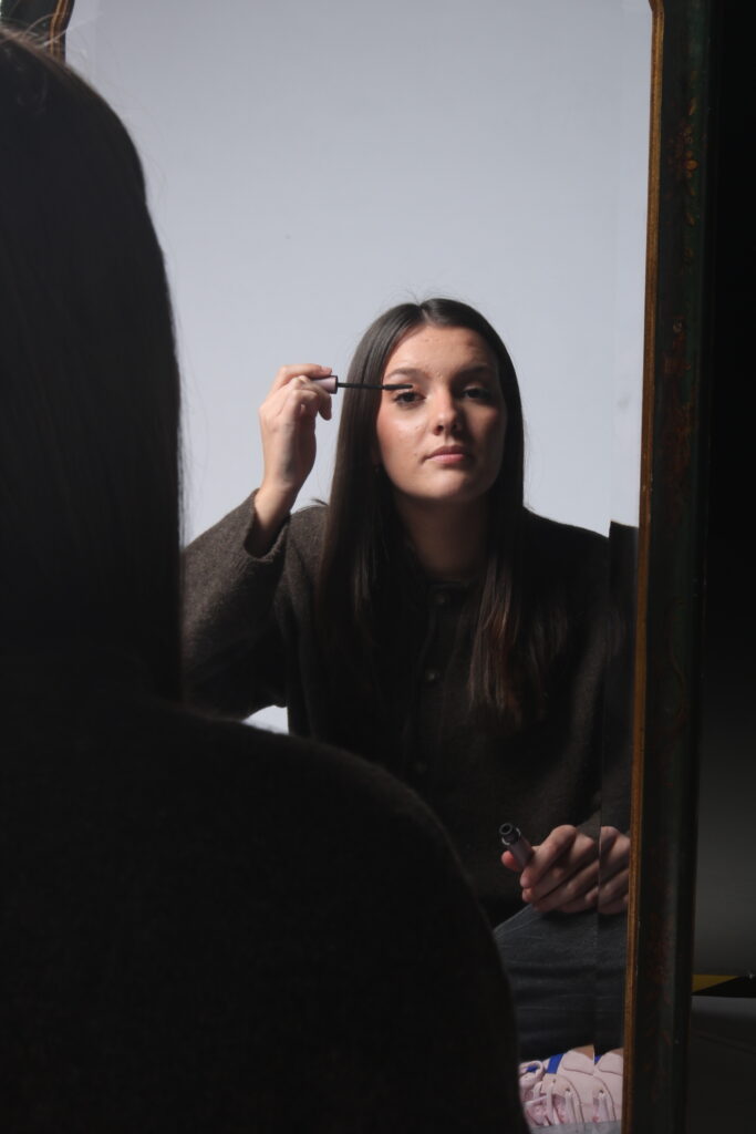
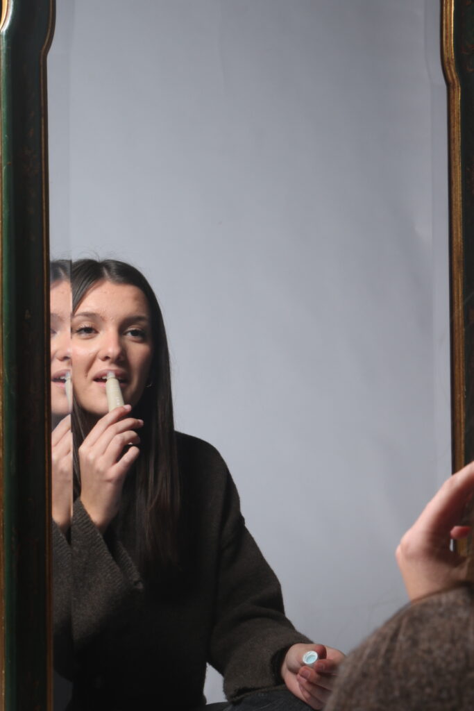
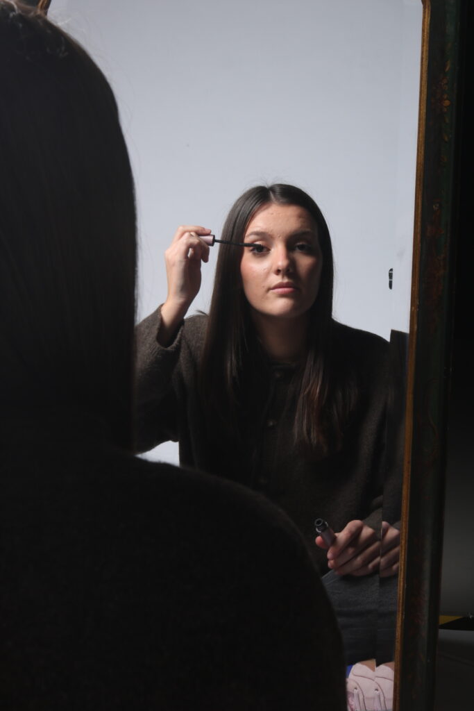
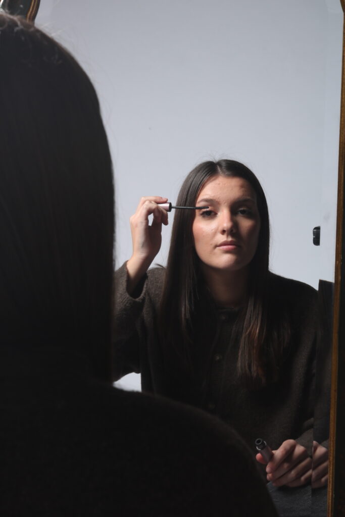
Contact Sheet1
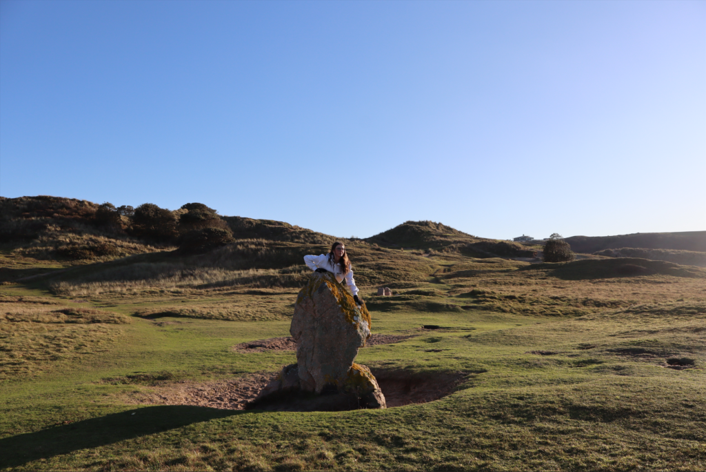
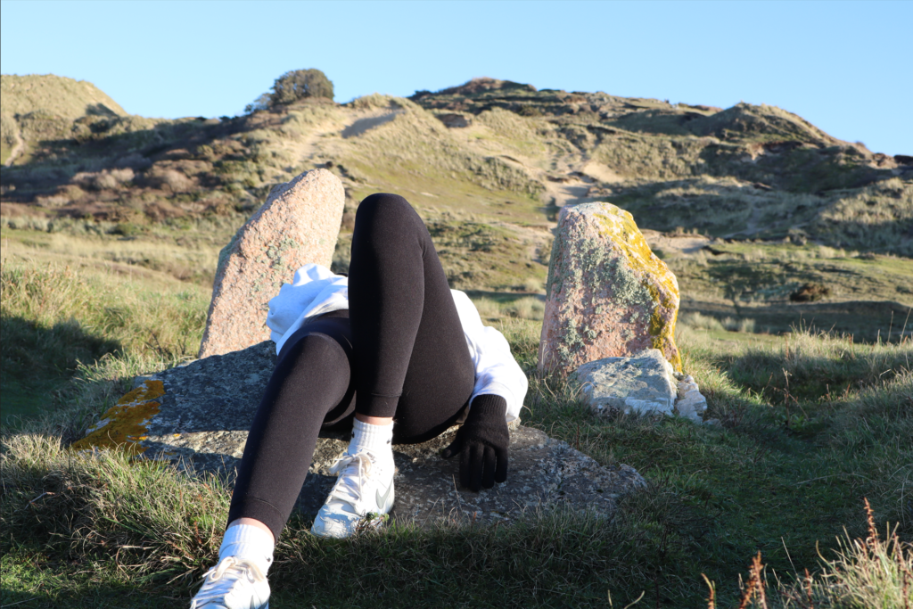
There were three photos that really stood out to me in this photo shoot.
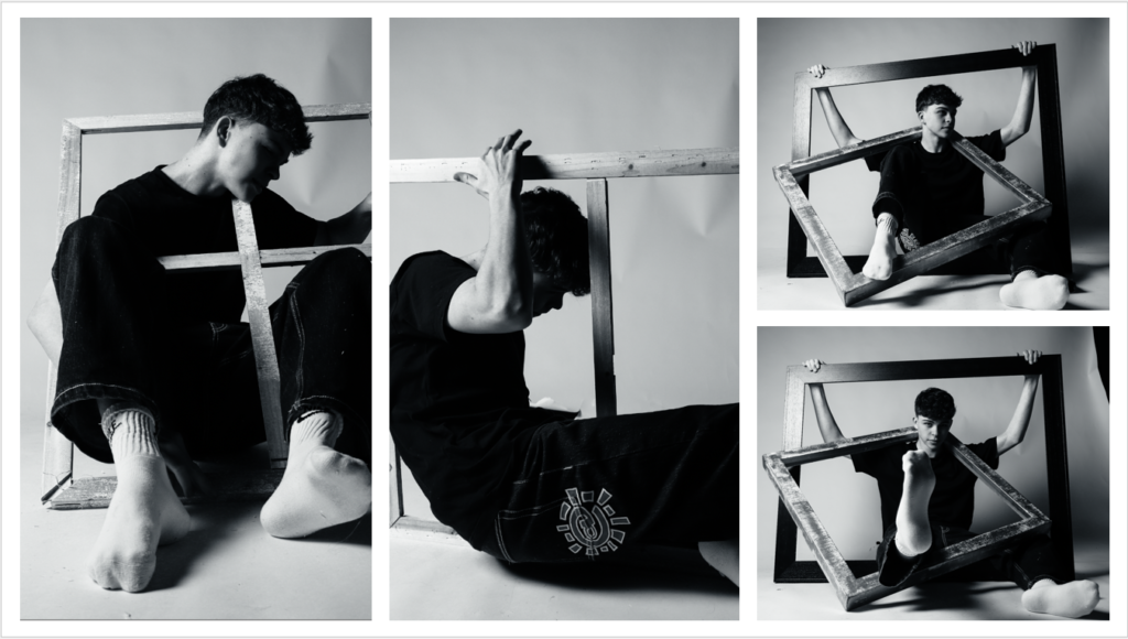
After editing this is how they came out.
Photoshoot 2
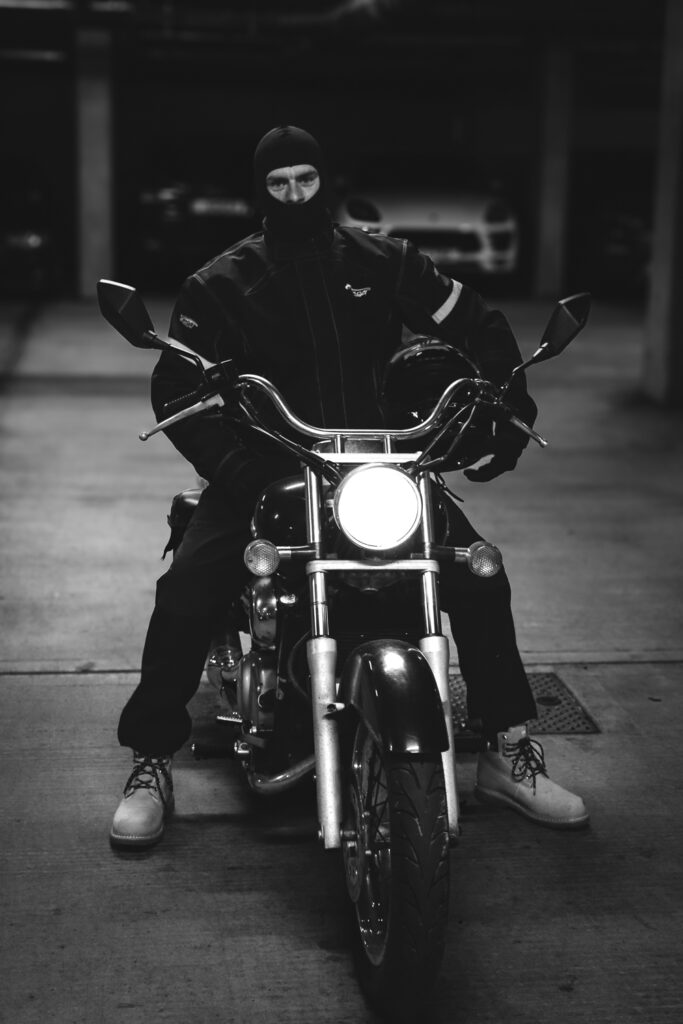
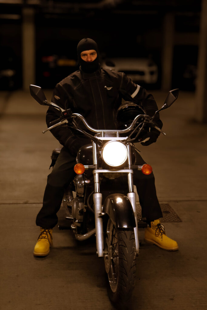
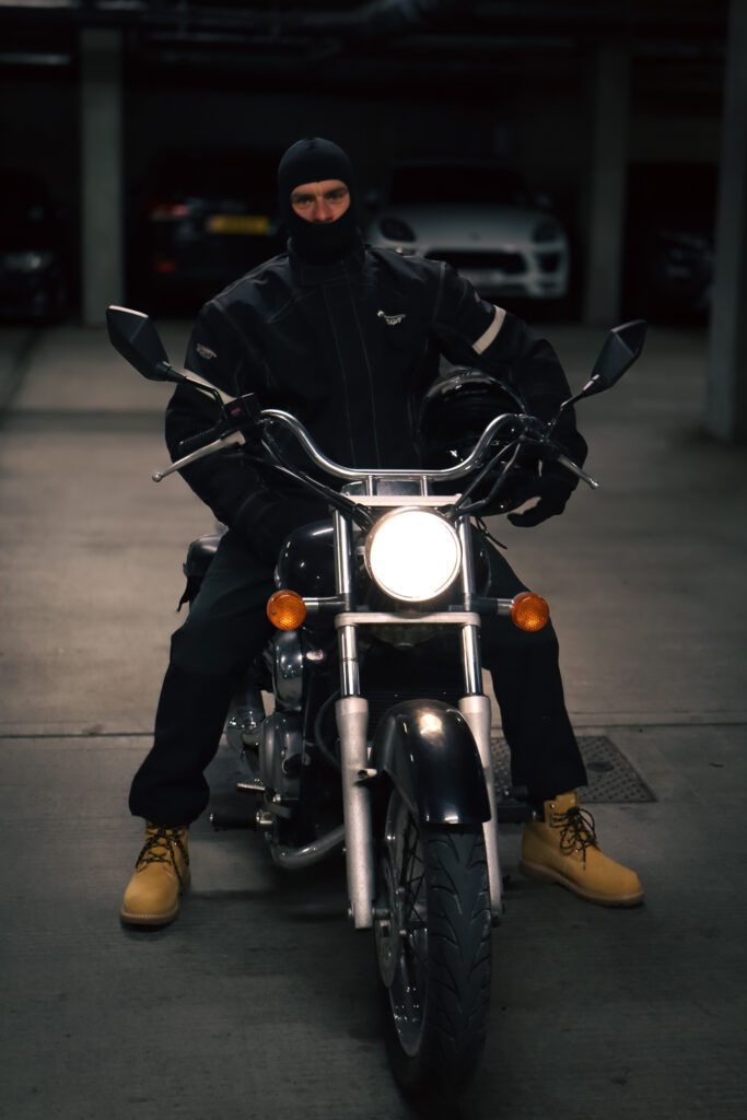
In my second photoshoot, I’m going to push myself to be more creative and take photos that are bolder and more unconventional, experimenting with interesting shapes and compositions. I plan to focus on using negative space more intentionally, paying attention to how it can enhance the overall visual impact of each shot. By playing with the balance between the subject and the empty space around it, I hope to create images that evoke a sense of tension, mystery, or simplicity. I want to explore how negative space can help direct the viewer’s attention and add depth or meaning to the scene. This will be a great opportunity to experiment with new angles, perspectives, and framing techniques, making my photos more dynamic.
Contact sheet 2
Here are 7 of my favourites edited
For the editing process, I decided to convert the photos into black and white, as I wanted to emulate Clare Rae’s distinctive black-and-white identity photo style. The black and white removes any distractions on colour, putting more focus on the shape and form.
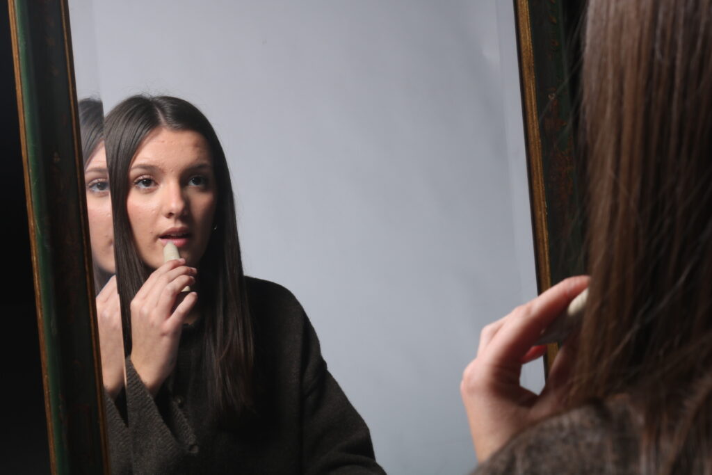
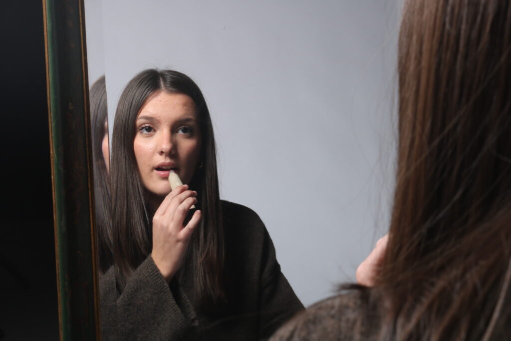
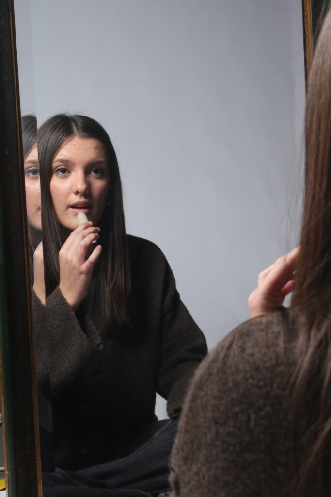
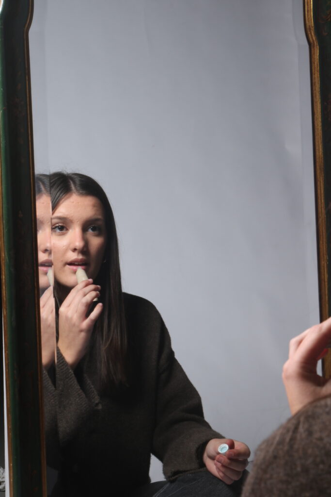
The idea of mirrors and windows within photography is the metaphorical term of a window representing the photographer capturing the world in its reality around them without interfering in it. The mirror represents an expression of the photographers own feelings and ideas built into their work artificially.
Reality Vs Constructed Reality
The concept of reality versus constructed reality in photography is the idea that every image tells a story about the version of reality its portraying. This will be impacted by the framing, subject, position of the camera and composition.
Tableaux
A painting or photograph where the characters and surrounding has been arranged for dramatic effect and appear unaware of the camera.
Surrealism
Where photographers use editing or props or positions to create dreamlike and unnatural settings using imaginative composition often to represent unconscious ideas.
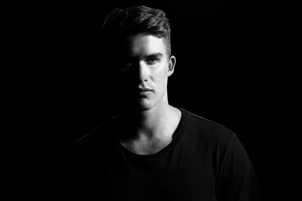
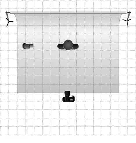
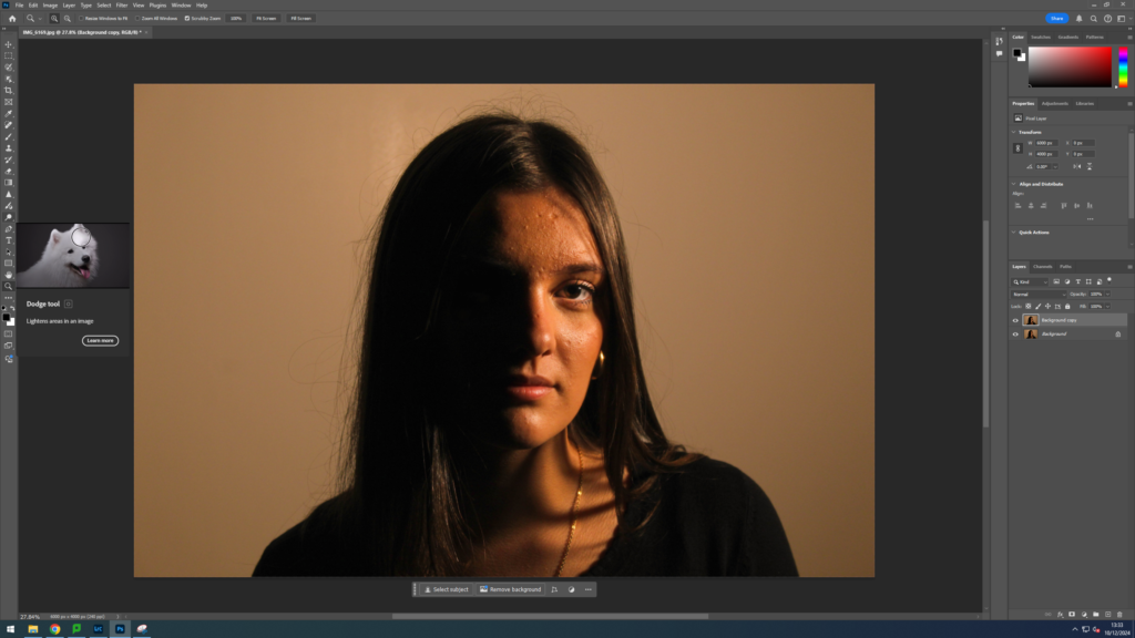
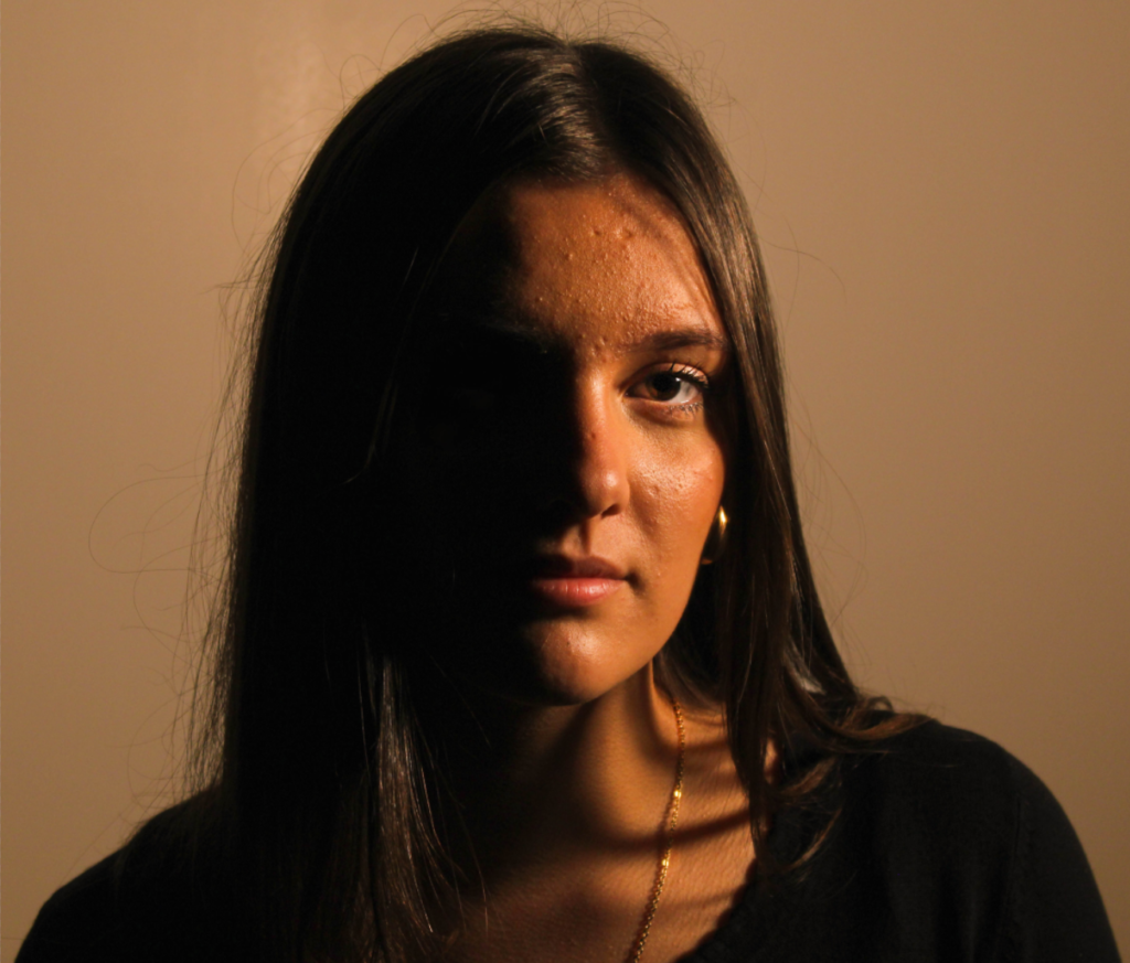
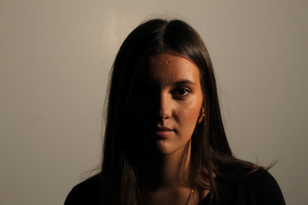
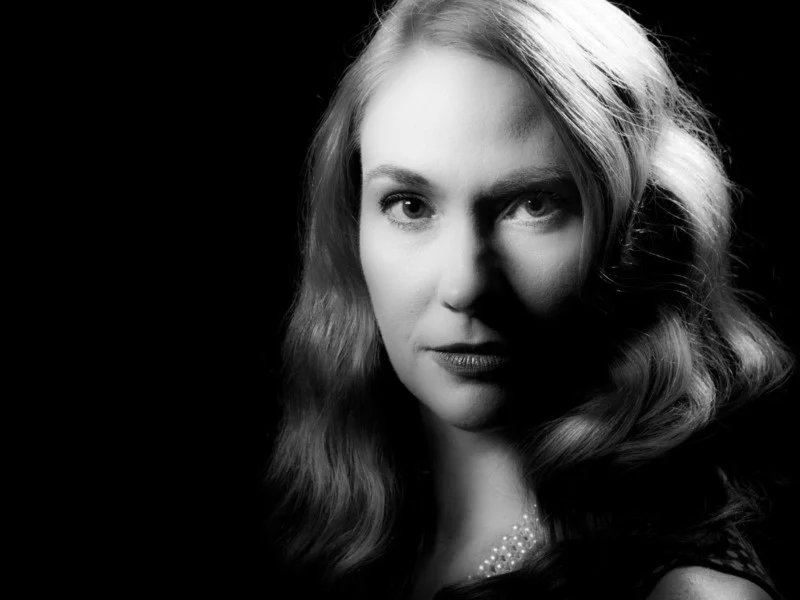
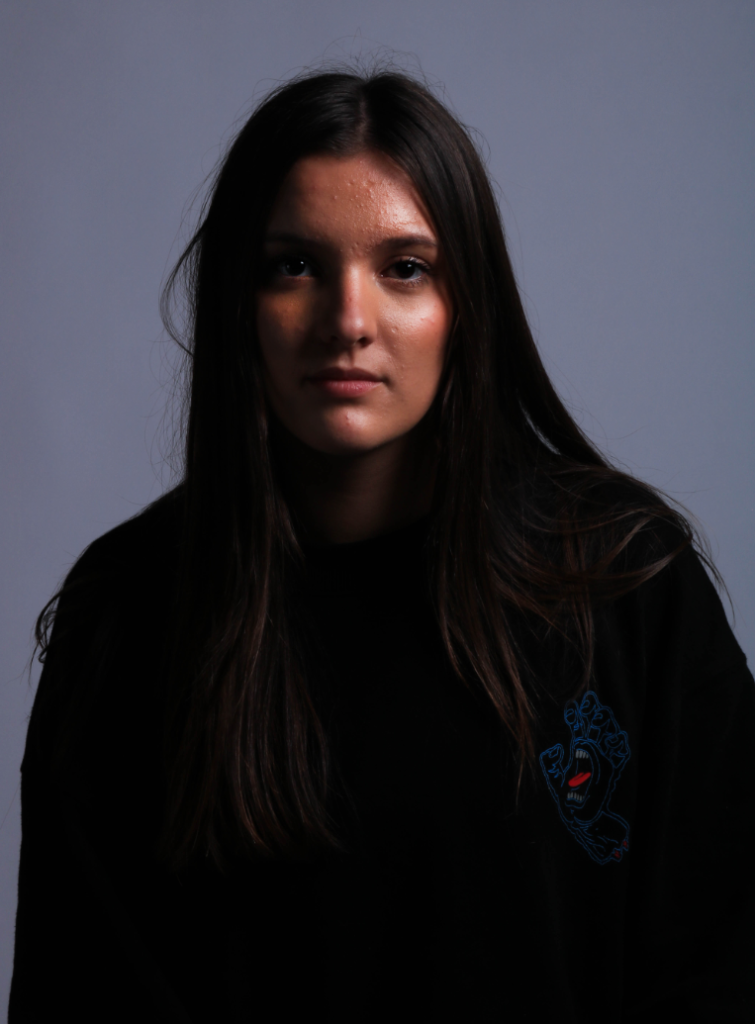
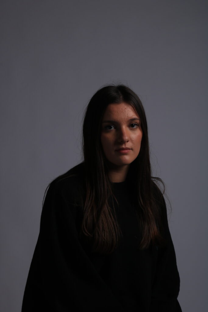
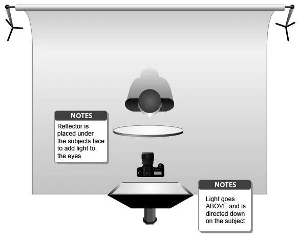
Split lighting is a technique used to illuminate only half the subjects face with the other half in darkness. This is achieved by having the light source at either the direct left or right of the subject 90 degrees from the direction of the face. Split lighting is used to create moody atmospheres and interesting effects.
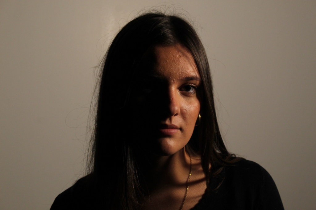
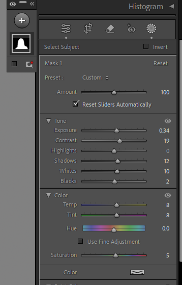
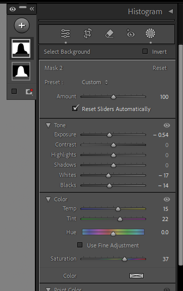
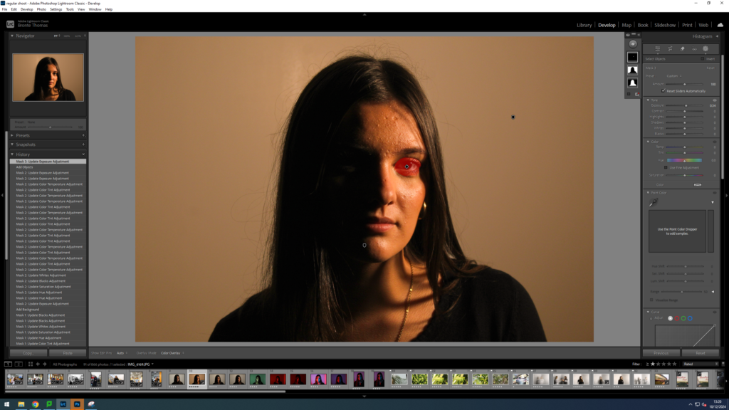
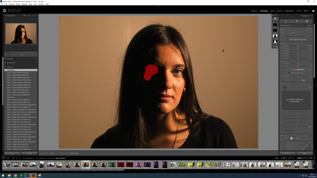
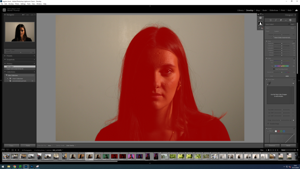
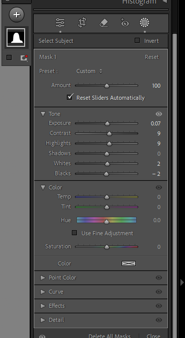
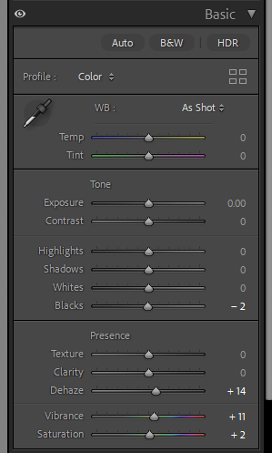
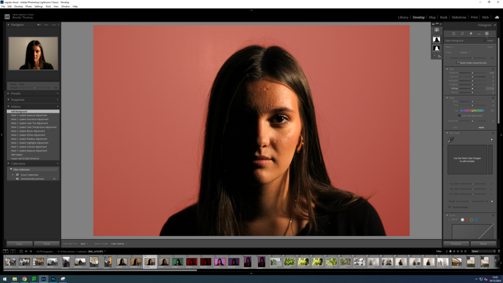
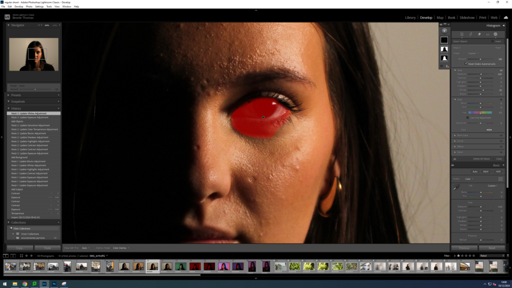
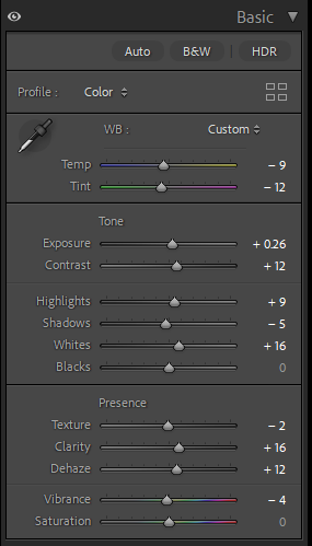
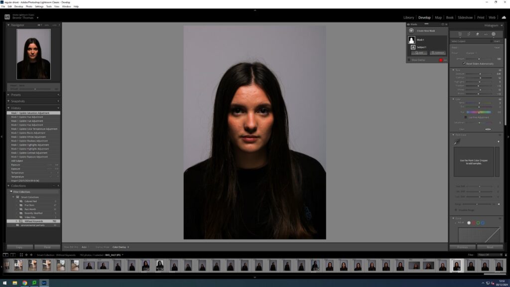
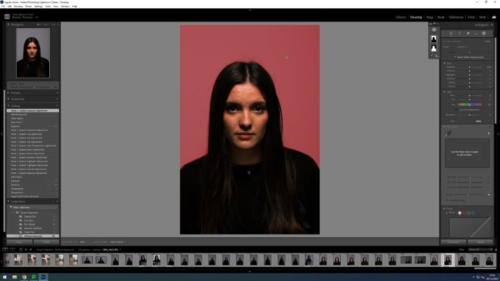
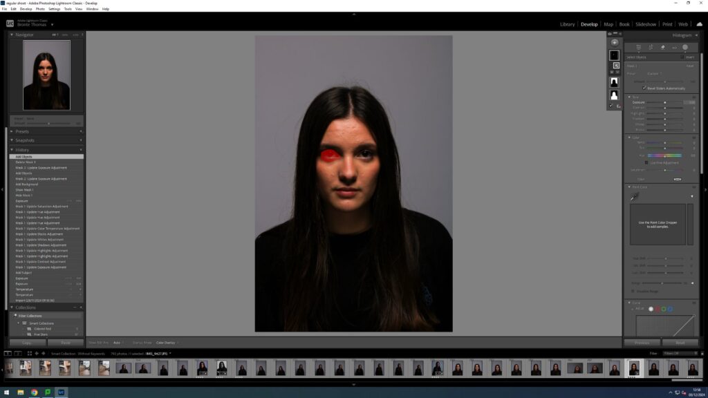
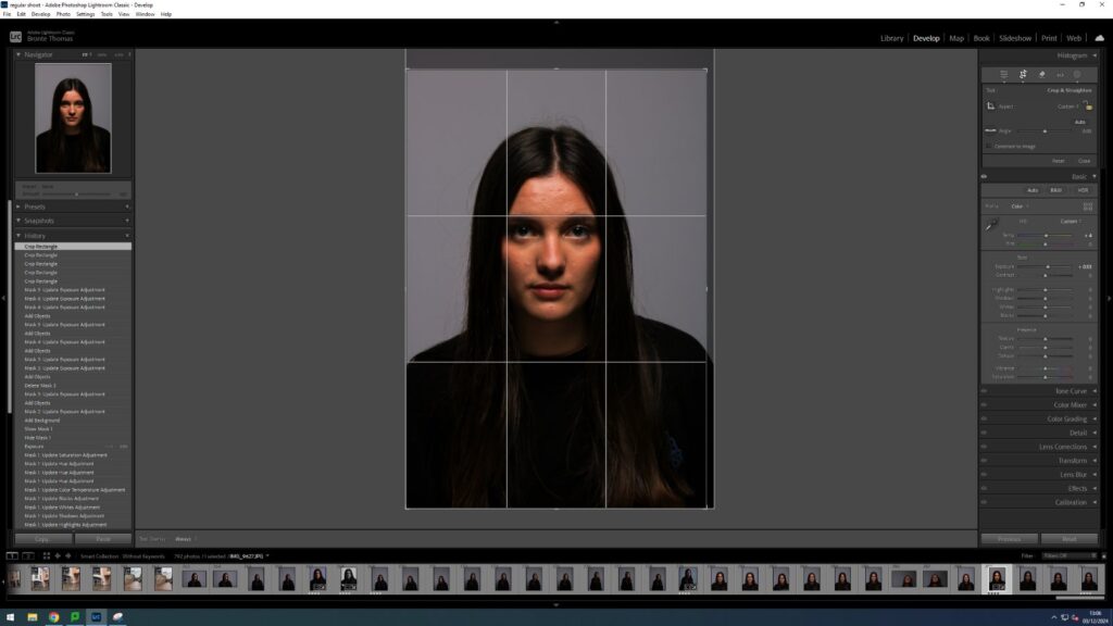
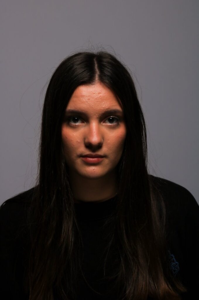
Original ImageFirst I selected the subjectAnd adjusted it using these editsI also edited the background using these edits to make it warmer to compliment her skin tone and ad to the warm temperature effect.I selected the eye to make lighterI then fixed some highlights of the other eyeI didn’t change much just made sure the other eye in shadow wasn’t visible
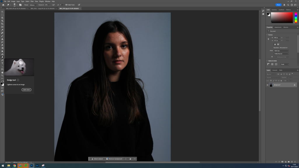
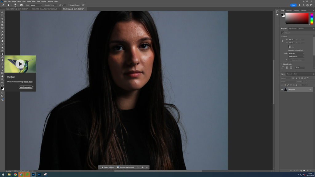
After that I exported it into photoshop
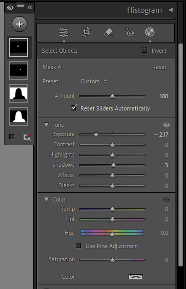
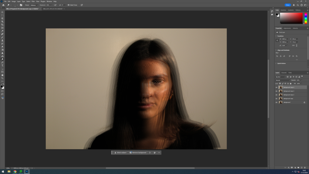
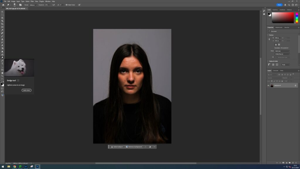
I then used the Dodge tool to add to the highlightsI then cropped the imageEdited ImageOriginal ImageFirst I selected the subject I edited it with these settingsAlong with theseI was inspired by Alessio Albi’s illusion work along with some other artists such as Tiffany Sutton and decided to try create some edits of my own I did this by duplicating the layer multiple times and then free transforming them individually and moving them. I then cropped the image and created this final piece.Final EditOriginal Image
I edited the brightness/contrast and exposure slightly on photoshop however I did not make any other adjustments
Alessio Albi was born in Peurugia Italy in 1986 he was always fascinated with nature ad science and went onto get a medical degree and at first worked as a nutritionist before he started his career as a photographer at age 24. He takes extremely atmospheric and moody photos and focuses his style mostly on fashion, advertisement and portrait photography where he primarily photographs women to utilise their feminine features such as long hair to add to his creative style. He stated that he was inspired by some of the hard periods in his life but also the beauty he sees in people around him. He uses both natural and studio lighting to take his pictures and uses a range of different skills. He often has his subjects to pose with very subtle facial expressions to let the viewer interpretate the mood and emotion themselves. He also uses dramatic and bold shadows in his pieces to create texture and interesting shapes.
I don’t believe that this image has had much editing done to it as the colours look quite natural besides the classic magazine look of the blurred skin to make it look glowy. The lighting looks to be natural sunlight, however could be warm studio lights. Albi has used Rembrandt lighting a long with creating some unique shadows using an obscure object. There is a short depth of field (DoF) as the background is blurred and the camera is focused on her shoulder and face which are close to the lens however Albi still expresses the 3D-ness of the model by having her place her right shoulder to be visible in the photo but shrouded in shadow. The exposure time also seems to be average as there is no glare to the highlights and the image doesn’t look under exposed as the area in shadow is still visible and the photo overall is not dark. ISO is also
Visual
The colours are natural and contrast with each other as the subject has a lot of warm tones to her however the background is very plain and uses cold grey tones to it but I believe the overall tone is light as the use of sunlight looking lighting with the deep shadows creating the leading lines to enhance the eyes of the subject and have them the main focus. The texture is smooth as there is no graininess due to poor exposure or IOS and the subject of the photo is the girls glowy skin. The only repeating pattern I can see within this image is the spiralling line creating leading lines towards the eye however the pattern is not completely symmetrical and the line breaks off at the top of her cheek and bottom of her eye.
Contextual
Albi states much of his inspiration comes from natures elements. He grew up in a family of artists and was heavily influenced by his upbringing.
Conceptual
I believe this photo is trying to convey the natural skin tone of the subject and how we as people naturally focus on the eyes of a person were looking at. I think with the subjects hair swept off of her face and how its just her with no make up or fancy clothes we see just the raw person herself and they say eyes are the window to the soul and I think Albi is trying to show how its not what matters on the outside by taking away from what society wants from her and rather the person the subject really is
Technical
This picture looks to be taken in a dance studio with the subject positioned lying on the floor, so the unnatural warm ceiling lights are shinning directly onto her face to create highlights on her cheeks, while the mirror creates the illusion of multiples of the subject. I can also infer it is a dance or drama studio of some kind as the subject looks to be wearing a costume. I believe this image has been edited as most ceiling lighting is not such warm colours and usually the intensity of the indoor electrical lighting would create more of a glare on the subjects skin then the soft highlights in the picture.
Visual
Albi uses warm tones in this image and has light tones to it. The subjects skin (I assume) is edited to be clearer such as often fashion photography is and therefore the texture is smooth however Albi has utilised the subjects hair draped behind her to add more fluidity and movement to the image. The picture looks less flat than many other portraits and looks more 3D due to the illusion of the duplicates.
Contextual
Conceptual
The image is taken so that you can only see the face and shoulders of the subject to add to the illusion without the viewer knowing straight away that a mirror is used to create it. I believe the image is supposed to be a show of Alessio Albi’s creative nature.
I selected these images as my best out of the photoshoot
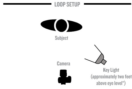
Loop lighting is similar to Rebrandt lighting where the aim is to have the cheek and part of the jawbone, under the eyebrow and the side of nose in shadow however, the main aim is to create a circular or loop-like shadow under one part of the nose. To achieve this you’ll want to have your light source at a higher angle to the subjects eyeline and at a 45 degree angle and move the light around and experiment making sure to not have the nose and cheek shadow connect.
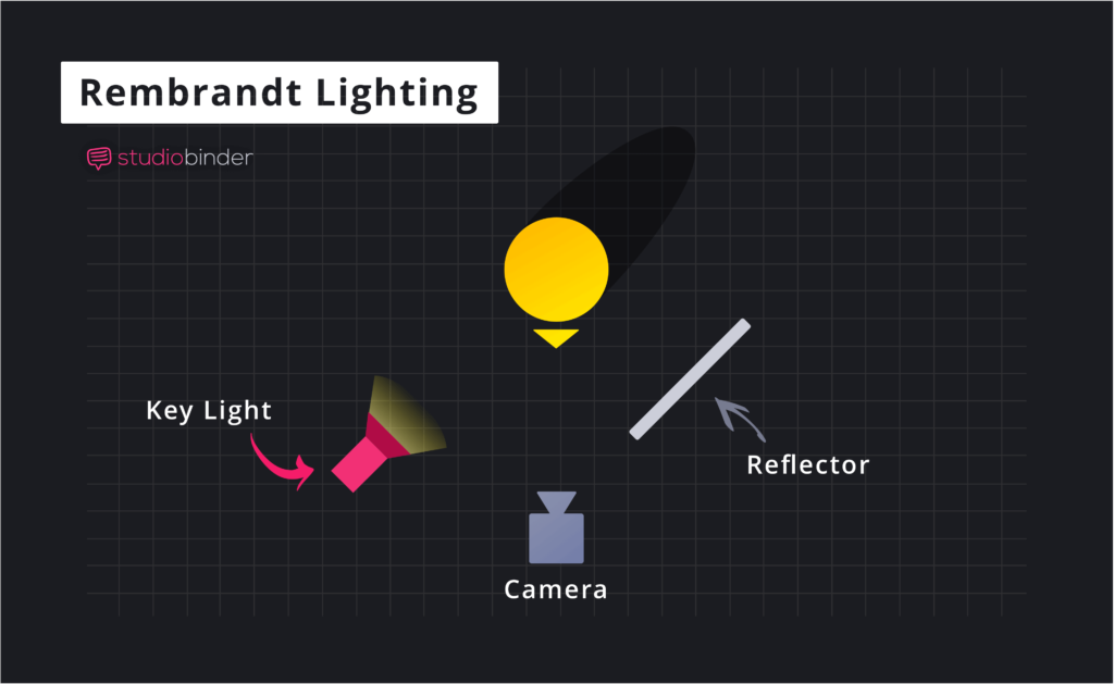
Rembrandt lighting also known as the Rembrandt Patch is the utilising the face structure and the shadows it casts to create a triangular shape under the eye. You do this by having the light at a 45 degree angle left or right from the direction the subject is facing and from a high angle looking down towards the subject. you then experiment with how far the light is from the subject depending on the subject themselves. You can also use reflectors to point the light at where you’d like the triangle to be.
Original Imagei then cropped the image to centre the subject
Once I did this I opened the image in photoshop and used the “Sharpen Tool” around the subjects eye and in the highlights of her hair to keep it more in focus. I also used the “Dodge Tool” to lighten the dark spots.
final ImageOriginal ImageI started by using Lightroom Classic and cropping the imageI tried to experiment by making the photo have a more blue haze to it and having cooler elementsI then used the “Dodge Tool” to lighten some of the highlights and make the triangle more prominentI then used the blur tool to blend the light and shadow together more naturallyI then used the “Sharpen Tool” to make theFinal Edit
Butterfly lighting is all about the shadows under the nose and creating a bat or butterfly like shape using the nose for shadows. To do this you stand the light close in front and high above the subject looking down at them. You can also use a reflector under the face to stop the chin from being in too much darkness.
Short lighting is a lighting technique that’s pretty much the opposite of broad lighting where the camera is focused on the darkest lit part of the face.
Back lighting is the lighting technique where all the lighting is coming from behind the subject and the subject is facing away from the light source. This is the same technique used to create silhouettes.
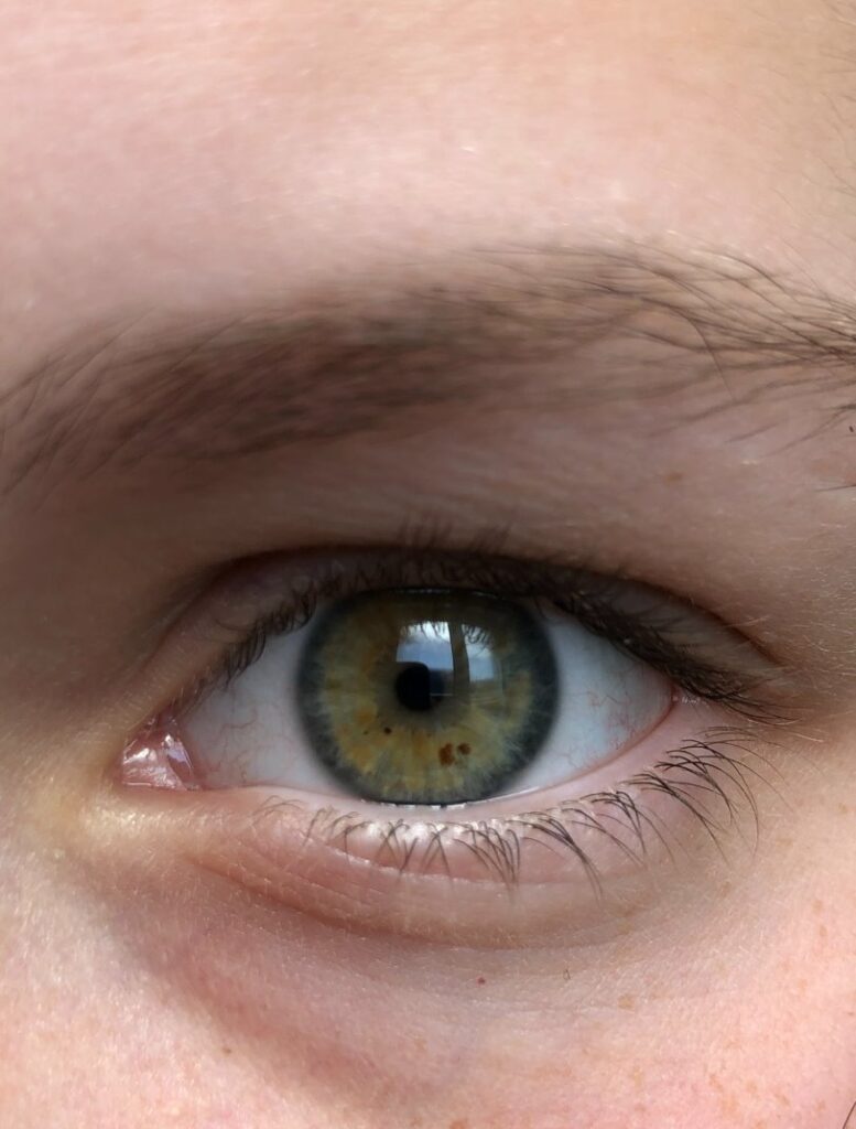
Oxford dictionary states identity is “The fact of being who or what a person or thing is”.
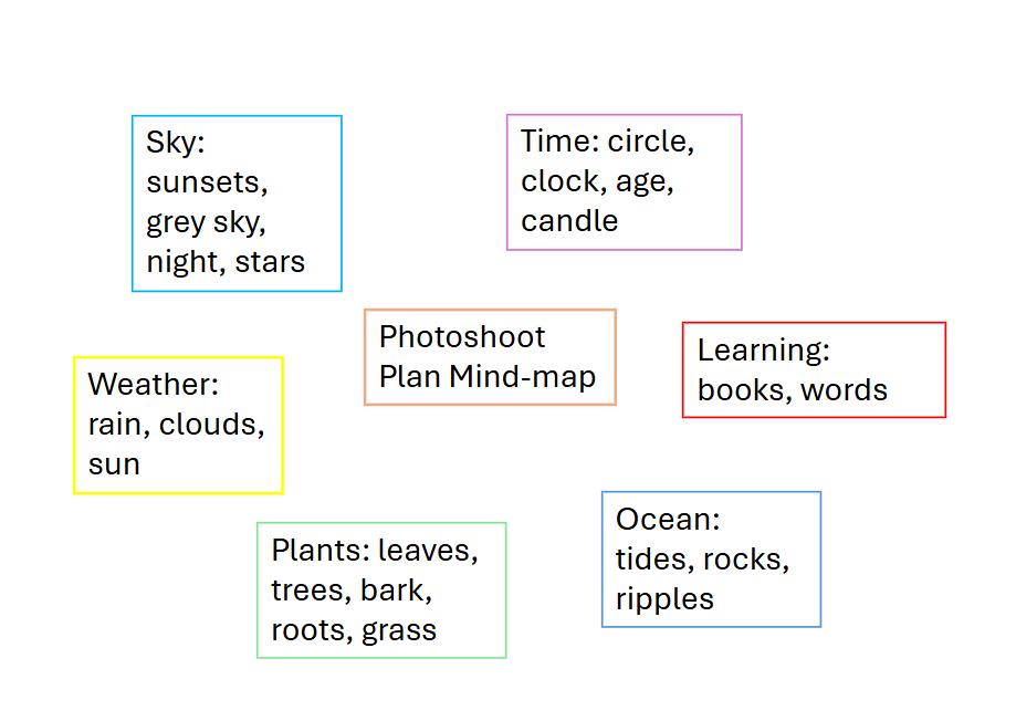
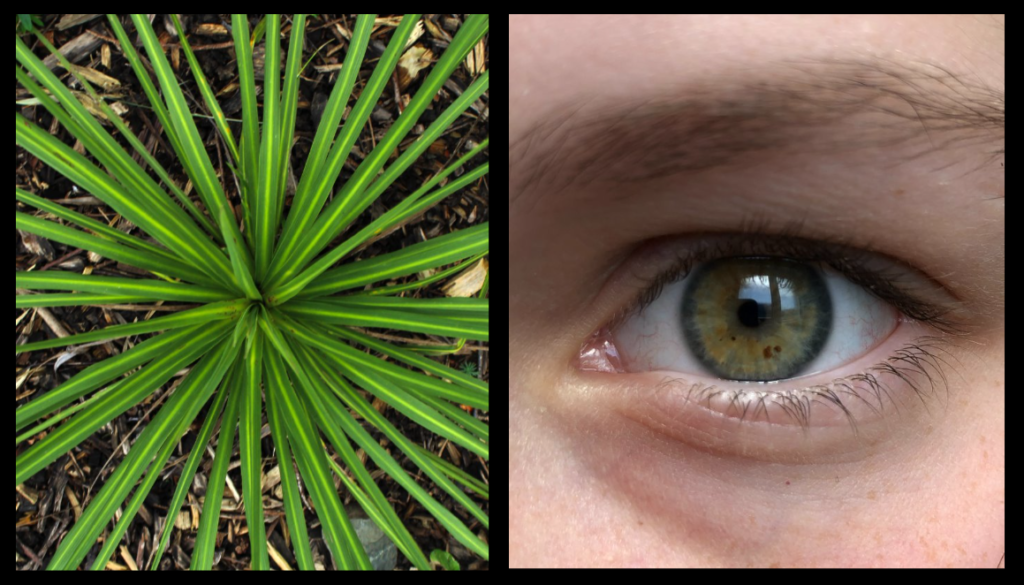
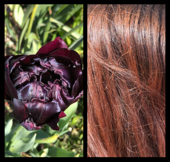
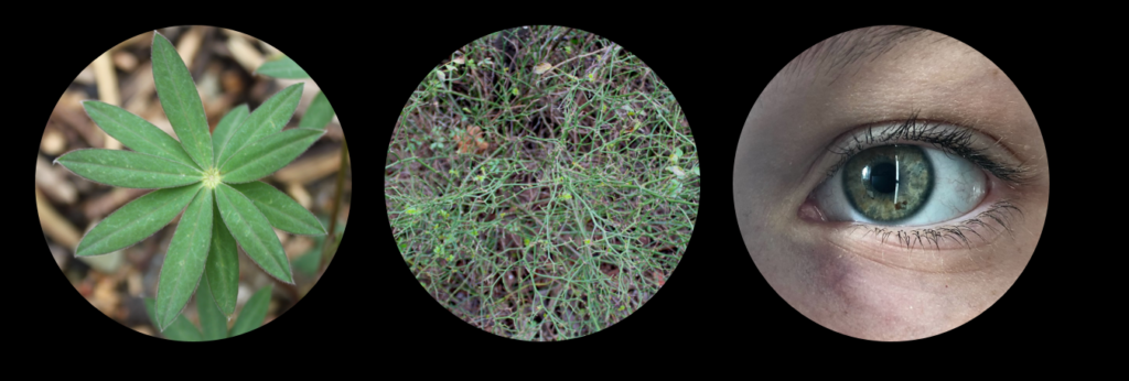
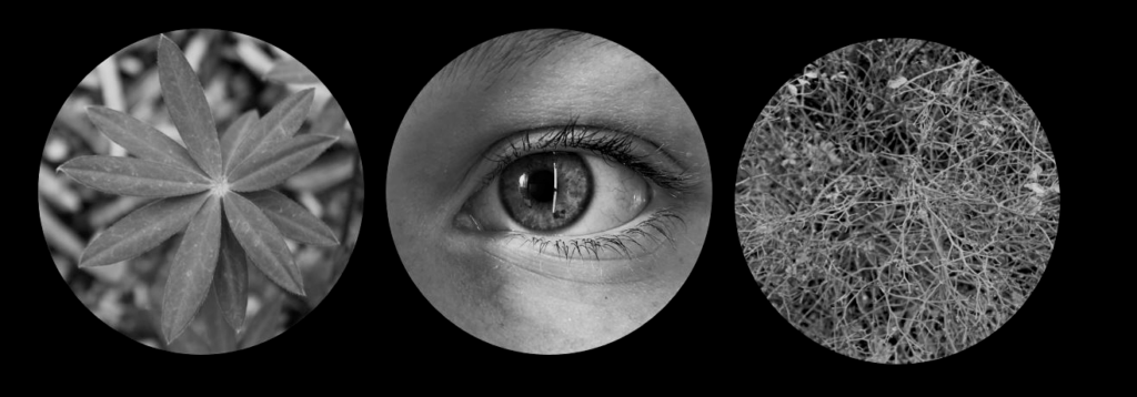
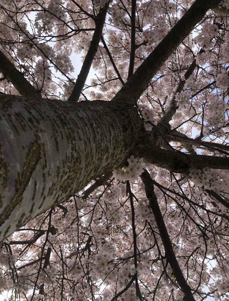
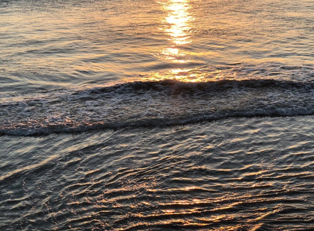
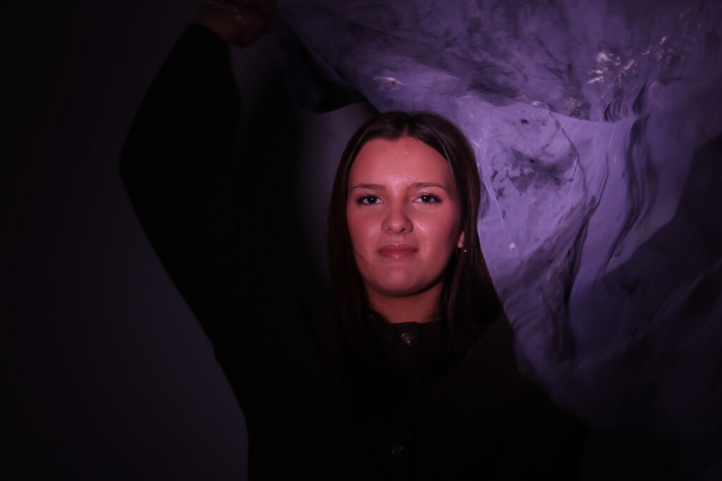
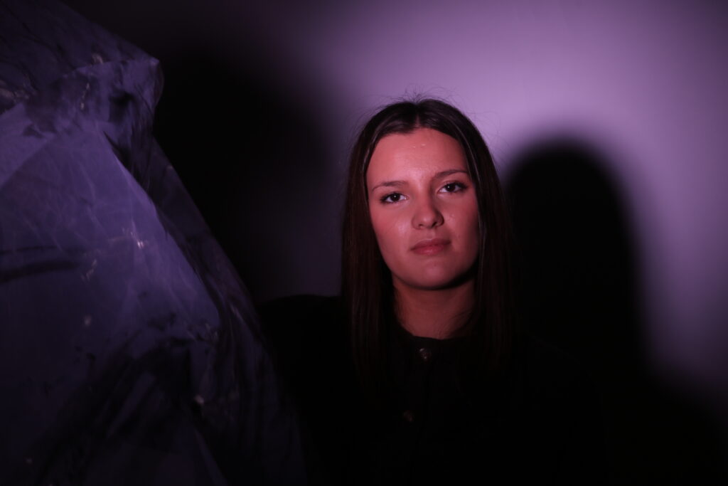
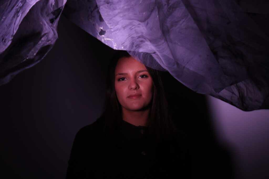
In my opinion labelling someone’s identity as one thing is unfair as identity changes constantly. Your identity is made up of your sense of self which changes daily. How others perceive you which is different for every person in your life as well as you values and actions. Also everything you learn, your experiences and your relationship with others will change all of these factors meaning every day your identity changes. Your identity will be different from when you were younger to now and even if you disagree with me and believe identity is more about physicality like your age or looks it still proves its changing all the time. I wanted to try and capture this and so I looked to find things that consistently change all the time naturally such as the weather, time, plants growing, the sky and the sea and link it to people to represent a persons identity. I took inspiration from Artists such as Alicja Brodowicz and Cindy Sherman.
Contact Sheets
Artist Research
Alicja Brodowicz
I took inspiration from Alicja Brodowicz
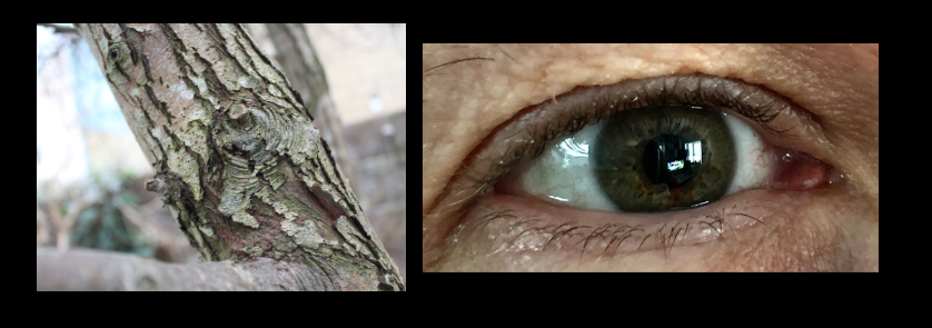
Alicja Brodowicz is a photographer born in Krakow, Poland in 1977. Her passion for photography started when she began taking photos of her 4 year old daughter and it grew from there to her fine art style influenced greatly by Sally Mann who specialises in thought provoking black and white portrait photographs designed to tell the backstory of the subject, along with Anders Petersen a popular black and white portrait photographer with 30 published books and won The Arles Photography of the year award in 2003. Around 90% of Brodowicz pictures are in black and white in a very abstracted style. She started the project Visual Exercises in 2018/2019 and spent months planning. She stated she usually does not plan before photographs but had the for this conceptual project.
Conceptually, Brodowicz uses the mirror method of representing reality of her own thought process and ideas of how humanity reflects nature. This was what inspired my idea of how identity also reflects nature through change and I wanted to capture this aspect in a similar mode of photography however I personalised the images by keeping many of them in colour as I prefer to take photos in colour as I feel it adds more depth and I want to appreciate how vibrant everything is and our ability to see this.
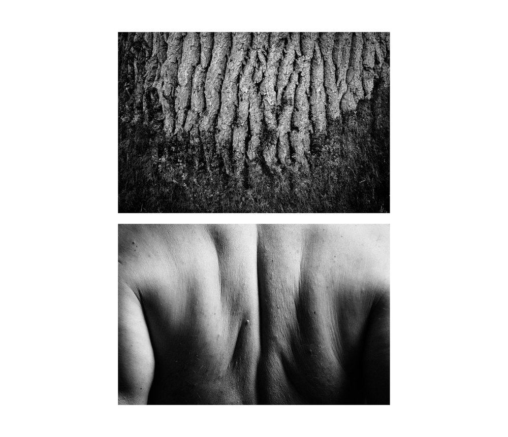
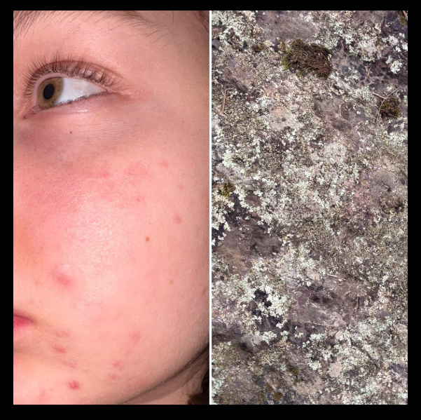
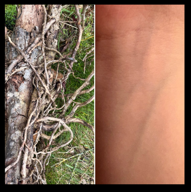
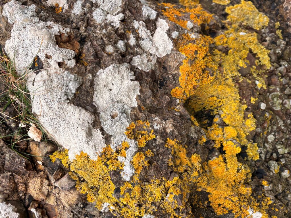
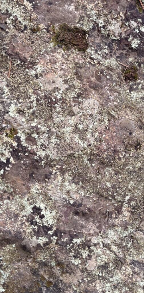
The lighting on the tree bark I can assume is natural lighting as the image is bright and trees are usually outdoors. I could guess however that the image of the person is in a studio due to the extreme shadows. The image is in sharp focus. There is a range of tones from dark to light due to the shadows and the bright sections of the image.
Visual
The image is in black and white however there is still drastic change of tones within both images. There is obviously a lot of texture within the image also as both photos are zoomed in capturing the creases and rivets in the bark and skin. The shape is quite 3D as the texture shows how the depth of field is different depending on where you’re looking in the image.
Contextual
This image was taken as a part of her Visual Exercises project
Conceptual
I think Brodowicz has taken this image to show the strength in the subject by aligning the with the sturdiness and strength of a tree.
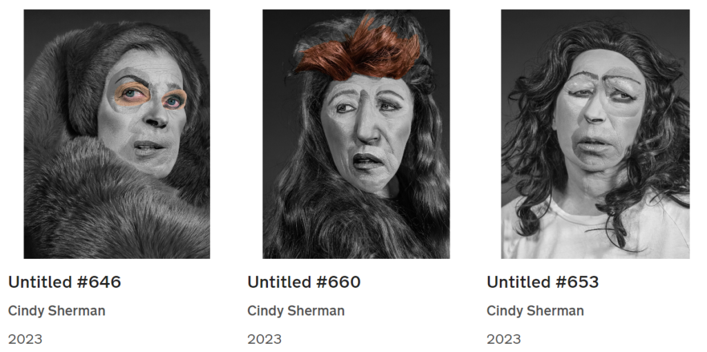
Cindy Sherman
I was also inspired by American photographer Cindy Sherman’s work and specifically her style of editing and her use of colour and black and white. Sherman was born in New Jersey US 1954. She began her photography journey in 1972 when she enrolled in at the State University of New York in painting before swapping her subject for photography. Her most recent work consisting of photos taken from 2010- 2023 was published with FT Weekend Magazine in 2023 originally intended to be used as an abstract wallpaper setting designed so that from a distance you can’t tell what it is however when you’re up close you can tell they’re pieces of different facial expressions.
Sherman specifically takes photos of herself but challenges this stating that you will never find the real her amongst the images as she plays roles and acts characters using props and wigs. I believe her work is to represent how unsettling the idea of a woman’s value being based off of her physical appearance. She is known to take on different identities in her photography and use the art to evade her true personality which I think corresponds to how our true identities are always hanging and don’t necessarily rely on our physical appearance as looks can be deceiving and therefore shows how others perceive you isn’t defining.
The lighting is unnatural as it looks to be taken in a studio as the lighting is even throughout all the images which is hard to replicate with natural lighting. The sticker effect adds to the depth of field as it looks closer to the camera. The image is in sharp focus. There is a range of tones within the image.
Visual
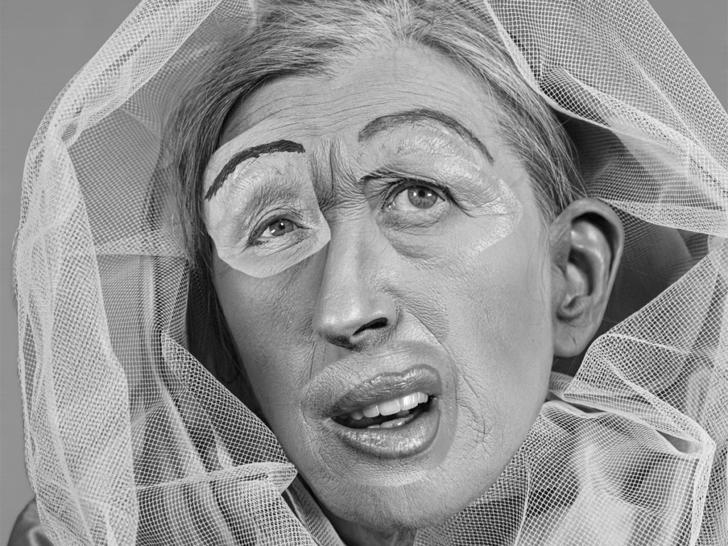
There is so colour as the image is in black and white however the shadows and highlights in the image add to the different tones. The wrinkles in the skin adds to the texture and lines in the image a long with the netting used to frame her face and the way the hair is brushed back. The image looks to be more 2D because of the style of creative editing. There isn’t any patterns I can spot in this photo.
Contextual
This image was taken as a part of her Untitled Film Stills project.
Conceptual
I think this image is used to demonstrate Sherman’s views on society’s beauty standards and she exaggerates the image to look ridiculous in order to show how unachievable the standard is. The stickers stand out to show this standard is not a part of her however they blend well in tone to express how they’ve been moulded onto her through her upbringing and society’s forced ideals.
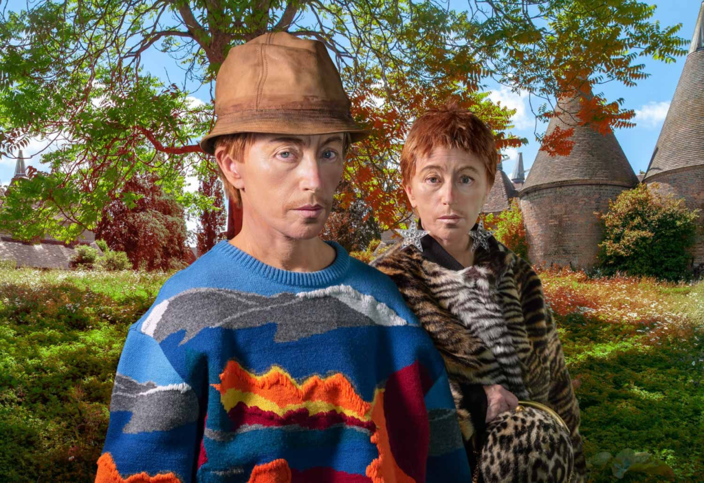
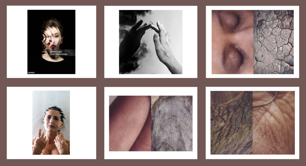
Some other ideas I found online:
My Best Edited Images
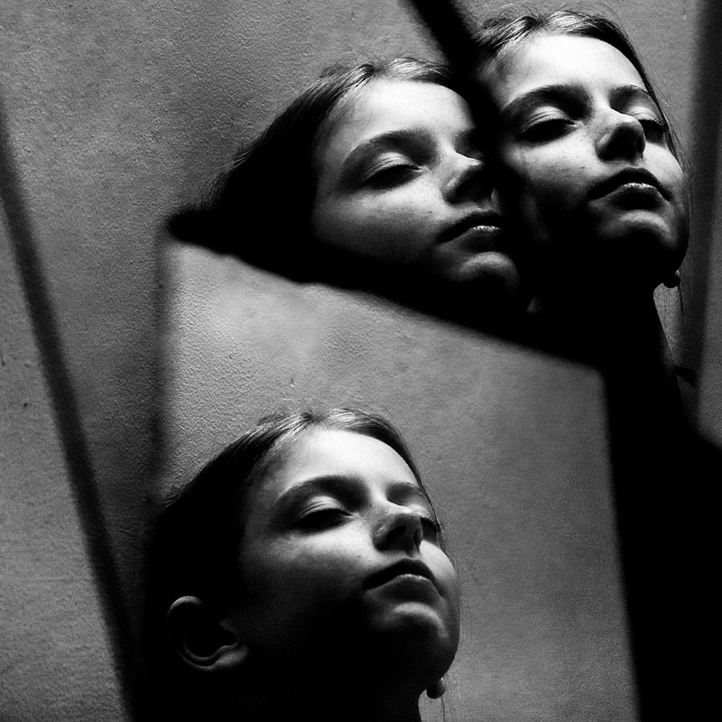
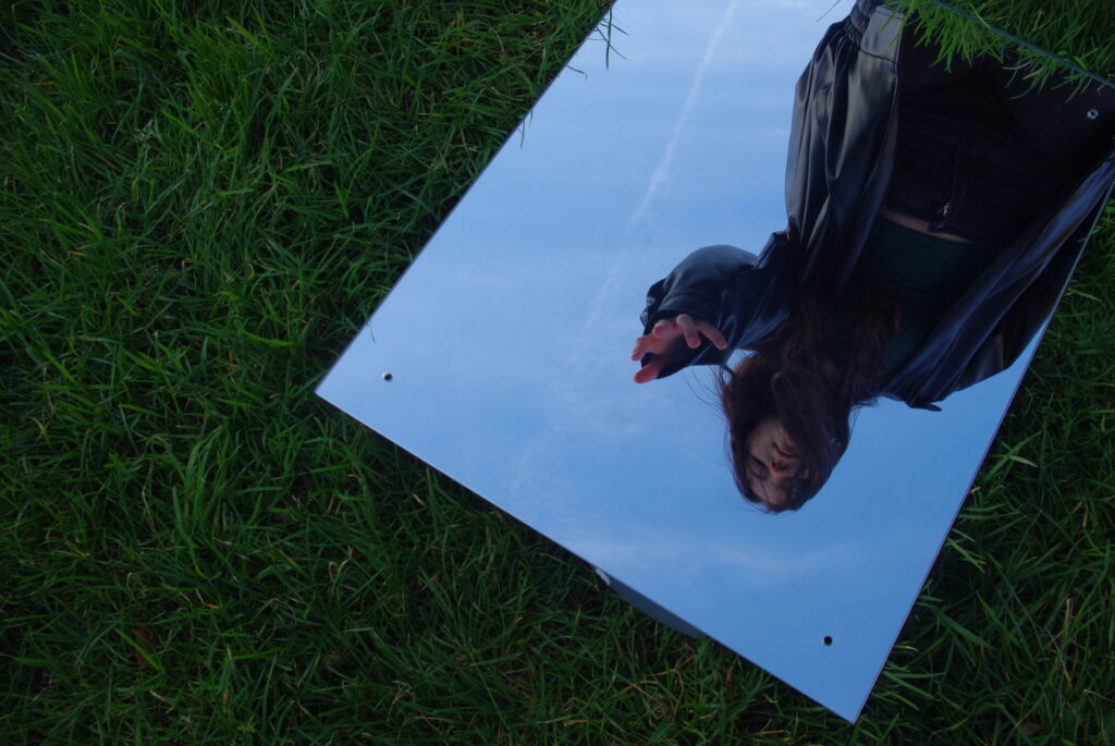
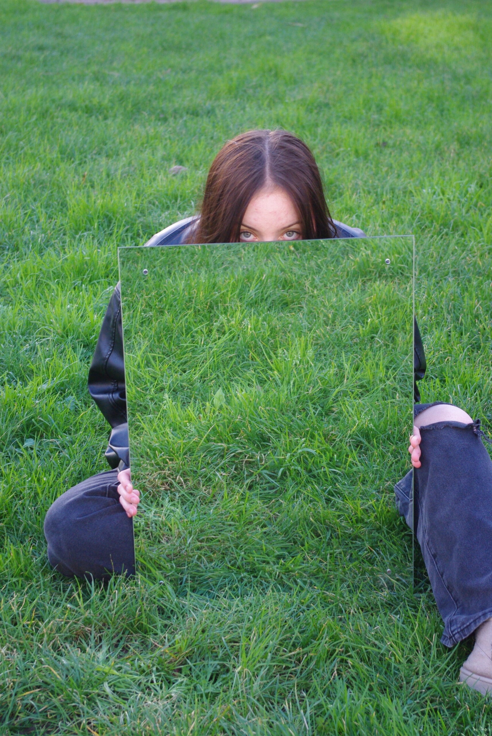
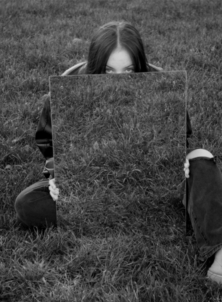
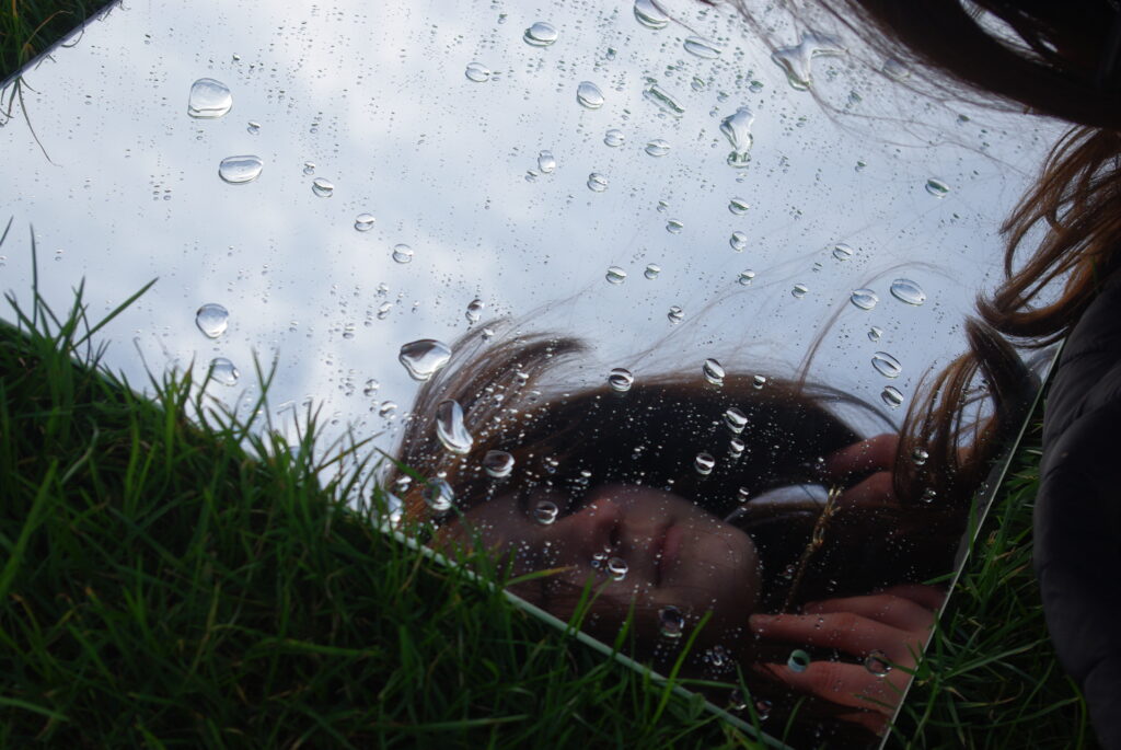
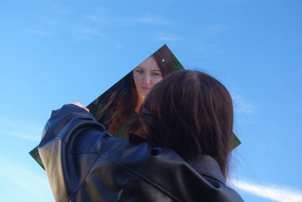
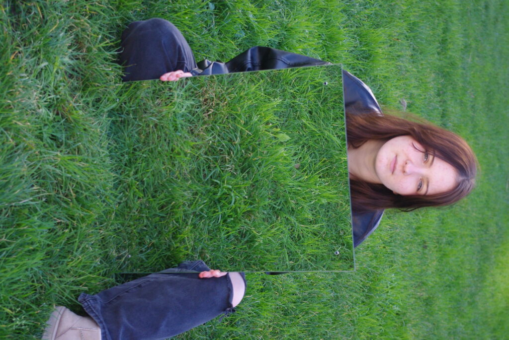
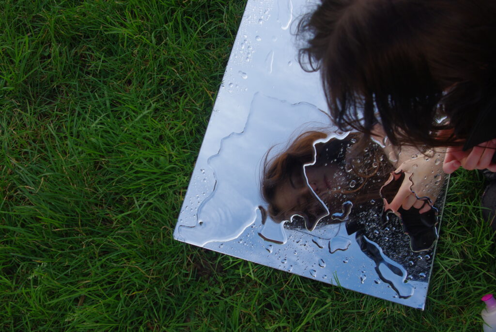
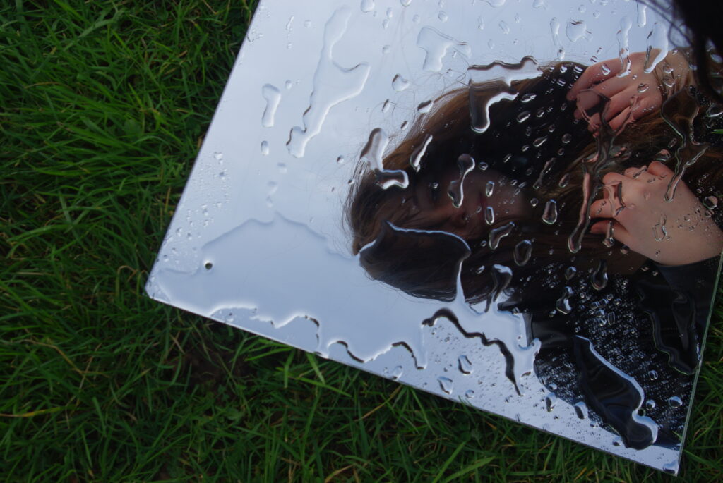
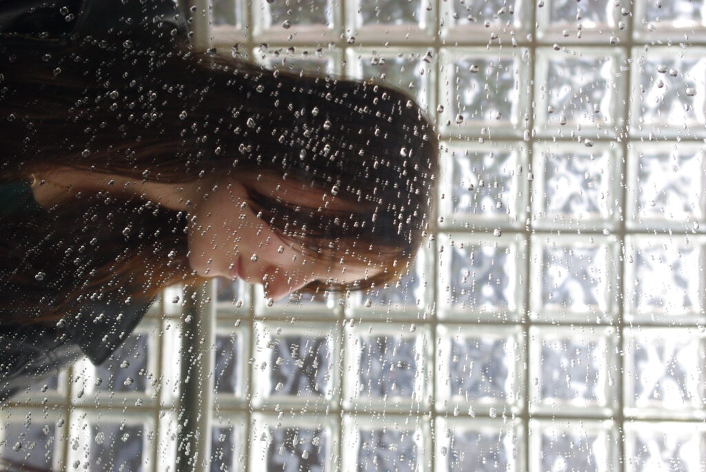
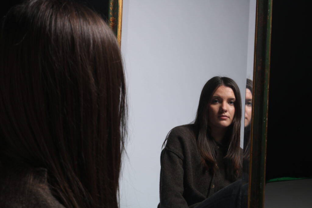
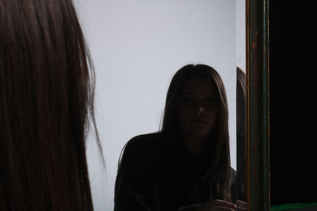
In this photoshoot I tried to look at rain and the sky for the natural elements that change frequently, as well as grass as its growing always. To do this I used a mirror and poured water on it to replicate the look of rain. I also thought to use a mirror to try to capture the idea of self reflection which is another part of identity.
Technical
The lighting in this image is natural/daylight as the image was taken outside. I used max aperture.
The shutter speed is it doesn’t look to be over or under exposed. F/ is 6.7 and the ISO is 800. The white balance was on Auto.
Visual
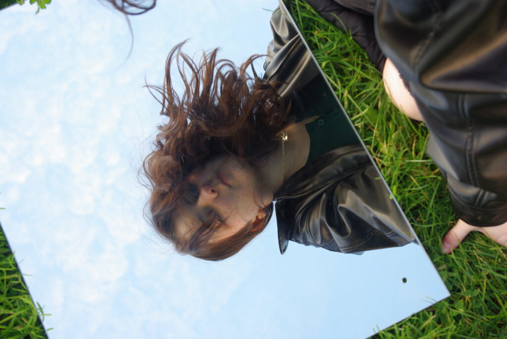
I kept the colour from the original image and heightened it only slightly as I felt they were quite vibrant as they were. The tone is both light and dark I feel as the image itself was taken in a bright setting however uses dark elements such as the shadows in the grass and cool toned colours. There is a lot of texture I believe in this image as the grass adds to it as well as the smoothness of the mirror a long with the wrinkles in her jacket. The mirror also contributes by adding the 2D flat shape contrasting with the length and form (3D) of the grass. The leading line of the arm adds to the image drawing the viewers eyes up to the subjects morphed ad blurred face. There is also 3D concept within this image as the mirror on the ground gives a sense of a door way or window making the image look more 3D.
Contextual
There isn’t much surrounding knowledge or historical things to know as I took this image recently making it modern. In this image I used the mirror effect within photography meaning I built my own ideas into reality it didn’t naturally occur as I interfered by constructing reality to create surrealism within the image.
Conceptual
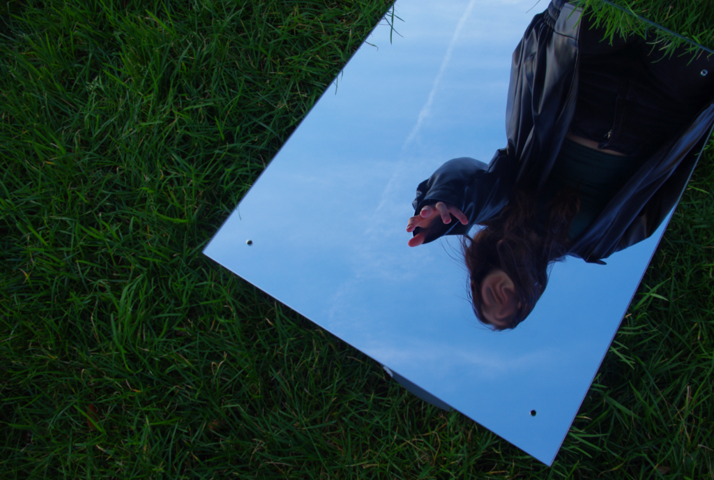
The meaning behind this image was to create an allusion of a window in the ground as well as capture the sky to link back to my nature within humans concept. I blurred the image to make the face distorted to have the viewer interpret it differently and to have to really look into the image and its surroundings to try to understand it based on what they know which ultimately is what identity is as its more than what you first assume at face-value.
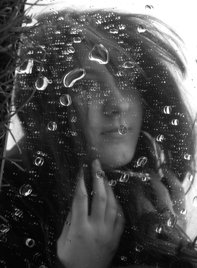
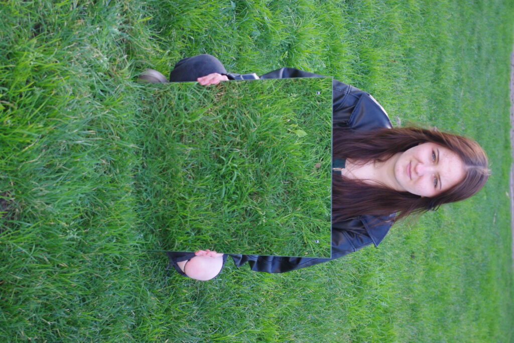
Technical
The lighting in this image is natural/daylight as the image was taken outside. I used max aperture.
The shutter speed is it doesn’t look to be over or under exposed. F/ is 6.7 and the ISO is 800. The white balance was on Auto.
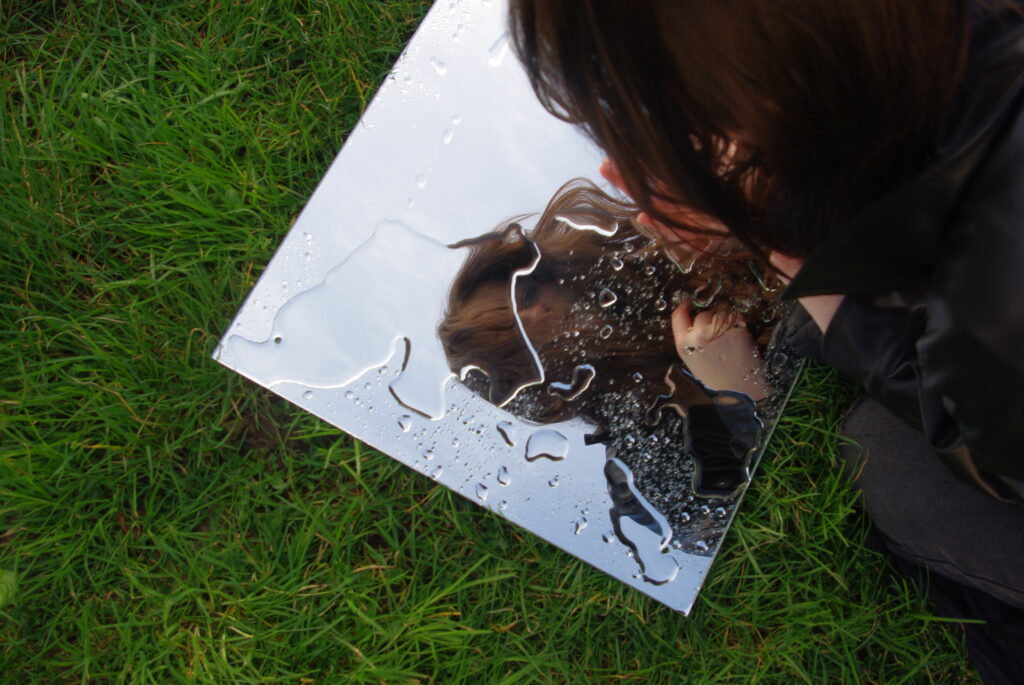
Visual
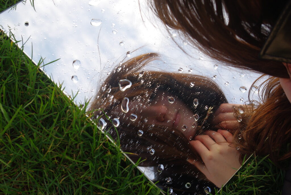
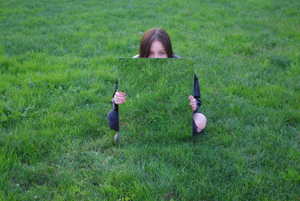
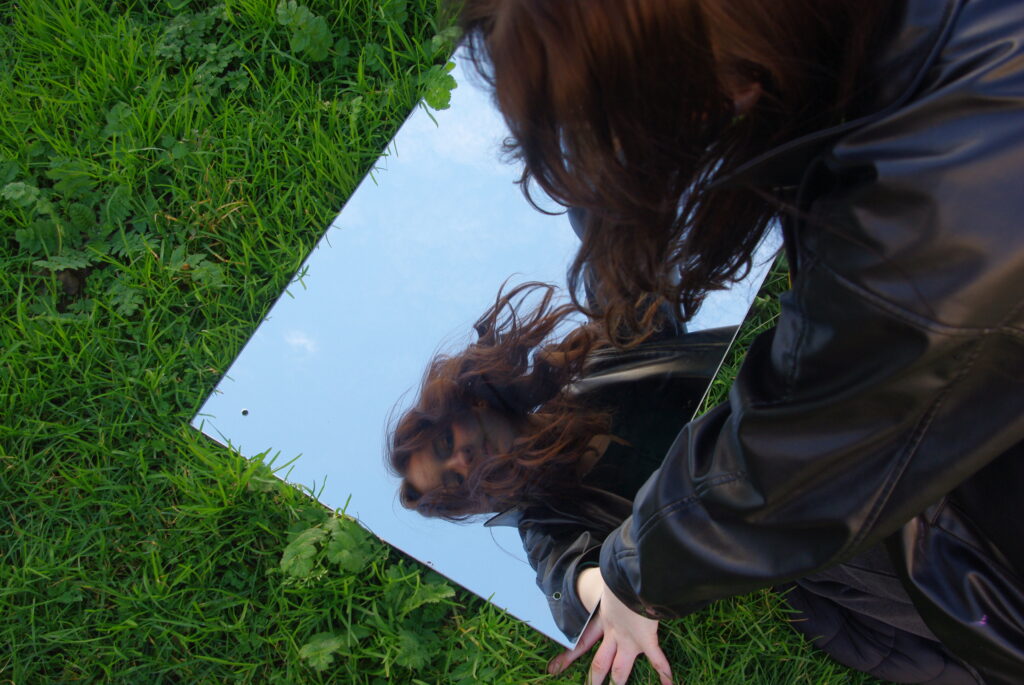
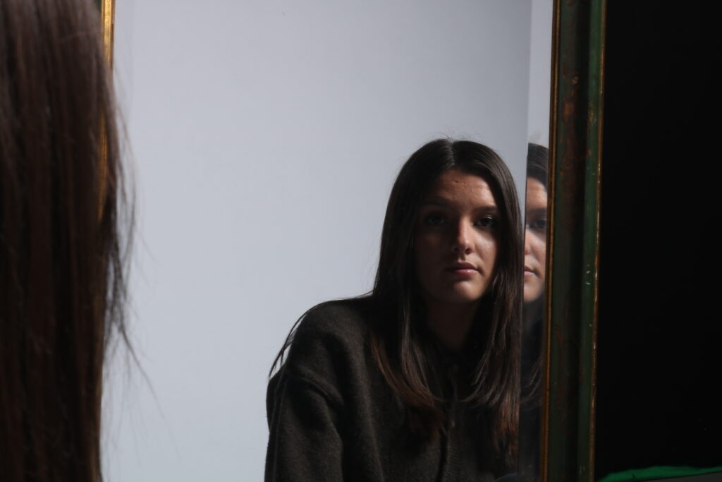
This picture is in black and white and therefore the colours are very muted. The image has quite dark tones to it as there is a lot of shadow created by the blades of grass however her eyes above the mirror look to be light as the dark grass contrasts with her fair skin. There is a lot of texture in this image as the grass adds texture as well as her hair the fabric of her jeans and jacket. There isn’t much shape involved in the image except how I asked the model to extend their left leg to create leading lines. The shape in the image isn’t even and therefore adds depth to the image as her leg is further in frame than the rest of her as well as the mirror giving a 3D concept.
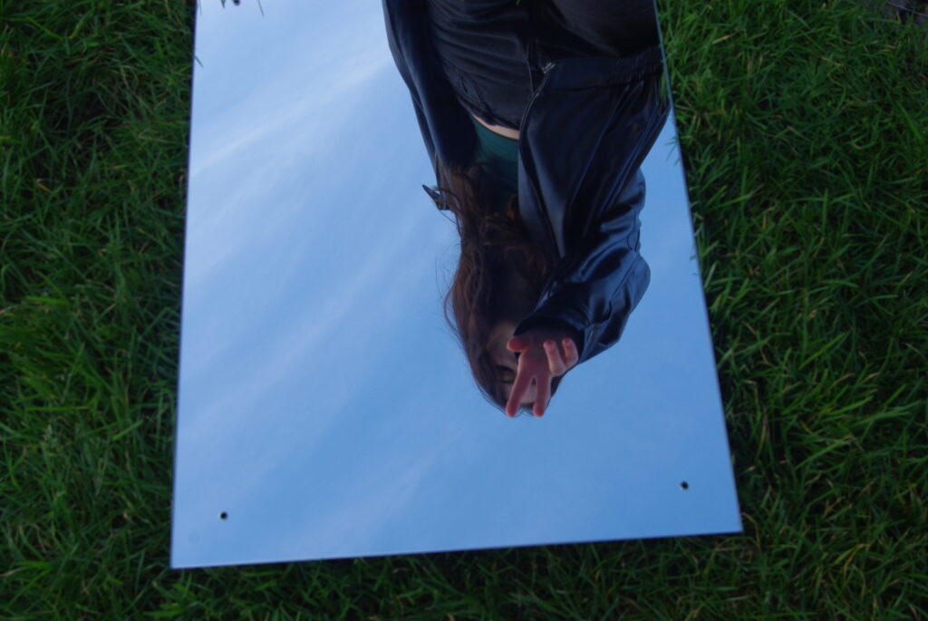
Contextual
In this image I used the mirror effect within photography meaning I built my own ideas into reality it didn’t naturally occur as I interfered by constructing reality to create surrealism within the image.
Conceptual
I took this image this way to convey how peoples experiences and their environment also add to their inner identity. The mirror represents how its looking into her and I asked the subject to look scared and hide behind the mirror as well as editing it to be in black and white to give a dark uneasiness to the image possibly foreshadowing her dark history to have the viewer use their imagination when seeing this image and think for themselves about what its trying to portray the way we can’t know the reasons behind someone being the way they are and it could be down to things they have been through in life.
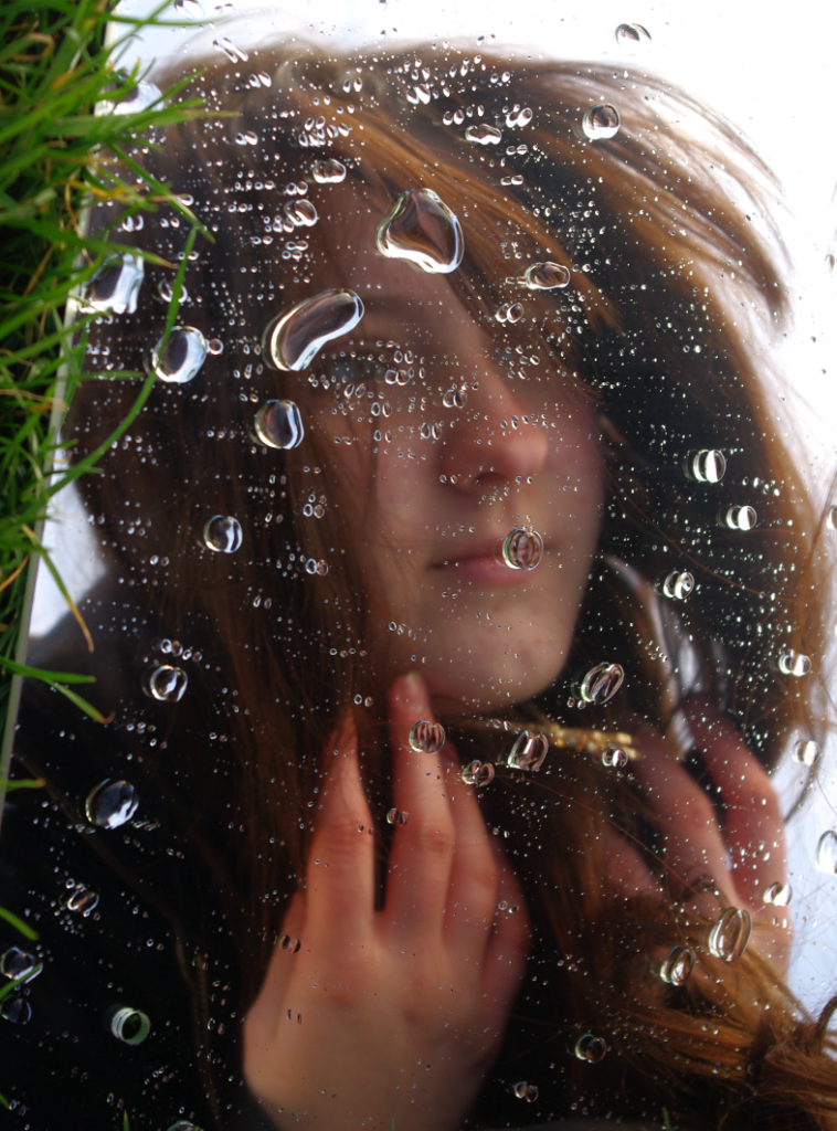
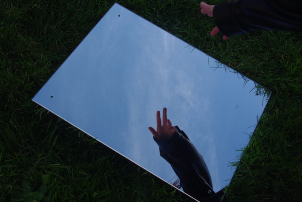
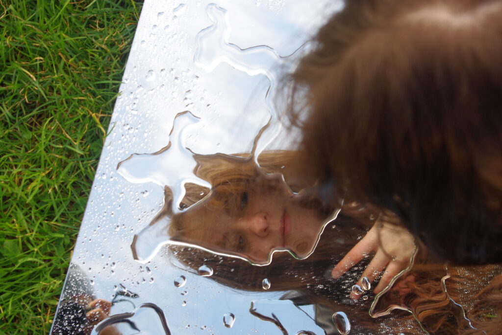
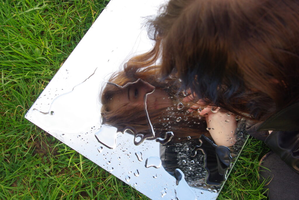
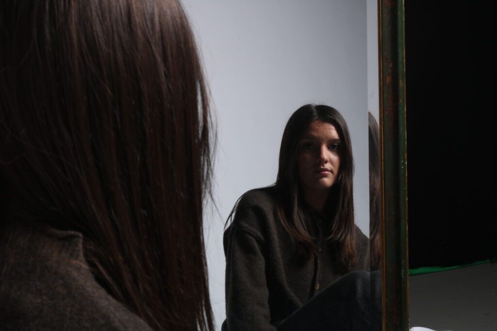
I tried this image in both B&W and colour as I’m not sure which one suits it better
Technical
The lighting in this image is natural/daylight as the image was taken outside. I used max aperture.
The shutter speed is it doesn’t look to be over or under exposed. F/ is 6.7 and the ISO is 800. The white balance was on Auto.
Visual
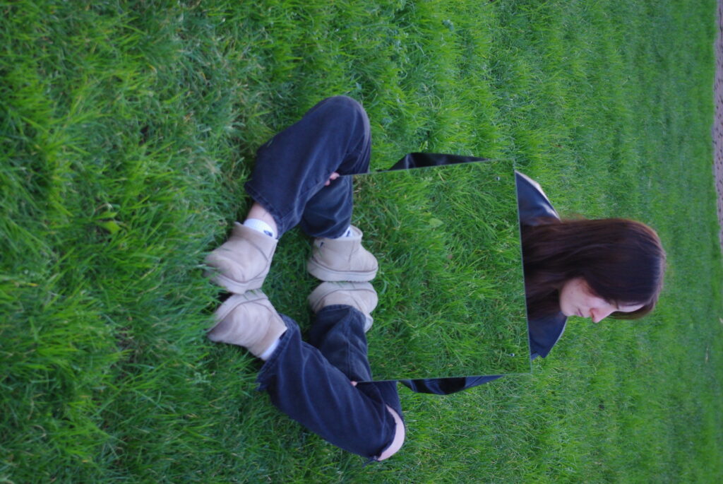
The coloured version is very light and has a range of warm and cool toned colours. the tone is light overall though there are some dark shadows within it. The water droplets as well as the models wispy hair adds texture. The image has a more 3D appearance due to the water droplets adding height to the mirror affect. The grass also adds to the 3D as it protrudes over the edge of the mirror making the mirror look like its party of the ground and it frames the image too. There isn’t many lines within the image other than the edge of the mirror and the blades of grass pointing to the models face.
Contextual
In this image I used the mirror effect within photography meaning I built my own ideas into reality it didn’t naturally occur as I interfered by constructing reality to create surrealism within the image.
Conceptual
The idea behind this image was to try and capture the idea of rain and link it back to the idea of identity changing naturally and finding things that change in nature the same as the water cycle and the weather.
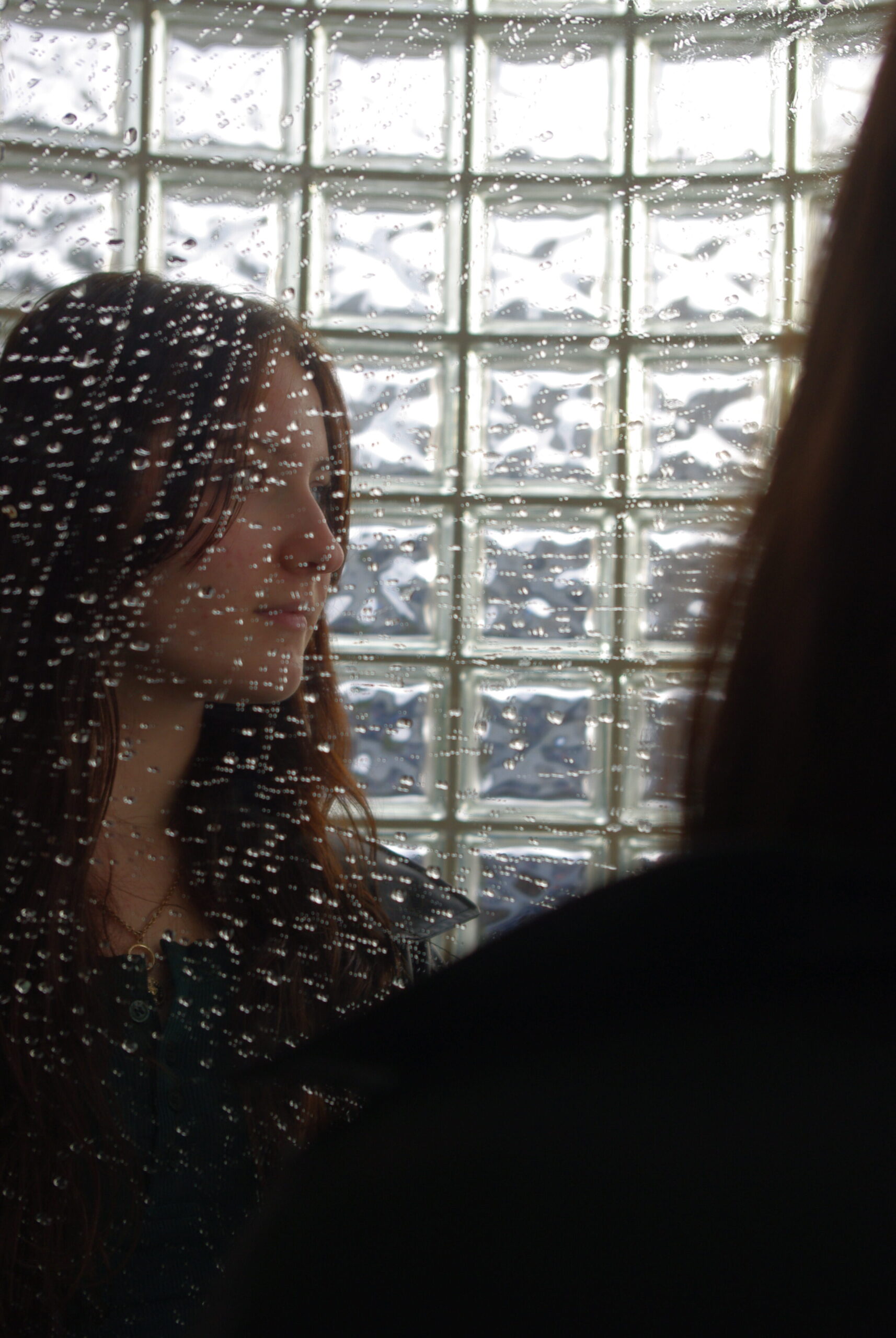
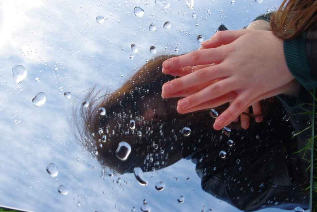
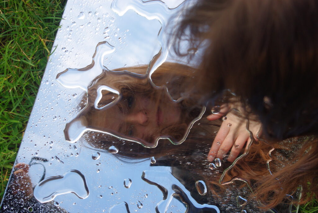
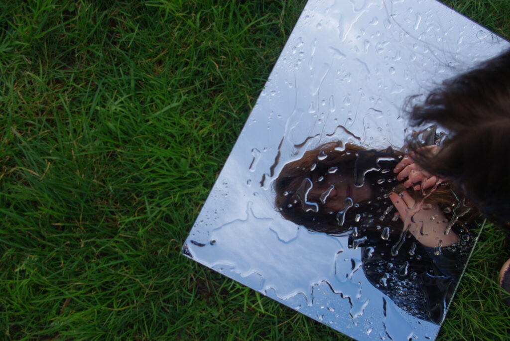
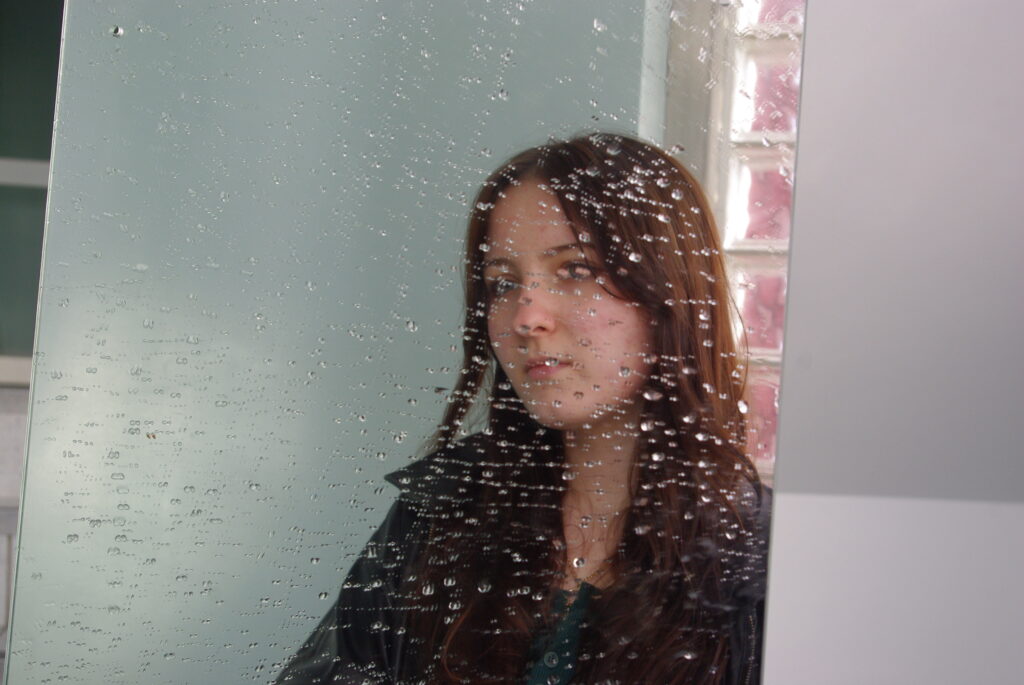
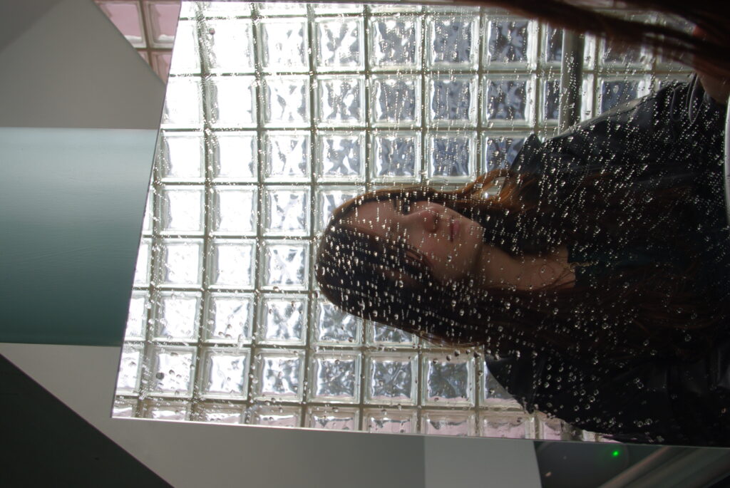
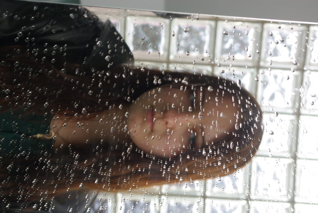
Technical
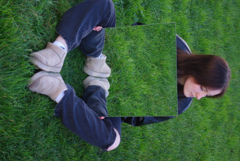
The lighting is both natural and artificial as the natural light is coming in through the window but there was also lights above the subject when taking the image. the Aperture used was max. The f stop was f/6.7. The exposure time was 1/90. The ISO used was ISO-100 and the White Balance was on Auto.
Visual
The colours are natural in this image
Contextual
In this image I used the mirror effect within photography meaning I built my own ideas into reality it didn’t naturally occur as I interfered by constructing reality to create surrealism within the image. However, I also used the window method as the window is behind the subject.
Conceptual
I did this to show how your choices of reality in its natural form can impact your identity and what your ideas of your own sense of self and you might not even realise it which is why the subject is not looking at herself in the mirror and reflecting instead the subject is distracted by what’s surrounding her. I also didn’t focus on the subject themselves but on the water on the mirror instead to add to this point of loosing yourself by what’s happening around you.
My Alicja Brodowicz and Cindy Sherman Inspired Images
Other Images
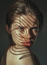
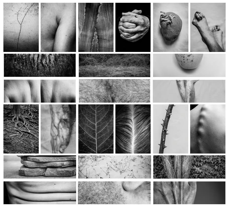
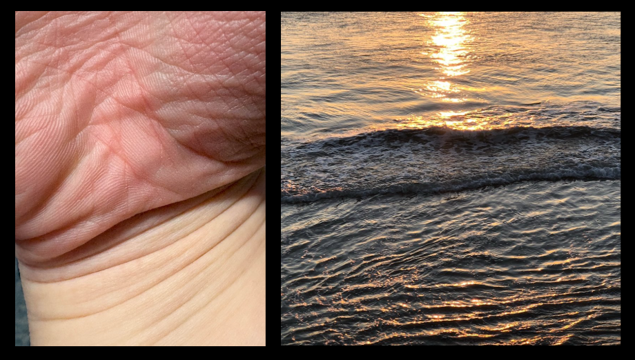
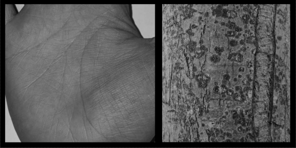
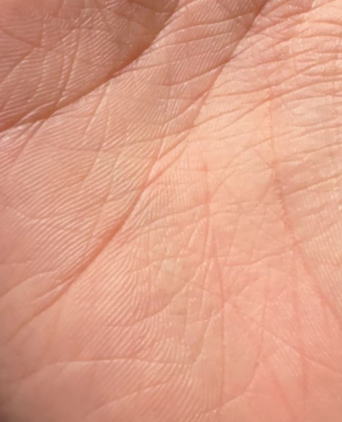
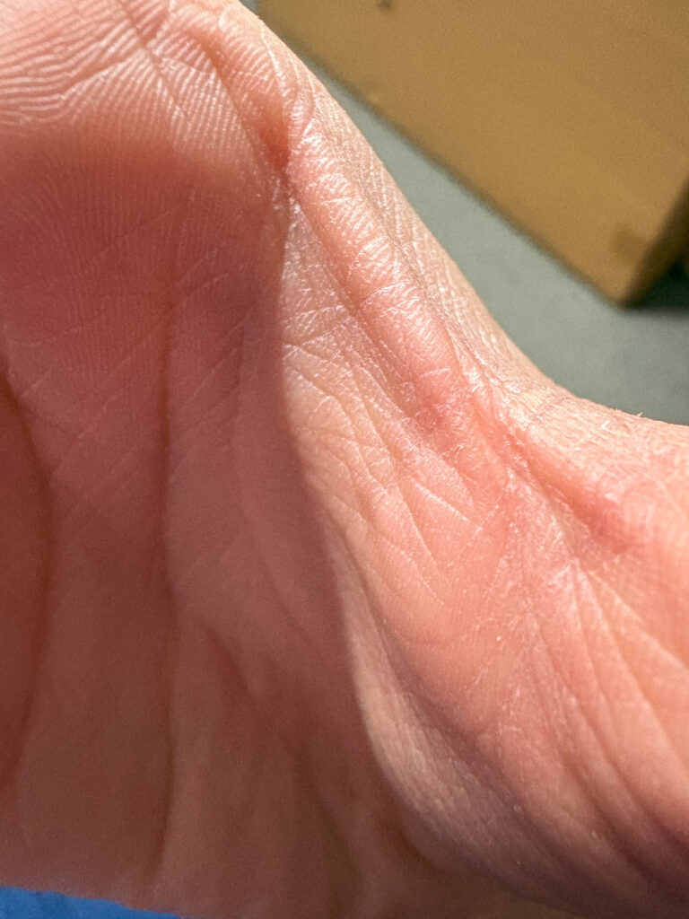
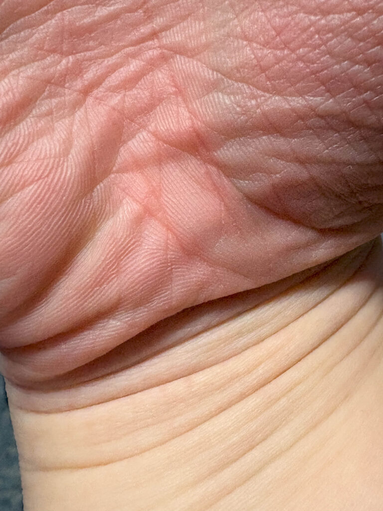
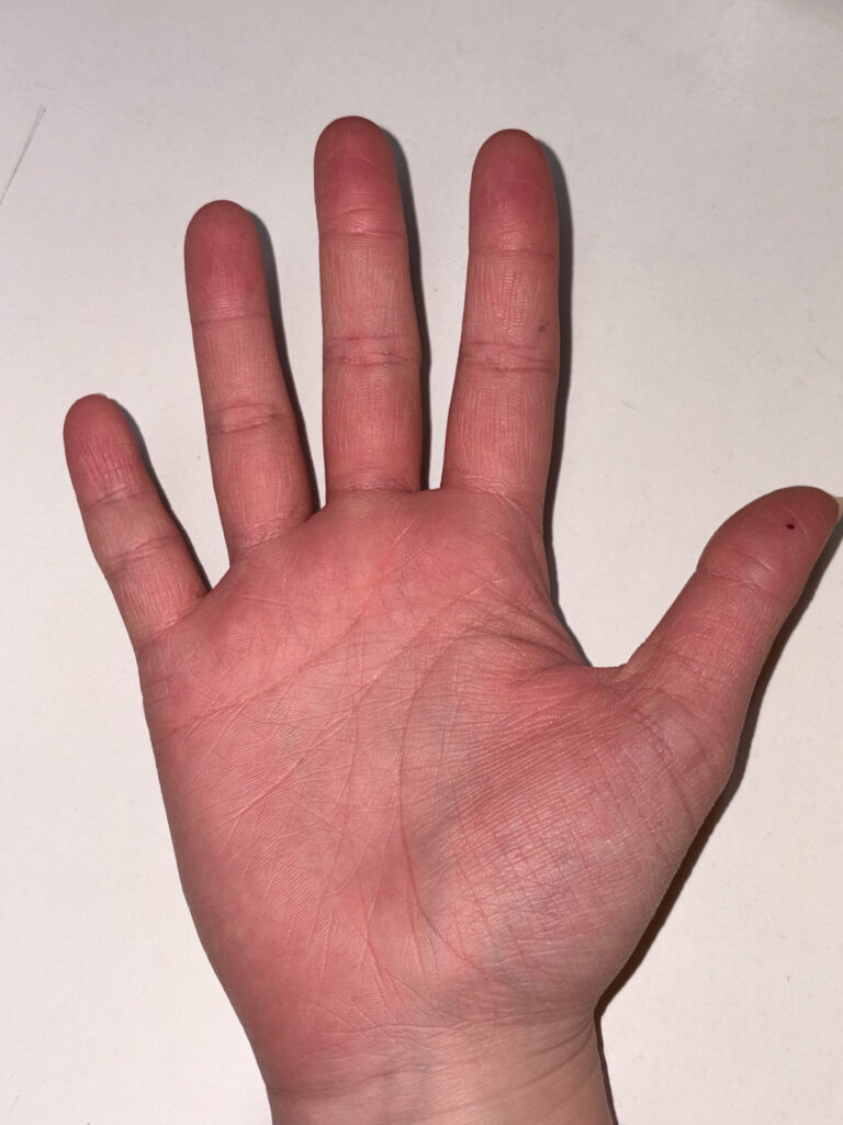
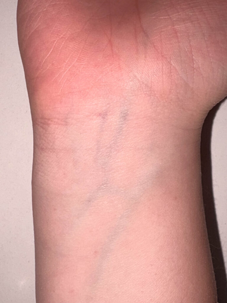
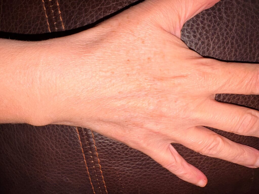
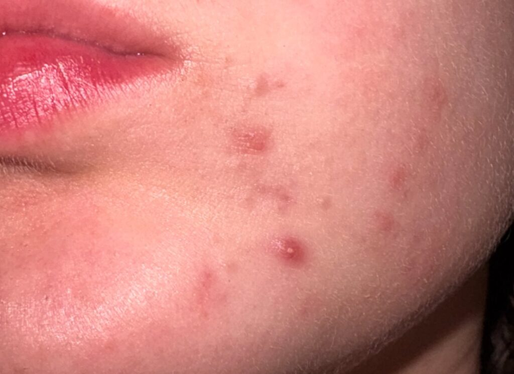
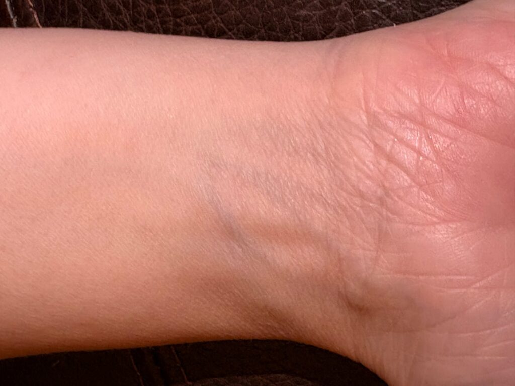
In the next shoot I tried to capture the lines naturally drawn over the human body such as finger prints and veins.
I think fingerprints are a huge sign of identity as every one is is different and unique. the same way people are. Even identical twins finger prints are different showing how every individuals identity is different and unique.
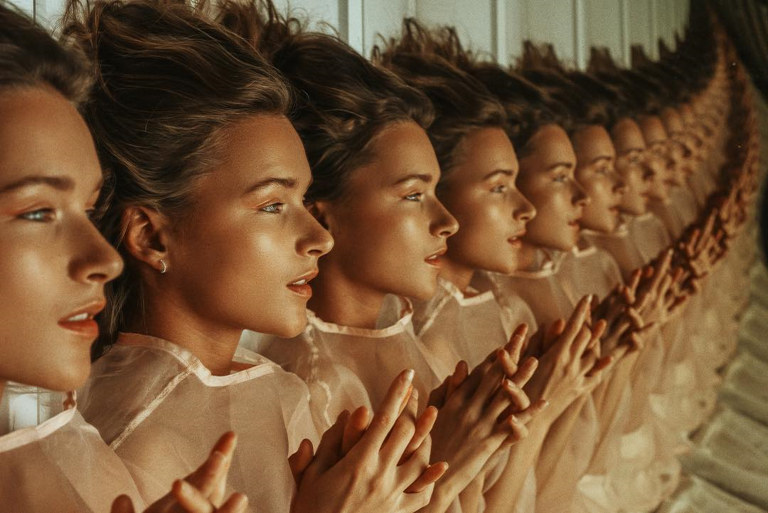
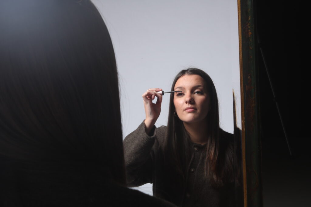
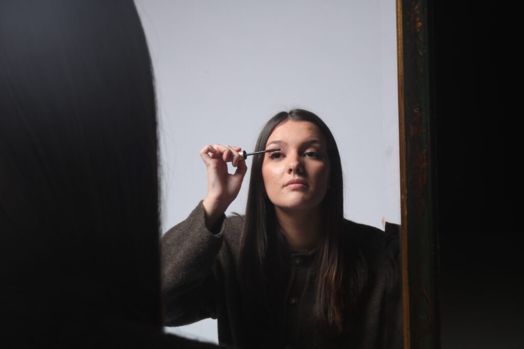
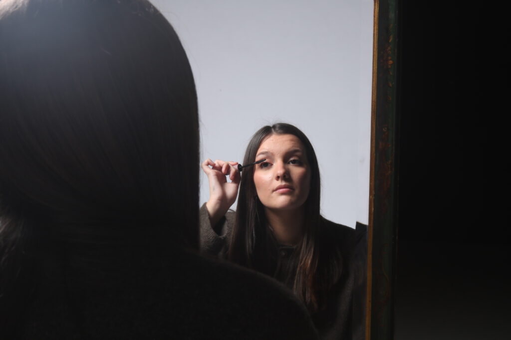
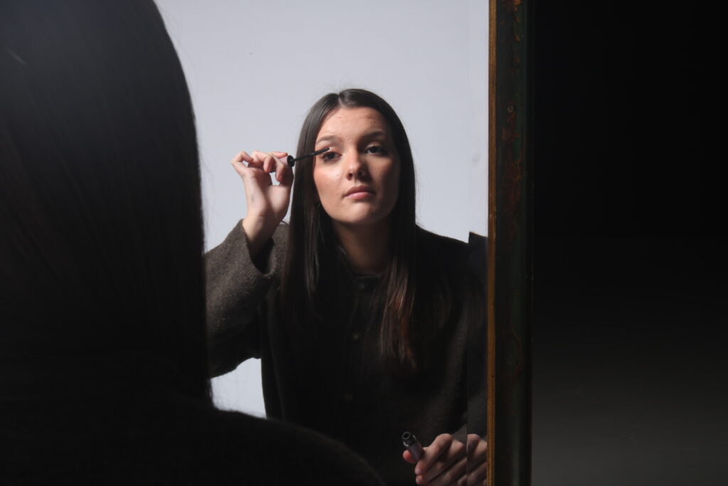
Femininity
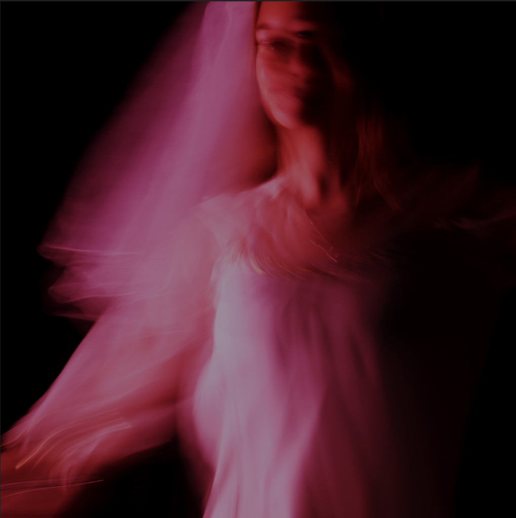
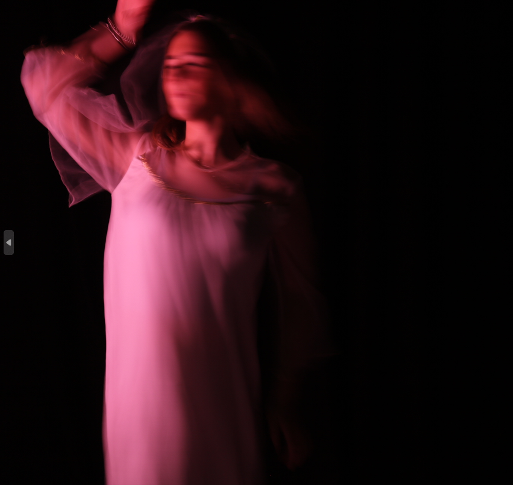
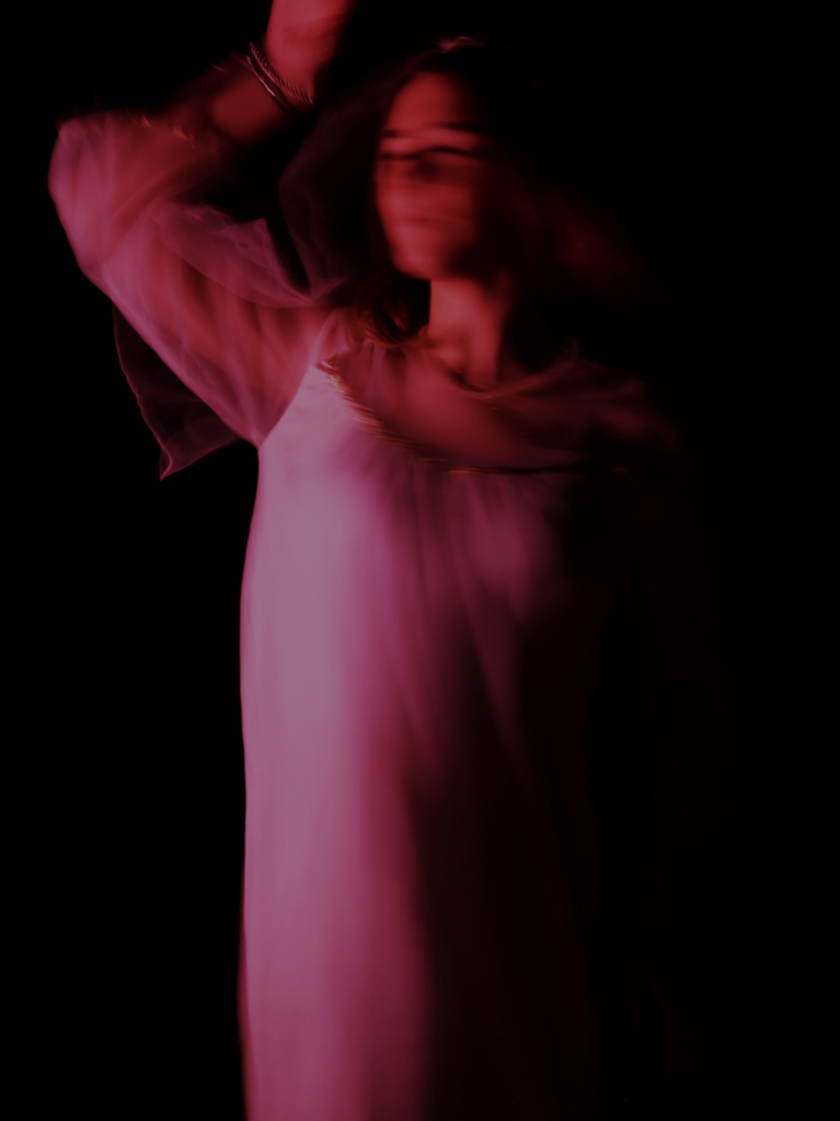
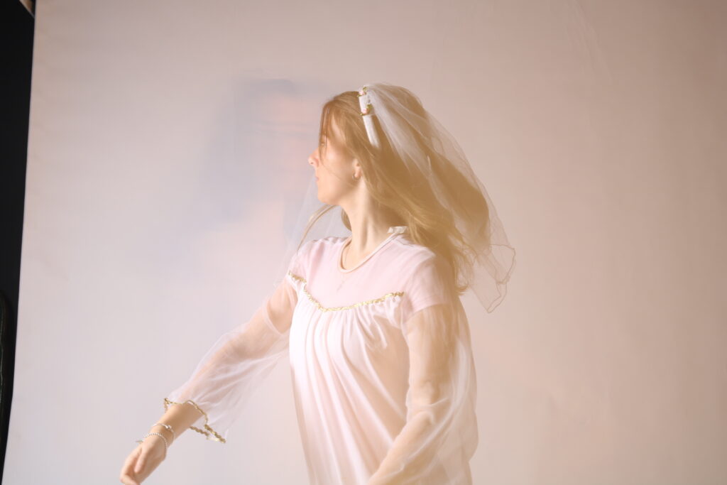
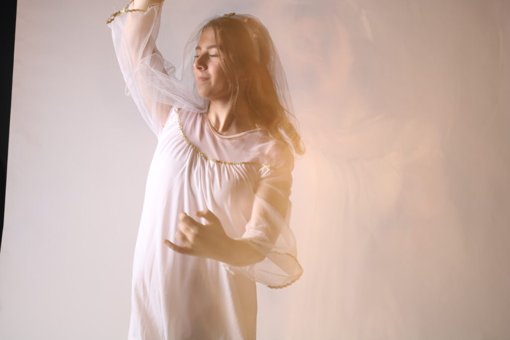
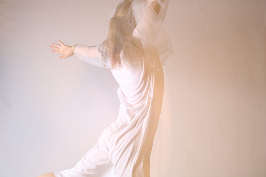
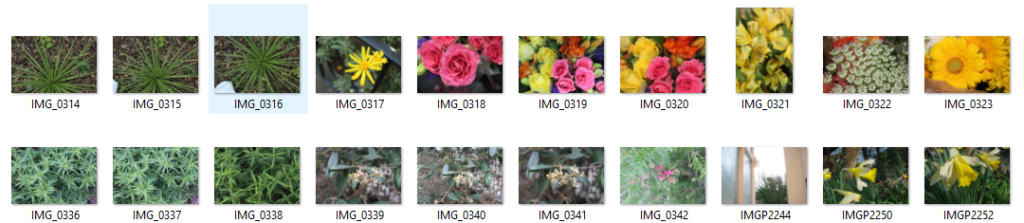
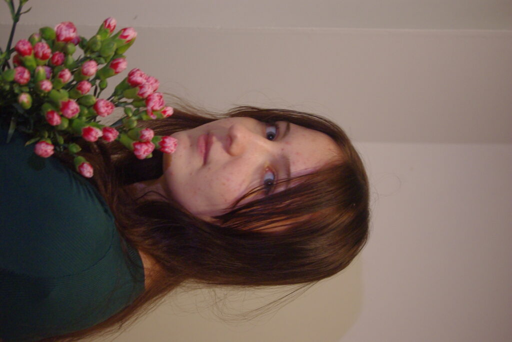
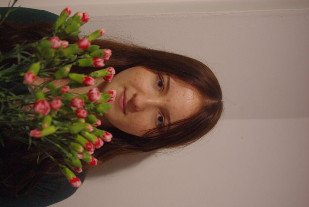
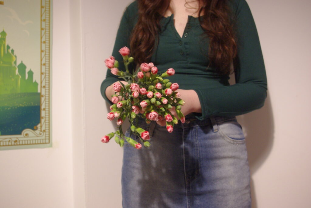
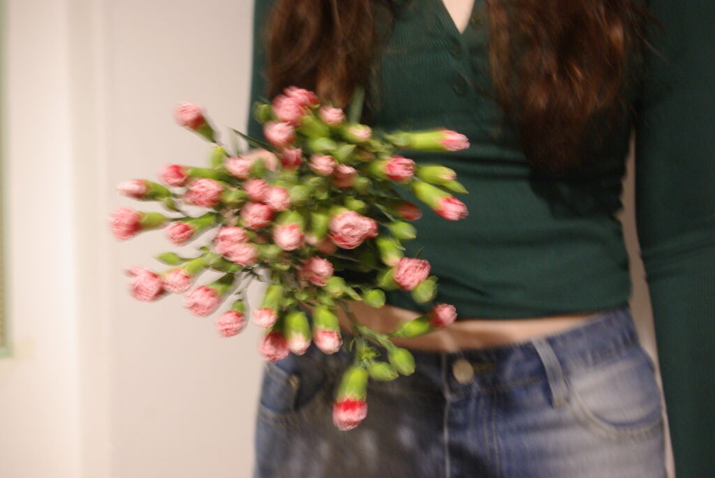
Femininity for me is a feeling rather than a look or a style. For me femininity is feeling empowered and confident and aligning yourself with being a woman. Femininity is being creative and passionate and in my opinion is not defined by clothes or your physical appearance however I do believe make up or certain clothes might help youfeel more feminine on the outside as well as inside. I used the symbolism of femininity of flowers throughout my photoshoots and the colour pink. I wanted to focus my photoshoot less on the physical appearance of a “girl” ad instead on the feeling of femininity and the idea of “girlhood”.
Girlhood being the sense of kinship a group of girls can bring by girls supporting other girls. The growing up with and relating to other girls going through the same things and being inspired by one another.
Another idea I had was the comparison of modern day femininity versus femininity in previous times and how social media effects peoples perception of femininity.