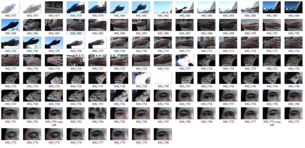
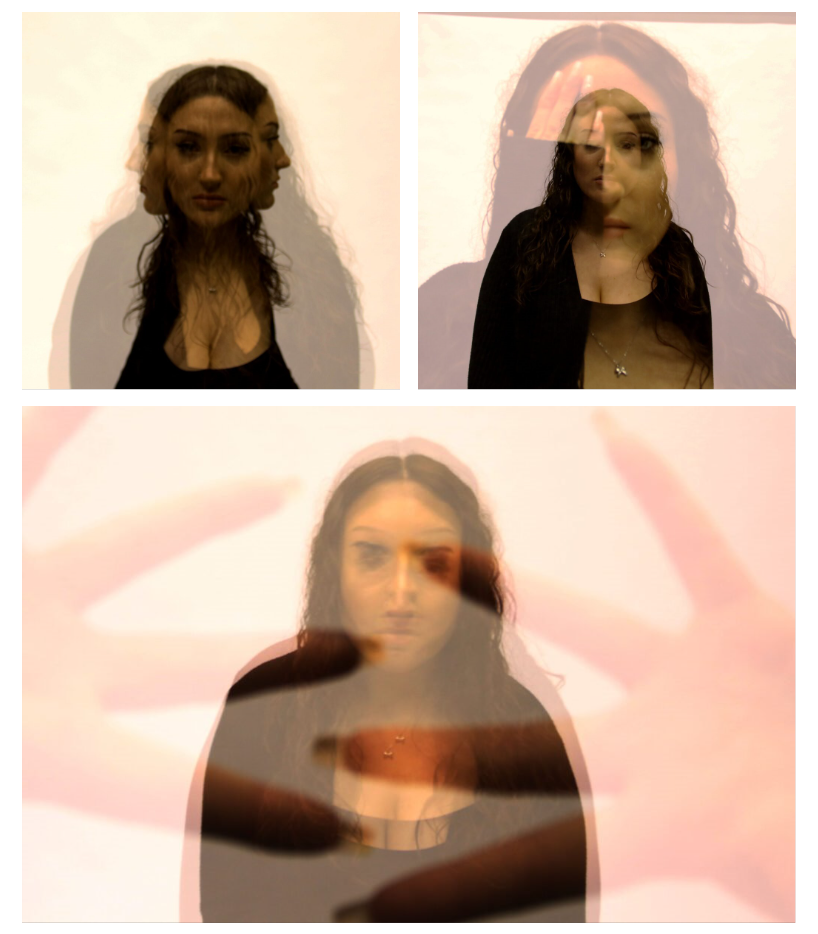
For this photoshoot, I was hugely inspired by Noor+, an unknown photographer on Pinterest, who draws on the body to show Identity. I ended up taking 106 images, from different angles to different lighting and different poses.
I planned this photoshoot by buying the equipment I would need (like the washable pens and some wipes) and planning whereabouts I would do the photoshoot. I thought that I wanted to have natural lighting for my images so I planned to go outside and take these images.
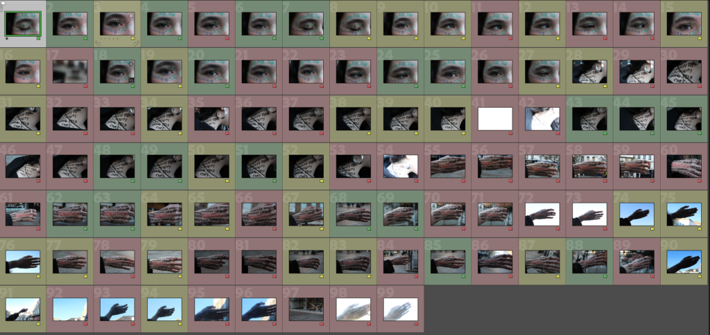
Once I uploaded my images to Lightroom, I went through each individual photo and analysed it to decide which images were the best. However, a lot of my images turned too bright or too dark due to the ISO, which made me colour them red. In comparison, the images highlighted in yellow and green are good images, but I like to be more specific with the ones I like.
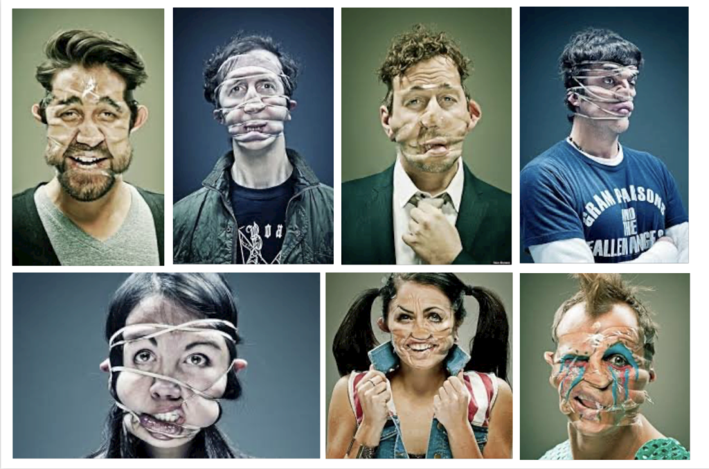
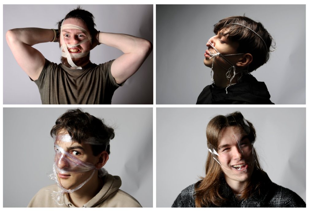
Here is a range of Wes Naman’s images where he uses vast materials (like cellotape and rubber bands/ string) to shape the subjects face and make them look unrecognisable. The idea behind this is to prove that looks aren’t important, and they don’t define you as a person (which closely relates to your identity and how you see yourself).
Technical
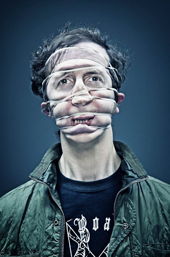
The image uses a fast shutter speed, as the subject looks still and in focus. The lighting is artificial, as the viewer can tell they are using a backdrop with strong white lights (which would not happen with natural light), and it seems like it is very intense, as you can notice the outside edges of the top are a lot darker, meaning the photographer has used a strong light on the subject. The image has a good ISO, as there is no grainy elements that are visible.
Visual
The middle-aged man looks unrecognisable as he has rubber bands wrapping his face, giving him a new look. He has a sort of confused and hurt look on his face, which could suggest he is shocked with the feeling. The navy background gives a cool tone, which could represent sorrow and sadness towards the pain of the rubber bands.
Contextual
A common belief is that beauty is everything, so by taking away that view in these images, it leaves the subject wondering who they actually are, and what their identity really is. The history of beauty is been around for centuries, so to counter act the beauty stereotype Wes Naman had his subjects distort their faces.
Conceptual
I believe the reason behind this image is to show the suffering people go through to accept themselves, when they shouldn’t need to. I also have the idea that it links to the appearance of yourself, and by manipulating the face into a different shape, it causes you to wonder what your identity is if you don’t have your looks (which is a common link for identity).
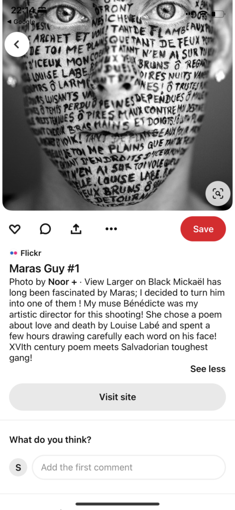
Noor+
Noor+ is a unknown photographer, who writes on the subjects face to show their identity and what they associate with. I liked this idea as I thought that it is a great way to demonstrate you as a person, and the ideas you think you are. Unfortunately, the words aren’t in English, so for my photoshoot, I will base it off of identity. This is also the only image I could find of this photographer, so I cannot create a mood board of his work.
Here is one of my final outcomes, where I selected my 4 best images and tweaked them to improve the quality of them. Luckily, I had 4 different subjects so the final presentation works well as you don’t have many of the same person, like Naman who also has various subjects. When I finished editing them, I put them into Powerpoint to make show the idea I want to have.
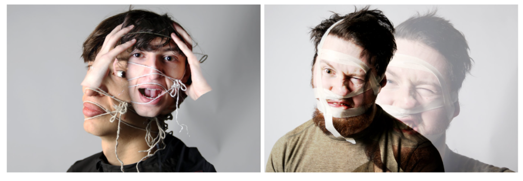
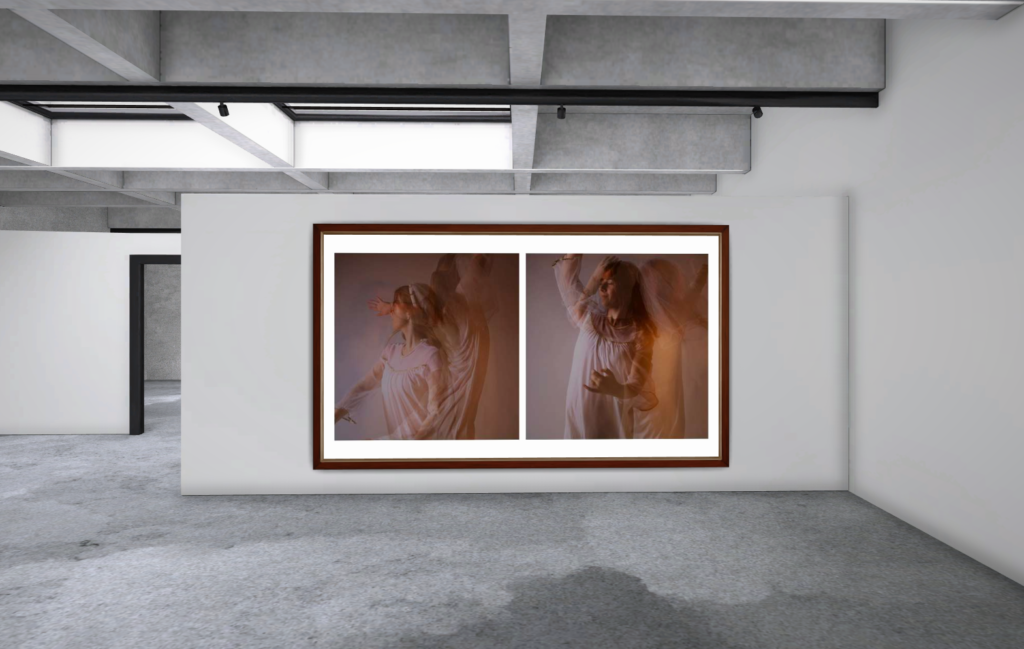
I then also decided to do another final outcome using the Wes Naman inspired images, to experiment and create different versions. I decided to choose a diptych styled presentation, where instead of multiple images, I only have two, which helps you to see the specific details linked into these images from the editing.
Noor+
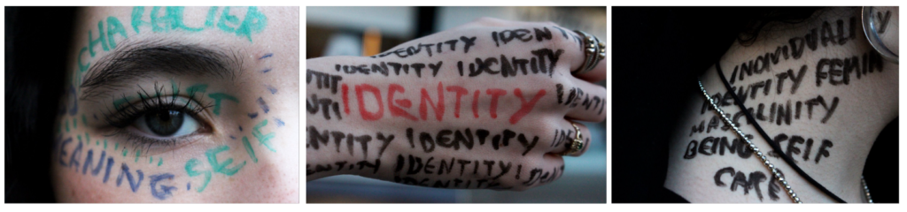
Lastly, for my Identity project, I also decided to use my other photoshoot where I wrote on area’s of my subjects body to show that no two are the same. I chose to place three of my best images into a triptych, to give the illusion of a story, and a meaning behind the different words placed on the different parts.
Creative Portraits
I wanted to include my final images from my creative portraiture, as I wanted to imagine the layout of them. For my first presentation, I only selected three images as I didn’t want to over crowd the layout I already thought of, and these were my best images from that specific artist.
For my other presentation of Creative Portraiture, I decided to only use one image as I really like the unique and artsy side to this edit, and I didn’t want to draw the attention away by including more.
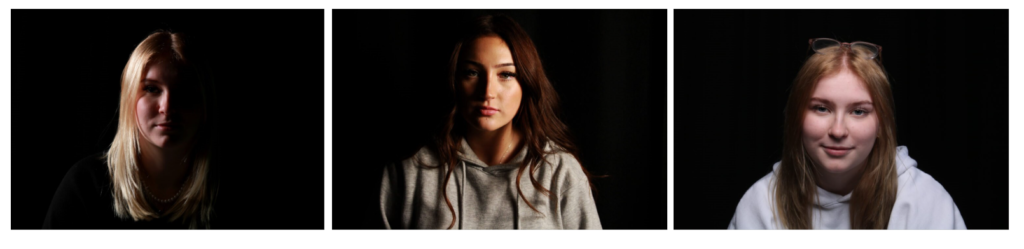
Studio Portraiture
This is my final presentation of Studio Portraiture, where I used the three different lighting methods to showcase my knowledge.
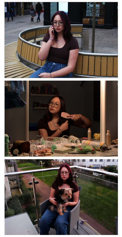
Environmental Portraiture
Lastly, this is my environmental portraiture, and I incorporated three images as well but I decided to lay them vertically instead of horizontally like the rest as it creates diversity.
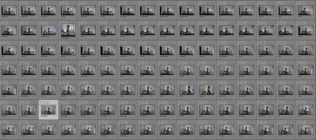
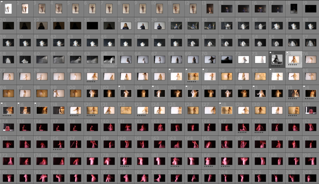
This is my contact sheet. I went through and rated all of my images from the photoshoot on a star scale from 1-5. 1 being the poorest and 5 being the best. I rated them depending on important qualities such as the lighting and making sure everything is in focus. A big factor in this photoshoot was trying to manage to see the full depth of field.
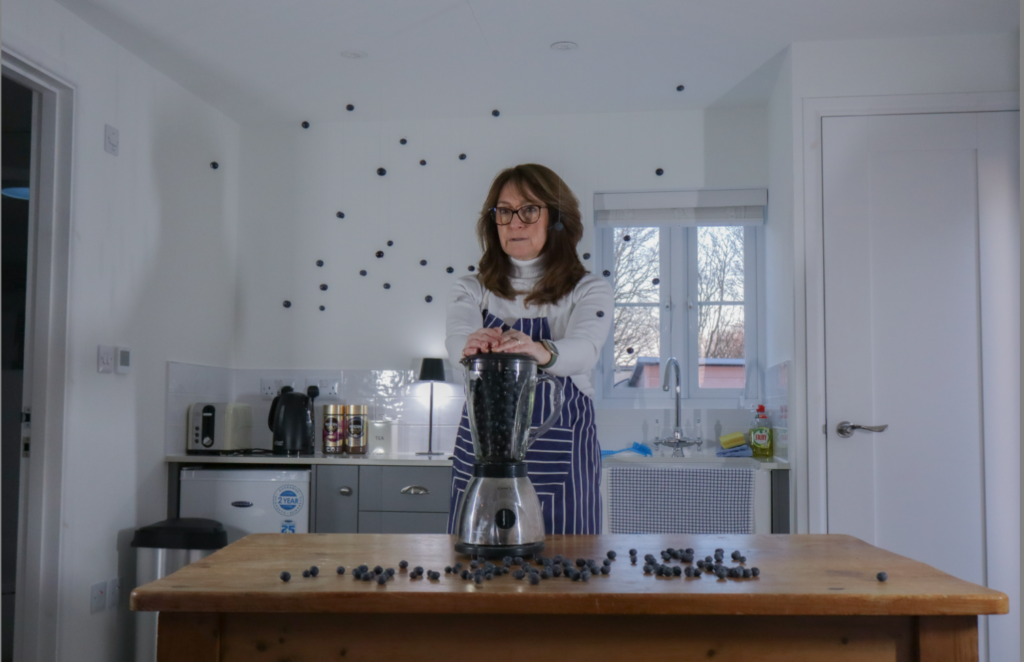
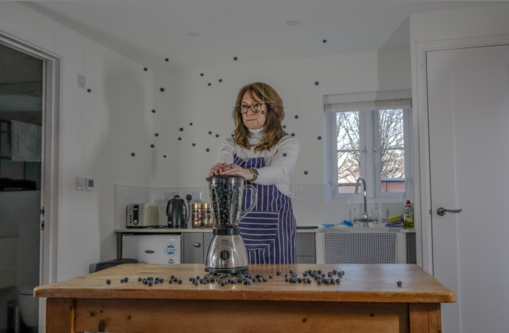
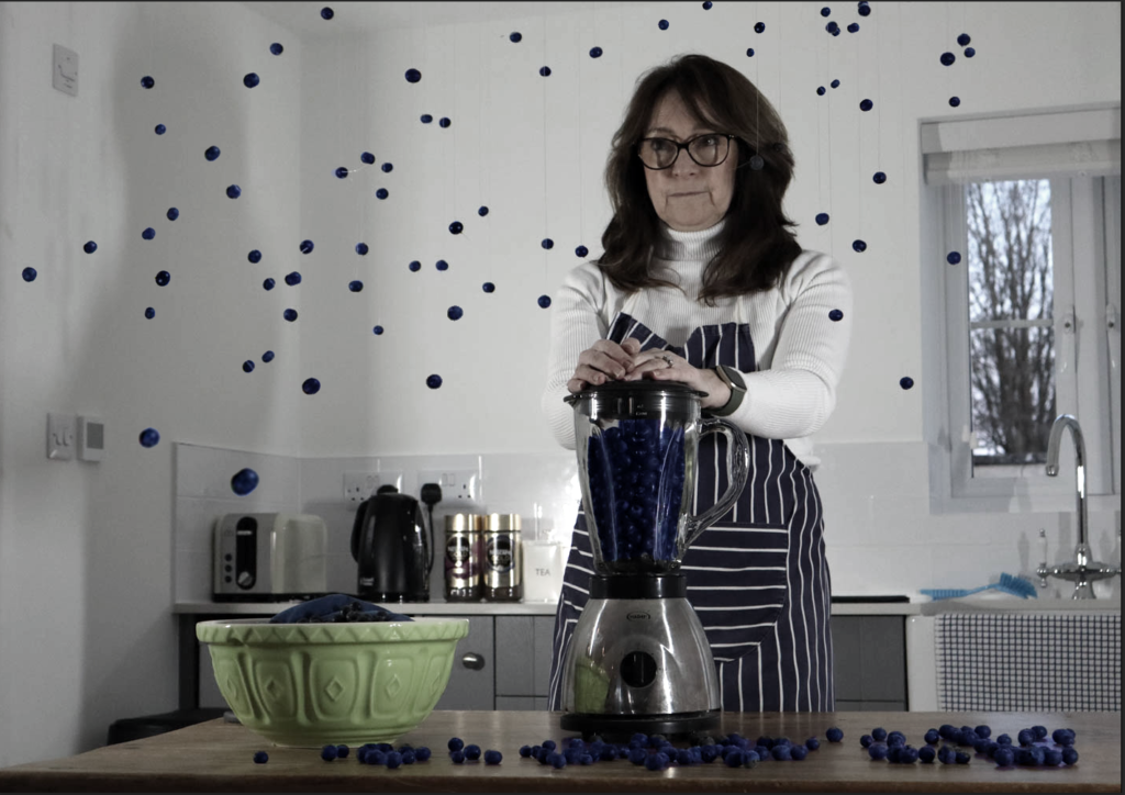
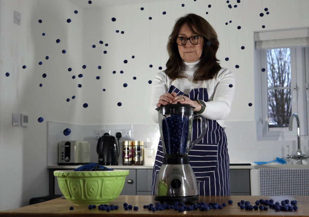
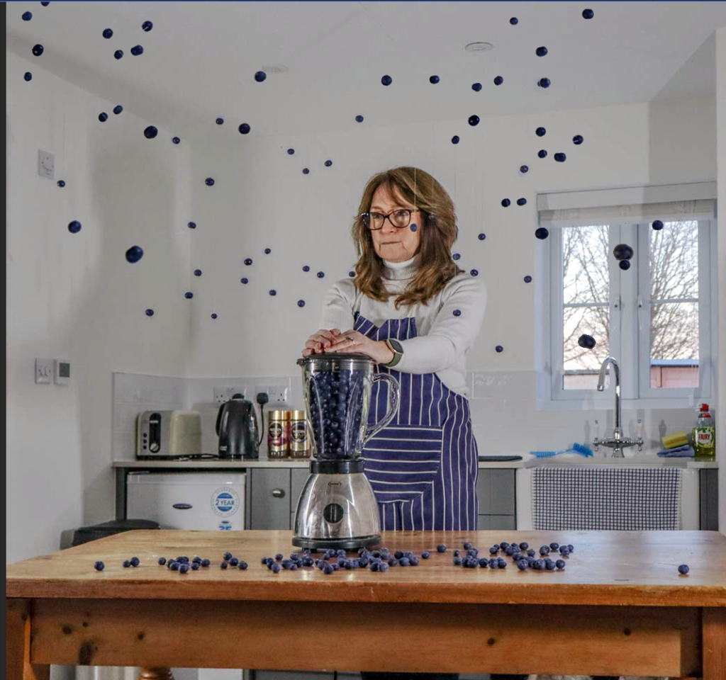
Editing: As these pictures were taken with a relatively high iso, they required a high amount of editing. Also what I did was on Photoshop make layers of the blueberries and then duplicate them and enhance the saturations to make them pop more as they become more blue
Final Pictures:
My Annotation
In this photo, a woman stands in a kitchen with her hands on a blender, which contains fresh blueberries. Surrounding her head, blueberries appear to float in mid-air, adding an unexpected and magical element to the scene. The soft, natural lighting creates a warm and inviting atmosphere, enhancing the overall feeling of comfort and homeliness. The woman’s calm, focused expression contrasts with the playful movement of the suspended berries, bringing a sense of balance to the image. The photo is inspired by the work of Cerise Doucede, who often blends elements of everyday life with surreal, whimsical touches. Here, the kitchen—a place typically associated with routine—becomes a canvas for creativity, where ordinary objects take on a new, fantastical life. The floating blueberries add a sense of wonder and movement, transforming a simple moment into something extraordinary. The combination of vibrant colours and the surreal composition creates an enchanting feeling, inviting the viewer to see the magic hidden in the everyday.
within in these photos it gives off a dramatic scene to it, which in the way the subject has been edited it shows a timeless effect. which these photos will be presented as A5.
another print layout to go with the previous print layout.
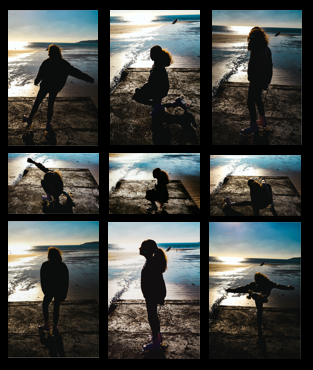
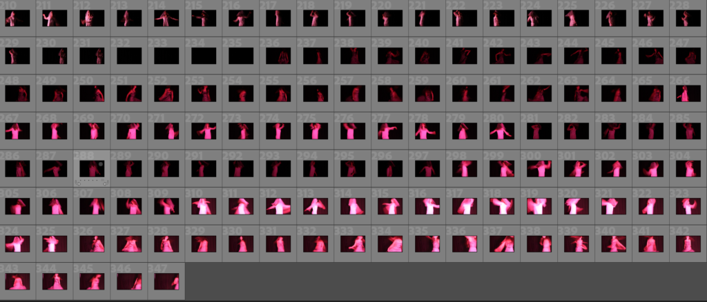
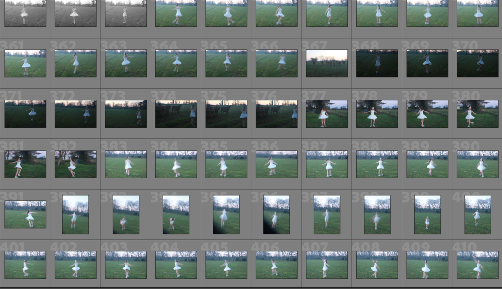
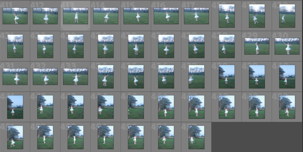
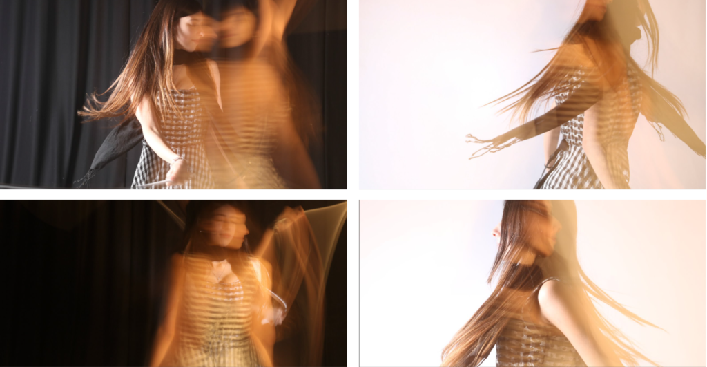
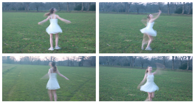
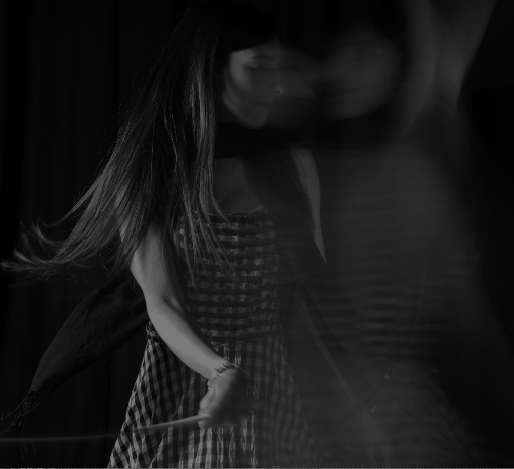
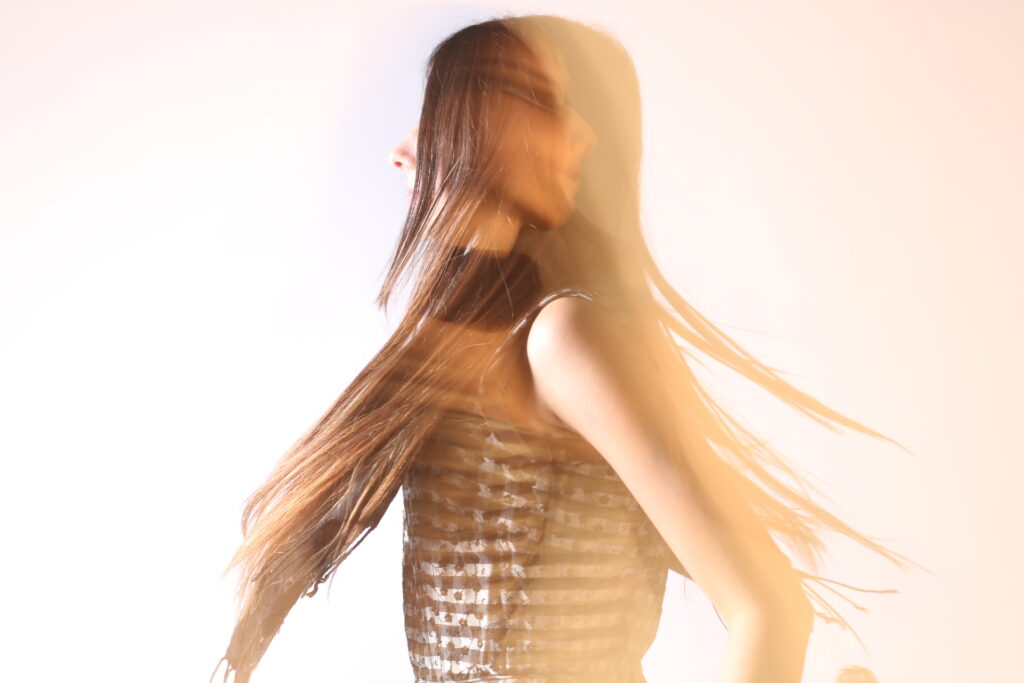
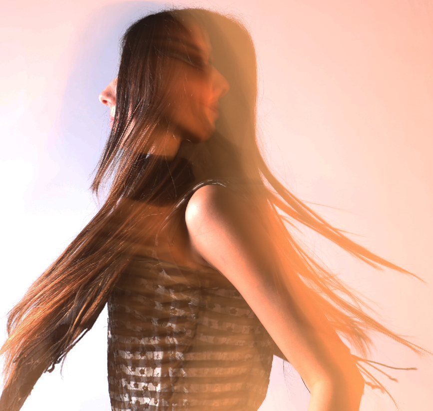
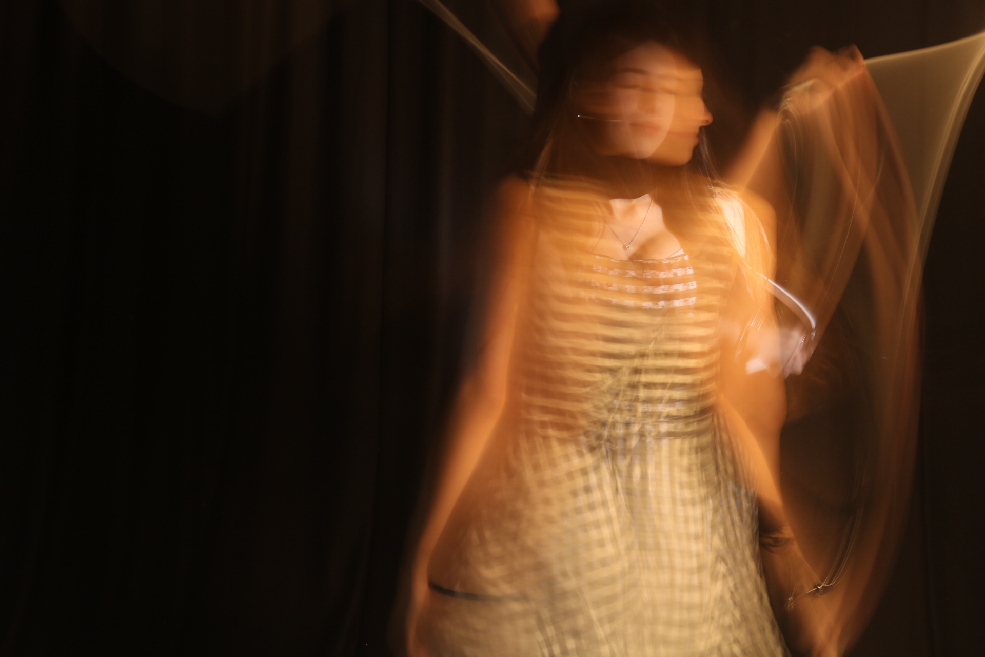
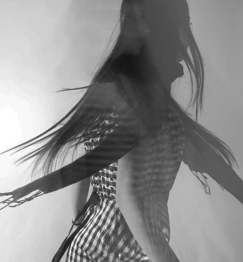
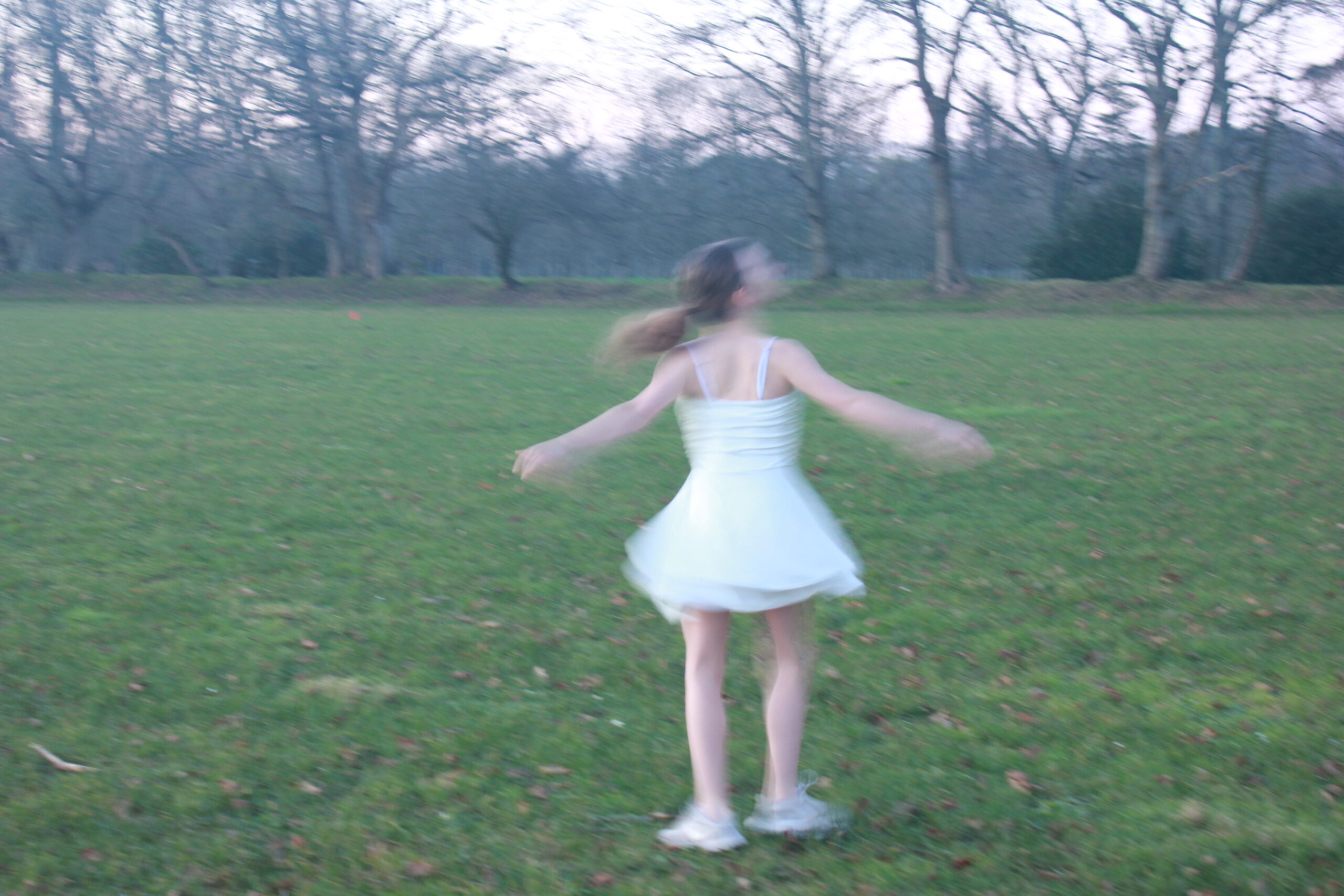
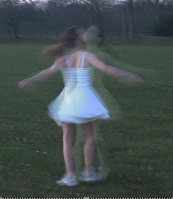
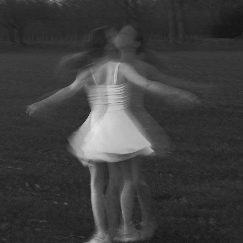
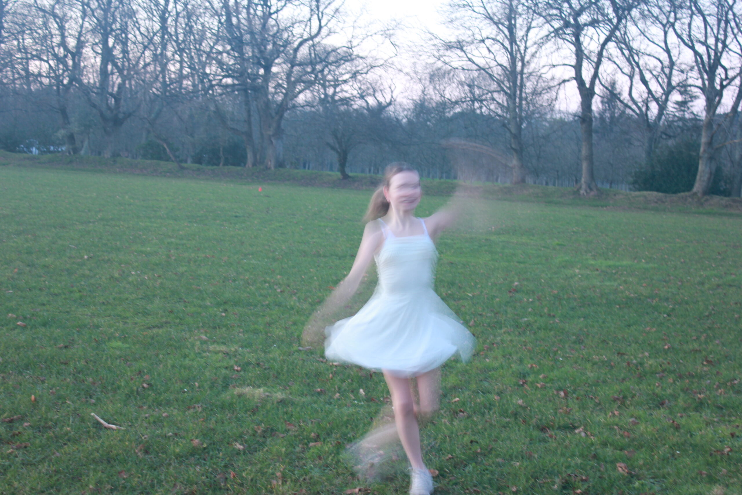
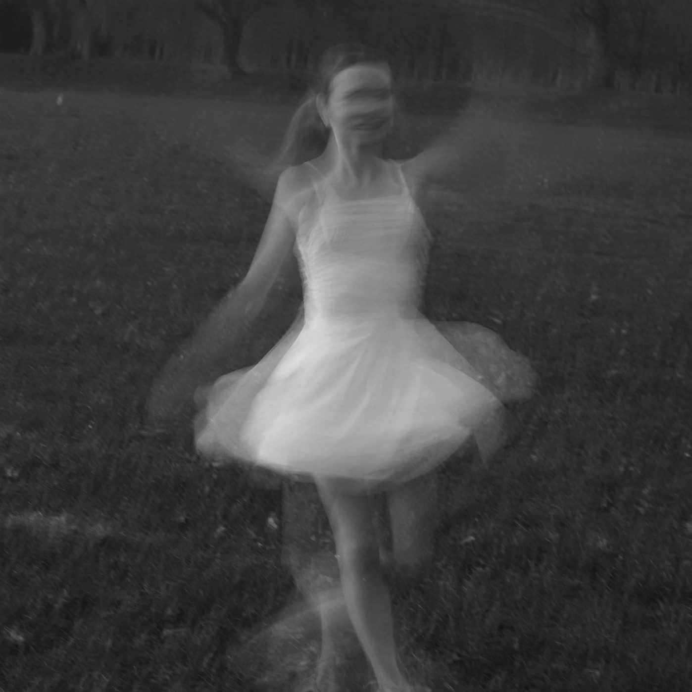
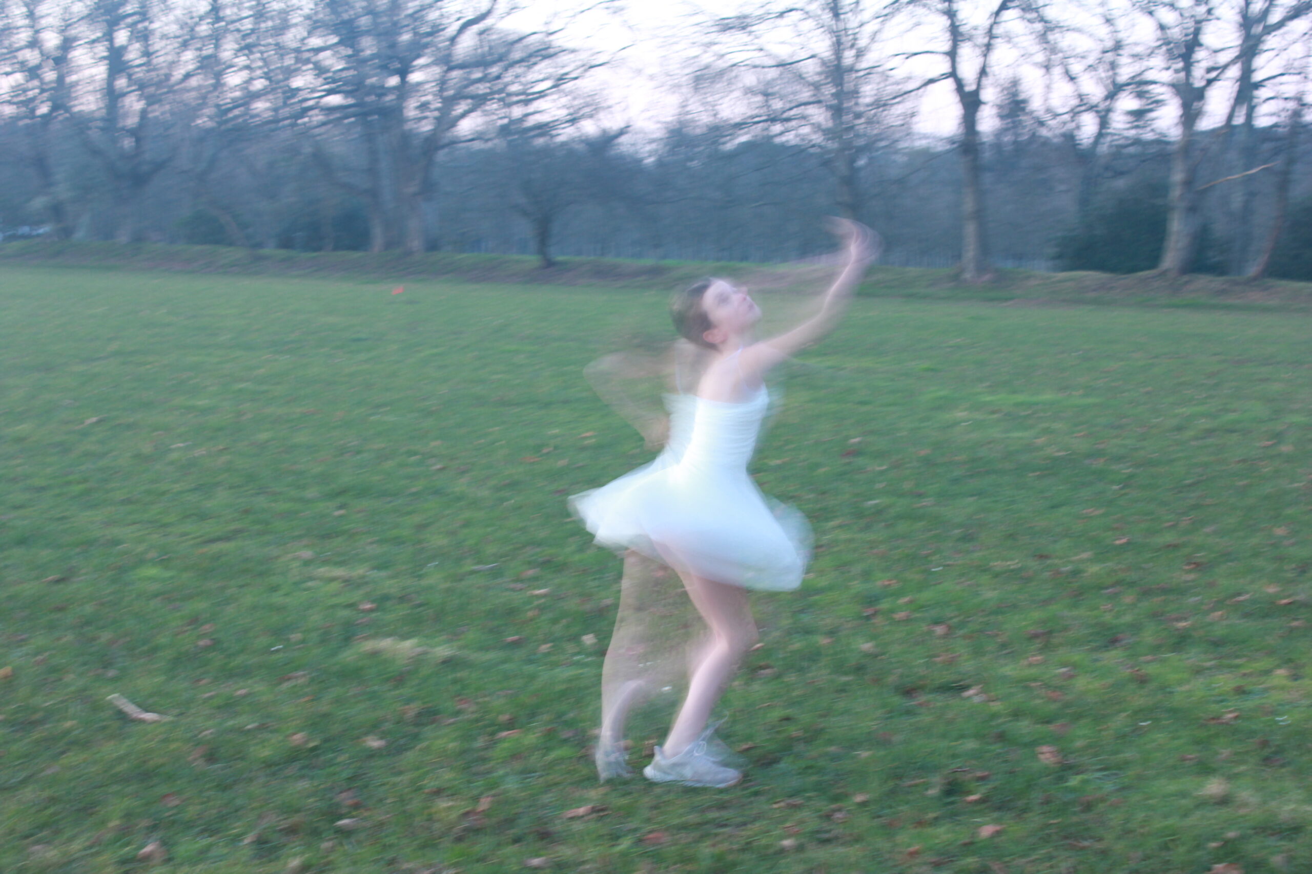
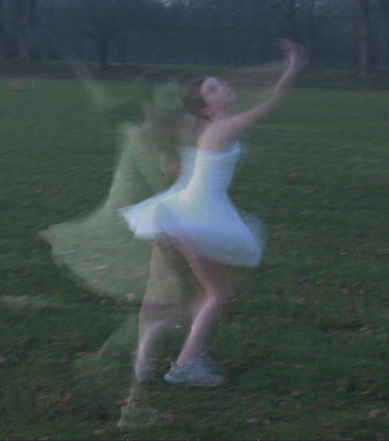
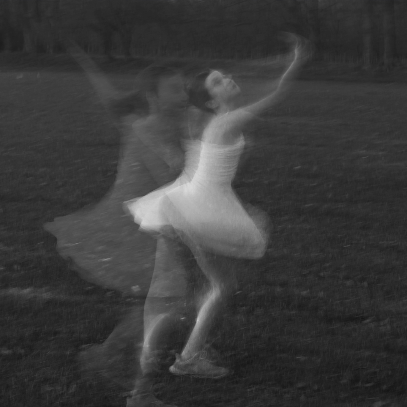
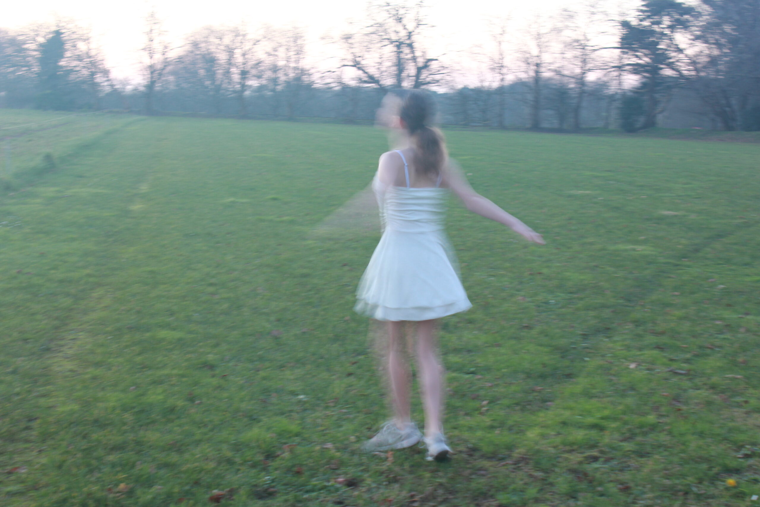
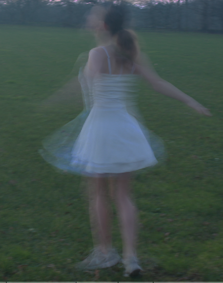
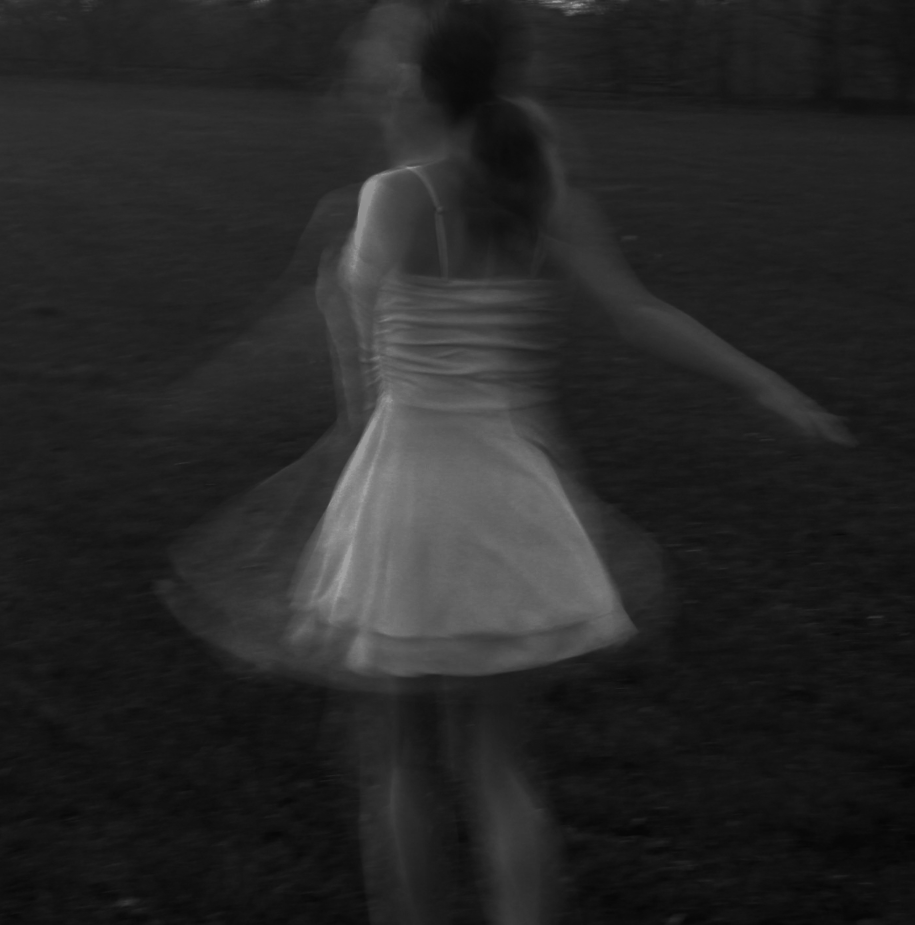
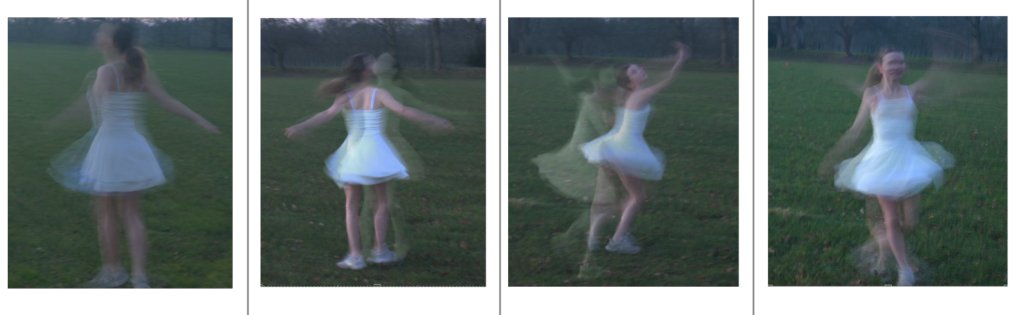
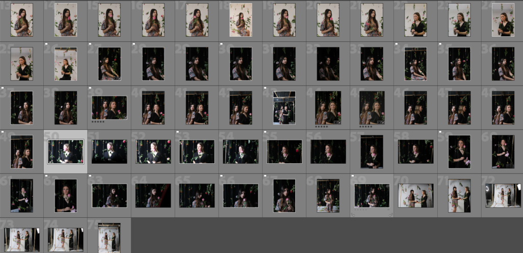
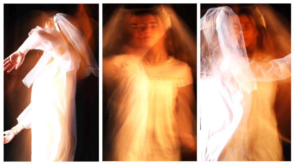
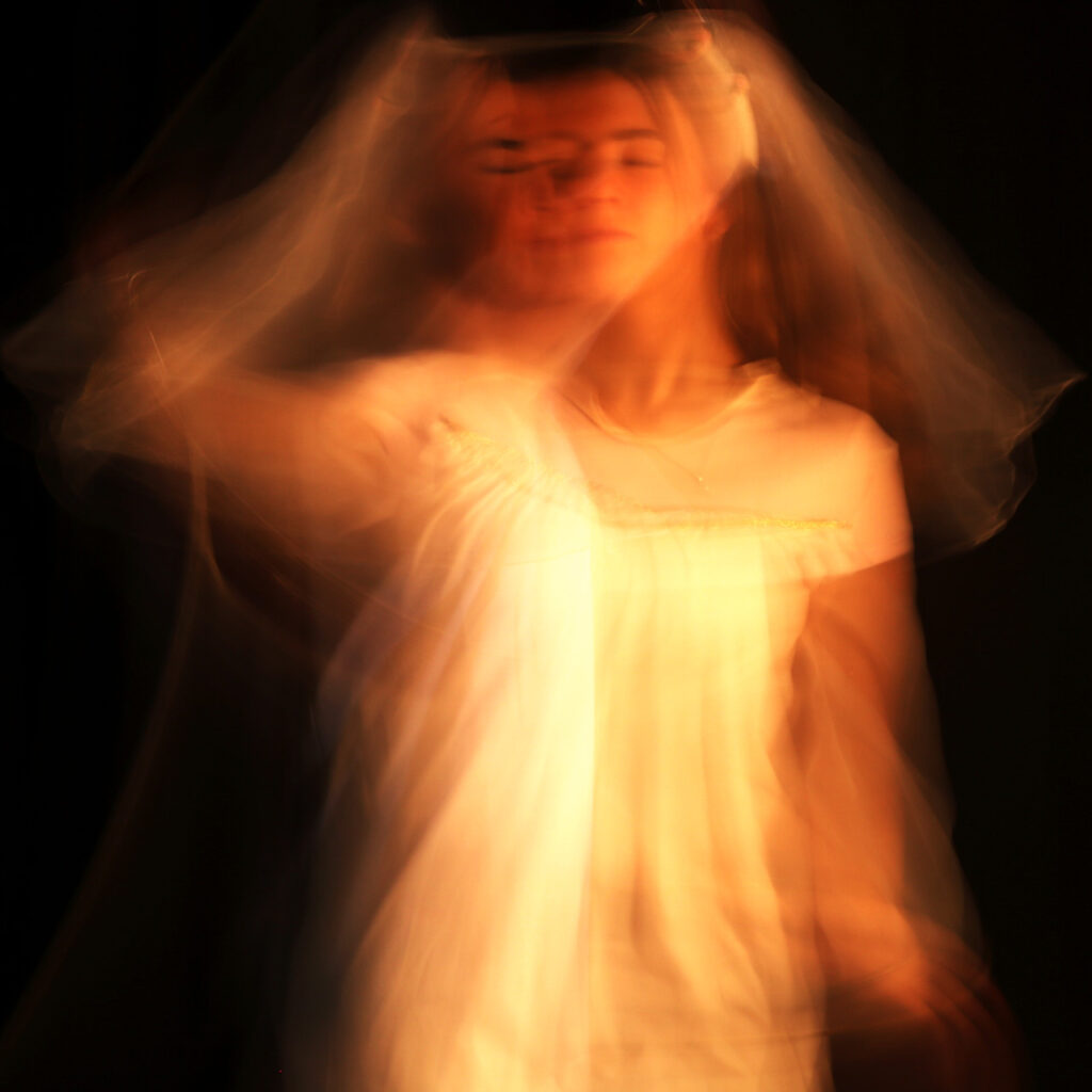
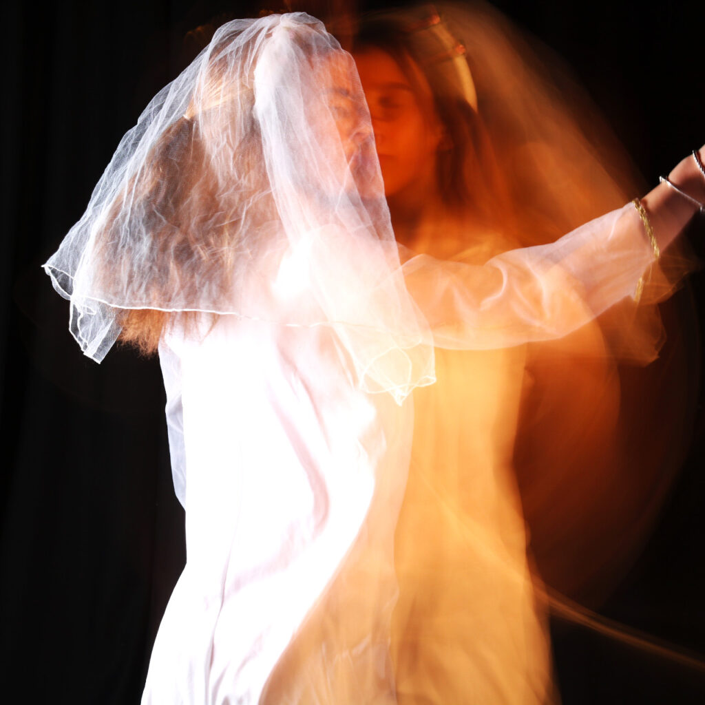
These are my contact sheets of my identity project from Lightroom. I have done two separate photoshoots. Overall I have 457 photos which I have taken. This consists of 347 in the first photo shoot and 110 on my second photoshoot. The first photoshoot I did was in the studio with Alisha. I got her to dress up in a flowy dress and spin around so I was able to take photos with long shutter speed like Francesca woodman would have used in her photos. On the second photo shoot I used my sister and also got her to wear a dress, I took her out to a field at dusk so the lighting would be good. Again in this photoshoot I also used a long shutter speed with my ISO on 600.
These four photos are my chosen photos to edit from my first photoshoot.
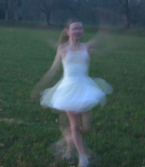
These are the four chosen photos from my second photoshoot that ill be using.
Before and after editing
First Photoshoot;
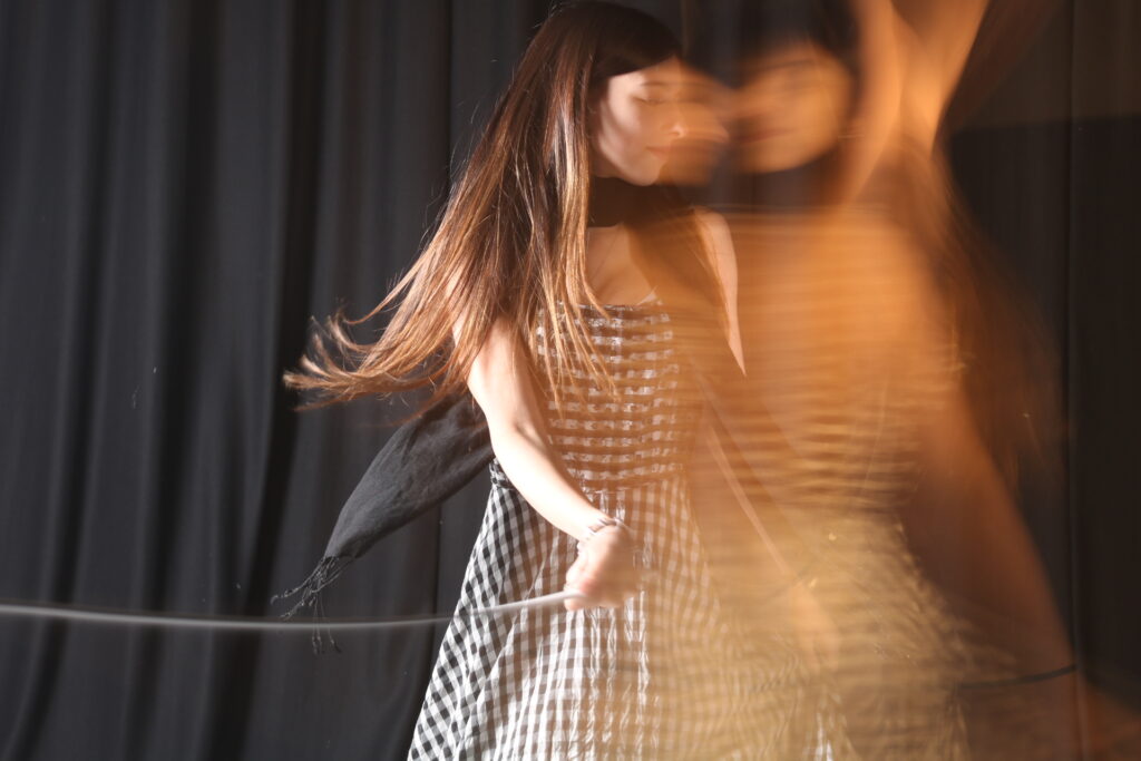
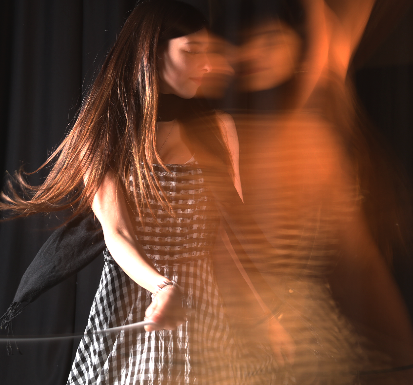
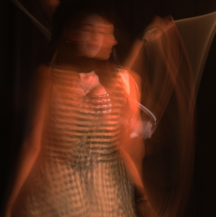
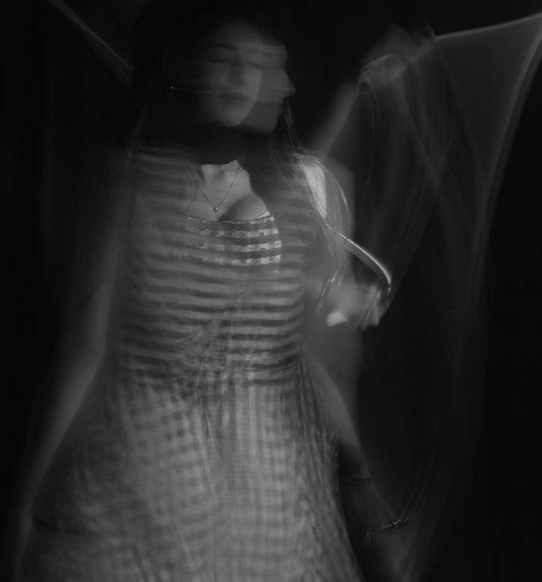
Down the left hand side, are my unedited photos. The photos down the middle I have cropped, changed the brightness and contrast and moved around the exposure. the photos on the right I have changed them all into black and white. I did this to show my different ideas of editing my photos. it shows that editing photos can be done in many different ways and still look good. For all of these photos I used a long shutter speed such as 1/6 or 1/8. I used different lights in the studio to help. I found the light that was most effective was the flash light which was connected to the camera. Therefore every time I took a photo the light would flash. I changed between the white and black backdrop throughout the photoshoot to experiment with which ones I liked more.
To edit the Hue/saturation for the middle column photos, I went onto photoshop selected image then scrolled down to adjustments then selected hue/saturation, I then adjusted it to what fitted the best. To change the brightness/contrast for the second and third column did the same thing but except I chose brightness/contrast instead of hue/saturation.
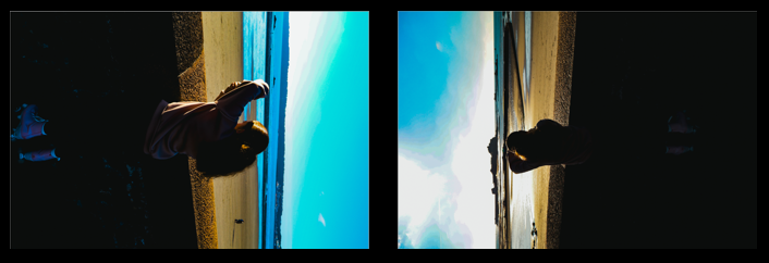
Second photoshoot;
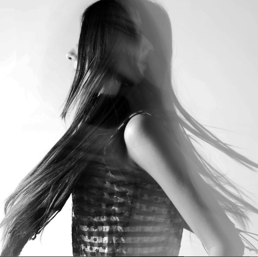
To edit these photos I used photoshop. I firstly dragged one photo on top of the other to create a double exposure photo. I then changed the opacity of the first photo so it would let the second photo come through and be visible. I then cropped the image so that my sister was the main focus and then changed the brightness and contrast on both photos until I got it to be where I wanted it. As I was outside, I did not have access to any lights, however the natural lighting was exactly what I needed for this photoshoot. With the black and white I used the edited photo and added a black and white photo filter, I then changed the brightness and contrast to be able to adjust the black and white to the way I wanted it. The black and white also looks a lot more like Francesca woodman’s photos as hers were all in black and white.
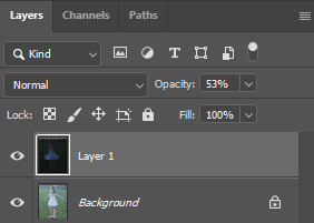
This is how I changed the opacity of the layer 1 so the background layers could come through on my photos.
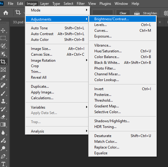
To adjust my brightness and contrast I went onto image then adjustments then brightness/contrast. I would then play around with it until I was confident with it.
My Final photos
how this links to identity.
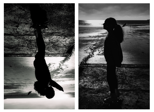
In my First set of photos, I’ve used double exposure to separate the two photos, the main photo being the body and the transparent photo being the soul coming out of the body. In my second set of photos I’ve used a long exposure whilst taking the photos, therefore both sets of photos are showing that the spiritual part of a person that some people believe continues to exist in some form after their body has died. The soul is the part of our being that consists of our thoughts, our emotions, and our unique personality. Therefore in these photos I wanted to separate the two to show that your body doesn’t define what or who you are and that your identity shouldn’t be what is seen on the outside. I think that my photos also represent freedom from the body, showing that your soul and body are two separate things.
Evaluation
Personally I would say that my final outcome was successful. However there would be changes that I would make if I were to do it again. With many of the images on my second photoshoot, my ISO was too high, therefore making the sky very bright and some of the photos came out grainier than the photos I took in the studio. Next time I would lower the ISO to make it more sharp and detailed. Or I could take my photos when it was just a little bit darker, therefore I wouldn’t have to worry as much about the ISO being to high. I would also probably take more photos for my second photoshoot so I could have had more options to chose from.
I tried to make spiritual details throughout the photographs just as Francesca woodman did. This is where I did my double exposure photos. In my first set of final photos, I used double exposure to make it look like there was a soul coming out of my sisters body. It gives it a spooky shadow effect and correlates to Francesca Woodman’s photos.
I knew what my intentions were when taking these photos as I had made a mood board on the theme of what I wanted my photos to look like which helped me throughout the process.
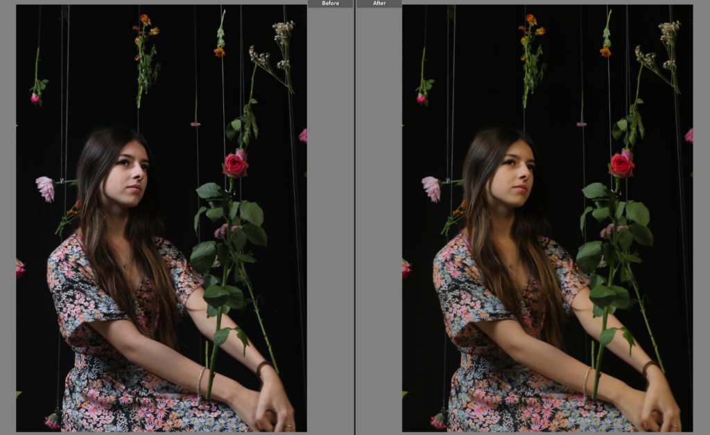
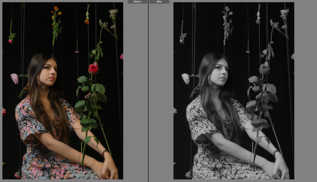
As the picture was already well lit i don’t believe there was much editing that could of been done. Even though I tried it in black and white I felt as if it took away the colour too much which is one of the best aspects of the picture. I picked these pictures as I preferred the contrast of the black background and the colourful flowers as it made the colours jump out more. In editing I slightly increased the saturation to exaggerate the colours
My final pictures:
My annotations
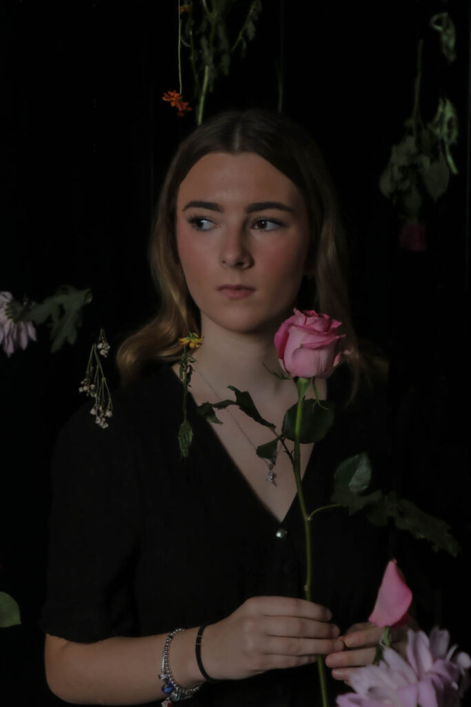
The photo shows a teenage girl sitting quietly, wearing a flowery dress that matches the flowers hanging above her. She looks calm and relaxed, her pose giving off a sense of youthful grace. The bright colours of the flowers and her dress really pop against the black background, making the whole scene feel vivid and full of life. There’s a nice balance between her and the flowers, almost like they’re connected, which adds a sense of harmony to the image. The dark backdrop makes everything else stand out, giving it a magical, dreamy vibe
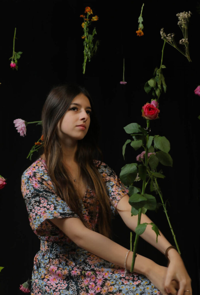
The photo captures a girl wearing a sleek black dress that contrasts beautifully with the pink rose she’s holding. The soft colours of the rose stand out against her outfit, creating a delicate yet striking balance. Above her, flowers are hung gracefully, adding a whimsical touch to the scene. The black background enhances the mood, making the vibrant details of the rose and the hanging flowers pop even more. Her confident stance and the gentle way she holds the rose give the image an elegant, almost cinematic feel. It’s a mix of simplicity and formality, with a touch of romance brought in by the flowers. The whole scene feels timeless, like a moment frozen in beauty.
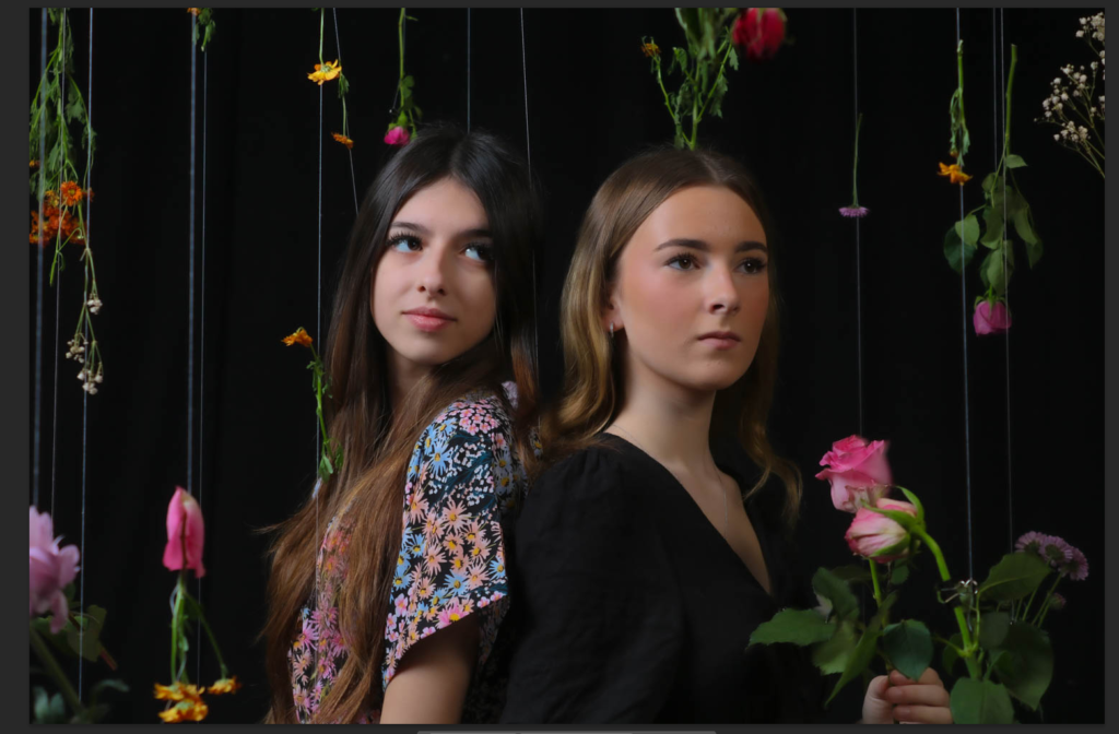
The picture shows two girls standing back to back, each with their own unique style. One is wearing a flowery dress that feels bright and cheerful, while the other is in a simple black dress, holding a pink rose that adds a soft, elegant touch. Above them, flowers hang gently, tying the whole scene together. The black background makes the colours pop, from the flowers to their outfits and the rose. Their poses feel close but still highlight their differences, showing off two sides of beauty—one light and lively, the other calm and classic. It’s a simple but eye-catching moment that feels both connected and unique.
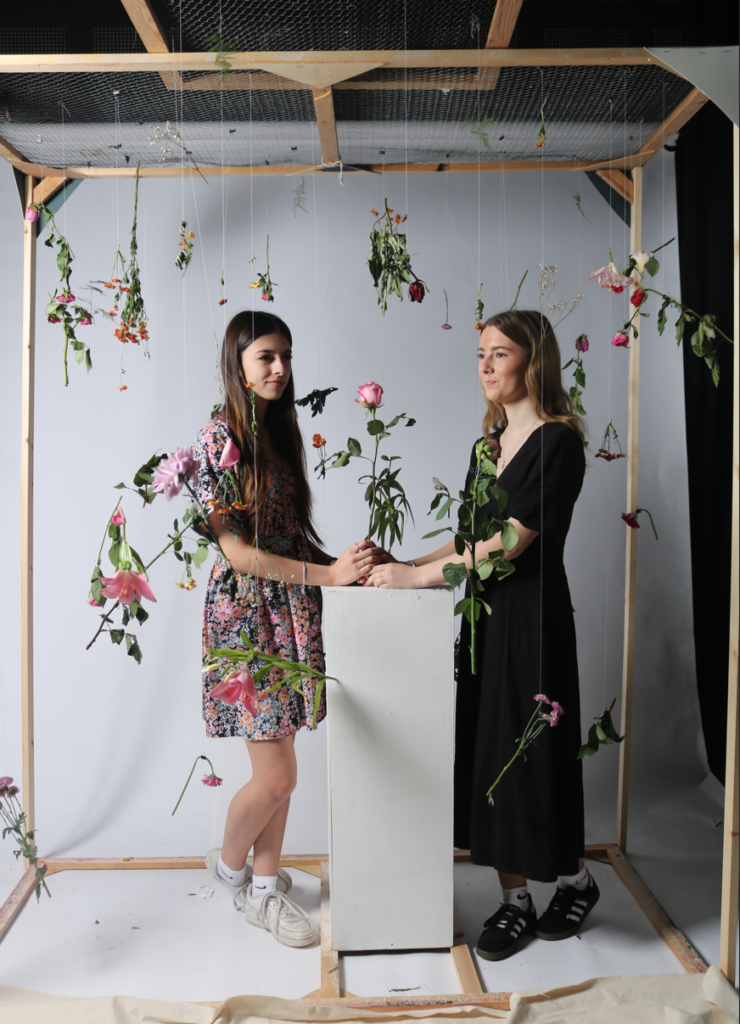
To get the flowers to be like how they are in the photoshoot i used a frame. This frame is shown in the picture below. This allowed me to be able to use a slower shutter speed and not have to focus on quickly taking loads of pictures whilst the flowers are thrown in the air.
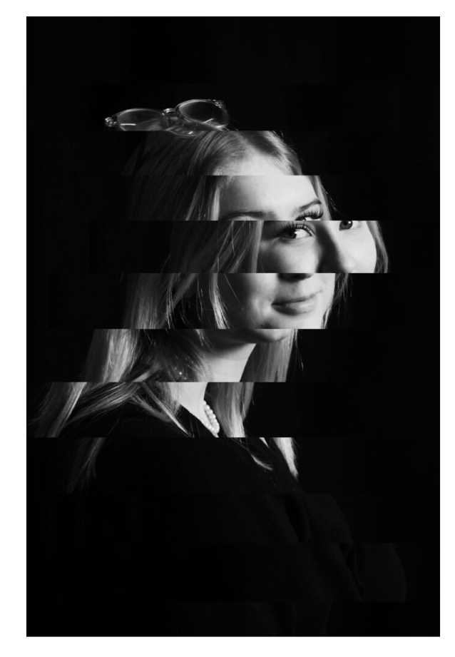
within this photo I edited by cropping it so each face is in one 3rd each and as been put into a black and white which makes it seem more like its been taken when most photos would be taken in black and white which is similar to Ilse Bing, which is quite similar to the one I edited below. however within this photo its slightly blurry, so dose not capture the full essence of the photographs that are similar to this photograph. (image above)
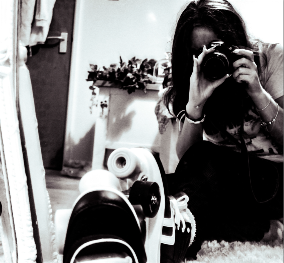
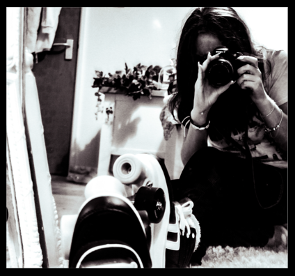
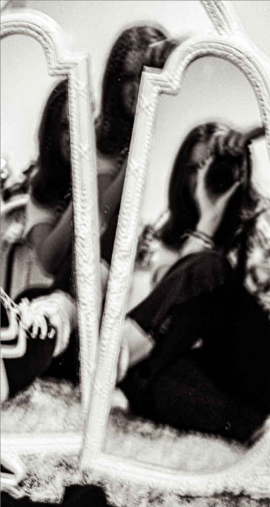
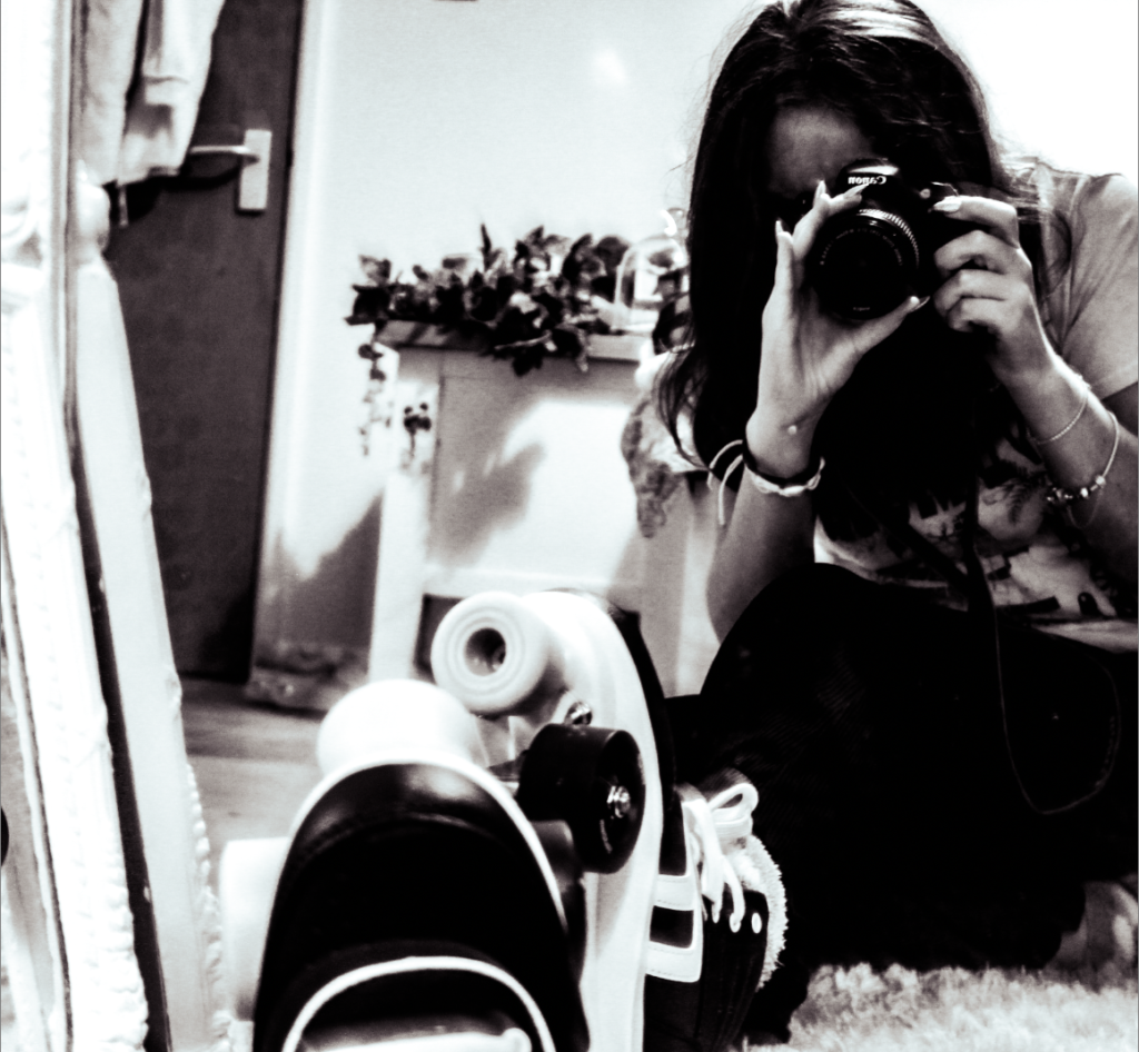
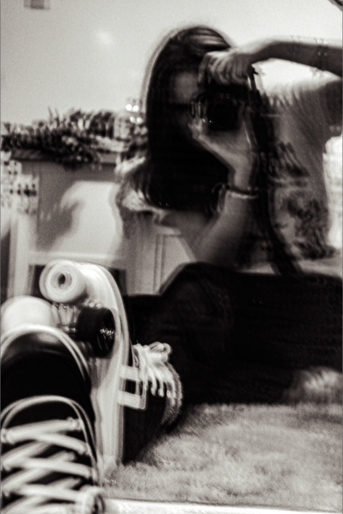
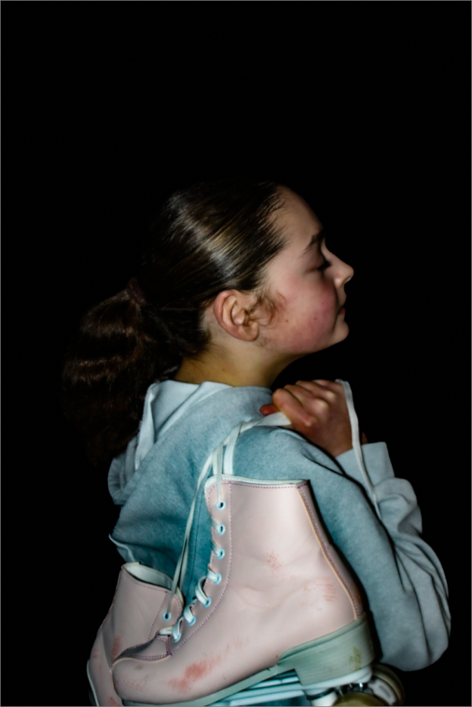
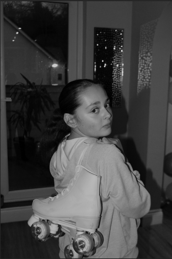
The edits in this photograph create a vintage, artistic vibe through the use of a black-and-white filter, which adds a timeless and nostalgic feel. The high contrast emphasizes textures and details, such as the reflection in the mirror and the roller skate in the foreground, while the composition, using the mirror and layered elements, adds depth and intrigue. Additionally, the graininess evokes a film photography aesthetic, enhancing the analogue feel and transforming a casual self-portrait into a stylistic and expressive piece. (image above)
this photo has a similar pose to a photos which Anastasia jobson took and how its been done in black and white however in all of her photos there is more of an facial expression , which in the photos is similar to Ilse Bing. (image above)
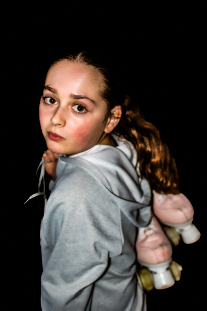
The edits in this image create a dramatic and emotional effect through the use of black-and-white conversion, high contrast, and sharp details. By removing colour, the focus shifts to the subject’s expression and textures, while the strong contrast highlights key features like the eyes and facial structure, adding intensity. The dramatic lighting creates depth and a sense of mystery, emphasizing vulnerability or introspection. Together, these techniques evoke a powerful emotional connection with the viewer. (image above)
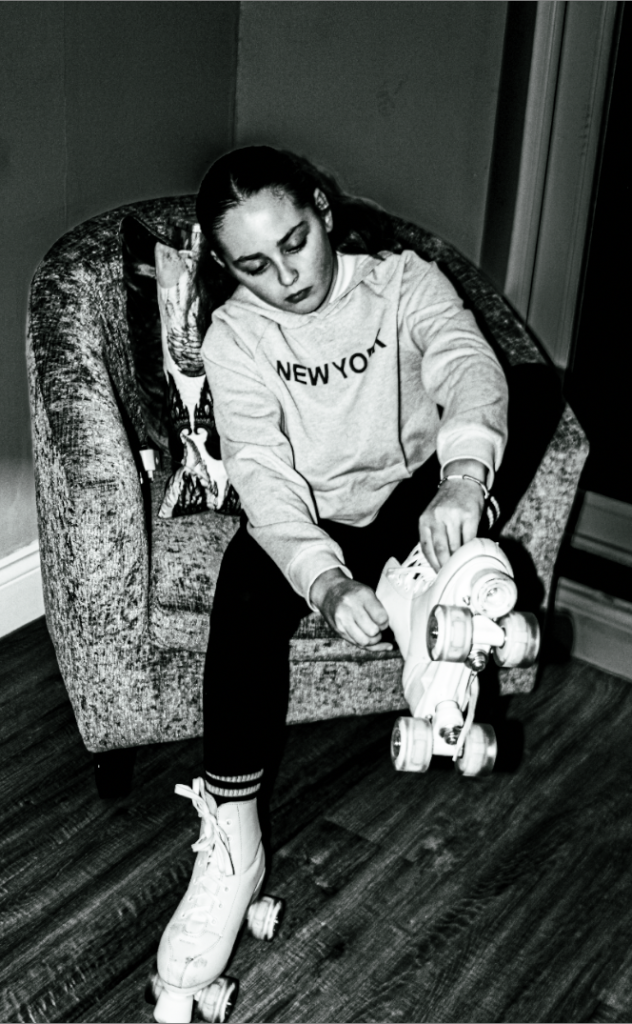
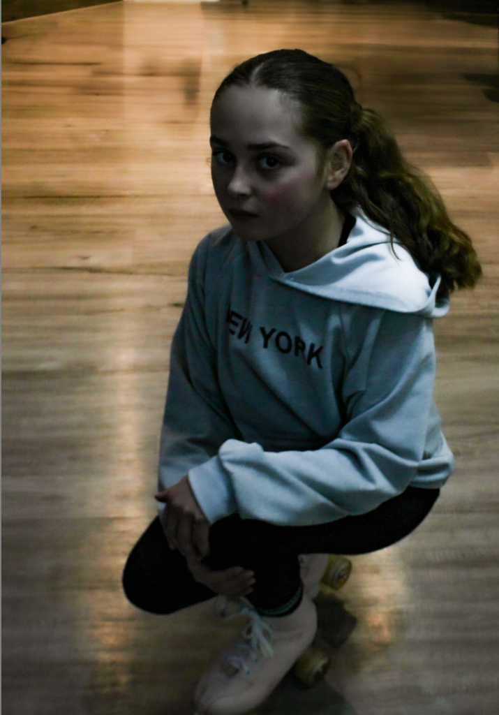
the edits in this black and white photo create a moody and timeless atmosphere. the absence of colour emphasizes texture and contrast, bringing attention to the subjects posture, expression, and surroundings. the gritty details, like wood grain floor and soft fabric of the chair, contribute to a vintage, reflective feel. (image above)
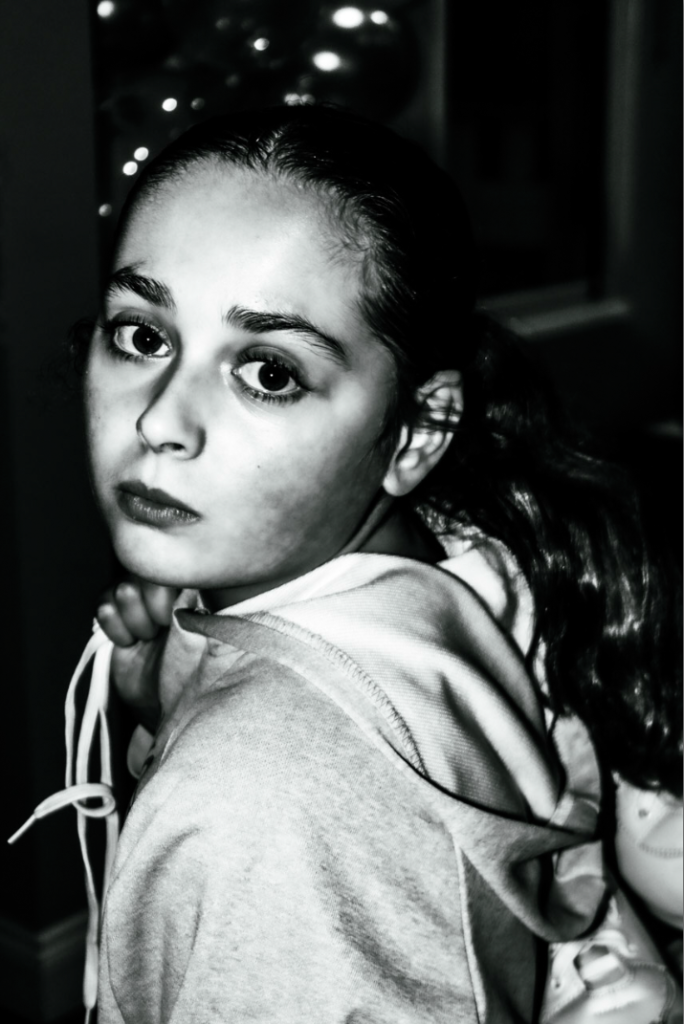
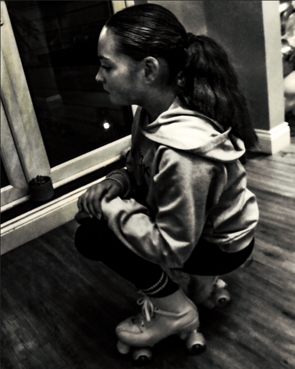
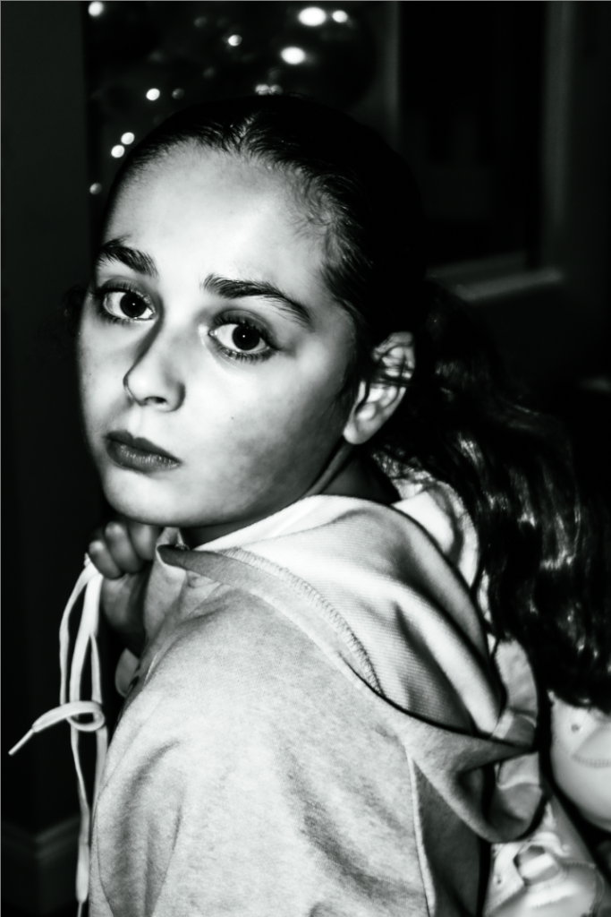
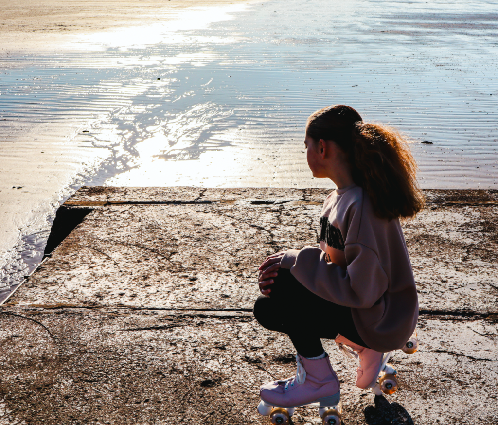
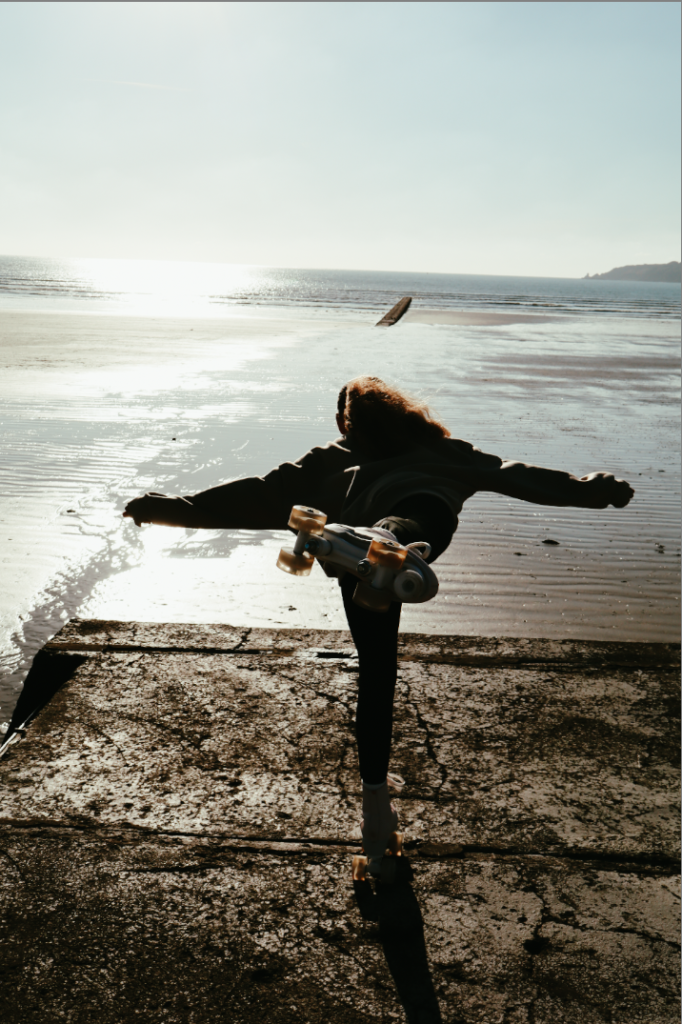
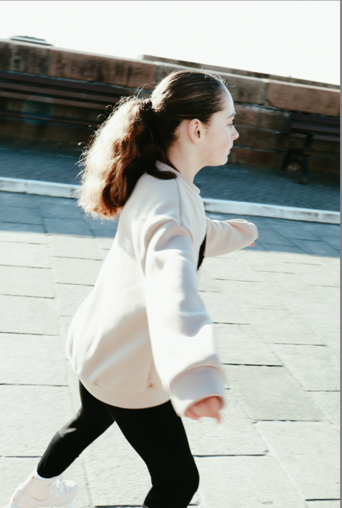
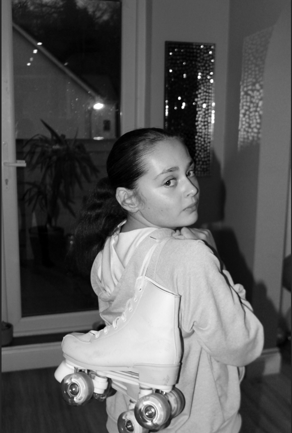
the edits enhance the photo by using dramatic lighting and a dark background to make the subject stand out, while the muted pastel tones and warm skin hues create a nostalgic, vintage feel. the focus on textures, like skates and hoodie, adds detail, while the soft emphasis on the subjects face and evokes an intimate and timeless aesthetic. (image above)
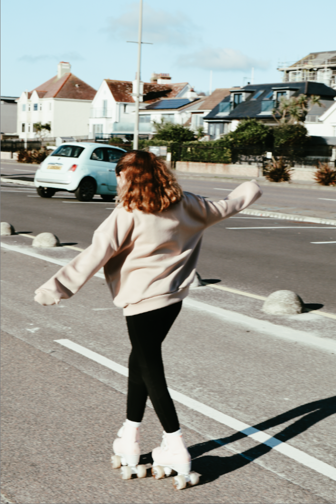
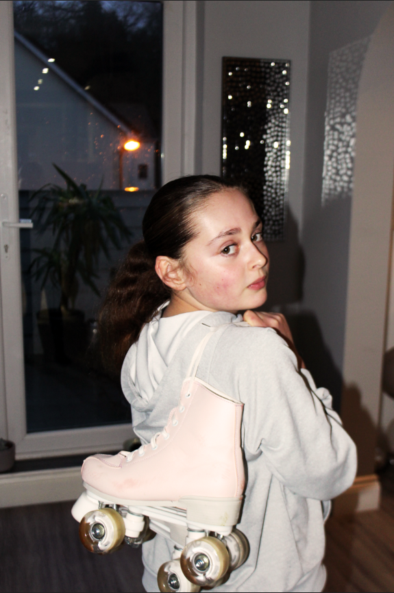
the edits in the photo creates a striking and intimate effect by emphasizing the subjects expression with soft lighting and dark background, which isolates and draws attention to her. the warm skin tones and subtle blush add a natural, emotional touch, while the pastel tones of roller-skates contribute to a nostalgic and youthful vibe. these elements work together to evoke a sense of quiet reflection and simplicity.
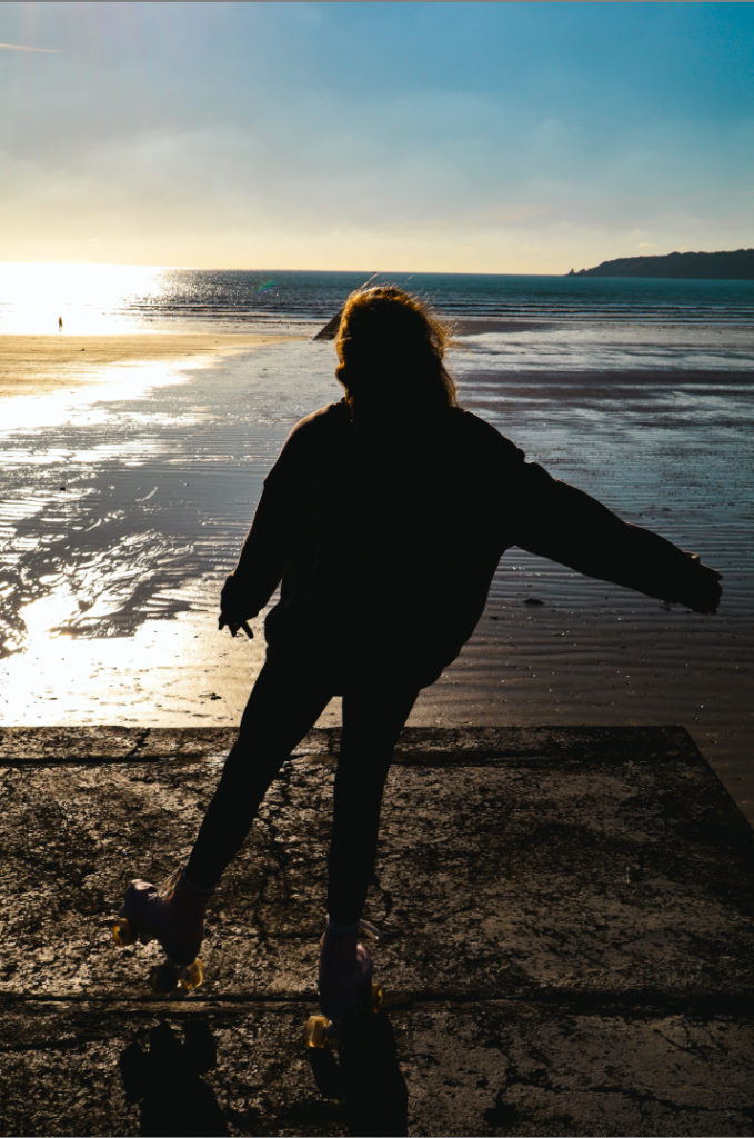
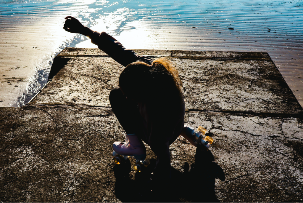
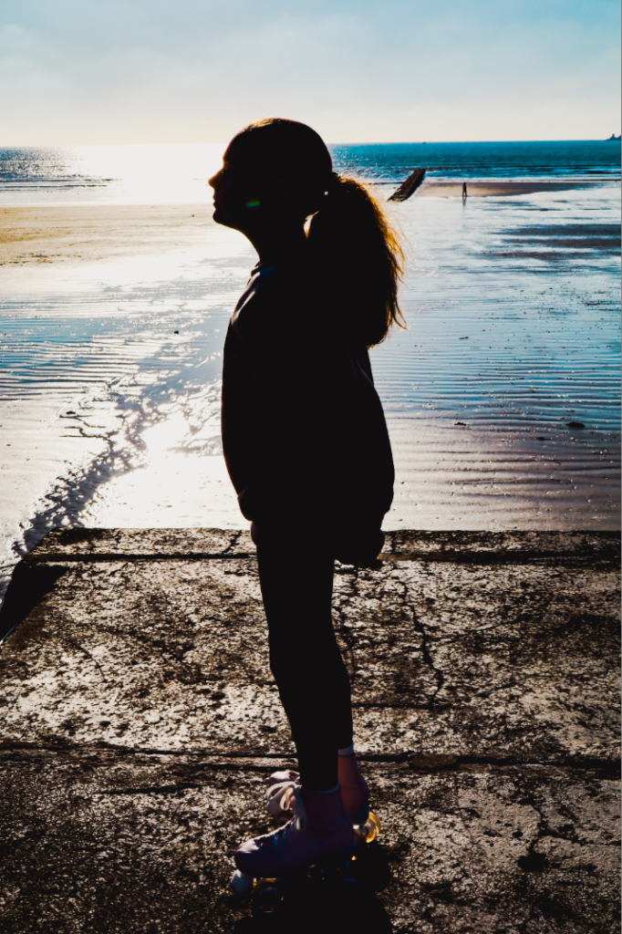
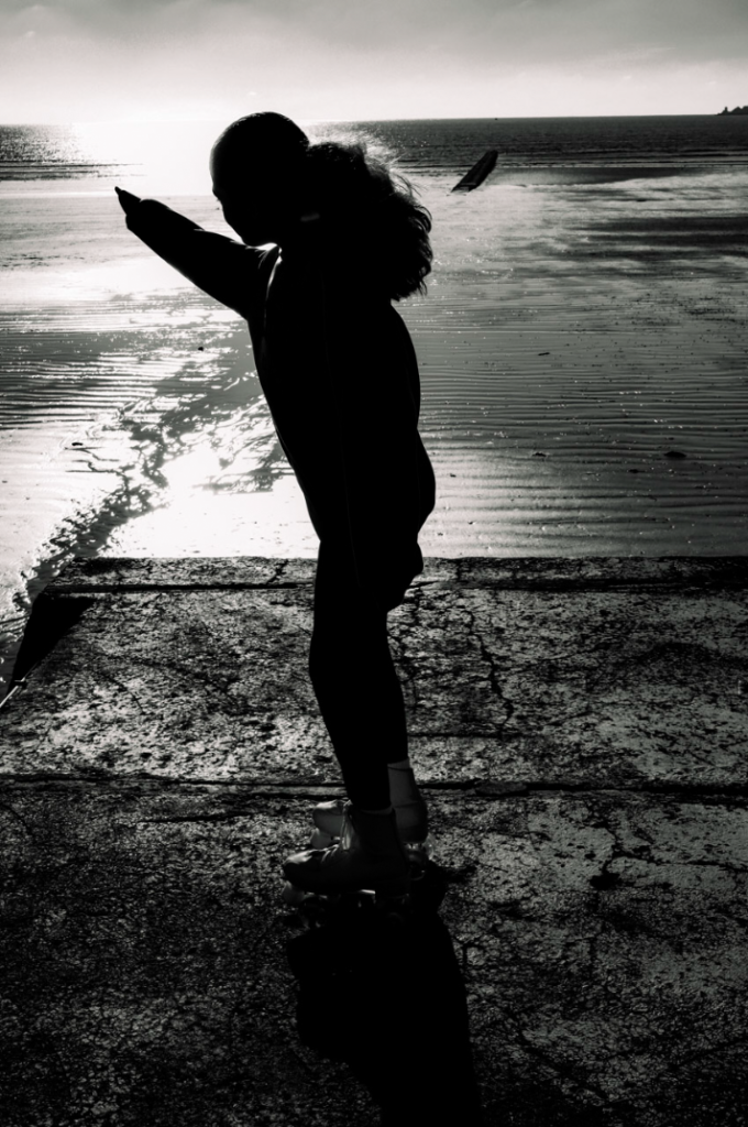
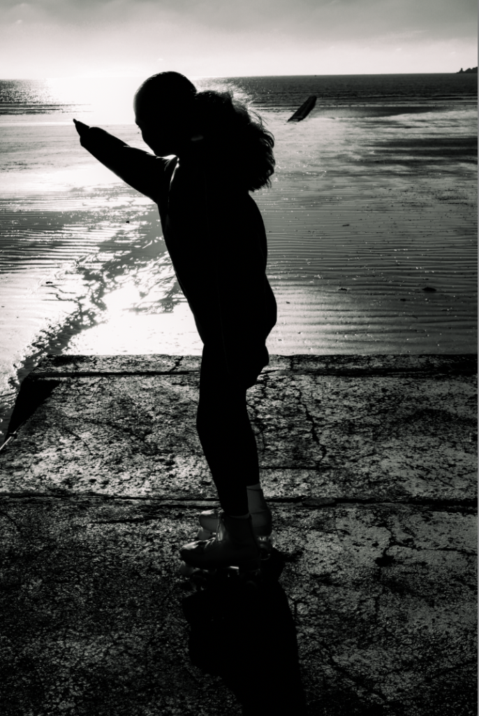
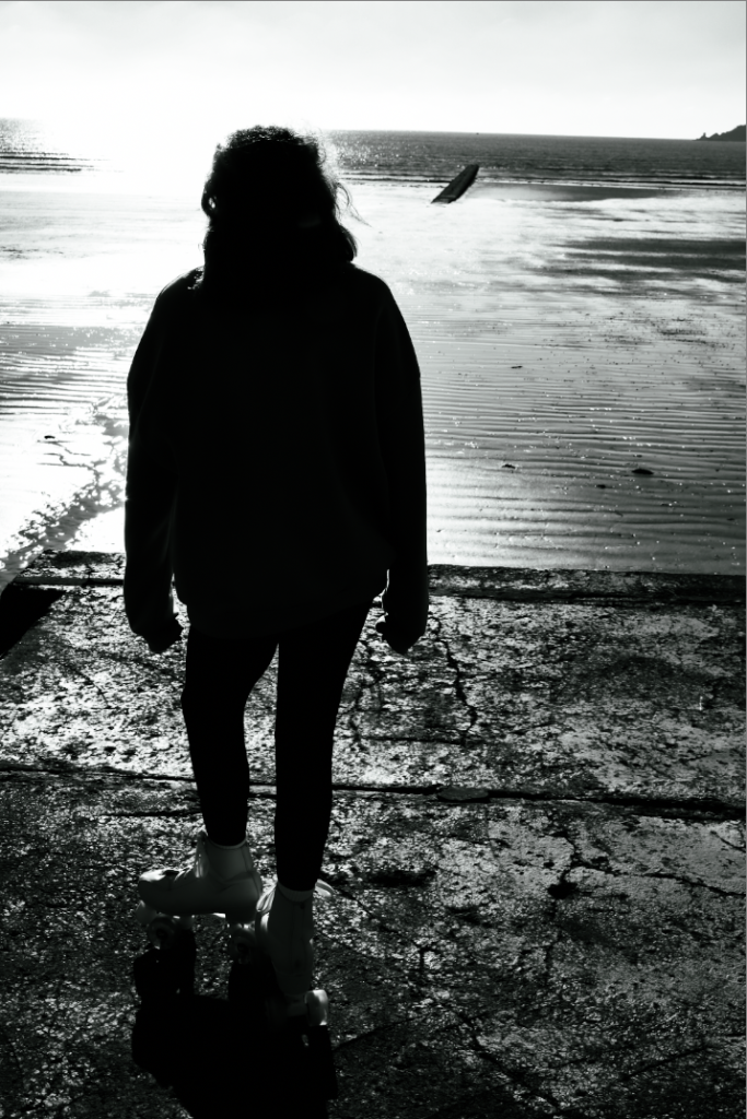
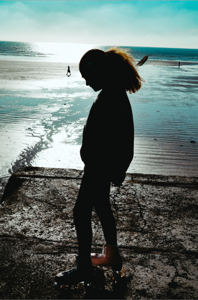
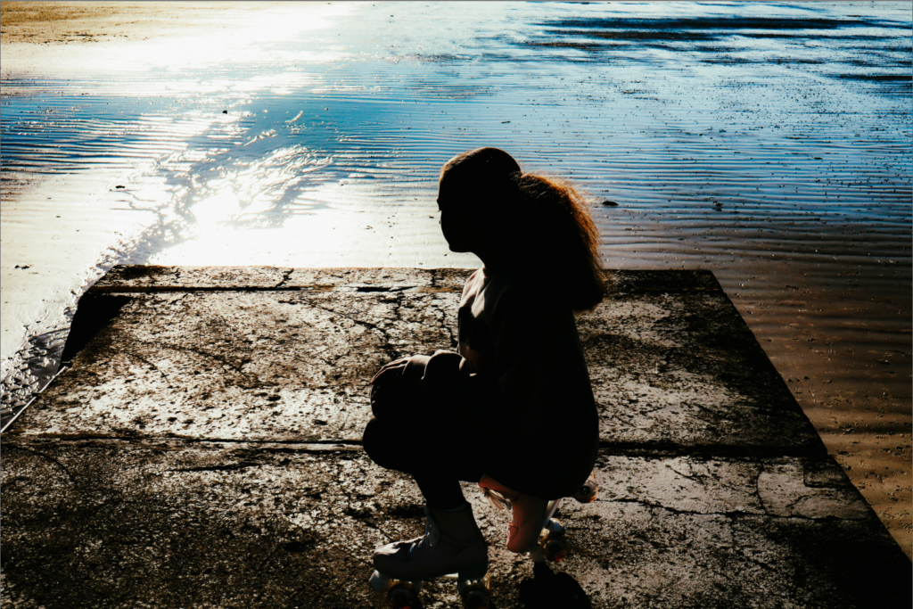
the edits in the image creates a dramatic and emotional tone by using a silhouette effect, where the subject is fully un shadow, contrasting sharply with a bright background. the high contrast enhances the textures of the ground and water, while the backlighting highlights the subjects edges, drawing focus to the glowing effect of the setting sun. the black and white filter removes colour distractions, emphasizing composition, light and texture, while adding a timeless and nostalgic quality. altogether, these elements combine to evoke a reflective, serene, or melancholic mood. (image above)
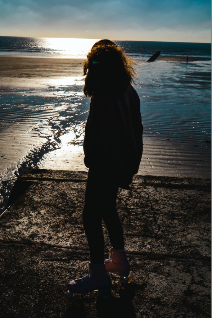
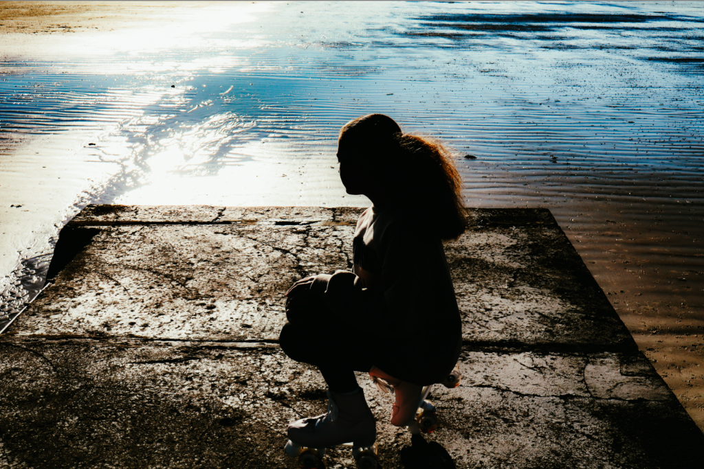
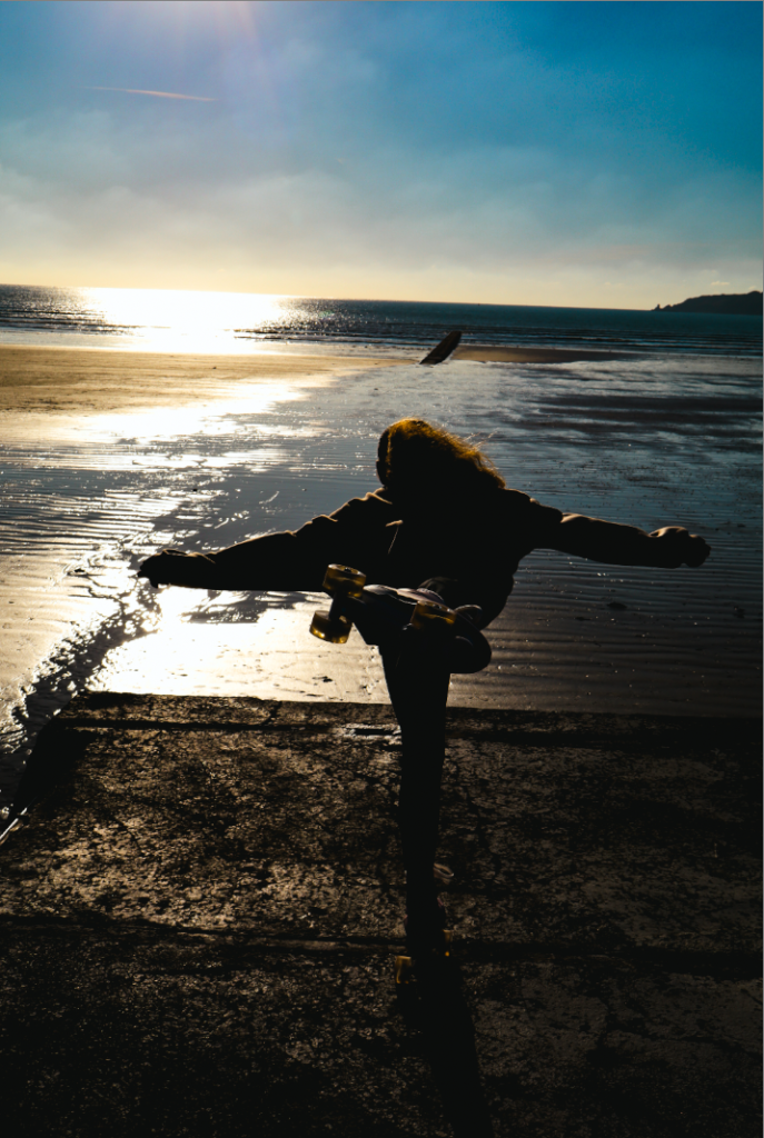
the edits in this image builds on the pervious image on the dramatic mood by maintaining the subjects is now standing still, facing the light, the background further highlights their shape while leaving their features undefined, emphasizing form and posture. the black and white tone enhances the reflective and timeless quality, while the textures of cracked ground and shimmering water adds dept. the stationary stance and quite composition evoke a scene of calm contemplation or solitude.
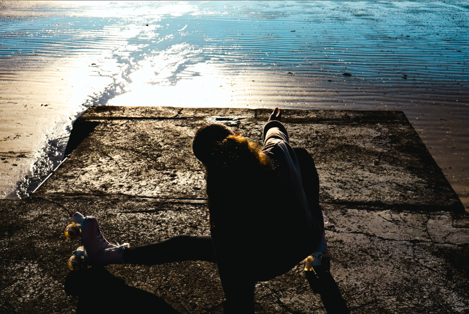
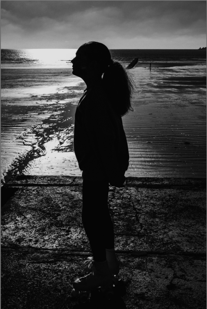
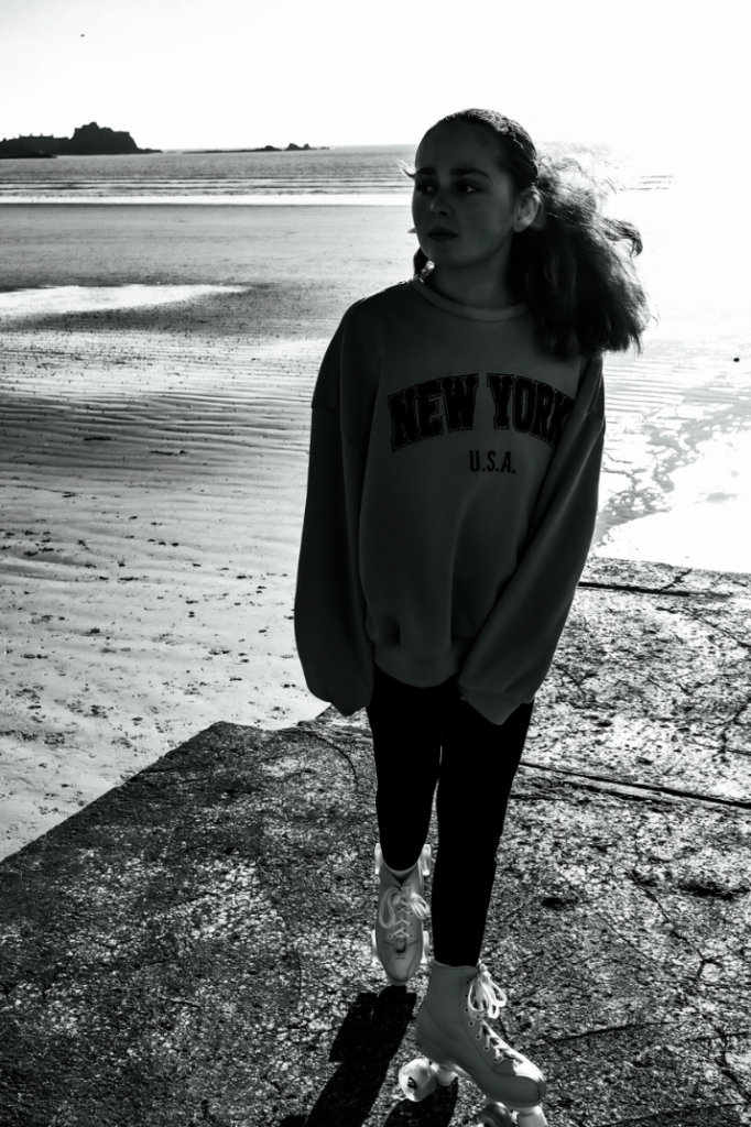
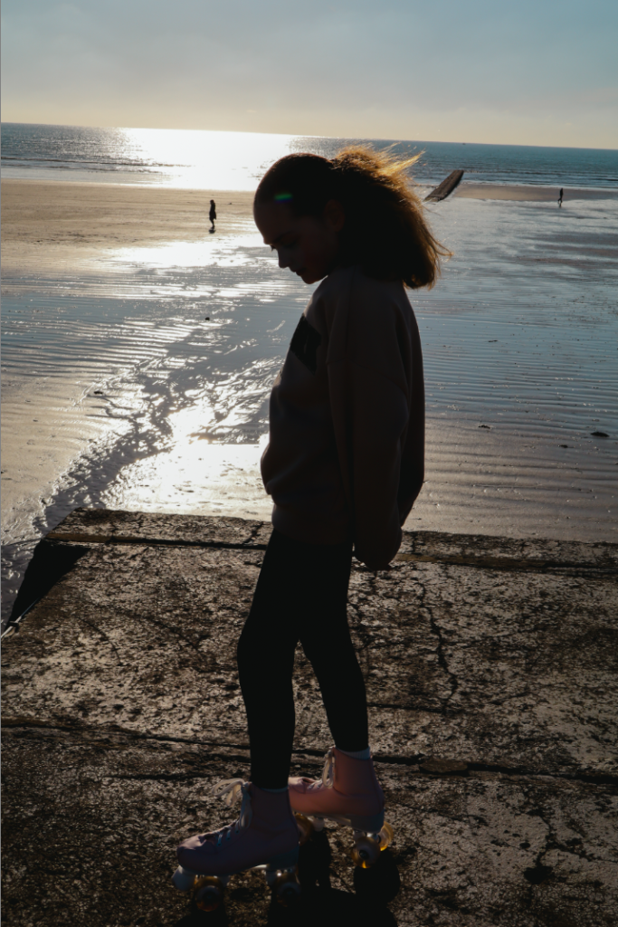
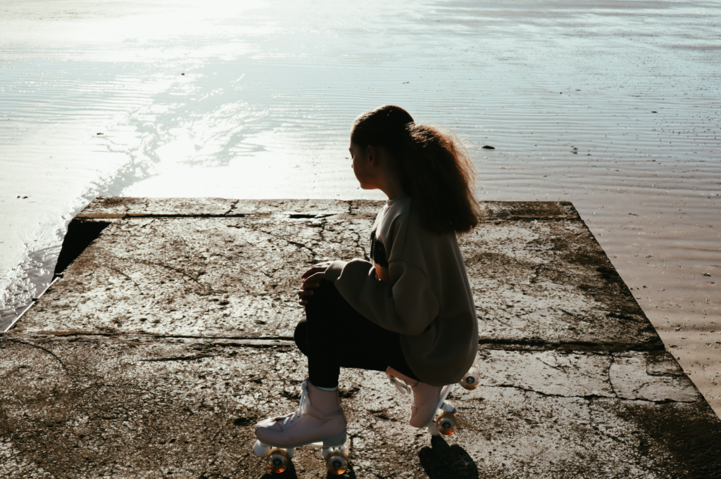
all of the black and white ones are quite similar by that in most of the its a black out subject that the shape is quite prominent but the photo below that’s in black and white show the facial features and expression and how is quite a sad tone within this photo.
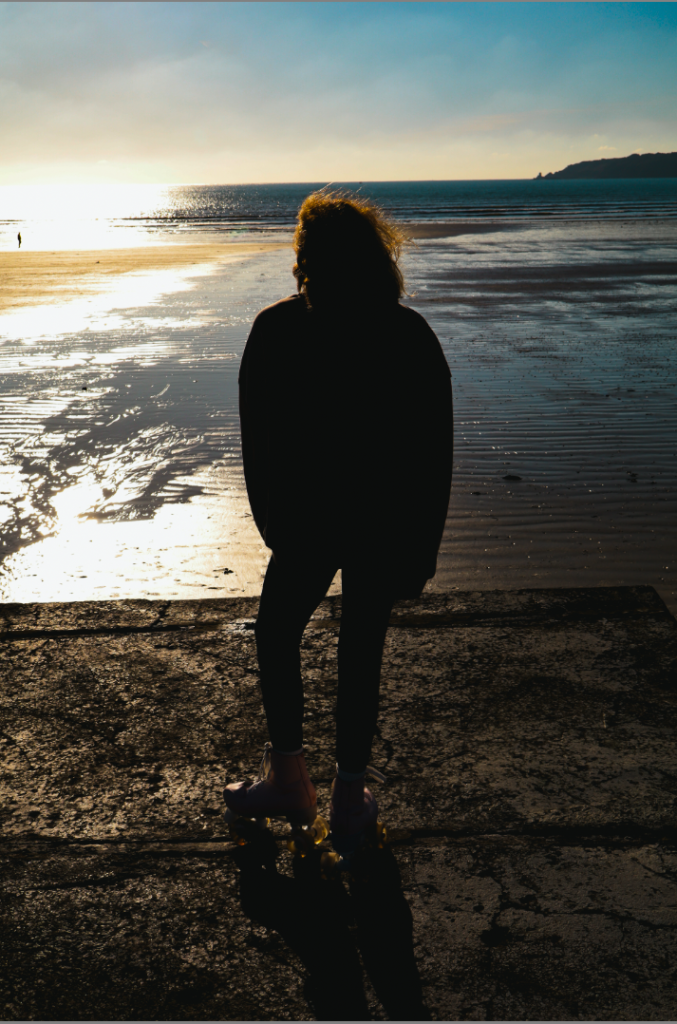
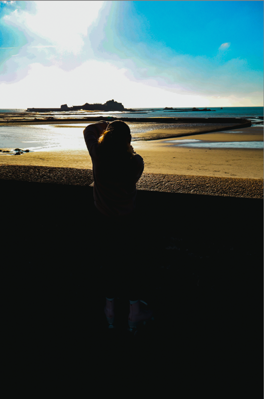
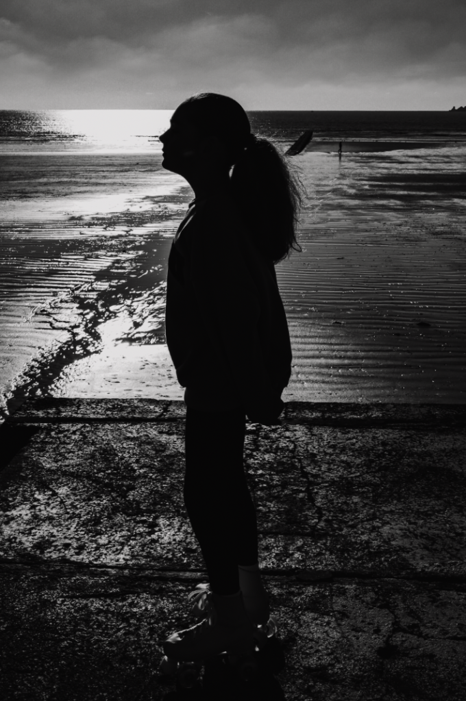
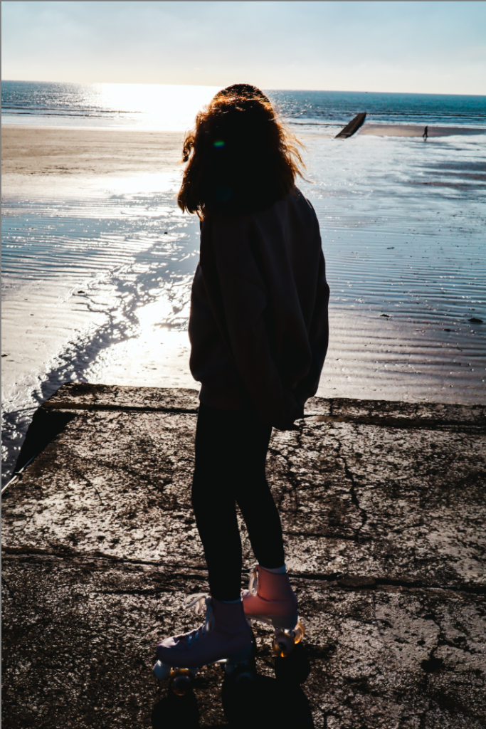
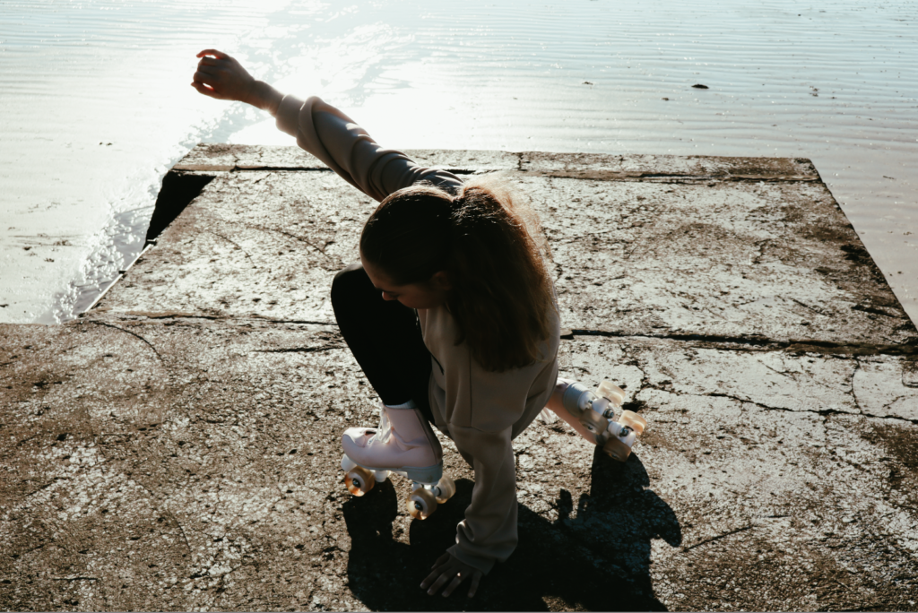
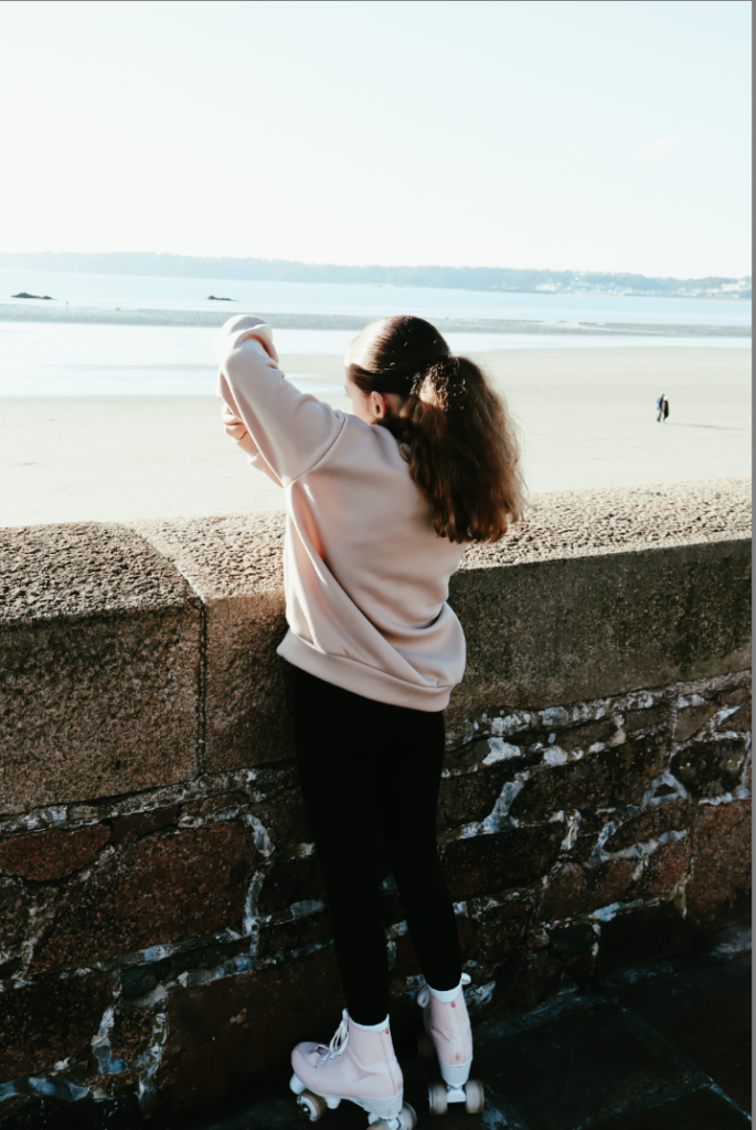
the image shifts the tone by revealing the subjects face and details, breaking away from the pervious silhouette style. the natural light creates contrast, but emphases the texture of subjects clothing and reflective background, adding depth. the subjects posture and expression feel candid and contemplative, while the monochrome palette maintains the timeless and nostalgic atmosphere. the inclusion of the skates and casual attire adds a scene of personality, blending a reflective mood with subtle dynamism. (image above)
the edits of this photo give a very cold effect to this image, which also with the subjects face facing downs its shows the mood of sadness and the blue background adds to this dramatically.
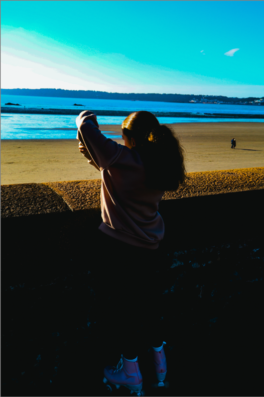
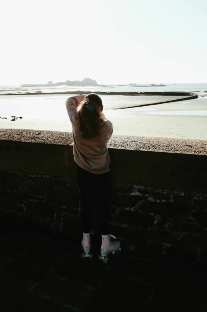
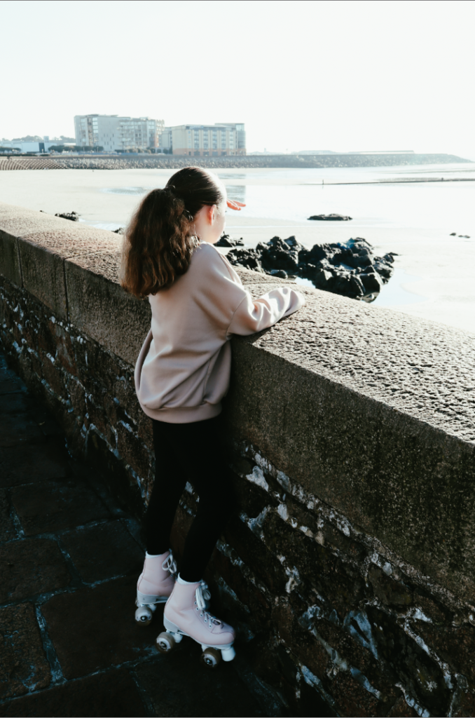
within theses 3 photos it gives a similar effect of timelessness but there is a more lighter pale shade within the photos.
this style of editing is what i will be doing on the day of the exam (2 photos above) these photos give off an effect of timelessness and the vibrant colours in the background make the subject more dramatic.
some of these edits don’t have the final edits on it.
some of these photos will be give their final edits on exam day.
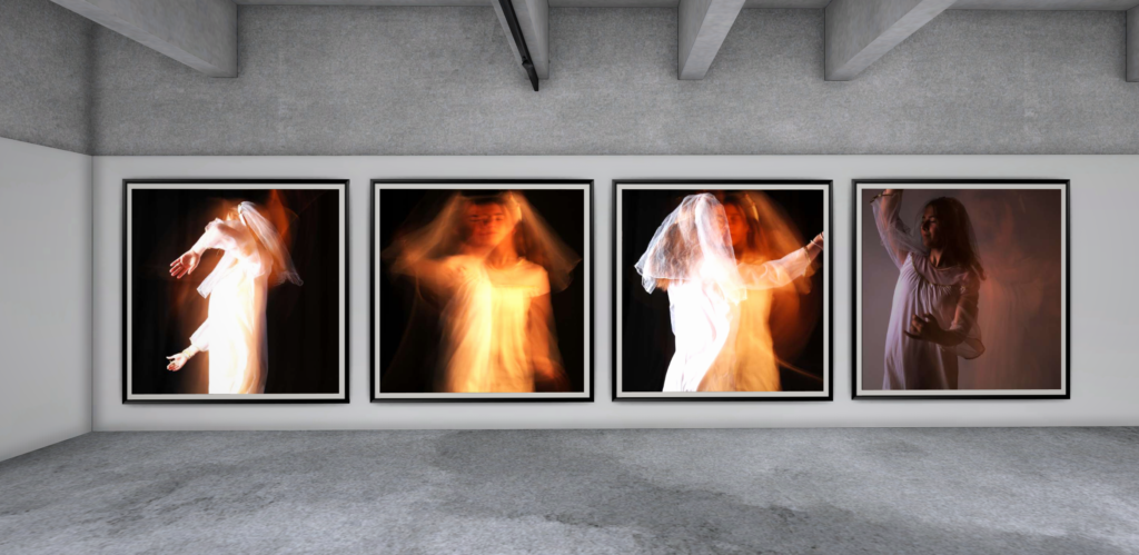
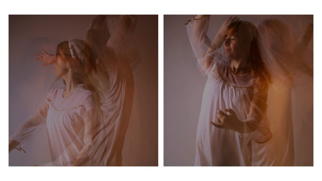
The photos I have chosen to be my final ones, create a storyline. They represent freedom and how the subject is finding and accepting her identity. Each photo has a shadow, which almost looks like a soul, leaving the subjects body, and as you go down the photos, the soul becomes further and further away from her body. This symbolises the subject letting go and accepting who she is.
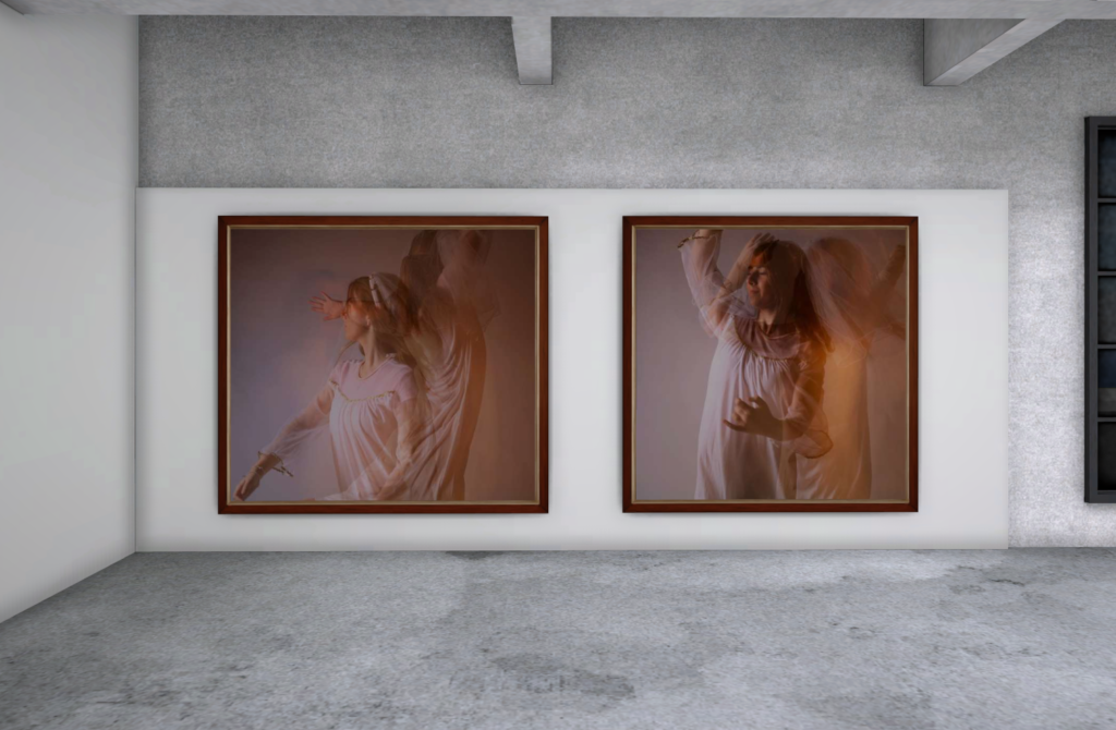
Virtual Gallery
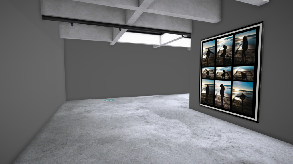
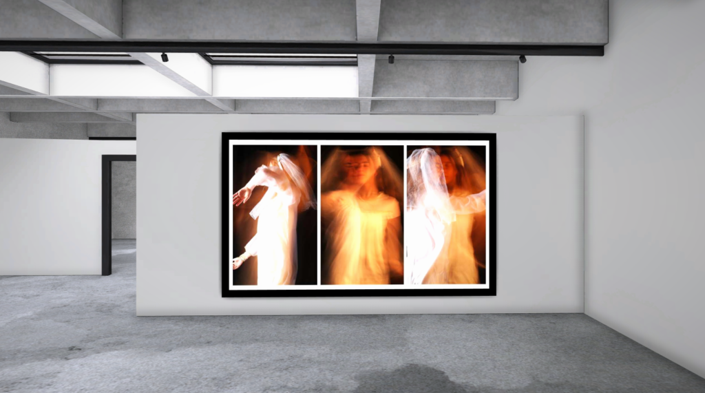
If these photos were to be put in a gallery, I would want to present them as either one of the virtual images below.
Final Photos
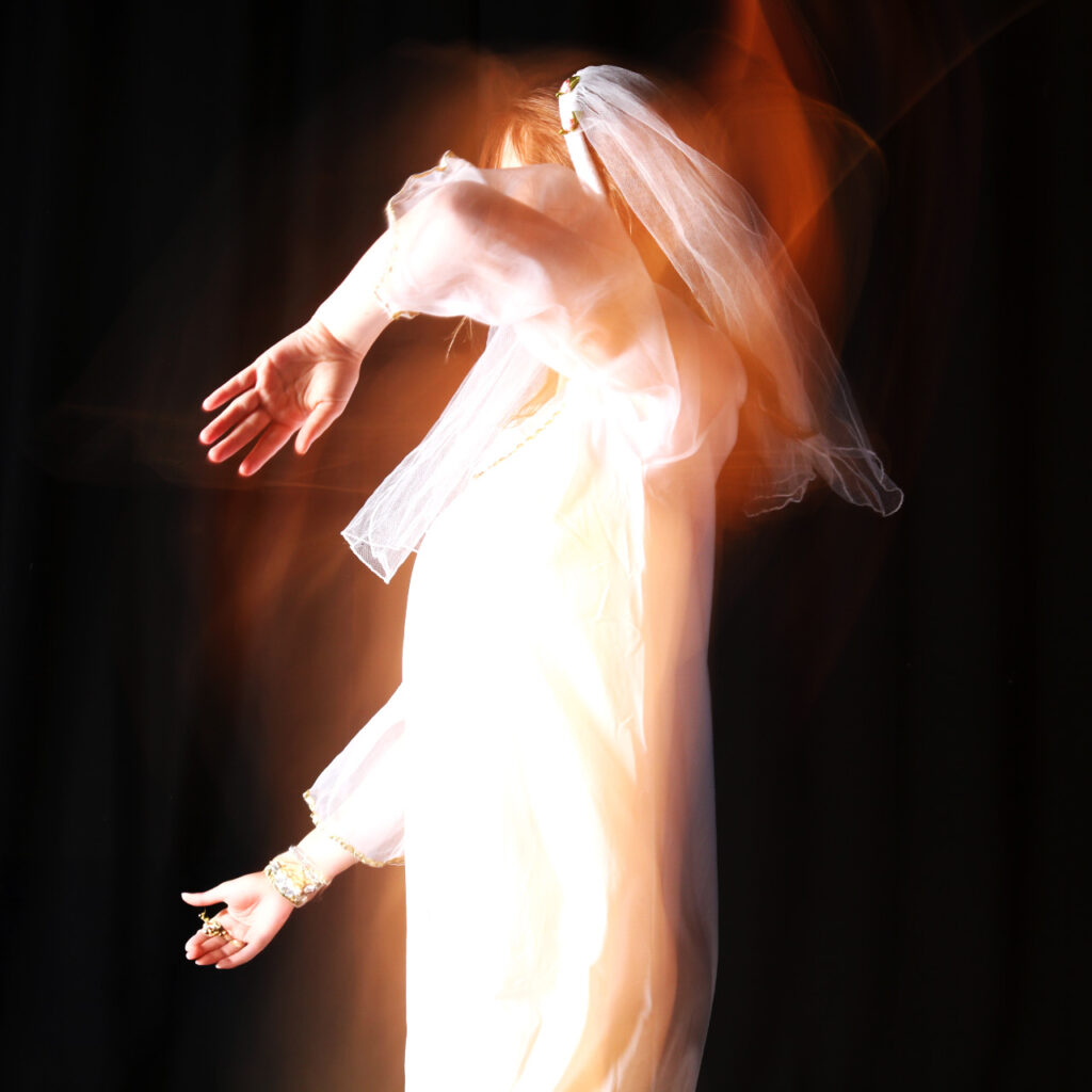
In this image, you can see how the subject is holding her arm up, almost shielding herself. This shows how she doesn’t want to accept her identity and wants it to stop.
Here you can tell how the subject is slowly giving in and letting herself go.
This image represents ‘question of self’ as she is facing herself, almost questioning herself and what her identity is, but also accepting it.
Set 2
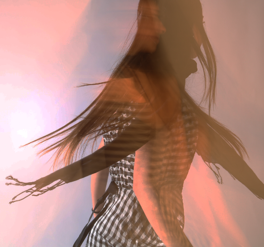
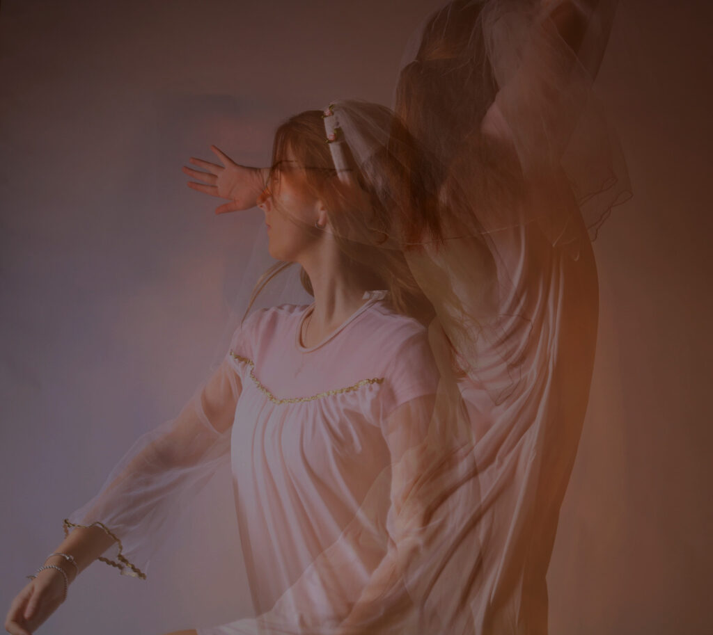
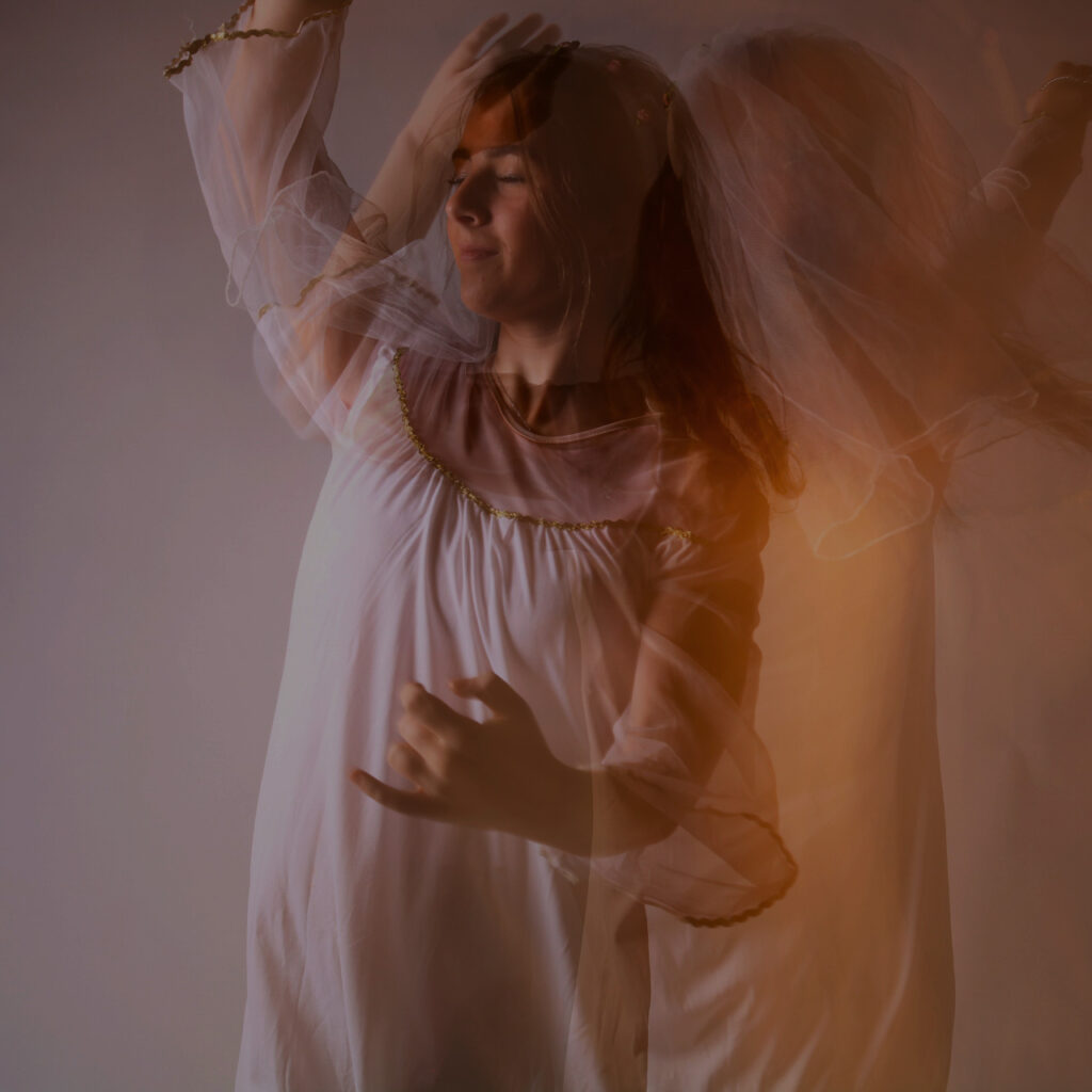
In this final piece, These photos show the subject’s identity as a dancer. The facial expressions in the images show how happy she feels when dancing. The double exposure images shows how the subject moves and captures her dancing more.
Virtual Gallery
This is how I would want my photos presented if they were to be put in a gallery.
Final Photos
These images give an angelic effect to the subject’s identity. The double exposure shows the movements and emotion being put into the images.
Evaluation
How successful was your final outcome?
I would say that my final outcome was successful, although i could have done better and taken some more photos in various different areas with different angles of the subject. I think I did well with what I had. I got a story across to the viewers and I believe my images represent that story and ‘finding your identity’ quite well.
I intended to capture the subject’s emotions and movements using a slow shutter speed and a long exposure from the beginning, what I did not intend to do is create a storyline from it. I was halfway through editing before I had realised that these images would work really well together and that’s when I decided to create the storyline.
I did make a few references to Francesca Woodman‘s technical aspect of her images as I used a long exposure but I used the flash and I relied on a high contrast to make my images look interesting which she did not.
Francesca Woodman’s images were all in black and white, whereas mine are in colour, although, the form and the pattern of both of our images are quite alike.
Some of Francesca’s photos represented ‘isolation’ and ‘questions of self’ which my images can represent as well, because mine indicate letting go of past self and accepting who you are.
I think, if i had the chance, I would change the outfits to something a bit more flowy to get more dimension in the images and really capture the slow shutter speed that I used. I would also change the setting of the images to somewhere more open and outside with nature. A different setting would allow the subject to express herself more as the studio didn’t have enough room for that.
To enhance my images and make them standout I am going to edit my images in a manner which allows for more detail to pop out and prioritise what I want to be seen in the photograph itself.
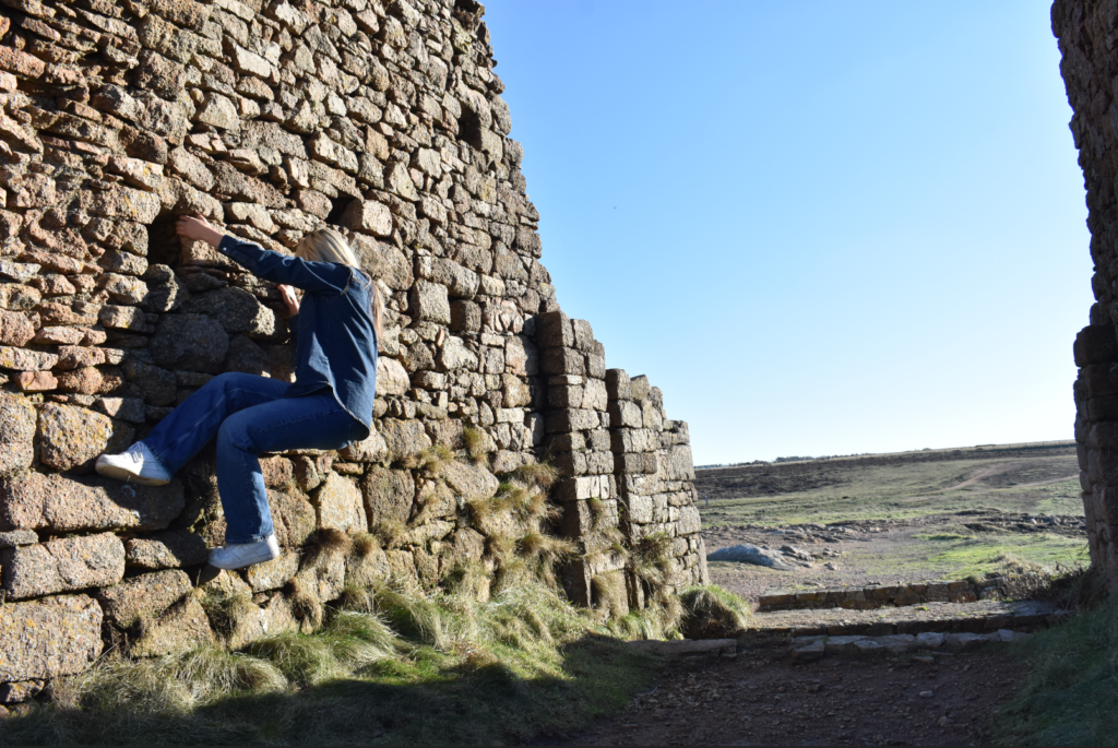
Photograph #1
Unedited
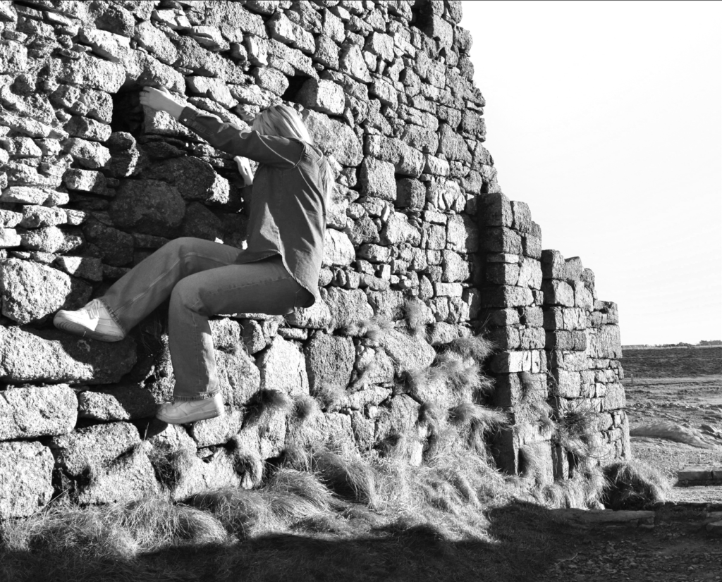
This photograph that I have taken is great as it captures both the detailed landscape with the rock wall as well as my subject attempting to climb it which created a unique posing position for the image. However the image by itself lacks a few things, for one the subject is tucked all the way to the left side of the image which may make it harder to indicate where I want the focus of the image to be set on, the image having colour is not a problem in itself however by setting the image up into a black and white colour scheme it can help minimise details on things like the sky or grass and enhance more details towards the subject and rock wall.
Edited
After Editing the image you can now see that it comes across more effective and the main focus is now easier to identify. To reach this point I cropped the image and rotated it slightly in order to make the image more straight and to discard the unimportant details and only keep the details I wanted in view. This allowed me to make my subject take up most of the image so I could use the rule of thirds composition, which helps highlight my subject as the main focus point of my image. To make the subject standout more and enhance more details around the image I decided to make the image black and white and adjust some levels so the subject can standout more, for example in the original image the subjects legs were in a dark area which made it less visible so by using a black and white colour scheme and adjusting the levels I was able to brighten them up and standout against the rock wall. I have also adjusted the levels for the scenery of the image too so I could preserve the detail of the rocks and grass which helps make the image more appealing to look at to the viewers.
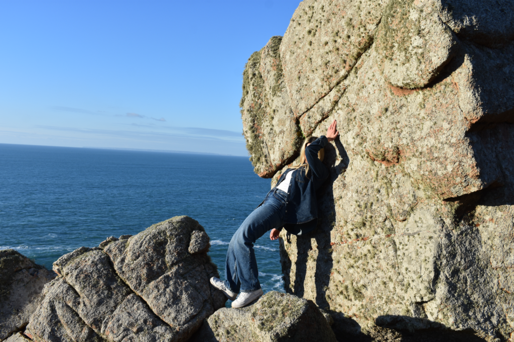
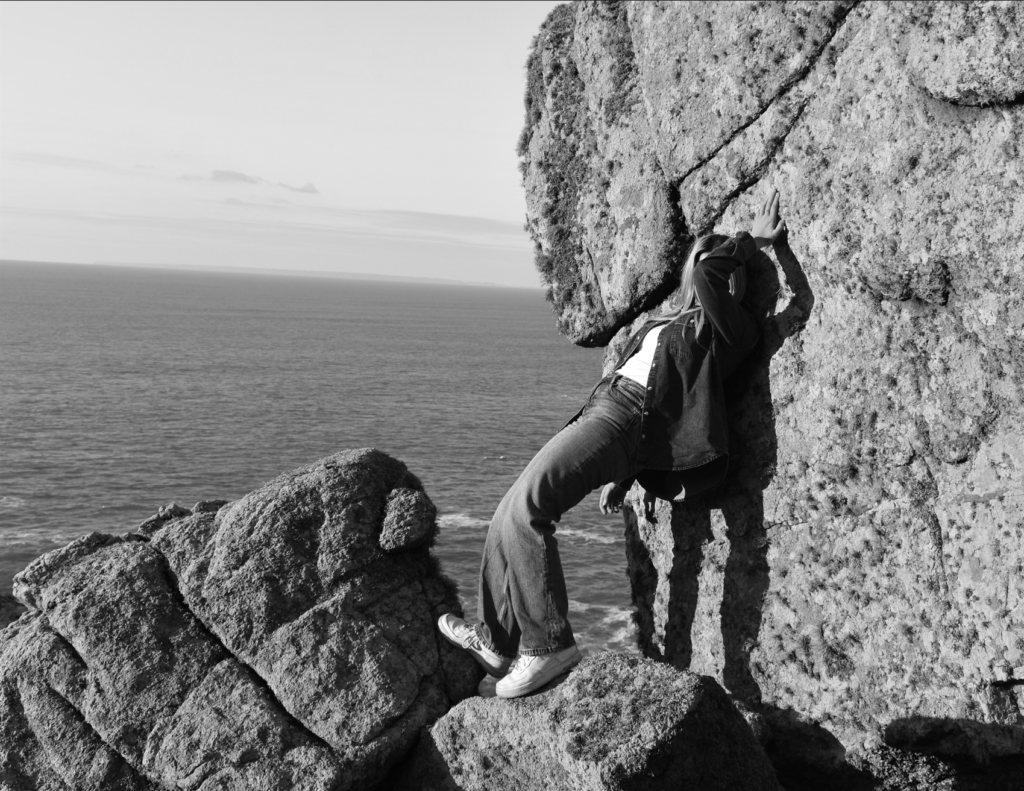
Photograph #2
Unedited
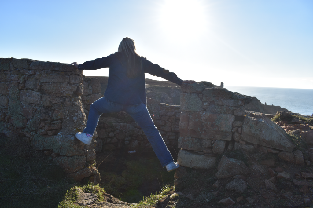
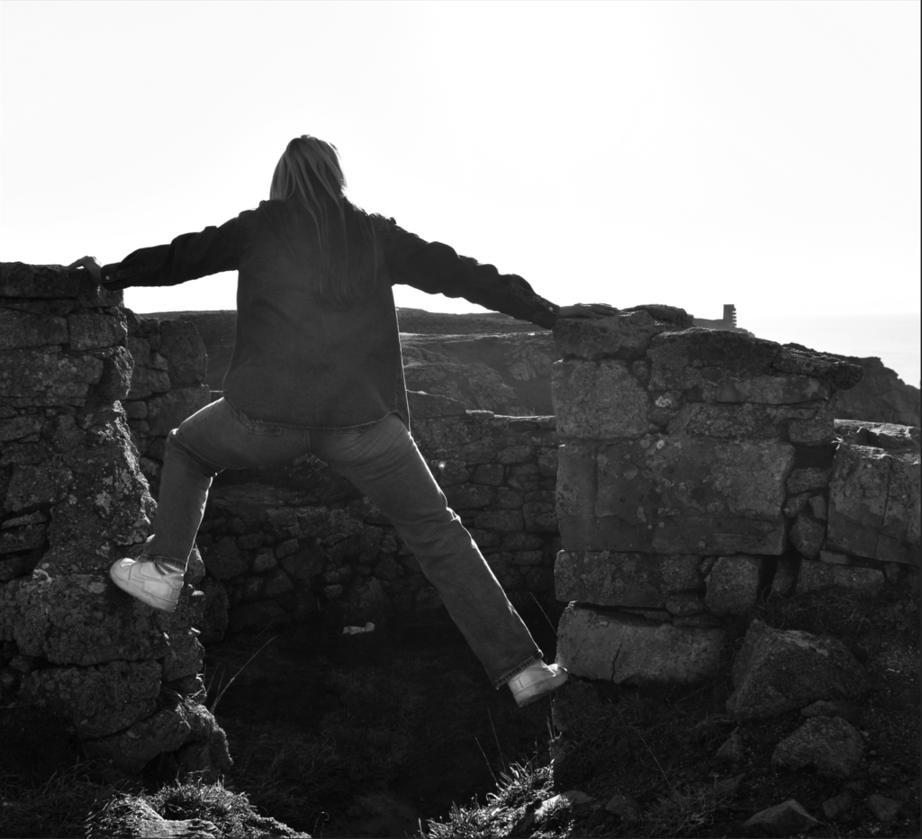
This photograph that I have taken is another image I found that had potential to be great especially when edited. The pose where she’s balancing on the divided rock wall helps add more mystery behind the photograph and the sky in view helps add more life to the image as it helps viewers figure out the type of environment the image was taken in. Edits will have to be done in this image to crop things I don’t want to be seen and rotate it slightly to keep the elements in the image straight. I also want to try and bring more detail into the subject as the lighting from the sun has made her figure appear more darker.
Edited
After editing this image you can now see the subject as the main focus of the photo. By cropping the right side and rotating the image to make things straighter it has allowed for a more aesthetically pleasing photo. Cropping also allowed me to use the rule of thirds which helped make my subject the main priority. By making it black and white and adjusting the colour levels it helped brighten the subject up slightly without making her look unnatural which makes her more noticeable and seen in this image. It has also helped to minimise distractions in certain aspects of the photo such as the small patches of different colours embedded in the rocks or the blue sky.
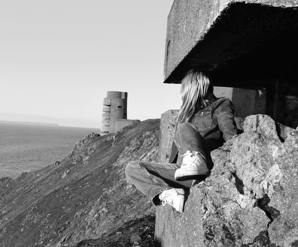
Photograph #3
Unedited
This photograph is one of my favourites that I have taken. The pose helps hide away some of her figure which makes it hard to depict and make assumptions about her feminine figure. The place used compliments the subject perfectly and has made the image so unique and pleasing to look at. The lighting used as well has also really helped make this image look good as it illuminates the structure clearly revealing the details on the stone but it also illuminated the surface of the subject which when edited will be able to make the subject standout next to the landscape. The image was taken from far away so cropping the image will need to be done to direct the focus towards the subject as well using a black and white colour scheme to bring more depth in certain things and retain the attention towards the subject.
Edited
After editing this photo you can now see the subject more clearly which now makes it easy to identify what is the main focus of the image. I’ve also cropped most sides of the image to minimise the size of the structure behind the subject so the attention is not drawn to that first. By using a black and white colour scheme and adjusting the light levels I was able to make the background more brighter and reveal more details, I was also able to make the subject brighter but not too unnaturally bright so more attention can be drawn to the subject and also so I could prevent the subject looking like she was blending in with the rocks. With all edits applied the image looks better than before especially with how its laid out now and what’s now in view.
Photograph #4
Unedited
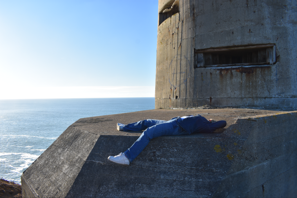
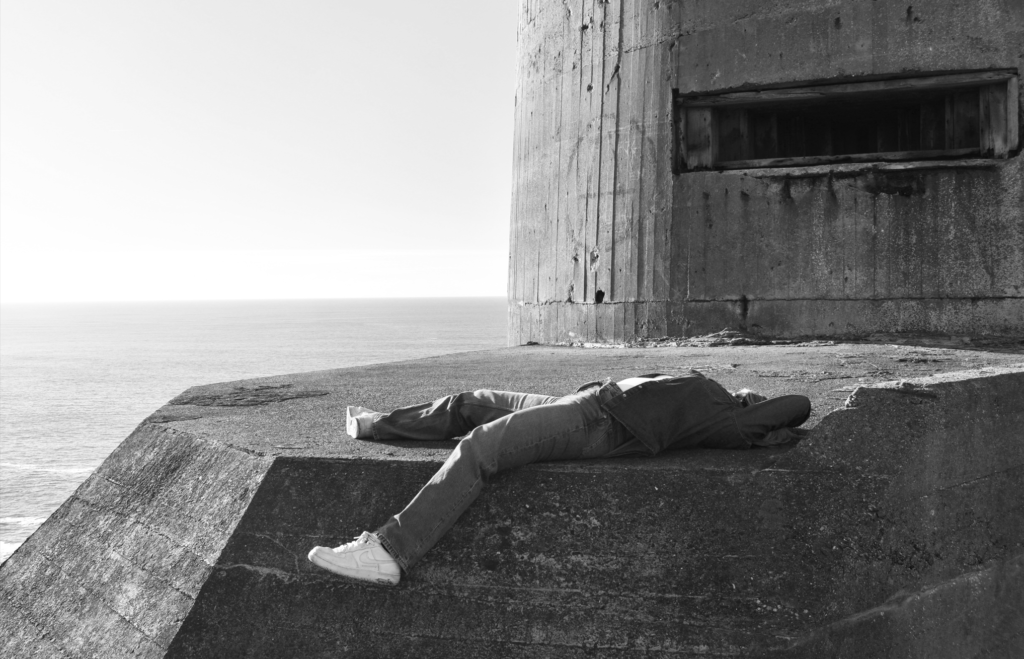
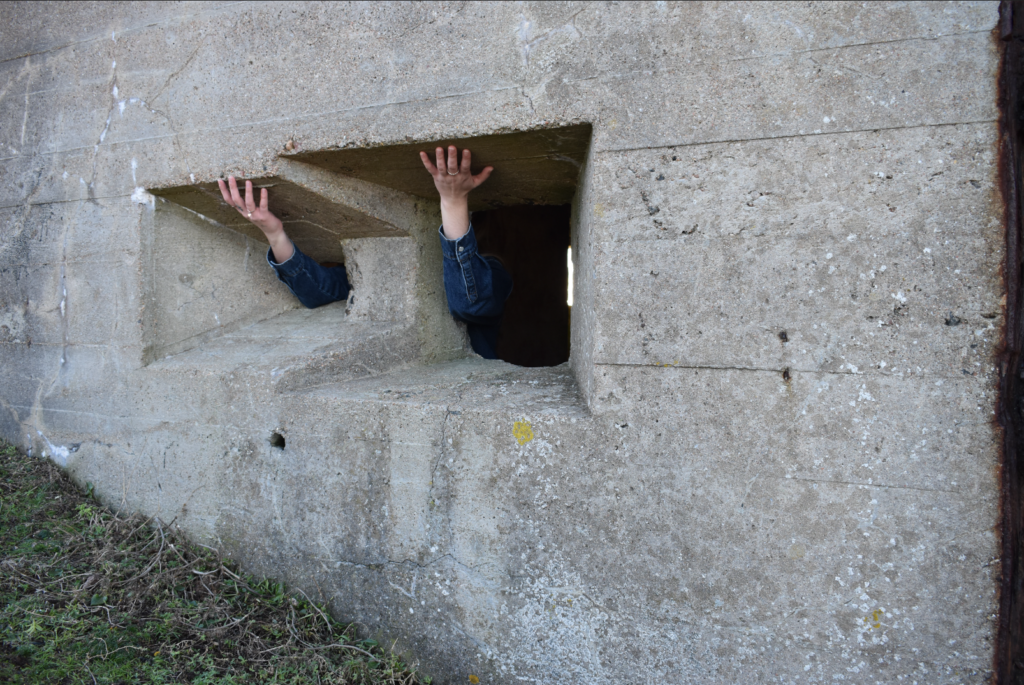
With this photograph I was inspired by one of Claude Cahun’s images where she put her arms through the rocks. So I decided to take inspiration but experiment with it differently which ended up with this image as an end result. I found this image quite interesting as by making the subject hold onto the top of the holes in the rock wall it makes it look like she is holding up the top part of the building. The darkness that you can see in the holes of the rocks are perfect as it helps hide the subject entirely with only the arms and hands being visible. By also taking the image closer to the wall and not revealing the sky or the entirety of the building, it helps to attract more focus towards the subject compared to if I were to take the photo further away as then the subject would appear very small compared to the rest of the image. The only issues I see with this photo is the low lighting due to the sunlight not being able to reach into this area and the size of the image which needs to be cropped so the subjects arms and hands are the main priority of the image.
Edited
With this photo now edited you are able to see that the subjects arms and hands are more in the centre in the photo which makes it likely that its the first thing you see when you first view the image. Since there were lots of empty space around the image which were mainly the walls of the building, I decided to crop a good amount so attention would be kept to the holes in the wall and my subject. Making the image black and white helped brighten up areas of the subject like her arms so they are more visible to the viewer and also helped gain more level of detail. Using black and white also made it look similar to Claude Cahuns image which was the main inspiration for this photograph.
Photograph #5
Unedited
With this photo I found that the layout and how it is presented is actually quite clever. Using the same similar style to Clare Rae from her “Entre Nous” collection, I have made the subject look away into the distance while making her figure hidden behind her legs and behind the rock. By posing like this it helps create a mysterious aspect to this image but also follows through with Clare Rae’s motive for her images which is to disturb societies depiction of the typical female figure. So by positioning my subject in this unique way it makes it harder to identify who or what she is. The background used is detailed and appealing which then alongside my subject helps compliment each other and builds a connection between my subject and the place. Due to me taking this photo from far away it will have to be cropped to prioritise the subject instead of the background behind her.
Edited
With this photo now edited you are able to see that the subject is more prioritised in the image with her taking up two thirds of the image. I have cropped a large chunk of the background so I could prioritise the subject and remove what I think wasn’t needed to be seen in this image. This final result was a nice outcome as you have that rock wall with the subject posing on it taking roughly one half of the image while the other half is more set on the background of the image and the details and things you can see from a distance. Making this image black and white helped to make the details and brightness of the subject greater. It also helped reduce distraction as the image contains a range of different colours used so by making it black and white it makes the viewer more drawn to the attention to detail and the meaning of the image rather then the colours used around the image. This image now becomes more effective when edited as I was able to choose how I wanted it presented. By also using these edits I was able to replicate Clare Rae’s style which is what I wanted due to her being the inspiration for this photo that I took.
Photograph #6
Unedited
With this photo I found that the background of rocks would work really well alongside my subject when posing. I have positioned her in a way where some of her figure is hidden away behind her torso or behind her leg, I’ve also made the subject lean against the rock while using her hand as support which made it possible to use her elbow to cover her face which helps to make the image more mysterious to the viewer. The background of the image matches well with my subject helping to build that connection between the person and the place which ends up making the image more effective. This was taken with Clare Rae as my inspiration as I found that one of the images from her ‘Entre Nous’ Collection was very eye catching especially with how it was taken and the ideas used so I wanted to apply some of those principles into my image. To make this image standout more I will need to add a few edits including cropping the image to keep the subject in view and make her the main priority.
Edited
With the image now edited we are now able to see the subject more clearly with her taking up a good amount of the photo. I have also cropped out areas of the background I felt were not very important to include or didn’t contribute much towards the image to minimise distractions. I have also used a black and white colour scheme to brighten up the subject as well as making the rocks appear more detailed. Using black and white also helps create more of a dramatic effect across the image which is what I wanted so I could make the image look more mysterious especially with how the face is covered. With this image now edited it is looking a lot better and looks more similar to Clare Rae’s work who was my inspiration for this photograph that I took.