To enhance my images and make them standout I am going to edit my images in a manner which allows for more detail to pop out and prioritise what I want to be seen in the photograph itself.
Photograph #1
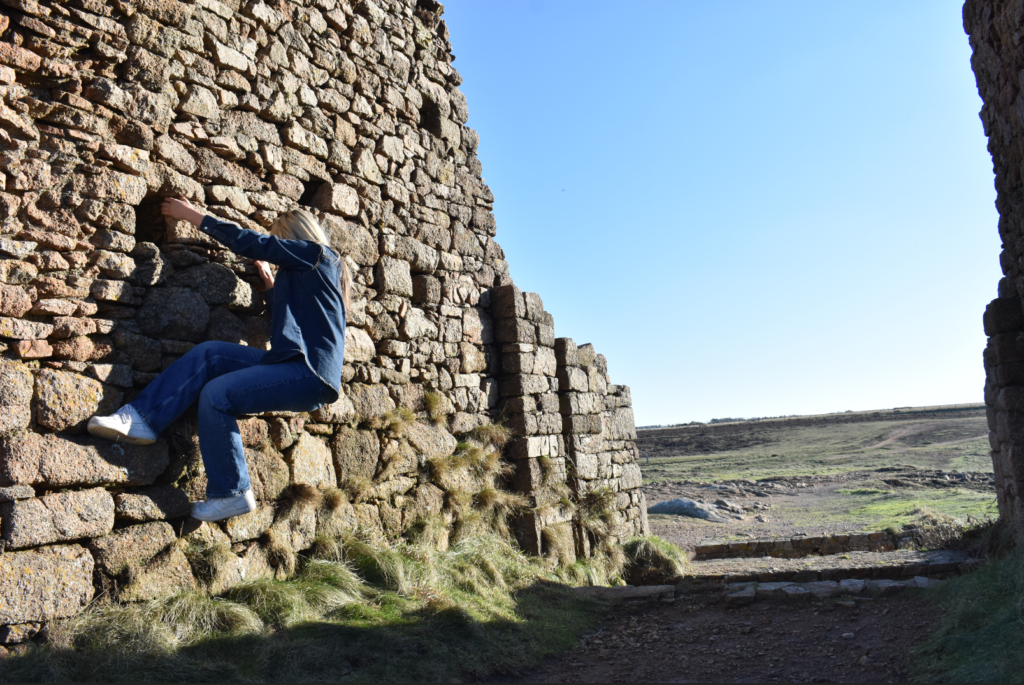
This photograph that I have taken is great as it captures both the detailed landscape with the rock wall as well as my subject attempting to climb it which created a unique posing position for the image. However the image by itself lacks a few things, for one the subject is tucked all the way to the left side of the image which may make it harder to indicate where I want the focus of the image to be set on, the image having colour is not a problem in itself however by setting the image up into a black and white colour scheme it can help minimise details on things like the sky or grass and enhance more details towards the subject and rock wall.
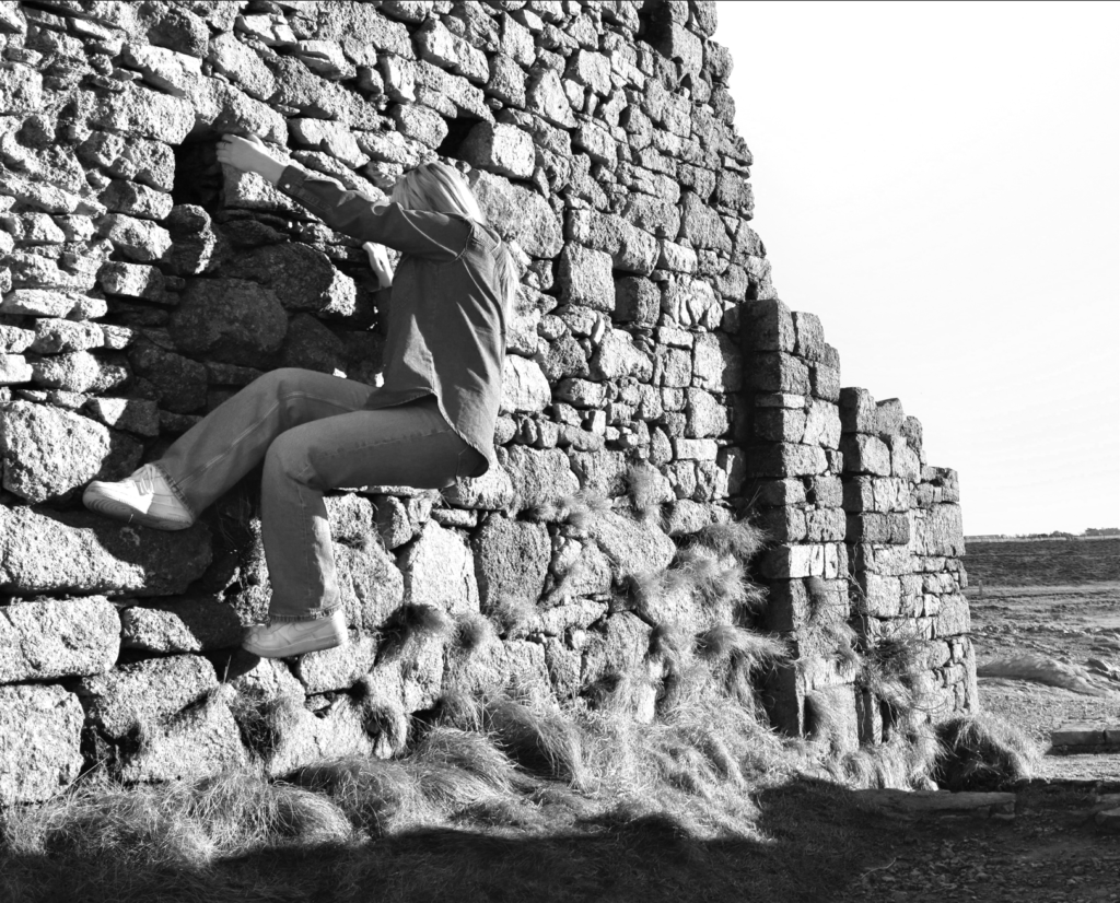
After Editing the image you can now see that it comes across more effective and the main focus is now easier to identify. To reach this point I cropped the image and rotated it slightly in order to make the image more straight and to discard the unimportant details and only keep the details I wanted in view. This allowed me to make my subject take up most of the image so I could use the rule of thirds composition, which helps highlight my subject as the main focus point of my image. To make the subject standout more and enhance more details around the image I decided to make the image black and white and adjust some levels so the subject can standout more, for example in the original image the subjects legs were in a dark area which made it less visible so by using a black and white colour scheme and adjusting the levels I was able to brighten them up and standout against the rock wall. I have also adjusted the levels for the scenery of the image too so I could preserve the detail of the rocks and grass which helps make the image more appealing to look at to the viewers.
Photograph #2
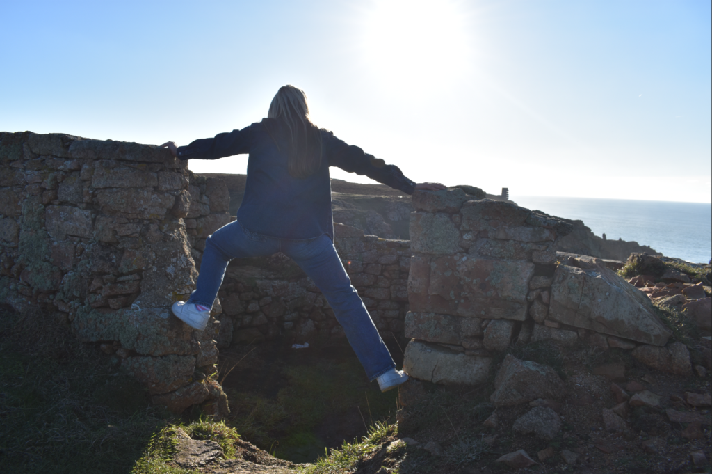
This photograph that I have taken is another image I found that had potential to be great especially when edited. The pose where she’s balancing on the divided rock wall helps add more mystery behind the photograph and the sky in view helps add more life to the image as it helps viewers figure out the type of environment the image was taken in. Edits will have to be done in this image to crop things I don’t want to be seen and rotate it slightly to keep the elements in the image straight. I also want to try and bring more detail into the subject as the lighting from the sun has made her figure appear more darker.
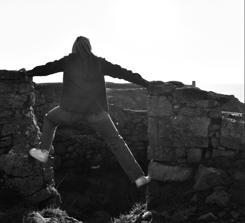
After editing this image you can now see the subject as the main focus of the photo. By cropping the right side and rotating the image to make things straighter it has allowed for a more aesthetically pleasing photo. Cropping also allowed me to use the rule of thirds which helped make my subject the main priority. By making it black and white and adjusting the colour levels it helped brighten the subject up slightly without making her look unnatural which makes her more noticeable and seen in this image. It has also helped to minimise distractions in certain aspects of the photo such as the small patches of different colours embedded in the rocks or the blue sky.
Photograph #3
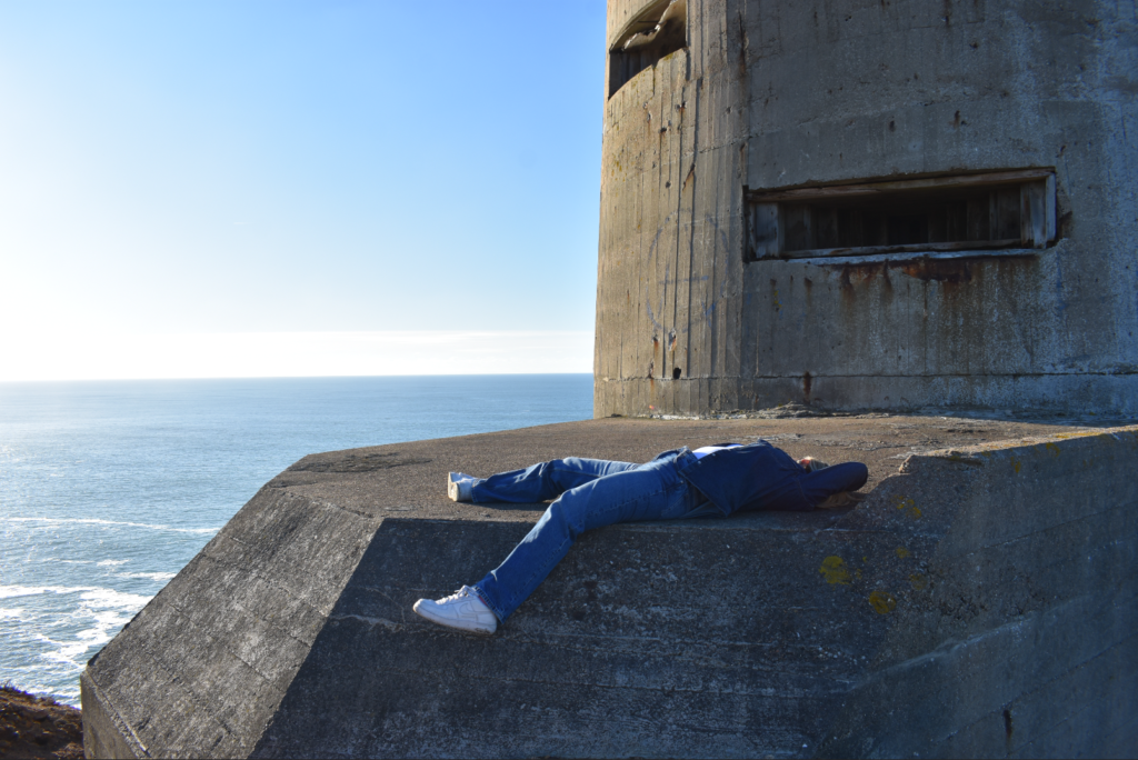
This photograph is one of my favourites that I have taken. The pose helps hide away some of her figure which makes it hard to depict and make assumptions about her feminine figure. The place used compliments the subject perfectly and has made the image so unique and pleasing to look at. The lighting used as well has also really helped make this image look good as it illuminates the structure clearly revealing the details on the stone but it also illuminated the surface of the subject which when edited will be able to make the subject standout next to the landscape. The image was taken from far away so cropping the image will need to be done to direct the focus towards the subject as well using a black and white colour scheme to bring more depth in certain things and retain the attention towards the subject.
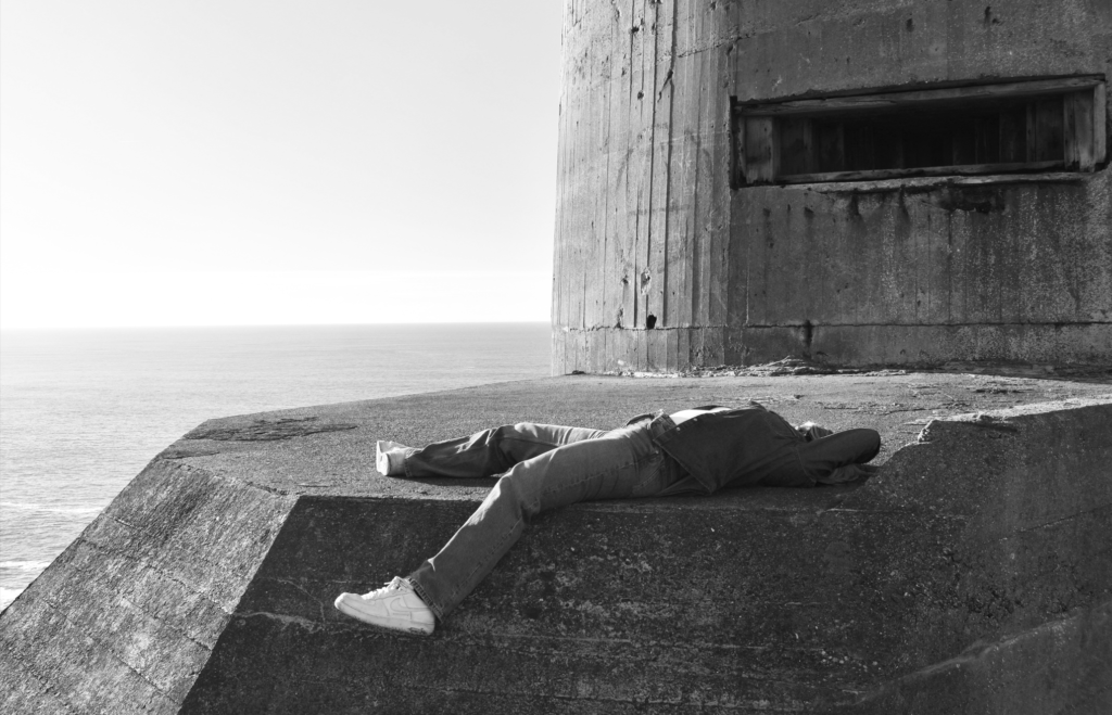
After editing this photo you can now see the subject more clearly which now makes it easy to identify what is the main focus of the image. I’ve also cropped most sides of the image to minimise the size of the structure behind the subject so the attention is not drawn to that first. By using a black and white colour scheme and adjusting the light levels I was able to make the background more brighter and reveal more details, I was also able to make the subject brighter but not too unnaturally bright so more attention can be drawn to the subject and also so I could prevent the subject looking like she was blending in with the rocks. With all edits applied the image looks better than before especially with how its laid out now and what’s now in view.
Photograph #4
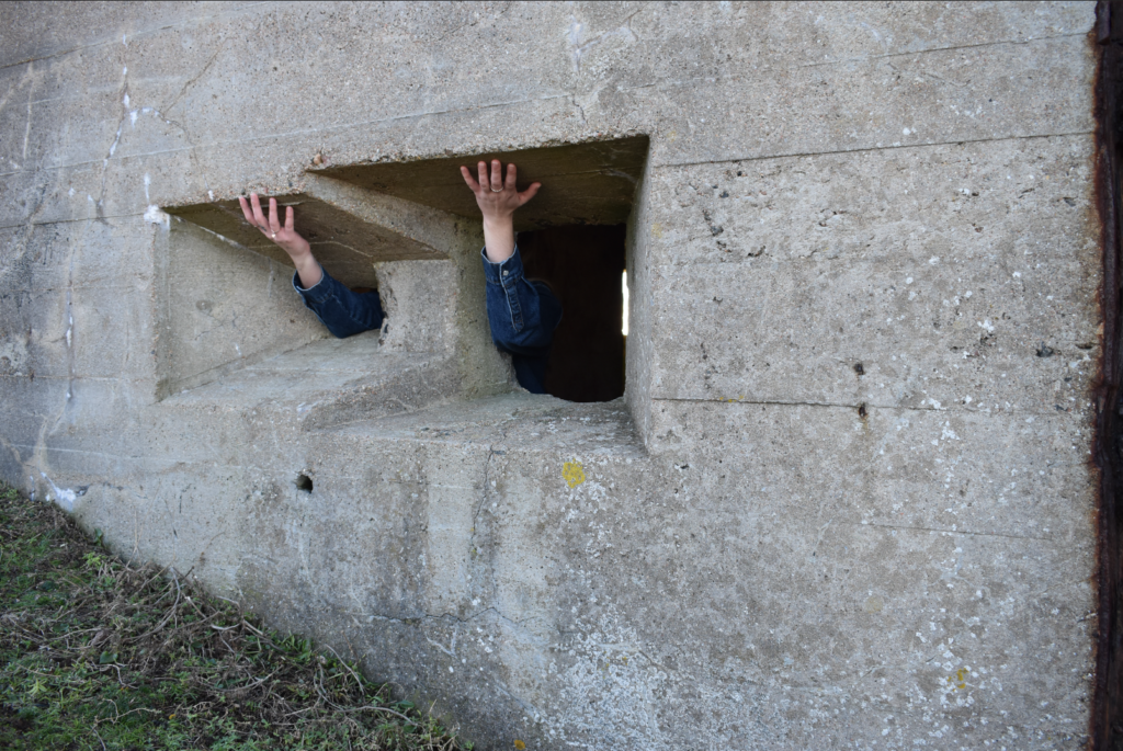
With this photograph I was inspired by one of Claude Cahun’s images where she put her arms through the rocks. So I decided to take inspiration but experiment with it differently which ended up with this image as an end result. I found this image quite interesting as by making the subject hold onto the top of the holes in the rock wall it makes it look like she is holding up the top part of the building. The darkness that you can see in the holes of the rocks are perfect as it helps hide the subject entirely with only the arms and hands being visible. By also taking the image closer to the wall and not revealing the sky or the entirety of the building, it helps to attract more focus towards the subject compared to if I were to take the photo further away as then the subject would appear very small compared to the rest of the image. The only issues I see with this photo is the low lighting due to the sunlight not being able to reach into this area and the size of the image which needs to be cropped so the subjects arms and hands are the main priority of the image.
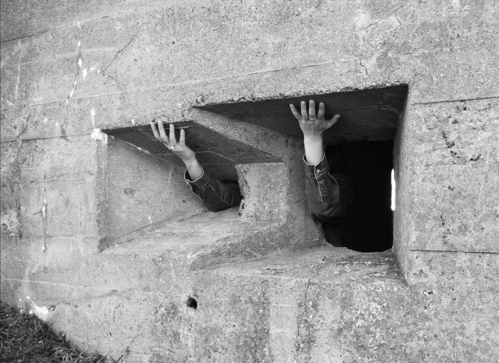
With this photo now edited you are able to see that the subjects arms and hands are more in the centre in the photo which makes it likely that its the first thing you see when you first view the image. Since there were lots of empty space around the image which were mainly the walls of the building, I decided to crop a good amount so attention would be kept to the holes in the wall and my subject. Making the image black and white helped brighten up areas of the subject like her arms so they are more visible to the viewer and also helped gain more level of detail. Using black and white also made it look similar to Claude Cahuns image which was the main inspiration for this photograph.
Photograph #5
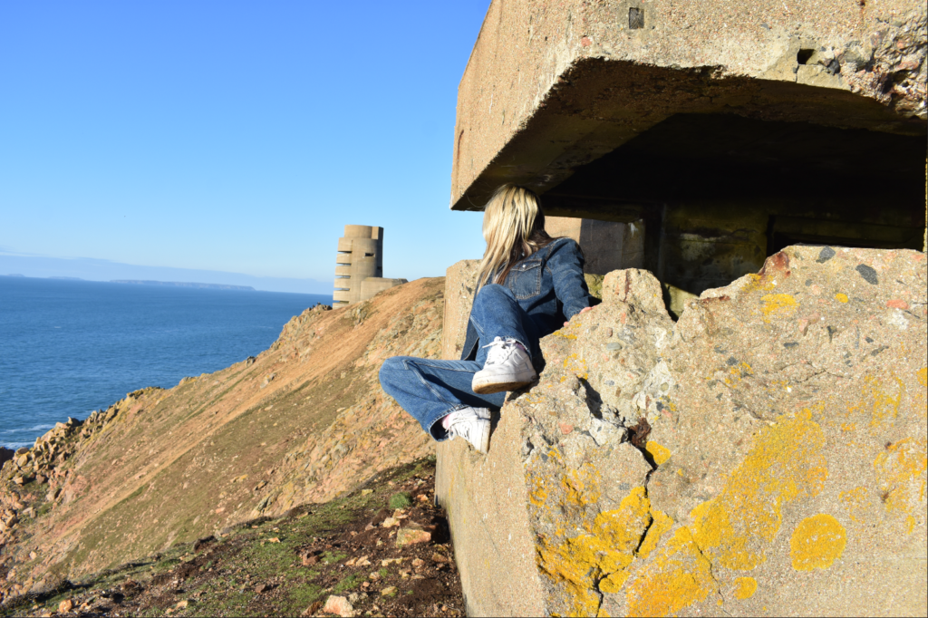
With this photo I found that the layout and how it is presented is actually quite clever. Using the same similar style to Clare Rae from her “Entre Nous” collection, I have made the subject look away into the distance while making her figure hidden behind her legs and behind the rock. By posing like this it helps create a mysterious aspect to this image but also follows through with Clare Rae’s motive for her images which is to disturb societies depiction of the typical female figure. So by positioning my subject in this unique way it makes it harder to identify who or what she is. The background used is detailed and appealing which then alongside my subject helps compliment each other and builds a connection between my subject and the place. Due to me taking this photo from far away it will have to be cropped to prioritise the subject instead of the background behind her.
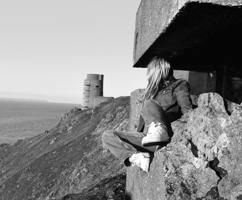
With this photo now edited you are able to see that the subject is more prioritised in the image with her taking up two thirds of the image. I have cropped a large chunk of the background so I could prioritise the subject and remove what I think wasn’t needed to be seen in this image. This final result was a nice outcome as you have that rock wall with the subject posing on it taking roughly one half of the image while the other half is more set on the background of the image and the details and things you can see from a distance. Making this image black and white helped to make the details and brightness of the subject greater. It also helped reduce distraction as the image contains a range of different colours used so by making it black and white it makes the viewer more drawn to the attention to detail and the meaning of the image rather then the colours used around the image. This image now becomes more effective when edited as I was able to choose how I wanted it presented. By also using these edits I was able to replicate Clare Rae’s style which is what I wanted due to her being the inspiration for this photo that I took.
Photograph #6
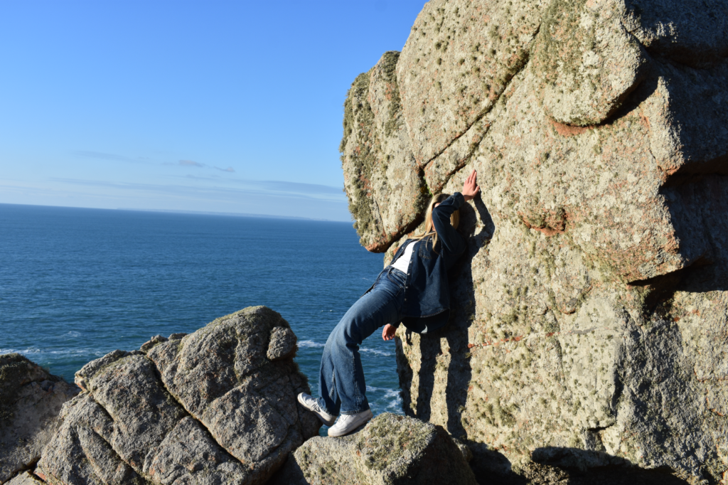
With this photo I found that the background of rocks would work really well alongside my subject when posing. I have positioned her in a way where some of her figure is hidden away behind her torso or behind her leg, I’ve also made the subject lean against the rock while using her hand as support which made it possible to use her elbow to cover her face which helps to make the image more mysterious to the viewer. The background of the image matches well with my subject helping to build that connection between the person and the place which ends up making the image more effective. This was taken with Clare Rae as my inspiration as I found that one of the images from her ‘Entre Nous’ Collection was very eye catching especially with how it was taken and the ideas used so I wanted to apply some of those principles into my image. To make this image standout more I will need to add a few edits including cropping the image to keep the subject in view and make her the main priority.
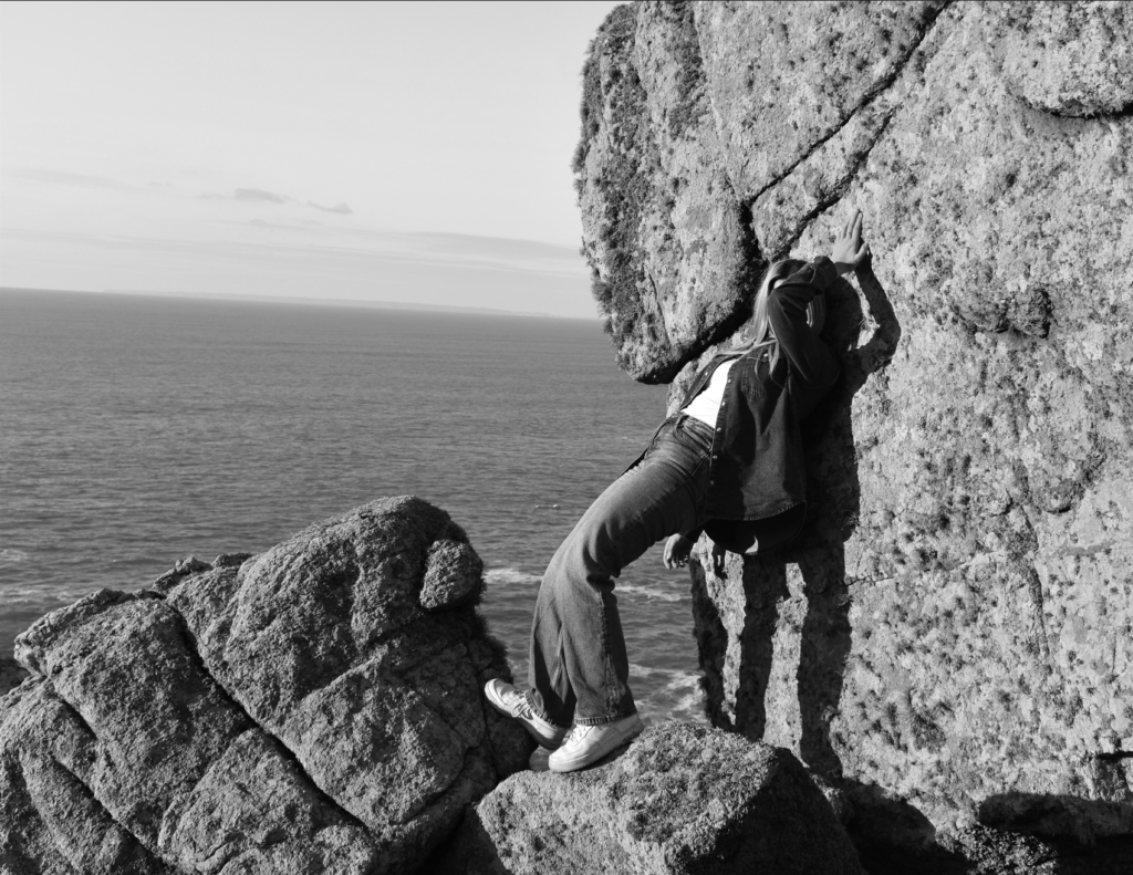
With the image now edited we are now able to see the subject more clearly with her taking up a good amount of the photo. I have also cropped out areas of the background I felt were not very important to include or didn’t contribute much towards the image to minimise distractions. I have also used a black and white colour scheme to brighten up the subject as well as making the rocks appear more detailed. Using black and white also helps create more of a dramatic effect across the image which is what I wanted so I could make the image look more mysterious especially with how the face is covered. With this image now edited it is looking a lot better and looks more similar to Clare Rae’s work who was my inspiration for this photograph that I took.
