Process of Editing
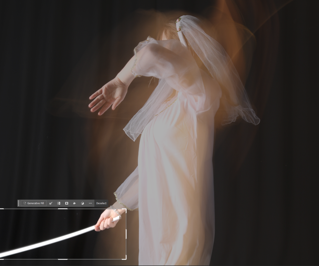
First, I cropped the photo to square, and then I selected what I wanted to remove from the photo and selected ‘generative fill’ which then edited it into just a hand without holding anything.
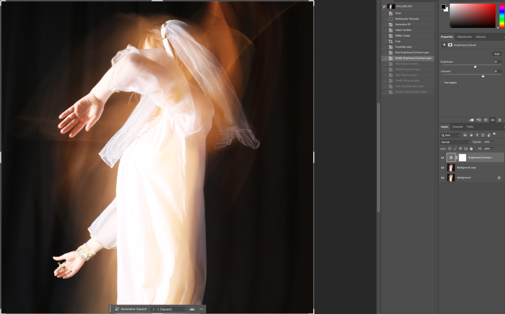
I then duplicated the layer, in case I made any mistakes, and I adjusted the brightness and contrast.
I then duplicated the layer, in case I made any mistakes, and I adjusted the brightness and contrast.
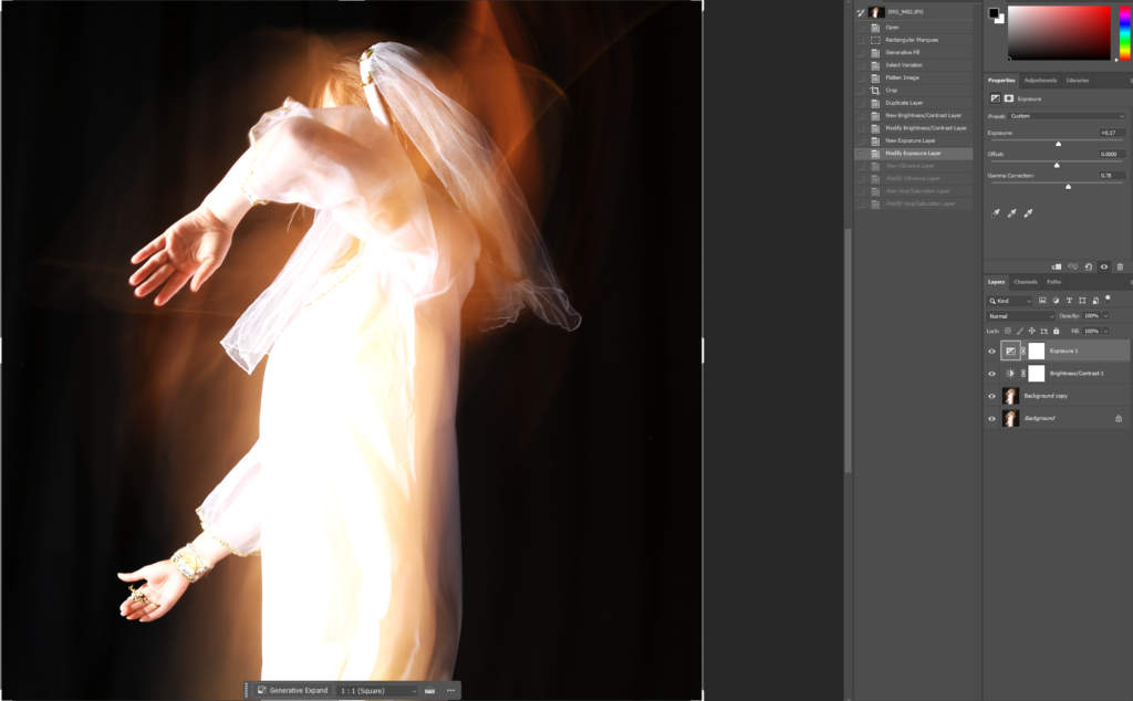
After that, I modified my exposure and gamma correction.
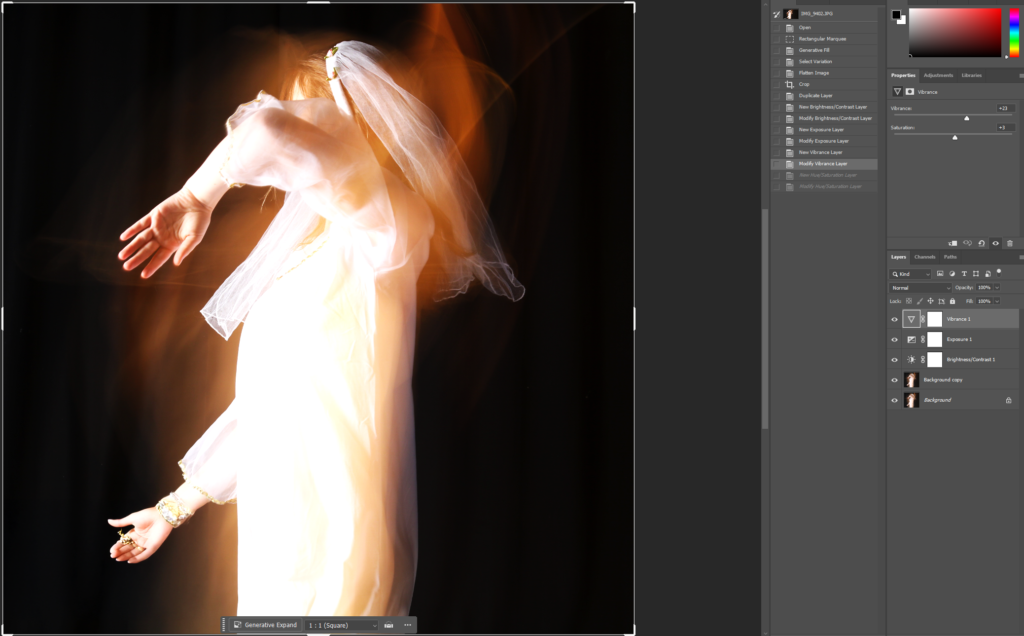
Then I decided to change the vibrance of the image.
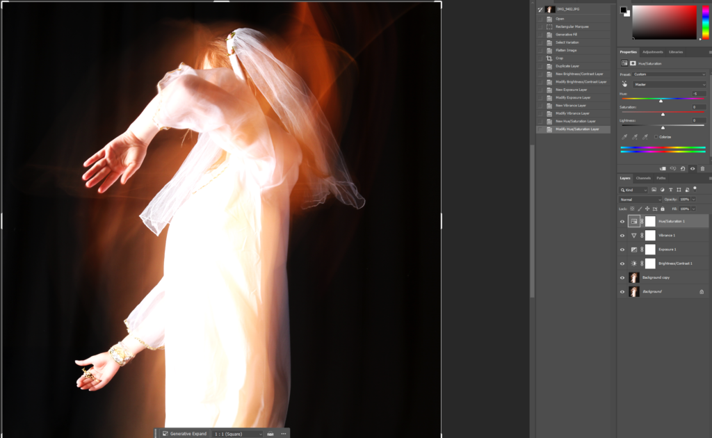
I then moved on to switching up the hue of the image, just slightly, to give the photo some dimension.
The three images were all edited the same way so that I could guarantee that they work well and look good together.
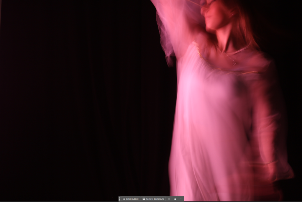
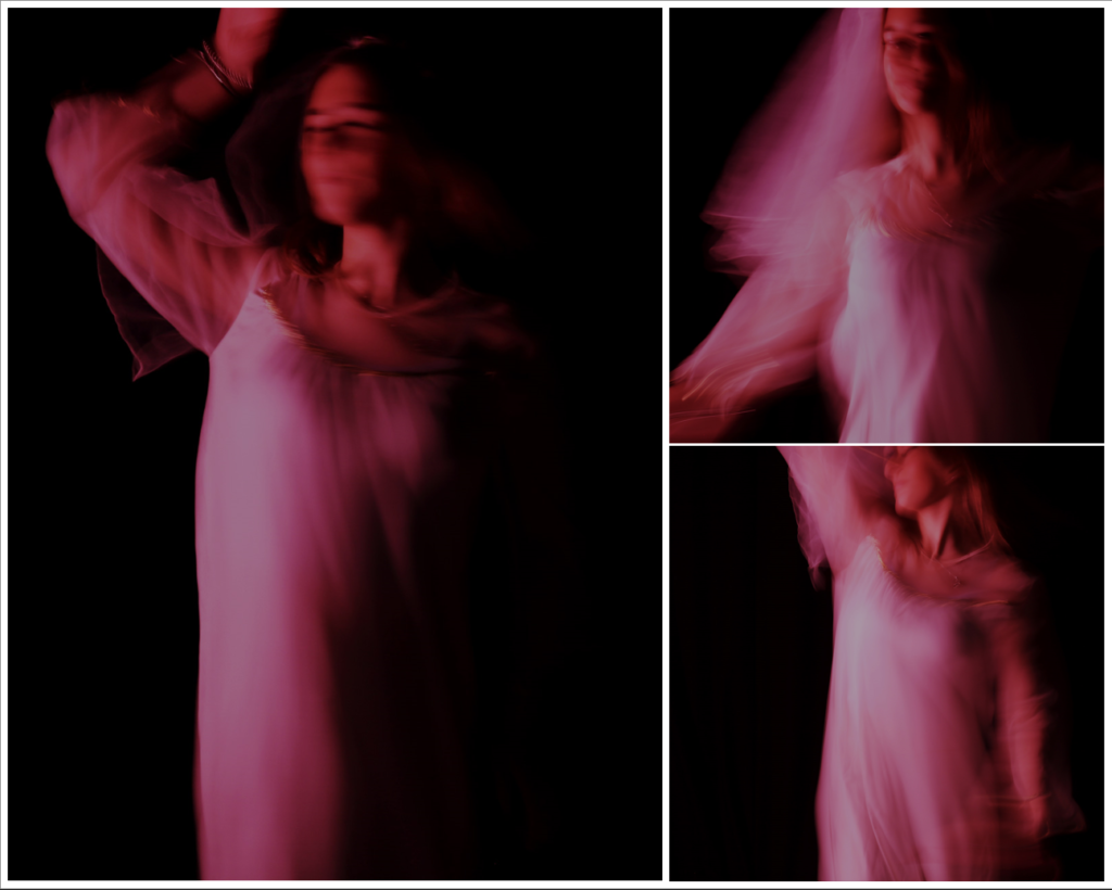
The femininity images had the same concept to editing except different settings.
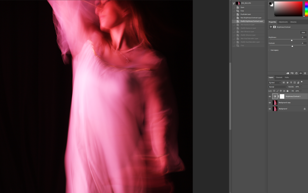
I cropped it to square and modified the brightness and contrast, increasing both of them to brighten up the image.
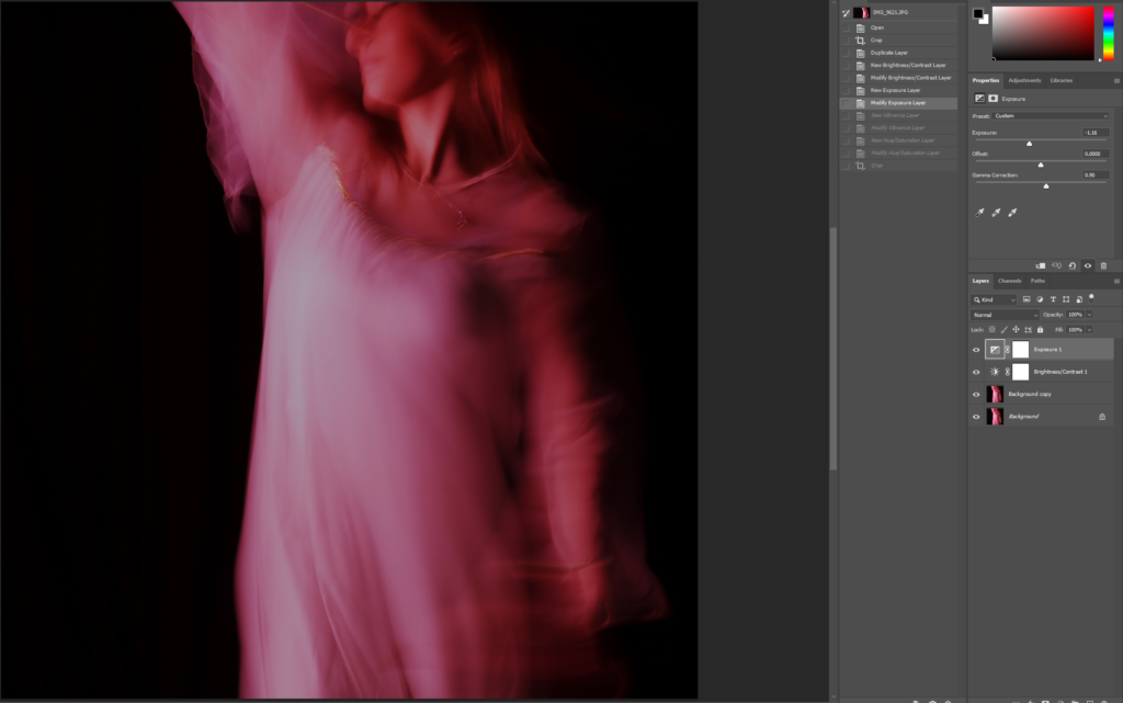
I then moved on to adjusting the exposure which I reduced, and the gamma correction which I increased. This gave a more eerie effect to the image, while still keeping the pink tint.
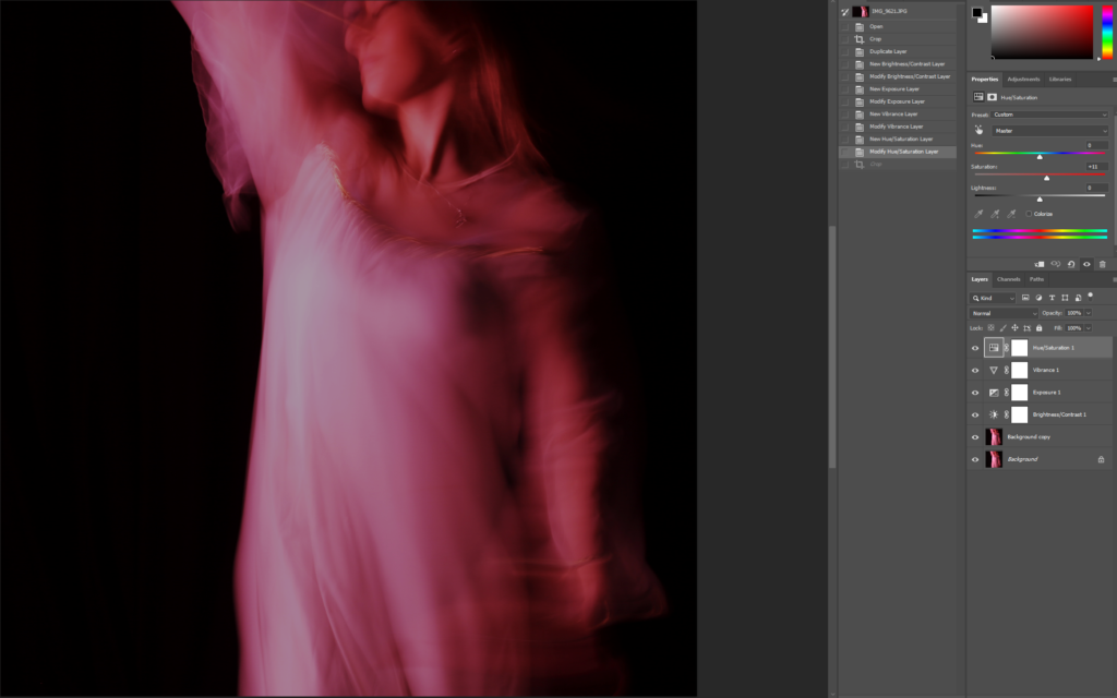
I then increased the saturation which brought back more of the pink colour that I lost when doing the gamma correction and exposure.
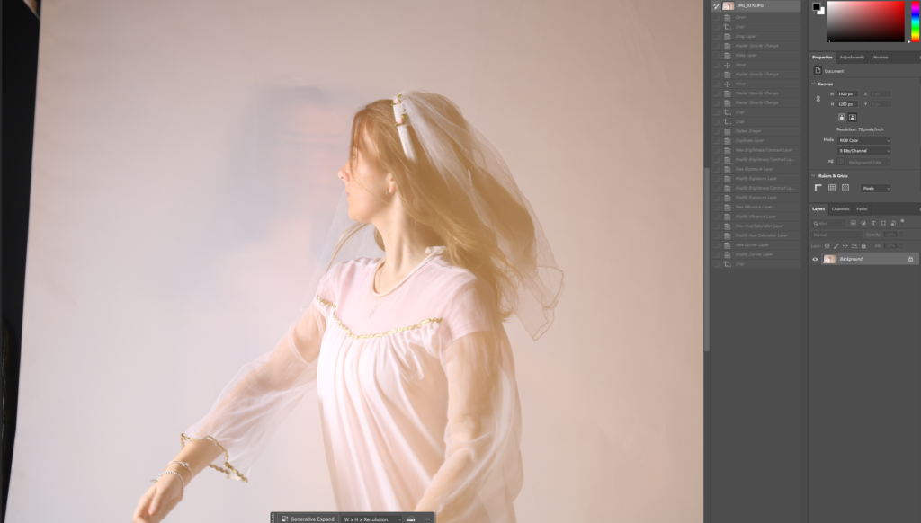
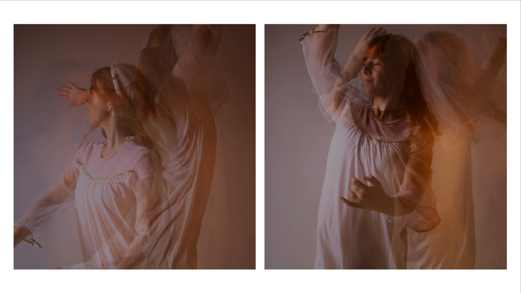
I started off with this photo.
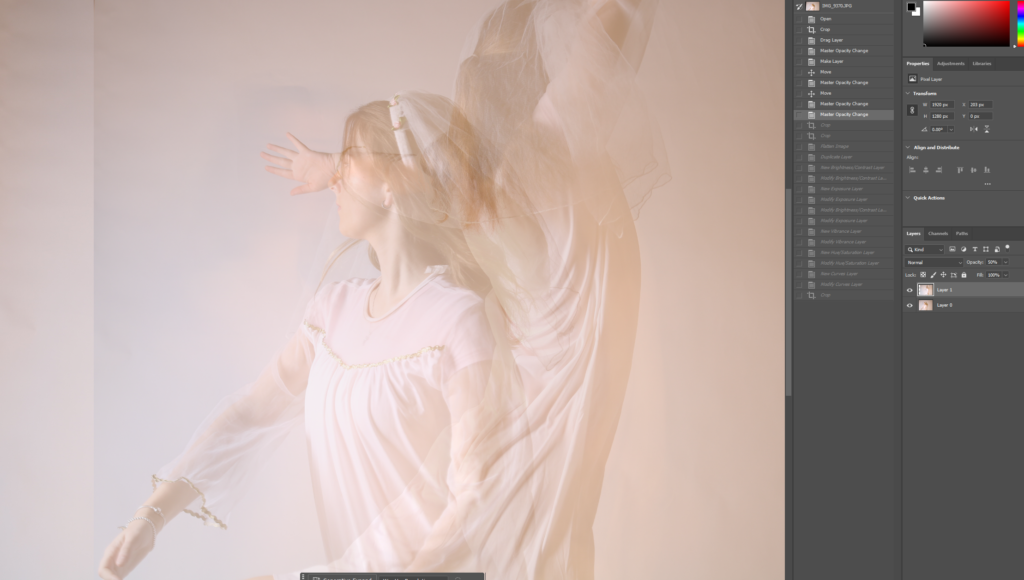
I then decided to add on another image on the top and blend them together by reducing the opacity on the top layer.
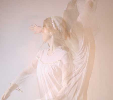
pped the image to get rid of negative space and so that it is square. I also flattened the image to make it all one layer.
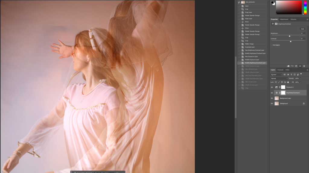
After that, I adjusted the brightness and contrast to make it a little darker as it was too light.
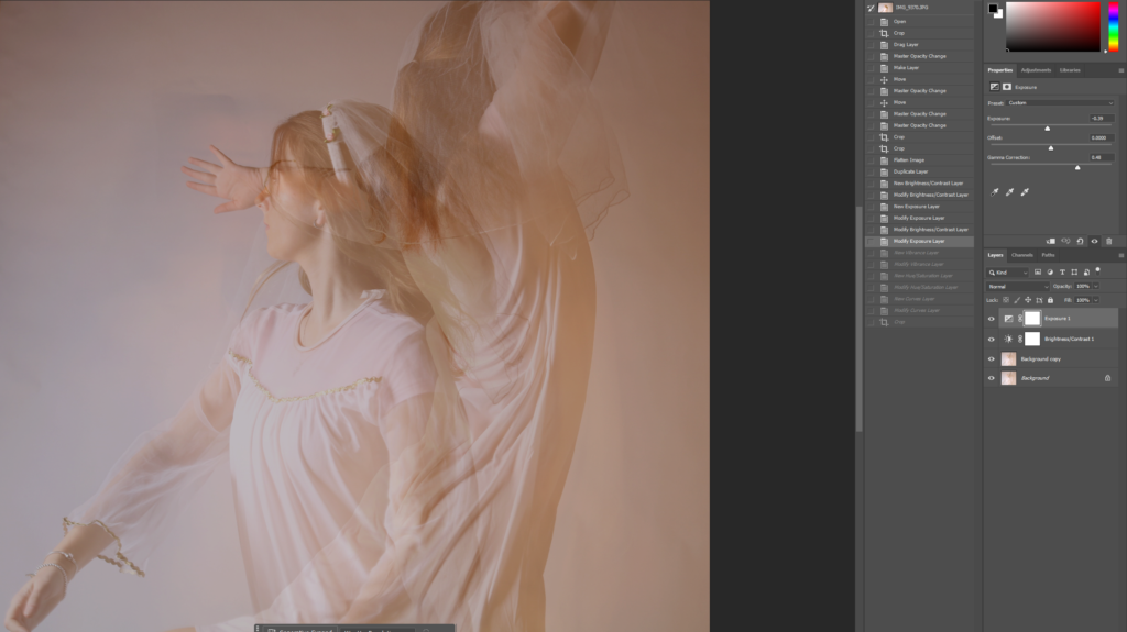
I decreased the exposure and increased the gamma correction to improve the quality of my image and also give it an angelic effect.
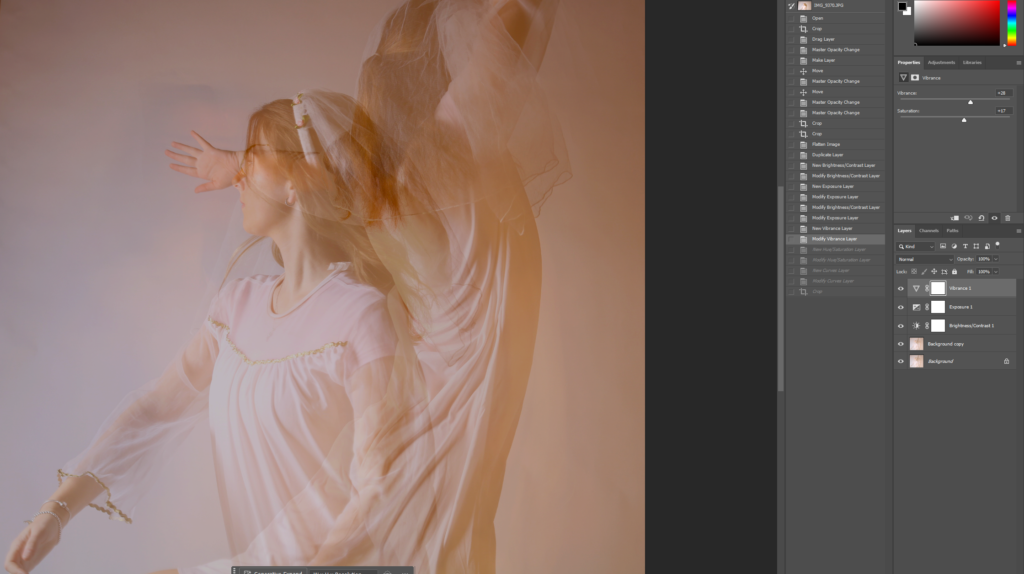
I modified the vibrance by increasing both the vibrance and saturation to give it a little tint.
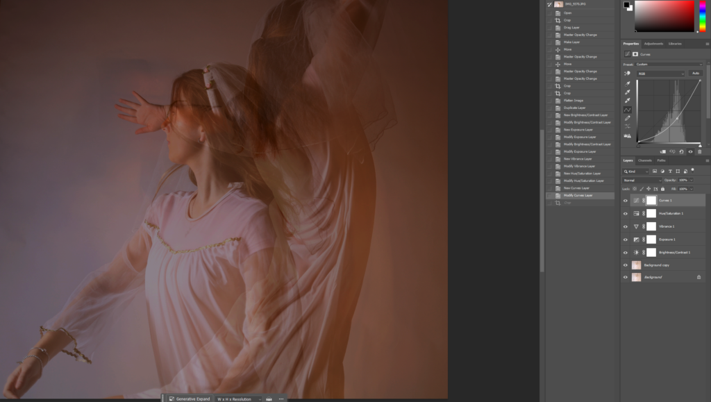
I then adjusted the curves to adjust the contrast and the lighting of my image.
Before and After Editing
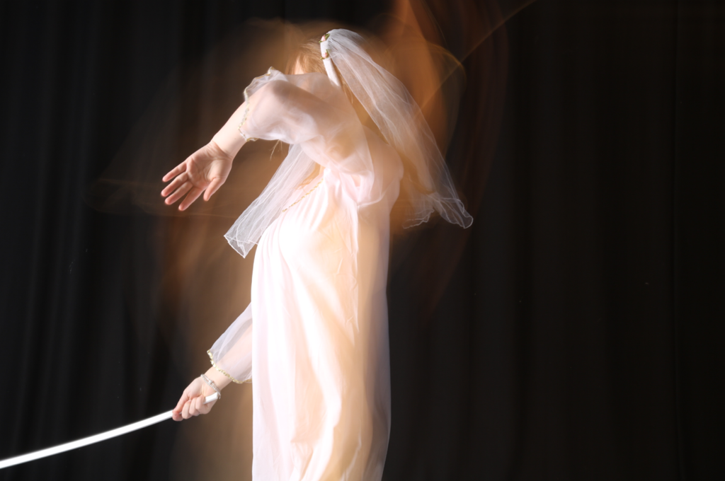
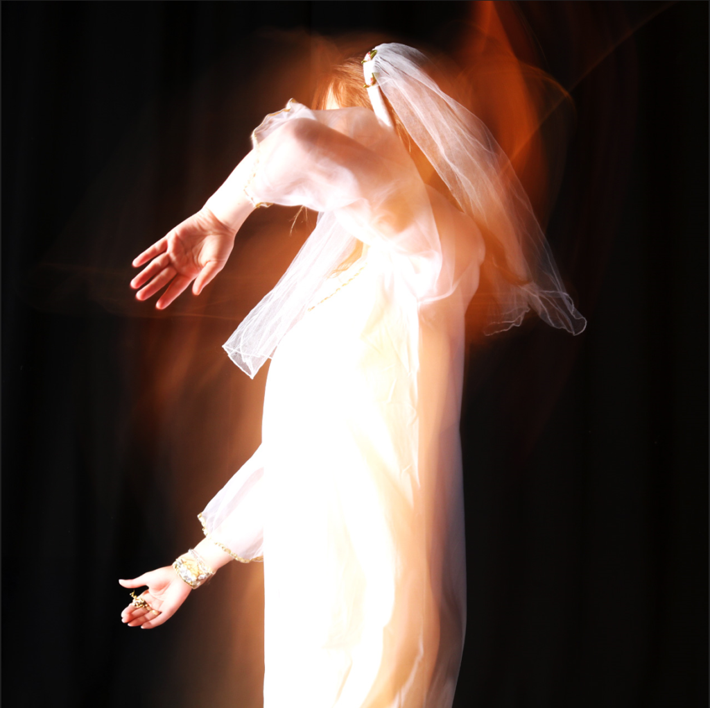
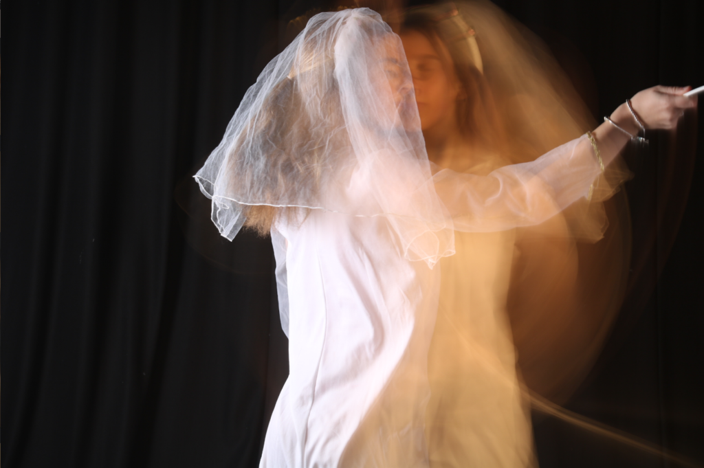
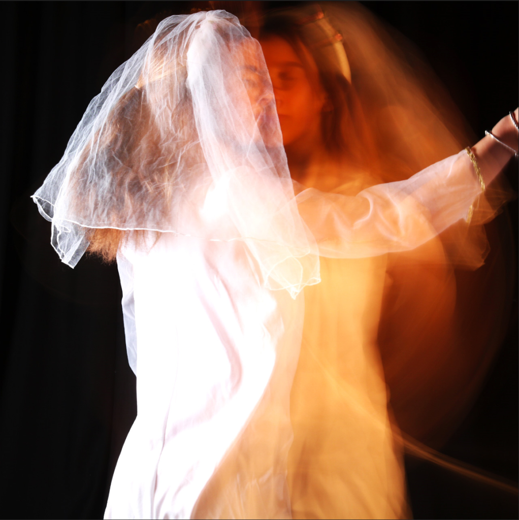
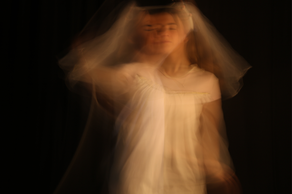
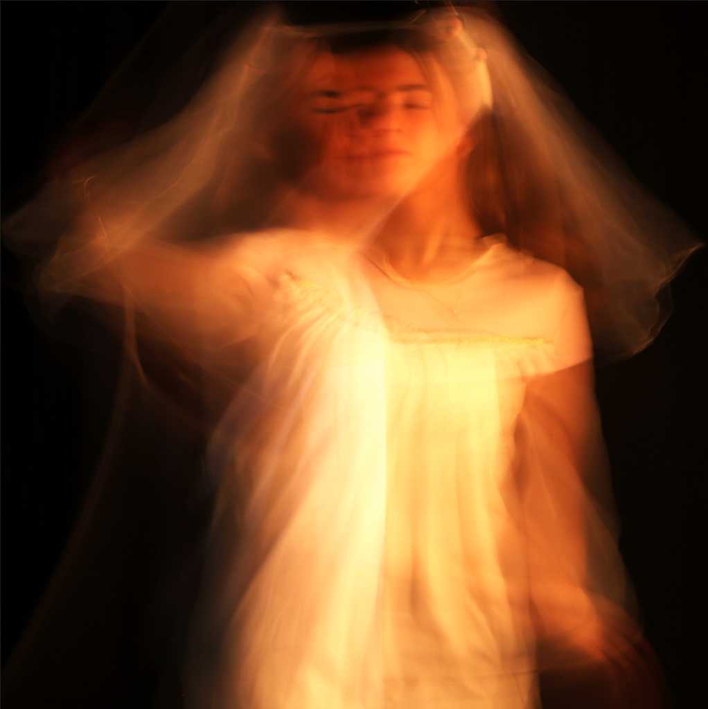
With these images, I brought up the brightness and contrast, exposure, vibrance and the gamma correction to create this soul effect. I reduced the hue only slightly to make the image look more like fire. I cropped it into a square with the subject in the middle of the image.
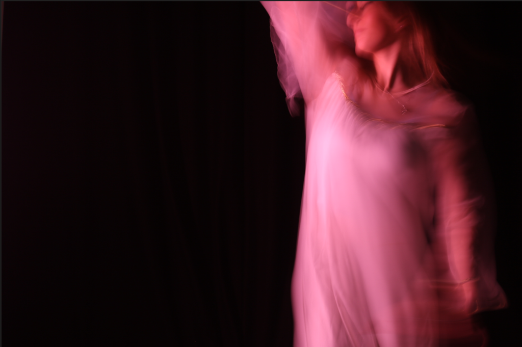
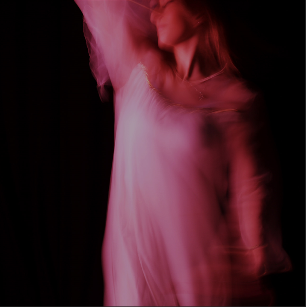
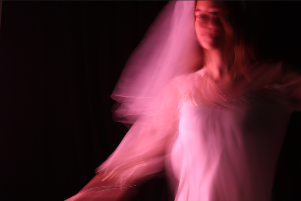
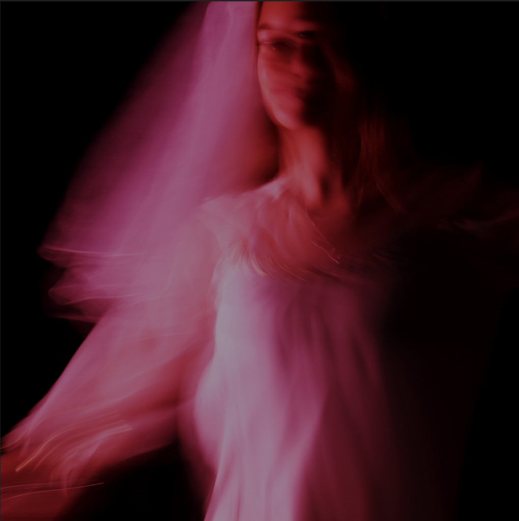
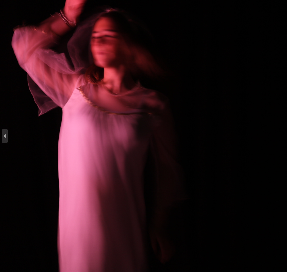
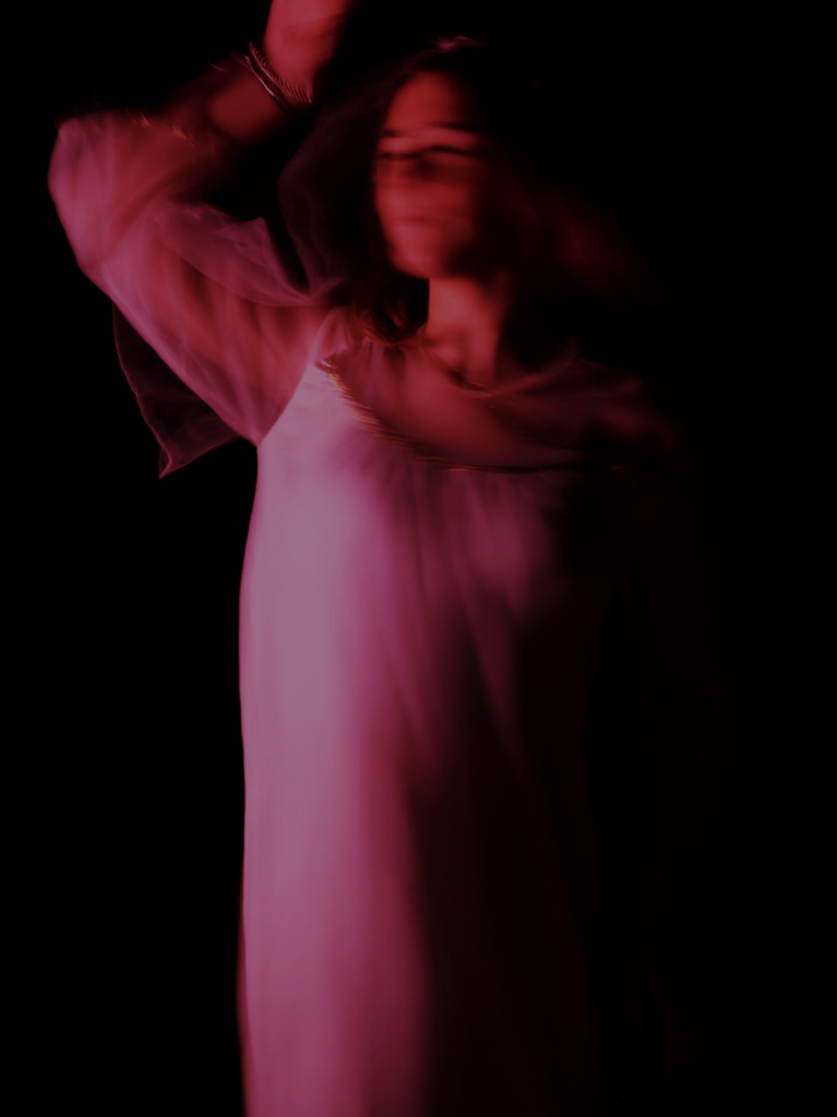
In this set of images, I went for the theme of femininity. I increased the brightness, contrast, gamma correction, vibrance and the saturation. I reduced the vibrance saturation, and the exposure. I cropped two of them to squares and one of them to get rid of negative space throughout the image.
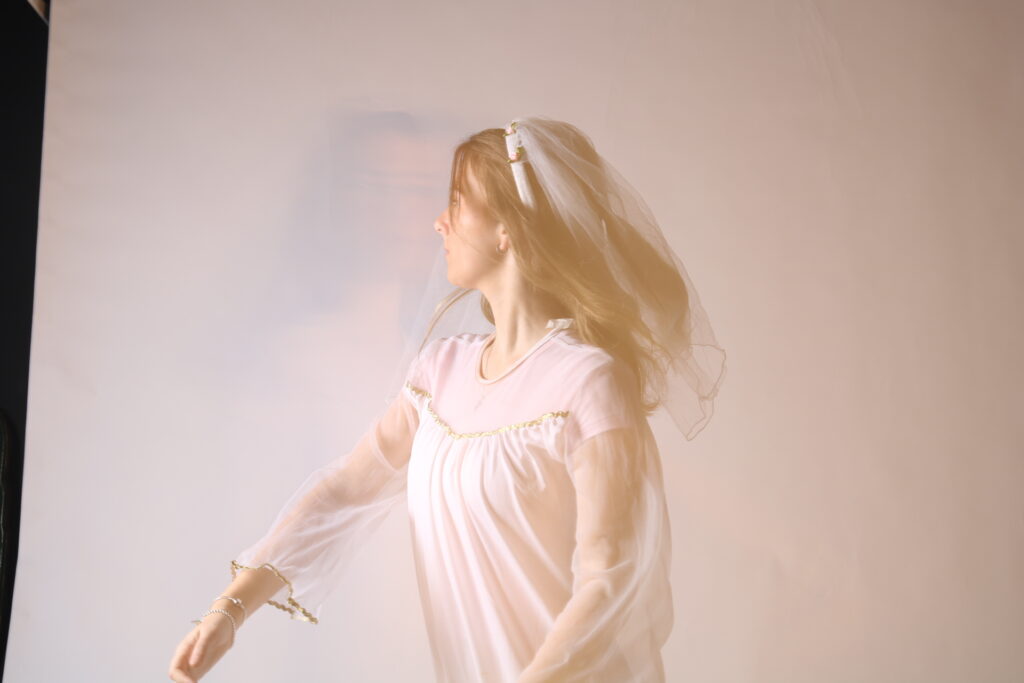
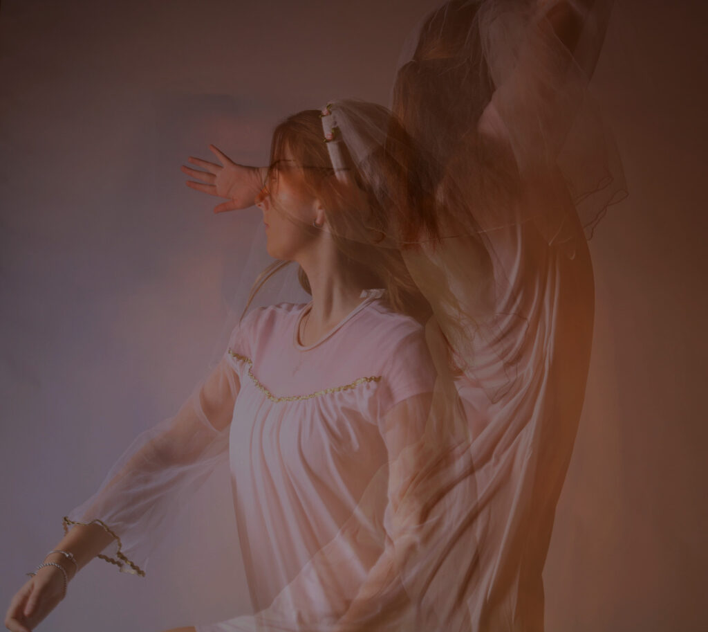
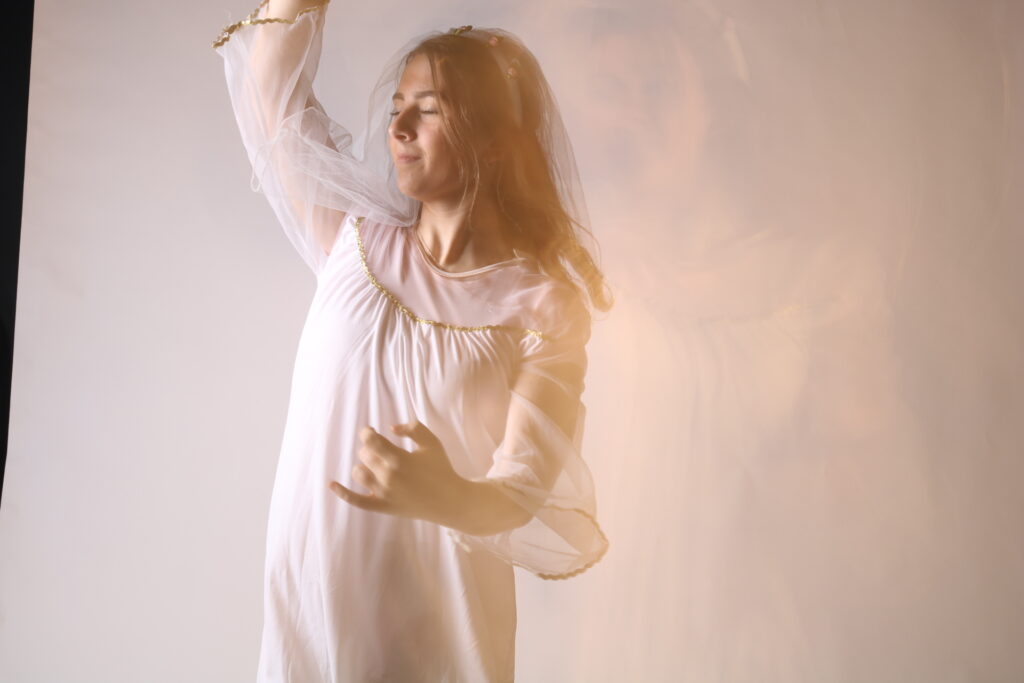
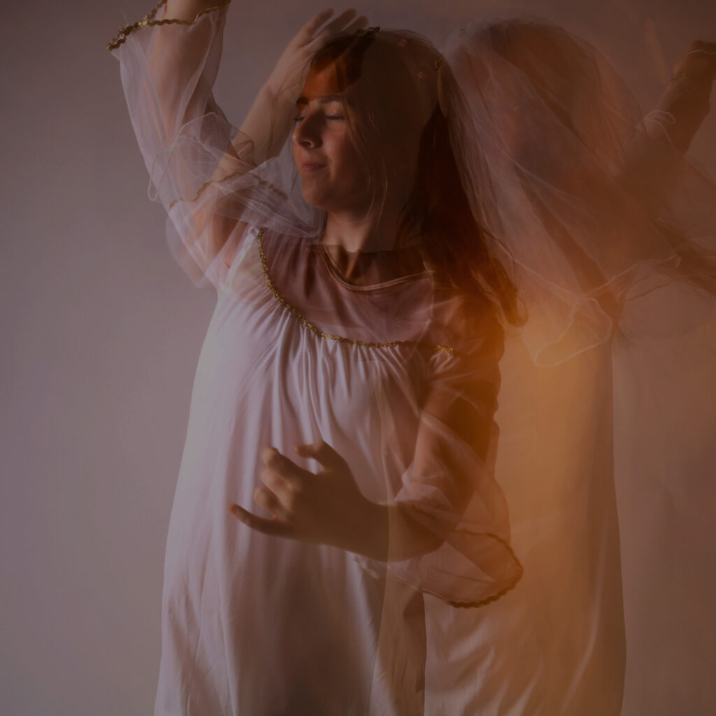
With these images, I increased the brightness, contrast, vibrance, saturation and gamma correction and reduced the hue saturation slightly.
Presentation
This is how I would want my final photos to be presented.

