Artist: Michael Betzener:
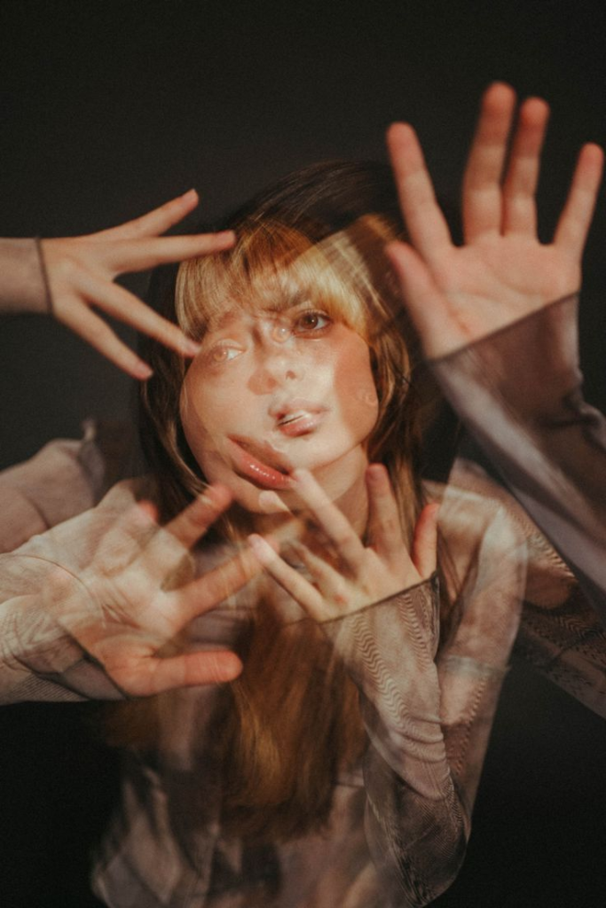
In the double exposure images, the overlapping imagery suggests that a person cant be reduced to a single image or perspective. Instead, we are multifaceted, shaped by different things for example our emotions, memories, experiences which come together to form our sense of self. I believe these portraits ask us to consider not just the visible aspects of a person, but also the invisible, the inner complexity that often goes unnoticed.
The overall effect feels like peering into someone’s soul, not just focusing on the surface, it makes you think about the subjects experiences, thoughts and internal contradictions.
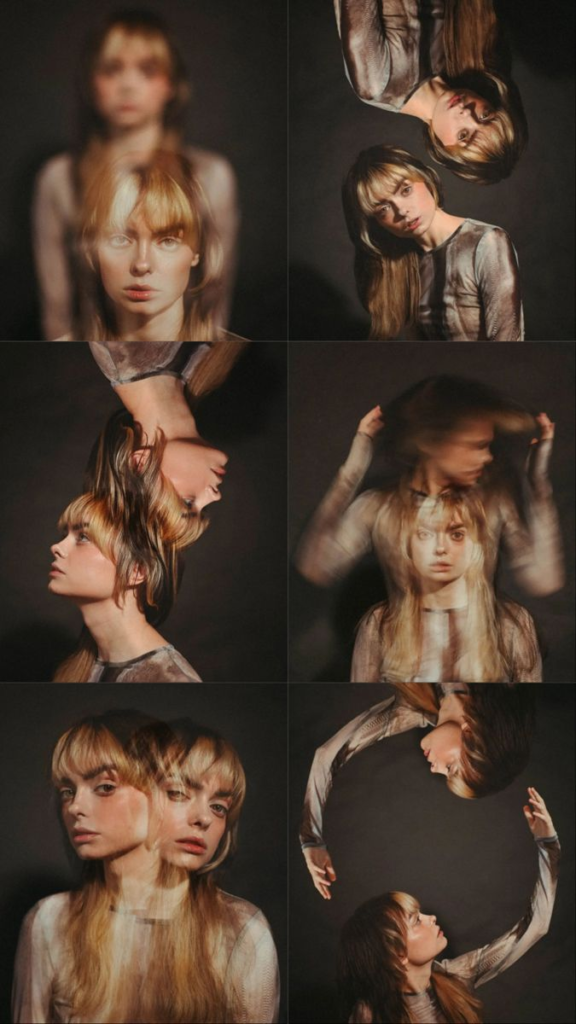
When I look at the mirrored images, the symmetry powerful, the subject is split in half with a perfect mirror image on either side. It feels like you’re staring at a reflection in a way that feels both calming and unnerving. The symmetry creates a sense of balance, but there’s something about it that doesn’t feel totally natural. It’s like there’s another version of her that on the surface level is identical but i think it is representing another vulnerable side that the subject is reflecting upon.
In terms of technique, Betzner is extremely precisise in these mirrored images. The way he aligns everything with perfect symmetry but still leaves a little room for imperfection gives the images a sense of realism that’s slightly unsettling.
The perfect split image feels like Betzner is playing with the idea of fragmentation, how our identities are often divided between how we project ourselves to the world and how we experience our inner selves. It’s like the mirror isn’t just about reflecting what’s in front of it, but about making us question what we really see when we look at ourselves.
Betzner’s use of double exposure inspires me to experiment with the idea of layering in my own work. The layers in his images don’t just add visual interest, they tell a story, often suggesting that the subject’s identity is never fully visible or contained within a single image. And I am going to attempt to expose that other side in my images.
My experiments with double exposure:
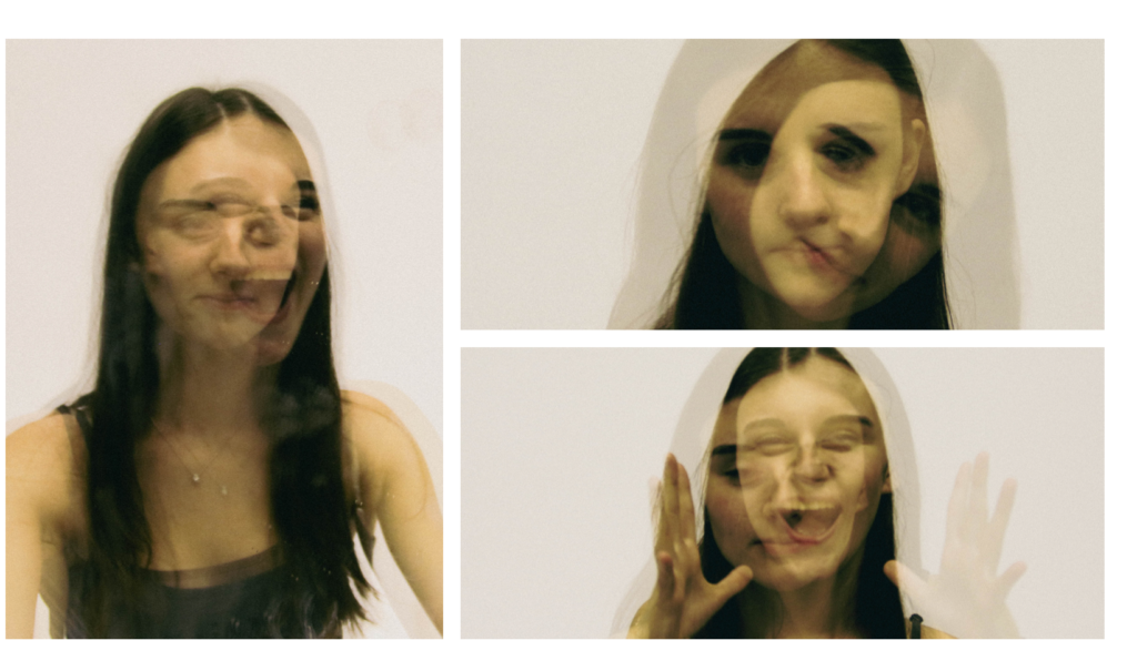
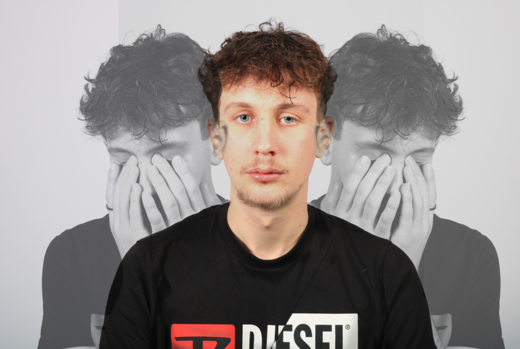
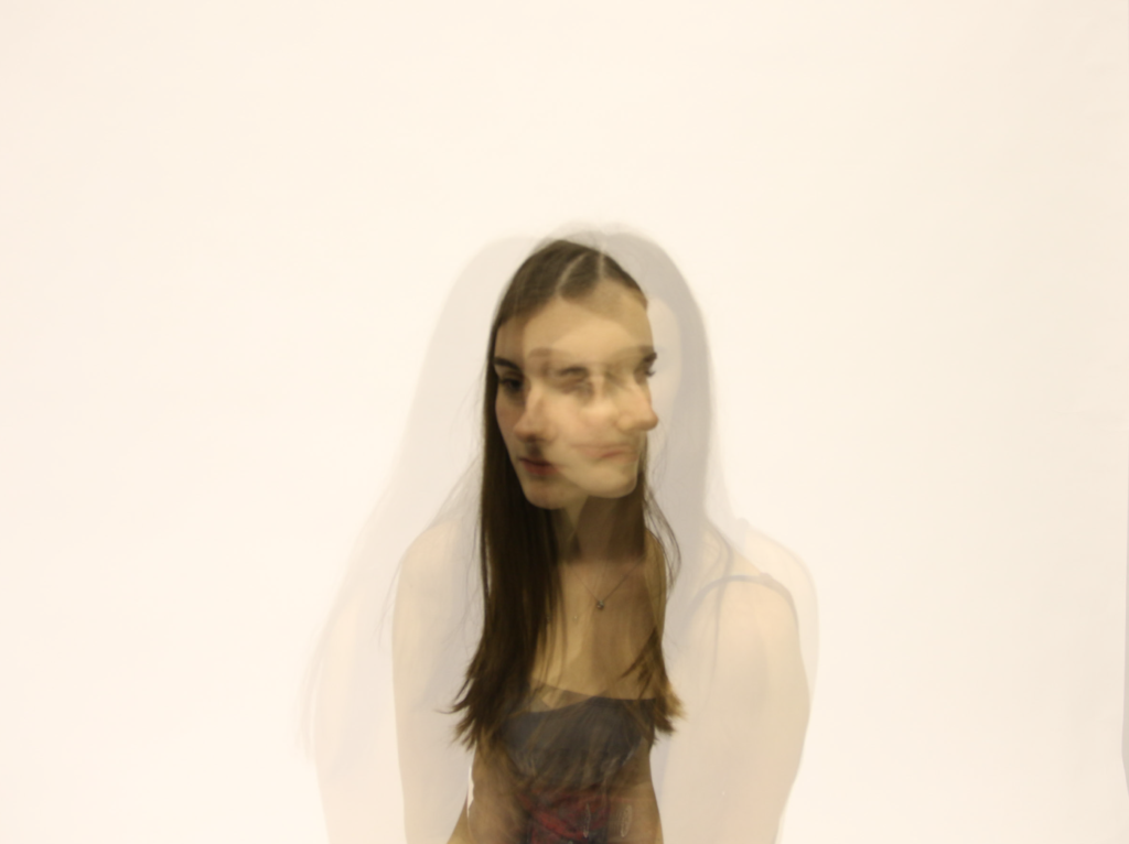
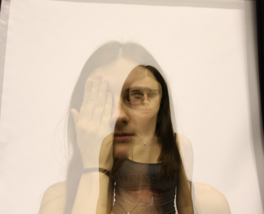
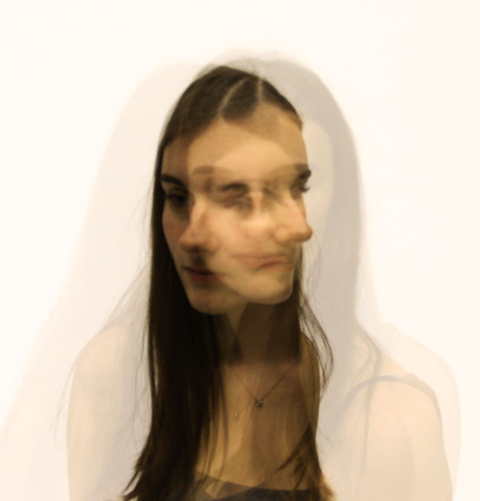
In this image the eye contact is what draws you in. The eyes create a direct connection, that feels personal, as though the subject is looking right at you. There’s a feeling of being watched or observed, but also of being unable to fully understand what’s being communicated. The eyes are clear, sharp, almost as if they’re holding something back, while the rest of the image feels like it’s slipping away as the colours and features blur. It’s unnerving because the subject feels both present and distant, both familiar and foreign at the same time.
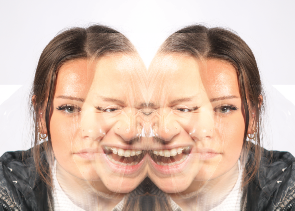
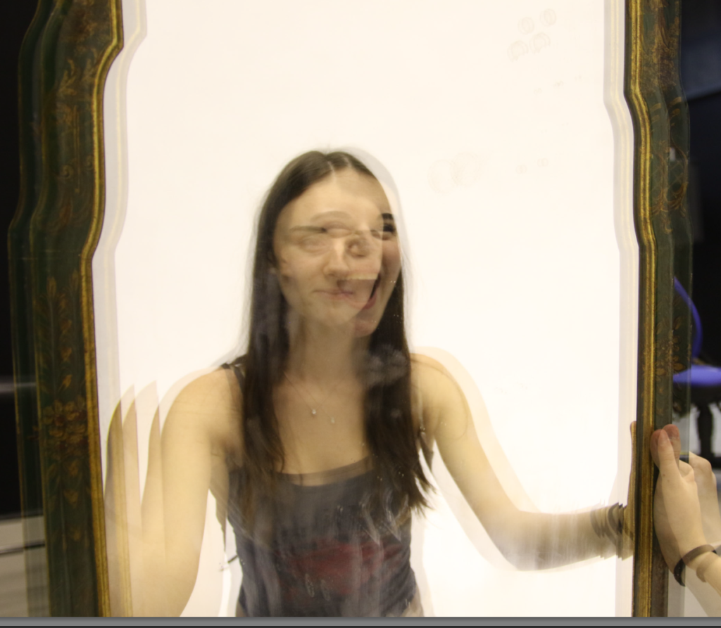
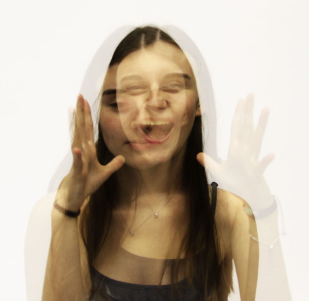
In this image the contrast between the deadpan expression and the screaming overlay creates a strong tension throughout. In the background image her face is almost emotionless, as if she’s holding something back, like a mask of control, suppressing her true feelings. The screaming image almost erupts out of her face, disrupting the calm and revealing her raw emotion.
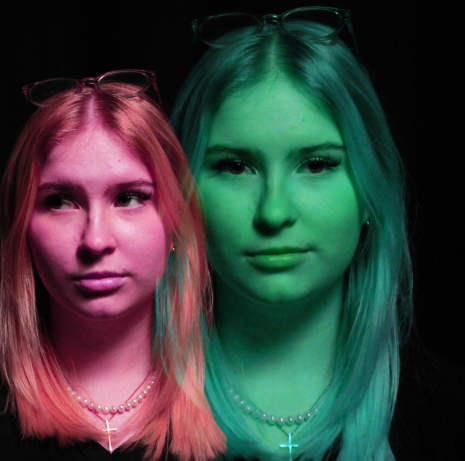
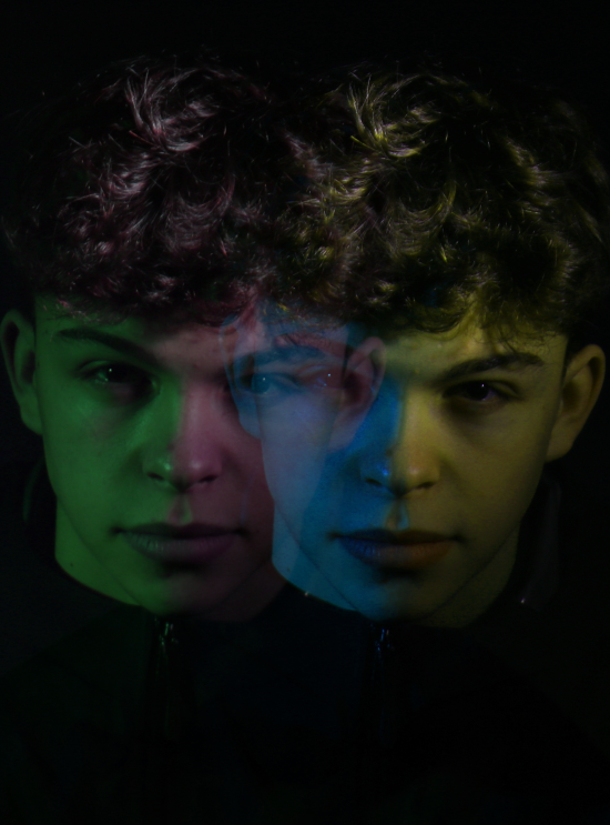
In this double exposure portrait, I used pink and blue/green to create a strong contrast that gives the image both depth and emotion.
Pink (Warm)
The pink tones add warmth and a personal touch to the photo. They make the subject feel more intimate and alive, like you’re connecting with them on a deeper level.
Blue/Green (Cool)
The blue/green tones, on the other hand, bring a sense of calm and tranquility to the image. It also creates a distant feel between the two images, the eye contact in the camera makes it feel like she’s looking right through you which creates a sense of unease.
The Contrast Between Pink and Blue/Green
The way pink and blue/green work together creates a nice balance. The pink draws your attention to the subject, giving it warmth and intimacy, while the blue/green tones add space and mystery. One colour feels close and emotional, while the other feels farther away, even though it is layered in front of the other image..
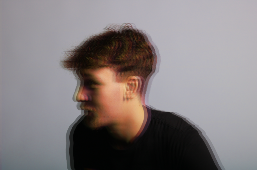
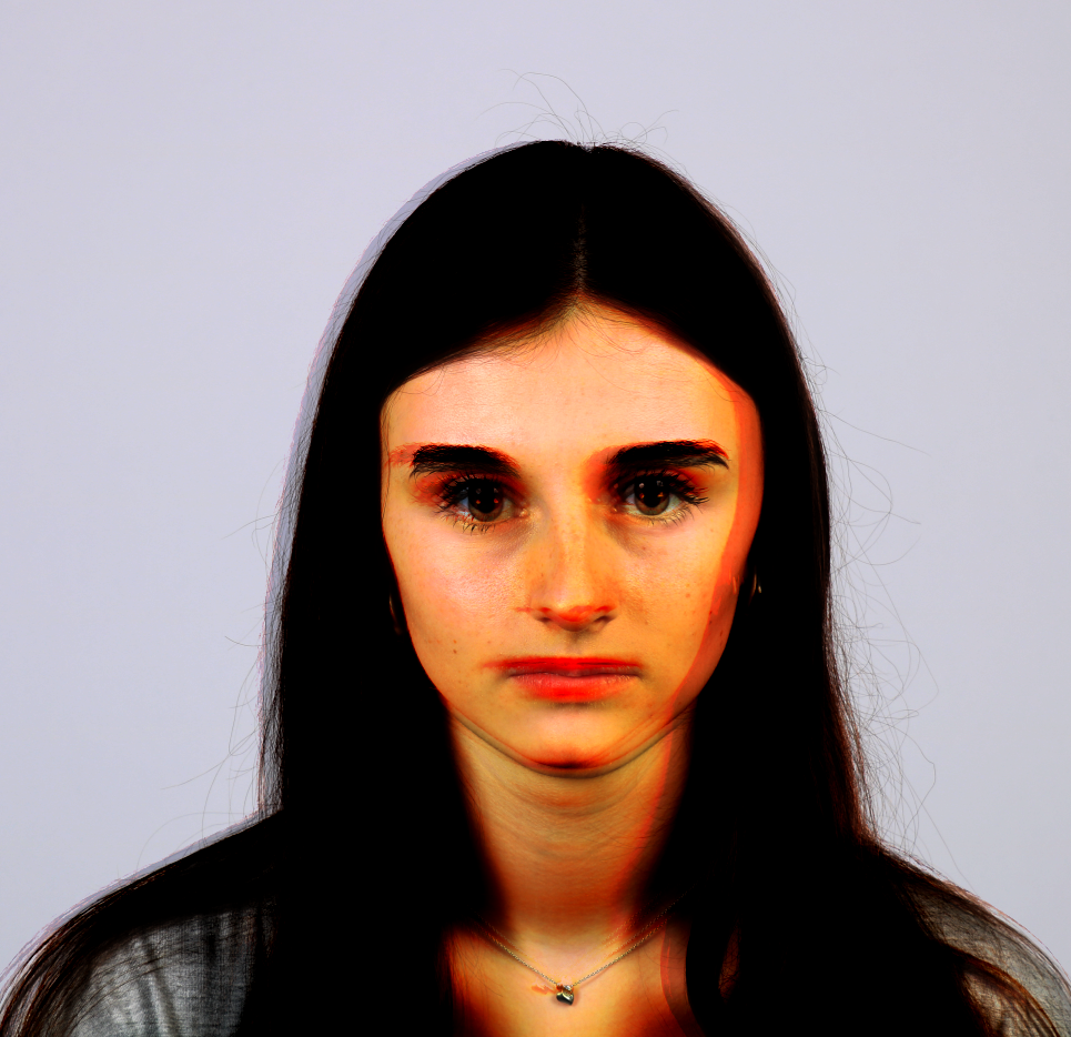
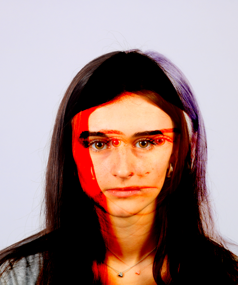
Using a double exposure camera:
Contact Sheet:
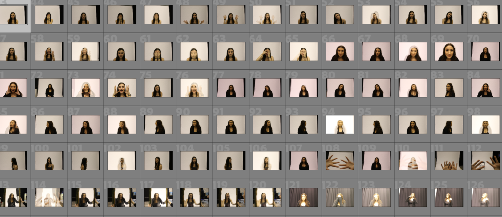
Images:
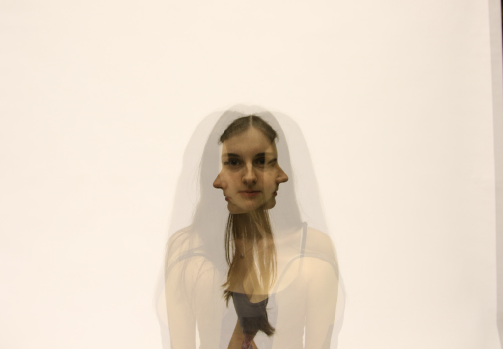
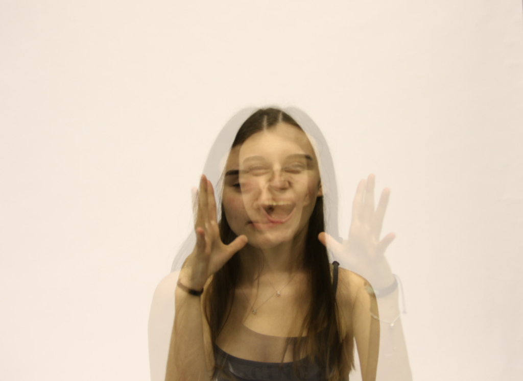
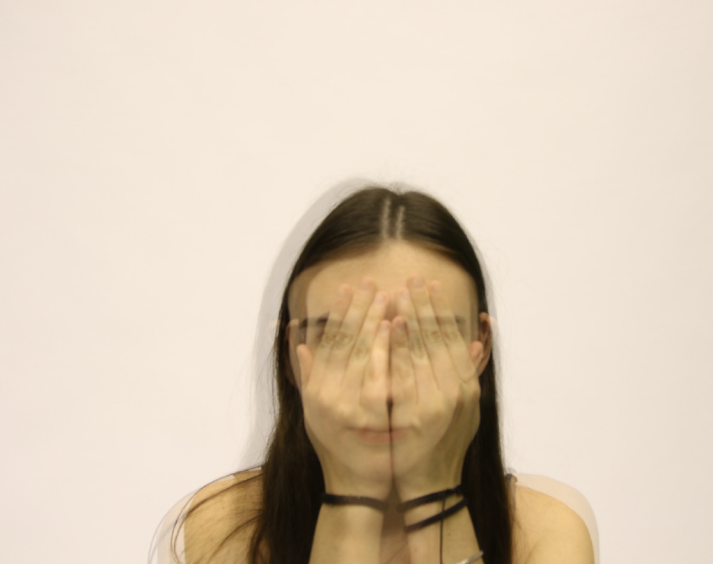
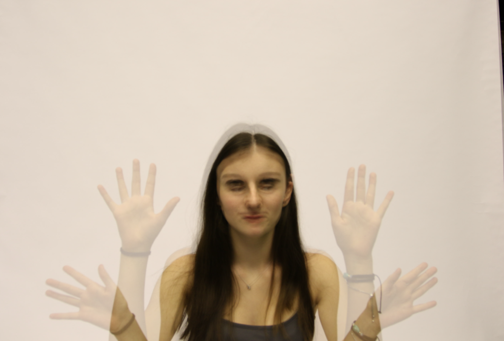
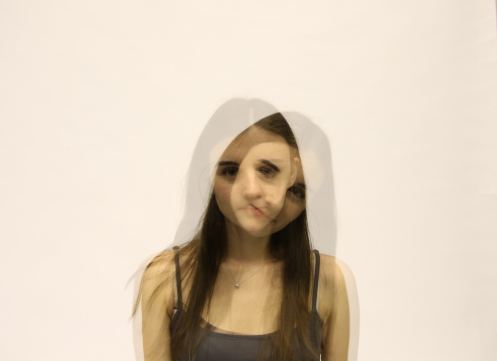
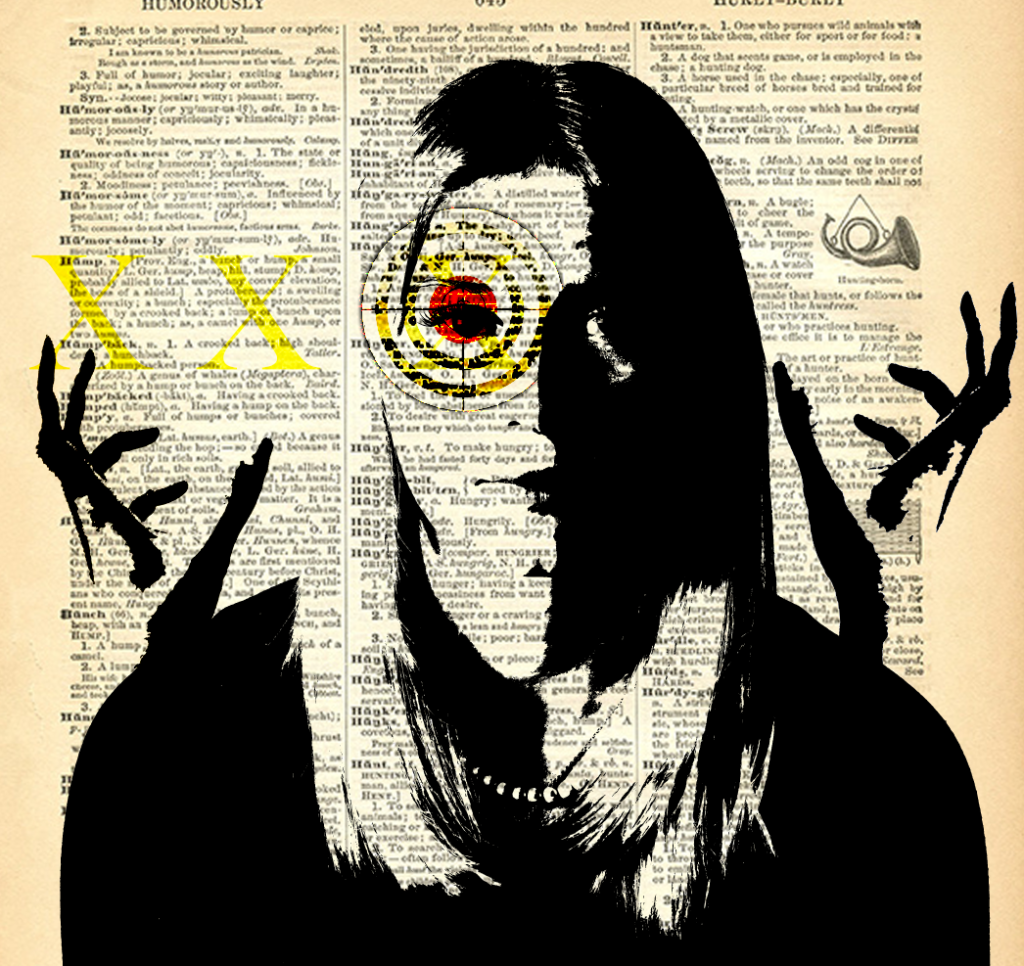
Experimenting with Photoshop:
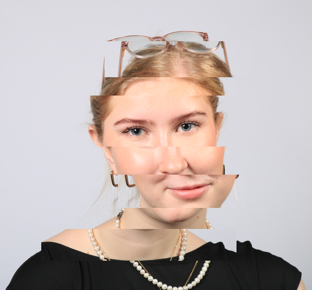
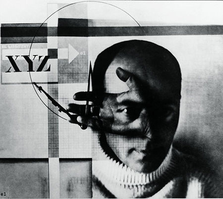
Inspiration: El Lissitzky
El Lissitzky is a Russian artist, architect, and graphic designer, that was closely involved in the Russian avant-garde movement. His photomontages combine photography, graphic design, and typographic elements to create strong, political layered images.
The Image I used as inspiration:
My Image
Final Images
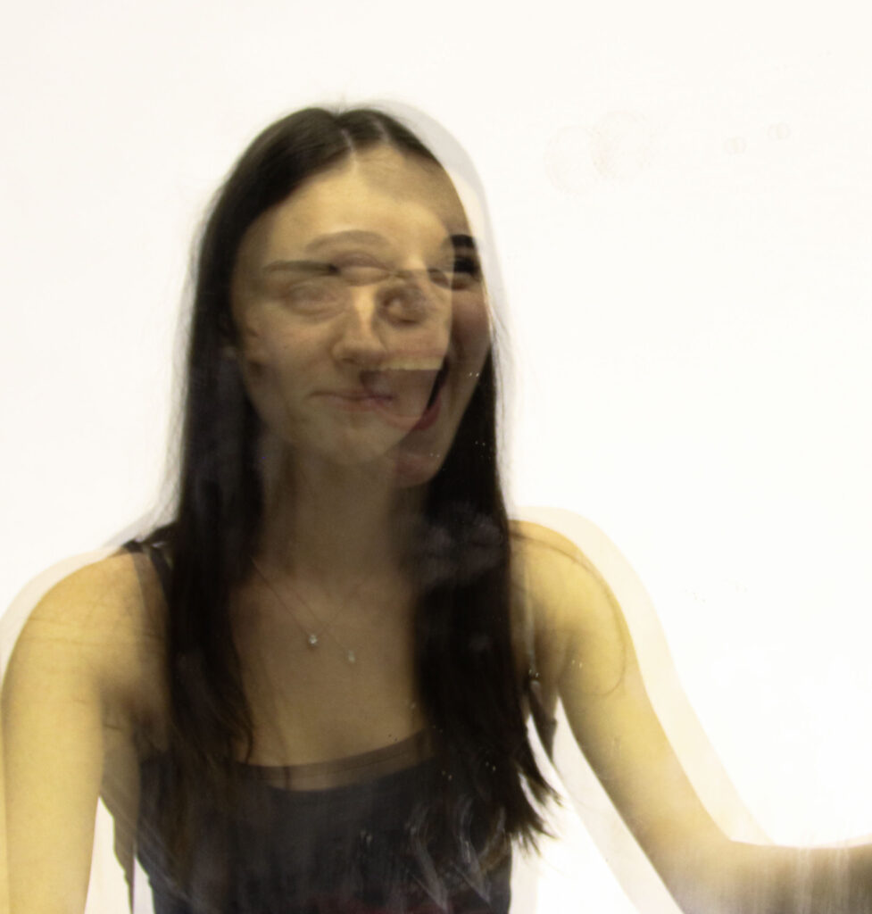
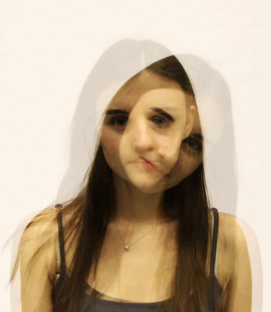
Chosen Images and Layout
