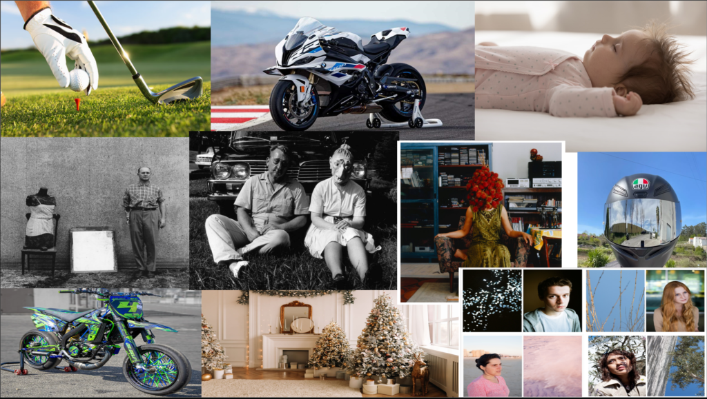
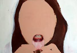
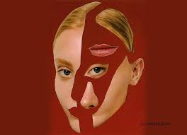
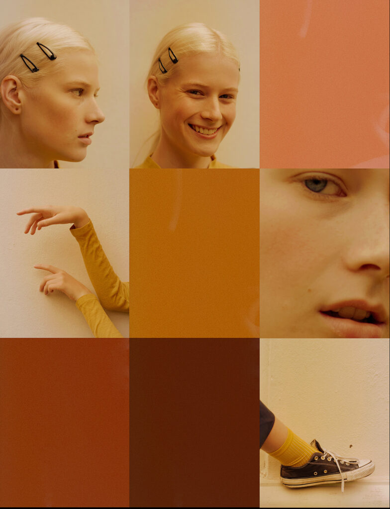
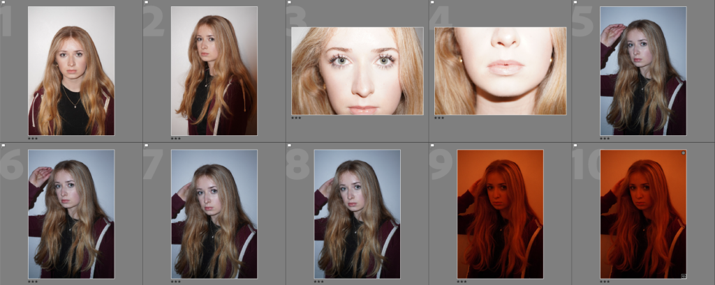
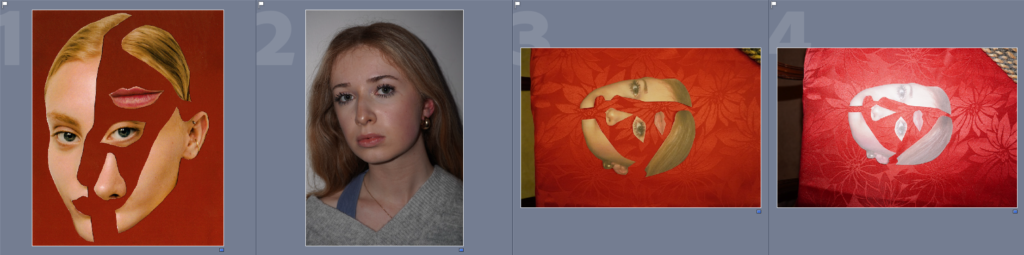
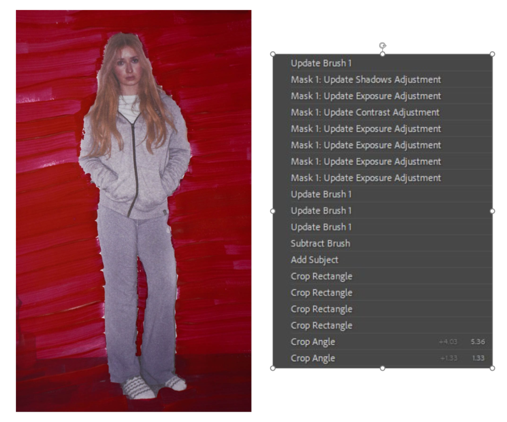
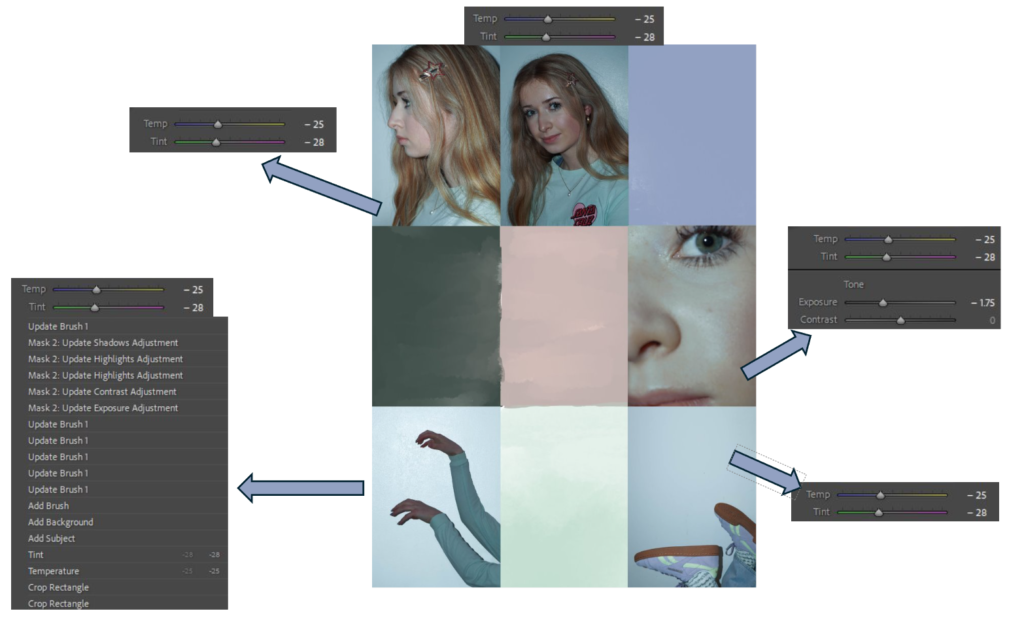
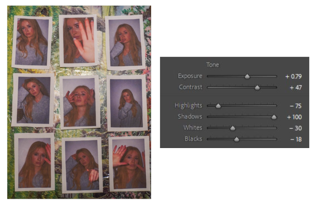
I will be trying to combine these two mood boards as I am inspired by the way Ralph Eugene Meatyard masks identity and Cerises Doucedes successful presentation of people in their own environment and thoughts
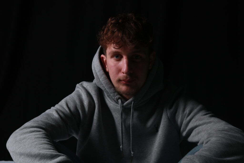
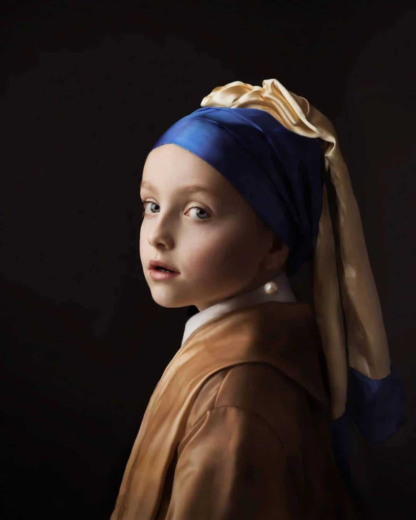
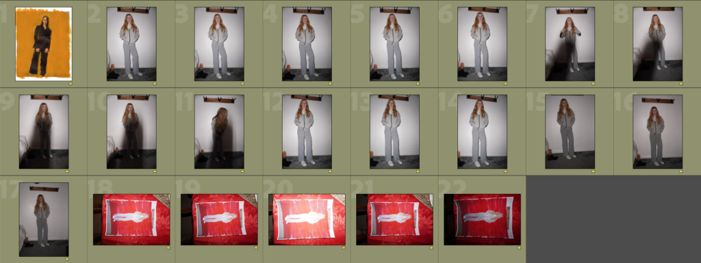
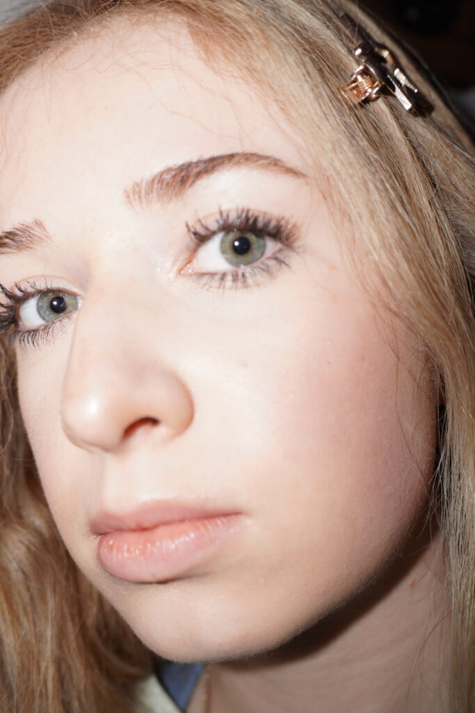
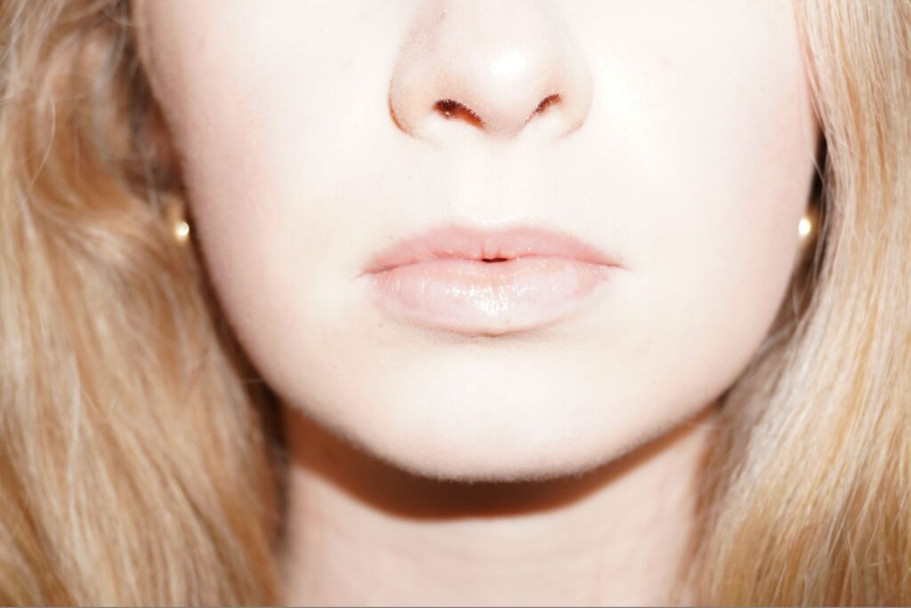
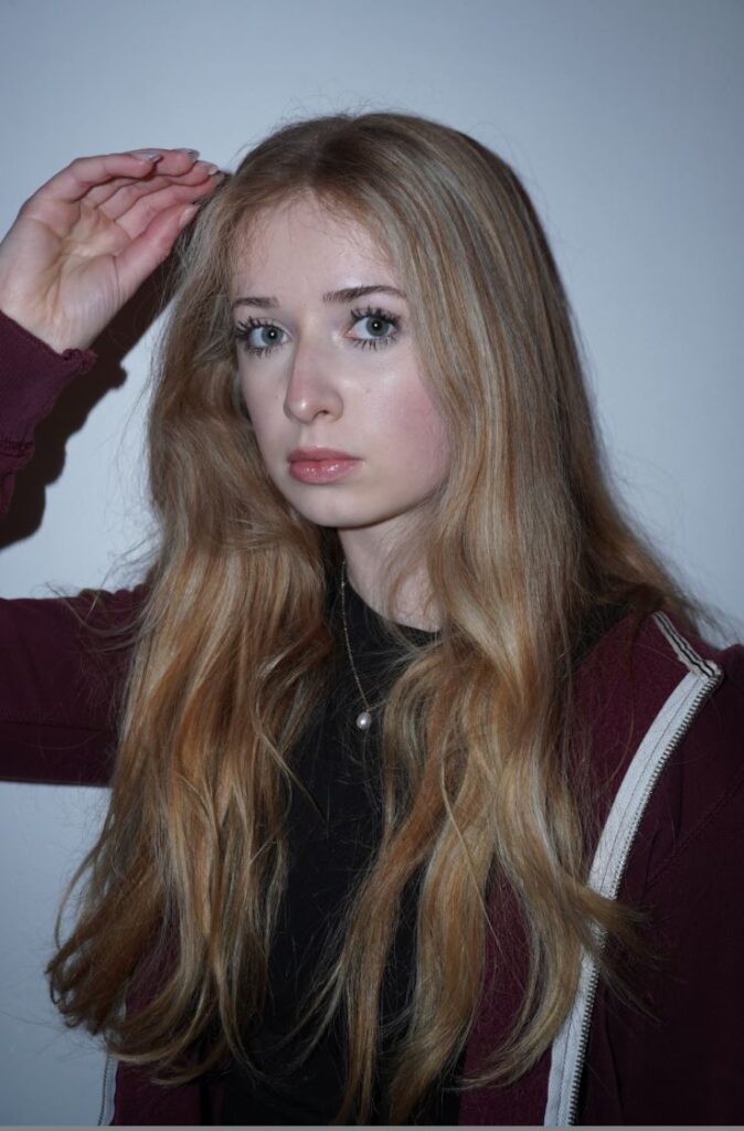
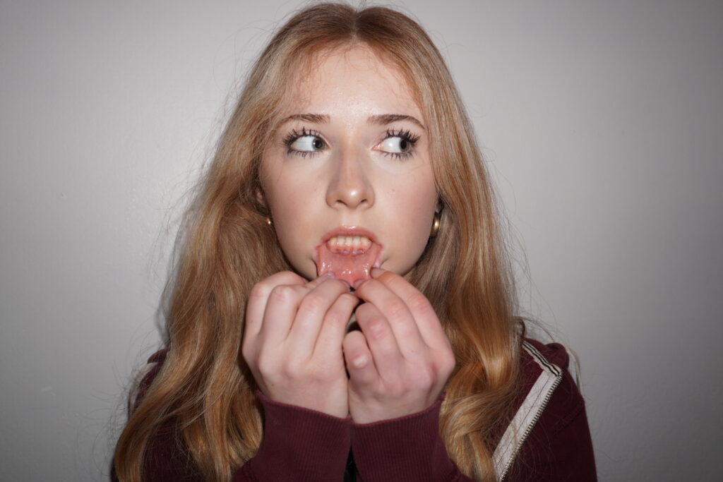
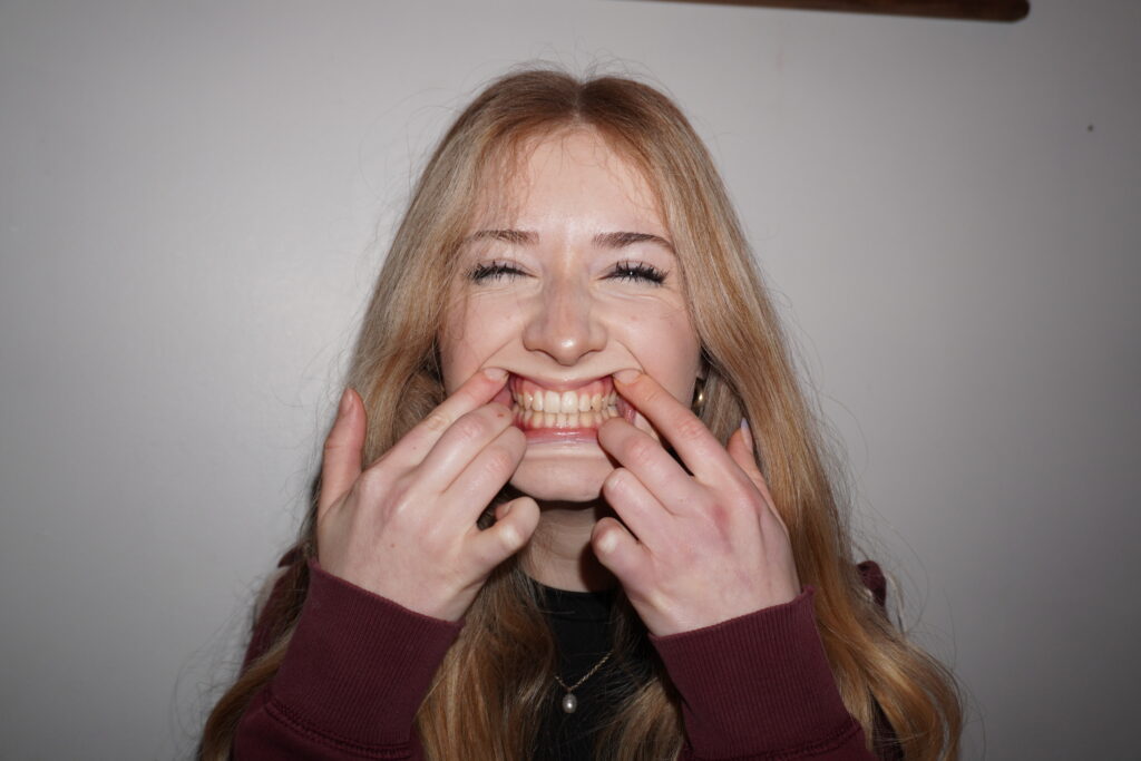
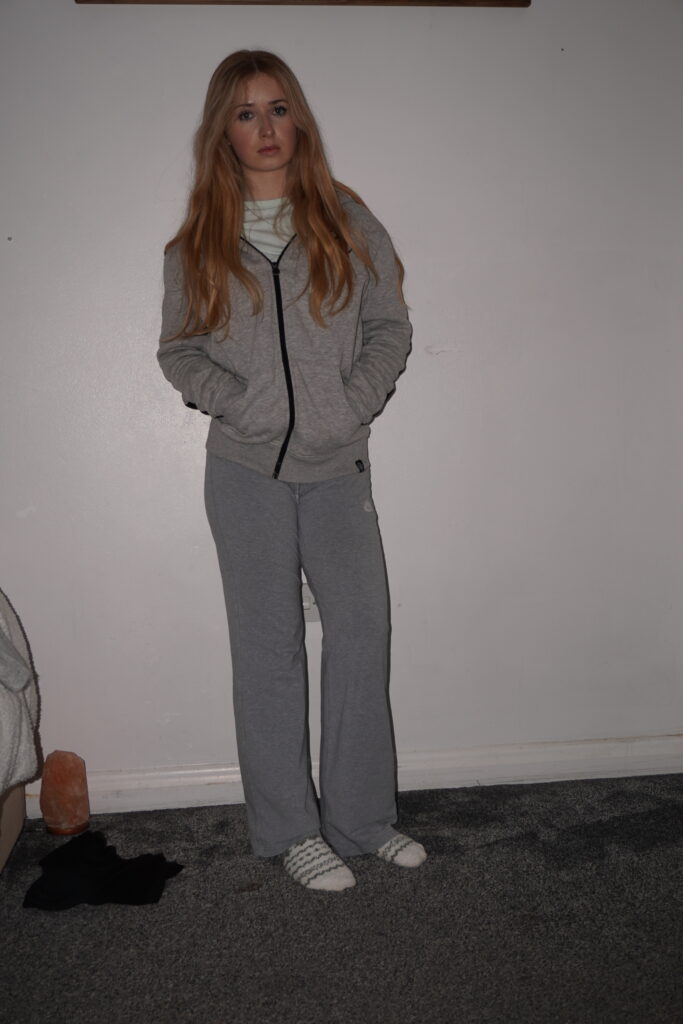
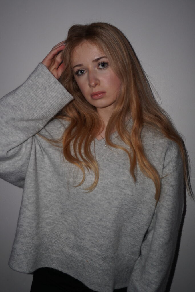
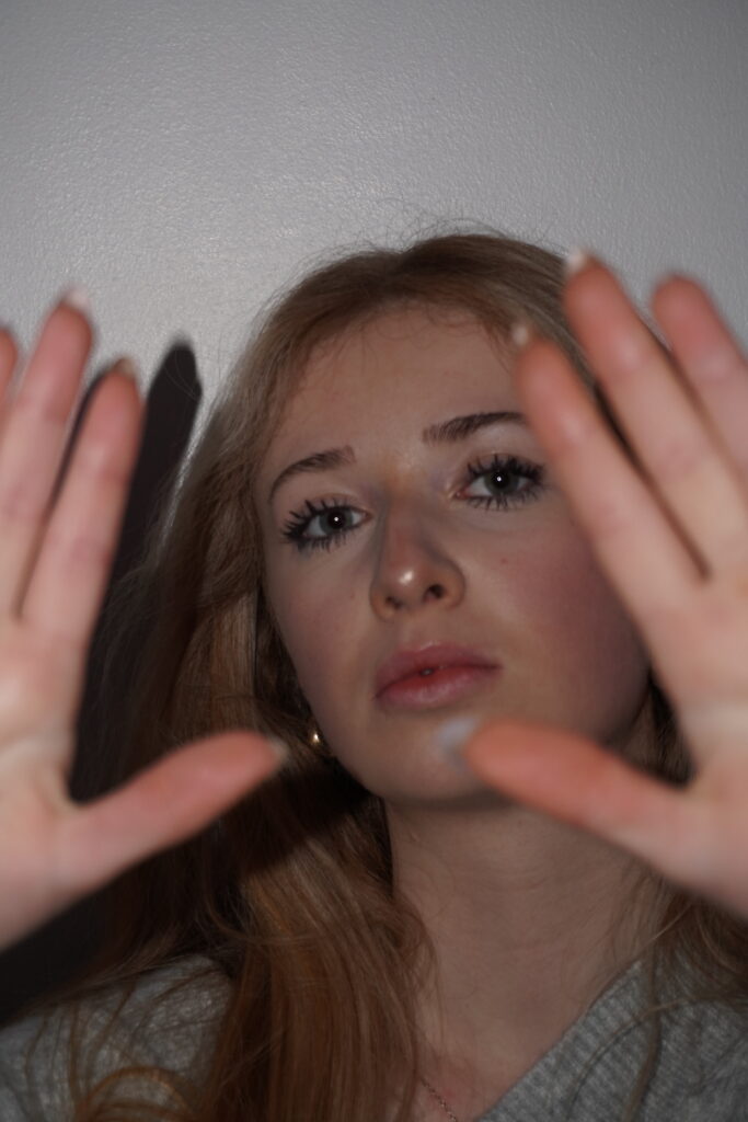
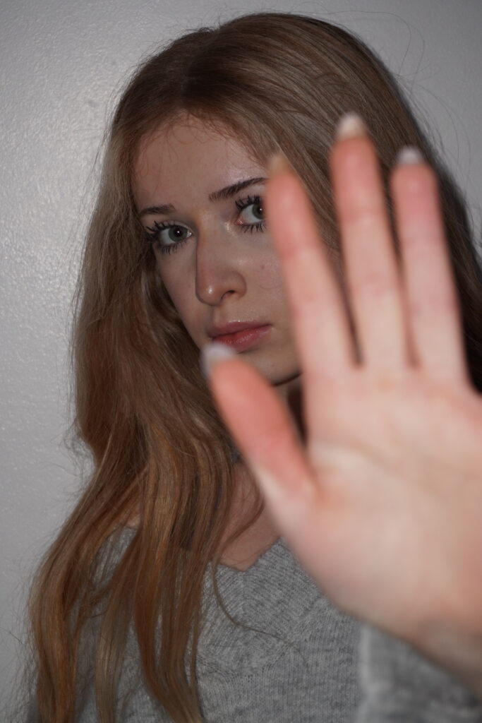
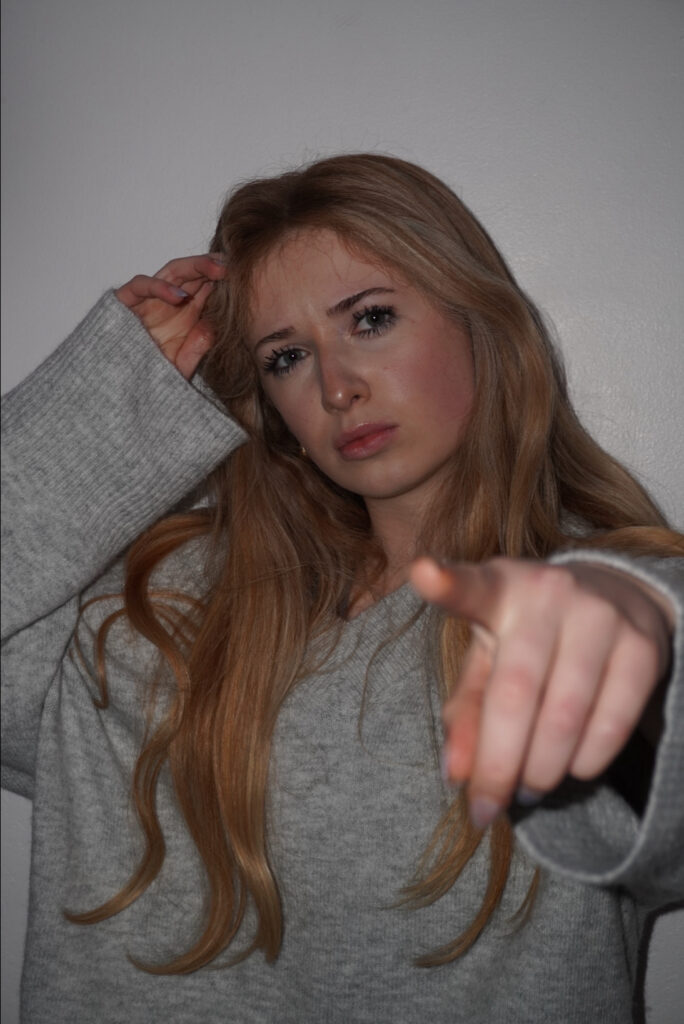
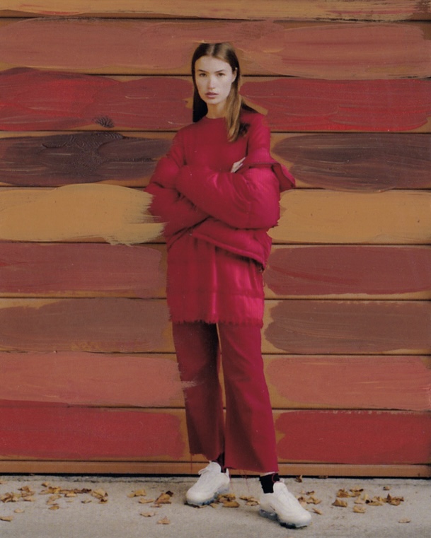
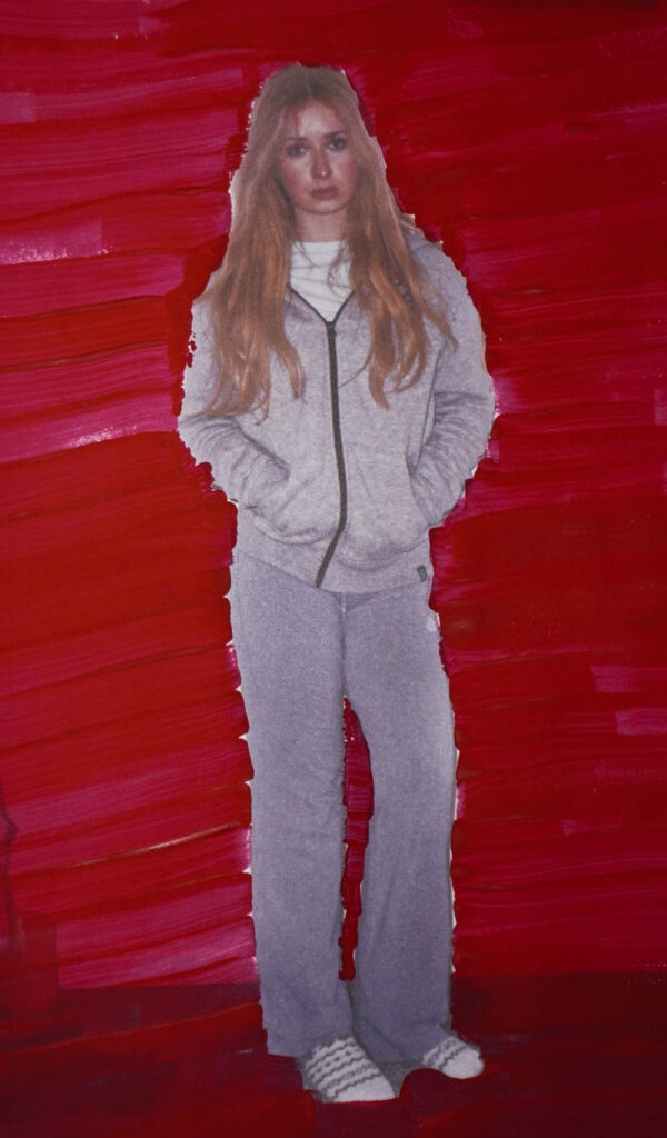
In my photoshoot I will try to focus on the binary opposites of masculinity and femininity and try to create a powerful narrative, by mixing clothing and accessories traditionally associated with each gender—such as pairing a tailored suit with delicate lace details or a soft dress with structured, bold accessories. Lighting can enhance the contrasts as well—using harsh lighting to accentuate strength and softer lighting to bring out vulnerability or softness. Split lighting, where one side of the subject is in shadow and the other is illuminated, can visually symbolize the opposing forces. For composition, I might place the masculine and feminine elements on opposite sides of the frame or use reflective surfaces like mirrors to show both sides of the subject’s identity. Props associated with each gender, such as boots or ties alongside flowers or jewelry, will deepen the symbolism, and playing with contrasting colours can further strengthen the mood. This approach will create a visual dialogue between masculinity and femininity, inviting the viewer to explore and interpret the boundaries between them.
An environmental portrait is a style of photography that captures a subject in a setting that reveals something about their personality, profession, or life. Unlike traditional studio portraits that isolate the subject, environmental portraits use the surroundings to add context and depth, making the image more storytelling and meaningful. For instance, a chef might be photographed in a busy kitchen, an artist in their studio surrounded by their tools, or a musician with their instrument in a performance space.
Mood board and definitions
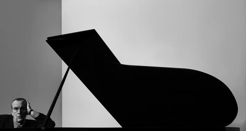
This style allows the setting to complement and enhance the subject’s identity. Arnold Newman, a master of this approach, often used environments to highlight his subjects’ essence. One of his most famous works is a portrait of composer Igor Stravinsky, where the placement of a grand piano becomes an integral part of the composition, emphasizing Stravinsky’s connection to music and creativity.
Image Analysis:
Visual:
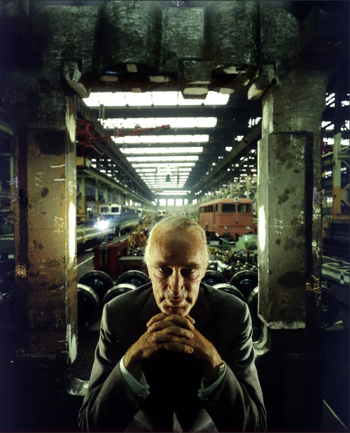
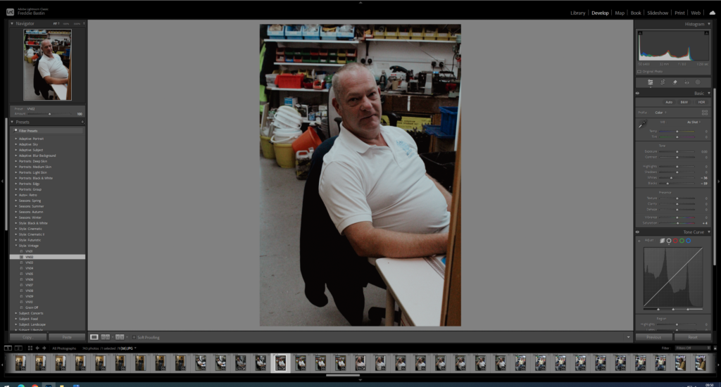
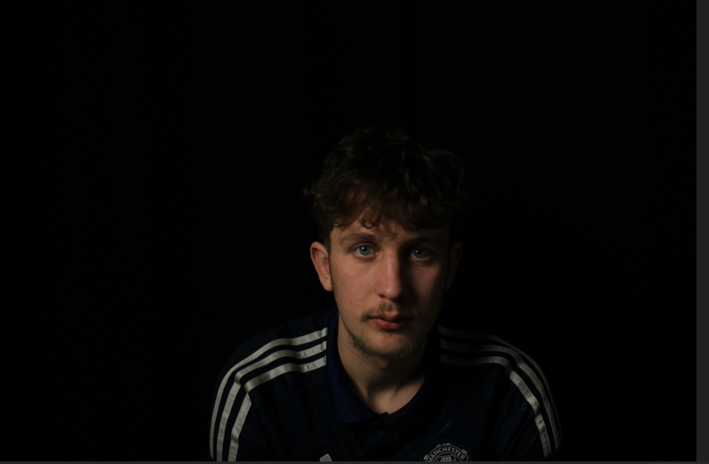
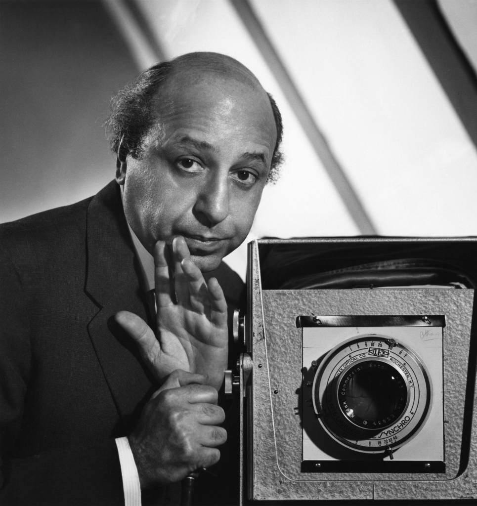
The lighting in this image appears artificial, casting strong contrasts on Krupp’s face. The shadows darken his features, making him look more sinister and intensifying his presence. This dramatic effect exaggerates the eerie atmosphere, reinforcing his infamous reputation.
The aperture seems to be set at a medium level, as the background has a slight blur while the foreground remains sharp. This keeps the focus on Krupp while still allowing the industrial setting to be recognizable.
A fast shutter speed is likely used, ensuring that the foreground is crisp and well-defined. The image has a balanced exposure, with highlights and shadows carefully controlled to enhance depth and drama.
The angle is eye level, positioning the viewer directly opposite Krupp. This perspective creates an unsettling confrontation, heightened by his piercing eye contact. His pose—leaning forward with clasped hands—evokes a sense of power, control, and even menace. This composition was intentional, as photographer Arnold Newman, a Jewish man, strongly disapproved of Krupp’s past, particularly his use of slave labour and connections to Nazi war crimes.
Krupp is the main focal point, positioned towards the lower center of the frame, and is visually framed by concrete pillars. This setting reinforces his dominance, as if he owns or controls the industrial background.
Leading lines guide the viewer’s eye toward his face. The top of the image and the receding lights in the center middle create depth while drawing focus to his portrait.
The balance in the image is striking—light at the top contrasts with the darkness below, creating a visual harmony while reinforcing the sinister mood. The strong contrast between highlights and shadows exaggerates his intimidating presence, making the atmosphere even more oppressive.
Contextual:
Arnold Newman was a photographer known for changing the way portraits tell a story. Instead of taking traditional headshots, he put people in settings that revealed something essential about their work or personality. He believed that where you see a person can be as telling as their expression or pose. This approach is called environmental portraiture, and it’s something he became famous for.
One of his best-known photos is of the composer Igor Stravinsky, who he positioned next to a grand piano, making it almost as much a part of the photo as Stravinsky himself. This creative choice highlighted Stravinsky’s life in music without needing words, and it became an iconic example of how to use an environment to enhance a portrait.
Newman’s work stands out because of his dramatic compositions and his use of natural or available light, which gave his photos an honest, timeless quality. He carefully considered each element in the frame, often using strong shapes and lines to make his portraits feel like more than just pictures. they felt like small stories. His subjects were often artists, musicians, writers, and political figures, including famous people like Pablo Picasso, John F. Kennedy, and Salvador Dalí.
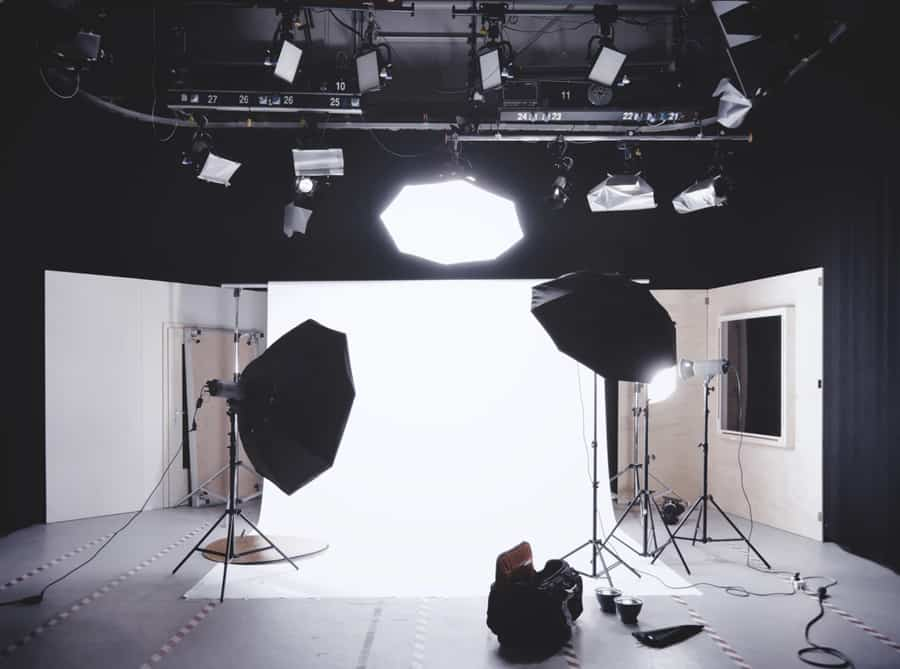
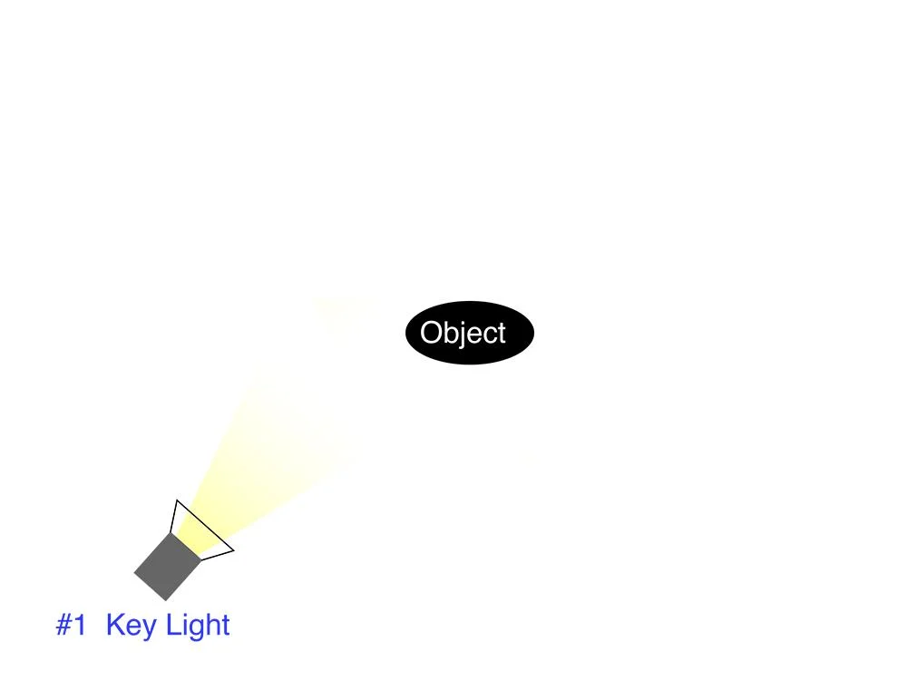
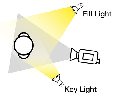
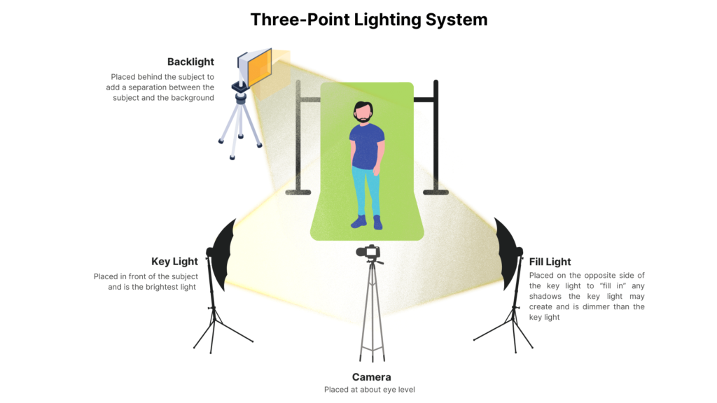
Studio lighting in photography refers to the use of artificial lighting setups within a controlled indoor environment to create high-quality and consistent images. It allows photographers to manipulate light and shadow to highlight their subject effectively and achieve a specific mood or style. A typical studio lighting setup includes a key light, the main light source that illuminates the subject, and a fill light to reduce harsh shadows. Backlights or rim lights can be added to separate the subject from the background and create depth.
How come we use studio lighting?
Studio lighting is used in photography to give precise control over the light in a scene. Unlike natural light, which can be inconsistent and unpredictable, studio lighting ensures reliable and steady lighting, making it ideal for professional-quality images. It allows us to shape and direct the light to achieve specific visual effects, such as softening shadows, emphasizing textures, or creating dramatic highlights. By using tools like reflectors, and diffusers, photographers can manipulate the light to suit their creative vision. Additionally, it offers complete control over background lighting, helping to create depth or separation between the subject and the backdrop. Overall, studio lighting provides the consistency, flexibility, and control needed to achieve polished and professional results, regardless of external conditions.
This is a set up of the lighting used in a studio. As you can see there are multiple different lights facing in different directions
What is the difference between 1 2 and 3 point lighting and what does each technique provide/solve?
1-Point, 2-Point, and 3-Point Lighting are essential lighting setups used in photography and filmmaking, each offering different effects and solutions.
1-Point Lighting uses a single light source, typically placed in front or to the side of the subject. This setup creates high contrast with deep shadows, giving a dramatic, moody look. It’s simple to set up and effective for portraits, but can result in flatness without fill light.
2-Point Lighting adds a second light, usually a backlight or rim light, placed behind the subject. This creates separation from the background and adds depth by outlining the subject. It’s great for dramatic effects, mystery, and defining edges but still relies on the main key light for illumination.
3-Point Lighting is the most common and balanced setup, consisting of a key light, fill light, and backlight. The key light provides the main illumination, the fill light softens shadows, and the backlight adds depth, helping the subject stand out from the background. This setup is versatile and used for flattering, natural looks in interviews, portraits, and narrative scenes.
Each technique addresses specific needs like mood, clarity, or depth, helping to shape the subject and the overall visual effect.
Rembrandt Lighting
What is Rembrandt lighting?
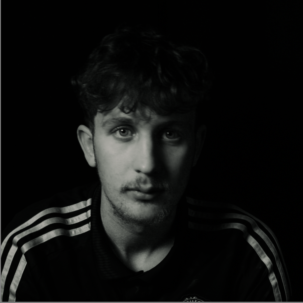
Rembrandt lighting is a dramatic and classic photography technique named after the Dutch painter Rembrandt, known for his use of light and shadow. It is characterized by a small, triangular patch of light on the shadowed cheek, achieved by positioning the light at a 45-degree angle to the subject and slightly above their eye level. This technique creates a striking contrast between light and shadow, adding depth and dimension to portraits. Typically, it involves a single light source, though subtle fill light can soften shadows if desired. Rembrandt lighting is widely used to create mood and emphasize facial features in portrait photography.
This is my most successful image that represents Rembrandt lighting, it does this as we can see a upside down triangle placed just below the models eye on the left of the picture
After developing this picture in photoshop this is my final image
Before :
After:
Butterfly lighting
How can butterfly lighting be described?
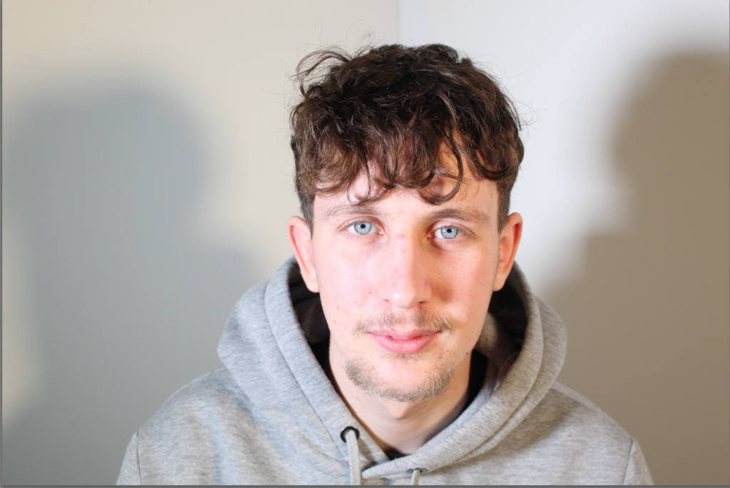
Butterfly lighting is a popular portrait photography technique named for the butterfly-shaped shadow it creates under the model’s nose. Achieved by positioning the light source directly in front of the subject, slightly above eye level and angled downward, it provides a soft, even illumination that highlights cheekbones and smooths facial features. This symmetrical lighting is especially flattering for beauty and glamour photography, creating a polished and professional look. We placed a reflector under the model’s face which eliminates the shadows under the model’s chin
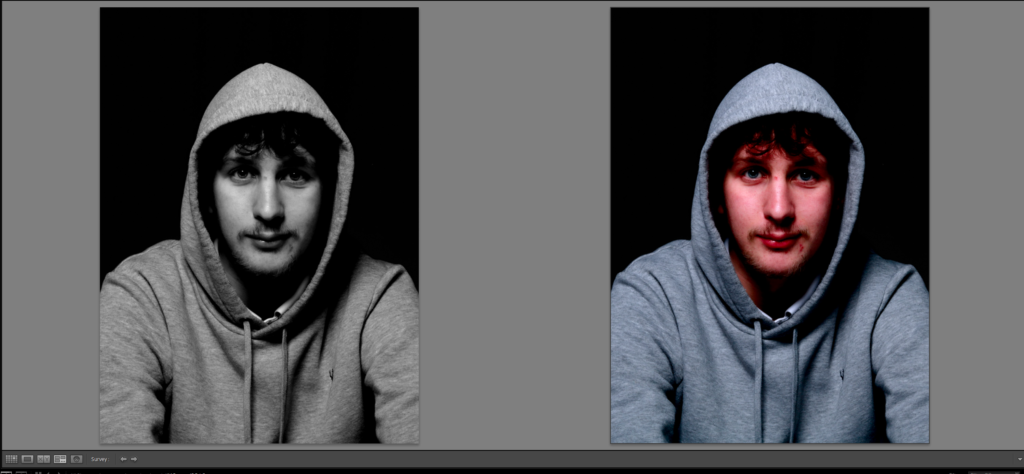
In Lightroom I have developed this as it has enhanced the models skin making his skin smoother, this adds to the picture as the shadows darken under his nose.
This is a comparison of the picture before and after I imported it into Lightroom and edited it.
I personally prefer the black and white one as it puts emphasises on the shadows on his face.
Fill lighting
Why do we use it?
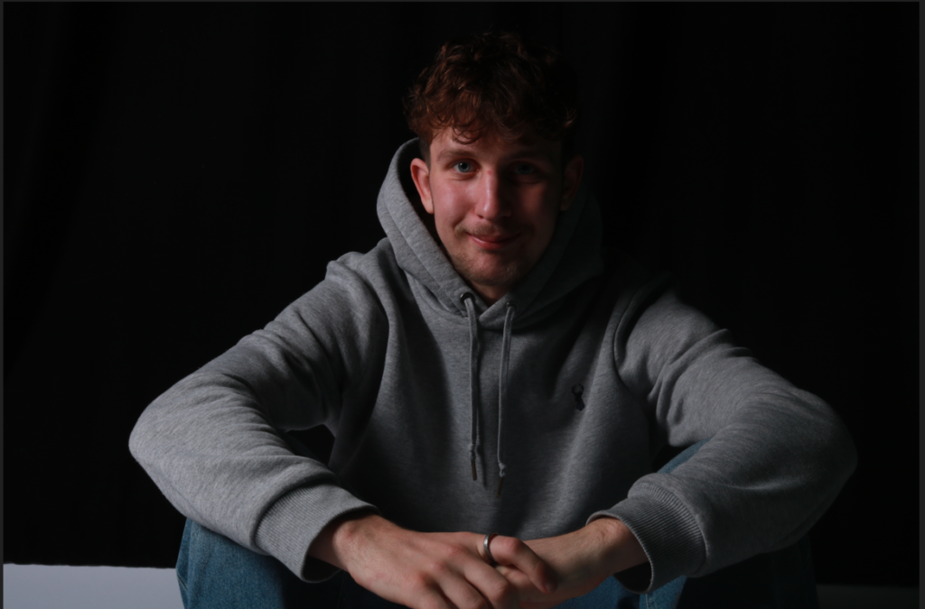
Fill lighting reduces shadows created by the primary light, also known as the key light. Its primary purpose is to soften harsh contrasts and ensure that details in shadowed areas are visible, creating a more balanced and visually appealing image. By lightening the darker parts of a scene without overpowering the key light, fill lighting helps to enhance details that might otherwise be lost in shadows. It also plays a significant role in setting the mood of a photograph. For instance, a subtle fill light can maintain a dramatic look with deeper shadows, while stronger fill lighting can create a more evenly lit and neutral appearance.
An example:
My Example:
To improve my image I should of put the light closer on the right hand side to eliminate slight shade.
Chiaroscuro
Chiaroscuro lighting is a way of using strong contrasts between light and shadow to create a bold, dramatic look. It helps add depth, dimension, and mood to an image or scene. The term comes from Italian, meaning “bright-dark,” and was made popular by artists like Caravaggio and Rembrandt during the Renaissance. It’s still a go-to technique in photography, film, and art for drawing attention to specific details, creating a three-dimensional feel, or setting the tone of a story. It’s all about using light and dark in creative ways to make visuals more striking.
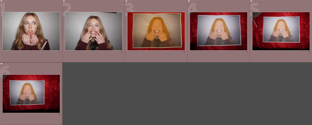
Tableau photography is a style of photography that involves carefully staged scenes that resemble a theatrical tableau, painting, or cinematic still. The term “tableau” refers to the creation of highly composed and deliberate photographic narratives.
Key Characteristics of Tableau Photography:
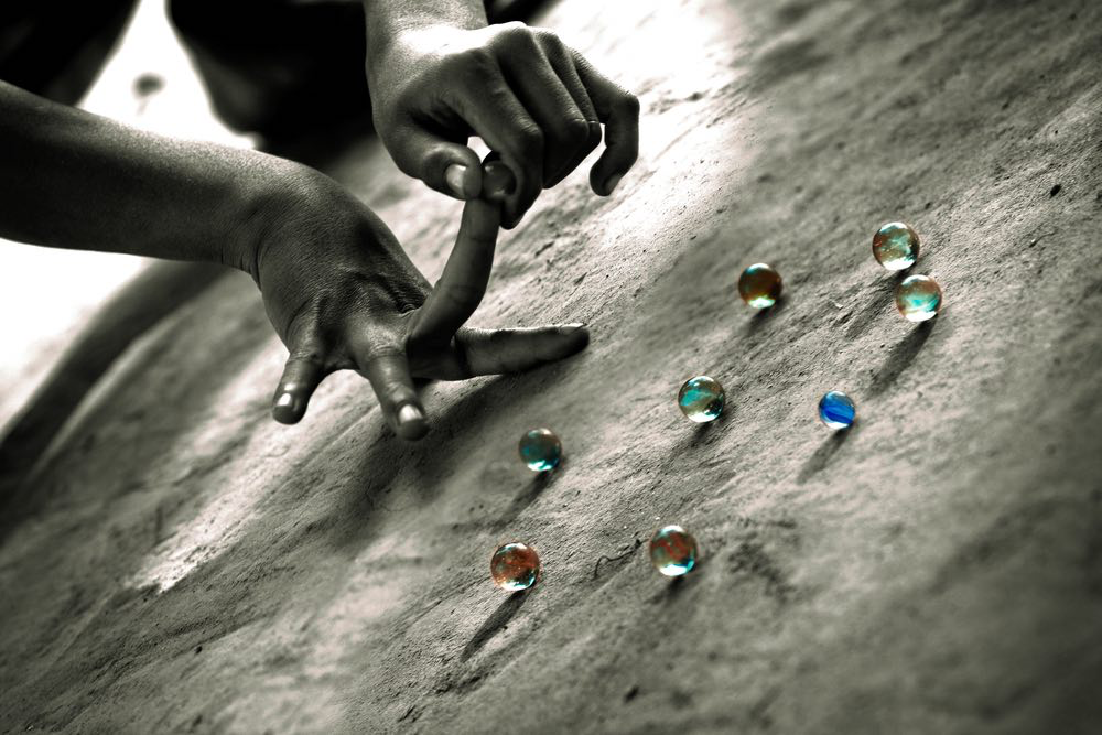
Narrative Focus: Tableau photographs often tell a story or suggest a larger narrative, leaving room for the viewer’s interpretation. A good example of this is some of Cindy Sherman’s work that I have already looked at. These are commonly studied and popular as each person that sees it, views it in a different light and from different perspectives
This picture is a good example of the use of narrative focus as you do not know what this hand is aiming to achieve but you can annotate it and compare with someone else and the annotations might be completely opposite.
For example I would talk about how this seems to be a child’s hand and how they value their marbles as they are portrayed in colour whilst the rest of the picture is in black and white. Furthermore this could also portray a sense of what this child finds fun as the colour could represent what brings the child joy. You could also go on to talk about the hard concrete floor that could be that of a car park or a neglected street. Then this brings in a factor of juxtaposition as a child is seen to be something to nurture and to take time and care over and in contrast a cold old floor.
This is just an example and shows how you can keep building on annotations and why this is a good type of photography.
Staged Composition:
Staged Composition refers to the layout of the entire shot; staging is the arrangement of objects and characters within the frame. Good composition and staging are key ingredients in any compelling professional image. The scenes are purposely arranged, with careful attention to lighting, props, costumes, and setting. They often mimic theatrical or cinematic techniques.
Painterly Aesthetic:
Many tableau photographers are inspired by the composition and lighting of classical paintings, creating works that resemble fine art.
The painterly aesthetic in photography is all about creating images that feel more like paintings than typical photographs. It focuses on mood, texture, and emotion rather than sharp details or realism. Photographers who go for this style often use soft lighting, blurred edges, and rich tones to give their work a dreamy, artistic feel. Sometimes, it’s about mimicking the look of old paintings, like those from the Impressionist or Romantic periods, with a focus on storytelling and atmosphere. It’s a way to turn photography into something more expressive and timeless, where the image feels carefully crafted, like a piece of art.
Symbolism:
Symbolism in tableau photography helps tell a deeper story through objects, colours, and body language. An apple might suggest temptation, a mirror could hint at self-reflection, and a clock can represent time slipping away. Colours set the mood for example: red for passion or danger, blue for sadness or calm, and black for mystery. Even the way people pose matters; looking away might suggest secrecy, while standing tall can show confidence. All these details work together to create images that make you think and feel something beyond what’s just in the frame.
A good example this picture taken by Cindy Sherman as the audience can look at it and pick out the finer detail
Jeff Wall
Jeff Wall is a Canadian photographer known for creating large, carefully staged images that feel like scenes from a movie or a painting. His photos might look like real moments, but they’re actually planned down to the smallest detail, sometimes taking months to complete. He often uses symbolism to suggest deeper meanings, drawing inspiration from art, literature, and everyday life.
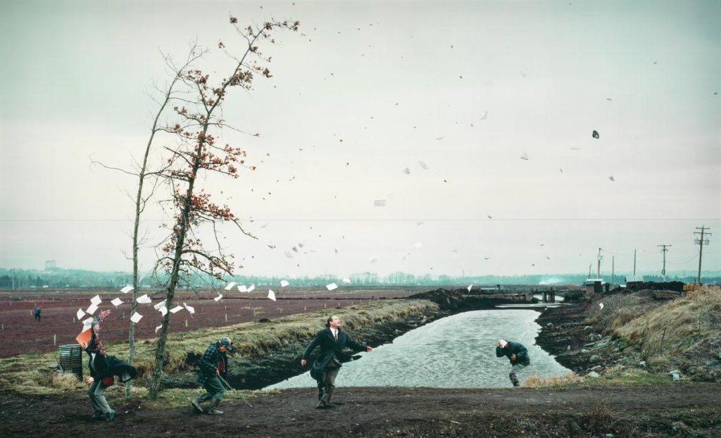
One of his most famous photos, A Sudden Gust Of Wind (1993), shows four people outside as papers fly through the air, caught in an invisible gust. It’s inspired by a Japanese woodblock print by Hokusai, and the flying papers can symbolize lost ideas, sudden change, or the chaos of life. The whole scene looks natural but was actually pieced together from multiple shots to get the perfect effect.
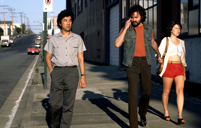
Wall plays with the idea of reality and fiction. His 1978 photo Mimic looks like a documentary-style street shot but was staged to highlight racial tension.
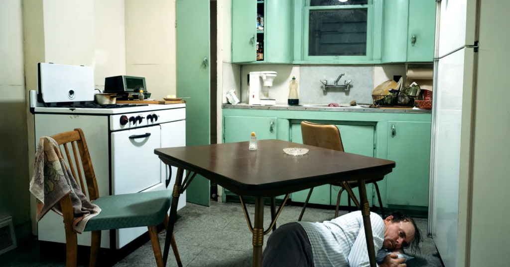
In Insomnia (1994), a man sprawled on a kitchen floor creates an eerie, unsettling scene that could suggest exhaustion, mental struggle, or something more mysterious.
What makes Wall’s work so powerful is how it pulls you in. At first glance, his images seem like everyday moments, but the more you look, the more details emerge, making you question what’s really happening beneath the surface.
Yousuf Karsh was born on the 23rd December 1908 in Mardin, American Turkey and dies on July 13th 2002 in Boston, Massachusetts). Yousuf was the most known and greatest portrait photographer of the 20th century. Karsh photographed famous men and women of politics , Hollywood, and the arts, from Albert Einstein, Sir Winston Churchill to Walt Disney and Audrey Hepburn. Throughout most of his career he used the 8×10 bellows Calumet ( 1997.o318) camera. Now a days his work is held in the collection of the National Gallery of Canada, The Museum of Modern Art in New York, The National Portrait Gallery in London, among many others. The last print of Karsh was sold for $42,5000.00.
Analysis
Visual
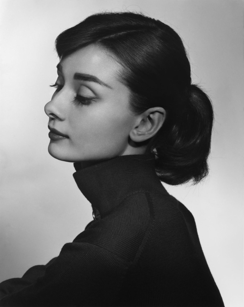
This image is a portrait of Audrey Hepburn, she is waring a black turtle neck, and her hair is up in a high ponytail, She is looking to the side showing her side profile. The image is in black and white which makes sense since this image was taken in 1956.
“The French novelist Colette picked her out of a ballet line-up to play Gigi on stage, and her career was launched. When I photographed her in Hollywood and commented on her quality of sophisticated vulnerability, she told me of her harrowing experiences during the Second World War. Years later, in the Kremlin, Chairman Brezhnev agreed to sit for me only if I made him as beautiful as Audrey Hepburn.”
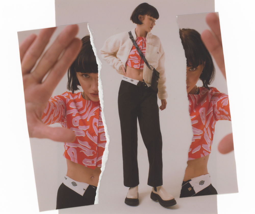
From this variety I decided to have a go at trying to take photos how Rosanna Jones did. She normally does a lot of physical work as well as digital. This allowed me to get creative both ways when having to work out what to do.
These are the images I chose to recreate digitally and physically.
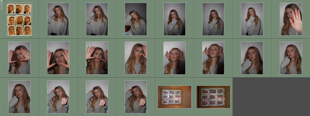
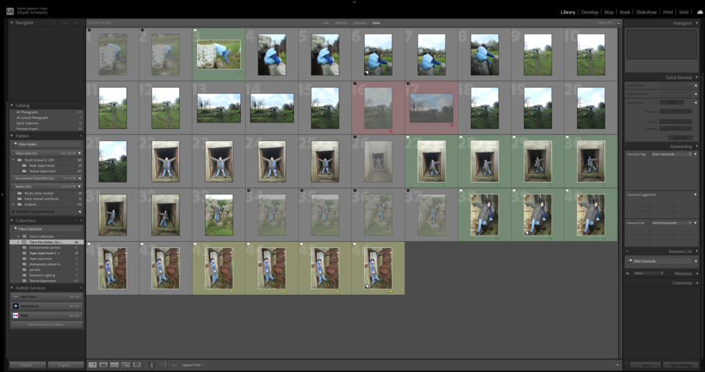
For this photoshoot I was able to get a range of images with different outfits, poses and lighting. At home I designed and created physical copies decided to recreate some of her iconic images. I then categorised it further into to colour and rating
I managed to categorise it by the starring it and colour coding it. I was then able to put the images I’m replicating in the same category to make it easier for myself when I’m editing digitally.
As you can see above I pressed P to keep the images I wanted to use for my final photos. I used X to get rid of the images I didn’t wanted to use for the future. Then I gave a rating for the images, they all had a rating out of 5.The images with 4 and 5 stars are the images I wanted to use for my final photos. The photos I didn’t like I rated 1-3 stars. Finally I gave them the colour yellow or green, green being the best and yellow being average. Red was for the photos that didn’t work out. I will edit the images so I will present final photos.
Photos I Didn’t Like From Photoshoot N01
Photo N01
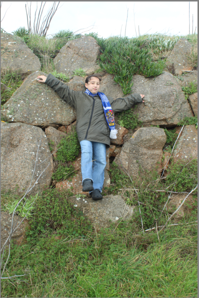
I didn’t like this photo due to not having a neutral facial expression, this feature ruined the photo and hasn’t really replicated Clare Rae’s environment and it wasn’t taken with the right pose. This pose has ruined the real meaning of the photo and doesn’t replicate what Clare Rae took. This is a facial expression that Clare Rae wouldn’t use in her photos, so it will ruin the photo.
Photo N02
I also didn’t like this photo due to the subject not being positioned properly in the middle and the rule of thirds wasn’t used to scale this photo.
Another reason why I don’t like this photo is due to lots of negative space. In Clare Rae’s photos she doesn’t really show negative space. This is only present in some photos, she has taken. Instead Clare Rae does close up shots from different angles.
Also in the background where the trees are they are overexposed, which means means there was to much light in the photo and Clare Rae doesn’t use this in her photos. By the image being overexposed it will limit the detail that is present in the photo and will reduce any opportunity for shadowing or any noticeable highlights in the image. It give the image a very poor quality.
Photo N03
I didn’t like this photo due to the angle. This photo wasn’t framed correctly so a good photo wasn’t executed. In Clare Rae’s photos her framing is taken on a tripod which will allow no movement the camera will the photo is being taken. Also Rae’s photos where taken with a straight-on angle. By having the photo at this angle means that some of the photo is cut out and gets rid of the important features that are present.
Also this image is overexposed as well. Overexposure is where there is too much lighting hitting the film or ,in a digital camera or a sensor. Overexposed photos are too bright, have very little detail in their highlights, and appear washed out and have lots of blurriness present. It would also give the image a very poor quality.
Image Selection For Photoshoot N02
This is going to be used to decide My Final Photos.
The photos flagged or selected green is what I’m to develop and use as my final photos. I chose these because they have the perfect lighting and are a perfect replication of Clare Rae’s photos. The photos coloured red or yellow are ones I’m not going to use due to blurriness and to much sunlight, due to being too sunny.
Photos I Didn’t Like
Photo N01
I didn’t like this image due to being very overexposed in the top half of the image. Overexposure is where there is too much lighting hitting the film or ,in a digital camera or a sensor. Overexposed photos are too bright, have very little detail in their highlights, and appear washed out and have lots of blurriness present. It also give the image a poor quality.
There are also too much shadows in this image. In the image Rae did I only spotted one shadow in the image. shadows draw attention to a particular part of the image. This isn’t need in this photo due to the only part needing attention is the subject and the way its positioned.
Photo N02
Another reason why I didn’t like this photo is due to the blurriness. Even though the ISO was set at 100, the camera might of been on Auto Focus which will automatically adjust what’s happening of the camera. Clare Rae’s photo didn’t include blurriness which makes the photo more clear to see.
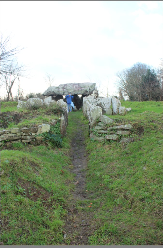
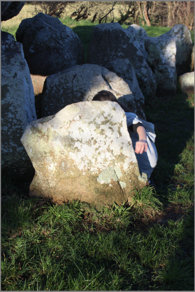
I didn’t like this photo due to the extra artificial light in this photo. This is why it has an overexposed quality in the background behind the Faldouet Dolmen (La Pouquelaye de Faldouet). By the photo being over exposed it means that the photo is too bright, has very little detail and the image will come out looking faded and of a poor quality.
Photo N03
I didn’t like this image because of the angle. This photo wasn’t framed correctly so a good photo wasn’t executed. In Clare Rae’s photos her framing is taken on a tripod which will allow no movement the camera will the photo is being taken. Also Rae’s photos where taken with a straight-on angle. By having the photo at this angle means that some of the photo is cut out and gets rid of the important features that are present.
I also didn’t like the subjects position due to the hand not being directly placed on the rock. This doesn’t replicate Clare Rae’s Image. By the hand not being on the rock it ruins the final image and it will become a failed photo.
Also Rae’s image has lots of negative space where as mine doesn’t, which means I haven’t scaled the photo correctly while taken it.
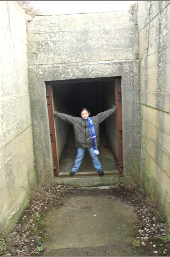
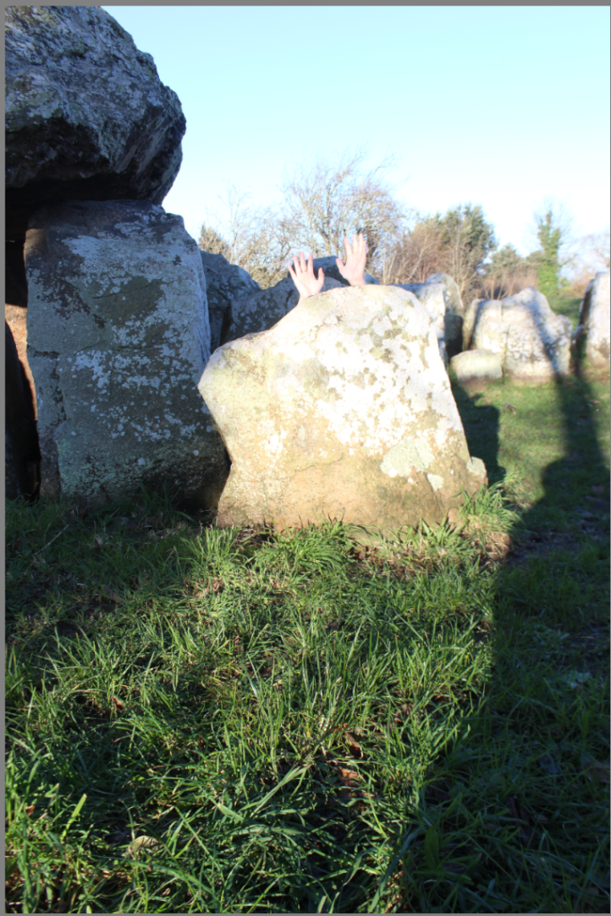
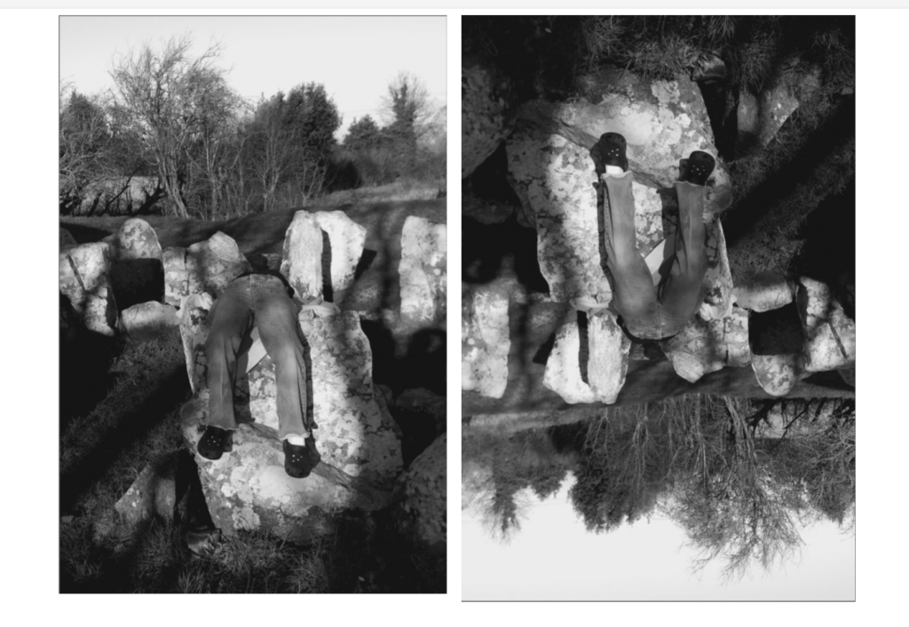
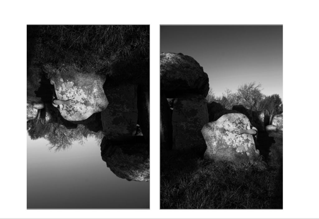
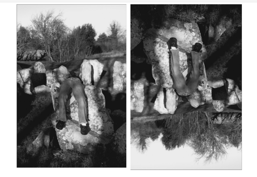
I like this image because it makes an upside down dolmen.
This is Idea 2
I like this idea because in the middle of the image this is where the top and the bottom of the rocks meet. This creates a pattern in both of the images.
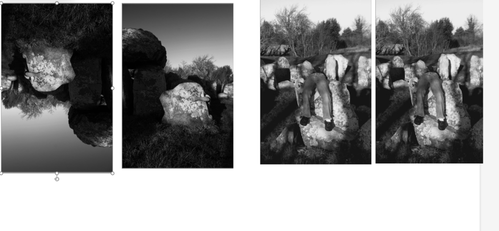
This is how I want to present my final photos.
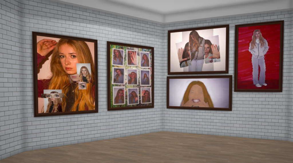
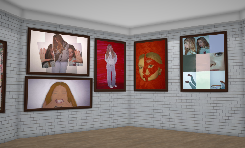
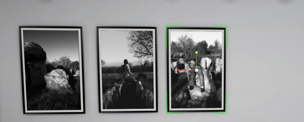
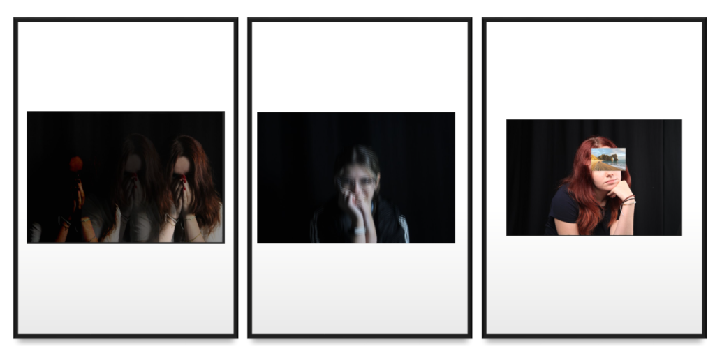
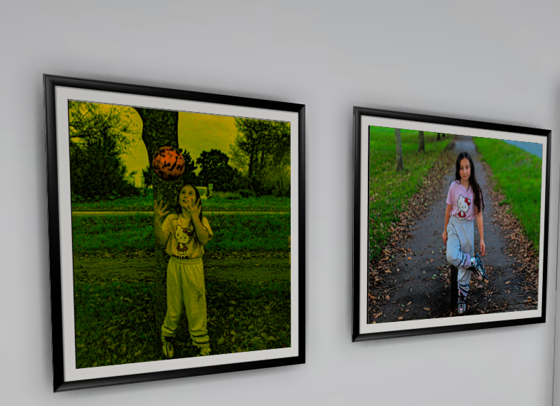
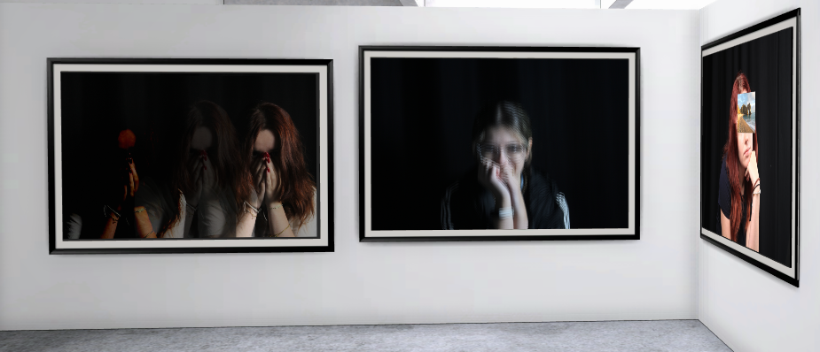
Virtual Gallery Presentation
I have presented these images like this with the same frames so they all look neat and tidy and these photos go together as well.
Portraits Final Images Presented
Best Images From Creative Portraits
I like these photos because they all have a unique feature about them and they are all in proportion.
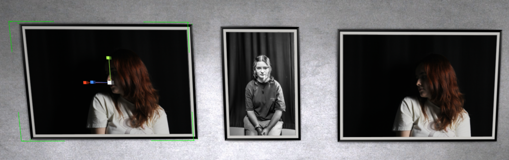
Best Images From Studio Portraits
I like images because they have no negative space and they aren’t blurry.
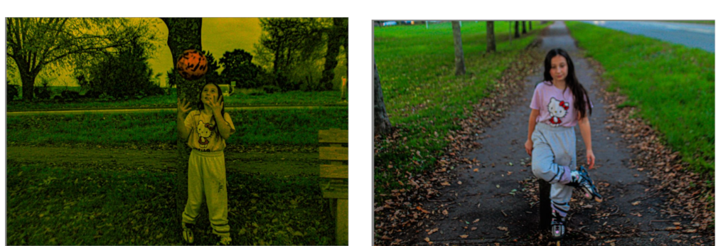
Best Images From Environmental Portraits
I like these photos because they represent two different sports in the outside environment. Both images look very nice next to each other.
Virtual Gallery for Environmental Portraits, Creative and Studio Portraits.
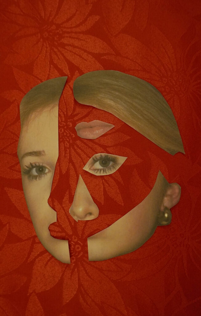
Identity refers to the sense of who humans are as individuals and as members of social groups. It also refers to the sense of how others may perceive and label themselves. Femininity is a set of attributes, behaviours and roles generally associated with women and girls. Femininity can be understood as socially constructed and there is also evidence that behaviours considered feminine are influenced by cultural factors. Masculinity is a concept that encompasses a range of behaviours, traits, roles and cultural meanings traditionally associated with being male. The term has evolved significantly over time from societal expectations, cultural narratives and individual identities. Identity can be shaped by the interplay between place and upbringing, influencing factors such as gender, culture, society, geography and politics. Gender identity can be shaped by societal norms while cultural identity often stems from geographical origins which may be disrupted by migration or displacement. Social identity emerges through community belonging but can be complicated by stereotypes or prejudices. A lack or loss of identity may result from alienation, creating disconnection from one‘s roots. Ultimately, identity is fluid, evolving through the dynamic interaction of personal experiences and external influences.
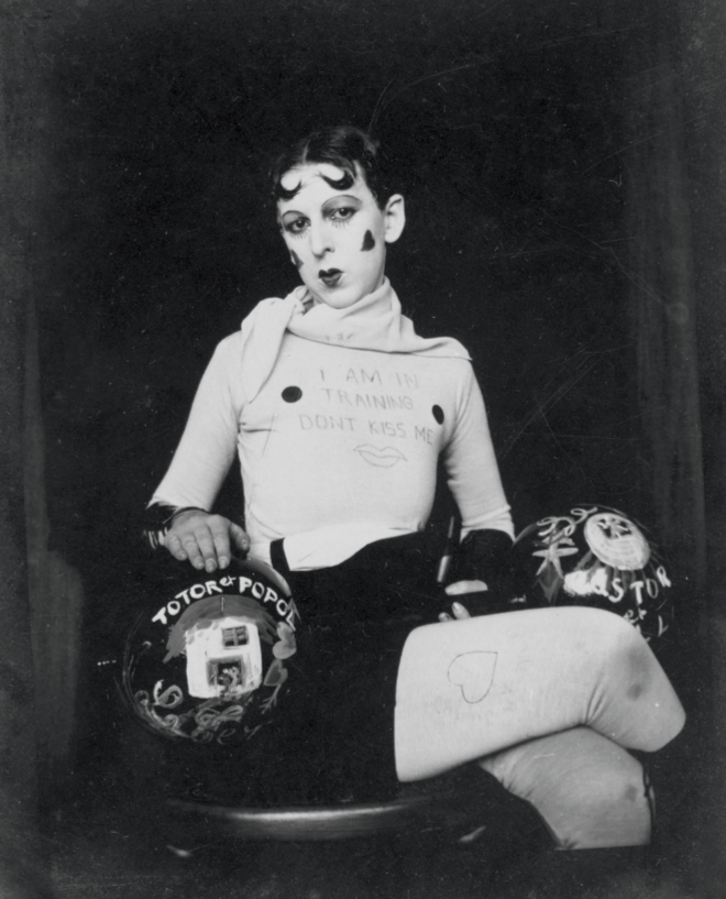
Claude Cahun
Claude Cahun was a French writer, photographer, surrealist and performance artist who was born of the name Lucy Renee Mathilde Schwob. Cahun employed a subversive avant-garde art practice as a form of resistance to the Nazis while also exploring the combined issues of gender, sexuality and power. She created antinationalist leaflets that mocked Nazi ideology and distributed them throughout Jersey, leaving them in strategic places. To present her views further, she created a series of photographs and photo montages that challenged traditional ideas of gender, sexuality and identity. In her self portraits she dresses as a man, a woman and a genderless figure; blurring the boundaries between gender and challenging the viewer’s assumptions about identity. Cahun’s connection to Jersey stemmed from many childhood holidays where she stayed on the island.
Visual
This photograph is of Claude Cahun herself. She is posed sat down with her legs crossed to one side while staring directly at the camera. She is wearing a short skirt with leggings underneath that have hearts drawn on them. Her long sleeved top also has writing on it saying ‘I AM TRAINING DONT KISS ME’ with two black dots either side. She has bold and stylistic makeup on her face with her hair slicked into a split style. She is also holding dumbbells with the words ‘TOTOR’ and ‘POPOL’ on them.
Technical
I believe that this photograph uses artificial lighting in order to darken the background and make the subject stand out. The background is in soft focus as the photo seems to be taken with a wide aperture. The photo has been taken at eye level in order to connect the subject and the viewer. Taken at a three quarter body shot, the costuming of the model is able to be seen which is important to convey Cahun’s artist goal.
Contextual
In the 1920’s, women were expected to take more compliant roles; prioritising raising children and providing emotional support for their husbands. However, later on, these demands became less and less compatible with women as they began learning to value their individuality above the needs of others.
Conceptual
Cahun used her work to showcase gender neutrality and to often undermine the traditional concepts of static gender roles. I believe the message on her top presents this idea by implying that she prioritises independence and education over taking a passive role. The use of the two dumbbells could symbolise her multiple and split personalities as she takes on alter egos within her art. The dumbbells are also in juxtaposition with the femininity presented as contrasts seem to be a common theme in her work.
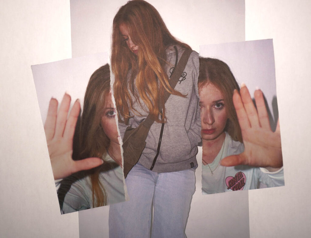
Photoshoot Mind Map and Mood Board
Inge Morath and Saul Steinberg
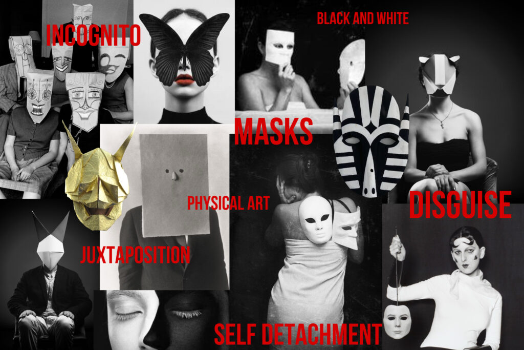
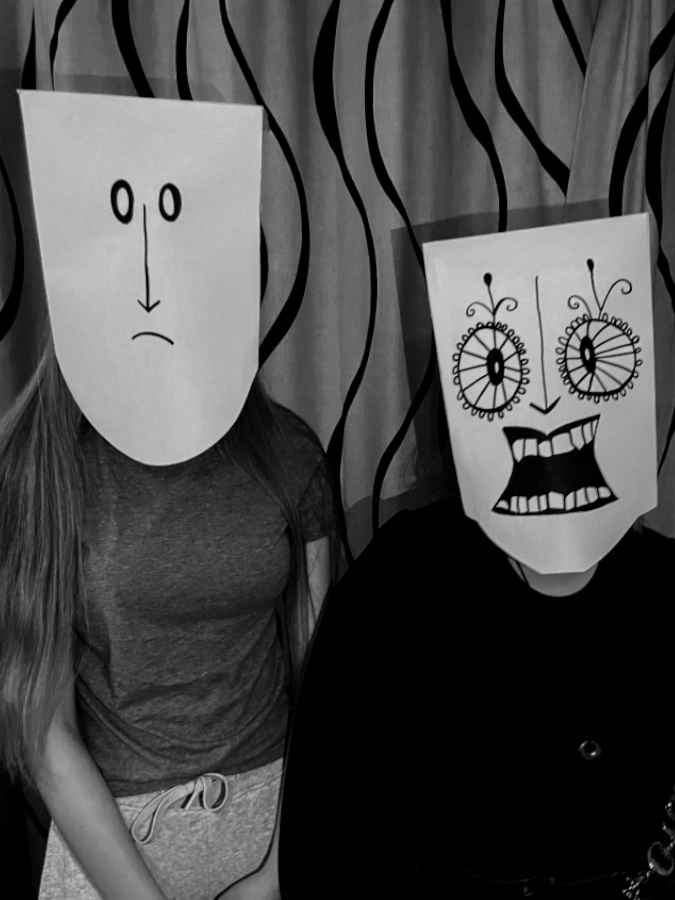
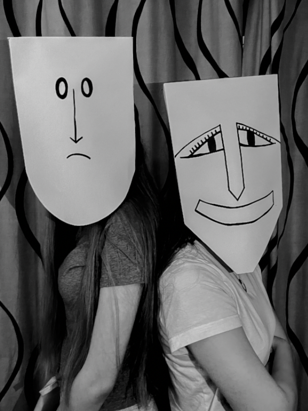
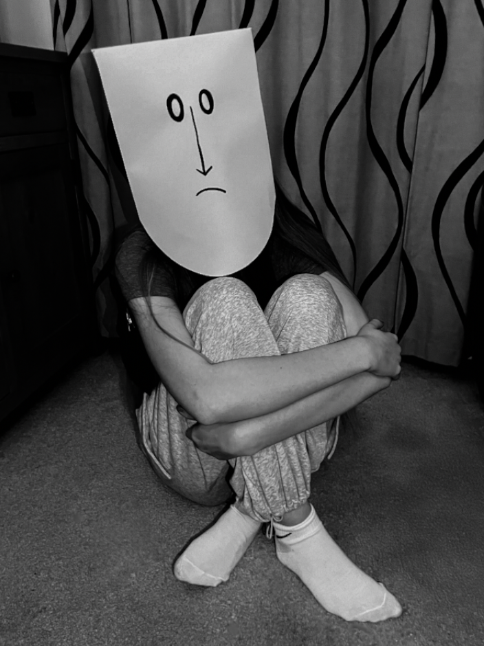
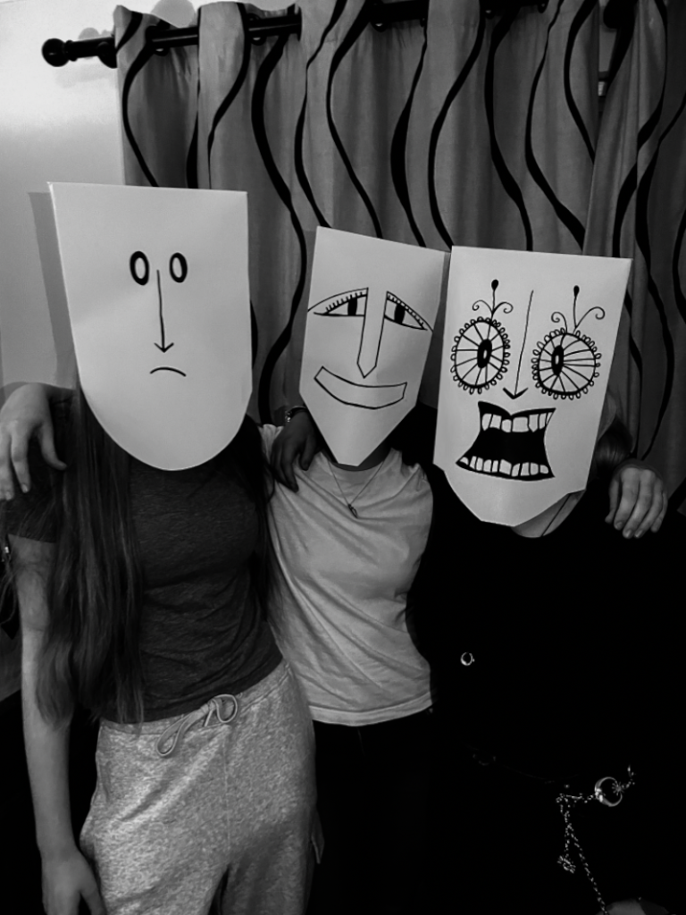
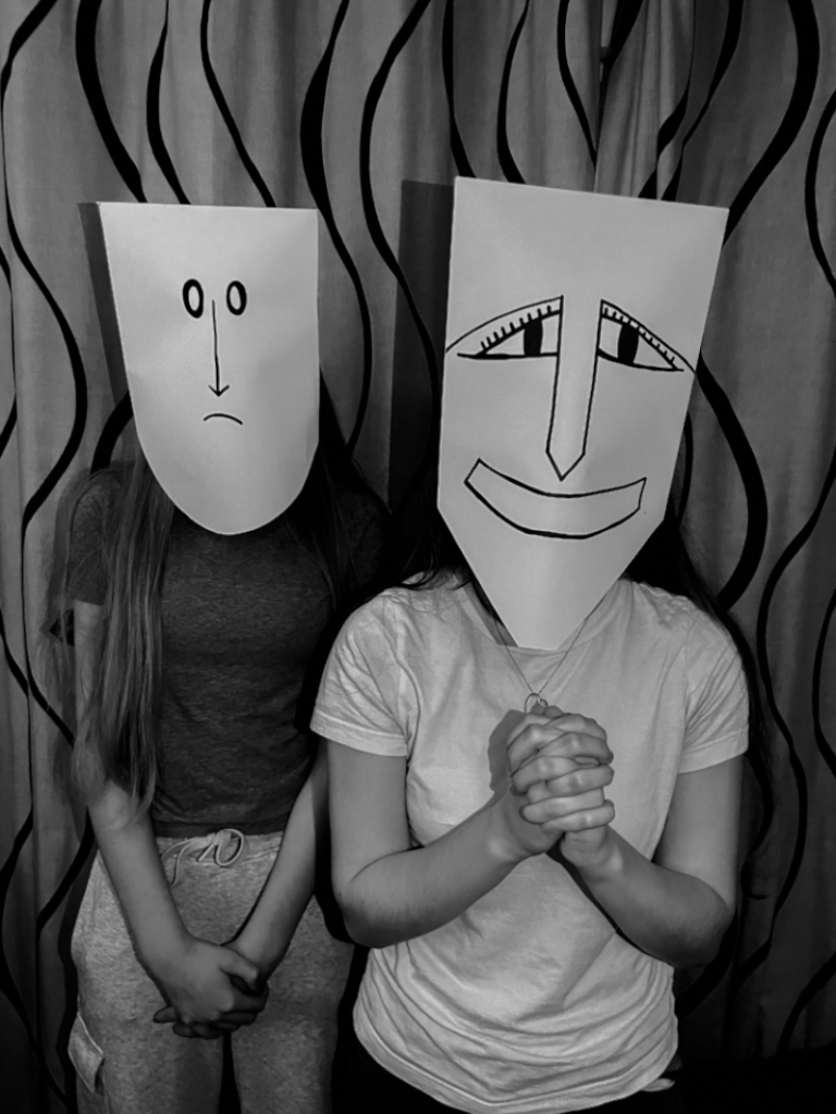
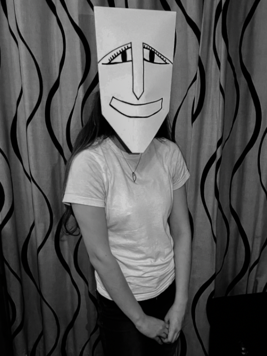
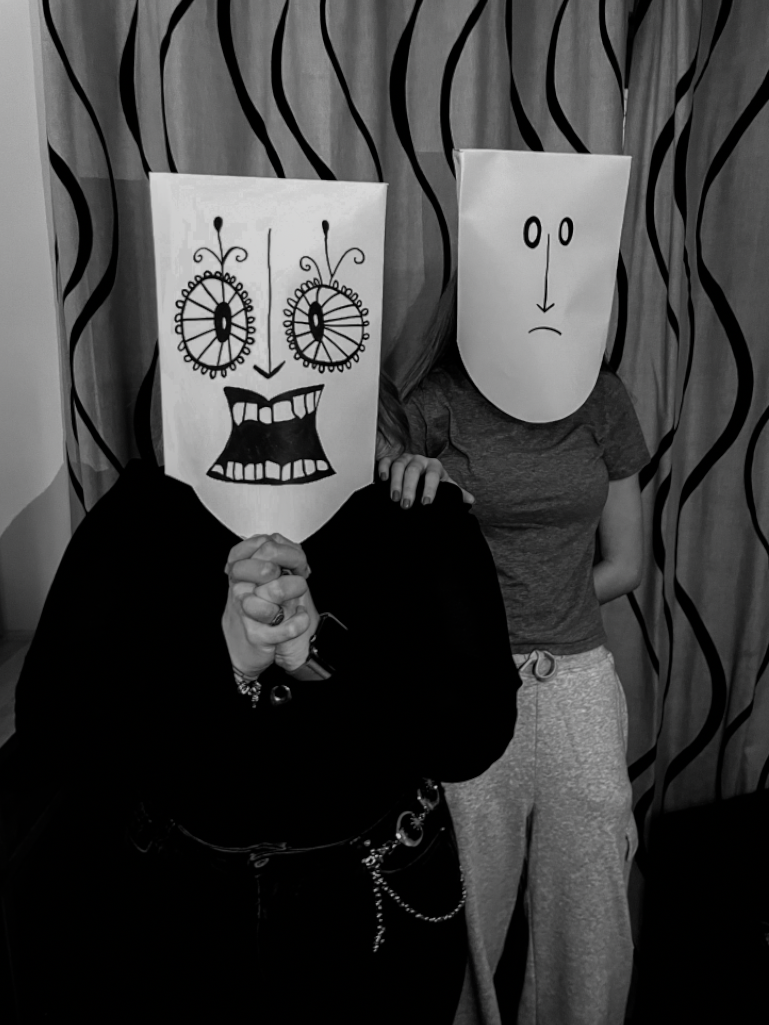
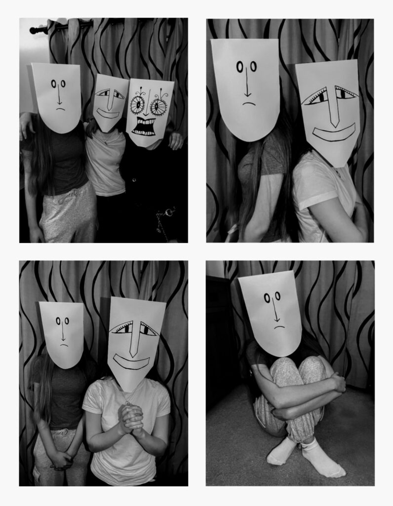
Inge Morath, who lived during 1923 to 2002, was a well known Austrian photographer who worked with many top celebrities. She collaborated with artist Saul Steinberg to create a collection of photographs they called ‘The Mask Series’. Between 1959 and 1962, Steinberg produced paper masks with an array of social species which were made famous through the photographs taken by Morath of Steinberg and his friends wearing the masks in various settings. He began with the making of masks based on the human face but this idea developed and eventually turned to the masks of other personas. The idea of disguise and masquerade is central to Steinberg’s art. He believed that in the world, everyone wears a mask, whether real or metaphorical and that people invent personas through facial expression and makeup with these facades becoming who they are. The pair produced hundreds of these photographs from glamorous to eerie and disconnected. Steinberg was always regarded to be a truly artistic man who was always crossing the boundaries of art by exploring new abstract and uncharted visual territory.
My Inspired Photoshoot
Before I started taking my photographs, I created three differently shaped and designed masks out of paper. Replicating Saul Steinberg’s work, I focused on building multiple personas and characters within the masks through use of expression. I selected three of my friends, as Steinberg does, to wear the masks in order to further resonate this project to myself. I directed them to pose in various positions and stances, some being naturalistic with others more stylistic, and focused on how their body language worked in sync with each other and their masks. I decided to take these photographs in my living room due to Inge Morath’s photos usually taking place in a similar setting. The use of the intimate background makes this concept feel more genuine while also creating a contrast between the mundane environment and the abstract masks. I let my friends wear casual clothing and any accessories that they liked in order to allow them to add their own flare and individuality to the shoot and their character; this is something seen in Morath’s photos also. From observation, I followed similar technical aspects found in ‘The Mask Series’. I took my photos with a relatively small aperture in order to have the background in soft focus but not on the same plane as the models in attempt to not take away too much from the focal point. I also used an ISO setting which had high sensitivity to add slight visual noise and grain to my photographs. Due to using natural lighting in order to achieve my artistic goal, the lighting was unpredictable and I had a lack of control over it. In result of this, the white balance within the photos on my contact sheet is different throughout with some pictures being warmer toned and others being colder. Although this would be an issue for me if my goal was to create a typology with the raw photos, I planned to fix this in my edits anyway when making my pictures black and white and more similar to my reference so this was not something that affected the project; it was worth it in order for me to achieve the overall aesthetic I wanted.
Best Images with Edits
Studio Photos
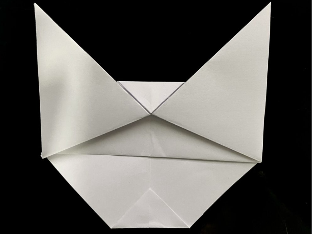
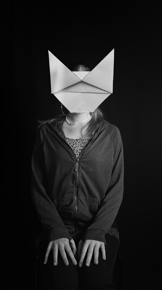
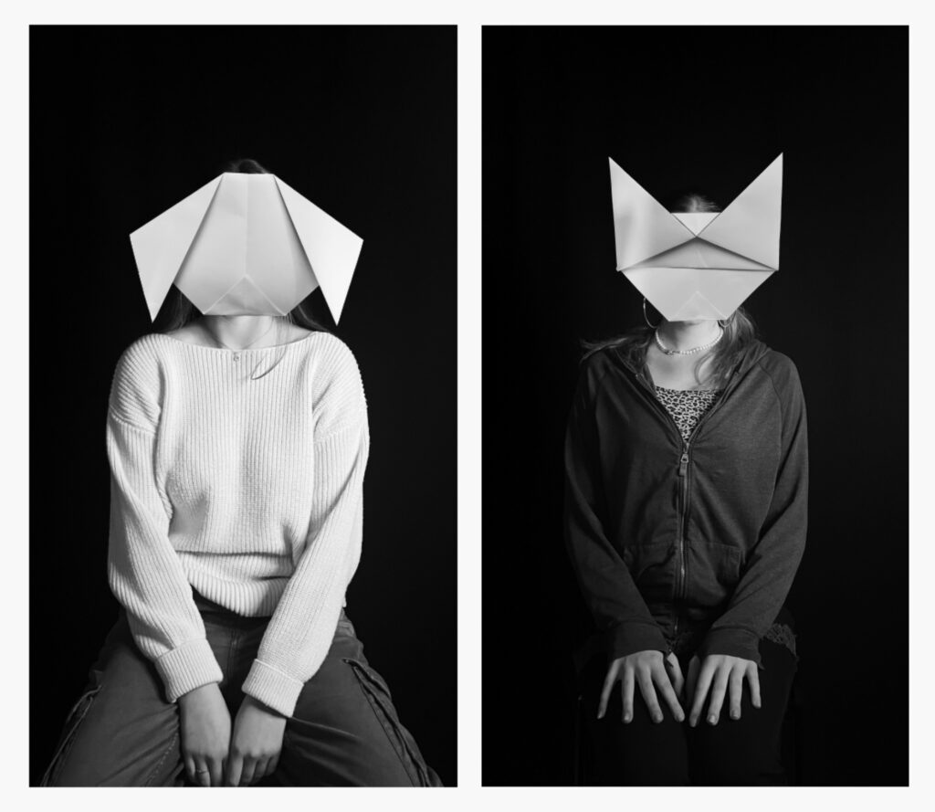
Inspired by Giacomo Favilla’s work where animal origami paper masks are displayed over the faces of the photograph’s sitter, I took similar photos in the studio with my models sat on a stool against a black background. Following my idea of disguise and masks from my previous work, I created origami pieces of two opposing animals; a dog and a cat. I wanted to add in another layer of juxtaposition through this concept with the ‘Black Cat’ and ‘Golden Retriever’ trope. I portrayed this further by having the model which I planned to have as the cat wearing dark toned clothing and sitting in a more typically feminine way. On the other hand, the model for the dog is more slouched while wearing lighter clothes. The ‘Cat vs Dog’ binary opposition also ties in nicely with the ideas and stereotypes surrounding femininity and masculinity. I took two collections of photos, ones of the models and ones of the paper, and in Photoshop layered them over one another to be able to achieve a precise and carefully arranged composition. When taking my photographs, I had central lighting from a ring light in order to have control on what I wanted seen in the photograph. This allowed for a contrast of black in the background to create artificial and staged looking photographs. The final photos create a sense of eeriness due to the unnormal subject matter and how in your face this is. The sitter is in the dead centre of the picture as they are facing directly forward however you can not see their face and eyes; which are normally telling of identity and emotion however these things are missing within the images. This helps to create a feeling of unease and disorientation, highlighting the point of loss of identity; replaced with inanimate masks attempting to portray other life forms. As Favilla does, I edited the pictures into black and white to further develop the point of being stripped of personality while also bringing attention to the photo’s formal elements. These photos overall present the idea of grasping for identity after being unsure of your own, followed by pretending to be a one dimensional person who allows society to sift them into binaries and ideologies.
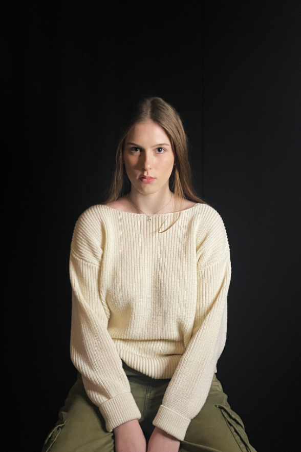
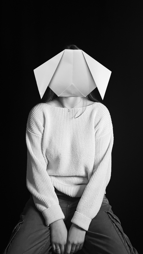
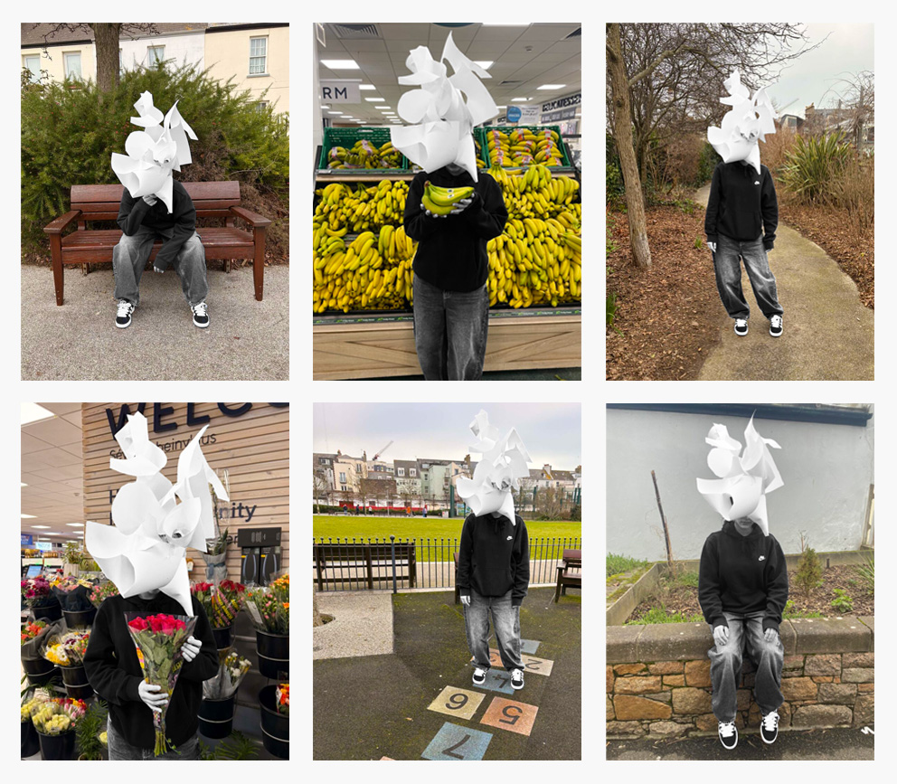
Final Concept
Combining various aspects from all my earlier work, I worked with a sculptural paper mask which I placed over my friend’s head and photographed her in various places and positions. I decided to work with this mask in particular to portray multiple ideas of identity and the self concealment which somebody may take in life. I chose to give the mask this somewhat double meaning to symbolise how identity is not just black and white with one meaning or answer either. I wanted viewers to be able to interpret it in their own way, possibly even resonating it back to their own lives. The mask can be seen as a manifestation of a too complex mind to where someone is so confused on there own identity and has too many views that it becomes a burden and spirals out of control into this crazy and intricate wiring of one’s brain. The mask can also be viewed as a masquerade and cover to hide from the fact that someone has no idea who they are. It plays as a cover to distract from the plain and unknown truth of a person deep down.
Favourite Raw Pictures
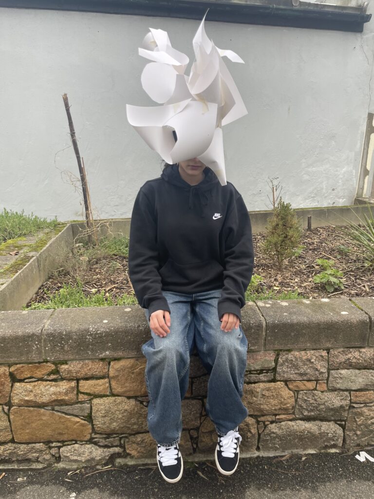
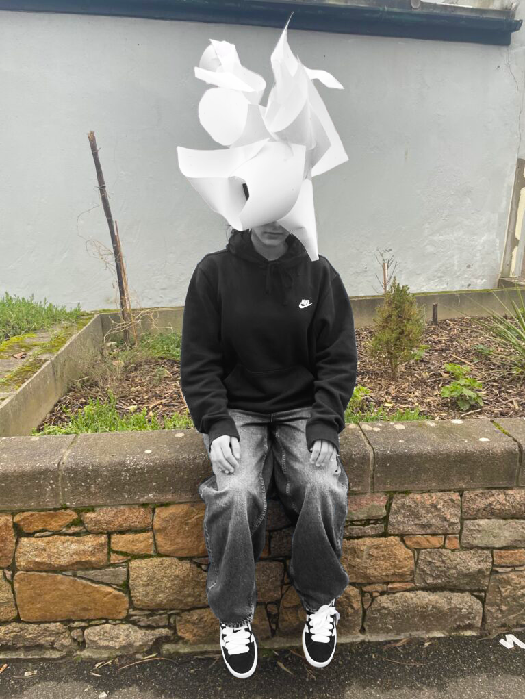
For this photograph, I wanted to capture a naturalistic shot while also experimenting with levels. I positioned the model sat on top of a brick wall against dull open background in order to represent the mundaneness of life which can appear in most everyone’s day to day. Her body language is causal as she tilts her head slightly towards the floor, showing how the mood in this composition is low but relaxed.
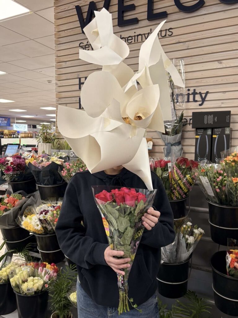
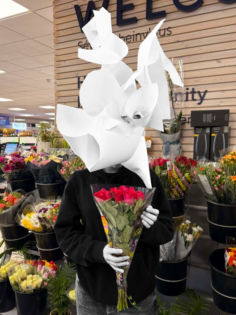
The bridge between the background and the model is something I established in this picture as the subject is in the foreground of where flowers are being sold while she is grasping a bunch herself. By delicately holding the flowers and seeming to look down at them in a longing way behind the mask, I wanted to capture a moment of acceptance with loss of identity as the shapes and patterns within these flowers mirror the mask and therefore allow for a moment of peace for the character as she comes face to face with something representative of herself.
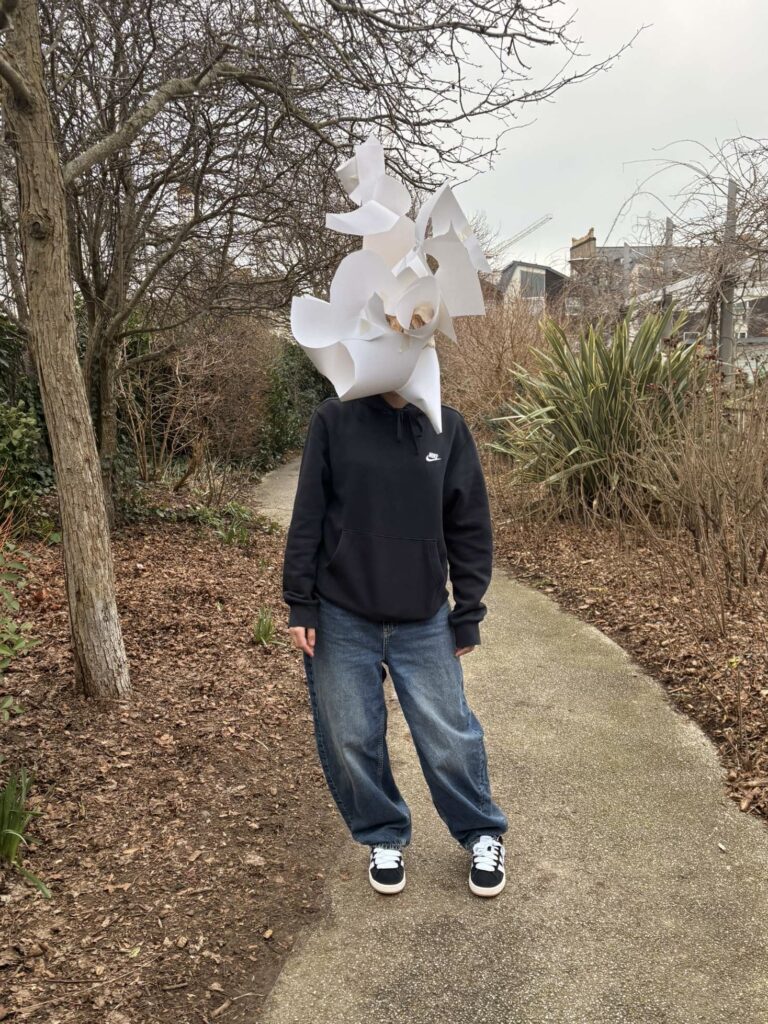
In this image I decided to emphasis the idea of disconnection from one’s environment which can relate to a battle with identity. I directed the model to stand central against the woodland environment while purposely not interacting or making contact with anything there. This symbolises the potential loneliness that can come with a lack of identity or too much complexity, highlighting how society can discard those who do not align with their ideologies as they fade into the background being lost in the crowd. Also, I chose to take this photograph on a path to add interesting lines and further formal elements while leading the eye to the subject.
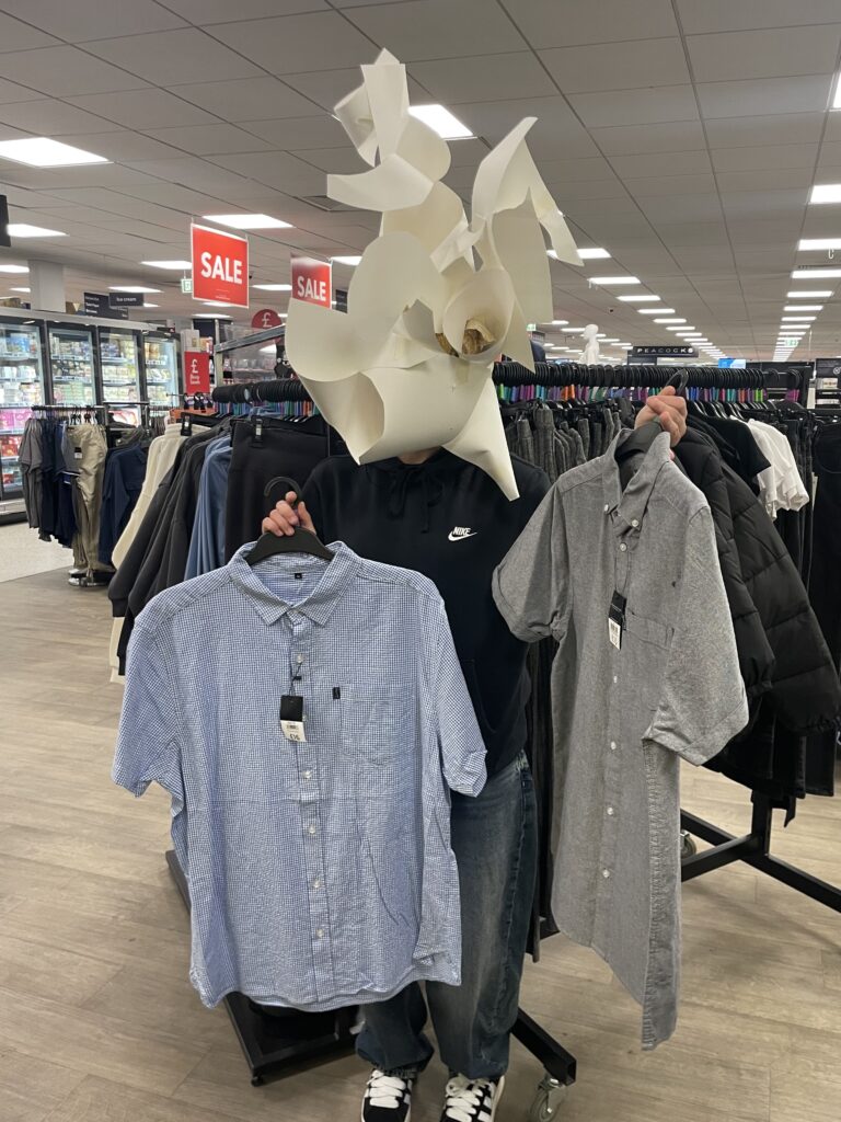
A point I wanted to make is the idea of how people may be struggling with their life and identities but continue with their days and pretend like these struggles are not there. This ties into the idea of performance with the abstract mask being an outward representation of the act someone can be putting on to seem different to their truth and reality. I showed this by staging my model doing something considered to be an everyday task, shopping, while I took a photo of this activity; ignoring the blatantly obvious strange mask as if it is not there.
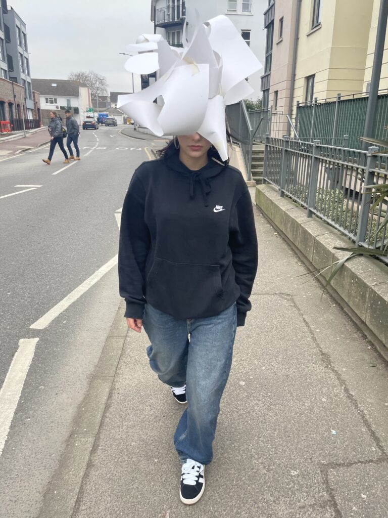
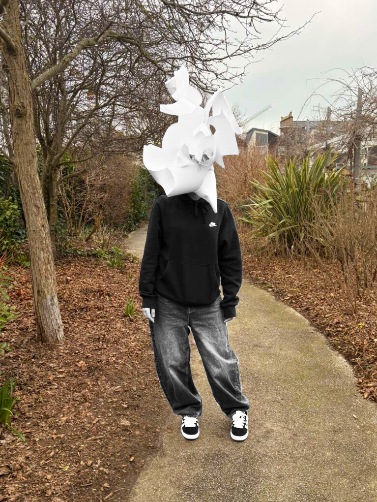
I experimented with some action shots with the subject in motion as I took the photographs. I went for a simple concept of walking, but with the mask on, which I managed to capture a frame of by using a high shutter speed. Because the photo is zoomed in but with the model’s whole body in frame, this photo feels quite confrontational as the subject walks straight at the camera and therefore towards the viewer.
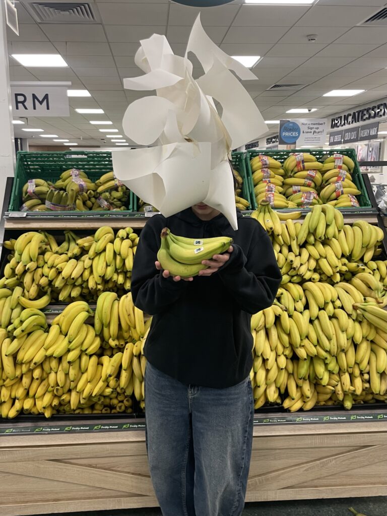
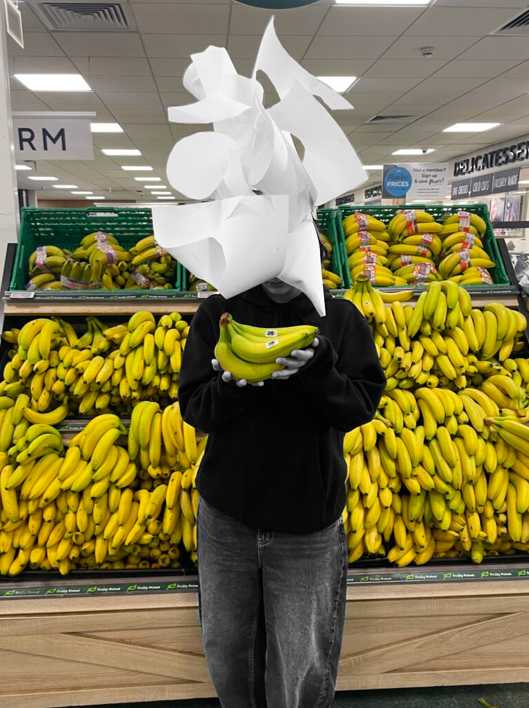
With the bananas being so vibrant in the photo, attention is taken away from the model. I wanted this composition to show that distraction and facade can pull away from one’s identity as it can be used as a ploy to avert people from knowing the truth and what can be at the core of somebody’s personality; highlighting the fact that no amount of makeup and acting can conceal or hide what is kept or lacked deep within a person.
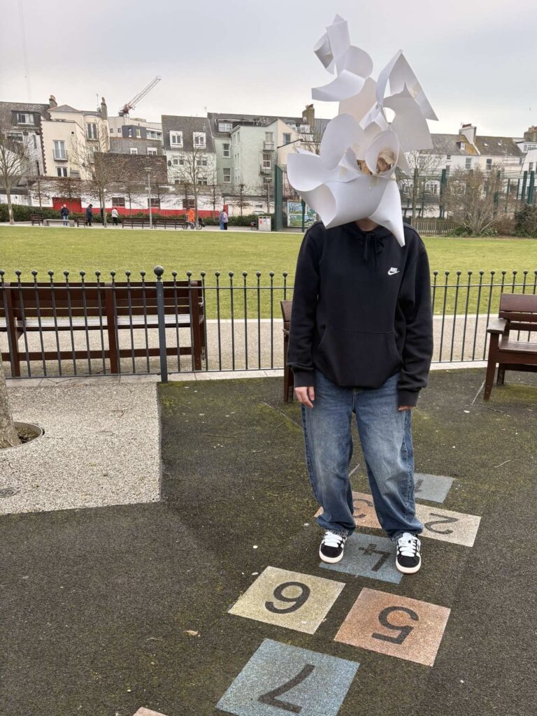
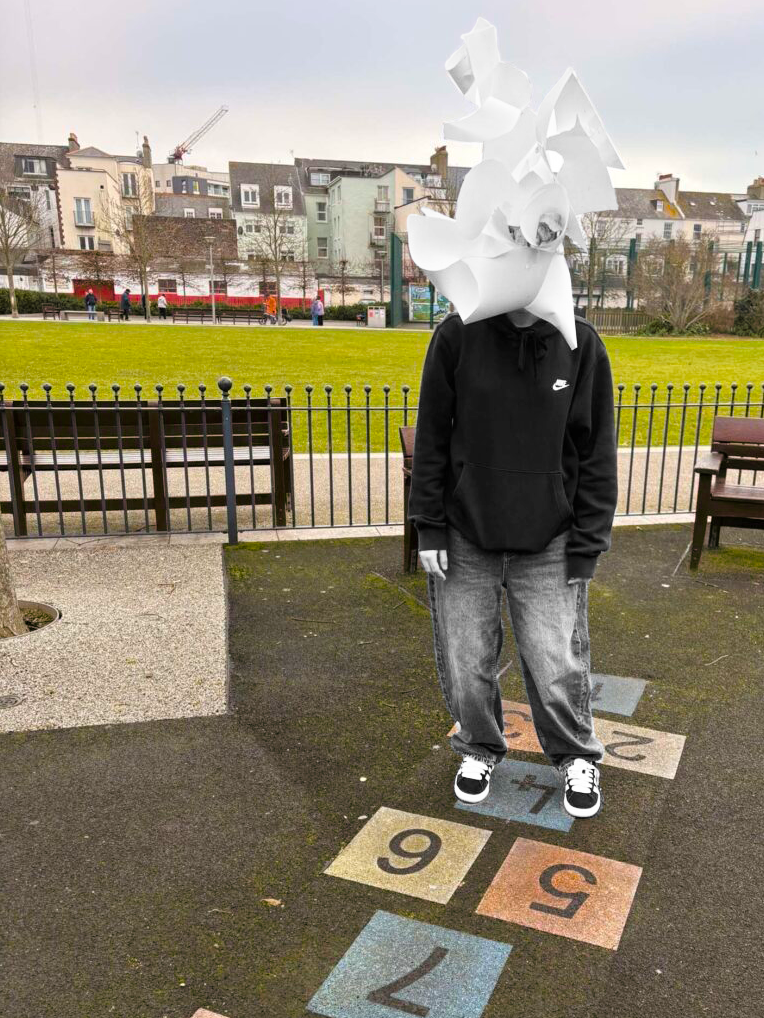
I decided to focus on a theme on nostalgia for this photograph, emphasised by the subject standing emotionless over a game of hopscotch; a popular childhood game. I wanted to create the idea of longing for the past however feeling unable to connect with it now; perhaps feeling reminiscing of a type where one feels they had more personality and freedom. The model takes a passive role instead of participating in the game as I positioned them more to the right side of the frame; utilising the rule of thirds to communicate my idea.
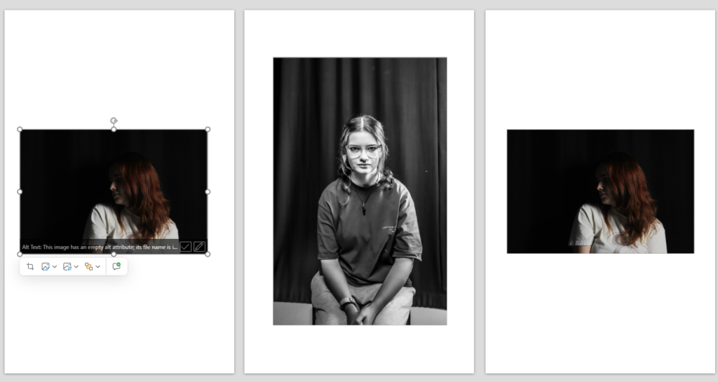
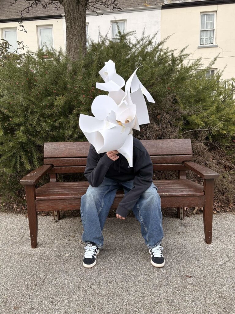
Wanting some pictures just focused on the character and mask, I had the sitter centre in the photo facing directly forward. The background is aesthetically pleasing enough to not take away from the subject. The picture is relaxed shown through the use of natural lighting and the casual posture of the model. This allows viewers to observe the character and photograph for what it is in a raw and genuine perspective.
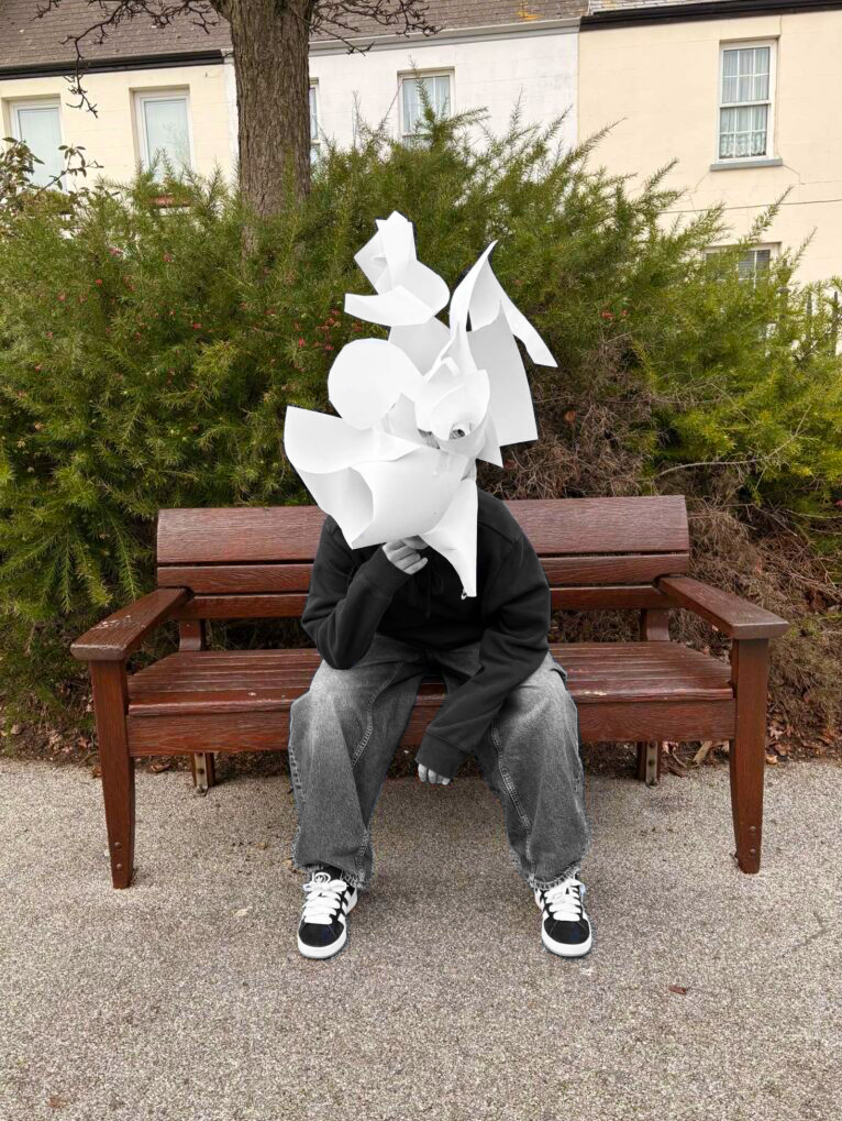
Final Pictures and Photoshop Manipulation
In photoshop, I duplicated the layer of my photograph and made the bottom layer filtered in a black and white effect. On the second layer, I heightened the vibrancy and saturation very subtly in order to extenuate the already colourful backgrounds. With a small brush, I carefully erased the character from the top layer which allowed for the monochrome version underneath to be revealed; creating a contrast between the subject and environment. By visually showing the separation of the two, the various ideas of disconnection from identity and background which I had communicated in the images are further reinforced through technical aspects. This represents different struggles with life and identity that people may be facing in various places and paths of life, highlighting purposeful or forced detachment from one’s self in order to remain present and understood by others; hiding in their own thoughts and face to repress the truth.
These are my final photos from my two identity photoshoots, these are my favourite photos from across both photoshoots.
Evaluation
How Successful Was Your Final Outcome ?
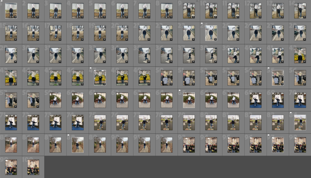
My final outcome was very successful because I achieved what I wanted to do and I made similarities between my images and my artist reference. It was also a successful outcome because this is the most photos I have taken for a project. I took 121 photos, which gave more variety with my images.
Did You Realise Your Intentions?
Yes I did because I made a plan before the project what I wanted to do and went through with it and I eventually came out to be successful.
What References Did You Make To Your Artist Reference?
I made reference to the visual, technical and the conceptual ideas. I did this by looking through Rae’s photos and seeing what elements I need to include to replicate certain photos that she photographed. I have linked to conceptual because this includes her body and I’ve achieved this in may photos. I’ve linked it to visual because I have used negative space in my photos because Rae doe this as well. Lastly ,I’ve linked it to technical because it used natural lighting instead of artificial. I have used natural lighting because Clare Rae does this in her photos/Images.
Is There Anything To Change?
Yes there is. If I could do this again would have more variety of photos, I would take more photos. I also would take more photos so I would have lots to chose from.