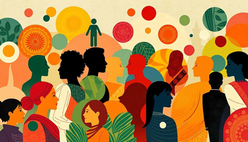
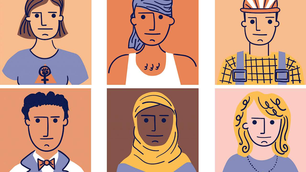
The fact of being who or what a person or thing is.
Identity is the set of qualities, beliefs, personality traits, appearance, and/or expressions that characterize a person or a group. Identity emerges during childhood as children start to comprehend their self-concept, and it remains a consistent aspect throughout different stages of life.
What is femininity ?
qualities or attributes regarded as characteristic of women or girls.
Femininity, in the context of the Social Sciences, refers to a socializing ideology that encompasses various interpretations and expressions of being a woman. It is not a fixed set of essential traits, but rather a concept that defines and organizes gender-related practices and relationships.
what is masculinity ?
qualities or attributes regarded as characteristic of men or boys.
Masculinity involves displaying attitudes and behaviours that signify and validate maleness, and involves being recognised in particular ways by other men and women.
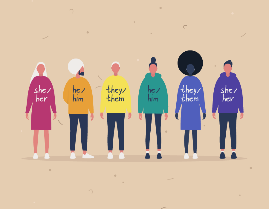
Gender Identity
Gender identity is your deeply-held inner feelings of whether you’re female or male, both, or neither.
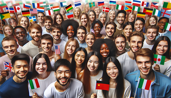
Cultural Identity
Your cultural identity is a critical piece of your personal identity that develops as you absorb, interpret, and adopt or reject the beliefs, values, behaviours, and norms of the communities in your life. Our cultural identity can evolve, as culture is ever-evolving and dynamic.
Social Identity
Social identity refers to the ways that people’s self-concepts are based on their membership in social groups. Examples include sports teams, religions, nationalities, occupations, sexual orientation, ethnic groups, and gender.
Geographical Identity
An individual or group’s sense of attachment to the country, region, city, or village in which they live.
Political Identity
Political identity is a form of social identity marking membership of certain groups that share a common struggle for a certain form of power. This can include identification with a political party, but also positions on specific political issues, nationalism, inter-ethnic relations or more abstract ideological themes
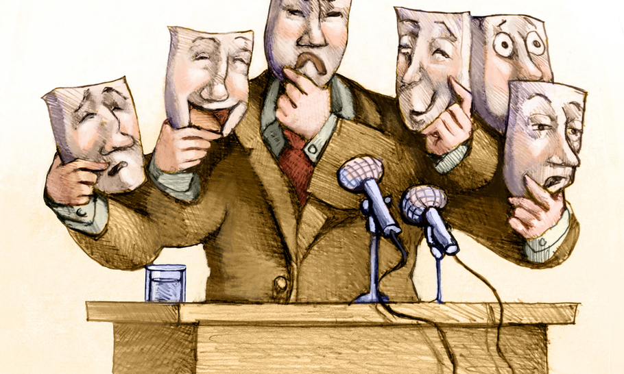
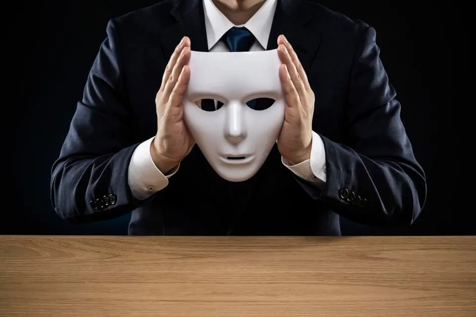
loss of Identity
A lack of self belief. Questioning value and worth – who am I without this job, role, title? Feeling lost without a sense of direction. Disconnected to personal values
Stereotypes
Stereotypes are characteristics that society instinctively attributes to groups of people to classify them according to age, weight, occupation, skin colour, gender, etc. Sexual stereotyping involves associating girls and boys with separate and, at times, opposing sets of characteristics.
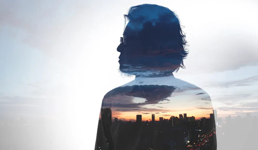
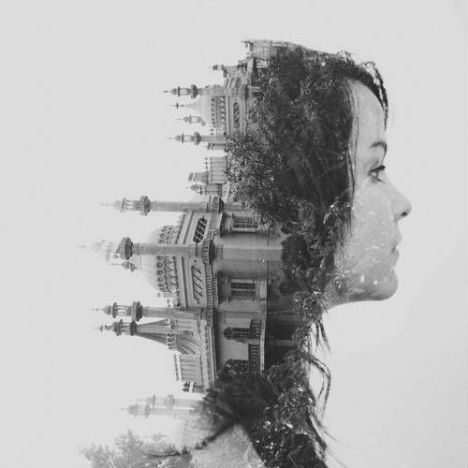
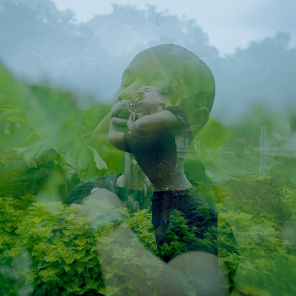
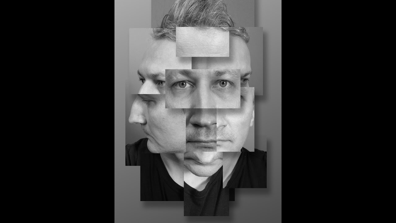
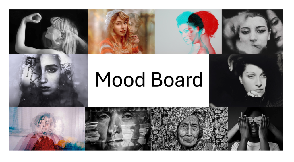
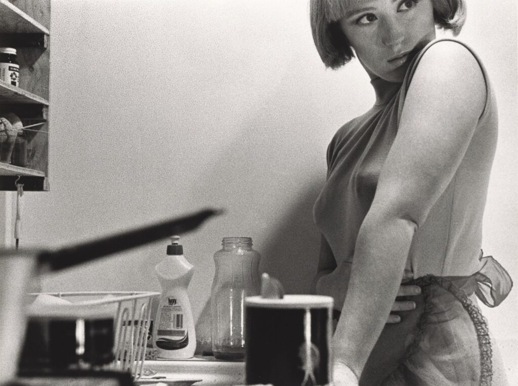
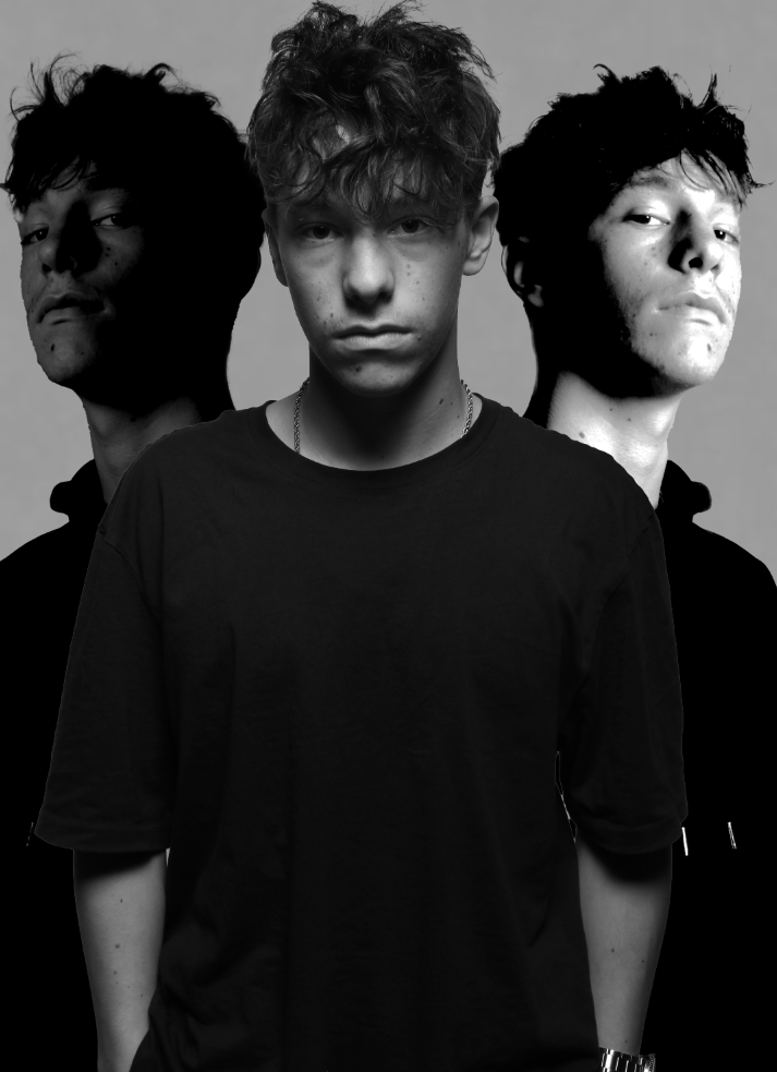
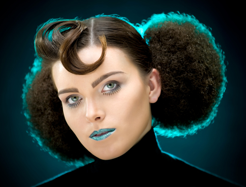
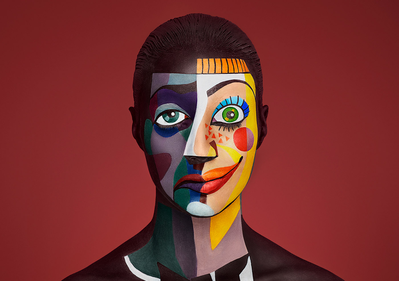
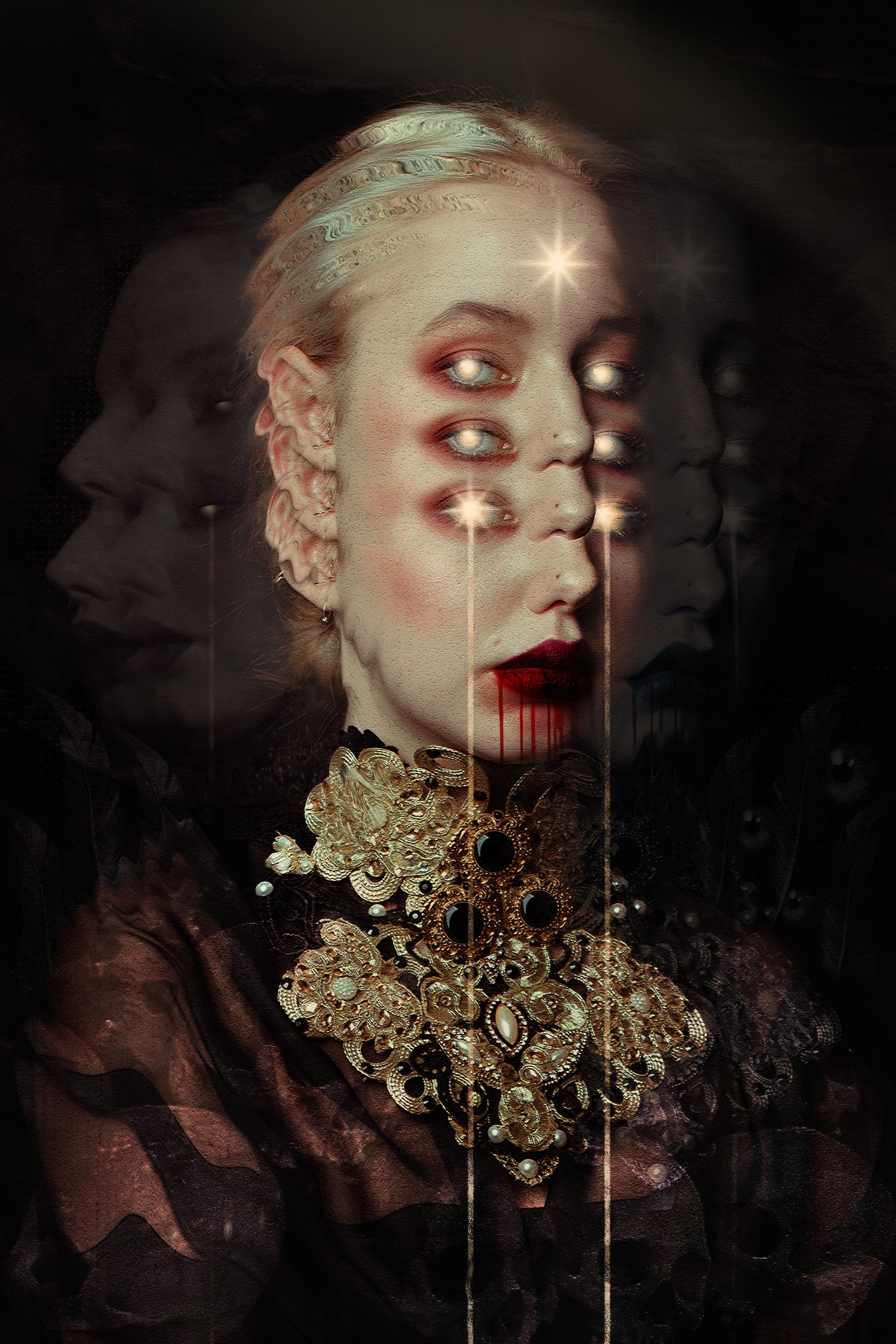
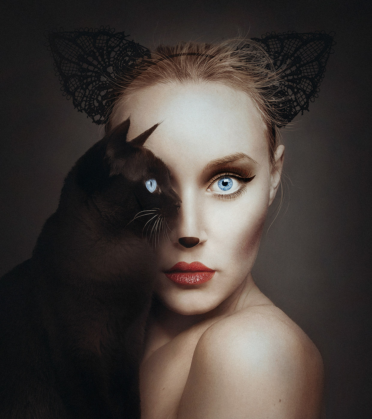
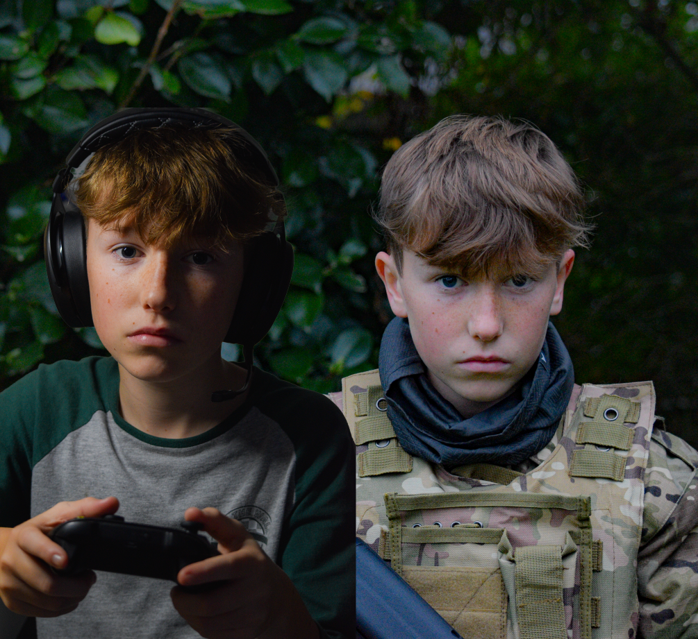
Creative Portraiture often refers to images that go beyond a single frame taken within a camera. Often creative portraiture combines images and other elements to create a final result also known as composite images.
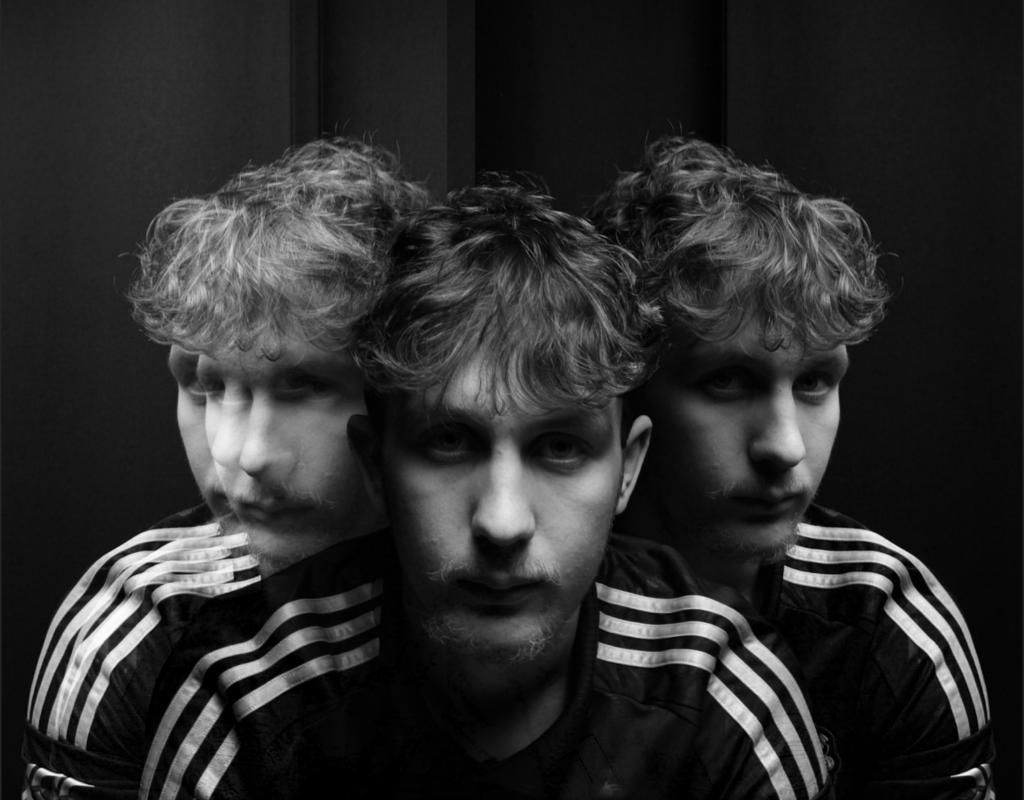
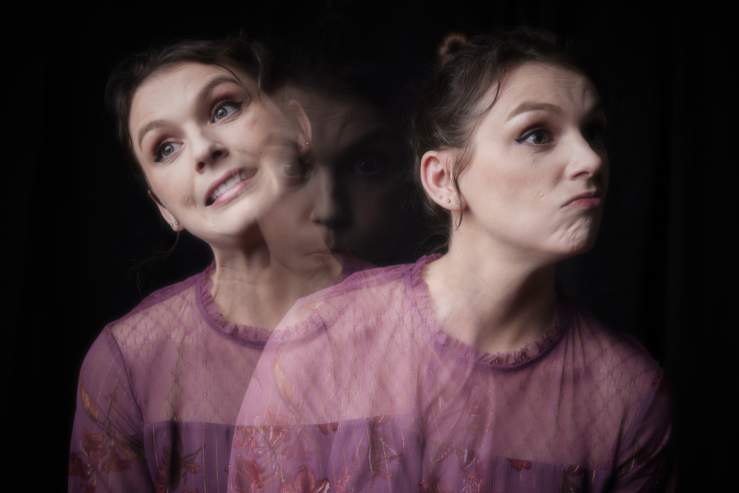
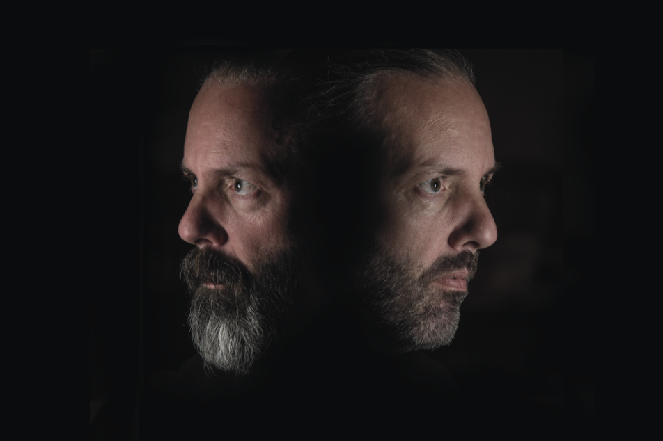
DOUBLE/ MULTI-EXPOSURE:
Multiple exposures are photographs in which two or more images are superimposed in a single frame, and they’re super easy to create using your analogue camera.
Tiffany Sutton:
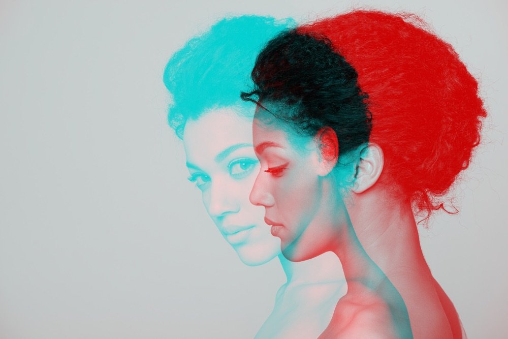
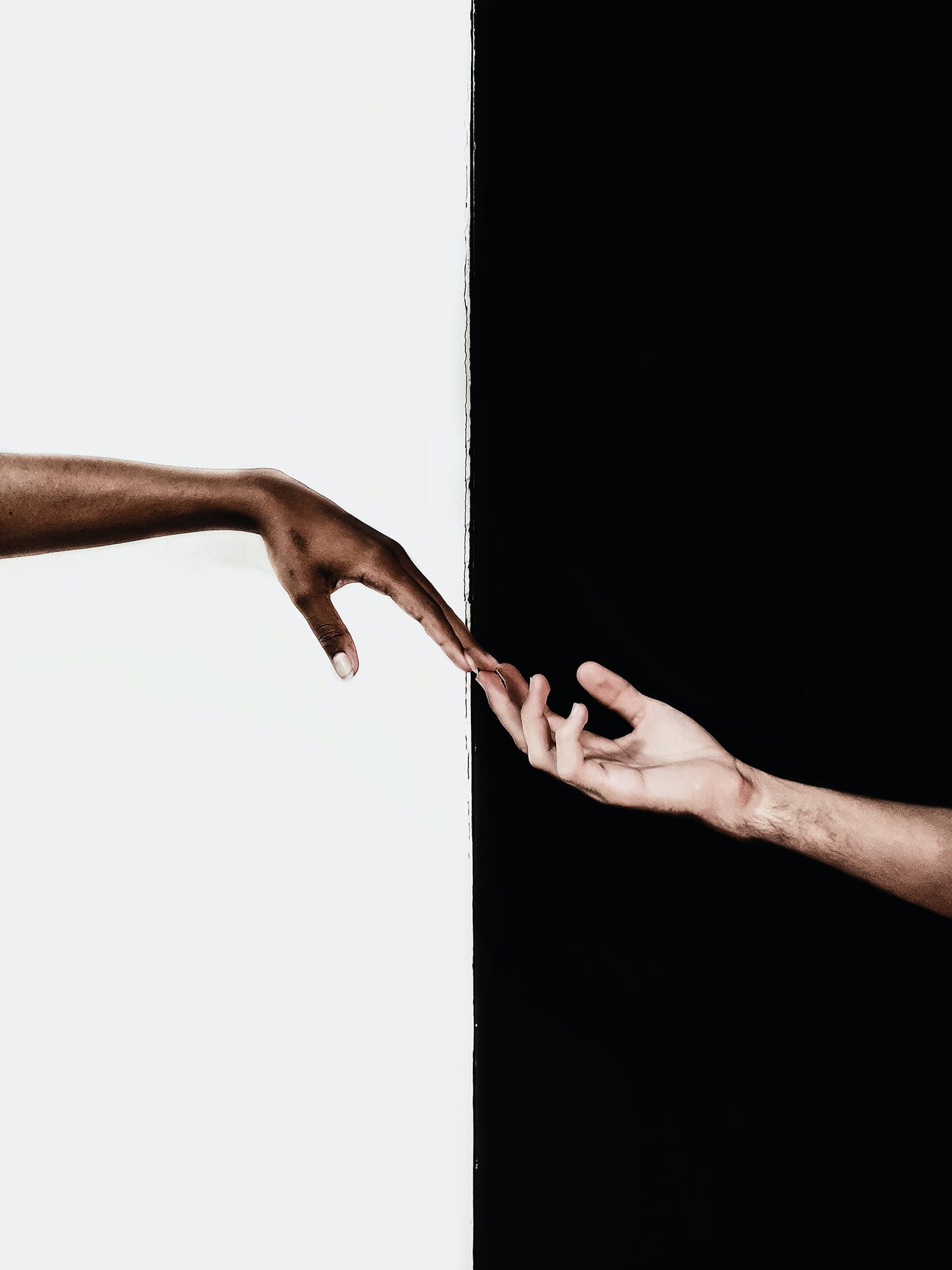
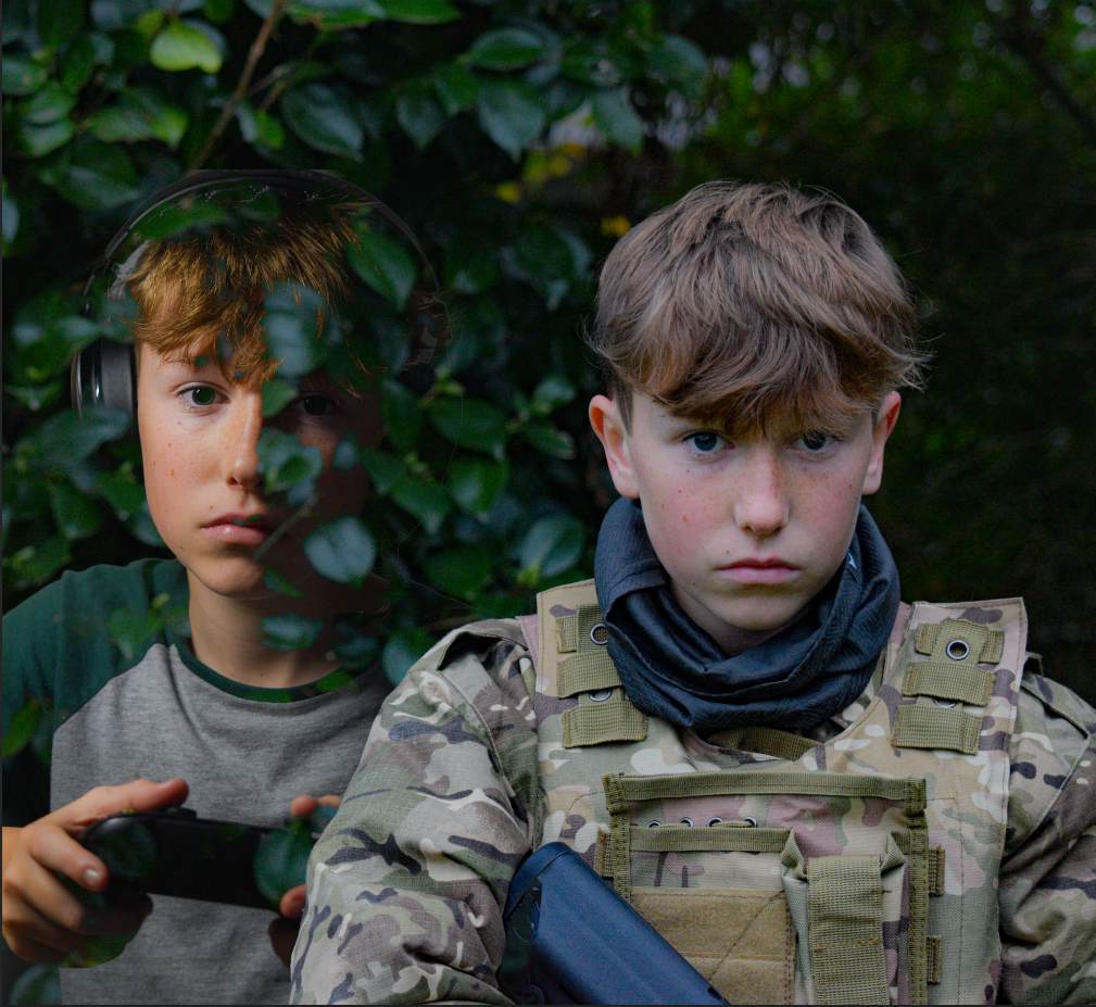
JUXTAPOSITION:
juxtaposition photography involves combining two or more elements in the same picture, highlighting the interesting contrast between them, to create an eye-catching and thought-provoking image.
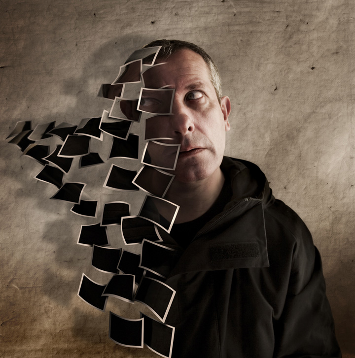
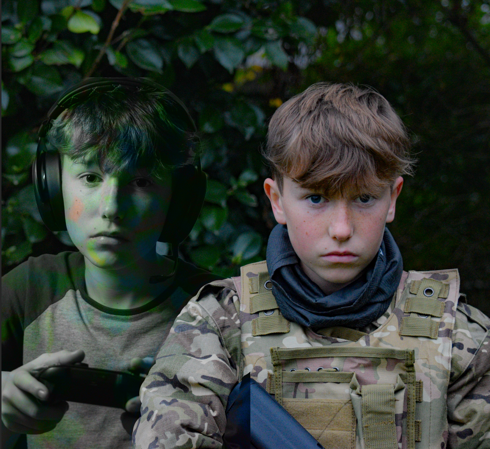
MONTAGE:
Photomontage is the process and the result of making a composite photograph by cutting, gluing, rearranging and overlapping two or more photographs into a new image.
Man Ray:
Man Ray was an American visual artist who spent most of his career in Paris. He was a significant contributor to the Dada and Surrealist movements, although his ties to each were informal. He produced major works in a variety of media but considered himself a painter above all. He was best known for his pioneering photography, and was a renowned fashion and portrait photographer. He is also noted for his work with photograms, which he called “rayographs” in reference to himself.
These are some of Man rays photographs with surrealism.
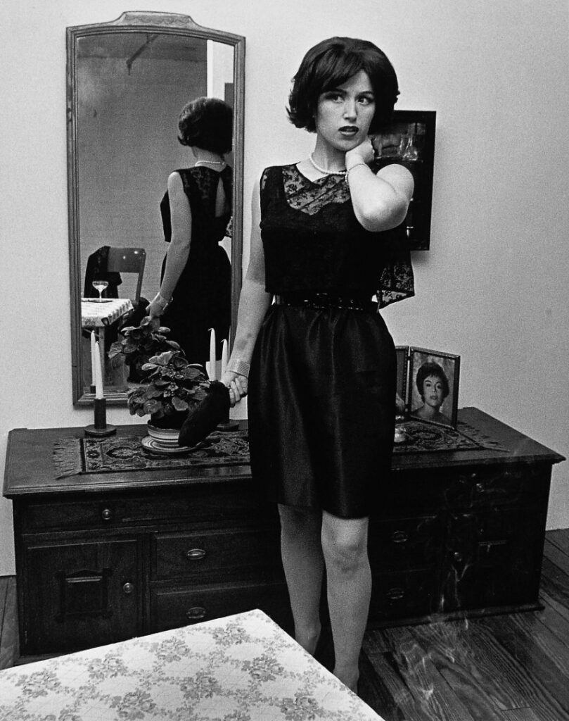
My Edits:
This one of my edits that I have made with a photo of Nicha and another photo of a painting which I have then layered together and changed the opacity so your able to see the painting on top of her which makes it look like a reflection of the ocean.
This is a two photos of Chanel i have put together which makes it look like their is a ghost behind her. I layered the two photos together and changed the opacity of the photo in the background photo and added a filer onto it to have the translucent blue.
This is another photo of Nicha that I’ve taken, one with the scarf on her head the other without a scarf.
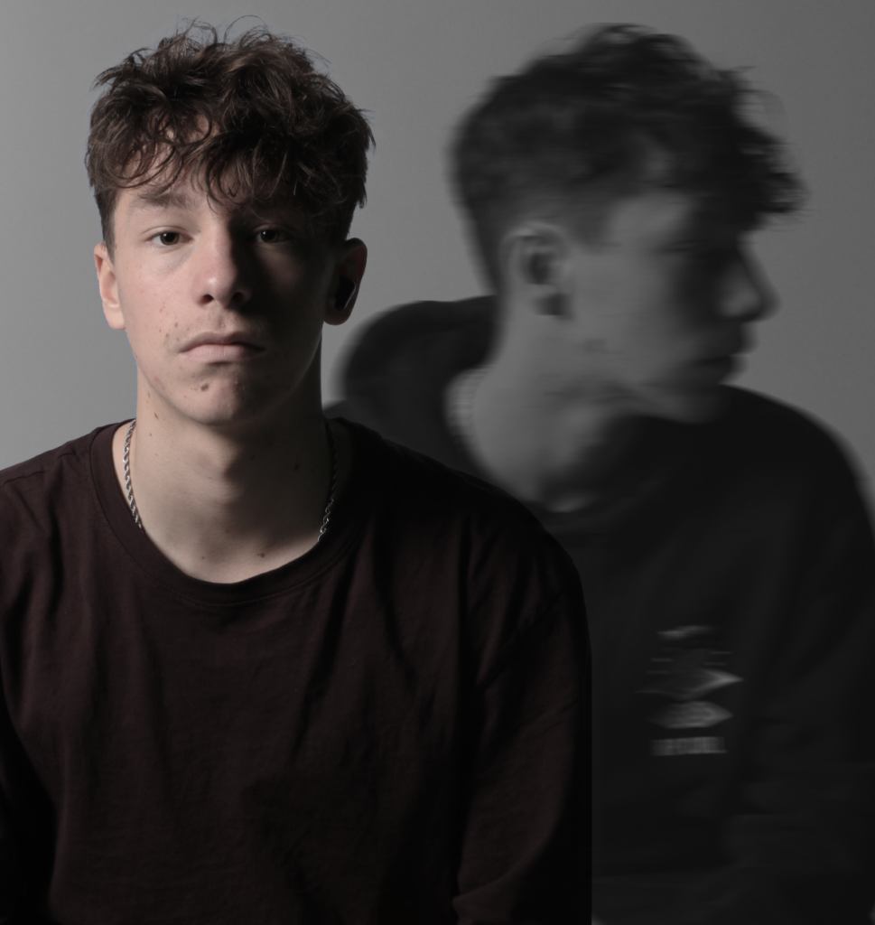
Double/Multi exposure photography is when two photos are combined into one, creating a surreal or artistic effect. Originally done by exposing the same film twice, it’s now mostly achieved with photo editing software like Photoshop. The idea is to blend two images together, such as layering a person’s face over a landscape, so that they merge into something unique and visually striking. This technique is a fun way to tell a story or add a dreamlike, creative twist to your photos.
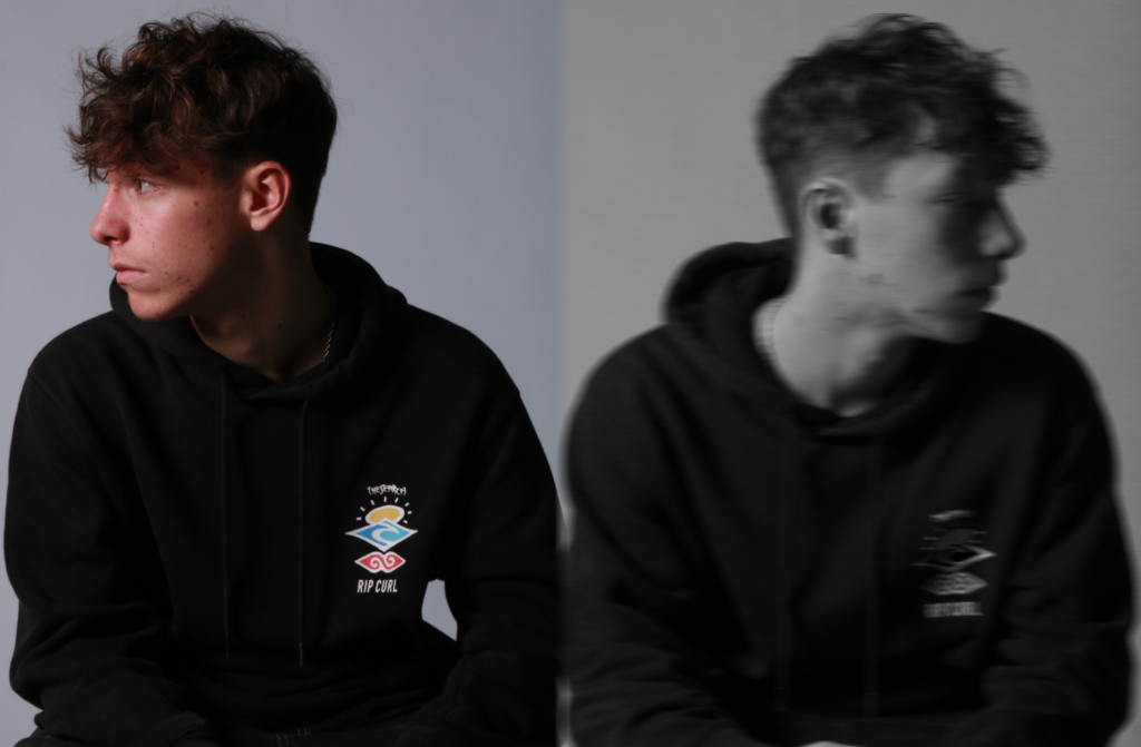
Juxtaposition:
Juxtaposition photography is when two contrasting or opposing elements are placed together in a single photo to create an interesting or thought-provoking effect. It’s all about showing differences, like combining old and new, light and dark, or nature and urban life, in one shot. This contrast can highlight unique details, create tension, or tell a story by making the viewer think about how the elements relate to each other. It’s a powerful way to capture striking visuals and evoke emotion or curiosity.
Montage photography is when multiple photos are combined into one image to create a new, layered story or concept. It’s like assembling a collage, where different pictures are placed together to show different perspectives or ideas in a single frame. This technique can mix elements of time, place, or even reality, allowing the photographer to convey a message or create a more complex visual narrative. It’s a creative way to blend different moments or subjects into one cohesive and often artistic image.
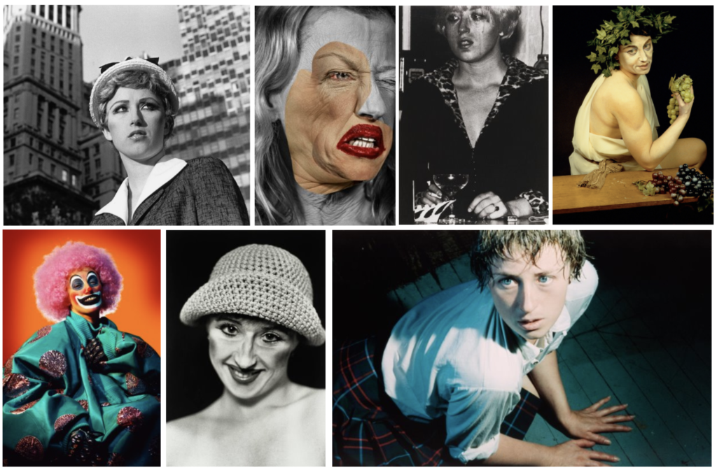
What photography movement was Cindy Sherman a key figure of? And what was their purpose?
What did she do before she became a photographer?
What are the key goals of her photography?
How does she achieve this goal (Who does she photograph? What personas are portrayed? What message is she trying to convey through her process?).
Does Cindy Sherman consider her photos to be self-portraits?
Key words:
Pictures Generation
Critique
Mass media
Female roles / personas
Oppressive portrayal of women
Self Portraits
Guises
Deception
Stereotypes
2. Analyse a chosen photo in depth:
Untitled Film Still #3
Use the template below to help you analyse photos:
Visual:
Who is the character that Sherman is adopting and how can you tell this? (what is she wearing etc?)
What else can you see in the photo and where does it look like the photograph set?
How is the subject posed? What is the emotion/ mood of the subject?
How is the subject framed? What does this add to the photo? Is it cramped? Spacious?
What do you think was going on before the photo was taken?
What tells you that something might be happening outside the frame?
How does the title contribute to the photo?
Keywords:
Housewife
Feminine stereotypes
Guarded
Suspense
Cramped
Cinematic
Technical
Aperture – Notice how the foreground objects are blurred… Does this mean it’s a wide or narrow aperture?
Shutter speed – could be quite a fast shutter speed as the subject is in focus, with a balanced exposure
Angle – Has it been taken from a slightly lowered angle or high angle? What does this contribute? Does it make you feel like you’re amongst the setting or outside of the setting.
Is it a full body shot or half body shot? What does this add? Is it more or less intimate?
Contextual
Use the internet to help you unpack more about the history of how women are portrayed in the media
Historically, how have women been portrayed in the media?
What were Sherman’s ‘untitled film stills’ intended to resemble?
Conceptual
Knowing that the photo is not a housewife, but in fact Sherman herself who is performing… what do you think the Film Stills are saying about cinema and mass media?
How could it link to the media today?
Alternative photo analysis:
Untitled Film Still #14, New York, Museum of Modern Art (1978)
Visual:
Who is the character that Sherman is adopting and how can you tell this? (what is she wearing etc?)
What else can you see in the photo and where does it look like the photograph set?
How is the subject posed? What is the emotion/ mood of the subject?
How is the subject framed? What does this add to the photo?
What do you think was going on before the photo was taken?
What tells you that something might be happening outside the frame?
How does the title contribute to the photo?
Technical
Aperture -Things in the background are in focus – Does the photo look like it is a wide or narrow aperture?
Shutter speed – could be quite a fast shutter speed as the subject is in focus, with a balanced exposure
Angle – What angle has it been taken from? What does this contribute? Does it make you feel like you’re amongst the setting or outside of the setting.
Is it a full body shot or half body shot? What does this add? Does it feel safe or exposed?
Contextual
Use the internet to help you unpack more about the history of how women are portrayed in the media
Historically, how have women been portrayed in the media?
What were Sherman’s ‘untitled film stills’ intended to resemble?
Concept
Knowing that the photo is not a housewife, but in fact Sherman herself who is performing… what do you think the Film Stills and Sherman’s approach is saying about cinema and mass media?
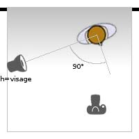
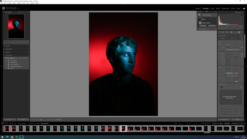
in this project we will be using many different lighting portraiture techniques to learn about the different techniques that can be done with a camera, light and a studio.
Artist reference Nadav Kander
Nadav Kander was a London based photographer that focused on portraiture, , artist and director, known for his portraiture and landscapes. Kander has produced a number of books and had his work exhibited widely. He received an Honorary Fellowship from the royal photographic society in 2015, and won the prix pricet award. I like Nadav Kanders work because of the way he uses his models and mixes in the light
visual:
This image is taken by Nadav Kandar he is using a mdoel in it. who is standing on bricks in the middle of the infinity white background, she is standing and curving her back, there is yellow and green gel lights in this photo and the shadow in the back is showing off the model
technical:
the lighting in this photo is white towards the bottom and then gel lights towards the top around the models face. Kandar is using a high aperture in this photo and the whole photo is in focus meaning that Kandar used a sharp focus. i think this photo was taken from around the stomach of the model which then contributes to the viewers being able to see the whole body.
Split lighting
Split lighting is a lighting technique that lights up half of a subject’s face while leaving the other half in a shadow, essentially “splitting” the face. This splitting effect is achieved by a light source that is perpendicular to the subject illuminating directly from one specific side.
Normally, the key light is placed high and to one side at the front, and the fill light or a reflector is placed half-height and on the other side at the front, set to about half the power of the key light, with the subject, if facing at an angle to the camera, with the key light illuminating the far side of the face. The key in Rembrandt lighting is creating the triangle or diamond shape of light underneath the eye. One side of the face is lit well from the main light source while the other side of the face uses the interaction of shadows and light, also known as chiaroscuro , to create this geometric form on the face. The triangle should be no longer than the nose and no wider than the eye. This technique may be achieved subtly or very dramatically by altering the distance between subject and lights and relative strengths of main and fill lights.
this is my attempt of split lighting my model in the photo did a pose to show the split with in the lighting to show the difference with the lights, I couldn’t edit these photos because of a problem in Lightroom but even without editing this photo came out nicely
For this lighting technique you shine a light at half of your models face and it highlights one side of the models face, you can also angle the light so it shines at the reflector and then by using the reflector the background will be dark and the other side will be lighter and if you use a white infinite background it will be darker.
Gel lighting
In the realm of photography and cinematography, lighting gels are thin, transparent, coloured materials, typically made from polyester or polycarbonate. They’re primarily used to alter the colour and quality of light in a scene. When we say ‘gels,’ we’re referring to these sheets of magic that can drastically transform an image or video by modifying the light source’s colour.
The use of gels traces back to the early days of theatre and stage performances, long before they found their place in cinema and photography. Originally, gels were made from Gelatin (hence the name), which was dyed various colours. As technology advanced, more durable materials replaced Gelatin, and gels became a staple tool for photographers and cinematographers alike.
this is my attempt of using gel lightings i made one side blue and the other side red, this photo came out good i also edited it to make the colours a bit more vibrant. I think this is my best photo because one side the shadow is red with a blue background and the other side is a blue shadow with a re background which is making the photo more detailed.
for gel lighting technique you get two lights and put a gel sheet with a colour of choice and then one side of the model will be red for example and the other side will be blue and the shadows will be opposite.
Butterfly lighting
Butterfly lighting is a lighting pattern used in portrait photography where the key light is placed above and pointing down on the subject’s face. This creates a dramatic shadow under the nose and chin that looks like a butterfly. It’s also called ‘Paramount lighting,’ named for the Hollywood studio and how they lit their most glamorous and beautiful actresses.
Butterfly lighting is perfect for portrait photography. It is one of the most flattering lighting techniques for sculpting facial features. Here’s a quick tutorial on butterfly lighting photography and how it works.
This is my best photo of using the butterfly lighting technique i edited this photo. I think this photo came out well because the butterfly lighting under the nose is very visible and the model in this photo is doing a passport styled photo.
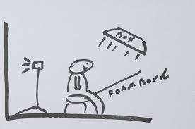
This is how butterfly lighting works you get a light above the person you are photographing and then you get a reflector under the person and it reflects the light to the persons head
Rembrandt lighting
Rembrandt lighting is a standard lighting technique that is used in studio portrait photography it is also used in contrast with butterfly It can be achieved using one light and a reflector, or two lights, and is popular because it is capable of producing images which appear both natural and compelling with a minimum of equipment. Rembrandt lighting is characterized by an illuminated triangle (also called “Rembrandt pat) under the eye of the subject on the less illuminated side of the face. It is named for the Dutch painter Rembrandt, who occasionally used this type of lighting
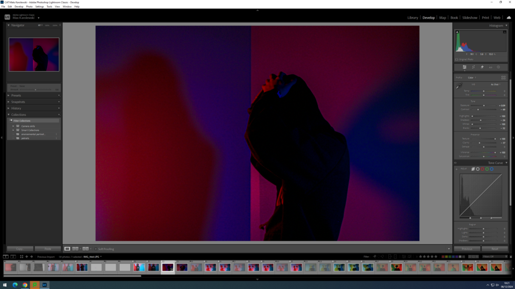
i think this is the best photo of Rembrandt lighting i did because i tried a different type of editing and it came out very well, i like this style of editing because its black and white but you can still see the shadow.
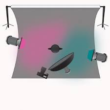
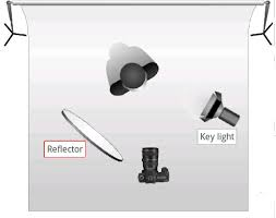
This is a diagram of the Rembrandt lighting technique the reflector reflects the key light back into the model and it comes out with nice shadows upon the model.
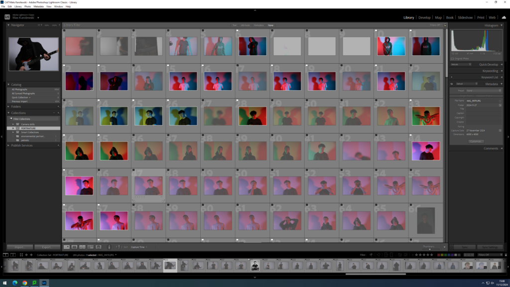
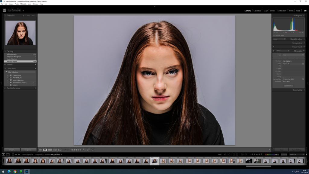
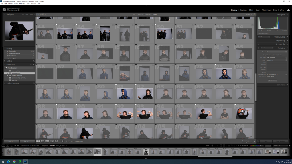
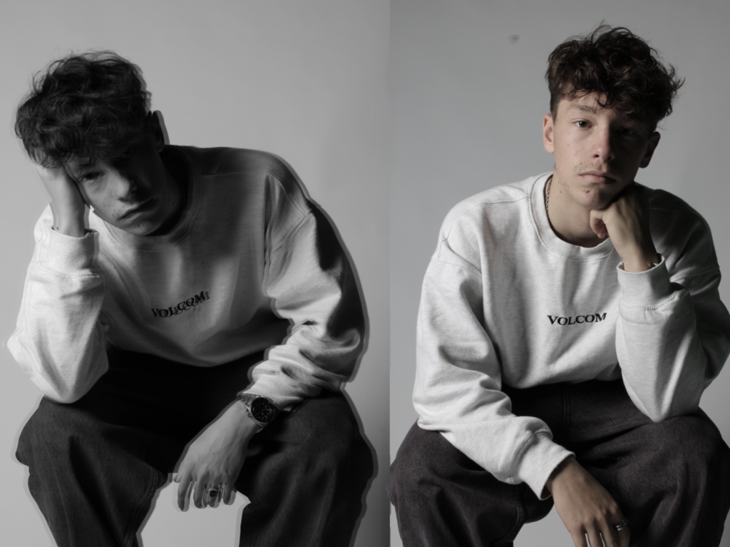
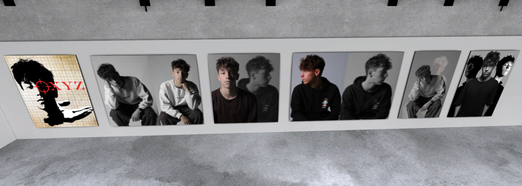
from all the photos I flagged the photos that are good and then unflagged the ones that I didn’t want to use, from all the photos i marked as a pass I chose the ones that I liked the most
Honey Comb
A lighting honeycomb grid is a specialized accessory used in photography to control and manipulate the direction of light. It typically consists of a grid of cells or hexagons that attach to a light modifier such as a reflector or softbox. The purpose of the honeycomb grid is to narrow down the spread of light, allowing photographers to focus and guide the illumination precisely where they want it. By using a honeycomb grid, photographers can avoid light spillage, create more defined shadows, and enhance the overall impact of their images. This tool is particularly valuable in portrait photography and other scenarios where controlled and directional lighting is essential for achieving specific visual effects.
This is the best honey comb photo I got I mixed it with some gels as well. The red spotlight behind is my favourite thing in this photo as it describes the photo a lot. Also the light on the face is like a spotlight.
Conclusion
In conclusion I think that this project was entertaining and it shows the different possible techniques that can be done, but in my opinion the gel lighting was the best ones I done because we can get many different outcomes and it wont always be the same, on the other hand I also think split lighting was good because the way the light reflected was different to other ways and it was also fun to do.
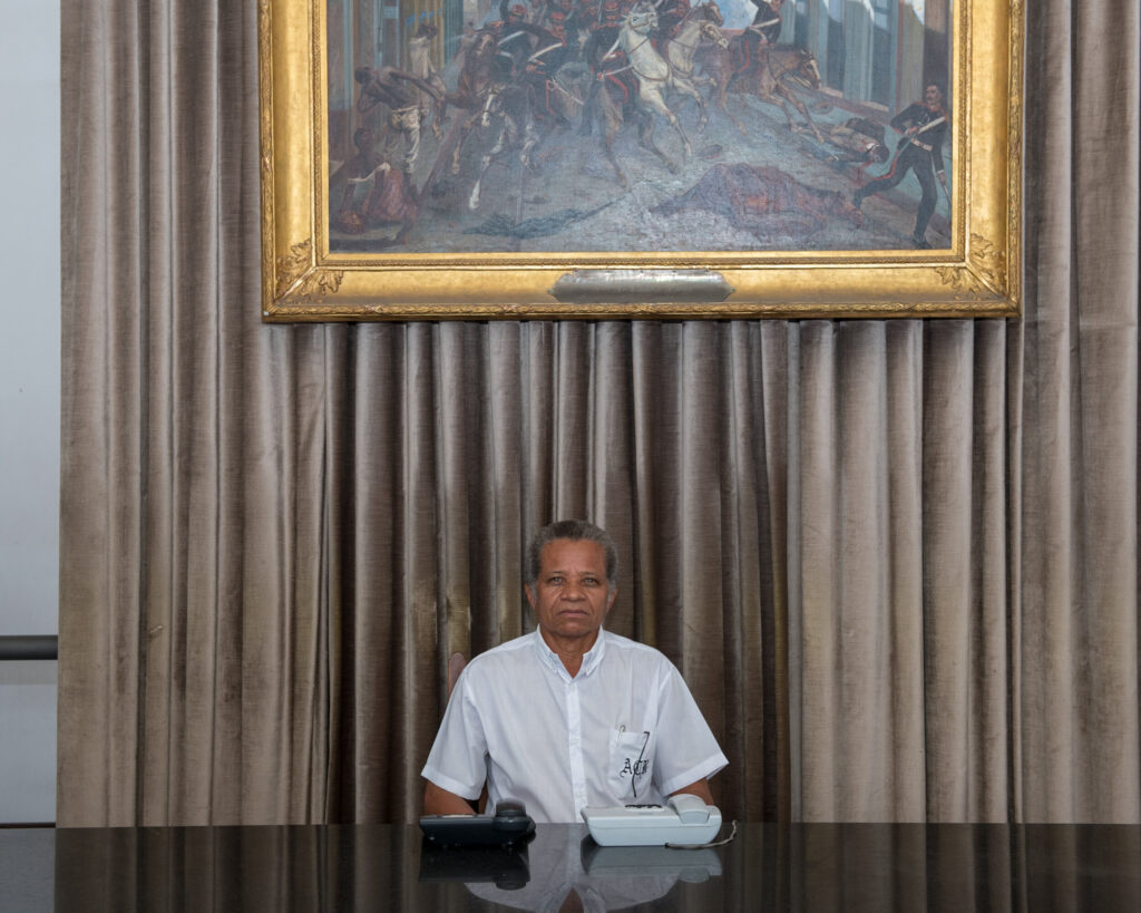
this photo is taken indoor and soft artificial lighting is used from above, the environment that this photo is taken from a reception, with the gold frame above it interprets that it is a rich office, the frame in this photo is half body angle, the approach of this photo the guy is sat with a natural pose, the guy gives eye contact engagement with camera with a straight face so that everyone knows he is ready for business, the camera man uses wide lens, mid-range f-stop, tripod, medium ss, low iso.
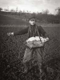
August Sander
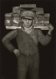
August Sander was a German photographer whose work documented the society he lived in. Lauded as one the most-important portrait photographers of the early 20th century, Sander focused his gaze on bricklayers, farmers, bakers, and other members of the community. “Nothing seemed to me more appropriate than to project an image of our time with absolute fidelity to nature by means of photography,” he once declared. “Let me speak the truth in all honesty about our age and the people of our age.” Born in Herdorf, Germany on November 17, 1876, Sanders learned photography during his military service in the city of Trier. By 1910, he had moved to a suburb of Cologne, spending his days biking along the roads to find people to photograph. By the time the Nazi regime rose to power in the 1930s, Sander was considered an authority on photography and recognized for his book face of our time (1929) During this era, he faced both personal persecution and the systematic destruction of his work. Following the death of his son in 1944, and the destruction of his work in 1946, Sander practically ceased photography altogether. He died in Cologne, Germany on April 20, 1964 at the age of 87. Today, the artist’s works are held in the collections of The Museum of Modern Art in New York, the National Gallery of Art in Washington, D.C., and the Wallraf-Richartz Museum in Cologne, among others.
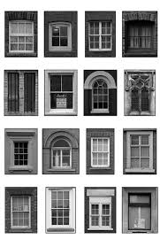
Typology
Typology is a set of images taken of the same subject in the same detail but you take a photo of the different types, typology is the act of finding, counting and classifying facts with the help of eyes.
like in this photo the photographer has taken photos of many different windows and they all look different.
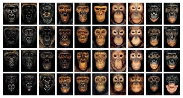
A photographer that focused there work on typology is Lucy Hurrel who took typologies of animals, i think this type of typology can mean a lot such as the difference with people but we are all the same but we just look different. Lucy Hurrel also focused on doing environmental typologies
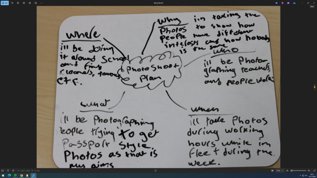
Photo shoot plan
Photos
we went out and took 158 out of my first round of picking photo i passed 33 photos and failed the rest
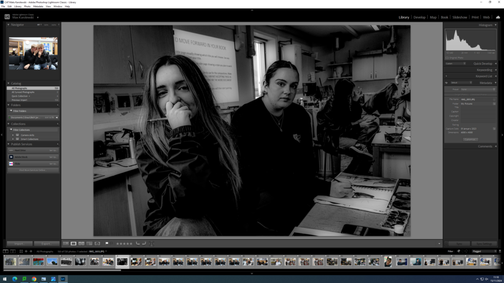
This photo is a good environmental portrait because it is people who have a passion for art, i edited this photo and made it black and white as i think it looked the best and it had the most detail
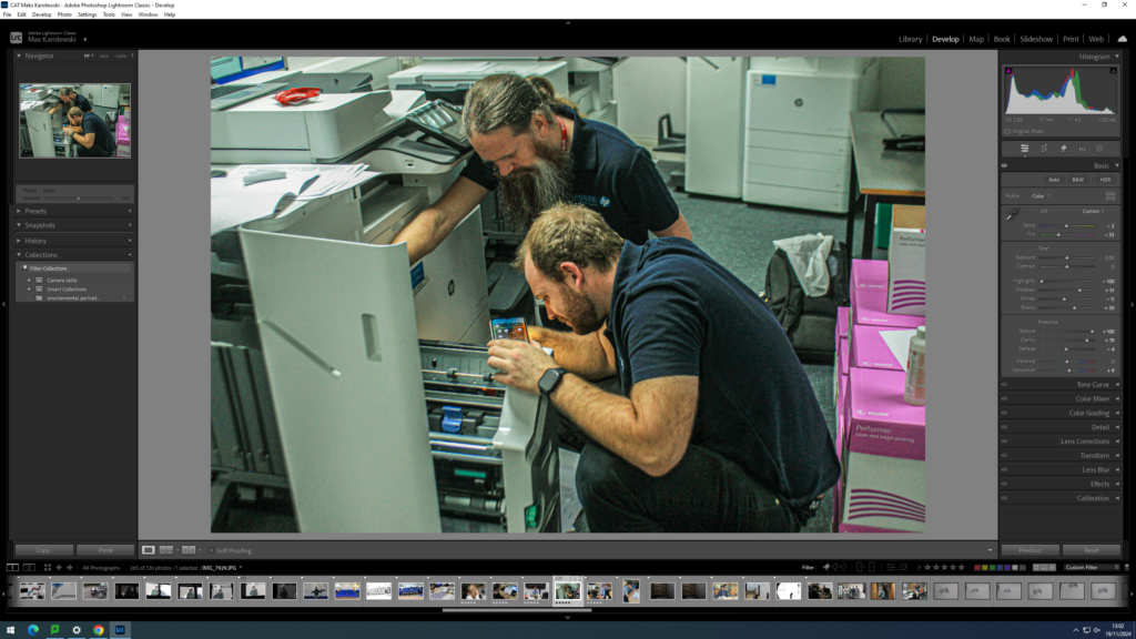
i like this photo because the workers are in there working clothes as well as there working environment which is technician. I edited this photo to add more lighting and make it more aesthetically pleasing.
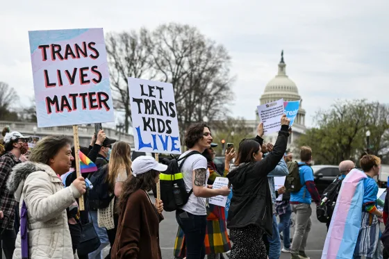
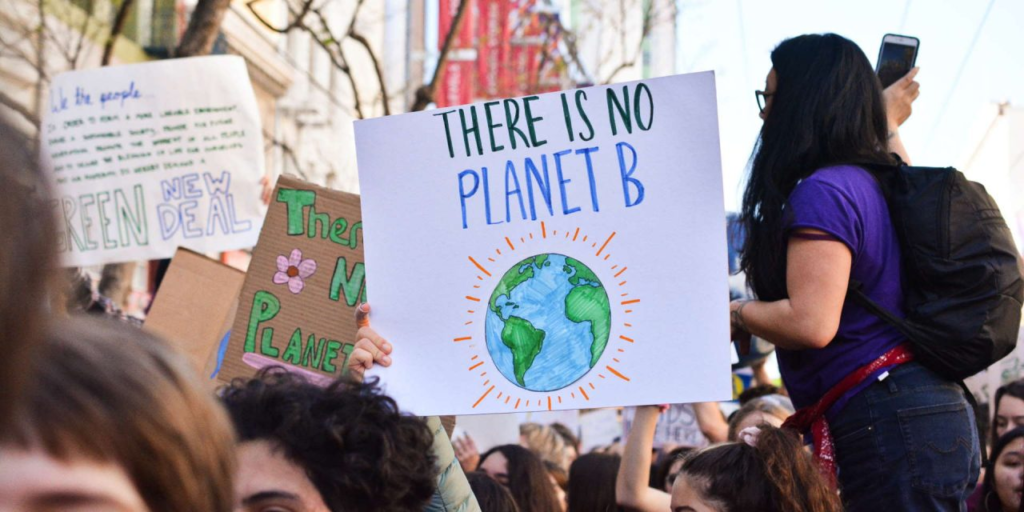
IDENTITY POLITICS is a phrase that describes a political approach where in people of a particular religion, race, social background and class or other identifying factor form special socio-political alliances. It makes the distinct experiences and challenges faced by these groups and advocates for policies and practices that address their specific needs and rights.
The term was coined by the Combahee River Collective in 1977. It took on widespread usage in the early 1980s, and in the ensuing decades has been employed in myriad cases with radically different connotations dependent upon the term’s context.
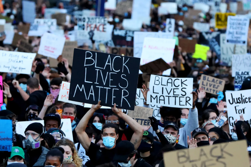
It has gained currency with the emergence of social activism, manifesting in many dialogues within the feminist , American civil rights , and LGBT movements , disabled groups, as well as multiple nationalist and postcolonial organizations, for example: Black Lives Matter movement.
How does Identity Politics link to Culture Wars?
CULTURE WARS are cultural conflicts between social groups and the battle for dominance of their values, beliefs, and practices. It commonly refers to topics on which there is general social disagreement and polarization in societal values is seen.
A “culture war” will signal much more than a disagreement. It will describe an impression of conflict between two irreconcilable worldviews in what is “fundamentally right and wrong about the world we live in” (1991).
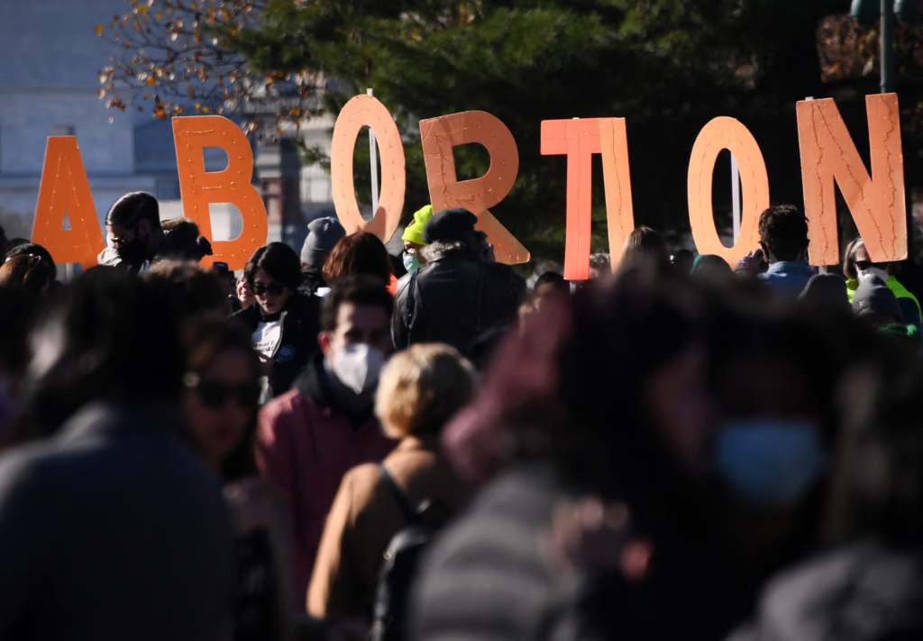
This term is commonly used to describe contemporary politics in western democracies with issues such as abortion, homosexuality ,transgender rights, pornography, multiculturalism, racial viewpoints and different cultural conflicts based on values, morality , and lifestyle being stated as the major political cleavage.
What are some of the positives associated with Identity politics?
Identity politics will help centre the experiences of those as they will view as they will be facing some systemic oppression so that society can get better understanding the interplay of different forms of demographic-based oppression and ensure that no one group is disproportionately or affected by political actions.
Dangers of Tribalism
Tribalism is defined as “behavior and attitudes that stem from strong loyalty to one’s own tribe or social group.”
The definition of as “a social division in a traditional society consisting of families or communities linked by social, economic, religious, or blood ties, with a common culture and dialect, typically having a recognized leader.” When we listen to the word tribe, we may think of Native Americans, but in modern usage the term can also refer to people who share common ideas and allegiances.
Tribalism
Tribalism can have extremely negative consequences when it is used to eliminate individuals or groups or to banish their rights, status, and/or independence. These negative impacts of tribalism are often sustained by competition and the perception of a very common threat. They will promote fear, anxiety, and prejudice, all of which make us more susceptible to fake news, propaganda, and conflict. Tribalism can take lots of forms in our modern society. One example of tribalism is individuals’ strong connections with sports teams. These partnership are frequently built on regional identities and approved through the use of symbols. We often see deep connection between fans of a specific team who classify strongly with each other and against fans of opposing teams.
Creative Portraits are what types of things will surround the photograph and its only a single shot.
Double/Multi-Exposures
Double/Multi-Exposures is creating an illusion by layering images (Section of images), which are over the top of each other. This may be achieved by using the correct camera settings ,or using Adobe Photoshop also by creating layers and then using BLENDING OPTIONS and opacity control, by getting rid parts of layers to then reveal other parts of the image.
Examples of DOUBLE/MULTI-EXPOSURE PHOTOS
Above there are some examples of double/multi-exposure photos , these photos were taken from many different artists.
Artist Reference
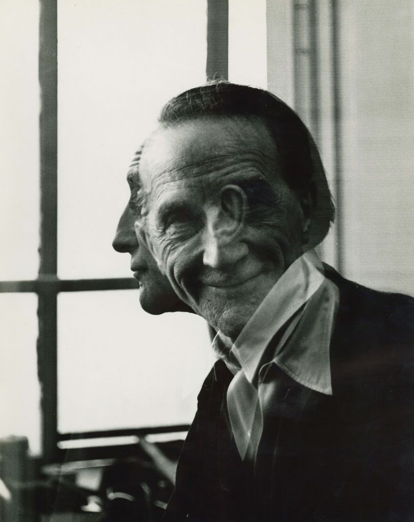
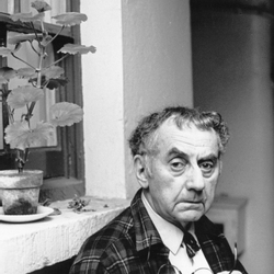
A famous Man Ray Photo
Technical- The lighting in this image is a natural lighting due to no lights reflecting on the photo. The aperture was likely quite large with a low f/stop number. This is because the man is in focus but the background isn’t in focus . Moreover the shutter speed was most likely quite quick, I can tell this because there is not a lot of motion blur and the man is in focus, I think it is something like 1/120 or 1/250. The ISO is most probably low, something like 100 or 200. Due to no visual noise and it doesn’t have a degrading quality.
Visual- There is no colour due to it being black and white, however its quite a light tone due to the bright and natural lighting. The man has rough, old skin which brings a large amount of texture to this photo and furthermore because of the multi- exposure due to two face being reflected in the photo. This image appears 3D. The rule of thirds is followed in this image, this is apparent because his eyes and head are in the centre and most of his body is not present in the image.
Man Ray
Man Ray was a visual artist and he spent most of his time in Paris, France. He was an important contributor to the Dada and the surrealist moments. He was also a painter. He was Born: August 27, 1890, Philadelphia, Pennsylvania ,United States and Died: November 18, 1976 (age 86 years),6th arrondissement of Paris.
Examples Of His Work
My Double Exposure Photos
Contact Sheet
This my contact sheet for my double exposure photographs.
Image Selection
Above you can see above I used P and X to flag my images to filter out my worst ones from the ok and good ones, next I rated these images 4 or 5 stars as 4 being ok ones and 5 being good ones, finally I gave them the colour yellow or green, green being the best and yellow being good.
My Double Exposure Photos
This photo didn’t need to be cropped on the sides due to equal negative space on each side this will create a balanced photo. On the top and the bottom it needed to be cropped due to having unequal negative space. To complete this photo three layers very needed to complete the background. In two of the layers I have reduced the opacity to make a shadow of the portrait. By reducing the opacity it removes most of the photo, so it will become a shadow. That is what has happened in my photo. This is a part of Man Ray’s work which adds opacity, shadows and lots of double exposure.
By being cropped, there is equal negative space on the top and the bottom of the photo.
This photo used has used six layers. If less layers were used I don’t think this photo would work out. I have reduced the opacity to 32 percent, this is why the photo has a blurred effect in the foreground. This photo has gave me inspiration from Man Ray, I love the way he gave a distorted effect to his photos.
In the background, I have some stars that you can slightly see. To make the stars in the background I have made a slight shadow so these stars can be clear.
This is the same photo as above, I have cropped it due to both sides having to much negative space ,which will create an unbalanced photo. I have also cropped the photo because I want the subject to be centred in the foreground of the photo.
Juxtaposition
Juxtaposition is placing two images together to show contrast or similarities. An example of a Juxtaposition is matching colours of your clothing to something out in the wilderness an example of an artist doing this is Nikita Pirtogov.
Artist Reference
Nikita Pirtogov
Nikita Pirogov is a photographer, artist and a poet who was born in Leningrad, USSR, in 1989. He studied in RGISI (Saint-Petersburg, Russia) and has got an MFA from IED Madrid (Madrid, Spain). His works were exhibited in Russia, Italy, France, The Netherlands, Denmark, Latvia, Slovakia, Portugal, USA, Brazil, China, Cambodia, Fiji and South Korea and are in the collections of State Russian Museum in Saint-Petersburg, Russia and Gallery Image in Aarhus, Denmark.
Examples of Nikita Portogov’s work
These photos are an example of juxtaposition due to the photographer matching colours with the subjects clothing, hair and the background. These photos are opposites of each other.
My Juxtaposition Photos
Lightened Black
These photos where edited in Lightroom using the filters BW11 and 05,this is how I achieved these final images.
Photo-Montage
Photo-montage is the process and the result of making composite photograph by cutting , gluing, rearranging and overlapping images to create new images.
Artist Reference
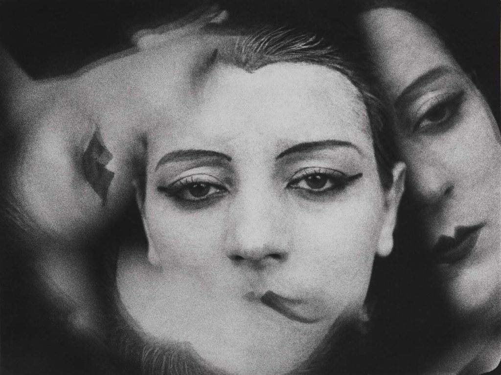
John Stezaker
Is a British artist who is thrilled by the amount of images. Taking classic movie stills, vintage postcards and book illustrations, Stezaker makes collages to give ancient images a original meaning. By adjusting, inverting and taking-apart separate pictures together to create unique new works of art, Stezaker explores the subversive force of found images. Stezaker’s famous Mask series fuses the profiles of glamorous sitters with caves, hamlets, or waterfalls, making for images of dark beauty.
This photo is one of John Stezaker’s most famous photos .It is called Mask XIV and it was created in 2006.This work follows a simple format: Stezaker covers an old and ancient publicity portrait of a film star with a postcard. The postcard is becoming the mask over the face, It opens a window into another space. This images will give different interpretations of people faces. The scene in the postcard could is reflecting the peace and tranquillity of the setting.
Above, His ‘Dark Star’ series is popular publicly portraits into cut-out silhouettes, creating an important presence in the place of the absent celebrity. Stezaker’s way of giving old images a modern place in life it will reach its height in the found images of hisThird Person Archive: the artist has removed elegant , haunting figures from the margins of out-of-date travel illustrations. Presented as images on their own, they now take the centre stage of our attention.
Examples of John Stezaker’s Work
My Photomontage Photos
Contact sheet
This is my contact sheet for my Photomontage Images.
Image Selection
Above you can see above I used P and X to flag my images to filter out my worst ones from the ok and good ones, next I rated these images 4 or 5 stars as 4 being ok ones and 5 being good ones, finally I gave them the colour yellow
This is the original photo without being cropped. Below is the same photo but cropped. To complete and finalise this photo four layers were needed for this in the background , otherwise it wouldn’t be as effective because less layers would make an empty photo. In all four layers I have kept the opacity the same. I have had some inspiration from John Stezaker because I love the way he uses photomontage in his photos.
This is the same photo as above, I have cropped it due to both sides having to much negative space ,which will create an unbalanced photo. I have also cropped the photo because I want the subject to be centred in the foreground of the photo.
This photo above gave me inspiration from John Stezakars work. I have done this photo in light instead of dark. The original photo done by John Stezakar’s was done in the dark. My favourite photo of his is called Mask XIV, which was photographed in 2006. I love this photo because it includes the beautiful beach in the foreground then a portrait in the background of the photo. This work follows a simple format with a portrait and a photo of a beach. The picture becomes a mask over the face. Alternatively, by replacing eyes with a beach creates tranquillity and peace. This photo will need to be cropped due to negative space on either side.
This is the cropped photo. By cropping it the subject is much more centred than it was before.
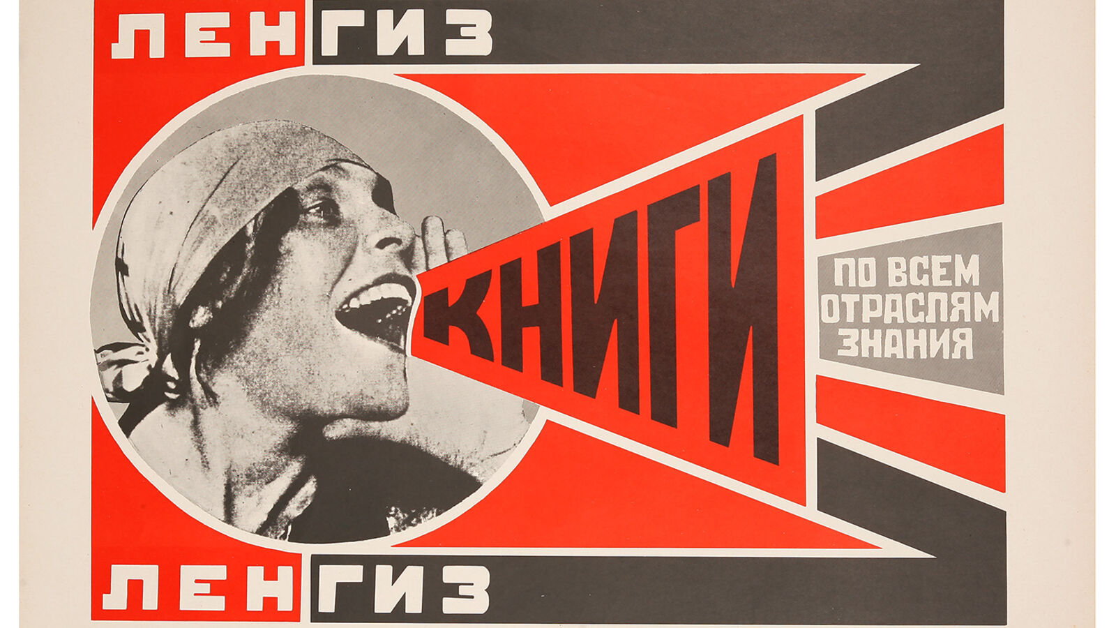
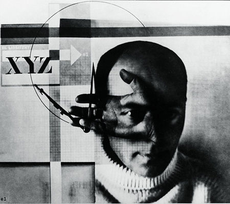
El Lissitsky
EL Lissitsky was a Jewish-Russian artist and photographer , active as a printmaker, painter, illustrator, designer, photographer, and architect. He was Born: November 23, 1890 Pochinok, Russia. He died December 30, 1941 (age 51 years), Moscow, Russia. He is known for using Geomertic shapes and negative space.
An Example Of One Of His Photos
Suprematism is famous art movement, focused on basic geometric forms, such as circles, squares, lines, and rectangles, painted in a limited range of colors. It was founded by Kazimir Malevich in Russia, around 1913, and announced in Malevich’s 1915 exhibition, The Last Futurist Exhibition of Paintings 0.10, in St. Petersburg, where he, alongside 13 other artists, exhibited 36 works in a similar style. The term suprematism refers to an abstract art based upon “the supremacy of pure artistic feeling” rather than on visual depiction of objects.
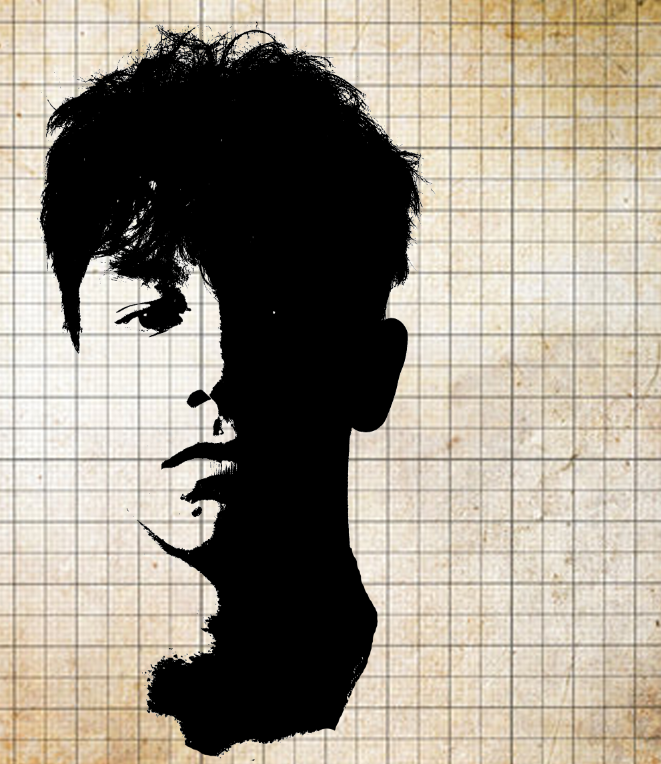
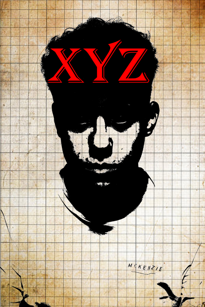
My Process For My Photo
This is the process I had to go through to create my photo below. In total I had to make 7 layers to create this photo.
I also used this bar to see how dark I wanted my photo .You can pick many different filters till you pick one that matches your theme.
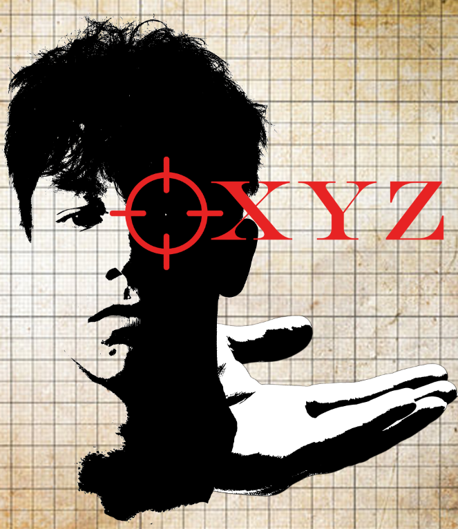
My Final Photo
I added a target on the shoulder in the photo because it got inspiration from El Lissitsky and it makes the photo more interesting and it adds more detail to his photo.
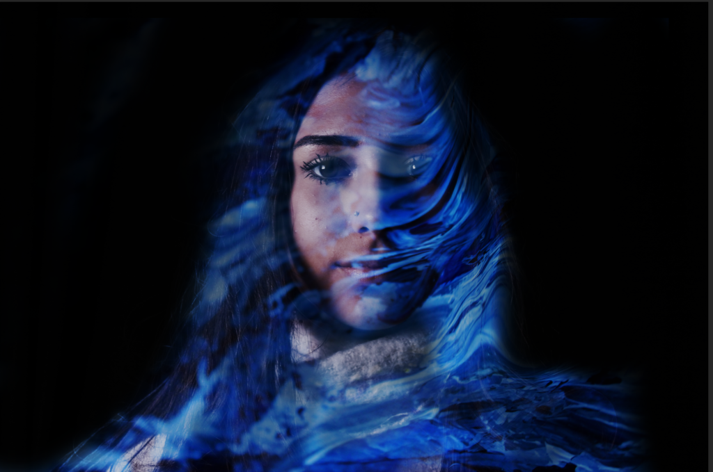
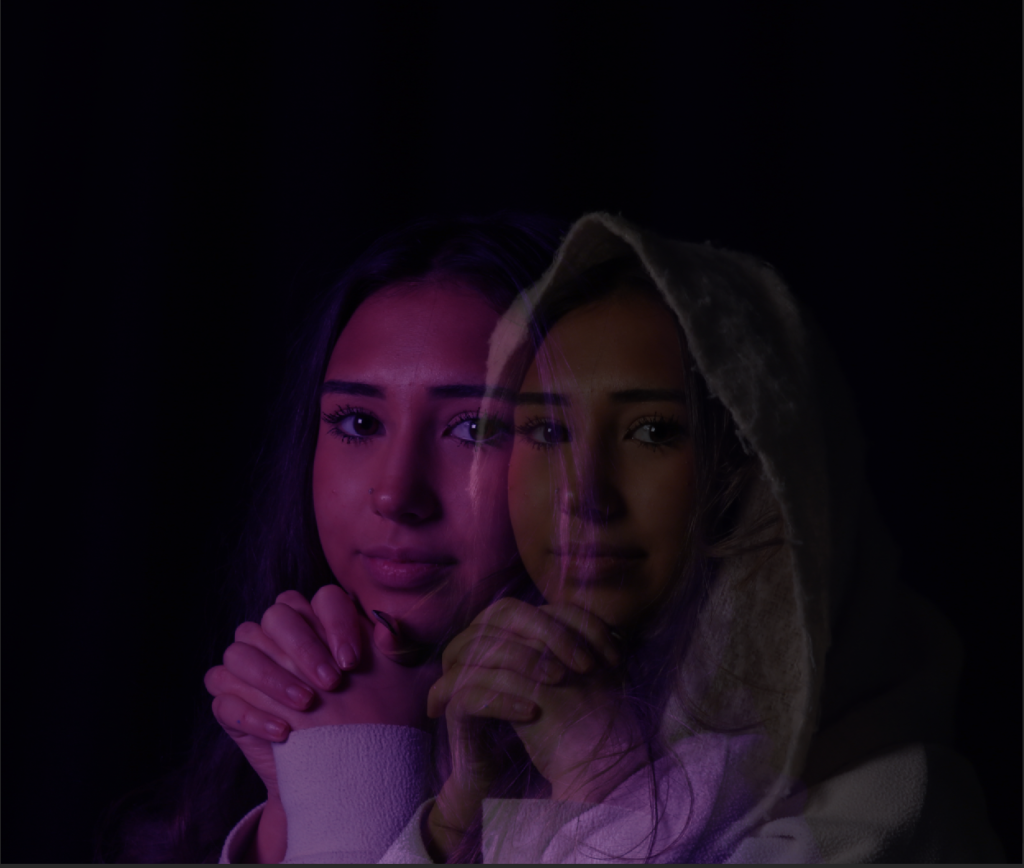
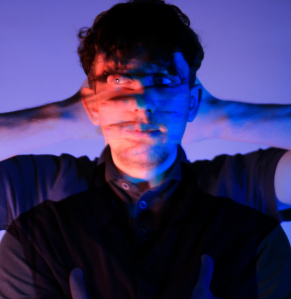
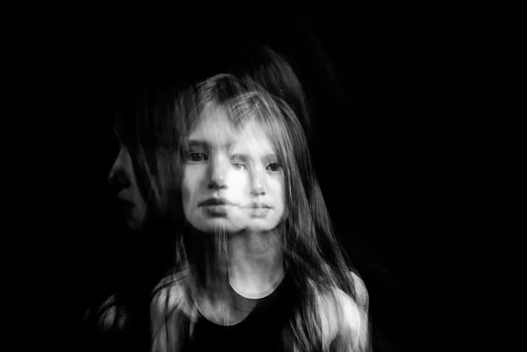
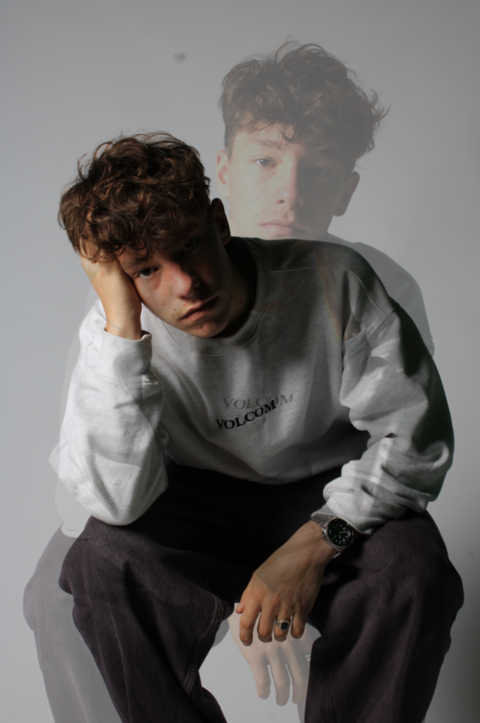
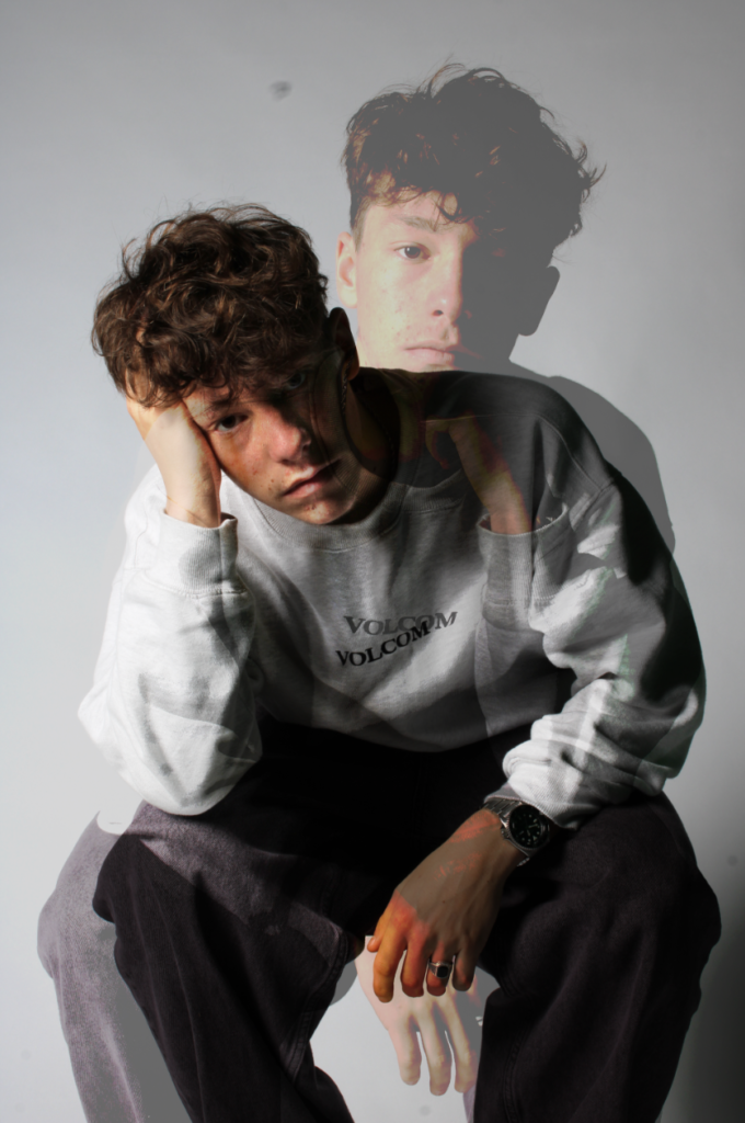
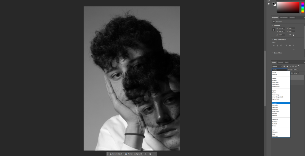
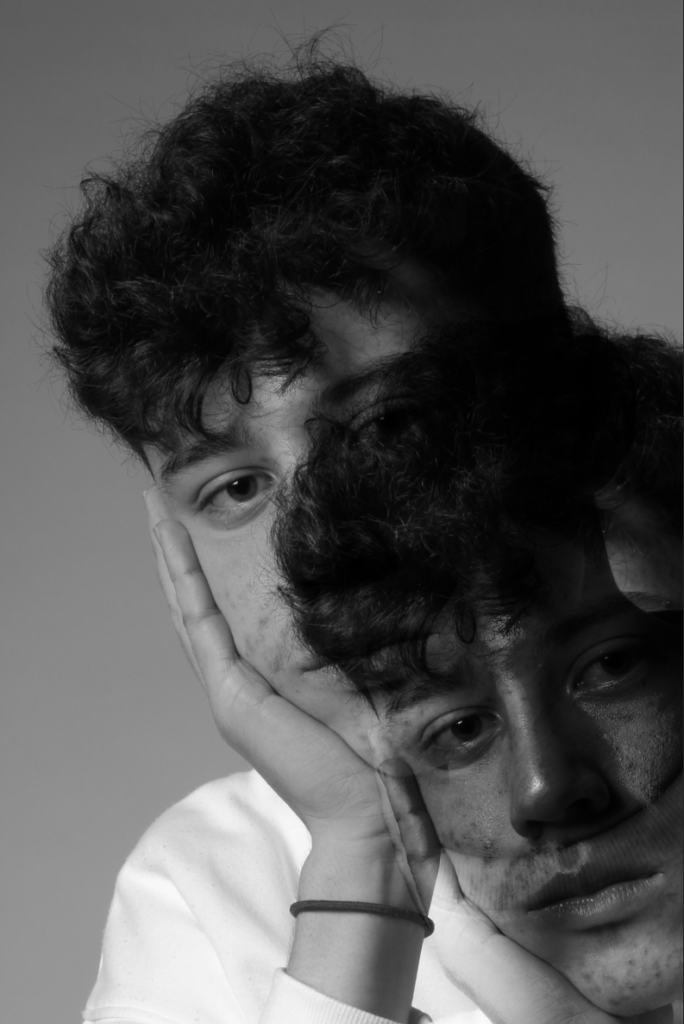
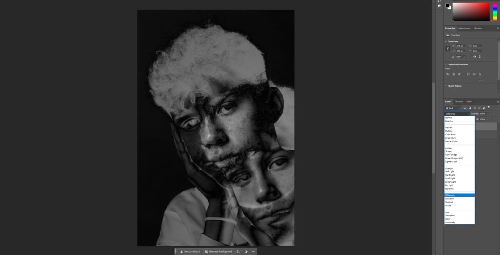
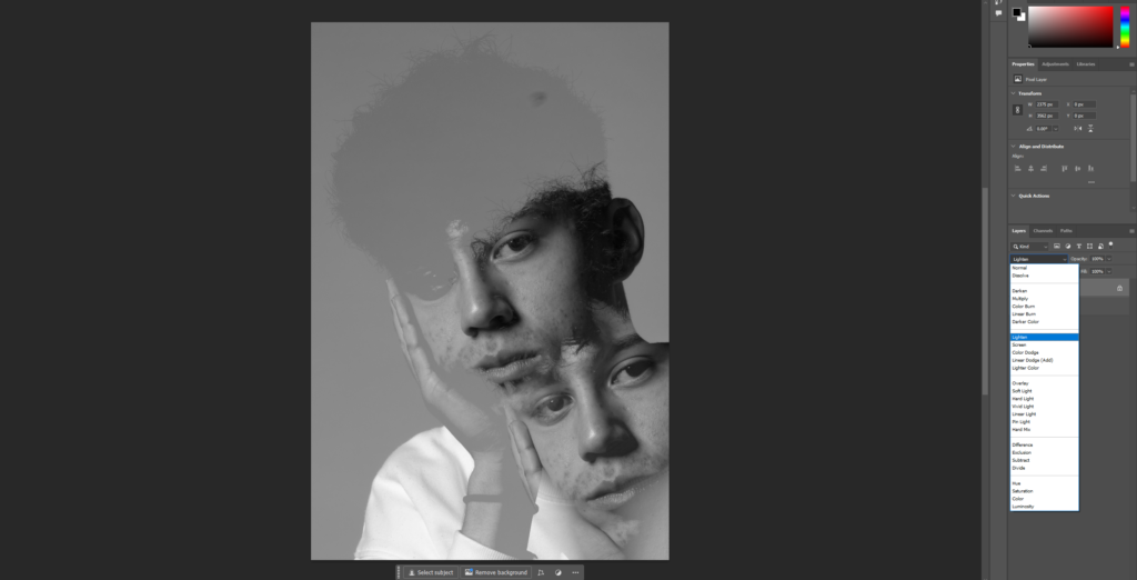
Double/multi exposure is a technique that combines two different exposures or images that are layered on top of each other; the image overlaid is less than full opacity so a bit of both images can be seen, producing an almost ghost-like image. Double/multi exposure can be created in-camera with certain settings or with editing programs like Photoshop/Lightroom using layers.
Double exposure can be used to make abstract, creative images that explore themes such as time, memory, and identity. By combining multiple elements and layering them into a single image, double exposure allows us to create new interpretations of reality and dream-like imagery.
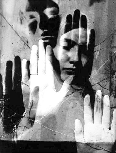
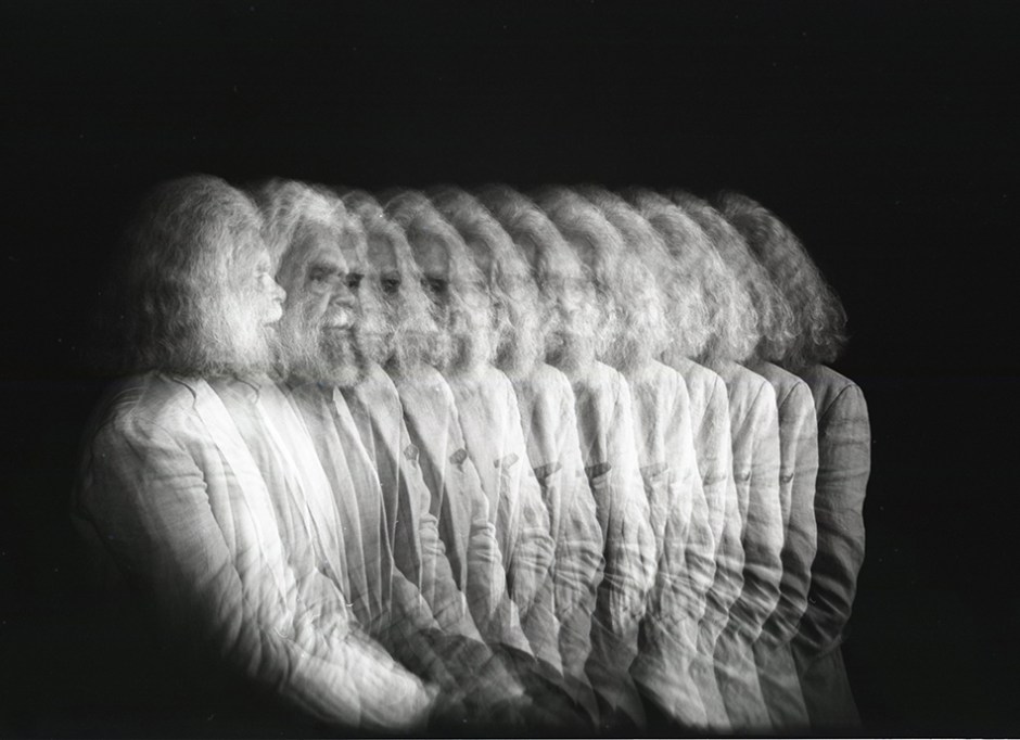
One of the most renowned multi exposure photographers was Man Ray, an American visual artist who spent most of his career in Paris. He contributed significantly to the Dada and Surrealist movements, and produced major works in a variety of media but considered himself a painter above all. He is most famous for his surreal dream-like multi exposure portraits, and is credited with increasing the popularity of this style of photography.
Above are two example double exposure images from Man Ray, where a person has been photographed twice in two different positions and/or expressions – these two photos have then been layered on top of each other as well as being made black and white to which results in a creative, surreal portrait with somewhat gloomy undertones.
Deeper Image Analysis – Man Ray
Technical – The lighting in the image appears to be natural light coming from the window to behind the man, creating light on the forehead of one layer and the side of the head on the second layer which consequently leads to shadows cast on the other half of his face. Furthermore, a low f/stop was likely used as the background is less in focus with more details and texture highlighted on the subject, contributing to the surreal atmosphere the image is creating. Finally, the ISO was likely low such as 100 or 200 since there is little to none visual noise apparent in the background which adds to the emptiness of the background and therefore the dream-like mood the image presents.
Visual – The image is presented in black and white, which when combined with the clash of light and dark tones between the two layers strengthens the contrast in shadows and lighting and adds more to the surreal aspect of the photography. This is also reinforced further with the lack of texture in the background in contrast with the texture present on the man’s face in form of wrinkles, making it seem like the subject photographed has been presented in a dreamy environment. Furthermore, there is clear use of form and 3D elements seen with the two different layers which combines with the other visual techniques mentioned creates a very captivating and intriguing surreal environment.
Conceptual – Being part of the surrealist movement, the reasoning behind this image was to spin a creative twist on the traditional portrait using multi exposure and an abstract background to create a dream-like effect which creates interest.
Juxtaposition
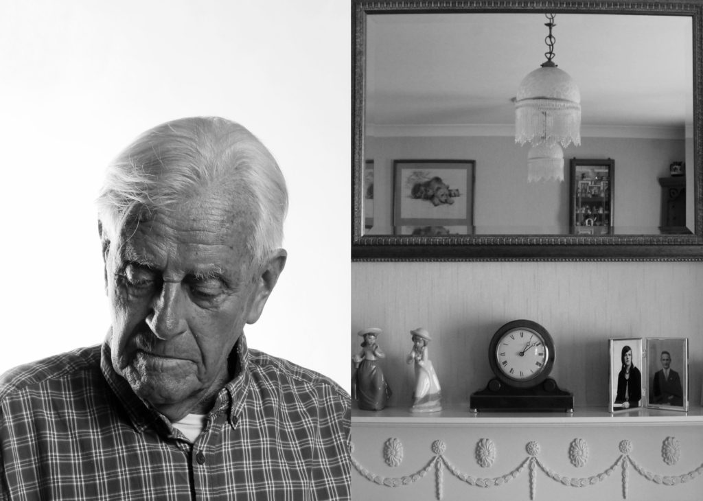
Juxtaposition is having two photos presented side by side to show contrast or highlight similarities. This can tell a story about a person and a place/person/memory associated with them, for example juxtaposing a builder with the construction site they are working in allowing the viewer to make a clear connection between the two images.
LIBERATION / OCCUPATION newspaper 25 April 2020
In the example image above, a portrait of an old man with a visibly distant and sad expression looking down from the camera has been juxtaposed alongside a picture of what seems to be a living room, with a mirror alongside a clock and some old pictures. From the man’s expression, a connection can be made between the two pictures as we can assume it is his room and the mirror represents reflection, with the clock and old pictures suggesting that the man is reflecting on his youth and past memories and seems to regret or miss them due to the lack of eye contact between him and the camera and his dull, depressed expression.
Photomontage
Photomontage is the process of making a composite photograph by cutting, gluing, rearranging and overlapping two or more photographs into a new image.
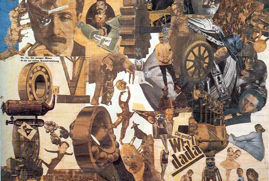
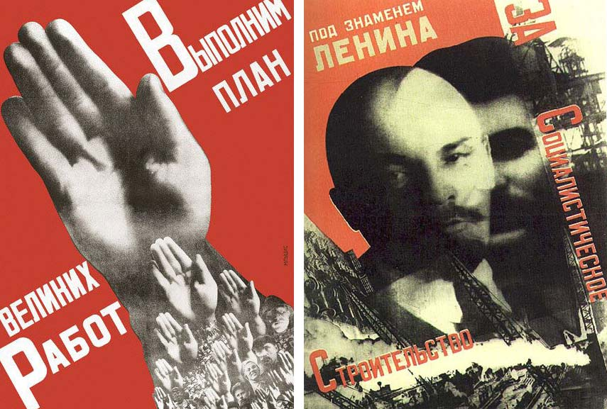
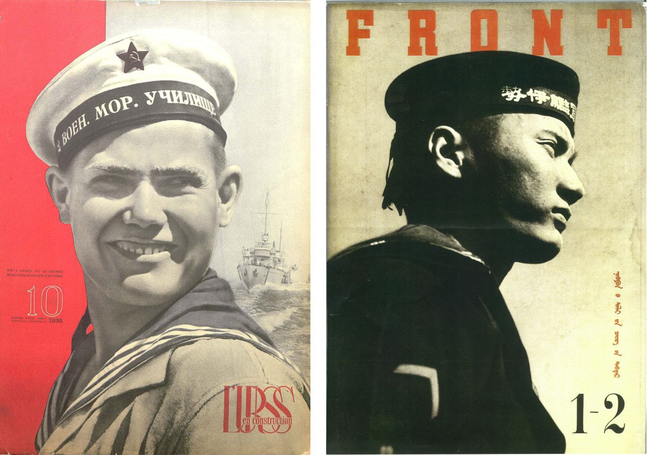
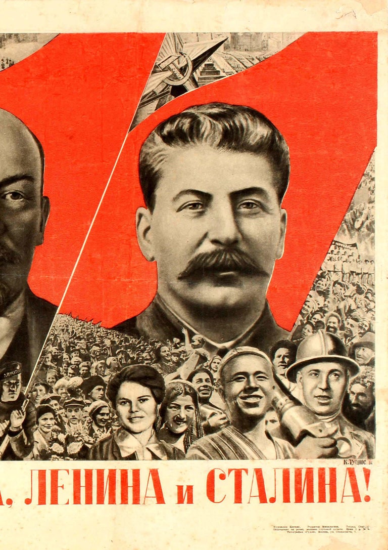
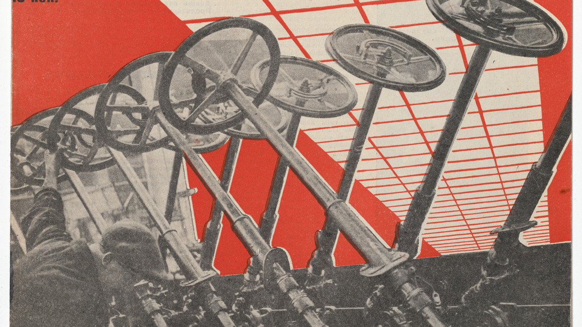
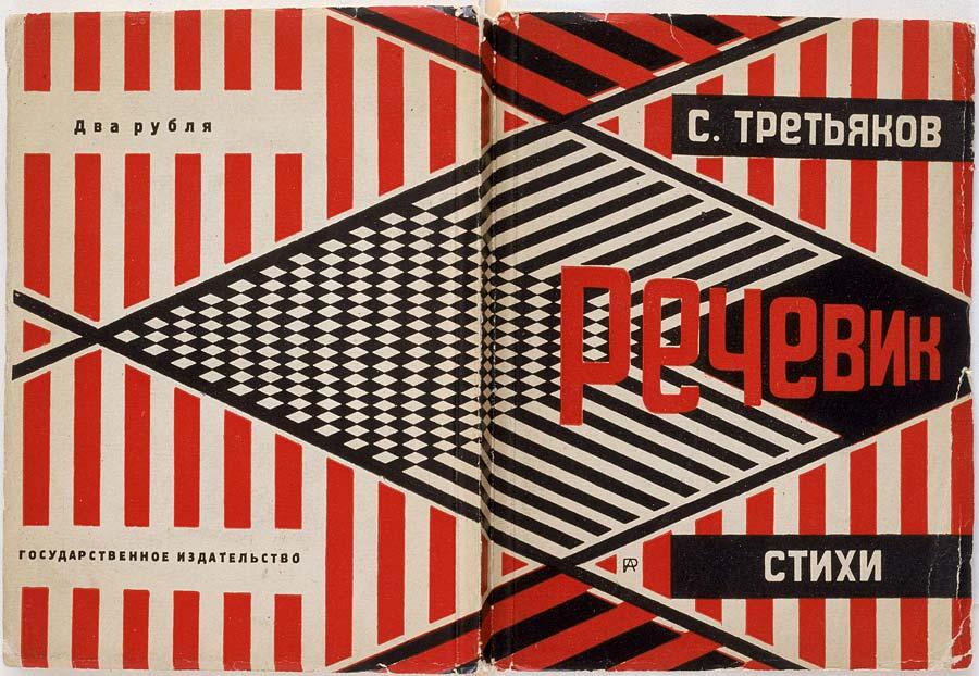
Photomontage is often used as a means of expressing political dissent. It was first used as a technique by the Dadaists in 1915 in their protests against the First World War, and one of the most famous examples of photomontages is Aleksander Rodchenko’s work during the Russian Constructivism – an artistic and architectural theory that originated in Russia at the beginning of 1913 by Vladimir Tatlin. This was a rejection of the idea of autonomous art by constructing it, and the movement supported art as a practice for social objectives.
Rodchenko was a highly adaptable artist who played a significant role in the constructivist and productivist movements following the Russian Revolution. Initially, he focused on painting and graphic design, but later shifted his attention to photomontage and photography. His photographic work was deeply connected to social issues, breaking new ground in style, and rejecting traditional painting techniques. He believed in the importance of analytical and documentary photography, often capturing his subjects from unusual perspectives – either from high above or low below – to surprise the audience and delay their understanding. He wrote: “One has to take several different shots of a subject, from different points of view and in different situations, as if one examined it in the round rather than looked through the same key-hole again and again.”
His photomontages often had the subjects presented in black and white with text and different images such as hands or other faces layered on top of/around the subject, creating unique and intriguing images.
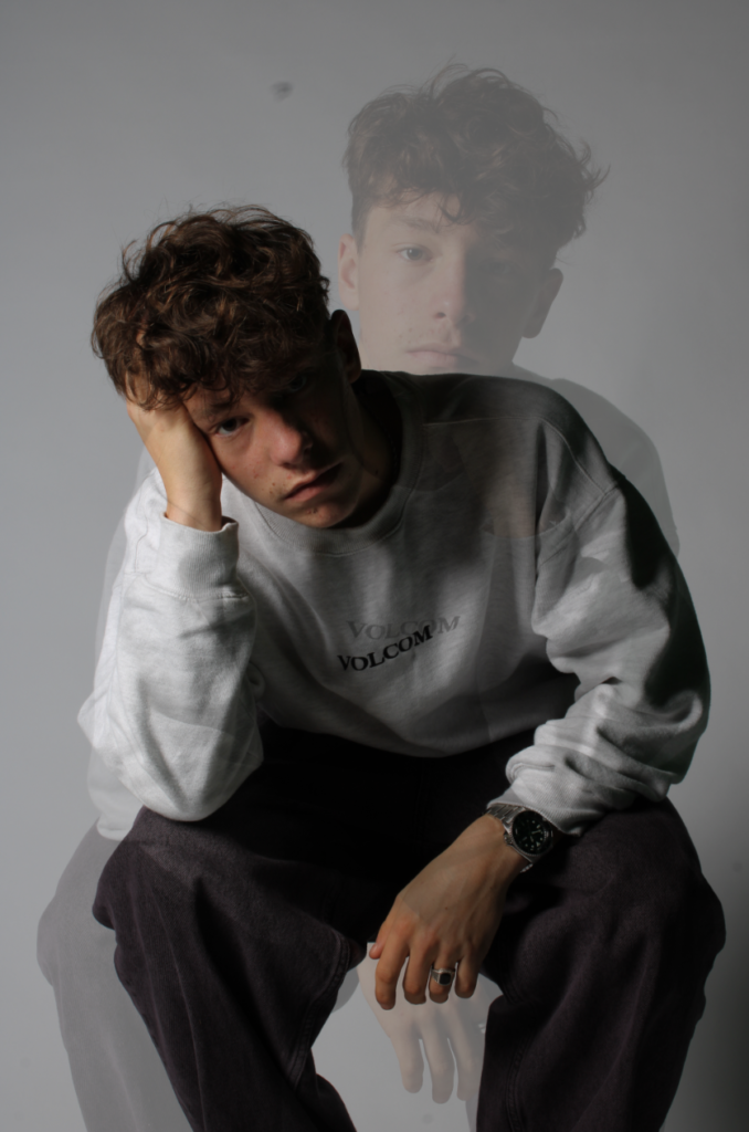
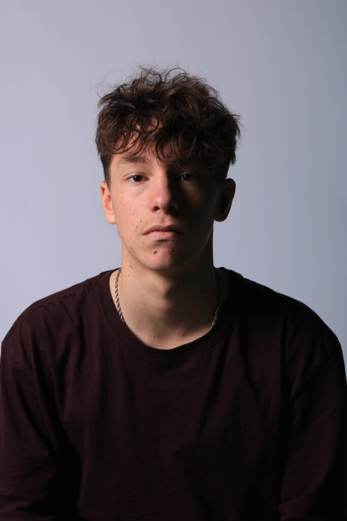
My Multi Exposure Work
To replicate the multi exposure effect, I took two of my studio portrait images to import into Photoshop.
My two chosen images
After I had chosen my two images, I then layered them on top of each other as seen below.
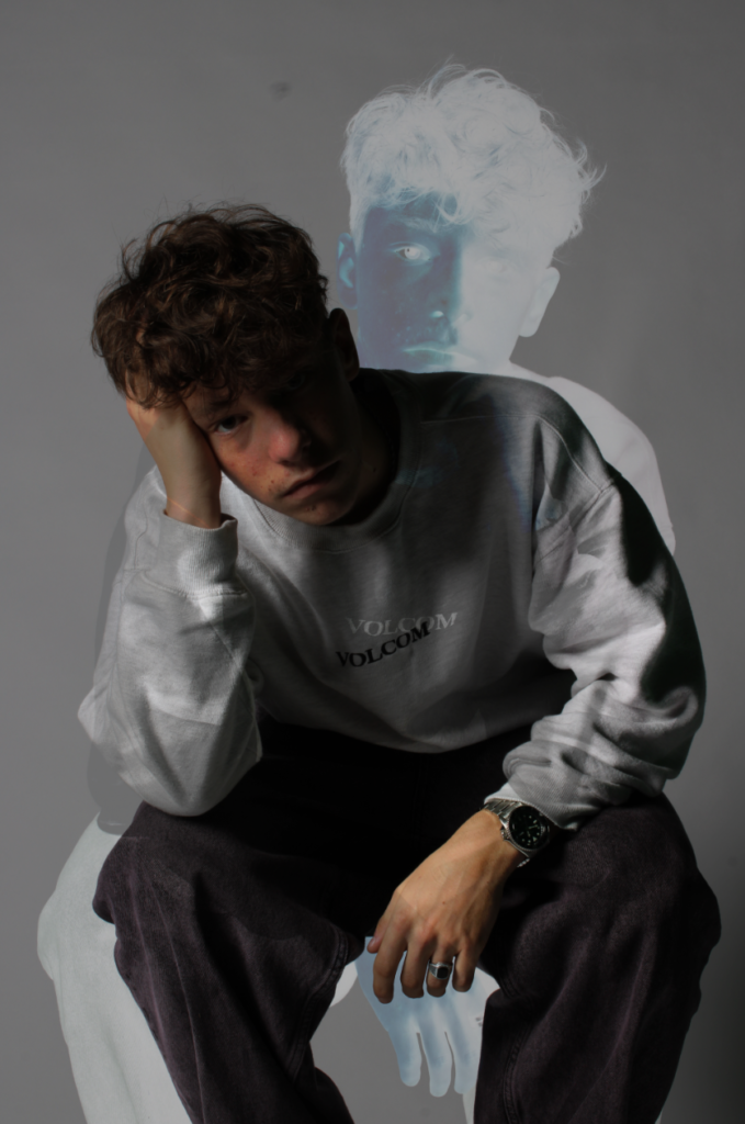
I then experimented with the different options available to see which one I liked most.
Darken
Vivid light
Multiply
Subtract
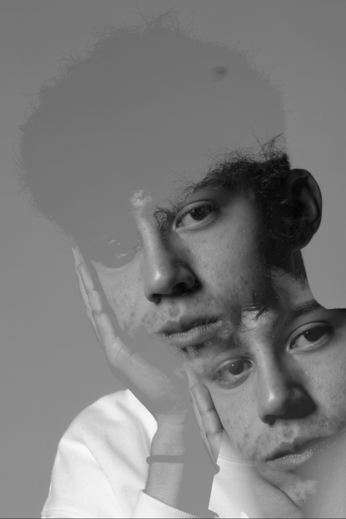
After deciding to use the subtract setting, I then tried changing the opacity to different levels and editing each layer separately (e.g. making the main one black and white while keeping the other one in colour) to see how this would affect the final outcome of my image.
I think this image turned out really well since the dull black and white colours as well as the hunched over pose of the first layer create a melancholic mood which clearly contrasts with the more intriguing atmosphere from the second layer due to the more vibrant colours and upright pose.
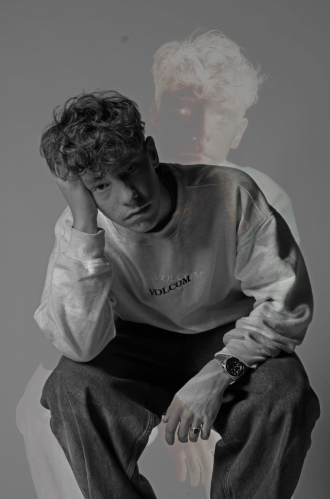
More Multi Exposure Experiments:
I then tried using images which were different to each other (e.g. some were headshots whereas some were half-body and some had Finn gazing directly at the camera whereas some had the gaze off to the side) and tried layering these images with each other and adjusting opacity to see what effect it would give my images. I found the most effective image was the last one, where I took I picture of Finn staring straight at the camera with a Rembrandt effect and put it in the foreground combined with a black and white, slightly motion blurred side profile shot in the background which clearly contrasts with the foreground and creates a dull and melancholic mood.
My Juxtaposition Work
For my juxtaposition experiments, I tried contrasting two images which were very clearly different to each other (e.g. one looking left and one looking right) and if needed editing one of the images to further highlight contrast.
For this juxtaposition, I took two portraits where Finn was looking in different directions and placed them side by side to contrast this difference. I thought this wouldn’t be enough so I took the right image where his face was slightly darker due to the lighting and made it black and white to amplify these shadows as well as further contrast from the left portrait, and finally added some motion blur which works really effectively to make the two portraits stand out from each other even more.
I then tried a similar idea, taking two portraits with contrasting positions and making one different from the other to highlight contrast. With the image on the left, I felt the subject’s body language and position had dull undertones to it so I made it black and white and copy and pasted the image while stacking it on top of it but moving it slightly to the left and right which created a blur/distortion effect. I found this worked really well since there is a clear difference in colour, lighting, composition and body language in both images which I was able to highlight using juxtaposition.
My Photomontage Work
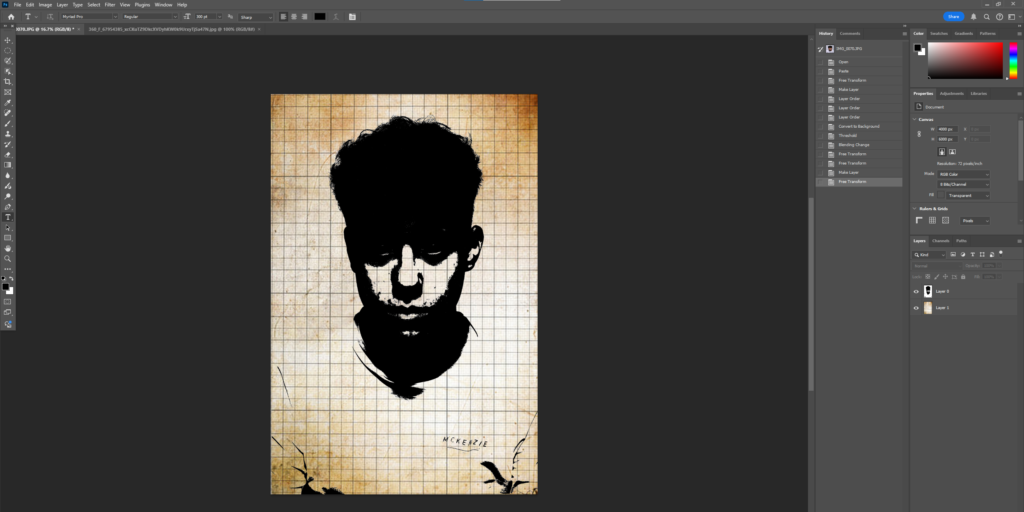
The portrait I used for my photomontage
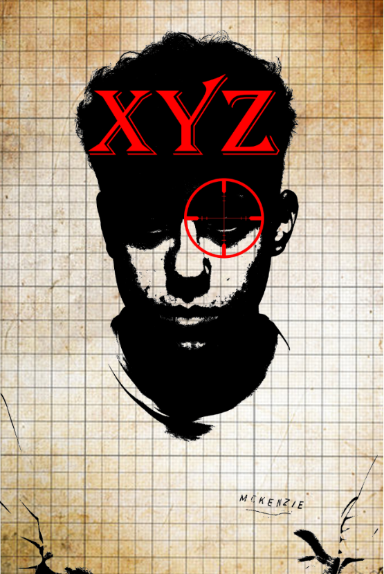
For my photomontage, I decided to try and replicate the Russian Constructivism style of photomontages used by Rodchenko.
I first got my background and got the head of my subject from the portrait before adjusting the threshold and placing it above my background, and then changing the blending.
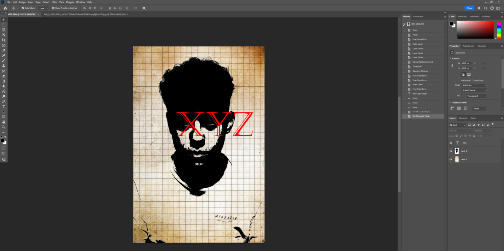
I then added a crosshair on the eye and some text alongside it to better achieve the photomontage effect, as well as an outstretched hand.
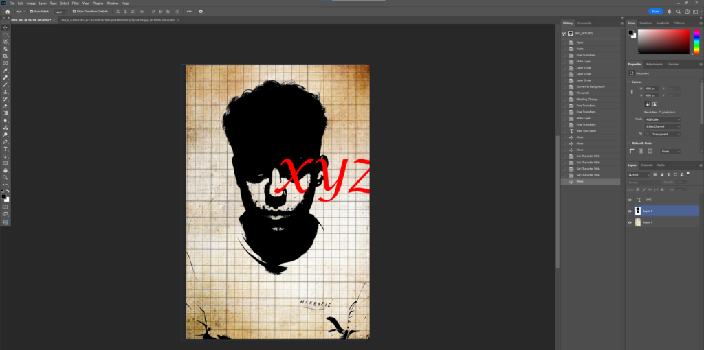
Photomontage – Compare vs Reference
I think I replicated a photomontage in the style of Rodchenko effectively since I have layered multiple images and text over each other, including a main subject with a hand layered on it. The only difference is mine has been done in colour since I like the contrast created between the black and white layers and the red crosshair with red text, and I think the crosshair fits nicely into the photomontage as an additional layer as well as bringing focus back to the subject’s eye in the dark half of his face.
Creative portraiture usually means photos that are more than just a single shot taken with a camera. It often mixes different images and elements to create a final piece, which is also called a composite image. This method can include pictures that have been heavily edited, while other styles might stick to what the camera originally captured. Before digital photography became popular, techniques in the darkroom like dodging, burning, and masking allowed photographers to get really creative with their images. Nowadays, when people talk about creatively changing an image, they often use the term “photoshopped.” This refers to images that have been altered in some way, often making them look different from reality, using software like Adobe Photoshop.
Examples
Double/ Multi-exposure
What is it?
Double or multiple exposures are a cool trick that happens when you stack images on top of one another. You can do this directly with your camera settings, or you can use Adobe Photoshop by making layers and adjusting the blending options and opacity. Another way to create this effect is by erasing parts of the layers to show different sections of the other images underneath.
Examples
Artist Analysis
Man Ray
Man Ray, originally named Emmanuel Radnitzky, was born on August 27, 1890, and passed away on November 18, 1976. He was an influential American artist who spent a large part of his life in Paris. While he played an important role in the Dada and Surrealist movements, his connections to these movements were more casual than formal. Man Ray created significant pieces across various art forms but primarily identified as a painter. He gained fame for his innovative photography and was well-known for his work in fashion and portrait photography. Additionally, he is recognized for his unique photograms, which he referred to as “rayographs” as a nod to his own name.
Examples of his work
These are some of Man Rays most famous multi-exposure photos.
Image Analysis
Technical- The lighting in this image is most likely nature lighting. This is because he appears to be looking out of a window which is bringing in some nature light. The aperture was likely quite large with a low f/stop number. This is because the man is in focus but the background is completely out of focus. Moreover the shutter speed was most likely quite quick, I can tell this because there is little motion blur and the man is in focus, I think it is something like 1/120 or 1/250. The ISO is most probably low, something like 100 or 200. Due to this photo being black and white, it appears cold with little warmth or saturation.
Visual- There is little colour due to it being black and white, however its quite a light tone due to the bright natural lighting. The man has rough, old skin which brings a large amount of texture to this photo and furthermore because of the multi- exposure the photo is given a lot of depth and makes it seem really 3D. The rule of thirds is followed in this image, this is apparent because his eyes and head are in the centre and most of his body is cropped out of the image.
My attempt at Multi-exposure
I used these two photos to create multi-exposure.
“Overlay”
More attempts
“Difference”
“Lighten”
Juxtapoisition
What is it?
Juxtaposition is when you put two contrasting things next to each other. This technique is usually used to highlight their similarities or differences, making it easier to compare and contrast them.
Examples
My Juxtaposition edits
Photoshop
Further Manipulating
“Lighten”
“Luminosity”
Russian Constructivism and Photomontage
What is it ?
Constructivism is an art movement that started in the early 1900s, specifically in 1915, thanks to artists Vladimir Tatlin and Alexander Rodchenko. This style is known for being abstract and minimalistic, focusing on representing the modern industrial world and urban environments. Instead of using decorative elements, constructivist artists preferred to work with industrial materials and assemblages. They believed in using art for social and propaganda purposes, aligning themselves with Soviet socialism, the Bolsheviks, and the Russian avant-garde. The impact of constructivist art and architecture was significant, shaping many modern art movements throughout the 20th century. It played a crucial role in influencing important styles like Bauhaus and De Stijl. Its reach extended across various fields, affecting architecture, sculpture, graphic design, industrial design, theater, film, dance, fashion, and even music to a certain degree.
Examples
Artist Analysis
Aleksander Rodchenko
Who is he ?
Aleksander Mikhailovich Rodchenko (December 5, 1891 – December 3, 1956) was a prominent Russian and Soviet artist, sculptor, photographer, and graphic designer. He played a key role in founding constructivism and Russian design and was married to fellow artist Varvara Stepanova. Rodchenko was a highly versatile artist who emerged as a leading figure in constructivism and productivism after the Russian Revolution. Initially, he worked as a painter and graphic designer, but later shifted his focus to photomontage and photography. His photographic work was socially conscious, innovative in form, and rejected traditional painterly styles. He often captured his subjects from unusual angles—either from above or below—to create a sense of surprise and delay the viewer’s understanding.
Aleksander Rodchenko
His Photos
My photo in his Style
This is the photo I’m going to use and edit
I tried a couple of designs to see which ones I liked the best.
My final Design
I then added a crosshair for more detail and to closer relate it to Rodchenko.