Contact Sheet
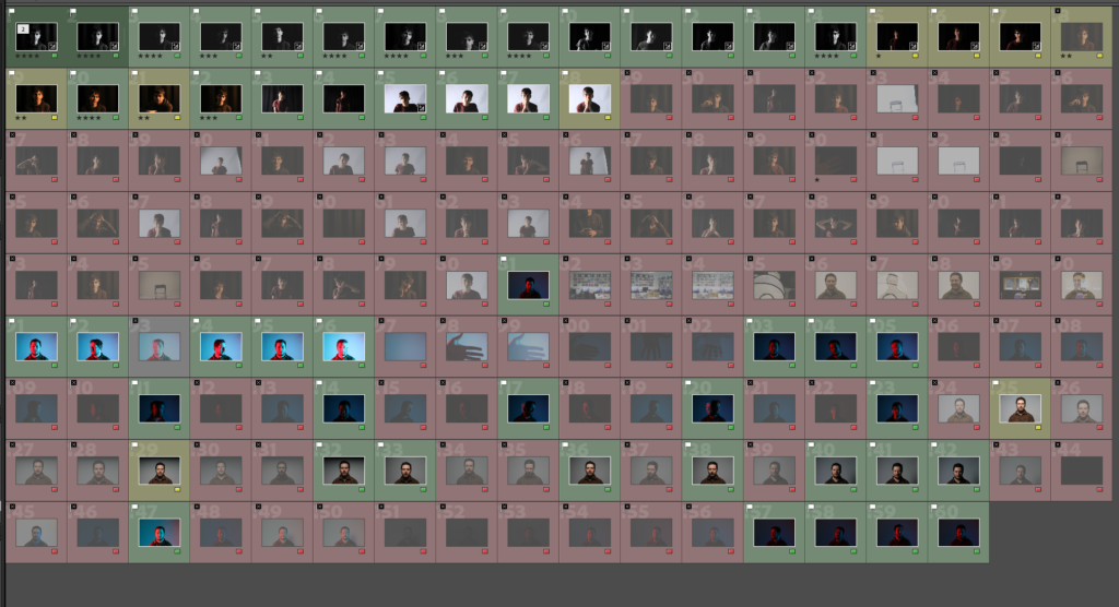
I ended up not using a lot of the images that were taken as half of them were either not making eye contact with the camera or were test images and the other half I felt that it didn’t match the standards I was aiming for. However for the ones I did select I felt that they were effective attempts at the different lighting styles.
Attempt at Rembrandt Lighting
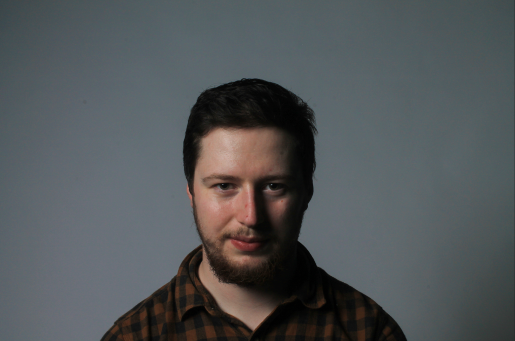
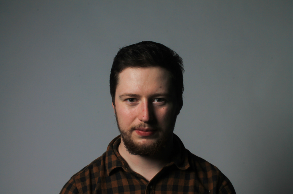
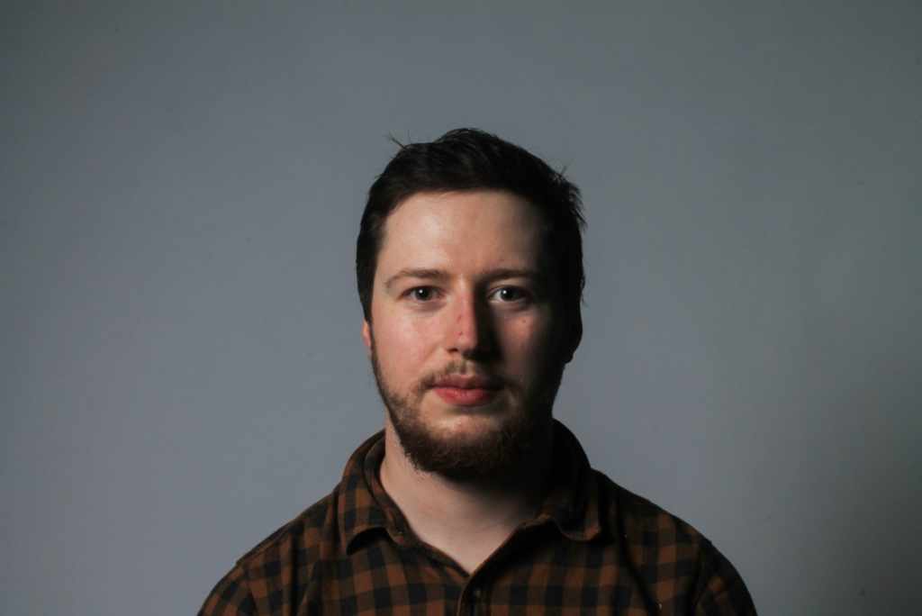
As you can see from my images I was able to capture the light triangle clearly under the eye which is the key characteristic of taking an image using Rembrandt lighting. You are also able to see the shadows casted under the right cheek and the right side of the nose which helps form that light triangle we are looking for. The strongest image out of these three is the one in the middle as I feel that it is clear to see the light triangle as well as the light intensity of the triangle which makes it easily visible for people to view the photo and identify that the image has used Rembrandt lighting.
Attempt at Chiaroscuro Lighting
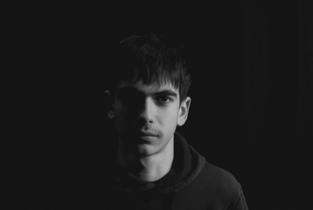
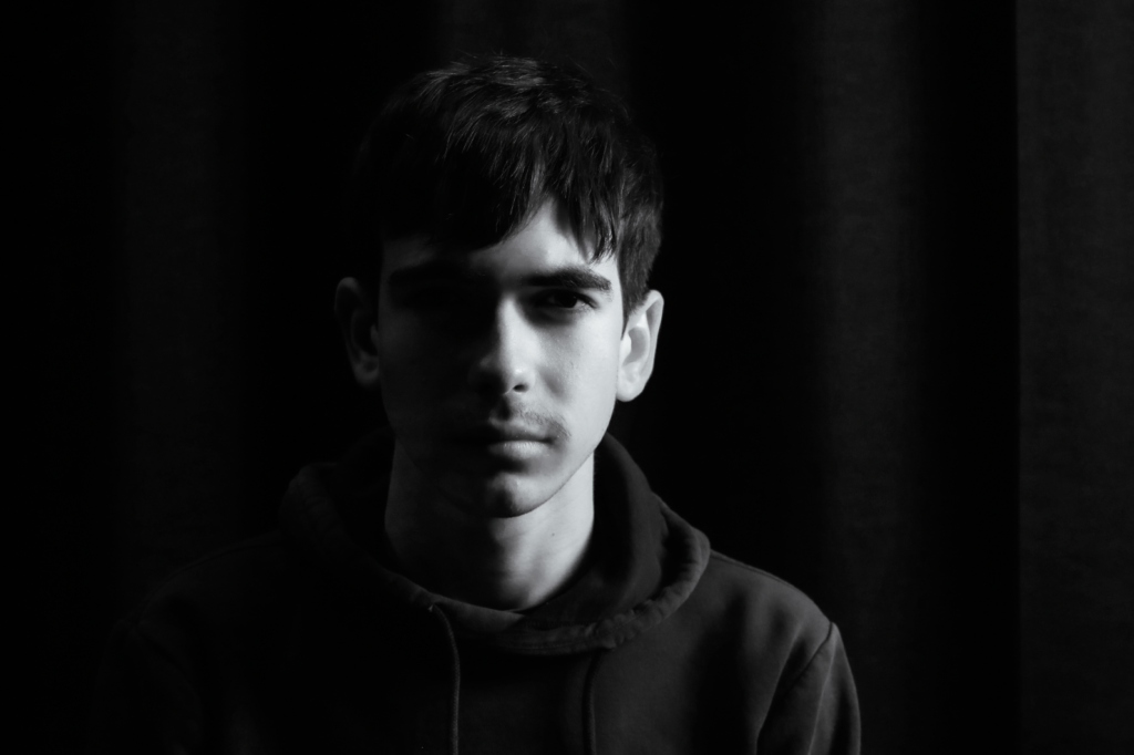
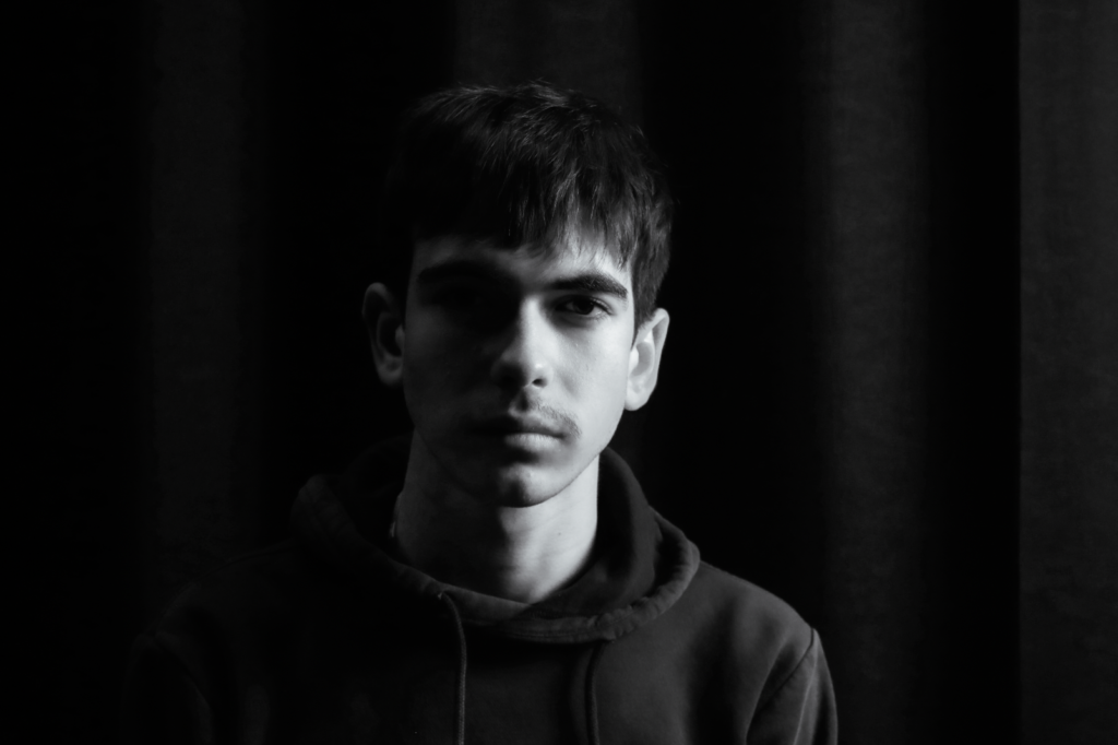
As you can see from my images I was able to position the lights in a way where I could increase the amount of shadows and highlights that were casted around my face in order to attract the viewers attention more towards the shape of the face and the details of the face as well. Out of these three I would say the image on the right is the most effective as one side of the face is lit up which allows for those details to be visible and allows for the shape along my chin to be more visible, and the other side of the face which is blacked out which allows for the brighter side to be the main focus so the viewers attention is more towards the shape of the face around the divide in the middle.
Attempt at Butterfly Lighting
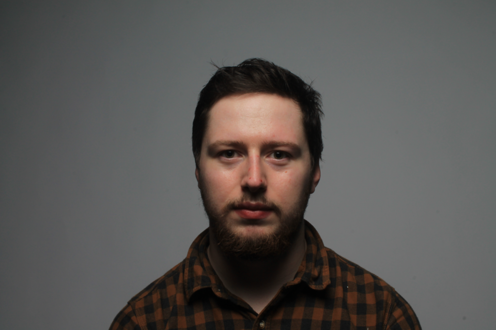
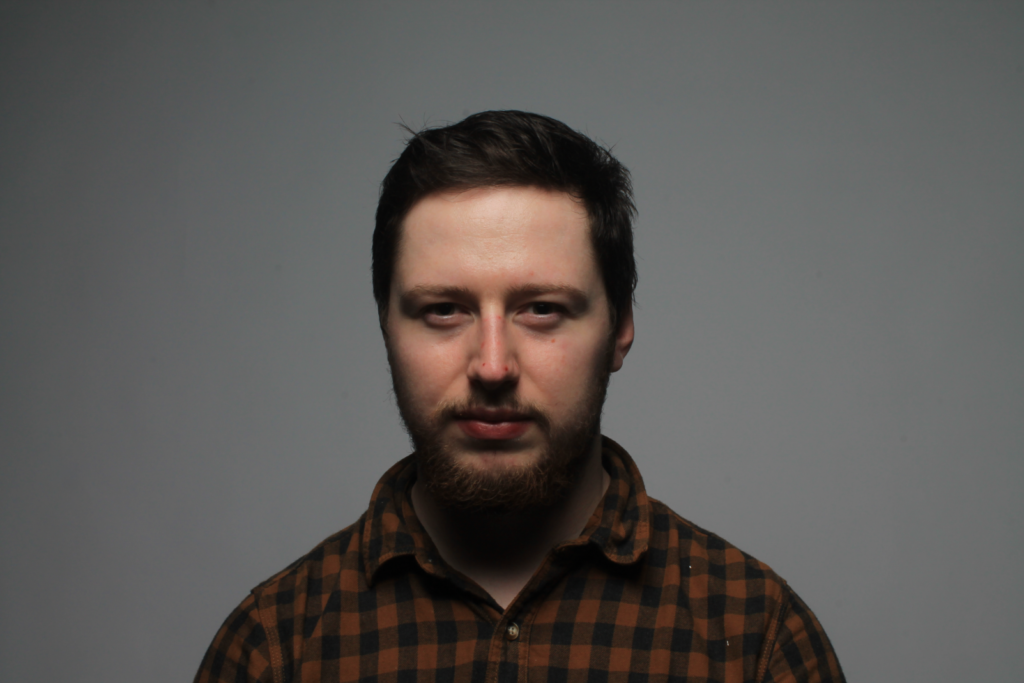
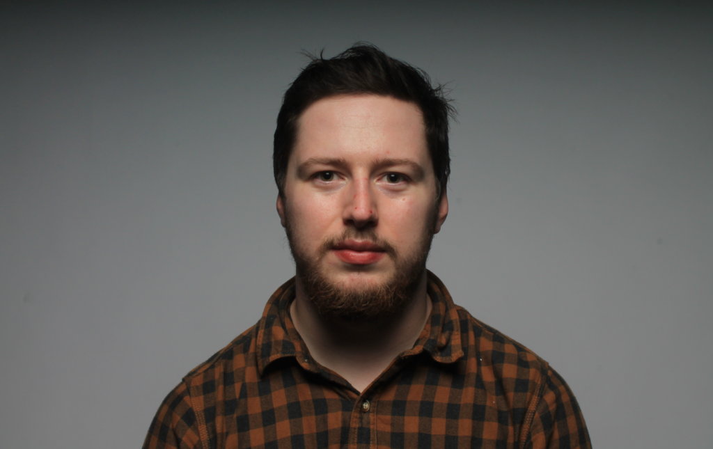
As you can see from my images I was able to position the light above the camera in order to cast shadows under the nose and to highlight some parts around the face which is what we want when trying to take pictures using butterfly lighting. Out of the these three I think that the image in the middle is the most effective as there is a clear visual of shadows under the nose and by the subject tilting their head slightly down it helped to create some minor shadows around the under and the top part of the eyelid.
Attempt at using Colour Gels
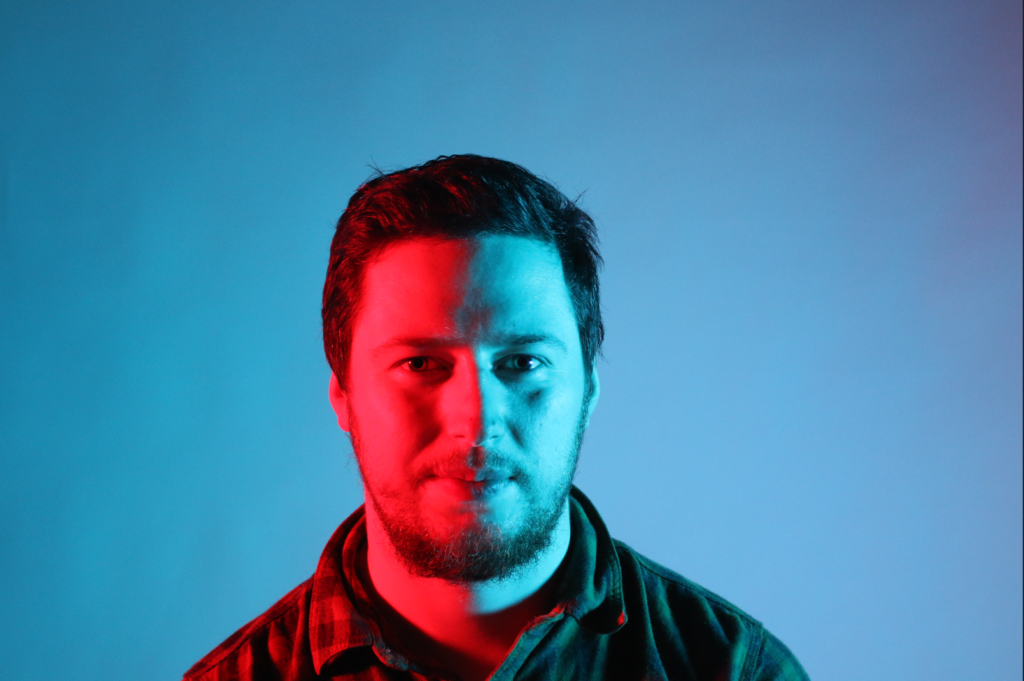
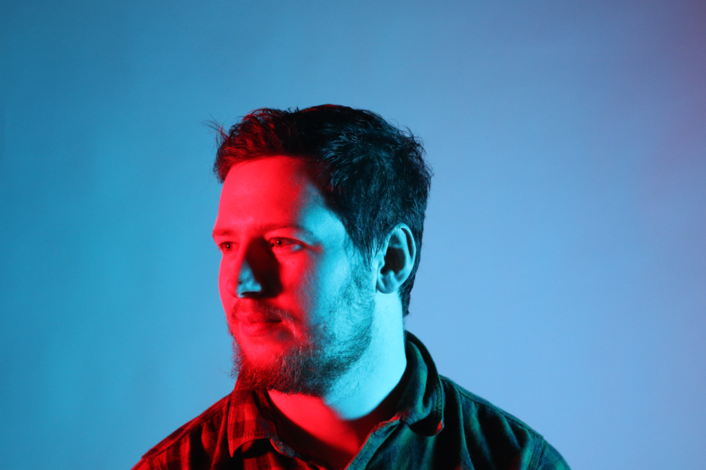
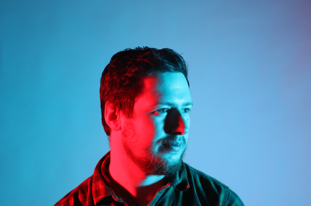
As you can see from my images I was able to put red coloured gel on the left side of the room and a blue coloured gel on the right side of the room which helped create this unique feel to the image. Coloured Gels have made these images standout and look more interesting to look at especially since the red and blue colours clash together nicely alongside each other. Out of these three images I think that the image on the left is more effective as it captures both of the colour gel lights perfectly creating a balance of both the red and blue light symmetrically on the subjects face.
