Man Ray
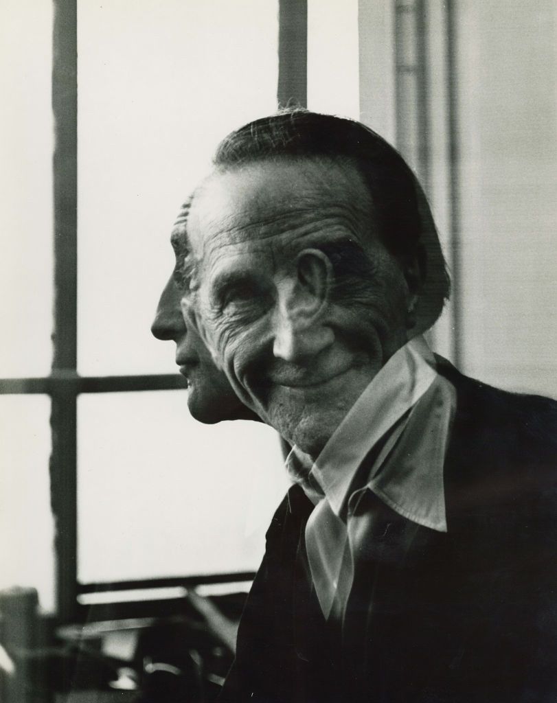
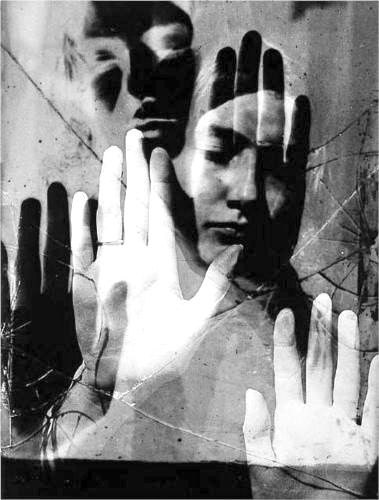
images by Man Ray
Man Ray was an American visual artist who spent most of his life in Paris. He was a significant contributor to the Dada and surrealist movements, although his ties to each were informal. Above all he was best known for his pioneering photography and was a highly known fashion and portrait photographer.
Ray is also well know for his photograms which he called “rayographs” Throughout his career Man Ray didn’t expose many details of his life or family into the public, Ray didn’t even publicly acknowledge his “other name” which was Emmanuel Radnitzky. He was born in South Philadelphia, August 27, 1890.
From a young age Man Ray was displaying a range of artistic and mechanical ability’s, whilst still at school he used to educate himself by frequently visiting the local art museums in his area.
Double / multi-exposure images
Double / multi-exposure images are photographs created by combining two or more photos into a single image, which blends different elements, subjects, or moments together. This technique can add depth or movement to an image.
To create these images I used photos from the previous post on studio portraits and edited them in photoshop
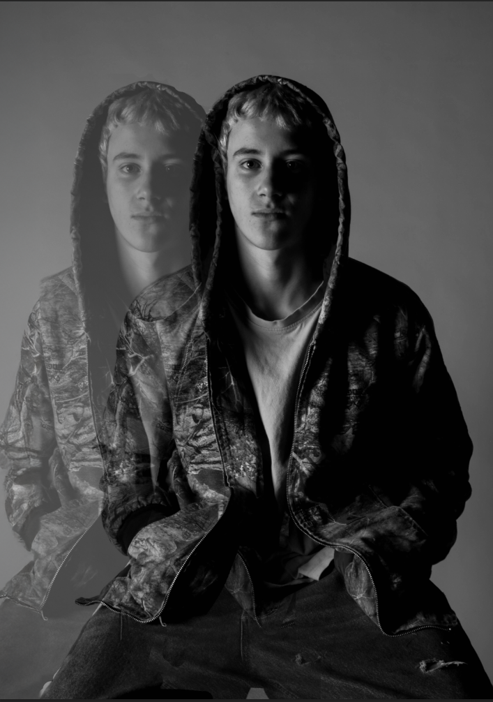
To create this image I cut out the subject of the image and made a new layer and pasted him on top. moved the second copy of the subject to where I wanted and turned the opacity down. I also edited the original image a bit more to add a bit more contrast and make the effect of the double a bit more dramatic.
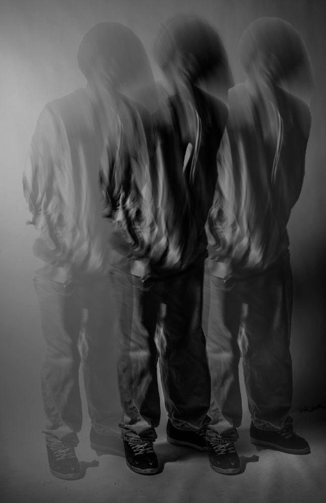
I thought that it would be cool to edit one of these images from when we did the motion blur photoshoot. As I thought that seeing the blur repeated would have a cool effect.
This image was a bit harder than the previous to edit as there was the blur as well and I copied it three time instead of two, I Used the eraser tool to smoothly blend these together as well as having it make the colour of the background correctly. Additionally I made the subject in the middle dark to add a bit more depth into the image.
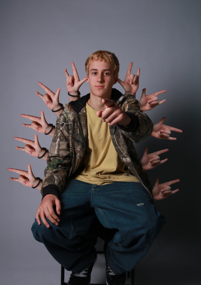
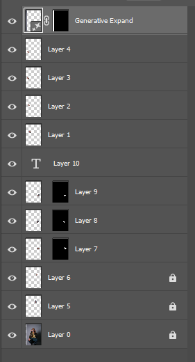
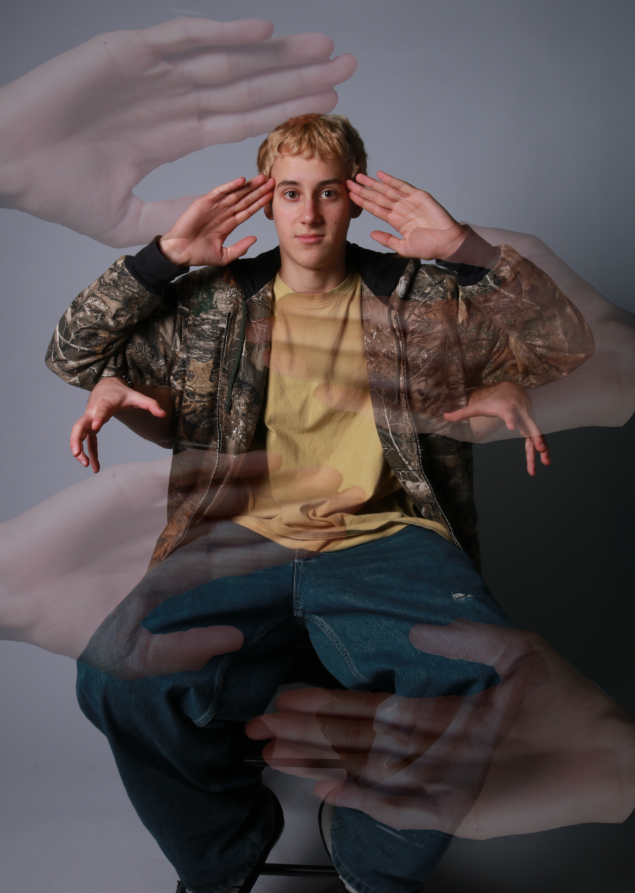
This was an idea I had as the regular image just had the hands in his ears which I thought would look different if they were replicated and moved around the whole subject. One issue I ran into with creating this is that the lighting on the hands didn’t match the tone of the background, especially when doing the right side which is significantly darker than the left or even higher up on the right side. The way that I combatted this is by clicking on the layer of the hand I would like to change. Then by going to the top of the screen and clicking on image then adjustments, that allows me to lower the brightness and contrast on that single layer. So I then did that for the rest of the hand I would like to make darker to match the tone of the background.
Russian Constructivism
Alexander Rodchenko
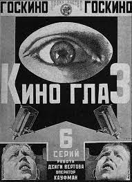
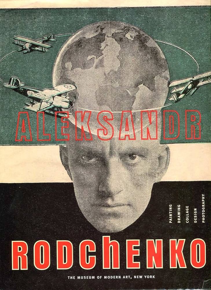
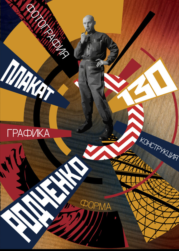
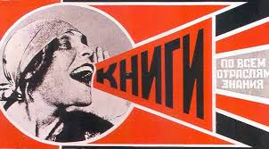
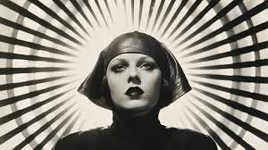
Images by Alexander Rodchenko
Alexander Rodchenko was a Russian and Soviet artist, sculptor, photographer, and graphic designer. He was one of the founders of constructivism and Russian design.
Rodchenko was born in St Petersburg and moved to Kazan after the passing of his father in 1909. Rodchenko became an artist without much exposure to the art world, he main drew inspiration from magazines. He began his artistic studies in 1910 at the Kazan Art School where he met his future wife.
In 1921 he became a member of the productivist group, which advocated bringing art into everyday life. He gave up painting to concentrate on graphic design for posters, books, and films.
Rodchenko was the main influence for many of the 20th century graphic designers, for example American conceptual artist Barbara kruger took huge inspiration from Rodchenko’s work.
My Interpretation
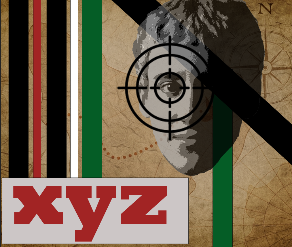
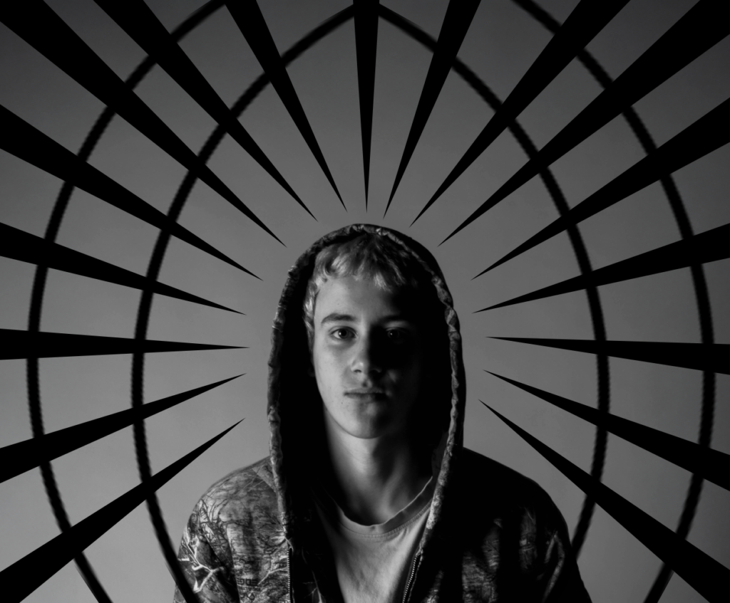
to create this image in photoshop I first got the background. Then I cut of the subjects face from a previous image, and edited it with a filter to create that high contrast look. and placed it onto the background I then added some stripes onto the image some with different of levels of opacity as I thought it looked a bit plain. Then added some bold red text as Rodchenko’s images that he created often involved adding text, so I decided that I should add some to mine to give the feel of his work. I then got the target off google images and thought that it added great effect to place it over the eye to draw attention.
Michael Betzner

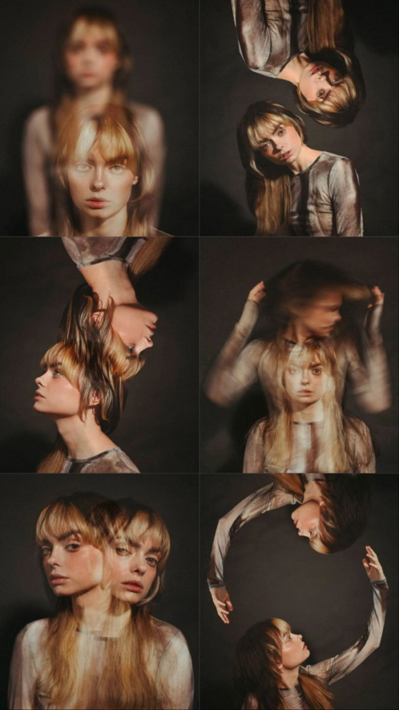
Michael Betzner is a 27 year old conceptual portrait photographer, who is completely self taught. Betzners photography started when he found his husbands ( Benjamin) old camera. Because he completely self taught he approaches photography with a different view and perspective. Betzner’s main focusses with his photography are fashion, branding and building portfolios.
Betzner states: “I felt right at home walking through the woods capturing nature, but I quickly fell in love with portraits and capturing people’s emotion”
Inspiration photo
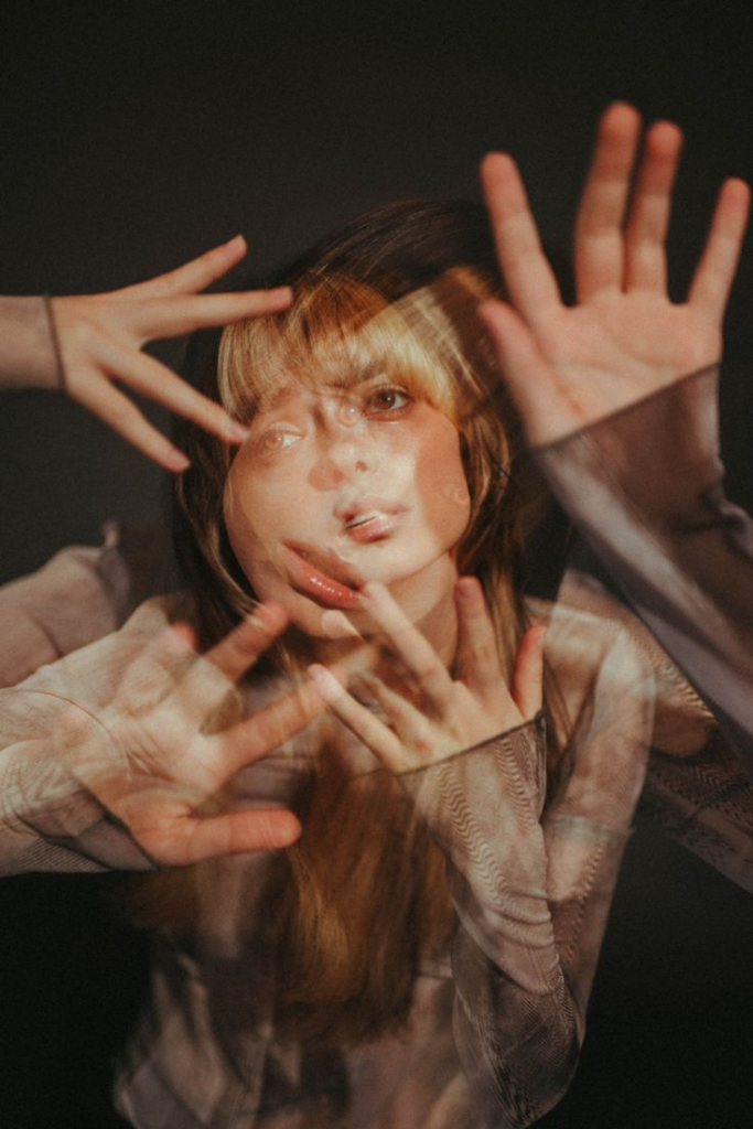
image by Micheal Betzner
My Interpretation
inspiration photo
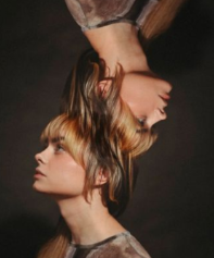
image by Micheal Betzner
Personally, I really like this image because it’s not something that I would have thought to do with an mage and show a real creative way of thinking and show the unique approach Betzner has to his work. As well as I think that the way that Betzner has blended the hair together looks great and seamless which really elevates the image.
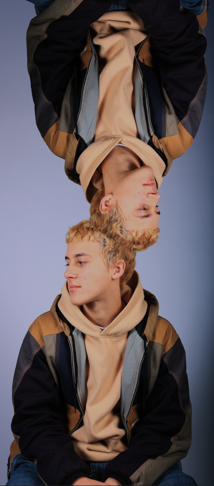
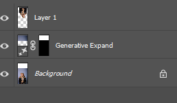
to create this image in photoshop I unlocked the background image, and expanded the image so that the top of the image was higher to allow me to place the copy of the guy on top, I selected the subject of the image and copy and pasted him back onto the image. I then pressed CTRL T to allow me to spin the image around to make it upside down I then used the erase tool to blend the hair better as it looked a bit weird because it didn’t blend.

Lots of good work here but You MUST complete current blog posts on a weekly basis, review them and publish them.
This allows us to assess your work and offer feedback and guidance to help steer your ideas in the best possible direction with a chance to control the quality too.
Remember to use the tracking sheet (emailed) and 10 step process to check what you need to produce…and try to step out of your comfort zone and take a few creative risks !