Environmental portrait – characteristics

Key features to consider with environmental portraiture:

LIGHTING: natural light or artificial light
< Outdoors > hard light > sunny weather creates hard contrast between light and shadows.
< soft light > overcast weather and clouds acts as soft box and diffuses the light.
< Indoors > use of window light > roof light > studio lights
< Direction of light > from the side > 45 degree angle > frontal > back light

ENVIRONMENT: location or setting that can add context to the portrait
< Tell a story about the sitter > lifestyle, social class, gender, ethnicity, age etc.
< Use of props > tools of the trade > personal items > clothing > fashion

FRAMING: arrangement of person(s)
< Full length body > three quarter length > half body
< Angle > low angle > deadpan > canted angle

APPROACH: formal (posed) > informal (natural, un-posed) > neutral pose and facial expression

GAZE: Eye contact > engagement with the camera
Averted gaze > looking away from camera

TECHNICAL
(CAMERA SETTING):
< Focal length > standard lens (50mm) > wide-angle lens (35mm)
< Depth of field > aperture settings > f/8, a mid f-stop number
< Movement > shutter speed settings > no less than 1/60 hand held or use a tripod for slower shutter speeds.
< ISO > outdoors > crisp image > low ISO > 100-400 ISO
< indoors > grainy image > high ISO > 400-1600 ISO
< White balance > outside daylight < inside either daylight or tungsten, or tube light – depending on light conditions.

Stuart Weaving , High Net Worth Individual (HNWI). Marina Court Penthouse, St Helier, Jersey. 7 June 2015

Formal Elements

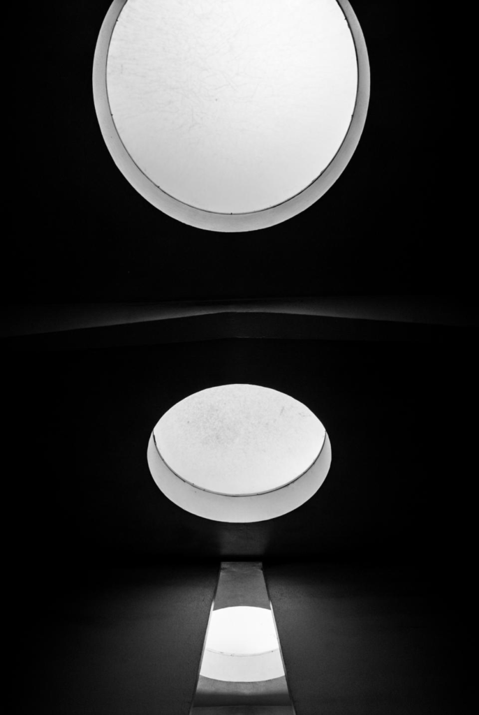
Lines

Lines are common in photographs. They are all around us, and every photo has lines. These lines often connect different points within the image. Sometimes, lines come into the photo from outside the frame or lead out of it. The type and direction of lines in your image can convey meaning. Vertical and horizontal lines suggest stability or a still feel. Horizontal lines can show distance, while vertical lines can represent height, balance, and strength. Diagonal lines create a more active scene.

Shape

In a photograph, a silhouette represents the simplest form of a shape, lacking any details like texture or color. Because it stands out sharply against its background, a silhouette is very noticeable. Shapes are typically defined by lines that either intersect or enclose them. They can also be identified by their brightness or darkness compared to their surroundings. Differences in color, texture, and pattern around a shape can help distinguish it further. Additionally, shapes can be defined by other shapes around them, like the arrow in a well-known shipping company’s logo. The area that contains a shape is known as positive space, while the area outside it is called negative space sometimes, the negative space can create its own shape.

Space

Adding space in your photos helps create a sense of scale and depth. It gives your main subject some breathing room, letting viewers focus on the key elements of the scene. This is especially helpful in outdoor photography, where you might want to highlight the size of features like mountains or lakes. However, you can use space effectively with almost any type of photography.

Repetition

Repetition in photography is the technique of using similar elements, patterns, or themes in a composition to create a sense of rhythm and balance. This can include repeatedly using lines, shapes, colors, textures, or other visual elements to achieve consistency. Examples of repetition in photography could be a row of trees, a series of arches, a field of sunflowers, or a group of people dressed alike. By repeating these elements, the photographer helps guide the viewer’s eye across the image, establishing a visual rhythm.

Texture

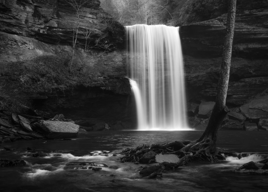
Adding texture to your composition can enhance your image and connect the viewer to it, especially in macro photography. You can find textures in various surfaces and environments. To highlight these textures, try different lighting setups and depth of field options. For instance, use flat light and position the camera directly in front of a weathered wall to emphasize its surface. But also, backlighting can reveal details in sand dunes, a shallow depth of field can showcase intricate materials, and a long exposure can create a smooth effect on flowing water.

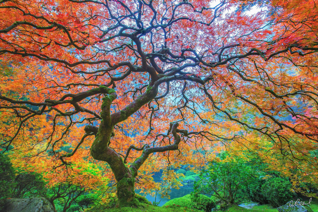
Colour

One of the most essential formal elements in visual imagery is undoubtedly colour. The use of colour, whether it appears as a solid block or as a harmonious grouping of similar shades, has the potential to create a particularly strong and memorable impact on the viewer. Different colours are not just aesthetically pleasing, they also hold significant power in terms of expression, allowing them to resonate with those who view with the image.

Value/Tone

Tone of your image is also very important in terms of formal elements, in which focusing on using contrast and the balance of light and dark areas. Tone is especially important in black and white photography, as it helps direct the viewer’s attention in the absence of color.

Texture

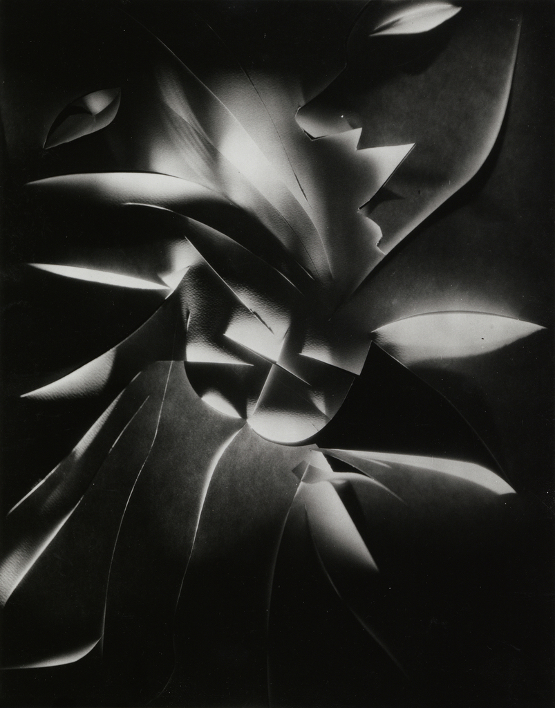
Francis Bruguière

Bruguiere had a pretty impressive career, shooting for famous magazines like Vogue and Vanity Fair. He got into photographic abstraction and even made some cool cut paper designs, which really leveled up his art. In 1928, he showed his work at the der Strum gallery in Berlin and got a lot of praise. That same year, he moved to London, where he started playing around with light, which became a big part of his style. In 1930, he teamed up with Oswell Blakeston to create Light Rhythms, England’s first abstract film, inspired by his light experiments. Later on, he wanted a more laid-back lifestyle, so he moved to Northamptonshire and kept creating art until he passed away.

My response to Francis Bruguière:

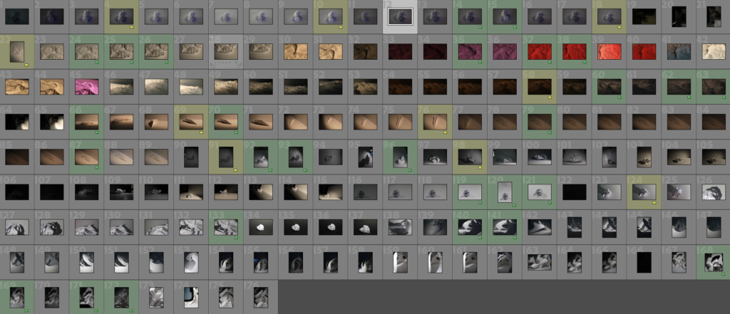
These are all the photographs I’ve taken that focus on paper photography and my interpretation of Francis Bruguiere’s work. To organize these images, I created a color-coding system. Green indicates photos that meet a pretty good standard, meaning they are clear and well lit, which enhances their quality. Yellow signifies images that aren’t quite as good but still have editing potential. These yellow-coded photos may have issues like being slightly out of focus or poorly lit. I believe both the green and yellow photos are still useful and can be improved through editing to highlight their best features.

Paper editing:

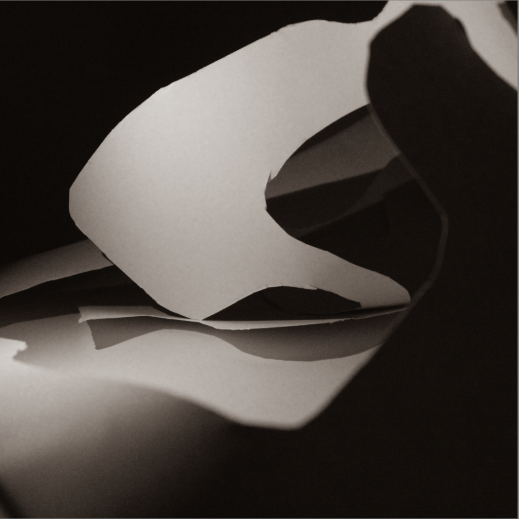
For editing, I used the develop tab to explore the black and white presets. There were many options, and I chose a sepia filter for some images. I also adjusted the exposure to create a darker look in certain photos, making the shadows more noticeable. I made slight changes to the contrast as well to emphasize the dark areas and enhance the shadows. These adjustments improved the visual impact of each photo and contributed to the mood I wanted to achieve.

Adobe Lightroom

Add evidence / screenshots of the following:

These are my photos that I think were good enough to be flagged. After they were flagged, I rated them on scale from 1-5. This allowed me to assess the quality of of the pictures and help understand what differentiates and bad photo from a good one. These are a frame of reference to contacts sheets and how they are used by photographer to pick the best and most relevant work to their ideas

Edited Image:

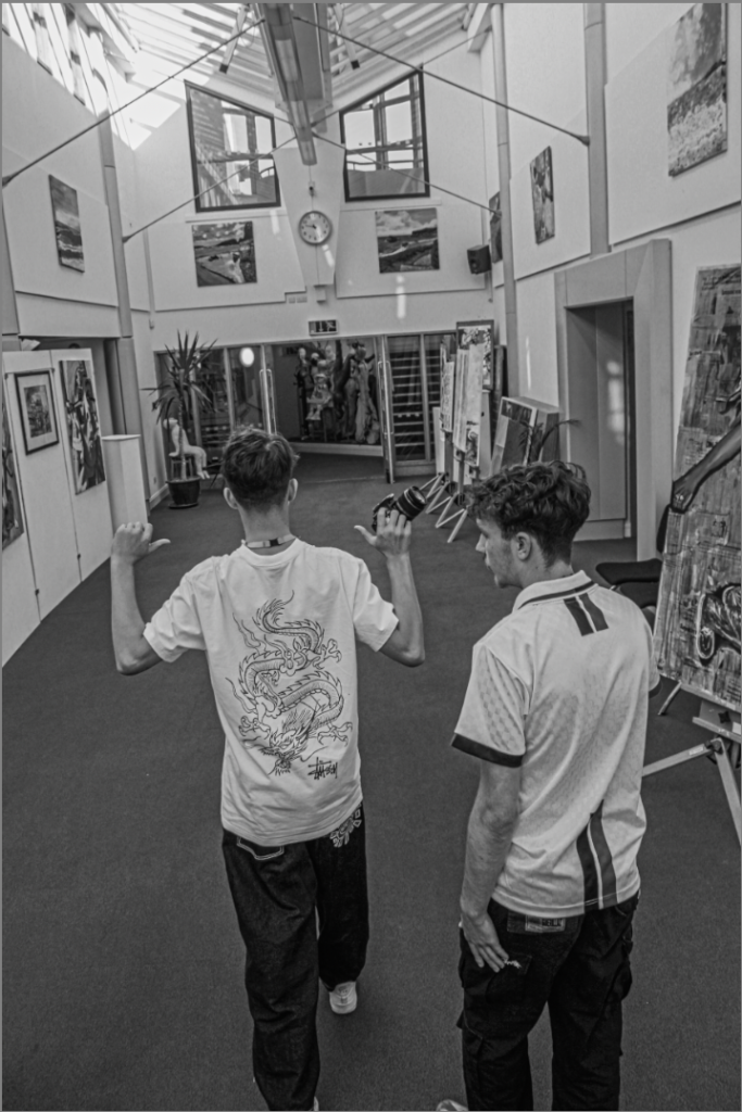
To edit this image, I changed it to black and white and messed around with this setting that changed the grain, this made the photo and the subjects in the photo seems like they have more detail as the stand out more. I also changed the contrast and brightness to make the blacks and whites stand more out.

Comparing Images:

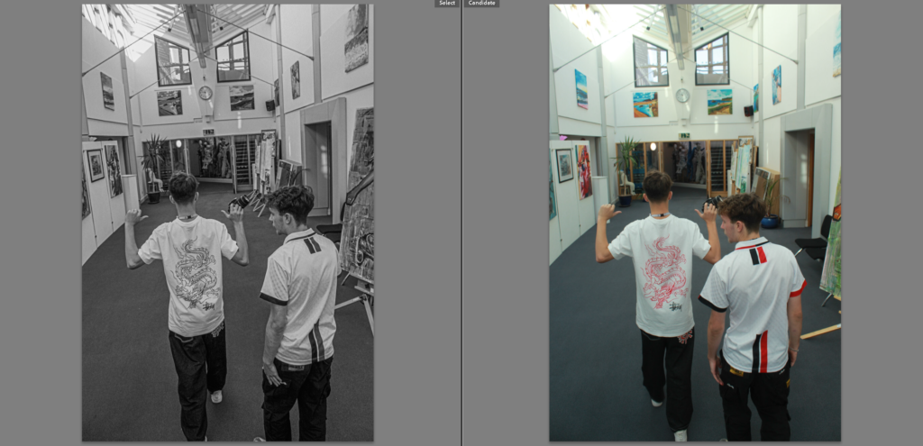
This is a comparison of the edited photo and the original, this gives a clear view of how the photo changed and how I could of done this. You then are able to analyse all the differences in each photo like for example you can tell that the image of the left seems more sharp and precise as a result of the edit techniques I used.

Contact sheets:

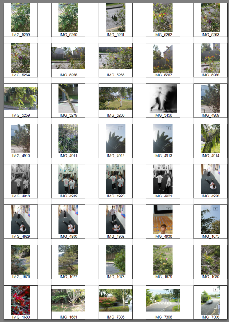
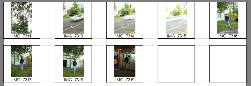
This is a contact sheet on some of the photos I did, this shows a clear example of the photo shoots I did for shutter speed and for apperture.