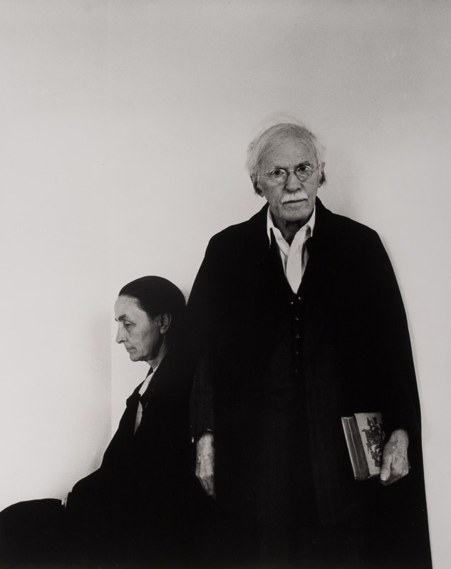
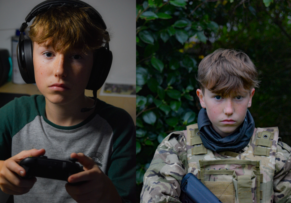
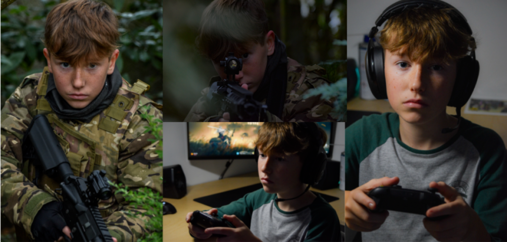
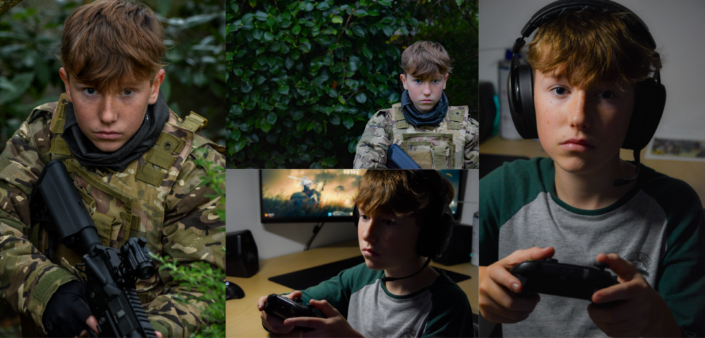
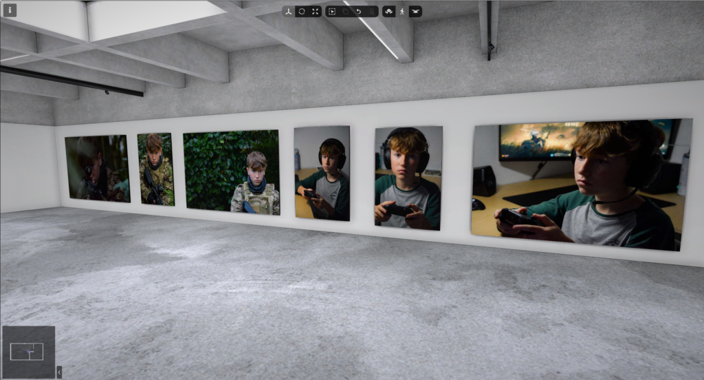
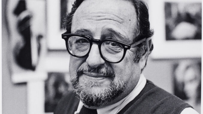
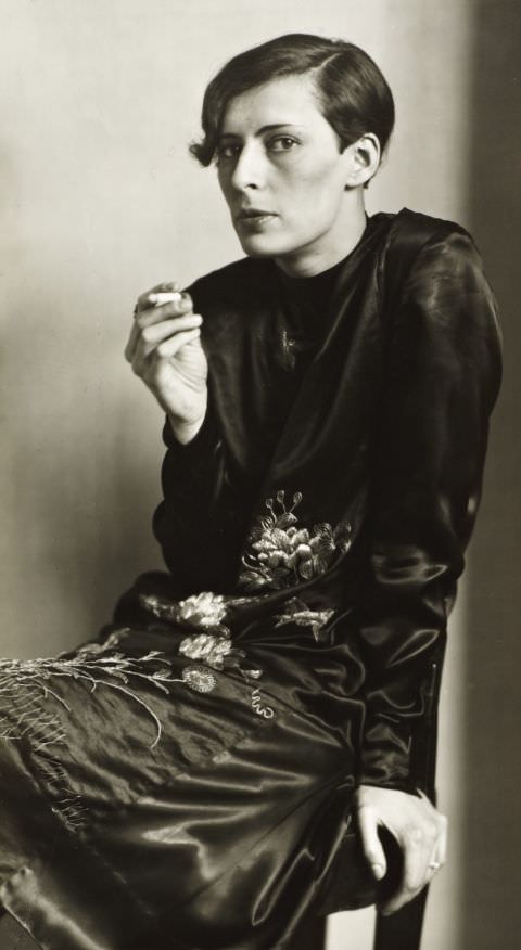
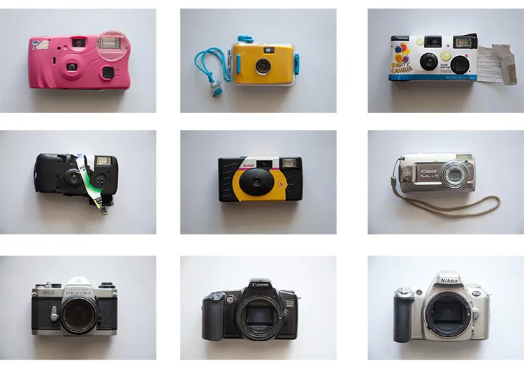
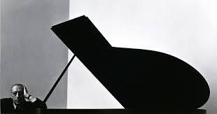
Arnold Abner Newman was an American photographer, known for his “environmental portraits” of artists and politicians. He was also known for his composed abstract and still life images. Newman was born : March 3, 1918, New York , United States and Died: June 6, 2006 (age 88 years), New York, United States.
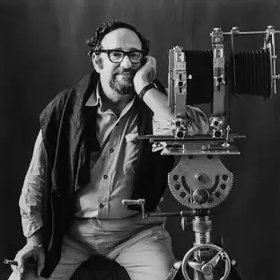
Photo Analysis
Visual
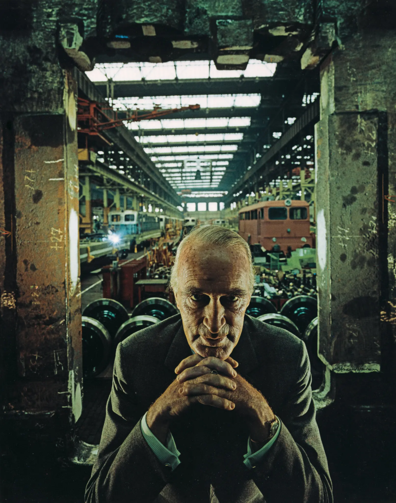
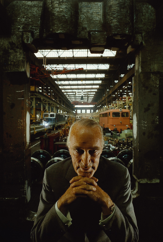
The person is the main focal point. Krupp is in-between the concrete pillars which create a cold and outdated effect, he is placed in the centre so the photo will create a line of symmetry. Krupp is leaning forward with hands which are interlocked in-between each other. Interlocking hands means that Krupp is connected to the place in the photo. Krupp shows lots of eye contact which creates a feeling of intimidation towards us, which also makes us scared and not want to go near him. Eye contact also shows a high level of confidence. The background of this photo is in an industrial environment, which shows that Krupp is in charge or owns the environment that he is in. Leading lines make the photo look balanced and proportional and position Krupp very central due where the lines start and finish.
Technical
The lighting may be artificial due to many different light that may be used and also due to the intensity of the light. Also the lights will create a powerful contrast on the sitters face. Which will make him more mysterious and darkening his gaze. The aperture is placed at a medium due to the amount of light the will want in the photo. This ha a very sharp foreground due to having a low ISO which makes the image look a lot clearer. Is placed at a medium aperture- very sharp foreground, slightly softer background . Able to identify environmental details, which means that easy to see. The Shutter speed- is quite a fast because Newman wanted to capture a very specific moment while the subject is in focus and also creates a balanced exposure. The angle is exactly eye level with the sitter which means we are immediately drawn tot him and also feels like we are extremely close to him.
Contextual
Alfred Krupp is the only subject in this photo which means he’s the main character. An Industrialist who ran war factories manufactured arms for the Nazi assault on Europe. Using slave labour from the concentration camps, is where the prisoners of war were literarily worked to death. The majority of the men and boys who perished were Jewish and Krupp holds a particular grudge amongst there people.Arnold Newman was Jewish of origin. Krupp was reluctant to agree for the photo to be taken but he eventually agreed. He didn’t want the photo taken by Newman due to him being Jewish, Krupp disliked the Jews. When deciding what to do with the shot , Newman asked Krupp to lean forward slightly, when he did he interlocked his fingers together tightly under his chin. The light hit the face completely and when Newman saw this effect he said ‘That he felt the hair stand up on the back of his neck’. This image became one of the most famous images of Newman’s Career.
Conceptual
When Krupp saw the picture he was said to have been furious due to the artist being Jewish. For Newman this was a little bit of revenge for him. The photo captures Krupp in a serious, sincere and a menacing light. The flow of the photo brought Krupp out from the shadows and allowed Newman to share his envy for his man with the world.
August Sander
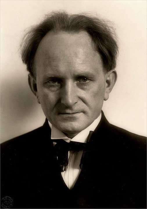
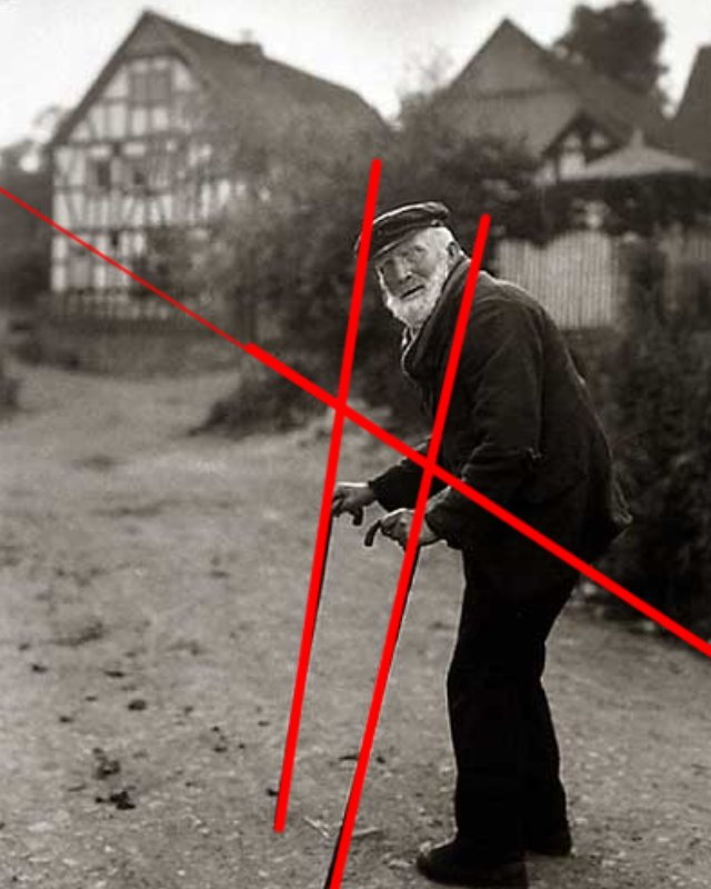
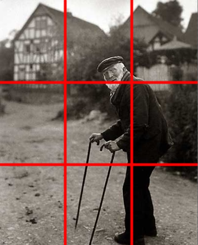
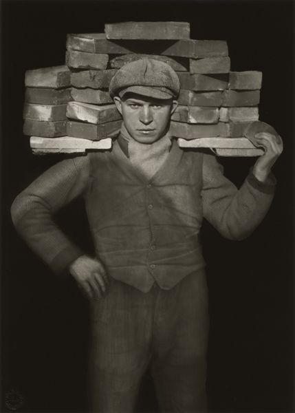
August Sander (1876–1964) was a German photographer , which was well known for his work documenting and capturing German community in the early 20th century.
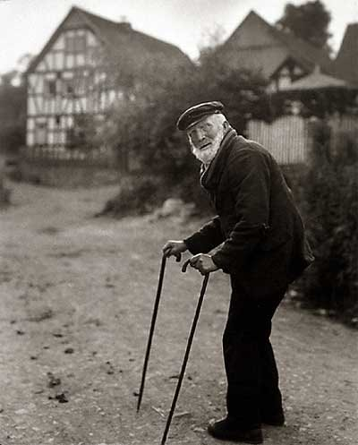
August Sander’s photography is powerful for its organised approach to gathering people and securing a wide range of individuals from different parts of life in Germany, often attention on class, occupation, and social role.
Social and Class Structures: Sander’s portraits weren’t just about capturing the physical appearance of his subjects. They were important roles that people played within the larger framework of a community . He saw his work as a way to show the complexities of class, identity, and occupation, often seeing how social status and profession were reflected in a person’s appearance and lifestyle.
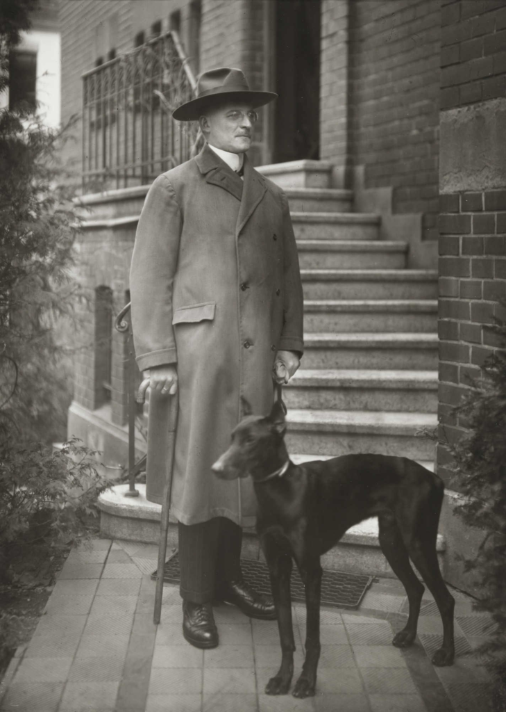
He gave respect to the people he photographed, regardless of their social standing and state . His photography gives a message that a sense of equality among the subjects in the photographs. He wanted to truly show the reality of life in Germany, from lower class life to high class.
Legacy
Sander’s most memorable series was , People of the 20th Century, was never fully accomplished in his lifetime, and much of his work remained unpublished during his career. However, the project has since been regarded as one of the most important photographic tasks of the 20th century.
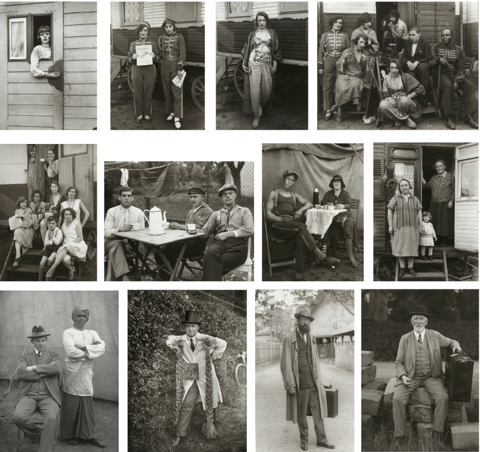
Typologies
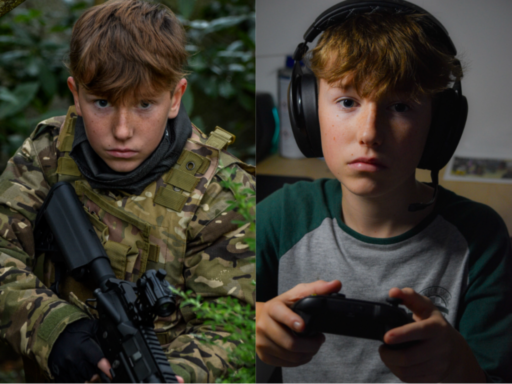
A photographic typology is a study of “types”. That is, a photographic series that prioritizes “collecting” rather than single or one image. It’s a powerful method of photography that can be used to reshape the way we see the world around us.


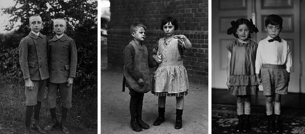
The concept of Photographic Typologies gets its origins from August Sander’s 1929 portrait series from Face of Our Time, which captured the diverse social fabric of Germany between the two World Wars. Sander’s intent was to capture a cross-section of a community in Germany —its various types, classes, and the relationships that are linked them. He recognized that displaying his portraits as a collective series revealed much more meaning than displaying them individually. Unfortunately, his photography had such significance and power that just four years after its creation, the Nazi regime had the photographic plates which were demolished and then the book was banned.
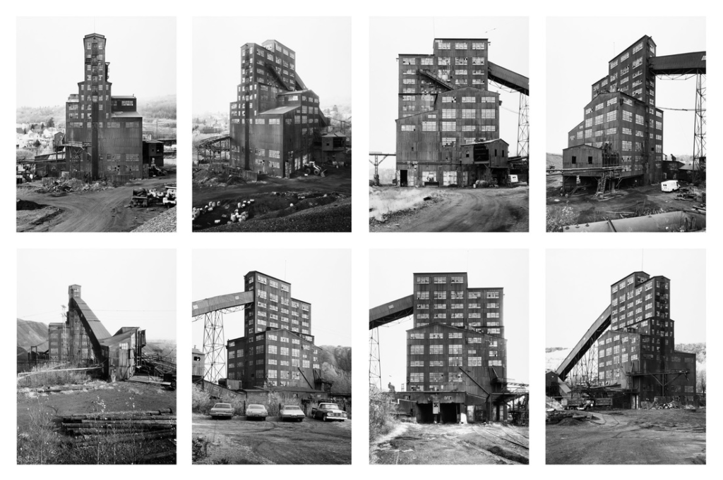
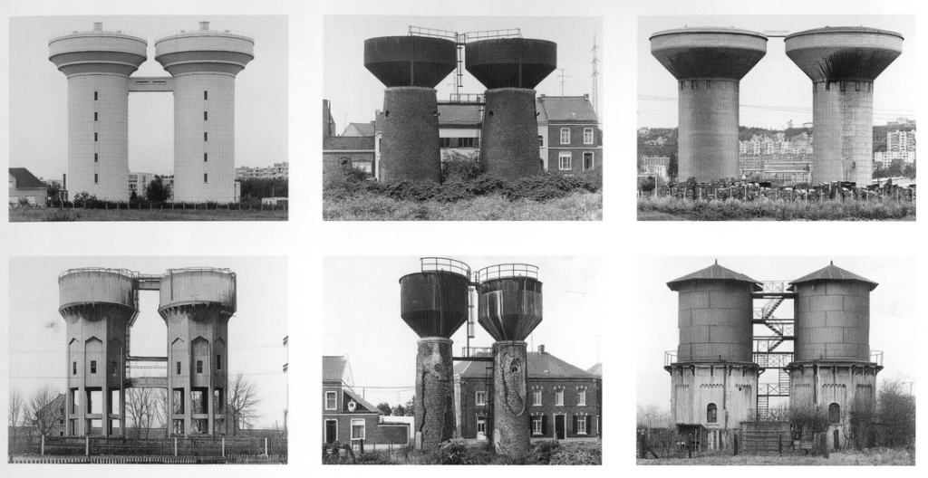
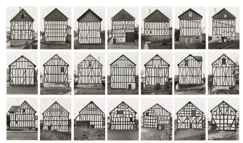
A typology in photography is a study of “types” , which is a collection of images put together to gather a meaning, rather than individual and isolated shots. This approach shifts the focus to “collecting” and categorizing, and has become a method for reshaping and how we think about the world around us . The term “typology” itself gotten exposure in photography in 1959, when the German artists Bernd and Hilla Becher began documenting the industrial architecture of Germany that was disappearing quickly . The Becher’s described their subjects as buildings where anonymity is the new style. Their objective was to document a fading landscape, and in doing so, typologies not only captured a moment in time but also invited viewers to reflect on the photographs in the broader context of history and community of Germany.
August Sanders Photography Analysis

TECHNICAL ASPECTS
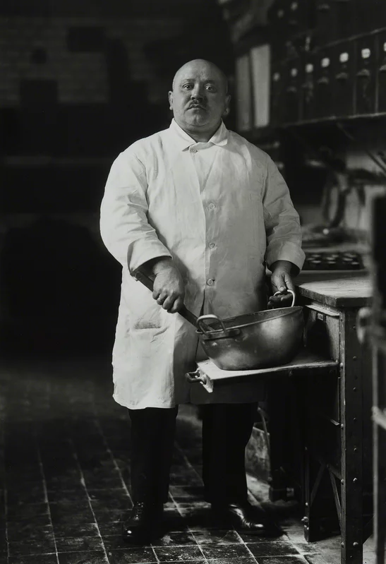
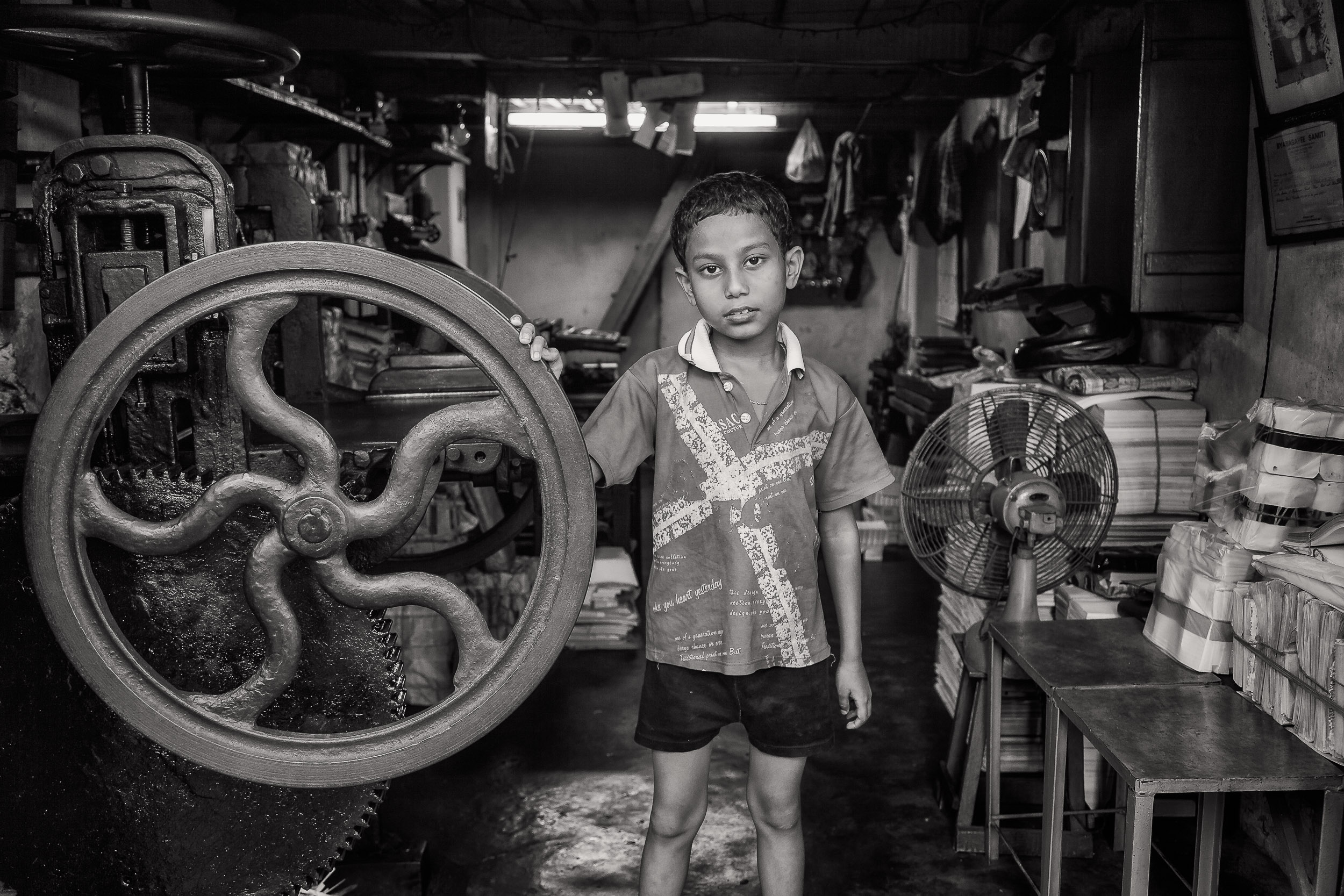
Due to the black and white format and filter on this photograph , it is hard to see what lighting was used. However, upon further inspection I can able to conclude that the source of light could be natural, coming from a window in the middle of the day , This is because if you look into the metal bowl grasped by the chef, the lighting seems to be in the shape of a distorted rectangle, which closely comes from a window. Additionally , due to the lighting being softly diffused, and not having a hard tone and definition within the subject/ where the projection is giving heavy and contrasting shadows upon the subjects body and face ( Similar to how artificial light would create a hard light with little diffusion) It is fair to say that the lighting is natural due to it having very similar characteristics to it. Finally, due to the angle of the reflection on his head compared to the angle of the light on the bowl, we can also conclude that there many windows positioned to the right of the subject and in the foreground of the photo ( due many light sources within the reflections) , all working together to make the scene of lighting and the atmosphere.
The tonal range in this shot (the range of tones in-between the darkest and brightest areas of an image that are caught by your camera.) which is wide as they are clearly many points within the image with pure black and pure white , along with lots of shades of grey in-between, This in return creates a lot of contrast within the image which will highlight the key features of the subjects body and outline. Additionally its easy to tell that this image is perfectly exposed, because the detail is still clear and nothing is too dark or too bright, cutting out the glare within the shot, from reflections.
APERTURE
The Aperture Used to create this shot is most likely quite low in the ranges of f2-4.He used a low aperture to capture a great shallow depth of field. Low apertures are ideal foe capturing portraits , as seen in the photograph with the chef, the subject (chef) is in focus which is the foreground, whereas his background is out of focus.
SHUTTER SPEED
With the Low aperture , I predicted there will be a fast shutter speed that was in use in order to capture the amount of light being let in through the lens. ( at least 1/200th of a second handheld or 1/15th of a second on a tripod.)A tripod was used to keep the camera still while in use . What supports my prediction is that there is no minimal motion blur, Meaning either the subject stood very still or at a high shutter speed was used to capture the moment in time without any blur.
ISO
The ISO used to take this photo was most likely quite low, as there is no visible grain or a degrading quality present in the photo and the image is very clear , additionally the image itself is extremely dark meaning a low ISO must have been used, which makes sense as the low aperture already lets in plenty of light into the camera , meaning that the light sensitivity of the camera wouldn’t need to be high, around 100-200 was probably used.










.jpg)
